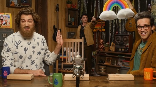
#i haven't opened photoshop in quite some time
Photo
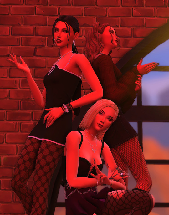
blooming in chaos (we them girls)
#sims 4#ts4#i haven't opened photoshop in quite some time#please excuse the bad quality#sims 4 edit#ts4 edit#i needed to do something to distract myself#only 3 of them bc giselle's racist#anyways#its bad but i made it and wanted to share it#so here it is
4 notes
·
View notes
Text
The Curse of Artistic Vision
I think being an artist comes down to developing an image in your head and then feeling compelled to manifest it. Sometimes you are able to improve upon that image in your head. Or you end up with something different that you like better.
But sometimes, for various reasons, you can't quite make that image a reality. And I don't know if other artists feel this way, but it feels like heartbreak every time. Not quite on the level of an incident of human decoupling, but it definitely sticks with you for a long time.
Sometimes I am limited by the current state of my skillset. I just haven't learned enough and gained enough experience to take a photo like the one in my brain.
And sometimes I am limited by my body, which puts huge restrictions on the amount of energy I can dedicate to crafting a photo.
I feel my knowledge and experience has never been at the level I am currently at. I think I have the *potential* to shoot just about anything I can imagine. Which is a cool feeling. I also feel like my image editing and manipulation skills are at the highest they have ever been. Which means anything I can't do in-camera, I can achieve in Lightroom and Photoshop.
But I just don't have a lot of energy to capture photos right now. And I am very limited by how much physical effort I can dedicate to the photographic process. Which is very frustrating. I'm hoping if I build a new studio in the house that will help a lot.
In the meantime, I have this library of images I took before 2017. Many of them I was not able to achieve my artistic vision.
But... I came close.
Which means on many of these old images I can use my editing skills of today to achieve what I could not back then.
And so I have started a huge re-edit project where I go back and realize my images as I wanted them to be.
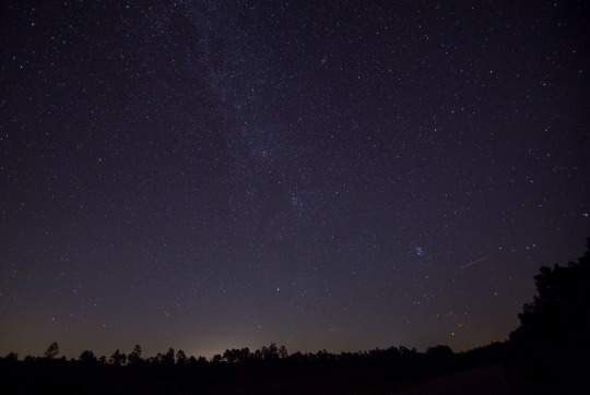
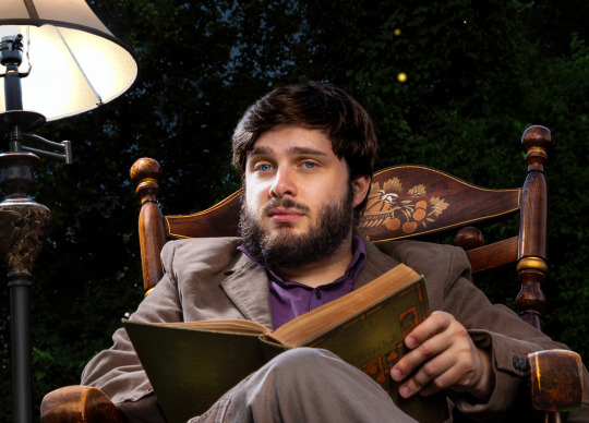
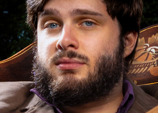
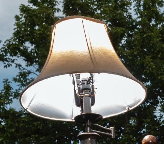
I had this idea for an image of someone in the middle of a dark forest in an open field reading a book and the only illumination was a lamp that seemed to be plugged into nothing. It popped into my head and it just seemed like a cool photo to create.
In July of 2016, my friend Ryan was visiting and we decided to try it. We even rented a big fancy 50 megapixel camera for a few days. I had never used a professional level camera and it was my birthday and I wanted that experience.
I even had this cool idea to hide a flash in the lamp so it would look like it was illuminated.
The resulting image was not anything like I had in my head. And for some reason, I edited it super bright, and you can barely even notice the cool lampshade flash trick. If you lower the exposure of the RAW file there is a well-defined circle of light in the grass, but it is hard to see in the 2016 edit.
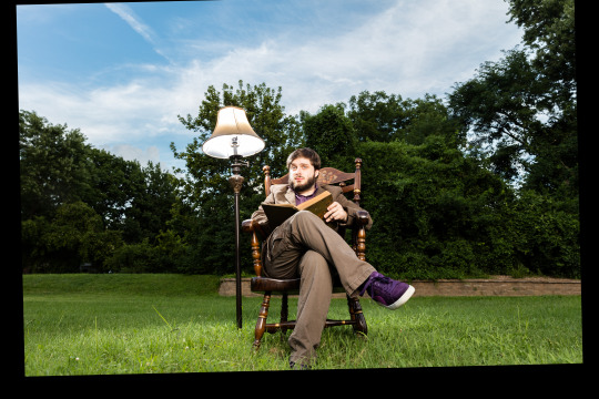
Where is the dark background? Why didn't I underexpose the background to make it look like night or sunset? I knew how to do that back then. I totally could have crafted the photo in my head at that time.
But then I noticed I only took like 8 photos of this scene. And I *always* overshoot. I took 300 photos of a bridge recently.
Then I remembered what happened. We moved a giant rocking chair, a lamp, and lighting equipment to the middle of my neighbor's yard and by the time I was ready to take the photo, I was about to pass out. I believe it was very hot as well.
And so the above was the best I could do under that circumstance. My body limited my artistic vision. And this has been bothering me for years. Sometimes I will think back on this photo and how cool it looked in my head and I will feel that heartbreak again.
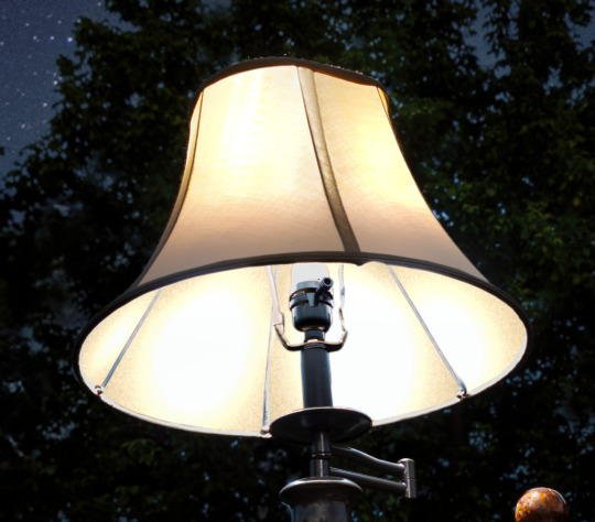
When I look at the RAW file... it is actually much better than my edited image.
Which makes me curious why I made it so damn bright. My best theory is I had a monitor that was slowly dying and I didn't realize how dim it got because our eyes are so good at adjusting, and it's possible all of my images from that era were overly bright because I was overcompensating for a dying display.
That fancy camera (Canon 5DS R) was a dream to work with. And having so many extra megapixels to play with is such a joy. People say you don't need more megapixels these days, but when you are doing high level image manipulation, having as much information as possible makes it a lot easier. Especially when making complex selections.
So, I've got a good start. I have a lot of pixels to play with. I was almost certain I could manifest my vision with modern knowledge and tools.
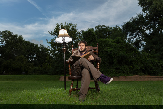
I'll start with the baseline edit in Lightroom. I'm not going to worry about the sky, as that will need to be swapped for my nighttime aesthetic.
The circle of light was there! It was just hiding in my bright exposure. So that's neat. And when you lower the exposure of the background, the lampshade trick presents itself as well.
At this point I was getting excited because I could see the potential. I just had to find the right sky. This one looks perfect.
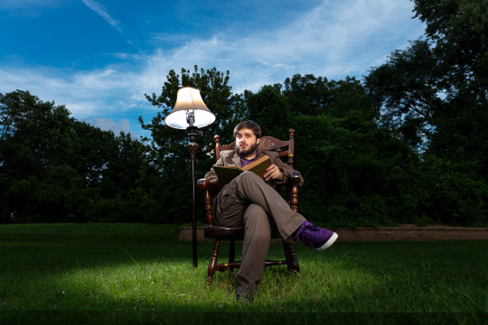
Okay, it is time for the big reveal.
Did I finally get this image out of my brain and into reality?

I DID!
I don't know if people will like this or find it artistically interesting, but Ryan and I were both very happy with the new version.
Also, I think Ryan's purple shoes really steal the show.
Though I had one idea that was never in my head originally.
Should I try it?
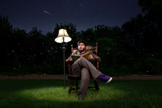
I still haven't decided on the fireflies yet, but Ryan and Katrina like them.
I can't state how nice it was to work on a 50 megapixel photo from a full frame sensor coming from a 10 year old camera with 4 stops less dynamic range and 24 megapixels.
This is zoomed in to 100%!
And the image doesn't even get soft at 300%.
Sorry, I got caught up in the megapixels.
And there is one detail you'll probably never notice unless I point it out, but I completely rebuilt the lampshade because I overexposed it.
I always say small details add up to big results. Plus I had to use some creative problem solving to figure out how to recreate a lampshade and I always enjoy that part of the process—where you don't know how to do something and then you figure it out. Very satisfying.
In any case, my brain feels better now. I feel like I was able to settle something that has been bothering me for ages. And I am grateful I was able to realize my artistic vision—even if it took 8 years.
Here is the before and after. It's fun to switch back and forth.

On to the next photo. And it may involve a furry little orange friend.
57 notes
·
View notes
Text
Hello sweet beans! Since my last tutorials have been yeeted into oblivion with deactivating my previous blog @/benkeibear I figured I repost them onto here!
💫 gradient line divider tutorial 💫
This tutorial uses my simple line divider tutorial as a base. Please familiarize yourself with it first since this is just additional steps!
I use various apps and sites for gradients. The apps I mainly use Canva or Gradient+ occasionally I use GradientDaze (for when I don't have specific colors in mind)
As websites I can recommend browsing through uiGradients or Webkima if you'd like animated gradients.
I'm a little oldschool and don't use photoshop but there's plenty tutorials on how to animate gradients there on YouTube!
Starting with Canva:
1. You first open your divider template. Mine is as in the previous tutorial the simple 1000x40.
2. Next you will click on the color button and choose a color like the little arrow shows
3. Then you select "Gradient" and Canva will give you a second color option. You can change both colors here or add many more if you'd like more colors. Here you can also choose what kind of gradient you want
Just play around here and continue to resize the images you saved as explained in the previous tutorial via ezgif or any other way you found for yourself.
Next we have Gradient+
This app is built pretty simple and there's not much to explain. You choose your two colors by tapping on the colored circle at the"Color A" and "Color B" and continue further down to navigate where color A starts and color B ends.


For the classic gradient you use the settings as above.
The app also offers radial and angular gradients so you can just play around with what you like!
Make the gradient big by tapping the expansion arrows and take a screenshot - then you may resize your divider.
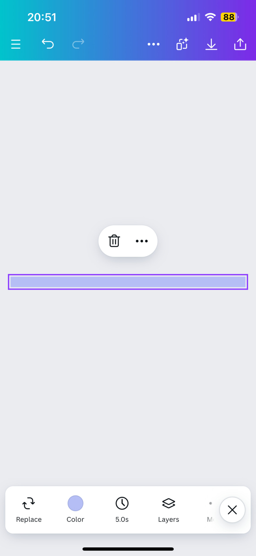
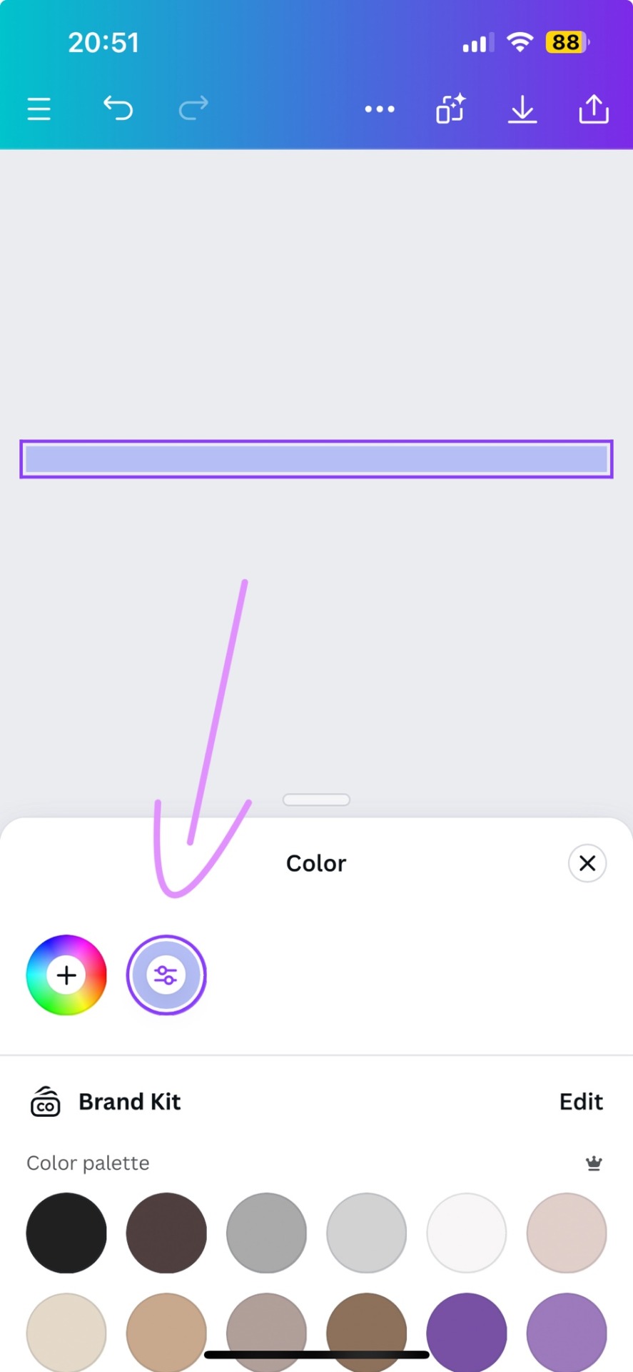
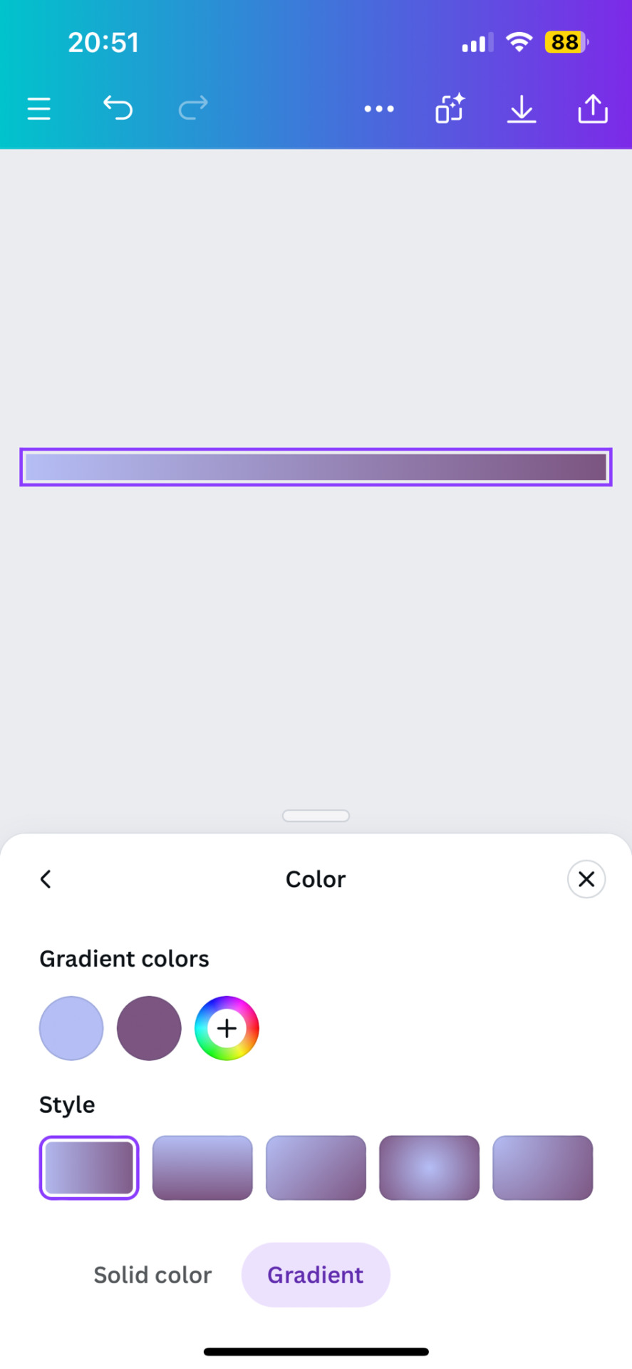
The last app is GradientDaze
Again, a very simple app but this time you can't enter hex codes. Instead you can move 2 circles around on a little color card and find pretty gradients you like
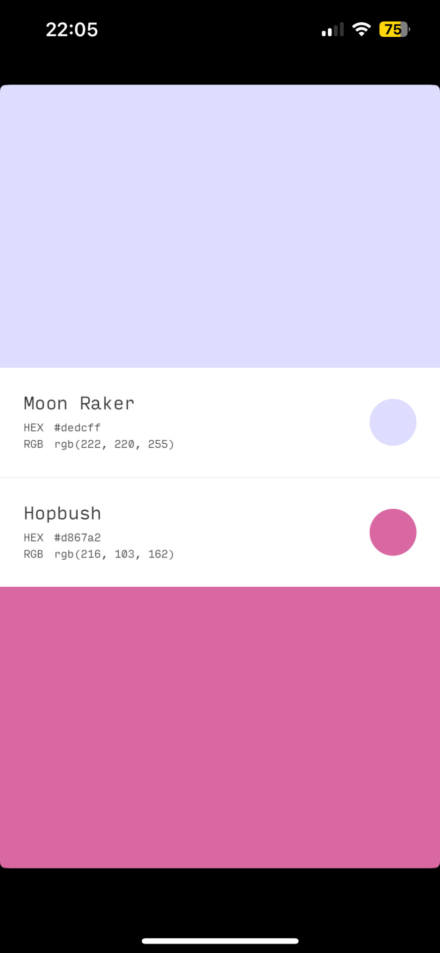
If you found two colors you like, you can click on the little + and then on "info" to see the color names and hex codes. In the menu after clicking + you also have the option to save the gradient
Once saved you can resize your dividers.
Onto the web pages.
At uiGradients you can browse through popular gradients users have made. Once you find one you like you can use the hex codes to make a gradient divider for example in Canva or you take a screenshot and resize it.
Using Webkima for animated dividers is a little inconvenient because you need to record your screen and make a gif out of if (you can do this at ezgif where you can immediately resize your animated gradient)
On Webkima you can choose up to three colors, the direction and speed at which the colors move. Personally I haven't used this yet except for a few custom dividers since it takes quite some time for one divider.

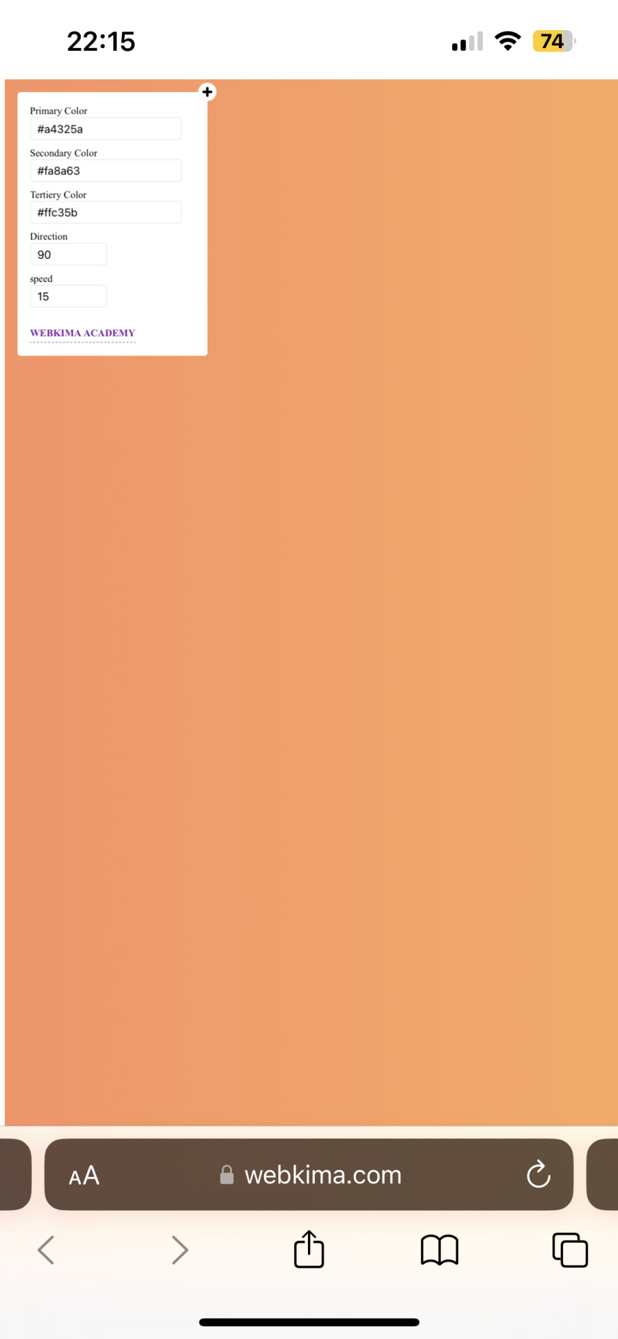
(Left: uiGradients / Right: Webkima)
Using these apps / sites is optional and I'm sure there's plenty other options out there but these are the ones I personally use and find easy to navigate, especially canva since you can do all this in the free version.
If you have any questions or something doesn't work as you thought it would please don't hesitate to reach out - I'm always happy to help!
#dividers by adornedwithlight#divider tutorial#gradient tutorial#Gradient dividers#Gradient divider tutorial#tumblr tutorial#Gradient lines#line dividers#aesthetic dividers
6 notes
·
View notes
Text
TUTORIAL 3
Making Gifs Purely with FFmpeg Scripts
FULL TUTORIALS | RECOLORED GIFS
Directly opposite to the last tutorial, this tutorial is for girls who LOVE command lines. You can make a goddamned motherfucking pristine, RECOLORED gif set from your command line, and feel cool as fuck while you're at it. And doing so is probably not quite as devoid of visual stimulus as you think!!
FULL SIZE EXAMPLE SET HERE | FULL CODE FOR THE SET HERE
Operating systems: Mac, Windows, and Linux
Quality potential: High
Software needed: FFmpeg
Difficulty: Advanced as far as gif-making, but this is actually a good first bash scripting project in my opinion if you've ever wanted to learn how.
Requirements: General familiarity with your computer's shell (Powershell on Windows, Terminal on Mac) helps a lot! I will try to make it as easy as possible to follow.
LIMITATIONS: 1) Frame by frame gif-making methods take up a lot of space on your drive in the interim. 2) The captioning method currently provided in the tutorial is not good for longer captions (there is a better method I plan to append eventually). 3) Recoloring options are minimal in this tutorial. Curves and many other color adjustments are available in FFmpeg but I haven't yet explored them.

First, let me get this response out of the way:
"I don’t understand how I can possibly do this if I can’t see what I’m doing!"
That’s the neat part—you DO get to see what you’re doing!
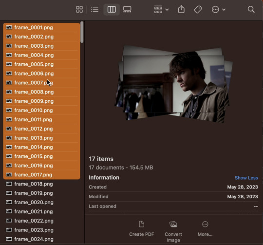
The first visual is your file browser.
If you were using Photoshop or GIMP to make these gifs, you’d view all of your frames in a sidebar as small thumbnails and select and scroll through them to add delete, and group select and manipulate them. The FRAMES folder in our file browser will serve this function, letting us see every frame in our set, delete any frames we don't want, and group them to apply the same crop, coloring, or caption to the same selection of frames.
The second visual is provided by FFplay.
FFplay is part of FFmpeg. When you use this command in your system shell, it opens an image or gif so you can see the results of a crop, recolor, caption (or all three!) on your work before actually applying it! This is how we will actually see, at full resolution on our screen, exactly how our image is looking.
WINDOWS USERS: CHANGE ALL FORWARD SLASHES IN THIS SCRIPT TO BACK SLASHES!!!
___________________________________________
1. Installing FFmpeg
___________________________________________
I recommend you install via Homebrew if you're on Mac or Linux by pasting this into your terminal (if/once Homebrew is installed):
brew install ffmpeg
Windows users or other users who don't want Homebrew can follow directions on the FFmpeg website.
___________________________________________
2. Screencapping Frames with FFmpeg
___________________________________________
There are many ways to do this. However, since this is the Pure FFmpeg tutorial, I'm going to point you to these instructions on how to automate this process with a script template I have already written for you and an example (screencapping for this exact set).
If you follow that tutorial exactly, you should come back for step 3 with a folder on your Desktop called FRAMES.
___________________________________________
3. Organize in the FRAMES Folder
___________________________________________
Go to your FRAMES folder in your file browser. Your frames are already ordered for you in the correct time sequence.
Delete any unwanted frames.
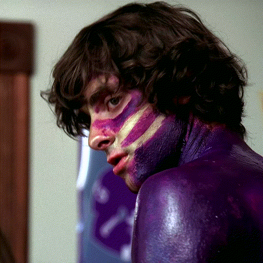
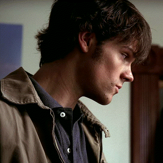
I need to "trim" some frames from the beginning and end of my set. For example, at the beginning of my set, the first 17 screencaps are of Sam from the first 564 milliseconds of the start of the 8.02 time stamp. I don't want this these frames in my gifset. I want my first gif to start on Dean when he appears starting in the 18th screencap.
If I hold shift and select all of the unwanted frames, I can delete them. Similarly, my screencaps end at the 8:11 mark, and only the first 156 milliseconds are on Dean. After that, the shot switches back to the purple guy. I don't want those shots of the purple guy, so I'll delete frames 247 through 280 at the end of the set, leaving me with frame_0018.png through frame_0246.png as all the frames of my gifset.
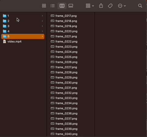
Make "Shot Folders".
As an example of what I mean by shots, look at the three example gifs at the top of the tutorial. The first gif has just one shot (i.e., the camera stays on Dean). The second gif has two shots (the camera is on the guy painted purple, and then it's on Dean again. In the third gif, there are two shots again—one on Sam, then one on Dean. So that's 5 shots. I want to separate frames belonging to each of the 5 shots into subfolders labeled 1 through 5 (see gif below).
______________________________
4. Setting up FFplay
______________________________
Now that we have all of our frames organized, we want to set up FFplay—the method we'll use to view our image manipulations before applying them.
NOTE: Type down all of the commands as you run through this whole tutorial!! In a word document, a text editor, etc. Do NOT just type your commands in the shell without keeping track of what you typed! You can also see an example of how to map out your scripts by following how I wrote them for Github here, and even download/copy paste my fulls script there and use it as a template for your own set.
Template for Creating Our Preliminary Gifs for FFplay
The first thing we need to do is make a preliminary test gif of every shot in our gifset. To do this, use the template below, changing only the parts in red:
cd ~/Desktop/FRAMES/ShotNumber
ffmpeg -start_number FileNumberOnFirstFrame -i frame_%04d.png -vf "fps=30" ffplay -vf Test.gif
The first line, beginning with "cd", tells me the file path to my shot folder where my frames are located.
The line below that combines the frames of my shot into a gif called Test.gif.
ffmpeg envokes the FFmpeg utility.
-start_number FileNumberOnFirstFrame -i frame_%04d.png tells FFmpeg to order the frames in the gif by the 4-digit number at the end of their file name, starting with FileNumberOnFirstFrame, which you should replace with the 4-digit number in the file name of the first frame in your shot folder.
-vf "fps=30" tells FFmpeg I want the gif to move at 30 frames per second (if you screencapped at a rate other than 30 FPS, you can simply change the number to match your frame rate).
In my example:
Say I want to generate a gif of my first shot. Then I need ShotNumber to be 1, and FileNumberOnFirstFrame to be 0018 (that's the 4-digit number on the first frame in my first shot, after deleting the first 17 frames). So my command looks like this:
cd ~/Desktop/FRAMES/1
ffmpeg -start_number 0018 -i frame_%04d.png -vf "fps=30" Test.gif
See Step 4 in my script on Github to see the script for all 5 shots.
Playing a gif from FFplay
Now if I want to play the gif I just made in FFplayer. I just type the following:
ffplay -loop 0 Test.gif
A window should pop up and loop through my gif (edit: I have adjusted this tutorial so the FFplay gif loops infinitely, by adding the setting -loop 0).
After repeating the above commands to generate a Test.gif in every shot folder, we're ready to move on to the rest of the steps.
__________________
5. Test Crop
_________________
Now that FFplay is set up, it's time to start manipulating our shots by applying changes to Test.gif in every shot folder. The first thing we want to do is crop.
NOTE 1: Cropping is different from scaling. At the very end of the tutorial, when we export, we will scale our gifs down to 540 px. For now, we want to work in full resolution, which for Supernatural is 1080p.
NOTE 2: Throughout this tutorial, when I add to an existing command, I will bold the new portion, and mark all the parts you can/should change in red.
Cropping Template
To crop a gif in FFplay, we add -vf "crop=w:h:x:y" to our FFplay command as follows:
cd ~/Desktop/FRAMES/ShotNumber
ffplay -vf "crop=w:h:x:y" -loop 0 Test.gif
Where
w is the width you want your cropped frames to be (in pixels)
h is the height you want your cropped frames to be (in pixels)
x and y are coordinates of the top left corner of your crop selection (in pixels)
To understand the x and y coordinates, think about if you wanted to use crop an image in a drawing software. You would generally select your crop tool, start in the top left corner, and drag your cursor down and right (blue dot in the illustration below represents where the crop starts in an example). So FFmpeg asks you to specify the top left corner where your crop starts with an x and y coordinate (in pixels), and uses the w and h variables to determine how large the crop should be.
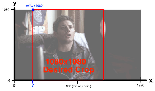
My frames are all 1920x1080 pixels. I would like my gifset to be square—1080x1080 pixels. So I already know I want my w and h to both be 1080. Since I want to start my crop at the top of a frame, losing no height, my y-coordinate (height to start my crop from) should also 1080. My x-coordinate is the only think I'm not sure about. I only know it needs to be bigger than 0 (0 would start my crop on the left edge) and smaller than 960, which would be the midway point.
So what am I going to do? ...I'm gonna make an educated guess of what x-coordinate would center Dean in a square frame in my FFplayer command, and if I don't like how he's centered, I'll simply move the x-coordinate over a little (decrease to move left, increase to move right).
So in my Example...
In FFmpeg, for my first shot, I'm going to guess x=300.
cd ~/Desktop/FRAMES/1
ffplay -vf "crop=1080:1080:300:1080" -loop 0 Test.gif
The FFplayer window shows me this:
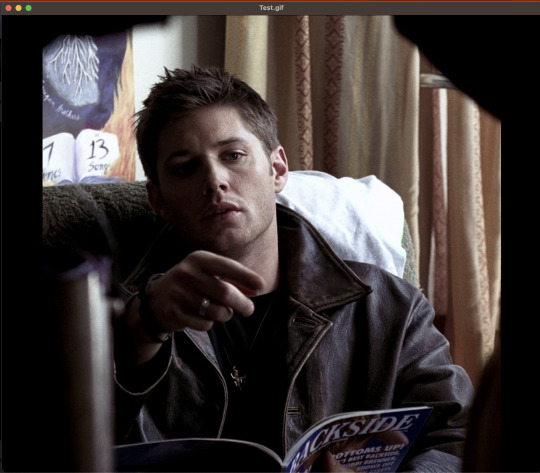
And I feel like the crop starts a little too far to the right. So I'm going to decrease my x-coordinate just a little—to 250. After replacing the 300 with a 250 and running again in FFplay, I feel good about 250, so that's the crop I'll set: -vf "crop=1080:1080:250:1080".
I need to follow this same process to determine the crop of my other shots (and keep a copy of the commands I used later!). What is useful however, is that 3 of my shots are all on Dean sitting (shots 1, 3, and 5). This means I can apply the same crop I made for shot 1 to shots 3 and 5.
See Step 5 in my script on Github to see all 5 shots.
___________________________________________
6. Test Coloring and Sharpening
___________________________________________
Because the lighting in this scene is pretty good, I did a very simple recoloring on this set. I may update later with a more extensive coloring tutorial with more options later (I'll link the post to this section if I do). Previously, we added a crop to our command: -vf "crop=1080:1080:250:1080" and now we want to test coloring options and a sharpening effect.
Coloring Template
I'm going to throw in the basics, and give you an updated FFplay template (new parts are bolded, variables you can adjust are in red and set at their default values).
cd ~/Desktop/FRAMES/ShotNumber
ffplay -vf "crop=w:h:x:y,eq=brightness=0.00:saturation=1.00:contrast=1.00,smartblur=1.5:-0.35:-3.5:0.65:0.25:2.0" -loop 0 Test.gif
NOTE: Notice that inside the quotes, a comma separates the command options crop, eq, and smartblur. Equals signs and colons distinguish between sub-options belonging to each of those three categories.
EQ:
brightness=0.00. Values can be adjusted anywhere between -1 and 1, with 0 as the default). I would adjust this setting in 0.01 unit increments.
saturation=1.0. Values between 0 and 3 are possible. 1 is the default value. I would adjust this setting in 0.1 unit increments at a time.
contrast=1.00. Increases contrast between light and shadow in the image (values between -1000 and 1000 are possible. I recommend you change this setting in 0.1 unit increments.
There are more color and image adjustment options than these available in FFmpeg. You can see a full list of properties you can adjust from eq here.
Smartblur:
smartblur=1.5:-0.35:-3.5:0.65:0.25:2.0 sharpens the frames. I recommend you not touch this setting. If you do want to adjust it, check the FFmpeg documentation. You can also remove this whole portion (and the associated comma) if you don't want a sharpening adjustment.
NOTE: It is also possible to add a curves adjustment to brighten certain parts of an image instead of the whole image. I haven’t worked with curves enough from the command line to give you good ideas on setting your curve and this set didn’t really need it, but if I get into it more in the future, I'll include it in a supplementary tutorial and link it here.
If you feel like you are losing all sense of objectivity and just want to see the images without your coloring at any point, simply re-run your ffplay from the end of the cropping section.
ffplay -vf "crop=w:h:x:y" Test.gif
In my example (shot 1):
Because all my characters are in the same room with similar lighting, I ended up applying the same color adjustment to all of my shots. But here's all my settings tested together on my first shot in FFplay:
cd ~/Desktop/FRAMES/1
ffplay -vf "crop=1080:1080:250:1080,eq=brightness=0.06:saturation=1.70:contrast=1.10,smartblur=1.5:-0.35:-3.5:0.65:0.25:2.0" -loop 0 Test.gif
See Step 6 in my script on Github to see all 5 shots.
___________________________________________
7. Apply crop and coloring to frames
___________________________________________
Up until this point, you have not actually applied your crop and color adjustments to your frames. You have simply tested your crop and coloring manipulations on a gif of all your frames that is still, if you go look at it in your file browser, not cropped.
So let's actually apply our adjustments to these frames!
NOTE: Captioning needs to be done after this step because auto centering the text won't work properly without actually cropping first). This is probably all for the better as our command is getting long and difficult to decipher!
Template to ACTUALLY Crop and Color
cd ~/Desktop/FRAMES/ShotNumber
mkdir crop
for i in *.png; do ffmpeg -y -i "$i" -vf "fps=30,crop=w:h:x:y,eq=brightness=0.00:saturation=1.00:contrast=1.00,smartblur=1.5:-0.35:-3.5:0.65:0.25:2.0" crop/${i%.png}.png; done
The first line (beginning with cd) tells us to go to our shot folder.
mkdir crop tells our computer to make a new subfolder in our shot folder called "crop".
for i in *.png; do ffmpeg -y -i "$i"; and the closing: crop/${i%.png}.png; done tells FFmpeg to do the same crop and color on every .png file in our shot folder, and save these adjusted shots into the crop subfolder.
In my example (shot 1)
cd ~/Desktop/FRAMES/1
mkdir crop
for i in *.png; do ffmpeg -y -i "$i" -vf "crop=1080:1080:250:1080,eq=brightness=0.06:saturation=1.7:contrast=1.1,smartblur=1.5:-0.35:-3.5:0.65:0.25:2.0" crop/${i%.png}.png; done
See Step 7 in my script on Github to see all 5 shots.
___________________________________________
8. Captioning
___________________________________________
Now we need to apply captions. You can also do an FFplay command here, but I'm going to show you something a little different with FFplay this time to see your caption. Instead of looking at captions over a whole gif, let's just test how our captions look on the first frame in our shot, since that's really all we need for captioning.
Captioning FFplay Template
Not all sets (and not all shots!) need captions (and if your set doesn't, you can skip down to the next section!) However, two of my shots need captions: Shot 1 and Shot 3. If you want to add captions, you can test them in FFplay on a single shot using this command:
cd ~/Desktop/FRAMES/ShotNumber/crop
ffplay -vf "drawtext=text='Your Text Goes Here':x=(w-text_w)/2:y=(h-text_h*2):fontsize=40:bordercolor=black:borderw=3:fontcolor=white" input.png
The default font is Arial. There are ways to set other fonts, but I haven't looked into them much because I'm pretty happy with Arial. This basic template with the existing numbers should give you a decent result, but if you want to change font sizing or colors or anything:
drawtext=text='Your Text Goes Here' | This is the most important bit. You place your caption in the red part. Note that your text will appear on just one line. If you have a longer statement from a character that will need two lines, you can draw your box twice. (I will add a link here for this alternative when I eventually try it).
x=(w-text_w)/2:y=(h-text_h*2) | This part centers the text on the bottom of the screen. I recommend you leave it alone as it’s intended to auto-center your text for you no matter what your crop ratio is. You will need to change the the y=(h-text_h*2) argument only if you have two lines of text to caption your frames with.
fontsize=40 | Changes the font size, of course.
bordercolor=black | changes the border color.
borderw=3 | changes the border weight.
fontcolor=white | This changes the font color.
input.png is the file name of the frame you want to view your caption on.
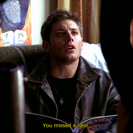
By the way, when changing text or border colors, you can type in colors coded into the documentation (the default is black) or insert a HEX color code in this field. For example, I always use yellow captions for Dean, so I found a yellow HEX code (#FDDA0D) I liked on htmlcolorcodes.com.
Here's how I FFplay my caption "You missed a spot."
cd ~/Desktop/FRAMES/1/crop
ffplay -vf "drawtext=text='You missed a spot.':x=(w-text_w)/2:y=(h-text_h*2):fontsize=40:bordercolor=black:borderw=3:fontcolor=#FDDA0D" frame_0018.png
See Step 8 in my script on Github to see both captioned shots.
Template for applying your caption:
If you like the way your caption looks in FFplay, you can apply it to all the frames in your shot folder with:
cd ~/Desktop/FRAMES/ShotNumber/crop
mkdir captioned
for i in .png; do ffmpeg -y -i "$i" -vf "drawtext=text='Your Text Goes Here.':x=(w-text_w)/2:y=(h-text_h2):fontsize=40:bordercolor=black:borderw=3:fontcolor=white" captioned/${i%.png}.png; done
Where
mkdir captioned makes a folder in the crop folder called "captioned"
for i in *.png; do ffmpeg -y -i "$i"; and the closing: crop/${i%.png}.png; done tells FFmpeg to place the same caption over every .png file in our shot folder, and save these adjusted shots into the captioned subfolder.
Here's the settings to apply captions to my first shot.
cd ~/Desktop/FRAMES/1/crop
mkdir captioned
for i in .png; do ffmpeg -y -i "$i" -vf "drawtext=text='You missed a spot.':x=(w-text_w)/2:y=(h-text_h2):fontsize=40:bordercolor=black:borderw=3:fontcolor=#FDDA0D" captioned/${i%.png}.png; done
See Step 8 in my script on Github to see both captioned shots.
___________________________________________
9. Organize shots into GIF folders
___________________________________________
We're almost done!!! It's time to go back to our file browser! Now that all of our frames in all of our shots are prepared how we want, we need to reorganize our shots into GIF folders. This is our way of group selecting all the frames that go into one gif for export.
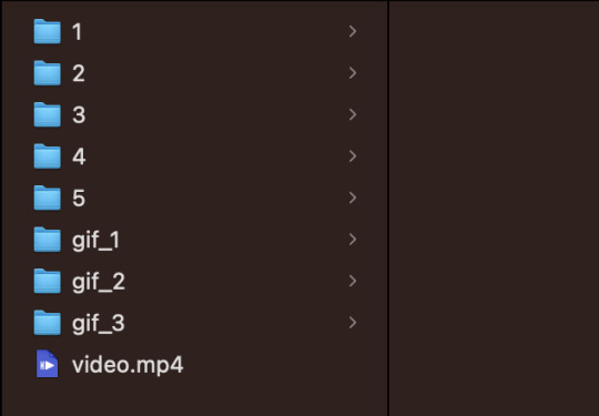
In my case, I want three gifs, so I'm going to make three new folders in the FRAMES folder: gif_1, gif_2, and gif_3. My FRAMES folder should now look like this:
Now I want to take my finished shots from my shot folders and copy their frames into the gif folder they are associated with. For example:
Gif 1 just contains the first shot. I also captioned shot 1. So I'm going to copy all the frames in FRAMES/1/crop/captioned into the gif_1 folder.
Gif 2 contains shots 2 and 3. Shot 2 has captions, so I need to take all the frames from FRAMES/2/crop/captioned and all the frames in FRAMES/3/crop and copy them in the gif_2 folder.
Gif 3 contains shots 4 and 5. I'm going to copy the contents of the crop folders for shots 4 and 5 into this folder (no captions on this gif).
___________________________________________
10. Compiling into GIF
___________________________________________
To combine all the frames from one gif folder into a gif, I'm going to use this template script:
cd ~/Desktop/FRAMES/GifFolder
ffmpeg -y -start_number FileNumberOnFirstFrame -i frame_%04d.png -vf "fps=30,scale=540:-1:flags=lanczos" ~/Desktop/FRAMES/GifName.gif
This is very similar to the script in step 4. This template opens one of our new gif folders, and takes all the frames, starting with the first frame in the folder (recall: you need to tell FFmpeg the 4-digit number on that first frame with FileNumberOnFirstFrame) and then turns it into a gif running at 30 FPS, scaled down to 540 by 540 pixels.
The parts we can/should adjust are as follows:
GifFolder is the name of our gif folder where our frames for our gif are located.
scale=540:-1:flags=lanczos is the command to scale down our gif (using what's called the lanczos method) to 540 x 540 pixels so it'll be small enough to upload to Tumblr.
fps=30 tells FFmpeg the proper FPS for our set (if you made your frames using this tutorial, 30 FPS is correct. If you took screencaps manually, it will be the frame rate of whatever you giffed. For TV, this might be 23 FPS for example).
~/Desktop/FRAMES/GifName.gif names our gif (specify with GifName) and outputs it to the FRAMES main folder.
Here's the command for Gif 1 in my set:
cd ~/Desktop/FRAMES/gif_1
ffmpeg -y -start_number 0018 -i frame_%04d.png -vf "fps=30,scale=540:-1:flags=lanczos" ~/Desktop/FRAMES/1.gif
See Step 10 in my script on Github to the script on all three gifs.
THE END!!!!
Do this step on all your gif folders and you're done!!!
You can view my full script for this example gifset on Github here and if you'd like, simply modify that script to make your own gifset!
10 notes
·
View notes
Text
Perfect Love VN Devlog #1
I will probably try doing these at the end of the week so I can detail what's happening.
This week I focused mostly on sprite editing. As of current, I have pretty much all of the sprites done, but they require a few adjustments. I have about four different sprites for each version of Milo, but the headsizes and eye positions were inconsistent so I had to change them in Photoshop again. I also added the sprite edits for the last choice where his eyes sort of change color. I was dumb about it and didn't use my tablet but rather my mouse. I have to edit the last of the Violence Milo sprites this week, which shouldn't be too difficult.
I drew some of the mini cgs that pop up during certain events, but I'm missing some for the second choice. Because they're all in black and white it's a lot easier so I can afford to put in a lot of them. I also worked on the Main Menu which is whatever you're seeing above. I haven't quite coded in the Load, Extras, Preferences and Exit yet. The idea is that the eye changes depending on the form that Milo is in. Above it's defaulted at Eris's eyes, and I wanted to check how Glass Minds did their eye shifting in their game. Turns out it's a video, so I'll have to pop open After Effects again possibly or try to remember how to do animation in Photoshop again. The idea is that the eyes will look around as the player selects things. I thought about it looking directly at the player when something is chosen, but I have no idea how to code that in plus it's not super important.
I did do some coding for the sprites as it leads up to the ending. Layered Images are honestly so much fun- they remind me of the type of game modding I like to do, so expect there be a lot of facial expression changes. I added some new layers for the Bully, since he's not as expressive as Milo is. That was drawn with my mouse too so hopefully nobody notices haha.
I haven't touched sfx or bg music yet but I did save a bunch of the free ones on Renpy. I know a couple of other places to get sounds for free, but I'll have to check later on. I'm hoping for a slightly eerie one for the Main Menu screen, but we'll have to check later. I'm planning on doing that last though.
Finally I have to resdesign the UI. The game is set in a weird aspect ratio, which is what I wanted, but it also forces the save screen to be kind of messed up. I was going to redo the UI anyways because I personally like remaking it so it looks...less like a renpy game, no offense to renpy. Plus it will probably look more unique and I think it's fun to make the UI look different, haha. Harks me back to the game modding I did as well where I redid the entire UI for it like 4 times.
I think that's the majority of it. If you have any questions on renpy or anything that I've done, I can try to answer it if you're interested. That being said, like a lot of yandere vn creators, this is my first game, so I probably don't know anything too detailed.
9 notes
·
View notes
Text
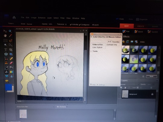
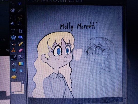
So after making those pencil doodles, I decided to open the Adobe Photoshop program my older brother installed for me on my laptop a few years ago. I'd been wanting to use it to create amazing digital art like I'd seen so many artists show off online but I didn't know how to make it work. Ugh! I finally got it to work for me recently, and boy, do I feel like a dumdum for not doing it sooner. I should've spent more time figuring out the proper functions and whatnot. Better late than never, I guess. I feel like so many possibilities have just opened up for me. I decided to experiment with one of the doodle photos, and got to work on coloring. I had to darken some of the fading pencil lines to prevent the paint fills from flowing out and spilling into the background. Molly is turning out quite nicely!
What the heck am I doing with my time? I haven't even finished those reaction shots I was working on these past few days.
Sorry, I've been so busy lately making extra money for the upcoming MomoCon that I keep conking out every night before witching hour. I managed to book myself a hotel room for May. Silva Hound has been announced as one of the guests so I'm expecting "Addict" to be played during a panel or concert! Speaking of, I was introduced to Hazbin Hotel during last year's MomoCon, where guest performers sang a cover of "Addict". Yeah, I saw the music video before I watched the pilot (and Angel Dust became one of my favorite characters). Heh.
If you're interested in Carley's fanfic Wait for Me, read it on Wattpad or Archive of Our Own! Check out her Twitter page, too, if you want!
#Hazbin Hotel#Wait for Me#Wattpad fanfic#AO3 fanfic#fanfic fan art#fanfiction fan art#fan art#pencil drawing#test drawing#pencil art#digital art#doodle#work in progress
3 notes
·
View notes
Text
Week 10 - Completing the loop
This unit has been really insightful and rewarding for me and I think it's given me some really useful tools, tips and processes I can apply in future projects!
Looking back on the learning outcomes, I can definitely say that I've learned plenty about design communication, from hand-drawing engineering drawings to creating tangible models to digitally iterating these!
I definitely found that the hand drawings and engineering standards weren't my favourite as they were really technical and a little dry, as not much creativity was involved. However, it was definitely really useful to have gone through the process and understand the intention behind engineering drawings which you could otherwise just generate in CAD softwares.
The perspective drawings from week 4 was definitely one of the more challenging tasks for me personally, as with more complex drawings, the number of construction lines made it really difficult to decipher. I think when I have time, I'd like to revisit parts 2 and 3 of the task in particular, as I found them to be quite confusing at the time of completing them.
The digital aspects of this unit were also the more difficult tasks for me, as I haven't had much experience in any type of digital software when it comes to design. Interestingly enough, although these tasks were difficult and time-consuming, they also turned out to be the tasks I enjoyed most. First, with the photoshop rendering, I found myself getting really sucked into the process of slowly adding shadow and light, and found that having a final outcome I liked felt really rewarding. Secondly, with 3Dsmax, I found myself getting really frustrated with the first steps of getting used to the interface and all the tools, however, was really pleased and surprised with myself when I was able to develop some things I was pretty proud of. In future, I know to dedicate more time to learning digital softwares, because although I'm always sceptical at first, this unit has shown me I really warm up to them and enjoy playing around with designs digitally.
Creating foam models and sketching freehand came pretty naturally to me as I've had more experience with these methods.
A key insight I've gained are the sheer amount of tools and skills both digitally and applicable by hand that can be explored in this degree. This unit has opened my eyes to the world of T-squares and set-squares in creating accurate drawings, the use of tracing paper for sketch iterations, 3D scanning, the possibilities and scope of digital softwares and so much more.
I've learnt that I should be more conscious of my time and time management and keep up with the weekly work, or at least try to catch up as soon as possible after a busy period of assignments. Although extremely valuable upon reflection, better time management would've definitely elevated my learning experience.
I enjoyed this unit a lot more than I anticipated, and will enjoy looking back at my blog as well as others' blogs to see the progress and the skills we've gained along the way!
11 notes
·
View notes
Text
Sorry, started ranting about live-action adaptations and corporate dilution of artistry, Can't Help Being A Capricorn or whatever
Discourse is allowed, just don't add something like "wow OP/prev you're a fucking reprobate I hope something happens to you that compromises your health" thanks ✌️😘
I'm also not tagging this, so if it breaches containment it's not my fault lmao
If I could be so bold.
I think the reason there's just so nauseatingly many live-action adaptations out right now, and over the past 12 years, is because there were quite a few fan-casts made over the years, whether by one person or a small group brainstorming together. Like if you search "[series] fan cast"***, there's a very good chance you'll find people still having fun with the idea of matching a celebrity up to their cartoon lookalikes, even today. Not corporations trying to drum engagement, not stark and barren listicle websites, but individual human beings who haven't been paid to say what they're saying or do what they're doing. Even after we've seen just how little Hollywood actually does with the concept 95% of the time, people are having fun with hypotheticals and being creative without restraints.
***The exception is live-action adaptations that have been officially made. If you look for things that have not been tainted adapted yet, it's like looking into a portal to a time before all This Shit started happening.
I think the main issue is, nobody who's making those fan-castings is imagining, like, a full-on movie to go with it. It's more like, who would look cute cosplaying as that character. The extent of the idea is a PhotoShop job, and that's it.
Not whatever vortex of billion-dollar soullessness we've been tossed around in for the past decade.
The Nihilist part of me wants to say: "This kind of open discussion online is gonna keep convincing Hollywood that these ideas are guaranteed to birth successful films, so we should just stop having these convos publically" -- but that's an incredibly stupid thought. I'm not gonna try and convince people that creating is something to be ashamed of and hidden away; in this Capitalist Hellworld, where artistry is minimized to keep profits high, commercial-free creativity often feels like our last stand.
I don't really have a solution at this time, myself. Nor do I think I'm responsible for providing one -- the majority of people I've tried to make a big artistic project with can tell you I'm not the most experienced nor the most confident director. But I do know that this is what the culture of media has been since the early 2010s, and all I aim to do with this rant is bring that fact to the forefront.
In the 80s and 90s (and some of the 00s), companies had no problem churning out fun visuals and engaging soundtracks and worldbuilding that took honest-to-God effort by the dozen. I mean we have nostalgia over commercials from those eras, and it wasn't just because we're susceptible to consumerism; if that were the case, we wouldn't roll our eyes and groan whenever we hear the Unholy Trio of a ukulele, glockenspiel and someone whistling over whatever fucking hunk of plastic they're trying to shove in our faces now.
The 00s had a more laid-back vibe to it, particularly with videogame commercials. This was the Era of Grimdark and goths and embracing darkness because it felt more real than anything else, or whatever the fuck I was writing about whilst crying over MCR songs. But even so, a good chunk of 00s media had effort put into it. Yes, more than half of it was horribly problematic and exploitative; I'm not telling you it was good, I'm telling you there was effort. Even the shit with deadpan narration and cheap mascot costumes and out-of-place toilet humor had some sort of creative writing team, had some sort of vision, had some sort of direction.
Then the Internet started ramping up in quality and bandwidth, and people actually could speak loud enough that companies would hear them. To anyone who's too young to remember a world before the Internet being pushed into every corner of everyday life: it wasn’t this way 15+ years ago. Media slowly became more collaborative over the era of AOL and MySpace, because consumer feedback became easier and easier to access. And then with the advent of YouTube in 2006 -- which, as shitty as it is now, was revolutionary at the time, being a place where you could publish videos without needing to audition for anyone -- access to free ideas had very suddenly become exponentially faster. More and more Internet stars were popping up on TV (think "Web Soup" and "Tosh.0"), and then Google bought YouTube and decided to monetize it and now everyone's a rockstar and Andy Warhol's laughing at us from beyond the grave.
Fuck off, Andy.
...Now, I know it feels like I took a million detours -- and I agree that it does, because driving around in my brain feels like zig-zagging between five lanes at once -- but this all came from my theory that the ideas for media are in the hands of unpaid creators. We went from production teams being creative as Hell in the 80s and 90s, to an intentional cynicism in the 00s, to a fizzling-out of ideas and corporations holding their hands out for scraps of ideas from the consumers in the 2010s.
Money isn't trickle-down, but culture sure as shit is trickle-up.
Again, I don't have any ideas on how to fix this. Capitalism breeds a culture that allows exploitation of every fundamental part of human existence, and it knows how to adapt. With every new slew of ideas I have on how to combat it, it worms its way through anyhow. It's like fighting a hydra, and it gives me agita if I think about it for too long.
I don't know.
I remember a time when adaptations were fun to think about, but they almost never came from the minds of people looking to profit off nostalgia. They came from impassioned, vision-driven fans who wanted to try retelling their favorite stories through a different lens... and I think that's a beautiful thing. All fanart is -- fanmade drawings, fanmade covers of songs, fanmade films, cosplay, and fan-casts.
I don't really know how to end this rant neatly. Just... next time you're on your way to watch the latest diluted, regurgitated corporate shlock that's trying to profit off your nostalgia, just remember that there's probably some unpaid, good-natured rando out there that took your favorite media to new heights without any executive meddling. Maybe save a buck or two from not buying a ticket.
Or just watch the original story again, since everyone seems to have forgotten what a re-release is.
I'm taking a nap. Thanks for sticking it out, if you made it this far into whatever the Hell this is.
3 notes
·
View notes
Note
for the artist art game 👀✨ how about 1??
1. Art programs you have but don't use
I've actually tried quite a few both on pc and on mobile. But since I use Windows and Android, i haven't had the opportunity to try out any ios exolusive programs.
Without counting those that I do use, even from time to time - the ones i keep but i haven't really used much are:
PaintTool SAI - i got it years ago when i was looking for a different program to use that is similar or simpler than Photoshop, but i never really got used to it and its menus were confusing because they were similar but completely jumbled compared to Photoshop. I keepbit now in case something happens to photoshop and i cant open it for some reason
paint.net - i got this one to open the type of files that the mobile drawing apps create. nothing else could open them and keep the layers but i haven't draw on my phone since my wrist surgery
Mental Canvas Draw - i saw videos of people drawing in there, creating like layers 3d images, kind of like a pop up book but digital. it looked so damn cool and ive wanted to try it but i still haven't had the time and i still need to get a new tablet
2 notes
·
View notes
Text
With this issue we move onto a new editor, Ian Rimmer who would go on to edit TFUK from #22 onwards. In this post I made back when I talked about Simon Furman and about the UK run, I mentioned it was Ian who recommended Simon to Sheila.
Ian knew Sheila through IPC Magazine's Photo Love, and knowing of the dispute over Scream going on at IPC, prompted Robert Sutherland, the Managing Director, to give Ian a position and after working on works such as Conan the Barbarian and Spider-Man Weekly. And when Sheila would move on to edit for the Doctor Who Magazine, Ian was invited to replace Sheila on Transformers. After appointing Simon as assistant editor and John Tomlinson as designer, they set about redesigning a comic that "thus far had struggled to find it's identity" (The Transformers Classics UK, pg 13). To John, Neville Brody (who popularized the logo/title tilt) and I.D.Magazine---with it's "spectacular layouts and great ideas" despite its almost fanzine like appearance--would serve as influence John.
During this time they found out that they'd be going weekly and in full color and aimed to flesh things out by the time it was set in place. #22 brought changes such as less clutter and more focus on the Transformers. The 2-pg opener, that I haven't seen and might be due to the scans, were replaced with a Transformers information page packed with text to prime the reader for the next story (quite different from other comics today), and letters got a dedicated page in the middle of the comic under the persona of a Transformer hosting it containing trivia and hints. The design philosophy for Marvel's most popular series would go on to influence the companies house style/style guide.
According to Ian, the comics had a bit of troubles with Hasbro early on, though following the revamp they seemed quite happy with what was going on, what Sheila was doing, he mentions, was a generalist approach such as covering lots of areas and not focus one on particular story. The definitive strategy was to turn that around and bring to life the bright, futuristic world and the expanding cast. Tomlinson was responsible for the look of the entire comic like placement of text on the cover and the pages of the comic itself. To quote John from The Transformers Classics UK.
"This was well before the age of InDesign, Photoshop, and even Quark XPress, so the design was a good deal less sophisticated than anything you'd see now. My brief was to create a strong, simple template that could be used again and again. [...] The Hasbro style guide was quite sparse compared to the style guides for licensed properties now, which usually include fonts, logos, icons, backgrounds, approved color schemes, ect. We had a few variations on the Transformers logo... and line art for some of the key Transformers, but that was about it. What visual identity the comic has was created in-house at Marval UK - not ust by me - and evolved gradually over time." Issues UK #22-26 encompass the US #6-8 by Bob Budiansky. The next UK original would be the #27-28 story "Repeat Performance!" along with the switch to full color and a weekly schedule.
Speaking of color, US strips would be done by Nel Yomtov and at the time he was only able to work with a 64 color pallet as the CMY method was expensive due to the longer time for the mechanical color separation process and wouldn't appear very well on the cheap newsprint of US comic paper. UK was different in that it was drawn, lettered, than printed on the canvas-like Kentmere and then was painted by hand.
#kcpstarscream#MarvelTransformers#kcpMT22#creator spotlight#Ian Rimmer#John Tomlinson#Marvel InHouse Design
0 notes
Text
Cumulohimbus's 2023 Digital Painting/Drawing Program Ranking
*Note: this is purely my opinion, and only includes programs I have personally used.*
Digital Painting/Drawing Programs from best to worst
Paint Tool SAI
Krita
Clip Studio Paint
Adobe Photoshop
GIMP
Medibang Paint (Mobile)
Breakdowns under the cut
Paint Tool SAI - Pros: lightweight/fast/responsive, one-time purchase, easy to navigate. Cons: not as many bells and whistles or editing capabilities as other programs, there is a monetary cost associated with it (it is allegedly easily piratable, but I would recommend paying the ~$45 USD to purchase it bc I think it's worth supporting the creator). Probably still my favorite program to use, Paint Tool SAI just runs really well. It's quite beginner friendly, but doesn't have all of the editing capabilities of other programs. That said, it's specifically for digital painting and drawing, and it does a phenomenal job when used for those purposes. 9/10.
Krita - Pros: free, has almost all of the same things you would find in commercial products including basic animation capabilities (I believe they're working on expanding and improving these as well). Cons: runs a bit slow at times, layers & layer modes are kinda complicated to figure out. I got Krita not too terribly long ago, and after exploring it a bit, I think it's perfectly viable up alongside commercial programs. It can lag a little at times, and it has a bit of a learning curve, even for those familiar with digital painting/drawing programs, particularly in how to set up layers and layer modes (I have a document set up to remind of certain steps in Krita, like how to make clipping masks). Other than that though, I'm excited to see the improvements it gets going forward. 8/10.
Clip Studio Paint - Pros: an all around solid program with lots of unique tools and access to a user community where you can acquire additional assets, highly customizable. Cons: paid license subscriptions 🤮, can run slow and lag at times, limited brush options at the start. I tested out CSP fully for the first time yesterday and I was pretty impressed by its capabilities. I especially enjoyed the ability to pull up a bunch of reference images in a sub view window, and a seemingly infinite color history which was super helpful in painting. I wish there had been more brush preset from the get-go so didn't have to teach myself how to get/make more, but the ones that are there are decent enough, and I'll probably use CSP some more before my free 2-year license of it expires. That said, I am disgusted by the paid subscription cost, and if you're a low-income artist, Krita can do a majority of what CSP can, for no cost. 7.5/10.
Adobe Photoshop/Illustrator - Pros: I mean, they can do what you want them to do I guess. Cons: paid license subscriptions 🤮 (by Adobe 🤮🤮). Joking and hatred of big corporations aside, I think both Photoshop and Illustrator would be better if they had more tools for painting/drawing, but you'll still be able to accomplish everything you hope to with them. They're two really well-known programs; Photoshop especially is frequently used for digital painting/drawing, but it's not really built for that. It's got a lot more photo editing capabilities (as it's name implies) than tools for digital painting/drawing/ illustration, though it can do those things just fine. Adobe Fresco is the program that's supposed to be more painterly, but I haven't tried that one out. Not going to give Adobe my money if I can avoid it though. There are cheaper, even free programs, that can do everything Adobe products can do and then some. 7/10.
GIMP - Pros: free + open source, very good editing & selection tools, customizable, you get a lot for $0. Cons: can run pretty slow/lag, actual drawing/painting tools aren't that great, even with pressure sensitive tablets, bit of a learning curve but if you've used other similar programs before GIMP is pretty easy to explore and figure out. I used to use GIMP for making thumbnails for my YouTube videos, and I still really enjoy it's image editing capabilities, but I wouldn't say it's very good for digital drawing and painting. 6/10 since it's free and does some stuff better than commercial programs.
Medibang Paint (Mobile) - Pros: it's nice to have a painting/drawing app I can access on the go, free, has all the basics. Cons: probably better on a device larger than a smartphone lol, mobile UI is a little annoying as well. I haven't tried the freemium version of Medibang, or any other version not on my smartphone. I don't hate it, but I wish the mobile version had a slightly different layout. I'd say the painting/drawing capabilities of Medibang mobile are at least on par with GIMP's, maybe a little better. It's tough to use the editing tools on mobile as well. 6/10.
#art#the larkchive#digital art programs#krita#gimp#paint tool sai#clip studio paint#medibang paint#photoshop my becursed#art program rankings
1 note
·
View note
Text
Additional information about me and my blog 📝
Hi! 🤗 I could have written this post earlier, but I thought that there is no better time than now! After all, people began to be interested in me and they may not have enough information from the main block (and I don’t want to overload it)… So, let's get acquainted!
Based on my nickname, you are free to call me Ju or Julie! ^-^
Being a "fan of many fandoms, especially Danganronpa", I'm going to dedicate this blog mostly to posts about this series of visual novel… But I also like anime and (obviosly) some games, namely:
Shaman King
Fruits Basket (Furuba)
Sasaki and Miyano (new yaoi anime)
Cookie Run
MazM: The Phantom of the Opera
Most likely, I will mention them according to my mood or as crossovers. And also, I'm not sure if I'll be posting anything about my personal life… Unless, images of my rabbit xD Everyone loves fluffies, right? 🐰
Another info: from this day on, I plan to open the ask function! You can ask me questions of any nature and about all the above fandoms! In fact, I love answering questions and seeing that people are interested in any kind of my works! ~
I'm not an artist or video-maker – just can write fanfics in my native language (and sometimes use photoshop, photo editors or different templates)… But you have to start somewhere!
The only thing, is let's respect each other and be at least polite!
I really dislike conflicts, shaming, accusations, and I myself will try to respect your opinion and tastes, even if everything inside me boils and rages. There will definitely be ⚠ disclaimers ⚠ under each of my posts, and I will try to inform you about topics that are unpleasant to me in advance (like, for example, politiсs)!
And since I have more or less indicated everything that I wanted, let's move on to Danganronpa again 👀 ehehe :>
For this post, I have prepared a couple of introductory tier lists so that you can find out about my tastes, and at the same time be able to ask something… But first, some important clarifications:
My favorite part of Danganronpa – it's DRV3: Killing Harmony, but as strange as it may sound, I have not yet completed this game :'D HOWEVER, I'm very calm about spoilers and, accordingly, I have already managed to find out a lot myself. All wiki info, all Free-Time events, Ultimate Development Plan, Danganronpa S, Salmon Team, Love Hotels, all fan thoughts, articles, executions, video with analysis of individual characters, some screenshots from the main game and plot twists… Seriously, I'm prepared for ALL of this. So can consider myself quite competent. And I'll start playing very soon anyway!
In DRV3 story, I prefer to ignore the pre-game ending, i.e. fake personalities. I also almost deny the Gopher project. It can be said, that I have my own Universe (really love generate various AU). I can provide an explanation if anyone needs it :^
Also, I am completely satisfied with the cast of the second Danganronpa known as Goodbye Despair, but haven't started watching anime yet (actively moving towards this goal, I want to know as much as possible)
I'm ULTIMATIVE Shipper (pairing maker ? xD). Doctor of shipping science. It affects a lot of my perception of things.
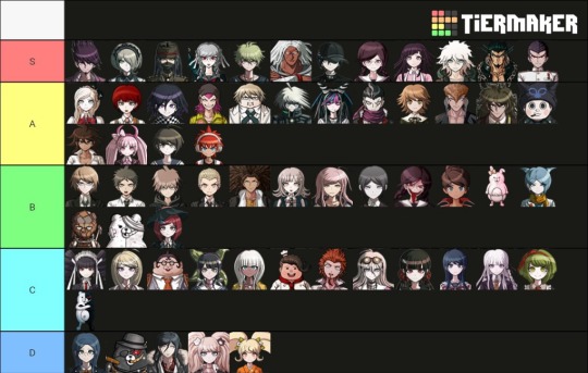
A-a-a-and… HERE IT IS!! First Tier-List 😅
It's pretty simple, but let me clarify one (so as not to deprive you of the opportunity to ask something) thing – tier D doesn't mean that I extremely hate these characters. Rather, I just can't accept their nature and principles, can't understand; but I will NEVER judge the people that like something in them. Although Kurokuma just annoyed me, I confess.

Second Tier-List – my favorite theme, PAIRINGS (yes, as you can see, I ship both het and femslash and just slash, and OT3)👩❤️👩👨❤️👨👩❤️👨
Sorry for the possible ripples in the eyes, Danganronpa is too wealthy in character combinations, phew. And before I start making clarifications on the wording, I would like to bow to the author of this tier-list 🛐
Because he seems to me to be the ONLY one who listed all the combinations, regardless of their popularity. In other variants, for example, I did not find either Shinsai or Shintojo (and as you can see, this was very important for me). There's no cross-game shipping, but I don't do it.
Now to the wording:
"Taking off my hat" means that "don't ship myself (although Ryoma/Kirumi is questionable and Mahiru/Soda isn't so clear), but I respect the fervor and dedication of people who consider them a good couple".
Some opposite of it – is "?¿ I don't understand". I mean, in this case, I'm REALLY confused. How. Why. They weren’t even close, in my opinion. But again, all without hate. Please don't hate for the pairings 🙏
And let’s wrap this up! I hope I could intrigue you 😉 There will be a new post soon!!
Link to the picrew if it's not displayed in the description under the photo: https://picrew.me/image_maker/1414503
#about me#ask me questions#send me asks#fandom things#danganronpa#danganronpa killing harmony#danganronpa goodbye despair#danganronpa trigger happy havoc#sdr2#drv3#tier-list#shipping#text post#let's be friends
5 notes
·
View notes
Text
I, a campaign manager
so in addition to being a CTO, a CS major, and a dorm vice president, i was also a campaign manager for 2 weeks (the exact campaign that I was managing is not entirely difficult to figure out if you really want to know, especially if you click on the links BUT i will be trying to not mention it specifically here lol). You might be wondering - (1) why and (2) how did you end up becoming a campaign manager..... you're not even a poli sci/gov/humanities/literally anything vaguely related to this major??
You're correct, yes, how did this happen? Well that's a great place to start this story:
How in the world this happened
Friends drag you into stuff. This happens to be the same friend that dragged me to New York, and then was 20% of the reason I got dragged into the negotiation class, and then was maybe 15% of the reason i got dragged into nonprofit activities? In terms of providing unique opportunities in my life, she definitely takes the cake. So one day, she says "I'm running for this position," and me and the squad says "we gotchu." What does that mean? Clearly wasn't sure in the beginning, but we were texting campaign strategies and slogans and tiktok ideas in the chat for fun. None of us had any real responsibilities, especially since the actual candidates were still weighing the playing field and figuring out their platform.
I also was a course 6, so I guess there was some expectation that I would make the website, even though I didn't actually code the website from scratch.
but anyways, it was actual campaign time.
CAMPAIGN SZN
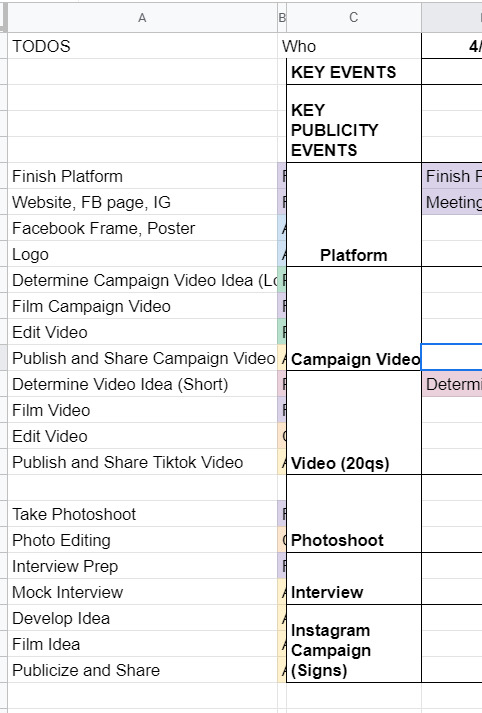
After they figured out the campaign platform, it was game on for the campaign materials. We spent a lot of time on artwork, we photoshopped pictures from a photo shoot, we came up with campaign motto ideas, we brainstormed strategies for officially announcing the campaign. We had an actual campaign meeting to talk over things in mid-April where I met like six different people, friends from both candidates on this ticket, who were supporting this effort. We had a google drive AND a Dropbox. Look at this:
Despite this seemingly organized effort, it was not that organized because this publicity team didn't actually actively do anything for like a week. Many reasons for this: one being it was actually the semester, and it was also CPW weekend. Unfortunately for me, that weekend was literally hell for me, because I was managing this site for our nonprofit, CPW events (so like five zoom calls on a Saturday), classes (because those are still happening), and then the campaign thing finally started, about a week before voting opened. In the form, of a website.
So the tl;dr is I developed an entire Squarespace website in one night. Yes, one night. I had to model it from I think the website from a Harvard campaign site, which took me like three or four hours on a Saturday night, which is a very fast time in my opinion to learn how to use Squarespace. I also bought a domain and figured out how to connect it to Squarespace at like 1 in the morning, which was the first domain I ever bought in my life!

(It expires in a month. I am absolutely going to let it die.)
Also, if anyone from squarespace is reading this for some reason, yall made a really solid product. I actually was very happy with my experience. You all should use it, I am 100% not sponsored by them at all, but honestly it was a very good experience. If you need to develop a website in four hours and don't have a lot of webdev experience, definitely consider it. You can even see website clicks and user analytics, it's actually really put together.
The next day we spend a lot of time going through website changes and artwork changes. It's bad. We had so many discussions about color palettes and the advantages of a 3 column vs 4 column layout. Yes. I'm serious. I'm starting to go crazy.
If anyone's interested, I would say that our website definitely was better than the other campaign's website. Like objectively. Like both campaigns were great, but the website? well. Here's the link (archived because I only paid for 1 month of squarespace :D) The amount of detail that went into it is actually incredible, the amount of spacing, i even had to custom CSS the header image so that mobile headers would show up correctly.
THE CAMPAIGN VIDEO
so sometime during this week, I had this thought about making a really good campaign video. I was very inspired by some of these Google ads that started with a Google search bar. (Yes, I am aware that I am that much of a Google simp.) To be honest, rewatching this ad, I really definitely just copied this entire ad lol, it's ok we don't have to talk about that.
That Wednesday, we coincidentally talked about what makes campaign videos successful. We talked about how Trump's incendiary imagery helped stoke the flames and how it was really effective in getting people to vote, and eventually helped him beat Clinton in the presidential election. So I went and took that and grabbed news clips and campus videos and overlayed that in the video, and it went from like a solid 6 to an 8 immediately, in my honest, unbiased opinion. You can see what I mean in the video itself: [link].
We also had to put together quite a few interviews about what they wanted from the school and were looking for in their candidates, which took a million years of coordination, but we somehow got it done in three days, and everything was put together in a flurry of a weekend, unending changes and small fixes for sixteen hours straight. I could not even tell you how much I learned about premiere pro and how to use layer masks and everything. I even composed the music for the first fifteen seconds of it. Literally, composed, it.
And so on a Sunday afternoon FINALLY right before voting, the video drops. I'm sitting in my backyard absorbing the sun because I hadn't left my computer for 48 hours straight.
It gets like 1000 views or impressions or something in like two days, which is incredible for me, since I'm not a professional by any standards, but I am considering being a professional campaign manager at this point. By the way, we're also managing an Instagram page, a Facebook page, a tiktok page, a website, our individual social media pages, and we're trying to synchronize this video drop and all of our publicity efforts across every single one of these channels. It's chaotic at best.
VOTING SZN
So it's voting week, where we give everyone an entire week to vote. Across the week, it's mostly a waiting game, we make a few more tiktoks and funny videos that we publicize to get out the vote more. The last day, we're thinking about it, and we know the final vote's gonna be close, so we message every. single. person. in our Facebook friends list. I think I singlehandedly convinced like twenty people to vote (and hopefully vote for our ticket).
There's a lot of drama about different stuff. I won't really talk about it because I think it got really messy, but this week and entire couple weeks was a lot to get through honestly. As a reminder, I'm also working on my senior thesis and my nonprofit website work is peaking at this point, so everything is very, very bad and none of us have slept in a while. Also it's the pandemic.
Finally, the results come out. We lost by like 20 votes or something, out of 1500 or so total votes casted or something like that. It's one of the highest voter turnouts in school history or something, I don't quite remember. After that, we're so emotionally drained from this whole thing that we just don't talk about it for a while and that's that.
If the ticket won, I wonder how it would've turned out. I feel like things would've continued to be busy, and maybe that's not a great thing. So maybe everything happened for a reason. I don't know, but those three weeks were quite interesting, quite fun, quite odd. I'm putting those videos in my personal portfolio and am putting Adobe Premiere Pro and Squarespace on my resume and moving on.
Anyways, thought I'd just share! i haven't posted in a while, and this was definitely one of my #weird #odd stories from my time at MIT, which is quite reminiscent of #weird #odd at MIT in general.
1 note
·
View note
Text
"There's A Wiener on the Left!"
In Finland, when I hear someone talk about Easter (in Finnish, Pääsiäinen), the first thing that comes to mind, for me at least, are witches. It's a tradition here for kids to go around town dressed up as witches on Palm Sunday, and trade decorated branches of willow for candy. It's quite similar to trick or treating on Halloween, something not as big a deal around here. But because witches equal Easter in my mind, I find it very fitting that in today's GMM, Rhett and Link were joined by Gavin Leatherwood from the Chilling adventures of Sabrina.
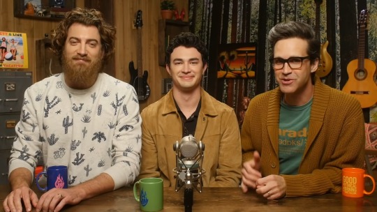
I've watched the first season of Sabrina, but something else has always come up, and I haven't watched the rest yet. Of course, I have watched the og Sabrina the Teenage witch, but let's not bring that up. No, actually, let's: I'm not ashamed to admit that I quite enjoyed the show, even the stiff robotic cat. But even though some quite unusual animals and other oddities are kinda the theme of today's game, they actually have very little to do with witchcraft, and more with the magic of photoshop. It's time to spot the differences in some pretty wicked pictures!
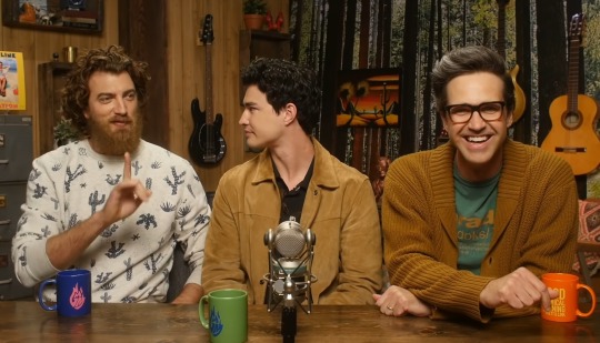
Rhett starts the episode by instantly asking Gavin if he prefers leather or wood, (Rhett likes both) just because, Leatherwood. Imagine being a guest on the show, meeting these two dorks for the first time, and this being the first thing they ask you? And then, you end up playing a game where each round ends with someone putting a curse on themself? 😂
Okay, Disney should consider making a Mickey Mouse movie where all the characters' faces would be replaced with dog faces. That Mickey Dog looks amazing!
Buzzer wood would make a fun name for a Toy story fan fic, and I know my mind is pretty deep in the gutter to say that. It doesn't help when Rhett says things like "I like buzzer wood, it's soft."
After Rhett and Gavin find the differences in the koala mask pics, Link has to walk under a ladder and flip a fish to bring bad luck on himself. I had to find out more about the fish thing, and apparently it is a thing, only not while cooking the fish but when serving it.
I'm not very good at this game. I only thought about how my mom has the same green Ikea dish brush that is in the second picture, and then I started to think I should load my dishwasher. If I was playing along, I'd end up doing all the cursed punishments.

Opening an umbrella indoors is considered to bring bad luck in Finland, too, but this is the first time I've heard about Leonardo DaVinci inventing masturbation. Way to go, Rhett!
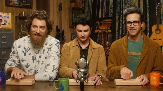
I spotted the nose in the stairs photo immediately, yay! Honestly, giving Link scissors and a hammer to smash a mirror with was possibly the worst idea ever. He didn't even know which hand to use with which tool! The horror on Rhett's face is very real, but somehow, the chaotic energy in this shot is also very much what GMM is all about.
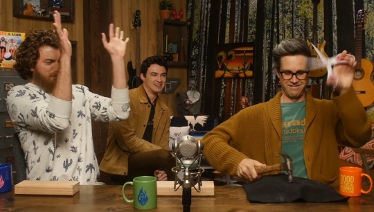
I don't think the picture of the chickens taking a bath is that weird, but just pretty funny, but now I really need to see that freckle. I'm glad Link lost this round, so we get to see his yo-yo skills. This round was bad luck to whoever has to swipe the salt off the floor.
I made an eight-legged cat from clay last week, but the dog is way cooler. I don't know why, but I think Gavin just put a curse on that pretty little rainbow with his wicked eye. But, I have to ask with Gavin, why would Link imagine a little girl in a gown pointing at the rainbow instead of Gavin? Oh, because he's Link. Obviously.
In the last photos, I spotted the creeper, but not the other mistakes. I love how Rhett's first guess, after Stevie said women are more prone to spot the last mistake, was boobies - I don't believe that would apply to all women. When Link guessed there's a wiener on the left, I tried to take a better look at the creeper to see if it was a wiener and not a person. I mean, it's possible, I guess. The Try guys just posted a video with Zack's wiener, so it's not unheard of. But, gosh, Rhett really can't whistle. That was equally painful and hilarious to watch.

Rhett also loses the final round, and somehow, his punishment is to get serenaded by two guys while getting a foot massage? I love how Link harmonizes the Happy Birthday song, he's really good at that!
In More, the guys play Light as a feather, stiff as a board with different objects. I've never tried this, but I did once play with a Ouija board with my friends, and I may have tricked them to think we talked to the spirit of someone who used to live where my family home is. I feel a bit guilty for doing that, but at the time it seemed like a good idea. I just didn't think they'd buy it.
Link admitting to Gavin that he and Rhett are the most sheltered middle-aged men he'll ever meet is somehow quite adorable, and I think the part where Link is doing awesome yo-yo tricks while whistling Deck the Halls in the background as Rhett struggles with the cardhouse while Gavin observes the situation, is one of those moments where you could send someone who isn't familiar with GMM, without context, and see how they react. But Link with that yo-yo...😯😍
Link may have shaky hands, but his reaction speed is phenomenal! I'm glad Gavin took his leather jacket off, it would have sucked if they spilled that orange juice on it.
Okay, I'm gonna stop now. They definately saved the best part of today's show to the end, because seeing Wushu sit on a pizza box up against the sky while the guys sing that song from Lion King is possibly the best thing I've seen in a while. And it's the perfect scene to end this post:
#gmm#gmmore#gmm 1725#rhett and link#gavin leatherwood#cursed images#spot the difference#light as a feather#stiff as a board#wushu in the sky with pizza box#link does yo-yo tricks#fun times
10 notes
·
View notes
Text
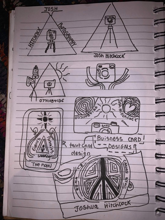
Business Card Project - Part 1
Around the time this module started, I got back into contact with someone by the name of Josh Hitchcock who I met and worked with back in college. We met when we were 16 and worked on several projects with each other during our year studying photography together, I learned a lot from Josh and we’ve stayed loosely in contact ever since leaving school but haven’t collaborated on anything for around 5 years despite having always had similar interests, styles and aesthetics. Josh is also still pursuing his passions and talents in visual communication and is beginning to build a portfolio with the aim of applying for a BA, just like I was doing this time last year. Alongside getting himself prepared to do a degree, he has been expanding his online presence and slowly establishing a business and brand identity for himself. He reached out to me originally to ask if I could potentially create him a logo that he could use across all of his platforms which he needed fairly quickly as he was building a website, unfortunately I couldn’t meet the turnaround deadline and so he commissioned someone else to do a logo, later reaching out to me again to ask if I might be able to create business cards instead.
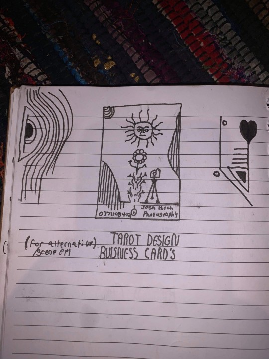
Josh had already started sketching out ideas and so he sent me his drawings as a starting point for the design
After some discussion and a little bit of time, Josh came to the decision that this was his favorite prospective card design and even began experimenting with it's colors.
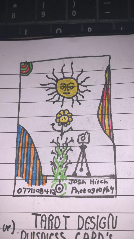
It was at this point that I asked him to create a Pinterest board to help gather all of the ideas together which he promptly delivered on. Pinterest’s description of the board “Clean, simple doodles. Photography orientated based on nature and ancient art. A perfect combination of tech, nature and aesthetic.” sums it up perfectly. This was a really strong starting point for the overall design as it includes everything from small decorative graphic details such as flowers, vines and suns; to a concise range of colors for the palette of the art itself. The board isn’t overcrowded, it's clearly well thought through and does good job of clearly communicating the kind of style that I was expected to reflect in my design.
Coincidentally around the same time I started this project, I decided to treat myself to an iPad Pro and Apple Pencil to support my University work, these have become increasing popular in the art world because they are incredibly powerful creative tools, I chose to invest in it mainly for it’s capabilities in creating digital art using the Adobe suite and Procreate using the pencil which is exclusive to iOS and has is slowly becoming the standard for digital drawings.
Having recently attended the Illustrator workshop, I thought that I would experiment with using this software both on my iPad and computer as I figured if I could learn to use them in conjunction with one another from the get go, I would be in a better position overall later on; but in doing so, I threw myself two learning curves at once as I was not only dabbling in software I wasn’t comfortable with but also using that software on a device that I am a complete beginner to which was a definite challenge for myself.
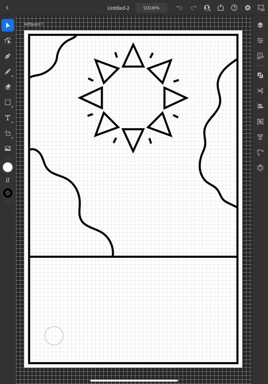
I started out by doing a Google search to find out what the standard size is for business cards and found out that is generally 3.5 x 2 inches (1050 x 600 pixels at 300 DPI, which is the standard DPI for printing). This is how I decided to set my document up which is what gives me the white rectangular shape that you see me working on to start off with.
To begin the design, I picked out my favorite things from Josh's sketch which were the wavy line details and the bohemian style sun. I created some simple outlines using the line tools on iPad Illustrator starting with the border and dividing horizontal line where I intended the design to end, from this I was able rough out where patches of lines would go and add the sun. For the sun, I originally tried to draw one with wavy points but I was struggling to get it proportionate, even when I'd figured out how to use the reflect tool to make my drawing symmetrical, it seemed to be throwing the design off and so I threw this idea out and went for a pointed sun design instead. I chose triangles for the points as a subtle reference to the exposure triangle which is a rule that dictates camera settings when it comes to photography so it ties in with the business well and was also a concept that Josh was trying to reflect in his logo. I achieved the geometrically accurate shape of the points around the sun by creating the very top triangle and then using the Radial Reflect tool whilst using my iPad which automatically created the rest of the points for me with even spacing and perfect symmetry; all I had to do then was resize the points as I pleased. Once I had done this, I decided to repeat the process but with a small line between each point to give it an extra beaming sunshine look, this also fits in with how some of the sun's and graphics are drawn on the Pinterest board that I'm referring to as I design this.
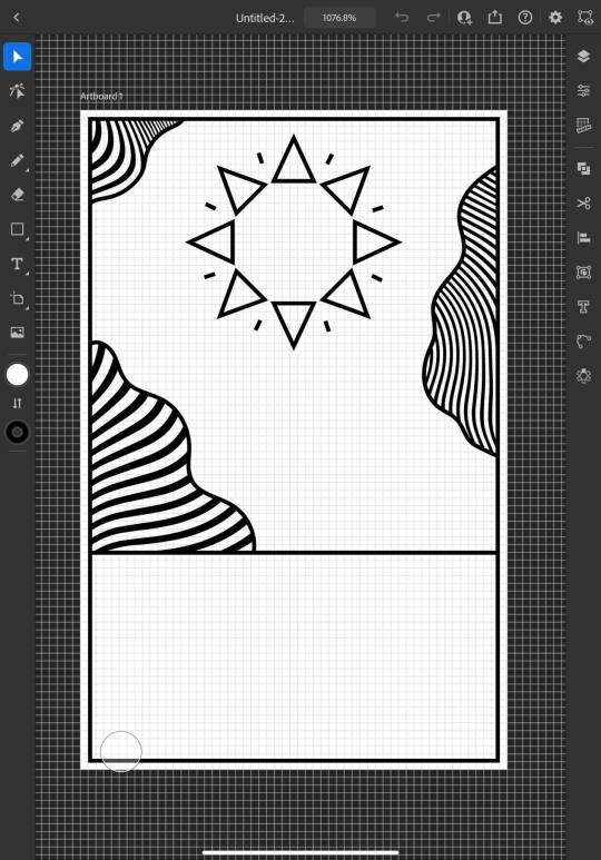
Once the outlines were complete, I started experimenting with filling in the patches with lines, this is an effect that is featured on the album art of one of my favorite albums of all time, Currents by Tame Impala which I previously learned how to do using a vector pack from Spoon Graphics as I did work inspired by it for my University portfolio. Although I have used these particularly line textures before, I have only used them in Photoshop and not Illustrator so I haven't actually used the vector versions of them up until this point. I inserted these into my work using my computer as that's where they were saved, I was able to use Adobe Cloud to sync my work between my PC and iPad making it easy and convenient to switch between the two whilst working. Adjusting the waves worked similarly to how it does when I use them in Photoshop, I just added them in as a layer and then used direct selection mode to delete the extra lines around the outlines and border that I’d drawn in leaving me with what you see above. At this point, I sent what I’d done so far to Josh so that I could begin to get his feedback and make sure that what I was doing was in line with his vision.
Whilst I was waiting for him to reply, I started experimenting with adding color to the design hoping that it would help us visualize it better; I used colors directly from the Pinterest board for my palette by taking a screenshot of the webpage, opening it up in Illustrator, swatching all of the colors and adding them to my Color Library so that they could be easily accessed whenever I needed them.
At this point, I just filled in the colors according to what made sense to me, blue for the sky, yellow for the sun and something contrasting for the wavy lines, honestly, I chose orange because it’s my favorite color and I really like the way that the purple looks next to it, especially against the blue background where it appears slightly more subtle whilst still being effective at breaking up the image in the way that it needs to.
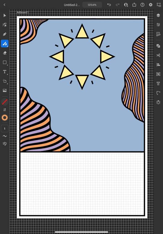
I continued to add colour, changing every other point on the sun to be red to give it more dimension and incorporate more of the colours from the chosen scheme; I then added green to the bottom section which I chose because I thought it would represent grass and fit in with the sun and sky theme that seemed to be emerging. I also added some small stars as I was experimenting with the shape tools dotting them into some small empty spaces on the design so that they line up in a triangular shape which is another subtle reference to the expose triangle.
Then I started experimenting with adding text and social media icons, Josh had told me that he wanted his name, website and social media information on the card, we decided to leave his phone number out as he only has a personal mobile number and didn’t want to risk handing it out to strangers. I chose this Art Deco style font for the name because I liked the lines in it and thought it went well with the lines in the top half of the design which are probably my favourite thing about it at this point. I didn’t use the same font for the website because it doesn’t look as good when it’s small, you can’t really see the lines and it made the website hard to read so instead I chose this glyph font which I thought Josh would like based on some of the imagery from the Pinterest board; I was unsure about this choice at first but it quickly grew on me as it’s subtle and yet it makes the website look bold on the bottom of the image which draws your eye down to it when you’re reading the information. I also added some social shapes to the front keeping Josh updated on my progress as I went along.
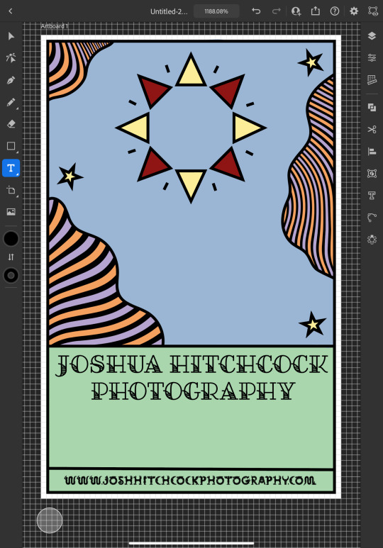
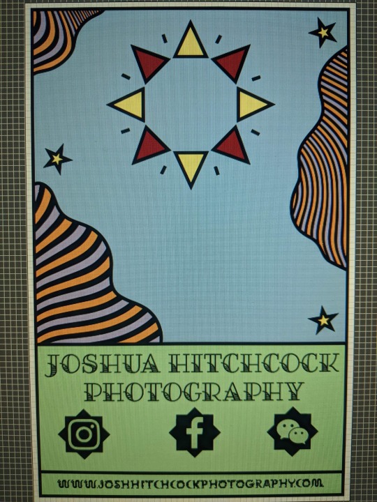
It was at this point that I started to receive some feedback from him, he was really happy with the first impressions of the design but did want to make a few changes. He started out by asking if I could change the green on the bottom to the orange colour in the waves with the hope of giving the card a more uniform look which we both agreed looked much better. He then asked me if I’d started designing the back which I hate to admit that I hadn’t actually thought about at this point and so we started discussing the layout; collectively agreeing to move the social media information to the back of the card and have that there along with some sort of bio which I much preferred the idea of as I wasn’t too keen on how the social shapes looked on the front of the card and I was worried about how I was going to fit all of the contact details on without making it look messy.

Originally we thought it might be nice to add some floral details to the front of the card where the space had now been freed up but we quickly decided that this didn’t look quite right.
0 notes
Text
Finally finished updating my theme on both desktop and mobile. Only took about 6hrs 😑
#texts#but I'm happy with them though#was worth all those hours lol#anyways#now that I'm completely done with my theme maybe I can finally tackle making some edits or gifs#though I know those will be shit#haven't made gifs in years#in fact I haven't opened photoshop in quite some time tbh
0 notes
Last Seen Blogs

iianuii
______________

can-of-worm
Singular Worm Vibes in the Club Tonight

techpage-blog
Untitled

wibbletrollfox
www.ukfurnituredeals.co.uk

sickasur
Sick as you are