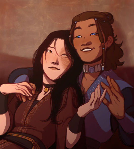
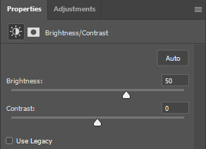
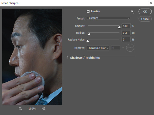
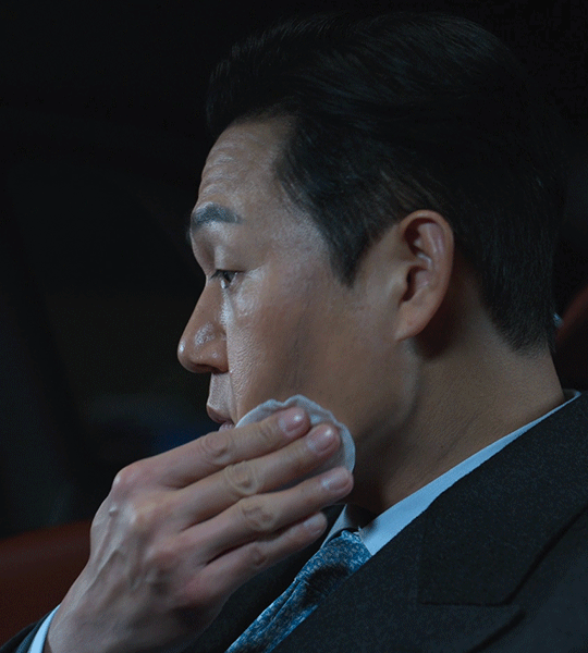
#i just followed a tutorial and played with the brightness and contrast
Explore tagged Tumblr posts
Visit Tumblr Blog
Explore Tumblr blogs with no restrictions, modern design and the best experience.
Last Seen Tumblr Blogs


Fun Fact
US Tumblr user growth rate is estimated to slow down to 4.1%.
Text

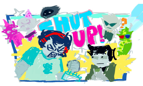
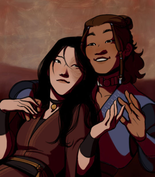
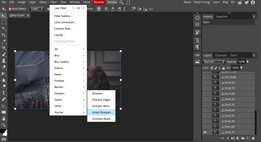
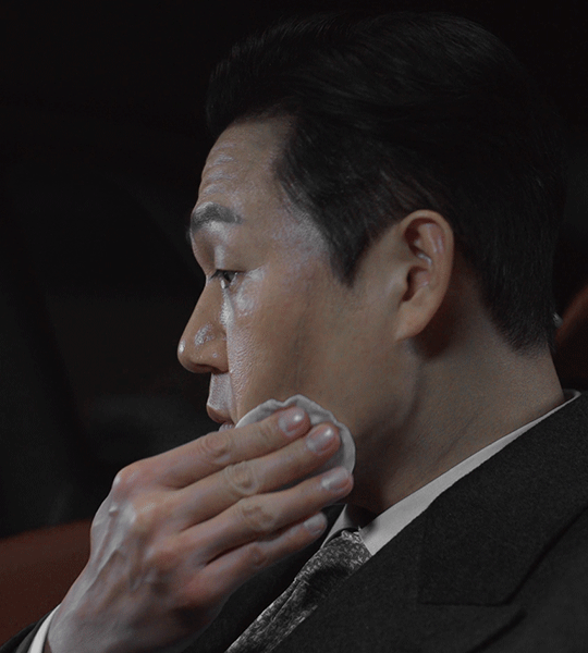
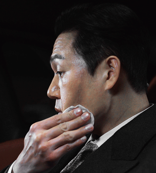
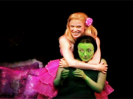
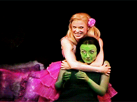
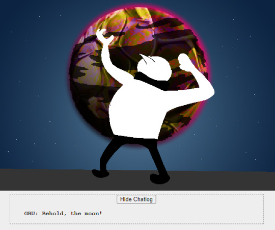
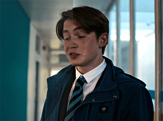
Aarni Soivio KUUMAA - Huuda Lujempaa (2017)
(this was the kuumaa gif idea i had in mind a few days ago. could be better, but it's my first time 😅)
#kuumaa#aarni soivio#huuda lujempaa#kuumaa gifs#my gifs#thank goodness i already made that tag#i just followed a tutorial and played with the brightness and contrast#i wish it would look smoother#but i want it to be this slow#and the sharpening is ehhh
17 notes
·
View notes
Note
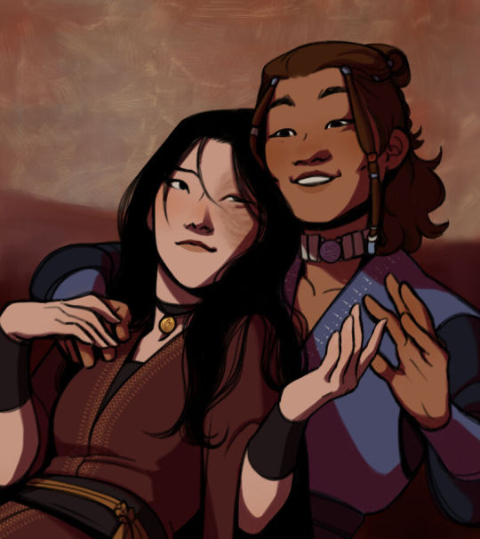
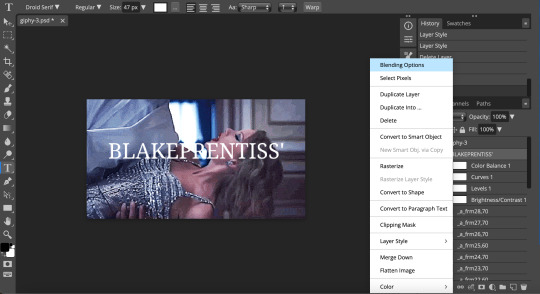
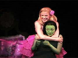
hi, I was wondering if you could help me with how to color the bucktommy helicopter ride? I haven’t been able to get rid of the green, and when I do it’s all blue or super pink. Any suggestions? Thank you!
hi anon! i'd be happy to share how i coloured that scene for this gifset, just keep in mind that this was my first attempt at this scene and i'm always tweaking my colouring!
the channel mixer is you best friend for these kinds of scenes, and here is a helpful tutorial explaining how to use it. i like to think of it as taking the colour of the tab and "pushing" it into the colour of the sliders (so if you're in the red tab and increasing the green slider, you're "pushing" red into the green areas of the gif).
under the cut i'll explain the major steps that helped me get the colouring here:

these are my regular colouring steps, which i'll be mostly following and referencing throughout, but with some tweaks.
Prepping the scene
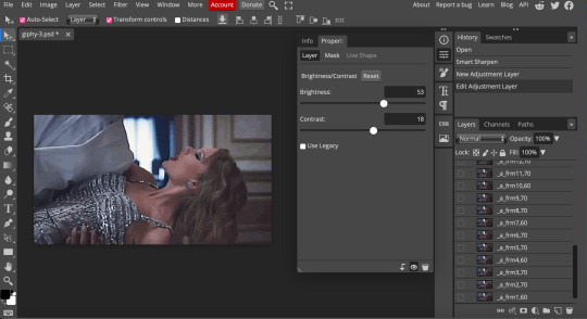
i start with a blank brightness/contrast layer set to 'screen' to brighten up the shot


then i use the curves layers i mentioned in my colouring tutorial and use the white and black eyedroppers to select the brightest and darkest green pixels in the scene. this brings out some of the blue.

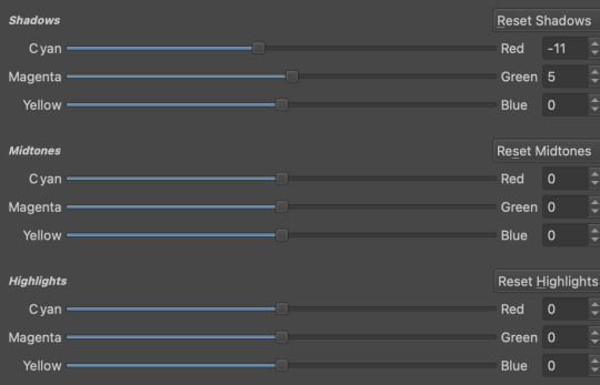
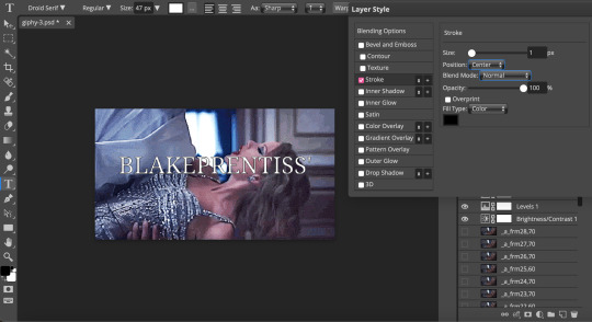
Channel Mixer
now i use the channel mixer to do some heavy lifting. these are my settings but play around with them until you're happy. i started by reducing the green, and then adding back red and blue.


Adding brightness
now i use another blank brightness/contrast layer set to 'screen' at 50% opacity, and use the second exposure layer, levels, and brightness/contrast layer from my colouring tutorial to brighten up the scene.


Channel Mixer 2.0
now as you can see the scene is still pretty green, so i add a second channel mixer layer with these settings:


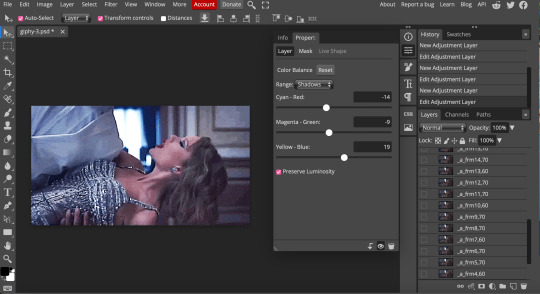
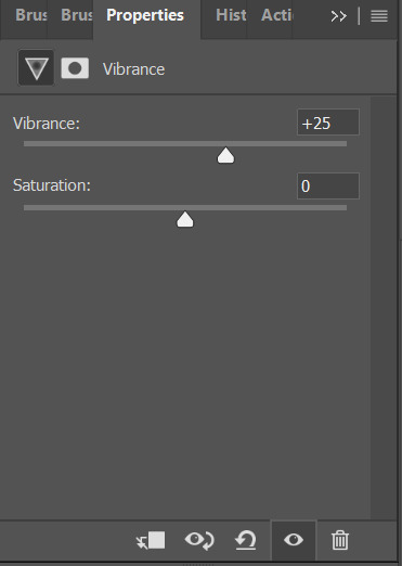
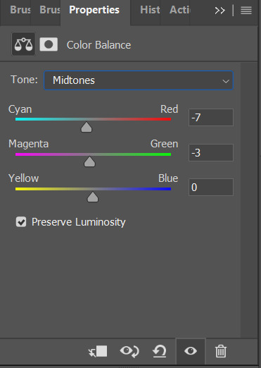
Color balance and hue/saturation
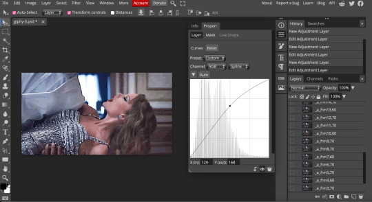
i do my color balance and hue/saturation steps as described in my colouring tutorial, with these settings:


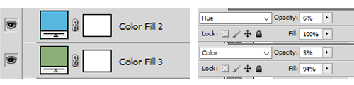
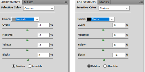
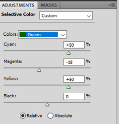
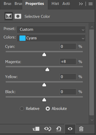
Selective colors
now it's just a matter of using your selective colours to add back warmth in the skin tones. i use multiple selective color layers and adjust the reds, yellows, and magentas to get the skin tone to look better (6 layers for this alone). i also adjust the cyans and blues to get the lights and uniform colours the way i want them. and i end off by adjusting the whites/neutrals/blacks to get some more brightness and contrast.
i've explained my reasoning in how i use my selective colour layers in my colouring tutorial.
Final Touches
i use the same final layers as my colouring tutorial, ending off with an auto curves layer at 25% opacity which leaves me with the final colouring i obtained here:

hope this somewhat helped anon! let me know if you have any more questions or want me to clarify anything further!
#911#bucktommy#tommy kinard#evan buckley#<- target audiences#answered#Anonymous#*tutorial#sorry this was just a rough explanation! i'm still tweaking things to get a colouring that i *love*#the channel mixer does most of the heavy lifting though and is the most important part#supplemented with color balance and selective colors to make things not look corpse like
133 notes
·
View notes
Text
.;* TUTORIAL: Black Backgrounds *;.
@infinityvalkariel asked me how I made images like the one above so I thought I'd put together a tutorial post!
Inspiration & Credit
First of all, I wanna give credit to (@)mallowwyyy on TikTok for the idea! I saw their video initially showing off the effect, and they mentioned in the video that they had a tutorial on their account - but I didn't have my phone at hand when I had the game open and wanted to try it, so I ended up reverse engineering the effect.
I went back and found their tutorial video, so you can follow that if you'd like! My version is pretty much the same, but they got a nice, softer effect - click / tap here to see mallowwyyy's tutorial video
My Tutorial
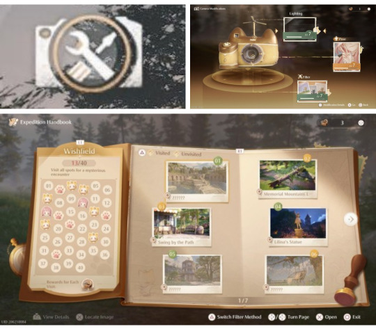
Step 1: Unlock Lighting!
So, the first step is to make sure you upgrade your camera lighting to about level 5 at least, to unlock the hue lighting. Personally my lighting is currently at level 7. Higher levels unlock more lighting options to play around with for this effect!
To upgrade your camera, open the in-game camera - then there should be an option in the top right that looks like a camera with tools inside (idk if the placement might be different on other devices, but it should be somewhere on your screen at least). If you select that, it opens the menu to upgrade your camera for new lighting/poses/filters using the materials you get from the expedition handbook photography stamp challenge.
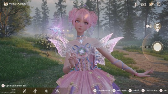
Step 2: Get Into Position
The beauty of this effect is location really doesn't matter since we're basically erasing the background, but bright lights and effects can sometimes peak through so that's worth bearing in mind. Below I'm just in a random location in the woods and I've set up the pose and camera placement where I want it.
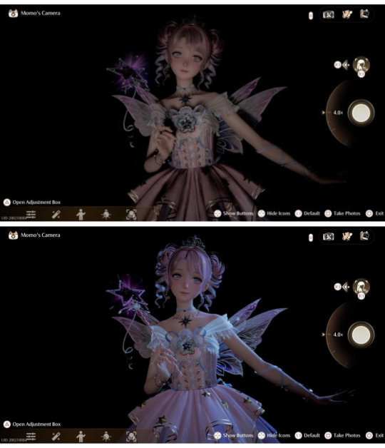
Step 3: Make Everything Pitch Black
Next, using the Adjustment Box, turn the Vignette all the way to the maximum then move the following options all the way to the lowest: Soft Light Intensity, Soft Light Range, Brightness, Exposure, Highlights, and Shadows.
You'll end up with something like the image below - very much an 'it gets worse before it gets better' situation - but, as you can see, the background is black!

Step 4: Add the Magic
Now it's time for the lighting to shine! Go to the Lighting section of the Adjustment Box and add the natural, default lighting for a softer touch or the unlocked hue lighting for a more colourful, saturated effect - and remember, you can adjust the intensity of the lighting! I've found max lighting then doing Step 5 below tends to work best, but you can play around with it.
Step 5: Final Tweaks
From here you just play around with the settings until you get a result you're personally happy with - whatever works best for your outfit and the vibe you wanna go for.
Black & White Effect: Turn Saturation & Natural Saturation all the way to the lowest
Make Colours Pop: Increase the Saturation & Natural Saturation (play around with the different levels of these two settings)
Make Nikki Brighter: Increase the Brightness, and also play around with the Highlights
More Intense Highlights & Shadows: Increase the Contrast
Soft Glow: Turn the Soft Light Intensity to maximum then increase the Soft Light Range until you're happy with it
This isn't an exhaustive list by any means - have fun playing around with the settings to see what interesting effects might come out of it!
Step 6: Playstation -> Phone Shenanigans
This final step is just for people playing on Playstation 5, like me - or for people who want to add an extra something to their images.
To get images off the Playstation and onto your phone so you can share them on social media and such, you have to download them from the game to the console, from the console to the Playstation app, then from the Playstation app to your phone - and somewhere along that process, I've found it tends to screw up the saturation and make the images more washed out. I do think it may just be an issue with the colour settings on my TV, but I don't know for sure.
Exhibit A: Photo of my TV screen taken by my phone camera vs image downloaded from the Playstation app:
Now, you might like how this looks and I often do lol, but when I want to fix the saturation and make it closer to how it actually looks on my TV screen, I play around with the default photo editor on my phone - there's usually a filter that brings it at least very close to how it looked on my TV, usually one or a combination of the following filters depending on the image: Honey, Clay, Metro, or Bazaar - filter options do vary depending on your device, I have a Google Pixel 6a. The filter previews are the main thing to go off of to see which filters will give the desired effect.
Exhibit B: Playstation app image vs edited image
...aaand that's it! I hope you enjoy playing around with this effect <3
(also, I made this post on my phone, so if there are any formatting issues do let me know and I'll see if I can fix it once I'm back from work and can edit this post on my laptop)
23 notes
·
View notes
Text
Tips and Tricks for krita (part two electric boogaloo)
Ok so this one is going to be a doozy because im going to include a lot of examples and tips for how to use filters (AKA YOUR NEW BEST FRIEND)
Link to part one.
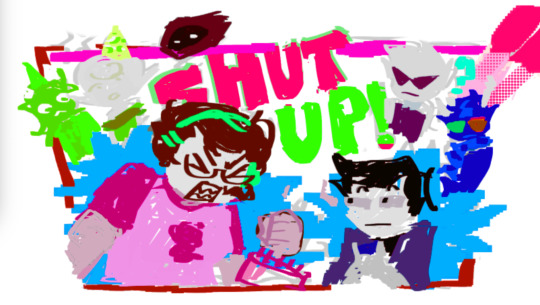
Ok so filters in krita can be a doozy so ill cover the ones i use in my art the most, these will be adjust, artistic, and enhance dropdowns. I will be using my art pieces to show how i modify my art- colourwise!
Obviously, start off with opening the filter menu up. Color balance brings you to this menu, where you can play around with the colour of your shadows, your midtones, and higlights. Its a lot of trial and error, just messing around to see what fits, and its how i got to this point. through just pushing the dials up and down. Honestly, a lot of this part of the tutorial is going to be me telling you to hit those dials and levers like you dont know nobody.

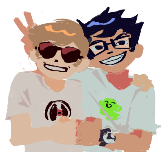
Even just small modifications as you can see can play so much of a difference. For here, i upped the cool tones for john, and upped the warm ones for dave. Colour theory without colour theorising i suppose you could say.
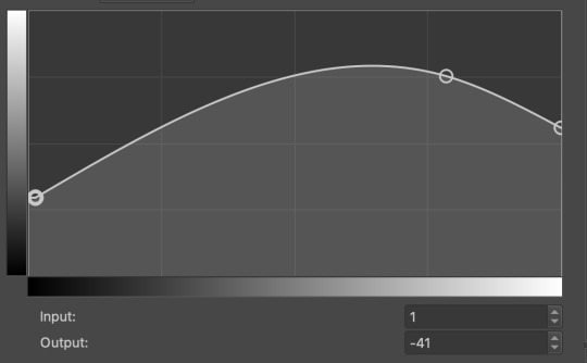
Crosschannel adjustment curves can help with contrast and colour intensity. Usually i have one point which i use to move up and down per my whims to control how bright my work is, and it can really help with really bringing out those colours so it doesnt all fall into one hue. Colour adjustment curves works similiarly, play around with them to get the desired effect.

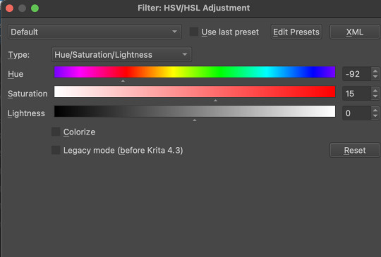
Krita also has HSV adjustment, but i usually use just the hue and saturation. Theyre pretty self explanatory, and can switch up your palette in pretty fun ways.
Now we move on to the ARTISTIC part. Again, i recommend you play around with them yourself, but i find index colours works really well for making really pretty art really fast! You just put in a few colours with descending lightest to darkest and you get an awesome art piece! Id say this is useful for pixel artists, but also useful for other parties. I might just start using this more myself. Its so easy wtf.
AND FINALLY THE MOST IMPORTANT THING.
HOW MY ART IS SO CRUNCHY.
If youve been following me for a while you probably noticed theres a slight crunch to my art. It gives it a slight bit of texture and makes it noticable. How do i do it?


You're welcome.
insert image of face on 90% opacity and comedic text for purpose.
Alternatively, if youre looking for a sbahj level of crunchiness, smack that "mean removal"for some fun.
Thats all! Happy drawing.
142 notes
·
View notes
Note
hello your gifs are really wonderful!~ <3 do you have any tutorials to follow or tips for black and white gifs? i can't get the black and white gifs i generate to look okay. thank you so much for whatever you can provide!
thank you!! i don't really have a tutorial for this, but i do pretty much always follow the same steps for my black and white gifs: i use a black and white method first (there are 2 main methods that i use), and then i add contrast and brightening layers (that's when we go from a dull b&w to a nice b&w)
BLACK AND WHITE
this will be your base black and white layer. i use either a gradient map layer, or a black & white layer, whatever looks best for the specific gif. the black & white layer offers more flexibility to change each color tone directly in one layer: playing with the red and yellow sliders will help make skintones darker or lighter as needed, same with other colors present in the gif. the gradient map layer usually gives a more contrasted look, and you can play with the gradient slider to make the gif brighter, but you'll have to use a selective color layer under the gradient map to edit each color as needed (especially reds and yellows, it's usually what i do).
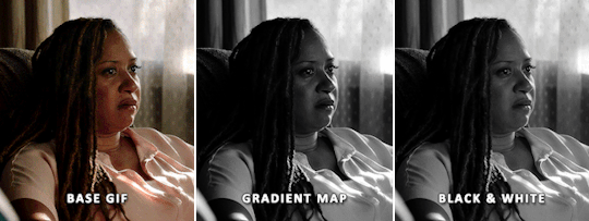
it's possible to achieve similar results with both base black and white methods, it just depends on your preferences and the base gif itself really. (more under the cut)
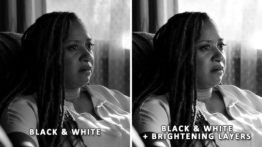
EXPOSURE & BRIGHTNESS
once you're satisfied with the black and white look so far, you can adjust the gif's brightness with your preferred method. just make sure the brightening layers are UNDER the b&w layer. i usually do a combination of these layers: exposure, curves, levels. when using gradient map i'll also use a selective color layer to edit the reds/yellows (and sometimes blacks) a little to balance the skintone(s). i always prefer brightening a gif after applying the black and white effect, while keeping these layers under the b&w layer.

CONTRAST & FINAL TOUCH
at this point, you could stop there or you may want to add more contrast on top of everything if you need, or even reduce the contrast, or go back and edit each color channel. also make sure the black and white effect didn't affect someone's skintone: sometimes it makes a skintone too dark or too pale compared to something in color.
for the gradient map method, i've added a brightness/contrast layer on top of the gradient map and brightening layers. i've also went back to the selective color layer below the gradient map to play with the white sliders so the curtains are not just bright white without any details to them when contrast is added.
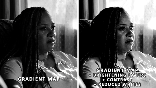
for the black & white method it's quite similar, on top of the black & white layer i have: brightness/contrast and another black & white layer with its blend mode set to soft light and its opacity set to 20% (a neat trick to introduce subtle contrast). i've also added a selective color layer under the black & white to add some deepness to the black values by playing with the black slider of the blacks tab, as well as reducing the bright whiteness in the curtains.
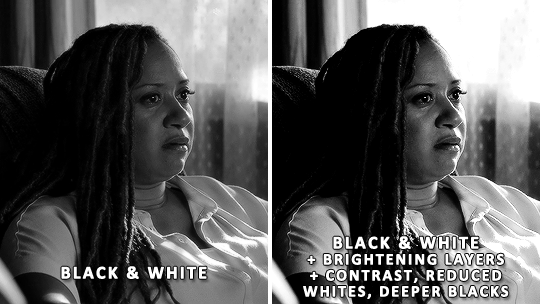
SHARPENING
one last thing to keep in mind: your sharpening method may need to be tweaked a little when using black and white. sometimes it enhances details, so your usual sharpening would be too strong, and sometimes it's the opposite. just make sure you aren't over sharpening and you're good to go.
i hope that helped a little!
125 notes
·
View notes
Note
hi dema! i’m learning how to do digital art, would you mind sharing your coloring process? coloring (and lineart) is the hardest thing for me to do T_T… what brushes do you use for coloring and how do you not make it look muddy? i’ve been trying to follow tutorials from different artists on youtube but i find my work to look so muddy… thank u in advance >__<
Hi, and thank you for thinking about me for advice! I'm honoured to share a bit of my process, nerve-wracking as that is for my shy self, and hopefully help you out as much as I can. Forgive me if I don't express myself very clearly—I have a bit of a hard time explaining these things. Now, let's get started, shall we?
I'll be using the first panel of this artwork as an example.
My process is pretty straight-forward for most artworks. Make a sketch, draw the lineart, and follow a self-made guideline for coloring and rendering.
Sometimes I'll throw the guideline to the trash bin and start experimenting with brushes and chiaroscuro and color palettes, but that doesn't happen most of the time and, when it does, it's more a challenge than anything else, and not really what I think you're looking for.
I'll include my usual steps here, however, and like I said earlier, these steps are more like what you'd call guidelines than actual rules.
(I just realized I didn't save the sketch for this artwork. Oops)
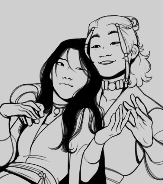
This is the lineart!
I tend to think that details bore me and are actually pretty exhausting to do, but then I go and make things as clear and detailed as I can. Because I'm a hypocrite like that.
I did try to keep things simple here, though, mostly because I had to go through three other panels and didn't want to burn out my fuel mid-process.
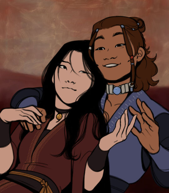
Base colors! The blush (and Zuko's scar!) I draw in a different layer in case I need adjusting the brightness or saturation later.
It's time for shadows!
Pick a color depending on the atmosphere you want the artwork to have. Is it a cozy, warm scene in a honey-tinted room, or is it a moment shared under the moonlight? The color choice should come as an answer to those questions—deep red for the first one and dark blue for the second.
Choose a color and make it dark and saturated. Then, play with the layer opacity! A darker shadow means harsher light, while less opacity works best for a softer look. See the difference? It's subtle, but it's there.
Of course, this is my personal choice. The way shadows are drawn and color is chosen depends on the artist and the artwork. I choose to play with a more simple coloring style, keeping shadows from blending into each other, but you may like a more realistic approach to shadows and colors.
My best advice? Try doing it every way you can, but in the end choose what works best for you. Whatever feels more comfortable, whatever you enjoy drawing the most. And then work to improve it. Love the little proof that you've gotten better, even if it's subtle.
And talking about subtlety...
I love to play with gradients. I use them mostly to give the artwork some form of atmosphere, and make it look cohesive and whole. A light gradient in the color and direction of the shadows will help the characters blend with the background, as will another gradient in lighter colors for the light.
Get creative with gradients! Use them so the lights feel brighter and the shadows darker.

Now it's time to work with the lineart again.
The pure black lineart makes the artwork look harsher, sharper, so I tend to give it some color to soften its edges and compliment the rest of the drawing. In darker shades as the rest of the colors, growing more saturated as the light comes closer.
I love to make the characters' eyes pop and glow! It's really fun what you can do by just messing a bit with the tones of the lineart.
Finally, I play with the level correction. A high contrast will help your artwork stand out and look brighter. See the difference?
And it's done!
Sometimes I like to add other effects or details, but this is the very, very rough shape of my usual process, and thus what I thought you'd like to see.
Once again, I'd like to point out that this is what works for me, and a large part of improving as an artist is just fooling around and messing up until you find the tools and tricks you're most comfortable with.
So keep drawing those muddy shadows and colors! They're only a step of the process.
#dema answers#zutara#art advice#art process#I hope this helped you anon#Tbh I have zero idea of what I'm doing most of the time#So don't worry if you don't#Worry instead the day you feel like a drawing comes easy and poses no challenge anymore#Always strive to do better to improve to fix that lighting or find a new way to depict a scene or find other filters and effects#No artwork is ever perfect and perfection itself should never be the goal#“Don't trust a song that's flawless”#Don't give up on the strain and the frustration of struggling against your own skills#Never fall out of love with the process#That's where art is
29 notes
·
View notes
Note
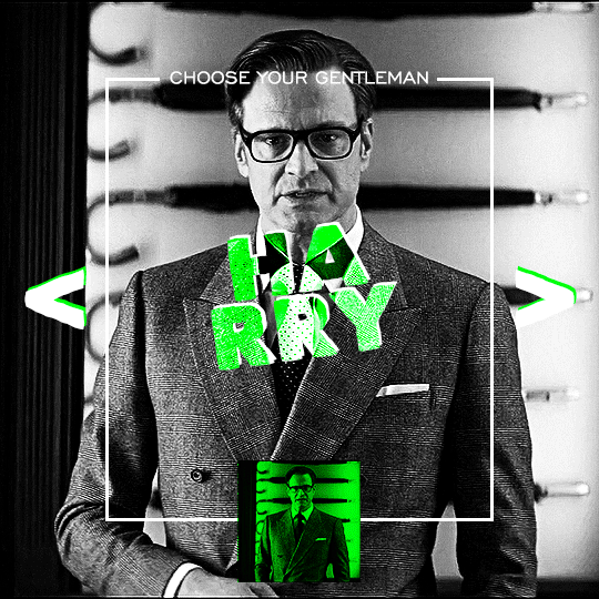
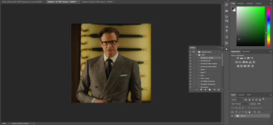
Hi, I love your blog and your edits. I was wondering if you could do a tutorial on how you combine multiple gifs into one in the first gif of yours MIKELOGAN’s 5K FOLLOWER CELEBRATION || GET TO KNOW ME MEMEFAVORITE ACTORS [2/10]Colin Firth (September 10, 1960) set? Thank you for reading this and helping me.
thank you so much, that's so kind!! this is the post in question (which was inspired by this gorgeous set) and i'll break down how to do it step by step below the cut!
i ended up saving this gif as a psd because i remember it taking me so long and being really frustrating, i just wasn't sure why. for reference, i posted that set back in september, just over four months ago. looking at the psd, i can see just how far i've grown as a gifmaker bc that thing is a hot mess. i made it about 3x more complicated than it needed to be, so let's do this the right way lol note: i was still using 0.07 frame rate at this point. i have since switched to 0.05 for smoother, quicker gifs.
what we're going to do is create all of these gifs separately and put them together at the end. in total, there are 6 individual gifs. let's start with harry.
i gif by importing video frames to layers, but if you prefer to screencap, load those in instead. because this ends up being a pretty large gif, both in size and length, i kept it to 20 frames per clip.
once you're satisfied with the frames you've chosen, crop your canvas to 540px x 540px. this is what i'm left with
this is when i sharpen my gifs. everyone's process is a little different. i created my own sharpening action, which converts my frames to video timeline and then sharpens.
the next step is to color your gif. if you're going for the overall look in mine, here were my layers:
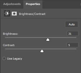
a brightness/contrast layer with brightness set to 31 and contrast to 5. this will depend on the scene you're working with

a levels layer using the black and white eyedroppers. the top one is your black eyedropper. to use it, click it and select the blackest part of your gif. do the same with the white eyedropper and select the lightest part of your gif. you may need to play around with selecting different points depending on your scene and the original coloring
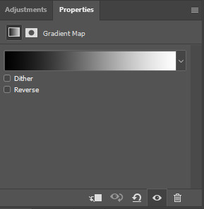
finally, a simple black & white gradient map layer on top
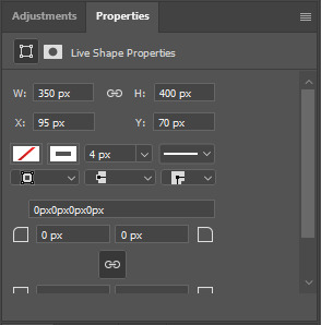
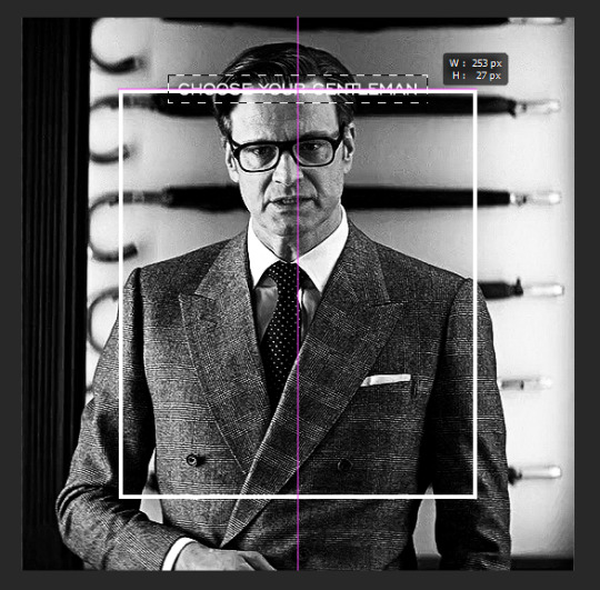
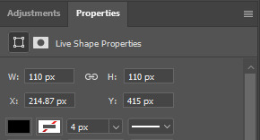
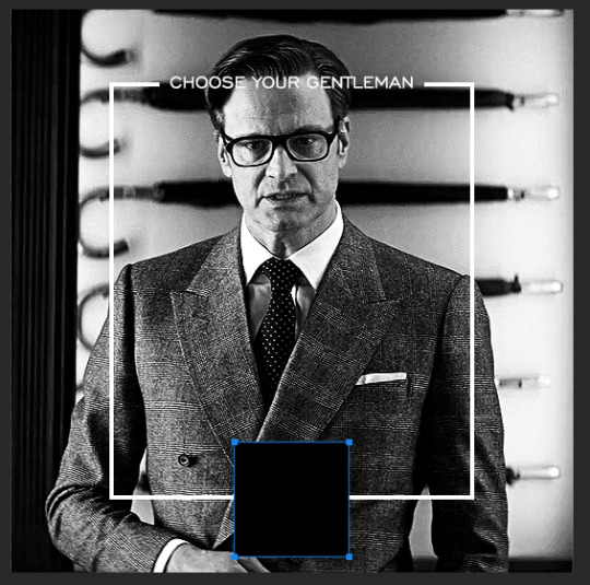
now we're going to add the thin rectangular border in the middle of the gif. i use the rectangle shape tool for this (press U on your keyboard) and these are my settings (x and y coordinates don't matter):

to center it perfectly, i use ctrl+T and drag it until it snaps into place with both the vertical and horizontal guides.
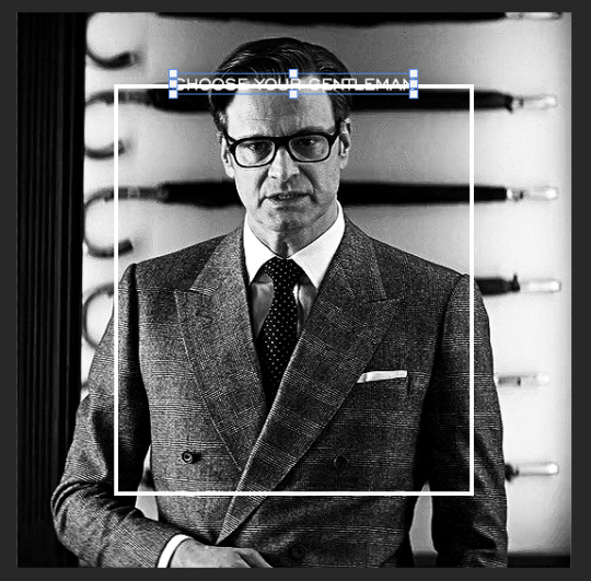
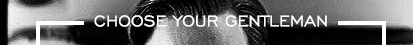
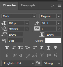
next, let's add the "choose your gentleman" text that goes at the top of the border. here is the font i chose and its settings:

once again, press ctrl+t and drag this to the vertical center of your gif and to the center of the top of the border. you should feel and see it snap into place. this is what we have now:
now, we're going to use a layer mask on the border so we can read the text. select the rectangle layer and click the layer mask button
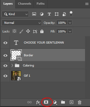
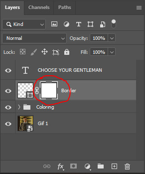
with the layer mask selected (as shown in the second image), use the rectangular marquee tool (M on your keyboard) to draw a rectangle around your text, taking care to keep it just a little larger
as you can see, you'll know when you're perfectly centered through your text layer and vertically on the entire canvas. select your brush tool without deselecting this rectangle (B on your keyboard) and paint the selection with a black brush. this masks that part of the border!

let's add the small square gif that goes at the bottom of the border now. i think the easiest way of doing this is to use the rectangular shape tool (U) again. the size of this gif is 110x110, so create a black square of that size with no stroke. Use ctrl+T to drag it to the center of the bottom of the border (the x and y coordinates don't matter):
now duplicate your original gif layer (ctrl+J) and drag it to the top of the layer panel. right click on it and create clipping mask. this will make it so the gif only appears within the confines of the square we just created. resize your gif by using ctrl+T and, making sure the proportions are locked, drag the corners to the edges of the square.
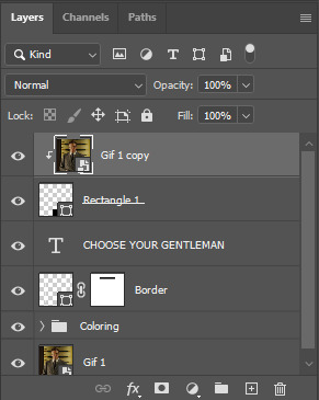
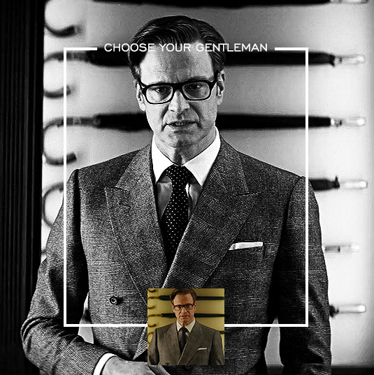
this gif is not colored at all as we only duplicated the gif itself and not the coloring layers. i duplicated those as well and dragged them on top of our small gif, but it's important to make sure those are using the clipping mask as well. you can click this on the properties layer of each adjustment layer to make sure they do.
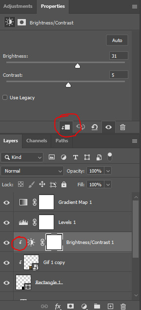
you'll know you've been successful when you see the small arrow next to each of your coloring layers. this keeps them from affecting the coloring of the larger, main gif.
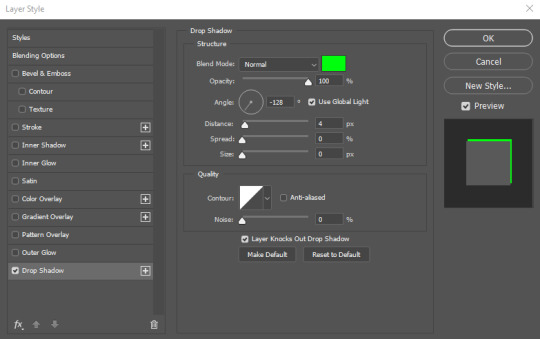
we're going to change the gradient map adjustment layer from black & white to black & lime green (or the color of your choosing). click on that layer and then on the map. this will bring up the gradient editor. click on the small white color stop at the far right end of the gradient and then on the color picker, choose a new color.

the hex code i used for the lime green is #00ff0c
our last steps are the angle brackets on either side of the gif and harry's name in the center. here are the settings i used for those (angle brackets on the left and harry on the right):
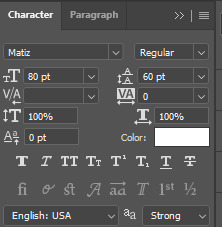
the layer styles for harry's name (double click on the text layer to call up this menu OR right click > blending options):
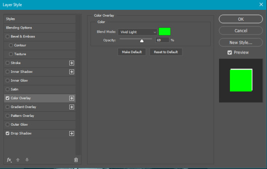
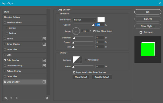
and for the angle brackets:
by now, you know how to utilize ctrl+T to move these layers where you'd like them. harry's name is centered horizontally and vertically and rotated at a bit of an angle and the angle brackets are centered horizontally and i just eyeballed where to put them in relation to the space between the border and the edge of the gif.
this is the complete first gif. what i would do for your own sanity since you have two more of these two create is 1) save it as a psd just in case something crashes and 2) don't convert it to a smart object until you have all 3 gifs completed and are ready to put them together.
the nice part about having the first one done is you've ultimately done the hard part. create your two other gifs, but you'll be using at least roughly the same coloring and all the same text, just with the colors adjusted, so you can drag those layers from your completed first gif to your others as you work on them.
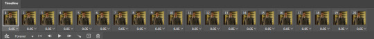
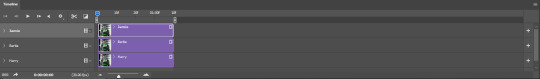
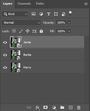
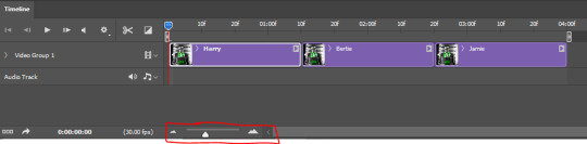
once you have all 3 gifs completed and still on 3 separate canvases (and saved as psds bc this is adobe friggin photoshop and shit breaks all the time), convert all layers on all the gifs to smart objects. this will simplify the final gif and make things much easier.
then, bring gif #2 and gif #3 both onto gif #1's canvas. this is what it will look like at first on the timeline and in your layer panel:
(full disclosure, i'm not making the other two lmao, i'm lazy and i already did it once in a way harder way 😂)
to get the gifs to play after one another rather than simultaneously, you just have to drag them after one another on the timeline!
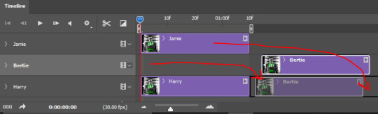
a little bit hard to show the actual process, but you're just clicking the bertie layer and dragging it down to harry's line after the harry layer. then do the same with the jamie layer, dragging it down to the harry layer after bertie. when you're done, it should look like this:
btw, the little slider i circled is what enlarges or shrinks the timeline view, so if you need to see something broken down a bit more/slower, drag it to the right. if you need to zoom out, drag it to the left.
and that's it! export and save your gif!
if you have any questions or anything is at all unclear about this, please let me know! i'm happy to help!
#answered#Anonymous#gif tutorial#my tutorials#gifmakerresource#completeresources#dailyresources#LISTEN. the way i did this 4 months ago was SO FUCKED#i made it SO SO much harder than it needed to be#you know what that is? growth.
97 notes
·
View notes
Text
lovely anons have been requesting a gif tutorial, and while there's plenty photoshop ones out there I think there's only a couple photopea ones (if you dont know photo pea is like an internet photoshop basically) so I thought I'd make a little tutorial on how I do my gifs!
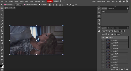
first you're gonna want to use any gif making platform to actually turn your video clip into a gif. I personally use giphy but I know there's a bunch of other platforms for this. then you're just going to open the gif in photo pea either by clicking "open from computer" on the home page or dragging it in from finder (Mac) or files.
IF YOU'RE MAKING A GIFSET: the first thing I do is make sure all of my gifs are the same number of frames. its important to do this if you want all of your gifs to restart at the same time! to do this I just go to the side where all the frames are listed - this one has 29 frames (note: it says 28 on the top frame, but the very first frame is listed as 0, so always add 1 to the top number to know now many frames there are). what I do is find the gif with the least amount of frames and then make all the gifs the same number - depending on what part of the gif I want to keep/delete I'll delete frames from the beginning, end, or both which usually requires some basic math
next, I click on the top frame, press shift, and then press on the bottom frame to select all (unfortunately there's no keyboard shortcut for this I don't think). then I'll click filter -> sharpen -> smart sharpen that way I can freely customize the sharpness of each gif depending on it's original quality. usually I do 200% at 0.5 pixels but I'll adjust if necessary.
now comes the actual coloring of the gif! all of these will be adjustment layers (layer -> new adjustment layer).
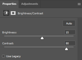
first I'll select the brightness/contrast layer and play around with those settings until it looks good to me.
next, I'll play around with the levels and curves layers until it looks how I want it.

sometimes I'll stop here if it looks good, sometimes I'll play around with the saturation adjustment layer, or in this case I'll edit the color balance to deepen some of the shades that aren't popping out how I want.
IF YOU'RE MAKING A GIFSET: the easiest thing I've figured out for coloring multiple gifs to save time is duplicating these adjustment layers to each gif in the set (layer -> duplicate layer into; it'll prompt you to select the psd you want to add the layers to). when I do this I turn off the visibility for each one and one by one turn them back on (starting with brightness/contrast) and adjust them if necessary.
if I'm not adding text this is where I'll end, but sometimes I like to add texts to more of my creative gifts. usually I'll follow a tutorial (@usergif resource directory has a bunch of good tutorials that can be adapted to photo pea, or I'll just look them up on Tumblr itself). sometimes I like to do things a little simpler, which is what I'll show here.
you're going to click on the T towards the bottom on the left sidebar, type put your text, change your font (photopea has a ton and I'm not too picky but you can download fonts from the internet and upload them), as well as color and size (don't forget to select all of the text when you do this!!) then click on the cursor icon to move the text to your desired placement.
then click on the layer in the right sidebar and select blending options.
I'm going to add a stroke of 1px in black to my text and position it to the center. I do this on every text I add to gifs (even if the text is black, which I ended up changing this one to) to add some extra size/detail.
you're more than happy to stop here, but I like to play around with some of the other blending options until I'm satisfied. sometimes I'll lower the fill to 0-30%, or in this case, I changed the blending option to overlay to get the desired effect. (both under blending options)
I followed the same steps with my second row of text, except I changed the font and then warped the text a bit after placing it where I wanted by T -> warp -> arch and changing the settings.

and you're done! file -> export as -> gif to save it! I also like to do this periodically throughout the process to make sure the gif is giffing if you know what I mean

#gif tutorial#photopeablr#photopea#photopea gif tutorial#mine*#tutorial*#tutorial#gif making tutorial#gif making
40 notes
·
View notes
Note
omg jesus christ how the hell you can sharpen the gif that.. sharp 🥹🥹 im such a fannnn please let me know some tips thank you
Hello, sweet Anon! I’m beyond flattered and honored that you would ask me for giffing tips and tricks 💙 “is he/she mad” sdfghjkl sounds about right - thank you!! 😂
Okay, let’s delve into it without much further ado:
(more underneath the cut)
1. HQ Videos
The most important thing is to get high-quality video files. I usually work with 1080p and got mine from dr*maday.me - you can find other kdramas there as well. It’s the go-to source for most kdrama gifmakers.
2. Brightness/Contrast
Make sure to get some good contrast with a Brightness/Contrast layer. That’s how you get the vibrancy, brightness, and deep blacks to make everything look more dynamic and quite sharp already even before the actual sharpening, though usually the colors end up too saturated and vibrant, so you’ll have to tone those down.
For the first gif in this set I used these settings:
This is what the gif looks like without any Brightness/Contrast layers (but still with all the other adjustment + coloring layers) vs. what it looks like with them:
3. Basic Sharpening
I like to leave the sharpening for last since it fits better into my workflow. For the basic sharpening (two Smart Sharpens) I use these common settings:

This is what it looks like after the two Smart Sharpens:
4. Vivid Sharpen (VS)
a. Full VS
For big gifs that are 540x500px or larger, I do a Vivid Sharpen after the basic two Smart Sharpens, and that’s what I did for the gifs in this set as well since they are 540x600px. I follow this tutorial, keeping the same settings (3.0px for the Gaussian Blur, 30% opacity for the VS group): https://sidonidoneeey.tumblr.com/post/667301663059656704/a-really-nice-anon-requested-a-gif-sharpening
And voila, there you have your beautiful crisp gifs! You could let it stay at that, but personally I also like to add an extra step…
b. Masking (Partial VS)
Hope you are familiar with masking, Anon!
If you aren’t, that’s okay too. Basically, you click on the icon of a circle in a square and a masking layer will appear on your VS group layer (as indicated by the red circle and arrows in the screenshot below). You can use a soft brush on that masking layer to hide and show what you like. Black = hiding the layer effect; white = showing the layer effect. After making the whole masking layer black (by inverting the colors with Ctrl+I), I use a white brush on the spots where I want to apply the VS:
Narrowing down the area of the sharpening is quite useful since VS tends to make gifs REALLY big, and the Tumblr size limit for gifs is currently at 10 MB, so that's something to keep in mind.
I also do it for depth of field (i.e. when the object in the foreground is sharp and the background is soft/blurry). Masking is a good way to amplify that, play with the soft/sharp contrast, and direct the viewer’s gaze.
With Park Sung-woong I found that VS works well on the dips and grooves in his skin, so I just generously used it on his whole body and face; with Woo Do-hwan I feel like VS looks a bit too harsh on his face, so I tried to use it mostly on his body + his hair, eyes, and mouth, leaving out the rest of his face (as best as I could since there's some movement), the way I did in gif 4 with the masking layer looking like this:
Here you can compare the screenshots of a partial VS vs. a full VS:

IMO the second one with the full VS looks slightly too harsh on his skin and darkens his face a bit, which I don't want; the background ends up looking grainier as well.
To get back to the first gif, here are three versions with different levels of sharpening for better comparison:
No Sharpening:
Smart Sharpen x2:
Smart Sharpen x2 + Partial VS:

And here you have the original footage (after cropping and resizing) vs. the final colored and sharpened gif:
...and that's how I did the sharpening for this gifset. Hope you found this helpful, dear Anon!
39 notes
·
View notes
Note
Hi, I'm a big fan of your blog and your gifs in general! I was wondering if you had any tutorial on how you color? Particularly your Wicked and Hadestown gifs look incredibly gorgeous and the colors really pop, and I'm so curious as to how you achieve those effects. Amazing work overall :D
hiii, oh my god thank you so much!! 🥺❤️
i'm happy to show you how i color my gifs but pls note that i basically have no idea what i'm doing, everything i know i taught myself via trial and error and this is just something i found works for me.
that being said, here's a quick (and very messy) bootleg coloring tutorial under the cut!
okay so, when it comes to making gifs and coloring in general, good source material is key. bright and clear videos make the coloring process SO much easier.
i picked an old 2010 wicked oberhausen boot for this tutorial. it doesn't have the highest resolution but the colors translate nicely and the lighting is pretty good as well.
now, this is our base gif cropped and sharpened. i usually want my gifs to look as natural and as close to their base version as possible with just colors and contrast enhanced slightly. baby steps are important here!
first thing i do is add a brightness/contrast layer. these are my settings for this gif:
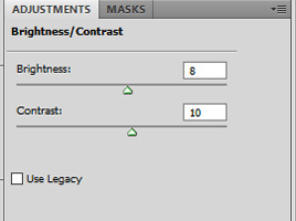
i rarely ever go above 20 with either brightness or contrast. adding too much early on will make your gif look grainy in the end. our gif now looks like this:

not much has changed but a little goes a long way, trust me. next up is a curves layer. i click the little arrow to open the drop down menu and select increase contrast (rgb). afterwards i reduce the opacity. for this gif i set it to 52%.
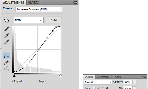
this will darken the gif again but it also gets rid of these white spots on elphaba's dress which is great.

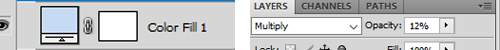
next, we start playing around with colors. i usually use 3 color fill and one or two selective color layers. this really is just playing around until you find the settings that you think look good. for this gif i wanted to enhance the green and neutralise some of the yellow, so i went with two color fill layers first.
green to slightly enhance the green of elphie's skin and blue to neutralise the yellow in glinda's hair.
next we're going with a selective color layer. think of the colors you want to pop. for this gif the obvious choices are elphie's skin and glinda's dress.


i added a second layer to further adjust the greens
and ended up with this gif

i then added another color fill layer, set it to multiply and reduced the opacity to 12
followed by a color balance layer

the purpose of these layers is to slightly "cool down" the gif, meaning they decrease orange/yellow undertones while enhancing the blue and purple ones.
next up is a levels layer to add a tiny bit more brightness

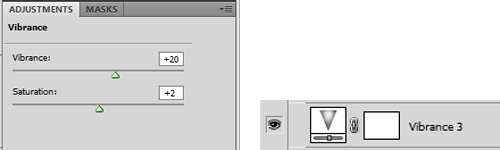
followed by a vibrance layer to make existing colors pop
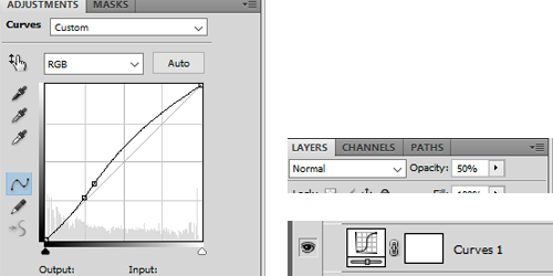
and another curves layer for more brightness/contrast with the opacity set to 50%
our gif now looks like this:
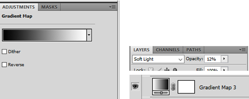
almost done! we're finishing up with a black and white gradient map layer for some more depth
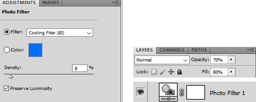
and a cooling filter to further reduce the yellow/orange tones of glinda's face and hair
and that's it!
so, here you go. this is my coloring process most of the time. sometimes i add more layers (on top or in between), other times i use less, it all depends on the specific scene and the mood i'm in lol.
now, could you leave out some of these steps? yeah, definitely. some layers probably don't even make that much of a difference but i like adding them anyway.
you can download the psd here. feel free to play around with my settings and add or delete layers as you see fit. hope this was at least somewhat helpful!
#ask#coloring tutorial#photoshop tutorial#*psd#*tutorial#*ps help#i don't know how to explain things i'm sorry
10 notes
·
View notes
Note
Hey mik! what's the process you use to make lands? They all look super amazing btw
i follow this tutorial but i dont follow it word-for-word
here i can do a quick lil thang
i like to use photoshop for this, idk how to translate it to other programs
i start w a canvas 1000x1000pixels, that way u can get a lotta detail in and then it looks even better when u inevitably shrink it for whatever ur using it for
use shape tool to make a circle. hold shift + click while dragging the tool to make a perfectly symmetrical circle. (or dont im not ur mom)

merge the shape layer down onto a raster layer.
turns into

now ur basically just adding textures n shit. i like doing it Hussie Style and using google images to add texture, basically just taking that shit and bastardizing the hell out of them through fucking around w/ the contrast/exposure/colors/etc. u can also use the photoshop generative tool to generate random texture shit (i love putting in nonsensical prompts to confuse the hell out of it--my favorite results are the really shitty ones that look like terrible collages), but its the same process for each one.
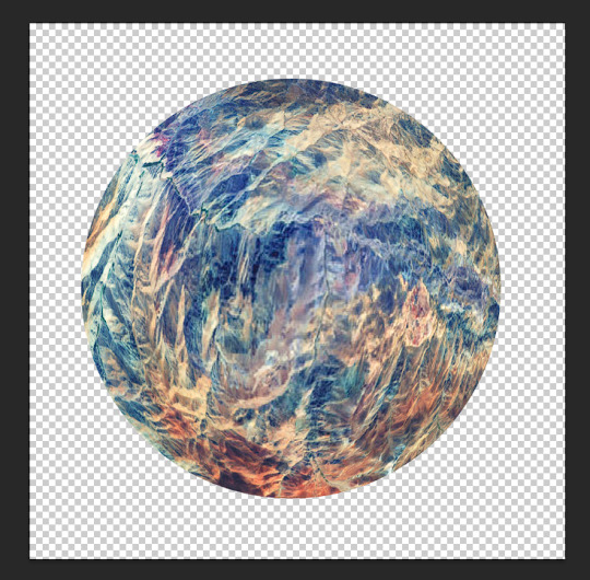
lets make up a planet. Land of Horns and Thorns.
i like to use satellite images to get that planet-y texture. i try to think of a relevant land-type. thorns are triangular, so are mountains. lets grab this image

next what we're about to do is called "transformative use"
copy+paste image on a new layer

right click on the image's layer, select "create clipping mask"
this should be the result:

but its a little flat. so lets make it rounder. i use the Liquefy tool in photoshop, but im sure theres other ways of doing it.
click filter > liquefy, then make sure u have the bloat tool selected. now bloat that mfer to ur liking. its ok if it looks a bit shit right now. when uve bloated it as much as u want, click ok. now u have smth like this
now start messing w/ filters and colors. i try to ascertain the mood im going for with a planet. Land of Horns and Thorns sounds a bit whimsical, but maybe subtly dangerous? so, translating that to color, maybe it's fun and colorful, but like, in the same way those deadly poisonous frogs are fun and colorful. maybe there will be some dark pits as well. lets see what we can do
i start w/ messing around w/ contrast. go to image > adjustments > brightness/contrast. fuck around w it to ur liking. this is what it looks like now
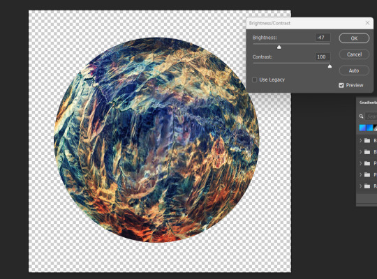
already we're starting to get some of those dark pits i wanted. lets make the colors pop a little more by messing w the exposure.

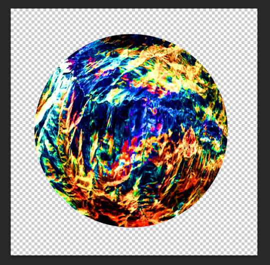
u can also mess w/ the vibrance, hue, saturation, etc. basically all those lil tools in the image > adjustments are ur best friends now. i like to increase the saturation to get that shit-jpeg look u see in homestuck sometimes
now create a new layer. we go back to google images. im gonna look up some closeups of thorns

this works fine. copy & paste. create clipping mask. bastardize the image however u want, similar to the first one. using the liquefy tool helps to get shit into place where u want it.
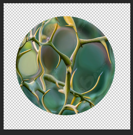
made it a little more abstract.
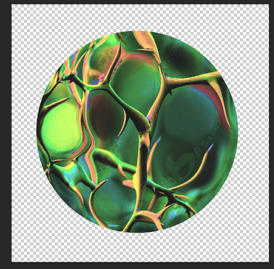
played w/ the color settings. i dont want this one to be as vibrant b/c im going to be using the layer modes. however, i do want to posterize the hell outta this
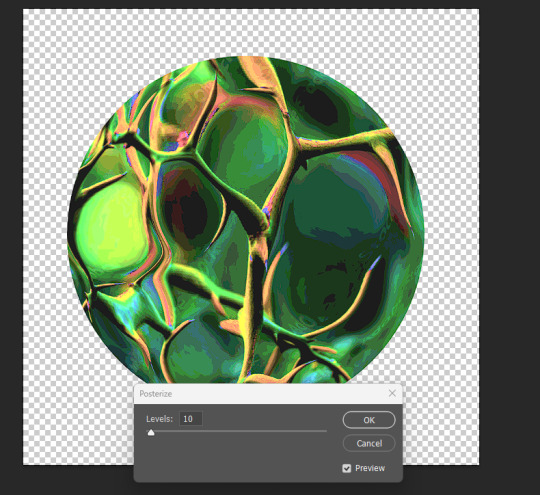
ok i like how it looks in luminosity mode.
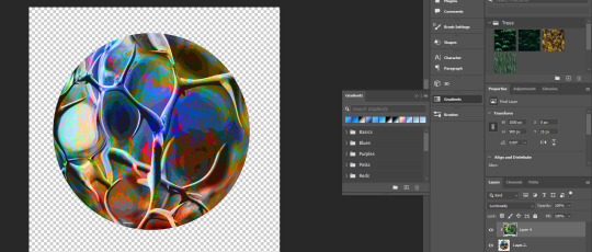
however, i kinda wanna change the colors of the bottom layer now. lets use a gradient map (image > adjustments > gradient map). just hit ok when the prompt comes up, we can detail it in the side panel.
if u just click the actual gradient bar itself, itll open up the gradient editor. there u can make ur own custom gradient and specify the colors n shit. theres also a bunch to choose from.
so, i think that looks pretty fucking cool. i love the contrast, but i kind of want to see what it looks like in other colors too. we head to the hue/saturation tool.

there, i like that. a bright, poisonous color with the threatening blotches of red. now lets make this mfer look like a planet. merge everything into one layer if ya want
the gradient tool is now ur best friend. i like to fuck w the gradients, one of my favorite effects is making a sorta halo gradient (basically just copy the opacity controls i have, im sure u can also google how to do it) and merge the gradient to an empty layer
and, yknow, just mess with the settings
u can add gradients to make it look more like a 3d object. mess w the colors and settings n shit

we add some clouds now. i just use 1px pencil tool. try to use the curvature of the planet to inform how u draw the clouds. think about how u want them to be formed (swirling around the center? stretched out? etc) and think about what u think the atmosphere would be like on ur planet. a completely barren planet like mercury may have no clouds at all. or maybe its like jupiter, where its nothing but clouds? also think about the anemology of the planet. how do the winds form, what directions do they go?
i think the Land of Horns and Thorns sounds like a place that would have a good amount of thunderstorms, so lets make the clouds black. mountains are pretty windy, so maybe the clouds will sporadic but dense.
fuck around w/ it til ur tired of looking at it. then make that fucker smaller (the average mspa panel is 650x450. unless ur planet is taking up the entire page, u can probably get away with smt smaller.) **make sure u have interpolation set to bicubic or nearest neighbor.
and then ur done.
side notes: literally do whatever u want tbh, u can do as many layers as u want, use whatever tools u want. thats pretty much the basic format ive got.
7 notes
·
View notes
Note
hi! first of all, i want to say that i love your gifs so much, you always make such beautiful things. i recently started giffing, and i was wondering if you have any tips about settings or process you usually use in your coloring psds? i'm struggling on what steps i should follow :(
hello ! thank you for taking the time to say this !
i usually never know what to say off the top of my head because i am generally chaotic & do things by whim and instinct rather than any real process, but !!! luckily, i was just talking to a friend about it recently so here's what i got.
photoshop settings- i've mentioned this in my main blog before, if you're not already doing this, load all your giffing steps into an action. if you don’t know how to make an action this handy tutorial tells you how. - change your most used commands into easily reachable keyboard shortcuts on the keyboard. for example, assuming you're right handed, your right hand will be cropping and colouring so you could switch command + (w) to open file>export>save for web to see your saving settings / command + ( ` ) to select the next tab. (i'm on a mac so imagine i used windows alternatives ) by using your left hand.
gif saving settings you might have your favourite go-to settings i.e. selective/pattern & bicubic etc. but just like not all sharpenings are created equal, different gif save settings work better for different sharpening styles. try different combis, the results may surprise you. for example, i used to swear by selective pattern+bicubic sharper when saving gifs, but i switched my sharpening style, and started going for a smoother, cleaner, glowier look, and realised after a lot of trial and error that adaptive/diffusion + bicubic smoother works best for the high value sharpening+gaussian blur settings i'm using to create what i want. the big lesson here is don't be afraid to strip everything down and go back to basics sometimes, it's tedious, but it usually pays off. i tried to find the post that taught me this for you and i can't but this one is an alternative !
colouring - the main things you'll be doing to colour a gif are (i don't always follow these in order but usually i do): a) brighten ( i.e. curves, levels, brightness, i used to add a white balance filter but stopped doing that years ago ) b) deepen ( these would be your contrast/gamma correction & offset on exposure adjustment layer/left arrow thingy of the levels adjustment layer ) c) colour correct, the hardest part ! it's like doing makeup. you'll end up using probably everything, colour balance, curves in the rgb setting (i need to learn to get comfy with this bc i'm not yet, but! soon.), selective colour my bff, hue/saturation & vibrance. there are great tutorials out there, but my most recent game-changer is i've finally figured out how to use the channel mixer adjustment. it helps to focus on a neutral colour in the background of your gif when it has an awful orange/green/whatever filter when using channel mixer (like a white wall or blue sky that has turned gross looking bc of the film's base filter), then adjust and play around until it turns into the colour it's supposed to be. then it will be easier to pile on layers over to colour your fc. i am ofc still learning, i have no idea how colour lookup works (i've read tutorials and still don't understand jvhakjx). d) final adjustments. this is when after the above, you decide whether you want to stylise your colouring, make it more vibrant, less vibrant, give it a tint, brighten again or enhance certain colours before saving! - a great way i got the hang of colourings is to open up colouring psds other people have made and toggle each adjustment layer on and off to see what difference they make to the base, you'll start to understand what the purpose of each thing is and why the layers are in that specific order.
last but not least, it took me 10 years to make gifs the way i do now ! my early gifs were all experimental, i went through so many phases (some i'm quite ashamed of, like the low vibrance/high saturation + high brightness trick i used to abuse. why did i do that.), and i did in fact master each adjustment layer (by this i mean learn to use them to their best potential) one by one. don't get discouraged, be patient with yourself and don't be afraid to try things !
11 notes
·
View notes
Text
So, not sure how many of you remember this, but I've come up with some ideas for it.
First off, when Candace first wakes up in the Mystery Dungeon universe she's deep inside one of the most dangerous dungeons in the area, because of course she is. She nearly gets eaten by a Druddigon, but gets saved by a Mismagius, Kilowattrel and Klefki (not that she knows what any of those are). They escort her out of the dungeon and into the nearest town, Sunrise Cove, which also happens to be where the local Explorer's Guild is located. She's given permission to stay at the Guild headquarters while she's getting her bearings in this new world, and she obviously ends up joining officially because otherwise we don't have a story. Speaking of which, I actually don't have a proper story yet but I do have some characters.
So the Guild is called the Whirlpool Guild, and its Guildmaster is an elderly Empoleon named Lester. He's basically a big jolly grandpa kind of guy who doesn't take himself too seriously, but it's clear from his scars and the way he carries himself that he earned his position, and could probably still hold his own if he ever had to.
The Rescue Team that saved Candace are Team Mystic, consisting of Astrid the Mismagius, Bullet the Kilowattrel and Jangles the Klefki.
Astrid is Lester's second in command, and is very stoic and businesslike in contrast to her boss's more playful attitude. But serious doesn't have to mean unkind, and she's got a bit of a reputation as the honorary Guild Mom.
Bullet's the Head Training Instructor for new recruits, so if this were an actual game you'd be seeing a lot of him during the tutorial section. He's extremely loyal to those who've truly earned his respect, especially his teammates and the Guildmaster.
And then there's Jangles, the Keeper of the Keys, who's basically in charge of the Guild's security. They take their job very seriously. Also, they have a not-so-secret crush on Astrid, because I thought it would be cute.
On to Team Buster, Candace and Lena act pretty much how you'd expect based on their source material and the fact that they both have amnesia, while Nugget is both their excitable little brother figure and their guide to the new world they've ended up in, particularly what exactly Pokemon even are.
Team Buster has rivals in the form of Team Venoshock, consisting of Sting the Hisuian Sneasel, Harvey the Grafaiai, and Sprout the Oddish.
Sting initially seems like your classic bully towards Candace, but it quickly becomes apparent that not only is she not really antagonizing Candace in any substantial way, but she's actually looking out for her in a sort of roundabout fashion. She's also convinced that Guildmaster Lester is hiding something and thus doesn't fully trust him or Team Mystic.
Harvey on the other hand is pretty much exactly what he seems like; an easily offended hothead who isn't too bright and prefers to follow Sting's lead. He and Lena butt heads a lot.
Then there's Sprout. He's... well, he's kind of a scaredy-cat and doesn't have much self-confidence. He actually only joined the Guild because Sting and Harvey saved his life on their first mission and he wanted to pay then back for it. Still, the fact that he's still around and actually doing a decent job says a lot.
Now for some of the residents of Sunrise Cove.
Usually in the town square you'll find a lute-playing Pikachu named Ben. He's always got a new song to play or story to tell. He also knows a lot more about the lore surrounding the main plot than a random musician probably should.
Then there's Rusty, the best postman in the world, who is definitely an ordinary Delibird and not a poorly disguised Iron Bundle, honest!
The bank is run by Silver the Gholdengo. In his defense he was named that before he evolved and didn't feel comfortable changing it to something more fitting.
A Sawk and Throh named Stan and Lee run a dojo where they teach Moves that you can't learn just by leveling up. No one's sure exactly what their relationship is, and as is typical in small towns there is much speculation.
The Kecleon shops in dungeons are still thriving as usual, but around these parts they answer to Viola the Tsareena, who runs the general store in town. Considering what Kecleon are like in the PMD universe, one can only imagine how strong she must be to have that kind of power over so many of them.
Over by the docks is Cap'n Salty the Perrserker, an old sailor who takes Rescue Teams of sufficient rank out to any dungeons you can't reach by land.
And also by the docks is the Crashing Wake, a diner run by Meloetta of all Pokemon. Nobody's entirely sure what's up with that, but she serves the best food in town so they're not about to complain.
Also of note are two regulars at the Crashing Wake, a Dewott named Macy who's clearly infatuated with Meloetta but doesn't have the courage to actually make a move (can you say Long-term Sidequest?), and a Whimsicott named Nimbus who may or may not be a notorious pirate captain.
#pokemon mystery dungeon#pmd ocs#phineas and ferb#ducktales#candace flynn#scorbunny#lena sabrewing#mimikyu#dedenne#empoleon#mismagius#kilowattrel#klefki#hisuian sneasel#grafaiai#oddish#pikachu#iron bundle#delibird#gholdengo#sawk#throh#kecleon#kecleon shop#tsareena#perrserker#meloetta#dewott#whimsicott#guildmaster lester
11 notes
·
View notes
Note
Hi!
Can you please do a tutorial on how you made this gifset (https://www.tumblr.com/pensbridgertons/729348005153685504/swanfire-appreciation-week-2023-day-7-free?source=share)?
Your gifs are gorgeous!
hello!! thank u sm!! <3
so im just gonna explain my process for the two types of gifs in the set (all of this done with PS CS6) (also i'm bad explaining things so bear with me pls <3)
for the lyric gifs (which were inspired by this gifset):
i started by making up a template for they layout that ended up looking like this

i got the play bar/song title template from here, and then just used the same font to add the "playing from playlist" text (and then also for when i filled in the lyric text). i used the rectangle shape tool to draw a square the size i wanted for the album cover spot (just as a place marker for where the gif would go), and used a rounded rectangle shape tool make the lyrics box, and for the color fill i used a light grey to dark grey gradient. in terms of determining the look, i was very much going off of the set i was inspired by and trying to recreate that look.
for making the gif, i started with my base bg gif shot. i used a gradient map to make it a solid color, applied my other brightness/contrast/etc adjustments, and converted it to work in timeline (i started in frames bc thats what i normally work in), and then applied noise (monochromatic, 5%) and gaussian blur (radius 0.8). i then made a new layer that i colored to match the blue or green of the gif i was working on, and lowered the transparency until the gif looked a little more flat/solid colored but you could still see the gif thru it (ended up being 46% opacity). i then copied the template over to the doc on top of the gif. this is what my doc looks like so far:

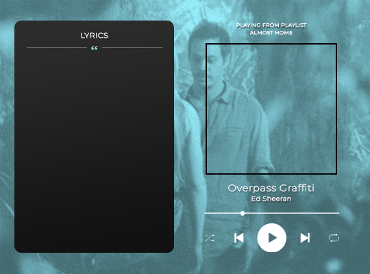
(the lyrics bar is the rectangle on the left, music player is everything a part of the play bar/text on the right)
the album cover gif was next, and for that i just made a second gif (either just one shot or two blended together depending on the gif), cropped it into a square, and resized it to fit the square template i had made. i then copied that gif file to the main gif doc, and moved it over the spot my template marked off and then hid the square border. after that, all thats left is adding the lyrics on top of the rectangle and changing the music player text to match the song (in the ref image above i have already changed it). for the lyrics, i chose certain lines i wanted to highlight and changed their color to match the color of the rest of the gif. and thats it!
for the song list gifs:
i started by making three different gifs that i was going to transition between, making each one a different color (blue, green, or b/w). for the transition, i followed this tutorial (just gonna share that instead of explaining it myself, they do a much better job than i would <3).
then for the song list, i used the same rectangle i had made for the lyrics gif. in order to make it into a song list like a playlist queue, i used the line tool to draw lines across the rectangle (i made their color light grey to make them subtle), spaced them out to the distance i thought looked right for each song spot and then copied those lines along the rest of the rectangle, making sure they stayed evenly spaced. and because i was working in frames, its important to make sure that all the shapes have unify visibility and unify layer position turned on so they are present the whole gif as it plays. i then filled in the songs i wanted to list in the spaces between the lines, using the same font as before.
and then finally, to go along with the transition, i included a lighter grey rectangle to make it look like the song was being selected. for this i made a rectangle the size of one of the song slots, positioned the layer under the text, and made it a lighter grey so it looked like the song was highlighted. to make it change between songs, bc i was working in frames, i made three copies of the rectangle layer, one for each song, and made them all invisible. then, i selected the frames i wanted the first rectangle to be visible on and turned its visibility back on. i wanted it to look like the selection was what caused the transition bc it was switching to a new song, so i did some overlap with when the rectangle changes. basically, i have gif 1 2 and 3, and so for the highlighted song for gif 3, i selected the last three frames of gif 2 (bc it came before gif 3 in the loop) as well as all of the frames of gif 3 excluding the last four (leaving one frame blank, and then the last three being a part of the next one) and turned on the visibility for the rectangle, and then repeated this for the other two rectangles/gifs.

for the playlist cover gif, i just did a regular gif making/coloring process, added the text, and used a film grain gif overlay over the top (i dont have the video source anymore, but you should be able to find some just by searching film grain overlay).
and that should be it! hopefully this is helpful to you!! i know this is kind of wordy/rambly so if you want anything cleared up/explained better feel free to let me know <3
0 notes
Photo
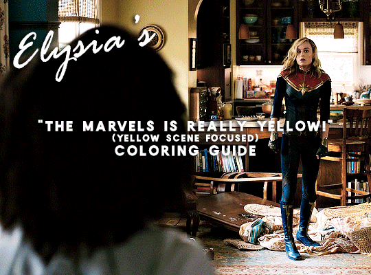
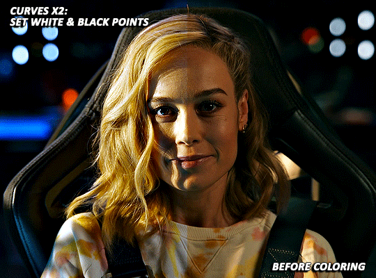
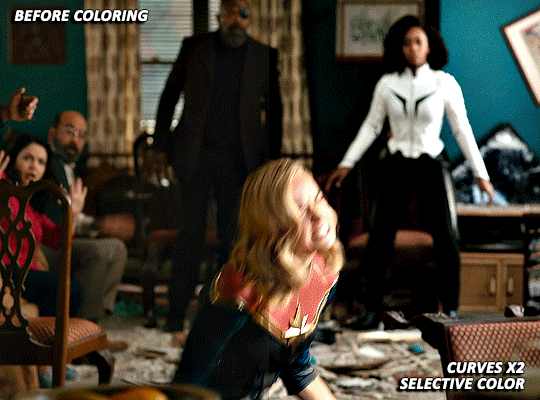
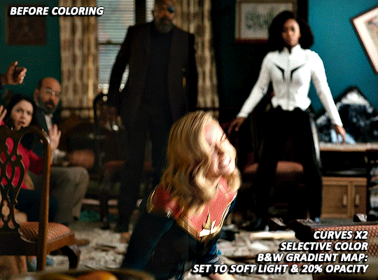
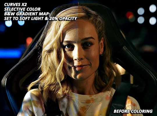
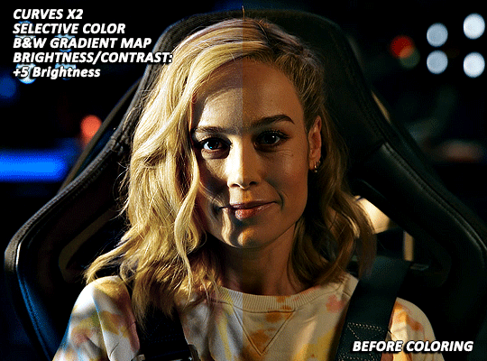
A few days ago (last week actually 🙈) @nikolatexla sent me a lovely message about my Carol in The Marvels set and asked for some guidance about my coloring process for that set. So, what follows is a fairly general guide to how I color, which a special emphasis on how I tried to combat the extreme amounts of yellow in a lot of The Marvels footage.
(And, just as a quick fyi, this not a full gifmaking tutorial--I’m focusing only on coloring and assuming that readers have a working knowledge of Photoshop.)
The Footage: File quality isn’t technically a part of coloring, but I do my best to work with only the highest quality footage options available to me. For trailers, this means that, excepting the stuff I am 100000% out of my mind excited for/simply cannot wait to gif and that I am fine giffing in fairly small dimensions, I wait until a non-YouTube copy is available. The Carol set in question was made using footage from a 1080p iTunes trailer download.
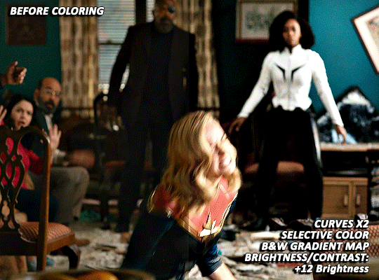
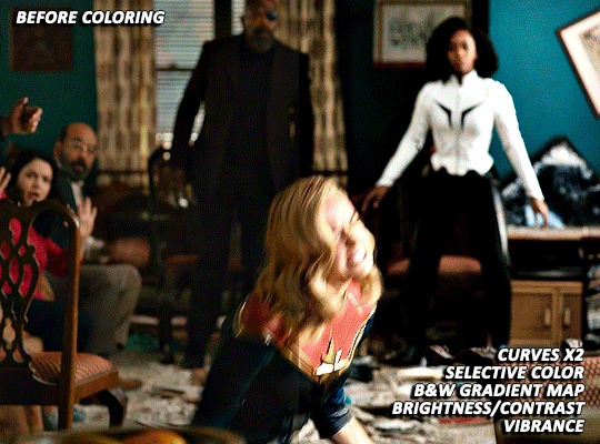
Layer Overview: This can vary slightly from gif to gif, but, when coloring, I pretty much always use: Curves x2, Selective Color, Gradient Map, Brightness/Contrast x2, and Vibrance. For gifs in need of more extensive color correction, I often add a second Selective Color layer and/or a Photo Filter layer.
Curves: All my colorings begin with two curves layers. The first, on the left, is used to set the white point. The second, on the right, is used to set the black point.
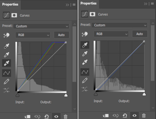
Using the appropriate dropper, I click on the brightest/whitest or darkest/blackest points of my image until I find a point that produces a result I like. For scenes with strong single-color tinting (heavily yellow, heavily blue, etc.), setting the white point can involve a bit of trial and error as heavily tinted white points can sometimes result in very weird or overly extreme results. Setting the black point is less likely to produce such extreme image transformations, but, if I’m struggling to find a point that doesn’t make the image darker than I want, I may lower the opacity of this layer.
As shown below, how much these layers do varies depending on the scene:

Selective Color: For selective color, I focus on whatever colors are most prominent within my image/whatever colors I want to reduce or enhance. I don’t have any particular formula for this, just dragging things up and down until I start to see changes I like. With super yellow/orange scenes or with scenes where your characters are looking just extra orange for some reason, this means focusing on the reds, yellows, and magentas. I also always increase the blacks: +2 magenta, yellow, and black. (For most Carol in uniform gifs, I also increase the amount of cyan and reduce the amount of yellow in the Cyans and Blues). As reducing reds and yellows in an image can leave white characters looking either pinker or greyer than you’d like as well as lead to the white washing of characters of color, I sometimes click over into another tab or image, wait a few minutes, and then go back to whatever I’m working on to see if I still think the coloring changes I’ve made look good. This is ALSO why I often add a second Selective Color layer after I’ve added all my other coloring layers. (I’ll discuss this more later on).
(Further, specific to Carol, reducing the amounts of reds and yellows in the image can help her face look less orange, but also does make the red parts of her uniform less vibrant. Layer masks can help mitigate that, but it’s harder to pull off on higher movement shots, so less red/orange image vs. less washed-out suit is mostly something that you will have to balance according to your personal preferences.)
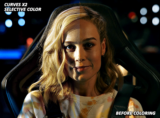
Gradient Map: I add a Black and White gradient map, make sure the method is set to classic and that the layer as a whole is set to soft light and 20% opacity. It’s subtle, but I think this helps given the image some extra depth and contrast.
Brightness/Contrast x1: For my first Brightness/Contrast layer, I tend to play things super safe. It’s easy for the light points in your image to start looking completely blown out, which, while sometimes unavoidable in order for the rest of your image to be visible, is something that I prefer to avoid or minimize when possible. (And I like to see what everything looks like before I potentially start more dramatically dragging things around on my second Brightness layer 😅).
Vibrance/Saturation: My standard settings for this layer are +5 Vibrance and +3 Saturation. The only time I really add more is if I’m making a colors focused set. For sets where I’m pulling a lot of yellow/red tones out via selective color, this layer can help make things look a bit more alive (but also is the main reason why I sometimes go back in with a second selective color layer).

Brightness/Contrast x2: Now that I’ve got my coloring 85% done, it’s time for some more brightness!
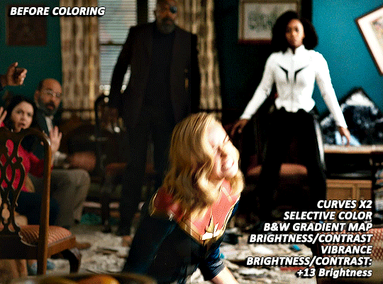
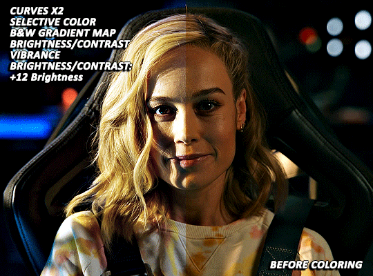
EXTRA TWEAKS: At this point, both gifs are at a point where, depending on the set/my mood/my energy level, I might post them as is. But they’re also not exactly where I’d really love them to be. Both are still a bit more yellow than I’d like and are, I think, good examples of the different ways I try and tackle this sort of thing. For both gifs, I’m going back in with some more selective color to further try and tamp down the yellow/orangey tones in Carol’s skin.
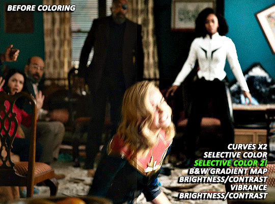
With the first scene, Carol can still skew somewhat orange/pink at times, even after the extra selective color layer, but, due to the red in her suit, there is limit to how far I can take things. And, while a Photo Filter layer could theoretically help things go a bit farther, I found that the cooling/blue filters I tried all tended to push Carol more towards the pink, rather than natural looking, end of things.
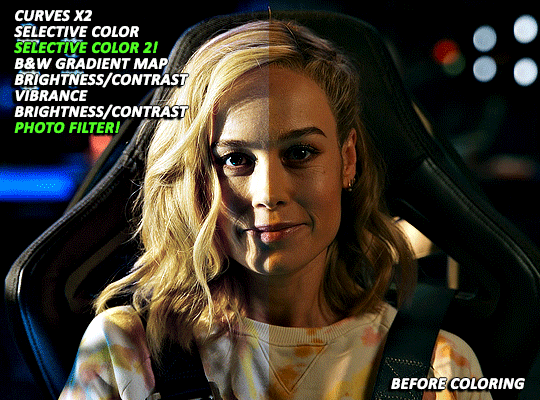
With the second scene, however, I did find a photo filter layer (Cooling Filter 80, with the layer set to 20% opacity) helpful in getting my coloring where I wanted it to be. Carol’s hair and skin doesn’t look as yellow as it did before and the rest of the image still looks fairly natural, rather than venturing into extremely blue or pink territory.
Final Thoughts: I know this has gotten long and is probably a bit more vibes (rather than exact adjustment instructions) heavy than some tutorials, but that is basically just how my coloring process is. I don’t think there’s any exact right way to color, but rather just what you find works for you and appeals most to your specific sensibilities. When we encounter new projects/pieces of media (even within already familiar mega franchises like the MCU), there also tend to be unique quirks that we have to get used to. I don’t think I’ve fully figured out coloring The Marvels at all (it was such a headache that, after three gifsets, I was 10000% done and didn’t open Photoshop for multiple days), but I do think that my experiences with other extreme color grading projects has helped me figure out how to at least start tackling it 🤷🏽♀️😅.
61 notes
·
View notes
Text

SCHAFER’S GIFFING TUTORIAL
hello guys! since im doing followers celebration and i think “why not make a gif tutorial too?” i started making gifs around this time last year, and here’s my giffing tutorial!
this tutorial will have basic giffing + coloring tutorials!
BEFORE YOU START:
make sure your video is at least 1080p, i always use 1080p video for my gifs, i think mkv works better than mp4, but it works either way.
filesize can be really big like almost 30gb if you’re giffing from a movie, so it’d be better if you have an external drive to save your files.
i use potplayer to screencap, pls download it from their official site, you dont want to get virus on your laptop.
i use photoshop cc 2019
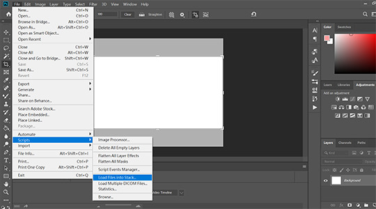
STEP 1: LOAD YOUR SCREENCAPS IN
go to File > Scripts > Load Files Into Stack then a window will show up tell you to choose your files
STEP 2: CONVERT VIDEO TIMELINE
click “Convert video timeline” then click three little boxes on the left corner in the pic.

STEP 3: REVERSE YOUR SCREENCAPS
once you converted to video timeline,
1. click three little lines highlighted by red box, then click “make frames from layers”
2. click three little lines again then click “select all frames”
3. click three little lines again then click “reverse frames” (cause when you converted your screencaps to video timeline, it’s reverse, so you need to do this step to reverse it back)

STEP 4: CHANGE YOUR GIF SPEED
i think .05 works the best since .04 is too fast and .06 is too slow.

STEP 5: CROP AND RESIZE
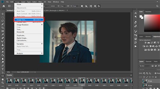
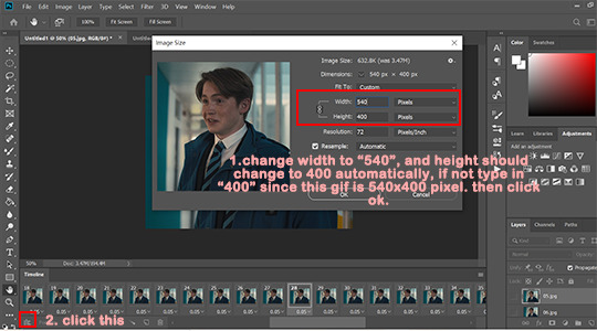
most of my gifs are 540x610px or 540x400px, but sometimes i do 540x540px too. whatever you choose, pls make sure that width is 540px. in this tutorial, i go with 540x400px.

once you cropped your gif, go to Image > Image size > set width to 540 pixels and height to 400pixels, it should change to 400px automatically when you typed 540 into width but if not type 400px manually.
then click okay and click three little boxes on the left corner.
STEP 6: SHARPENING
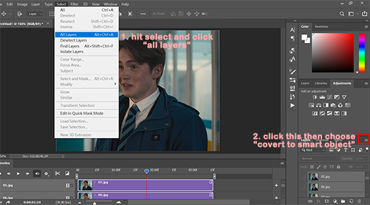
go to Select > All Layers, and click three little lines on the right > convert to smart object.
after you converted your gif to smart object, go to Filter > Sharpen > Smart sharpen.
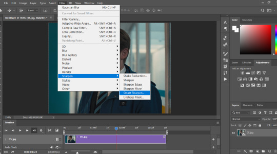
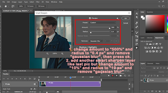
my personal sharpening setting has six layers in total, we’ll be adding two smart sharpen layers first.
layer one: amount: 500%, radius: 0.4px, remove: gaussian blur
then click okay and add another smart sharpen layer.
layer two: amount: 10%, radius: 10px, remove: gaussian blur
then click okay
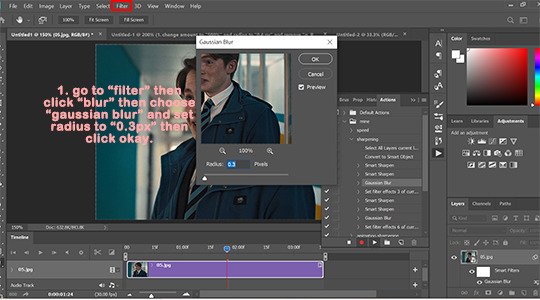
next, go to Filter > Blur > Gaussian Blur > set radius to: 0.3px then click okay.
then add two more smart sharpen layers and one more gaussian blur layer
layer 3: amount: 500%, radius: 0.3px, remove: gaussian blur
layer 4: amount: 5%, radius: 5px, remove: gaussian blur
blur layer 2: radius: 0.3px
i ususally do step 1 to 6 with action so it saves me a lot of time since once you made an action, you only need to click play action.
STEP 7: COLORING
before we start, i wanted to say that there is no correct way to color gifs, so my coloring process may not be suitable for everyone. and i dont use psd, i color every single gif by hand since every gif has different lightning.
i ususally go from 1 to 5
1. Brightness/Contrast
i usually only adjust contrast unless the gif is super dark, my contrast is usually around 20-40 depending on the gifs.

2. Levels
levels is basically lifesaver and where you make most dramatic change here, like if the gifs is super dark or yellow, this is where you fix them.
i use black dropper to click on the darkest part in the gif and white dropper to click on the lightest part in the gif.
and remember that some scenes are just really dark, don’t over do it, it’ll make your gif look terrible.

before/after Levels:
you can see that we remove the ugly yellow and brighten it.
3. Vibrance
i only adjust Vibrance, usually around 20-35, sometimes i’d adjust saturation too. and pls DO NOT OVER SATURATE IT, over-saturated gif will look lousy and terrible if youre not making smaller gifs like 268x268px
4. Color balance
i like my gifs look white/blue/cold ish, and here is where i cast the spell i mean make adjustment.

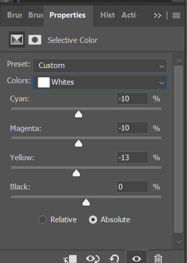
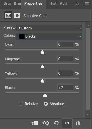
5. Seletive color
most of the time i only mess around with color black and white here, black: to add more contrast, white: to make white even brighter. sometimes i’d adjust color red too, if a charater’s face is too red, adjust color red’ cyan.
STEP 8: EXPORT YOUR GIF
go to File > Export > Save for Web (legacy)

make sure your gif is under 10mb since 10mb it’s tumblr’s gif size limit, and you can only post ten gifs in a post.
my save settings is usually Selective and Diffusion, and make sure transparency is checked.
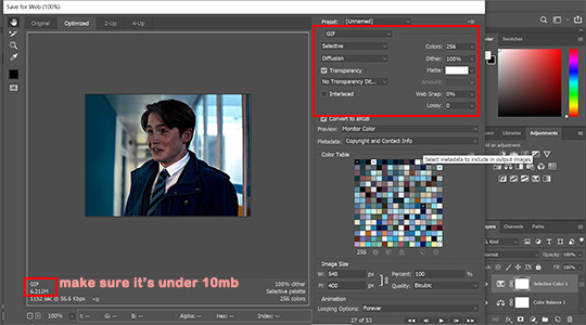
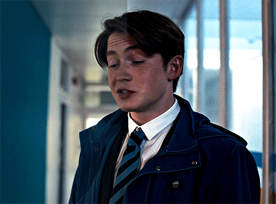
here’s the result:
that’s all! if you have any question pls don’t hesitate to send me an ask!!
#gif tutorial#ps tutorials#coloring tutorial#tuserkay#userrlucie#userrsun#usermarcy#userhers#userkarlo#userannalise#olivialook#userkosmos#userkarolina#userkraina#tuserheidi#userauden#usersem#***#*tutorial
306 notes
·
View notes