#inkscape tutorials
Explore tagged Tumblr posts
Visit Tumblr Blog
Explore Tumblr blogs with no restrictions, modern design and the best experience.
Last Seen Tumblr Blogs


Fun Fact
Total funding amounts to $125.3M.
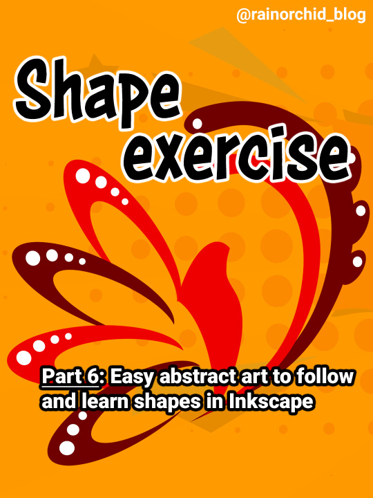
Text
In this tutorial we'll show how to create a tiled texture or pattern in Inkscape, using a fleur de lis design surrounded by an ornate border.
0 notes
Text
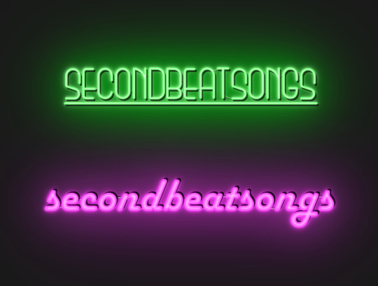
how to make neon signs in inkscape!
I lost my mind and spent a large amount of hours yesterday perfecting my methods and figuring out how to do this, so if you're interested in making something like this:

here's how to do that!
step 1: cover your workspace in a dark grey rectangle, and lock that layer down.
I've been using 80% or 90% grey - you want this so you can see your neon effect, but you don't want it entirely black at this stage, or you won't be able to see your shadow layer.

step 2: create some text!
pro tip: rounder sans-serif fonts look the best for this, because think about what a neon sign is made of - it's tubes, bent into shapes! so if your font or design looks too sharp and pointy, it'll feel unrealistic when you make it neon.
(this is, of course, a perfectionism thing on my end, so feel free to ignore any and all rules in order to make the thing that you want to make. as with all art, you can do whatever you want forever!)
bonus pro tip: if you, like me, have over 1400 fonts installed and programs tend to lag when you browse through all of them, nexusfont is a great free software that lets you sort your fonts into categories, search them, and preview what any text looks like in different fonts! I love it. it is my best friend
now I'm going to do this with a few different fonts, so that you can see how it works with them. so today, I'm picking Futura Round, Harlow Solid Italic, and then to challenge myself, Beauty School Dropout and Block

make the text white, and also select the text and go to Paths -> Object to Path, because some things don't work right if they're not paths.
let's start off easy with Futura Round!
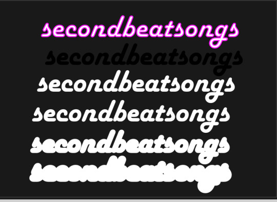
Step 3: duplicate your text layer
now bear with me here. but you need to take the text you're working with, and either right-click duplicate or copy/paste the layer until you have seven total copies of the text you're working with.

arrange them like this, making sure the top one is the first layer on the list (and so on), and then in the layers tab, label them like so:
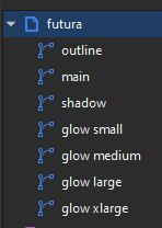
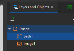
pro tip: if you don't have the layers tab open, go to Objects -> Objects and Layers, and that'll pop it right up
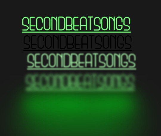
Step 4: blur time!
switch to the Fill and Stroke tab, and make these changes to the paths:
glow small: 15% blur, 100% opacity
glow medium: 20% blur, 90% opacity
glow large: 50% blur, 70% opacity
glow xlarge: 70% blur, 70% opacity
your workspace should now look like this:

this is good!
pro tip: these numbers are just loose guidelines! at the end, mess around with everything to make sure that the glow looks right to you! nothing is an exact science
Step 5: shadow and outline
for the shadow layer, make it solid black, and then change the opacity to 50%
for the outline layer, we're doing something fun and weird. so right now it's a fill object, but we want it to be an outline instead! so let's hit the X in the lower left to make it empty, and then shift-click on...for the sake of this, let's say blue. to make our nice blue outline.
now's the weird part
now. use the align tool (Objects -> Align and Distribute), select the outline layer and the main layer, and align them so the outline text is exactly centered on the main one.
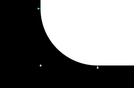
then go to Paths -> Path Effects, and when the tab opens, select just the outline layer, then click the drop-down arrow in the Path Effects tab and select Offset
here's our goal right now:
we want to offset the outline until it fits inside the text underneath it, and also mess with the stroke layer settings until you have a nice thick outline that doesn't overlap itself.
mess around with the plus and minus buttons. there are no exact numbers here; you just have to know when it looks good! but for me, the settings were a -0.34mm offset, with a stroke width of 0.700mm
this is roughly what you want it to look like:

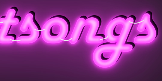
now, with the outline layer still selected, blur it out just a bit until it looks fuzzy, and like the white center is a highlight rather than a separate layer. for me, the right number was about 8.3% of blur, to get a result like this:

Step 6: layering and changing colors
okay! at this point your work should look something like this:

you now want to select every layer except the shadow layer, and use Align to center them all on top of each other.
pro tip: make sure to untoggle "move/align selection as a group", otherwise this will not work.
you should now have something that looks like this, with the shadow layer sitting all by itself somewhere off to the side

now's the fun part: colors!
since we've decided that this neon light is going to be blue, it's time to change the glow to reflect that!
here's what it looks like when you change all of the glow layers to be that same, #0000FF blue as the outline layer

and here's what it looks like when you take the glow small layer and make it just a bit lighter (#4343FF) using the stroke and fill tab

in general, mess around with the layer colors until you like how they look! I find that it generally looks better if the glow small layer is a bit lighter, and the glow medium layer is as dark as the original color. everything else is fair game.
also the main layer can stay white (if you want it to seem very bright), or you can make it a very very light blue if you want it to be a bit more subdued.
Step 7: final steps
take your sad, neglected shadow layer, and move it slightly up and to the right of your main layer, so that it works...well, basically like a drop shadow.
then take your original rectangle, and switch it to 100% black.
now. gaze upon your masterpiece

that's a good neon sign if I've ever seen one.
but now. now's when we lose our minds
Steps 8-??: perfectionism and nonsense
so let's move the Futura one aside (and hide it! inkscape lags if there are too many blurry layers visible at once, so hide anything you're not using!), set the rectangle back to grey, and move on to Harlow Solid Italic.
I've sped through a few of the steps here (out of order) so you can see what I'm doing. I've added outlines to the large glow and xlarge glow, and bumped them up a bit so they'll have a larger glow area in general

this time I've made the large glow a little bit lighter than the xlarge glow and medium glow, and made the main layer a very pale pink instead of just white. I also blurred the outline layer just a bit more, because this font needed a bit more fuzz to make it look good.

hell yeah. this rocks.
now, one detail for perfectionism: in neon signs IRL, if you look closely, there are wires attaching them in the back, often connecting each letter to the next. so...let's do that!
get your pen tool, set it to spiro path, and then make little droopy lines connecting each letter.
make these thin, 100% opacity, and a very light (almost white) grey color. then group all of them together, and move this group under the small glow layer
pro tip: some of the cords might go mostly through the shadow layer. if this is the case, just put the cord group one layer above the shadow layer instead, and then it'll be fine. but you might make the cord color a pale-greyish pink to make it look like there's glow hitting it.
ultra advanced technique: duplicate the cord group, make it black and 50% opacity, position it slightly up and to the right of the original, and then move it one layer below it. you've got cord shadows babey!

lookit that. stare at that beautiful perfection. I love it. this brings me joy.
and now: the one that will be the most work
let's gooo Beauty School Dropout!
this one I'm using as an example for what to do with a font that's a bit too pointy to look realistic

this font is really fun and bendy, but the ends of the letters are flat instead of rounded, and the corners are a bit too sharp. so...let's fix that!
now, there are several ways we can do this (after doing Object to Path ofc).
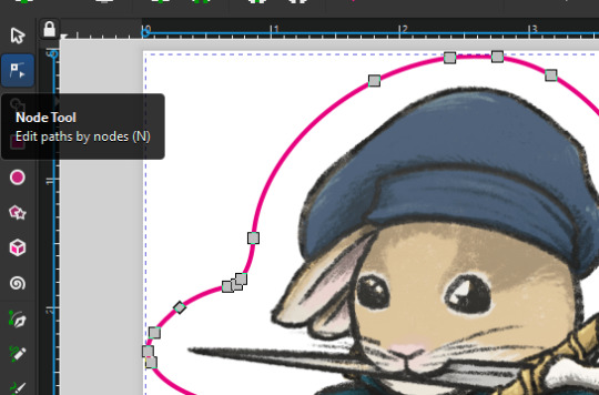
one way is to edit the path yourself, going slowly, and making sure everything is perfect, editing the nodes individually.
or, you could select the text layer using the node tool, then click the button in the top bar labeled Add Corners LPE, and then drag the little circles and triangles around to smooth out the corners
I've decided to do the LPE method, but the problem here is that if you apply the LPE effect before making sure all of the corners look good nodes-wise, it's hell to try and fix it. so before LPE-ing, look at all the spots that you're going to apply the effect, and make sure each has one point at each sharp corner, with no weird overlapping bits. okay? okay.
also for the line beneath the text, it looks like it's made up of a bunch of different segments

and since I want to keep this line because I think it looks cool, we're going to have to deal with that, and make sure that it's all one solid piece, otherwise the outlining won't work. so I've gotta delete all the extra segments, and then move the points on just one of those segments until it's the full original line width, before rounding those corners as well.
basically I've got my work cut out for me here, this will all take a bit.
...aaand an episode and a half of Supernatural later, here's this!

look at how nice and round that is! perfect for the rest of the neon process
and with cords, shadows, layering, etc

hell yeah.
more things: it's block font time
let's make an outline-style neon sign!
my seven layers:

for all but the last two, I've not used the fill option with them at all - I have simply used the stroke outline.
now don't be worried! the stroke-to-path still works just the same way even using an outline to begin with! so it's easy to get an outline of an outline, and do the offset thing just like you did before
however, because this font is more complex-looking, there will probably be some errors when you offset it

for example, it didn't fully outline the second half of the Os, so I just copied the left halves, mirrored them, and replaced the right half with the complete left half
pro tip: keep in mind that you have to re-apply the offset to any bits that you add to the outline layer!
doing the same steps as last time, editing the glow blurs as I see fit, once again we end up with beauty and perfection.

another thing you can do: turn off the lights!
I'm going to use Beauty School Dropout and Harlow for this, but after making your beautiful neon signs, here's how to make it look like a turned-off sign, for if you want to make...idk, a gif of a light turning on and off, or a burned-out sign, or something like that.
so start with (ideally, duplicated copies of) your neon signs:
and then simply delete every glow layer, change the outline layer to 90% grey and your main layer to 70% grey, change the cords' color to a darker shade of grey than whatever it already is, and lower the opacity of the shadows by about 10-15%.
doing that, you end up with this

bam! lights turned off!
last thing: logos and other stuff
you can make neon signs with images as well as with text! the steps are essentially the same, though you may have to do more editing to make it look good, and use simplify on the path if it's too detailed.
and if you're using anything besides an .svg, you first go to Paths -> Trace Bitmap to turn your image into a vector! but unfortunately I've already used 29 images in this post, so here, just look at this Keith Haring thing I made as an example:

is it messier than the text? yeah for sure. does it have some pointy bits I could smooth out more? definitely. but, I've watched three episodes of Supernatural today, and that is more than enough time spent on this. so this is what you get.
but yeah, that's how I make neon signs in inkscape! I used to do it in GIMP, but this works much better, and looks so nice and clean! <3
(man, graphic design really is my passion)
#tutorials#inkscape#reference#neon#graphic design#tbh this is definitely for my own reference too because I know I will eventually forget this process#but I want it to also be useful to other people#so here!#inkscape tutorial#enjoy#graphic design is my passion#tutorial
137 notes
·
View notes
Text
Resources Find: A YT Channel that does short tutorials about using programs for creating, and other skills - drawing, photo editing, 3d modeling, web stuff...
I was looking for a short overview video of InkScape and found this channel. judging by that tutorial, this channel is going to be useful.
3 notes
·
View notes
Text
Tutorial: SVGs for sticker printing
english version over here
Desde que empecé a hacer stickers me pasó que varias amistades me comentaron que tienen problemas para armar la versión vectorizada para corte de una ilustración. Y para mí es fácil. Yokesé. Les cuento cómo hacerlo acá abajo.
Lo que necesitás
Tu software de ilustración de preferencia (yo uso Procreate)
Inkscape (gratarola)
5 minutos libres
Paso 1: Las imágenes
En tu software de ilustración favorito, hacé tu dibujito. Exportá eso como PNG.
También vas a tener que dibujar por dónde querrías cortar el sticker en negro, y rellenarlo de negro, y exportarlo como PNG.
En Procreate yo hago todo esto en un mismo archivo y uso la función de exportar todas las capas visibles como PNG... porque paja.


Deberías terminar con dos archivos, uno que tenga la silueta por la que querés cortar y otro que sea la ilustración.
Paso 2: Trazado en Inkscape
Abrí el archivo de tu silueta en Inkscape. Andá a Path > Trace bitmap. Asegurate de que esté seleccionado tu PNG a la derecha, y te va a aparecer a la izquierda una vista previa de cómo quedaría tu SVG. Podés jugar con los settings un poco si te parece necesario, pero yo casi nunca tengo que tocar nada.
Cuando sentís que está todo en orden, le das Apply.


Felicidades, ¡creaste tu SVG! Volviendo a la pestaña de Layers and objects vas a poder ver que además de la imagen, ahora tenés un path. Podés borrar la imagen, ya no la necesitamos.
Paso 3: Limpiar el path
Para que sea más visualmente legible el archivo, vamos a cambiar el estilo del path. Dale click derecho y andá a Fill and stroke.

Yo en general uso
Fill: no paint
Stroke paint: Fucsia
Stroke style: 1pt
Es lo que me piden la mayoría de las imprentas, pero podés usar lo que te pinte realmente. Si tenés otro archivo SVG ya armado y querés copiar su estilo sin cambiar cada cosa a manopla, podés abrirlo en inkscape, seleccionarlo, copiarlo; ir a donde querés pegar el estilo, seleccionar el path y hacer CTRL+SHIFT+V. Eso aplica el estilo de un path sin modificar el target.
También podés aprovechar a chequear que los nodos estén bien con la Node tool a la izquierda. Yo francamente nunca lo hago porque siempre sale limpio, pero está bueno para confirmar que todo está ok. Básicamente mientras que tus nodos no se vean como un serrucho, todo joya.
Paso 4: Incorporar tu ilustración
Hacé CTRL+I para abrir el menú de importación y buscá tu ilustración. Agregala, ajustala, movela hasta que quede bien.
Felicidades, terminaste.
Hacé CTRL+SHIFT+E para exportar tu archivo como SVG y estás. Te recomiendo guardar los archivos individuales de cada diseño, hace mucho más fácil el armado de pliegos.
¿Gustó? ¿Sirvió? Reblogeá, gil. Y si tenés ganas, dejame un cafecito.
Bonus meme 1: Clipping
Si tu imagen es mucho más grande que tu capa de corte, puede estar bueno clippearla para que no sobresalga. Es una pavada de hacer.
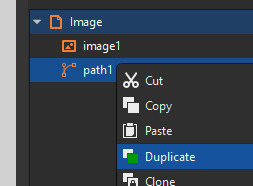
Seleccioná tu path de corte
Dale click derecho, duplicalo
Seleccioná la copia del path Y la imagen (importante que el path esté arriba de la imagen en el navegador)
Click derecho, Set clip. BOOM.

Bonus meme 2: Renombrar capas
Muchas imprentas usan Adobe Illustrator para abrir los archivos. Si querés que las capas se lean bien para ellos, tenés que darle click derecho a la capa y cambiarle el ID en Object Properties. No te olvides de apretar el botón de Set cuando terminás de cambiarlo!
#tutorial#inkscape#open software#ilustración#argentina#illustration#procreate#printing#stickers#entrepreneur#artists on tumblr#resources
2 notes
·
View notes
Text
It's hard to express, but
I understand that a lot of people on the internet would consider me Old
I do make an effort to keep up with how things change
mostly because I am incessantly curious and always want to learn and learn about new stuff
but also because I do not want to be one of those Old People Stereotypes who is actively hostile to things changing
especially things I was taught were How Things Are
So when I see people younger than I am reacting hostilely to changes in things that are, as far as their daily lives go, pure trivia
I do start to wonder if resistance change is just universal, with young people having more time, as they age, to get used to it
(and note this is about little things that don't change daily life for most people, like the classification of Pluto or dinosaur feathers, and not about life or death things)
#i used the same version of corel for 15 years and it was *hard* to switch to inkscape#like i was actively hostile to looking up tutorials#i felt like it was bad ui design if i couldn't figure something out on my own#because i had figured out corel on my own! ...after using some form of it since the early 90s...oh. hmm.#but i got over that and used tutorials and it's fine now
13 notes
·
View notes
Text
youtube
I noticed a lot of people struggle with text in Krita, so here's a tutorial.
2 notes
·
View notes
Text
How to draw SVG Fir Tree with Inkscape
#firtree#fir tree#sapin#inkscape tutorial#vectorart#digitaldrawing#howtodraw#drawingtutorial#inkscape#arttutorial
3 notes
·
View notes
Text
3 notes
·
View notes
Video
youtube
Inkscape Mini Tutorial - Designing simple Animals using basic shapes and strokes This mini video tutorial from 2Dgameartguru.com explains the design of simple animals with basic shapes and strokes in Inkscape v1.3. In this short video, I apply easy-to-use tools to create and pose a simple bird made up of circles and lines. The lines can be bent, curved, and repositioned quickly to put the bird or any other animal into a pose. I add the Path Effect Taper Stroke to the tail feathers to shape them.
#youtube#tutorial#inkscape#beginner#vector#design#graphicdesign#illustration#animals#bird#crow#wings#feathers#easy#quick
2 notes
·
View notes
Text

do you guys think user "angry at operating system bullshit" is really mad about this because i can't tell
#dis.txt#this is sarcasm btw but i lost it at ''IT HATES ME AND IM SURE IT HATES OTHERS TOO'' like. it's inkscape. jesus christ#(and no it's not hyper-intuitive but there's good documentation and a lotttttt of tutorials and videos and shit online. you gotta learn it)#(i've tried out worse vector graphics editing/drawing software. like wayyyyyyy worse)#becoming a massive fan of Software Manager reviews
0 notes
Text
youtube
#youtube#draw#drawing#painting#digital painting#paint#art tutorial#art youtube#tutorial#art#inkscape
0 notes
Text
@spriteattack My first post on tumblr will be a link to an artist, 2dgameartguru, who works tirelessly and beautifully to teach in Inkscape and Affinity Designer. I find his tutorials very easy on my ears and mind. He is firmly NO to AI scraping and stealing.
I am technovellum, an old, ill, has been. On better days I try to learn something new. I am writing a script for a radio show or app. I began when I fell ill. Small steps.
I came to tumblr to follow people who have interesting things to teach or show. Boop!
technovellum
1 note
·
View note
Text


Shop Sign Wall Lights - UPDATED 15 May 2025
I put together a few sets of shop sign wall lights. But there are instructions. I kept some swatches as a default white color so that you could pick which color you want the light to be while in live mode. This saved on the file size of the package file because the more textures a file has, the more bloated the file size is.
I had some fun with some shop names although I mainly included generic titles in both English and Simlish.
DOWNLOAD for FREE: SFS
OR at Patreon*
*You must be over 18 to access my Patreon page.
INSTRUCTIONS ON CHANGING LIGHT COLORS
Once you place the light in build mode, then go to live mode. Click on the light and you will get the following pie menu.

Select SET COLOR AND INTENSITY and then choose THIS LIGHT. The color options will then appear so you can select which color you want.

If you use the name signs along with the Awning Lights, make sure to place the name on top of the awning so when you select the color picker, the correct sign changes colors. The other option is to place the name separate from the awning, go to live mode and change the color, then go back to build mode and add the awning light you want.
Enable the bb.moveobjects on cheat and then you can make adjustments to location and size of objects. You can adjust the position of the light on the wall by depressing the Alt key while placing the sign (on PC). You can adjust the size of the item by depressing the Shift key and either [ (for smaller) or ] (for bigger) (on PC).
CREDITS
Awning Shop Lights - 19 swatches of various awning wall lights. 18 are pre-colored and one is white so you can change the color yourself in game.
Candy Shop Lights - 20 swatches
Pottery Shop Lights - 25 swatches
Tattoo Shop Lights - 21 swatches
Enjoy!
Creations by SexyIrish7
These cc objects are new 3d meshes created using Blender and Sims 4 Studio.
Polygon Count: 6
All CC have:
*Ability to search catalog using search terms: sexyirish7 and si7
*Customized thumbnail
*******
CREDITS:
Software credits:
Sims 4 Studio v. 3.2.4.1 (Star): https://sims4studio.com
Blender 4.0: https://www.blender.org/download/
GIMP v. 2.10.34: https://www.gimp.org/
Inkscape v. 1.2: https://inkscape.org/
Thank you to the creators and moderators producing tutorials and answering questions!
*******
Model and Image credits:
Mesh created by me.
Simlish font credit to Franzilla: https://modthesims.info/
Image credits:
Awning Lights Image credits: Modified image from Adobe Stock
Candy Shop Image credits:
Swatches 1-3: Image by pch.vector on Freepik https://www.freepik.com/free-vector/christmas-candies-symbols-set-neon-style_11241813.htm#fromView=search&page=1&position=26&uuid=8b541325-0e62-4e37-9468-6bacd30f8963&query=neon+lollipop+candy
Swatches 4-8: Image by gstudioimagen on Freepik https://www.freepik.com/free-vector/sweet-candy-neon-seamless-pattern_5595774.htm#fromView=search&page=2&position=30&uuid=e2259de5-014d-4d04-af87-1198ee0f35e2&query=%40gstudioimagen+neon
https://www.freepik.com/free-vector/sweet-candy-neon-seamless-pattern_5595775.htm#fromView=search&page=1&position=27&uuid=e2259de5-014d-4d04-af87-1198ee0f35e2&query=%40gstudioimagen+neon
Swatches 9-10: Image by openclipart.org https://all-free-download.com/free-vector/download/peppermint_candy_clip_art_13182.html
https://all-free-download.com/free-vector/download/round_candy_with_stick_card_on_pink_background_6823183.html
Swatch 11: Image by All-free-download.com https://all-free-download.com/free-vector/download/round_candy_with_stick_card_on_pink_background_6823183.html
Swatches 12: Image by katemangostar on Freepik https://www.freepik.com/free-vector/ice-cream-cart-neon-sign_3238564.htm#fromView=search&page=8&position=42&uuid=2f82b4d1-5ca8-449c-ae22-4573861ebcb0&query=neon+sign+retail
Pottery Shop Image credits:
Swatch 1: Crafting icons created by andinur - Flaticon https://www.flaticon.com/free-icon/pottery_17392031
Swatch 2: Image by katemangostar via Freepik https://www.freepik.com/free-vector/aquarius-neon-sign_5561944.htm#fromView=search&page=2&position=5&uuid=c55e5e21-0550-46f0-b9be-cfa85ff38796&query=Ceramic+Neon
Swatch 3-4: Pottery icons created by Smashicons - Flaticon https://www.flaticon.com/free-icon/vase_3760867
https://www.flaticon.com/free-icon/vase_3760970
Swatch 5: Icon by istar_design_bureau via Freepik https://www.freepik.com/icon/pottery_1958438#fromView=search&page=2&position=20&uuid=096084ae-13fe-429c-a419-e6e13ccd37b9
Swatch 6:Icons by Eucalyp - Flaticon https://www.flaticon.com/free-icon/pottery_6552610
Swatch 7: Icon by berkahicon via Freepik https://www.freepik.com/icon/spin_13785816#fromView=search&page=2&position=0&uuid=096084ae-13fe-429c-a419-e6e13ccd37b9
Swatches 8-11: Icons by Freepik https://www.freepik.com/icon/pottery_8540816#fromView=search&page=3&position=43&uuid=096084ae-13fe-429c-a419-e6e13ccd37b9
https://www.flaticon.com/free-icon/machine_9200546
https://www.flaticon.com/free-icon/vase_8838322
https://www.flaticon.com/free-icon/pottery_3305262
Tattoo Shop Image credits:
Swatch 1: Modified Image by katemangostar on Freepik https://www.freepik.com/free-vector/tattoo-salon-neon-text-with-tattoo-machine-neon-sign-night-bright-advertisement_2438198.htm?log-in=email
Swatch 2: Image by Nippy Custom https://www.nippycustom.com/products/tattoo-neon-sign
Swatches 3-5: Image by bohlam via Vecteezy https://www.vecteezy.com/vector-art/2185717-tattoo-studio-neon-signs-style-text-vector
https://www.vecteezy.com/vector-art/34210463-neon-sign-tattoo-studio-with-brick-wall-background-vector
*******
TOU:
Do not re-upload and claim as your own
Do not re-upload and hide behind a paywall
*******
Changelog:
15.05.2025
*Updated swatches for compatibility with slotted signs.
*Added wall deco slot so that signs can be stacked on slotted signs for Awning Signs
*Added swatches with inverted images for Candy, Pottery, and Tattoo Shop Signs.
#the sims 4 cc#ts4cc#sims 4 cc#the sims 4#wall decor#sims 4#ts4#lights#wall lights#signs#shop signs#retail#pottery#ceramics#tattoo#ink#candy#lollipop#sweets#sugar#light tutorial#sexyirish7#updated cc#featured
306 notes
·
View notes
Text
as per a request in my local renegade server: here is my process (such as it is) for the stenciled covers i've done for my binds. obviously, huge thanks to everyone in the renegade discord for teaching me most of what i know about bookbinding. this tutorial only exists thanks to the resources they've made available and the conversations i've had there.
material list
vinyl cutter (i have a silhouette portrait 3) + mat + blade
stencil vinyl (i have this one, but have had some adherence troubles with it. unclear whether this is just The Nature Of Stencil Vinyl or whether there's a better brand out there. adhesive vinyl can also be a viable option, although i haven't personally experimented with it yet.)
transfer tape (i have this stuff. it's fine.)
weeding tools (i have this hook and a very fine tip pair of tweezers. i highly recommend getting a hook, especially if you—like me—are haunted by the specter of carpal tunnel. get an off-brand one or get one on sale, though. i only have the silhouette brand one because it was on clearance.)
acrylic medium (i have this one because it was on sale at the time i was buying acrylic medium. when i replace it, i will be replacing it with a matte one. the gloss definitely has a noticeable sheen that i don't love.)
acrylic paint (literally any paint will do. i've been mostly using the decoart extreme sheen because it's $4 at michaels. you may be noticing a theme here.)
stiff stenciling brushes (the ones i have are similar to these but cost even less. again, there's a theme here.)
an iron and some parchment paper (jury is still out on whether using heat to "set" the pattern is necessary, but i do feel like it melts the paint a bit into the bookcloth and lessens the extent to which the pattern sits above the bookcloth.)
your trusty bone folder
instructions and a truly hideous number of words under the cut.
step 0.5: discern what will make a good stencil and what will make you hate yourself, your life, and the art of bookbinding
there are a LOT of different ways to put titling on a book. you could do a paper cover with a printed design or paste paper labels onto bookcloth or foil your title onto your cover with heat activated foil. the best method depends on what kind of design you have in mind, what tools you have available to you, and what materials you're working with (for example, i've had very bad luck getting acrylic paint to adhere to Allure bookcloth, but Allure does foil like a dream).
as far as stencils are concerned, you can kind of sort cover designs into three categories:
BEST for stencils: big, bold shapes on larger format books (think letter folio or letter/legal quarto)
OKAY for stencils, but you might hate yourself: intricate detail at a large enough form factor for it to be cut well by your vinyl cutter
BAD for stencils, you will die and it will hurt the entire time you are dying: lots of intricate detail and lots of fine lines
below are examples of category 1, 2, and 3 (all designed for letter folio). to be clear, category 3 can technically be possible, depending on the design. but only undertake it with the awareness that you will die, and it will hurt the entire time you are dying.
step 1: design a thing to put on your cover
i'm not going to go too in depth on this because cover design is a HUGE can of worms. a few pointers, though:
i never start designing my cover until my text block is done. this allows me to design my cover at "full size" based on the measured size of my text block and cover boards.
i fully lay out my cover in a separate program before exporting a transparent PNG to silhouette studio (or whichever proprietary software you have to use to communicate with your particular vinyl cutter). i use affinity designer. some free options would be inkscape (if you want to work with vectors) or gimp.
i design my cover on a document with dimensions of (HEIGHT of boards + 20 mm) x (WIDTH of boards or spine + 20 mm) and 10 mm margins. the area within the margins represents the actual dimensions of the thing i'm designing, while the area outside of the margins creates a mask that prevents me from getting paint on things i don't want paint on (like the covers, if i'm creating a spine stencil).
i always outline my document with a 3 or 4pt black line. this creates the outer edge of my stencil and provides my vinyl cutter with a cut line. if you're working with a smaller vinyl cutter (like the cricut joy) there are ways to jigsaw designs together from smaller pieces of vinyl, but i'm not the person to ask about that. i specifically bought a portrait so that i didn't have to worry about that.
here's an example of one of my affinity files from a recent cover. i've exaggerated my outline to make it clearer. you can also see that i use affinity to experiment with color combinations. before i export, i turn all my elements black and make any backgrounds transparent, meaning that the PNG i import into silhouette studio looks like the one on the right.

step 2: cut and weed your stencil
again, not going to go terribly in depth here. there is a veritable army of youtubers out there with tutorials about how to use [insert propriety vinyl cutter software here]. but, again, a few pointers:
with my particular vinyl cutter and stencil vinyl, i usually cut my stencils with the material set to "washi," depth at 1, force at 13, and speed at 4. google, experiment, see what works. also, you want to put your stencil vinyl on the mat with the blue vinyl facing UP, and you don't want to mirror your design. with stencils, what you see is what you get.
i cut my vinyl a bit bigger than necessary because i'd rather waste a bit of vinyl than have to worry about a stencil falling off the edge of my vinyl because i misaligned it on the mat.
unlike HTV, you will be weeding out all the black parts of your original image. be prepared to hate the letters "e" and "a" forever, because you will have to somehow keep the little eye of them in place while you pry out the rest of it.
step 3: apply your stencil to your case
alright, now let's get into the meat of it. i always stencil after my case is finished but before i case in my book. this means that if i totally fuck it up, i can trash the case instead of the entire book.
additionally, i completely stencil my spine first (as in lay down stencil, paint, remove stencil) and then stencil my covers. i've found that it's easier when you don't have stencils overlapping and sticking to each other.
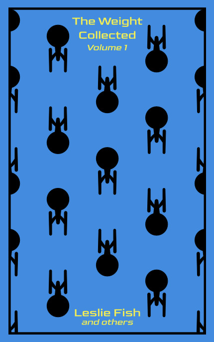
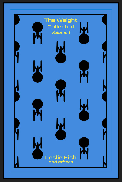
OPTIONAL STEP: mark guides onto your cover to help you position your stencil. whether or not i do this step depends on the design. a lot of the time, i just eyeball it. but for some designs, precision is key. for those projects, i use my ruler to mark out guides in white chalk for where i need certain elements of the stencil to fall. (i used guide marks for the "penguin clothbound" copies of the The Weight Collected that i've been using as an example in this post—the black rectangular boarder would've made uneven placement REALLY obvious.)
use transfer tape to remove your vinyl from its slick backing. what i've found is that you really, really don't want your transfer tape to be too sticky. you want it just barely sticky enough to pick up the stencil if you rub it down with a bone folder or your fingernail. i have a piece of transfer tape that i stuck to my jeans a bunch of times and then proceeded to use for 8 books in a row. it is, frankly, still a little bit too sticky. i have rolled it up so that i can use it for the next 8 books, at which point it will presumably be the right level of stickiness.
position your stencil. when you're happy with it, rub it firmly down with your bone folder. then do it again. then use your fingernail to score down over the titling text. then pray. in my experience, stencils prefer to stick to transfer tape rather than bookcloth. ymmv.
start at one corner of your stencil. carefully begin peeling back the transfer tape. i've found that essentially folding back the transfer tape (like, the corner that's been freed from the stencil being folded back away from the stencil) helps the tape to release. go slowly, rubbing down with the bone fold as necessary.
after you've finally manage to pry the tape off, go back and smooth down the stencil and firmly rub it down to get it to adhere to the bookcloth as thoroughly as possible with as few ripples or air bubbles as possible.
step 4: paint time!
here is a secret that the renegade discord taught me that i am now passing on to all of you: before you put any paint on your stencil, put down a layer of clear acrylic medium. the medium will finish the job of pasting down the stencil to your cover, and any leaks that happen in the process will be clear medium instead of colored paint (and will therefore be basically unnoticeable). ergo:
stipple a thin coat of acrylic medium over your stencil. you want to use an up-and-down daubing motion, not a brushing motion. brushing will get paint under your stencil. let dry.
after your medium is dry, stipple a few thin coats of your colored acrylic paint onto your stencil. let dry between coats. (i usually find that two coats is enough.) again, try to keep your coats thin. you don't want a thick layer of paint because that will create a raised surface above your bookcloth.
let your paint fully dry. i usually leave it overnight, but if i'm feeling especially impatient, i still make sure to at least give it a good three or four hours.
peel up your stencil. your weeding tools will once again come into play here to pry up little bits and pieces of stencil (like the stupid eyes of the "a"s and "e"s that were so annoying during the initial weeding stage).
step 5: optional setting stage
again, jury is still out on whether or not this is necessary, and the effects are pretty subtle. but i do it every time anyway. some tips:
use an iron on very low heat (i keep mine at the low end of the synthetic setting) and with steam turned OFF
keep a piece of parchment paper (NOT waxed paper. you want the slick paper that you put under cookies to keep them from sticking to the pan.) between the iron and your cover.
press the iron down, don't rub it like you're ironing a shirt. it's possible to smear your paint doing that (ask me how i know).
i usually lay the iron down on a section for 10-15 seconds at a time, then lift it and move it to another section.
start with less of everything (less heat, less time) and build up. always better to be conservative with this.
i usually continue until the paint is warm to the touch, then move onto another section. after it's cooled, i evaluate if i feel like it's melted into the cloth enough. if not, i repeat the process.
step 6: BOOK
congrats, you have put a design on a book cover. the world is your oyster. go forth and make books. become ungovernable.


113 notes
·
View notes
Text

digitized this drawing as a test using inkscape and this tutorial, took like 5 minutes, much easier than I expected! Removed the bullet journal dots with the speckles option, only one lonely dot stands fast

trying to make drawing fun again!!
#this could have been much neater but the point was that i discovered that this can be done in like. 5 minutes if you already have your scan#or photo#other tutorials suggest that you trace the whole thing but that is absolutely not necessary!!#once you turn the illustration into vector using e.g. inkscape you can also throw it in your illustration software of choice for coloring#which i wont do lmao#anyways useful stuff!#traditional illustration#inkscape
2 notes
·
View notes
Text
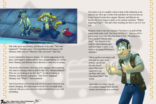
I tried the story book route with this what if story of Tad becoming a jaguar, this format was inspired by the Tad story book “Tadeo Jones 3. El libro de la película: La tabla esmeralda”.
All the images are done in Clip Studio paint then I transfer it over to Inkscape in order to set up the font and put everything together.
I'm new to inkscape layout and how it functions so the text may appear a bit wonky and yes I watch tutorials.
Art © KimJ Characters © Enrique Gato
#my art#tad the lost explorer#fanart#tad 4#tad jones#tad the lost explorer 4#mummy (tadeo jones)#Belzoni (tadeo jones)#transformation#jaguar#storybook#mockup
25 notes
·
View notes