#it's more of a concept sketch than a polished piece anyway; I really just wanted to render some rock formations to destress
Text
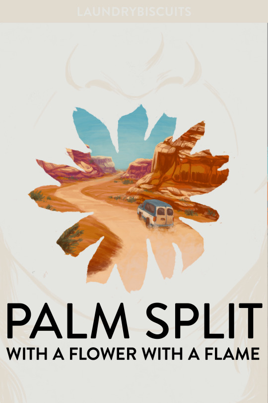
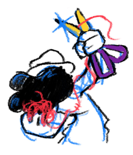
Cover design for my fic palm split with a flower with a flame (13.6k, T, Steddie hanahaki road trip AU)
#instead of doing any of the many urgent things I need to do before leaving the UK#I am fucking around with cover design and learning to paint red rocks#I do not enjoy painting vehicles so we're just gonna ignore how the van looks a little wonky#it's more of a concept sketch than a polished piece anyway; I really just wanted to render some rock formations to destress#I've also generally been getting into cover design lately bc it's such an interesting and specific challenge!
30 notes
·
View notes
Text
I thought I'd share the sketch of this poster/book cover as well as my initial concepts! You can click the "Read More" button for more in-depth explanations on my design process.
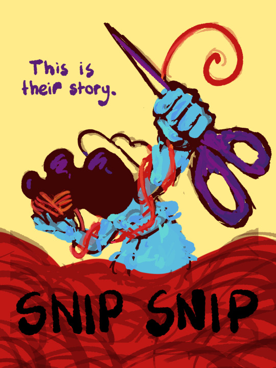
Thhis is all for my latest fanfiction, Snip Snip, so if you'd like to check that out, then...
Now let's crack in!
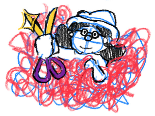
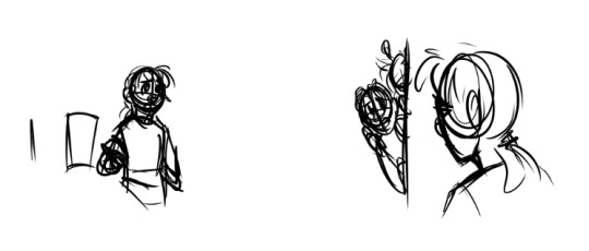
For the release of "Snip Snip", I actually had several different directions in mind! One was a comic of one of the scenes from the fanfic—specifically the one where the Professor breaks down in front of Kate and Joyce with the line "I don't like being a woman"—and the other was a series of doodles showing the Professor's transition. Unfortunately, both directions met dead ends as I couldn't find the motivation to do either. The most progress I made were these sketches.
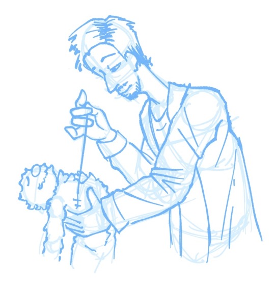
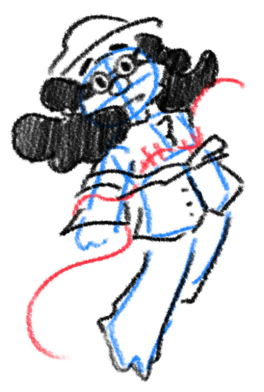
If you're wondering, "The first one looks familiar..." that's because I reused that pose for my first promo art! It was too good of a pose. I couldn't waste it :P
But anyways, after a period of getting extremely frustrated over the lack of progress, I realized my main problem: I was biting off more than I could chew. I didn't know this at the time, but I was dealing with burnout from school assignments that made drawing more ambitious ideas like the ones I had very difficult. Hence, I had to scale it down. It made me think, "Why not do something like a movie poster or a book cover?"
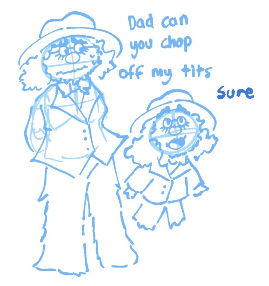
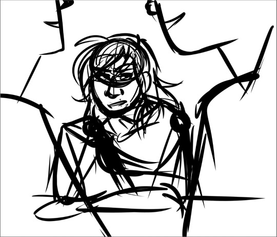
That's how the sketches at the top of the post came to be! I consulted a friend of mine over which pose to choose, and he picked the third one which I understand why so. The obscuring of the Professor's face not only made it cool, but it adds symbolism in how we don't really see his true identity—the real him—until his transition. Here's the first sketch!
As you can see, the title is on the top left corner! However, I moved it to the bottom for two reasons
It's advice I learnt while looking up how to make movie posters since moving the title to the bottom tends to bring more focus to the illustration above.
I couldn't find a font that fits! And the idea of doing typography again (especially after the Keep Yourself Safe poster...) was really not what I signed up for.
But then it left the problem of the top corner looking empty. It was too distracting! So what did I fill it in with? The subtitle: This is their story. The composition is now more balanced, and also the subtitle tickles me.
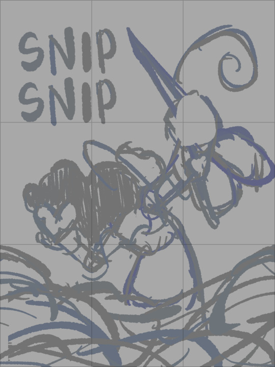
As I said before, I looked up movie posters for this! Special thanks to the Nashville Film Institute and Muse by Clio for their articles that guided me during this poster making process. I will say though I got really sidetracked watching Filmmaker IQ's The History of the Hollywood Movie Poster 😭 It's really interesting, I'd recommend watching it!
One thing I learnt is that movie posters limit their colour palettes. Of course, this is good advice for art in general, but movie posters emphasize on its colour usage to attract the audience with their simple yet bold schemes. It is a piece of advertisement after all! Following their footsteps, I limited my colours to the primary colours (red, yellow, blue) and purple to make the scissors pop and allude to the nonbinary flag colour scheme.
And from there, it was just a matter of experimenting with rendering! I wanted a mix of pop art and storybook illustrations, so I mixed lineart with lineless, and I wanted to retain the energy of the sketch while still polishing it, so I cleaned the sketch, merged it with the colours, and painted on top of it rather than make a separate lineart layer.
Overall, I'm extremly proud of the end result! The struggle of figuring out the promo art for this fic has been tormenting me since the beginning of the year, so I'm glad to bring it to an end. Thank you for reading my ramblings! I hope you learnt something or at least had fun? Either way, have a good day!!
#this truly has been a rambles moment#i really really recommend watching that video by the way it is FASCINATING#the professor#shane madej#puppet history#poster design#art process#design process#art#artists on tumblr#sketches#concept art#chris p fried rambles#chris p fried art
11 notes
·
View notes
Text
The ArtCenter Files
I was accepted for the Fall 2020 Illustration program at ArtCenter College of Design. Just like with the post I made after being accepted to Ringling, this one will also be a list of tips I gathered during my application process. This is not a guarantee of your acceptance, but just something to help inform those looking into ArtCenter, primarily for Illustration. (You can skip to number 3 if you just want help on your portfolio.)
1.) BEFORE WORKING ON THE APPLICATION:
Please schedule either an in-person or online meeting with an Admissions counselor first. This is important as no one knows the programs and curriculum better than they do. Just by talking to a counselor about my interests, she was able to help narrow down what major would be a good fit for me, as well as give insight as to what the coursework would look like. (Not to mention portfolio help!)
ArtCenter also has different terms: Fall, Spring, and Summer. You’d have to look for the exact starting dates to determine which term would work best for you, or speak to the counselor. You can schedule a meeting with a counselor by going to ArtCenter’s website; under the Admissions tab, you will see “Schedule an appointment.” If you can’t find it, there’s also the option to either email or call the Admissions desk (both contacts on their website.)
If you or your parents are at a loss on what to ask the counselor, consider these: Scholarships and how to get them, tuition + costs, terms, curriculum details, what the major is like, show examples of your work + get feedback, and how well-connected the school is (ie internship opportunities).
2.) WORKING ON THE APPLICATION:
If you decided ArtCenter is a good fit, make sure you don’t immediately jump into the portfolio. The Application is equally important; personally I prefer to complete it first. Under the Admissions tab, you will find the link to the Application Requirements page, which lays out all the steps like a checklist. Either bookmark it or write them down so you can keep track what of you’ve completed!
3.) (ILLUSTRATION) PORTFOLIO HELP:
You will be uploading your pieces to ArtCenter’s SlideRoom. There’s a page on ArtCenter’s website that details what the portfolio requires, but I’ll copy and paste it so I can refer to it for the rest of my post. I’m writing this in 2020, so please check the site yourself in case there are changes.
“Submit 10 to 15 figure drawings from a live model that include both gestural and more developed pieces. Other observational drawings from life are also required such as self-portraits or portraits of others, sketches of animals and scenes from nature and cityscapes. Include imaginative drawings that demonstrate your passion for and understanding of illustration in both color and black and white.
Submit three or more pieces that highlight drawing or painting skills, and show the development of a story or concept. Sketchbooks that display a range of interests and skills are welcome and we recommend a limit of 10 to 15 sketchbook pages submitted as one PDF.”
What if you don’t have any pieces that fit into this? Here are some of my ideas:
Figure Drawing: If you can, sign up for figure drawing classes. Speaking as someone who has some art school experience, please don’t just search up nude figures and draw those for your portfolio, especially if you’ve never drawn figures before, unless you have absolutely no choice. That’s what I had done in high school, but taking actual figure drawing classes in college made me realize that having a teacher to give you advice and look for your mistakes helps you so much more. Not to mention, you will be training yourself how to quickly capture the human figure, sometimes in 1 minute or less.
Life Drawings/Observations: These are basically “cafe sketches” or observational drawings. Still lives count as long as they are polished. Googling pictures for you to draw for your portfolio should be a last resort! You don’t have to visit any where fancy to make a good portfolio piece; with practice, you can make an interesting drawing out of any subject. Start locally, and then try working out of your comfort zone if needed. First draw your friends, family, pets, rooms, or garden. Then you can move onto parks, zoos, and other public places.
Sketchbook Pages: You can include less-polished life drawing sketches from your sketchbook in your portfolio. I also recommend sketching out your story ideas, any character designs, story boards, or comics. Be sure to include some color! Even if you think an idea is silly or dumb, sketch it anyways. You’ll then have a larger pool of sketches to choose for your portfolio.
Story Illustrations: Your illustrations do not all have to be paintings, but if you forgo the painting aspect, it should be a really strong drawing (ie with good line work and details.) Despite “illustration” being a broad term, what they are asking for aligns more with illustrations for books, and concept work for movies and games. To get inspiration, search up concept art for movies by Disney, Dreamworks, BlueSky, etc. Remember, don’t get caught too much in the scenery of your piece, your characters and their interactions in your illustration should be the main focus. Be sure to thumbnail your ideas (a rough drawing) and experiment with different composition, angles, and lighting before working on your final piece. If you are still not sure if your idea fits what ArtCenter wants, you can email an admissions counselor your work and ask for their feedback.
Tips I got from an admissions counselor:
- Slideroom only allows 10-15 upload spaces, but there is a way to work around this if you have more than 15 pieces. You can upload PDF files; SlideRoom acts as though 1 PDF is the same as uploading one “artwork,” therefore only taking up 1 submission space even if your PDF has 10 slides on it. (Great for your figures and sketchbook! Either organize your pieces on Google Slides or PowerPoint, then save it as a PDF file.)
- You should have a mixture of traditional and digital work.
- Your sketchbook pages should feature some color even if they aren’t polished drawings.
- Aside from your illustrations, not everything in your portfolio has to be a finished drawing or “polished.” In fact, if your sketchbook has sketches of animals, landscapes, interior environments etc. that counts as a life drawing submission.
- The presentation and order of your pieces on SlideRoom are important. Don’t have some random order like “sketchbook, paintings, animals, illustrations.” I don’t know if this is widely accepted at ArtCenter, but for my portfolio, I was told to order it like: Still life paintings, Illustrations, Sketchbook pages, Observation drawings, Figures. The only logic I gleaned from that was it was a gradual shift from the most polished work to the least. Ask a counselor if they have a preferred order.
- Despite the minimum requirement for story illustrations being three, I was actually asked to do 4, as they felt it would make my portfolio stronger.
4.) PORTFOLIO VIDEO ESSAY HELP:
Honestly, the site’s description couldn’t have said it any clearer. There is an entire page dedicated to its instructions, but I do have extra tips for this. SlideRoom will have its own page for you to directly upload your video file, but if the file is too big, the best solution is to upload your video essay to YouTube. Instead of submitting the video file directly, what I did was upload a PDF with the YouTube link to my video. (I made a Google Docs, copy and pasted the link, then saved it as a PDF. Yes it is allowed.) Just make sure your video is published publicly. If I can overcome my embarrassment, so can you.
5.) FINAL TIPS:
- Don’t try to study examples of accepted portfolios, as it may cause you to emulate their style or pieces in hopes of getting a higher chance of acceptance. Trust me when I say the reviewers can tell if your work lacks passion or your own creative input.
- Find out which medium works best for you; some new passion may be discovered just from experimentation. For example, I struggled with figure drawing until I tried using Prismacolor colored pencils, which then became my go-to medium for figures. If you’re feeling bored or uninspired with one medium, go and try something new.
- PLEASE always email the admissions team for help if you’re stuck. You can even send an email asking if there were steps you missed preventing them from reviewing your application. I did, and it saved my butt. Furthermore, keeping in contact with the school in this manner helps to attach a face to an application, and may demonstrate to them that you’re really passionate about getting into the school.
I hope this was helpful, but don’t be afraid to message me with more questions! <3
#art portfolio#portfolio help#artcenter#art tips#Art College#artcollege#art center#Illustration#illustration portfolio#art help#art school
12 notes
·
View notes
Note
What is your process working on art for Ghosts? How do you choose which scenes to draw, and how do you go about capturing that essence when you’re drawing? I love your art and I look forward to seeing every doodle and full piece each chapter :’)
ayyy fun art skills question
okay sO. here’s a cut because there’s gonna be a lot of screenshots probably.
edit: hey tumblr why did you eat my cut--
so for choosing scenes: well i’ve got a hard rule that there’s one for every flashback, because consistency is a good thing, and as a result of that i actually have a whole file that’s JUST concept sketches for flashback pictures, but i’ll get into concepts in a second here. Other art for chapter is largely just me looking for striking visuals; moments we have planned in the chapter that i feel would translate well to art, and which i could enhance the weight of with an image, or failing a good moment sometimes as with this past chapter i’ll go for something a little more abstract to capture a general vibe of the chapter. The picture of astrid w/ trent behind her, with her in his shadow looking dangerous--A lot of the tension in Ghosts is gonna come from that; from the ambiguity on where Astrid stands in all this and what she’ll do if/when she learns certain things, etc etc
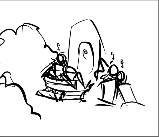
anyway though! that’s how to choose things; the next step is for me to do some sketches until i hit on a concept/composition that i like. These sketches are sometimes very small at first, because thumbnails are a great way to get composition down without worrying too much about the details, and when i do that they look like this:
(Both of these were attempts at the art for chapter 6′s flashback; the one on the left was scrapped, and the one on the right i ended up using!)
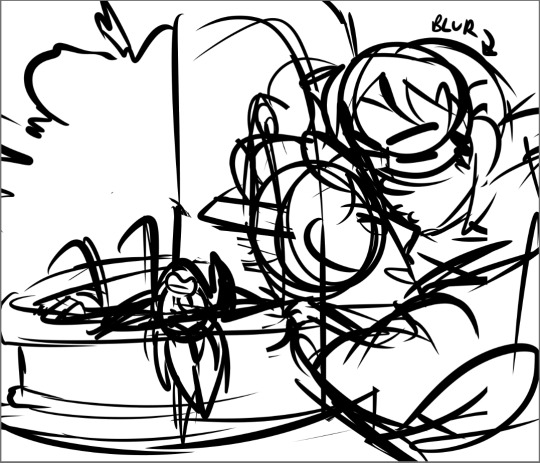
Sometimes i don’t go small at first though, it varies. Sometimes I get a sketch I like on the first try, too, but other times it takes a LOT of tries--chapter 5′s went through three attempts before I got one I liked; and these were also all drawn before the actual flashback was written!
here was attempt 1:
which has an ok composition for the basic theme of “the boys are being romantic and astrid is being an annoying little sister about it”, but i wasn’t in love with it, plus it broke a rule that i’ve been using for the art that i can’t explain without spoiling some stuff but trust me it just doesn’t work.
then we came up with the idea of the kids specifically hanging out at soltryce around this dried up fountain hidden behind some bushes, and that worked out better for this scene; the first attempt at it looked like this
which was getting there but still not really interesting composition...and then, hey, third time’s the charm
im just gonna keep using this picture as the example because its absolutely one of my favorites i’ve done. but anyway
from this stage then i copy the whole sketch and move it onto its own file, and i collect whatever reference photos or palettes i need and start cleaning up the sketch a bit so i can lay down base colors!
...i apparently dont have the rough flat colors for this image anymore, oops, but i can at least give you an idea of what those would’ve looked like and what a somewhat cleaned up sketch looks like!
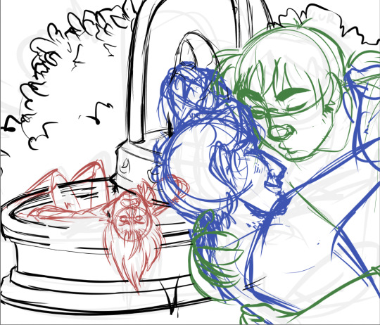
(i always sketch astrid in red, bren/caleb in blue, and eodwulf in green at this stage; it helps make it easier as my sketches get more complicated to determine where one person starts and another ends)
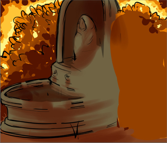
and then this first pass of flat colors is 100% purely to determine if i like the composition still when it’s colored, how the lighting/shading works, if the characters look like they really are in the background, if the mood is conveyed through the color scheme chosen, etc. it’s not supposed to be neat or look at all polished yet, in fact a lot of the time this stage can be REALLY sloppy. this is purely just making sure the overall feel is what i want
and from there every other step is basically just cleanup and tweaking! like, lineart and everything else are technically a lot more complicated than that, but i mean, the hard part of conveying the mood and getting the composition down are done and the rest is usually pretty smooth sailing, aside from the occasional hiccup of “why wont you LOOK RIGHT” and spending hours looking for more references,
anyway thats how the art happens! :D
the whole time, also, ed @tactfulgrimalkin is getting spammed with wips. just. so many.
17 notes
·
View notes
Photo
Ink Dance
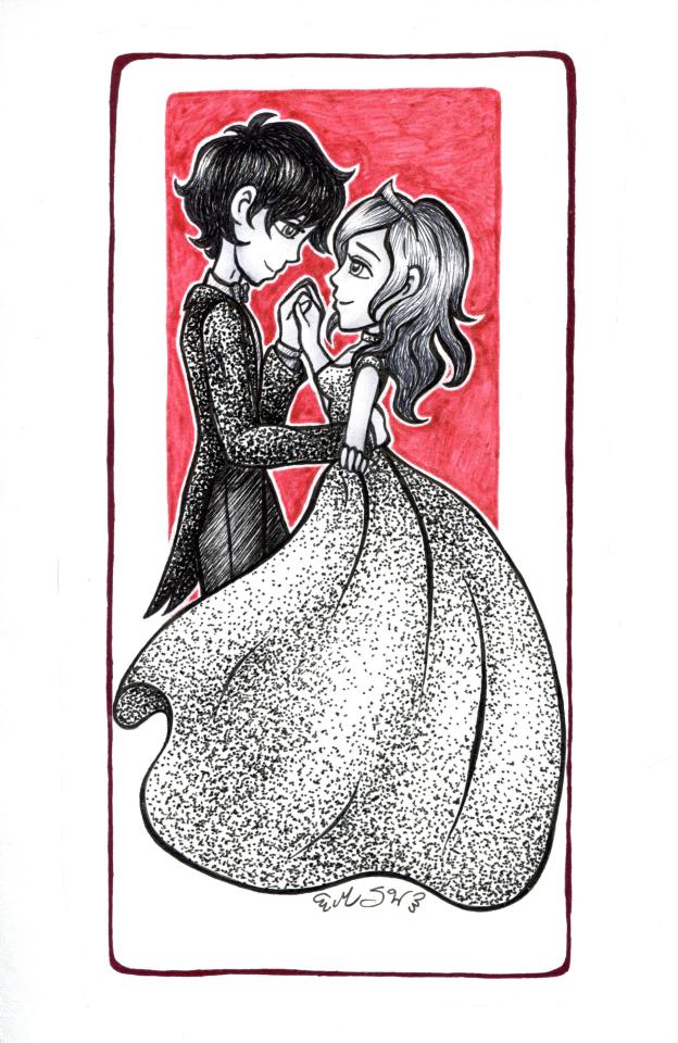
I feel like it's very ironic that a break from Inktober art on my front looks like the regular Inktober content from a lot of artists.
Why is this a thing when I normally don't do ink drawings like this? First of all, I was just really in the mood to draw something princessy and romantic/sweet; Second of all, probably because of all the seasonal ink drawings going around, I had kind of an itch to give more a "classic" Inktober approach a try, especially since I didn't have any super strong ideas for a color palette once I had my romantic-type sketch ready to move to the next stages. Third of all, while I was thinking about where to take the sketch and possibly doing ink things, I watched a video by one of my favorite YouTubers where the challenge was to make a drawing with nothing but dots--aka Stippling. And from that, since I didn't really want to add anything else to the silhouette/shape of the skirt after I spent what felt like way too long trying to get it right, I thought maybe stipple-shading it would be a good way to make it look more interesting by making it look kind of glittery/sparkly.
Now, if you've known me long enough, you may remember that I do not have a great relationship with the concept of stippling after a certain art project I had to do years ago. Problems in that scenario include The subject matter, the "twist," the size of the drawing, etc.
This time, I'd be doing the stippling on my own terms on a significantly smaller scale, and I would not be limited to stippling and stippling alone. I was still apprehensive about the idea because as much as I liked the sketch I really didn't want to start stippling and end up totally hating the final product because of it.
And a full disclosure that the actual act of stippling is still pretty tedious, but this time it was more bearable because I wasn't running on four hours of sleep in a brightly lit classroom with no other option for mental stimulation/distraction, repeatedly stabbing a gigantic piece of paper, unable to stop and take a break if necessary for fear of getting in trouble or not finishing the darn thing on time, but you can't just not pay attention and zone-out because then you're going to end up with dots in the wrong place and--
Do you see why I didn't like my high school art classes?
Anyway.
I did my best with the proportions/pose since I couldn't find a good reference for the exact pose I had in my head and I got tired of trying to find one (and I really didn't want to settle for something that was "close enough" but still not what I wanted). So I had to go largely with what I saw in my head and my best instincts. I also purposefully used the girl's dress skirt to hide the guys' legs because I didn't feel like trying to draw guy dress shoes. Or feet, for that matter. This was largely about just having fun with some cute imagery and ink techniques, not "let's draw perfectly accurate formal clothing including shoes."
And you know, I think considering I had to make it up as I went along, it still turned out pretty well.
After that, I transferred the sketch to a piece of mixed media paper and went on with the ink.
I did the lines around the characters first, naturally, to set the boundaries of whatever ink techniques I ended up using, and then I started with the stippling.
I think I started with the guy's jacket, but as I went I did end up doing so back-and-forth between the stippled areas to try and keep the shading and contrast relatively consistent. I had decided to do his jacket as stippled during planning for a little more visual interest since otherwise, he would've been a lot of just lines/hatching. It also makes the stippled dress look less out of place. (And also in real life I wish it were more common practice for guys to wear sequined formal jackets because I think they're just a cool fashion item.)
After that, I moved on to doing their hair, which was a pretty obvious thing; the hatching/lines technique is just a really nice hair texture. Though getting it just right to leave the shine did take a little extra care.
And really, other than his bowtie, the rest of the ink techniques were all hatching/lines, since those seemed like the best-suited textures for his pants, shirt, and her crown since those are all supposed to be relatively smooth items. Technically, the bowtie probably would be too in real life, but I like the slight difference in tone that cross-hatching it gives.
Originally, I didn't really have a plan for their skin and that held true after I did everything else. I really didn't want to accidentally ruin it with too much texture or the shading being too harsh, so after some consideration, I just decided to use a few gray Copics just a little bit for shading, kind of like what happened on Roses in Your Eyes. It's barely noticeable, but I think it's just enough to get the idea across that they're not stark-white like the paper.
The only bad thing about the markers is that the ink line for the guy's chin did end up smudging just a little, so in person, it almost looks like he has some stubble or a goatee that I hadn't planned on being there. I touched up a little on the scan, but it's still kinda there. There's nothing inherently wrong with that, and some might argue it really works since my style of drawing guys tends to lean more feminine as-is, it's just not what I was expecting.
Also, since they're so small, I left their eyes alone as far as any further shading or coloring goes. It just didn't seem like a good idea to try anything in such a tiny space. And from far away you really don't notice the difference. Or at least I don't.
And it was mostly unintentional, but I do like the contrast of how the guy's colors are mostly pretty dark, while the girl's are more mid and light-toned.
After all, that was said and done though, it still felt like it was missing something.
Thus, I couldn't help myself and once I'd thought about it, I ended up adding a red box behind the characters using a Stardust gelly roll pen. So in real life, it's also nice and glittery. And I tried my hand at doing the white outline in reverse; instead of drawing it in with a white gel pen after the fact, I just colored in the box right up to the characters and tried to leave the space behind. I did have to touch up one or two spots where I got too close, but it was an interesting experiment that worked out pretty well.
Red felt like a good color to go with because of how it contrasts with the black and white, and also I thought the whole "black white and red/read" joke was kinda funny.
And yet still, it was missing something.
I ended up going around one more time with a Pentel Sparkle Pop, one of the pens I had considered for the box behind them but nixed because it seemed too heavy/dark, and in the end, I think that was a good call. Together, the box and the outline with them a sort of grounding and add a nice pop of color without being too distracting.
Overall, this was actually fairly simple and it turned out being much faster to polish off than I expected, probably largely because of the lack of color and not having to work about picking out the right individual values and getting the blending/shading smooth between different colors or having to build up layers over time.
It may not be the greatest pen-and-ink drawing of all time, but considering this isn't something I normally go for, I'm pretty happy with it.
And if I'm being completely honest, it was nice to take a break from my way of Inktober and make some art using more traditional methods in the spirit of the season.
Speaking of which, I can hardly believe we've come so far already; there's only like a week left to go!
____
Artwork © me, MysticSparkleWings
____
Where to find me & my artwork:
My Website | Commission Info + Prices | Ko-Fi | dA Print Shop | RedBubble | Twitter | Tumblr | Instagram
2 notes
·
View notes
Note
How do you do your artwork? I want to get into graphic design and I love your style
hi, love! first, thank you so much here’s an example of the graphic designing I’ve done for 7 years)
Illustrations are just drawings, and to get even more specific, there’s regular drawing and then there’s digital drawing, and I currently do everything digital (i could not draw well on a piece of paper to save my life, no clue why)
SO! here’s my process! and keep in mind that this might not be what works for you, or only one or two things will stick, but I think it’s great to give everything a try and see what you like!
NOTE: I use a Wacom Intuos Tablet (small) with the Wacom pen. The program I use is Photoshop CC 2019.
1) Find References Do NOT be afraid or ashamed to use reference photos as you’re starting. I have a pintrest board that I save any and all photos that I will want to use as references for my drawings For example, THIS photo is a reference I used for my Jemma sketch, and funny enough, Cassandra Jean also used this photo for reference in THIS illustration she did that I saw two days after I finished and posted my sketch. So if someone as talented as CJ can use reference photos, you can to!
2) Sketch So now that I have my reference photo(s) I start to sketch. And sometimes you’ll have to sketch over your original sketch to make a hand look normal, or fix an eye, but you can keep working at a sketch until you’re happy! Don’t be afraid to even sketch on top of your reference photos! If you’re just starting out, and have no clue why you can’t get this one damn foot to look right, just sketch it over the reference! It helps you learn how things are shaped, how to draw certain curves, etc, and eventually you’ll understand and have a natural eye for sketching a body! And don’t think your sketch has to look absolutely polished! A sketch is meant to be rough, it’s just an outline of the basic shapes you need. Think of it like an book: the outline of the plot is the sketch, and the actual writing is the inking...which brings me to...
3) Inking When you’re finally happy with your sketch, you can start to ink your lines. “inking” just refers to actually putting down concrete lines in your drawing. This is where you decide if you want that shoulder to be a little higher or a little lower. How I ink my drawings: set my sketch layer to 30% opacity, set my brush size to 15 or 20, set Smoothing to 100. Next to Smoothing, there’s a little gear icon, and I select “Stroke Catch-Up” -- this means that when I start to draw my lines, the actual lines are delayed on screen. This helps A LOT to get those perfect lines in one swipe (of course, you might to do it 20 times before you get it perfect, but that just comes with the territory) and means you won’t have those weird sections you might get if you were drawing, picking up your pen, and going back in to finish the line. (I hope that made sense, here’s a Youtube video I watched when I was starting out that helps explain this concept!) When you’re inking, you might have lines that intersect at corners, but I just erase those when I’m done with the entire inking process, instead of while I’m doing it! ALSO, you do not have to ink every single line in your sketch (I’ll mention this later!) just the important/main ones!
4) Colouring THE FUN PART! I move my sketch and inking layers on top of my layers that I will be using for colouring, so that when I colour, the inked lines cover the edges of the colours (does that make sense???) ANYWAY My style currently is what I call “block colouring.” it means that there really is not shading or “traditional” tonal values or realistic shadows to objects. It’s pretty “flat” except for basic shadows to give some dimension. I start with the base of the skin tone, then base of the hair, the clothes/jewelry, etc. just put the colour down (and runes I just fill in Black). make sure it nice and tight, and the skin colour doesn’t run into the hair or clothes, ya know? Then I go in with a colour just a bit darker than each of the colours in the drawing already. If you’re drawing a white person, shade the skin with a slightly darker pink/peach colour, if it’s a POC, choose shades darker than their tone. This goes for hair, eyes, clothes etc! You might have to look back at your reference photos to know where the shadows are on your person! I shade using my brush set on 100% smoothing, so that the edges are straight as well!
5) Sketching...Again When i’ve finished with colouring, I reapply my sketch layer at full opacity on top of my colouring WITH my inking. you remember how I said you don’t have to ink every single line, just the main ones? Well that’s because you can go back with your sketch layer, erase the sketching of those main lines, so you have the sketching of the smaller lines left! And what I mean by smaller lines is like the sketching on the folds in fabric, or lines in the throat that detail the Adam’s apple. It gives my drawings just a hint of the “rough” style of sketching that I really like!
That’s pretty much my process! I’m sorry if some things didn’t make sense (it’s my first time trying to explain these things) so if you need clarification, don’t hesitate to ask!
wow this was long!
2 notes
·
View notes
Text
Wow, it’s been a while: looking back at Origins
First of all, if anybody still reads content here: hi! Sorry I kinda left you all in the dark. I’ve been busy working on other projects, and this Tumblr fell by the wayside. Its purpose become less relevant as I’ve progressed, to be quite frank. Nevertheless, it’s still here, and as long as it’s still here, I’ll still eventually have something to write.
Before I launch into the rest of this post, what’ve I been up to in the years I’ve been gone? For one, college happened. I’ve still got lots of work as always, but it’s now on my own schedule and towards my own goals: liberating, in a way. (A side benefit: transferring my musically creative mindset into the kitchen produces delicious results. :-) I’ve also picked up another project that’s taken up a lot of my time: linux-wiiu. (Essentially, we’re working on a proper port of Linux to the Wii U; a development release is currently available for download. Check it out, if you like!)
I’m still an active musician and producer, don’t worry! I recently released “Standing On The Edge Of Time” (a J-rock piece that completely rips off the style of anime openings) and am currently working on something called “Reign Of The Dark”. (Spoiler alert: Eurobeat is fun to write.) I’ve got some other ideas in the works too. Knowing a bit more guitar (and a lot more bass) has certainly helped.
Anyway, on to the main reason I’ve returned to ramble and muse.
Just over two years ago, I released Origins, the first (and so far, only) album I have ever released. Earlier tonight, I went back for the first time in a while, sat down, and properly listened to it the entire way through. For the first time, I’ve stopped cringing like I always used to when I’d listen and inevitably hear the endless mistakes and areas I could have improved upon. Instead, I found myself seeing past me’s work in a more admirable light. (Wow, that got deep fast.) Here’s what I mean:
Overall, everything on this album was really exploratory and unafraid. I didn’t know enough about audio engineering to know what I was doing wrong, and so I just threw myself at the task of writing an album without stopping to think. In doing so, I was able to look past most of the trouble of professional-quality perfection, especially in sound design; I simply wasn’t able to see it! This allowed me to concentrate all my abilities as pure creative energy; as a result, beginning producer me was able to create a full 7 track EP in 9 months.
Something about past me was able to take rough inspirations and transform them into full-on musical ideas. I’m still trying to figure out what that was. According to my old notes, my inspirations for each track were:
Isle Genesis: make a track at all
Prelude (The Denizens): Elton John-style piano, carefree/happy/fun. (I seem to remember Animal Crossing’s simple theme having something to do with it too...)
Soul Scream: somebody asked me to write a YouTube channel jingle
Isle Genesis reprise: total ripoff of James Cronin’s “Dead Horses” album: his title track has a solo reprise of the main melody halfway through the album, and I thought I’d try that idea. (Great album, by the way.)
Deity Duel: wrote an energetic hook, but needed to flesh it out. Heard trance producer JayB do a rock remix of some video game song...immediately thought “a rhythm guitar would sound cool here”
Aftermath: listened to a ton of electro jams by Jouni Ollila’s BURG project and wanted to copy the general style.
Reunion: “hey, most of this album kinda maps out the story for a roleplay project I’m part of...why not extrapolate a bit and have two characters reunite in a fanfiction ending?” The two lead instruments symbolize two different characters from that old RP, actually.
Listening now, instead of hearing all the shortcomings, I’m beginning to appreciate just how wild it was that I could come up with this many ideas and just lay them down on tape, no questions asked. Sure, they could use some polish. You know what, though? I’m liking them more and more just as they are: it’s like a little time capsule of the raw excitement I had back then.
I should take a second to mention something else. I’m not sure if I’ve publicly talked about this before, but Isle Genesis was written during a time in my life when I was involved with a role-play community writing project called Islands of Origin. As the roleplay’s world was fleshed out, I started to draw parallels between my ideas and the theoretical backstory of the fictional world; in return, I noticed the world’s backstory shaping my ideas. I suppose I started to write a concept album without even realizing it, now that I think about it. Islands of Origin gave Isle Genesis a purpose and direction.
Besides the fact that obsessive perfectionist me can now hear the finer mistakes I make, this is probably the reason I *still* haven’t been able to release the 2nd album I’ve challenged myself to write every year since. I’ve just been sketching ideas with no real topic or overall backbone. This should have been more obvious to me earlier: it’s one of the entire reasons I love the Pet Sounds album by the Beach Boys! Pet Sounds was one of the first albums (to my knowledge) that served as a logical progression of music, rather than a collection of hit singles.
Is there a conclusion to this ramble? I’m not sure. Maybe I’ll form a grand plan for my second album. I’ll likely just as soon get rid of it. I’m really not sure what this all means.
I’m certain of one thing, though: for the first time in a long while, I truly enjoyed listening to Origins. Maybe I should make some music to top it.
Time to write that second album.
A bit of logistics: I’m not sure how much (if at all) this Tumblr will be used in the future. I’ll always release my major works on all major platforms as CompuCat; I’ll also continue to use my SoundCloud page as a more informal release platform for ideas and works-in-progress. If anybody’s still reading here, though: seriously, thanks. I never thought anybody would still be paying any attention here. I’ll be back with more music....eventually. :)
2 notes
·
View notes
Note
I really think my art isn't good at all and everytime I look at it, I get depressed and I just give up, I think "I should just stop and let people with talent do it." I want to give up because my drawing skills are really bad, I know I need to pratice but it looks horrible and I keep thinking I should just try something else. But I want to draw the things I like and be proud of myself too. What is your advice, Lia-sensei? (I love youu and I'm sorry if it's too depressing, I'm just very lost ;;)
Hey Anon~
First of all, I want you to know that every artist feels this way one moment or another, and that’s because there’s always someone we look up to, that we think will always be better than us no matter what. So I think it’s easier when you come to accept that you may never be technically speaking “the best” , but that it won’t stop you from keep drawing what you want.
Sounds plain, I know, and a lot of people have said this before, but I really think the best you can do is to focus on drawing what you really want, solely because you feel like it, because you have an idea you want to share or because you enjoy doing it without thinking about the consequences (that is, people’s reaction to it, notes, shares, etc.).It’s not about “letting people with talent do it”, it’s about sharing something only you can do. There’s a story only you can tell and contribute to the community, that is for sure. The thing is getting it out of your head.
What I could advice depends on the approach you want to have with drawing.
• If you aim to dedicate yourself to art in the future, you have to get used to the idea of spending your whole time in front of a white paper (or pc?). So you really need to have an immense passion about art in general, meaning you will work towards polishing your skills e v e r y d a y.
- If you have doubts (because it’s valid) or you want do it for a hobby (like is my case), I do recommend attending art classes anyway. Not a degree or anything like that, but maybe a short (and less expensive) course so you can study from basic concepts. It helps A LOT. It gives you lots of tools to work with, that may be available on the web too, but sometimes it’s easier when a teacher introduces you to them. At least in my case, a teacher figure is important.
- And/Or, like I’ve adviced before, look up for LOTS of tutorials. Search tutorials for everything you can think of: human figure, dynamic figure, coloring in SAI, coloring in Photoshop, Manga Studio, lazy coloring, detailed coloring, hair coloring, face expressions, etc. etc.. There’s a lot of options, just save the ones you like and think you can follow. Then just follow the tutorial a couple of times for different drawings, and you’ll start mixing everything up and create your own style and method of working. It will simply happen with time.
^ Either of those optiones will take time, of course. And if you’re like me, you’re not even going to notice an improvement but after years have passed haha orzBut don’t let that stop you from drawing! The point is having fun and sharing the ideas in your head (be it original material or fandom-related) :)
And let me remind you that the practices and sketches you make are for yourself and don’t have to be art pieces (you don’t even have to share them if you don’t want).
Just remember there are mangas and webtoons out there with horrible drawings(??). Oops xD Nah but I’m serious… it’s okay if they don’t have the best artstyle or techniques, the important is they gain attention because the concept is appealing. AND you can actually see the artists getting better with time~
[ At least for me, I don’t consider myself having great drawings, but when people like them, I assume it’s because the idea is funny, entertaining or ridiculous (my speciality lol) to the fandom, not because they’re art pieces xD ]
I know it’s not easy, but you gotta keep practicing.
You can do it Anon, I believe in you~~ ٩(ˊᗜˋ*)✧
Sorry for the long reply, I probably didn’t say anything revealing or helpful at all lol I suck at giving advices…. but if you need more ideas, you can talk to me, okay? I’ll try to help! ( ´ ▽ ` )ノ
(Don’t worry about the message, I understand how you feel. And also, thank you! Ilu too Anon ❤ ❤)
22 notes
·
View notes
Note
What artists do you like/ draw inspiration from? And how did you develop your own style? At what point in learning art did you feel comfortable with your style?
Yes. let me talk about style.
uuuuh style. I think I might have a take on that which slightly diverges from the common view of simply being patient and letting it happen. Nobody ostracize me please.So when I started drawing in earnest, which was back in school, it was comics. My friends were into manga, so I was into manga, so that was kind of what I drew. I did read more French comics, though, most notably Sillage (Buchet/Morvan), but also Yiu and others I only know the German titles of. A mangaka I discovered in my teens and liked a lot was Hiroki Endo who did EDEN. Lots of SciFi things. So when I started to do original comics more for myself than to fit in that started to bleed through more and more. That style also comes to light if you see me sketching people without reference! I don’t draw that way anymore for finished work, but I can’t seem to wholly get rid of it, ha. Anyways, when I started studying illustration I had several people tell me that me having drawn comics for such a long time could have ‘ruined’ me and I might have trouble to try out something knew. Look, this is not a case of people trying to keep me from drawing comics because they thought of them as lesser (maybe they did, but I don't think though. I think it was more about being an autodidact with an already recognizable style.) That was a case of ‘We think you already found your style and it will be hard for you to learn something new’. And I wanted to learn new things! Making it in comics is super hard. And comics are so much work! I didn’t know who I was as an illustrator yet and I wanted to find out. And people telling me they didn’t think I could do a thing made me throw myself into it even harder! The first two semesters of art school I started into every assignment with no pre-concept of what I was going to do and tried out everything, no questions asked. I wanted to be a blank page and make something new.Well, when I started art school I thought the only reasonable job options would lie in the concept art field, or at least I’d have to learn to do polished digital paintings. But I ended up with a drawing teacher (He’s on Tumblr actually and he’s very, very good. I’ve learned a ton. @jensmariaweber) preaching the power of drawing and discovered so much more new art on the internet and rediscovered some of the books I used to marvel about as a child (illustrated magical creature books. Froud. Alan Lee. Tony DiTerlizzi) and people like @rovinacai just made the transition from digital painting to drawings and found success, so I felt like it would be okay if I focused on what I was actually good at, which was drawing, instead of trying to learn this thing I wasn’t really all that into. So I was doing all this different stuff for art school. And I worked on personal work at the side, which was influenced by my interests in fantasy art. And they were all in different media and had little similarities in style.At some point somebody on DeviantArt mentioned that while the artworks all looked different, my gallery had a constant atmosphere that held everything together. Which was a moment of clarity for me! I learned about the difference between ‘style’ and ‘voice’ later on. Oh and at the beginning of art school my drawing teacher also told us about how you don’t have a style when you start drawing, but then you develop one based on habits and the ways you learn to solve problems comfortably (I’ve read another artist say something in a similar vein about how style ist really just the accumulation of mistakes you make and are okay with.) and the next step is basically when you become so good that you can create anything and it looks like you did it because you have gained full understanding of everything and have transcended into a higher consciousness. I’m kidding. But it’s something like: You can’t do art. You can fool people into thinking you can do art. YOU BECOME ART. I’m kidding again. I should have asked for a handy quote.Anyways. So. I continued to learn, not worrying about style for a time, but I was already (this is ridiculous. 1,5 years are nothing.) in my third semester and half through my studies and suddenly worrying about the future! All the info I learned from art directors and helpful blogs on the internet told me I needed at least one consistent style I could sell to clients, so they would know what I was all about! And that most art students were all over place because they were still learning. But I wanted to do this as my job and my portfolio at the time *was* all over the place. Cue identity crisis! What to dooo? I had no go to medium, no style, no nothing, just some atmosphere and a little skill.I had to develop a marketable style until I finished art school. Not as in ‘people pleasing’, but I had to develop something I could present to potential clients. A way for me to work in that I felt secure enough in to know it would get me through jobs. Think of it less as style and more as a commodity. I stumbled upon the concept of a dream portfolio (a collection of artworks by other people you wish you had made yourself.) on the Tumblr of @jmfenner91 and looked through my inspiration folder until I had narrowed it down to about 11 images. What I did next was to analyze them and take notes on what I liked about them. (Surprise! It was mostly lighting, mood, shapes and all kinds of contrast.) Then I made sure to keep those things in mind when doing my own work. In the meantime I found that working in pencil and doing colour digitally worked quite well for me, so I started to solve me assignments that way and also sneaking in more and more of my interests and visual preferences, so they could serve as actual portfolio pieces. Then I added the painterly aspect with the acrylics to have a greater range of textures and solidified that way of working with my seven ravens project. So this is how I got my ‘style’. I’m starting to get bored with it, so I’m doing more different work and continue to try out ways to develop it further and learn more on the side, but I have these one or two styles I can rely on to get me occasional work and to solve problems well. At the core of it I tried to figure out what I liked, what I was good at and then stuck to that for long enough for me to be able to reliably reproduce it. Of course I didn’t build it on nothing, but I also didn’t just wait for it to fall into my lap. (But Jana, are you not confusing style and MEDIUM? Because those are different things. Yes and no??? Maybe I am. But sticking to a limited amount of media helped. I think sticking to a hand full of unifying elements in my picture making helped more, though. And medium is important. My linework is an essential part of my ‘style’ and some media force me to lose them and it definitely impacts the style, even if the voice remains. So I think medium is something that to a certain part can dictate your ‘style’ and is part of the whole.)
16 notes
·
View notes
Text
Ectober Day 6: Ghost Hunger
I owe everyone a bit of an explanation before we dive into this fever dream. Yes, I know exactly what ghost hunger refers to, but it just isn’t my thing. It’s a neat concept, but I don’t really find it fun to write for, or even read, except in the rarest of cases. I can stand it if it advances an innovative plotline, but just for its own sake…meh.
So I didn’t have any idea what I was going to do for day 6. I considered skipping it, but that felt like admitting defeat. With this in the back of my mind, I was scrolling through tumblr, as one does, and found this lovely piece by @schnivel.
One of my favorite things about schnivel’s style is the dynamic quality all of his characters have. I don’t know how to explain it, but it draws the viewer in, and sells that these characters are real. Complex emotions are portrayed and conveyed with such ease, I get that creative itch every time. I love everything in your art tag, it makes me so happy. Thank you for sharing!
But anyway. In this particular piece, I love the angle of the external light and the ambient light radiating from the suspiciously viscous fluid clinging to his hands. I think it was the combination of the fluid consistency, color choice, and blood connection that did it.
So as my mind tends to do when I’m tired and see something emotionally charged, it took a running nosedive off the deep end into absurdist territory.
So here is a fic inspired by color choice, texture, and my traumatic experiences with product promotion as a child of the 90s and early 2000s. I am so sorry but also kind of not. Please forgive me, schnivel. Thank you so much for letting me ruin the mood. And seriously, check out schnivel’s blog!
(Sorry for all the notes. Commentary at the end.)
Summary: When a popular variety of novelty ketchup is discontinued, the ghost population of Amity Park clashes over who will claim the last box.
Warnings: Customer service feels, light innuendo
Word Count: ~1700
“You do realize that’s disgusting,” Sam deadpanned, looking on with a mixture of mild horror and disgust as Danny smothered his hotdog in a quantity of green slime that could only be defined as excessive. Somehow it was impossible to turn away. Tucker didn’t seem to share the sentiment, busying himself with his PDA.
Spurred on by the attention, Danny looked Sam dead in the eyes, staring unflinchingly into their icy, amethyst depths while cramming as much of the sandwich into his mouth as possible.
Only to aim a tad low, bumping into his lower lip. Time seemed to slow down as blue eyes widened comically in surprise, hand contracting around the bun reflexively, coaxing gobs of the novelty ketchup to ooze out the back and coat the front of his favorite t-shirt, soaking into white fabric with karmatic vengeance.
Sam and Tucker witnessed the following shift from shock to sudden horror at the state of his shirt became clear. They glanced at each other, unprompted, then lost it completely, howling with laughter as Danny dropped his ‘dog to scrub frantically at his chest with a wad of the worse-than-useless paper napkins the school provided that screamed government subsidy. His response time was impressive, but the damage was done: a prominent, verdant dribble trail clearly illustrated the tragedy that unfolded at lunch that day.
“Are you kidding me? I still have half the day to go,” Danny moaned, hands running anxiously through already messy hair.
“Just phase it off!” Tucker pointed out helpfully, returning to his PDA as chuckles died down into amused sympathy.
“Tuck, intangibility doesn’t remove stains. It’s set too far in the fabric. Otherwise laundry would be so much easier. Hmm.” Danny took a moment to consider the potential, wondering if that was how Vlad managed to keep his ghostwear so pristine. Maybe if he could concentrate his focus…
“You had it coming. I don’t understand why you insist on consuming that promotional garbage.” Sam rolled her eyes derisively.
“Because it’s the best!” Danny insisted. Sam and Tucker shared a look, resigned to their friend’s strange obsession.
Danny didn’t know what it was, but ever since that popular condiment brand out of Pittsburgh developed a line of novelty ketchup, he was hooked. It came in all sorts of unappetizing colors, like green and purple, and the cringe-worthy ad campaign made Danny wonder if the whole thing was an elaborate prank. But it eventually showed up at the discount food distributer his family frequented, and he bought it himself, despite Jazz’s teasing. Funny. He swears he’s caught her using it more than once when she thought he wasn’t around.
While Jazz was exasperated by the blatant exploitation of the mindset of the lower middle working class, Sam objected to the artificial dyes and preservatives, and Tucker insisted it was nothing less than an insult to the integrity of meat, whatever that was supposed to mean. Maybe the dye makes it taste a bit different. Maybe he just gets a kick out of eating food in weird colors and watching his friends squirm. Heck, maybe he’s just been desensitized by enough mutant, home-cooked meals that something so harmless but strange fills him with nostalgia. Whatever the case, Danny couldn’t seem to get enough of the stuff. He even started taking it to school with him as a fun way to avoid looking too closely at what was on his tray.
“Uh oh, dude,” Tucker chuckled, bringing up a specific news article on his PDA. “Looks like your days of ruining hot dogs are numbered.”
“You’re kidding. Please tell me you’re kidding,” Danny begged.
“Afraid not,” Tucker grinned, sliding his tech across the table to deliver the news firsthand.
Blue eyes widened in horror, before the teenager collapsed onto the table dramatically with a moan. “Why is it that as soon as I discover something awesome, it’s gone?”
“Honestly, that’s probably why it appeared on the shelves at Hubert’s in the first place,” Sam remarked flippantly, preferring to pick at chipping nail polish than acknowledge the lump of pouting teenager currently occupying half the table.
“Yeah, brand names are always too good to be true in places like that,” Tucker nodded sagely, patting Danny on the shoulder in mock sympathy.
Danny hauled himself upright with a sigh. “Nothing else for it. I’ll just have to go after school and stockpile all the bottles I can. They can’t be out yet.”
“How are you out?! It was just here less than a week ago!”
But the dramatics of a ketchup-crazed teenager were no match for the practiced apathy projected by the young but seasoned customer service guru manning the register, six hours into a ten hour shift.
“Look, man, I just work here. There’s plenty of purple,” she sighed, glazed eyes carelessly roaming to glace at the condiments section, poking at her monitor screen.
“It doesn’t taste the same,” Danny moaned, prompting a significant look to pass between the duo accompanying him. They had no idea why they thought it would be a good to tag along on this juvenile side quest. This was just embarrassing.
“Huh,” the cashier remarked offhandedly. “Looks like we might have one more box in the back. I’ll go check, if you want…” she trailed off unenthusiastically, distracted by the hopefully bobbing shock of black hair that wouldn’t leave her alone unless she made a show of effort. With a long-suffering sigh, the underpaid civil servant shuffled off to the back, teenagers at her heels until she ducked behind a wildly swinging door, a scuffed sheet of plastic shoved haphazardly into the gateway in a pathetic effort to separate customer-friendly space from the chaos of the warehouse.
The friends waited attentively, then with growing annoyance, Sam scuffing the chipping tile with heavy boots as the minutes ticked by. Around fifteen minutes in, Tucker decided to call it.
“I think she just blew you off, dude.”
“No way,” Danny insisted. “She’s just being thorough.”
At that moment, a familiar figure slouched out from behind the off-white mockery of a barrier. Danny drooped visibly at the lack of bottles in her arms.
“Welp, I found it.” Danny perked up. “Where is it?”
“In the back.” She continued to amble through the aisles, not even bothering to glance at the irritating customer as she returned to the front. Danny followed her, confused.
“And?” he ventured.
“What?” she asked, uncapping a company pen to doodle on a scrap of receipt paper, pointedly ignoring the nuisance in the vain hope it would leave her in peace.
Danny barely restrained himself in time to prevent throwing his arms up in exasperation. “Can I have some?” he dared to ask. The girl acted like she didn’t hear him, outlining a cartoonish face with care, allowing him to stew for a while.
She finally raised hazel orbs full of resignation to meet his. “You somehow manage to get it down, you can just have it.” The just leave me alone was implied. Heavily.
Danny lit up. “Really?”
“Yeah, yeah,” she waved him away, returning to her receipt sketch.
“Thanks!” Danny called over his shoulder, already on his way to claim his prize.
“That was kind of weird,” Sam observed.
“Oh, come on Sam, why do you have to be so pessimistic all the time? She probably couldn’t reach it. All Danny has to do is float up to the shelf, and we’re out of here,” Tucker said, confidently leading the way into the dark space, the main light coming from a desk equipped with a dated microwave and littered with the remains of hurried lunches.
It was kind of weird being behind the scenes. The air felt heavy, stale. It was difficult to shake the uneasy feeling that they dismissed, at first, with being in a restricted area, but that quickly faded into the background.
A puff of cold air suddenly expanded, forcing its way up a certain ghostly throat and expelling in a bluish cloud as it forced vapor in the surrounding air to condense.
“Nice going, Tuck,” Sam punched him lightly in the shoulder.
Danny ignored the exchange, quickly “going ghost” and floating up to investigate. And was not at all surprised to find the Lunch Lady and the Box Ghost playing a less-than-friendly game of tug-of-war with the box of sauce. Okay, maybe he was surprised; he didn’t know either of them had a subtle bone in their bodies…if they had bones. Or bodies. Gah.
He was honestly kind of impressed that they had avoided detection for so long, and wondered if the cashier’s composure spoke to her merit, or to the horrors of customer service. Danny resolved to be nicer to customer service associates.
From there, it was “doom” this and “beware” that. Danny threw some ectoblasts, repelled some processed meat products, brushed off some boxes. It was amazing how much more annoying the two of them were working together. But, still, not even really a challenge, so the half ghost made short work of the duo, while trying not to think too hard about the implications of this team up. A certain young ghost from an alternate future came to mind…
Danny chased the pair off, trying not to think about the two of them sharing a thermos. He was all too glad to claim his prize and head home. It had been an interesting afternoon.
Despite the strange start, the pair of friends thought that the day was pretty successful. As a result, neither Tucker nor Sam were expecting the caricature of despair that greeted them on the front steps of Fenton Works come morning.
“Dare we ask?” Sam muttered.
Tucker sighed, shaking his head. “He’ll let us know soon enough.”
Somewhere in Wisconsin, a certain blue-skinned half ghost emerged from his portal, shiftily checking the entrance before ducking through with his prize.
What am I doing? I live alone.
Still, one could never be too careful. It wouldn’t do to have Daniel catch wind of this. He certainly would never admit it, but he couldn’t help the strange nostalgia it inspired; the off-putting color instilled him with a strange longing for cheap meals of questionable quality cooked with a certain pair of paranormal science students. He still had his dignity after all.
A/N: Anyone who’s ever worked retail knows the best way to get rid of a persistent customer and score an extra break in the process is to “check” the back. Seriously, most places know what they have in the back due to the magic of inventory, but for some reason, that middle-aged woman with too much makeup will not leave us alone, insisting we check the back because she thinks we’re idiots (you know the type). And how dare we come back without checking thoroughly. The cashier probably found the ketchup in less than a minute, determined retrieval was impossible, then spent the rest of the time on her phone. Of course, like 10% of the time, there really is extra in the back so I can’t exactly fault them, but we could do without the condescension.
So…yeah. I think my mind kind of mashed together the fact that the show took place in the 2000s with the fact that ketchup looks vaguely like blood, and the drawing used the two major colors of Heinz’s horrendous EZ Squirt line. As a child who begged for this ketchup, then refused to eat it, I can understand the initial appeal, but it got gross fast, and I didn’t finish the bottle. What can I say, it tasted off to me. I feel like I read about some human instinct regarding food safety contributing to that at some point. But I still remember this product, especially the commercials, with horror.
Thank you so much to @schnivel for the inspiration! Hope everyone enjoyed it!
11 notes
·
View notes
Text
ffuckcingn Part 2 where i talk more abt resolutions But This Time Writing
So
some resolutions in terms of Not Drawing. non art related goals. i really want to start writing again? like, definitely not as serious as art, this is like a personal enjoyment kind of thing, like a hobby? idk i guess it doesn’t matter really but ok basically, i have all those millions of documents in my phone right. all the thousands of fic ideas that i have but can’t get myself to write? i want to. write them,,
not all of them, probably definitely not all of them but i mean, i made this to-do list for myself, because i kind of have this thing i do that’s basically become tradition at this point where at the end of every semester im always scrambling to get finals done and while im doing that i get The Procrastination Urge where i suddenly get super excited to do everything that isn’t my homework, so i write it all down in a to-do list for after finals week is over & then i have Goals for the break in between semesters so i have stuff to do instead of just taking a thousand week-long depression naps, right. i mean, whether i actually ever do the things on my lists is another matter entirely but The Point Is i make them and i have them & on the most recent list one of the items is “write at least one fic & post it”
which i feel like is a pretty decent goal? with the number of fucking ideas i have crammed into my phone’s limited memory it’s not like i’ll exactly be wracking my brain for ideas, and i do genuinely enjoy writing, it’s just. my problem with writing in recent years has been mostly a lack of the required energy & motivation it takes to write out a full story, and i always just attributed that to depression, which is. partly true. i mean it’s fuckin valid as fuck but i think i’ve also come to realize that the reason it takes so much energy for me to write is because i’m a huge perfectionist when it comes to writing
like, im a perfectionist in general, and i’ll get all hard on myself about art too, but i feel like i have a much higher standard for my writing and That’s a big ol’ problem because my current skill level is way below that standard unless i push myself to my limit, which is where the massive energy suck comes from which is why i never write
i’ve seen some very good art advice before which is “let your drawings suck.” you can’t get better if u don’t crank out a bunch of shitty drawings first, etc. etc. and like, i never thought to apply that to writing too??? i’ve always been so caught up in, like, the concept of good writing; i feel like i know what makes a good story and i know the kinds of things to avoid and i know the principles of a successful narrative, but actually trying to put that knowledge into practice, getting into the details and each specific building block of a story is an entirely different process
it’s the difference between visualizing a painting & then actually painting it. it never comes out exactly how you pictured it because you never know what it’s gonna look like before you make it, you can’t know because it doesn’t exist yet. things happen in the process of making it, a multitude of factors influence you as you’re working on it, you know, things you couldn’t have predicted.
what i’m getting at is that me feeling like i know how to write doesn’t mean i actually know how to write and because i thought i knew how to write i felt like anything less than perfect writing was unacceptable because come on, you know this, you can do better than this, and i’ve let that hold me back for uh. a very long time
because the other way i’ve been looking at writing is. there is no sketching. with drawing, you have doodles, sketches and finished pieces. the way i was looking at it, writing is always the finished piece, so it always has to be polished and flawless, and i think part of that might be just the general way people seem to view writing, that it’s either Good or Bad, right. art is fine because everybody’s at a different skill level, everybody’s learning, but when people read something it’s always about “are they in character is the dialogue believable is the plot engaging is the vocabulary descriptive enough etc etc” and if it doesn’t meet most or all of those criteria then it’s a Bad Fic and it’s not worth their time
(which, side-note, i suppose the most significant reason for the difference between people’s attitude towards art vs writing would be the amount of time it takes to consume each one, right)
so i’ve always put this pressure on myself to write to the absolute best of my ability (and then some) or else it was shitty, embarrassing, things like that. and now that i’ve taken enough steps back to realize this, i want my new attitude towards my writing to be just. whatever happens happens. if you’re writing, then you’re practicing, and if you’re practicing, then you’re improving. anything is better than just letting ideas rot because you’re paralyzing yourself with a standard so high there’s no point in even trying to reach it. why try to scale a fuckin 50 ft wall when u can take the stairs, u know?
so this year im just gonna let myself write shitty stories & have as much fun with it as i can & not worry about making it perfect because literally 6 years went by because i wanted it to be perfect & i have fuckin jack shit to show for it. im just gonna Do it
and for my final resolution, along those same lines, i want to work on comics this year. i feel like comics are the ultimate combination of art and writing, at least for me. i need to know how to structure a story as well as put visuals to it, get a lot better at visual storytelling. i want to get a feel for how to lay out panels and how to pace things so that the story flows smoothly while remaining engaging and hitting all the beats it needs to, and just. idk i feel like such a beginner when it comes to comics and if that’s something i really want to do then i need to get started on really learning it, you know?
something that i feel like was helping me was actually redrawing pages of comics that i like; it’s one thing to study a comic by reading it & paying attention to things like layout and borders, but when i started redrawing a page of mp100, for example, i really got a close-up sense of what it’s like to actually... do it. because if you’re actually drawing the thing out for yourself, you can’t skip any details accidentally because you have to pay attention to everything if you want to replicate it accurately (or at least you have to see what’s going on in the original to be able to change it to whatever you want to change it to)
so i think this year im gonna do more comic studies, redraw some pages from my faves to see what’s really going on, and hopefully become more familiar with the process of making comics. i also want to making short comics of my own, which is where the storytelling comes in- the more creative elements as opposed to the technical aspects. i’ve had a few ideas for short comics in the past but i haven’t actually made them for a similar reason to the whole writing thing. just perfectionism in general. i need to let myself make shitty comics to be able to get to the good ones, so like. practice. experimentation. all that kind of stuff
anyway that’s pretty much it for resolutions this year? at least anything relating to art & writing. there are some that im confident i can do and some that im feeling a little shakier about but im at least willing to give them a shot and hopefully by the end of the year i’ll have made progress i can be proud of
#retag later#talkin bout stuff#resolutions n shit#hmm theres more smaller resolutions that i felt like didn't fit into this post but that's ok#mainly i just wanted to say i'm gonna try to be more active on yt as in posting more often than every 2 months#still not weekly uploads but at /least/ monthly would be nice. every 2 weeks would be fantastic#& then for piano i wanna try to get better at recording my shit. not messing up as much. just getting better in general
1 note
·
View note
Text
Wood Inlay Ornament with German Glass Glitter
Hi friends! And hi to new friends visiting from the #CreativeChristmas Challenge hosted by Remodelaholic!
youtube
To those of you who don’t know me yet: welcome. Everyone else has already started drinking and saying really embarrassing things (about themselves, not you… we’re not a super judgmental bunch). To those of you who already know me: cheers. As always, you rock. And I was just kidding about the drinking thing (unless it’s football season and a Saturday, which yes to both).
Anyway, from time to time, I like to throw my hat in on a DIY challenge or two because nothing excuses buying more power tools like overcommitting to a deadline for fun (like the 2×4 summer challenge and boom: new coffee table!). This time around, the theme was making something for Christmas. I’ve already been finding inspiration for my color scheme this year in the form of acorns, snowflakes, owls, and other wintery-woodland things, so I figured: why not see if I can fill up the inevitable empty parts of my tree with what I have on hand, rather than buying a bunch of new ornaments? I also just happened upon a set of carving bits for my Dremel and have been itching to experiment with epoxy/inlays/resins, so I started playing around until this happened:
And as a fun little bonus: I actually made a video of it too!
Tools and Materials
affiliate links of items I recommend and use are listed in this post, which support this site at no cost to you… thanks!
scrap wood (I had 1″ x 4″ poplar)
scissors
printer paper
inkjet printer
acetone or nail polish remover
Dremel 200
Dremel engraving/carving kit
band saw or scroll saw
random orbit sander
wood stain (I used Minwax Ipswich Pine and washed while it was still wet with Early American… I’ll have to show you guys more about this as I’ve done it a number of times to get the colors I like)
Mod Podge
small detail paint brush
Miss Mustard Seed’s German Glass Glitter in Silver Tiara
Martha Stewart Crafts extra fine glitter in Smoky Quartz
clear spray sealer (gloss)
small drill bit
thread (I used stuff from my cross stitch stash)
First things first: print out the image (mine is available for download near the end of the post) and cut it out. I used a scrap piece of poplar that was bound for the burn pile, so I wasn’t really expecting perfection (in fact as you can see, I first used a different image that was WAY too intricate for a first-time experiment and then decided on the final design).
To transfer the ink from the printer paper, I swabbed the back with an acetone nail polish remover. As you can see, the image didn’t transfer perfectly, but it was good enough (I got the idea from my buddy Brad’s video here — then went with the option that wouldn’t require changing out of my pajama pants or going into the cold garage that morning).
Next, I took out my Dremel and a new engraving/carving set I’d recently purchased for another inlay project. In my opinion, crafting is a good intro before graduating to larger pieces, so I figured this would help me practice with diamond tips, how to control the carve, etc. A good method is to create the hard outline first, then carve out the middle, and continue to make the inlay deeper and deeper until it’s got enough depth to hold the inlay material (glitter, epoxy I assume, whatever).
Next, I sketched out the overall shape (spoiler: it wasn’t at all even, so I highly recommend using the template) and then went to cut out the piece. And this is when it seemed like things were conspiring against me: my new scroll saw was broken… right out of the box. Womp, womp.
To make the situation a little stickier, I was about 5 hours away at this point from needing to head out of town to Raleigh, NC (recap here), and I had no other tools that would give me the right depth and shape. Disappointed but undeterred, I figured the next best thing would be to ask to borrow tools from the person I’d be visiting (thankfully, it was a trip to visit some DIY blogging friends just for fun — my pal Brittany just so happened to have a band saw in her garage). Of course, now I want one of those, too.
Of course, I’d never actually used a band saw before, so despite the general don’t-cut-your-fingers-off rule, the piece still came out a little wonky (mostly due to my non-templating sketch). I was able to shape it a little more with an orbital sander. I also carved the edges out a little more and did a final sanding with high grit sandpaper before stain.
Since the overall concept was to make this look like an inlay, I wanted to use glitter with a little more grit and sparkle: enter, German glass glitter. It’s really amazing stuff in person. To paint it into place, I relied on a small paint brush (tip: if the brush starts to fray a little, spin it as you’re dipping it into the glue to get the point fine again… check out my video to see a demo of that).
You can layer the glitter in, too: after giving it some time to dry, paint another bit of glue on top of the glitter and add more into the recessed areas. It will add depth!
I added extra-fine gold glitter around the edge and sealed the whole thing with a clear gloss spray, then drilled a hole through the top and threaded it so it could hang on the tree.
Caveat: before I sealed with a clear gloss, I actually tried to seal with an old polycrylic which unfortunately made the top and bottom tips look faded/cloudy once it dried. At first I thought I’d lean into the mistake by painting the back and sides with chalk paint and sanding to make it look rustic, but it looked really sad instead and totally detracted from the sparkle on the front. I wanted to get this done in time for the blog hop, so I just continued on with sealing again and adding the glitter around the edge. So, if you try a project like this, don’t make my mistake and you’ll get even better results!
You can also try other inlay methods, other glitter colors, fill in the center vs the outer rings with opposite hues, etc… the possibilities are pretty endless!
All in all, I think it’s going to make a nice addition to my white/gold/chrome/woodland Christmas decor theme this year (and the less I need to spend on ornaments, the more budget I have to make Christmas cocktails, hehe).
Want to try this for yourself? You can download my template here.
To be perfectly frank, I think the photos really don’t do the sparkle on this piece enough justice (in fact, I worried that it was looking too drab in photos). So, I made a video tutorial too (I’d love it if you subscribed if you haven’t already… with what I’ve learned in making this tutorial, there is more to come no doubt!).
youtube
As I mentioned, this DIY was part of a blog hop, with 25 other bloggers participating — aka, enough DIY Christmas ideas to keep you busy right up until the actual holiday (if you were so ambitiously inclined). So, check out a preview of the other projects and bloggers participating in the images below. You can also head over to the Remodelaholic post (who is hosting this hop) to check out other DIYers submitting their inspired ideas (on social media, you can look for #CreativeChristmas to find them all).
DIY Christmas Trees and Ornaments
Wintry Silver Dollar Store Christmas Tree Decor | Remodelaholic
Marbled Christmas Ornaments | Doodlecraft
Scrap Wood Inlay Ornaments | The Ugly Duckling House (you’re here!)
Woodburned Wood Slice Ornaments | Sisters What
Flocked Pine Cones | Practical and Pretty
Abstract Monogram Ornaments | Domicile37
Concrete Christmas Ornaments | The Palette Muse
Wood Slice Deer Ornaments | Our Crafty Mom
Vintage Gumball Machine Ornaments | Beth Watson Design Studio
Etched Glass Ornaments | Just Call Me Homegirl
Unicorn Inspired Christmas Tree | The DIY Mommy
Driftwood Reindeer Ornaments | Sustain My Craft Habit
DIY Christmas Gifts and Decor
Christmas Pine Hoop Wreath | This Mama’s Dance
Gingerbread Man Candles | Nourish and Nestle
Wire and Glass Chandelier | Home with Cupcakes and Crinoline
Christmas Scroll Wall Art | Grace In My Space
Lighted Wood Trees | Frazzled Joy
Crocheted Christmas Hat | Luz Patterns
Christmas Card Photo Display| Hertoolbelt
JOY Porch Sign | Ginger Snap Crafts
Folding Bar Cart Table | Everyday Party Magazine
Wood and Burlap Christmas Sign | Leap of Faith Crafting
Wood Block Snowman | Anika’s DIY Life
Holiday Candle Wrap | Dragonfly & Lily Pads
Christmas Pom Pom Pillow | Small Home Soul
Handlettered Wall Art | Smiling Colors
Those of us who did videos for this hop can be found in the playlist below, so those of you who would rather watch than read (or just want to blow off work for a few more minutes) have something, too! *If you’re having difficulty playing it, you can jump over to the playlist here.*
youtube
There you have it! Hope you’re getting into the holiday spirit just in time. Will you be working on any decor ideas this Christmas? This is going to be a very busy holiday season for me, so be sure to check back in for more DIYs (I’m going to give that epoxy inlay idea a shot, and a few more scrap ideas are just bubbling in the ol’ brain). Have a great weekend!
You'll Also Love
25 Great Gift Ideas for the Craft Beer Lover
DIY Wooden Couch Sleeve
It’s Pronounced “Damn Good Cookie̶...
Lots of Sneak Peeks: Riding the Buildathon Wave
.yuzo_related_post img{width:170px !important; height:170px !important;} .yuzo_related_post .relatedthumb{line-height:14px;background:#ffffff !important;color:#454747!important;} .yuzo_related_post .relatedthumb:hover{background:#ffffff !important; -webkit-transition: background 0.2s linear; -moz-transition: background 0.2s linear; -o-transition: background 0.2s linear; transition: background 0.2s linear;;color:#454747!important;} .yuzo_related_post .relatedthumb a{color:#102a3b!important;} .yuzo_related_post .relatedthumb a:hover{ color:#113f5e}!important;} .yuzo_related_post .relatedthumb:hover a{ color:#113f5e!important;} .yuzo_related_post .relatedthumb:hover .yuzo__text--title{ color:#113f5e!important;} .yuzo_related_post .yuzo_text, .yuzo_related_post .yuzo_views_post {color:#454747!important;} .yuzo_related_post .relatedthumb:hover .yuzo_text, .yuzo_related_post:hover .yuzo_views_post {color:#454747!important;} .yuzo_related_post .relatedthumb{ margin: 0px 6px 0px 6px; padding: 0px 0px 0px 0px; } jQuery(document).ready(function( $ ){ jQuery('.yuzo_related_post .yuzo_wraps').equalizer({ columns : '> div' }); });
The post Wood Inlay Ornament with German Glass Glitter appeared first on The Ugly Duckling House.
Website // Subscribe // Advertise // Twitter // Facebook // Google+
Wood Inlay Ornament with German Glass Glitter published first on http://ift.tt/2qxZz2j
0 notes
Text
Wood Inlay Ornament with German Glass Glitter
Hi friends! And hi to new friends visiting from the #CreativeChristmas Challenge hosted by Remodelaholic!
To those of you who don’t know me yet: welcome. Everyone else has already started drinking and saying really embarrassing things (about themselves, not you… we’re not a super judgmental bunch). To those of you who already know me: cheers. As always, you rock. And I was just kidding about the drinking thing (unless it’s football season and a Saturday, which yes to both).
Anyway, from time to time, I like to throw my hat in on a DIY challenge or two because nothing excuses buying more power tools like overcommitting to a deadline for fun (like the 2×4 summer challenge and boom: new coffee table!). This time around, the theme was making something for Christmas. I’ve already been finding inspiration for my color scheme this year in the form of acorns, snowflakes, owls, and other wintery-woodland things, so I figured: why not see if I can fill up the inevitable empty parts of my tree with what I have on hand, rather than buying a bunch of new ornaments? I also just happened upon a set of carving bits for my Dremel and have been itching to experiment with epoxy/inlays/resins, so I started playing around until this happened:
And as a fun little bonus: I actually made a video of it too!
Tools and Materials
affiliate links of items I recommend and use are listed in this post, which support this site at no cost to you… thanks!
scrap wood (I had 1″ x 4″ poplar)
scissors
printer paper
inkjet printer
acetone or nail polish remover
Dremel 200
Dremel engraving/carving kit
band saw or scroll saw
random orbit sander
wood stain (I used Minwax Ipswich Pine and washed while it was still wet with Early American… I’ll have to show you guys more about this as I’ve done it a number of times to get the colors I like)
Mod Podge
small detail paint brush
Miss Mustard Seed’s German Glass Glitter in Silver Tiara
Martha Stewart Crafts extra fine glitter in Smoky Quartz
clear spray sealer (gloss)
small drill bit
thread (I used stuff from my cross stitch stash)
First things first: print out the image (mine is available for download near the end of the post) and cut it out. I used a scrap piece of poplar that was bound for the burn pile, so I wasn’t really expecting perfection (in fact as you can see, I first used a different image that was WAY too intricate for a first-time experiment and then decided on the final design).
To transfer the ink from the printer paper, I swabbed the back with an acetone nail polish remover. As you can see, the image didn’t transfer perfectly, but it was good enough (I got the idea from my buddy Brad’s video here — then went with the option that wouldn’t require changing out of my pajama pants or going into the cold garage that morning).
Next, I took out my Dremel and a new engraving/carving set I’d recently purchased for another inlay project. In my opinion, crafting is a good intro before graduating to larger pieces, so I figured this would help me practice with diamond tips, how to control the carve, etc. A good method is to create the hard outline first, then carve out the middle, and continue to make the inlay deeper and deeper until it’s got enough depth to hold the inlay material (glitter, epoxy I assume, whatever).
Next, I sketched out the overall shape (spoiler: it wasn’t at all even, so I highly recommend using the template) and then went to cut out the piece. And this is when it seemed like things were conspiring against me: my new scroll saw was broken… right out of the box. Womp, womp.
To make the situation a little stickier, I was about 5 hours away at this point from needing to head out of town to Raleigh, NC (recap here), and I had no other tools that would give me the right depth and shape. Disappointed but undeterred, I figured the next best thing would be to ask to borrow tools from the person I’d be visiting (thankfully, it was a trip to visit some DIY blogging friends just for fun — my pal Brittany just so happened to have a band saw in her garage). Of course, now I want one of those, too.
Of course, I’d never actually used a band saw before, so despite the general don’t-cut-your-fingers-off rule, the piece still came out a little wonky (mostly due to my non-templating sketch). I was able to shape it a little more with an orbital sander. I also carved the edges out a little more and did a final sanding with high grit sandpaper before stain.
Since the overall concept was to make this look like an inlay, I wanted to use glitter with a little more grit and sparkle: enter, German glass glitter. It’s really amazing stuff in person. To paint it into place, I relied on a small paint brush (tip: if the brush starts to fray a little, spin it as you’re dipping it into the glue to get the point fine again… check out my video to see a demo of that).
You can layer the glitter in, too: after giving it some time to dry, paint another bit of glue on top of the glitter and add more into the recessed areas. It will add depth!
I added extra-fine gold glitter around the edge and sealed the whole thing with a clear gloss spray, then drilled a hole through the top and threaded it so it could hang on the tree.
Caveat: before I sealed with a clear gloss, I actually tried to seal with an old polycrylic which unfortunately made the top and bottom tips look faded/cloudy once it dried. At first I thought I’d lean into the mistake by painting the back and sides with chalk paint and sanding to make it look rustic, but it looked really sad instead and totally detracted from the sparkle on the front. I wanted to get this done in time for the blog hop, so I just continued on with sealing again and adding the glitter around the edge. So, if you try a project like this, don’t make my mistake and you’ll get even better results!
You can also try other inlay methods, other glitter colors, fill in the center vs the outer rings with opposite hues, etc… the possibilities are pretty endless!
All in all, I think it’s going to make a nice addition to my white/gold/chrome/woodland Christmas decor theme this year (and the less I need to spend on ornaments, the more budget I have to make Christmas cocktails, hehe).
Want to try this for yourself? You can download my template here.
To be perfectly frank, I think the photos really don’t do the sparkle on this piece enough justice (in fact, I worried that it was looking too drab in photos). So, I made a video tutorial too (I’d love it if you subscribed if you haven’t already… with what I’ve learned in making this tutorial, there is more to come no doubt!).
As I mentioned, this DIY was part of a blog hop, with 25 other bloggers participating — aka, enough DIY Christmas ideas to keep you busy right up until the actual holiday (if you were so ambitiously inclined). So, check out a preview of the other projects and bloggers participating in the images below. You can also head over to the Remodelaholic post (who is hosting this hop) to check out other DIYers submitting their inspired ideas (on social media, you can look for #CreativeChristmas to find them all).
DIY Christmas Trees and Ornaments
Wintry Silver Dollar Store Christmas Tree Decor | Remodelaholic
Marbled Christmas Ornaments | Doodlecraft
Scrap Wood Inlay Ornaments | The Ugly Duckling House (you’re here!)
Woodburned Wood Slice Ornaments | Sisters What
Flocked Pine Cones | Practical and Pretty
Abstract Monogram Ornaments | Domicile37
Concrete Christmas Ornaments | The Palette Muse
Wood Slice Deer Ornaments | Our Crafty Mom
Vintage Gumball Machine Ornaments | Beth Watson Design Studio
Etched Glass Ornaments | Just Call Me Homegirl
Unicorn Inspired Christmas Tree | The DIY Mommy
Driftwood Reindeer Ornaments | Sustain My Craft Habit
DIY Christmas Gifts and Decor
Christmas Pine Hoop Wreath | This Mama’s Dance
Gingerbread Man Candles | Nourish and Nestle
Wire and Glass Chandelier | Home with Cupcakes and Crinoline
Christmas Scroll Wall Art | Grace In My Space
Lighted Wood Trees | Frazzled Joy
Crocheted Christmas Hat | Luz Patterns
Christmas Card Photo Display| Hertoolbelt
JOY Porch Sign | Ginger Snap Crafts
Folding Bar Cart Table | Everyday Party Magazine
Wood and Burlap Christmas Sign | Leap of Faith Crafting
Wood Block Snowman | Anika’s DIY Life
Holiday Candle Wrap | Dragonfly & Lily Pads
Christmas Pom Pom Pillow | Small Home Soul
Handlettered Wall Art | Smiling Colors
Those of us who did videos for this hop can be found in the playlist below, so those of you who would rather watch than read (or just want to blow off work for a few more minutes) have something, too! *If you’re having difficulty playing it, you can jump over to the playlist here.*
There you have it! Hope you’re getting into the holiday spirit just in time. Will you be working on any decor ideas this Christmas? This is going to be a very busy holiday season for me, so be sure to check back in for more DIYs (I’m going to give that epoxy inlay idea a shot, and a few more scrap ideas are just bubbling in the ol’ brain). Have a great weekend!
You'll Also Love
25 Great Gift Ideas for the Craft Beer Lover
DIY Wooden Couch Sleeve
It’s Pronounced “Damn Good Cookie̶...
Lots of Sneak Peeks: Riding the Buildathon Wave
The post Wood Inlay Ornament with German Glass Glitter appeared first on The Ugly Duckling House.
Website // Subscribe // Advertise // Twitter // Facebook // Google+
from mix1 http://ift.tt/2mesqe5 via with this info
0 notes
Text
Wood Inlay Ornament with German Glass Glitter
Hi friends! And hi to new friends visiting from the #CreativeChristmas Challenge hosted by Remodelaholic!
To those of you who don’t know me yet: welcome. Everyone else has already started drinking and saying really embarrassing things (about themselves, not you… we’re not a super judgmental bunch). To those of you who already know me: cheers. As always, you rock. And I was just kidding about the drinking thing (unless it’s football season and a Saturday, which yes to both).
Anyway, from time to time, I like to throw my hat in on a DIY challenge or two because nothing excuses buying more power tools like overcommitting to a deadline for fun (like the 2×4 summer challenge and boom: new coffee table!). This time around, the theme was making something for Christmas. I’ve already been finding inspiration for my color scheme this year in the form of acorns, snowflakes, owls, and other wintery-woodland things, so I figured: why not see if I can fill up the inevitable empty parts of my tree with what I have on hand, rather than buying a bunch of new ornaments? I also just happened upon a set of carving bits for my Dremel and have been itching to experiment with epoxy/inlays/resins, so I started playing around until this happened:
And as a fun little bonus: I actually made a video of it too!
Tools and Materials
affiliate links of items I recommend and use are listed in this post, which support this site at no cost to you… thanks!
scrap wood (I had 1″ x 4″ poplar)
scissors
printer paper
inkjet printer
acetone or nail polish remover
Dremel 200
Dremel engraving/carving kit
band saw or scroll saw
random orbit sander
wood stain (I used Minwax Ipswich Pine and washed while it was still wet with Early American… I’ll have to show you guys more about this as I’ve done it a number of times to get the colors I like)
Mod Podge
small detail paint brush
Miss Mustard Seed’s German Glass Glitter in Silver Tiara
Martha Stewart Crafts extra fine glitter in Smoky Quartz
clear spray sealer (gloss)
small drill bit
thread (I used stuff from my cross stitch stash)
First things first: print out the image (mine is available for download near the end of the post) and cut it out. I used a scrap piece of poplar that was bound for the burn pile, so I wasn’t really expecting perfection (in fact as you can see, I first used a different image that was WAY too intricate for a first-time experiment and then decided on the final design).
To transfer the ink from the printer paper, I swabbed the back with an acetone nail polish remover. As you can see, the image didn’t transfer perfectly, but it was good enough (I got the idea from my buddy Brad’s video here — then went with the option that wouldn’t require changing out of my pajama pants or going into the cold garage that morning).
Next, I took out my Dremel and a new engraving/carving set I’d recently purchased for another inlay project. In my opinion, crafting is a good intro before graduating to larger pieces, so I figured this would help me practice with diamond tips, how to control the carve, etc. A good method is to create the hard outline first, then carve out the middle, and continue to make the inlay deeper and deeper until it’s got enough depth to hold the inlay material (glitter, epoxy I assume, whatever).
Next, I sketched out the overall shape (spoiler: it wasn’t at all even, so I highly recommend using the template) and then went to cut out the piece. And this is when it seemed like things were conspiring against me: my new scroll saw was broken… right out of the box. Womp, womp.
To make the situation a little stickier, I was about 5 hours away at this point from needing to head out of town to Raleigh, NC (recap here), and I had no other tools that would give me the right depth and shape. Disappointed but undeterred, I figured the next best thing would be to ask to borrow tools from the person I’d be visiting (thankfully, it was a trip to visit some DIY blogging friends just for fun — my pal Brittany just so happened to have a band saw in her garage). Of course, now I want one of those, too.
Of course, I’d never actually used a band saw before, so despite the general don’t-cut-your-fingers-off rule, the piece still came out a little wonky (mostly due to my non-templating sketch). I was able to shape it a little more with an orbital sander. I also carved the edges out a little more and did a final sanding with high grit sandpaper before stain.
Since the overall concept was to make this look like an inlay, I wanted to use glitter with a little more grit and sparkle: enter, German glass glitter. It’s really amazing stuff in person. To paint it into place, I relied on a small paint brush (tip: if the brush starts to fray a little, spin it as you’re dipping it into the glue to get the point fine again… check out my video to see a demo of that).
You can layer the glitter in, too: after giving it some time to dry, paint another bit of glue on top of the glitter and add more into the recessed areas. It will add depth!
I added extra-fine gold glitter around the edge and sealed the whole thing with a clear gloss spray, then drilled a hole through the top and threaded it so it could hang on the tree.
Caveat: before I sealed with a clear gloss, I actually tried to seal with an old polycrylic which unfortunately made the top and bottom tips look faded/cloudy once it dried. At first I thought I’d lean into the mistake by painting the back and sides with chalk paint and sanding to make it look rustic, but it looked really sad instead and totally detracted from the sparkle on the front. I wanted to get this done in time for the blog hop, so I just continued on with sealing again and adding the glitter around the edge. So, if you try a project like this, don’t make my mistake and you’ll get even better results!
You can also try other inlay methods, other glitter colors, fill in the center vs the outer rings with opposite hues, etc… the possibilities are pretty endless!
All in all, I think it’s going to make a nice addition to my white/gold/chrome/woodland Christmas decor theme this year (and the less I need to spend on ornaments, the more budget I have to make Christmas cocktails, hehe).
Want to try this for yourself? You can download my template here.
To be perfectly frank, I think the photos really don’t do the sparkle on this piece enough justice (in fact, I worried that it was looking too drab in photos). So, I made a video tutorial too (I’d love it if you subscribed if you haven’t already… with what I’ve learned in making this tutorial, there is more to come no doubt!).
As I mentioned, this DIY was part of a blog hop, with 25 other bloggers participating — aka, enough DIY Christmas ideas to keep you busy right up until the actual holiday (if you were so ambitiously inclined). So, check out a preview of the other projects and bloggers participating in the images below. You can also head over to the Remodelaholic post (who is hosting this hop) to check out other DIYers submitting their inspired ideas (on social media, you can look for #CreativeChristmas to find them all).
DIY Christmas Trees and Ornaments
Wintry Silver Dollar Store Christmas Tree Decor | Remodelaholic
Marbled Christmas Ornaments | Doodlecraft
Scrap Wood Inlay Ornaments | The Ugly Duckling House (you’re here!)
Woodburned Wood Slice Ornaments | Sisters What
Flocked Pine Cones | Practical and Pretty
Abstract Monogram Ornaments | Domicile37
Concrete Christmas Ornaments | The Palette Muse
Wood Slice Deer Ornaments | Our Crafty Mom
Vintage Gumball Machine Ornaments | Beth Watson Design Studio
Etched Glass Ornaments | Just Call Me Homegirl
Unicorn Inspired Christmas Tree | The DIY Mommy
Driftwood Reindeer Ornaments | Sustain My Craft Habit
DIY Christmas Gifts and Decor
Christmas Pine Hoop Wreath | This Mama’s Dance
Gingerbread Man Candles | Nourish and Nestle
Wire and Glass Chandelier | Home with Cupcakes and Crinoline
Christmas Scroll Wall Art | Grace In My Space
Lighted Wood Trees | Frazzled Joy
Crocheted Christmas Hat | Luz Patterns
Christmas Card Photo Display| Hertoolbelt
JOY Porch Sign | Ginger Snap Crafts
Folding Bar Cart Table | Everyday Party Magazine
Wood and Burlap Christmas Sign | Leap of Faith Crafting
Wood Block Snowman | Anika’s DIY Life
Holiday Candle Wrap | Dragonfly & Lily Pads
Christmas Pom Pom Pillow | Small Home Soul
Handlettered Wall Art | Smiling Colors
Those of us who did videos for this hop can be found in the playlist below, so those of you who would rather watch than read (or just want to blow off work for a few more minutes) have something, too! *If you’re having difficulty playing it, you can jump over to the playlist here.*
There you have it! Hope you’re getting into the holiday spirit just in time. Will you be working on any decor ideas this Christmas? This is going to be a very busy holiday season for me, so be sure to check back in for more DIYs (I’m going to give that epoxy inlay idea a shot, and a few more scrap ideas are just bubbling in the ol’ brain). Have a great weekend!
You'll Also Love
25 Great Gift Ideas for the Craft Beer Lover
DIY Wooden Couch Sleeve
It’s Pronounced “Damn Good Cookie̶...
Lots of Sneak Peeks: Riding the Buildathon Wave
The post Wood Inlay Ornament with German Glass Glitter appeared first on The Ugly Duckling House.
Website // Subscribe // Advertise // Twitter // Facebook // Google+
from car2 http://ift.tt/2mesqe5 via as shown a lot
0 notes
Text
Wood Inlay Ornament with German Glass Glitter
Hi friends! And hi to new friends visiting from the #CreativeChristmas Challenge hosted by Remodelaholic!
To those of you who don’t know me yet: welcome. Everyone else has already started drinking and saying really embarrassing things (about themselves, not you… we’re not a super judgmental bunch). To those of you who already know me: cheers. As always, you rock. And I was just kidding about the drinking thing (unless it’s football season and a Saturday, which yes to both).
Anyway, from time to time, I like to throw my hat in on a DIY challenge or two because nothing excuses buying more power tools like overcommitting to a deadline for fun (like the 2×4 summer challenge and boom: new coffee table!). This time around, the theme was making something for Christmas. I’ve already been finding inspiration for my color scheme this year in the form of acorns, snowflakes, owls, and other wintery-woodland things, so I figured: why not see if I can fill up the inevitable empty parts of my tree with what I have on hand, rather than buying a bunch of new ornaments? I also just happened upon a set of carving bits for my Dremel and have been itching to experiment with epoxy/inlays/resins, so I started playing around until this happened:
And as a fun little bonus: I actually made a video of it too!
Tools and Materials
affiliate links of items I recommend and use are listed in this post, which support this site at no cost to you… thanks!
scrap wood (I had 1″ x 4″ poplar)
scissors
printer paper
inkjet printer
acetone or nail polish remover
Dremel 200
Dremel engraving/carving kit
band saw or scroll saw
random orbit sander
wood stain (I used Minwax Ipswich Pine and washed while it was still wet with Early American… I’ll have to show you guys more about this as I’ve done it a number of times to get the colors I like)
Mod Podge
small detail paint brush
Miss Mustard Seed’s German Glass Glitter in Silver Tiara
Martha Stewart Crafts extra fine glitter in Smoky Quartz
clear spray sealer (gloss)
small drill bit
thread (I used stuff from my cross stitch stash)
First things first: print out the image (mine is available for download near the end of the post) and cut it out. I used a scrap piece of poplar that was bound for the burn pile, so I wasn’t really expecting perfection (in fact as you can see, I first used a different image that was WAY too intricate for a first-time experiment and then decided on the final design).
To transfer the ink from the printer paper, I swabbed the back with an acetone nail polish remover. As you can see, the image didn’t transfer perfectly, but it was good enough (I got the idea from my buddy Brad’s video here — then went with the option that wouldn’t require changing out of my pajama pants or going into the cold garage that morning).
Next, I took out my Dremel and a new engraving/carving set I’d recently purchased for another inlay project. In my opinion, crafting is a good intro before graduating to larger pieces, so I figured this would help me practice with diamond tips, how to control the carve, etc. A good method is to create the hard outline first, then carve out the middle, and continue to make the inlay deeper and deeper until it’s got enough depth to hold the inlay material (glitter, epoxy I assume, whatever).
Next, I sketched out the overall shape (spoiler: it wasn’t at all even, so I highly recommend using the template) and then went to cut out the piece. And this is when it seemed like things were conspiring against me: my new scroll saw was broken… right out of the box. Womp, womp.
To make the situation a little stickier, I was about 5 hours away at this point from needing to head out of town to Raleigh, NC (recap here), and I had no other tools that would give me the right depth and shape. Disappointed but undeterred, I figured the next best thing would be to ask to borrow tools from the person I’d be visiting (thankfully, it was a trip to visit some DIY blogging friends just for fun — my pal Brittany just so happened to have a band saw in her garage). Of course, now I want one of those, too.
Of course, I’d never actually used a band saw before, so despite the general don’t-cut-your-fingers-off rule, the piece still came out a little wonky (mostly due to my non-templating sketch). I was able to shape it a little more with an orbital sander. I also carved the edges out a little more and did a final sanding with high grit sandpaper before stain.
Since the overall concept was to make this look like an inlay, I wanted to use glitter with a little more grit and sparkle: enter, German glass glitter. It’s really amazing stuff in person. To paint it into place, I relied on a small paint brush (tip: if the brush starts to fray a little, spin it as you’re dipping it into the glue to get the point fine again… check out my video to see a demo of that).
You can layer the glitter in, too: after giving it some time to dry, paint another bit of glue on top of the glitter and add more into the recessed areas. It will add depth!
I added extra-fine gold glitter around the edge and sealed the whole thing with a clear gloss spray, then drilled a hole through the top and threaded it so it could hang on the tree.
Caveat: before I sealed with a clear gloss, I actually tried to seal with an old polycrylic which unfortunately made the top and bottom tips look faded/cloudy once it dried. At first I thought I’d lean into the mistake by painting the back and sides with chalk paint and sanding to make it look rustic, but it looked really sad instead and totally detracted from the sparkle on the front. I wanted to get this done in time for the blog hop, so I just continued on with sealing again and adding the glitter around the edge. So, if you try a project like this, don’t make my mistake and you’ll get even better results!
You can also try other inlay methods, other glitter colors, fill in the center vs the outer rings with opposite hues, etc… the possibilities are pretty endless!
All in all, I think it’s going to make a nice addition to my white/gold/chrome/woodland Christmas decor theme this year (and the less I need to spend on ornaments, the more budget I have to make Christmas cocktails, hehe).
Want to try this for yourself? You can download my template here.
To be perfectly frank, I think the photos really don’t do the sparkle on this piece enough justice (in fact, I worried that it was looking too drab in photos). So, I made a video tutorial too (I’d love it if you subscribed if you haven’t already… with what I’ve learned in making this tutorial, there is more to come no doubt!).
youtube
As I mentioned, this DIY was part of a blog hop, with 25 other bloggers participating — aka, enough DIY Christmas ideas to keep you busy right up until the actual holiday (if you were so ambitiously inclined). So, check out a preview of the other projects and bloggers participating in the images below. You can also head over to the Remodelaholic post (who is hosting this hop) to check out other DIYers submitting their inspired ideas (on social media, you can look for #CreativeChristmas to find them all).
DIY Christmas Trees and Ornaments
Wintry Silver Dollar Store Christmas Tree Decor | Remodelaholic
Marbled Christmas Ornaments | Doodlecraft
Scrap Wood Inlay Ornaments | The Ugly Duckling House (you’re here!)
Woodburned Wood Slice Ornaments | Sisters What
Flocked Pine Cones | Practical and Pretty
Abstract Monogram Ornaments | Domicile37
Concrete Christmas Ornaments | The Palette Muse
Wood Slice Deer Ornaments | Our Crafty Mom
Vintage Gumball Machine Ornaments | Beth Watson Design Studio
Etched Glass Ornaments | Just Call Me Homegirl
Unicorn Inspired Christmas Tree | The DIY Mommy
Driftwood Reindeer Ornaments | Sustain My Craft Habit
DIY Christmas Gifts and Decor
Christmas Pine Hoop Wreath | This Mama’s Dance
Gingerbread Man Candles | Nourish and Nestle
Wire and Glass Chandelier | Home with Cupcakes and Crinoline
Christmas Scroll Wall Art | Grace In My Space
Lighted Wood Trees | Frazzled Joy
Crocheted Christmas Hat | Luz Patterns
Christmas Card Photo Display| Hertoolbelt
JOY Porch Sign | Ginger Snap Crafts
Folding Bar Cart Table | Everyday Party Magazine
Wood and Burlap Christmas Sign | Leap of Faith Crafting
Wood Block Snowman | Anika’s DIY Life
Holiday Candle Wrap | Dragonfly & Lily Pads
Christmas Pom Pom Pillow | Small Home Soul
Handlettered Wall Art | Smiling Colors
Those of us who did videos for this hop can be found in the playlist below, so those of you who would rather watch than read (or just want to blow off work for a few more minutes) have something, too! *If you’re having difficulty playing it, you can jump over to the playlist here.*
youtube
There you have it! Hope you’re getting into the holiday spirit just in time. Will you be working on any decor ideas this Christmas? This is going to be a very busy holiday season for me, so be sure to check back in for more DIYs (I’m going to give that epoxy inlay idea a shot, and a few more scrap ideas are just bubbling in the ol’ brain). Have a great weekend!
You'll Also Love
25 Great Gift Ideas for the Craft Beer Lover
DIY Wooden Couch Sleeve
It’s Pronounced “Damn Good Cookie̶...
Lots of Sneak Peeks: Riding the Buildathon Wave
.yuzo_related_post img{width:170px !important; height:170px !important;} .yuzo_related_post .relatedthumb{line-height:14px;background:#ffffff !important;color:#454747!important;} .yuzo_related_post .relatedthumb:hover{background:#ffffff !important; -webkit-transition: background 0.2s linear; -moz-transition: background 0.2s linear; -o-transition: background 0.2s linear; transition: background 0.2s linear;;color:#454747!important;} .yuzo_related_post .relatedthumb a{color:#102a3b!important;} .yuzo_related_post .relatedthumb a:hover{ color:#113f5e}!important;} .yuzo_related_post .relatedthumb:hover a{ color:#113f5e!important;} .yuzo_related_post .relatedthumb:hover .yuzo__text--title{ color:#113f5e!important;} .yuzo_related_post .yuzo_text, .yuzo_related_post .yuzo_views_post {color:#454747!important;} .yuzo_related_post .relatedthumb:hover .yuzo_text, .yuzo_related_post:hover .yuzo_views_post {color:#454747!important;} .yuzo_related_post .relatedthumb{ margin: 0px 6px 0px 6px; padding: 0px 0px 0px 0px; } jQuery(document).ready(function( $ ){ jQuery('.yuzo_related_post .yuzo_wraps').equalizer({ columns : '> div' }); });
The post Wood Inlay Ornament with German Glass Glitter appeared first on The Ugly Duckling House.
Website // Subscribe // Advertise // Twitter // Facebook // Google+
Read more http://ift.tt/2mesqe5
Areas served: Winston-Salem, High Point, Yadkinville, Mocksville, Advance, Clemmons, Kernersville, Greensboro, Walnut Cove, Statesville, NC, North Carolina
Services: House painting, roofing, deck building, landscaping, Carpentry, Flooring, tile, hardwood, remodeling, home improvement, interior, exterior
0 notes
Text
Wood Inlay Ornament with German Glass Glitter
Hi friends! And hi to new friends visiting from the #CreativeChristmas Challenge hosted by Remodelaholic!
To those of you who don’t know me yet: welcome. Everyone else has already started drinking and saying really embarrassing things (about themselves, not you… we’re not a super judgmental bunch). To those of you who already know me: cheers. As always, you rock. And I was just kidding about the drinking thing (unless it’s football season and a Saturday, which yes to both).
Anyway, from time to time, I like to throw my hat in on a DIY challenge or two because nothing excuses buying more power tools like overcommitting to a deadline for fun (like the 2×4 summer challenge and boom: new coffee table!). This time around, the theme was making something for Christmas. I’ve already been finding inspiration for my color scheme this year in the form of acorns, snowflakes, owls, and other wintery-woodland things, so I figured: why not see if I can fill up the inevitable empty parts of my tree with what I have on hand, rather than buying a bunch of new ornaments? I also just happened upon a set of carving bits for my Dremel and have been itching to experiment with epoxy/inlays/resins, so I started playing around until this happened:
And as a fun little bonus: I actually made a video of it too!
Tools and Materials
affiliate links of items I recommend and use are listed in this post, which support this site at no cost to you… thanks!
scrap wood (I had 1″ x 4″ poplar)
scissors
printer paper
inkjet printer
acetone or nail polish remover
Dremel 200
Dremel engraving/carving kit
band saw or scroll saw
random orbit sander
wood stain (I used Minwax Ipswich Pine and washed while it was still wet with Early American… I’ll have to show you guys more about this as I’ve done it a number of times to get the colors I like)
Mod Podge
small detail paint brush
Miss Mustard Seed’s German Glass Glitter in Silver Tiara
Martha Stewart Crafts extra fine glitter in Smoky Quartz
clear spray sealer (gloss)
small drill bit
thread (I used stuff from my cross stitch stash)
First things first: print out the image (mine is available for download near the end of the post) and cut it out. I used a scrap piece of poplar that was bound for the burn pile, so I wasn’t really expecting perfection (in fact as you can see, I first used a different image that was WAY too intricate for a first-time experiment and then decided on the final design).
To transfer the ink from the printer paper, I swabbed the back with an acetone nail polish remover. As you can see, the image didn’t transfer perfectly, but it was good enough (I got the idea from my buddy Brad’s video here — then went with the option that wouldn’t require changing out of my pajama pants or going into the cold garage that morning).
Next, I took out my Dremel and a new engraving/carving set I’d recently purchased for another inlay project. In my opinion, crafting is a good intro before graduating to larger pieces, so I figured this would help me practice with diamond tips, how to control the carve, etc. A good method is to create the hard outline first, then carve out the middle, and continue to make the inlay deeper and deeper until it’s got enough depth to hold the inlay material (glitter, epoxy I assume, whatever).
Next, I sketched out the overall shape (spoiler: it wasn’t at all even, so I highly recommend using the template) and then went to cut out the piece. And this is when it seemed like things were conspiring against me: my new scroll saw was broken… right out of the box. Womp, womp.
To make the situation a little stickier, I was about 5 hours away at this point from needing to head out of town to Raleigh, NC (recap here), and I had no other tools that would give me the right depth and shape. Disappointed but undeterred, I figured the next best thing would be to ask to borrow tools from the person I’d be visiting (thankfully, it was a trip to visit some DIY blogging friends just for fun — my pal Brittany just so happened to have a band saw in her garage). Of course, now I want one of those, too.
Of course, I’d never actually used a band saw before, so despite the general don’t-cut-your-fingers-off rule, the piece still came out a little wonky (mostly due to my non-templating sketch). I was able to shape it a little more with an orbital sander. I also carved the edges out a little more and did a final sanding with high grit sandpaper before stain.
Since the overall concept was to make this look like an inlay, I wanted to use glitter with a little more grit and sparkle: enter, German glass glitter. It’s really amazing stuff in person. To paint it into place, I relied on a small paint brush (tip: if the brush starts to fray a little, spin it as you’re dipping it into the glue to get the point fine again… check out my video to see a demo of that).
You can layer the glitter in, too: after giving it some time to dry, paint another bit of glue on top of the glitter and add more into the recessed areas. It will add depth!
I added extra-fine gold glitter around the edge and sealed the whole thing with a clear gloss spray, then drilled a hole through the top and threaded it so it could hang on the tree.
Caveat: before I sealed with a clear gloss, I actually tried to seal with an old polycrylic which unfortunately made the top and bottom tips look faded/cloudy once it dried. At first I thought I’d lean into the mistake by painting the back and sides with chalk paint and sanding to make it look rustic, but it looked really sad instead and totally detracted from the sparkle on the front. I wanted to get this done in time for the blog hop, so I just continued on with sealing again and adding the glitter around the edge. So, if you try a project like this, don’t make my mistake and you’ll get even better results!
You can also try other inlay methods, other glitter colors, fill in the center vs the outer rings with opposite hues, etc… the possibilities are pretty endless!
All in all, I think it’s going to make a nice addition to my white/gold/chrome/woodland Christmas decor theme this year (and the less I need to spend on ornaments, the more budget I have to make Christmas cocktails, hehe).
Want to try this for yourself? You can download my template here.
To be perfectly frank, I think the photos really don’t do the sparkle on this piece enough justice (in fact, I worried that it was looking too drab in photos). So, I made a video tutorial too (I’d love it if you subscribed if you haven’t already… with what I’ve learned in making this tutorial, there is more to come no doubt!).
As I mentioned, this DIY was part of a blog hop, with 25 other bloggers participating — aka, enough DIY Christmas ideas to keep you busy right up until the actual holiday (if you were so ambitiously inclined). So, check out a preview of the other projects and bloggers participating in the images below. You can also head over to the Remodelaholic post (who is hosting this hop) to check out other DIYers submitting their inspired ideas (on social media, you can look for #CreativeChristmas to find them all).
DIY Christmas Trees and Ornaments
Wintry Silver Dollar Store Christmas Tree Decor | Remodelaholic
Marbled Christmas Ornaments | Doodlecraft
Scrap Wood Inlay Ornaments | The Ugly Duckling House (you’re here!)
Woodburned Wood Slice Ornaments | Sisters What
Flocked Pine Cones | Practical and Pretty
Abstract Monogram Ornaments | Domicile37
Concrete Christmas Ornaments | The Palette Muse
Wood Slice Deer Ornaments | Our Crafty Mom
Vintage Gumball Machine Ornaments | Beth Watson Design Studio
Etched Glass Ornaments | Just Call Me Homegirl
Unicorn Inspired Christmas Tree | The DIY Mommy
Driftwood Reindeer Ornaments | Sustain My Craft Habit
DIY Christmas Gifts and Decor
Christmas Pine Hoop Wreath | This Mama’s Dance
Gingerbread Man Candles | Nourish and Nestle
Wire and Glass Chandelier | Home with Cupcakes and Crinoline
Christmas Scroll Wall Art | Grace In My Space
Lighted Wood Trees | Frazzled Joy
Crocheted Christmas Hat | Luz Patterns
Christmas Card Photo Display| Hertoolbelt
JOY Porch Sign | Ginger Snap Crafts
Folding Bar Cart Table | Everyday Party Magazine
Wood and Burlap Christmas Sign | Leap of Faith Crafting
Wood Block Snowman | Anika’s DIY Life
Holiday Candle Wrap | Dragonfly & Lily Pads
Christmas Pom Pom Pillow | Small Home Soul
Handlettered Wall Art | Smiling Colors
Those of us who did videos for this hop can be found in the playlist below, so those of you who would rather watch than read (or just want to blow off work for a few more minutes) have something, too! *If you’re having difficulty playing it, you can jump over to the playlist here.*
youtube
There you have it! Hope you’re getting into the holiday spirit just in time. Will you be working on any decor ideas this Christmas? This is going to be a very busy holiday season for me, so be sure to check back in for more DIYs (I’m going to give that epoxy inlay idea a shot, and a few more scrap ideas are just bubbling in the ol’ brain). Have a great weekend!
You'll Also Love
25 Great Gift Ideas for the Craft Beer Lover
DIY Wooden Couch Sleeve
It’s Pronounced “Damn Good Cookie̶...
Lots of Sneak Peeks: Riding the Buildathon Wave
.yuzo_related_post img{width:170px !important; height:170px !important;} .yuzo_related_post .relatedthumb{line-height:14px;background:#ffffff !important;color:#454747!important;} .yuzo_related_post .relatedthumb:hover{background:#ffffff !important; -webkit-transition: background 0.2s linear; -moz-transition: background 0.2s linear; -o-transition: background 0.2s linear; transition: background 0.2s linear;;color:#454747!important;} .yuzo_related_post .relatedthumb a{color:#102a3b!important;} .yuzo_related_post .relatedthumb a:hover{ color:#113f5e}!important;} .yuzo_related_post .relatedthumb:hover a{ color:#113f5e!important;} .yuzo_related_post .relatedthumb:hover .yuzo__text--title{ color:#113f5e!important;} .yuzo_related_post .yuzo_text, .yuzo_related_post .yuzo_views_post {color:#454747!important;} .yuzo_related_post .relatedthumb:hover .yuzo_text, .yuzo_related_post:hover .yuzo_views_post {color:#454747!important;} .yuzo_related_post .relatedthumb{ margin: 0px 6px 0px 6px; padding: 0px 0px 0px 0px; } jQuery(document).ready(function( $ ){ jQuery('.yuzo_related_post .yuzo_wraps').equalizer({ columns : '> div' }); });
The post Wood Inlay Ornament with German Glass Glitter appeared first on The Ugly Duckling House.
Website // Subscribe // Advertise // Twitter // Facebook // Google+
from Home Improvement https://www.uglyducklinghouse.com/wood-inlay-ornament-german-glass-glitter/
via http://www.rssmix.com/
0 notes
Last Seen Blogs

o-sxn-blog
O Sun

aisforafrofuturism
A is for Afrofuturism

actsasgeek
acts as geek

meandeanfightingmachine
Deano

dogtrainingcloud
Untitled