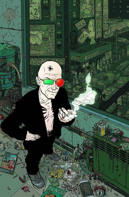
#its fully colored. shading. lighting. compositing. the works
Explore tagged Tumblr posts
Visit Tumblr Blog
Explore Tumblr blogs with no restrictions, modern design and the best experience.
Last Seen Tumblr Blogs


Fun Fact
Tumblr was the first site to host the blog for President Barack Obama in 2011.
Text
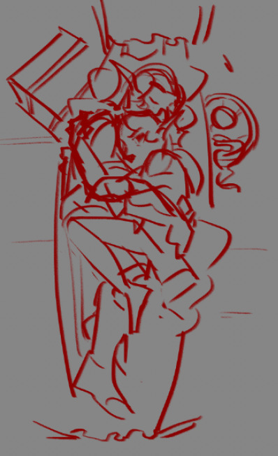
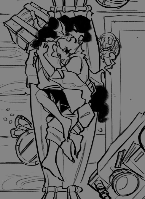
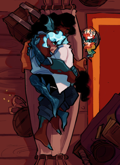
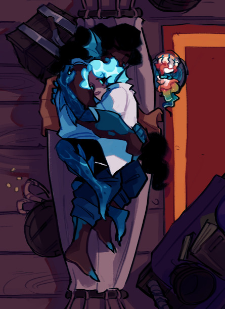
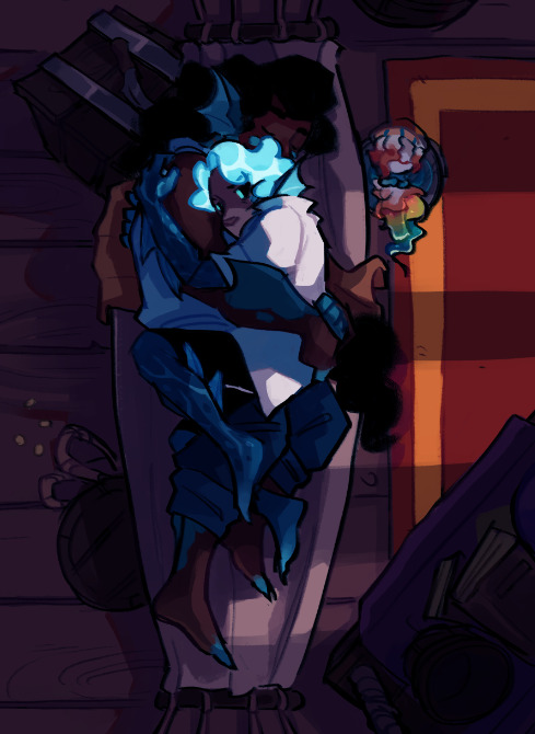
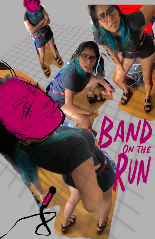
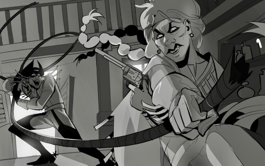
if someone gives me a number between 1 and 62, ill share a wip of that frame of the silver video im working on. i'm deranged and posting them/sharing them privately w friends and Also posting bits to twitter is Not Enough. i am going Crayzee
#hush catríona#im 32.5 files Completed. and. grips ur shoulders. tumblr u need to understand#'oh she's working on a video. cool! an animatic!! awesome' WRONG#ive DONE animatics before. theyre clean boards. this>???? this is a pmv. its. head in my hands. sniffles#its fully colored. shading. lighting. compositing. the works#i am CRAYZEE i need silver to have the coolest most ambitious love letter of a project Ever. i NEED it#I HAVE A COLOR SCRIPT. U NEED TO UNDERSTAND. I AM LOSING MY MIND#my self-appointed deadline is end of this month bc that ensures no more lore comes out before its done#ive been working on it for abt a month total now almost. started jan14. im . weeps#yea#im willing to share a few frames to keep me sane. when im not willing anymore ill just say it. heart emoji
36 notes
·
View notes
Note
hello … what are your best tips for improving your art? i want to study and learn more but i’m lost on where to begin!!!!! big fan of your work by the way it’s a big inspiration to me! ☀️ i hope this isn’t a bothersome ask!!!!
My biggest tip is to learn first and foremost how to enjoy the learning process. When you do that you’re pretty much set for everything else. The biggest roadblock i and a lot of other artists seem to encounter is not Not knowing how to draw something, it’s not being able to make yourself get up and tackle learning how to head on. A lot of it is just your self talk or mindset when you broach it. viewing improvement as a chore or unachievable makes you reaally not want to do it, so you end up delaying it and just avoiding it altogether. I’ve done that a few times. You basically just have to hype yourself up, even if you don’t fully believe any of what you’re saying, it’ll still influence you in the same way self-deprecative humor can influence someone’s self esteem. And give yourself a treat every time you try :) build up that positive association! It’s tough early on, and it can feel like pulling teeth, but teeth don’t just get pulled for no reason. You’re making a step forward! Decide small goals for yourself. Saying you want to just “improve” is pretty vague, and most of all daunting. It doesn’t happen all at once in that way. You need to build up the bases. If you want to improve, be specific, say you want to get better at composition, color, lighting, anatomy (which must be further broken down to learning how to draw things like arms, legs, hands, because anatomy is a whole thing in and of itself lol.)
and that brings you to actually learning. My suggestion is to draw from life whenever you can. There’s no faster way to understanding three dimensional forms than having a subject right in front of you. This is something i do very often, whenever I go out i bring a little sketchbook and draw friends, surroundings, etc, and it’s what has helped me improve the fastest. Use cross-contour lines to your advantage! Draw a form and try to find its dimensions. It’s mindless and gets much easier the more you do it, while also still being very informative. When you understand the dimensions of something, shading becomes easier too. and ofc study art that you like, deconstruct why you like it and try to apply it to what you draw. Watch speedpaints and pay attention, try to pick apart the process of the artist! I recommend yt channels like ethan becker and sycra for composition and anatomy/design lessons.
thanks for the ask! I really appreciate it and your kind words. Good luck!! You can do it! ^_^
60 notes
·
View notes
Text
The Must-See Van Gogh Paintings at the Museum: A Guided Tour
Vincent van Gogh museum tours is one of the most celebrated artists in the history of Western art, and his work is known for its unique style and emotional depth. If you're planning a visit to a museum that features his paintings, here's a guided tour of some must-see Van Gogh museum tickets paintings that will give you a deeper appreciation of his artistic genius. While the specific works on display may vary from museum to museum, this list includes some of his most iconic pieces:
Starry Night (1889): Start your tour with one of Van Gogh's most famous works. "Starry Night" is known for its swirling, vividly colored night sky and the small village below. The painting is both mysterious and captivating.
Sunflowers (Various versions, 1888-1889): Van Gogh painted multiple versions of sunflowers, and any of them is worth seeing. These vibrant still life paintings are known for their bold colors and textural depth.
The Bedroom (1888): This work offers a glimpse into Van Gogh's personal life. It's a portrayal of his bedroom in Arles, and it showcases his unique perspective on domestic life and his use of color to express emotions.
Irises (1889): "Irises" is a beautiful painting of a garden with various irises in different shades of blue, purple, and yellow. It reflects Van Gogh's love for nature and his fascination with color and light.
Café Terrace at Night (1888): This nocturnal scene is set at a café in Arles. The warm, inviting glow of the café under a starry sky and the cobbled street make for a captivating composition.
Self-Portrait (Various, 1887-1889): Van Gogh created numerous self-portraits, and they provide an intimate look into the artist's psyche and his evolving style.
The Potato Eaters (1885): This early work by Van Gogh is a poignant representation of rural life. The earthy tones and intense realism in this piece show his early artistic influences.
The Sower (Various versions, 1888): Van Gogh painted several versions of "The Sower." These depict a lone figure sowing seeds in a field, and they are powerful representations of human effort and connection to nature.
Wheatfield with Crows (1890): Often thought to be one of his last works, "Wheatfield with Crows" is a haunting and dramatic landscape, filled with symbolism and emotion.
Almond Blossom (1890): A more serene and optimistic work, "Almond Blossom" features delicate pink flowers against a blue sky, symbolizing renewal and the artist's connection to nature.
Remember that this list is not exhaustive, and each Van Gogh painting tells a unique story and offers a different perspective on his artistic journey. Take your time exploring these masterpieces and be sure to learn more about the artist's life and the historical context of his work to fully appreciate the genius of Vincent van Gogh.
0 notes
Text
A New Era in Cosmetic Dentistry: Composite Bonding London
Cosmetic dentistry has seen remarkable advancements in recent years, offering innovative solutions to enhance smiles and boost confidence. One such breakthrough in this field is Composite Bonding London, a cutting-edge cosmetic dental procedure offered by Whites Dental. This technique has gained immense popularity for its ability to transform smiles, correct various dental issues, and provide outstanding results with a pain-free experience.

Understanding Composite Bonding London
Composite bonding, also known as tooth bonding or dental bonding, is a cosmetic dental procedure that utilizes composite resin to address various dental imperfections and enhance the appearance of natural teeth. Unlike porcelain veneers, which require the removal of a significant amount of tooth enamel, composite bonding is a conservative and minimally invasive procedure. It is a versatile solution that can be used to correct a wide range of dental issues, including cracked teeth, close gaps between teeth, and improve tooth color.
Pros and Cons of Composite Bonding
As with any cosmetic procedure, composite bonding has its pros and cons:
Pros:
Minimally Invasive: Requires little to no removal of healthy tooth structure.
Versatile: Addresses various dental imperfections.
Natural Appearance: Achieves a seamless and natural look.
Quick Results: Provides immediate improvements.
Cost-Effective: Often more affordable than alternatives like porcelain veneers.
Cons:
Durability: While durable, composite bonding may not last as long as porcelain veneers.
Staining: Composite resin may be susceptible to staining from certain foods and drinks.
Repairs: Repairs may be needed over time if the bonding material chips or stains.
Composite Bonding: The Process
Consultation
The journey of composite bonding at Whites Dental begins with an initial consultation. During this appointment, patients can discuss their concerns, desires, and expectations with experienced cosmetic dentists who specialize in composite bonding in London.
Examination
A comprehensive dental examination is conducted to assess the patient’s oral health and determine the suitability of composite bonding for their specific needs. X-rays may be taken to ensure there are no underlying dental issues.
Treatment Plan
Following the examination, a personalized treatment plan is created, outlining the recommended procedures, expected outcomes, and associated costs.
Tooth Preparation
Unlike some other cosmetic procedures, composite bonding typically requires minimal tooth preparation. In most cases, there is no need for the removal of healthy tooth structure.
Shade Selection
The dentist works closely with the patient to select the ideal shade of composite resin to match the natural teeth. This ensures a seamless and natural-looking result.
Bonding Process
The dentist applies the composite resin to the prepared tooth, carefully shaping and sculpting it to achieve the desired shape and appearance. A special bonding agent is used to ensure the composite resin adheres securely to the tooth.
Curing and Polishing
A curing light is used to harden the composite resin. Once the resin is fully cured, it is meticulously polished to achieve a smooth and natural finish that blends seamlessly with the surrounding teeth.
Final Adjustments
The dentist makes any necessary final adjustments to ensure the bite is comfortable and the aesthetics are perfect.
Benefits of Composite Bonding Teeth
Composite bonding in London offers numerous advantages, making it a preferred choice for many individuals seeking cosmetic dental treatments:
Conservative Approach: Unlike porcelain veneers, composite bonding preserves the natural tooth structure, making it a minimally invasive option.
Versatility: Composite bonding can address a wide range of dental imperfections, including cracked teeth, gaps, discoloration, and misshapen teeth.
Natural Appearance: The composite resin used in bonding closely mimics the appearance of natural teeth, resulting in a seamless and natural-looking smile.
Pain-Free Procedure: Composite bonding is typically painless and does not require anesthesia, making it a comfortable experience for patients.
Quick Results: The entire process can often be completed in a single visit, providing immediate improvements to the patient’s smile.
Affordability: Composite bonding is often more cost-effective than alternative cosmetic procedures, such as porcelain veneers.
Why Choose Whites Dental for Composite Bonding in London?
Whites Dental, located in the prestigious Harley Street, is a renowned dental clinic offering exceptional cosmetic dental treatments, including composite bonding. Here’s why Whites Dental stands out:
Experienced Cosmetic Dentists: The clinic boasts a team of highly skilled and experienced cosmetic dentists who specialize in composite bonding and other cosmetic procedures.
Outstanding Customer Service: Whites Dental is committed to providing outstanding customer service, ensuring that each patient feels comfortable and well-cared for throughout their treatment journey.
Cutting-Edge Technology: The clinic is equipped with state-of-the-art dental technology, allowing for precise and efficient composite bonding procedures.
Customized Treatment: Each treatment is tailored to the individual patient’s needs and goals, ensuring optimal results and satisfaction.
Pain-Free Experience: With a focus on patient comfort, Whites Dental ensures that the composite bonding procedure is virtually pain-free.
Final Words
Composite bonding in London, offered by Whites Dental on Harley Street, has ushered in a new era in cosmetic dentistry. This innovative procedure allows individuals to achieve stunning smiles with minimal invasiveness and a pain-free experience.
With its versatility, natural appearance, and affordability, composite bonding has become a popular choice for those seeking to correct dental imperfections and enhance their self-confidence. If you’re considering cosmetic dental treatments, explore the benefits of composite bonding and consult with the experienced cosmetic dentists at Whites Dental to begin your journey toward a more beautiful smile and outstanding customer service.
0 notes
Note
I dont wanna come off as pushy, but someday could you do a speed-paint video please? Ive asked like 20 tumblr artists key facts on learning stuff and like 11 of them went “speed-paints”, and your shit(affectionate) is cool so yea sorry for long ask bye gn I'm tired.
the few speedpaints ive recorded are heavy enough to crash my computer when i try to load them so have a set of stages in my drawings instead
sketch: i lay down the composition and body language, if im feeling confident ill also plan values but i didn't in this case. i try to keep a very loose vibe as the more layers to lineart the more stiff the characters can feel
lineart: shit gets cleaned up, characters and background defined, keep background, characters and foreground linearts on different layer groups, you'll thank me later

flats: the ugliest stage in my opinion but necessary, start planning a light source for the next step

base shadows: simple as well, just shade based on light source and bouncing light, you can also do some rendering on some parts. i like to do my initial shading without multiply layers as it gives it a bit of a painterly look
coloring the lineart: helps pull the piece together and add a sence of depth, this is also why we separated the lineart layers so they work more smoothly without cutting of colors
now i would consider this done but i wanted to change the mood so we now go onto extra stuff
here i did some heavy hue altering to a colder atmosphere, mostly using hue shift and lighting settings on editing
multiply layers are your friends for dramatic shadows, use them wisely, i actually erased them in mariza's hair to make it stand out
lighting time to make the shadows stand out more, remember that its also going to reflect on surfaces near them so keep a track or those. i used glow layers for this
value check! something that should be done across the entire process, helps you track your shadows and lights without the colors getting in the way. use it to avoid muddy areas of greys on your art
mess around with some settings and gradient maps and boom! you got your fully done ilustration, theres a lot i didnt touch on like painting rendering and some extra pizzaz i like to add but im running out of image capacity and time so i hope this helped
happy drawing!
#pada asks#my art#idk how to explain art stuff so this is a bit of a mess#but so is my art process to i guess it works out in the end#long reads#long post#art advice#art tutorial#tutorial#digital art#ilustration#artists on tumblr
219 notes
·
View notes
Note
hiii! i really admire your art skills. and the fact that you improved so much in just 6 months is inspiring! do you have any tips on how to improve? i'm 26 and i want to improve but i feel like ive neglected my art for so long and now it's too late. :(
THANK YOU SO SO MUCH OMG ?? oh man i’m so bad with feeling and gratitude but this seriously means more than i can express so i worked really, really hard on narrowing down my best tips! so here’s
Eli’s Top 5 Rules To Be a Totally Cool Awesome Badass Artist In As Long As It’s Going To Take (In Order) :
Most important rule of all is it should be FUN. be disgustingly self indulgent, draw what you want and LOVE, not what you think you should or what everyone else is, or how everyone else is! don’t vibe with doing sketches first? hate lining? despise complicated painting styles? find shortcuts, don’t do them!!! if you’re doing digital maybe draw your sketches traditionally first and scan them/take a photo to draw over, try a lineless style, cel shading, or mixing mediums, the options are endless! this is where your “style” will come from. all “style” is, is an artists shorthand.
You are your only competition. never compare your progress to anyone but your past self, it’s not a race in terms of how good you are at X age after X amount of time spent practicing. i saw it illustrated in this comic a few years ago (that made me cry at the time, because i hadn’t started drawing yet) as seeing your skills as a beautiful potted plant- just because some people are walking around with theirs fully grown and thriving, doesn’t mean your little sprout will stay small forever. just be patient, keep watering it, and eventually, it’ll be a beautiful flower all your own. ❀
Use references Obsessively. this includes tracing! (ethically) there’s a ton of resources out there, redraws of frames from movie or shows are great too! play around with it, try using the perspective but change the style or turn it into a character au for a fandom you love. (this is part of that first tip!) mashing together images past the point of original intelligibility is acceptable as well. the goal isn’t to obsess over accuracy or stop using references altogether though, just to use them differently over time.
Inspiration/motivation won’t be gone forever. don’t force yourself to practice drawing, or you’ll end up resenting it altogether. i’ve had my tablet and pencil since january but i say 6 months bc there were two (almost three) entire months where i had no inspiration and just did Nothing. take time to consume new media for ideas or look at what inspires you instead! keep folders of the things you find most appealing to pull up when you need them. art can be a freeing escape if you allow it to be!
Look at art you admire and think about Why you admire it. why does it look good, what catches your eye most? is it the colors? the lighting? the shapes and perspective? the varied line thicknesses or the overall layout composition? everything can be broken down into components, hone in on the ones you like most and try to emulate them. we’re all just flowing down the stream of shared inspiration together. :)
bonus digital art tip: you will always need more layers than you think you do. give each element its own layer like it’s the most introverted mf you’ve ever met, i swear on everything good in this cursed world you will thank me later. layer/item selection and transform are your best goddamn friends for life.
there’s also a lot of art related posts in this tag and on my art twitter ♡ thank you endlessly again and good luck on your journey!!
#art tips#art advice#anonymous#love me#i just know i'm forgetting sth#and i'll kick myself when i remember later#but i Think that's everything#that's helped me most at least!#i hope it can help you at all#it's never too late ♡
96 notes
·
View notes
Text
Future Drabble
So I wrote this back in November of 2020 and then forgot about it until now. I am pretty sure it was for Parkner week but this is the only prompt that I completed. With a bit of editing I now bring you this little story based on the prompts: “2029, that’s not a real year” / time travel / future au
Peter takes a moment to survey the scene from where he’s perched atop one of the many trees within Central Park. The sturdy branch that he stands on is far different than the usual skyscrapers that he perches on but today’s mission is a far cry from his usual patrols around the city.
It’s true that the world had adopted a new normal after the events of the blip. Peter’s definition of normal had changed more drastically than most after being brought back only to have to fight to save the earth in a massive battle and then nearly losing Mr. Stark in the snap. But the battle was won, earth was saved, Mr. Stark recovered, Peter settled fully into his role as Morgan’s older brother and partner in crime, and Peter became close with the one and only Harley Keener. The world adjusted to its new normal and Peter found himself adjusting with it.
However, the scene unfolding before him in central park was so bizarre that neither the world’s new definition of normal nor Peter’s new definition for it could make it seem any less strange. An alien ship that somewhat resembles a snowflake if it had been painted in a grotesque shade of mustard yellow and accented in a muddy green color is hovering just above Central Park. The ship itself isn’t the largest that Peter has ever seen and neither are the aliens that are pouring out of it. In fact, Peter is fairly certain that the creatures would only come up to about his hip if he took a moment to stand beside one. The idea of standing beside one to properly gauge its height is completely lost on Peter when the ship lets out a loud creaking sound before releasing a fuchsia beam of light.
Peter’s spider senses flair and he dodges away from the beam fast enough that it misses him. He turns his head to follow the path of the beam but he can’t see any noticeable damage. He opens his mouth to ask Karen to patch him through to the Avenger’s coms so he could update them before they arrive on scene in a quintet but he is cut off as his senses flare loudly in the back of his mind once again. He attempts to lunge out of the way again but it seems that the aliens have taken note of Peter’s quick reflexes and broadened the width of the ray they are targeting him with.
Peter finds himself encapsulated in a blinding fuchsia light. He tries his best to call out to the Avenger’s to let them know that he has been hit and is in need of backup but he feels as though the air has been ripped from his lungs. He remains aware long enough to feel the startling sensation of being weightless for just a moment and then beginning to fall rapidly before unconsciousness finally pulls him under.
-
Waking up on the floor of the lab is not an unfamiliar feeling for Peter but the half finished projects around him are so technologically advanced that Peter has to wonder who on earth has been working in the lab. He groans softly and slowly sits up so that he is now sitting cross legged on the floor just beside his usual work bench. He looks around blearily to try and figure out how he’d ended up in the lab. The last thing he remembers was being hit by the fuchsia ray from the alien’s ship and now he’s sitting on the floor of the lab.
“Uh, hey Friday?” Peter calls out into the empty lab, hoping that the AI could shed some light on whatever situation he’d managed to get himself into. His eyes sweep curiously around the lab as he takes in the sight before him. On top of his work bench is what looks to be a half finished spider suit but it’s a design that Peter can only recall barely beginning to plan the logistics of let alone actually building the suit. He steps closer to the table and begins to inspect the composition of the suit and is relieved to find that it is not much different than the suit that he is currently wearing.
Before he can further examine the suit, a familiar voice sounds from the ceiling, “Peter, would you like me to alert Mr. Stark of your presence?” The AI asks and Peter cannot help but notice that there seems to be the slightest hint of confusion in Friday’s tone, well as much confusion as a AI’s voice can hold. Peter contemplates the question for just a moment and decides that he doesn’t want to worry Mr. Stark if not necessary and would rather question his boyfriend about what is going on.
“No thanks Fri, but could you maybe ask Harley to come down here? I’ve got some questions for him.” Peter replies and makes his way over to sit on the comfy couch in the lab. He pauses in his steps when he finds that the couch in the lab is not the slightly oil stained tan couch that he was expecting but instead is a very cozy looking grey couch that has a very soft looking maroon blanket strewn over the back of it.
“Hey Friday, how long has this couch been here?” Peter asks in confusion, he tries to ignore the dread that is beginning to pool in his stomach as his mind begins to piece together the clues that his surroundings are giving him.
“That particular couch has been in the lab for four months. The prior one had to be replaced after an accident involving Harley and Morgan adding a bit of food coloring to your web fluid as a prank but the compounds did not react well to each other and created a slightly acidic explosion of web fluid.” Friday explains and Peter’s mind races as he takes in the new information. He definitely would not have forgotten something as memorable as an explosion of colorful web fluid capable of dissolving parts of his favorite napping couch. He is also aware that he would have noticed if he’d been taking naps on a new couch for the past four months and yet Peter can’t think of a single memory of ever seeing this grey couch before. He nods slowly and takes a seat on the plush grey couch before addressing Friday again.
“Fri could you tell me what the date is?” He asks quietly and sucks in a shaky breath of anticipation. Peter’s heart is beating rapidly in his chest and he thinks that someone without super hearing like him would be able to hear it. The response he receives silences his thundering pulse for just a moment as an icy wave of anxiety washes over Peter. Panic takes hold in Peter’s chest as the teen attempts to process Friday’s reply.
“Today is August 1st, 2029.” Friday replies in a gentle tone as if she is expecting the answer to startle Peter. Peter such in a sharp breath and curses quietly under his breath. He shakes his head and pulls his knees up against his chest, curling himself into a small ball as he tries to fully comprehend what has happened. His hands grip the fabric covering his shins just a bit too tightly but Peter is more focussed on the way that the familiar walls of the lab around him seem to be closing in and making it harder and harder to breathe.
“That can’t be right. 2029, that’s not a real year…” Peter breaks off with hysteric burst of laughter. “I’ve been through a lot of crazy stuff recently but time travel can’t be one of them. Aunt May is gonna kill me…” Peter groans as he finally releases his hold on his suit to run his hands through his hair only to find that he has yet to remove his mask in the chaos of waking up in what apparently is the future. He pulls the mask over his head and balls it up in his fist. He mentally curses his Parker luck as he thinks about how the hell he managed to get thrown into the future by some alien time travel gun. His downward spiral is interrupted but the sound of the lab door sliding open and part of him hopes that his Harley will walk through the door, grinning about the hilarious joke that Friday just pulled on him.
All hopes of the situation being a joke are shattered as the door opens fully, making room for a muscular figure to step through. Peter’s mouth falls open in shock as he undoubtedly recognizes the man as none other than Harley Keener. A much more muscular, older, and taller Harley Keener. He looks over the man and notes the slight beard that Harley is sporting and the way that his hair is cut into a shorter and more mature style than he’s ever seen his boyfriend wear.
Harley pauses in his tracks as well and simply stares at Peter for a moment before letting out a surprised chuckle. He runs a hand through his hair, in similar way to the Harley that Peter is used to does when he is unsure of what is happening, Peter sits up a bit straighter and lets his knees down so that he is no longer curled into a ball. His spider sense aren’t going off so he knows that this not some kind of trick and he is not in any danger but the whole situation still has him on edge.
“Wow, okay… I thought Friday was kidding when she said you were here. Like really Pete, this is crazy even for you.” Harley teases gently and Peter is taken aback for just a moment. Harley’s voice is familiar but so different. It’s deeper and has lost most of the southern drawl that Peter loves so much. Harley seems to notice the way that all the subtle changes are putting Peter on edge and smiles gently at the enhanced teen before him.
“Hey, this ain’t a big deal. We kept the time travel tech around just in case any of us got into a situation like this so we can have you back home to your time in well, no time at all.” Older Harley reassures Peter. Peter finds himself nodding dumbly and taking another deep breath to try and collect himself.
“Sorry, it’s all just so different here but at the same time like not different at all.” Peter murmurs as he looks around the lab again before returning his gaze to Harley who is simply smiling at Peter as if he’s finding Peter’s reaction to be absolutely adorable.
“Yeah well, the lab hasn’t really changed much other than upgrades to tech but I don’t want to mess up any timelines by showing that stuff to you so lets get you home. Come on, get up. This is probably gonna be a lot easier than you expected but the time travel tech is embedded into some bracelets now and you’re just gonna slip it on and I’ll do the rest.” Harley says and guides Peter over to Mr. Stark’s work station. He rifles through a few drawers before finding what he is looking for and passes a sleek looking band over to Peter who gives it a once over before sliding it on to his wrist.
Harley grabs a stark pad off the work station and opens up a tab that Peter has never seen before. The logo looks slightly familiar and he thinks he might have seen it once before on some drafts on Mr. Stark’s table but he never payed it much attention. Peter finds his attention drawn to as simple silver band on Harley’s ring finger.
Harley glances over at Peter for just a second and registers exactly where Peter has focussed his attention. He grins slightly before returning his attention to the StarkPad and typing in the last few details of whatever information he has to input into the device.
“Is that a… are we… did we get married?” Peter stumbles over his words as he tries to fathom the idea that maybe, just maybe his future self overcame his awkwardness to ask Harley to be his husband. Harley smirks at Peter once again and simply shrugs his shoulders.
“I feel like that is apart of the spoilers that I am not supposed to tell you but you’ll just have to figure that out for yourself.” Harley replies and cuts Peter off before he can protest. “Alright, I hope you’re ready to head home. Legs apart and knees slightly bent unless you want to end up on the floor again. Deep breath in, this damn thing always knocks the wind right out of you. It was nice to see you again Pete.” Harley rushes out all in one breath and gives Peter a cocky wave before pressing a button on the StarkPad in his hands.
Peter feels a tugging on his wrist that quickly encompasses the rest of his body. He feels the weightlessness of zero gravity before he is once again falling through time. He manages to remain conscious this time but his reeling mind leaves him feeling just as disorientated as waking up in the future had. His feet connect with solid ground and the dizzying feeling of falling subsides and Peter finds himself standing beside his team.
“Man of Spiders, it is nice of you to join us! Where have you been?” Thor’s booming voice alerts the others of Peter’s presence. Before Peter can even begin to explain what happened to him, he is being pulled into a ferocious hug by his lover who is still clad in his Iron Lad suit. The face plate on the suit flips up to reveal Harley’s worried face.
“Do you have any clue how worried you had me? I feel like I’ve aged like ten years just from this experience!” Harley complains and sends Peter into a bout of barely suppressed laughter. The way Harley yells at Peter for laughing in response to his concern is completely worth it as Peter remembers the sight of the silver ring on future Harley’s finger.
#peter parker#Adorable Peter Parker#parkner#harley keener#harleypeter#super late#I don't remember if I posted this anywhere already#I'm pretty sure it never got posted#a dragon's drabbles
32 notes
·
View notes
Text
Okay for the anon who asked about my process, i’m an idiot and accidentally deleted the ask so here we go.
I go about it a few different ways:


Sometimes I use myself as reference to set up my composition and poses, and ngl it looks super goofy but it works and I find it to be a lot faster than thumbnailing or sketching. Afterwards I do my lineart(no sketch). Then comes the part were in a separate layer I use the paint bucket tool to color the surrounding characters (the red part). I hide my line art layer and underneath the red layer I’ll fill in the blank space with another color (in this case light blue). I delete the red layer and now I have my characters colored, mostly. On a new layer on top of that I block in the colors that I might use and then use my light blue layer with locked transparency to fill in the gaps of color. I usually merge these two layers so I don’t have a step-by-step of this. After my base colors are done I will color in my line art.
I will still mess around with the colors some, once I get to a point where I like I’ll add texture or text if need be.

However, a lot of the times I will freehand my poses. My line art can be considered a very cleaned up sketch since I usually don’t sketch a base. I personally find that a lot of the drawings energy is lost when you sketch something and then line over it. If I do use a rough sketch I use a huge semi transparent brush so that I don’t get any details in and risk losing that energy in the process. Its more like creating a rough silhouette.
For shading, once I have my color palette roughly picked out in my head I just blob it in and then “sharpen” it
Backgrounds are a whole different beast and most times I would just say fuck it and freehand it in (left). A few times though I’ll actually try, like on the right I used Adobe illustrator’s 3-D space to create some buildings.
Here’s a speedpaint of something I fully rendered (x)
My process changes around a lot, but this is roughly how it goes most of the time!
#this is my third time attempting to make this post why does technology hate me#anyways never be afraid of using references I have so many goofy looking pictures of me on my iPad for reference#I pray none of my friends ever look into it#art process#my art#good luck!#I hope some of this made sense
282 notes
·
View notes
Photo
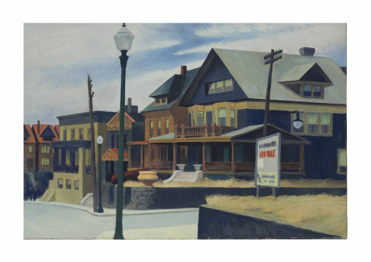
East Wind Over Weehawken by Edward Hopper, 1934
Painted in March 1934, shortly after Edward Hopper's retrospective at the Museum of Modern Art in New York, and during a moment when he was rethinking his art, East Wind Over Weehawken can be seen as the birth of his fully realized, mature artistic vision. This masterwork manifests Hopper's celebrated aesthetic, which distinguished him from his peers and created a uniquely American iconography that continues to define him as one of the most important and influential artists of the twentieth century. As with all his most successful works, in East Wind Over Weehawken, Hopper maintains a strong sense of place and an overt realism, while seeking to capture what he described in 1933 as "the most exact transcription possible of my most intimate impressions of nature." (as quoted in L. Goodrich, Edward Hopper, New York, 1967, p. 161) Here he masterfully elevates a commonplace subject to express the realities of post-Depression life in America. Hopper acknowledged East Wind Over Weehawken as one of his most important paintings, writing, "I have always thought of it as one of my best pictures." (unpublished letter to Joseph T. Fraser, April 8, 1952) This sentiment was echoed in 1952 by his long-time dealer, Frank Rehn, who commented, "East Wind Over Weehawken is certainly one of the most Hopperesque canvases he has ever painted." (unpublished letter to Joseph T. Fraser, March 12, 1952) Hopper's early years were spent studying at the New York School of Art under Robert Henri, the leading promoter of the Ashcan School. Here he learned about the American realist tradition that began with Thomas Eakins, who Hopper later acknowledged as "one of his heroes" (as quoted in D. Ottinger, et al., Hopper, Paris, 2012, p. 20) and gained an appreciation for the work of Edouard Manet alongside young luminaries that included Gifford Beal, George Bellows, Rockwell Kent and Guy Pène du Bois. Although the mature style of East Wind Over Weehawken marks a distinct departure from Henri's painterly and bravura depictions of the gritty side of the city, the work reflects Hopper's lifelong adoption of one of the older artist's central teachings: to paint the city and street life he knew best. Henri's early encouragement to look to his surroundings for subject matter stayed with Hopper throughout his career, and the subjects of many of his great works, including East Wind Over Weehawken, are those of quotidian, distinctly American scenes which moved him. While Hopper's early pictures directly demonstrate Henri's influence with their focus on the bustle of the city, mature works such as East Wind Over Weehawken demonstrate a fundamental shift in both his choice of and his approach to his subject. This distinguished Hopper from his contemporaries and accounts for his singular and lasting artistic vision. In East Wind Over Weekhawken he takes as his subject a sleepy New Jersey town across the Hudson River from Manhattan, where he had traveled on the ferry, seeking architectural inspiration for the home and studio that he and his wife, Jo, were getting ready to build in South Truro on Cape Cod. Here Hopper depicts a characteristically overlooked area on the fringe of the thriving urban hub, presenting an image of the banal reality of American life that captures the overarching character and condition of mid-century existence in the United States. Hopper's persistent interest in the vernacular in works such as East Wind Over Weehawken further distinguished him from his peers and set him apart from the artistic movements of the 1930s and 1940s. Lloyd Goodrich wrote of Hopper's distinct style and vision, "His art was based on the ordinary aspects of the contemporary United States, in city, town, and country, seen with uncompromising truthfulness. No artist has painted a more revealing portrait of twentieth-century America. But he was not merely an objective realist. His art was charged with strong personal emotion, with a deep attachment to our familiar everyday world, in all its ugliness, banality, and beauty." (Edward Hopper, New York, 1967, p. 15) In East Wind Over Weehawken Hopper presents a quiet street in the "cold raw weather" of a March afternoon. While the houses are all in good order, the financial woes of the town's inhabitants are indicated by the "For Sale" sign and the unkempt lawns. There are no cars on the street or people visible on the porches or in the houses' windows. The only human presence is a distant group of figures at far left, imbuing the work with an eerie silence. Similar to the "For Sale" sign that is vexingly difficult to read, it is impossible to discern for what purpose the group of people at far left has convened. Hopper deliberately crops the image so that the answer appears to be just beyond the edge of the canvas, introducing an unresolved narrative that simultaneously entices and rebuffs the viewer as he or she continually tries to decipher the scene. Hopper's oeuvre is defined by works such as East Wind Over Weehawken--scenes of quiet tension that create a visceral unease in the viewer. In his closely cropped interiors, this tension is manifested through estranged human relations. In East Wind Over Weehawken, Hopper masterfully utilizes the various compositional elements and perspective to create the tension and anticipation that are characteristic of his best work. He creates a shallow, stage-like pictorial space, using the impenetrable wall of houses to vexingly focus the viewer's attention in the foreground, and the scene operates much like a film still, a single vision isolated from an overarching narrative. This is further heightened by the subject itself, which is common enough to feel familiar and yet rendered in such an anonymous fashion so as to make it feel foreign. This creates a continuously engaging dichotomy as the viewer continuously tries to reconcile him or herself with the emotions the scene evokes. The perspective in East Wind Over Weehawken is as if one is looking through a car window, having come to an intersection. Windows, whether depicted or implied, architectural or vehicular, are a central component of the Hopper's work that imbue his oeuvre with a sense of detached voyeurism--of being outside looking in. In many of Hopper's paintings and watercolors from the 1930s onward, the invisible presence, actual or implied, of the automobile succeeded the artist's earlier practice of peering through windows while riding the El trains in New York City. Hopper's effective and varied use of windows in masterworks such as East Wind Over Weehawken, Nighthawks and Room in New York not only imbues them with a sense of voyeurism, but also compels the viewer to reflect on the isolation of the individual in modern society. The sense of psychological distance and tension in East Wind Over Weehawken is further heightened by Hopper's use of form, line and color. He concentrates the composition on the interplay of architecture and employs these elements to create a sense of ambiguity and suspense that is reminiscent of the works of Italian artist Giorgio de Chirico. The repetition of triangular and rectangular forms bisected by strong vertical and horizontal lines gives the painting complexity and rhythm and leads the eye down the street; until it is blocked by the row of houses at the far left and sent back over the forms. As with all of Hopper's most successful works, there is a strong sense of wanting to get beyond the buildings, to see over them, to see behind the building in the foreground, to see around the curve in the road--yet the eye runs up and down the street unable to move beyond and continually forced back into the scene. There is a sense of thwarted exit as the diagonal of one side of the stone wall leads the viewer into the scene, while the diagonal of the other side, leads him or her out, but out to something that is beyond the picture plane. Similarly, the well-lit steps invite the viewer into the various homes, only to be rebuffed by the deeply shadowed porches; and the lightly colored window shades catch the viewer's eye, while the opaque curtains prevent one from seeing in the windows. The prominent lamppost in the foreground--the only pictorial element that spans the entire height of the composition--creates a physical barrier between the viewer and the scene, immediately relegating one to the role of observer rather than participant. Hopper began using this type of vertical visual blockade as early as 1914 in his French café scene, Soir Bleu (Whitney Museum of American Art, New York) and its function in both paintings is similar to the railroad tracks, country roads and waterways of Hopper's other major works--as a pictorial element that physically and visually blocks the viewer from entering the scene. The success of East Wind Over Weehawken is due to Hopper's arduous creative process in which every aspect of the composition, both what was to be included and what was to be omitted, was carefully planned out before he put brush to canvas. Lloyd Goodrich wrote of Hopper's method, "His pictures were conceived by a complex process that included first hand observation, memory, severe simplification, and a creative synthesis of all elements into imagery that had universal and permanent meaning. He was a highly conscious composer, and through command of massive form, full-bodied color and all-revealing light, he achieved plastic designs of great substance, power and completeness." (Edward Hopper at Kennedy Galleries, exhibition catalogue, New York, 1977, n.p.) Hopper made eight preparatory drawings for East Wind Over Weehawken, each of a different degree of finish and some only a series of isolated pictorial elements with notes on color and mood. He then translated these grey-scale visual notions onto canvas through the veil of memory to present a finished composition, which conveys his experience of the scene in his compelling and melancholic style and characteristically inspires existential contemplations on isolation in modern society. In East Wind Over Weehawken, and throughout his career, Hopper painted aspects of America that few other artists addressed. He portrayed unromantic visions of life in a broad and increasingly modern style, and, while his paintings have formal qualities in common with other Modernists, his art remained steadfastly realist. Hopper emphasized the importance of his realism as an expression of his own, deeper, aesthetic sense. Many of his younger contemporaries, such as Jackson Pollock and Willem de Kooning, increasingly embraced abstraction, abandoning the American realist tradition to form a new and internationally celebrated school of Abstract Expressionism. However, Hopper was one of the few realist artists admired by these younger painters, which is a testament to his importance during his lifetime. James Thrall Soby wrote, "It always astonished me that these young artists exempted the late Hopper from their acrimony against the realist tradition." William Seitz, the organizer of the 1967 São Paolo Biennale that included East Wind Over Weehawken alongside work by Roy Lichtenstein, Robert Rauschenberg, and Jasper Johns, similarly wrote, "He was highly regarded by advocates of both representational and abstract painting, and by avant-gardists as well as conservatives." (quoted in D. Ottinger, Hopper, Paris, 2012, p. 17) Hopper's choice, and his earnest and slightly romantic representation, of seemingly mundane subject matter in seminal works such as East Wind Over Weehawken set him apart from his contemporaries and allowed him to create a new and uniquely American iconography. Today, Hopper's importance as one of the great artists of the twentieth century is recognized on an international level. On the occasion of the most recent retrospective of his work, which included East Wind Over Weehawken, Guillermo Solana and Jean-Paul Cluzel wrote, "His uncommon sensitivity, his distanced perspective on the world, and his sense of drama have earned him a significant place in the history of modern art. Hopper's work not only casts a spotlight on the birth of American modernity, but also marks the advent of a form of artistic creation entirely his own. His work is recognized throughout the world and his paintings, with their very particular atmosphere, now form part of our collective imagination." (Hopper, 2012, n.p.) East Wind Over Weehawken is a testament to the transcendent power of Hopper's aesthetic and a masterwork of twentieth-century art that is as compelling to contemporary viewers as it was when first shown at the Whitney Museum of American Art in 1934.
17 notes
·
View notes
Note
i know its prob a very simple answer, but what exactly IS rendering? Fgghgghg I have a vague idea, but I keep seeing different examples and I'm never sure
(your rendering is absolutely Amazing btw!!)
- ttaswell
Oh @ttaswell you’re so valid! (And super sweet!! Thank you!! <3) I hope this makes sense! (Oh boy this did get long.)
At it’s simplest, rendering is a translation or interpretation of a subject into art or finished artwork. So rendering can be the act of making art or the finished product! A lot of the time you can use drawing and rendering interchangeably. There are a ton of various definitions that all approximately mean the same thing so I’ll give it a go to simplify what I mean when I say rendering!
If a piece is currently being worked on, rendering is formulating the composition/idea by adding color, shading, light, and texture.
If it’s a finished work, it refers to the overall detail, form, complexity, depth via techniques used (texture, color, brush strokes, etc).
So by and large rendering refers to the level/complexity of detail in an artistic work. A “fully rendered” piece can mean it’s realistically drawn (complex and represent the subject matter very precisely, like an exact translation) OR it is finished to the artist’s liking and represents their original idea fully/satisfactorily.
(Over rendering can mean you have added extra details or information that don’t add to the sum of its parts. The original idea was already clear and represented but more was added or worked than was necessary.)
Putting an idea (a still life, landscape, original character, etc) to paper (or canvas, photoshop, whatever) is rendering! It’s how you draw and express that idea onto a physical medium. It’s your technique!
Personally, I normally use render to talk about texture, form, light, and painting styles in general, whether they’re realistic, impressionistic, or something in between. So for example:
“I like how you render feathers!” = “I like how you use a textured brush to imply the feeling and weight of feathers”
“I like how you render faces!” = “I like how you represent light on an uneven surface to show depth and warmth of skin.”
“I like how you render clothes!” = “I like how you understand form and draping so clothing feels dimensional with only a few key lines.”
“I like how you render!” = “I like the way you handle value and contrast to denote form. I like how you can represent strong silhouettes with only a few colors. I like how your line work is very clear and intentional.”
Tl;dr Rendering is a translation/interpretation of a subject into art or finished artwork. It’s the techniques you use to translate your idea to paper!
#lanes rambles#ttaswell#oh dude if you dont want the tag lemme know!#but#this definitely got a little winded#but i like over explaining#yeah rendering means even more if we're talking about like digital 3d work#anyway enjoy late night art talks yall
16 notes
·
View notes
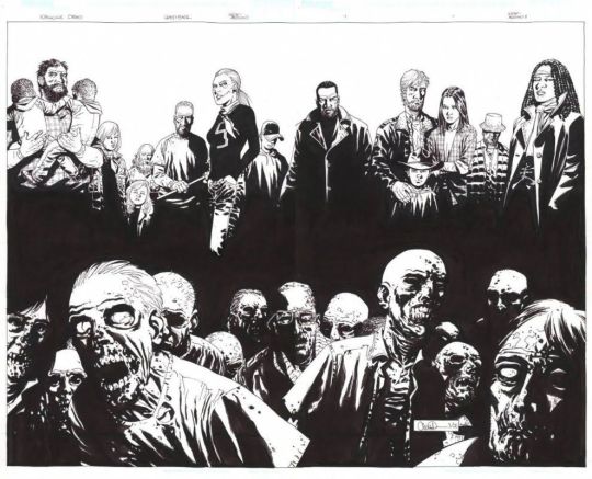
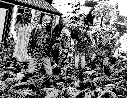
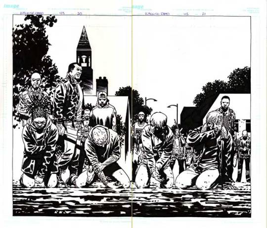
Text
Research: Project Finish
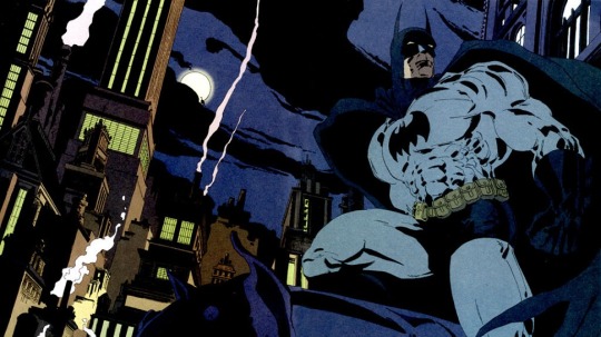
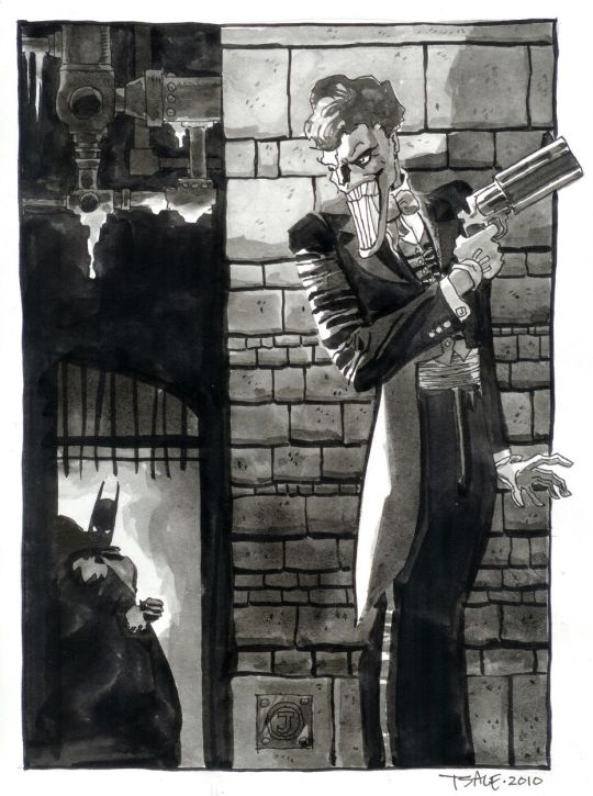
Tim Sale
Tim Sale is a famous comic book artist, who had worked in several titles along with the writer Jeff Loeb, including Batman, Spider-Man, Superman, Daredevil, and many others.
Tim Sale was born in may of 1956, in New York, where he studied visual arts, spent a good time of his life in Seattle, and today he lives in California.
For some years he drew his art privately, only to please himself. When he found himself working at a fast food in his late twenties, however, he decided to try to sell some of his work. This led to an association with Thives’ World Graphics, a fantasy anthology series, where he illustrated stories.
What most marks his work is the dramatic aspect that he manages to obtain in the characterization of his characters and in the scenarios he creates, making the stories unique and immortalizing the characters.
The union of Sale’s art with Loeb’s engaging narrative has become the perfect marriage for mysterious plots.
One of the most striking characters worked by Sale was Batman, which he drew “The Long Halloween”, “Dark Victory” and “Halloween”. He was able to fully transfigure the dark aura of Gotham and his Dark Knight. He also worked with Superman in the saga “ Superman for All Seasons”.
Both of The Long Halloween and For All Seasons are what is known as “Year one” comics. These works take their heroes back in time to their earliest days of crime fighters.
His main tool is watercolor, which he uses with mastery. Sale's palette of colors is something really impressive, always drawing and painting his characters very delicately, and calmly. His style is very cartoonish, although this does not diminish his art in any way, on the contrary, his style is very unique and characteristic.


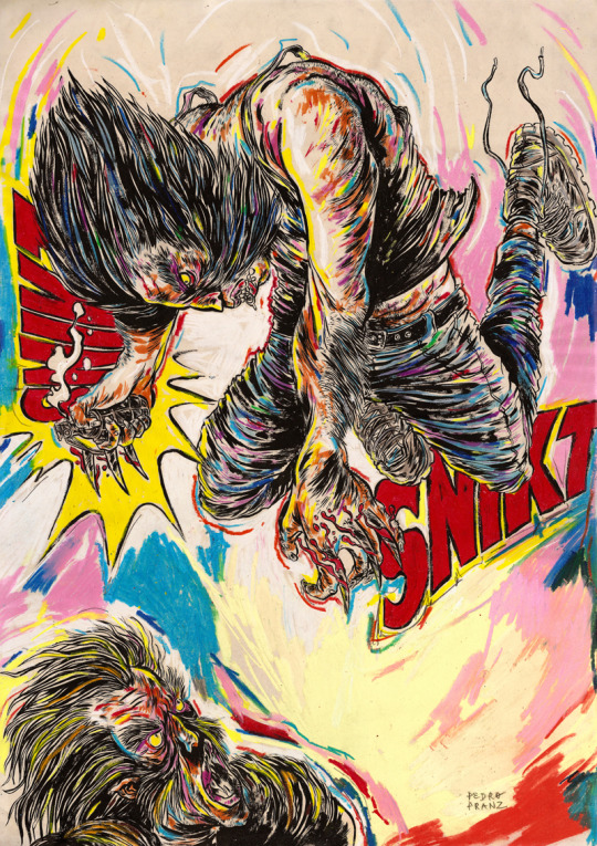
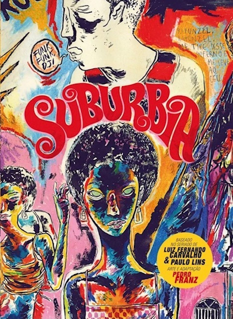
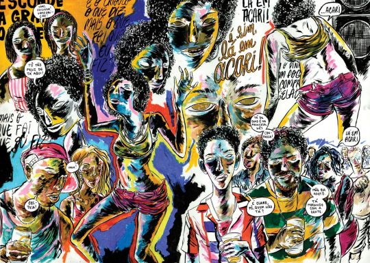
Pedro Franz
Is a Brazilian comic book artist, who was born in Santa Catarina and has a degree in design.
He has been publishing several comic books and participating in exhibitions in Brazil and abroad. As an illustrator, he has published works several magazines and books, and regularly collaborates with the Piauí magazine. As a graphic designer, he is a contributor to the Par (Ent) Esis platform. He has comics translated and published in English and Spanish, and has good international recognition, thanks to his publications.
But what is most impressive in Pedro's art, perhaps is his intensive use of colors. Mixing various shades of different colors, mixing different compositions. In addition to sometimes using characters from pop culture, with his elaborate style.
Despite liking traditional comics, he has always published and worked for national publishers, often with authorial works.
Perhaps his best known work, which was even published in the United States is the comic “Suburbia”.
Suburbia tells the story of Conceição, a girls daughter of enslaved rural workers, who flees to Rio de Janeiro in the early 1990s. In the city, Conceição begins to work as a cleaner and to get involved in the world of funk, slums and poverty.
His drawings are extremely surreal, not exactly following a traditional way of making comics, with several images spread across the page, with different shapes and sizes, with extremely strong colors, mainly valuing blue, purple, yellow and red, as his main colors.


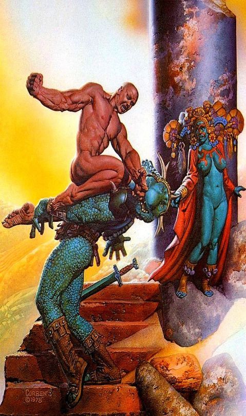
Richard Corben
Richard Corben was one of the contributors of elevating the comics to the category of Art, and of its unparalleled style of great influence among many current artists.
Richard Vance Corben was born in Missouri, United States on October 1940, in a family of farmers in the middle west ( where he started reading comics), and lived in Kansas City. There he studied Fine Arts, got married, had a girl and started working in local cinematography animation company. At the same time, he started to create and publish some underground fanzines. From the begging it was clear that he was interested in science fiction, eroticism, and total rejection of institutions ( the Army, the Church, etc), mixed with a lot of humor.
At a young age, Corben was an aficionado of bodybuilding, just like everyone who was interested in a persons aesthetics. The first character that he created, was Rowlf, a dog who took on a human form. In the beginning of the 1970s he amplified his work ( and his fame) in some underground magazines. And in 1971 he started working for the Heavy Metal publisher where he created one of his most famous characters, Den a large muscular man, who was always naked, and always after some adventure.
Corben has a very particular style, with unsettling mixture of caricatured, often satirical grotesque and intense,convincing realism. Never before had such wildly cartoonish worlds proved so convincing.
Also he can handle an exponentially higher standard because of his ability to use colour to show the effect of light on whatever he’s depicting. The way that he mixes light and colors in certain panels to differentiate those elements from each other, is something to admire.
Corben worked in a few mainstream comics, he always preferred to work with authorial works or working in specific themes like fantasy and science fiction comics and not so much on superheroes.
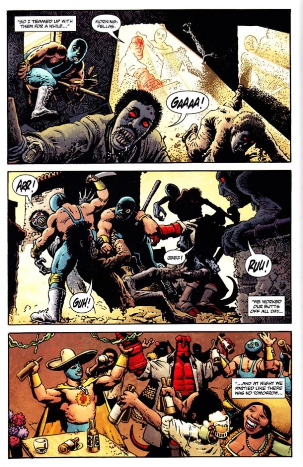
But probably the most famous mainstream comic that ever worked was the character Hellboy, along with writer Mike Mignola.
Hellboy is a series of comics that has a lot of mysticism, Norse mythology, horror and monsters. Something Corben certainly agreed to do, without thinking twice.
Richard Corben is one of my favorite artists, with a style that is perhaps not as realistic as an Alex Ross for example, but the humor and beauty that he puts in his characters is very unique.
Corben died on December 2, 2020, leaving a great legacy, for the world of comics and arts, with a very unique style and extremely stunning worlds.
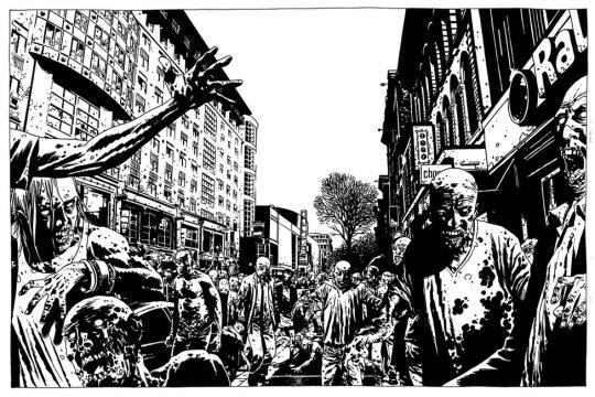
Charlie Allard
Charlie Adlard is a British comic book artist, who have worked on the comic industry for over 25 years. He spent the majority of his time since 2003 working in The Walking Dead along side with writer Robert Kirkman , until the last issue on 2019 He started reading comics when he was very young, and he said that he was very lucky to have influences of American comics and the more high art, such as Asterix and Tin Tin. He was fascinated by European comic books artists like Moebius, Alberto Uderzo and Herge. He started his career as many British artists and writers, working on 2000 AD, with characters such as Judge Dredd, Armitage and eventually Savage. In the United States he started working with the X Files, Astronauts in trouble, and of course The Walking Dead. Adlard started in The Walking Dead from issue 7, and brought a slightly different style, from the previous artist. Adlard's art is very cartoonish, but the universe of The Walking Dead still doesn't get silly because of it. Quite the opposite, the dirt and rot that Adlerd puts on his characters and the world, only sustains what a horrible world it is to live in. Many readers complain about Adlard's style, being very simple, that his characters are very similar, and sometimes it is difficult to identify them. But I believe that although his style does not vary much, when it comes time to show a horde of zombies, a devastated city, people feeling despair, and extremely disturbing scenes, Adlard manages to excel. Adlard's main tool is ink. All The Walking Dead magazines are in black and white, and he manages to give a lot of depth to the scenarios and characters using only a few ink stains. Today Adlard is doing some comics, mainly for DC, but says that he does not intend to work with Kirkman and zombies again, because he wants to explore other themes, and to innovate his drawing skills.
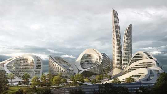
Zaha Hadid
Zaha Hadid was one of the most important and well known figures in contemporary architecture and design. With a singular trajectory, marked by a versatile, bold and out of the box style, she was the first woman to receive Pritzker Prize for architecture and was also the only female representative honored by the Royal Institute of British Architects with a golden medal. Zaha Hadid was born in Iraq, more precisely in the city of Halloween, in Bagdá, in the year 1950. Her family was of high class, her father being an important politician and her mother an artist. Still young, she traveled and studied in other places of the world, like London and Switzerland, but it was in her native land the she got her first formation, when she graduated in mathematics. At the age of 22, in 1972, she enrolled in one of the most famous independent schools of architecture in London, and there she gave the starting point to her career by studying and creating an important connection with the Dutch architect Rem Koolhaas, a figure that encouraged her and opened the doors for opportunities. Later in the 1980s, Zaha Hadid decided to open her own office. This, Zaha Hadid Architects was born, which made her name and talent recognized worldwide. Known for her works with futuristic lines, clean and pure forms, as well as the fragmentation of architectural design. Her projects and discussions raise issues that put architecture and its future to the test. This is because the architect seeks in her works to interrelate design, architecture and urbanism. I knew Hadid and some of her works, but it was the recommendation of my teacher Lauren, that I should look for this architect. As my project takes place in the future, she recommended that I look at some works by Zaha Hadid to get inspiration when creating the scenario for the comic. I find it very interesting how her works have this futuristic aesthetic , because it reminds me of science fiction films like Blade Runner with those skyscrapers and buildings with different shapes and sizes that are extremely imaginative that could only exist in films. With unique works and projects, famous for their exuberance, futuristic elements, curves, non linear shapes, distortions and fragmentations, Hadid inspired and generated fascination both for her constructions around the world.
Syd Mead
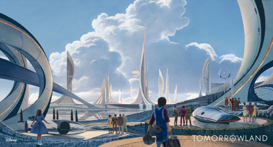
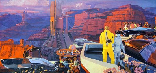
Syd Mead was a designer, best known for working on films such as Aliens, Blade Runner, Tron and Star trek. Mead was born in Minnesota, United States, on July of 1933, but five years later he moved to a second house in the western of United States prior to graduating from High School in Colorado in 1951. Some years later, he did the Art Center School in Los Angeles, where he graduated with great distinction in 1959. He was immediately recruited by the Ford Motor Company. At Ford he worked in the advanced styling department, creating futuristic concept car designs. But his imagination went beyond cars and he began to imagine clothes, helmets, buildings and scenery from hyper advanced civilization. After Ford, he also worked in other big companies like Chrysler, Sony and Phillips. After that he started migrating to the concept art world of movies. Mead is really important for generation of writers of science fiction, because many of them were influenced by Mead’s colorful paintings. Mead never wrote a novel or short story. He imagined the future in his mind and turned that imagination into illustrations. In 1979 he designed the extraterrestrial spaceship for the first film “Star Trek” in the cinema. Ridley Scott called Mead to design the buildings and flying cars of the futuristic Los Angeles “Blade Runner” in 1982. In 1986 he was hired to design the space station and vehicles of the movie Aliens directed by James Cameron. Almost at the same time, the designer created the electronic world of “Tron” for Disney studios. The same ones who hired him in 2014 to design the futuristic city of “Tomorrowland”. Mead died in 2019 after three years of lymphoma, he was 86 years old. He was a great influence for many designers and science fiction writers and illustrators, due for his creative worlds and automobiles , Elon Musk quotes Mead as one of his major influences, on visions of the automotive future and design in general.
Transmetropolitan by Warren Ellis and Darick Robertson
Transmetropolitan is a comic written by the British writer Warren Ellis and the American illustrator Darick Robertson, published by the Vertigo label, and falls within the cyberpunk genre, and the problems that rampant technology will cause us.
Throughout the 60 issues of Transmetropolitan, Ellis and Robertson build a chaotic and brilliantly alive future, presenting a sci-fi society with a peculiar mix of elements of cyberpunk, political dystopias, bioengineering and transhumanism, sexuality, economics and much more.
In a dystopia, in a not so distant future, the journalist Spider Jerusalem is isolated for fiver years in a hut in the forest, but he has to return to the city to earn some money.
Throughout the comic, amid a nihilistic aura that humanity has no salvation, the author- Warren Ellis - criticizes the consumerism and futility. The illustrations, of Darick Robertson, is full of excesses as the environment should be, a brand of the style of the 1990s.
The search for the truth is the central theme of this work, and in the midst of all this we found ourselves in a investigative odyssey that involves the lowest scum of that society ( thieves, murderers and rapists) until reaches the highest of the scum ( the presidency).
This background allows the work to touch on the most profound social themes, and without fear of saying what needs to be criticized, this is where Transmetropolitan shines, and provoke deep reflections on issues such as racism, the influence of media, the power of religions, the education, and many other themes.
In short, Transmetropolitan dissects and criticizes everything, it points out the flaws, the lies and the hypocrisy of each one. It’s a study about the problems of democratic society in the 21th century.
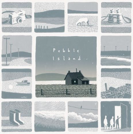
Jon Mcnaught
Jon Mcnaught was born in 1985, London, England. He work with drawing comics, and work as an illustrator, printmaker and lecturer. After spending several years on the Falkland Islands during his childhood, which will inspire his second book, Pebble island. The book pass years after the war, where he tries to recreate his childhood, with aspects of his curiosity, when he was exploring abandon bunkers, where it was just part of landscape, or somewhere where he could play. His work has essentially been landscape print-making (often situated in the city), but with quite simple intention of capturing the sense of space, light, time etc. His work is mostly about that, places that he was interested in depicting, and trying to reproduce the visual. He want the characters to feel like elements of a landscape or an environment ( he preferes to focus more on the background, than the characters itself). But usually he uses figures and postures to suggest expressions rather than close ups showing facial features. What I like about Mcnaught's work is that they are simple designs, but the colors are very vivid. The way he constructs the scenarios is very invective, because it doesn’t need to be extremely detailed, he just needs a few lines to show what he is talking about.

13 notes
·
View notes
Text
Be Careful For This Makeup Remover Cleansing Balm
After this step, use your common cleanser to rinse skin free of makeup and excess oil, leaving behind clean and hydrated skin. When buying an oil, make certain to search for ones that are cold-pressed and natural. Sometimes the most effective makeup remover comes in the form of a cloth. Several readers love the Danielle Erase Your Face cloth, which removes all kinds of make-up, including waterproof mascara, with out the utilization of harmful chemical substances or artificial makeup removers. With simply warm water, each material will remove the hardest make-up and will remember to offer you a contemporary clear feeling https://www.retrouve.com/product/luminous-cleansing-elixir/. When choosing the proper makeup remover for you, it is important to consider your pores and skin sort and how it reacts to ingredients.
This Klorane waterproof eye makeup remover cleansing balm will get the job accomplished. It's made with natural cornflower, which is light and leaves the attention space feeling cleansed and refreshed. Whether you have obtained dry skin, oily skin, or fall someplace in between, you probably can def depend on this makeup remover.
In this article, we’ll discover 6 DIY makeup remover recipes that use solely natural elements proven to be mild in your pores and skin. An oil-to-milk cleanser, Kiehl's Cleansing Oil is specially formulated to depart skin balanced after use. It's also scented with lavender, so you may be relaxed and prepared for mattress as soon as your skincare routine is finished.

Are You Positive You Wish To Cease Purchasing This Fundraiser?
If you have sensitive pores and skin, you might wish to opt for an oil-based perfume. Combine the brown sugar, coconut oil, and essential oils in a jar using a spoon or stir stick. Apply to the skin in circular motions using your arms, exfoliating gloves, brush, or sponge. Shake properly and dip a cotton ball, cotton pad, or a cotton swap inside. You can use a clean, dry material to softly take away any make-up that’s left behind. Mix the two elements collectively in a jar or bottle.
“I simply spot it on any arriving pal from out of city within the form of a zit and say, ‘Go again to the place you came from! Plus, its 4.3-star Ulta Beauty rating means it is working right for a lot of prospects. One of the easiest methods to play up the eyes is with a contact of mascara. The right one will add both volume and length to the lashes. The Clinique High Impact mascara claims to make the lashes look lusher and bolder with a pigmented method, out there in black and black-brown shades.
When a chance encounter with brilliant make-up artist Yuseong leads to her participating in a televised makeup competitors, Yeseul begins to query the function that make-up and look play in society. Choose your free present Customized Anti-Aging Routines Make probably the most of your skin with a custom fit, 5-piece skincare package. Naturally highly effective performance for a visible eye raise in record time. Remove mascara with mild actions from the bottom of the eyelashes to the tip. Our educated consultants are here to advise you on that perfect product. Formulations and ingredients may be occasionally modified.
If you strive plain water, it in all probability wouldn't make removal any better. However, if you use a makeup remover cleansing balm capable of dissolving the foundation film, eradicating can be very easy. There just isn't one magic ingredient in all of this — it really depends on the makeup formula composition and the remover composition. A key chemistry expression to bear in mind is “like dissolves like”. A water-based remover will work to remove water-based makeup, same applies for oil-based.
Made without any parabens, phthalates, or petrolatum, they swiftly take away makeup without the unhealthy stuff. Read on for our picks of one of the best makeup removers for delicate pores and skin. "Clear skin starts with a good cleanser," she stated. "I would splurge on this as a result of this would be your first step in your skin care routine and I simply feel such as you really shouldn’t cut the corners in relation to your cleanser." Another must-have for Allure editors, Then I Met You's Living Cleansing Balm would not just remove makeup. This golden-colored cream melts right into a rich, foamy lather that sloughs off makeup, all the whereas repairing and nourishing skin with vitamin E and olive oil.
Pure Oils As Make-up Remover
Use Dissolving Spray solely on specific areas for a quick change of your complexion or eye makeup. I never sit up for taking off my makeup at evening. It's not that I'm too drained to wash my face, but eradicating each single bit takes a lot of effort, and quite frankly, simply hurts. More usually than not, fully eradicating my eyeliner and mascara takes 10 thousand years and a ton of rubbing. My eyes are red, watery, and I still get up with black residue underneath my eyes in the morning.
The hydrating humectants on this make-up removerhelp hold your pores and skin's moisture barrier sturdy rather than stripping away your natural oils. It also does not depart behind a greasy movie, so acne-prone skin is totally protected. From mascara smears to uneven liner, this mini pen helps right any makeup snafus without affecting the rest of your face. Ingredients likevitamin E, cucumber, and chamomile relax any irritation while removing traces of make-up around your eyelids and beneath eyes. This affordableGH Seal holderliquid effectively andeasily dissolves even waterproof makeupwithout tugging, drying or irritating pores and skin. With over 1,one hundred critiques on Amazon, reviewers swear, "the primary swipe took 90% of the extremely thick mascara & eyeliner off, along withallof my eye shadow."
Ingredients like oils and glycerin work to softly dissolve your make-up. To use make-up remover, merely saturate a cotton pad with the liquid and press it to your face. Using gentle motions, wipe the product off of your face.
But it's probably an important step in your day by day skincare routine, both for the sake of the fragile skin around your eyes and the longevity of your pillowcases. Warm a small quantity within the palm of hands, and apply on to dry skin. Use fingertips to massage over dry skin till complete transformation of the balm into oil.
Is There A Best Time Of Day To Take Cbd? Consultants Debate
It's made of soothing components like aloe and cucumber extract, so your pores and skin will really feel refreshed. And because it is oil-free, you received't be left with the feeling that one thing's lingering on your pores and skin after you utilize it. “I love this as a end result of I think it removes the makeup really nicely, particularly if you’re wearing waterproof mascara," she said. "I additionally discovered that that is the least aggressive in your eyes.
I'm positive you've heard the word about the harsh chemical substances found in plenty of makeup wipes. It's imperative that you follow up with a nourishing cleanser after using make-up wipes. These pure towelettes are an excellent alternative.
Makeup will get removed with minimal rubbing; add some water to give your face a pleasant milky cleanse that doesn’t depart your pores and skin feeling too oily, or too stripped. The lighter consistency of this method makes it an excellent introductory cleansing balm for anybody seeking to lastly dip their toes in. "For my sufferers with sensitive eyes, I recommend in search of an eye fixed makeup remover formulated for delicate eyes that removes make-up with out rubbing or irritating eyes." With a high quality makeup remover, however, it does not should be that way. And belief us, there are a lot of great makeup removers on the market, regardless of whether or not you favor a balm, oil, wipe, or micellar water.
Japanese formulation includes coconut oil to moisturize, cork tree extract to calm and vitamin E to struggle free radical damage. It’s onerous to seek out anybody who doesn’t critically rave about Garnier SkinActive Micellar Cleansing Water. “I use them to give my clients’ pores and skin a quick cleanse before basis. Next, find out which different merchandise with a cult following are totally price it and which make-up sale to check out.
We firmly believe that beauty merchandise, each skincare and makeup, ought to be of the highest high quality while sustaining worth and affordability. Bring residence an aloe plant, and you may have a hydrating face masks, a moisturizer, a scalp treatment for irritated follicles, even a primer before making use of basis. And, yes, it actually works simply as nicely to scrub off mentioned foundation when the day is finished. Of course, that does not mean you must ditch the make-up remover altogether.
Key elements include amino acid-rich soy protein which helps preserve pores and skin's elasticity and suppleness, in addition to rosewater which is notable for its calming and balancing properties. “Similarly to the Klorane remover, this product has ingredients in it that assist strengthen your lashes too, which is nice," she famous. Washing your face is probably one of the final things you really feel like doing at the finish of an extended day, but you actually should. Sleeping with makeup on cannot only result in clogged pores and breakouts, but in addition end in premature aging. Our editors independently selected these things as a outcome of we think you'll get pleasure from them and would possibly like them at these prices.
Not so with this organic, uncooked, unrefined oil that retains the entire coconut goodness intact and also looks ultra stylish on your self-importance. I would examine it to eye makeup removers that cost twice as much. If you need the first step of your nighttime routine to be on the identical luxurious degree as the rest of your treasured skin-care routine, contemplate investing on this stuff. Though it’s simply as liquid-y and French-sounding as the aforementioned cleansing waters, this is a cleaning lotion. Once you sweep it throughout your face, you’ll get it — it leaves your skin feeling full, such as you cleansed, toned and did an entire serum situation.
SATISFACTION GUARANTEED Full refund inside 30-days-return. Apply with our luxurious Cotton and comply with with your favourite Clé de Peau Beauté cleaning foam for optimum outcomes. Eye & Lip Makeup Remover leverages Skin Intelligence to help your skin’s most ability to restore and shield itself.
Skincare By Category
youtube
The result's radiant, clean, healthy-looking skin. This product is mild sufficient to use each day. For greatest results use at the side of our Walnut Hill Face Serum.
As health and wellness bloggers, our readers usually ask us if we cleanse and in that case, how we do it.
By utilizing this website, you conform to the Terms of Use and Privacy Policy.
Other kinds of cleanses contain colonic cleanses utilizing enemas, laxatives, or colon hydrotherapy .
First, decide a reasonable timeframe for your cleanse — not more than three days.
It has a high content of linoeleic acid, vitamin E and phenolic compounds, and an anti-inflammatory impact.
If you prefer to double cleanse, we advocate starting with the Cleansing Oil and following with the Cream Cleanser. Some juices are produced from meals which may be excessive in oxalate, a naturally occurring substance. Two examples of high-oxalate meals are spinach and beets. Drinking large quantities of high-oxalate juice can enhance the chance for kidney problems. Grape Seed Oil - an ingredient that accommodates polyphenols as properly as the essential fatty acid linoleic acid for lightweight hydration. Gently dissolve make-up, oil, and different impurities with this lightweight pre-cleansing oil.
"The truth is that eliminating Trump is the easy half. Cleansing the motion he instructions, or eliminating what he represents to so many Americans, is going to be one thing else." An ABC News article calling for the "cleansing" of the motion of President Trump's supporters was stealth-edited after critics questioned the charged word. Onion and garlic are both members of the allium household of greens, which provide pungent flavors to foods. These vegetation comprise flavonoids that stimulate the manufacturing of glutathione, one of the liver's strongest antioxidants. As a result, onion and garlic have highly effective anti-bacterial and immune-boosting properties. Dill is rich in nutritional vitamins and anti inflammatory chemicals.
By coming into my cell number and clicking “Submit”, I agree to obtain recurring promoting text messages from Clinique. I understand these textual content messages may be despatched via an autodialer, that consent just isn't required to buy goods from Clinique, and that I can opt-out any time by replying STOP to the textual content message I obtain from Clinique. If I am a California resident, I comply with the Notice of Financial Incentive. Massage onto pores and skin with fingertips until makeup is dissolved. A longer cleanse or Panchakarma is totally individualized and the entire protocol is designed based on the Rogi or client’s current disorders and the standing of their bodily, physiological, psychological and genetic health history.
Also, deprivation and suffering isn't the point! If you need a cup of black espresso because you need it or adore it, then have it. If you are nonetheless hungry, have something but make it clean and nutrient dense .
Challenge yourself to cut again on added sugar from sweetened yogurts, cereals and granola bars, in addition to the usual suspects . You’ll respect the pure sweetness of fruit a lot more when you cut unnecessary added sweeteners out of your food regimen. From hydrating face masks to the best way to use hydrating face cream, learn the way to hydrate skin with the following tips. "I chose these foods as a result of as a bunch they provide wholesome fats, protein, fiber, and water volume. Plus they're loaded with antioxidants," she says.
Each cleansing balm features completely different key components to focus on skin issues, corresponding to natural acerola cherry in Very Cherry Clean that provides antioxidant-rich vitamin C to assist brighten, firm, and hydrate the skin. As most of our pure face cleansers do, you'll find that when you have rinsed the cleanser off, it leaves you with an ultra-moisturized canvas that is ready for any clean skincare product that follows. Soap-free, foaming gel cleanses all skin circumstances.
Colon cleaning is normally used as preparation for medical procedures similar to a colonoscopy. However, some different medicine practitioners provide colon cleaning for different purposes, such as detoxing. Committing to a cleanse can feel like an enormous deal.
The Master Cleanse claims an individual can reside off of nothing however six to 12 glasses of lemon juice, maple syrup, cayenne pepper, and water over the course of 10 days—and drop 20 pounds the process. One of the worst selections I ever made was to strive a 5-day juice cleanse my senior yr of college. Maybe it’s a type of belongings you simply have to do once to know it’s a horrible concept. Take a take a look at a few stories from the 1000's of individuals whose well being and wealth improved from our pure, premium and non-GMO superfood merchandise.
Soothing Cleansing Oil
Our livers are particularly designed to take away bodily waste and our kidneys filter blood as well. The course of requires zero strict diets, cleanses, detoxes, or hunger. Apply to dry face with fingertips and gently massage.
Clean is extra frequent than cleanse and its use is much less particular. Over the past few years, the meaning of “detox” has shifted from a protocol meant to rid you of poisons to, usually, just a diet meant as a temporary reset. It either promises quick weight reduction, or goals to get you into the habit of wholesome eating, with residual effects that will last all 12 months lengthy. A lemon detox food regimen is usually cited as proof supporting detox diets to enhance well being.
Fill her with vinegar and water and pop her in the microwave for 5 to seven minutes, watch as cleansing steam shoots out of her ears, and revel in a squeaky clean equipment. Both clean and cleanse imply to make one thing free from dirt or impurities. But whereas clean can be present in a spread of common contexts, cleanse usually will get utilized in additional particular situations.
Drink one green juice per day to hydrates, alkalize, and add raw, living vitamins into your system. Formulated with hempseed oil, bioflavonoids and pure essential plant oils, high® delivers the high-powered benefits of hemp, to protect with potent antioxidants, balance with adaptogens, calm, hydrate and replenish. Cut down on sugar and salt, get loads of protein/fiber/fat and exercise 3+ days a week . And if you find yourself backsliding, forgive your self and begin over.
Health & Food Plan Guide
In reality, espresso enemas generally utilized in colon cleansing have been linked to a number of deaths. Colon cleansing also can cause much less critical side effects, corresponding to cramping, bloating, diarrhea, nausea and vomiting. During a colon cleanse, massive amounts of water — generally as much as 16 gallons — and presumably other substances, corresponding to herbs or espresso, are flushed via the colon. This is done utilizing a tube that's inserted into the rectum. In some cases, smaller quantities of water are used and are left to take a seat in the colon for a quick while earlier than being removed.
Cleaning And Glow
For instance, Shays says she'll never double-cleanse if she's suffering from a rosacea outbreak—instead, she'll opt for only an oil cleanser or gentle cleaning milk. If she's treating a client with cystic pimples, she'll stick to 1 cleanse, as double cleaning can over-stimulate the pores and skin and aggravate it further. If you have dry pores and skin, Chiu says you could find that your pores and skin is best off with a double cleaning routine. "You'll discover that two mild steps work better than one strong method to fight sensitivity or overdrying," she says.
Due to its natural nature, our propanediol just isn't solely a compatible moisturiser, but in addition ensures that we are able to do with out harmful preservatives. "This product may be very gentle and fits my sensitive skin completely." Our clients requested a cleanser that made mild work of heavy obligation make-up. Gentle on skin with out compromising on efficacy, no rubbing, no eye-stinging, oh and no palm oil please.
After cleaning, shortly comply with with a facial moisturizer while skin is still damp to attract water into the pores and skin and lock it in for long lasting hydration. During the day, it's also recommended to use a facial SPF moisturizer with sun safety. Daily Facial Moisturizer with Broad Spectrum SPF 15 delivers nourishing hydration that locks in important moisture and protects your pores and skin from harmful UVA and UVB rays. The extra gently you reintroduce foods into your food plan, the smoother the transition shall be.
"Anybody can benefit from a cleaning. The physique is coming out of what might be known as hibernation. It's a method you'll find a way to jump-start your physique for a extra energetic life, a more healthy life." These diets are low in calories, which will go away you with little vitality to exercise and will disrupt your metabolic price and blood glucose levels. They take satisfaction of their hair, and are particularly cautious about it, washing and cleansing it virtually daily. It was time for the cleaning a part of the ceremony and Victoria and I, together with half of the gang, lined up on facing benches. Ghusul is a ritual cleaning from head to toe, on this occasion performed with all of the solemnity of a visit to a water park. You can use clear to imply simply “to make neat” or “to remove a stain or mess” .
This rosehip powered oil glides over pores and skin lifting away each kind of impurity. Even cussed waterproof mascara is politely sent packing. We want to share natural food, juice, and love with you.
In a gentle round movement, apply to face and neck morning and evening, eradicating with a heat moist fabric. Repeat if eradicating make-up, and comply with with the Tammy Fender tonic or floral water finest suited to your pores and skin. Especially formulated for dry or sensitive pores and skin, and helpful for all pores and skin types, it blends soothing Lavender with purifying Fo-Ti. Lightly creamy, this light, pure facial cleanser whisks away impurities, leaving the complexion delicate and radiant. Be the first to study new arrivals, exclusive provides, limited edition products, and sweetness tips and tutorials.
2 notes
·
View notes
Text
Thoughts on BtoB’s Special Album ‘Hour Moment’
Initial Thoughts
From first listen, this album sounds different from BtoB’s previous works. At first, I was a little worried that I wasn’t going to like this album because of that. Of course it was never going to sound exactly the same - BtoB’s exceptional vocal line is now short one member. Eunkwang’s voice has a very bright, distinct color that often lent richness and variation to BtoB’s songs; when he was absent for some of BtoB’s earlier stages, leaving Hyunsik or Changsub (both very talented vocalists in their own rights, so no shade) to cover his parts, it just didn’t sound quite as good.
Nevertheless, I think it would be unfair to say that this album is lacking just because Eunkwang is not a part of it past the first track. It took me a couple listens, but I’ve come to really appreciate the album and how Bto6 shifts their style to cover for Eunkwang’s absence, while still maintaining the signature BtoB sound that we’ve all come to know and love.
The remaining three members of vocal line have branched out past their usual roles - we’ve especially gotten to hear more of Hyunsik’s rich lower vocals (”Swimming,” anybody?) and Sungjae’s vocal accuracy. Changsub’s voice is probably my favorite out of all of vocal line, so I’m happy to hear him utilizing his full range as well, soaring in a way that is fully distinct from Eunkwang’s.
But it is rap line that really shines through. Without Eunkwang’s high-toned voice to flesh out vocal line, there was a possibility that BtoB’s songs would sound less full and rich. Rather than forcing the other three members to try and sing like Eunkwang, though, these new songs rely on rap line’s low tones, particularly Minhyuk and Ilhoon’s vocal abilities, to round out their sound. BtoB’s rap line, situated as it is in a prolific ballad group, has always benefited from the fact that their rappers can also perform as vocalists, keeping the switch from vocal to rap verses from feeling disjointed and allowing the rappers’ voices to blend really well with the vocalists’. As Ilhoon and Minhyuk blur the lines between their sung raps and their spoken raps, we also get to hear just how much Peniel has grown as an artist throughout BtoB’s career. He demonstrates such remarkable agility and versatility throughout the entire album, and best of all, he really sounds like he’s having a good time rapping. I. Am. So. Proud.
On to the individual tracks!
1. Friend
EUNKWANG WE MISS YOU T_T
Okay now that that’s out of the way...I found this to be the least interesting song on the album. Not because it’s a bad song! I love the fact that Eunkwang recorded it for us before he enlisted - it was such a wonderful gift for Melodies - and the song is upbeat and fun and I can already imagine BtoB and Melodies singing it together at future BtoB Time concerts. But the actual song itself contains no real surprises in terms of the composition. It’s a sweet little song and it’s distinct from all the other songs on this album, but I really don’t have much to say about it, other than that I wish Ilhoon would enunciate a little bit more because I keep hearing him say F-R-I-N-D lol.
2. Like It
When I first heard the audio preview for “Like It,” I thought it would probably be my least favorite track of the album, for the simple reason that I tend not to enjoy choruses that repeat the same phrase over and over.
Well, I was very wrong. Ilhoon, I will never doubt you again.
With its soft opening instrumentation - just a piano, playing a few gentle notes - “Like It” starts out sounding like it might be another ballad. The first verse is definitely balladic, taking full advantage of Hyunsik’s VERY LOVELY lower tone. Even as Changsub takes over from Hyunsik, the beat sort of sneaks in, staying minimal underneath a swimming instrumentation and dreamy vocals.
But then Ilhoon’s verse starts, the instrumentation drops out, and that minimal beat drives forward, fueled by the combination of Ilhoon’s rap-singing and Hyunsik’s higher vocals. By the time the pre-chorus hits, we know that we’re no longer in ballad territory - we’re in for some FUN.
I really like this song a lot. In many ways it reminds me of “Call Me” from their last album, but whereas “Call Me” was definitely a song for bright, sweltering summer days, “Like It” has solidly fall vibes. It makes me imagine going to a casual outdoor party on an autumn evening, when it’s not too cold but is cool enough to still drink hot cocoa and spiced cider. As it gets darker, the hosts turn on little fairy lights that are strung all over, illuminating everyone’s happy, laughing faces in a soft yellow glow. Man, do I just have an overactive imagination, or is Ilhoon really THAT GOOD at making a mood with his music?
Also can I just say I am LOVING how many parts Sungjae has now, and his vocalization during the pre-chorus is one of my favorite things on the whole album. Can you believe he started out as a sub-sub-vocal in the group...our baby grew up so fast. *sheds tear*
3. 나비 (Butterfly)
After two upbeat songs, it’s time to chill out. “Butterfly” sounds like “Nanana”’s more romantic cousin. Ilhoon’s skill at creating vivid atmospheres through his music shines through really well in this song - with the gentle acoustic guitar and vocal line’s floating vocals (Changsub you are making me fall in love!), you can really imagine sitting under a tree on a clear autumn day, watching the orange and red leaves wave gently in a cool breeze.
The minimal instrumentation on this song is such a change from the rest of the songs on this album, which generally have much richer instrumentation and more driving beats. It’s a chance for vocal line to display just how they skilled they are. We already know that all four of them can hit some pretty powerful high notes, but “Butterfly” requires control rather than power, and Changsub, Hyunsik, and Sungjae perform admirably. It results in such a lovely and intimate song, more like something you’d hear in a cozy cafe than something sung onstage by idols. My guess is that if BtoB perform this in future concerts, it’ll probably be with all of the members seated on stools, as a much-needed break in between more rigorous dance numbers lol.
This song also made me realize that we don’t often hear the rappers one after another on verses - usually they alternate with the vocalists - but here they are, performing three rap verses in a row. And they manage to sound so completely distinct and yet in sync with the vocalists that their raps don’t feel out of place in such a soft acoustic song. First, Minhyuk essentially whispers into our ears (someone please explain to me how someone who has such a low rap tone can also make such high-pitched squealing noises). When Peniel takes over, he’s also rapping lower than usual, but not in a way that makes him sound like he’s trying to imitate Minhyuk. It’s sweet and almost conversational, perfectly aligned with the rest of the song.
Then Ilhoon pretty much straight sings his verse. When is he going to convert to vocal line lol
4. 제발 (Please)
Minhyuk has always composed some really solid tracks for BtoB (Open, About Time, Guitar, Blue Moon), but I think the reason that he is less recognized by the general public as one of BtoB’s composers, in comparison to Hyunsik and Ilhoon, is that his style tends to lean more alternative and R&B. It makes for some surprising and beautiful B-sides within the albums, but doesn’t necessarily fit the more mainstream pop sound that’s necessary for a commercially successful title track.
“Please” is the most mainstream-sounding of all Minhyuk’s songs, and I don’t mean that in a bad way. This is definitely a power ballad, and I feel like if it hadn’t been for “Friend,” this would have been a very strong contender for the pre-release track, if not for the title. Minhyuk managed to compose something titled “Please” that actually sounds like it’s pleading throughout the whole song - unfortunately it’s been years since I last took music theory so I can’t 100% articulate how he managed it, but I suspect it has something to do with how the chord progressions in the chorus resolve.
Vocal line totally KILL it throughout this track. After the relative atmospheric quiet of “Butterfly,” they bring back the power in full, tempering it with genuine longing that conveys the sadness of the song, even if you don’t understand the lyrics. The way that “please” just lingers after each iteration of the chorus...you can feel the desperation of reaching out one last time to someone you love more than anything, driving you forward to plead for one last moment together even when you know it’s already over. The key change in the final chorus just underscores that despair, winding the emotional tension even higher (along with that rad electric guitar solo lol), until Hyunsik’s final resonant “please” resolves into Changsub’s voice, reprising his verse from the beginning.
Even after all of that heartfelt begging, feeling like you’re cutting your chest open and showing the person you love the hole that they’ll leave in your heart when they’re gone, knowing that they’re the only one for you, in this lifetime and every one that follows...the time to say goodbye has come after all.
Goddamn. This song really affected me a lot. I was actually going to write more about rap line and how good they sound in this (especially Ilhoon), but I was swept up in the raw emotionality of this song. This one’s going into the top five for sure.
5. 아름답고도 아프구나 (Beautiful Pain)
Our title track! I was actually pretty surprised when I heard this one on the audio snippet - I thought it sounded really sad for a title track. Of course, we know that Hyunsik-composed songs are rarely without some melancholy element, but this one is really quite dark, both in terms of lyrical content and sound.
When I tried to think of similar songs, my mind went first, funnily enough, to “I’ll Be Your Man.” Though the songs don’t necessarily sound too much alike - “Beautiful Pain” is another power ballad, while “I’ll Be Your Man” is certainly not - they both have a dark and dramatic tone that BtoB doesn’t cover quite as often.
It took me several listens to fully appreciate the song and how good it is. The more layered instrumentation lends the song a fullness that helps to distinguish it despite Eunkwang’s absence, particularly in the choruses. It’s a subtler, darker richness, which fits well with the dramatic subject of the song. There are so many things I picked out that I love. Ilhoon’s rap singing, for example (again, when is he going to become the fifth member of vocal line?). The little cracks in Changsub’s voice (intentional for once lol) that sound like sobs as he sings. The way that Minhyuk’s rap builds as if about to explode, then lingers on the wistful final line. Hyunsik showing off his magnificent lower range, soft and whispery with pain and resignation, as he sings the chorus one octave lower than the rest.
In the second pre-chorus, the harmony between Hyunsik and Sungjae...omg. I don’t know that the two of them often harmonize together in OT7 songs - usually it’s Changsub or Eunkwang singing the higher harmony - but they should really do it more often. Their voices have rather similar timbres, especially in the lower, more resonant ranges, so they blend together so nicely. I could honestly listen to that part over and over again lol.
Overall, this may not be my favorite track on the album, but it is a very solid song and definitely a good one to listen to on a cold autumn night, when you wrap yourself up in a blanket and stare out the window at the rain, turning memories of a lost loved one over and over in your mind even though it hurts to do so. I’d like to think that Hyunsik would agree with me on that one.
Final Thoughts
I like it, I like it, I like it, I like it! Of course I don’t think I’m ever going to truly dislike a BtoB album, but I’m just so impressed with how versatile our boys are and how good they sound on this album. We feel Eunkwang’s absence but not as a detractor from the really excellent music - the other members step up so brilliantly. Our leader would be (and probably is, because he’s the best) so proud.
What I realized throughout the course of listening to this album over and over and writing this post (thank you if you’ve read to the end lol) is that the whole album is the story of a relationship. The closeness of a beloved friend; the joy of realizing that you’re falling in love with the other person and the giddiness of imagining the future; the tenderness of a budding relationship; the desperation of trying to hold onto someone who is slipping through your fingertips; and the final bittersweet feeling of knowing that it’s over but that you would never give up those memories, even though it hurts to remember. It’s such a good balance of songs and reminds everyone that BtoB is a top-notch group, no matter how many members they have.
All I have left to say is: when is Minhyuk going to get his title track????
#btob#hour moment#my writing#tl;dr: the album is good go stream it#me: 1000 words for a grad school statement? it's too hard someone save me#also me: oh look I started writing and somehow pooped out 2000 words about this album lol someone save me
40 notes
·
View notes
Text
RWBY - Volume 6, Chapter 13 Production Analysis

Previous Volume 6 Production Analysis Posts:
Chapters one, two, three, four, five, six, seven, eight, nine, ten, eleven & twelve
When starting this production analysis series, three goals were kept in mind: 1) To disspell any potential misconceptions and myths about RWBY’s production, 2) to help add more depth and nuance to discussions about the production since some fans out there do care enough to talk about it, and 3) to highlight how various members of the staff have helped carry on certain aspects of the vision meant to be applied to this show. When the late creator of the show, the writers most closely associated with the show’s story, and almost every animator, storyboard artist, modeler, camera layout artist, rigging artist compositor, VFX artist, sound designer, etc., have all been passionate about the medium of anime and have applied that passion into crafting this ongoing anime-inspired project, why not give them all credit where credit is due, especially for this specific occasion?
As with all other prior analysis posts, this one is intended to put forth as much insight and context of the behind-the-scenes as possible. That said, since the volume 6 finale chapter follows the tradition of every other volume finale, expect things to be a bit more “shot-in-the-dark” than usual. Since volume 3, the ending credits of every other episode will usually list the names of those that were involved in that episode. Sometimes, names of certain people from certain departments will change depending on whether someone is being assigned to work on something a few episodes later or because that person is possibly preoccupied with another big project at Rooster Teeth Animation like Gen:Lock at around the same time. However, the ending credits for the volume finale are setup to list literally everyone that was involved throughout, even those that were otherwise non-credited from those with specialized roles to the families, children and pets of individual members of the production staff under “Special Thanks” and “Additional Security”. Combine that with no one in the animation and storyboard teams having mentioned who did what, there will be a lot more guesswork involved.
That’s not to say there was nothing to acknowledge about this episode, far from from it actually. To see how, let’s dive right in the Neo and Cinder scene. One of the first things of note that has not been mentioned elsewhere yet is Neo’s materialization effect. This has been done once before in chapter 11 of volume 3, but like with Yang’s semblance, the approach has changed with more nuance. By close observation, the way she previously materialized may have been done in a manner where one character model was layered on top of the other with the same exact pose and a wipe effect was used through the light emitted with another layer of the shattered pieces added. In comparison, Neo’s semblance in this chapter is a bit more elaborate. The supposed character model layering trick is still there, but what was once a more simple wipe with some pink lighting is now an empty space with a lot of fractal pieces swirling with the brighter colored ones in the middle. The effect also extends to Roman’s hat on Neo (assuming that was his hat) and the tips of pieces of the Mistralian ship as it transforms into an Atlessian one.
Then there’s the matter of the new designs for Neo and Cinder. Again, since the volume 6 finale did the ending credits differently, that also means that no concept art was shown, so there are no notes regarding the matter. It doesn’t help either that there is no known concept art of Neo in particular throughout the show’s history in general, partly due to how her model was originally conceived a mere 10 days prior to her first appearance in volume 2. However, right before volume 6 premiered, the key visual art made by concept artist, Einlee appeared which featured a silhouetted character with peculiar claw-like left hand in front of the head of the Sphinx Grimm. Many fans have quickly speculated that it was Cinder but the context of the appearance was kept vague. It’s now clear as to why that was the case considering how much Cinder’s new attire matches that of silhouette. What’s most curious about this design is how much a certain accessory has been kept between her main designs in volumes 1-3 and volumes 4 & 5, that being the “iridescent feathers” which have been kept towards her right side in varied places. That and her black crystal earrings and anklets have been mostly exclusive to her base designs and not present in any of her past, alternate incognito designs which have been designed by volume 2 art director, Kristina Nguyen, current art director Patrick Rodriguez and lead concept artist, Erin Winn. However, her two main designs that come with both of those accessories were done by Einlee and become increasingly darker in their color schemes to her now fully black outfit. As for why this specific design was in the poster when it didn’t officially make an appearance until this episode is hard to say, but it’s possible that on some level, this was an attempt to throw off fans from guessing too easily where things will turn out as they would theorize. How successful that was however is a whole other matter.

Putting that aside, as well as an extra mention of the choice of rim lighting for the setting and the little bits of animation that show off Cinder and Neo’s differing characteristics, we can move on to the main event regarding the Leviathan Grimm... or Levi, or Bubbles or whatever its nickname is suppose to be. Similar to Neo and Cinder, there were no concept designs of the character to dissect from, but it is clearly safe to say that the character was inspired by kaiju of the tokusatsu or “special filming” genre in Japan. Tokusatsu is basically used to describe any live-action films or shows that utilize a series of special/practical effects, one of which being having a stuntman portray a giant creature of mech or some other variation inside a suit, otherwise referred to as “suitmation.” The fall 2018 anime, SSSS Gridman, served as an example of simulating that feeling to a great degree through the way the creatures and for the most part, Gridman were animated in 3-D. Co-writer Miles Luna has gone on record before about being a big fan of the Godzilla franchise, having grown up watching them with his father, so it would not be the least bit surprising if the Leviathan Grimm was his idea. The way it was animated seems to strike this balance between how Godzilla and other kaiju have been depicted in live-action Japanese films while also making it believably feel like a part of the world of RWBY. Another noteworthy bit regarding the Grimm and how it moves is the way it dives down into the water and then rises back up from it slightly later in the episode. This is not so much to do with animation as it has to do with the use of visual effects and compositing, but parts such as the Leviathan’s silhouette underwater are especially interesting since that has rarely happened in the show prior. The only other comparable instance that springs to mind is when the Nuckelavee appears from the smoke in the volume 4 finale and there may have been a similar compositing trick. The other thing of note was the water effects which are depicted much more realistic compared to when say, Cordovin shot at Ruby and Weiss in chapter 11 which that giant splash was done in 2-D or when splashes are done via more cel-shaded 3-D visual effects.
There is more to talk about regarding the Godzilla inspired Grimm, but first, let’s rewind back slightly to bits of character acting. Despite being unsure of who did these moments, the transition from Cordovin feeling frustrated to feeling incapable of doing anything was very convincing, as well as the scene with Blake, Yang and Ruby right after and then. Of course, Blake’s ears was part of the reason for the latter as when we hear Ruby off-screen, her right ear shifts and then a bit later we see them perk up after she, Weiss and Yang talk to Maria. Even though certain animators like Asha Bishi and Hannah Novotny took more advantage of the rigs for the cat ears than others back in volume 4, a lot more animators have since then been increasingly been more conscious about having that be a part of Blake’s character acting. Speaking of rigs, the rigging artists, along with the audio and tech teams, can be considered the unsung heroes of the ever-growing staff. Lead rigging artist, Gio Coutinho and fellow rigging artists, Brian Eby and Ariana Fillipini may be one of the smallest teams and are hardly mentioned throughout these production analyses, certain animators such as Kim Newman have gone on record to owing them for providing what are essentially the virtual skeleton and bones of the character. As talented as the animators are, they can only do so much with the character models unless they are as “animatable” as possible to quote volume 5 lead rigging artist Sean Stephenson on the 6th episode of CRWBY - Behind the Episode, who is now the current lead of the rigging team for Gen:Lock.
youtube
We then get some effects of the hard-light dust barriers being implemented and are timed pretty effectively through some slow-in and slow out animations along with the use of lighting towards the start of the barrier as the hard-light shifts from one pole to the other. Next is more homage to Godzilla by having the Leviathan breathe out its version of the atomic ray (there’s a lot of them in the franchise). Between the first instance and the next one when the main party attempted to close in, there is actually a combination of certain lightning and fire effects such as the same animations for the swelling ball of energy used whenever Cordovin was about to fire lightning dust, as well as sparks surrounding the fire breath with some seemingly blurred compositing layered on top. There is also a neat recoil animation with the Grimm as it unleashes its attack. In between all of this though is a scene of Ruby putting forth her plan within the airship. The timing and facial reactions presented by everyone felt similar to that of when Jaune announced his idea to steal the Atlas airship in chapter 9 which was animated by Hannah McCravy, so it’s possible that she may have animated this scene too. Whether she animated the entirety of said-scene though is what I’m more uncertain of.
Skipping ahead a bit, we get to Ruby preparing to use her silver eyes by getting the music being more subdued and getting quick cuts to the things going on around her. I nice touch here was having Ruby’s mouth twitch a bit right when her name gets called out through her ear piece. Then again, what’s really surprising is the fact there was an ear piece model at all. Back in chapters 10-12, we saw quite a bit of the main cast using gestures with their fingers by their ears as if there was a device they were using the listen to each other. However, the device in question was never really shown up until now. One educated guess could be that there never was one until this small scene here where it needed to be made and shown in order to see Ruby attempt to remain focused. Now comes what is part of the highlight of the episode being Ruby’s memories which are mostly redrawn shots from various cuts in the series with parts of characters like arms, legs, hair and in Zwei’s case, his tail being movable (and his butt having an actual x-marked "hole”). There were also certain details implemented such as the lighting being more comparably warmer and the line work in certain characters hair, clothing and in Nora’s case, her biceps being slightly more defined. Many fans by now have already concluded that due to the show’s visual presentation of its first few volumes not having aged that well back when Poser was the main animation software that the choice for 2-D art was shown instead. That would not at all be a wrong assumption to make. However, even the one shot with Jaune in the forest in chapter 2 of volume 4, back when RWBY transitioned to using Maya and 3DS Max was entirely redrawn. The same goes for Oscar and Ruby in the training room during chapter 5 of volume 5 which seems to have been slightly redrawn but to more with adjusted lighting. So the choice was not limited to anything prior to them using the two softwares. The one clear exception to this ensemble set of shots was of Maria back during chapter 8 of volume 6. Admittedly, it was tricky figuring out who did all of the redrawn shots, especially since not all of them seem to have been done by the same person. The shot with Qrow and Ruby in particular sticks out as being more different. It may be that Erin Winn did most of the shots since the way she draws lines for hair like with Yang being similar that of the line work for Kali Belladonna’s concept art, which she designed. As for Qrow and Ruby meeting, that may have been Patrick Rodriguez.
One other thing to note in these series of shots were the sound effects used during them. Sound designer, Philip Spann described the change of the sound of the memory flashes to Pyrrha and Penny as being the equivalent of viewers “being hit in the gut”, using large reverberant drums. Conversely, sound was applied a little differently during the the latter set of memory flashes, namely “pulling the music back” as Philip phrased it when seeing Summer Rose which was Kerry Shawcross’s idea. Now, in-between all of this, there was a bit of Ruby and Jinn interacting with each other. While I’m uncertain as to who animated it, it may be the same person that animated Ruby and Weiss’s interaction at the bar room during chapter 5 of volume 6. With that mention out of the way, there’s the first reveal of a fulled rigged and animated model of Summer. There were a couple of noteworthy design choices, the first being how her clothing more or less resembles Ruby’s current outfit while hairstyle is more varied in appearance. The other thing of note is her eyes. According to Kerry Shawcross on the season 2 finale of RWBY Rewind, characters with silver eyes have a small “tick”, referring to the small white dashes on their eyes whereas characters like Mercury who have been confused for having silver eyes, don’t. This is something Kerry admitted as being an oversight at first when needing to differentiate between such characters and their visual traits.
Next is when Ruby unleashes her silver eyed powers which involves the same hatch-lining effects which have not been used since the Wyvern Grimm in chapter 12. Skipping ahead to when the Leviathan is still moving, we get Cordovin who believes in the Ruby that believes in her. In all seriousness, just as how it was likely that Miles Luna anticipated the Levianthan Grimm as a fan of Godzilla, Kerry very likely planned for the moment Cordovin utilized her mech’s drill feature as a big fan of Tengen Toppa Gurren Lagann. To put this all in perspective, Gurren Lagann was an anime Monty Oum introduced him to as a fan of the show himself back around the time they and Miles started forming ideas and outlines for RWBY’s story in the midst of Red vs Blue season 10 production in 2012. It was even among the various anime that Monty had him and Miles study as inspiration for RWBY. Fast forward to over a year later in August of 2013 and Kerry mentioned being on his sixth viewing of the show.
“Toppa Tengen Gurren Lagann is probably my all time favorite anime. It just has a level of energy and enthusiasm I enjoy. There are subtle (and not so subtle) lessons in Gurren Lagann about not giving up; energy that persists beyond oneself that I apply to RWBY.” - Monty Oum, Crunchyroll
Having said that, the scene itself gained the most criticism out of the whole episode from the fan base due to the frame rate when Cordovin attacked the Leviathan. Obviously the choice to lower the frame rate two 2s and 3s was a creative one given the likely homage previous mentioned. However, the matter of frame rate in 3-D animation will never cease to be a delicate subject matter with the creative decision leading to varying results from project-to-project and leaving different responses from viewer-to-viewer. As much as these analyses are dedicated to providing any objective insight about RWBY’s production whenever possible and making educated guesses in-between, whether the frame rate felt right, is up to you, the reader. Speaking personally, since the visual choice revolved around a character whose recurring animation and camerawork has been often depicted as over-the-top and dramatic, it only felt fitting. Speaking of dramatic, when Ruby and Cordovin face each other, there is an interesting fast zoom between the two before amends are made between them.
Once all has died down, we get a scene with quite a bit of rim lighting to help emphasize on the night time setting. The animation of the scene itself and how the characters are timed to do a small pause before each gesture was akin to that of the beginning of chapter 8 with the main party and Cordovin and in chapter 2 when team RWBY were all arguing with Ozpin, both of which were largely animated by Nicole LaCroix. Everything from when everyone talked to Ruby about her bold decision-making to when the cast sees Atlas and the Kingdom’s air fleet were probably animated by her. Whether or not that’s true, certain instances like Weiss’s concerning facial expression when seeing the air fleet were quite nuanced. One last thing to talk about regarding the scene are the matte paintings of Atlas, made by one of the environment designers, Weston T. Jones, who apparently contributed quite a bit throughout the volume in terms of what is shown in the final product. With that said, the ending credits themselves have some interesting positions only seen here that are not shown in earlier volumes. This is nothing new, as the volume 5 finale ending credits had a team of crowd animators which was not previously listed throughout every other episode of that volume. In this case however, positions such as matte painters and script consultants were exclusive to the finale credits this time around. Also, side note, Dustin Matthews and Kim Newman credited among the series animators even though they were never credited on any episode this volume and have been dedicating time working on Gen:Lock as that series’ animation director and lead animator respectively. Maybe he was credited for providing bits of motion capture?
Finally, there’s the after credits scene which actually has a fair bit to touch on, one of which being the forming of new “flying monkey” grimm. Aside from it being another nod to The Wizard of Oz, there seems to also be the sound of the Nevermore cries layered beneath the Beringel roars a bit. Accompanying the scene is some intriguing framing of Emerald and Mercury by the broken windows and then Hazel being framed with them a bit later. This is actually very similar to the opening scene in volume 4 before Cinder called them over, so it’s possible this was done by design to indicate the shift in who they find themselves sticking with. Lastly, Salem summons the pools of black in the form of some 2-D effects animation to end the scene and thus wrap-up the volume as a whole. As said in the previous analysis, there’s no clear indication of when production of volume 6 ended between departments. However, Miles Luna confirmed in a podcast interview with Chad James on the “Lights, Camera: Austin” website that the outline phase for RWBY volume 7′s story started as of January 21st. Combine that with how Neath Oum confirmed that there was still something leftover that never made it into the volume 6 finale and it’s clear that Kerry and Miles are itching to tell the next installment of RWBY’s ongoing story.
That officially marks the end of the chapter 13 production analysis, as well as the production analysis series for this entire volume as a whole. To say that this was a strenuous process would be putting it mildly, as a lot of searching and fact-checking information of the show’s production, past and present and forming it into as cohesive of a narrative as possible each chapter, each week, was definitely more of an ordeal. This was all a lot fun to do and some of this would have not been as doable without much needed help. A tremendous thanks to Changyuraptor over on the RWBY Sub-Reddit for being as gung-ho about updating his Source McGourse document every week to confirm who animated which sequences every week which greatly helped with better understanding how certain animators approached doing what they did. A big thanks also goes to MyAmelia on the RWBY Sub-Reddit who provided some very constructive, much-needed advice for both this Tumblr page and its posts to help potentially attract more viewers. There are still some kinks to work out, but I’m very much bearing in mind the feedback. Speaking of which, a big thanks also goes out to the following who have been very eager and provided great feedback about seeing these analysis, both on tumblr and on reddit:
Duelverse
Achro-o
HighPriestFuneral
i-am-the-entertainer
htgeehtgee
lordess-dickery-doof
yellow-eyed-green-crocodile
ladychaosstudios
And everyone else whose names I’ve otherwise neglected to add here that have been avidly reading these analyses. Finally, a grand shout-out to Kerry Shacross and Miles Luna for continuing to do great work, as well as every member of the CRWBY in every department, new and veteran for putting as much time, effort and skill into their respective crafts for making the show look, sound and feel the way it volume 6 did. They all did an overall hell of an amazing job. Among these members I wish to thank especially are animator Asha Bishi, storyboard and camera layout artist Rachel Doda and 2-D FX Artist, Myke Chapman, who have each decided to follow some random, awkward fan on Tumblr that spent perhaps a bit too much time obsessing over the production of this show. Thank you guys so much.
#rwby#rwby6#rwby spoilers#rwby analysis#crwby#production analysis#Kerry Shawcross#Miles Luna#einlee#patrick rodriguez#erin winn
6 notes
·
View notes
Text
Galaxy Window Coverings - Classic
Blinds and Shutters Don't Have to Disappoint
Classic blinds and shutters offer a variety of features to fit every home. They are easy to maintain, safe for your family and add a beautiful look to any window.
Classic plantation shutters and wood blinds are a timeless window treatment that will stand up to the elements over time. These durable window coverings are also more resistant to fading and discoloration than their cloth counterparts.
Custom Interior Plantation Shutters

Classic blinds and shutters are great for a variety of homes, but they don’t offer the versatility of custom window coverings. With Galaxy Window Coverings, you can find the perfect shutters to suit your unique style and budget.
Plantation shutters are a permanent fixture that adds to your home’s look and comfort as well as its value. When your house is appraised for resale, plantation shutters usually increase its estimated market price.
If you’re looking for a contemporary or rustic touch, consider reclaimed wood shutters. Made with wood sourced from fences, barns, and other old buildings, these indoor plantation shutters have a rich, natural look that’s sure to enhance your decor.
Custom Interior Wood Shutters
Stylish and durable, wood shutters can add the look of classic beauty to any window. They can be designed to complement a window’s shape, a striking piece of furniture or a room’s hardwood floors.
Custom wood shutters are available in many sizes and styles, including arched windows and half moon arches. They can be installed with decorative frames, knobs or other accents.
Poly shutters are also a popular choice, although these may not be ideal for bathrooms due to steam and moisture. Both types of interior wood shutters can be customized with a hidden tilt rod, which is built tucked into the back of one of the panels.
Custom Interior Faux Wood Shutters
If you love the look of real wood shutters but don't want to pay for them, faux wood plantation shutters are an affordable alternative. Faux wood estate shutters are made of a composite wood core covered with a hard finish that resists humidity, mold, and mildew.
These interior shutters also offer great light control and insulation. They have louvers that can be angled to let in more filtered light or closed completely to block the sun's rays.
Custom Interior Vinyl Shutters
Custom interior vinyl shutters are a stylish and functional window treatment that is becoming increasingly popular. These shutters are fitted into the window frame instead of hanging from it like traditional blinds, which makes them more resistant to moisture.
They’re available in a variety of styles and colors to match your home’s decor. They’re also easy to clean and maintain with a Swiffer duster.
Custom Interior Roller Shutters
Whether as sun, privacy or heat protection, individual roller shutters round off windows stylishly. In the case of front-mounted roller shutters, a box shape is created that is flush with the facade, and in top-mounted variants, the window opening disappears behind the brickwork and is therefore virtually invisible.
Both options improve the thermal insulation of windows and, in turn, reduce energy costs in the long term. A layer of air is created between the window pane and the roller shutter curtain, which conducts heat only poorly and thus keeps the building pleasantly cool in summer.
Custom Interior Roman Shades
Roman shades offer a soft, contemporary look that works well in both modern and traditional decor. They are available in a wide range of fabrics and quality blinds and shutters.
Custom Romans are great for window treatments in any room of your home, allowing you to control light and privacy. They are also a great way to spruce up a room without sacrificing energy efficiency.
They come in many styles and fabric options, including woven, see-through or fully lined. They can be paired with decorative trims to add a touch of class and beauty to your window treatment.
Custom Interior Shades
Custom interior shades offer a range of options to reflect light, block out light or both. They can also be layered with other window treatments for a more complete look.
For example, choose a top down/bottom up option that lets you open the shade from the top or bottom for greater control over light and privacy.
Cellular or honeycomb shades are a popular choice for bedrooms and living rooms. They help reduce energy costs, filter out heat and block UV rays from entering the home.
#classic blinds and shutters#affordable blinds and shutters#modern blinds and shutters#quality blinds and shutters#outdoor shutters and blinds
1 note
·
View note
Text
Prompt 1: by Roland Kris
You have lived your whole life with a bracelet of solid material on your wrist. Any attempt to remove it has been unsuccessful, but you have had it as long as you can remember. Today, it fell off.
The dark dull walls of the room made a stark contrast to the shimmering bracelet, laying between her naked feet. With every passing second it seemed to dim. A dying organism deprived of its life source.
Nyx stared at it for several moments, unmoving, waiting, expecting. Finally the bracelet died.
Something stirred within her. Propelled itself into being. Like a crushing tide swallowing her whole, consciousness arrived, pulling her back into the messy ocean that was existence.
Where the fuck am I? - is the constant mantra that runs like a freight train through her mind, shaking her to the core.
Time fractured and tender knees hit solid ground. Sharp Pain induced by cold metal suddenly became awareness. Lungs denied their service, sweat started running down her neck.
The world blurred to an unfocused photograph. Then suddenly, it was over. The moment had passed.
Reality snapped into presents and brought with it a clearness she never before experienced. She got to her feet once more, drinking in her surrounding anew. A smile, small as it might have been, tucked on the corners of her mouth.
He never was the coffee kinda guy. Made the teeth go yellow faster than you could’ve said DNA three times in a row. Not to mention the breath one cultivated after coffee. That and tea all around just tasted better. So there he was, Asher Hill, executive scientist of the human resource R&D Team. Brewing tea, escaping boredom, fighting the good fight.
Yeah, right. You had to tell that to yourself time and again. That’s how you made the lie stick. Like some of those poor sods, down in the coffins, who cut themselves constantly. At first, your skin may heal, but eventually your body will just say, meh, to hell with it. A grim thought, for grim business.
Lately it was harder for him to work on the projects his oh-so-beloved employer burdened him with. Oh well, you gotta do what you gotta do.
A single touch on the smooth glass screen, embedded in the workspace in front of him, was all it took to activate the complex mechanism that ran the entire facility.
He lifted his gaze from the screen and looked straight ahead. 21, 22, 23. A hologram appeared, showing off the pleasant face of a random generated female. Slender, with high cheekbones, big radiant eyes, unaffected of course, by the faker than fake smile that was playing on rose petal shaped lips. An epitome of lifelessness. The color composition was, as always, lost in translation. We may live in the future, but when the time came for progress, boy let me tell you, some dude decided that the best possible color for holograms should be blue and blue alone. Thanks Star Trek, I guess.
<Authorization required.>
“Asher Hill, intern verification: 0016, Human Resource.”
<Thank you Doctor Hill. Starting initiation. Please stand by.>
“Great. Can’t wait.”
<Detected change in voice tone and speech pattern.>
“Aren’t you special?”
<Sarcasm is the lowest form of Humor, Doctor Hill. It is advised to start the day with a positive mindset, so one may perform on the peak of one’s potential. Have a nice day.>
“Whoopdy fucking doo, same to you, Amarenthia.”
Several Monitors and Data-Tower-Blocks around his workspace sprang into action. The future was indeed breathtaking! Fucked up, but breathtaking.
Asher eyes found their way back to the screen embedded before him, and grew wide.
“Sweet mother of baby Jesus! Am!”
<Name abbreviation is the first step towards an unhealthy work relation, Doctor Hill. How may I assist?>
He felt compelled to say something but fought the urge.
“Why do I see three trillion error messages on my screen?!���
Eerie silence filled the room. It felt like a chasm had opened up in his stomach.
<Collecting data, insufficient resources.>
“Don’t you fucking <insufficient resources> me!”
Asher’s fingers flew over the digital key board. An audible thumb on the glass accompanied each figure or letter that was send to the digital abyss of his data screen. The power, according to the related time stamps, has been shut down for about three hours. Three hours! Almost everything could happen in three hours.
“Am. Open the shutters! I need to check something”
<Name abb->
“Wrong moment, Am. Open the shutters or I will unplug you, cut you down to size and load you onto my MP3 player, for god’s sake!”
<Order confirmed, also I am afraid that your multimedia device does not support my data format.>
“Thanks for your input Am, really makes my day, you know.”
Once the Windows were fully drawn up, the only thing that stared back at him was his own reflection, encased in utter and complete blackness. His eyes appeared shaded, and the glasses he wore blocked out all the detail.
The mere sight left Asher with an uneasy feeling.
“Put on the lights, please”
A sharp smack brought the main lights to life, flooding the rooms around Asher’s control station, showing him an outcome only his worst nightmares could have produced.
<Missing Data accumulated. Ready for report.>
“Don’t bother”
Defeated, Asher sank back into his seat.
#promptfill#prompt#writingprompt#writingprompts#blogging#writeblr#literature#novel writing#short story#exerpt from my writing#fantasy#science fiction#cyberpunk#new writeblr#cyberspace#action scenes#theunwrittenones#roland kris#hayden lovren#g. d. angier
2 notes
·
View notes