#just like really rough sketches that I decided to colour
Text
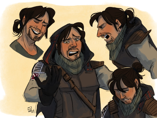
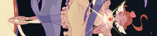
Hey look it’s Andal Brask
#just like really rough sketches that I decided to colour#trying to get a feel for him and cayde#Cayde is a pain to draw though#andal brask#destiny 2#destiny 2 hunter#destiny art#hunter vanguard#my art#digital art#procreate#destiny the game
129 notes
·
View notes
Text

summary of art 2023! here are some of my fave (non-zine) pieces from every month this year :) i'm most happy with the way my digital colouring process has improved from last year 🎉 it's easier now to make things look less flat after some tricks i picked up and practiced throughout the year ✨️✨️
thank you for all your support! it's always a pleasure and a delight to see your tags and comments in my notes. it really picked me up this year when i needed it. :')💖 let's all have a great 2024!
pieces: jan / feb / mar / apr / may / jun / jul / aug / sep / oct / nov / dec
#art summary#summary of art#demon slayer#batfamily#one piece#newsies#stranger things#kny#spot me going through my phases haha :') batfamily > renkaza > mishanks#fr tho this year's kinda scared me and im still dealing but it was always nice to open the app and see the enthusiasm for my art#thanks yall 💖💖💖#i wish i could add my zine pieces to this cuz im really proud of them :')#i couldve added the six au batfamily one but i also realized i have no idea what month id put it in lol#i finished it in apr but i posted it in dec 😅#so i decided to just. not. lol. but im proud of it!!!#the figure skating mihawk one was a surprise for me. i didnt expect it to turn out so good.#it was a rough sketch i only coloured cuz i coloured shanks's and then it felt like i was being unfair to mihawk hahaha#but the shading + the bg turned out really nice
42 notes
·
View notes
Text


Okokokokok- ignore how rough and messy some of these redraws/sketches are - but it's apparently also dinosaur month?? (WHY did no one ever tell me it's Jurassic June? I love dinosaurs) And like. What if Rise but dinosaurs?!
I don't often post such loose sketches but I wanted to show these off cause I really like some of this.
Design choices and dino species + the reasons I picked them bellow (looking for potential Donnie dino suggestions):
Clothes: Without the shell they really need clothes. They'd all have pretty much the same pants to keep some unity, except maybe Mikey (I decided they should all have the same pants after I finished the Mikey sketches, not sure if I'll keep the shorts or change to pants). Accessories are a mix of pre and post finale.
Raph - I think would keep it simple and practical but would also wear nice jackets and stuff when in casual situations. I need to work on giving him an alternative outfit and tweak his accessories a bit.
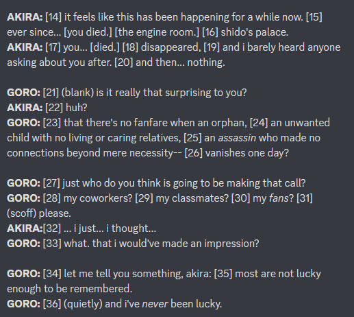
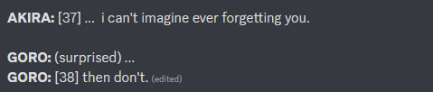
Donnie - An oversized pull-over hoodie cause we already know he loves that shit. We see him wearing it all the time. Easy enough. He wears a comfortable singlet underneath so the straps of his battle sail don't rub. Nice soft fabric, tight fit so it doesn't move around, tucks it into his pants, etc. When he wears the battle sail he won't overheat so he can wear hoodies basically all year round.
Leo - He's in one of those shirts with obnoxiously large arm holes and make it cropped cause 1. I think he would 2. I want it to be different from Raph and Donnie's singlets. He usually wears the shoulder strap off his shoulder but pulls it up when he needs to. He has some of the black bandages over his mid drift atm but I might just make his pants super high waisted in the final version. He'd probably wear a bomber jacket (also cropped?) over the top for cool weather, but doesn't like to hide his feathers.
Mikey - I think he'd mostly wear hand me downs when he's younger. He definitely goes through a stage of rebelling and wanting to pick his own and would find a middle ground of appreciating sharing some of his brother's clothes and modifying them, as long as he has the choice of his own available. Not sure if that would be before or after this design. At the moment he's got Raph's old shorts (from a loooong time ago), Leo's old shirt, and Donnie's old zip up hoodie. He does have his own accessories though, including pins instead of stickers.
Dinosaurs: I kept them all as non-avian dinosaurs, AKA not including animals that are colloquially considered dinos but aren't (like pterosaurs). I wanted to keep an even split of herbivore vs carnivore just so one wasn't the odd one out. I wanted to keep most of their body structure, colours and distinguishing features the same as canon. Obviously I added tails cause, yeah, of course haha. I did want them to be recognisable as different species of dino using distinct characteristics that their species is known for. I did ignore a lot of differences though, like size and bipedal vs quadruped (although the quadrupeds might be more likely to go to all fours, especially when fighting or afraid). Leo and Donnie are carnivores so have sharper teeth and claws.
Raph - Some kind of Ceratopsian (likely Triceratops or something very similar) and he was the first idea I had for this and I'm really happy with it. I think it just suits him. Trike Raph just came to me in an unprecedented moment of genius. His spikey frill replicates his spikey shell. His sturdiness, protectiveness and willingness to kick ass when needed, all scream trike to me.
Donnie - Spinosaurus but looking for other species recommendations. More details below:
So I wanted to figure out a way for him to have tech with a similar function to his battle shell (in the sense that it's something that helped him in day to day life) and so I went with spino cause one possible theory about a function of spinosaurus' sail is temperature regulation. So his battle sail has heating/cooling systems as well as other tech. A spino's sail was probably not fragile but the battle sail would also help protect it from being targeted during fights or crushed during extreme impacts. It was also thought to be used for display, and what's more of a display than a battle sail? The only problem I have with this is that it's lacking part of what makes Donnie's battle shell so great, which is that it is essentially a prosthetic. Not quite the same as how prosthetics are used in people of course, just in the sense that it is replicating the functionality of a body part that he doesn't have (I can't think of a better word). Well he does have a shell but it doesn't function in the same way that his brothers shells do, which leaves him with less defense than they have, hence a big reason for the battle shell (I hope I explained this well, it was hard to try and word properly). I can't think of a good way to do this with dinos. I was thinking of a carno or something with tiny arms, then Donnie could have tech enhanced arms but I'm pretty much ignoring body structure in the others so it would be weird to have just Donnie be affected by a difference in limb structure/functionality. I was thinking prosthetic tail but every non avian dinosaur had a pretty substantial tail. Except therizinosaurus but even they hade pretty obvious tails. I'm open to suggestions for this one if anyone has ideas. It does have to be an extinct non-avian dinosaur (anything not in Avialae), preferably carnivore but if someone suggests a really good herbivore or omnivore then I can try and swap Mikey for a carnivore. I want there to be an even split.
I also wanted to give him something different on his face, like his brothers, and that could only be a little spino crest and it crowds the top of his head but I can't put it anywhere else...
Leo - A type of Dromaeosaur. I was tossing up between this and a dilophosaur where his red stripes were part of the dilo's crest, cause I wasn't sure about giving him feathers. But dilo Leo was so plain compared to the rest and the crests were hard to get looking right so I went back to raptor Leo. I can definitely imagine him literally and metaphorically preening his feathers too. You can't really see it but he does also have that big raptor claw. Raptors were smart, tactical and worked in packs so I think that suits him. I wasn't specifically referencing how some artists draw Leo's stripes coming off his face (I was just trying to replicate his stripes somehow, even though it doesn't make a huge amount of sense) but I realised afterwards that it kinda looks like that and might have been subconsciously inspired by it.
Mikey - Is an Ankylosaur. I'm pretty happy with the species but I need to work out the design of his armour plating so that it looks interesting, cool and protective but isn't too chunky, too pointy or super lumpy looking. I went with an anky cause Mikey is often hiding in his shell and he can't do the same here but he could curl up in a defensive ball. Plus I could imagine him using his tail club in his razzmatazz fighting style. A little like his kusari-fundo or nunchacku/nunchucks (not sure on proper wording).
#rottmnt#save rottmnt#rise of the teenage mutant ninja turtles#rise of the tmnt#save rise of the tmnt#unpause rise of the tmnt#unpause rottmnt#rise season 3#rottmnt leo#rottmnt donnie#rottmnt mikey#rottmnt raphael#rise leo#rise mikey#rise raph#rise donnie#rottmnt au#jurassic june#tmnt au#dinosaur character
616 notes
·
View notes
Text
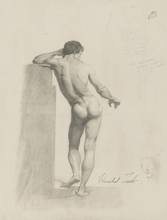
Kind of couldn’t let humanity forget about this.

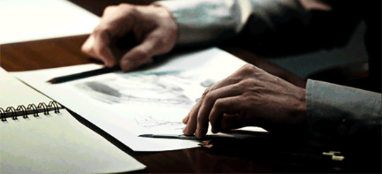
About Hannibal’s drawing pencils…(Decided to make a whole separate post about Hannibal Lecter’s drawing supplies to keep all the things I figured out after really attentive, extensive and obsessive research & viewing. Thanks to @existingcharactersdiehorribly for signal boosting my original questions! Sharing the fruit of my labours for the good of all Fannibals.)
1. Free range psychiatrist drawing habits
Hannibal DOES, in fact, draw with Tombow MONO graphite drawing pencils! (Originally, I just tossed the idea out there because these beautiful Japanese pencils seemed to fit his style, and it was an accurate guess.) These are professional drawing pencils, high-density graphite, strong point, smooth line. Hannibal has several at hand when he is drawing (which makes sense since his drawings have different values): in one scene, he’s shown with four different pencils while working on one sketch.
In case you want to sketch like Baltimore socialite Hannibal, this is a Tombow MONO.
He sharpens them with a scalpel (again, makes sense, a blade is preferable to a pencil sharpener for a better point).
Hannibal doesn’t seem to use a kneaded eraser, which is strange, nor have I spotted a blending stump (tortillon), but he has an ergonomically shaped triangular eraser. It looks like one of Faber-Castell grip erasers, the one Hannibal uses is the triangular shape but in a dark colour, possibly dark green (?). He also has a brush (to brush off the bits of eraser from the drawing).
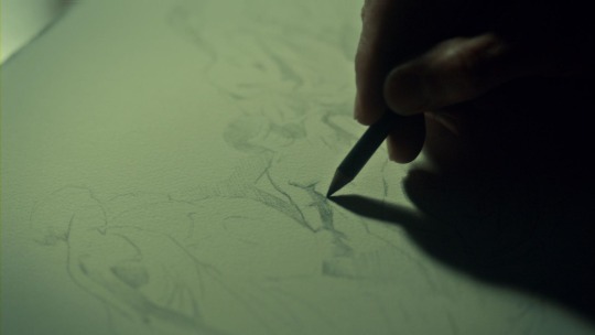
2. Cooped up BSHCI resident drawing habits
Apparently Dr Alana Bloom provides Hannibal with quality drawing supplies. Unlike his usual set of hexagonal graphite pencils, Hannibal is seen with a single black round one. The lead is very black, suggesting a mix of charcoal and wax or charcoal and lead. It would have a soft matte finish. After squinting about 1001 times watching it roll over Hannibal’s table for half a second, I am certain it is Sanford Prismacolor Premier Colored Pencil, 935 Black, which is actually much more expensive than a single MONO drawing pencil (rough estimate: approx. $6.50 for 935 Black vs. approx. $1.50 for a Mono?). Alana is really pampering Hannibal.
In case you want to sketch like Hannibal in BSHCI, this is a Sanford Prismacolor Premier 935 Black.
(NB: Hannibal also uses a different pencil while in BSHCI, specifically, during the coversation with Alana about his insanity plea. The non-drawing tip is similar to the Tombow MONO, but I can give no definitive opinion yet.)
So far I haven’t been able to identify Hannibal’s drawing paper (loose sheets). He seems to use at least two types, one which appears heavier and with a warm tint (example), the other less heavy, smooth and prone to minor creasing (example), probably for looser preliminary sketches? But there’s also an unfinished study of a woman on a warm-tinted (or perhaps yellowed with age?), thinner, slightly creased paper (this one). Examples from NBC Hannibal site.
If you have any ideas about the grain, weight, tint, and brand of Hannibal’s drawing paper, or any observations of his use of erasers and blending stumps, please let me know! Or just chime in if you, too, care about Hannibal’s drawing supplies.
cc: trobador (banned I think?)
54 notes
·
View notes
Text
original sketches
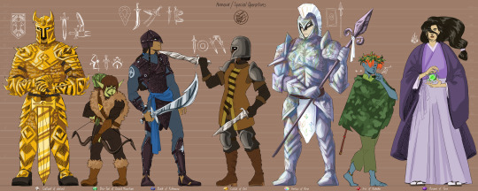
DELTORA FASHION CONCEPT ART V2
hello i have finally coloured some rough sketches of some deltoran fashions, a redraw of some really old sketches from ages ago.
im a pretty amateur concept artists and i hate designing clothes so truly was a challenge for me hahah BUT it has given me plenty of time to think of headcanons. im not sure what i've already posted about or not so im just gonna go ahead and rant
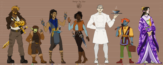
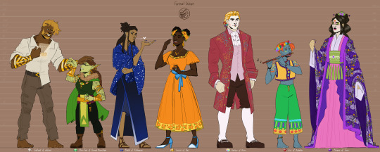
these characters were originally just models for me to draw the clothes on, so i didn't need to draw a new person every time; although in some of my earliest sketches of different people groups i did a bunch of people. but naturally these characters have developed a little and some of them are my beloved adin-era OCs <3
[about 4,500 words]
⬜ JALIS
since the jalis are reknowned for their warrior prowess and their signature gold armour, i thought it'd be neat that even if when they're not wearing the full set, they are always wearing their arm guards. it's a sense of pride and identity, they probably receive them as a rite of passage into adulthood. not every jalis is a knight, but they value a heart of courage and great feats and they all have them, and would wear them always (or at least special occasions if one prefers not).
i headcanon that jasmine was gifted her own set of arm guards as an expression of their respect and admiration of her. her relationship with glock grew so much and was cut off, but she earned her "heart of a jalis" and we didnt get to see much of jasmine and gers together, but theres plenty of time post-DQ3. i think my jasmine and the jalis thoughts should be a separate post though, otherwise this post will never end 😂
i dont imagine that the jalis had special party clothes, i think they just turn up in their usual clothes and get drunk and dance their hearts out maybe start a brawl thats none of my business
i cant remember why i've been giving them this geometric sort of pattern tbh. i think i drew someone at some point and wanted it to look different to mcbride's design but im not sure if i like it or not. the plus is that i can make diamond motifs though!!
i also cant really remember how my brown skin gold hair came to be 🤔🤔 wait backtracking i think what happened is that i decided to draw del people as black latinx inspired, so it wasn't that big a step to make jalis also dark skinned since they're both in the south (deltora geography is weird tho so like it's not that deep) and then i think i made them blonde as i "why not??" situation but tHEN i thought maybe it's connected to their jalis gold?
my headcanon is that their armour is made of a unique metal that can only be found in diamond territory, it's super hard, tough, and light etc. so maybe whatever is In The Ground is also in them and their blood and shows in their hair????
🥳 fun fact 🥳
wasn't until i had to draw steven and glock side by side that i had realised what i'd done?? i.e. steven canonically has brown skin gold hair too¹. which now forces me to think about whether it should be a coincidence (like it is) or shall i headcanon that steven and nevets' father was jalis² 🤔
¹ pretty sure it's about the dichotomy, to show contrast but connection between the brothers. i have many steven and nevets thoughts but that should also be another post
² i am.
🟩 DREAD GNOMES
these characters are adin-era, so unfortunately this would be when the gnomes still hunt the kin. whats weird is that i realised that i was picturing the caramelly brown fabric that this gnome is wearing was the kin pelt and not the big furry parts?? i usually picture the kin as more like velvetty. idk what the thicker fur parts would be though?? literally any other animal i guess 😅 i dont know it doesn't make sense and it's only occurring to me right now i shall have to think about it lmao
anyway made them green because why not. maybe they come in different colours idk. this gnome is pre-gellick so does go out in the sun, gellick-era gnomes would be waaaaay more paler they probably looked white. this could be similar to the jalis and like theres something in the grounddd
gla-thon claims that the dread gnomes knew that lesser gems had weaker but the same powers of the great talisman gems (sots), but im not sure if they knew it before adin. would be interesting if they did 🤔 and how they figured it out?? (side note but now im wondering about how withick knew what to write about the gems??) would imply that if they got the great emerald than they could deduce there are others surely. unless they thought it was a freak accident/miracle. anyway we know they love gems and gold etc etc so they obviously decorate themselves with heaps of jewellery
triangle motifs in homage to their mountain 💚
i gave them a sort of war paint ritual. i'm not sure if they all do the same markings, but this one was specifically to symbolise a bow and arrow (arrow going up the nose). you can see it a bit better here lol. i also decided that sometimes they wear it for purely cosmetic purposes. im not sure what the substance is exactly though. i think in my head i was imagining something similar to kohl, but maybe not.
🥳 fun fact 🥳
bre-tak and az-zure are lesbians (i make the rules)
🟦 MERE
oooooh baby this is my guy my babygirl my everything
okay so i think this headcanon developed recently when i last drew sky of rithmere and i thought that mere superstition encouraged them to wear their charms in random spots to avoid them cancelling each other out. it could be construed to be they were inspired by the night sky and the pattern of the stars perhaps. this led them to prefer asymmetrical fashions, mostly prominent in the armour i put badr in
🥳 fun fact 🥳
badr means "full moon" 👀
i think i originally decided the mere had leather armour just to give them something different iirc but the mere characters we see are usually the lithe, speedy, crafty type, so maybe light, mobile armour does work for them lol. anyway the main reason is that i had the image of studded leather, and i was like ohohoho STARS
i generally think of them with muted colours but sometimes they have a bold blue for their prized garmants. like zillah and co, the leaders of rithmere in adin's time were described with bright blue and starry cloaks. (i checked the wiki just to check zillah's name lol and apparently it's actually canon they have leather armour?? so not sure why i thought otherwise) anyway i do currently have minecraft brain but i did vaguely remember that people made ultramarine pigment from grinding lapis lazuli into a powder and im not sure if thats something the mere would do or if there's some strong blue dyes they can get from plants or something native to their territory 🤔
actually im liking that idea now? it would be incredibly time-consuming and labour-intensive but that would add to its value?? real world lapis lazuli has a horrible yield rate of 1kg lapis to 30g of pigment apparently, but it's a strong pigment (unless i misunderstand). alternative name for ultramarine is "permanent blue" apparently so. anyway ultramarine irl is more of a paint pigment, but in roddaverse maybe the mere make a lucky blue dye to use on cloaks and scarfs and shawls etc for good fortune?? me frantically checking that i put badr and luisa's wedding garb in bold blue lmAO oh i did but it's a little muted. they mix in oils and stuff to make the paint, so it doesnt seem like a stretch that they can mix different ingredients or ratio to make a cloth dye (to my very amateur understanding).
so im imagining now that they have a special (probably secret within the mere) process to create bright blue thread speckled with white (also gold to me. im pro deltora lapis with gold) and weave it into their beautiful starry night fabric. the amount of labour and the use of their prized lapis lazuli makes it very special, and maybe some people think it's the lapis that makes the fabric lucky or maybe some people think it's the work of love and time that makes it lucky, maybe both.
🥳 fun fact 🥳
i forgot that "bless your lucky stars" is like a real saying until recently lol
a starry cloak is probably something only the really rich could afford, but i think that they are more like heirlooms and states of office? im not sure if these pieces are things that one would purchase or something they would receive. bit hard to imagine people doing it for free but maybe it's one of those staple things that they revere and everyone else works to support them as well etc like the cooks in noradz are prized. idk. but yeah like a poorer family couldn't get a new one, but they would have one that has been in their family for generations you know? and i think that there would be something about like. idk youre meeting up with your doctor or something and youre nervous and you put on your family's best clothes (the most lucky ones) and maybe youre cynical about the whole good fortune stuff but there's something comforting about wearing the cloak your mother wore and your grandmother and your great grandmother wore, who also had to do such things. something something gives you the confidence to make your own luck because youre no longer pessimistic and allowing avoidable mistakes to happen
this means that the mere giving adin a cloak was a REALLY big deal because they definitely dont just go throwing those around and they would probably only give it to an outsider in trade for a steeeeeeeeeeeep price. which of course means that there would be knock offs with bad quality dye. lmao thats perfect actually. like 10000% there would be merchants in rithmere trying to sell cheaper versions to people that are expensive but still affordable to the average person. some would be different shades of blue, but the more crafty might have dyes that are strong but not lasting.
oh also i headcanon that palace fashion was a conglomerate of aspects from all the tribes but this should be it's own post i think. but i just remembered that i put gold thread in badr's braids in the formal wear sketch. i did that to tie in with the veins/flecks of gold (technically pyrite) in irl lapis lazuli. as such, people at del palace were inspired to weave gold into their hair too.
also gives me another thing to ship badr and luisa lmao. badr can wear some gold and luisa can wear some blue as a treat for me <3 moon and stars ocs beloved
🟨 DEL
alright. okay so del is definitely very white western patriarchal coded (most just a bias of living in that type of society i reckon) but it sucks and i'm passionate about making del NOT that. i think i've said this a million times now but this should be it's own post too, but most succinctly del is a very vibrant, curious, and daring sort of culture (e.g. their recklessness, exploration, trading). they were already marrying non-deltorans before adin (i imagine that some might have dared to marry outside of del, but it would have been way more politically complex so it was rarer and often kept quiet and rural). people of del were moving to other countries (like dorne) and people were probably moving to del, so del is definitely a big mix of different people and languages and superstitions and stuff.
but anyway i wanted to set a sort of base for before that. i've had art on the wip pile for YEARS about this and i'd flesh this out properly when it's done lol (hopefully we see that day) but since the topaz has the power to summon spirits, i really wanted to develop an aspect of del culture around that? i was inspired by Día De Los Muertos (Day of the Dead) and i still want to do some more in depth research and explore it more properly, but i like the idea that del will celebrate their lost loved ones life, coming together to remember, if they were lucky the got to see and even talk to their spirits. maybe pre-talisman they did know about topaz properties and they had a big deposit of gems that they would wheel out for the festival and the huge pile under the full moon would be enough to allow the spirits and people to interact? anyway this is a longwinded explanation of why my sketches of del fashion could be latinx inspired.
circle motifs in homage to the moon. the trim decoration on luisa's scabbards are based on moon phases :D
i also arbitrarily decided that del people love swishy clothes. they're all about the drama of cloaks and twirling in sundresses etc it's fun. not sure if i will actually follow through with that lol or maybe that can just be luisa.
🥳 fun fact 🥳
i think hearing luisa laugh would heal me
there's no particular reason for why i've been drawing a lot of del people as black, other than maybe spite lol. i think i drew jasmine and that got the ball rolling. del is a blank enough slate that they can be anything. im tired of white people being the front runners asldkjfhalsdf. bUT again del is multicultural, so there isn't a particular look for anyone in del. being del is more a state of mind and being part of community i think. you move to del and you participate in their society in one way or another and boom youre del now they adopted you.
🌈 PLAINS
hiran attire inspired by french aristocratic fashion. i cant remember who posted about it but pretty sure this was something that circulated around the fandom at least a little bit at some point.
added some subtle rainbow to harlow's outfits because he's the strong silent type. but i suppose there are so much more gaudier and extravagant outfits.
i was going to say this was just hira fashion and not like, rural plains fashion but i guess this is the same for all of them. it's just like a general direction for what someone might wear.
the swirly patterns?? i dont know. i drew them when i did adin's pre-battle speech as the last supper but i dont think there's a particular reason. i remember that i was trying to do something unique because lief recognises the cup in the city of rats as the same/similar to the one in noradz, so there had to be something to be recognisable lol but i probably just did it this way because it's relatively easy to doodle, just takes a bit of time.
🥳 fun fact 🥳
harlow was a cook before the shadow invasion. out of desperation, he and many others had to train to defend hira. he's big with natural balance and reflexes so he excelled and is a pretty adept warrior, but he will always think of himself as a cook first, warrior second.
now the armour!! freshest headcanon piping hot. yesterday when i was colouring i was sitting there like wow you look like a tin can man and you are so boring. we went from pretty colours to blank. im almost certain the hiran soldiers were described as silver with white plumes, so i was planning on doing that but they had intricate details on their armour because they are Extra, so it has the swirly patterns you can see on harlow's coat.
but then suddenly i was like. what if. pearlescent.
and honestly i loved it so much i didnt care i was setting myself up for some difficult work ahead lmao. but my general idea was that they're armour looked like it was silver, but if the light catches it at the right angle it exposes the rainbow in it. most of these headcanons i've had baking for at least a year, but this is very new so i dont any hard details yet. kira mentioned enamel or ceramic and lowkey interested in having a look into that so that theres another armour material. maybe it's gonna be like special jalis gold and special plains silver. maybe something else. i also just remembered bismuth exists (same boat as gold as very heavy and soft) but i think maybe it's too loud, i think im liking the more subtle pearlescent thing aLTHOUGH it's a good metallic rainbow reference 👀 maybe there is an esteemed plains warrior with a rainbow sword
ANYWAY pearlescent armour really hit my heart because oh my god once upon a time the plains had a shore and they could visit the sea,,,, lowkey ocean vibes without an ocean [screaming crying cat spinning in a void.gif]
🥳 fun fact 🥳
i have NO idea what food harlow has made. i think i had ratatouille on the brain at the time????
🟥 RALADS
⚠ PROPAGANDA ALERT ⚠
ruby territory best territory. ruby symbol of happiness. warns of danger AND antidote to poison. double helpful. ralads are so sweet and so smart. architectural and engineering marvels. living in harmony with the land and beasts. D'OR!!! manus and nanion friendship underrated and so special to me. horse girls. AND. broome. god theres so much i could say about broome that i cant say anything. anyway you guys know im normal about broome yes of course. separate post etc etc
i think technically this is a headcanon but it's not that big a stretch surely but as above i always picture ralads as in harmony with nature. never take more than they need, know how to work with not against, theyre not the main attraction but an equal part of the bigger picture.. this isn't even about how smart they are with engineering and their perfectly round houses with bricks that are cut perfectly. im thinking about their knowledge of their world is so strong and wide and diverse. they have the most vibrant and potent dyes and pigments around, they have the most colourful fabrics and clothes around. the plains has many colours but it can't compete, and they have different styles. i think that the hirans would trade for the dyes though (maybe undercutting pre-adin, maybe more equal post-unification). i think that they would also have a pretty decent blue dye but it is still inferior to mere lapis lazuli blue. it is probably a dye that could be used for a mid range mere garment?
maybe it's the anime fault but i do usually imagine ralads as barefoot but i also drew iris with construction tools and just the idea of ralads walking around a construction site barefoot was not fun to me. but it could be a hobbit tough soles situation. anyway i drew some shoes so i had a vague reference if i wanted to draw ralad shoes.
obviously had a problem drawing warrior attire for a non-war race. but i thought what if i leaned into the stories the hirans tell about how the scouts and soldiers they send into the ralad wilds never returned and were often found dead with broken bones or whatnot. definitely big watching but never seen vibes imo. so i decked iris out in some camouflage lol
🥳 fun fact 🥳
im sure the ralads can whistle and whatnot to make birdcall signals, but i thought it was fun for iris to be able to make birdcalls with her flute
HEY ALSO headcanon about ralad hair. i was making some dragon art from a doran pov that i was going to save for that but i cant wait now. but we know from Tales that the ralads had a good relationship with the ruby dragons, could even summon them (unless im misremembering and it was more like a premeditated calling) but i was thinking about how they nest with .. human? hair. and i was thinking what if they grow out their hair? and then they offer it to a dragon when they are ready? i dont know if there's a nesting season for dragons but it could be something like that? ralad-dragon ceremony and party time. this isn't a rite of passage type of thing, just something that they like to do. not everyone does it probably, but most do it once, some people do it several or many times in their lifetime. it's an honour, but not really a sacrifice to them. it's part of the world balance and theyre willing to serve the dragons as the dragons serve them as they water the plants and the plants feed them and they feed beasts and beasts feed them.
also dont remember why i did the hair so bright and orangey??? genuinely perplexed lmao. probably was leaning into irl ginger but like THEYRE BLUE so i could probably make them actual red. not sure if this is also like a "theres something in the ground" situation also that makes their hair red but maybe 😂😂
side note but it's lowkey so wild to me that rodda was like yeah these guys are blue-grey with red hair, and then everyone else is like an average person, BUT the mountain people are short. like they're all just some guy basically???
it does make return to del so so funny because fallow is like AYO look at these MONSTERS they are UGLY and WEIRD
but i guess thats part of the motivation to give the deltora tribes some basic unique traits.
🟪 TORANS
okay so toran robes as inspired by japanese fashion is definitely something that's floated around the fandom for ages. i can't remember if it was before or after seeing posts about it that i started my first concept sketches but i think it probably had a hand in helping me visualise what rodda was talking about when she described their robes as butterfly wings when they speed-travelled. like yeah big deep sleeves and floor trailing hems WOULD probably look like colourful butterfly wings in the wind,,
🥳 fun fact 🥳
azami be always hungry. if only she knew someone who liked to cook 🤔
i don't have much to say design-wise, kinda just did various doodling. they would probably be second in extravagance to the plains, but it's a different sort of detail? they are probably a bit more refined and elegant than the hirans who are probably more bold in their designs. torans grow to be vain and selfish (it's already started by adin's time) so they probably have a high value on the beauty of their belongings, and it probably began with imagery of beasts and plants and dragons in amethyst territory, "true" pictures. but as time went on it probably distorted a bit and became idealised and/or fantastical etc.
OKAY SO my brain bluescreened just now for a moment trying to figure out how a people who use magic to make life easier, were also the ones known for their weaving, a manual hands-on task (lief's cloak is praised as being worthy of toran looms, implying high grade; pretty sure this was supposed to be a hint that his mother is not who he thinks she is also). some conclusions are 1) they weave with magic (sad, horrible), 2) they weave as a past-time, for fun etc (okay) but i took it to a third option
for a long time ive been thinking about toran magic as like, a balance and an energy thing (because i like that stuff lol) they cannot create something from nothing, only change things. they couldnt summon a fire, but they could change a piece of wood to fire and start a campfire, or those more advanced could even change the air into fire. but honestly it's left me a bit unsatisfied. like how does that explain the tora-del highway? hELL tora itself? what happened to the marble that got carved away? also how can that mountain have been so perfect there was no cracks or seams?? or did they carve those bits out lol. questions for another day.
anyway i was thinking about how hobbies are good for you, you dont have to be good at something but it's good to do stuff for fun and when you do crafts you get a cool thing at the end of it that you made. but it's also like skills you can develop? and i wondered what if weaving is a starter skill that they learn, some of them at least. maybe there are different activities, and they do the one that speaks to them the most. there were other types of artisans in tora, just not as talked about (i guess they're robes are pretty iconic so it's easy for people to go wow robes wow weavers who made fabric for the robes so soft) like i distinctly remember barda remarking about how tora was untouched and why bandits wouldn't have stolen the carved box that ended up holding the auto-reply letters from the palace.
so what im thinking is that maybe this builds a foundation to help torans visualise and perform their magic?
it actually solves a problem ive had in my headcanons i feel like ive got seven eyes open rn 😂😂 but in relation to del culture and traditions, i've been thinking about there being a physical and spiritual realm of course, and maybe it's the comfort of threes but it felt like something was missing.
i dont know what to call it yet, but im thinking the third thing is like the glue, it connects all things, it's in everything. it's like a third realm but also more of like a medium maybe? kind of sappy but we can just call this the magical realm for now. i actually used to think of toran magic as being like a subset of the greater deltora magic, but now im thinking it's more like torans are more receptive to the magic realm, as del are to the spiritual, and the ralads to the physical; theyre the experts in these things, which is why unified deltora is important 😂; likewise dread gnomes specialise in gems, jalis in combat, mere in cunning, plains in hope perhaps? literally never thought about it quite like this so maybe i will process it different later and designate different specialties.
so when the torans are young, they learn a craft and these skills help them sort of "tap into" the magical realm. so in the case i first thought of, when a toran weaver starts to see and interact with the magical realm, the easiest way for them to engage with it would be to think of it as weaving. they might see the magical realm as threads that connect everything, and weave things together to get what they want. a potter might see it as a malleable mass and sculpt what they want. a carpenter might see it as something to carve, something to break and put together.
the magical realm is not a concrete thing at all, up to interpretation, perhaps a unique experience to anyone who could glimpse in; don't strictly have to be toran, but they are perhaps naturally receptive to it or it could even be entirely a knowledge thing and that they are taught about it more; someone like verity who had her eyes opened to this realm, and learned to interact with it on instinct. does open questions to what the hell is up with the plains lmao but i think thats another post.
__
sorry about all the "i'll tell you in another post" i was attempting to stay on track 😂😂 also there's a 90% chance im gonna forget to come back and write about them so if anyone is dying to know feel free to send me an ask or something???
also if you want to know more about these OCs let me know 👀 i can find an ask game or something maybe. it's a case of i know a lot but will forget it all if asked to speak freely, i need specific questions. i have also developed the first four a bit more, but the last three are not without character so they can still be included. maybe it will be a group effort and they will have Background.
#tribes concept art project#emily rodda#roddaverse#deltora quest#postlyn#postlyn art#postlyn thoughts#postlyn headcanon#oc#gallant of jaliad#bre-tak of dread mountain#badr of rithmere#luisa of del#harlow of hira#iris of raladin#azami of tora#//#i should make a lil headcanon database#lyn's headcanon wiki lmao#also im so sorry if anyhting is illegible lmao i have not proofread any of it and i never will#say hi to lyn's stream of conscious#have the most audhd post you've ever seen in your life
64 notes
·
View notes
Note
hi !! i recently played storyseeker and really loved it !! i was curious about how you went about designing the story for it ?? was it hard to keep track of all the moving narrative parts ?? how did you decide where to reveal what info ?? hope you dont mind me asking -- i really love your art !! have a great day !!
I'm glad you enjoyed Storyseeker! Old as it may be, out of everything I've made it's still the game I'd most like to make a spiritual successor to.
Answers to narrative design questions after the cut:
It's funny, Storyseeker's design process was so organic that realistically it should've turned into a right mess. But just as organically it lead into design principles that made organising the story a breeze, honestly.
What I mean by organic: As touched upon in this reply regarding worldbuilding, the story kept writing itself as long as I kept asking it questions, so I just let it do its thing. The player is meant to experience the narrative in much the same way, with me imposing as little control over them as possible while they travel as they please and narrate to themselves the story of what they see.
It sounds freeform and terribly unstructured, but I established a principle of design that aims to help the player connect the dots instead of feeling lost in a cacophony of random details. While making the game I called them "paths": routes the player is likely to take or subtly guided to take, that connect together related parts of the narrative. Visually some are literal paths or roads, but they could be anything that the player might follow. Footprints, streams of bubbles, the line of sight of an NPC, the sight of something irregular peeking at the edge of the screen...
A path presents both a question and a direction to go look for the answer. Oftentimes, the exact questions I was asking myself when building the world piece by piece. Where does this road lead? Where are these weasels swimming to (or, approaching from the opposite direction, where did they come from)? What dislodged itself from this hole in the ice and where did it go? What kind of a body are these giant toes connected to? Ie., to answer your question of when to reveal information: when the player asks for the information by moving towards where it's revealed, whether on purpose or unknowingly.
If the player follows the direction they must end up on another path because good answers beget more questions. The single most important design document I had was a piece of scrap paper with a rough sketch of the map and a whole lot of coloured lines flowing across it to mark the paths I was prepping for the player. (Lines, not arrows, since I couldn't predict which direction they'd be traveled in.) By visualising them I tried to make sure none of them stopped abruptly or looped in a circle, and that all the places of interest were covered.
(The biggest exception to this design is of course the dead end of a room that is the game's final area: the temple interior that can only be found by completionists. That's why it "completes" the game by being a narrative dead end, too.)
I genuinely didn't even plan it this way on purpose, but it turns out that it really helps keep track of a narrative when you make a game where webs of cause and consequence are all visually illustrated on a literal map. :D If you're the type of person who benefits from visually organising things, I don't see why you couldn't draw abstracted maps of your narrative even if it's not so visual in nature.
I know I definitely need to do more of that! Just last week I rescued my current project's dialogue rewrite with visualisation and arrow doodles. It had grown into an overwhelming mess of unplanned splitting and rejoining branches and microreactivity, so to have any chance of looking at it without inviting a migraine, I closed the document and instead mapped the whole script into a single page outline of what each conversation is supposed to convey to the player. It's so much easier for me to think about the shape of the story when I can see it in one glance!
#ask#storyseeker#plus a bit of the dark queen of mortholme devblogging at the end#narrative design#anyways thank you for this ask friend#last I heard of Storyseeker was from someone who seemingly made an itch.io account just to leave it the comment “1.5/10”#it was honestly pretty funny
19 notes
·
View notes
Note
Hi, i hope this question doesn't bothers you, do you have any videos of your process?, im currently starting to learn how to do digital art and have trouble knowing where to start and what to do (im always like, should i start drawing this part first?, is it better to do clean lineart or just paint over the sketch?, do i work on the lights first or the shadows?, etc)
I can probs make you a video on this at some point based on something I'm currently working on, although I have a few on my tiktok already (@ xephia) if that helps!
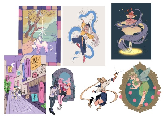
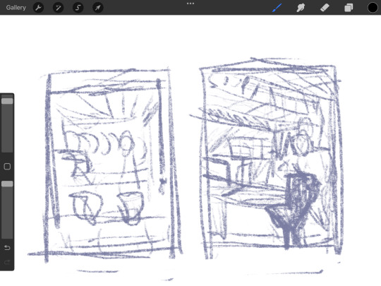
My process is a bit messier than many other artists - I alternate between stages of sketch and colour before I even think about ‘final colour’. I’ll start with a sketch like the ones below, then slap some rough colour on. This is because IMO colour is an important part of the composition so I want to see what works before I line. They’re not meant to be pretty or social media ready. This stage can look super messy or tidy depending on how I feel or how complicated it is. And they can look wildly different; here’s some examples:
That stage also helps me decide if I want to finish the piece or if I should abandon it (I abandon a lot). Sometimes this stage takes 15min, sometimes 2 hours, it really depends on the piece. But for me personally, it’s crucial because otherwise I find it very hard to envision how it will look later, or forget what I was planning.
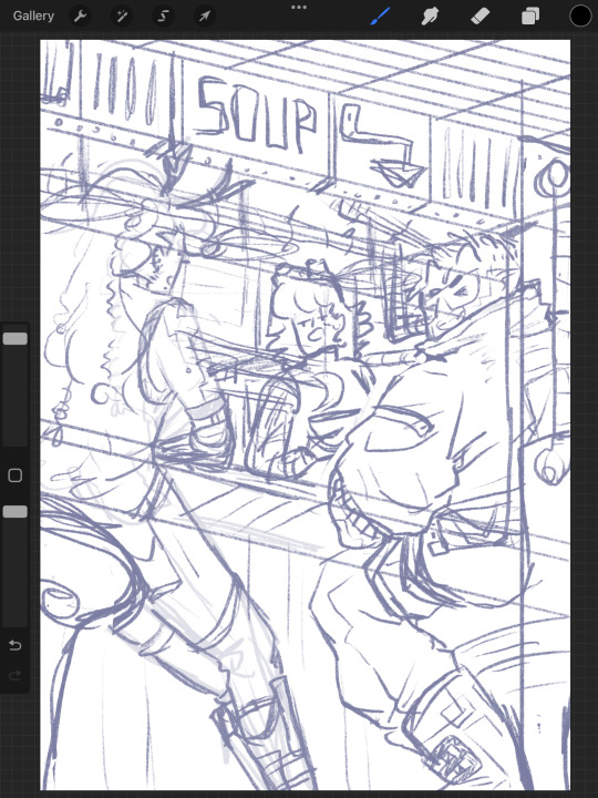
Then, I do at least one more layer of ‘sketch line art’, which is basically a first layer of line art to see what works and what needs changing. I colour the important bits relatively cleanly (usually character/s) and add might some subtle shadows/gradients and/or lighting to get a feel of what it will look like finished. Sometimes I repeat this process a couple of times if I’m not happy with how the first iteration looked. This stage usually looks a little like this character sheet I’m working on, and this slice from a Kiki delivery service sketch:
It’s usually not until I’ve done all that, that I go over and do the final lineart, making it thicker, colouring the lines, redoing the flat colours, tidying it up, and adjusting where needed. Essentially I don’t start ‘finishing’ a piece until I’m happy with where everything sits and what colours I’ve picked. It’s only at this point I feel like the sketch is ready to line, and lining and final colouring can actually take less time for me than all those layers of planning somehow haha.
At this point I keep tidying, cleaning, lining, colouring, until the piece feels complete. Sometimes complete for one piece is tidier than complete for another, it really depends.
I’ll also use Procreate’s push tool to adjust things as I go in all steps - it saves a lot of time and isn’t cheating.
Although as you can probably tell from my examples, I do change this procress up a lot depending on the piece! Sometimes I’ll even paint over parts of my final piece like I did in this magical girl street. I think find whatever works for you, everyone will work differently and things like mood, energy levels, how patient you feel, how stressed you are, if you have any hand pain or shaking, and how much free time you have that day to draw can all affect your process day to day, week to week.
Some days it will be easier and more comfortable to sketch messily, other days tidier. Some days you will draw well, other days not well at all. At least for me, I find consistency almost impossible.
So I think there's no right or wrong order to do things and it's great to switch it up and keep things interesting for yourself, and different processes work for different people. Hope this helps!
#faq#art process#art advice#art tips#drawing guide#sketch progress#digital art#procreate#human artist
25 notes
·
View notes
Text
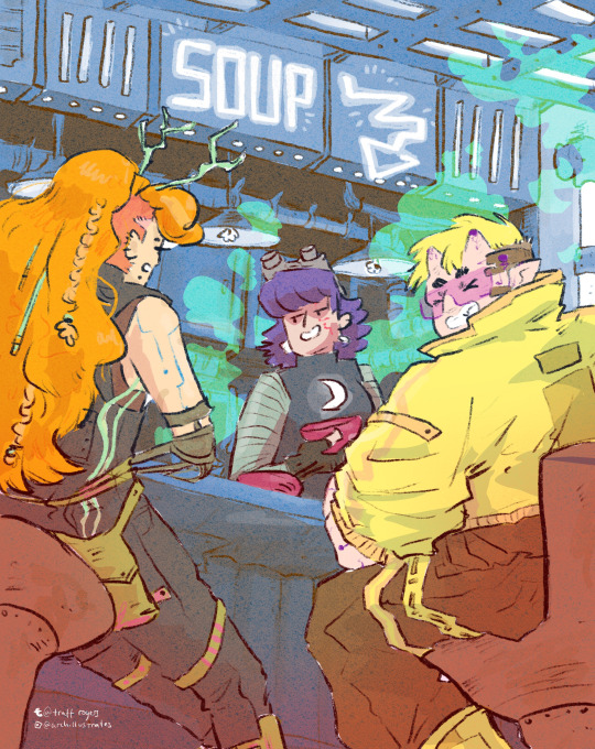
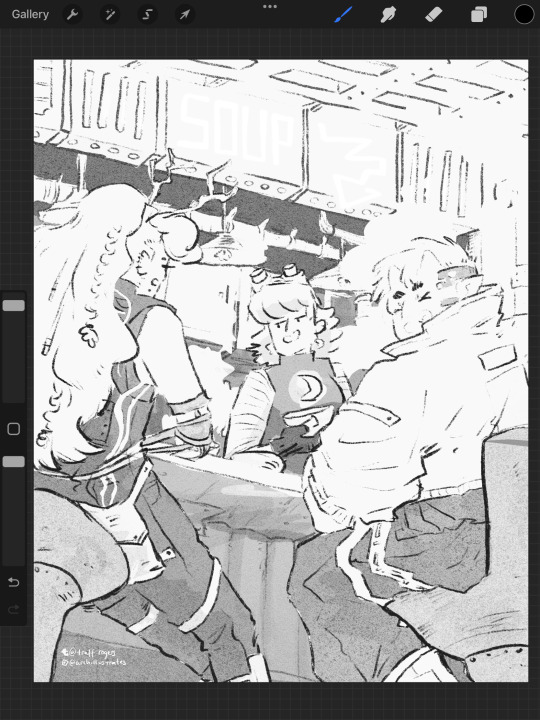
23rd Feb '24 - [arch] OH RISO my beloved!!!!!! ft. cyberpunk hermitcraft soup group
A cliffhanger!!!! And now I have to wait a month for you to upload the second half?? How will I cope :’’0
For real, it’s so awesome to see your process and the sheer amount of inspiration you take! In particular, I thought ‘Sit on Two Chairs’ and ‘This Was Our Pact’ were particularly yummy.
I think book covers are really hard. You have to sum up a book’s energy in one image, make it stand out and show just enough so people want more. Exploring the narrative through those full pages is really interesting - though this is something you did for fun, it could be a really useful technique for getting to know a narrative. When I’m designing my comic covers, I always do it last - that way I’ve had practice with the visual style and I’m thoroughly familiar with the themes, so I guess spending a bit of time with the characters and narrative in this way helps for standalone book covers too. Of course, it helps if you have the time for that XD
Okay!! Onto what I've been up to!!! [warning this is a beefy post I'm sorry for your poor reading brain]
The past two weeks have been really enjoyable! I’ve been playing a lot with slow world-building, in sketchbooks, google documents, and voice notes to friends. Letting myself really sit with concepts, think about the characters, let them play in my head with no expectations. With this relaxation and lack of pressure, some beautiful narratives and interactions have been developing. I’m starting to need a name for a world/ the story. I’m not quite ready to give them a full introduction to the internet - I know it doesn’t but it feels like there’s some accountability to *produce something* and this slow development is really important for the quality and my skill building.
It’s really hard to take on, but we actually don’t have to make the perfect thing now! In fact, it’s impossible. Pressure on ourselves makes it so hard to make something good if we’re always grasping at the final result.
In the meantime, while those characters develop, I have been working hard on my basic skills. I wrote about characterization last post, but this week I focused on setting and colour. I was inspired (once again) by Hermitcraft. I’ve seen some really incredible illustrations of Minecraft builds in the fandom, and it seems like a great exercise.
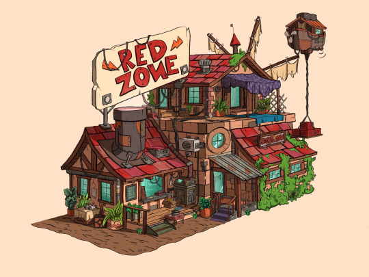
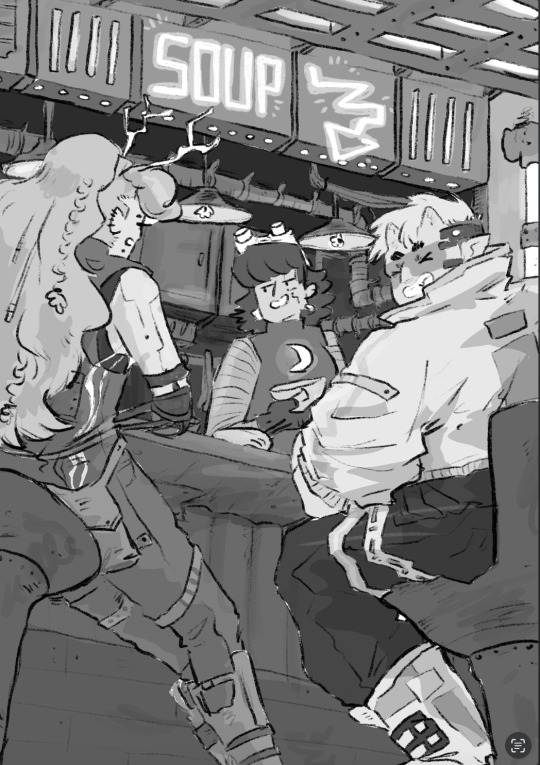
Bdouble0's Season 10 Base illustrated by @applestruda [source] and The Red Zone, built and illustrated by Bdouble0 [source]
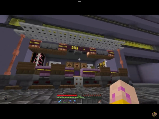
One of the creators on Hermitcraft, ImpulseSV, created this build in a recent episode. It takes inspiration from the last season of Hermitcraft, where he was part of the ‘soup group’ with two other players, and his current base concept - a cyberpunk city. I also LOVE his new character design, so I wanted to place him in the scene.
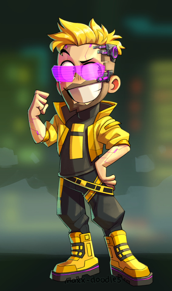
Screenshot from Impulse's video and new impulse design by @maxx-doodles
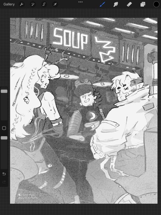
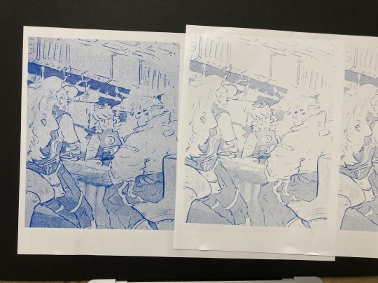
Here are some initial thumbnails I did, trying to figure out the composition. I wasn’t sure of the vibe yet, so I tried some rough thumbnailing, and drawing on an isometric grid and other perspective techniques. I’m going a bit mad for characters at the mo, so I wanted to place some in the scene. I found the angle of the isometric grid steep to place characters comfortably, so decided against that.
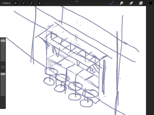
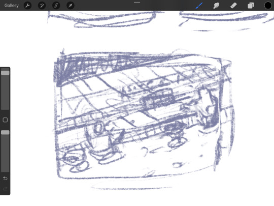
Looking back at it, I love the second! But I believe I was struggling with the perspective. I decided on the last one eventually.
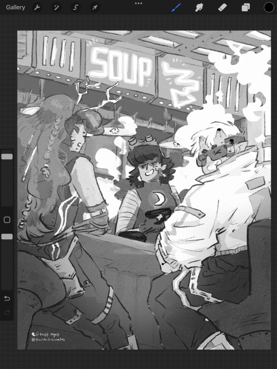
Now, I absolutely adore all of the players in the Soup Group, and I am BIG fan of redesigning their notable characteristics to suit different settings. So yes, I decided to put all of the soup group in the image.
PearlescentMoon (left) from my comic and GeminiTay's Hermitcraft Season 10 design [from this thumbnail] (right)
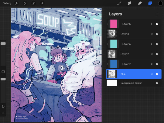
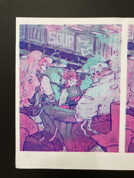
Here's the sketch of the final image. I really enjoyed coming up with cyberpunk versions of them all. I used the impulse design almost exactly, with a few extra interesting details since he's mostly viewed from the back. For PearlescentMoon (middle) I kept her fringe, dark hair and gave her a glowing moon symbol on her top. For GeminiTay, I kept her long ginger hair, antlers (but glowing!) and took inspiration from her new season 10 design - a dark blue jumpsuit to match her dark blue clothes in her new design, and the braids she is often drawn with. I also gave them edgy new hairstyles. And a robot arm. I don't have lore for that.
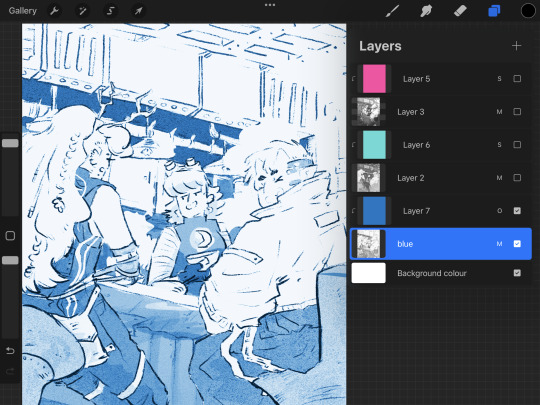
As usual, I filled each flat colour-to-be with black and lowered the opacity to play with the values. Then I added colours one at a time, aware might be riso printing it. Originally I stuck to trying to make it printable (making the colours out of ones I could make my layering 2-3 colours at different opacities), but as I went on, I decided to drop that and focus on the quality of the image in a digital format alone. I did keep the grayscale version above with all the separate layers in case I needed that if/when I came to riso printing it. Below are the main two digital colour schemes I tried out.
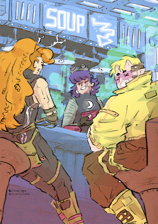
I settled on the one on the left, with the blue tones - the foreground characters really pop. I put a few details in Gem's hair, colour variations etc, and cropped it for Instagram. I actually much prefer the cropped version - it sits better in a rule of thirds.
Now the moment we've all been waiting for :'')
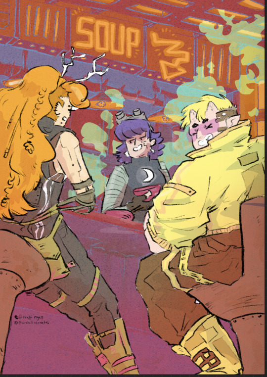
RISO!!!!!!!!!!!
I returned to Cardiff after a couple of months away and was delighted to spend my first day back at The Printhaus, an awesome shared print studio where I have basically made my home. A few of my awesome friends happened to be there, so I spent the day playing around with this image with their help! (please check them out they're very cool - Gavin helped me a lot (we hung out at Thought Bubble, remember? and Rhi gave good crits too!!)
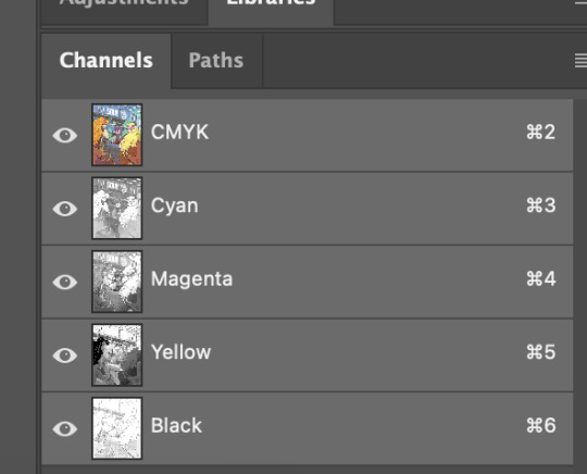
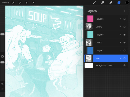
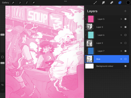
For those who don't know, risograph is basically a shitty photocopier that can only print one colour at a time. However, you can play with gradients and opacities, and layer colours really nicely to combine. I've done a lot of single-colour tonal work with riso but this is my first go really layering.
First, Gavin showed me how to separate the channels in Photoshop, using the flat image uploaded to the 'gram. We copied and pasted these layers in grayscale and added blending modes to each layer to replicate what they might look like when printed.
With blending modes, the digital mockup looked like this!!
This bit goes into technical details for replicating what the print might look like for those who might want it - feel free to skip :)))
I copied and pasted the Cyan, Black and Magenta layers as greyscale (as you can see above)
I made all of the greyscale layers multiply layers since risograph ink is transparent and we wanted to see how it layers. The ink usually comes out a bit lighter than you think, so it's good to bear that in mind. I used a clipping mask over each greyscale layer and a blending mode. WHEN YOU PRINT, PRINT IN GREYSCALE, NOT COLOUR.
Here's how I split the colours from CMYK to the riso colours, their hex codes and the blending mode I used to replicate the colours:
Cyan - Mint [HEX#82D8D5] Screen
Magenta - Fluorescent Pink [HEX#FF48B0] Screen
Black - Blue [HEX#0078BF] Overlay
Yellow - scrapped for colour scheme purposes
Blue, Mint and Florencent Pink layers in greyscale in Procreate.
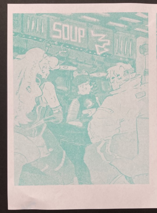
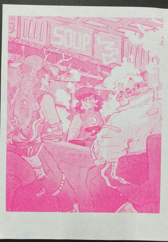
Riso printed Mint and Florescent Pink layers on separate paper, followed by the two layered together.
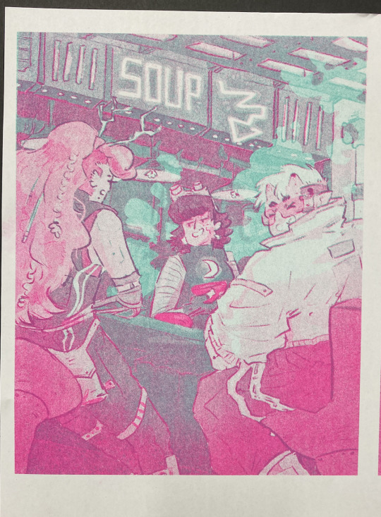
We always start with the lighter colour inks first, because sometimes the rollers can pick up the ink and cause extra marks where you don't want them. The first two colours came out great!
The first time we printed the blue, it came out very dark (left, first image). I have had this issue before - my last book, Winter Wellbeing, came out much darker than I wanted. Now I realise that the blue ink is super sensitive. All the 'white space' that is covered by a low-opacity blue on the left is only 2%, and yet it has come out pretty strong. We tried printing it on one of the misaligned images just to see, but it took all of the brightness out of the neon soup sign at the top of the image (second image). So I changed the values and pushed them way lighter, so it just pushed the values of the darker bits slightly, and brightened some of the lineart (right, first image)
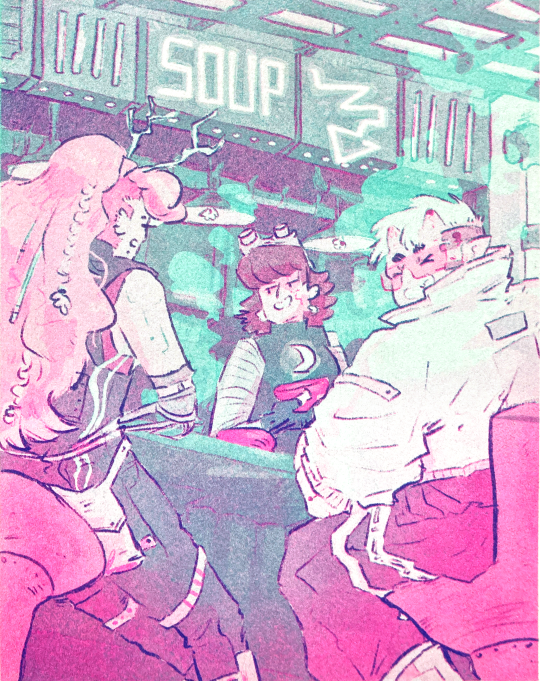
And this is the final riso printed version!! I'm so so happy with how this came out. It's so different from the original digital version, and I actually love that.
I didn't create new colours in the way that I intended to - I wanted to play with overlaying purposefully to create specific colours eg. orange for the hair etc. But!!! I'm really happy with how it came out. That will have to be a project for next time.
Also, many copies are slightly misaligned, so in future I think I'd do flat layers for the colours a more blobby style with the linework on one layer only so there's less of a chance for obvious misalignment. design for the riso, rather than riso the design.
Overall though, this feels like a super cool step up and a milestone for me. Super happy with how it came out!! And I'm excited to play with colour some more.
Can't wait to see the rest of the Lionheart brothers! Enjoy your weekend :)))
Archie 🕺🕺🕺🕺🕺🕺🕺🕺🕺🕺🕺🕺 <3
#archillustrates#arch is learning#smileyshri#project development#art#art process#art resource#process#artists on tumblr#illustration#comic#picture book#small art blog#art blog#illustration blog#female artists on tumblr#queer artists on tumblr#illustrator#book illustrator#female illustrator#queer illustrator#comic artist#comic art#female artists on instagram#artists on instagram#procreate#digital artwork#digital artist#artist blog#artist on tumblr
20 notes
·
View notes
Photo

Transformers: Multiverse #24 - "The Connection - Part 1"
Originally posted on September 13th, 2013
Story - Adam White
Art - Joe Teanby
Colours - Laura Holy
Letters - Franco Villa
deviantART
wada sez: On deviantART, Joe Teanby explained this strip’s place in canon: “Adam's story is fantastic as not only does it fill in / add to the story of the first movie, but he fleshed out the characters. He also decided to give the robots a more recognisable look, and in doing so created a merging of the different Transformers universes.” The name of the location of the movie’s final battle, “Mission City”, has been changed to an anagram, per Villa: “Simmion City instead of Mission City is a writer's choice to make clear that this is an alternate universe.” Adam White offered a more extended commentary, which I’ve mirrored below alongside the clean inks and an Italian translation. Check back tomorrow for Part 2!


This was never written as a "what if" alternative reality (as much as any other stories I have seen here) but I ended up changing the city title as I figured the art choices had forced the story into that direction. . . . . but the reality of the writing is a bit different. . . . and this looks like a good enough thread to explain those artistic choices.
When I thought up the story, I immediately envisioned the standard movie-verse, with all it's quirks and visual traits. The problem was that the two leads I had for this were arguably amongst the most throwaway of the Autobot movie characters and, unlike movie-Megs, lacked that depth of character for me to care about that incarnation of them. The cons? They seemed to have stronger elements to them. . . . so they were left to anchor the story more in Bay-land.
The reason fans got so (rightly) annoyed about Jazz's treatment was because they weren't responding to "a movie bot" dying, but a mix of what Jazz means to them (g1/animated/g2/comics/so on) and, when I started to sketch out my hideous roughs, that mix of incarnations popped up in what I actually assumed was his movie look.
So I then gave Joe and Laura the huge challenge to blend those rather characterless designs for movie Ratchet and Jazz, with G1 elements. I was amazed at what they did, and gained so much from seeing how they got their heads around that and ended up with just the right balance.
As much as I am overjoyed with the results of the team, I am even more thrilled that everyone seems to have excepted these hybrids for the characters they are. Yes, Ratchet looks different, but you can also accept its a movie-Ratchet because of the situation he is in. A credit to the team, I think!
A final note on the name. I actually hadn't added a location ident to the start of the script and Franco kindly added one during lettering. Seeing it reminded me 1) How much I hated the bland name 2) How much I really hated the dumb name. . . . . so I tweaked it in the same style that the character designs had been. :-)
#Transformers#Maccadam#Live-action film series#Transformers: Multiverse#Adam White#Joe Teanby#Laura Holy#Franco Villa#Ratchet#Jazz#Megatron#Barricade
10 notes
·
View notes
Text
Progress talk thread
I like to take a lot of backups as I draw so we I can show off my widdle Lilly wips!! I'm drawing again that means I get to talk about drawing again yahoo
Lately when starting a drawing I've been trying to block out very rough thumbnails as seen above! I usually just start drawing like, the head, and trying to then figure out a body under neath and line by line it all ends up pretty similar to my past stuff because it's just not planned out! I don't know where the road is taking me!
So by starting out and trying to throw together the general pose with just a blown up light brush I'm coming up with much more interesting piece! I can figure out the general shape of the entire piece and then start working on top. No making a shoulder then drawing the hand over it and then erasing the shoulder and getting frustrated because it just doesn't look connected right because I didn't plan it out… where does this drawing end? where's the limits?? where am I going?? So my current workflow involves
Make the dimensions of the piece roughly (just throw a coloured rectangle down) -> very roughly block out the shape of the body within it
This also has the benefit of inspiring me to fill in the blanks with a pose I didn't initially expect! The body is reversed from my initial vague idea because seeing the blobs made me go OH IT'D BE COOL IF I DID IT WITH THE BODY FACING THIS DIRECTION ACTUALLY LET'S MAKE THAT WORK!! If you look at the initial you can kinda see it looks more like she's looking down at you with the raised arm being the one facing you.

Anyways after doing my personal Holiday pic the other day, I was like, it would be cool to do a small run of postcards to send to people yahoo!!
I checked the sizes of postcards and none were even close! They all had like an extra inch on of extra space on the bottom whoops! I free style my rectangle sizes when planning an illustration and I guess they're closer to square than the ideal rectangle! Whoops!
So for this one after getting the initial sketch down I thought, hey how close is this to 5x7? AND LO AND BEHOLD IT WAS THE SAME ISSUE!!! So I took filling out the extra space as a challenge. I'm trying to be more dynamic with my art after all!
I spent time adjusting the piece in sai2 using the transform tool with it's perspective skewing on. I wiggled and rotated and pushed n pulled and you get what you see above. A much more dynamic piece filling out the canvas!
The thing that took the most time in this phase was getting the skirt to a shape I found acceptable.
Up next was moving towards making it a finished piece!
Thick lineart is something I've been deciding if I want to stick with or not but honestly it's my natural state! I love thick lineart!! I grew up on manga I wanna see some black lines!!! In the future I wanna go back to colouring lineart as well but for now I believe I need to lean into my natural tendencies for thick lines!
I threw down my lineart to a mostly acceptable state, and brainstormed ways to fill the empty space surrounding Lilly. I found there was just a lot of empty space in the bottom left and I didn't really solve that in the final, but that's ok. It's something I'm trying to be aware of as I actually attempt illustrations. I want to finish pieces right now, I'm not in a place where I can let perfectionism slow me down.
Currently my layers are (face) and (lineart)
I throw down some flat colours, a light layer above and for once I tried a shade layer too! It might of been a multiply layer. It was probably was. Anyways this is what I was happy with before moving forward with refining it. I'm currently going with more focus on like, backlighting/rimlighting because it's easier to make it work with my no context existing in da void illustrations haha.
To refine it, right now, I'm playing around with mainly using one layer. So I slammed together my layers other than the face (I made that mistake with my previous piece and that's how we ended up with the eyebrow incident. I wasn't going to put myself in a place where I had to erase an eyebrow again) and started sculpting!
I think sculpting is the best way to describe it, really. It's a lot of slamming down chunky lines, and since the lineart is on the same layer, I'm constantly pushing colours out and finding the ideal shape of both it and the lineart. It helps me push my shapes even farther and let the colours take priority when they need to. Instead of them being separate things I worry about they're all just one big piece!
I was a bit worried about merging the plaid pattern down as well, but I did my best to get the skirt in a place I wasn't going to adjust much after the merge. That was the biggest priority of the previous step really.
It's a lot of fun! I recommend people try it! Try sculpting your lineart a bit!
I added the necklace accessory after since I knew trying to fit it in earlier would also be a pain in the ass haha. I'm not a one layer purist! I'm just having fun!
The background, I went in with no idea for a bg. So this is what we get. I think it works fine for this piece, it's a vtuber attacking you with big fluffy bear claws with no context other than that they are a bear and they're going to fucking get you. Red fits, Lilly has a very orange/red hued design and it's an aggressive attack so the mood works. I could of even gone harder and made it look a bit more splattery but I wasn't sure if I was going to fill up the bottom left space or not.
Looking back maybe I could fit in her name on a cool blood splatter there but I am not a graphic design major my brain is growing slowly in this department thank you
Also fluffy claw gloves usually have much less defined fingers but I couldn't make mitts look good with my initial plans so I stuck with my initial idea!!! Thank u.
Anyways follow Lilly [Twitch]
15 notes
·
View notes
Text
some "behind the scenes" stuff from this comic (read as: wips and assorted thoughts)
SOME BACKSTORY: i was halfheartedly playing through strikers after finishing p5r. the fact that akechi's not even mentioned in that whole game made me sad. the fact that akechi stops being mentioned basically the moment he dies in p5 vanilla makes me sad. i had thoughts. so i decided to make a comic about it
i wrote down the entirety of the script for this while in a complete haze listening to third eye by florence + the machine on repeat for an hour straight. that song has nothing to do with anything the comic is about. or with either of the characters involved. i can't explain my thought process there.
(the 'official' title of the comic is "a ghost amongst the living (consequences of a cognitive death.)" as a sort of tribute to that song, even though it has, again, nothing to do with what the comic is about)

THE SCRIPT: the numbers correlate to text bubbles on my thumbnails (see next). i also put it on discord so i could more easily see it/edit from either my phone or computer, which i don't think is the MOST efficient or professional way to go about doing this, but
you may notice this is a little bit different from the text on the final product. this is because. i changed some things while typing it out for the final thing. i don't know what else to tell you.
i did reach a point where i had read these same words over and over so much that i started questioning if anything i wrote made sense and if i even knew how to speak english correctly. i'd like to thank my friends for reassuring me that some of my wording was ok, and also google because every time i asked "is that even a thing people say" i would just plug it on there to try to figure it out (because i was too embarrassed to ask anyone to read over it)
THE THUMBNAILS: just a rough idea of panelling and where to put text bubbles and such. this took fucking forever. comics are hard. nobody ever tells you this (<- something i said about like 10 times to the same people while making this)

THE SKETCHES: basically grabbing the thumbnails and making them into an actual thing i can draw onto. also getting all the text laid out-- i don't think that's entirely necessary at this point but i was just excited to see it all laid out and being able to read it
(shoutout to my friend sophie for making the font i used for this/use for all my longer comics. she's an icon and a legend and has really nice handwriting)

you may notice that page 9 is completely different from the thumbnails. this is because i was tired by the time i got to that part in planning and i paid for it. brainstorming & reworking that page took me an entire day. comics are HARD. I AM TELLING YOU THIS
page 6 also changed by the time i got around to lining it because i decided that it sucked and i hated it. reworking that into something more acceptable also took me about half a day. i'm happy with how it turned out though, and glad that i no longer have the issue of having a flop ass page in the middle of this
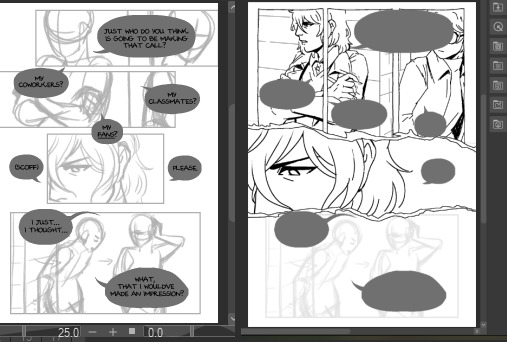
THE PROCESS: was actually quite straightforward after that, just doing the lines and the like. but i wanted to share how i did the backgrounds. i grabbed a bunch of in-game screenshots i took for reference and just plugged them through csp's "artistic > lines only" filter and just traced over that

i love you art shortcuts that make my life & ability to make yaoi comics easier
(if you're curious too here's all the screenshots i took & was keeping on the side for reference)

ETC: some miscellaneous thoughts, because if you've made it all the way through this then you probably don't have anything better to do anyway:
all in all this took two weeks. script was written on the 11th, thumbnails were done on the 14th, sketches were done on the 17th, lining on the 24th, aaand colouring took me just one day. comics are HARD and TAKE TIME. NOBODY TELLS YOU THIS!!!!!
i actually started getting wrist pain somewhere along the 2nd day of lining/3rd page. that step of the process probably took longer than it otherwise would because i had to keep taking breaks 2 ensure i wouldn't break my hand completely -_-
my sanity throughout the lining process was only ensured by listening to a frankly stupid amount of jpop. thank you wednesday campanella and mrs. green apple
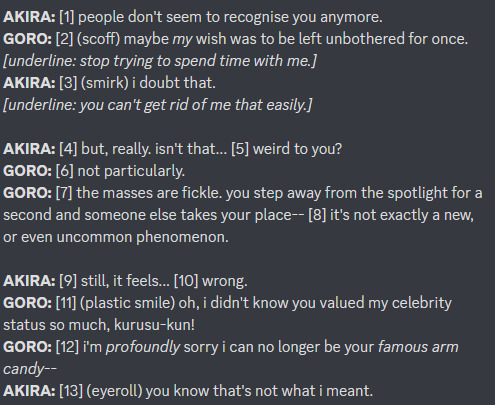
i think my favourite page is page 3. i like how the panels get crooked when akechi puts the detective prince persona on, i like how akira deadpans (in a straightened panel) to cut him off. also in order to get the hand right in the first panel i did the hair twirling motion myself and ended up hitting myself in the eye with my own hair. it was worth it though
IN CONCLUSION: i think they went a bit too hard with the yaoi fanservice in persona 5 royal
#misc#this is so long lmfao sorry i'm proud of what i made & i have a lot 2 say#i hope at least someone finds it interesting. if not. well this was entirely self indulgent so it's no biggie
52 notes
·
View notes
Text
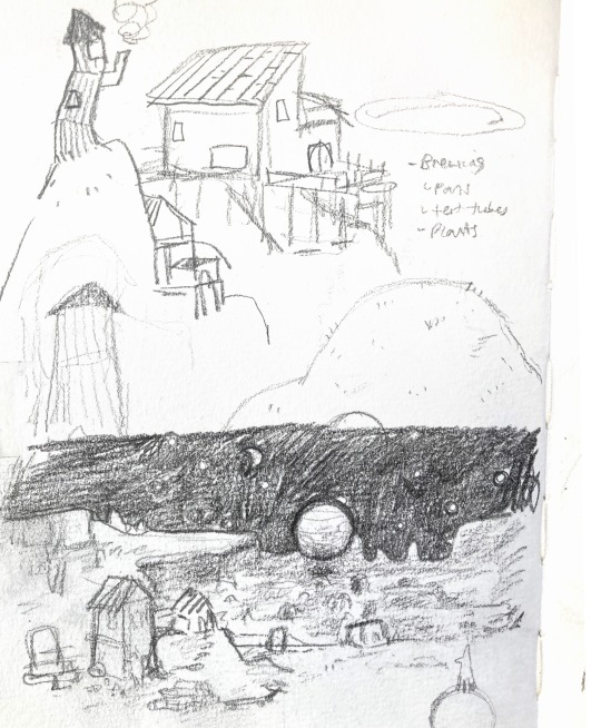
week 2
expanding on previous concepts and creating new mood baords for new concept (mouse POV) + dino refrences

story boarding these concepts + story baording 360 scene
had not story boarded before, great opertunity to also practice writing, perspective and enviroments
I used this video to understand story boarding better. I chose it because its someone with experience and its a movie i care about a lot, i think it builds suspense really well https://www.youtube.com/watch?v=NPrkxj2MyZI
the story boards werent very detailed in these videos because thier team already has a story and a setting they are going with so they know what the characters look like and where they are but they just need to know who does what when. We dont have that yet, i want it to be clear what the enviroment looks like, what the lighting should be like and what the general mood should be so while still applying story boarding methods i will add more detail.
I dont get to work with camera movement much as the player will be positioned in one spot but i can mess with perspective
mouse POV:


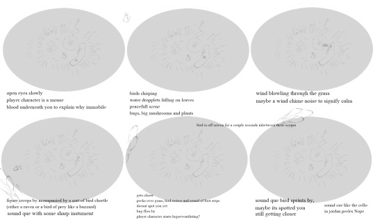

prey POV
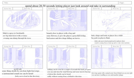


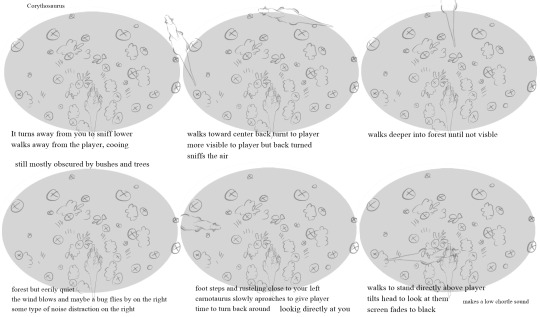
+ concept art Prey POV & thalasophobia
With the last render i did with the wounded herbivore i felt like i really didnt do a good job of conveying the mood with that drawing. so i decided that to try and set a mood better it migth help if i dont work with color first to make it less confusing and cluttered for now. I remebered a group project from a while ago where one of the artists sketched the scene first in gray scale. a big inspiration of mine is RJ Palmer so i trurned to his artstation for some inspiration and looked for a couple of gray scale tutorials as i have never done this before. i do render my art sometimes but usually not with backgrounds and generally with colours immediately.
(the last render i have done. It works for what i was trying to do but its low on contrast, a bit bland and definitely not what I need for what i want to achieve now)

Grey scale paintings work great to show the lighting conditions. So to make sure the client and my team understood my concepts i set out to create grey scale paintings of posible scenes in the experiece.
i found these vidoes helpful when trying to undertand what i should be looking for (ussualy, depends per piece ofcouse ): https://www.youtube.com/watch?v=Z8rL_0Fl06U dont have it be to cluttered, have the values from the fore ground and background differ (breaking this rule for the thalasaphobia, just a little bit)
that video is great but i didnt want to start my process how she did, its too harsh for what i was going for, i migth aswell just make a rough sketch instead. So i looked for another method and found one more to my liking https://www.youtube.com/watch?v=bN2BggfFTgk
he starts with a sketch and builds the mid tone first and then throws the shadow ont there and sculps forms out of those base shapes.
As mentioned, this is my first time painting like this. i started with the shark as water disperses light in a way that is a lit softer and i thought it would make for a good starting point to get a bit more confident. I felt it was lacking some movement so i added fish that could add a nice shimmer. I used refrences for anatomy and proportions for the animals from google images, readablitly, aireal perspective (values based on distance, thing sget lightter the further they are from the camera)
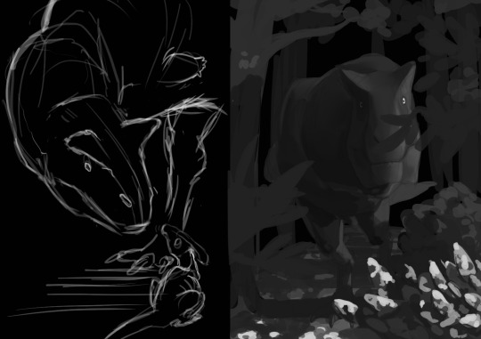
then i started on the carnotaurus and how it could look as it aproaches you with the look of a hungy lion. i was excited to try some harsher lighing and a background. i did the first sketch with hardely any refrences and realised he looked far too much like a T.rex when carnotaurus have far slimmer heads.
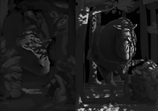
after finding a couple of skull refences i rebuilt the head and adjusted some more proportions. which was better but it was still lacking mood and atmosphere so i looked back at RJ Palmers work and looked at some grey scale painting tutorials from people that create art i find apealing and that have experience. You might also notice that im using high contrast lighting on the animal aswell as the other objects, breaking the readability rule a little bit. I did this because i was reminded of tigers and how they camouflage and i thought that would look really cool, i still made sure he stood out from the background ofcourse.
https://www.youtube.com/watch?v=Z8rL_0Fl06U https://www.youtube.com/watch?v=bN2BggfFTgk
Though its not done it was great practice. I will finish it in my free time later as i have to move on and do other work and its sufficient as concept art that conveys the lighting and mood i was going for for now.
14 notes
·
View notes
Text
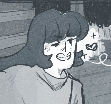
My brain be like: no you have art block and can't draw anything for months, but when you're on a short trip with your best friends - and don't actually have time for it - inspiration suddenly hits you and you have to sketch something in the middle of the night🤷🏼♀️
Drew this on Friday night after a sorta overwhelming day (I had a great time with my friends - we watched the Barbie movie -, but we also had a really exhausting afternoon before that, walked a lot around the city and it was loud and overwhelming and just too much for me), and I was in desperate need for some quiet and comfort. I didn't originally intend to post it, but kind of changed my mind, idk maybe to counteract the fact that my irl friends think Davy is ugly xD
Might or might not clean up the sketch and make a finished drawing out of it once I get back home and have access to my computer. I still haven't fully figured out Selena's design yet, but I'm in need of more art of her and Davy😭💕
It's just a very rough sketch, plus I drew only from memory so Davy probably looks a little ... eh. The second reason I decided to post it anyways was because I liked the colour combination👀 Although it actually happened completely by chance. I wanted to make my screen as dark as possible to not disturb my sleeping friends, so I filled the first layer on the canvas with black and then drew with white, basically "inverted". Also I only used different colours for Davy and Selena because I could see way easier how their bodies are intersecting and it helped a lot figuring out the poses. I use this method often in my drawing process, but somehow I also liked particularly how it looked here :)
#wip#<- maybe#f/o: 🐙#self ship#self ship art#self shipping#self insert x canon#fictional other#f/o#f/o x s/i#oc x canon#villain f/o#digital sketch#sketch#selniasart
8 notes
·
View notes
Note
Hey; I was curious if you’d be willing to draw a character to a book I’m struggling to work on. I thought it’d be an interesting request for you; and because I really like your art style!

This is just my rough sketch of them, I’ve actually never drawn them out myself in color or anything
But if it’s okay; I’d love to see your concept of Button Boy based on these details!
Let me know what you think; and have a beautiful day!


I decided to do one with and without colour if that’s ok. I’m so sorry that it took me so long to draw I got art block (😭) but I finally did it! I really like your concept and I hope your book is going well! Have a great week! :)
11 notes
·
View notes
Photo
Hey!! Here’s my updated commission sheet. Everything is correct as of February 2023. You can also tip me on ko-fi here
It’s very important that you read the T&Cs under the read more before commissioning me. I’ve tried to keep it as short and sweet as possible, but there are things you need to know in order to have the most streamlined experience possible.
If you have any further questions, please don’t hesitate to send me an ask or email.
Thanks! ♥
Notes
Standard resolution is 300dpi. Size can be altered to meet requirements.
Please let me know if you want to remain anonymous, if you do not want the work to be shared, or want to use an alias when the work is presented in my portfolio.
All images will have a watermark during the WIP stage. The watermark will be removed upon delivery of the artwork.
Please remember that all copyright is retained by me, the artist, and starryspectre/Bel must be credited when/if you share the artwork anywhere. If you share my artwork online, a link to my site or blog would be really helpful, but it isn’t mandatory.
Usage
These price guidelines are for personal use only. Commercial artwork (e.g. book illustrations, editorials etc) will require further negotiation of prices, as well as a new contract and licensing agreement.
Please contact me directly if you’re uncertain or the artwork is intended for commercial use.
Development
Major revisions (e.g. changing a pose, clothing, angles etc) are best decided on during the sketch phase of the artwork. This is because I am a traditional artist and major revisions are not easily achieved once the work is completed. This means that once I get your approval on a sketch, no more major revisions can be be done. So please tell me if something is not to your liking or you would like something significantly altered during the sketch stage.
Please try to keep major revisions to a minimum of two.
Minor revisions (such as a small change of colour or fine details) are okay and incur no added cost.
Please send references to help me meet your requirements as closely as possible. This can include sketches and photos, but descriptions are also useful.
If you do not have a very solid idea of what you want, it’s okay! These are simply rough guidelines for the limits of what I can/will do. Much of the brief will likely be created during our initial discussion, so if you’re not sure, the best idea is to just shoot me a message and see if we can come up with something.
Payment
Paypal is preferred but if you live in the UK and would rather do a bank transfer, this can also be arranged.
50% of the payment is expected before the commencement of work on the commission, and 50% upon its completion.
Alternatively, you can pay me 100% of my fee before the commencement of work if you prefer.
Cancellation & Kill fees
If the commission is cancelled before the sketch stage, I will refund you fully.
If the commission is cancelled during the sketch phase, I will refund 50% of the initial fee paid. If you have paid in full already, I will repay 75% of the overall fee.
If the commission is cancelled after the sketch phase, there will be no refund.
If I cannot complete the commission for some unjustifiable reason of my own, I will refund you fully.
Content
I will not illustrate depictions of excessive gore, violence, or hateful subject matter (racism, homophobia, misogyny etc).
Nudity and NSFW commissions will be accepted as long as they do not fall into the above categories.
I will not plagiarise another artist’s work, designs or style.
Contact
You can contact me in a variety of ways:
E-mail: [email protected] (preferred)
Via an ask on Tumblr
Via PM on Artstation
My timezone is GMT or GMT+1 in Summer. If you need your work by a certain date/time, please let me know beforehand.
#illustration#illustrator for hire#art#artist for hire#artist for commission#traditional media#traditional art#fantasy art#character art#character illustration#character design#freelance illustrator#freelance illustrator commission
35 notes
·
View notes
Text
Project: Movement.
Week 8. Tuesday - Friday
Animation
Finished Backgrounds
So between Tuesday and Thursday I got 5 backgrounds done and started a bit of animation started but I'll mention that in a separate post, here I'm just going to discuss my finished backgrounds, and finished one more on Friday.
I repeated my process from last Friday when going about the drawing, starting off with a rough drawing, line art, base colours, shading, highlights, and lights. I decided to put together my process and final product for each background here.
Background 1


The only real change from my process last week was that Paul showed me a neat way of creating a light affect to add to the atmosphere using the octagonal lasso tool. Basically create a new layer, select your chosen area of light, fill in with a dirty yellow, and then lower the opacity of that layer to 12-20 % and blend the edges when necessary. I then duplicated the layer and overlapped them slightly.
Background 2


I actually copy and pasted my sketch from background 1 for background 2 and 4, purely just to save time and and have my proportions from the first one.
Background 3


I wasn't originally going to do a detailed background for this scene as it was just supposed to be light glinting on a pair of scissors and giving the viewer a glimpse of the protagonists face. Im glad I did because I'm honestly really happy with how it came out
Background 4


I think I could have made my highlights a bit stronger here in fairness, it looks a small bit like pee now that I'm looking at it, but its a dirty gig bathroom, I wouldn't be surprised if someone did urinate in the sink, and that's coming from someone who works in a pub.
Background 5


The dept in the sink is a bit wonky but we're rocking with it.
Background 6


I like how this one turned out however I think I should have lowered the opacity of the light layer a bit more, its a tad too green for my liking. However my computer has a natural greenish tint to the screen a lot of the time so it might not be as bad as I think it is.
3 notes
·
View notes
Last Seen Blogs
blackberreh-art
Art Blog

totallyfitindia
Totally Fit

msdiorsblog
Ms. Dior
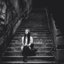
femmefatalities
Hello stranger.

garagedoorrepaircanada
Garage Door Repair