#keyframe tutorial
Explore tagged Tumblr posts
Visit Tumblr Blog
Explore Tumblr blogs with no restrictions, modern design and the best experience.
Last Seen Tumblr Blogs


Fun Fact
Tumblr has a low social media market share in South America.
Text

I was asked to put together a demonstration on how I did the analog selection effect in the first gif of my Final Girl set which mostly involved elaborate keyframe work and was like a living hell. This will be a much more simplified version for comprehensive ease, but still very wordy.
This tutorial is for intermediate/experienced level gifmakers who are already familiar with gif-making, keyframes, and layer masks, and this will serve more as a guide than anything.
If you are not comfortably experienced with the above, this may be difficult to follow because I won't be elaborating on every detail, but if you're still interested in recreating something like this regardless, I suggest checking out the below tutorials first:
Giffing 101: A Comprehensive Guide by redbelles
Clipping masks vs. layer masks by kal-kestis on usergif
Shapes and putting gifs inside them by nobie
Create your canvas, make your shapes and align them in the positions you want them to be in. Then get the gifs you plan on filling your shapes with created on standby.
Things to keep in mind before starting: 1. Many of you may have already learned through experience that photoshop has a tendency to create duplicate frames when you are working with multiple gifs on one canvas. It typically occurs when you don't have the same number of frames in all the gifs that you're combining onto your canvas, or rather, your clips are not perfectly aligned. OR when you are working with keyframes, but this time we will have an exception to that rule for what're doing so I won't be discussing the 0.03-interval rule here but if you're curious, it's fully explained this this tutorial by nik on usergif.
To be on the safe side, load in the same number of frames for all gifs. I usually just load in however many frames for each, and then I trim the clips on both ends to be the same, but they have to be exact. If even a single integer is out of place in timeline, you could still risk getting duplicate frames at the end. 2. When making an edit like this, you have to consider the amount of time you have from start to end to make the transitions and rationally plan them out in the space you have available. The more shapes you use, the more frames your gifs will need to be composed of.
3. If you're trying to get the same effect as in my Final Girl edit, where the black & white is default, and the color phases in and out, my goal here is for the color to be visible for at least 10-15 frames each gif, so with 3 gifs, I figured around 65-70 frames would be a good range.

For my first gif, I intentionally loaded in my gamble of 68 frames. For the other two, I loaded in all that was capped in the folders, moved the clips into the positions I wanted them to be in, put them in their designated layer masks, and then trimmed the clips on both sides to match the initial 68-frame clip. ❗️Remember that they have to be exactly aligned like this and all other trimmed off clips deleted before you start your key-framing❗️

Next you wanna make a group for each gif (highlighted in yellow for visibility) to put your coloring adjustments into with a layer mask for their designated shapes, which should look like this in your layers, and like the below in timeline once aligned with the rest of the clips.

I also just tucked the shape layers into the coloring groups to clean it up. But if you plan on creating frames for the gifs, I suggest you move those layers to the bottom and keep them until the end when they can be used for borders, but if not you can make new shapes later.
Assign a black & white gradient map to each gif with a clipping mask on top of your coloring groups.

Now lets say you're not pleased with the outcome of the black & white like for mine, it desperately needs brighting and contrast.
Add your brighting adjustments as needed, and give every adjustment its corresponding layer mask like below.

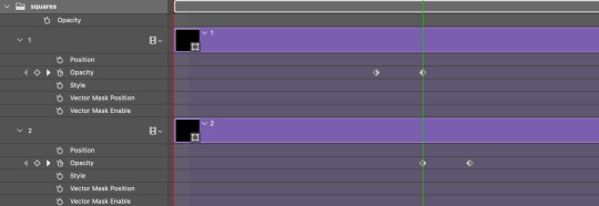
Next, duplicate both your gif layer and your coloring group, then select both duplicates, as well as your new b&w color adjustments and convert them into a smart object together.
You should now have your original gif + original coloring group, and one single black & white gif on top.

Do this with the rest of the gifs! If you want, you can also combine your original gif and coloring group into a smart object so you have one colored gif, and one black & white counterpart for each.

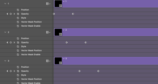
Now we add the key frames!
You're going to be adding opacity keyframes to your black and white gif layers only. Decide which gif you want the color reveal to start with, and what your reveal pattern is going to be.
I chose to reveal the color of my first gif 11 marks in, which means I need to add a key frame at the 10th mark as well. This is because we don't want a literal "fade-out" effect, we want the change to be immediate. The first key should be at 100% opacity, and the second at 0%. You shouldn't have to worry about duplicate frames upon conversion because all keyframes will only be 1 integer apart.

Once you've decided where your next reveal will start on your second gif of choice, repeat the process.
Then you have to add more 2 more key frames to the prior gif to transition it back into black & white. This needs to occur simultaneously as the next gif transitions into color. Where one starts, another ends, and where one ends, another starts, etc.

Follow this process until you have 2 pairs of keyframes on all your gifs (your final gif should only have 1 pair). Whether you want the transitions to be evenly spaced is your choice and I think it looks cleaner that way. For my final girl set, I was trying to simulate an analog effect similar to making a player selection in an old video game so they were placed methodically to be "jumpy". But play with the keyframe intervals between each gif to get them to look the way you want.
Your keyframes should look like this in the end for reference:

Circling back to adding borders, it's the same keyframe process, but on new shape layers on 0% fill +stroke to serve as the border (if you deleted your shapes earlier). Try adding an "outer glow" blending option to make the border more prominent. Then, make sure the opacity keyframes on the shapes align with the keyframes on the gifs.
If you have any further questions on something not elaborated enough on, my dms are open!
#usergif#tutorials#gif tutorials#photoshop#photoshop tutorials#ps tutorials#keyframe tutorial#resources*#tutorials*
33 notes
·
View notes
Text
learning after effects by. doing whatever this is, apparently
#luo binghe#svsss#scum villian self saving system#scum villains self saving system#incorrect svsss quotes#mxtx#incorrect mxtx#i just did tutorials until i figured out how to edit the curves for keyframes and then was like#'i'll figure the rest out by making a binghe edit'. first of all. you and what content.#and then this took me like. Way too many fucking hours anyway. ...i genuinely don't want to talk about it. learning programs is hard#this was not how i was supposed to be spending my free time this week. oops. learning valuable new tools can be productive.#even if it occurs through creating. this#anwyay i've been thinking about that post + illustration together ever since i saw the image for the first time
269 notes
·
View notes
Text
How2Draw Comics: Story
Last time we learned about conceptualizing our characters, settings, art style, etc. Now we actually have to put our characters in a situation, drive them from point A to point B through a story.
There are many different ways to do this. I'm assuming you have, if not an outlined story, a situation you want your character to experience. If you don't have a story, make your character order pizza but something happens and they have to rescue the pizza (and the delivery guy, I guess.) The first method I'll discuss is my least favorite- the Script Method.

You write a script for your story, listing pages and panels as you go along. I hate this. It feels too limiting, and panels are actually one of the most limiting and intimidating things to a beginner comic artist. Yet most tutorials encourage you to draw your panels first and then squish or stretch your drawings to fit, and that's what the Script Method is based off of. I draw my panels while I do my drawings, or even after I do them.
If pacing your comics is one of the most difficult things for you (what size do I make my panels? Is there too much dialogue on this page?) then I suggest the Storytelling Method.


You do not have to make a full short story or book. Usually I just say something like, "boy is making cake. girl walks up behind him and hugs him, kissing his floury cheek. she walks away, licking her finger. she has stolen some cake batter and he didn't notice." In my head I can see a more detailed story there, but you can tell a story without a bunch of flowery prose.
You may be wondering how this helps with pacing your comics. Well, I have actions associated with dialogue, meaning I know which drawings will have which dialogue, automatically creating a nice balance. Additionally, I know what to prioritize. I know that the panel introducing the manor will be large, because I used the words "large and imposing" to describe it. I know that when I set the ballroom scene in this story, I also need to set the scene in an establishing shot. And I know that I'm going to have Bernice's appearance on the food table be surprising, taking place after she tugs his shirt or something. (This will probably make more sense once I actually make the comic)
The final method is a very flexible one for those who aren't into words and just want to draw- the Children's Book Method.


This particular example is mind-mapping, but you can also do a more organized version by storyboarding (placing each drawing in a square and giving a short description for context). I call these collectively the Children's Book Method because the basic idea is that you don't repeat your drawings like you would in a comic. Instead, you draw those things that feel the most interesting and most dynamic, the things that are most important. (like keyframes in an animation) Children's books illustrate one scene at a time, providing context for many different moments in one picture (and some text). They are less sequential than a comic because they only have one picture per page.


I usually have a mix of the storytelling method and the storyboarding end of children's book method. And usually I tell myself a story only in my head, without writing it out, because that's all I need. And I'll admit, sometimes the stories play out in my head like a movie, which is probably why the script method works for people. Sometimes you don't know which is the most effective way to tell yourself a story until you try to draw the comic and see what is giving you the most trouble.
If you have any questions, feel free to ask me! I know I'm kind of rambly and don't make much sense, so if you need clarification or other tips, I'll do my best to help.
Next is Panels and Pacing: Drawing the Comic (which will probably happen in multiple posts, but this art block will make it nigh impossible for a while, why doesn't it just go away?)
#how2draw#how2draw comics#art tutorial#comic#mouse#art block is the worst!#it's kind of hard to describe how you do things#when you just do it in your head#i may make an example of how i actually use the children's book method to help me lay out my comic pages#you could call the children's book method the keyframe method if you want
9 notes
·
View notes
Text
...so all this time, I've been applying fixes to card errors for my finalized GX subs often using a combination of AfterEffects and Sony Vegas with scenes involving movement like zooms or panning along the screen... manually keyframing zooms or pans in Vegas after Power-Pinning a card proxy into place in AE...
...when I could've been using Track Motion in AE to wipe out 95% of the work?? Leaving just spot-checking here/there to see how it came out??? How did I only just get the hang of that lmao
#subbing rambling#i only just figured it out since i was applying a fix to a 'jenerater' typo on the Amon Dis-Belt analysis screen in 111#[after digging up a tutorial or two]#which made that a much simpler fix than i thought it'd be had i gone to keyframe the zoom there in Vegas alone#so tried it with one of the errors in 112 where Amon has Poison Cloud on his Disk where Nimbusman should be#[and this happens a few times in 111 and 112 btw--in 111 at one point Manjoume already has V-to-Z where VW should be on his Disk lol]#and boom it followed the positioning and scale near perfectly#and the next one i just did with just a straight pan across the screen was perfect#really not sure why i didn't try it sooner#that'll probably save some good time going forward haha#anyway also an update that work on 111 and 112 is coming along and i'm working on a few more fixes for 112#then i'll work on the credits; set up the video; and then get onto the scripts#stay tuned~
7 notes
·
View notes
Text
i figured out keyframes + fun coloring
#ro's ps adventures#i have been faintly mystified by keyframes for the last (checks) five months????#but i found a tutorial that actually made sense for once#and now i am in a happier place lmao#this knowledge is going to be 1: very useful and 2: very timeconsuming (for my perfectionist ass on color edits)
14 notes
·
View notes
Text
Rough Walk Cycle
Nicola, our animation blogger, is making excellent progress developing characters for her video game. This week she sketched a new walk cycle animation and offers three tips for new animators attempting to do the same #MarywoodArt #Animation #illustration
Continuing to work on the video game I’m making, I sketched both a walk cycle animation, which will be one of the animations that plays as the player moves, and an idle animation, which (so far) is just breathing. I’ve tried a few walk cycles before, but only simple ones, like this one here. It’s made up of eight frames, four for each opposing leg. I would have had no idea how to approach this…

View On WordPress
#Animation#Art#frames#Game Animation#game design#idle animation#Illustration#inspiration#keyframes#Marywood Art#Marywood Art Department#Marywood University#marywood university art#Marywood University Art Department#tutorials#Walk Cycle#Walk Cycle Animation#walk cycle tips#Where Creativity Works#YouTube
2 notes
·
View notes
Text

Going through this while having absolutely no knowledge and seeing the app for the first time was a mistake :|
I hope alight motion will be a good replacement for capcut...
#fresco's chatterbox#editing#alight motion#yeah there is a tutorial but I don't feel like watching a 20min kong video about something i already know how to do#.... kinda....#i see the keyframes but I can't click on them wth???#maybe cuz this is a tutorial project or smth??
1 note
·
View note
Text
youtube
Unleash Animation Magic: Creating Flipbook Style Animations in Green Screen by DoInk
Embark on a journey into the world of animation with Green Screen by DoInk! In this blog post, we're diving deep into the art of flipbook-style animations, showcasing how you can bring your drawings to life with captivating motion. Whether you're an aspiring animator or a teacher looking to engage your students in a dynamic lesson, this tutorial will equip you with the skills to craft simple flipbook animations using the powerful features of Green Screen by DoInk.
What you will learn:
Introduction to flipbook-style animations in Green Screen by DoInk
Step-by-step guide on creating flipbook animations from scratch
Utilizing the app's drawing tools and timeline for seamless animation
Real-world examples showcasing the versatility of flipbook animations
Elevating your storytelling with dynamic and engaging visuals
With Green Screen by DoInk, the world of animation is at your fingertips. Whether you're crafting whimsical characters or illustrating educational concepts, flipbook-style animations offer a captivating way to bring your ideas to life and engage your audience like never before.
#Green Screen by DoInk#Flipbook Animation Tutorial#Animation Principles#Drawing Tools in Green Screen#DoInk Tutorial for Animators and Educators#Dynamic Storytelling with Flipbook Animations#Creating Motion with Keyframes#Enhance Engagement with Animated Content#DoInk#Do Ink#How to animate#How to animate with Students#Animation App#simple animation#animate simply#Youtube
0 notes
Text
youtube
#After Effects tutorial#Social media post animation#Animation techniques#Motion graphics#Adobe After Effects#Design principles#Typography#Keyframe animation#Color theory#Engagement strategies#Digital creativity#Graphic design tutorial#Social media marketing#social media post animation after effects#motion graphics templates#adobe after effect tutorial in hindi#motion graphics#motion design#motion graphics designer#animated graphics#motion design studio#Youtube
1 note
·
View note
Text
Step-by-Step Guide to Keyframing in After Effects for Stunning Animations

Introduction:
Welcome to the exciting world of keyframing in After Effects! If you're looking to elevate your animation game and create stunning visuals, mastering keyframing is a crucial skill. In this step-by-step guide, we'll walk you through the fundamentals of keyframing in After Effects, demystifying the process and empowering you to bring your creative visions to life. Let's dive into this comprehensive After Effects keyframing tutorial.
Understanding Keyframing:
Before we delve into the nitty-gritty details, let's establish a clear understanding of keyframing. In animation, keyframes serve as markers that define the starting and ending points of an animation sequence. By strategically placing keyframes, you can create smooth transitions and dynamic movements, adding a professional touch to your projects.
Getting Started with After Effects Keyframing:
Open After Effects: Launch After Effects and create a new composition to begin your animation journey.
Import Your Assets: Import the elements you want to animate into your composition. This could include images, text, or even video clips.
Select Your Layer: Choose the layer you want to animate and make sure it is selected in the timeline.
Access the Keyframe Assistant: Look for the stopwatch icon next to the property you want to animate. Clicking this icon activates keyframing for that property.
Set Your Initial Keyframe: Move the playhead to the starting point of your animation and set your initial keyframe by adjusting the property value.
Move to the End of the Animation: Advance the playhead to the desired endpoint of your animation.
Adjust the Property Value: Modify the property value to set the final state of your animation.
After Effects Handles: Explore the use of handles to control the speed and easing of your animation, creating a more polished look.
Repeat these steps for additional properties or layers to build a complex and visually appealing animation.
Enhancing Your Animation with Advanced Techniques: To take your animations to the next level, consider exploring these advanced keyframing techniques:
Easy Ease:
Apply the Easy Ease function to create smooth transitions between keyframes.
Graph Editor:
Dive into the Graph Editor to fine-tune the velocity and acceleration of your animation.
Parenting:
Utilize the Parenting feature to link layers and create intricate motion hierarchies.
Conclusion:
Congratulations! You've completed our step-by-step keyframing guide in After Effects. By mastering these techniques, you can breathe life into your creations, making them visually stunning and captivating. Whether you're a seasoned animator or a beginner, this After Effects keyframing tutorial serves as a valuable resource to elevate your animation skills. Embrace the power of keyframes and unleash your creativity in After Effects!
#step by step keyframing guide#After Effects keyframing tutorial.#attitude academy#enrollnow#learnwithattitudeacademy#bestcourse#attitude tally academy#video editing course in uttam nagar
0 notes
Text

How to Make a Loader Animation in CSS
#css loader animation#css loading animation#loader html css#css tricks#css animation tutorial#css keyframes animations#css animation examples#learn to code#html css#divinector#frontenddevelopment#css#code#css3#html
1 note
·
View note
Note
Coloring anon here, yes, I would definitely like to know more about how you color frame by frame and the other techniques you mentioned! It would be much appreciated, thank you!
Hi anon! I'd be happy to go over my preferred methods for colouring!

First resort (ideal):
Painting over shots with little movement (the first method in this tutorial)
Colour manipulation using selective colours (the second method in this tutorial; alternate tutorial -> i also sometimes add a hue/saturation layer on top to manipulate the cyans/blues as well)
Second resort:
Keyframes for shots with consistent movement where it's easy to hide "imperfections" (tutorial 1, tutorial 2)
Last resort:
Frame by frame colouring -> DISCLAIMER: the way I do this method is the easiest way I've gotten it to work for me but that also means that it's very inflexible when it comes to editing any of the colouring afterwards. Once you start colouring in frame animation mode you're basically locked in so you need your gifs to be exactly the way you want them prior to adding your colour
So in this tutorial I'll go over how I do my frame by frame colouring as well as how I create actions to automate the repetitive parts of this process! (Some resources that explain how to create actions are here: 1 2)
To use the select subject feature you will need Photoshop CC 2018 or later
Step 1: Preparing your gif with base colouring
So first you want to do your base colouring for your gif in timeline mode, which I've explained here. I keep my gifs short (ideally 40 frames or less) since this colouring process is tedious!
I make sure that in my hue/saturation layer, I turn the saturation in the yellow, green, cyan, and blue tabs all down to -100 (and for the yellows I usually add around +20 to +60 in lightness)
Here's my gif with the base colouring that I'll be starting with:

Note: turning down the saturation in almost all the colours gives you that nice silver/grey neutral background to paint on top of. It's a lot less noticeable when your painted layers aren't perfect
Step 2: Converting to Frame Animation Mode
I use the save action from this action pack to convert my gif from timeline mode to frame animation mode.
You cannot edit your base colouring from this point onwards!
Step 3: Using Select Subject
If you're recording an action this is the step you would *start recording*
This is what your window should look like:

Making sure your first frame and first layer are selected, go to Select at the top of your window and click Subject

You should then see the marching ants outline around the person in your gif

You then want to create a new solid colour fill layer (which can be found when you click that little circle icon at the bottom of your layers panel), and set the layer blending mode to colour.
The layer mask will automatically be created since you had the marching ants outline.

Since my person is in colour and not the background, I want to invert the layer mask by clicking on it and using command + i (or ctrl + i), and now this is what it looks like:

Note: Select subject isn't always perfect!!!, depending on how cluttered the scene is and how much contrast there is between your person and the background, select subject could either do a really good job like it did here, or screw up a little like it did here:

That's okay though because it still gives us a good base to start from! We can fix any issues by painting with black and white brushes on the layer mask.
Step 3.5: Create clipping mask
Thanks to @wolfchans for telling me about this because it gives us back a little bit of flexibility when colouring frame by frame! Instead of merging down, we can make a clipping mask instead. Right click the solid colour fill layer and select create clipping mask.


If you're recording an action, it's at this point where I would *stop recording*
Step 4: Fixing the layer mask if needed
So now I want his jacket and t-shirt to also be purple, and to show his fingers behind the glass. I make sure the layer mask is selected, and paint with a brush at 60-70% hardness (painting with black erases the colour, painting with white shows the colour). User smaller brush sizes to paint smaller details!
This is what my canvas and layer mask look like now.

Step 5: Repeat
Now I click on my second frame and second layer, and repeat steps 3-4. As you can see, using the clipping mask allows you to still see and edit the colouring of the previous frame, just make sure you click on the right frame and it's corresponding layer when you're doing further editing.

This is where an action is super helpful in cutting down all the repetitive steps and clicks you need to do. So at this point I'd just play the action I created and paint on the layer mask as needed.
Repeat for all your frames and then you're done! After this I convert it back to timeline mode again so that I can add my text and do any other effects such as blending or transitions. Hope this helped!!
#answered#Anonymous#*tutorial#userbeanie#userwintersoldado#userishh#userfaiths#usercats#usertj#tuserhol#userahri#usereus#usershreyu#userchibi#userbunneis#usermibbles#uservivaldi#carolook#userbuckleys#usertenacious#tuserheidi#userholtz
239 notes
·
View notes
Note
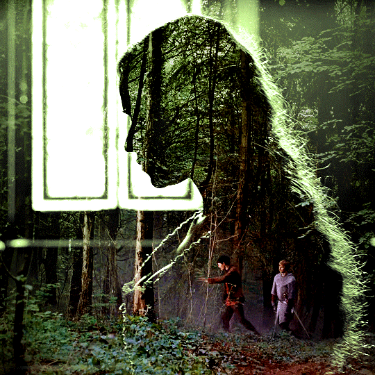
Hi! Can I ask how you did the double exposure gifs for your merlin set? They're beautiful btw!
heyy, thank you!! of course!
it's actually not very hard, the trick is to find the right shots for this. here's how i did it (reference gifset), under the cut.

for this tutorial i will be: — using photoshop cs5 on windows — assuming you know how to make gifs using the timeline — have basic coloring, sharpening, groups, and layer masks knowledge
I. CHOOSING THE RIGHT SHOTS
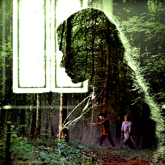
the ultimate trick to pull this off is to choose the right image. in order to do the double exposure, you need a silhouette shot that has these:
a defined and dark silhouette with a background that is not too busy
enough contrast between the silhouette and the background
the silhouette should take at least 50% of the space
not too much movement
here are a few examples of why they work and why they won't:
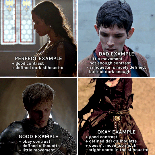
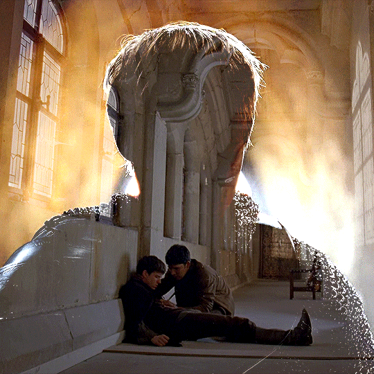
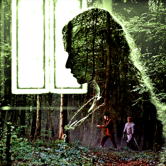
gwen: perfect example since this shot is already quite contrasted with a defined silhouette. there won't be a lot of work needed to make this one work.
merlin: not a great example because even tho there's a somewhat good contrast between him and the background, the silhouette is just too bright, not dark enough.
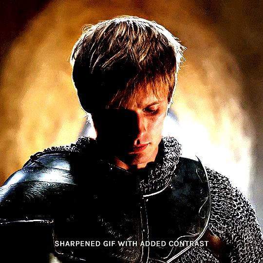
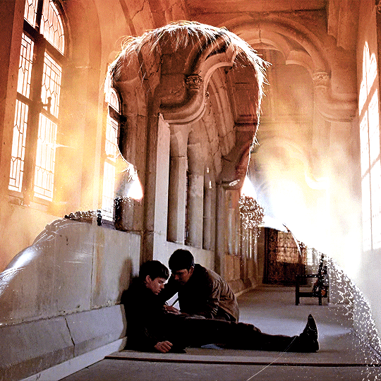
arthur: another good example, even if there are some bright spots on his face and armor. since he's not moving too much, you can definitely brush some black over him to make his silhouette darker (i'll explain/show later)
morgana: this one could work because the contrast is great, but of course her skintone is very bright against the black clothing. that being said, since the movement is not too bad, it could be possible to brush some black over her and move these layers with keyframes (as mentioned for arthur's example). i haven't tried it tho, but i think it would work well enough.
once you have your silhouette shot, you need another gif for the double exposure. what works best, in my opinion, are:
wide, large shots
shots with no to little camera movement (no pan, zoom, etc), but the subjects in the shot can have little movement of course
pretty cinematography/scenery shots
i find these are easier to find and make it work, it's not as "precise" as with silhouette shots. it's mostly just trial and error to see what works best with the silhouettes.
II. PREPPING THE SILHOUETTE
for the effect to work, we want a silhouette that's dark as possible. i'm gonna use the gwen and arthur shots as examples.
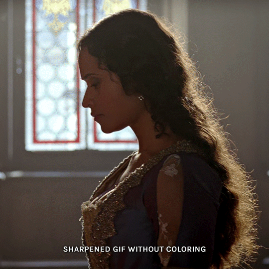
for the gwen gif, i started by sharpening, and then upped the contrast by quite a lot so her silhouette is mostly black, while retaining some nice details. i've used only 3 layers here:

selective color layer: in the blacks tab, playing with the black slider (value: +10)
brightness/contrast layer: added a lot of contrast (+61) and a bit of brightness (+10)
black and white layer: on top, its blending mode set to soft light and at 20% opacity. gives a bit more depth and contrast

then for the arthur example, i've also sharpened it first, and added contrast layers in this order (the skintone looks horrible, but it won't matter soon lol):
levels layer: black slider at 0, grey slider at 0.76, white slider at 104
selective color layer: in the blacks tab, black slider at +10
brightness/contrast layer: brightness at +1-, contrast at +47
black and white layer: on top, its blending mode set to soft light and at 20% opacity. gives a bit more depth and contrast
as you can see, half of his face is still quite bright. to correct that, create a new empty layer and put it between the gif and the coloring layers.
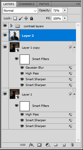
using a really soft brush and the black color, brush some black over his face and body on that new empty layer. you can edit the layer's opacity if you want, i've set mine to 71%. since arthur doesn't move much here, there's no need to keyframe this layer's position. for the morgana example, this is where you'd need to play with keyframes to make it work. here's where i'm at now after this:
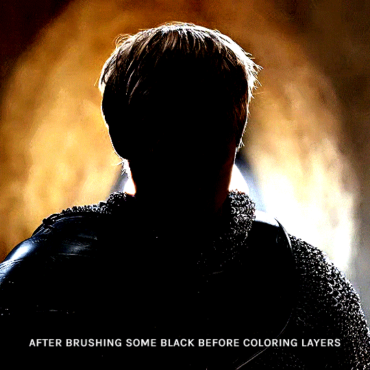
you can always edit this layer later if you need, after doing the double exposure blending.
once the silhouette is all ready, you can put all layers in a group and rename it (i've renamed mine silhouette).
III. BLENDING
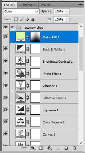
now the fun part! import the wide/scenery shot in photoshop, then resize it to the same height of your silhouette gif. make sure the gif is a smart object layer, and sharpen it. finally, bring this gif onto the silhouette canvas (by right clicking the smart object > duplicate layer). once you have both gifs onto your canvas, put the wide shot gif layer in a group, and set this group's blending option to screen.

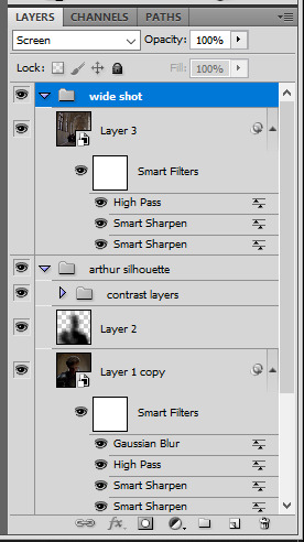
you can then position the wide/scenery gif the way you like it in the canvas. this is how it looks for both examples after i've done that:

if the blending mode screen doesn't give you the best result, so you can play around with other blending modes (such as lighten and linear dodge in these particular cases), but generally speaking, screen is the real mvp here haha.
IV. COLORING
now that the double exposure effect is done, we need to color the gifs to bring them together. i went with simple coloring here, simply enhancing the colors that were already there. just make sure that the coloring layers for each gif are in their respective groups. here's how i've colored both examples:
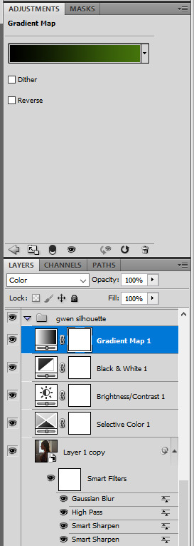
gwen silhouette group: i added a gradient map layer on top of the contrast layers in black to green and set the blending mode to color
scenery shot group: multiple coloring layers, with a green color fill layer (blending mode set to color), with a layer mask so it only affects the top half of the gif
for the arthur gif, i did something very similar but with warmer colors. i didn't use a gradient map for arthur though:
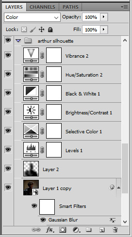
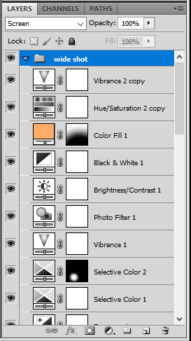
arthur silhouette group: i made the yellow warmer, closer to orange/red, with a hue/saturation layer, and added more vibrance. didn't feel like it needed a gradient map layer here though.
wide shot group: basic coloring layers to enhance colors from the merlin & daegal shot, and an orange color fill layer set to the color blending mode.
at this point you're pretty much done. just need to add some final touches and typography (if you want).
V. FINAL TOUCHES
a small and completely optional detail, but i wanted to soften the edges of the wide gifs. to do so i've duplicated the smart object gif layer and removed the sharpening filters (right click on smart filter > clear smart filters). put this layer on top of the other smart object layers (but still below the coloring).
then with this same layer still selected, go to filter > blur > gaussian blur... > 10px. this will give you a very blurry gif, but we only want the edges of the canvas to be softer. so add a layer mask to this layer. with a very large and soft brush (mine was at 0% hardness and about 800px size), brush some black onto the layer mask to remove the blur in the middle of the gif.

you can play with this layer's opacity or gaussian blur amount if you want (by double clicking on the gaussian blur smart layer filter). here how both examples look with this gaussian blur layer:

you can also mask some of wide/scenery gifs if you'd prefer, so it shows less outside of the silhouette. just put a layer mask on that whole wide shot group and brush some black or grey on the layer mask. it's what i did for the gwen gif, with a very soft brush and i set the mask density to 72% (i kept the arthur one as is tho):

and that's how i did it! hopefully that was clear enough :)
#alie replies#*ps help#resource#tutorial#allresources#*gfx#usercats#usersmia#userrobin#userfaiths#usertina#usermoonchild#userchibi#uservivaldi#usertreena#userraffa#userriel#userelio#usermadita#usersmblmn
1K notes
·
View notes
Text

I got a couple of asks on how I did the text transition in this set. I'm going to explain as best as I can (with image references).
*Disclaimer: this assumes you have a basic understanding of giffing with video timeline, and keyframes. If you're new to keyframes, check out this tutorial by @userpeggycarter before proceeding.
Step 1: Go through, make your gif, color and all that jazz. if you're not familiar with giffing and need a guide, check this one out by @cal-kestis. Be mindful of the number of frames you have, as it is extremely important when keyframing begins. Make sure you have an even number of frames, or you will have an uneven transition. For this gif I'm at 60 frames total, and I'd be careful exceeding 70, as if you need to go back and delete... It just sucks, so be mindful! You'll see my gif and coloring under a group I titled "base" - and I highly recommend putting your gif/coloring/etc. into groups, as it will make the timeline a bit cleaner, and it's a little easier to find everything you need. But when you're done, you should be here:

*Quick note 1: Make sure your gif is in 8-bit mode. If you aren't familiar with bit modes, that is a tutorial for another time. For now, you can change it here:

Step 2.1: Pick your font/placement/etc. I really recommend being 100% on whatever you pick, along with the size. I've encountered problems when I move the font after the fact with alignment, so it's best to look your gif over to ensure you're satisfied. For this set, I went with Figtree, placed dead center.
I want to add to this by saying, thus far, I have found that white is the only color that works for this. I'm playing around with some other options, but black is 100% a no go. If you find a way to get that working, let me know. I'll amend this tutorial.
Photo of text settings, along with where you should be now.

Step 2.2: Since we're transitioning into a new set of words/text, you need to get that text ready as well. Shorten the length of time the first piece of text runs to halfway (I have 60 frames, so I cut it to 30).

Step 2.3: Duplicate your text layer, type your other text. The two texts should show for length of time, as you have an even number of frames, meaning you can divide by 2. Move it over to the end of where the previous text ends. If that makes no sense, it should look like the below: (again, folder for the typography to know where to reference. I have a small organization addiction so.. creator's choice)

*Quick note 2: I do not recommend changing to a new font or size with this, it won't look quite right. Of course, experiment away! This is just a small caution based on my own experimentation.
Now, to get to the actual fun part...
Step 3.1: Duplicate the first text layer. For this gif, it's the one that says "it didn't change anything". Once you duplicate it, you'll be turning it into a smart object. This is so the filter we apply works. Repeat for the second text layer. Lil gif below:

Quick note 3: I recommend going one text bit at a time, and also would tell you to put each typography layer into its own folder. This is really important for later, so doing it earlier is better.
Step 3.2: We will now apply the filter. To do this, you're going to click the smart object version of our text, then go to Filter → Stylize → Wind. For the gifset I made, I used Method → Blast and Direction → From the Right. Click "OK" and the filter will apply. Duplicate this for the other text layer.

Step 4: We now begin the keyframing. I highly recommend the rule of 0.3, which is when your transitions are over the span of multiples of 3 (i.e. if you start at frame 1 with 100% opacity, frame 3 will be at 0%). We'll be doing 6 frames from 100% to 0%, and vice versa, for this transition. This was the best time I found for this transition, but it's a matter of preference. Just follow that rule of 3.
Step 4.1: Click the smart layer of the text we made on the timeline, then click the little arrow on the left of the name of the layer. You'll see this:

See the little clock next to Opacity? Click it, and you get this lovely little yellow diamond. This is how we control the visibility of the Wind layer. It will start at 100%, keep it there.

Click the arrow on the right of the play button 6 times (aka get to the 6th frame), click the stopwatch again. While on this frame, and the yellow diamond clicked, change the opacity of the Wind layer to 0% It'll look like this:


You will repeat this, in reverse, at the end of the text layer.
Quick note 4: Sometimes, Photoshop is moody. To get the diamond on frame 30 (or whatever frame # the end of your text layer is), put it on the frame prior. You can then nudge that diamond over 1 frame. See below:


Repeat the process for the other text layer.
Step 5: We're basically done! Change your gif from video timeline to frames, maybe do a quick play through to make sure all is well.
Quick note 4 (it's the last one I promise): I have heard from many that when they work with keyframes, they end up with duplicate frames. I, personally, have not encountered this issue. I do not know if it is because of the version of Photoshop others are using, PC vs. Mac, or some other secret third thing. I recommend that, when you check your gif, verify if there are duplicate frames. The keyframe tutorial I linked earlier goes into further detail, and here is another lovely explanation from Nik, the master of all things keyframe transitions.
Step 5.1: Export, and give yourself a high five because you deserve it.
If you have any questions, don't hesitate to reach out! I'll try to clarify anything if needed. Happy giffing!
#*tutorial#c*#*ps#tutorial#userchibi#usertj#uservivaldi#userbuckleys#usertina#userroza#usershreyu#usersole#useralien#userabs#userrainbow#quicklings#userbambie#useraljoscha#userzal#userbess#userfern#tuserhol#usernolan#usermagic#userhallie#usershale#userholloway#tusermels#usergif#we will absolutely not be discussing that fact that i have been awake since 630 am
218 notes
·
View notes
Text
Someone asked me how I created the fade transition in this gifset which I’ll try to explain in the most comprehensive way that I can. If you've never done something like this before, I suggest reading through the full tutorial before attempting it so you know what you'll need to plan for.
To follow, you should have:
basic knowledge of how to make gifs in photoshop
some familiarity with the concept of how keyframes work
patience
Difficulty level: Moderate/advanced
Prep + overview
First and foremost, make the two gifs you'll be using. Both will need to have about the same amount of frames.
For ref the gif in my example is 540x540.
I recommend around 60-70 frames max total for a big gif, which can be pushing it if both are in color, then I would aim for 50-60. My gif has a total of 74 frames which I finessed using lossy and this will be explained in Part 4.
⚠️ IMPORTANT: when overlaying two or more gifs and when using key frames, you MUST set your frame delay to 0.03 fps for each gif, which can be changed to 0.05 fps or anything else that you want after converting the combined canvas back into frames. But both gifs have to be set to 0.03 before you convert them to timeline to avoid duplicated frames that don't match up, resulting in an unpleasantly choppy finish.
Part 1: Getting Started
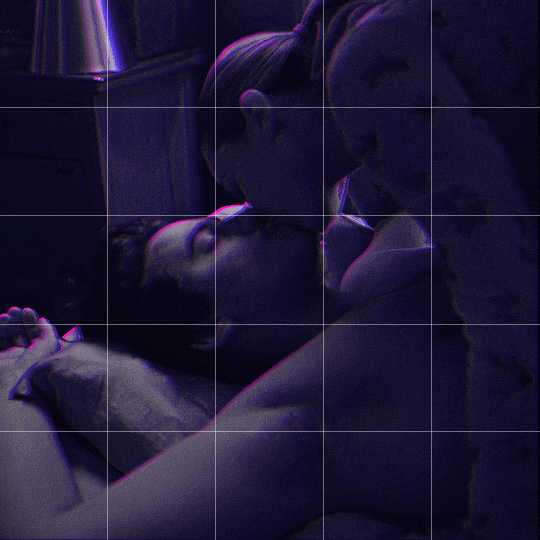
Drag one of your gifs onto the other so they're both on the same canvas.
The gif that your canvas is fading FROM (Gif 1) should be on top of the gif it is fading INTO (Gif 2).
And here's a visual of the order in which your layers should appear by the end of this tutorial, so you know what you're working toward achieving:

Part 2: Creating the grid
Go to: View > Guides > New guide layout
I chose 5 columns and 5 rows to get the result of 25 squares.
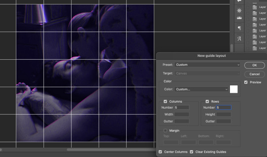
The more rows and columns you choose, the more work you'll have to do, and the faster your squares will have to fade out so keep that in mind. I wouldn't recommend any more than 25 squares for this type of transition.

To save time, duplicate the line you've created 3 more times, or as many times as needed (key shortcut: CMD +J) and move each one to align with the guides both horizontally and vertically. You won't need to recreate the lines on the edges of the canvas, only the ones that will show.
After you complete this step, you will no longer need the guides so you can go back in and clear them.

Follow the same duplicating process for the squares with the rectangle tool using the lines you've created.
Align the squares inside the grid lines. The squares should not overlap the lines but fit precisely inside them.
This might take a few tries for each because although to the eye, the squares look all exactly the same size, you'll notice that if you try to use the same duplicated square for every single one without alterations, many of them will be a few pixels off and you'll have to transform the paths to fit.
To do this go to edit > transform path and hold down the command key with the control key as you move one edge to fill the space.
Once you're done, put all the squares in their separate group, which needs to be sandwiched between Gif 1 and Gif 2.

Right click Gif 1 and choose "create clipping mask" from the drop down to mask it to the squares group. This step is super important.
After this point, I also took the opacity of the line groups down to about 40% so the lines wouldn't be so bold. Doing this revealed some squares that needed fixing so even if you aren't going dim the lines, I recommend clicking off the visibility of the lines for a moment to make sure everything is covered properly.

Part 3A: Prep For Key framing
I wanted my squares to fade out in a random-like fashion and if you want the same effect, you will have to decide which squares you want to fade out first, or reversely, which parts of Gif 2 you want to be revealed first.
In order to see what's going on underneath, I made Gif 1 invisible and turned down the opacity of the squares group.

If you want text underneath to be revealed when the squares fade away, I would add that now, and place the text group above Gif 2, but under the squares group.

Make a mental note that where your text is placed and the order in which it will be revealed is also something you will have to plan for.
With the move tool, click on the first square you want to fade out. Every time you click on a square, it will reveal itself in your layers.
I chose A3 to be the first square to fade and I'm gonna move this one to the very top of all the other square layers.
So if I click on D2 next, that layer would need to be moved under the A3 layer and so on. You'll go back and forth between doing this and adding key frames to each one. As you go along, it's crucial that you put them in order from top to bottom and highly suggested that you rename the layers (numerically for example) which will make it easier to see where you've left off as your dragging the layers into place.

Part 3B: Adding the Keyframes
This is where we enter the gates of hell things become tedious.
Open up the squares group in the timeline panel so you can see all the clips.
Here is my example of the general pattern that's followed and its corresponding layers of what you want to achieve when you're finished:
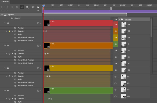
So let’s try it!
Expand the control time magnification all the way to the right so you can see every frame per second.

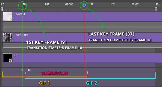
As shown in Part 3A, select your first chosen square.
Where you place the time-indicator on the panel will indicate the placement of the keyframe. Click on the clock next to opacity to place your first keyframe.

Move the time-indicator over 3 frames and place the next key frame.

Things to consider before moving forward:
Where you place your very first keyframe will be detrimental. If you're using a lot of squares like I did, you may have to start the transition sooner than preferred.
If you're doing 25 squares, the key frames will have to be more condensed which means more overlapping because more frames are required to finish the transition, verses if you're only using a 9-squared grid. See Part 4 for more detailed examples of this.
The opacity will remain at 100% for every initial key frame, and the second one will be at 0%.
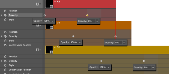
Instead of creating two keyframes like this and changing the opacities for every single clip, you can copy the keyframes and paste them onto the other clips by click-dragging your mouse over both of them and they'll both turn yellow. Then right click one of the keyframes and hit copy.
Now drop down to your next clip, move your time-indicator if necessary to the spot where the first keyframe will start and click the clock to create one. Then right click it and hit "paste".

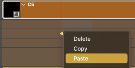
Tip: When you have both keyframes selected, you can also move them side to side by click-dragging one of them while both are highlighted.
Your full repetitive process in steps will go as follows:
click on square of choice on the canvas
drag that square layer to the top under the last renamed
in timeline panel: drop down to next clip, move time-indicator tick to your chosen spot for the next keyframe
create new keyframe
right click new keyframe & paste copied keyframes
repeat until you've done this with every square in the group
Now you can change the opacity of your squares layer group back to 100% and turn on the visibility of Gif 1. Then hit play to see the magic happen.
PART 4: Finished examples
Example 1
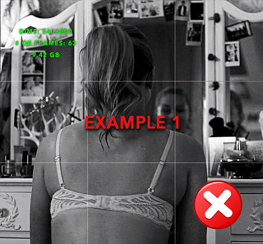
the transition starts too soon Cause: initial keyframe was placed at frame 0
the squares fade away too quickly Cause: overlapping keyframes, seen below. (this may be the ideal way to go with more squares, but for only 9, it's too fast)
Example 2
more frame time for first gif
transition wraps up at a good point Cause: in this instance, the first keyframe was placed 9 frames in, and the keyframes are not overlapping. The sequential pair starts where the last pair ended, creating a slower fade of each square.
Part 5: Final Tips and Saving
You can dl my save action here which will convert everything back into frames, change the frame rate to 0.05 and open the export window so you can see the size of the gif immediately.
If it's over 10gb, one way to finesse this is by use of lossy. By definition, lossy “compresses by removing background data” and therefore quality can be lost when pushed too far. But for most gifs, I have not noticed a deterioration in quality at all when saving with lossy until you start getting into 15-20 or higher, then it will start eating away at your gif so keep it minimal.

If you've done this and your gif is losing a noticeable amount of quality and you still haven’t gotten it below 10mb, you will have no choice but to start deleting frames.
When it comes to transitions like this one, sometimes you can't spare a single frame and if this is the case, you will have to return to the timeline state in your history and condense the key frames to fade out quicker so you can shorten the gif. You should always save a history point before converting so you have a bookmark to go back to in case this happens.
That's pretty much it, free to shoot me an ask on here or on @jugheadjones with any questions.
#gif tutorial#photoshop tutorial#transition tutorial#grid tutorial#usergif#ps help#tutorials#tutorials*#resources*#requested
428 notes
·
View notes
Text
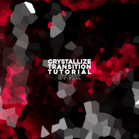
HOW TO: Do A Crystallize Gif Transition
Hi! I was asked to explain how I did the transition effect in this gifset, so here's a quick tutorial! Disclaimer: This tutorial assumes you have an intermediate understanding of gif-making in Photoshop using Video Timeline and requires the use of keyframes.

PHASE 1: THE GIFS
1.1 – Determine how many frames you need. Since you need at least 2 scenes for a transition, consider limiting the amount of frames you'll use per scene. For a transition between 2 scenes that's 540x540px, I would recommend no more than 30 frames per scene (for a final gif that's 60 frames). Even that may be pushing it depending on your coloring. Just be sure to consider the dimensions and colors of your gifs in relation to the amount of frames to keep your final gif under Tumblr's 10MB limit.
1.2 – Import frames, crop, resize, convert to smart object for Video Timeline, color, blend, etc. Do this as you normally would! If you need a tutorial for the basics, here's my tutorial. :) Please note, the methods in this tutorial only work with gifs that are converted into smart objects in the Video Timeline workspace.
Tip A: I recommend using scenes where there's a lot of one color (or scenes where you can manipulate it to look like that). The crystallize filter on a gif creates A LOT of movement that can feel a bit chaotic. Having your gif be primarily one color reduces the eye strain a bit imo.
Tip B: I like how this effect looks with blended scenes because it allows me to use different "crystal" sizes (more on this in Step 2.2). Check out the USERGIF Resource Directory for plenty of blending tutorials!
1.3 – Move all your gifs into one document, group into folders, and arrange. Once everything's in one doc, keep everything organized in a group folder! I have just two scenes, so that's Folder 1 & 2. Within those folders are the gifs I blended, which I labeled by gif color. Then, simply drag Folder 2 so it continues right after Folder 1. (Make sure none of your adjustment layers from Folder 2 accidentally affect Folder 1! You can do this by clipping your adjustment layers to match the length of the gif as I did, or using clipping masks.)
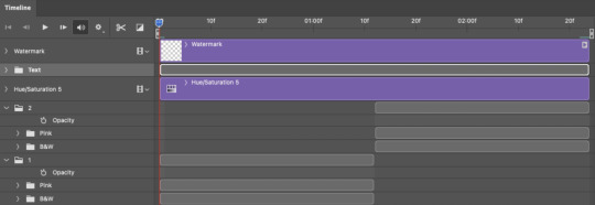
(Ignore that lone Hue/Saturation layer lol. I decided last-minute that I wanted my gif to lean more pink than red.)
PHASE 2: THE FILTERS
2.1 – Duplicate each scene. We're going to use opacity keyframe animations on these duplicated scenes that allow it to go from "normal" to "effect" and vice versa. The filters will only be applied to the duplicates. In the screenshot below, all of my duplicates are highlighted:

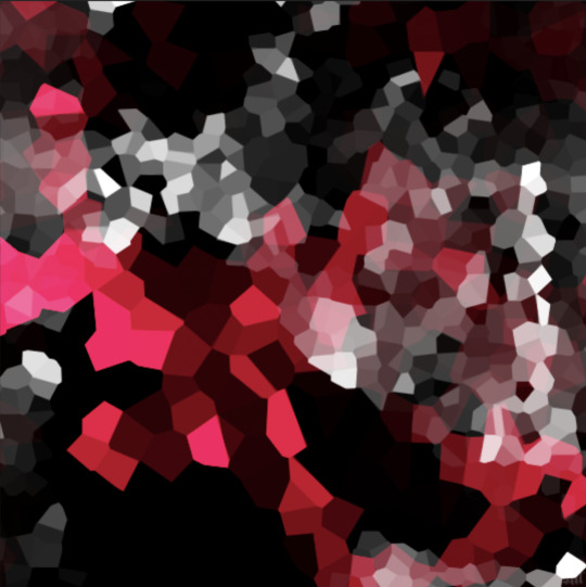
2.2 – Apply the Crystallize Filter. Above your sharpening settings, apply this filter by going to Filter → Pixelate → Crystallize. On the pink gifs, I made the crystals bigger (cell size: 45), and on the black and white gifs, I did a cell size of 25.
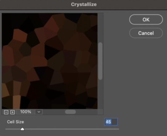
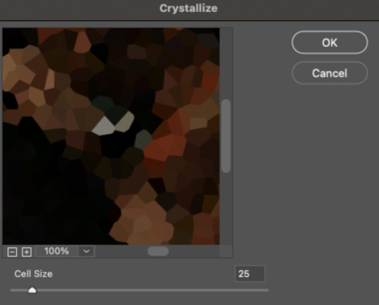
The different sizes help break up the uniformity of the crystals imo, creating more of a mosaic-like look, which is what I wanted to match my gifset concept.
2.3 – Apply the Oil Paint Filter (Optional). Filter > Stylize > Oil Paint. Here are my settings (they're the same for both crystal cell sizes):
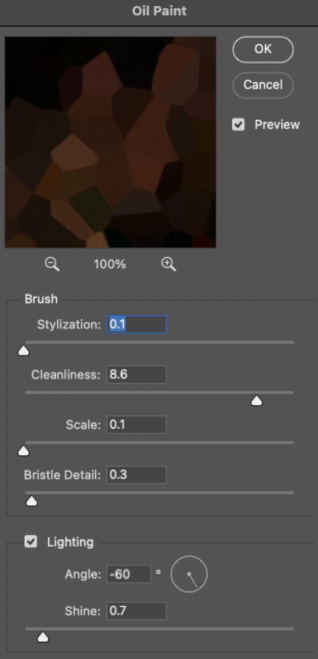
Brush – Stylization: 0.1, Cleanliness: 8.6, Scale: 0.1, Bristle Detail: 0.3 Lighting – Angle: -60, Shine: 0.7
This filter helps soften the cells a bit while adding some texture (left: no oil paint; right: with oil paint):

2.4 – Repeat steps 2.2 & 2.3 on all duplicated scenes.
PHASE 3: THE KEYFRAMES
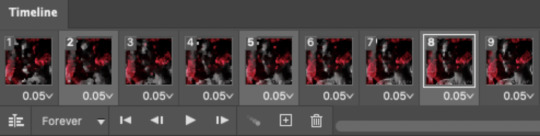
3.1 – Add opacity keyframes. The very start and end of each scene needs an opacity keyframe set to 100% opacity. Move 0.09 seconds from each of those points, and place another opacity keyframe, this time set to 0% opacity. We're basically making the crystals fade in and out. Please reference the screenshot below for keyframe placement:

If you need more info on opacity keyframes, check out Phase 2 from this fade transition tutorial I did on usergif.
3.2 – Repeat step 3.1 on all duplicated scenes. All the keyframes in Folder 1 should line up exactly and all the keyframes in Folder 2 should line up exactly!
PHASE 4: THE DUPLICATES
4.1 – Convert back to Frame Animation. If you're not sure how to do this, I've written out the steps here. I rec the action linked in my general gif tutorial which I shared earlier!
4.2 – Delete duplicate frames. Whenever you use keyframe animations, you'll get duplicate frames. That's just how it works, unfortunately. If you follow my steps exactly (specifically the 0.09-second spacing, which follows my tried-and-true 0.03-second rule), you'll have a total of 12 duplicate frames exactly — 3 duplicates per keyframe section. Just manually delete them! You can spot the duplicates by eye, but with this spacing, it's usually the 2nd, 5th, and 8th frame for each transition section. The selected frames below were my duplicates:
If you want to learn more about why there are duplicates and the math behind it all, I explained it in more detail in this ask.
4.3 – Export and you're done!
I hope this tutorial helps! Let me know if you have any questions :)
#gif tutorial#completeresources#usershreyu#usernanda#useryoshi#userzaynab#userrobin#usersalty#userhella#alielook#uservivaldi#tuserabbie#useraish#userabs#tuserlucie#mialook#resource*#gfx*
384 notes
·
View notes