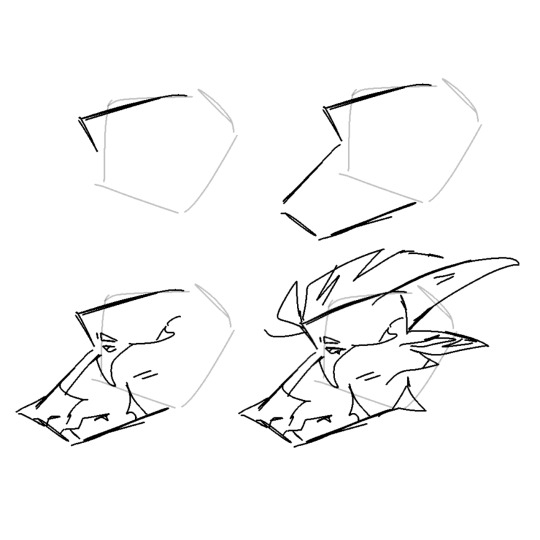
#makes it fun to break them down for Lineart
Explore tagged Tumblr posts
Visit Tumblr Blog
Explore Tumblr blogs with no restrictions, modern design and the best experience.
Last Seen Tumblr Blogs


Fun Fact
Tumblr has a 66 index score for customer satisfaction in the US.
Text
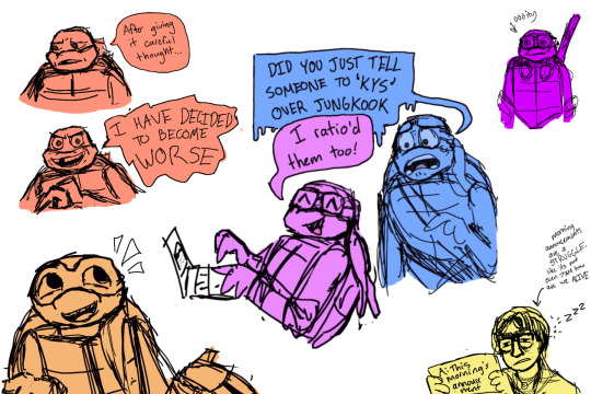
all of them are such cringe teenagers. they’re perfect
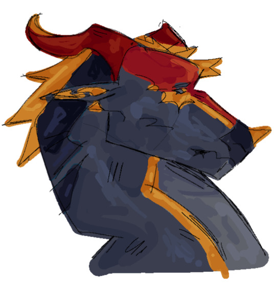
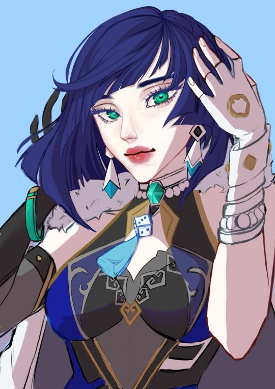
#TMNT mutant mayhem#mm Raph#mm mikey#mm donnie#mm leo#tmnt#mm tmnt#fanart#art stuffs#Mutant mayhem spoilers#kind of? Just in the sense that it talks about the movie and I know not many people have had a chance to see it yet#i love the idea of Donnie being an absolute twitter menace#he barely has the option to touch grass or socially interact and hes a teenager. he would be TERRRIIIBBLLLE#also i relate way too much to April. We are shaking hands on the horror that is the school announcements#i also LOOOOVE drawing these designs. The use of lines and shapes#makes it fun to break them down for Lineart#i cant choose a fav. The movie did them all so well and fun
244 notes
·
View notes
Note
wow your comics are stunning! the vanco especially is so effortlessly beautiful and well structured. Do you have a tutorial on how you make comics? Your panel work and composition is especially great, would love to know more about the process
THANK YOUUU. I am not really good with tutorials, hah. My comic process is also very much "I want to do this NOW!" and then I do it. I don't do any script, I sketch full sized thumbnails and write the "kind like this" versions of the dialogue into the thumbnails (or I won't and after I'll be like hmm I wonder what I wanted to do here).
Here's the steps of my latest little comic:
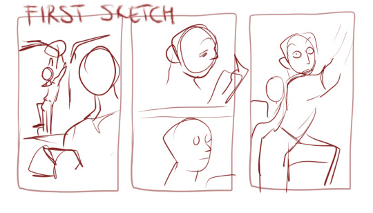
These are my thumbnails. My main goal when I start a page is to do a simple 1. Establish where we are 2. Establish who are there
I am not good with establishing shots tbh. They kill me every time. With fancomics it's easier because I don't even have to show The Last Drop because of course these idiots would be there :D

After the rough idea I do the actual sketch that I will use to help me do lineart. Just very simple and usually the characters are just their most important features. Sometimes you can barely recognize them.

Here's the final one just for comparison.
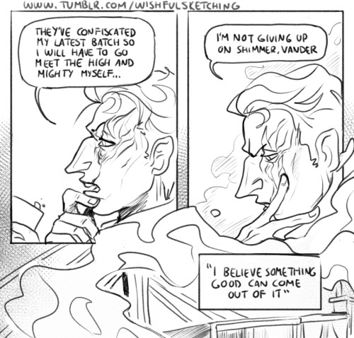
With the bigger comic I posted yesterday, I just love making movement that carries through the panels. When I know I have to add lots of dialogue to explain things, I'll make the characters do something at the same time

I just wanted to make this casual/domestic moment of bitching about life while Vander is being caring and Silco accepts it.
With composition and panel work, idk, it usually comes down to what mood I want/what I want to show (expressions usually) OR. What I don't want to show :D When you want to be lazy, you will become creative! And nobody will know!
I am very fond of breaking the panels to kinda showcase change, I guess. I do it a lot. With like the effect of the next panel entering the previous one or with speech bubbles.
With this one I had to come up with ways to transition to all the scenes within the "memory" and it was pretty fun yet also made me anxious because I also had to keep the pace up.
I draw quick and I am pretty confident with my control over my lines, so I don't really have any tips for lineart. One thing I do wanna say is that you have to learn to let go. I want to fix so much from the headcanon comic I did. I won't. It's not bad, it's just not perfect. It wouldn't be perfect even if I would fix it.
#answering stuff#talking about stuff#comic#thank youuu for the ask#not really a tutorial just me talking about my comic idk
471 notes
·
View notes
Note
How to draw like you no borax
Good question!
I'd warn against following my process (at least if you want to learn), but I'll be honest and show you, lol. (Heads up: this is just how I do FAN art. When having fun, I generally care less about the fundamentals.)
1. I slap down super rough sketches, jotting lines/expressions like bullet points of my idea. Pretty much stick figures with just enough detail to remember who's who later. Not shown here, I also move, resize, and add details to express the intended composition if I'm planning something larger. You may notice a lot of curved lines / haphazard circles.
2. I refine the sketch by drawing it with more intention and build structure with slightly blockier shapes. If I'm really struggling with a pose, this is also where I'll find references or look at myself for bits and pieces to fill in the gaps. (When practicing, I would highly recommend using a reference from the start so all your limbs are an appropriate length and you don't need to say things like "that's passable" right before posting. If you're a perfectionist you'll leave that thought with the rough sketch.)
3. I'll decide around here whether or not to leave the sketch as is or commit to lineart (not likely). I guess I'd say I "shape the lines" here by going over some to add thickness/weight, and by adding basic sort-of-shading to break things up a little. Then I'll just fill in space if the page looks empty. (Usually this is where I incorporate the borax, but I hear baking soda works nicely if you're worried.)

4. Onto coloring. I don't feel confident enough to pretend I know what I'm doing here, lol. I just choose my base colors, imagine the general direction of the light source, then add minor gradients to the light and dark layers so they don't look flat. Then I just add some BS highlights and outline them. I've only recently found the motivation to properly practice coloring and just go with the flow tbh.
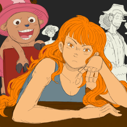

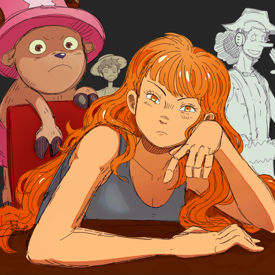
You may notice that Nami's forearm is too long, her hand looks like a pancake and Chopper has no joints! My kind sibling explained to me once that my anatomy is poor, but cohesive enough that nothing stands out too bad, lol. That's why it is important to use references!! And if you're me, practice all parts of anatomy at the same time with full bodies so that even when you're at a loss, your hands aren't that much better than your feet.
All in all, to draw like me, just have a very hedonistic approach to art, ha. Draw what you want, avoid getting burnt out on any single piece (sometimes that happens when you try to perfect drawings one at a time), and follow my personal motto:
Make fun, not masterpieces.
Idk how helpful this was, but there you have it!
493 notes
·
View notes
Text
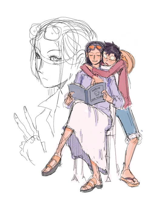
i got a few asks about my process :0 so yea i took some screenshots mid-process of my recent cliff-skk thing just for that
m gonna preface everything by saying that i did have a ref for the environment!! i avoid color dropping from the image and tracing cuz i do want to hone some digital skills. also saying i'm doing an "environment study" when i'm really just drawing skk makes me feel better abt myself
when i don't have a reference, i tend to do some thumbnail sketches in my sketchbook. here's some random stuff of past work, where i rawdogged everything:
but whatever, back to the cliff-skk. i'll also post a timelapse of it for easy ref, but detailed stuff is under the cut :)
first i did some rough sketches on an orangeish background (underpainting etiquette, i find it helps things feel brighter and keep a stable tone when choosing colors to lay on top), and I quickly lined skk :)


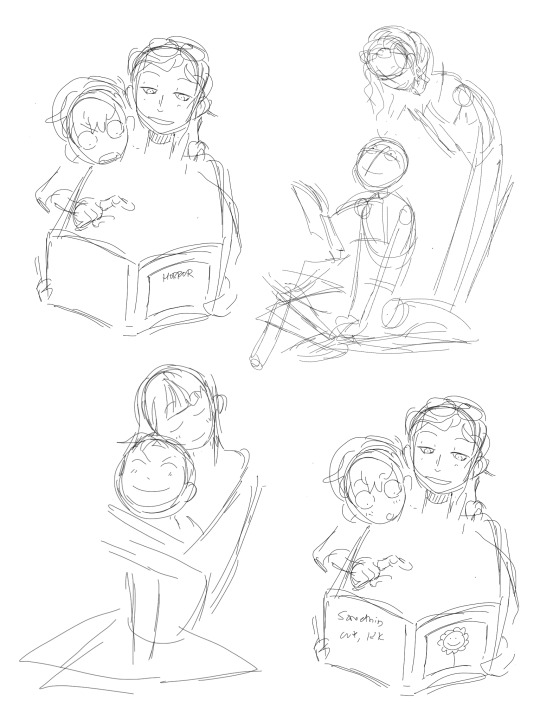
then I laid down some flats for the background, again really eyeballing the reference for hues. afterwards i thought it was a bit bright, and i wanted a more sepia/nostalgia feel to it, so i hue adjusted everything to something more uniform


then i lay down flats for skk + the ocean, which i both had to color adjust a lot (you might see that in the timelapse), and then i jump straight into rendering the background. when i render, i always prefer to do it over something lineless, so i turn the sketch layer off. i rarely do lineart for backgrounds.
i also used to render the characters first, but i've found that it's just not a great approach—especially for art where characters and background are interacting, knowing the hues and shades of the environment is crucial to effective rendering on the character that doesn't make them look out of place.
when i'm rendering, i really try to keep in mind tenants of contrast, perspective, form, and light/shadow. ex, stuff "closer" to us has more detail; the hill in the back is minimalist (in comparison); the shadows lean cool-green while the light leans gray-yellow. rake brushes really carried me here idk... my fav brushstyle forever


eventually i reach a point where i'm satisfied (or bored) with the background. for the last stages i usually have the subjects hidden so i can really perfect the details—but then for super duper final details, like the little leaf specks and grass strands, i unhid skk so the poppy details could work around skk. then i get to rendering the characters :)
i forgot to take ss of all the stages when i rendered skk, but here's something from... about the middle of the process? i tend to render characters with the lineart hidden as well, sometimes bringing it back just to clarify things, but ultimately i prefer to define things by form than by line. that's just me tho idk, idt it makes or breaks anything, just a preference
again rlly just thinking about cool/warm, reflective tones (the greenish shadow on chuuya's left inner leg, sky-gray blue on dazai's vest), really just slotting the subject into the environment. after i finish rendering the characters, i usually return to the background and add some stuff—in this one i defined the waves a bit and put some grass around skk
and yeah then we're done idk LOL. sometimes i run the file through camera raw (photoshop) to do some color adjustments—i find that my iPad displays colors super differently, usually making things a lot lighter than they are (u can see how dark the timelapse is...), so i find myself lightening my work a lot. i also sharpen and add noise as needed :)
i think my process has changed a lotttt even in this past year. it's kinda crazy!! it's always fun to do these and just reflect a bit on how i work. mostly just mindless insanity until it kinda works.
thanks for sending in an ask. and if u read all that, thanks to u too lolol
189 notes
·
View notes
Text

it was suggested I post this to the tags as well >:D
fuck it ima tag @transcendence-au as well because tbh I'm very proud of my silly little animation
some me being a nerd under the cut!
okay so this all started when I read the original post this was inspired by and though 'wouldn't it be silly to add some art to this 3 year old post?' but then I decided to animate it for funsies!
and gosh I sure do love animating!
So I got the base sketch and then got into the lineart animation for each component!
i don't have the sketches/wips saved at all sense this wasn't really a project and it took less than a day to complete. but here's a peak at the timeline
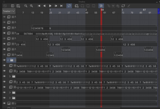
I animate entirely in my ususal drawing software: clip studio paint. It's just what's easiest for me.

all of these layers outside that folder are just the sparkles! after I finished I added some sparkles for fun! there's a lot of them because it involved a lot of copy and pasting sparkle layers
the bottom folders here are the wings body and facial expression! for everything like the wings arms and flags I was able to just copy paste, reverse, and then align the timing correctly in the timeline
one thing unique about this animation is that the lineart and colors are in separate layers! I tend to do line and colors on the same layer but this time I was using a brush that doesn't have the same lack of anti-aliasing and sense it's a small animation I wasn't as worried about keeping a minimum of layers like usual.
also the movement of the body is only 4 frames! and one one of those is just the hat shifting position
initially I wasn't going to have the second facial expression but when I got stuck on animating the flags I added the second facial expression while taking a break.
the arm animation is just 8 frames! honestly the only tricky part in this is the flags, everything else was pretty simple, which made it super fun to work on because I got both a challenge and mindless therapeutic drawing out of it.
NOW THE FLAGS there was 3 throw away attempts before I got it: you see the thing that made this tricky is finding the balance between believability and visual appeal. a big part of animation is creating the illusion of physics, this is the 'believability' part, I need these to look like flags that are moving and made of flat fabric, HOWEVER if I animate these one-to-one with realistic physics: it won't look good! I can't apply wind to the whole drawing because then the hair would have to react, and wind goes one way, and I wan't the flags to be pointing opposite directions. so without wind the flags would be laying down flat, but that won't look good at all! and furthermore realistic physics would have the flag not being all nice and front facing most of the time. so the trick here was figuring out how much physics to apply to make it look believable, while still making it look good.
one trick I did to help me animate the flags is I actually made a plan rectangle flag as a guide so that the general mass/volume of the flag would stay consistent, this is something i highly recommend when animating! like having a circle guide along a characters head to keep their height and proportions consistent.
after I finally found the balance with the flag lineart coloring wasn't too hard! sense I just had to follow the lines, and THANK GOODNESS the trans and aroace flag have the same number of stripes: saving me time!
and then it all comes together to make a satisfying perfectly looping bundle of cuteness >:DDD I feel like the tau fandom doesn't have as many artists with particularly cartoony/chibi art styles so I've gotta play my part in spreading the joy-whimsy-adorable-sillys >:D
anyway! hope you get to see a cool beetle today :D
#kyukyudraws#animation#alcor the dreambender#tau#transcendence au#the transcendence au#gravity falls
119 notes
·
View notes
Note
Hello! I’m just here bc I’m a little confused on what you meant by Smythe drawing out “each individual asset” when she was making comics? Now, granted, I can see that it made her file ginormous, but me personally as someone who knows nothing about making online comics but is really wanting to get into it (and also as someone who has a ‘too many layers’ problem myself), is there a way to avoid using too many layers?
My current way of making comics has been to draw the panels individually and then format them (which I know is terrible management wise and also messes with the quality) but I honestly have no other idea of how to do it properly, and seeing how stunning Lore Rekindled looks, I don’t know how you would manage to put all that lighting effects and little details on the same layers. (But also I may be thinking of it wrong so I’ll let you talk qwq)
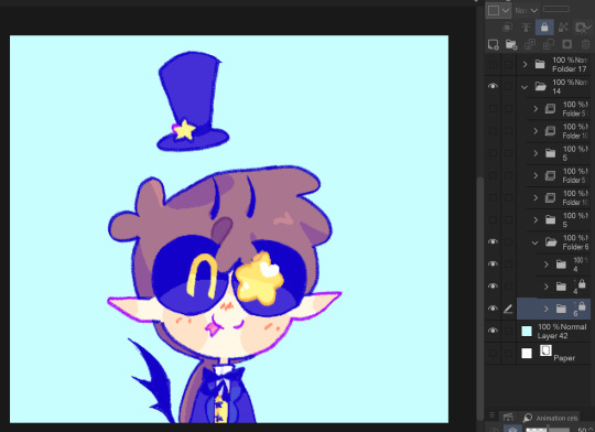
Ah I can actually give you a visual breakdown of what I meant by that!
So in this you can see there are a TON of layers, and not even all of them are visible because some of them are stuffed into FOLDERS that have been left closed. BUT if you look REEEEALLY carefully-

^^^ These layers right here? That's specifically Minthe from this panel in Episode 61:

(the unique pose here makes it real easy to tell that this is the corresponding panel, you can see the matching body shape with the dark shading that's clipped to the base layer below it!)
So what this means is that Rachel didn't draw all her characters on one base layer, she drew every single character in every single panel separately. Now of course, she could merge all these layers together as working on separate layers helps make it easier to work on elements that collide separately (like one character being 'underneath' another character like Hades is here) but because she has all of those clipping layers with the shading already added in, she likely didn't merge them afterwards because that would actually create MORE problems (because if she merged the Minthe layer in with Hades, then the shading for Minthe that she painted outside of the lines would show up on Hades and then she'd have to erase it which is just a bunch of extra work).
You can also tell all these characters are on their own layer because the layer thumbnail EXCLUSIVELY shows those characters. A layer will show as much canvas length as it needs to cover what's in that layer, so if the thumbnail is only showing one character, that means there's NOTHING ELSE on that layer. If there were more elements on this layer than just Minthe, the layer thumbnail would look more like this:
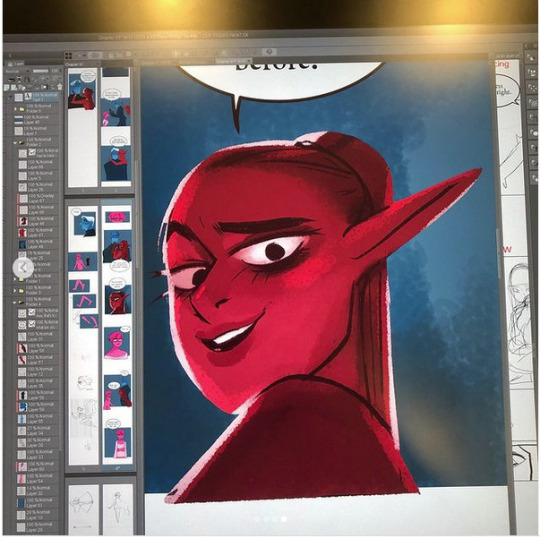
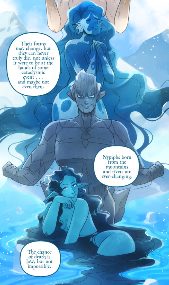
Now let's compare it to Rekindled's layers! I'll use a completed page to make it fair as we use a lot of extra layers in the post-production phase where we add the texture effects and glow and all that fun stuff, plus I'll even make it a more complicated page like that big nymph explanation spread from Episode 51:
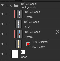
So I'll break it down to make this make more sense:
BG 2 Copy (technically this is supposed to be BG 1) - Basically the panel shapes, what I'll do is mark out the panels with flat blocks and through that we'll add background elements in a clipping layer (usually done by Banshriek). Often times they'll do multiple layers to make the process easier and then merge them all together in the end. With these shapes operating as panels, it means I can just auto select the whole layer, invert the selection, and easily erase whatever's outside of it (such as the lineart and base colors that I put down afterwards). I could just use masking layers like I did in [AFTERBIRTH] but I find this way works better for the process of making Rekindled.
BG 2 - This is where we add objects / foreground elements. So stuff like furniture, interactables, anything that needs to be kept separate from the larger background to make it easier to work with. This can also include "floating" panels that need to be above other panels, such as this:

All of the backgrounds are then nested in a folder for organization purposes (we also sometimes use clipping layers on top of those folders to apply extra effects over anything contained within that folder without affecting other folders, that's a common technique that Banshriek applies)
Then we get into our Characters folder:
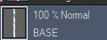
BASE - This is where I do the majority of my work, all the characters in every panel on a page are flatted into this layer. Sometimes I do have to create separate layers to, again, make it easier to work with overlapping characters, but usually those layers will be merged before I go into the shading process. I simply shade on a single layer by using the lasso / magic wand tool to select my area for painting, the flat colors make it really easy to do that. Sometimes I need to create a secondary shading layer if I've put down dark colors that start to bleed into the lighter colors, but again, I merge when I'm done into a single shading layer. We also sometimes employ an Add (Glow) layer into the clipping set if we need a glow effect that's exclusive to the characters and doesn't travel outside of their base colors.
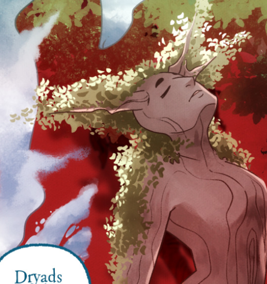
There's a (leaves) layer here that I used for the dryad because I needed the leaves to be above the base layer, after that I selected the leaves elements so that I could erase the lineart in the layer above it where needed.
LINEART - It's lineart, enough said haha That said, I do think Rachel actually uses clipping layers for her lineart in places, it seems to be visible in some of her process videos where you can see the lineart present in a clipping layer, and that would explain why there are panels where the lineart suddenly 'cuts off' and doesn't travel outside of the base layer, like so:
GLOW - This is where we do an Add (Glow) layer that isn't restricted to the base layer, it's where we add all the fun lil' glow and sparkle effects over the characters !
The CLOUDS layer is, like the leaves, a background element that needs to be above the base layers rather than constricted to the background.
Above the Characters folder you can see what I mentioned earlier where Banshriek has added more post-production effects that are exclusively clipped to the contents of the Characters folder. This means the effects / blend modes do NOT affect the background layers or anything above it.
The BLUR (Overlay) layer is something we just started doing over the past several episodes, it's a technique I actually picked up from 66 of City of Blank where I merge all the layers into a new visible layer which I then apply a Gaussian Blur to at around 60% and then set to Overlay (and then I adjust the layer opacity until it looks right, usually around 25-35%), it gives it a bit of a softer "dreamier" vibe in the final colors and really helps unify everything!
CANVAS - This is an Overlay layer which is also set to an opacity of 25-35% where I go over the panels with the Add Canvas brush from the Kyle Webster set, unlike the Canvas overlay texture in CSP I can actually choose the colors I want to use which means I can match the canvas texture color to the mood and environment of the scene (ex. I'll use a very light blue for scenes in the Underworld). Not only does it give it that signature texture from S1 of LO, but it also helps balance out the effects of the BLUR layer.
The SKETCH layer sits on top of everything and gets turned off once all the base layers and lineart are down, and ofc the SPEECH folder is just where all the text is kept.
I know everything I just laid out is a LOT but ultimately it's how we operate, it works for us! But it also begs the question of why Rachel operates the way she does because a lot of it seems extremely unnecessary and more likely to bite her in the ass (the more layers there are, the bigger your file size gets, the risk of drawing on the wrong layer increases as well as the risk of posting a panel that's missing elements because the layer was left turned off by mistake, etc.) And it's more so concerning with how she operates with her assistants because if she's still using this many layers when collaborating with other people, hooo boy. Though based on what I've observed of what her assistants contribute, I get a lot more of the sense that she circumvents this by having the artists do the flats separately and then importing them in as separate assets that she then just imports into the page and places them where they need to be. Still not a great workflow IMO because it's what's led to a lot of the issues of characters "floating" rather than feeling like they're actually in the environment-
-but that's still an issue that could be solved by Rachel just taking more time to actually flesh out the backgrounds and lighting to give more of an impression of the characters actually existing in the space. Like that Hestia panel could easily be fixed by just giving the background a bit more detail and putting actual shading underneath her (and lighting from whatever direction it's coming from).
Either way, regardless of whether or not Rachel's process is productive or not, I hope that breakdown helps explain how we do it in Rekindled! Learning how to manage layers is definitely a skill that can be tricky to harness, but once it "clicks" there's a lot you can get away with. Ultimately how you do it is up to you, but my best piece of advice to offer is to just be open to other types of workflows because you don't know how much you might be shooting yourself in the foot doing things the hard way when there are often way easier and more efficient ways to get the same job done. That's basically the vibe I get from observing Rachel's workflow, it seems like she's still using methods that she thinks are working for her (and probably did work just fine for her when it was JUST her) but could be vastly improved for her and her team if she'd just get over the initial hump of stepping outside of her comfort zone. Would probably make for a better comic too LOL
I hope that helps! Good luck! ( ´ ∀ `)ノ~ ♡
#ask me anything#ama#anon ama#anon ask me anything#lore olympus critical#anti lore olympus#lo critical#lore rekindled#webcomic advice
155 notes
·
View notes
Text
{ Style Study } - Jayden Revri in the style of Alphonse Mucha
Time elapsed: ~14 h Date completed: January 1st, 2025 Ref: Jayden Revri for Wonderland Magazine Done in Procreate
Style study No. 2 is done! Lineart, Ref, and yapping under the cut:
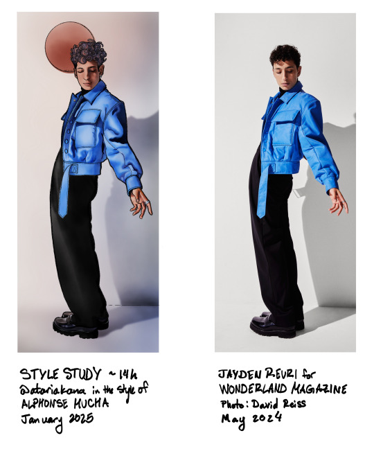
This one had a lot of ups and downs. The pose was so fun and although the lineart still took up a good chunk of time, I actually had a lot of fun doing it--I like Mucha's style of a thick outline and then limited lines in the rest of the drawing. I thought my usual pencil brush would be the best fit for it, especially since most lineart brushes drive me nuts and I don't know why. The disadvantage of the pencil though is that it's a little textured and not 100% opaque, making selections difficult (this was especially a problem on the pants).
As for the rendering, I was trying to imitate a watercolor style with a mixture of hard edges and gradients and not a lot of fine detail. I think I over-rendered parts of this one again, like the shoes for example, which breaks the style a bit, but yk. Using Procreate's watercolor brushes was a struggle because I've never really used them before, and I'm not even good with actual watercolors, so I sort of felt like I was floundering the whole time. I actually half repainted the face before I decided that the first version was better and then went back to it. Also I tried to do something with the hair that did not pan out at all, but since these are supposed to be quick studies (hah) I decided to leave it. Overall I'm really happy with it though, I like the look of it and I think I captured the elements of Mucha's style that I was wanting to try out. I also did more painting with the selection tool and that's starting to feel more natural and was really helpful for this one, so yay :)
I've been enjoying pushing myself out of my comfort zone and doing things I didn't think I could manage with these studies. I've sort of been feeling like my art is stagnating/not good enough or contributing anything worthwhile etc., and this has been really refreshing and a reminder that I can, in fact, draw :) Most of all, I feel like I'm learning stuff I can apply to other projects, which is a really good feeling.
The next study I'm doing is Lyendecker, which is smth I've been wanting to do for a while but kept putting off bc I was afraid of failure, but I was looking for references yesterday and actually? I think I can manage this. Excited to start working on it! ✨
If you read this far first of all I admire your perseverance second of all I am giving you a cookie in thanks <3 🍪
#jayden revri#dbda cast#dead boy detectives cast#digital art#illustration#art only#the most distinctive part of mucha's/art nouveau's style is probably all the detailed plant imagery but.#i did not do that. because i dont have that kind of time#maybe if i was doing a real art nouveau piece but this was trying out a lining & rendering style mostly#all this to say. is this recognizable as mucha's style to anyone but me? lol
55 notes
·
View notes
Note
Just wanted to ask, please forgive me if you've already answred this, what program do you use? Your art fucks HARD and like. I was looking at your art of the two moths over the city they die in and I was hit with the wave of "oh that looks really fucking fun actually." Like i know my art program can't do some of those effects and like, I'd love to try fucking about with them.
hi there, thank you! all my art is done in procreate and paint tool sai
because you mentioned that drawing in particular i thought it would be fun to break it down and show ppl what exactly went into each part of it so check this out
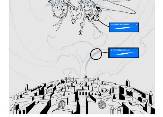
sketch & lineart - the brushes come from georgbrush.club and the urban sketcher is my most commonly used lineart brush, it has a nice irregular shape. the square brush is nice for big blocky sketches.
the cityscape was REALLY hard but basically I got a photo of the skyline of florence, traced some basic building shapes, then bullshitted the rest using the vertical symmetry/mirror tool to cut down on the amount of work (so i only had to sketch one half of the city). then for lineart I turned off vertical symmetry, turned on the two-point perspective tool, and got this:
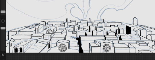
the rose windows were made using the radial symmetry tool.
I didn't like it being so flat, so I used the liquify tool to make a kind of fish-eye effect (limited success tbh). I liked how it looked but the buildings in front needed something to cover them up to make the liquification less obvious...
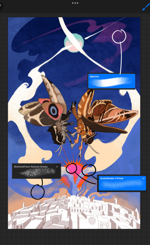
first pass colours. I felt they were very washed out, aside from the sun which i loved. I use the spectra brush (default procreate) for skyscapes a lot, I love the texture. Although the clouds were filled in using the lasso selection tool, I softened the edges using the square pencil again and added texture using true grit sampler grainy brushes. The translucency effect comes from my setting the brush as an eraser. The sun rays come from the radial symmetry tool.
Blocking in the moths' colours was done with the urban sketcher again.
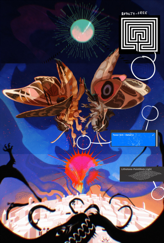
Something people may not have noticed is the labyrinth hidden in the sky! yeah I had a bunch of versions where it was more obvious but I found that it clashed a bit and was too busy, so I made it subtle. But yes. I searched for "royalty free labyrinth" and picked one.
The toner grit brush is one you've seen before if you've looked at any art on tumblr lately (this is such a popular brush) and it's from the true grit fast grit set. The pointillism brush is from the true grit free sampler pack, like my grain brushes.
I added shadows to the moths, increased saturation overall, and changed the clouds to a translucent blue (you can even see in the sun where I forgot to block in the sun itself because the clouds over it used to be opaque lol). Moon rays were drawn using the radial symmetry tool but this time with rotational symmetry off. I also moved the moon down closer to the moths because I felt that it was a bit far away, and this served to visually divide the drawing into three equal parts, so I chose to lean into that and divide the sky colours too, to show passing time, or an endless moment - morning, evening, night, etc.
And then the oroborous, I tried a few different effects on it because I wanted it to be very clearly separate from the main scene - I settled on a dot matrix newsprint texture, using procreate's onboard tool, and some heavy chromatic aberration. This is because the oroborous isn't real, it's purely symbolic and the moths' demise started when they became photographers so I liked the print media aspect there as well. The story itself is about grief without closure, cyclical violence, and sunk cost fallacy, while everyone explores an endless labyrinth, so an oroborous fits I think
what makes art fun to me is thinking up ways I can tell a story using just a single image. and sure a lot of it will be lost to an audience who isn't familiar with the characters or backstory but i want to leave enough in there that even complete strangers to my work will be able to construct a narrative about what's happening here, rather than it just being a cool image. that's my goal.
Finally I exported it to sai on my pc to give it a once-over. this is really important because the retina display on an ipad is oversaturated on purpose, to make everything look amazing and vibrant. but what this means is that on other screens, your work might look washed out. it's especially bad at displaying yellows! so i look at it in sai on my pc and i make minor adjustments, in this case I actually added another multiply layer on the moths and an overlay on their non-shadowed parts to increase the contrast there.
finally if you've read this far, I played a little trick with the caption of the drawing. yeah, THEY die... but only one of those moths is a theythem pronoun haver... the other has to survive. he isn't given a choice in the matter.
#fr you will never catch me trying to mystify my process i will explain literally everything#brushes
475 notes
·
View notes
Note
Greetings, fellow Jamil enjoyer ✨️ I'd love to hear what's your story behind rediscovering that enthusiasm to make personal art again? Well basically, anything you'd like to share further about your creative journey. You caught my attention when you said you were feeling lost for years, because that coincidentally describes my predicament with digital art right now! 😅 Anyway, all the best with your drawing, and may your passion continue to motivate you to create to your heart's content! 🌻✨️
I nvr expected anyone to be interested in my story😳
Well, to put it simple, I started feeling lost around the time when I started work as a junior concept artist that once told my boss, "One day I want to be involved in anime-styled projects!"
↓
That day haven't come yet. Instead, I keep getting jobs that I don't enjoy cuz I'm too bad at it.
I felt like shit cuz, imo, I keep disappointing ppl.
I felt like trash compared to other artists.
I felt like I was wasting time if I wasn't practicing color & lighting.
I felt ashamed of my personal artstyle cuz it's no use in my current job.
I stopped drawing in my free time cuz after stopping myself from drawing what I like, I didn’t know what to draw anymore.
I was hiding all my likings in weeb shit too cuz at this point I thought I was a embarrassment. (I nvr decorated my desk either.)
↓
Things started to change when I was given time and chance to do a small anime-styled portfolio project with a colleague. It’s like leaving a testament to whoever discovers this project, telling them that yes, someone is dead ass serious about anime style.
After that, I took a long break from my company. Staying home, I'm like, "That last portfolio I did I love it so much, I want to do it again"
"Fk it, now no one can judge me imma draw what I want. I will use my best skills even if companies may not need it."
Did some character design & fanart in free time, showing more anime-styled works on ArtStation.
"Instead of pushing everything to average, imma push what already had best in me to 100, so ppl see me, they can see what I’m best at, not just someone average. I want ppl to see that 0.0001% rare job they will immediately think of me."
"I should be proud of my art more to make a career out of it."
Self love, embrace more of my likings by decorating my room with my own art, more pkm & twst merch right👏 on👏 the👏 table👏 not in the drawer anymore.
↓
Finally, time has come. Got a great opportunity. Found back confidence, went back to company to start working on it (this time my office desk is decor with pkm 🥰).
It was super hard & stressful as fk, but I never felt this alive before, it feels good to get feedback on something u truly want to improve. 1 compliment can make me go "I can do this, I still have way more to go."
At the same time, double hair down Jamil has dropped & I'm feeling myself to draw in free time again. Now, every morning if nothing to rush, I will arrive early at office & draw personal art, which is most of the recent drawings u guys are seeing right now.
That's all of my story✨☝️
In short, the main reason me feeling lost years ago is because I keep doing jobs I don't enjoy & I thought my personal artstyle is worthless to my job. I also keep comparing my weakest point to other artists' strongest point (which is a no no)
The key that get me back to personal art again is finding self confidence by knowing what's the best in my style, embrace it, and starting self love.
"I only draw personal art for myself, not to impress anyone. I enjoy my art more than anyone. Even if no one ask for this I still had fun drawing this." Remember this!✨
Moral of story is keep drawing in the way you truly desire, especially in your free time. It's the only way u can "revenge" on ur current state. If you have no drawing intention, how bout starting off finding artstyle goals on Pinterest? Color goals✨ shape & lineart goals✨design goals✨ Discover good arts that makes you jealous & go " That's so cool I want to do this too!"
The most important thing is, not every art pieces need to hit everything perfectly. Monday u can do 1 piece focus on shapes. Tuesday u can do another 1 piece focus on color. Wednesday anatomy. Thursday lighting. Let 1 subject become the main focus. It's ok to hit only 1 subject perfectly. Let that 1 become the strongest point in this drawing is enough.
Oh gosh this is getting too long.
I hope you enjoy drawing again. Wish you an amazing new year☺️
35 notes
·
View notes
Note
can you do a style tutorial?? dude there's geniunally nobody else who draws like you, your art is so poetic and divine, it's inspiring
WAAA THANK YOU ANON OH MY DAYS ??? genuinely this is one of the nicest compliments ive ever received on my art omga what .
im not very good at explaining things but eem ill try !!
i feel like one of the biggest things is the sort of sketchy/messy vibe .. i use a super tiny brush ('digital brush' on ibis (its a premade lol) on size 1-2) and kind of scribble scrabble sometimes .. i also dont do lineart, i cant be bothered to do allat so i just clean up my sketch using an eraser !
i also stay away from using curves and instead try to use as many straight edges as possible if that makes sense .. also arbitrary lines in the drawing are a must . i think thats one of my fav parts of drawing :)
when it comes to coloring and rendering, i start by adding a darker, slightly more saturated color for shading, then blend it out with a midtone, do thr same for lighting, and then i add details !!
ive also been told that my usage of warmer tones is recognizable, and i achieve that by playing around with the 'color balance' filter on ibis until im happy with the results
for shading, i use a dark color (anywhere between blue and red, depending on the character and environment) for shading and a light yellowy color for lighting on an overlay layer ! then (also on overlay) i use those colors to add more arbitrary lines and scribbles
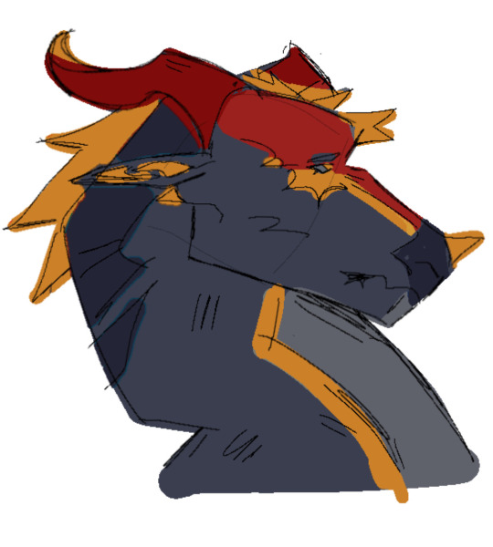
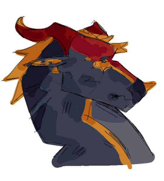
here i kind of tried to break down my sketching process, idk if it makes sense or not tho😓
my current artstyle is the result of six or so years of constant drawing and growing and experimenting !! experimenting with your artstyle is a huge factor in allowing it to evolve as well as for you to find what works the best .
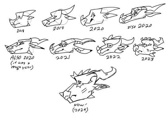
referencing/figuring out how specific artists that you like achieve their artstyles is super good for experimenting !! in 2021 i was a huge fan of bellasaurus and animatedwings, so i referenced their art a lot, picked out what i liked, and incorporated it into my own style :)
i didnt include humans in this because im not very confident when drawing them and still have to heavily reference things lol .. maybe another day
overall just have fun and go with whatever feels right ! below ill attach some of my art pieces broken down if you want to use them as a reference

136 notes
·
View notes
Text
Here ye here ye, another breaking down processes post from yours truly!
For this animation, my plan was to make something I'm proud of AND also something to force me to take my time since with all previous animation works they were all rushed. I normally tend to speed through work as someone whose illustrations are painterly and I like to keep them rough. Also lets be totally honest my other plan for this animation was to animate Mizrox being so sickeningly sweet.
Fun fact, this animation was going to be longer. I had tried to plan out Olrox climbing on top of Mizrak during the kiss to lay on his chest. There was an attempt trying to rough that out and several ref videos It was scrapped because for the life of me I could not figure it out. Also hypothetically if I was going to keep it, I would cut to another angle (perhaps Mizrak's face close up) and then cut to another angle that would make it easier to see that climbing over the top. OR, consider Olrox already sleeping on his chest (im just rambling now but this is basically 'if you were able to do this again' section).
I wish I actually went through a more proper tie-down process because the jump from going from my rough straight to clean was rough (badum tsk) for the first few seconds. Defintely learnt my lesson ALSO Olrox is surprisingly really fun to draw from behind.
I challenged myself to see if I could get the idea of "bigger movements, less in-betweens, smaller/slower movements, more in-betweens." Though the effect of Olrox rubbing his face against his arm may be a little too jarring and I steered quite a bit away from my rough and self-reference video in hopes of making the face rubbing more apparent because I thought the character acting was too subtle and wanted a contrast to the other half of the scene. I reconfigured my CSP animation workspace for this too so it definitely made the process less tedious when cleaning up the animation.
(Which by the way I do record a lot of self-references depending on the section! For things I can't do/uncomfortable doing, I'll end up looking up videos. It's the easiest for me to catch subtle things in body language and also get a feels for the motion.)
Also I'm really satisfied with Olrox's anticipation before his smooch and the shoulder roll at the end even though technically the arc doesn't complete itself. MIZRAK THOUGH, when cleaning up I realised my rough wouldn't make sense because he's already looking at him so there's no need for a turn, and then the lack of a shoulder movement felt jarring, so all of that was done without any thought, wish I did think about it more though.

Now compositing was a monster in its own right and basically me jumping back and forth between turning on and off different layers, but here are all the new things I did; I duplicated and blurred the lines of the lineart, beveled the shadows so it was lighter on the inside, and added a rim of blur so the focus drew towards the couple. Also will absolutely admit that my fanboy ass went "... be crazy and try to mimic the show." The final did not go that route because I thought it was more important to emphasize the mood/atmosphere (Also Olrox is intentionally stylized differently because i wanted him to be softer here and I had to give him eye highlights for plot HELP). THOUGH to say I did not try to mimic the style, the #2 lighting test was my 'attempt' LOL 😭 I can never consume media normally.
Here are the lighting tests I went through. I definitely knew I wanted to go with a morning vibe, though I tested out a night ver for fun and did some edge lighting which led to mixing both version #2 and #3 to make #4.
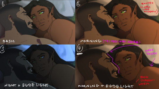
Fun fact, I almost went with #2 due to fear of getting too heavy-handed with compositing and therefore losing the animation (even though I really liked #4 at the time). Thanks to a friend, they also shared the sentiment of liking #4, though pointed out it felt like midday and encouraged me to make the colours warmer and deepen the shadows. It is a really tough balance but I think for a softer scene like this, the more additional layers of comp worked out in the end.
The edge light was a last minute thing because someone told me to add sound and to have light stream in. Also at this point I deadass forgot that you know, Olrox, is a vampire, but hey rule of cute overrules. We can pretend its light not from the sun LOL

Also yay I got to show off my own style a tad, I love paintingggg. It's not as completely fully rendered coz I knew that it would get covered up but I still made sure it was quite clean regardless. I didn't realise how much of it would be covered up even though I did make sure they would fit/make sense for bg LOL
Now we are done!
If you've gotten this far thank you! There's gonna be less frequency of these animations due to the semester starting back up soon and I don't get many opportunities to actually 2D animate (despite it being an animation degree RAH). Also I remembering cringing and laughing a lot when I immediately started putting colour down going "oh i can see the end of the horizon, i have too much power as an artist, people will see this i cant let them see me be crazy"

[Here's some memes I drew over while my friend was reviewing my work]
#mystery talks#castlevania nocturne#artists on tumblr#castlevania#castlevania fanart#fan animation#olrox/mizrak#i still keep going “oh no people who worked on the show will see this theyre gonna see im insane /lh”#its ok coz being crazy pushes you to achieve things
93 notes
·
View notes
Note
Do you have any tips for drawing?
OKAYY this has been sitting for a while my apolocheese... i thiiink i might have answered a similar ask before (i did in fact) with some drawing tips... so this time i think i'll give some art advice on avoiding or coping with burnout <- guy who has spent most of its 20s with burnout, art block, and building a new relationship around art while working full time
one thing for sure i had to learn was how to trick myself into looking at art as a fun hobby and not more work, and it took a long time but it worked for me. takes some mental discipline, but well worth it. art comes easier when you see it as something fun throughout the whole process, and not more work. you have to want to do it.
don't always force yourself to finish something all in one go, especially without breaks. take breaks to get up, stretch, eat, drink, take care of yourself. you'll associate art with feeling better that way too. also, not everything needs to be done in one day, especially when it's for you. i stopped finishing things in one day a long time ago and it helped me find time to draw even on days i work. i always have time for art if i don't put pressure on finishing it the same day!!
NEVER force yourself to draw if you don't want to, same goes for writing or any creative endeavor. you'll burnout faster by forcing yourself and it'll feel like a chore and you'll grow a negative connection with your art which will make it harder and take longer to heal from. its taken me Years to remind myself of this but now i can come home from an 8 hour shift and still want to sit down and draw after i get home and take care of myself first.
if you feel like you're burning out or there's a creative wall preventing you from doing anything, ride it out. it sucks and it's upsetting, but the best thing to do when you want to make something but just Can't is to let it be, and gain some perspective doing something else for a while. play some games (especially new ones), watch new shows, new movies, try a new craft. Honestly, dabbling in anything new that shows other peoples' creative processes, and doing something new to create something, does wonders for art block. you get a new perspective on things and you'll come back to your creative process with a new lens on things and new solutions as well.
i think this one's most important but oh my god. please. please. love your art. love what you make. be proud of it. i save all my art to my phone and look at it all the time, even older pieces from years ago. find what you love about your art, yeah you'll find mistakes but that's not bad either. learn from them, grow, but oh my god please love the process as much as the outcome too. love the way you sketch things, the way your lineart changes details as you go along, how much the colors make it come to life, and be proud of the end result. loving your art and the time you spend to make it makes all the difference, it's not a chore, it's a form of self expression and that's what makes it all worth it. LOVE YOUR ART.
okay that was my sentence i hope you liked it. (:
#asks#art advice#i gueesssss... i mean it's all a part of the process#art is a process and a journey and we all go through it differently
29 notes
·
View notes
Text
hello i was tagged by @18minutemajor for WIP Wednesday. it is not Wednesday but i am also not a cop so . here we gooo!!!!!!! tagging my esteemed colleagues (very politely and with no pressure!!!):
@neonfretra @oensible @sorrellegiance @moregraceful @stereax
@wheelsnipecelebrini
@korshrimpski (EDIT: it won’t?? let me tag you. unless these are on separate lines <3)
what's in-progress in your life <3 writing? art? recipe? skill acquisition?
if any crafty people see this - if ANYONE sees this - and would like to join in, feel free and consider yourself tagged <3 (and tag me back so i can see your stuff!!!) link to 18minutemajor's post if yall curious :3 my VERY long wip dump + ramblings under the cut!
its christmas soon and i like to paint gifts for my friends + and i'm finally revisiting my anime/lineart/inking era (here you are K!! my lineart past, present, and future!! <3) so here are some things i've been working on/coming back to/MAY NEVER FINISH: hockey related:
this is juraj slafkovsky and his dinky little middle part which he can absolutely learn to style into something a little less dinky but never does. i am so charmed by him. i imagine he just rocks it because his pretty privilege supersedes dinky middle parts . LMAO!!
here is Sasuke from my Naruto Hockey AU. I am a little stuck on jersey mockups lol. here he is. our haunted little 1OA who is absolutely normal and regular about his captain (LOUD incorrect buzzer):
personal oc art
wanna know some puckpocketed deep lore? i've never been one to make OCs. i was just not a very creative kid tbh. spent all my time drawing sailor moon instead. i still go back to her sometimes because she is one of my favourite shapes in the WORLD!!
in my 20s i took up playing d&d because of the. uh. plague. <3 and got pretty close to having OCs!! those count right? anyway. here is my tavern-wench-turned-wizard!!! i think i painted this 2 years ago? <- put dates on your works guys it saves lives. her name is Mel (short for Melins (pronounced like melons. on account of her knockers. can you tell i never grew out of my 12 yr old booby/cock joke era?) i revisited Mel recently and have started painting her in earnest again!! :3
I briefly dated someone who was very into streetwear and fashion, and I fell down a techwear/gorpcore/cyberpunk rabbit hole for a couple days out of curiosity. i remember literally zero salient info on any of it except the broad strokes of silhouetting and Vibes. what i emerged with, however, was a ?? sorta OC?? im not sure what to call them. they dont rly have a name or gender. I did this little sheet ages ago + the aborted attempt at a portrait later:
Here are my most recent explorations (i have been doing SOOOO much art. <3) which include:
unfinished character sheet + chibi art. I played with their jacket (much more structured/square/tailored thing) and added a lotta random buckles and belts. i took textiles class years ago and have a little experience in garment construction. and i know for a fact this thing does not make any sense. it hurts me to look at a little bit LMAO so i've paused it while i go draft patterns (badly. i was never good at drafting. i think i may have to break out my scrap fabric stash and hand sew a real life mock-up. HELP!)
here is me having fun with them and imagining them as some kind of cyber-fisherman. the best part of every game is the fishing mini-game to me. i love fishing mini-games so much. I made their hair really big because i wanted them to have big unwieldy hair and the vibes told me i should add more movement to the piece aside from the fishing line. I messed with their jacket AGAIN because i can't stop thinking about what kinda jacket they'd wear. gorp-core ? idk. it sure is something!
gifts for my friends :3
back in my weeb era for real YAYYYY!!! up til now i'd been making hockey art using a zero pressure sensitivity pen brush because i simply did NOT want to deal with that. it is and has always been a barrier to me making art that uses line art. <3 easing my way back into it though!
I used to paint gifts for my friends and then get them printed into lil posters and mount them on nice backing :3 i am now ready and back to painting.
Here is my girlbestie's OC. just a rough pose sketch. i think im pretty unsatisfied with the gesture of the head/hand. i wanted to include her gun in some way. i fear i may have to rework the pose entirely <3
For the genshin girlies.. here are some of my friends fave characters.
Yelan - this one i started many holidays ago and put on the backburner because the colouring was wigging me out. you can see where i started rendering stuff + got sidetracked and started on something else (the crystal choker IM LAUGHING @ past me...)
Ayaka - I reaaally like what i did here with the perspective + foreshortening. I don't know if the pose or expression is in-character or not, but i had fun :3 got stunlocked looking at references of genshin weapons so this is where i left off:
if you made it all the way down here hi... <3 ice hockey really cracked the ketchup bottle open for me when it comes to making art again. i love the communities i've found, and i'm inspired by every artist on here every day. thanks for being so cool + have a great day :)
#hiiii... late with starbucks (gigantic wip dump now i feel good about sharing again)#puckpainting#tag game#eye contact#the . the tag thingy for half of these aint working HELP <3
19 notes
·
View notes
Text
need to take a government mandated break from working on lineart to 1) rest my hand 2) clear my mind, and so here is # Freak F...Saturday. no fun alliteration on saturday :(
i want to talk about Bastien and fun things about him and his sexuality but first let me take you to faraway lands of two years ago? more or less, when i was revamping his character and rotating him in my mind as you do and trying to figure out what makes him who he is and what makes him like, fucking catnip for Wolfgang. and i came across two things, VCH piercing and transmasc doms and it was like yes. there they are : ) it was really important for me not to write yet another sexually repressed virginal trans character - because of many reasons, but ultimately because that's not someone Wolfgang would find interesting. and realizing he's Very sexually experienced dom made things finally click.
so Bastien came of age away from home, in a community of butches and leatherdykes, free with kink and sexuality and very loose with boundaries and those late teens into his twenties were really formative, even if he eventually ended up having to move away for med school (and started his transition around that same time). he was still fucking around a lot in college, occasionally getting into some flings, until Matteo showed interest and they started dating - first it wasn't supposed to be very serious (though Bastien liked that a cis gay was interested in him and kept treating him to nice dinners and bought him clothes, he can't lie no matter how it makes him cringe now) but then you know, the things happened that happened and Matteo was a lifeline that helped him through some of the worst months of his life and they ended up moving in together.
Matteo was also really supportive of him getting top surgery (also offering to pay for extra cosmetic surgery to remove the scars - which Bastien declined), pushing him to think about bottom surgery as well. because Matteo always bottoms, usually he prefers to be fucked from behind with the strap, twink pillow princess style, and they would both pretend that was enough for Bastien.
Bastien likes topping, don't get the idea that he wasn't into it, it's just something that became.. so much of a routine over time, a chore even. he likes domming and kink but their sex was really mostly vanilla and basically entirely based on Matteo's whims (which to be fair, Bastien never quite tried to voice his own needs in the bedroom or anywhere else in their relationship). and Matteo would not in any way acknowledge that he had anything but the strap between his legs. which.. again was.. affirming at first but the more Bastien's body kept changing - with T, gaining weight, gaining muscle and body hair - the more he actually felt good in his own skin. and his desires changed with that too - how they would maybe like to be touched and perceived changed as well. but to Bastien it seemed there was no avenue to explore that within the long term relationship they had with Matteo.
this is a long lead up to talk about how when they first - finally - start fucking with Wolfgang, they are more than happy to do it on Bastien's terms. like they prefer to top usually, but they also happily fold to anyone more dominant or insistent on a position :) Bastien not only gets to fuck them how he wants, but also after a too long time he allows someone else to touch him and hold him and fuck him and make him a complete mess in a way they didn't know they could even handle.
..and it's a whole, slow process. he would catch himself feeling embarrassed even, thinking it's something he should have sorted out in his 20s. getting in touch with his emotions and his body after years of numbness and pushing down his desires doesn't come easy. even when he would finally want to try bottoming again, he would only nod at Wolfgang as consent without being able to say what he wanted or what he would like, he would hide his face, covering it with his hands or turning away when he came. but little by little he lets them in more and more, emotionally and on every other level. they push each other's boundaries and they build trust in each other. he forces himself to be honest and to stay in the moment and to voice his own desires, and of course that's all made easier with a lover who not only is also trans but is actually eager to please him : )

#i know i brieeffffly touched on the topic of his sexuality back when i actually was sketching the comic the image is from#so here is the extended essay version#bastien#ramble#i lied its not about murder or androids this whole story is actually about how cruel it is to force verses to be only in one lane 💔#verse 4 verse t4t is life changing
15 notes
·
View notes
Note
I am a bit jealous of the way you paint. Do you have some tutorials or ways to improve? I love paint, I try my best, but my colors end up always muddy 🥲
here's a bunch of miscellaneous thoughts... I hope this helps!!! I've never really written tutorials before so it's a bunch of different tips collected together
whenever you see something that inspires you, save it somewhere! then look at all your inspirations every once in a while and analyze what made you like them - like certain techniques or colour usage or something. then when drawing, try to incorporate it! (i've saved finished pieces, sketches, half-done stuff, speedpaints, lots of different things as inspiration)
using more saturated midtones for shading could help in making things not look muddy (like this tutorial). of course having more desaturated colours could also be a vibe you're going for
don't be afraid to use desaturated or bolder colours!
I love underpainting (tutorial on it)
I also love using the lasso fill tool. I don't do lineart so whenever I need to plop down a big bunch of colour (like for people) it's lasso fill time! on procreate it'd be select -> freehand -> color fill
some people will be like don't overuse blending tools and soft brushes and! while I do think it's super important to learn how to rawdog just blend things, eventually you'll find that reintroducing them into your workflow could be useful! I guess it's more of an advanced tool?
granted I just use hard brushes to blend everything anyways. if you feel like you're overusing blending/soft brushes then try using a harder textured brush, or the good ol round brush with opacity and size being controlled by pressure. or alternate between the two
my painting workflow is changing refined sketch layer to a multiply layer + making it a different colour -> underpainting colour -> lasso fill in shapes (with the underpainting) -> laying colours down at a lower opacity or with a textured brush -> sometimes using a multiply layer for quickly putting in shadows -> some minor painting under the sketch lines -> painting over everything (sometimes I merge a bunch of layers together). here's a video of a wip!
I don't know how to describe this... colour constancy... so, colours look different in different lighting conditions but the brain still recognizes them as the same local colour. one thing I had to really figure out was how to choose colours under different lighting conditions (instead of using a multiply layer for everything)(I still use multiply layers for some things though) bc I found that outright picking them made things more interesting? since style is all about your own choices. like in the above video Paradox's skin is actually a dark grey-purple and his labcoat is dark grey-blue but the brain recognizes that's a white guy with a white labcoat in a different lighting condition. uh. Color and Light by James Gurney has better explanations of this
thumbnailing colours are useful. also don't be afraid to restart your colours over and over if they don't feel right - kinda like a warmup
I like having a brush with minor colour jitter on stroke (like 3%) I can switch to for some colour variation
change your pen's overall sensitivity to be something like this so you don't have to press as hard to get to the ~100% range

get funky and experimental with it! break the rules once you've learned them!
tutorials I liked:
the book Color and Light by James Gurney
importance of values and contrast (pics)
mini rendering tutorials (pics)
underpainting (pics)
colour tips (pdf but the sample tutorials are already helpful)
anatomy quick tips: skin (video)
how i paint skin/light by niro (video)
the fastest way to learn to draw color & light (video)
3 techniques for incredibly realistic portraits (video)
I also find speedpaint videos to be super useful to get a sense of other people's workflow!
brushes I'm using
verkomy's fun marker for sketching + textured painting
moss' sketchy sketch for some sketching
an edit of a default round brush to have a uniformed glaze rendering mode, and variable size (40%), opacity (50%), and flow (max) based on pressure. I think there's other edits too?
default soft brush for quick soft brush needs, like putting down some colours for tinting something with an overlay layer
a square-ish textured brush with 3% stroke color jitter. copied it from a CSP brush that I use (PX paint)
#I had this typed up and then I accidentally refreshed the page so hopefully I have everything captured again#really hope it helps!!#EDIT: added some brushes
8 notes
·
View notes
Text
I had a fun dream.
I forget how exactly it got to this part, but at one point, I was rushing through a TV Space. Like, the physical representation of inside a tv. it was kinda warehouse shaped. and these big partition doors were coming down to separate the episode from the next part, and I managed to slip through under the first partition door, into a smaller room, but the next door after that was going faster, and I couldn't make it in time. I was now stuck in the ad break. There was a weird accordion fold thing on the door, and I could shove myself in there if I wanted, but the last time I did that I was just extra saturated with ads, so, no thanks
so I busted through the wall
on the other side, they were filming phineas and ferb. the director took offense to me being there, but I was like "haha! no, I am in here now!"
"yeah, as the villain," the director griped, because he really didn't want me there, but I was delighted with this comparison.
"Yes! I get to be the Doofenshmirtz!" I cried cheerfully, and immediately challenged Perry the Platypus to a dual, with kendo swords specifically
"you can't do that!" the director complained
"nah, actually, that's fine, let them," said Dan Povenmire and Swampy Marsh, who were also there now
so, with permission from the people at top, and much to the director's despair, I launched into the scene again. I declared that if Perry didn't stop me, I would take over the WORLD! hahahahahaha evil laugh
then —after a quick aside that kendo swords are wooden btw— I ran off and broke through a bunch more walls with Perry in pursuit, until Dan and Swampy (who had become a lineart drawing on blue paper) asked me to stop and pick a room, because it was hard to keep up with the cameras
so then Perry the Platypus and I had our dual, except the prop people hadn't been able to find any wooden swords. so Perry had some weird filler prop that might’ve been my cats' fishing rod toy? not sure exactly. but he was trying to use it as two props at once, and I was gesturing as though I had a sword but my hand was empty, ao the dual scene was kinda messy and not working very well. alas.
we found me a stick too after a bit, and I ended the dual by twisting Perry's sword out of his grip and into the campfire that happened to also be in the room for some reason.
"Ooops," I said very insincerely. "Guess I shouldn't have picked the room with fire to have a fight with wooden swords." and then I jumped out the hole we'd previously made in the side of the building and escaped
then I was trying to actually escape, not just as a scene, but cause the director was trying to catch me for wrecking havoc. I could still smash through walls in the set (and the walls of reality, sorta, with an end result like teleportation/ dimension hopping), but that left big obvious holes to chase me through
I noticed one of the helper people on the filming crew wish she could just bash holes through the walls of reality like that, and she tried, except that instead of getting to somewhere new, like I did, she was in a thick wall full of insulation. trying to keep bashing the hole just got her deeper and deeper into the insulation
and I got an idea
instead of continuing to bash big obvious holes in the rigid set walls, I started burrowing through the insulation, which fell back into place behind me. hehehe, sneaky time
then the helper girl, whose name I now knew was Erica, started lamenting aloud about being stuck, and she wanted to get home to her friends and family. So I decided to help her out.
I went over to where she was now attempting to wade through the insulation, knee deep into it, and I kinda just... dug around her to make her sink into it, and formed it into a spiral slide to send her into the wizard of oz. it made sense as a solution at the time.
then, for a reason I don't recall, I was telling someone about the incidents that had just happened, and in so doing, returned to the pnf set to recount/reinact it.
The director was not pleased to see me return.
also the holes in the walls had started to heal closed, and bashing through them again in retelling undid their progress.
I paused, and offered the director a choice. I could do this fast, or I could... an option I don't remember now.
He did not want to pick. He didn't like either option. I picked for him, and said I'd do it quick, and then rushed through the scene, now with me narrating was happened cause this was a retelling.
Except this time I paused to pick up some paint stir sticks to use for the kendo swords. "we didn’t have these the first time, but we can use these this time," I explained, handing Perry his stir stick.
he then proceeded to be better at swordfighting than me, and the fight ended cause I got something in my eye and had to call a pause.
after that, I think I just kinda left? woke up not long after that.
#original#dream writing#phineas and ferb#there was an earlier bit where I was paragliding and a building behind me blew up and I could feel the whoosh of wind from that#I was also very confused when I woke up because I forgot I had taken a nap#I saw that it was like 10:30 and thought I had overslept#I meant to get up at 9 or 10 in the morning#but no it was still evening
10 notes
·
View notes