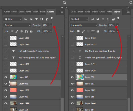
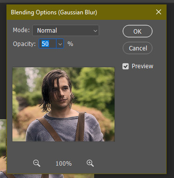
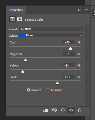
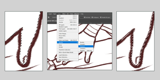
#maybe i need to adjust the opacity on the red light layer....
Text
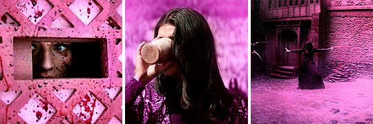
what? a saw vampire au? nooooooo haha thats craaazy
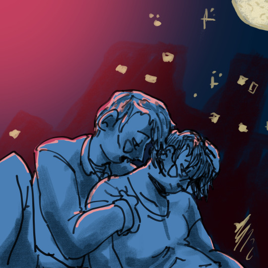
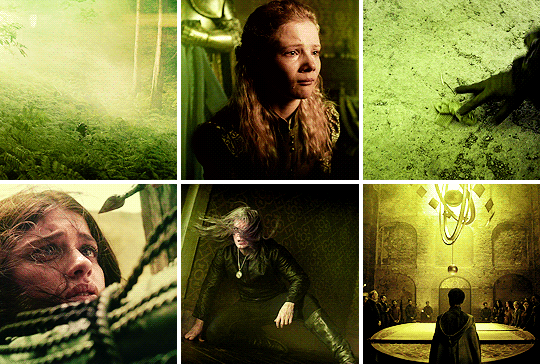
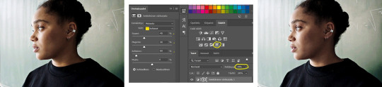
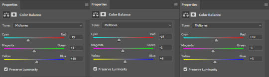
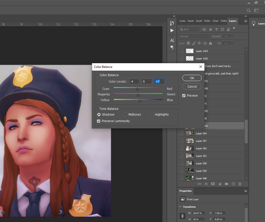
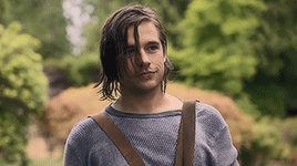
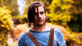
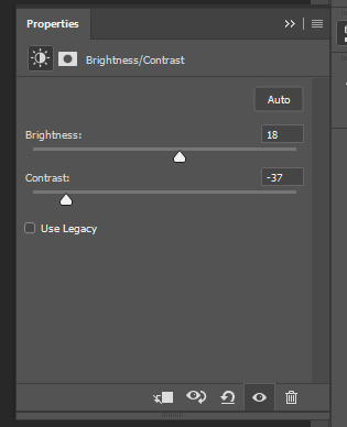
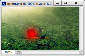
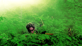
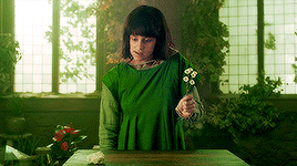
#saw 2004#not entirely happy with this but i cant figure out why so.#i am posting it as is#well see if i update it later when i realize why i am so so about it#i do like it better than the first version#because i am a dummy head (affectionate) i have three different versions of this file on my computer and all of them are different#fanart#my art#artists on tumblr#chainshipping#lawrence gordon#sawposting#adam from saw#vampires!#my new favorite color scheme is red black and blue#right in time for the fourth lmao#maybe i need to adjust the opacity on the red light layer....
82 notes
·
View notes
Note
Hii Becca, congrats on your 15k! 📝Could you do a tutorial of how you do your rainbow color sets?
of course! let’s talk about rainbows such as the ones i’ve created here, here and here! this is maybe going to be more of a series of tips to use when attempting a rainbow set as i have my colouring tutorial explaining how i colour my gifs!
i’d also recommend taking a look at my tutorial on how to get several gifs in one as i also use techniques from this.
so let’s get started under the cut!
tip 1: finding scenes
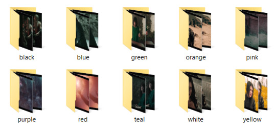
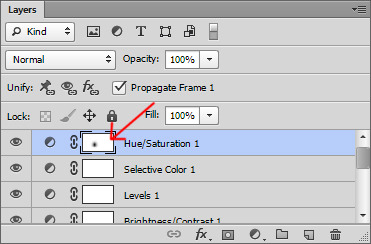
one of the most important things when attempting a rainbow set is the scene picking. i usually go through and pick the scenes i like, but then sort them into their base colours. so for example i will put all of the blue scenes into a folder, then all of the green scenes into another folder (you can see a screenshot below of what i usually do).
this will save you a lot of time because it’s easier to enhance colours that are already there, rather than have to colour each scene from scratch. the smallest rainbow i’ve done is 30 gifs which is still quite a lot for one set (the others are both above 60) so you really want to make life easier on yourself by using scenes that already have those colours in them.
tip 2: decide on your layout
people have come up with all kinds of exciting ways to present rainbows recently. you have ones like i listed of my examples above which is fairly simple boxes or rectangles together, or you can do things with different shapes such as this really cool layout. you can experiment with whatever you want but it’s a good idea to start with an idea of what you want to achieve and how many gifs you want within it!
tip 3: start with your black and whites
the way i like to do my rainbow set is as a gradient, so each line gradually changes from one shade to the next. the easiest way for me to do this is by starting with my white lines and my black lines, even though they are at opposing ends of the set.
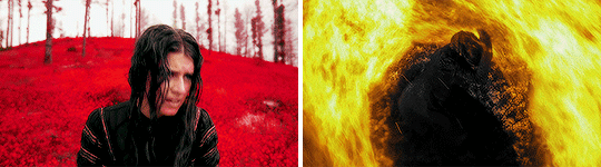
for my witcher set, because the darker scenes included yennefer with fire, i knew i needed to go from black to either red or orange. i went with red and was able to work, so this gave me the ‘starting point’ for my rainbow (even though on the set it’s the ending point, i know that’s a bit confusing!)

but having this meant i could now figure out my ending point. i knew this needed to be either pink or orange as these are the colours next to red in the spectrum. in making my white gifs, it was easier to add a little touch of light pink in with my colouring, so i created a white to pink transition as such:
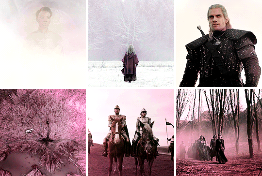
this has now given me the ‘start’ and ‘end’ points for my rainbow, which is really helpful in knowing my sequence of colours and how i’m going to transition throughout the set.
note: you can start anywhere on the colour spectrum like this, i could go from black > blue all the way through to say green > white. i will say in my experience i have found it more effective to transition from black to a warmer colour (such as red or orange) because these colours standout well on a black background which gifs you an effective gradient effect, but this also depends on the shows i’m working with.
tip 4: getting a line of gifs to match in colouring
obviously one of the key things about a rainbow is that each gif in a line is a similar shade. otherwise you won’t get quite the same rainbow effect going on! as i said before please read my colouring tutorial because a lot of what i’m going to talk about now will be presuming you’ve already gone through that.
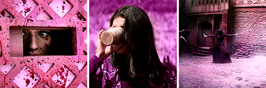
so in order to get my colours to match i firstly colour all of my gifs with their basic colouring separately, and then put them all together as so:

as you can see these all have elements of pink in them but most are not fully pink and also the shades do not yet match. but that’s fine! now i have them all together it’s easier to see as i colour each one how the shades match to each other.
i proceeded to use my usual colouring method of using the paint brush (step 3 in my colouring tutorial). each of these gifs have all been coloured with the exact same shade with the brush, each under all the other colouring layers, with a slightly pink gradient over the top of all colouring layers. for the right hand gif i used some hue/saturation adjustments to change the cyan/green shades to pink but otherwise, they’ve all had the same painting adjustments:
as you can see they’re now a lot more pink, but they still don’t match in shade! the middle and right hand gifs were far too purply for me as i wanted more of a ‘rosy pink’ shade.
so, i added a few paint brush layers on top (again in exactly the same shade). in the middle gif, i have added a little bit of colour around the top of her head and set this to ‘hard light’ to lighten this area.
on the right hand gif i added a layer covering the entire gif and set this to multiply to bring a bit more colour depth, then added another layer with some colour to the top of the house as it’s shade is a little lighter, and set this layer to ‘hue’ lowering the opacity to 35%:
we can see here that the middle gif has been lightened around the edges, and the right hand gif now has a much stronger colour with the top of the house matching the rest of the gif!
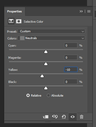
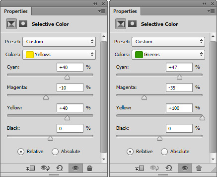
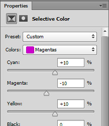
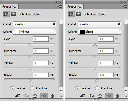
but this still isn’t quite there. the shade of the left hand gif is still a bit lighter and more ‘rosy pink’. so, i cracked out the selective colours! selective colours are a dream when it comes to rainbow sets. all i did here was play around with the magentas using selective colours of each gif to get them to match.
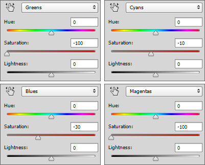
left hand gif: i darkened the magentas a little and added more cyan tones
middle gif: i lightened the magentas, adding more magenta and yellow tones
right hand gif: i lightened the magentas, adding more magenta and yellow tones. i also added a layer of white with my brush right at the bottom and set this to ‘softlight’ lowering the opacity to 31% to just lighten the ground:
ta-da! now it seems like a cohesive colouring! the key here really is to just play around with your selective colours, look at the gifs together and see how each one matches to the next.
tip 5: transitioning between shades
as said before i really like making my rainbows more of a gradient where we transition through different shades. so i’m gonna walk you through how i work adjusting from one shade to the other and making it look ‘cohesive’.
so i usually work from line to line. i firstly try to get all of the gifs to match each other in colouring, and then i worry about how that looks in relation to the row above/below it. it’s always good to open your lines together on ps (even if they are in separate gifs) just so you can see how they work next to each other. so i have my first line here all coloured:
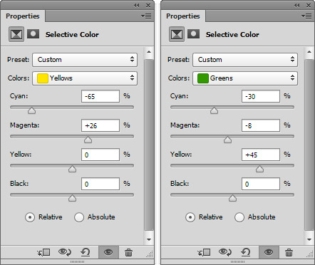
i’m currently transitioning from green to yellow so i want the next line to be more of a yellowy tone, but also not too yellow or the transition will be too sudden. so, what i do is create the next line of gifs and colour these also in green, using the same shade of paint brush as i did for the above line:
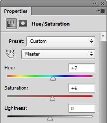
as we can see the greens match pretty nicely! the only issue of course is that i want the second line to be more yellow. but this is where we go back to our trusty selective colours. so starting with that bottom right gif, i added a selective colour layer reducing the cyans and increasing the yellows, then also a yellow selective colour layer increasing the yellows and magentas, and decreasing the cyans. i also threw in a hue & saturation layer to lighten the yellows so we get this:
now this is definitely stepping the colouring towards yellow, without making it a strong yellow yet (as that’s what my next line will be!). this is therefore a great transition shade between the light green and yellow, and will add a nice cohesive look to the set. with the right hand gif in a shade i like, i then worked on the other two gifs to get them to match the row (as spoken about in tip 4!).
this was again achieved by using selective colours adjustments to decrease cyans and increase yellows under the ‘green’ and ‘yellow’ tones. although for the left hand gif i also added a layer set to ‘color’ on top of all colouring layers at a dark green/yellow shade just to get a stronger colour for the background!

and there we go! we now have a green to yellow transition fade. to create the entire effect i continue like this. for the next line of gifs i would colour them in yellow, and then make any selective colour adjustments needed to create a ‘smooth’ transition, and then move to orange and on to red. i’ve said it before but i’ll say it again: play with selective colours! they are your best friend for making rainbow sets and really do make a world of difference.
the end
and that’s it! i hope the techniques i’ve gone over will help you get your head around rainbows and how best to tackle them. doing a rainbow set can seem daunting because there are a lot of gifs involved, and i will admit they are time consuming, but it is most about repeating techniques over and over again as you move through the rainbow.
i started on a ‘smaller scale’ of just giffing one of my characters in every episode and trying to make each gif flow as more of a gradient between a few colours, and that was a really great exercise for me on how to manipulate shades and get a set to flow in a cohesive gradient before i built up to a whole rainbow. so if you wanted to experiment with something like that first it might be a good starting point.
anyway, i really hope this helps and as always, if you have any further questions please feel free to ask :)
#cantfightfatetoo#fyeahps#completeresources#itsphotoshop#gif tutorial#tutorial#ps help#*15k#i really hope this makes sense because i always have the problem of just cos i know what i'm talking about doesn't mean anyone else does lol#anyway i really hope this helps!#and if not it showcases the magic of selective colours
277 notes
·
View notes
Text

Okeyy here it is!! I decided to put together a step by step (gif) coloring tutorial where i list the layers i use and how i've so far made them work for me.
I've been giffing for 2 years now (i'm using PS CC2019, the example pics are in finnish but icons and placements should be the same) but it's an ongoing learning process.
My coloring style is quite natural, i don't do fancy stuff often and i mostly just want the colors to look as true to real as possible but better than originally. And for this kind of style i've found the steps below working for me.
I also don't have any base psds or anything that i'd often use. I always start the coloring for each set from the scratch because, to me, it's the most fun part of giffing. I have 6 layers I use every time and then some random additional ones that i often add too. None of this is me saying what you should do, this all just me explaining what i do and hopefully this can be helpful to someone.
Ok ok time to get to the point so:
1. Curves
I always, like literally always, start with this layer
Sometimes i just drag the line upwards to brighten the gif but very often i use the eyedropper tool
Choose the white tool, pick the whitest (but not 100% white coz then it won't do anything) spot and it will make that the whitest part of the gif. It also works great at correcting the colors, sometimes you need to try multiple different spots to get the best result
The black dropper tool works the same way, only opposite, so clicking on the darkest spot you make that the blackest part of the gif
If the effect is good but a bit too much, you can lower the opacity of the layer, or the other way, so if it did well but not enough then duplicate the layer
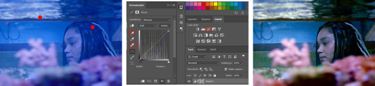
Example: the difference between the left and right photo is 2 clicks and this, my dudes, is why i worship curves. I chose the white eyedropper tool and clicked on that light spot visible in the water, then i chose the black eyedropper and clicked on fatou’s hair and that’s it. Needs more work, but that’s a pretty allright (and easy!!) start (zoom to see better)
2. Levels
I drag the left and right sliders a bit to the center to get contrast (left ~5-20, right ~240)
The eyedroppers work on this layer pretty much the same way as in curves, but i'm more used to using them only with curves
3. Black and white gradient map
I set the blending mode to soft light and lower the opacity to ~10-30 %, this brings some depth to the colors imo
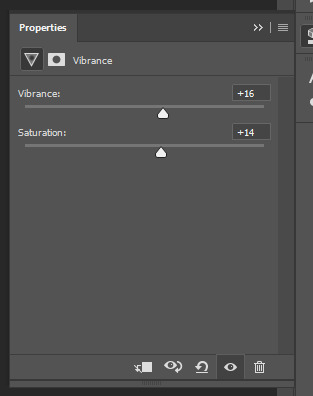
4. Vibrance
I usually add ~20-60, it really varies tho and you can just wing it most times
5. Exposure
I set the top one (exposure) to 0,1 - 0,2 and bottom one (gamma) to 0,97 - 0,90. This is an effective layer so better not do too much
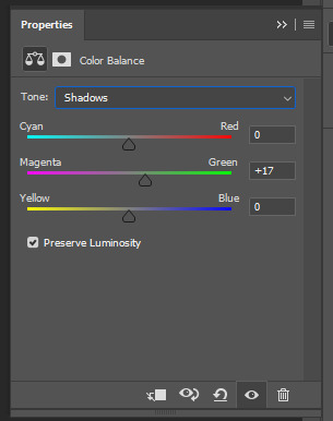
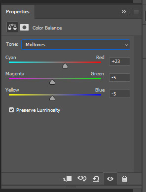
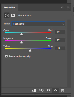
6. Color balance
Owing my life to this layer
I add this layer at around this point of coloring but i drag it to be the bottom layer, since when it's under the rest of the layers it's more effective
In the midtones, i always drag the bottom slider towards blue, something as small as +2 might work, sometimes you need to go +15 or so. I might drag the middle slider slightly to the left to reduce the green tones, and the top one on either side depending on the tone of the gif
Example: this one doesn’t have any of those other 5 coloring layers i always use so it needs more work but also it shows how effective color balance is. I added more blue than normally, at least with one layer, but this one needed it imo. Love to see the green go whoosh
At this point the coloring might be done (jk it likely isn’t) but if it needs some more work then i might try one or some/all of these:
7. Photofilter
I mostly use either warm orange filter to bring some warmness to the colors or cold blue filter to correct yellow/green/red tones
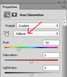
8. Hue/saturation
I choose red and drag the middle slider (saturation) to -5 to -20, this helps to reduce the orange/unnatural skintones
Example:
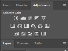
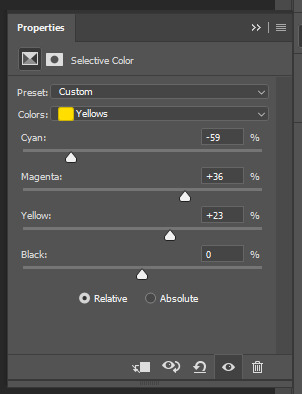
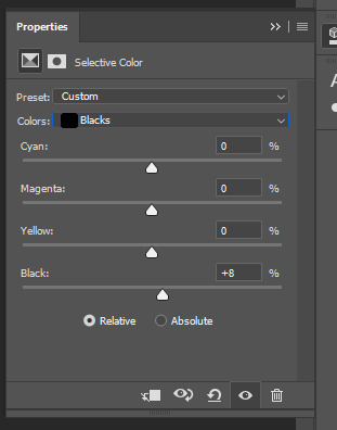
9. Selective color
Playing around with whichever color i want to add or reduce, if i feel like the gif needs more contrast i choose neutral and/or black and drag the bottom (black) color to the right.
If sometimes the whites are too blinding, i choose white and then the bottom option (black) and drag it to the right ~10 -20.
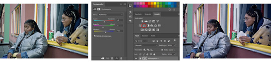
If the skintones are too yellowish, i choose yellow and go -40 / -40 / -80 and leave the blacks at 0. If it does too much, i lower the opacity of the layer, or in case i want it to be more, i duplicate the layer
Example: (zoom and cry happy tears over the ugley yellowness being gone)
10. Gradient map
For example blue-white gradient to get to colder tones, yellow-white to brighten/soften the colors or smth like pink-blue if you want to get fancier (the options are limitless tbh)
I set these to soft light and lower the opacity, usually to less than 40%
If i want the color to strongly affect the entire gif, then i leave the blending mode to normal or choose color
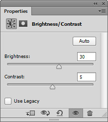
11. Brightness
Adding this if some more brightness is needed (i don't use the contrast option here but go to levels instead, if needed)
_________
Tips with poc!!
Some things i've found to be helpful when wanting to bring color back to the skintone after brightening or other adjustments have taken some of it away:
a. Check the points 8 & 9
In selective coloring choosing neutral or black and then black in them and dragging it to the right helps to darken the skintone
Try choosing red or yellow and then yellows or blacks in them and dragging the slider either to the left or right, depending if you want to add or reduce the yellow/red tone
Honestly the best advice i can give with selective coloring is to just simply play around, choose a color, drag them sliders to the left 'n right and see what happens
b. Go to channel mixer and add a little bit of red (+101-105)
c. Add levels or contrast or vibrance layer
d. Choose a warm colored photo filter
e. Be careful with exposure and too much brightness
_________
Soooo yeah, these are the layers i use, sometimes you can't do everything with the same layer so for example i might add one or two more curves to get brightness, or multiple selective coloring layers or add another color balance etc.
Generally i like to do small changes with one layer and not everything all at once.
_________
As for when saving the gif for web, these are my settings. I translated the one’s that aren’t obvious but everything else i’m assuming doesn’t need translating since this view always looks the same.
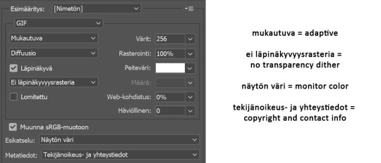
I use diffusion 90% the time, but when it doesn’t look quite right i try pattern. And sometimes when the gif has been really dark originally (😩) and has needed tons of brightening layers, noise might be the best option.
At the bottom i have the quality set as “bicubic”.
_________
So that’s it! If you made it this far, thank you, ily <3 Lots of stuff i’ve learned along the way and lots of stuff to be learned. Hoping that maybe you got to learn something from my way of coloring, too. And if not, thanks for reading anyway 😌✌🏻
#here it is 😳#i've never done posts like this but i tried to explain stuff as shortly but clearly as i could#hope it's easy to follow#and that i didn't forget anything crucial jdjdkdkd#gif tutorial#coloring tutorial#mp
49 notes
·
View notes
Photo

The people have spoken! I’m going to show you how I do my
ADJUSTMENT LAYERS
Curves are awesome but we’re not using them today
I’m obsessed with Vibrance layers right now and I figured out that using them in a specific way actually brings up darkness in super dark things like Mr. Robot!
You may already know you can have multiple sharpening layers but maybe you didn’t know that you can alter their opacity?
Color balance isn’t always ideal but it’s great when the footage is already well-lit (like with the footage we’re starting with)
The best thing this method does is that it will make the light and colors in your gifs POP.
Full disclosure: this is best viewed on a desktop—it almost made my phone’s Tumblr app crash. Lots of media under the cut!
Disclaimer: I use this method of making gifs and you will need a passing understanding of Photoshop and adjustment layers, which I did attempt to describe how to use. Not going to describe it here, but click the link above or DM me with questions.
Here’s what it looks like already resized from 1080p video down to Tumblr width of 540px. A bit dim, no clarity.

An image like this deserves to pop! So! We’re going to make heavy use of Vibrance adjustment layers.
Basically:
1. Create a new Vibrance layer and bump the “vibrance” slider all the way up. Then change the blend mode to Color Dodge. Chances are good 100% Fill is way, way too much—but take it all the way down to 0% and then bring the slider up until the highlights begin to jump out. 28% worked here.

2. Make a Copy of that Vibrance layer! (Drag the layer down to the little + in a box button at the bottom right of the layers.) Then change the Blend Mode to Screen and move the fill percentage around until you’re happy (40% in this case).
This is my new TRICK and it does amazing things to brighten up dark footage. It’s great because it is less likely to create mottled color noise.

3. Make a Copy of THAT Vibrance layer and keep the blending mode on Screen! I did this by accident once and realized it does such a nice job of building on the subtle brightening the previous layer did. In this particular gif, I took the fill percentage way down to 8% and the change is almost negligible so I’m not including a screenshot.
4. MAKE YET ANOTHER COPY of the Vibrance layer! But instead of going brighter, we’re now going to bring back the blacks. Change the Blend Mode to Color Burn. Then bring the Fill way down and slide it back up until you’re happy that the darkest tones in your image look substantial. In this case, it was 10%. With the Color Burn Vibrance layer, a little bit goes a long, long way.

5. Finally, create a new Color Balance adjustment layer and fiddle as needed. In this case, I kept the adjustments from a previous section of the video that was very red—so I worked to dial back those reds by incorporating more cyans/blues without letting it go too green.
I only adjusted the Shadows and Midtones here, not the Highlights (because that’s where his skin tone, in this lighting, needs to remain the most natural—remember to respect and work WITH people’s skin tones, never work to “correct” them!).
The difference is subtle and I’m not sure it makes it better but it certainly makes the colors more... separate.

That’s it for adjustment layers! Here’s what it looks like as you turn on each layer. I’ll show you my sharpening method after this!

Sharpening
So I’m using three sharpening layers (technically not layers, but smart filters) these days. It can take longer for the computer to render it, but I’m loving the results.
As long as whatever is in the timeline is currently a Smart Image, then you can turn them on and off and change their opacity and this is a powerful way to make sure things are both smooth and not over-sharpened!
Here are the specs for each of the sharpening layers in the order that I usually turn them on:
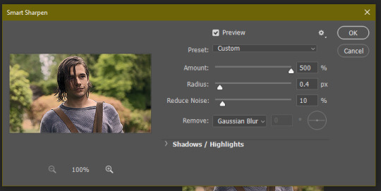
Sharpen.
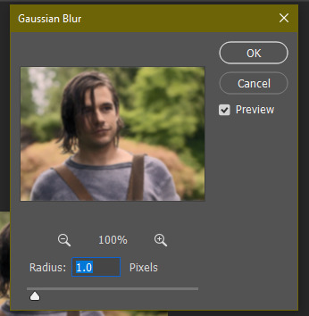
Smart sharpen. [Amount: 500px, Radius: 0.3, Reduce Noise: 20%, Remove: Gaussian Blur]
Smart sharpen. [Amount: 10, Radius: 10.0, Reduce Noise: 4%, Remove: Gaussian Blur]
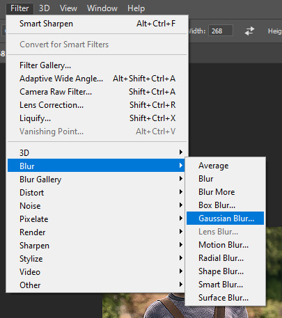
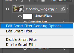
But here’s the deal: those will over-sharpen and no matter how you move the sliders, you’ll find there’s nothing you can do. SO! You just tone down the overall effect by clicking on the icon to the right of the sharpening layer:

And then you can change the blending mode and opacity of each sharpening layer. I keep all of the Blending Modes on Normal, then change the opacity:
Sharpen. [Opacity: 64%]
Smart Sharpen. [Opacity: 100%]
Smart Sharpen. [Opacity: 100%]
It’s possible you’ll move these opacity sliders all over to make this look good! Always depends on how much of the image your subject is taking up and how good the quality of the original footage is.

And then of course, here’s the final product!
And...
If you want an example of what this Vibrance layer method can do for dark Mr. Robot footage, check this out:

Hope that gets the gears turning for y’all. I’m looking forward to seeing what you guys do, and if you have any cool adjustment layer ideas that come about as a result of these, please share! I love seeing new, experimental ideas!
cc: @ilygwilym and @xmxisxforxmaybe who said they’d be interested in this 😀
93 notes
·
View notes
Note
psst share your outer banks coloring secrets
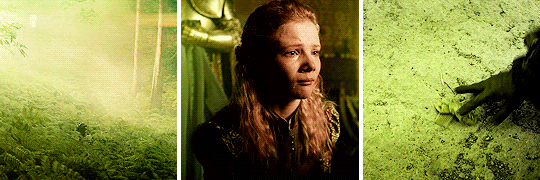
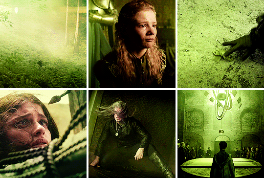
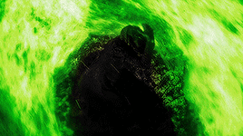
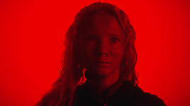
ah, yes, one of the worst shows to color lmaoooo. i'll try to give some tips but im sure as anyone who has tried to color this show knows each scene is diff and has it's own flavor of awful yellow/green/red shading.
some tips on how to go from this to this......


............under the cut! (warning v long and idk if i'm the best at explaining things lmao)
so firstly, i use this psd i made ages ago for everything (alecbaenes was my url many moons ago i just am too lazy to change and reupload). usually i will go into each individual layer of that psd and see how they work with the scene, and will change the opacity or turn off the layer depending on what looks best. generally for obx, i will lower the opacity on the gradient map layer, as well as certain vibrancy/curves/levels layers, ones that make the gif brighter and more vibrant. i will usually bring back some vibrancy and brightness later but when im first getting the base coloring, some layers just heighten the yellow/red and we need to kinda bring that down before we make adjustments to get aspects like skin color more accurate.
so, just with my psd/adjustments made to the psd layers, the gif may looks something like this: (going to use this gif bc i made it more recently so i remember some of the stuff i did better, and is the most accurate to my current process--plus it sucks to color lmao)
ususally still way to red/yellow for my liking, both for the skin tones and to be able to manipulate the colors for a vibrant coloring! so the next step is to get colors as close to how they are normally. warning, you will have to make 345435354 adjustment layers and just keep tweaking and tweaking... and tweaking. sometimes i will have like 20+ adjustment layers at the end of the process. i usually put all my adjustments under my psd--i also always add a vibrance and brightness layer above. sometimes it helps to do final tweaks above the psd if you just cant get anything right bc of course the psd will change how colors normally look.
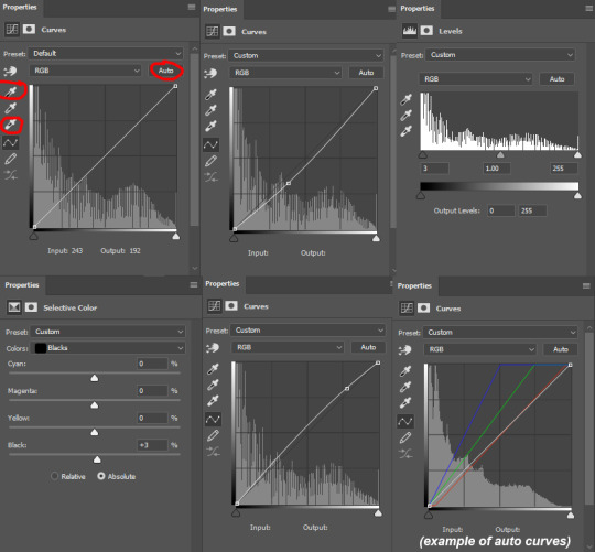
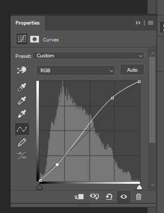
anyways, usually my base fixes will be some sort of combination of curves, levels, color balance, and selective color. so like, if the gif needs more depth/darkness, or is way too bright, i will bring the curve down or up respectively. levels, and also increasing the black selective color layer will also add depth. i will also use auto curve sometimes! the first image i have below i circled some of the extra tools i may use--auto for auto curves, the top black eyedropper you select the darker points in your gif and it will adjust based on that, the bottom one for the lightest--if i use those i will either use the black one only, or the black and then the white. the other three are examples of how my curve layers may look--i already have S curves in my psd, so when i do extra curve adjustments, it's just one single point, and i don't move it that much. same with levels, i dont make a super dramatic change, when it's under the psd it's enough to just move a bit to make a big difference. sometimes i'll also bring these layers to a lower opacity.
generally my first step is color balance though, especially if the gif seems mostly fine lighting wise. for obx, i usually shift it towards cyan and blue to cancel out the red tones. magenta and green depends, if its more green i may move towards magenta and vice versa, but usually i dont shift it that dramatically and often leave it alone. i will usually move the bottom bar towards blue, to soften the yellow tones. color balance helps shift the overall colors of the gif. notice that it's on mid tones in these pictures:
as you can see, i shift the cyan/red one more dramatically than the yellow/blue, and with magenta and green i usually just move it 1-3 points over. in the last one, i actually shifted towards red above my psd layer, because after all my adjustments i lost some of the red/warmth, so i brought back in red.
with color balance/curves, the gif may looks something like this
less of a completely red/yellow filter over everything! but still not great, their skin is too red, and overall still not the best base to try colorings. so next up is selective color, which can really help you fine tune things, but because of that.... SUUUUPER tedious. i will have 3495874 selective color layers and sometimes like 5 of them will be half canceling each other out just to get something okay. but this is a hobby i've chosen so we must suffer LKRGJRG. generally, my realm revolves around red, yellow, and at times magenta or neutral. if you think back to how we fixed some of the colors with color balance, kind of a similar principle, just with the individual colors. and lots of experimenting. so with color balance i would cancel out reds by making them more cyan--on the red selective color, im also gonna turn up the cyan. for yellow, i'm gonna make it more magenta, to make the yellow tones warmer. i will tweak the other tones too, just kinda experiment to see how changing it affects the gif, and then soon you will kind of intuitively know how to change the values based on whats going on in the gif lighting. magenta selective color helps for red values that are more pink, so make them more red or yellow based on what you need--i don't use this as much, hence i didnt have an example in the crop of psds i opened, but it's helpful sometimes. with neutral selective color, it usually affects the whole gif, so again, only minimal changes--usually i will bring the black levels down if it got to bright, or add just a tinge or yellow or cyan or whatever i need. here's some pics to show examples of what mine looked like for this gif:
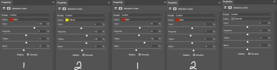
there were many more, but i just chose a few. the '1' and '2' i wrote to demonstrate that these layers were sequential, how they balance each other, and how selective color can be a tedious balancing act-- the second example it's like basically the opposite but it balances it out. also, if you have two characters with different skin tones, or the lighting is different for them, etc, you can use layer masks to erase certain adjustments so it only affects one of the subjects. some of these tweaks will be inbetween me transforming the gif to be colorful, and noticing how the colors interact, etc. so between this i was also making it colorful and it's not exactly the finished product at this stage: but this is kind of what the gif would look like after all the adjustments just to get it looking... normalish:

not totally perfect but MUCH better, and also will look a little different when surrounded by the colors i want to turn it into. i have some stuff about how i color in this tag, i can do a lil other tutorial or smth if needed but bc i have limited photo space on the ask and already wrote so much i wont get super into it here. but for shows like obx, it helps to work with a group of colors that will work with the show--yellows/oranges are easier bc of all the yellow already found in the show. pinks can be harder because there is so much yellow in the show, but doable. greens are good because of all the green in the show, and thus blues are good because its easy to go from green to blue with selective color and stuff. thus, purples are good too because its easy to go from blue to purple! stuff like that makes it easier. some work with selective color, hue and saturation, gradients, and voila!

you can see how maybe some of the issues like it being still a little too yellow/greeny toned balances out with the surrounding colors.
also, a big part of it is just practice! i've been giffing for yeaaaaaars and with media that has just the most god awful lighting so i've gotten good at understanding what to do and sometimes i'm just on auto pilot.
hopefully that helped, i know it was long winded and it can be hard to explain/understand photoshop. if y'all want some more in depth explanation about a part of the process i can try, or with other examples!
9 notes
·
View notes
Photo

Hey guys! 😊 I’ve written this tutorial on how I edit my screenshots! It’s maybe a bit (a lot) more detailed than I originally intended, but I hope it gives you some new ideas/tips/tricks! 💗 (included below: how i fake reshade xD)

So I’m gonna start with this unedited screenshot of Felicia. 😁 I don’t use Reshade in my game, too much hassle. :P Instead, I use overlay textures and Photoshop actions to make my shots look pretty~ 😁
Here’s what that shot looks like after I’ve dragged it onto my echo_base.psd (the file I use for all my Winter Echo posts). I resize the shot only after bringing it onto the psd (but for this one, I’m leaving it at the original size). For Winter Echo panels, I use dimensions of 1011x608px at 72dpi.

Here’s what the shot looks like after I’ve turned on my four overlay texture layers above it. I have a large collection of these because I use them in my illustration work. Most of my textures I get from Adobe Stock (or make myself) but you can find a lot of great free ones on google images by using search terms like “gradient texture” or “overlay texture” (to get the best ones, change your image search settings: Tools > Size > Large). Here are the four I’m using for Winter Echo without their overlay effects applied:


And here are the specific overlay settings I’ve applied to each one:

This requires a bit of trial and error! If you use this method you’ll probably end up mucking around with the overlay effects and opacity a lot because the results will vary according to the textures you’re using and the lighting in the shot underneath. These specific textures and their settings took me a while to settle on and I’ve used a variety of others in the past. 😊

This brings me to the Actions Panel! xD If you use a lot of lighting and colour adjustments on your shots, actions are a really good way to record them so you can apply identical effects to each shot. The shot above has had my “WE Indoor New” and “WE Colour Adjust” actions applied. But that doesn’t help you much, so here’s what I’ve actually recorded for those actions:
Photo Filter

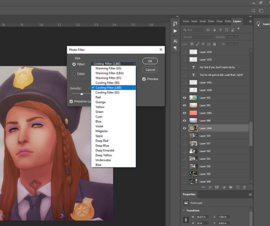
First step is always Photo Filter. Sims shots tend to come out a bit too warm imo, so I usually apply a Cooling filter (LBB is slightly purple).
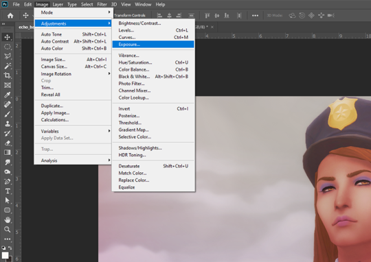
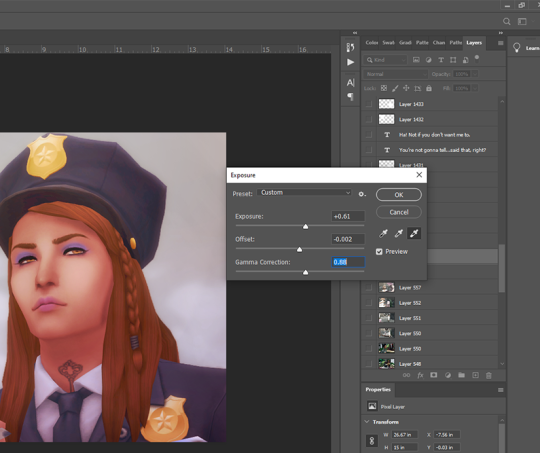
Exposure
Exposure is a bitch to adjust because it will often have wildly different effects in different lighting. So I usually only adjust this a little, and let my textures do most of the lightening/brightening. You can get some very interesting effects with this though (e.g. I used to increase the offset a fair amount to make my shots look more dusty/soft).
Colour Balance

Again, my textures and photo filter are doing most of the work here, but I always add a bit more blue to shadows, and sometimes a bit of yellow to highlights just to take some redness out of skintones.
Levels

I use this instead of brightness/contrast. Just to make whites a little more white, and blacks a little more black, because sometimes my textures can make them a bit dull. Adjust as you like!
Noise

I used to use an overlay texture for this, but I like the consistency of Photoshop’s Noise effect. 😊 Don’t go nuts with this! A tiny bit of noise goes a long way. xD (and also, a higher noise level that looks good on a close up will make your wide angle shots look like a blurry mess, trust me 😅)
That’s all the effects I use in my recorded actions! Next step is...
Dodge & Burn
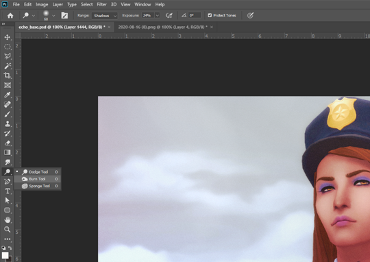
I only use this on shots that need a little extra depth, and only on faces/hair/clothing. Mostly I use the dodge tool on the T-zone of faces and the burn tool (with a large, soft brush) around the sides of faces. Keep the exposure very low to control how much shadow/highlight you’re adding. (You might also want to work on a duplicate layer for this step, in case you end up hating the result and wanna go back to the original xD)
That’s pretty much it for how I edit my shots! Obviously I haven’t gone into the tiny editing things like smoothing really angular edges, fixing clipping, etc or we’d be here all day. 😅 But here’s a little bit extra about how I make my speech bubbles:

I use Photoshop’s Rounded Rectangle tool on a new layer...


The corner radius can be adjusted in this panel. If you can’t see this panel, you can find it under Window > Properties.

Then I use the Polygonal Lasso tool (right-click on the Lasso tool to find the Polygonal Lasso) to draw a triangle on a new layer, and fill it with white.

I merge the two layers (the rounded rectangle layer & the triangle layer) and bring the opacity down to around 75-80% (depending on the shot in the background - if there’s a lot of detail behind the bubble, it needs to be more solid so the text stays readable). I’ve added text afterwards in this example but I always put the text in first, so I know how big the bubble needs to be and where to place it. I keep all these bubble and text layers in the psd until after they’re posted, so I can easily make edits as needed. 😊 (but I don’t keep them forever, because I’d have thousands of layers by now and the psd would take 10min to open 😅)
I hope that was all easy enough to follow!! If you have any questions at all about any of this stuff, or need help with Photoshop in general, please feel free to leave me a comment or shoot me a message! I’m always happy to help 😁💗
83 notes
·
View notes
Text
detailed giffing + basic coloring tutorial for beginners
so a lot of gif/coloring tutorials are pretty outdated or not that detailed & i wanted to put my own out there! in this:
how to get the screencaps for your gifs
how to make a general gif
basic coloring (no psds here, it just gives you a basic idea for making colors pop and look nice. you can look up how to use psds, but i prefer making my own for every gif as it’s much more personal, gratifying, and creative. there’s nothing wrong with using psds as long as you don’t claim them as your own, it’s just not my personal thing)
how to save a gif
we’ll be going from this:
to this
what you need:
photoshop (cc 2019 is what i’m using, but this works with any version of photoshop really as long as you download a version with the timeline feature) i won’t add download links here since i don’t want this deleted, but you can look some up on tumblr or use the pirate bay (current url is pirateproxy.blue as of 4/29/2020) & follow the instructions there.
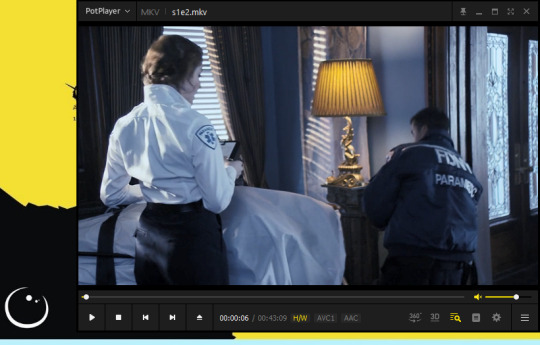
for windows: potplayer/kmplayer (both use literally the exact same instructions) this tutorial uses potplayer but kmplayer uses like literally the same instructions, it just doesnt work right on my computer
for mac: mplayer. this tutorial does NOT cover this so find a tutorial on tumblr on how to take screencaps with mplayer & then skip to the “how to make a general gif” section. though, again, i’m on a pc so i have no idea if this is entirely accurate for mac.
if you’re downloading from youtube: clipconverter
if you’re Definitely Legaly torrenting: utorrent + the pirate bay (again, current url is pirateproxy.blue as of 4/29/2020) or another torrent site + you should really consider getting a VPN when torrenting (i use privateinternetaccess but you can find one that suits you)
note: download an adblock of some kind, disable automatic downloads on your computer, & download an antivirus program if you want because some sites are sketchier than others! this is ESPECIALLY crucial on sites like piratebay. keep your computer safe babes.
1. screencapping
there’s several ways to get screencaps on photoshop, but this is the easiest imo and i’ve never done the whole convert video frames to layers thing. like i said, you’ll need potplayer or kmplayer. i’m using potplayer. important note: don’t accidentally download viruses here! read each screen carefully & make sure you’re not hitting accept to download any secondary programs.
1. download your .mp4/.mkv. you can go to youtube & find a clip/scene/whatever and use clipconverter to download it. just make sure you download it at 720 (or higher) as anything lower than that will give you a poor quality gif. you can also download using somewhere like the pirate bay, but for this you need utorrent & i would HIGHLY recommend using a vpn if you live in a country where torrenting copyrighted content is illegal, as your internet provider may flag your ip address if you don’t & you torrent too often.
2. download potplayer/kmplayer & get it set up
3. create a screencaps folder. i always put mine on my desktop. in your screencaps folder, make a folder for however many gifs you want in your set. i just have one for mine so:
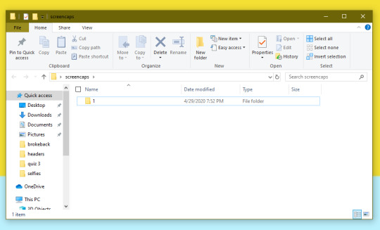
4. open up your .mp4/.mkv
5. hit ctrl + g to bring up the screen capture pop-up & set your settings to these. click the button w/the three dots next to the storage option & select the folder you created for your first gif
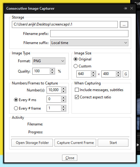
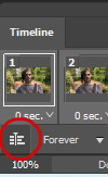
6. navigate to the scene you want to gif. when you’re there, pause it and hit the start button on the consecutive image capture screen, then play the video. how many screencaps you need depends on the size of your gif. for larger gifs (so like 540px wide gifs), you’re probably going to want to keep it below 30 frames. for smaller gifs (268px wide or less) you can maybe stretch it to 60, depending on how much coloring you add. you can always delete screencaps later though in photoshop, so don’t worry about it too much. for this gif, i only had 17 frames because the scene was really short lmao
7. go to your screencap folder you made & delete any unnecessary frames. it’ll look like this:
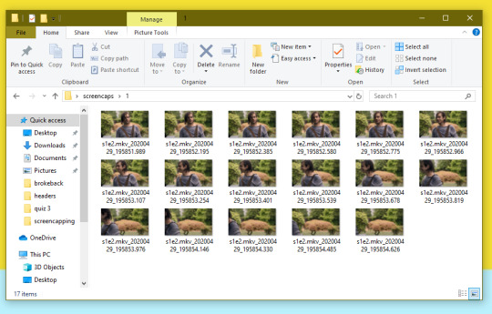
8. repeat the process for any other gifs, making new folders in your “screencaps” folder, numbered for however many gifs you’re making. make sure to change the folder you’re loading the images into on the image capture pop up though so they don’t all go into folder 1.
2. making a simple gif (+sharpening)
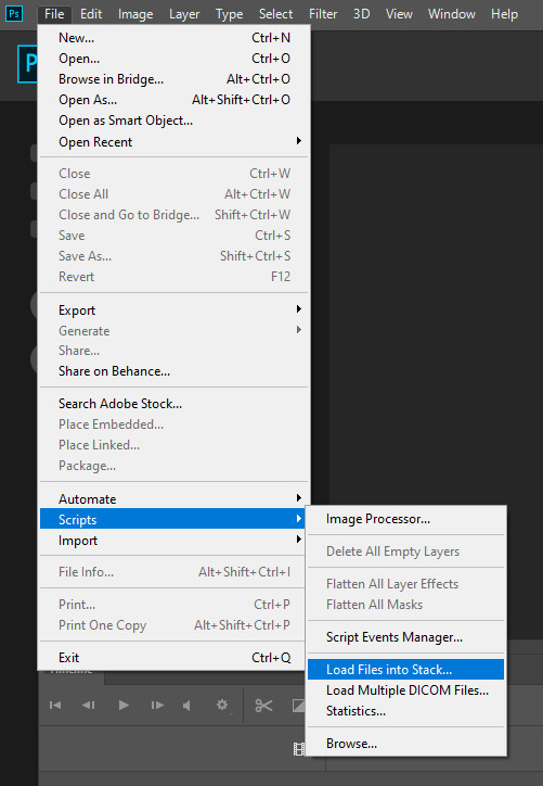
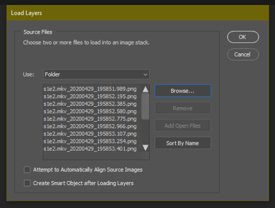
1. first, you need to load your screencaps. when you open up photoshop, go to file > scripts > load files into stack
2. when the window pops up, switch the “file” option to “folder”
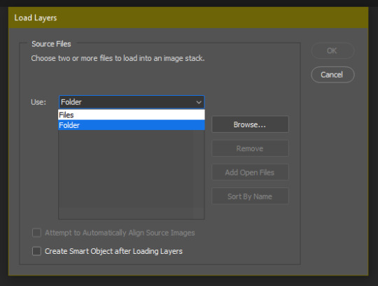
3. click browse and find your screencap folder for your first gif (in my case, desktop > screencaps > 1) once it’s all loaded, click “OK”
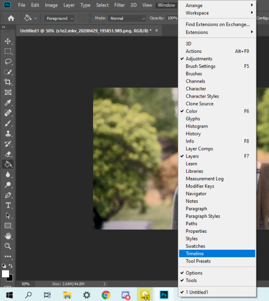
4. it’ll take a minute to load all your screencaps into photoshop. when they do, go to the upper bar on photoshop > windows > timeline
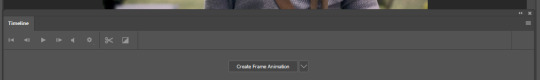
5. when the timeline bar shows up, click “create frame animation”
6. hit this button and click “make frames from layers”
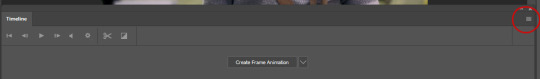
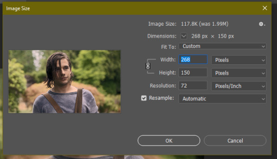
7. hit the button again and click “reverse frames”
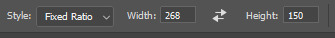
8. click back onto your first gif. then select the rectangular marquee tool and set it to whatever gif size you want. the width for 2 small gifs next to each other is 268px, the width for full size gifs is 540px. most people use 268x150 px for gifsets of 4+

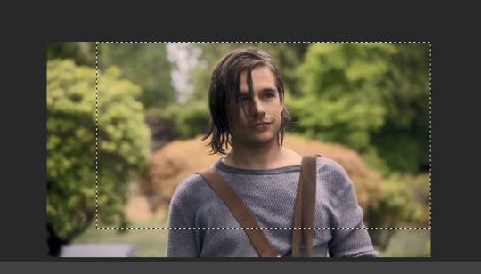
9. use the marquee tool to select what area you want for your gif, like this. it’s up to you how to crop it! get creative!
10. go to image > crop
11. now that your image is cropped, go to image > image size. change the size to your desired gif size (in this case 268x150). hit “OK”. then make sure it’s zoomed in to 100%

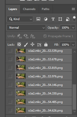
12. now, you COULD just save this gif, but they look way better sharpened. so you need to convert this to a smart object. to do so, first select all your layers in the righthand layer window. to select all the layers, click on your top layer, hold shift, and scroll down to your bottom layer & click on it as well while still holding shift
13. next, you need to select all your frames. go back to the options button from part 6 > select all frames
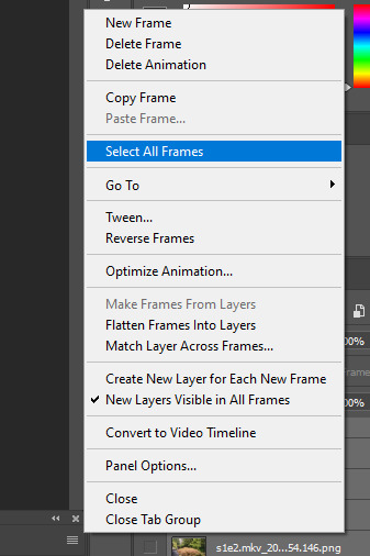
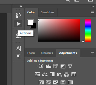
14. next, we’re going to create an action to make your life 100x easier when it comes to sharpening gifs in the future. to do so, go to the actions icon (may look different on different versions of photoshop, but basically just find the actions window)
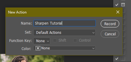
15. create a new action with this button. name it something. i named this one “sharpen tutorial” and hit “record”
16. click this button to convert to video timeline
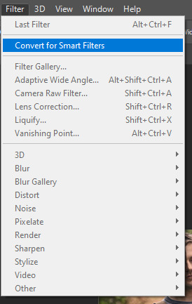
17. go to filter > convert for smart objects
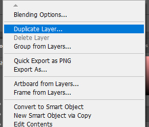
18. go to your single created layer and right click and click duplicate layer. this helps get rid of the transparent border around the gif.
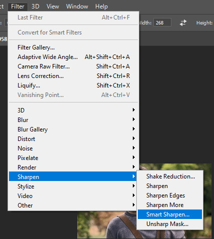
19. go to filter > sharpen > smart sharpen & use these settings
20. go to filter > blur > gaussian blur. set it to these settings.
21. go to your second layer with the filters on it & right click on the gaussian blur filter to select “edit smart filter blending options” and set the opacity to 50%. you can mess around with this for different levels of sharpness. the closer to 0%, the sharper your gif will be.
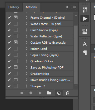
22. hit the stop recording button on your sharpen action. now you’ll have an action to use next time you make a gif! after you’ve followed all the steps 1-13 you simply go to actions, click on your saved sharpening action, and hit play instead & it’ll do steps 14-21 in a few seconds. here’s a pic of the stop button on the actions window
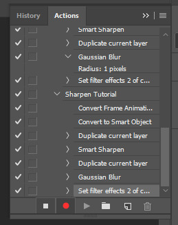
23. our gif is now sharpened! you can end with this & skip to the saving a gif section, or you can continue to coloring. here’s what we have so far.
3. coloring
now on to coloring. this is pretty basic coloring and it probably won’t work if you follow my numbers exactly, as every single scene is different color + lighting wise. but this is just an example of the kind of thing you could do. basically, if you’re making vibrant gifs, you want to up the brightness + contrast + vibrance and make the colors already present pop. if you want anything more complicated (pale gifs, changing the colors to make, say, quentin’s shirt in these gifs red instead of blue), you’ll have to find other tutorials or experiment on your own. learning how to color & finding your style takes time! you can download psds if you want, but imo those kinda take the fun out of making gifs? that’s just me though.
after each step, i’ll show you what the gif looks like.
1. i usually start with a curves layer. i usually don’t mess with the color curve options, just this one:
2. next, i do a brightness/contrast layer

3. next, i do a vibrance layer. make sure not to make it TOO saturated or it’ll look bad.
4. next i do a color balance layer. this is where it really starts differing depending on what color you want your gif to be.
5. next we move to the selective color layers, which are arguably the most powerful. here you can make colors pop, change colors, etc. it’ll take lots of practice & messing around with, but here’s what i did with this gif. this one is making yellow + blue pop
6. next, i did two more selective color layers editing the blue tab to make the blue pop even more


7. i still wasn’t quite happy with it, so i added another selective color layer to edit the blacks + neutrals + greens
8. for good measure, i added one more brightness/contrast layer

9. and the gif is done! however, you can play around with various adjustment layers until you’re happy. again, this is just an example of how to do basic coloring. it’s a skill like any other & takes practice. to keep consistent coloring in a gifset,
9b. you may want to make a psd of this coloring. to do so, you need to put all your adjustment layers in a folder, delete your frame layers, and click file > save as. save it as a .psd. then you can open it and drag it onto any other gifs you make, adjusting the coloring accordingly but still with the same vibes. you don’t have to do this, but it makes life easier. here’s how to use your saved psd, though obviously you’re using your own in this case and not a downloaded one.
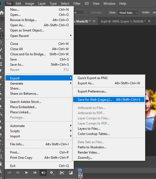
4. saving your gif
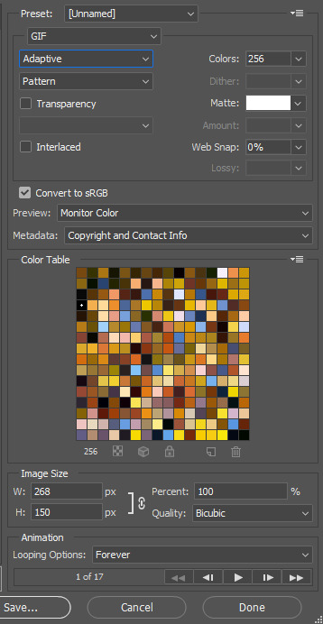
1. on photoshop cc 2019, you go to file > export > save for web (legacy). for other versions, you can just go to file > save for web. use these settings. the gif size limit is 3mb per gif, so make sure your file size is under that. if it’s not, you’ll need to delete some frames or some adjustment layers.
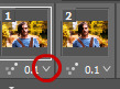
2. now, photoshop is a bit of a pain & this gif timing will not be right. so you need to open your newly saved gif. then you hit this button + select all frames
3. click this button & select “other”. tumblr gifs are typically .05-.08. my photoshop is glitchy and i have to set mine to .1-.15 or they’re WAY too fast. but usually, go with .05-.08 unless yours ends up glitching too.
4. save it like you did the first time and ta-da! you’ve made a gif!
#gif tutorial#photoshop tutorial#edit tutorial#coloring tutorial#yes im using the magicians its my hyperfixation and i get to choose the gifs
164 notes
·
View notes
Note
hi, just wanted to say that i love your tutorials! you have helped me improve so much in photoshop, i cant thank you enough. I was wondering if you know how to archive this edit? (riddlemarvolo(.)tumblr(.)com/post/189886322626/after-all-this-time-always) do you think you can make a coloring tutorial about it? i've tried myself to do it but i don't know how, it never looks like that.
Yes I can! Tutorial on how to get these gifs below:

There are a few ways to get these kind of gifs, I will show a few different ways. My main tip to achieve these gifs is to choose scenes that can easily be manipulated. Don’t try to make a bright yellow gif out of a dark scene. It may be frustrating if you have specific scene, but it will pay off in the end.
On to the first way to get this look and also the easiest, and that’s to focus on the color that’s already predominantly in the scene (like grass is green, fire is red, oceans are blue, etc).
This is my first gif, with sharpening only:
As you can see that main color is green, so instead of changing that to blue, I want to enhance the color. To start I’ll just a few brightening layers. A “Brightness/Contrast”, a “Levels” and an “Exposure”. It doesn’t really matter what settings you use as long as you gradually brighten up your gif. I also want to edit the blacks and whites with a “Selective Color” layer. I won’t show these settings, but I have tutorials on literally everything here.
So here’s my edited gif:

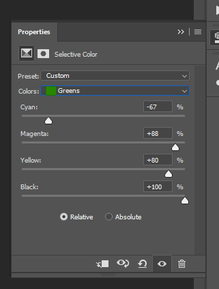
I didn’t add to the colors, saturation or vibrance, but to achieve really solid colors, I want to start with a “Selective Color” layer. I will edit all the colors a little bit, but I want to focus on my main color, green. Here are my settings for the yellow and the green:
A tip for green is to add to both the “Cyan” and the “Yellow”, that way it’s more green then orange-ish. I also edited the yellow since yellow and green colors tend to blend together.
I also want to add a “Hue/Saturation” layer and on the main slider, slide it just a bit to make the overall color green (or whatever your main color is), here’s my setting:
And my gif now:
Since this changed the skin color as well, I want to use a soft, round eraser brush and on the layers, click on the alpha layer of the “Hue/Saturation” layer, this will allow you to edit where the adjustment layer shows on the gif.
For tutorial purposes, I’ll show you with a color layer where I used the eraser:
And the layer now:
Now my gif:
You can also edit the skin tones (and other non-main colored areas) and use the alpha layer to erase everything but the skin.
Now to make the color pop, add a “Selective Color” layer editing your main color, mine being green. Then duplicate this layer a few times for an intense look. You can do this for any color, edit the “Red” for reds “Blues” for blues and so on, then just duplicate the layer.
Now to really make the colors pop, I want to add another “Brightness/Contrast” layer and really brighten the gif. Here’s my settings:
Here’s my before gif:
And after:
Here’s another gif I did, this time instead of focusing on green, cyan and blue was my focus:

The second way is to change the color that’s already predominantly on the gif (like changing a blue sky to pink, or a light blue snowy scene to dark blue).
This is pretty easy after the first tutorial. Once you have your gif ready and up to the “After” step above, you can use a “Selective Color” layer and a “Hue/Saturation” layer to alter the color of the gif. It can be something simple like green to yellow or more advanced like green to red. In either case, make sure to gradually change the color, rather than one big jump.
Here’s my gif:
And here’s my gif now using the steps above to bring out the yellow:
Now, I want to change the yellow to something more appealing (lol), so I want to go to red. First, I want to add a “Hue/Saturation” layer, only edit the channel of the color you’re editing, so for me, I’m only working on the “Yellow” channel. Here are my settings:
And my gif:

So if you make a drastic change, the skin might need help, but just do the same thing as above where you click on the alpha layer of your “Hue/Saturation” layer and then erase the part over the skin if needed. My gif now:

Se how the whites look pink-ish and the blacks look dull? To make the gif look “less edited” you might want to touch up the blacks and whites of the gif using a “Selective Color” layer. Basically if the whites or blacks are too toned to a color and it’s obvious then edit the whites and blacks. Here are my settings for both:
and my gif now:

Now just finish off with another “Selective Color” layer and duplicate it a few times like above and your done! Here’s my before:
And after:

And another gif where I changed the red to green. Here’s the before:

and after:
The last way is to completely change a color to match your color scheme (like a green forest to blue or a beige paper to purple), but there’s two ways to do this. Either your scene is already extremely tinted to one color (like a neon pink lighting, or a blue underwater scene) or to use editing to change the color using color layers and adjustments.
The first is an overly saturated, one or two tone gif like this:

For that, all you need to do is use the first part of the tutorial to make the main color pop. Here’s my gif after that:
Now, add a “Hue/Saturation” layer and edit only the channel needed, mine being red. Here’s my settings to turn the red to purple:
And my gif now:

If like my gif, your color got too wild, just turn the opacity down to your “Hue/Saturation” layer and use a “Selective Color” layer to finish the job. Here’s my settings:
And my before:
And after:
To use color and adjustment layers to change the color of you gif, use the first tutorial to generally brighten the colors of your gif. Here’s mine without singling out specific color:

Now you want to decide what color you want to do. I’ll do green since it’s an easier match. So start to add a “Selective Color” layer to boost your selected color. You may also need to add a “Hue/Saturation” layer like the second tutorial. Here’s my gif:

Now to really get the color you want, add a new layer and using a soft, round brush, color over your gif where you want to change the color like this:
Then you can either set that to “Softlight”, “Hardlight”, “Color” or “Hue”. Here’s mine set to “Softlight”:

Once you get a color you’re happy with, you can use a “Selective Color” layer to make the color pop. Here’s my settings:
I also added a “Brightness/Contrast” layer to brighten the scene up, here’s my gif:
Now just finish off with a final “Selective Color” layer, editing all the colors. Here’s my before:
And after:

Here’s another gif that has a more drastic change. The before:
After:

And to get the white and black gifs (and the gray in between). All you need to do is find a neutral colored scene. Here’s my two gifs, the top being my white and the second my black:

For both of these, you want to start the first tutorial up until the color selecting. Here are my edited gifs:

Now for the white gif, you want to add a “Hue/Saturation” layer and set the saturation for most of the colors to -100. Don’t do this on the red, maybe the yellow channel because you don’t want to ruin skin tones. Here’s my settings:
and my gif now:
I also want to add a “Selective Color” layer and darken the blacks and brighten the whites by adding to the whites. Here’s my settings:
and my gif now:

Now for a final “Brightness/Contrast” layer:
And my before gif:
And after:
And for the “Black”, you want to really brighten and add some contrast. Here’s my setting for a “Brightness/Contrast” layer:
and my gif:

You may need to add a “Hue/Saturation” layer to remove any unnecessary colors like we did for the white gif above.
The final layer for this is a “Selective Color” layer. You really want to darken the blacks, here’s my settings:
And the before:
And after:
I hope this tutorial helps! I don’t make these kind of gifs, but if any of you need help, feel free to message me!
#gif tutorials#gif tutorial#coloring tutorial#completeresources#itsphotoshop#my resources#anon#answered
386 notes
·
View notes
Text
My Giffing Process & Tutorial, Part 2
Part 1
Coloring
Now’s time for the funnest part of making gifs, coloring! It’s my favorite part because you can really use your imagination and make the gif your own. I have a couple of base colorings I use (which you can see here) but I usually make a new coloring for each gifset because I like playing with different colors and have a specific coloring for each gifset.

For these gifs I went for a lighter, low-contrast lighting. I dragged up the brightness and highlights and whites, and dragged down the contrast. After applying these adjustments the gif looks like this:


As for the actual colors, in this gifset I faded out the greens and blues and made the yellows and reds soft coral shades. I often use the Color Balance layer to erase the greens and bring up the reds, and that\s what I did here too. With the two Hue/Saturation layers I faded out the blue and brought out the reds, making them softer and lighter to fit the low-contrast style I was going for. In Selective Color I tweaked the tones of the red a little to get the soft coral/orangy tone. And this is what the gif looks like with all the coloring layers applied.

Sharpening
The last step in my gif making process is sharpening. I have used many different settings and methods of sharpening, right now I’m using the settings from this tutorial. It uses both Smart Sharpen and Gaussian Blur together, and I think it looks really nice.

First you need to click the icon on the bottom left corner to change the Frame Animation back to the Video Timeline, as seen above.

Then go and select all your layers of screenshots on the right. Right click to bring up the menu and click Convert to Smart Layers.

Make sure you have the new combined Smart Layer selected and then go to Filter > Sharpen > Smart Sharpen.

These are the settings I use for Smart Sharpen.

After applying the Smart Sharpen, the Layers panel should look like this.

Right click the layer and select Duplicate Layer. It opens up a menu box where you can rename it, but I usually just go with the default one to save time and click OK.

Select the new, duplicated layer and go to Filter > Blur > Gaussian Blur.

Apply these settings and press OK.

Your layers panel should now look like this. The Gaussian Blur is a little too strong just as is, so a couple tweaks are still needed. Double click the little icon marked to bring up a settings panel.

Apply these settings and press OK.

And finally, set the opacity of the layer with the Gaussian Blur on it down to 50%. This tones down the blur enough to still be there and have an effect, but not to render the other Sharpening pointless.
Exporting

The last step; exporting. Go to File > Export > Save for Web (Legacy).

In this view, make sure you have selected GIF in the upper right side, and that the gif size (under the preview window on the left) is below the Tumblr restriction. I’m still not 100% sure what the new upped limits are now, but I like to keep my gifs under 6 mb, just in case. Here there is no problem, as the gif is only about 1.5 mb. There are a bunch of settings on this window but I don’t really touch them that much. Once you’ve checked that everything is good, click Save and save your finished gif!

Hope this was clear to follow and maybe useful too! For me it’s always interesting to see other people’s giffing process and compare it to my own and maybe learn something new!
22 notes
·
View notes
Video
undefined
tumblr
I’ve learned a few things since my last tutorial post, so I decided to break down my process and write up a new tutorial for one of my more recent pieces.
Here is a link to the finished piece, commissioned and posted by @finnreyultd! Drawn in Photoshop CC 2019.
More below the cut!
1. Layout. Roughly sketch the major pose(s). It may help to split the canvas into a 3x3 grid and try to place points of focus where the grid lines cross. Another option is to use thick brushes and blot out large areas of light and shadow. Of course, don’t let that limit your creativity!

2. Detailed sketch. Once you’ve decided on the layout, refine the details of the sketch. Here’s where you correct proportion errors, use the transform tools, and flesh out where you will put the final lines. (I actually decided to switch to landscape orientation at this point!)
3. Outlines. Reduce the opacity of the sketch layer(s) and draw the outlines on a new layer at 100% opacity. This helps prevent that oh-no-I-accidentally-drew-all-of-my-good-lines-on-my-sketch-layer situation.
For the thickness of the outlines, Scott McCloud (and other artists) say to use a thicker line for the outermost lines of a form/character, and use thinner lines for inner details. The actual thickness is up to you, but this guideline has really helped me make my lines look cleaner, even in the sketching stage.
For the colour, I personally like to use a dark, partially saturated colour for outlines instead of black. If I need to, I’ll change it later using hue/saturation/lightness adjustments.

4. Block in flat colours. This step can be done by colouring in the flats manually or with the magic wand selection-- but that will depend on how clean the linework is. My lines don’t always connect at the corners, but this method works well enough lately.
Using the magic wand tool set to ‘Sample All Layers’, select an area or multiple areas to fill with colour. Go to Select> Modify> Expand... and expand the selection until it overlaps with your outlines (the number should be maybe half of the brush size, depending on your line thickness). Then you can fill this area with the desired colour on the flat colours layer. Here’s a video tutorial on how to do this and turn this into a handy quick action.
When choosing flat colours, I try to decide the background colour and lighting first, so it is easier to choose whether to choose colours that have unity with the background. In this drawing, I started with a dark reddish-grey background, so I chose flat colours that are slightly darker and tinted red.

When I’m done this step, I have one layer with all of the flat colours (or one per character) that looks like this:

5. Shading. Saying is easier than doing, of course...
Create a clipping mask on the flats layer. Using the flat colours layer as a way to select one colour/object/piece of clothing with the magic wand tool, I shade by painting within the selection on the clipping mask layer.
Now you don’t want to have to look at the flashing selection outline all the time, so you can hide them with ctrl+H, or View> Extras (off). The selection is still active, but the selection outline is hidden.

When it comes to how to shade, I can’t really explain that, except saying to look at real life examples (like reference photos, or your own hand next to a lamp) and try to capture the direct light, the core shadow, and the indirect or bounced light.
Realistic shading is much more complex than that, but this simplistic view of thinking about it really helps me for drawings like this. It also doesn’t hurt to exaggerate these shades (e.g. making bounced light that isn’t actually there) when it looks good!

Tip for blending: in Photoshop, holding the Alt key when you’re using the brush tool brings up the eyedropper tool, and the ‘x’ key switches between the two colours in the palette. These two shortcuts are really helpful for quickly picking and painting colours to blend your shadows and highlights together.
6. Zoom out. At this point you’ve probably been looking closely at your work for a long time. Zoom out and see if everything looks as you want it to.
Do the lights need to be lightened? Do the characters stand out from the background? Are the outlines too light or too dark or not thick enough? Does the image look like it needs to be tinted with a colour?
This is where I make new layers and try out adjustment layers and blending modes to see if edits like painting a big highlight over the whole image makes it looks better. I typically end up with a layer set to ‘Overlay’ or ‘Linear dodge” with some soft highlights over the foreground characters.
In this one, I also added a clipping mask over my outlines so I could darken them in places that needed to be darker, like Finn’s hair, or towards the shadow in the bottom left.
And voilà!

I hope that was helpful to anyone! Hopefully these concepts can be applied to other programs if you don’t use Photoshop!
Feel free to message me if you have any questions. Good luck to you and your art!
52 notes
·
View notes
Text
How to change specific colors in a scene (gif) - tutorial
Hey!
So I’ve gotten a few requests regarding how I do the color change on Daenerys outfits which used to be blue but changed into red (as seen here and here) but also color change in general. I’m no way a pro when it comes to this - and this tutorial is based mostly on me playing around in Photoshop waaay too long, lol. There is most certainly better tutorials out there, but this is how I do it.
I apologize for not having any clear before-and-after examples, but it can be applied to literally anything; changing a normal red rose into a blue one, a green dress into a purple one etc etc.
This tutorial does require basic Photoshop knowledge since I won’t go into in depth on how layering works etc. Anyways, it depends a looot on how the color you want to change is to begin with (in this case, she had a very deep blue outfit, and I want it to be red. And in this case it was very light blue, almost white, but I wanted it red as well). A rule of thumb, if it originally already has a strong color the easier it is to change it into another specific color:
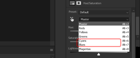
1. Let’s hypothetically say the color I want is red, but at the moment it is blue, I would firsly create a new Hue/Saturation adjustment layer:
2. Next, since the color is blue at the moment, you want to choose the blues (and often cyans as well) in the adjustment layer:
3. After that, you want to adjust the hue til’ you get the color you want (in this case red). It differs from gif to gif where you want to pull the bar, but more often than not if you want to make something redder you pull it towards the red. Also adjust saturation if you need/want to make the color more vibrant or less so:
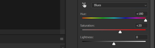
4. It is important to note you might have to do this a few times, meaning, that you might need more than one Hue/Saturation layer. It depend a lot on the scene you are giffing. Also, you have to adjust to the current color - so if it’s no longer blue but maybe, let’s say it’s like orange, you have the choose yellows (or maybe even reds) instead. I also play around with Selective Color (an adjustment layer) to get the wanted color.
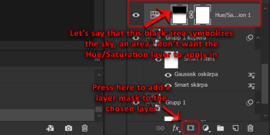
5. But what if there are other blues in the scene - such as the sky - that in this case also would turn red? In this case I just add a layer mask and choose which areas of the gif I want the adjustment layers to cover. The blacks symbolizes the area I don’t want the color change to apply in and the white the area I want the color change to apply in. Basically, just choose the color black and start painting the sky:
*This is also a good trick if you want to change the color red and/or yellow into another color. This is due to skin often changing along with it. Layer masks are a life saver then if you don’t want the skin of a person change to, let’s say green (unless your plan is to make Poison Ivy and in that case you should tag me cause she is the love of my life).
6. Anyways, if I have multiple adjustment layers (maybe I used 3 Hue/Saturation layers and 2 Selective Color layers) and I want to add a layer mask to all of them I usually add the layers into a group and then add the layer mask to the group. That way all the layers in the group will be affected - and I don’t have to add a layer mask to each and every one. It’s a good lazy option, haha.
7. To make it a bit more “realistic” I usually add the adjustment layer levels and change the contrast to darken/lightening it a bit. But only to the area where I have applied the color, therefore, layer masks are once again my best friend in eliminating the areas I don’t want changed.
Once again, this is only the basic information of how to change specific colors since I often play around with a lot of different adjustment layers in order to get the exact result I’m looking for. Practice makes perfect!
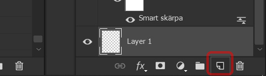
However, if the thing I want to change color on doesn’t have a deep clear color (which was the case with her dress here, which originally was very very light blue - almost white - in the areas where I wanted red) I have to basically paint on the color I want to the specific area:
1. Firstly, create a new layer and apply the color to the chosen area (if it’s a dress I want to change from white to red, I color the dress in red). It will look weird to begin with, but bear with me:
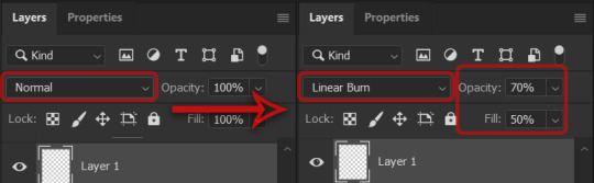
2. Then change the layer you just created from normal to linear burn (color burn also work). I usually adjust the opacity along with fill to make it look more “realistic”:
3. As I mentioned previously, to make it a bit more “realistic”, I add the adjustment layer levels and change the contrast to darken it a bit. I more often than not add a layer mask here as well since I do not want it to apply to the entire gif.
4. I often play around a lot with Hue/Saturation layers and Selective Color layers as well here to really get the color I’m looking for.
*This way of coloring is difficult if the person is moving a lot (at least to me) - so it’s best if the person (or thing - whatever you want to color) is somewhat still. Otherwise the color will splouge over to other unintended areas (but I think a bit is expected - I usually just accept the facts some areas that I don’t really want colored will get some coloring anyways).
This tutorial is a bit all over the place, sorry about that! And it might not be the most efficient way. But hopefully it helps someone with the basics of changing a specific colors. And as usual; practice makes perfect. Play around a lot and it will get better and better! I had no knowledge before I started experimenting - and I still am.
40 notes
·
View notes
Photo


How I Add Shading
I was recently asked about how I go about shading my drawings, so I decided to put together this tutorial to hopefully help show what my process is! This style isn’t too difficult to do, but I’ll try to explain it a little more in-depth so hopefully everything is covered.
It should be noted that this tutorial is more focused on how I ‘stylize’ my shading--not on where or how I decide to put shadows. I’m still working on improving that myself XD
Tutorial under the cut.
Sadly I’m not shading a Pokémon for this tutorial :C Originally, I was just going to make this a quick little thing for the friend who asked, but I decided I’d just create this instead. So here we get some random wonky drawing I found that already had line art :D
---Also before I get into it, I should mention that the program I use is FireAlpaca. (because it’s free and i’m cheap) Some art programs may not have the same tools or may have the tools in different places. I’d suggest looking up whether your program has similar tools and brushes if you wanted to try out my style of shading. There’s always alternative ways to go about it though!---

So as I already mentioned, I start out with the line art. While this isn’t part of the shading, I’ll just mention that I generally use the Pen tool with the correction set to 20 (which can be found at the top of the program when the pencil to the left is selected).
The correction tool makes it easier to draw smooth lines. As for the pen width, it depends on your canvas size and how thick you want the lines. This canvas is 2975x3850 pixels and I used a pen width of about 10.

I lay down my flat colors next in another layer underneath the line art. The paint bucket tool is a friend--although I’d suggest checking the corners for missed patches.
Now we can get to the shading. I like to make another folder between the line art and color layers. Folders are also friends c:

Now I actually block in where the shadows are going to be. Often times it helps to draw where your light source is coming from so that you can keep the lighting vs. shadowing consistent. Not that I’m great at that XD

I tend to use a reeaallly saturated color while initially drawing the shadows. Bright reds and cobalt blues tend to be my go-tos depending on which has the most contrast to the picture I’m working with. It makes it easier to see where you’ve already added it and see where you might need more shading.
While blocking in the shadows, I just use the same pen tool as I did for the line art and coloring. Once again, keep in mind where the light source is! You’ll want to block in the shadows on surfaces that are facing away from that source.

Now that the sections I want darkened are blocked in, I want to change the shadows from that annoyingly bright red to something else. In order to do that, I go to the layers tab and find the “Protect Alpha” button. I want to make sure that box is checked off.
What that button does is it allows you to be able to color over what you’ve already drawn in that layer without going out of the lines. So now I can take a larger brush with the hue I want my shadows and just sweep it across my drawing to change the color.

Once I recolor the shadows to the main color I want, I often times add this little extra step. Basically I like to change some of the hues to similar colors of surrounding objects.
So let’s say this person is outdoors. I'd color near the feet a dark green to represent indirect light from the grass below. I’d also change the top of them to have a lighter blue for the sky. I like to use the Air Brush for this part. (It also might make more sense if I actually had a background XD)
Now this isn’t quite how indirect light works, but this is my little take on it, and I’m just saying boo to realism apparently :P You can always look up an actual tutorial on indirect lighting. I just think this adds a little variety to my simple shading style.

Now I want to turn back off Protect Alpha on the layer. I’m going to select the Blur tool now. With this tool, I can trace along my shadows and it will create a fuzzy edge. This helps give the shading a softer look and blend in a bit more with the picture.
The size of pen and Blur Intensity depends on the size of canvas you are using and on personal preference. A larger brush will blend it farther and spread it thinner and a lower blur intensity will blend it less, keeping more of the original lines. Opposites will of course do the, uh... opposite...

This is what it looks like after I’ve blurred all of the lines.

Now I’m going to change the type of layer it is. To do that I go over to the layers tab and find the section that says ‘Blending.’ By clicking the triangle, a list drops down with different options that I can change my layer to. I use Multiply for my shadows layer.

Now the layer appears darker. The colors underneath it influence the colors of the shadows I’ve added as well. This makes it look a little more ‘natural’ after this next step in my opinion than if it were on a normal layer.

Here’s a simple step! All I do is change the layer’s opacity to 50%. This makes the shadows partially transparent so that they are not so dark and you can see the color underneath them more!
Now sometimes I just end shading right here as it is. But other times I like to add another dimension of shading into it to make it pop out a little more.

Here I am selecting my whole image so that I won’t be able to draw outside of it. (I technically could have/should have done that for the shadows as well, but it’s not too important.) It is good to do it for this step though due to the type of brush I’m using and the size of it.
So first I created a new layer, which I named ‘light.’ I’m going to add some extra lighting effects on top of the drawing here. Now to select the whole image, I first placed all of my previous folders into one collective folder. While having the main folder highlighted, I can click the ‘Select’ button at the top of my program. There are options where you can Create Selections from Layer. When I click that, it will create a selection out of everything I have drawn so far. With the selection active, I can draw freely on top of my drawing without having to worry about getting out of the lines.

I swapped to the Air Brush now. I chose a light, bright color and set the opacity of the brush to a low percentage. In this case it was 5%. The color can always be changed later similar to how I did the shadows.
Here I’m layering on areas where the light hits the person directly. With a lower opacity and wider brush, it is easier to blend the strokes smoother. While I add in the lighting, I do end up adjusting the size of my brush so that it can fit between the areas I want to lighten.

After I finished adding as much lighting as I desired, I also swapped the layer type again. This time I changed it to Add instead of Multiply. It’s much brighter now.

And now for the final two steps. I change the opacity of the light layer to 25%, and I add another layer above the line art. On the new layer I use the watercolor brush and paint on white shines onto the eyes to make them seem more lively. (I also add a bit of highlights to the teeth as well, but they aren’t as noticeable.)
And finally I’ve finished.

Here is the finished product!
This style isn’t actually too difficult to do, it really is only two different tones of shading. The only reason this “tutorial” is so long is because I went through every step of adjusting the layers and finding the tools.
I applaud anyone who actually managed to get through this whole thing o.o It turned out much longer than I intended, but I wanted to show the specific tools in case someone else wanted to try out some of these steps. And now I’m tired and am just going to leave this as it is. I hope this helps or inspires someone out there! Or maybe just appeases anyone’s curiousity :P
Also if anyone happens to actually try this out, I’d love to see XD And once again, different programs may have different tools! Never hurts to experiment with what you have!
Hopefully I didn’t forget anything! Feel free to submit questions to me about anything else and enjoy arting! :D
#charmander#tutorial#reference#art tutorial#shading tutorial#how I draw#pokemon#uh... dunno what to tag#my stoof#my art#art#shading#what are my usual tags...?#anyway sorry this is so long#it really is a good thing I had the cut o.o#now i'm gonna go get food.#also random note but that first picture of charmander is supposed to be my streaming picture XD#if I ever actually do art streams that is :P#if I do you'll likely see it again
21 notes
·
View notes
Photo

the long awaited updated icon tutorial in which i will show you how i make all of the different icons that i make. (it’s a bit long so... you have been warned)
for this icon tutorial you will need:
a screencap
an icon psd
doodles / textures / templates
i. BASICS
okay, so you open your image on photoshop, here's Mera (the love of my life)
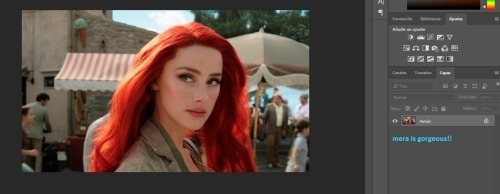
next, what i do is i duplicate the layer by right clicking on Mera and selecting duplicate
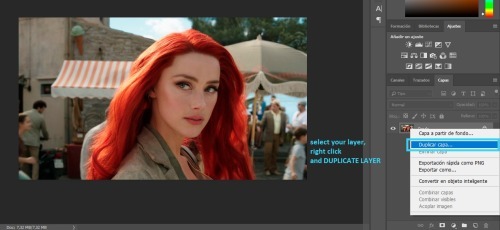
and i do this until i have three copied layers and my original
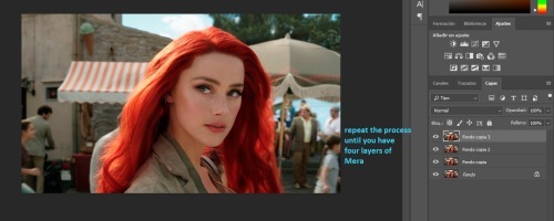
then i select the first layer and add auto tone
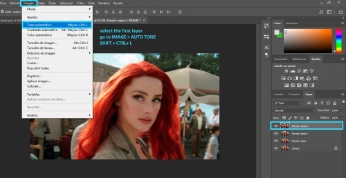
for the second layer i add auto contrast
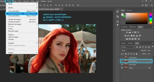
and for the third layer i add auto color
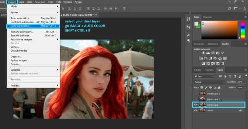
and i select those three layers and lower the opacity to 25% - i do this because it balance's the picture's look.
sometimes if the picture is too blue, the auto color will bring it back to its original color. in those cases, i use the fixed image as the "base" and set the blue image to 25% opacity.
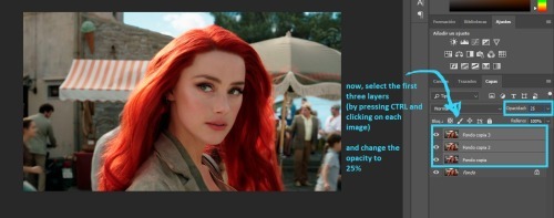
andf finally, i like to crop my picture. (you can crop it again later if you don't like the results, i simply like getting an idea of what my icon will look like)
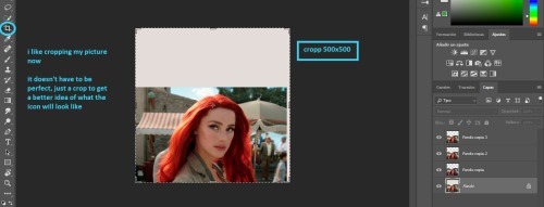
finally, i merge my layers together
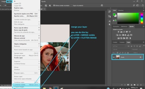
ii. COLORING
the first thing i do for coloring is add my icon psd. you can color your icon any way you like, but if you want to use my psd i will show you the basics of how to edit it so it looks good on any icon.
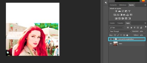
the first thing you need to do is open the folder. and take the visibility off all of the layers it contains, like so
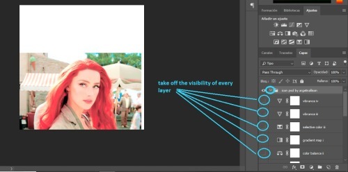
now, i do my editing in pieces, so first i look at brightness layers
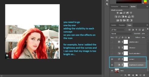
most likely, your picture will be too bright like mine. what you need to do is add another brightness / contrast layer and lower the brightness a bit
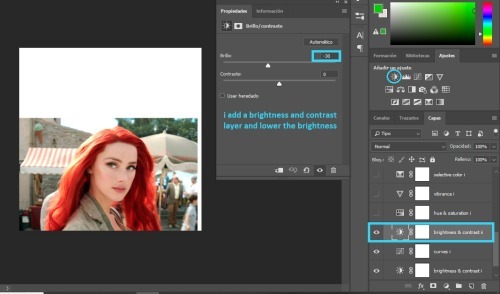
then i look at the saturation layers. and what i want to check is if my image is too yellow, or too red, or too much of a color.
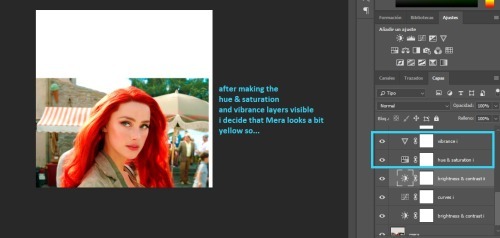
and if so, i fix it with a color balance layer.
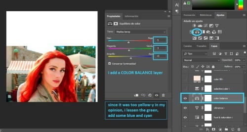
next i add all the selective color and the color fill.
the selective color should work for all fandoms (it has for me), but the color fill will need to be modified depending on the brightness of your image.
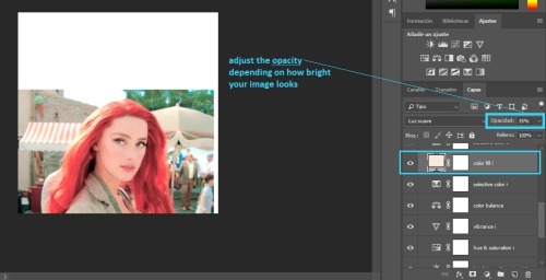
you can now add all the layers up to the gradient map.
you will need to lower the opacity of the gradient map depending on what you think looks best in your image
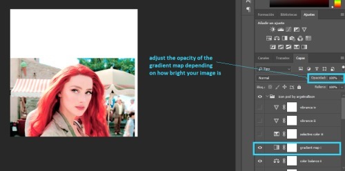
at the end, i have two vibrance layers. you will not need both, so check each one to see which one looks better and delete the other one
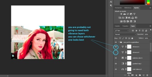
we are pretty much done with the icon psd
i like to edit the skin a bit, to make it look smoother. this is optional so you can skip this part if you don't wanna do it.
anyway, i add a new layer and chose a skin tone. (i used #ebcdc9)
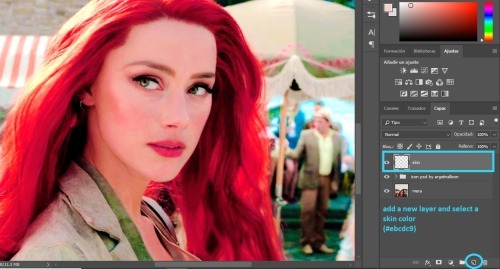
i set the layer to COLOR and i paint over Mera's skin
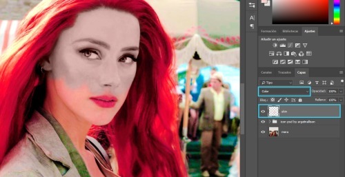
then all you do is adjust the opacity. somewhere between 10 and 50% should be okay.
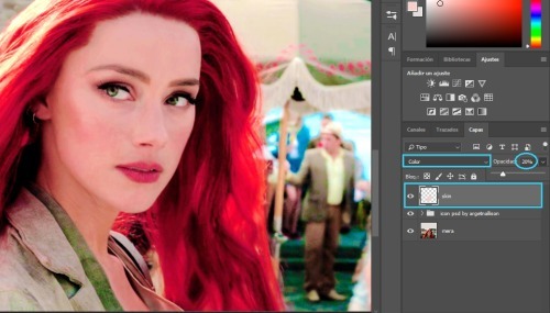
i add another layer, and i paint over her skin with pink (#ce2c64), i set it to SOFT LIGHT and lower the opacity to somewhere between 10 and 50%
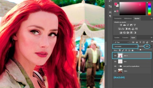
i am all done with her skin
then i add another layer, set to SOFT LIGHT and paint over Mera's cheeks and lips with a pink or red color. (i used #ce2c64).
i lowered the opacity to 26% but this is optional
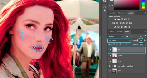
next i edit the eyes
i add a new layer set to COLOR and use a small brush to color over her eyes with white.
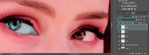
then i duplicate the layer and set it to SOFT LIGHT
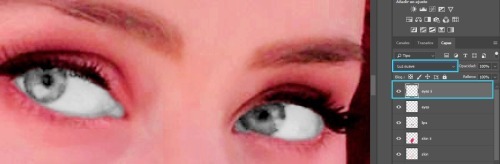
in that same layer, i color over her iris with green (´cause her eyes are green, but you could use any color you wanted)
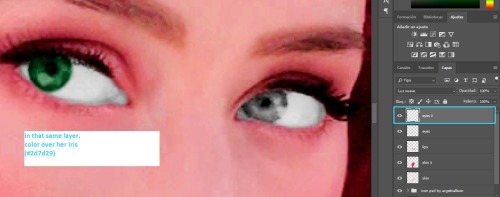
then i use a very small brush to paint around her eyes (sort of like eye-liner) with black or dark brown
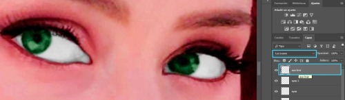
i think it looks bad, so i add some gaussian blur
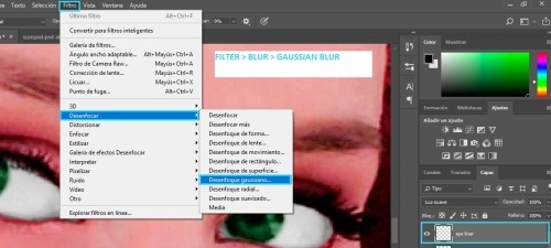
with these settings:
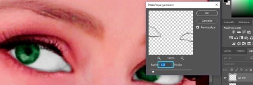
i zoom out
i add a new layer set to COLOR and i use an orange color (#d96932) to paint over Mera's hair. after, i lower the opacity to whatever i think looks good.
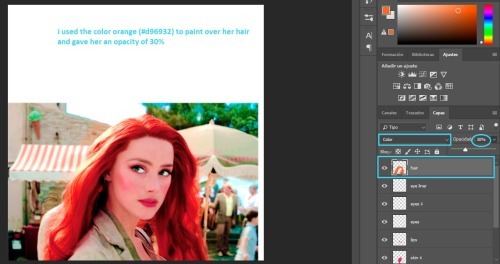
i duplicate the layer, set it to SOFT LIGHT and change the opacity again.
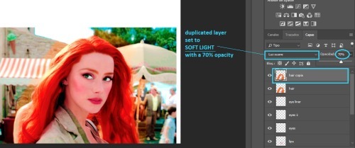
this step is also optional
when i color over her clothes i usually chose whatever color i want, paint over her clothes, set the layer to COLOR or SOFT LIGHT
but, i will show you a trick i use, so instead, paint over her clothes with white and set the layer to COLOR
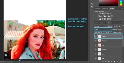
when you are done, duplicate the layer and hide it from view for now.
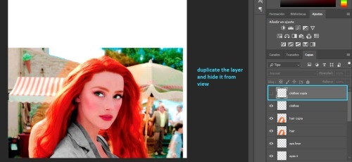
merge your image again, but make sure you merge the visible layers so your clothes layer doesn't get deleted!
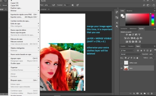
iii. CUTTING OUT
at this point i like to add my background. i use pre-made gradients made by me (you can learn how to make them here). but you can use a normal color fill background or you can find gradient packs to use.
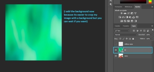
that layer goes behind Mera
now we have to cut out our icon. if you guys have a preffered method, you can go ahead and use that. i have some methods here. but i will show you what i like to do
we're going to add a layer mask on our image
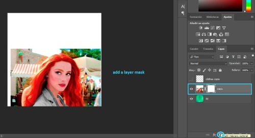
i select the eraser tool, with a small brush, and 90% hardness
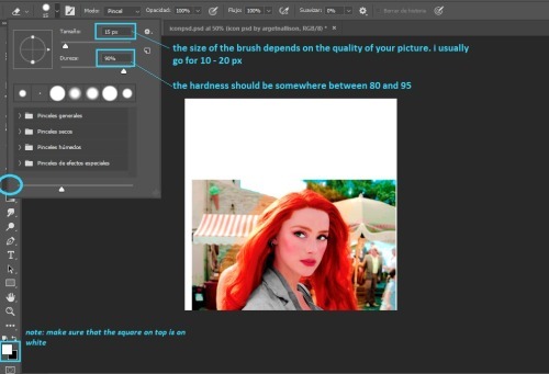
i zoom in and i paint an outline around Mera.
when you are done, you should have something like this:
note: the outline's thickness doesn't matter much, but the thicker it is, the easier it will be to do the next step
we change the size of the brush
and paint over the rest of the image
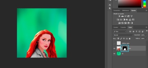
we will duplicate the Mera layer
and drag the layer mask to our clothes layer
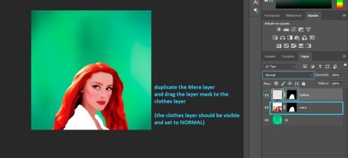
now we add a color fill layer
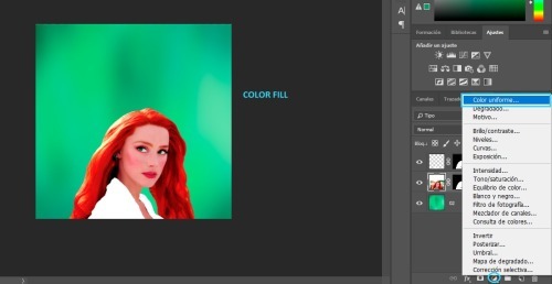
set to black (#000000)
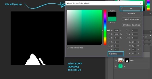
then we merge the black color fill layer with the clothes layer
(you select both of them, right click and select merge)
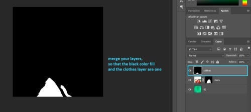
next, click on CHANNELS and then click on the dotted circle at the bottom, this will select the white in your image (but it only works if the image is black and white).
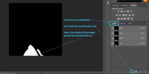
then go back to layers and clik on the layer mask
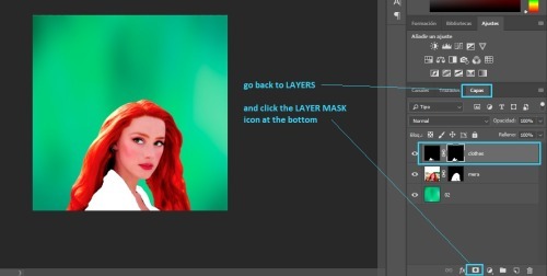
finally, i duplicate my background drag it on top of Mera and add the layer mask we just created, like so:
note: you can set that layer to SOFT LIGHT or COLOR depending on what you think looks best, and you can adjust the opacity as well.
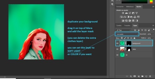
now back to our Mera layer.
i like to convert it to smart filter
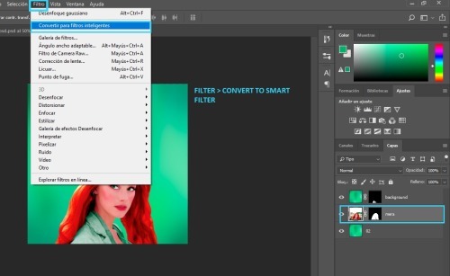
and i duplicate the Mera layer
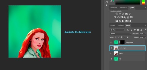
then, i add vibrance to the duplicated layer
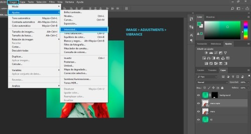
i add all of the vibrance
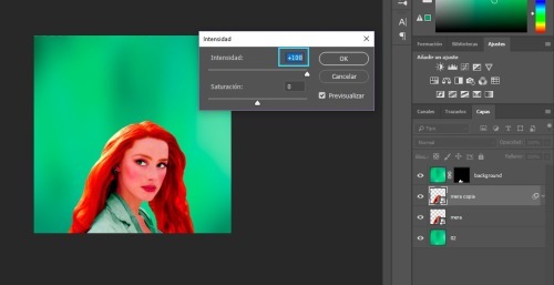
next, i add gaussian blur
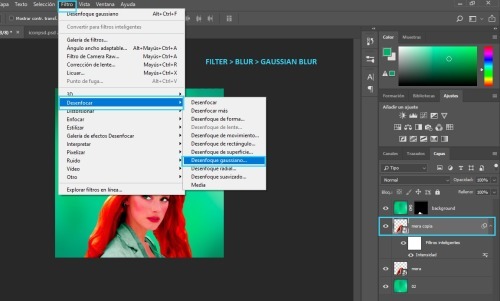
you should chose the settings
i usually go for 15px, but it depends on your image.
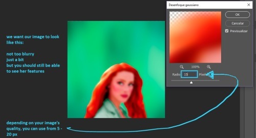
and i adjust the opacity
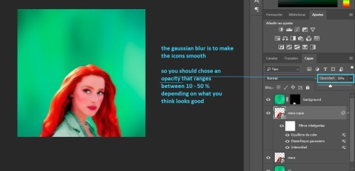
at this point, the icon is pretty much done.
i like adding a few final touches. first, i add a gradient map layer
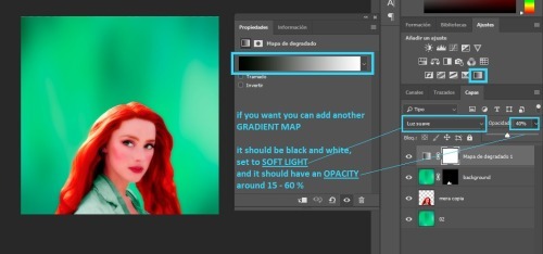
then, i add a new layer set to SOFT LIGHT
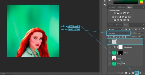
then, add a gradient
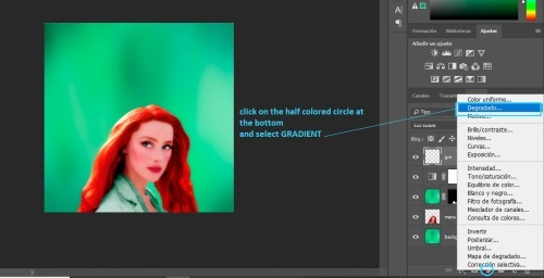
next, you will get a pop up.
you can select the same color as your background if you like
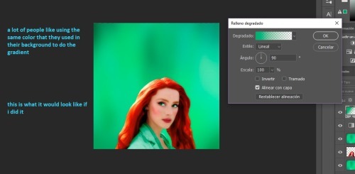
but, i like for my gradient to be black and white, so...
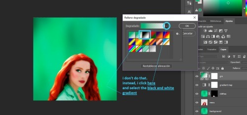
then, once you chose your color, you can change the angle here
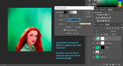
and the last step is adjusting the opacity
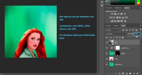
we are done! the last step is to merge your layers.
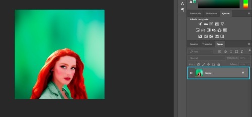
iv. SAVING
to have the best quality, you need to save your icons for web.
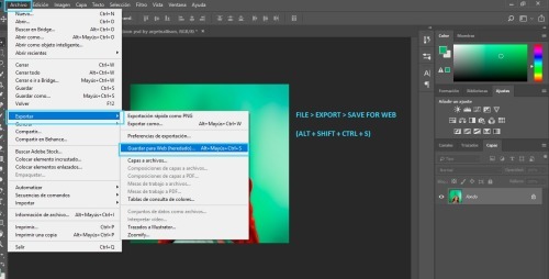
these are the settings i use:
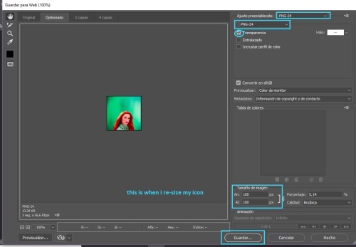
v. CHANGING COLORS
now you might be thinking. "Michell, why the hell did you make me do all that stuff for her clothes? Like, what's the point?" well... having that layer mask makes it so easy to change the colors
all you have to do is add a new background, duplicate it, and drag the clothes layer mask to the duplicated background layer
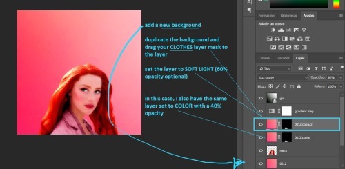
vi. TEXTURES

there are two ways to add textures
the first one is if the texture is the same color as your background. all you do is set it to SOFT LIGHT or SCREEN or whatever else you want and you are done! like this:

and the second one is if you want to use a texture that is a different color than your icon, like this:
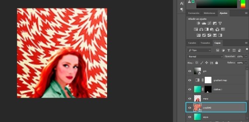
what i do is, i select that layer and go IMAGE > ADJUSTMENTS > VIBRANCE
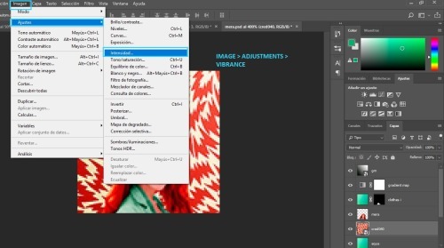
and i get rid off all the vibrance
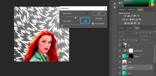
and now i can set it to SOFT LIGHT (or anything else i want) and it will look awesome!
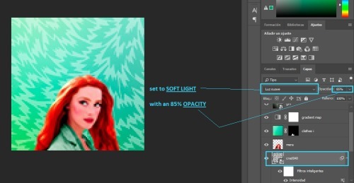
note: here are some of my favorite textures and here are some of my textures
vii. DOODLES

adding doodles is super easy. all you need to do is drag them over your icon, change the size and maybe rotate them a bit
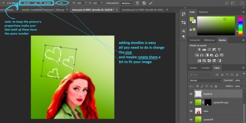
you can leave them as they are, or set them to SOFT LIGHT or SCREEN
note: i don't use doodles much, but you can find some here
viii. TEXT TEXTURES

for text/lyrics textures are very easy to use. i mostly set them to SCREEN. and as you can see above there's a bunch of different styles you can do, which i really like
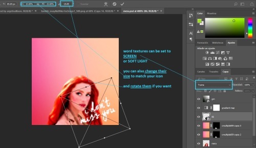
for these, the most important thing is the size. remember you can make the textures smaller or larger to fit your image
ix. SHAPE ICONS

these icons are really easy to make. all you need to do is add a layer mask
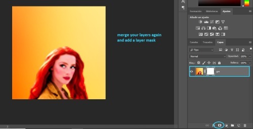
you add your template over the icon
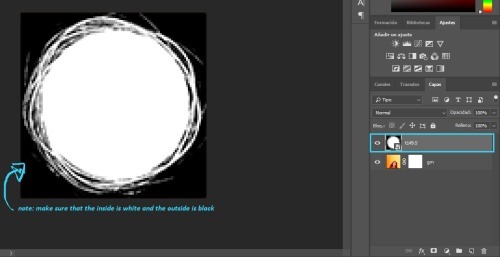
you click SELECT > ALL and once the image is selected press CTRL+C to copy the layer
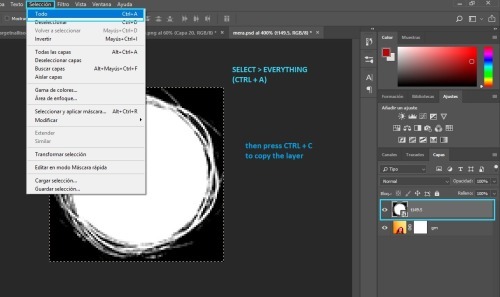
then press ALT and click the white square on the layer mask
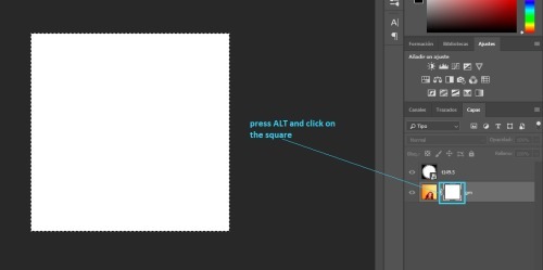
press CTRL+V to paste your template
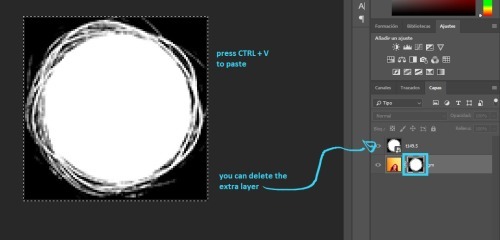
finally, convert your image for smart filters
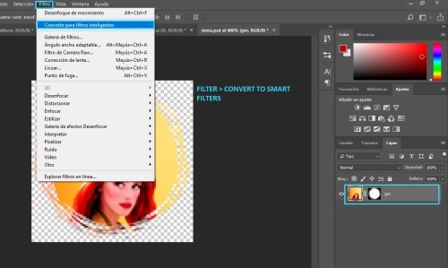
note: here's a template psd i made
p.s. here's a full tutorial in case you need more help
x. CIRCLE OUTLINE ICONS

these icons are really easy as well! first, you need to make a circle icon (with the tutorial above) and you will need some circle outlines or flower crowns. (i googled them to find the ones i used)
anyway, you place it on top of your icon like so
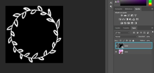
then we go to CHANNELS and click the dotted circle
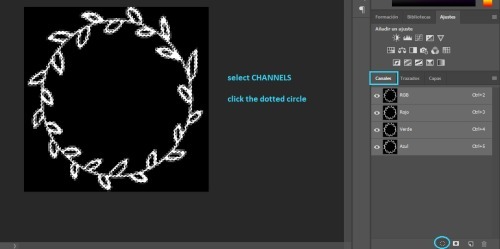
go back to LAYERS
next add a color fill layer, with whichever color you want (i use white always)
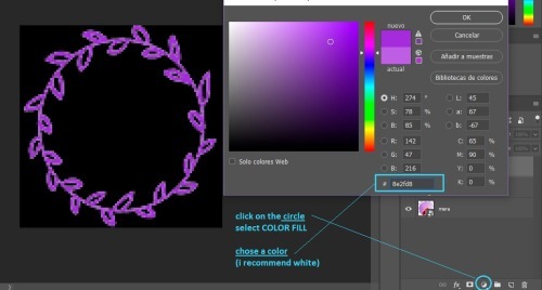
and then you get this.
(you might need to re-size your circle icon a bit, just press CTRL + T and change it in the squares at the top)
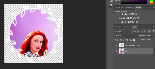
that's all!
if you have any more questions my askbox is open!
541 notes
·
View notes
Note
Hey, since you released a PSD, just a question: why do a lot simmers release PSDs instead of Photoshop Actions? It's a lot faster to edit photos with actions instead of PSDs.
First of all, I do agree that actions are a lot faster than PSDs. Especially useful if the lighting of your screenshots are fairly consistent.
As for your other question, I’m just speaking for myself here, but I want granular control of each photo I edit since I tend to edit different kids of shots in one sitting. Maybe the photo is too red so I need to make adjustments here and there, or adjust the brightness or opacity of a certain layer before I sharpen and save.
There are some actions that flatten the image at some point, for example. But what if I want to preserve my layers?
8 notes
·
View notes
Photo
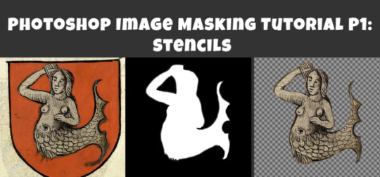
Photoshop Image Masking Tutorial Part 1: Simple Layer Masking to Image with Alpha, for Stencils and Overlays
As promised to a few people now, here is a (probably overly long) tutorial on masking in photoshop. Masking is where you use another image to show what parts of the main image you want to be visible and which parts invisible (or transparent). White = visible. Black = invisibile. Gray = various degrees of transparency. Alpha layers in DDS images do this for the entire image. Masks of individual layers do this for individual layers. This is a really really helpful skill for making textures.
This is all aimed at people who enjoy using Photoshop but are primarily beginners at it. I think I can safely say that masking is a “hump” skill for people who are otherwise pretty handy at Photoshop. I’m told it is a tricky thing to learn and an easy thing to forget, and it doesn’t help that there are several ways to approach it. This is the way I learned that actually stuck for me, so maybe it will make sense for you, too.
Part 1 (below) walks you through how I do overlays/stencils with transparency, from an image that is NOT neatly clipped.
Part 2 will cover RGB masks.
Part 3 will be masking of paint layers and other things in Create A World.
Part 4 will be masking in World Machine.
Part 5 will venture away from masking to cover novel uses of CAW, World Machine, and Crazy Bump for making textures, primarily normal maps, for CC objects and CAS (yes really!).
This is written for TS3 modders, but TS4 and TS2 modders might find it useful as well.
Skills covered:
Select --> Color Range, Inverse
Edit --> fill
Image --> adjustment --> Hue/Saturation(/Lightness), Brightness/Contrast
Filter --> Blur --> Gaussian Blur
Layers: New Layer, Merge Layers, Delete Layers, Mask Layer, Apply Mask
Channels: Edit Mask of Layer, Create Alpha Channel, Edit Alpha Channel
Save as DDS with transparency, Save as PNG for opening in Gimp with transparency
Importing into TSRW stencil OR package file via S3PE
If you already use photoshop, you probably have done some form of creating layers with transparency. You may have selected a portion of your image and copied it, or erased everything but the parts of your image you want. That is all VALID, but working with masks instead has two advantages: first, it is non-destructive. Your image remains intact in case you delete something you might want later. Second, you can make softer transitions with greater detail than is ever possible from hand selecting or using the magic wand tool.
To begin, you can open your image directly in photoshop and just start working with it as is, or if you prefer you can copy it over to a document of the right size for your final texture (ie. 1024x1024 at 72 px per inch ARGB). You might want to do that if you already have other elements of your texture going on, but if you edit this image separately you don’t risk accidentally messing up your existing work. So:
1. Open your image. In Layers, right click your background to create a copy. Please leave the background layer there for now, or make a second copy to save for later. You need TWO layers with your image in, because the layer we are working with is going to be transformed into a masking layer.

2. I’m aiming to isolate the mermaid. I definitely don’t need any of the beige background and I don’t care about the shape of the shield, so I’m just going to use the marquee tool to select the areas I don’t want and delete the. I select the area I want to keep, then go to select --> inverse selection to select the surrounding areas. I can then hit delete and place a black layer underneath to merge down on OR I can go to the edit menu --> fill --> black. The goal here is to gradually make the areas we don’t want BLACK and the areas we do want WHITE.


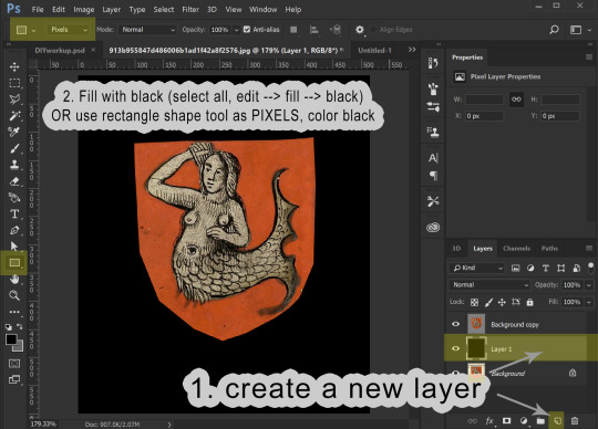

3. We now have our mermaid on the red shield sitting surrounded by black. This is a pretty good image to work with because what I want to isolate is a different color than the part I don’t want to keep. I’m going to now use the select --> color range tool to select red, and then the hue/saturation adjustment to make all of the red go black:


If you haven’t already merged your image with a black background, you can do that now.
4. Before proceeding, make sure your image is entirely desturated (in grayscale). If you haven’t already, go to image --> adjustments --> hue/saturation, and drag the saturation levels all the way down. Now we go into the Image menu --> Adjustments --> Brightness/Contrast and start playing with these to make the area inside the mermaid as white as possible and the areas surrounding the mermaid as dark as possible. I find it helps to adjust brightness first to bring the areas I want to go to white above a 50% gray and then use the contrast to drive those values apart. This might sound weird, but just play around, and you will get the idea.
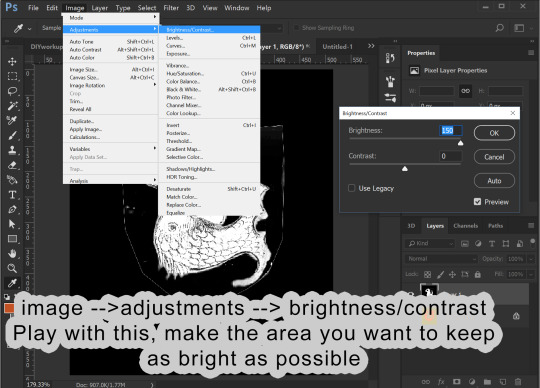
You likely will find that the image has too much detail. The scales on the mermaid I don’t want to be transparent. I want those dark details on my image to show! So, I go into Filter --> Blur --> gaussian blur to help make those details more light gray. This also make the white outline leftover from the shield shape darker by blurring the surrounding black into it.

I can then go back into brightness/contrast. You can jump back and forth between the two tools until you get a nice, crisp mask.
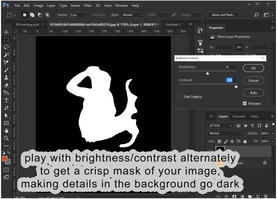
You can then go back into gaussian blur one more time to make the edges a little smoother.
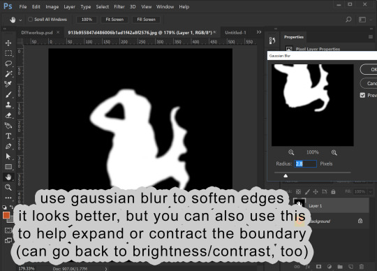
5. I now am going to copy this black and white image and add it as a masking layer of my original image. You need to be working with a copy layer of your original image. This will not work with the background layer (unless you want the mask to be the alpha of the entire image).

You have your black and white “mask” layer copied. Now you select the layer with your original colored image and add a masking layer to it. From within the Layers panel (really important to be in the Layers panel, NOT channels) click the rectangle with the circle in it. This will add a masking image to your layer.
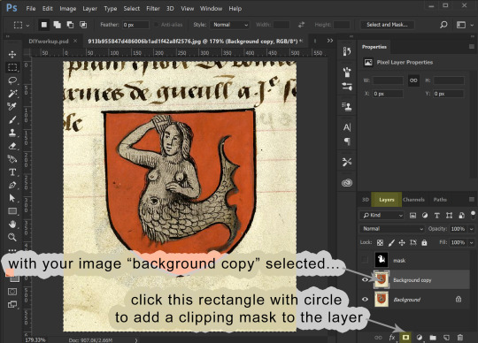

For that layer, click the channels panel, then click the “eye” visibility to the left of each channel to turn off the visibility of the RGB channels and turn on the visibility of the Mask channel. Select the mask channel and paste your mask image into it. Click back on the “eyes” to make everything visible, then go back to the Layers panel to see your image, now transparent because of the added mask. Note that from within the layers panel you can select either the image or the mask (the little “link” symbol in between can be turned on and off to link them or not, but you can ignore that for our purposes.)
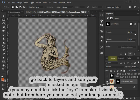
6. Now we are going to edit the mask. I like to make a layer of a contrasting color to my image and place it underneath, so I can better see what the mask leaves and keeps.

Making sure your layer with your masked image is selected in the layers panel, go back to the channels panel, and select the mask channel to work with. You can leave the RGB/red/green/blue channels enabled and edit the mask directly, using either brightness/contrast OR a paint brush with black or white color. As you paint black on the mask you will see this “erases” the image (but it isn’t actually erasing the image, just adjusting the mask).


Playing with brightness will push the boundaries of your mask in and out, and contrast will make the boundary crisper. You can always adjust the layer with blur, too.
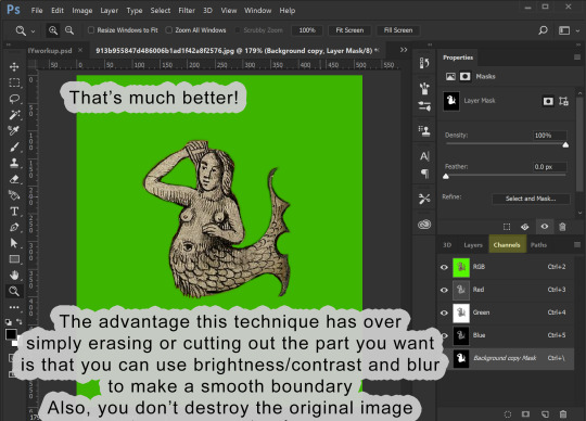
7. OK, cool! The mask is how I want it. Now I can prepare it for use. At this point you only need the layers with your image and its mask.
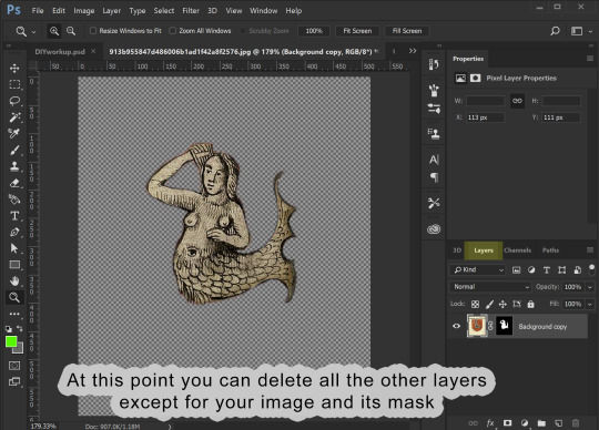
Assuming that you now want to transfer this image elsewhere and perhaps edit its shape to fit something else, you can then right-click the mask and select “apply mask”. This will delete the parts of your image that are masked out. Now you can copy your image and past it wherever you want it to go.
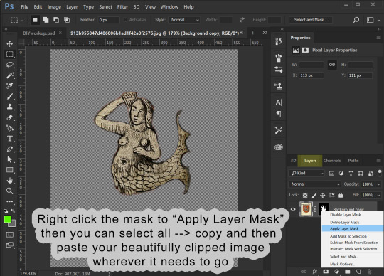
8. I’m making an overlay for a banner deco object. I already have a template made showing me where the banner is. I past the image into it and adjust its shape to look how I want.

9. Once you have it looking how you want, the final step is to prep it for saving as a DDS file. Assuming your image is the correct size (ie 1024x1024), we are once again going to use our image to make a mask. Only, this time, it already is at the correct opacity and transparency. So, duplicate your image. You can also at this point create a solid black background layer underneath it (new layer, fill it with edit/fill or with a the rectangle (pixel) tool). Choose one of your two image layers to make the new mask from. Select that layer, and go to image --> adjustments --> hue saturation. Drag the lightness ALL the way up (+100). You will see all of your image turn white. Click ok, then merge your all-white image down onto the black layer! Presto! This is your image mask again, only adjusted to fit your final image. In fact, this is what is going to become the mask of the entire image, the Alpha channel.


In my example below I’ve renamed that layer “alpha”. This does NOT make it the alpha channel, it is just to remind myself this layer will become the alpha channel. Now I make a layer behind my primary image filled with a color that matches the overall hue of my primary image. The point of this is so that any transparency created by the alpha layer will catch this color instead of filling it with white. You can then merge your primary image down onto this color layer, making it a solid image with no transparency.
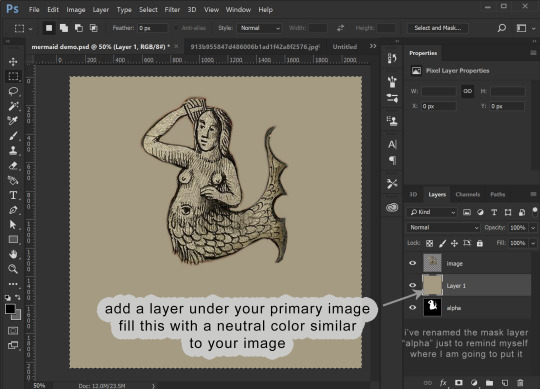
Now we COPY your “alpha” layer in its entirety, and go back into Channels panel. At the bottom of the channels panel, click the “new channel” (same image as “new layer” in the layers panel. This now creates the ALPHA channel for the ENTIRE IMAGE (not just whatever layer). Make sure that just the Alpha channel is selected and paste your copied “alpha” layer into it. Make sure that your entire image is still visible when the RGB channels are all visible.
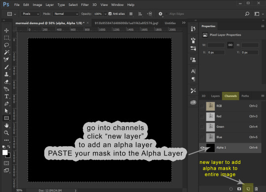
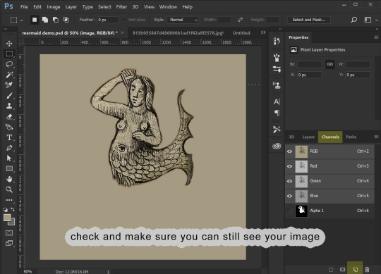
10. We can now save this image. (If you don’t have the NVIDIA plug in or it doesn’t work for you, you can use this plugin: https://software.intel.com/en-us/articles/intel-texture-works-plugin OR you can save the image as a PNG with transparency and open it in GIMP to save it as a DDS. JPEG formating does NOT carry the Alpha channel transparency!). The correct format is DXT5 ARB 8 with interpolated alpha. You can name it whatever you want.
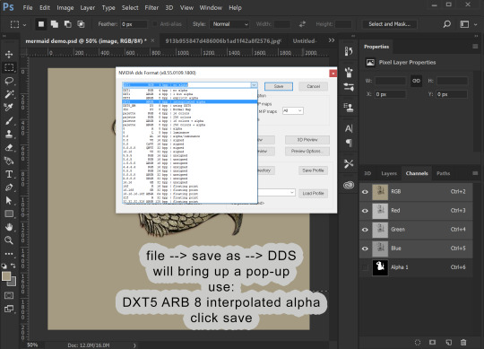
11. To use this stencil in TSRW, simply open up your project, go to the texture variation you want, go to stencil, and import the DDS image. You could also import it as an overlay.

To import it is a default override of an image for an object you have as a package, open the package in S3PE (clone it first with S3OC if you want to make a NEW non-default object) and then right-click the _IMG you want to replace, select replace, and then navigate to your saved image. S3PE will automatically change to file name to whatever the name of the image you are replacing is. And that is it!
Alternately, you can use Texture Tweaker to create new texture variations and add new stencils. But, I’m not going to explain that here.


That is all I’ve got for now!
28 notes
·
View notes
Photo

D.va Line Art Tutorial: Basic Level
I’ve been wanting to create some art tutorial for some time and I’ve finally did it! I hope there is some wisdom you get from this Tutorial, so let’s start!
Now this is a simple tutorial, so there wouldn’t be many advanced techniques, but the good thing is, it is simple, so that almost everyone can follow through, of course in the future, I will create even better tutorials that are easier to learn and understand.
I’ve always like illustrative art, and with my passion in digital painting, sometimes I try to combine them both together, and this is one of the result. In the future, I will try to constantly create many such illustrative art.
Software Used: Photoshop CS6, Corel Painter (optional)
Dimension: Approx 3000px x 3000px
1. Drawing stage
Now this is the part that I cannot teach you here: drawing.
It really depends on your drawing skills, and for those who can;t draw so well, my strong advice is: draw on paper.
While I did this in digital out of convenience, nothing beats drawing straight on paper. Drawing digitally will hardly improve your drawing skills at all if any (my observation & exp), but drawing on paper will improve your accuracy and drawing memory much much faster and better.
Take your time drawing, if you have a good base drawing, then everything else will be nice and easy, so don’t rush it.
2. Outlining Digitally
Depending on your preferences, you can just draw any patterns, but my design here is about Peacock & Lotus design, with the Peacock symbolizing Dva’s penchant for showing off, as for the Lotus... well it’s pretty!
As you can see here, some of my outlines are pretty sleek and smooth, and that’s because I create a new clean outline on top of my previous rough drawing. This is usually quite important in terms of line drawing/painting. It makes the process easier and the whole image more clean and finished.
Painter Technique: Now, I create my drawing in my favorite app Photoshop, but Photoshop it’s not for being very bad in making smooth lines, so you have to use another program to do that.
Currently, my favorite program for creating such smooth lines is Corel Painter. You can search for “Brush Smoothing” setting, and set the “Damping” to around 80 for a good line stabilization.
While I forgot which brush I use for this, I now recommend the 2B pencil with 100% opacity (The blue lines). Make them on a different layer.
Try and create the lines with as little strokes as possible. For long curved lines like the hair, you can utilized Painter’s awesome “Paint on a path” feature, just check it on the top toolbar settings. It allows you to create a path and paint straight onto it, thus saving the frustration of redrawing again and again to get that smooth long lines.
For the red lines, “Concept Art Jitter Smooth” Under the Chalk section.
Other Software Technique: This line art technique can also be done with other software with brush stabilization feature like SAI, or Clip Paint Studio, and many others, so don’t worry if you don’t have Painter.
3. Base Colors
Now the next step is to bring the image back to Photoshop for coloring. Use the pen tool and create the basic shapes and fill them with block colors in different layers.
Now it is tempting to use the Lasso or the Paint bucket to fill, but don’t. The lasso tool has problem in creating smooth lines (which we need), and also the paint bucket (I’ll explain next time how to use it in another Tutorial).
If you have created the paths and shapes in different layers, then you can lock the layer transparency and start painting with the real desired colors.
Here I used the soft Airbrush in PS to paint it some reddish hue around her cheeks and forehead. Don’t worry about getting the colors very accurate for now, since you have separated them to different layers, it is very easy to make adjustments later on. Also, don’t forget to add a background, preferably grey or some neutral colors. It helps better to gauge the value of the colors later on, if you put white, most colors seem too dark, and of you put black, colors will seem too bright.
4. Start Painting

On a layer above the body, I painted the peacock leaves by using the Lasso tool, fill colors, and use airbrush to paint it highlights and shadow.
For the Lotus leaves, I use the Lasso, but I don’t fill it, since I want the blackness of the suit to come through. And instead of using the Airbrush, I use the PS standard round brush, with shape dynamic off and opacity pressure on, I painted with downward strokes lightly to create the leaf textures, and painted the same way again with brighter colors, and add a final highlight and the tip of most leafs.
5. More Painting
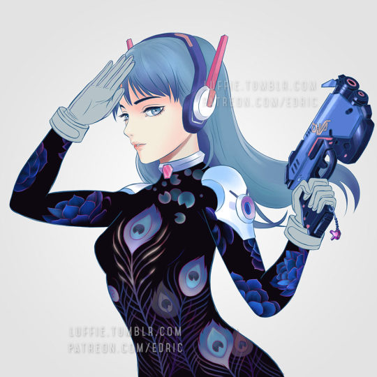
Continue painting the leafs, and the the shoulders, before moving to other parts like the gun. I’ve also added more leafs underneath the original leaf layer, since I felt it looked a bit empty. For the glow of the feathers, I simply create a layer on top of the outline layer, and set it to “color dodge”, and add some bright colors.
If the colors look weird/off, simply use Hue/Saturation to edit them till it looks right, then color pick from that section and paint the rest.
6. Finishing/Editing
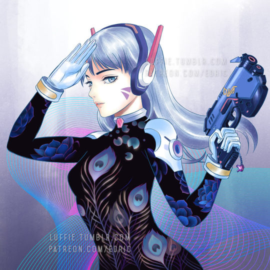
As you can see, I changed the hair, since I wasn’t satisfied with the previous color. To get the bright look, you need to start with a white base. And as with the gloves, shoulders and hair, I changed their base colors to white.
Then with my texture brush, I simply painted according to the form, and leave some white shining through in the middle. This will created those “white sheen” you see here. Then for the hair, I painted darker colors near the tip/end of the hairs. I’ve also brighten the her face in the process.
For the background, I was actually a little clueless on what to paint. So I just painted some light strokes using the same textured brush and add a design element on it. Maybe next time, with better planning, I will create better backgrounds.
End Note:
So there you have it, and as you have learnt, there isn’t any complicated techniques behind this picture, and if you have prepared each stage accordingly step by step, everything later will become easier. Of course this is not the most detailed tutorial as some steps can be broken down even further to make it clearer, but that is for future tutorials!
If you like my work and would like to learn more and support me, please do consider supporting me at Patreon.com/edric . It truly helps me a lot to devote more time to create this tutorials and art, plus you will also get my custom brushes and PSD file so that you learn better, and of course, Patrons receive special tutorials. Every bit of support helps, and are truly truly appreciated!!!
Or you can buy me a coffee for late night painting too here :https://ko-fi.com/edricartist
53 notes
·
View notes
Last Seen Blogs
ajdlfkasjf
a monument to compromise///pure rage. zero fucking compromise
renlikesthings
Ren Likes Things!
8beluna
sei l'imprevisto che asspetavo
anime-expert
The page for Anime

finegroup57
پمپ باد فندکی ایران پمپ