#or even getting decent lineart
Text

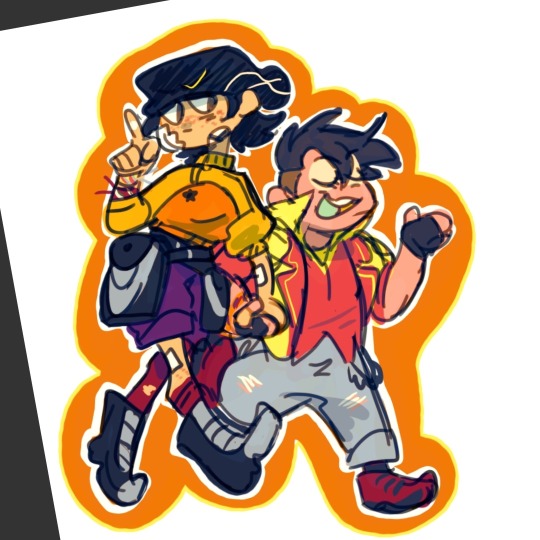
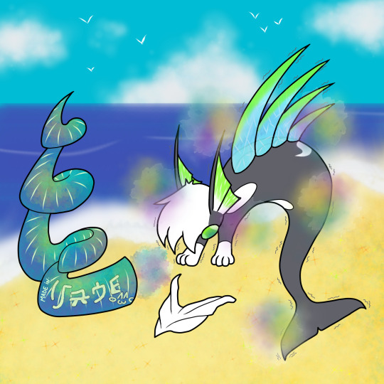
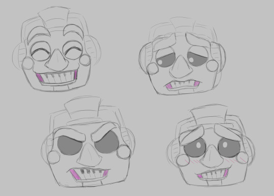
think im gonna totally redraw these l8r so uhm. first draft fusionfall eddeddy redesigns >_<
#as in im gonna try actually doing lineart later n not fucking w eddys colors n maybe the jackets#dork art#i cant emulate thr ff style this is basically just me drawing regularly#i might attempt ed but she looked decent + this was an excuse to visual my brainrot around the eddeddy ff lore#even tho i havent even reached peach creek in game yet#tho i did speedrun to it as a child n getting fucked up by nanobots on the way
44 notes
·
View notes
Text
gnawing at the bars of my cage bc i'm home for thanksgiving and all i have to draw with is a sketchbook bc i haven't set up my tablet with my laptop (i had like five entire days before i came home that i could have used to draw and actively chose not to)
#TRADITIONAL ISNT NEARLY AS FUNNNNN I DONT WANNA#i'll admit here and now my years and years and years of digital art have spoiled me so bad lmao#what do you MEAN i can only get as far as pencil now. where is my transform tool. where is my ctrl z. do you hate me#i have so few traditional materials i couldn't even do decent lineart if i wanted to. blaugh#for FULL reference of how little i do traditional art just know i've been using the exact same sketchbook since 10th grade#it only has 60 pages#it's just barely over halfway full#i need my puter :( my convenients :(
6 notes
·
View notes
Text
A breakdown of my quirrel!nosk comic from last year (original post here) since I like doing breakdowns and talking about my process, and I know at least some people like reading those things. :)
First of all, a little background. I made that comic in an evening with just a pencil, a black marker, two grey markers, and a yellow-orange marker. (All markers had a thick tip and a thin tip, and all were water-based markers, so they don't blend like alcohol markers, but they can still be layered to affect the values) I had a text post from @g0at0ad saved in my drafts that said "gotta say. massive missed opportunity to not have nosk mimic quirrel to lure the knight into its lair." and finally, I had an idea for how to illustrate the reveal and felt I had a decent idea for the nosk's design.
I wanted to follow the same encounter order as the game provides, and by happy coincidence, I realized that the route from first sighting to nosk den includes the hot spring, so it made perfect sense for that location and the real Quirrel to appear in the comic.
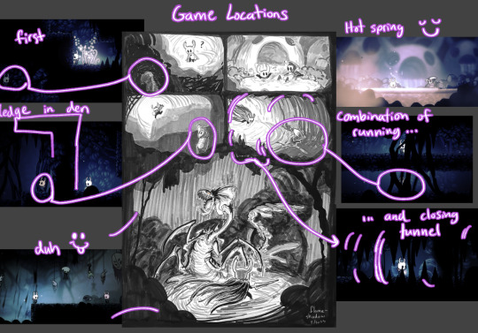
Ghost spots a Quirrel-like figure in the darkness in the first panel, and then as the path continues and drops into the hot spring, there's (real) Quirrel, so clearly that's who Ghost saw a minute ago. Yay, friend! And since Quirrel explores around, it's not strange that Ghost would spot him again in an area not so far away, though it's odd how he got ahead of them. Perhaps a different tunnel? And it seems like Quirrel wants to lead the way to something, so Ghost follows, until-
That's not Quirrel.
In addition to the potential of a reader already knowing the game's locations and recognizing the path to the nosk's den, there are other visual clues that subtly communicate that something might not be right. I made it so every panel but the hot spring one has black silhouettes encroaching on the space within.
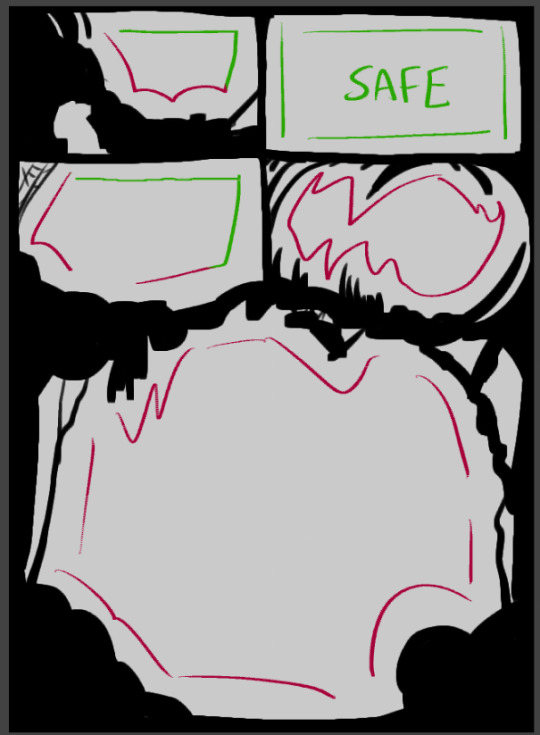
The third panel is the mildest one being encroached upon because Ghost doesn't yet feel like something is off (still reassured from seeing Quirrel in the safe hot spring) but the trap is coming together. The existence of the spider web in the corner is a nod to the trap because it's a common visual symbol for being trapped.
Also note how both the first and third panels have some safety via straight panel edges. Contrasted with the fourth and fifth panels which have no straight edges as Ghost cannot escape and there is no safety.
Another subtle reinforcement of danger vs safety is how the use of black is very limited in the hot spring panel. It's a brighter room mechanically, yes, but it's also a Safe Room. The only black is Ghost's void parts and a thin outline around Quirrel (and also a bit of shading on his arm that I did out of habit before remembering that I wasn't going to use black to shade him here, oops!)
And, note that in the only panel with Real Quirrel, he isn't framed against a darker shape in the background.
Okay, and finally, I will share a bit about the nosk reveal panel and its design...
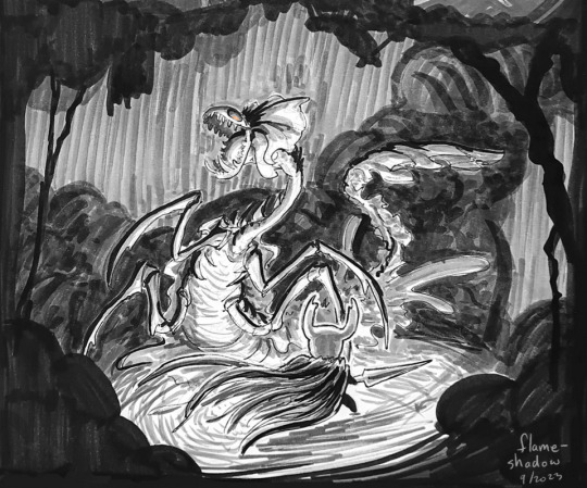
This pose and angle are dramatic and all, but they're The Worst for showcasing the actual design of the nosk! Just a complete mistake on my part that I did my best to roll with, since I didn't realize until too late how I'd messed myself up.
Which happens! I don't always get it right, and especially when I'm working traditionally, there's a point where I can't go back, so I just have to make do with what I gave myself. :) I don't hate what I have here, but I have been dissatisfied with it ever since I drew the lineart.
A thought I have had since then was that maybe I should've drawn it larger, to be more threatening? Maybe a different pose to show off the side-body frills? I explored a couple ideas below, but honestly, I think the whole panel would have to be reworked to get it right.
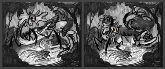
Making sure that the background frames the nosk effectively would be one of the main things I'd redo, but I'm getting tired and don't feel like drawing more, so I'll just leave it at the nosk replacement sketches.
And since I don't think I did a good job with displaying the nosk's design effectively, I quickly sketched some of the features to maybe show them off a bit better.
I like the gimmick of the nosk turning its head, so I pretty much always maintain that with my nosk designs. This one is no exception. Quirrel's head and face become the cranium and upper jaw while Monomon's mask becomes the lower jaw - the extra length causes an underbite. I've always been a fan of when people add a veil hanging from Monomon's mask while Quirrel is wearing it, so that's where the frills come from. ("Why didn't you include the veil in your Quirrel drawings, then?" I hear you ask. And honestly..... I don't know! That could've been an oversight or it could've been deliberate and I just don't remember my justification. That happens sometimes XD)
Anyway uhhh yeah! I think that's it. I like making comics. I like thinking about nosk. Tadaa~
#hollow knight#nosk#quirrel#comic breakdown#flameshadowart#long post#id in alt#this took longer than intended lol but it's done now~#i like doing analyses like this both to show where i do cool things and consider where things could be improved
71 notes
·
View notes
Note
What advice would you give beginner artists?
it's fine to want to do more stylized art, but nothing will help you improve quickly like studying from life. even if you want to draw very stylized figures, life drawing is still going to help you understand how the human body works and then you can build your stylization off of that understanding. I also recommend studying specifically things you're looking to improve--if you feel like your poses aren't dynamic, ask your model to do some quick (1-2 min) dynamic poses and work on getting the gesture down. if you're looking for anatomy, ask for longer, more static poses and really study the contours of the body. this also applies for portraiture and character art--my expressions and facial structure improved like CRAZY when i started doing portrait studies from life! (note: i know live model sessions aren't accessible for everyone. i'm a huge advocate for nude models, if you can find a studio nearby that's affordable to you that offers sessions, that's the best you're gonna get. however, there are sites that will give you photos of nude models to draw from, too, or you can even just ask friends or family to pose for you when they aren't busy, that's what i did before i started getting model sessions from my school!)
materials are not everything but sometimes a good material can make a difference. it's important to know what's worth it and what isn't for your skill level. invest in some decent-quality supplies or a good art program, but understand that you're still going to need to work to understand your materials and use them to their fullest potential. (if you're a digital artist buy csp. trust me on this. get it on sale. it will change your life. also do not fucking use photoshop)
tracing is ok. listen to me. TRACING. IS. OK. tracing is how you learn. don't trace other people's art and pass it off as your own, obviously, but there is literally no problem with tracing real-life reference photos. I routinely trace references for backgrounds and the like. there is no reason for you to kill yourself trying to make complex perspective and shit up from your head when you can very easily just overlay a photo and get what you need.
in that same vein, USE REFERENCE PHOTOS. find pics online or take pics of yourself and USE THEM to see how your poses work. it makes it SO SO SO much easier. the understanding that you need to create a pose out of nowhere will come with time but you're not going to get that skill unless you have a foundation of understanding how the real human body works, and the easiest way to get that understanding is by copying photos of real people.
last but not least, there's generally a sort of 'rulebook' that new artists are expected to go by, especially online, when it comes to digital art. when i was first learning, it was all about lineart and cell shading, two things that I didn't really like. Nowadays it seems to be all about rendering. the single most important thing i can tell you is if it sucks you don't have to do it. if you hate lineart just color your sketches. if you hate shading don't shade, or find a different way to shade that you enjoy more. if rendering is annoying or difficult for you DON'T BOTHER!! art is supposed to be fun. if part of your process is annoying or upsetting to you, cut it the fuck out. don't torture yourself just to do art the "right" way. i guarantee your art will look better when you're having fun making it anyway!
#asks#ALSO don't go in expecting to monetize your social media presence/go viral as an artist. make art for YOU and make what you want to make.#if your art has passion behind it then attention will come naturally!
330 notes
·
View notes
Text
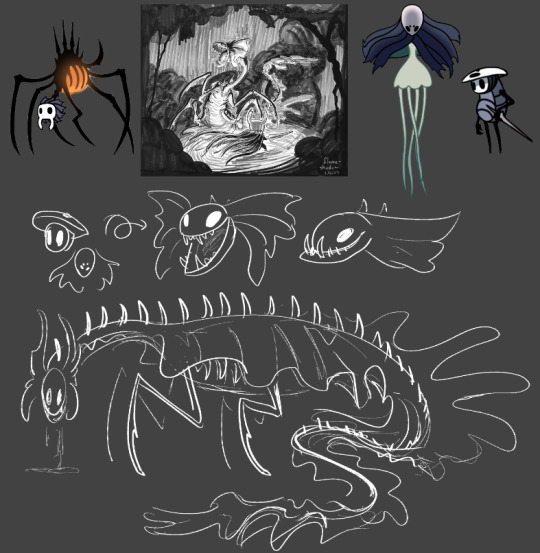
DannyMerMay 2024
Day 1: Insect/Anchor
The return of Little Baby Moth! (From last year DannyMay)
Something happened since last time the two of them met, so LBMo is reasonably surprised to see Little Baby Man Mer's new form... or is this just an alternative dimension iteration of LBM (by @tourettesdog)? 🤔
(Keep reading to find the answer!)
@pikakaistudios Little Baby Mer inspired me in doing my own, so Kudos and credits where are due!
More fanarts and lore under the cut because it was getting long...
(^~^;)ゞ
Prompt for DannyMay by @dannymayevent and MerMay by @vladdyissues.
〜(꒪꒳꒪)〜
Since I'm a serial procrastinator and I wanted to be sure the art pieces were at least decent/accurate, I was almost late (but thank CW that I did, because some of them had the wrong orca-pattern and I would have brought disgrace upon myself if I published anything not done right since orcas are one of my favorite animals).
That being said, let's continue the DannyMerMay journey!
Day 12: Time Travel/Seafood
My poor Mer-boy got yoinked temporalily into the past when he was still Danny (so even before the "normal" LBM-fication) and he's feeling reeeaaally distressed at the act of practically cannibalism that his past-self is committing...
(≧∇≦)
Day 2+4+29: Wish/Starfish + Wander/Night + Fireworks/Bioluminescence
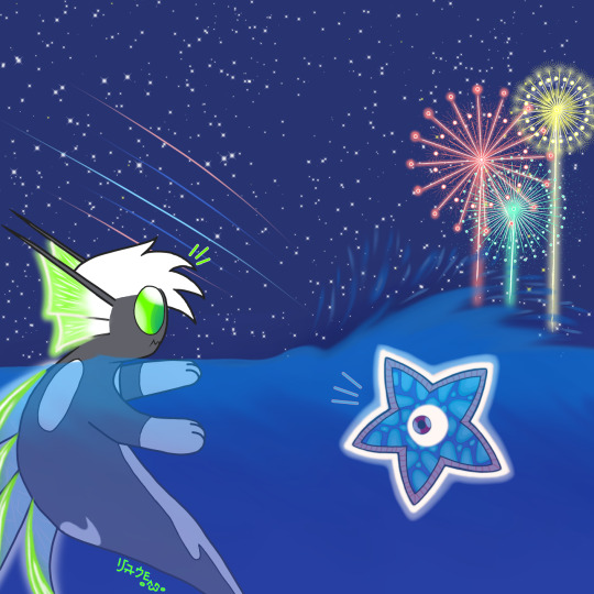
Wandering in the night, some interesting encounters are bound to happen...
I wonder what would happen if you wish upon a(n alien) star(fish)...
(≧∇≦)
Day 19+20: Iron/Pearl + Pitch AU/Abyss
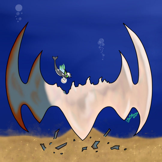
LBMer found a his rightful Crown (of Fire) sunk into the depths of the ocean!
But since it was rusty and forgotten, what better way to restore it than ghostly mother pearl?
(Works like ghostly ice, but it's an exclusive power of LBMer.)
(The Crown got bigger than canon, but he smol!)
Day 26: Shoes/Camouflage
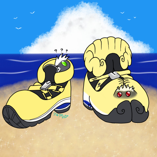
They say that imitation is one of the best form of flattery, but when you don't want to get caught by a certain dimensional hopper (and be mistaken for one of his foes), it's the best way to blend in!
(Octopi can camouflage in ways that make you think that magic is real...)
ฅ^≧ﻌ≦^ฅ
(Little Baby Terror unfortunately got caught in the same "accident" that LBM did, so they generally prefer to stick together-ish in case they need help.)
Day 16+22: Glowing Veins/Courtship + Song Lyrics/Songs
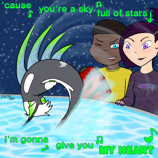
I couldn't help myself and sneaked in some Everlasting Trio for the soul.
After all, LBM (and therefore LBMer) is still Danny, even if he has new form(s) and instincts.
They do incarnate the "Would you still love me if I was a worm?", don't they?
(◡̀_◡́)
Song: A Sky Full of Stars by Coldplay
(It feels such a Danny song to use, plus I checked how orcas court and while there's some posturing, they also sing! It felt only natural from there... >:3c)
Day 11: Mutation/Shell(s)
And finally: the answer!
LBM found this weird shell on the beach while they were on vacation, but when he checked it (read: nibbed it), it reacted and tooted a magical cloud that mutated our Little Baby Man into a Mer!
(The same fate happened to Dani/Little Baby Menace and Dan/Little Baby Terror, changing them into a Seahorse Mer and Octopus Mer respectively.
I've got a lineart done of them for another prompt, but I didn't manage in time to clean and color it yet, along with a couple of others... ( ≧Д≦) )
This has two versions because I couldn't decide which was better. @teacupsandstarlight suggested the first because of the transforming smoke around our boi, but since I saved both, I told myself: why not upload both?
For now, that's all! (๑•̀ㅂ•́)و✧
I still have some linearts to finish/digitalize/color, but at least I contributed to these two fantastic events, hope y'all enjoyed them and my works!
Hope to type ya soon! ฅ^•ﻌ•^ฅ
#the dragon draws#danny phantom#dannymermay24#dannymay2024#dannymay#mermay#mermay 2024#little baby man#little baby mer#orca whale#little baby moth#little baby cryptid#danny fenton#little baby terror#octopus#merman#dan phantom#tucker foley#sam manson#long post#digital art#little cameos 💙#jarro the starro#kh sora#or at least his shoes from the fist game#tw bugs
54 notes
·
View notes
Text
Splatbands Idol AU Part 1 - Ichiya and Namida as The Squid Sisters


Thought I’d finalize my designs for this idea (it’s not really an “AU” despite the title bc the designs are kinda the main focus) where the main bands and idols for each game swap roles. So OTH are Wet Floor, Deep Cut are C-Side, and ofc, the Squid Sisters are Squid Squad. Ichiya and Namida specifically, since I like to think of them as a duo and their colors even fit Splatoon’s main colors of blue and orange!
feat. some kinda lazy art bc I don’t rlly wanna do lineart esp since I’m gonna have to draw the other two groups as well lol. Pretty happy with their designs tho, I think I fused them well.
more info under the cut to keep this post short
Even tho this concept is mostly focused on the band characters, this does mean that the idols take their place as well (along with the other band members, so the main band of Splatoon 1 is now Callie, Marie, Ikkan and Murasaki). It gets kinda confusing if you think too hard about it (esp for OTH lol) so we’re just not gonna do that. It’s mostly so I can draw the band characters in cute outfits lol
Anyway Meet Squid Squad! Here to bring news, music, and splatfests to a plaza near you.
The Squid Sisters have a decent amount of story, and although I’m already said in going to worry too much about that, it is pretty easy to merge the squid sisters and squid squad’s stories together, so why not? Instead of growing apart in Splatoon 2 they full on break up, but then get back together and instead start to use pseudonyms (Agent 001 and 002). Guess that means Ikkan and Callie are chill but just distant.
Their personalities are the same tho. Ichiya is still an asshole in Splatoon 1 lol. Maybe not really on the news, but you can see it in Octo Valley for sure. And then I bet He’s nicer in Splatoon 3 but his first reaction to C-Side is definitely not “I love them”
As for Namida, she’s a lil less smug than Marie, but she’s still the more sarcastic of the two, both on camera and off. She’s a little relieved that Agent 4 never heard of Squid Squad and feels weird about being called “boss” all the time.
They both play their instruments on stage during splatfests along with singing, kinda like Marina in We’re So Back. All their songs minus Calamari Inkantation are Squid Squad songs with a more pop-like tinge. (Ikkan left bc he didn’t like all the pop Callie was writing lol).
oh yea and have to mention they probably are agents but they’re not related idk how they’d know captain cuttlefish. Or maybe captain cuttlefish is someone entirely different! Who knows!
Once again this is more of a fun concept than a fully fledged AU. None of these confusing or vague things are gonna get concrete explanations, I just like speculating abt this type of thing.
#Don’t know when I’ll get to the others but I do have designs in mind so!#Keep an eye out#splatbands idol au#splatbands#splatband#squid squad#front roe#ichiya splatoon#namida splatoon#squid sisters
53 notes
·
View notes
Text
Tutorial for @mimssides
How I draw with alcohol markers. Beginner edition
First off all I want to specify: this is based on my experience only, so take it with caution. This is also my first tutorial ever.
1) Have an underpaper.
Unless you use some really thick paper, markers will bleed on your next page or table ( depending if you're drawing in a sketchbook or not). I recommend to have one list of some decent paper under the page you're drawing on. Decent means thicker than office paper, can be watercolor paper, it usually perfect for it. It's reusable and over the years mine two look like this:
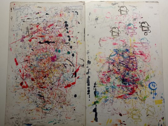
( you can see there's a lot of stuff going on there)
2) Always, and I mean ALWAYS erase your sketch.
If you're doing a quick try out of color combinations you can skip this step, because you don't need the aesthetic or anything. I'm not sure how useful this tip is for colored pencils ( cuz I never sketch with those), but with regular graphite pencil it's very much important. Graphite smudges your markers, and not only that. It also gets trapped if you go over it with a marker, meaning you wouldn't be able to erase it and it's going to leave you with gray smudges all over. Truly awful.
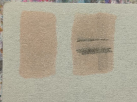
3) Have your pallets on the same paper you draw on. Or simply - have pallets!
Colors can show differently on different paper, that's why it's important to do color swatches once you buy your markers. They are designed for specific paper, and on your paper they can look a lot darker or really pale. I recommend testing colors before you buy them, it's usually an option in the most craft stores. If you're buying a set just take 30 minutes to do all the swatches and naming them. It also helps visually to see what colors you have.
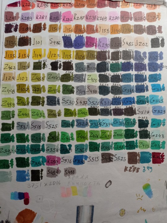
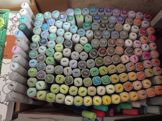
(I have a lot, but you don't need as much, there's like 60 colors I use usually and the rest are on rare occasions. Build a set you're comfortable with)
4) Make sure your materials all work together.
We already talked about graphite swatches, not the worst thing that can happen to you. Mainly you need to make sure how your materials work together, how they lay on top of each other. Make sure your lineart won't react to your markers, there's special waterproof liners and those are the best for markers ( mine are Pigma Micron from Sakura). See how your pens and liners act before and after you apply markers.
Decide which is better to use before and which after markers
5) No black.
I don't use black in any of my drawings. All you see is different shades of gray. It looks much more pleasant with the rest of the colors and it allows for my lineart to be visible underneath. Sometimes even those grays are too dark and I need to add more shades or white lineart to fix it

6) How to shade.
This is a very subjective thing to talk about. You can shade how you want. I will talk about two ways I shade.
1. Same marker. Markers dry. And when they do you can go over them another time. Usually that makes a darker shade of the same color and it's a pretty safe way to do the shading if you don't know which colors can go together. It doesn't work as well on the light colors and difference can be barely noticeable. It's a nice way to get soft shading
2. The pure chaos. Just kidding... Different color marker. It's hard to explain, and yo always need to test what works for you. If you want sharper shade you need to grab a different color, can be from the same hue ( for yellow - orange, for red - burgundy) or something a little more spicy. You can add different hues to your colors with different shades ( your black with red shades is suddenly looks burgundy, or purple, or blue). Experiment! Fail! Find out which combinations work and which don't!
If color seems a little darker than you expect you can go over it with original color, which might lighten it up. This tip doesn't always work

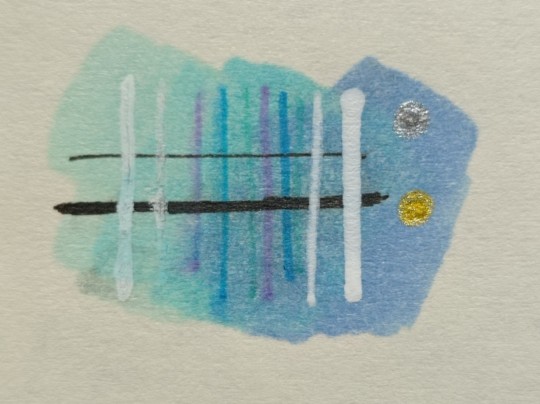
7) How to do gradients.
1. Choose your colors beforehand, see how well they work together. It's easy to do a gradient from red to pink, but not so much from orange to blue. You might need to choose lighter colors, because if you want smooth transition from one color to another you will need to go over them a couple of times and that will darken them.
2. Add a middle color. Not every gradient needs a middle color, but with it you can make your gradient much smoother, it will be more noticeable the bigger aria you cover. The more middle colors you have the more harder gradients you can do

( without and with a middle color)
3. Act quickly. Markers dry relatively quickly so you need to add colors one after the other, you can't go away before you're done.
4. Blend with the lighter color. You can also start with this color as a base but that doesn't work for all color combinations. Lighter color will go in top a darker and flow into it making it lighter and transition smoother. ( example: you go from red to purple to cyan, you will need to start with red, then purple going over red to soften it, and finally the lightest cyan going over purple and maybe even a little red). You always put darkest first and go over it.
There's other methods of doing the gradients. They are very similar actually, but for second one you will need a blender. For the first one grab two markers you want to use ( more if you're feeling risky) turn one of the markers upside down and touch their tips. Now use your understanding of gravity. Color from the top marker will go into the bottom one. The longer you wait the longer the gradient will be. Usually I don't need to wait longer than 3 seconds.
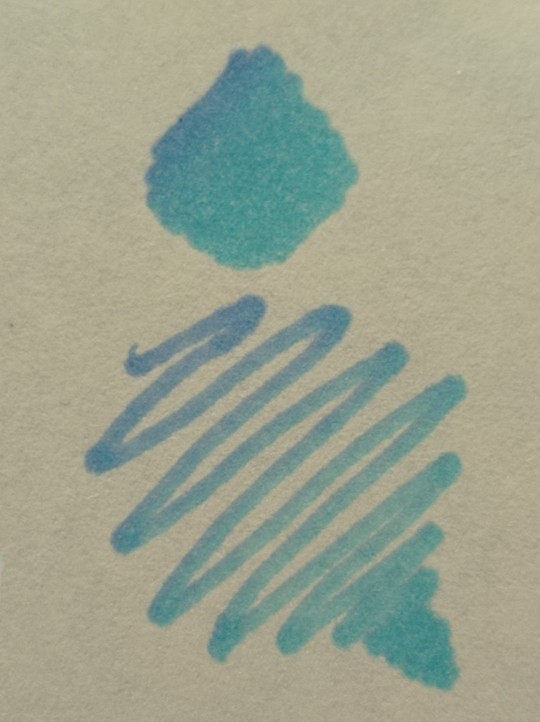
And you can do the same with a blender
8) How to use a blender.
Blender is a marker with no color. Usually it's named B000 (I recommend buying a blender with brush tip). There are many ways to use it.
Gradients: you can use two markers technique with a blender making gradient fade on one end, or you can mix colors inside the blender.
Fixing mistakes: blender will make a white show through your color, you can use it to get rid of the wrong color. But it doesn't work without some problems. Of course darker colors will likely stay, even if much lighter, and your previous color will try to flee ( likely to other sides, if you're lucky it will go on your underpaper)
That's all I have for you today. Experiment and learn something new. Hope that helps
114 notes
·
View notes
Text
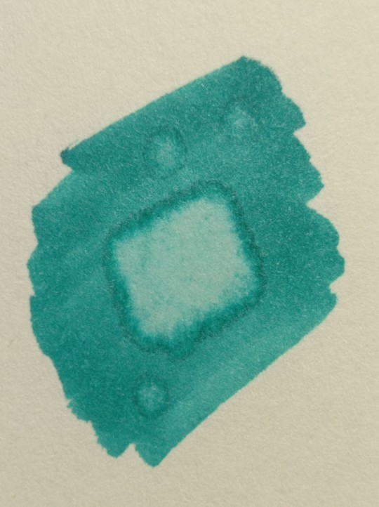
Very old drawing! ...and unfortunately I don't like it very much 😭
After finishing Hollow Knight I started looking through what I still had unfinished and along with other Pokemon I found this. This drawing given me several problems the first time: after coloring the background the Unown didn't come out as I wanted. I tried to delete it or fix it and after I abandoned it. I decided to redo Unown separately and glued it on paper on "3D" style; I still don't like it, I overdid it, but definitely better than before. Taking a decent photo and getting the right color and shade was titanic, but it's finished even if prettier in person cwc 🤍
I see I still have one Lapras, one Chimchar, some Detective Conan's drawing... I have two more in mind, actually completely different, I don't know what to choose but I have the lineart ready 😎
#unown#pokemon#pokemon unown#pokemon art#pokemon drawing#traditional art#art#artist on tumblr#artist#nintendo#nintendo switch#switch#shiroi neko#shiroi neko's art#colored pencils#drawing#videogames#games#game freak#johto#pokemon johto#unown art#unown drawing#anime#manga#traditional
20 notes
·
View notes
Note
Hey there! Since you also reblogged the post saying you want people to send you asks (actually I even reblogged it from you), here I am to ask you a question. A potentially very tough one. Ready?
If you had to pick only one (1!) favorite Mario character who would it be and why?
I'm just trying to get to know my mutuals a little better, y'know?
But most people seem to be using that 'send me asks' post as another opportunity to say mushy stuff to each other, so let me also do that! I'd like to remind you that I'm very glad that I'm following your blog. You're certainly a fun and kind person, and must say I like you very much 😀❤️ Thanks for always supporting my art, it really means a lot to me.
Also please teach me your ways to draw so fast, I just finally finished sketching my latest fanart today (yeah, that ambitious one) and it took embarrassingly long. And this one is supposed to have a proper lineart too💀
Oh, that reminds me: I'm really excited for your animations! Once I'm done with my current fanart, the next bigger fan project on my list is also one animation I've been thinking of, so I hope we'll be able to motivate each other a bit 😁👊
OH
just oneeee? 😩
Whew, okay, well... while Daisy has a huge place in my heart (especially lately, as you can tell 😹), my all-time favorite will always be Luigi.
See, the funny thing is that I hardly cared for him before the movie, and even a little after I watched the movie. My first favorite Mario character was actually Rosalina when SMG came out, because I was SO obsessed with space when I was younger (and still kinda am), and blue was and is my favorite color (such a deep reason, right? :P)
I always tend to lean towards the underdogs of a franchise, yet I don't remember the exact moment that drew me to him. There were just a bunch of edits and videos of him flooding all of my social media pages when the movie hype was still fresh, and I guess one day I decided, "yup. that's my guy."
I think the moment that really solidified my love for him was when I replayed Luigi's Mansion (I kiiinda played it before, but I was 4 and just pressing buttons lol... it's strangely a core memory for me). His bravery throughout the game despite his evident fears and anxieties is just... so inspiring and real to me, genuinely. And a little bit of him shone through his commentary of some of the objects throughout the mansion, which was also endearing 😆 The game gets creepier the deeper I think about it, and I just can't help but give him more flowers for going through it three different times!
plus, he's just so happy and awkward and silly. how could you not love him?!
But in short, he's my favorite because he's relatable to me, and I find his little quirks adorable and endearing.
yet despite all that, he knows when to lock tf IN. that's my hero <3
anywhoooo...
Mugi!!! I couldn't be any happier that we're friends and moots! You've blessed my timeline with your gorgeously detailed art and commentary, and I'm so grateful you support my art just as much ♥️♥️ I admire and like you very much as well, you're amazing <3
as for quick art, basically-
and thank you!! the animation might take longer because classes start tomorrow for me, and year 3 of uni is definitely gonna be more challenging and, er, expensive. 🫠 Hopefully I'll learn to manage my time better so I can make decent progress every day, but I do know where I want to go with the animation. Big yes to motivating each other!! I know that ambitious art will be PHENOMENAL when it's dropped, and I can't wait to see your style in motion! :))
#ok but for real for quick art#usually i sketch out the entire piece very roughly#then make desired adjustments#and then cleaner lineart then color then proper rendering#I know some people take extra steps to make lineart more crisp... but I like clean but still a bit sketchy#maybe that's why its so quick for me cause I do my art in only four steps 😹#but motivation is also a thing. when I'm VERY motivated I can get a piece done in 25-30 min#either that or a week in a half no in between LOL#bb's rambles#super mario#luigi#my baby <3#asks#thanks for asking!#💚💚💚💚#megamagimugi
12 notes
·
View notes
Note
Hello! I am a beginner artist and I love ur art!! Super pretty and the colors are very tasty. Do you have some tips? I'd love to see your art process!
HELLO ANON!! first of all i am very honoured that u would ask me this because 90% of the time i feel like i have no idea what i am doing and like im still a beginner artist myself DSDSJDF. i would love to share some stuff i learnt and some stuff about my process (regardless of how messy it is sdfhsj)
(final piece)
here's an old example of my process i found! while the steps sometimes look different for other pieces, i feel like this is a good demonstration of how the basic structure looks.
1. the sketch - this is where i'm mainly figuring out how i want the piece to look. i was redrawing a screenshot for this piece so it looks a LOT neater than what a lot of my other sketches look like, for example, here's the process of me figuring out my recent drawing of haise:


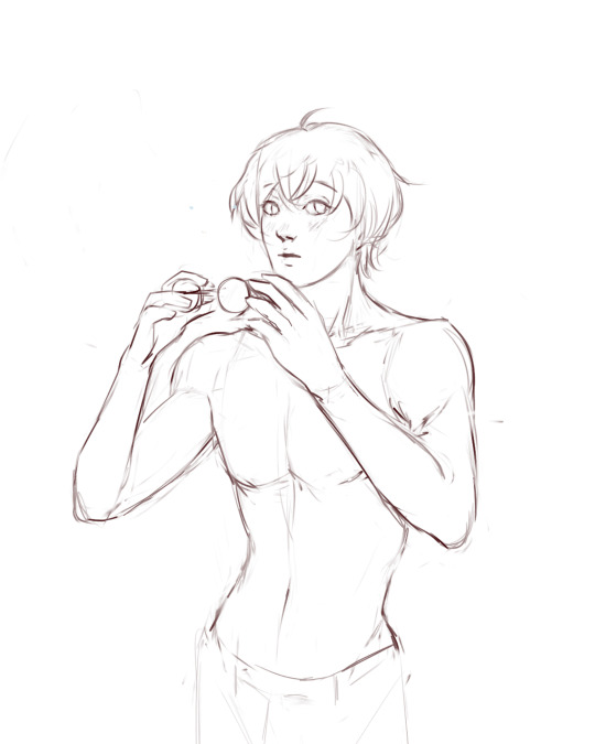
(final piece)
in the first two steps, i was mainly working with showing myself what the piece was going to be. the last one was where i used references/technical knowledge to try and show whoever will be looking at it what the piece was
2. cleaning up the sketch + base colours. these two usually occur simultaneously because i will get bored cleaning up the sketch midway through and want to start adding colour LMAO. on a more practical note, sometimes putting down the base colours and having a better idea of what the finished product will look like might make it easier to refine things.
a note: cleaning up for me doesn't mean doing lineart. it mostly means erasing any overly messy lines on the sketch and redrawing small parts to make it look tidier where needed. i often leave it 'messy' at this stage, too. like here:

(final piece)
3. light/shadow. this is my FAVOURITE part because it's where the piece starts pulling together. the method i used in the current piece was putting a multiply layer over the colours folder and filling in where light would be obstructed. after that, i used a luminosity layer to put in some bright sunlight. marc brunet has a great way of explaining it by advising to pretend that the light is the camera and you're behind the lens. this is such a good way to block in average light/shadow values! sometimes this looks a bit crazy because everything is still so messy but that is why we have...
4. rendering. this is where i fit all the remaining pieces of the puzzle together. i'll refine the colours a bit more -- e.g. colouring in the eyes, -- and fiddle a bit with the shadows to add some more variation to the hues/value. this is where i think a lot about light and shadow theory and try and make it look more realistic. marco bucci saved my LIFE with his videos about ambient occlusion and ambient light (part 1 / part 2) -- essentially, what i keep in mind the most is that if a plane in shadow is facing the sky (or is open to any other form of light that isn't the direct light source) it will contain ambient light. it is SUCH a game changer when you add it to your pieces, trust me, even if youre lazy about it. if needed i'll pull up some references to make everything look good!
5. rendering... part 2? honestly this step kind of blends with the last one as i tend to do it simultaneously. i basically clean up all the messy lines from before by painting over them! with the majority of the colours i need put down, i can just eyedrop them and paint over anything that's needed. this also comes in with the light/shadow, where, if i need a more subtle hue for either/or, i will eyedrop it and brush it in.
some further notes:
i very rarely use references during the first stages of my sketch. i think it tends to look quite stiff and unnatural if i rely too hard on the. and i personally prefer the creative room when the idea is still being conceived. references come in when i can look at what i have down on the canvas and have a fairly decent idea of what i want, including pose, composition, etc. it's essentially a first draft to guide me to where i want to go with the piece. it's when i'm done with this that i bring out references, and even then, they don't necessarily have to be the exact pose -- i'll usually get a couple of pics which show what i need to double check and keep them up as a guide. by the end of the 'sketch', i usually have a basic construction of what i need to continue, even if it's messy.
i use very soft brushes when putting down colour because it allows for more hue variation. like i said, i enjoy eyedropping and brushing in colours afterwards, so this really helps!
layer modes are ur friend! i try not to rely on them too hard during rendering because i like the freedom of painting over but they're very useful when you're blocking in your initial colours
sometimes, when i feel like i want to try something new with my art, i'll keep pieces that inspire me up in front of me. i have two of sui ishida's art books and sometimes i'll just flick to a page that oils the Art Gears in my brain and keep it open while i draw. i don't necessarily reference it, but i like having it there so i can glance over every once in a while. i don't usually make a conscious choice where i'm like "ok i want to render skin the way he does" but it's more like. my brain knows what it likes in his art and it'll try and push that part of my art in a similar direction.
honestly the best advice i have is that art is very much based on vibes. everytime i've tried to think too much about it, to do things 'correctly', to rigidly stick to art theory, my art has not come out nicely. i think the technical parts of art are important to know and understand but i also think it's important to let your knowledge come through naturally when it is needed instead of pressuring yourself to do things 'right'. tbh you probably already know that but it's something i forget a lot so maybe it serves as a helpful reminder?? sedsfhsl
ANYWAY SORRY THIS WAS SO LONG! i hope i covered what you needed and if you need anything else/want me to expand on anything feel free to drop me another ask ! <3
make sure to look after yourself and trust yourself and ENJOY!!! art is about having fun!
81 notes
·
View notes
Note
if it's okay, would you mind sharing your art process? your style is SO gorgeous dude. keep it up spardacest nation!!!
Thank you so much anon, and of course!
I kinda posted about it on twitter a while ago, but for anyone not also on there, here's a paraphrasing of what I said there!
(under a cut bc it's gonna get a bit long)
(speedpaint video from procreate mostly bc like I also said in that post, it's one of the few pieces I've done entirely on procreate and thus entirely recorded kdfjhdk I usually don't do the sketching + painting parts on there but every now and then I get lazy and want to get it all done quick in one program lol! It's not as good as it would look if I were using krita to render (which is what I normally use) but it gets the idea across decently of what it is that I do)
The short version of my process is:
sketch, clean up sketch for lineart, then flat colors, then paint over the flats (i make the flats my shadows and paint on the light), then a multiply layer for skin details (like lips, eyebags, etc), then an overlay layer for skin transparency details (red over the ears/nose/fingertips etc), then i do hair over the lineart, then a multiply layer with the contact shadows in a light beige/grey/neutral tone on top of everything else, and then i unify layers, paint over the details, and color correct the HELL out of it
The longer version is:
SO, first of all, I will say, my entire process for a finished/fully redered piece is pretty scattered and uses a lot of different apps, because after many years of trying out different drawing apps I found that I just worked better when I could incorporate the parts I liked best from each individual one rather than having to adapt to another app entirely!
In total, what I use is: autodesk sketchbook and procreate for the first half I do on my ipad, then krita and photoshop on my computer when I'm actually rendering (but any photo editing app instead of ps will do, I'm just used to photoshop bc that's what I learned as my first drawing app WAAAY back in the day lol), and then meitu on my phone for color filters (also any phone editing app with filters in it will do), AND also optional just for references: blender and daz3d on computer + magicposer on my phone
The actual step by step of what I do:
First of all, if I want to do a detailed, well rendered piece I will start by getting my references ready. That means either just grabbing a screenshot from the game if it's like, a simple portrait, or a photo reference, taking a picture of myself in the right pose/lighting, and if it's something more complex I will recreate the scene in Daz3D to simulate a realistic lighting, OR even just blender (i have the game models for the dmc characters downloaded, so I can just pop them in, pose them and change the lighting to get a realistic idea of what shadows their faces will cast in that specific angle/lighting.)
Note: references are pretty essential to me, and there's nothing to be ashamed about for using them! Personally I don't struggle a lot with the drawing/sketching part of art, but my tiny little pea brain cannot fathom how to make an object 3D in my mind, and how to visualize shadows realistically... thus the reliance on 3D programs to do that for me, and then all I have to do is draw what I'm seeing lol. My art improved significantly ever since I started making 3D refs so I could get /exactly/ what I needed - there's still a lot of leeway you need to learn though, because as realistic as the lighting will be in a rendering program, you'll never really get a fully natural looking image, as far as stuff like the body stretching/squishing/pulling when it's in movement, facial expressions, folds in clothing/fabric, etc... so really it's more a guide than something meant to be followed 1:1.
Then, once I'm confident I know exactly what I'm gonna draw/have the idea in my head, I start sketching it in sketchbook. Not really getting very in depth, just blocking out rough shapes - I like sketchbook and to be on my ipad for that because it feels very reminiscent of traditional sketching on paper to me, which while I'm not super confident on my traditional art abilities, I do get the most natural/fluid/non-stiff figures out that way.
Then when I think I have the general idea ready, I export the sketch layer as a png and import it into procreate - which is where I kinda start picking at the sketch and polishing it like i'm carving it out haha. Lots of liquify tool, flipping the canvas to check if it's even, blending out some of the lineart to help out with the rendering later, and then polishing up what was once the sketch into serviceable lineart. I usually reimport it back into sketchbook at this stage - while I like procreate for drawing I don't love the brushes I can use for lineart there, and so I usually only draw the "base" naked figure in there - when I'm in sketchbook I use a hard pencil to refine the details, then on a separate layer add all the things "on top" like hair, clothing, etc - usually I can get it pretty easily in one go, and once I'm satisfied I erase the naked body under the clothes and unify the lineart layers.
Then I will just do the flats with a hard brush, turning the lineart layer into an overlay layer and coloring things in with the shadow colors.
At this point, I export the file as a psd and import it on my computer - I give it a once over in photoshop first to see if there needs to be any adjusting (like whether any layer that has an effect needs to have a different effect, if all the colors look right since the ipad screen isn't the most faithful, if i wanna change the background color, etc), and once I think it's ready enough, I open it up in krita, where I do the actual bulk of the painting/rendering (as to why specifically krita: it's because I've gotten very comfortable with the brush/painting brush dynamics there and cannot seem to get as good results anywhere else, it's just the goldilocks spot of a brush for me haha.)
If anyone's curious, here's the brushes I usually use for painting:
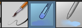
The one in the middle is my go to painting brush, left one for tinier/more refined details, right one for blending out soft shadows (though I learned the hard way to not overuse it, or it will look like I went ham with an airbrush tool lol).
(I don't change any of the settings on these brushes, so if you wanna try out the exact ones I use! Just fresh off how they come out the app haha)
I paint on the lights on top of the shadows, and just focus on that for the time being - once I'm done with the basic painting, I'll make a separate multiply layer for details like lip color, eye waterlines, makeup if there is any, eyebags, etc, and then adjust the opacity until it feels right - then I'll make an overlay layer with skin translucency details (like, when you hold your hands in front of a light and see the tips of your fingers become bright orange - many parts of your body are always a bit translucent to the blood underneath, specifically parts where the skin is thin like noses, cheeks, joints, knuckles, etc, and I found it makes the character look a lot more alive to add that subtle coloring in) - then usually I do hair on a separate layer on top of the lineart (because that way I can add small flyaways, more details, etc, and just use the lineart as a guide)
After that, I'll usually make a multiply layer on top of everything where I'll add contact shadows in a neutral color (usually pretty pale, it'll be darker anyway since it's multiply), and once I feel like I've rendered everything out properly, I save the psd and re-open it on photoshop.
In photoshop, I'll mess around with the layers a little bit more (changing hue/saturation, opacity, etc), fuck around with the background to make it look pleasing, and once I'm happy with it, I'll unify the layers and start color correcting - usually by duplicating the unified layer and messing with the curve/hsl of the image and then changing the opacity of that edited layer until it's as strong or muted as I want it to be - then I also edit the RGB curves individually and adjust the opacity of that also (because I just really like how it ends up looking if I give a bit of a red/warm tint to the shadows lol), and at that point often I will reimport the finished image into procreate for some finalizing touches! Like, blending out shadows that came out too harshly, painting over anything that came out not the way I wanted it, redefining the lineart if it got messy during painting, and adding any extra small detail that might have gotten lost like catchlights, hair shines, hair flyaways, tears, etc. I also do one last round of flipping the canvas and liquify if needed!
At this point, I export the finished image both to my computer and my phone - on my phone I open it up on the photo editing app, and add a bunch of different color filters - I don't hesitate from going completely balls to the walls here, and just kinda applying as many filters as will make an image look pleasing to my eye.
Once I think it looks good, I'll export the edited image to my computer - and then open both the version without filters and the one with them on photoshop, and use the filtered version as an opacity layer, and adjust it until it doesn't look as crazy anymore lol.
One last step I recently started incorporating was also changing the image to grayscale after I'm done, and doing one last round of curves in greyscale to make sure the values look right, and nothing is getting too lost because the values are too similar (because i know i get a bit swept up in getting repulsed by harsh contrasting lighting and can end up washing out all of rendering if I don't check myself kjdfgk)
AND that's it!
Yes it's a pretty long and chaotic process, but it's coming from years of trial and error and realizing I can just let myself fo whatever makes me happier with the results, and I don't have to stay constrained to one program if I don't like every tool it has to offer/don't have to accept the final image fresh off the painting app as the "finished" image with no adjustments allowed after, lol. I don't find it takes a lot more time than if I didn't do it this way, but YMMV.
Hope this was helpful and sorry for taking so long to explain! I just wanted to give a thorough explanation dfhdkhkx
#asks#sorry i know its a bit chaos hfdgd#but i hope its helpful anon! thanks for asking#also for anyone wondering#no i am not paying for ps lmao#fuck adobe#it is always morally correct to pirate adobe products people#if you have an alternative photo editing app you like best youre welcome to use it#but if youre too used to photoshop. everything is free on the internet if you know where to look#i also wouldnt recommend meitu bc it feels like a pretty sketchy app all things considered#im just too lazy to care to change my go to app but i would look for a different phone app#p sure theres billions that let you add funky color filters instead#actually i think you could use photoshop camera raw filters for that too#its just way too intensive of a process for my tiny potato computer and it feels a lot faster + seamless on phone
13 notes
·
View notes
Note
hi new anon for your enjoyment! (i don’t remember if i’ve sent asks sh)
Some good ideas for learning to draw newborns!
Get screenshots from The Kitten Lady’s videos or from her instagram to do little kitten arts of. Warning for babies at varying levels of sick, though; she’s a miracle worker and often saves babies who have no chances without her intervention.
Look for photos of newborns and do base sketches based on/over top of them, then lineart without the image. Do this until you like how it turns out! Keep in mind no one tends to take photos of cat babies until they’re maybe a day or so, or until they’re dry if they really wanna publicize it. But not much growth happens between 0-2 days so that still helps.
Just draw a bean with tiny stick legs and smushed cat face. no idea if this is even a good/well-explained idea, thats just how i’ve seen people draw them before
as a note, it’s hard to come by newborns cuddling with mama outside of videos because a lot of people like to have mama out of the photo or just don’t have mama for whatever reason. Something something cute babies > cute mamas with babies, idk the reason. Also kittens like to nurse a lot from my knowledge so that could contribute.
- 🫁 anon
(if 🫁 anon doesn’t work i will be 🪸 anon)
thank you for the tip! a couple of people have said i should watch cat birthing videos (which is fine bc im not squeamish at all) but you're the first who actually gave me a specific channel, I'll probably check out The Kitten Lady's videos at some point :)
i have no problems with drawing the babies with the parents, really (except it means More Drawing, which is also fine depending on how im feeling that day), its more just trying to get a good picture of what the kitten looks like without them being all smushed up behind another kitten or without being held in a human hand (which is a very common trend for newborn kitten pics, for decent reason, gotta keep the little guys warm and comfy). i do just need to put in the effort to learn to draw kittens but for some reason i cant get their anatomy down lmao. at least for older kittens its just Cat but Smushed Up but newborns are just like little aliens to me. peanut shaped idiots (affectionate)
#fallenasks#lung anon#<unclaimed so its all yours :) added you to the list#which. since some ppl have asked. i just keep in case someone wants to be X anon and its already claimed
30 notes
·
View notes
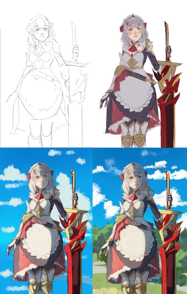
Text
Short version: Trying to come up with a design for DJ that works in my style and can emote decently and that I generally like the look of. Ideally a bit closer to canon than how I've been drawing him. So did some quick sketches to try to work on that.
Longer ramble below the cut.
So...part of why I've been drawing Music so much more than DJ is that I just haven't really liked how I've been drawing DJ for awhile now.
When I started drawing him I was still kinda...getting into the swing of even doing art again, so I cut myself a lot of slack. I scared myself off of drawing the DCA much because I gave myself too many "rules" for how to draw them, so with DJ I just said screw it, his face is basically squishy and he can change his eye shape and mouth shape however he needs to and even close his lips fully. And his "lips" are me just coloring the lineart pink because lips aren't something I have historically given my characters.
So when I started drawing MM I tried to challenge myself to not do those things. His lips never fully close, his eye shape stays round with the eyelids responsible for changing the shape of them, he has actual lips. And I got it work for him, but applying those techniques to DJ was...often not what I'd hoped for. But I think I'm starting to get it.
I'm also trying to get DJ's head dimensions to be more consistently square-ish. And I realized I can put his headphone headband behind his hat since his head is long enough to do that. (Even if his canon design doesn't take advantage of that fact :P)
His hat being bigger than canon and his chin being fairly flat (not having the exaggerated cleft/bump thing(? idk the proper name for it) that Music has) are deliberate because I like them.
Idk. Not sure if I'll stick with this style overall. I think works better for Music because most of the time he has some form of smarmy grin whereas DJ's facial expressions have a wider range.
20 notes
·
View notes
Note
Hello! Sorry if this is weird to ask, you're the only artist I follow that regularly does adopts, so I thought you'd have some advice. I'm thinking about getting into selling adoptables, and was wondering if you had any tips for like, getting the word out there? Or just in general, really.
To be completely honest with you, I got into adoptables by complete accident and my success had been largely generated through luck. My first Warrior Cats "set" was priced at $35 and sold on Deviantart (and can still be seen here). Before that, however, I still had a relatively decent following - before I got heavily into WC I tried and failed to start up a "closed species" (not for lack of interest, I just don't enjoy the process of making and editing "bases"). So I guess some trial and error was involved, too.
As for actionable advice, start on building a loyal audience first. Advertising adoptable designs through normal channels (twitter, da, tumblr, etc.) is difficult, so it's almost easier to make art without going straight to monetizing it. It was months after my WC designs got traction that I considered a Patreon, for example, because at that point the demand was in such a way that it was starting to get stressful managing it all.
Another thing is try to make something that sets your adopts apart. I can't think of anyone who wrote "stories"/design notes for their designs before I started doing it (at least when WC is involved - that was more of a 'thing' in closed species and something I was inspired by trying to set myself apart). In my case, my audience was receptive to the elaborate nature of the unique lineart/design notes/story/etc. enough to pay anywhere between ~$150-300+.
Algorithms are all luck nowadays. Good luck trying to make sense of them in a way that will make your art accessible to others - nowadays, I don't even try. Which is why I suggested focusing on your art and who you want to target first.
Adopt making isn't for everyone. I basically took a break for the entire year in 2023 because I was burnt out so badly trying to maintain a strict monthly schedule. Take care of yourself first and use adopts to explore other avenues, don't try to force it as an end goal. Anyone who tells you otherwise is not giving you reasonable expectations.
18 notes
·
View notes
Text
Actually here's some Gabbika (she has a name now!!!) because I'm experimenting with lineart and 'simpler' style (for comics, mainly)

backstory dump below!!
Once a human lady, living a pretty chill life - Gabbika had many interests, which she happily enjoyed. Coming from a decently wealthy family herself, she was well educated and lucky enough to work as an appraiser at her family's little jewellery store. She was an expert at telling apart the fakes from the real, and giving things their true value. Yet her private life was full of cheap things, which whilst not as expensive carried much more emotional value to her. She loved color, she loved fun. She had a hefty collection of movies and vinyls, when she felt good enough, she'd dance, and overall really tried to enjoy a lot in life. During all that, The War was happening, but because of the location and 'luxury' her family's store offered, she only ever got second hand news.
Well, she was met with quite a surprise, after The Revolution happened. A mixed boy, half human and half monster took the leadership role. And quickly started enforcing new rules around.
Gabbika's family was accused of supporting hunting monsters (even tho they tried to stay away from both sides) and promptly arrested. All their belongings being redistributed to 2 sisters (guys they don't have a name yet, even tho they really old ocs of mine :( ). Turns out, they were one of the few humans with financial enterprises, which chose to support the Rebels. And now they were reaping the rewards - which in Gabbika's case meant taking over her entire store.
Gabbi was the only person 'left' from her family. As she was too young at the time to be 'recognised', she avoided imprisonment. The sisters took notice of that too, 'feeling pity' for her and offering her a job...at her own store. That was an offer she couldn't say no to!
Gabbika suffers from chronic pain (on most days she gets through, but the bad ones aren't uncommon either), and so she's got to take care of and make accomodations for herself. She's independent in most things, but majority of her budget is spent on painkillers and rehabilitation sessions. That means less money for tanning beds and makeup! Tragic! But no, seriously, she was on her way to build a colorful and fun life for herself, and then everything got taken away from her. She's forced to work for 2 heartless stuck-up sisters, putting on a 'serious' faćade, not allowed to really express herself, or indulge in things she'd like. And they're holding her hostage, as they exclusively own the entire 'gem' and jewellery industry in the City.
Gabbika wouldn't be able to run a place with her own name, and even if, the sisters would smush it out of existence.
She doesn't plan on 'keeping' things this way. She's constructing a plan. But until then, she decided to start ventilating her built-up frustration and hatred for 'the rich'. By putting on a new disguise (ironically, a look that she feels much more like herself, than in anything she can normally wear) and vandalizing properties and belongings of various wealthy individuals. Defacing them with paint and various junk. Things aren't perfect. And money won't make them any 'better' than all the people they try to separate themselves from!
Gabbika is fed up.
#my art#art#oc#digital art#my ocs#oc art#artists on tumblr#picklegods arts#picklegods ocs#oc writing#oc story#my oc stuff#backstory#lore dump#lore#oc lore
5 notes
·
View notes
Note
would you ever post a progress timelapse/progress screenshots? you render in such a fascinating way i cant even wrap my head around how you get from sketch to final colored piece its fascinating!!! i don't think I've ever seen this technique and I'm really really curious how you go about it! love ur art<333
well sometimes i post speedpaints on youtube although theyre really shitty and old and i dont think i ever remember to include the sketch/lineart process.... but someday i will make a decent speedpaint 🤞🤞
anyways tbh i mostly use the airbrush + lasso tool LMAO and a pretty basic round brush for lineart/details. then its just a slow build up of texture/color until im happy with it i guess
oh yeah and i always finish off by redrawing parts of the lineart with like a highly saturated dark red.. if that makes sense
also this is the nicest thing ever im gonna cry ive been feeling so down about my art recently and i just hate everything i make so this is SO very lovely to hear 😖😖😖
9 notes
·
View notes
Last Seen Blogs
dlido
Help.
mestodlyanika
Mr. Sandman

indiabullsfinance
Indiabulls Finance

chadwinwrites-blog
library

muvosohom
Untitled