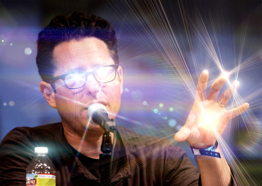
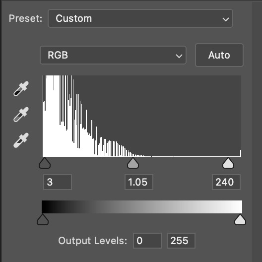
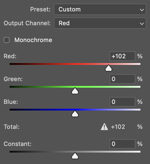
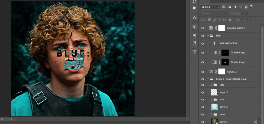
#photoshop: how much red do you want
Text
Let's talk about vintage lenses.
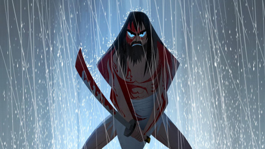
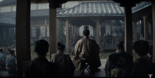
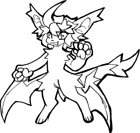
Here is your cool samurai show with modern lenses.
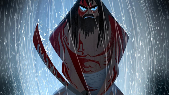
Here is your cool samurai show with vintage lenses.
Hollywood is no stranger to fads.
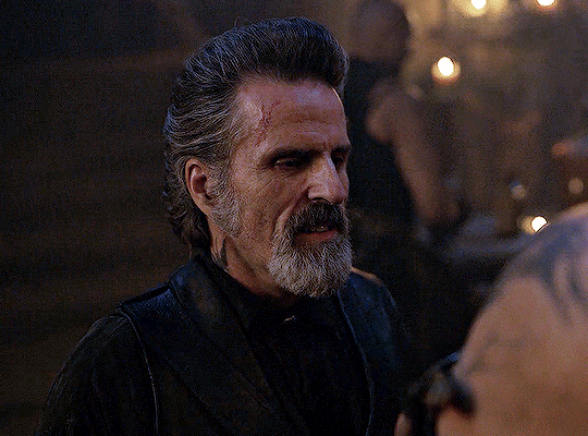
We are currently in the middle of a "make everything too dark" fad. But that fad is starting to overlap with "let's use really old lenses on ridiculously high resolution cameras."
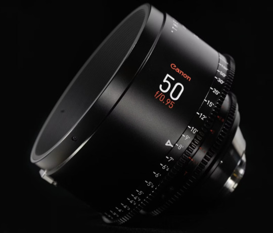
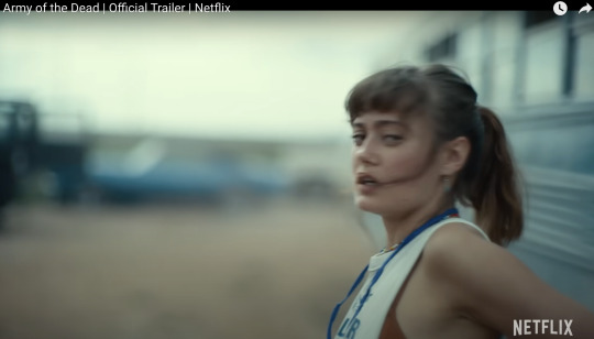
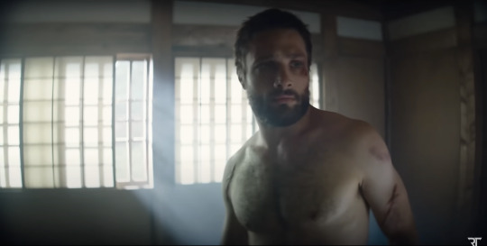
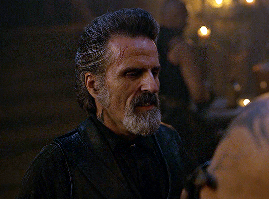
This is Zack Snyder with a Red Monstro 8K camera.
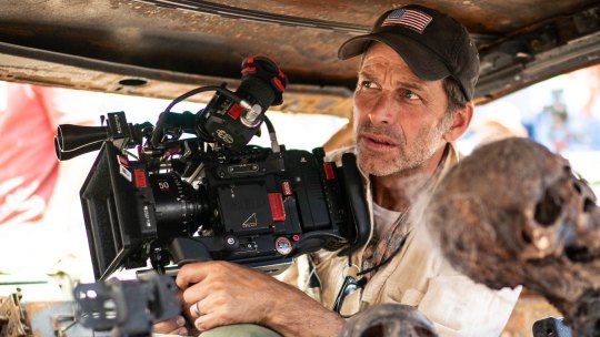
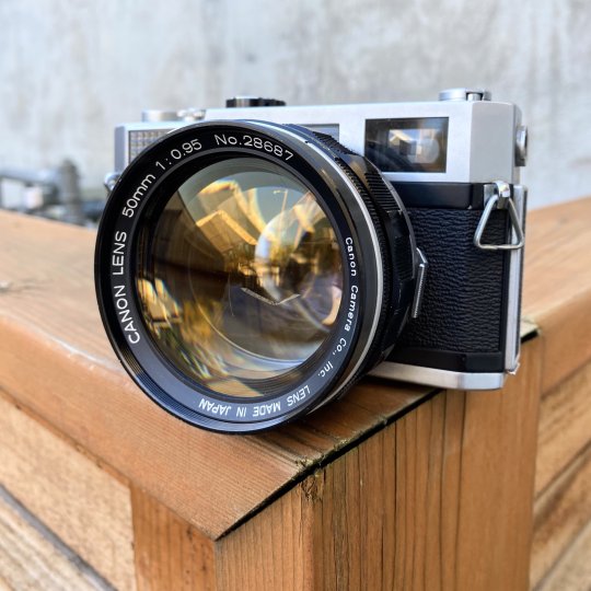
He is using a "rehoused" vintage 50mm f/0.95 Canon "Dream Lens" which was first manufactured in 1961.
This old lens is put inside a fancy new body that can fit onto modern cameras.
Which means Zack is getting nowhere near 8K worth of detail. These lenses are not even close to being sharp. Which is fine. I think the obsession with detail can get a bit silly and sometimes things can be "too sharp."
But it is a funny juxtaposition.
The dream lens is a cool lens. It has character. It has certain aberrations and defects that can actually be beneficial to making a cool photograph. It's a bit like vinyl records for photography.
[ Peter Thoeny ]
It has vignetting and distortion and a very strange swirly background blur.
[ Gabriel Binder ]
Optical engineers have been spending the last 60 years trying to eliminate these defects. And I sometimes wonder if they are confused by this fad.
"I WORKED 70 HOURS PER WEEK TO GET PERFECT CORNER SHARPNESS!"
And whether you prefer to work with a perfect optic or a vintage one... it is a valid aesthetic decision either way. I think vintage glass can really suit candid natural light photography. You can almost get abstract with these lenses.
[ Peter Theony ]
Personally I like to start with as close to perfect as possible and then add the character in later. That way I can dial in the effect and tweak how much of it I want. But even with modern image editing tools, some of these aberrations are difficult to recreate authentically.
That said, it can be very easy for the "character" of these lenses to become distracting. And just like when someone first finds the lens flares in Photoshop, it can be easy for people to overdo things.
Zack Snyder decided to be his own cameraman and used only vintage glass in his recent movies and it has led to some complaints about the imagery.
I mean, Zack Snyder overdoing something? I can't even imagine it.
Non camera people felt Army of the Dead was blurry and a bit weird but they couldn't quite explain why it felt that way.
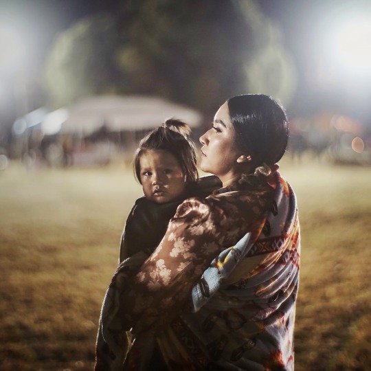
The dream lens has a very wide aperture and it lets in a lot of light. But it also has a very very shallow depth of field. Which means it is very difficult to nail focus.
[ Peter Thoeny ]
Her near eye is in focus and her far eye is soft. You literally can't get an entire face in focus.
There is no reason you have to use the dream lens at f/0.95 at all times. But just like those irresistible lens flares, Zack couldn't help himself.
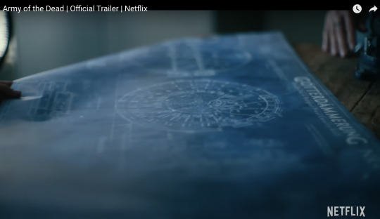
Here is a blueprint that you can't really see.
Extreme close ups of faces without autofocus at f/0.95 is nearly impossible to pull critical focus on.
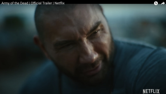
Looks like Zack nailed the area just above the eyebrow here.
Let's try to find the point of focus in this one.
Ummmm... she is just... blurry. Missed focus completely.
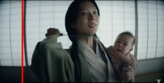
But Zack isn't the only one going vintage. I've been seeing this a lot recently.
Shogun is a beautiful show. And for the most part, I really enjoyed the cinematography. But they went the vintage lens route and it kept going from gorgeous to "I can't not see it" distracting. And perhaps because I am familiar with these lens defects I am more prone to noticing. But I do think it hurt the imagery in a few spots.
Vingetting is a darkening of the corners of the frame.
Light rays in the corners are much harder to control. A lot of modern lenses still have this problem, but they create software corrections to eliminate the issue. Some cameras do it automatically as you are recording the image.
Vintage lenses were built before lens corrections where a thing—before software was a thing. So you either have to live with them, try to remove them with VFX, or crop into your image and lose some resolution.
It's possible this is the aesthetic they wanted. They felt the vignetting added something to the image. But I just found my eyes darting to the corners and not focusing on the composition.
And then you have distortion.
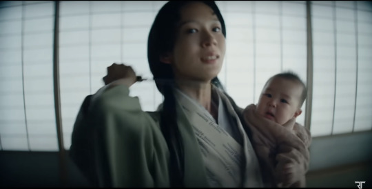
In this case, barrel distortion.
This is mostly prominent in wide angle lenses. In order to get that wider field of view the lens has to accept light from some very steep angles. And that can be quite difficult to correct. So you kind have to sacrifice any straight lines.
And sometimes this was a positive contribution to the image.
I thought the curved lines matched the way they were sitting here.
But most of the time I just felt like I was looking at feudal Japan through a fish's eye.
It's a bit more tolerable as a still, but when all of these verticals are bowing in motion, I start to feel like I am developing tunnel vision.
I love that this is a tool that is available. Rehousing lenses is a really neat process and I'm glad this old glass is getting new life.
This documentary shows how lens rehousing is done and is quite fascinating if you are in to that sort of thing.
youtube
But I think we are in a "too much of a good thing" phase when it comes to these lenses. I think a balance between old and new can be found.
And I also think maybe Zack should see what f/2.8 looks like. He might like having more than an eyebrow in focus.
426 notes
·
View notes
Note
hi i'm sorry to bother you but do you have any tips on giffing dark indoor scenes? yours always look so good!
hi there! not a bother at all :) i can definitely try to explain the steps i usually take under the cut!
this tutorial will assume that you already know the basic steps of gif-making — if you don't, there are lots of great tutorials floating around on this site that can help you out! :)
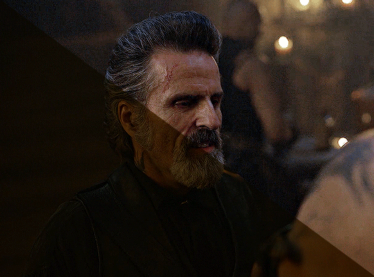
here's the gif i'll work with to explain my steps, the bottom being the original and the top being the coloured/brightened version.
before we start, a general tip i recommend keeping in mind: if you want to brighten a dark scene, you'll want to get your hands on the highest quality download you can find. 1080p is decent, but if your laptop can handle 2160p 4k hdr files* without sounding like it's about to explode, that'll get you even better results!
(*colouring hdr 4k files requires a different set of steps — the scene will appear washed-out on photoshop, so you need to make sure that you don't end up whitewashing anyone if you do choose to work with this type of file.)
since most of my downloads are 1080p, i'll use this type of file in this tutorial.
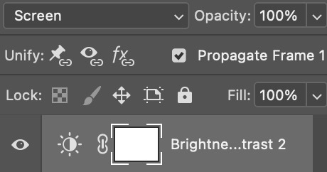
the first step of my gifmaking process with 1080p files is almost always the same no matter what scene i'm giffing. i make a brightness/contrast layer and set the blending mode to screen:
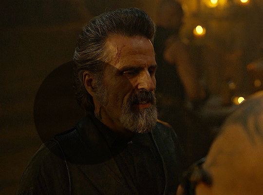
now my gif looks like this:
depending on the scene and how washed out it looks after this layer, i'll play around with the opacity. for this gif, i didn't touch the opacity at all. use your best judgement for this, because every scene is different!
i find that dark indoor scenes are usually tinted in yellow or green. one of my first goals is to try to fix the undertone of this scene before focusing on brightening it any further. i go to colour balance for this, and play around with the midtones, shadows, and highlights.
again, every scene is different, so the amount to which you use colour balance will differ, but for this specific scene, my goal was to neutralize the yellow. i focused particularly on the midtones and shadows of the colour balance layer, moving the scales to the opposite of the reds.
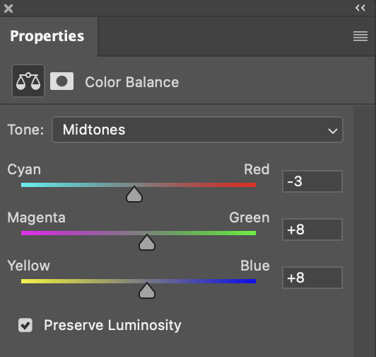
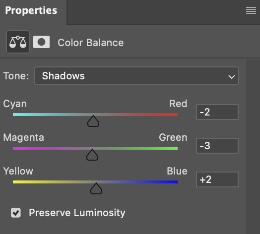
doing so will help with neutralizing the yellow. the only reason i moved the scales towards magenta and blue (therefore making it a bit more red than less) rather than green and yellow in shadows was because i wanted a darker contrast in the blacks. moving them to green and yellow made the overall scene more yellow since there were so many dark spots that shadows affected. (you'll see what i mean when you start experimenting with your own gif — this part of the process really just depends on your preferences!)
our gif might not look that much better yet, but it will soon! our best friend channel mixer is gonna help us out. for an in-depth post about how to use this adjustment layer, i recommend checking out this tutorial.
i'm someone who prefers to make more than one layer for the same adjustment layer for a reason i can't even explain (i just find that it helps me stay more organized). so don't think of this process like i can only use this layer once so i MUST fix it NOW. you can create multiple layers of the same adjustment layer, because every layer on top will affect the ones underneath it.
since my priority is getting rid of the yellow tint, i went to the Blue section of the channel mixer and increased it in all of the scales:
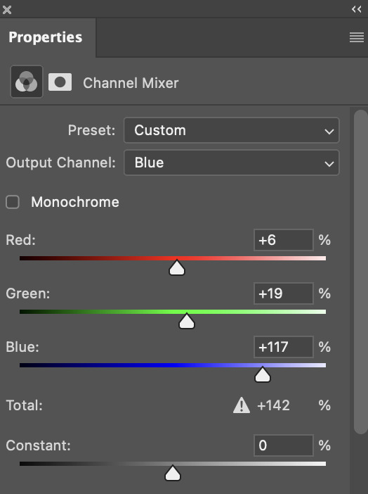
this step alone has helped us out so much, because look at our gif now!
not only does the background look less yellow, but so does izzy's skintone.
now i'm going to focus on trying to brighten the scene even more without destroying the quality. the levels layer can actually help out a lot with this.
the amount to which i move each toggle differs per scene, and i think experimenting depending on your gif works best for this layer.
side note: i prefer not to use the ink droppers on the side because the contrast in the result usually ends up feeling too strong for my preferences, but if you find that this works better for you, then go for it! basically, the first dropper with the black ink should be clicked before you select the darkest part of the scene that you can find, and vice versa for the third dropper with the white ink — click it, and then select the brightest part of your scene.
curves is the next layer that does fantastic work! unlike the levels layer, i do actually use the ink droppers for this. it's the same concept, with the first dropper being used on the darkest part of the scene, and the third dropper on the brightest.
try to think of curves as something that not only further brightens your scene, but also helps with the colour neutralizing process.
i grab the first dropper, then click the darkest parts of the gif that i can see. depending on the undertone of the blacks that you're clicking on, the tint of your gif might actually change significantly. this is why i prefer to click once, then undo the action if i don't like what it gives me. izzy's leather jacket was the sweet spot for this gif.
when i'm satisfied, i make another curves layer and use the third dropper to click the bright/white parts of the scene. for this gif in particular, the lights in the background were a good fit because they carried a yellow undertone — this meant that my curves layer actually helped to further neutralize the yellows in the scene as a whole!
(i manually dragged the curves graph upwards for the third dropper to make it brighter. i don't need to do this if the dropper does this for me automatically, but since the lights were pretty bright, it only changed the tone of the scene and didn't increase the brightness — hence the manual step.)
pat yourself on the back, because this is what our gif looks like now!
this is good, but it's not great — there's still just a bit too much yellow in the scene for my liking (sorry, i'm picky! :P)
i created another channel mixer layer and played with the toggles until i was satisfied:
ta-da! the gif as a whole is much less red/yellow now:
this is when i start fixing the colouring now — namely, his skin tone. selective colour will be your best friend here. i wanted to make his face just a tad brighter and less of a yellow-ish magenta shade, so i focused on the reds and yellows.
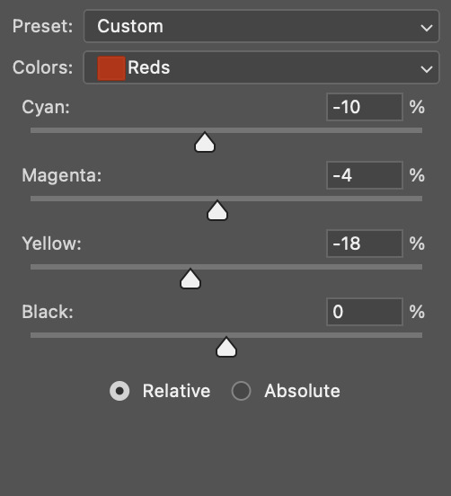
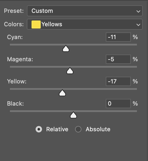
then, out of habit, i created another selective colour layer and took out more of the "yellow" in the whites to make them whiter, and increased the black (just by +1, since the contrast is pretty good enough already).
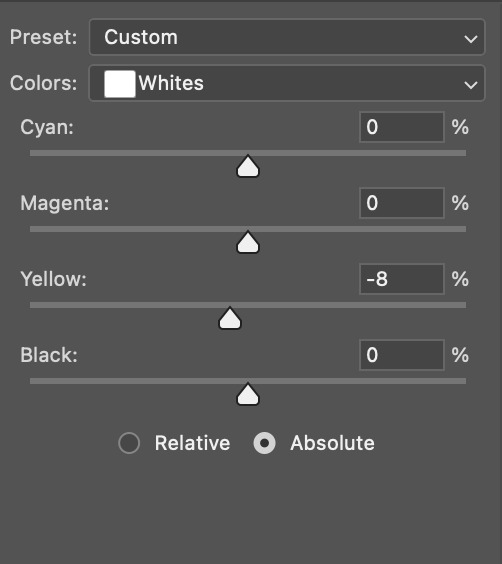
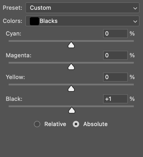
note: i switched to "absolute" for these two colours. basically, relative = less vibrant colour manipulation, and absolute = more vibrant/stronger colour manipulation. i prefer to stick to "relative" for fixing skin-tone since "absolute" can be a bit too strong for that.
our gif looks like this now!

his face looks brighter and much less yellow, so i'm satisfied!
this next step is not mandatory at all — again, i'm just picky and despise yellow-tinted scenes. i personally believe that indoor scenes that are yellow/green tinted make them look more dark than they actually are, so i do my best to get rid of these colours.
i also don't always do this, but for this gif, i just simply went to hue/saturation, selected the yellows from the drop-down menu and decreased its saturation.
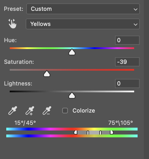
be careful not to do this too much. depending on the quality of your download, this can significantly decrease your gif quality. i tend to worry less about this when i'm working with 2160p files, but again, those files require an entirely different set of steps when it comes to brightening/colouring.
since this was a 1080p file download (and one that was actually less than 1GB, oops, don't do that), i played it safe and decreased it by -39 only.
note: you also want to be cautious of colour-washing skintone when it comes to this step. i find that another selective colour layer can help perfect the skintone in case the yellow drains out of it too much, but skip the hue/saturation step if it's too difficult to work with — better to be safe than sorry.
anyway, this is the final gif!
that's usually what i do when it comes to colouring dark indoor scenes! i hope this tutorial makes sense, and if you have any further questions, don't hesitate to reach out! :)
#tutorial#gif tutorial#resources#completeresources#coloring tutorial#allresources#dailyresources#userraffa#userdean#uservivaldi#alielook#usercats#usermoonchild#usernaureen#userbarrow#userabs#useraish#useralison#userisaiah#*mytutorials#i am so sorry if this is incoherent#it’s so hard to explain things coherently 😫
683 notes
·
View notes
Text
How to Buy a Computer for Cheaper
Buy refurbished. And I'm going to show you how, and, in general, how to buy a better computer than you currently have. I'm fairly tech-knowledgeable, but not an expert. But this is how I've bought my last three computers for personal use and business (graphics). I'm writing this for people who barely know computers. If you have a techie friend or family member, having them help can do a lot for the stress of buying a new computer.
There are three numbers you want to know from your current computer: hard drive size, RAM, and processor speed (slightly less important, unless you're doing gaming or 3d rendering or something else like that)
We're going to assume you use Windows, because if you use Apple I can't help, sorry.
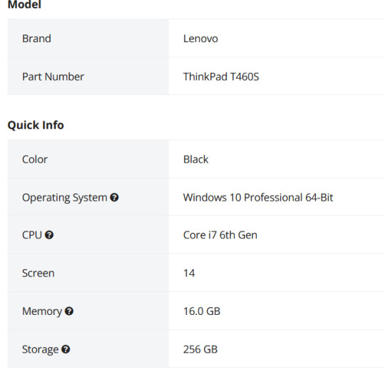
First is hard drive. This is how much space you have to put files. This is in bytes. These days all hard drives are in gigabytes or terabytes (1000 gigabytes = 1 terabyte). To get your hard drive size, open Windows Explorer, go to This PC (or My Computer if you have a really old OS).
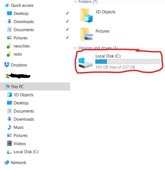
To get more details, you can right-click on the drive. and open Properties. But now you know your hard drive size, 237 GB in this case. (this is rather small, but that's okay for this laptop). If you're planning on storing a lot of videos, big photos, have a lot of applications, etc, you want MINIMUM 500 GB. You can always have external drives as well.
While you've got this open, right-click on This PC (or My Computer). This'll give you a lot of information that can be useful if you're trying to get tech support.
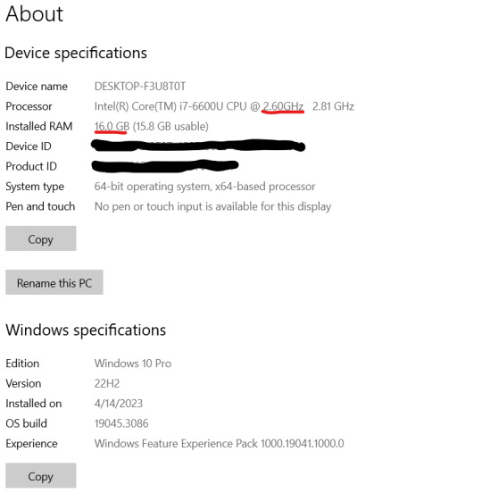
I've underlined in red the two key things. Processor: it can help to know the whole bit (or at least the Intel i# bit) just so you don't buy one that's a bunch older, but processor models are confusing and beyond me. The absolutely important bit is the speed, in gigahertz (GHz). Bigger is faster. The processor speed is how fast your computer can run. In this case the processor is 2.60 GHz, which is just fine for most things.
The other bit is RAM. This is "random-access memory" aka memory, which is easy to confuse for, like how much space you have. No. RAM is basically how fast your computer can open stuff. This laptop has 16 GB RAM. Make sure you note that this is the RAM, because it and the hard drive use the same units.
If you're mostly writing, use spreadsheets, watching streaming, or doing light graphics work 16 GB is fine. If you have a lot of things open at a time or gaming or doing 3d modeling or digital art, get at least 32 GB or it's gonna lag a lot.
In general, if you find your current laptop slow, you want a new one with more RAM and a processor that's at least slightly faster. If you're getting a new computer to use new software, look at the system requirements and exceed them.
I'll show you an example of that. Let's say I wanted to start doing digital art on this computer, using ClipStudio Paint. Generally the easiest way to find the requirements is to search for 'program name system' in your search engine of choice. You can click around their website if you want, but just searching is a lot faster.
That gives me this page
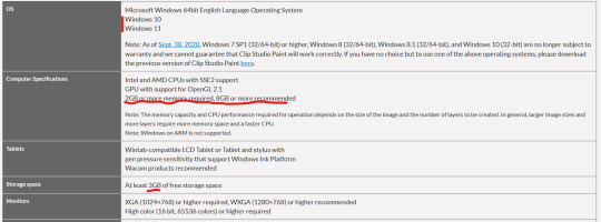
(Clip Studio does not have very heavy requirements).
Under Computer Specs it tells you the processor types and your RAM requirements. You're basically going to be good for the processor, no matter what. That 2 GB minimum of memory is, again, the RAM.
Storage space is how much space on your hard drive it needs.
Actually for comparison, let's look at the current Photoshop requirements.
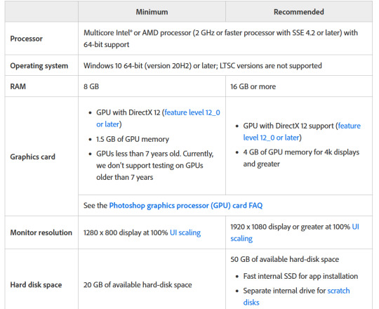
Photoshop wants LOTS of speed and space, greedy bastard that it is. (The Graphics card bit is somewhat beyond my expertise, sorry)
But now you have your three numbers: hard drive space, RAM (memory) and processor (CPU). Now we're going to find a computer that's better and cheaper than buying new!
We're going to buy ~refurbished~
A refurbished computer is one that was used and then returned and fixed up to sell again. It may have wear on the keyboard or case, but everything inside (aside from the battery) should be like new. (The battery may hold less charge.) A good dealer will note condition. And refurbished means any flaws in the hardware will be fixed. They have gone through individual quality control that new products don't usually.
I've bought four computers refurbished and only had one dud (Windows kept crashing during set-up). The dud has been returned and we're waiting for the new one.
You can buy refurbished computers from the manufacturers (Lenovo, Dell, Apple, etc) or from online computer stores (Best Buy and my favorite Newegg). You want to buy from a reputable store because they'll have warranties offered and a good return policy.
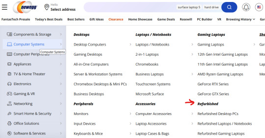
I'm going to show you how to find a refurbished computer on Newegg.
You're going to go to Newegg.com, you're gonna go to computer systems in their menu, and you're gonna find refurbished
Then, down the side there's a ton of checkboxes where you can select your specifications. If there's a brand you prefer, select that (I like Lenovos A LOT - they last a long time and have very few problems, in my experience. Yes, this is a recommendation).
Put in your memory (RAM), put in your hard drive, put in your CPU speed (processor), and any other preferences like monitor size or which version of Windows you want (I don't want Windows 11 any time soon). I generally just do RAM and hard drive and manually check the CPU, but that's a personal preference. Then hit apply and it'll filter down.
I'm going to say right now, if you are getting a laptop and you can afford to get a SSD, do it. SSD is a solid-state drive, vs a normal hard drive (HDD, hard disk-drive). They're less prone to breaking down and they're faster. But they're also more expensive.
Anyway, we have our filtered list of possible laptops. Now what?
Well, now comes the annoying part. Every model of computer can be different - it can have a better or worse display, it can have a crappy keyboard, or whatever. So you find a computer that looks okay, and you then look for reviews.
Here's our first row of results
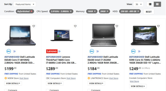
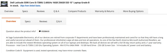
Let's take a look at the Lenovo, because I like Lenovos and I loathe Dells (they're... fine...). That Thinkpad T460S is the part to Google (search for 'Lenovo Thinkpad T460s reviews'). Good websites that I trust include PCMag, LaptopMag.com, and Notebookcheck.com (which is VERY techie about displays). But every reviewer will probably be getting one with different specs than the thing you're looking at.
Here are key things that will be the same across all of them: keyboard (is it comfortable, etc), battery life, how good is the trackpad/nub mouse (nub mice are immensely superior to trackpads imho), weight, how many and what kind of ports does it have (for USB, an external monitor, etc). Monitors can vary depending on the specs, so you'll have to compare those. Mostly you're making sure it doesn't completely suck.
Let's go back to Newegg and look at the specs of that Lenovo. Newegg makes it easy, with tabs for whatever the seller wants to say, the specs, reviews, and Q&A (which is usually empty).
This is the start of the specs. This is actually a lesser model than the laptop we were getting the specs for. It's okay. What I don't like is that the seller gives very little other info, for example on condition. Here's a Dell with much better information - condition and warranty info.
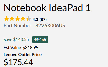
One thing you'll want to do on Newegg is check the seller's reviews. Like on eBay or Etsy, you have to use some judgement. If you worry about that, going to the manufacturer's online outlet in a safer bet, but you won't quite get as good of deals. But they're still pretty damn good as this random computer on Lenovo's outlet shows.
Okay, so I think I've covered everything. I do recommend having a techie friend either help or double check things if you're not especially techie. But this can save you hundreds of dollars or allow you to get a better computer than you were thinking.
990 notes
·
View notes
Note
Hello!! I'm a huge fan of your art and I thought I would ask about your colorwork, because it's genuinely super impressive to me how all your pieces have amazing palettes and they add so so so much to the general atmosphere. Do you have any process to pick colors for pieces? Like using picture references, gradient maps, etc or do you genuinely just eyeball them? I'm super curious :]
But yea I really love what you do and love seeing every new piece!! Have a nice day! Ty for reading <3
Thanks! I very much use references, though I don't use the color picker on them, gotta train the eye. I have an ever-expanding reference folder of photos and paintings with colors that I like so that when I start a new painting and I have an idea of the color scheme I want in mind, I'll already have some reference on hand. Good reference really makes a world of difference!
I also like to bias colors a little bit away from their standard versions:
The more blue green and the more yellow green are both more interesting to me than the "just green" green. Nothing wrong with that average green though, sometimes that's exactly what you need. It's always situational.
Lastly, a fantastic color tip for digital art specifically that I got from Mike Hernandez: Use the RGB sliders instead of the HSB color selection!
By default, Photoshop gives you the HSB (Hue, Saturation, Brightness) color picking setup which looks like this:
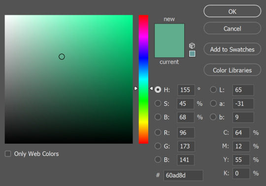
It's perfectly functional and has its uses, but it doesn't really feel like mixing color. On the other hand, if you use the RGB sliders:
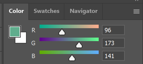
Now you can add a little more blue if you think that's what the color needs, or you can take away red, add some green, etc. It gets you actually mixing color and thinking more about how the colors relate to each other. It can take some getting used to if you've only used the HSB setup before, but it's worth it!
#and thank you for your patience!#I know this and other questions have been sitting in my inbox for a while#these past months have been the type where there was always something (or several somethings) just a little more urgent on the to-do list#and once again thank you so so much to everyone who has sent in kind messages about my work!!#it would flood this blog if I were to respond to every one but know that I do immensely appreciate every one#they absolutely make my day
231 notes
·
View notes
Text
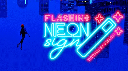
HOW TO: Make Animated Neon Text
Hi! No one asked for this tutorial, but this is one of my favorite typography effects as of late — so I thought I'd share how I do it. You can see this effect in the first gif of this *NSYNC Celebrity set and the last gif of this Anthony Bridgerton set. Disclaimer: This tutorial assumes you have a basic understanding of gif-making in Photoshop. It's also exclusively in Timeline and uses keyframes for the fading effect seen on the blue text.

PHASE 1: PREP YOUR BASE GIF
1.1 – Choose a dark scene.
This effect looks best contrasted against a dark background. You can definitely do it with a bright background, but just like a neon sign irl, you only turn it on in the dark/at night — so keep that in mind!
1.2 – Determine the length of your clip.
Depending on how much you want your text to flash or fade in, you'll want to make sure you have a scene long enough to also allow the text not to flash — reducing the strain it takes to actually read the text. For reference, my gif is 48 frames.
1.3 – Crop, color, etc. as you would.
New to gif-making? Check out my basic tutorial here!
PHASE 2: FORMAT YOUR TEXT
Before we animate anything, get your text and any vectors laid out and formatted exactly as you want them!
2.1 – Finding neon sign fonts.
It's easy as going to dafont.com and typing "neon" into the search bar!
2.2 – Fonts I used.
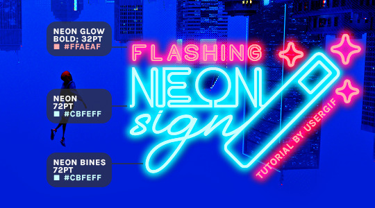
Neon Glow by weknow | Neon by Fenotype | Neon Bines by Eknoji Studio
And to not leave my fellow font hoarders hanging, the font for "tutorial by usergif" is Karla (it's a Google font) 🥰
2.3 – Group your text layers. (Conditional)
If you plan on having multiple text layers like I did and you want them to appear connected (like how the last letters of "NEON" and "sign" intersect with the wand icon), I suggest putting the layers into groups according to color (the shortcut to group layers is Command+G). If you don't group your text and just apply the outer glow settings to each individual layer, you'll end up with something like this:
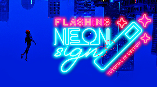
—where you can see the glow overlap with the line, instead of the smooth connection you see in my final example gif. I'm using 2 colors for my text, so I made a group for red and a group for blue.
2.4 – Apply Outer Glow.
Right-click your text layer (or your group if you have several layers) and select "Blending Options" to open the Layer Style menu. Check "Outer Glow" and feel free to play around with the settings until you like the way your text looks!
Your outer glow color should be darker and more vibrant than the color of the text itself. The text should be within the same color family but much brighter and, sometimes, almost white (see Step 2.2 again for my text colors).
Here are the settings for the Red Glow (the glow color is #FF3966) and Blue Glow (#00F0FF):
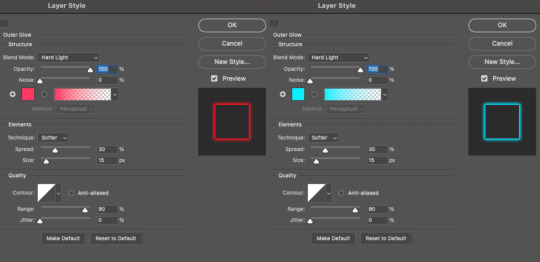
These aren't always my exact settings but they're pretty close to my standard. I always set the blend mode to Hard Light and usually have the opacity at 100%.
For every gif I use this effect on, I like to play around with Spread and Size. Spread will make the glow look denser and "expand the boundaries" (source: Adobe) and Size will diffuse the glow and blow it out so it covers a larger area (Adobe says it "Specifies the radius and size of blur").
2.5 – Duplicate your text layer/groups and remove glow.
We're only going to be animating the glow on our text, and since doing this affects its opacity/visibility, we want to preserve the base text by creating a duplicate.
I just hit the Command+J shortcut to duplicate my groups and delete the Outer Glow effects, making sure that the "No Glow" version is above the "Glow" version:
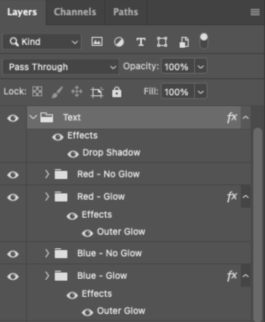
I also put all these groups into one group called "Text" for organization and so I could apply a drop shadow to all the elements for better visibility.
PHASE 3: CREATE THE FLASHING EFFECT
This is for the effect you see on the RED text in my gif!
3.1 – The 0.03-Second Rule
If you've read any of my animation tutorials before, you're probably already familiar with this rule. In my experience (and for reasons I can't explain), Video Timeline pauses every 0.03 seconds (try clicking the forward button a few times, you'll probably find a "duplicate" or paused frame). So, keep all your layers a duration of 0.03-second increments (e.g. 0.06 or 0.09 seconds can also work) and align them on the Timeline at 0.03-second intervals. If you don't follow this rule, you'll get duplicate frames when you export, resulting in a choppy final gif.
3.2 – Trim and arrange your text layers.
Only on the layers/groups WITH the Outer Glow effect, trim them into several segments of varying lengths where the glow will be "on" (visible) and leaving spaces where the glow should be "off."
Typically, I'll have a mixture of 0.06 and 0.03-second text. That's when the glow will be visible. Between each "flash" of visibility, I've got a 0.03-second blank space, baby *pen clicks* and I'll write your name:
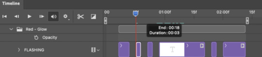
The layers shown above are arranged with a few flashes and two long segments of no flashing. This is the order and duration of each segment shown above (purple = visible segments):
0.06 blank, 0.06 visible, 0.03 blank, 0.03 visible, 0.03 blank, 0.03 visible, 0.03 blank, 0.24 visible (the long bit where "FLASHING" doesn't flash at all), 0.03 blank, 0.03 visible, 0.03 blank, 0.12 visible
(I only did this for the text that says "FLASHING" to give it a glitching effect. The other red text keeps the glow visible starting at the first long segment.)
PHASE 4: CREATE THE FADE-IN EFFECT
This is for the effect you see on the BLUE text in my gif!
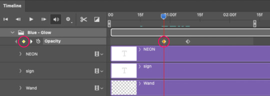
4.1 – Animate using the Opacity Keyframe.
Again, we're only touching the layers/groups WITH the glow effect. If you only have one layer of text, you'll find the Opacity Keyframe by clicking the film reel icon:
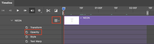
If you're working with groups like me, you'll find it in the Timeline panel under the group when it's expanded:
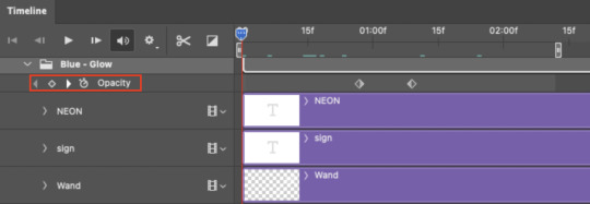
As you can see, I already added my keyframes (lil diamond babies). And luckily, it's super easy to do!
4.2 – Add the ending Keyframe first.
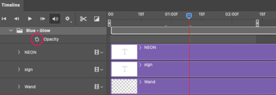
We're starting at the end because our layers/groups are already at 100% opacity. Drag the playhead (the blue arrow attached to the red vertical line) to a spot where you want the glow to be 100% opaque — this is where the glow will be fully "on" or visible. [Again, follow the 0.03-Second Rule. You will get duplicate frames regardless when using keyframes (this will be explained in the note in Phase 5), but abiding to the rule will mitigate the amount of dupes you get.]
Then, click the clock icon by "Opacity" to place a keyframe:
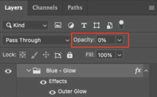
4.3 – Add the starting Keyframe.
Go backward from the ending Keyframe you just placed (I went back 0.12 seconds — but you can play around with the duration of the fade, just keep it a multiple of 0.03):
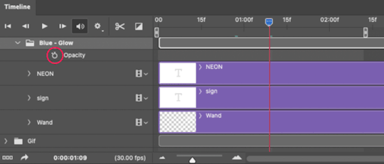
And drop another keyframe, this time by clicking the diamond icon by "Opacity":
4.4 – Reduce the opacity on the starting Keyframe.
Keeping that keyframe you just placed selected, go to the layers panel and reduce your layer's/group's opacity to 0%:
Now, this Outer Glow will slowly fade from 0% to 100% opacity.
And just for a visual aid, here's where my fade-in keyframes are in relation to my flashing segments:
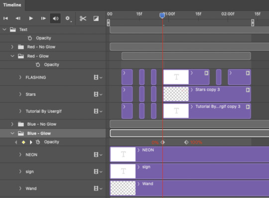
To refresh your mind, the 0% Opacity Keyframe starts when "FLASHING" is visible for 0.24 seconds (the first long segment of visibility).
With these keyframes, you'll get a smooth fade-in à la ✨light switch with a dimmer✨
PHASE 5: EXPORT
Yay, we're finished! Convert from Timeline back to Frames and export your gif!
NOTE: If you only did the flashing effect and followed my 0.03-Second Rule, you shouldn't have any duplicate gifs.
BUT if you included the fade-in effect using keyframes, you WILL have duplicate frames. 'Tis the nature of keyframes. 🤷♀️ I had 4 extra frames where the fade-in starts, which I deleted. So, as always, I recommend checking your frames when you convert from Video Timeline back to Frame Animation — and manually delete any duplicate frames.
Sorry this tutorial is so long 🙈 I over-explain so you're not just mechanically copying steps, but understanding the WHY behind each step! Thanks for bearing with me
If you have specific questions about this tutorial, feel free to send a message to usergif and I'll try my best to help! :)
More USERGIF tutorials • More resources by Nik • USERGIF Resource Directory
#typography#gif tutorial#completeresources#usershreyu#useryoshi#userelio#userzaynab#userives#usertreena#usercim#userrobin#userkosmos#usersalty#userhella#alielook#uservalentina#uservivaldi#*usergif#*tutorial#by nik#flashing gif
780 notes
·
View notes
Text

Obligatory coffee shop au art
Close-ups and ramblings under the cut because I spent waaay too long on this
Welcome to my brain soup.
Disclaimer, I didn’t really plan this piece and just kept adding concepts as I went, so it’s kind of all over the place. It’s more a big patchwork of dumb ideas I got excited over, rather than a well thought-out drawing, but I like it as it is! It feels like my brain did when I was reading htn :]
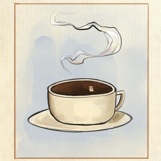
1. The whole concept behind this is just "Vintage coffee ad but make it the griddlehark coffee shop au". I was aiming for cheerful but also not quite right, in a very stock photo kind of way if that makes sense. Gideon is smiling but she is not a willing participant in this. Also that coffee is cold.
I - very predictably - took inspiration from Leyendecker’s work, since his ads and posters are the first that come to my mind when I think "vintage ad", and also because I do feel like his painting technique is close to how I naturally paint. This is not meant to be a study of his style tho, I didn’t try to break it down on more than a very superficial level.
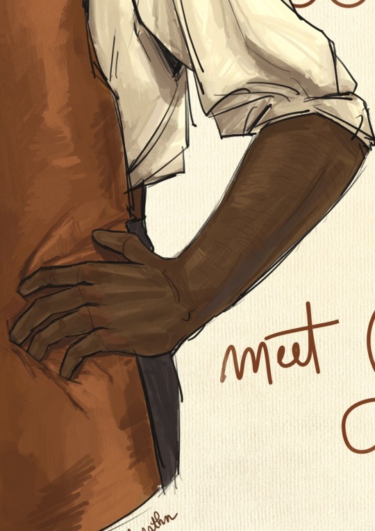
2. 3. Nothing special to say, just Gideon’s arms (her perfect biceps are hidden from view lest they cause a riot in the cafeteria). Also arm hair. I feel like it’s becoming a recurring feature in my art lol
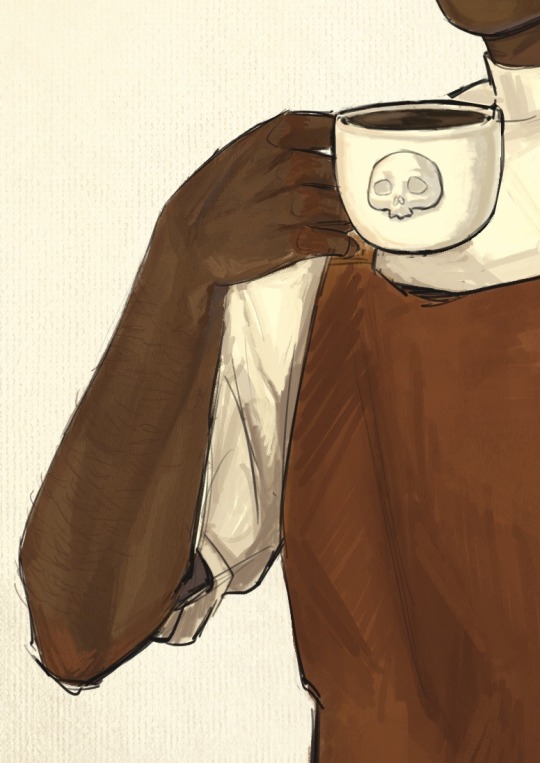
4. I debated whether or not to add a foam skull on the coffee then ultimately decided against it. That’s one skull too many, and honestly Gideon neither has the skill nor the patience to attempt one. Let’s be real, if they let her have access to the pitcher she’d make tits. So here is your tits-free coffee, courtesy of the Cohort photoshop editors.
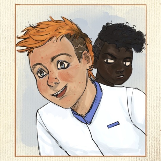
5. Isaac, sporting the Fourth’s blue not only in dress but also in his questionnable choice of eye makeup. They have matching haircut only so Jeanne can showcase how much better it looks on her.
6. This is where I finally have something clever-ish to say. Thoughts ! I have them ! Sometimes. So. Harrow. You can’t see it but she has a nose piercing as well - this is relevant to spreading my agenda that Harrow is full of bone (piercings, that is). Sue me, I forgot that they let her keep her face paint in this scene. Onto the actual thought process.
This is where Abigail interrupts the scene, before Harrow can catch a glimpse of barista!Gideon. Her interruption is shown by the unfinished look of this panel : the sketch lines peeking through (in a reddish hue, to mimic sanguine, the red chalk that artists used to draw sketches and studies - and also because the contrast of the colors makes it pop better against her skin) + the rendering is messier from the neck and down.
Abigail is blocking half of Harrow from view - I wanted to have her hide Harrow’s eyes and thus line of sight entirely, but I feared Harrow wouldn’t be as recognizable with more than half her face hidden, frowny eyebrows and all.
Abigail herself is meant to look out of place here, without taking too much attention away from Gideon. I drew her in a much simpler style, using a more monochromatic palette and cell shading, to contrast against the rest of the gang, where I used a lot more color variation and a more detailed & textured painting style.
That’s about all I have on this, if you got this far thank you! Your support is much appreciated. If you liked this drawing I’d be overjoyed if you reblogged it and left your thoughts in the tags/notes! I’m always happy when I read them, even just a "#nice" makes my day.
#my art#tlt#griddlehark#coffee shop au#you know the one#the locked tomb#harrow the ninth#htn#gideon nav#harrow nonagesimus#ft the terrible teens#isaac tettares#jeannemary chatur#and the woman the myth herself#abigail pent#artists on tumblr#tlt fanart
100 notes
·
View notes
Text
My GIF Making process: Screen capturing using MPV player, Organizing files, 3 Sharpening settings, Basic Coloring PSD + Actions set

This is a very long post so heads up.
I’ll try to be as thorough and true as much as possible to the way I make my gifs (I already use Photoshop Actions which I’ve long since set up but now for this tutorial I’m reviewing them to show you the exact steps I’ve learned to create my gifs 😃) and present them to you in a semi-coherent way. Also, please bear with me since English is my second language.
First things first. Below are the things and tools we need to do this:
Downloaded 4K or 1080p quality videos (let’s all assume we know where to get these—especially for high definition movies and tv series—so this post doesn’t get removed, okay? 😛)
Adobe Photoshop CC or the CS versions can work as well, but full disclosure I haven’t created gifs using the CS versions since 2020. I’m currently using Adobe Photoshop 2024.
mpv player. Use mpv player to get those frames/screenshots or any other video player that has a screen grabber feature. I’ve used adapter for the longest time but I’ve switched to mpv because the press to screenshot feature while the video is playing has been a game changer not to mention ultimate time saver for me. For adapter you need to play it in another video player (like VLC player), to get the start and end timestamps of the scene you want to gif which takes me ages before I can even open Photoshop.
Anyway! Please stop reading this post for a moment and head over to this amazing tutorial by kylos. She perfectly tells you how to install and use mpv player, both for Mac and Windows users.
One thing I have to share though, I had a tough time when I updated my MacOS to Sonoma since MPV is suddenly either duplicating frames or when I delete the duplicates the player seems to be skipping frames :/ I searched and found a solution here, though it didn’t work for me lol. My workaround for this in the meantime is decreasing the speed down to 0.70 then start screenshotting—it’s not the same pre Sonoma update but it works so I’ll have to accept it rather than have jumpy looking gifs.
Now, after this part of kylos’ tutorial:

you can continue reading the following sections of my gif tutorial below.
I want to share this little tip (sorry, this will only cater to Mac users) that I hope will be helpful for organizing the screenshots that MPV saved to the folder you have selected. Because believe me you don’t want to go through 1k+ of screenshots to select just 42-50 frames for your gif.
The Control + Command + N shortcut
This shortcut allows you to create a new folder from files you have pre-selected. As you can see below I have already created a couple of folders, and inside each folder I have selected screenshots that I want to include in one single gif. It's up to you how you want to divide yours, assuming you intend to create and post a Tumblr gifset rather than just one gif.

Another tip is making use of tags. Most of, if not all the time, I make supercorp gifs so I tag blue for Kara and red (or green) for Lena—just being ridiculously on brand and all that.
Before we finally open Photoshop, there's one more thing I want to say—I know, please bear with me for the third? fourth? time 😅
It's helpful to organize everything into their respective folders so you know the total number of items/frames you have. This way, you can add or delete excess or unnecessary shots before uploading them in Photoshop.
For example below there are 80 screenshots of Kara inside this folder and for a 1:1 (540 x 540 px) Tumblr gif, Photoshop can just work around with 42-50 max number of frames with color adjustments applied before it exceeds the 10 MB file size limit of Tumblr.

Sometimes I skip this step because it can be exhausting (haha) and include everything so I can decide visually which frames to keep later on. You'll understand what I mean later on. But it's important to keep the Tumblr 10 MB file size limit in mind. Fewer frames, or just the right amount of frames, is better.
So, with the screenshot organization out of the way, let's finally head over to Photoshop.
Giffing in Photoshop, yay!
Let’s begin by navigating to File > Scripts > Load Files into Stack…

The Load Layers window will appear. Click the Browse button next.
Find your chosen screenshots folder, press Command + A to select all files from that folder then click Open. Then click OK.
After importing and stacking your files, Photoshop should display the following view:

By the way, I'll be providing the clip I've used in this tutorial so if want to use them to follow along be my guest :)
If you haven't already opened your Timeline panel, navigate to Windows > Timeline.
Now, let's focus on the Timeline panel for the next couple of steps.
Click Create Video Timeline, then you’ll have this:

Now click the menu icon on the top right corner then go to Convert Frames > Make Frames from Clips

Still working on the Timeline panel, click the bottom left icon this time—the icon with the three tiny boxes—to Convert to Frame Animation
Select Make Frames From Layers from the top right corner menu button.
So now you have this:

Go and click the top right menu icon again to Select All Frames
Then click the small dropdown icon to set another value for Frame Delay. Select Other…

The best for me and for most is 0.05 but you can always play around and see what you think works for you.
Click the top right menu icon again to Reverse Frames.
I think Photoshop has long since fixed this issue but usually the first animation frame is empty so I just delete it but now going through all these steps there seems to be none of that but anyways, the delete icon is the last one among the line of feature buttons at the bottom part of the Timeline panel.
Yay, now we can have our first proper GIF preview of a thirsty Lena 😜

Press spacebar to watch your gif play for the very first time! After an hour and half of selecting and cutting off screenshots! 😛 Play it some more. No really, I’m serious. I do this so even as early (lol) as this part in the gif making process, I can see which frames I can/should delete to be within the 10 MB file size limit. You can also do it at the end of course 🙂
Now, let’s go to the next important steps of this tutorial post which I’ve numbered below.
Crop and resize to meet Tumblr's required dimensions. The width value should be either 540px, 268px, or 177px.
Convert the gif to a Smart Object for sharpening.
Apply lighting and basic color adjustments before the heavy coloring. I will be sharing the base adjustments layers I use for my gifs 😃.
1. Crop and Resize
Click on the Crop tool (shortcut: the C key)

I like my GIFs big so I always set this to 1:1 ratio if the scene allows it. Press the Enter key after selecting the area of the frame that you want to keep.
Side note: If you find that after cropping, you want to adjust the image to the left or another direction, simply unselect the Delete Cropped Pixels option. This way, you will still have the whole frame area available to crop again as needed and as you prefer.
Now we need to resize our gif and the shortcut for that is Command + Opt + I. Type in 540 as the width measurement, then the height will automatically change to follow the ratio you’ve set while cropping.
540 x 540 px for 1:1
540 x 405 px for 4:3
540 x 304 px for 16:9
For the Resample value I prefer Bilinear—but you can always select the other options to see what you like best.
Click OK. Then Command + 0 and Command + - to properly view the those 540 pixels.

Now we get to the exciting part :) the sharpen settings!
2. Sharpen
First we need to have all these layers “compressed” intro a single smart object from which we can apply filters to.
Select this little button on the the bottom left corner of the Timeline panel.


Select > All Layers
Then go to Filter > Convert for Smart Filters
Just click OK when a pop-up shows up.
Now you should have this view on the Layers panel:

Now I have 3 sharpen settings to share but I’ll have download links to the Action packs at the end of this long ass tutorial so if you want to skip ahead, feel free to do so.
Sharpen v1
Go to Filter > Sharpen > Smart Sharpen…
Below are my settings. I don’t adjust anything under Shadows/Highlights.
Amount: 500
Radius: 0.4
Click OK then do another Smart Sharpen but this time with the below adjustments.
Amount: 12
Radius: 10.0

As you can see Lena’s beautiful eyes are “popping out” now with these filters applied. Click OK.
Now we need to Convert to Frame Animation. Follow the steps below.
Click on the menu icon at the top right corner of the Timeline panel, then click Convert Frames > Flatten Frames into Clips
Then Convert Frames > Convert to Frame Animation
One more click to Make Frames From Layers
Delete the first frame then Select All then Set Frame Delay to 0.05

and there you have it! Play your GIF and make sure it’s just around 42-50 frames. This is the time to select and delete.
To preview and save your GIF go to File > Export > Save for Web (Legacy)…
Below are my Export settings. Make sure to have the file size around 9.2 MB to 9.4 MB max and not exactly 10 MB.

This time I got away with 55 frames but this is because I haven’t applied lighting and color adjustments yet and not to mention the smart sharpen settings aren't to heavy so let’s take that into consideration.
Sharpen v1 preview:

Sharpen v2
Go back to this part of the tutorial and apply the v2 settings.
Smart Sharpen 1:
Amount: 500
Radius: 0.3
Smart Sharpen 2:
Amount: 20
Radius: 0.5
We’re adding a new type of Filter which is Reduce Noise (Filter > Noise > Reduce Noise...) with the below settings.

Then one last Smart Sharpen:
Amount: 500
Radius: 0.3
Your Layers panel should look like this:

Then do the Convert to Frames Animation section again and see below preview.
Sharpen v2 preview:

Sharpen v3:
Smart Sharpen 1:
Amount: 500
Radius: 0.4
Smart Sharpen 2:
Amount: 12
Radius: 10.0
Reduce Noise:
Strength: 5
Preserve Details: 50%
Reduce Color Noise: 0%
Sharpen Details: 50%
Sharpen v3 preview:

And here they are next to each other with coloring applied:
v1

v2

v3

Congratulations, you've made it to the end of the post 😂
As promised, here is the download link to all the files I used in this tutorial which include:
supercorp 2.05 Crossfire clip
3 PSD files with sharpen settings and basic coloring PSD
Actions set
As always, if you're feeling generous here's my Ko-fi link :) Thank you guys and I hope this tutorial will help you and make you love gif making.
P.S. In the next post I'll be sharing more references I found helpful especially with coloring. I just have to search and gather them all.
-Jill
#tutorial#gif tutorial#photoshop tutorial#gif making#sharpening#sharpening tutorial#photoshop#photoshop resources#psd#psd coloring#gif coloring#supercorp#supercorpedit#lena luthor#supergirl#my tutorial#this has been a long time coming#guys. i'm BEGGING you. use the actions set - it was a pain doing all this manually again ngl LMAO#i've been so used to just playing the actions#so this has been a wild refresher course for me too 😆
126 notes
·
View notes
Text
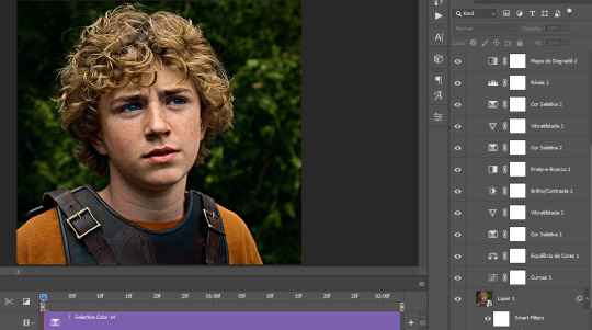
The silent art of gif making
The gif above has 32 layers plus 6 that aren't shown because this is part of a larger edit. I wanted to share it to give everyone a glimpse of the art of gif making and how long it usually takes for me to make something like this. This one took me about an hour and a half but only because I couldn't get the shade of blue right.
I use Adobe Photoshop 2021 and my computer doesn't have a large memory space (I don't know what to call it) so usually most of psds get deleted because I'm too lazy to get a hard drive. It doesn't really bother me that much because I like the art so when it's done, it's done. Off to somewhere else it goes.
Here are the layers:

Everything is neat and organized in folders because I like it that way. I prefer to edit it in timeline but others edit each frame. There's a layer not shown (Layer 4 is not visible) and it's the vector art. Here it is:
Now it is visible. I don't plan to make this a tutorial, but if you're interested I'd love to share a few tricks about it. I'm pretty new to the colors in gifmaking but the rest is simple to understand. Here, I just want to show how much work it takes to make it.
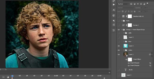
I opened Group 2 and here's the base gif. I already sharpened and sized it correctly but that's about it. Let's open the base coloring next.
Yay! Now it looks pretty! The edits are in Portuguese but it doesn't matter. There's a silent art of adding layers depending on how you want the gif to look but you get used to it. The order matters and you can add multiple layers of the same thing (for eg. multiple layers of levels or curves or exposure).
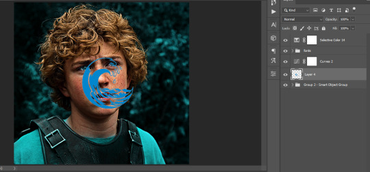
This was pretty much my first experiment with coloring so I don't know what I'm doing (this happens a lot with any art form but gifmaking exceeds in DIYing your way to the finished product) but I didn't want to mess up his hair, that's why the blue color is like that. Blue is easy to work with because there's little on the skin (different from red and yellow but that's color theory). I painted the layers like that and put it on screen, now let's correct how the rest looks.
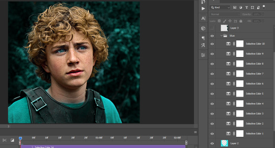
I was stuck trying to get the right teal shade of blue so yes, those are 10 layers of selective color mostly on cyan blue. We fixed his hair (yay!) we could've probably fixed the blue on his neck too but I was lazy. This is close to what I wanted so let's roll with that.
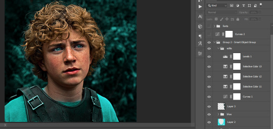
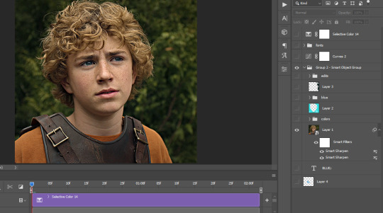
BUT I wanted his freckles to show, so let's edit a little bit more. Now his hair is more vibrant and his skin has red tones, which accentuates the blues and his eyes (exactly what I wanted!). That lost Layer 2 was me trying to fix some shadows in the background but in the end, it didn't make such a difference.
This was part of an edit, so let's add the graphics and also edit them so they're the right shade of blue and the correct size. A few gradient maps and a dozen font tests later, it appears to be done! Here it is:
Please reblog gifsets on tumblr. We gifmakers really enjoy doing what we do (otherwise we wouldn't be here) but it takes so long, you wouldn't imagine. Tumblr is the main website used for gif making and honestly, we have nowhere to go but share our art here. This was only to show how long it takes but if you're new and want to get into the art of gif making, there are a lot of really cool resource blogs in here. And my ask box is always open! Sending gifmakers all my love.
#gif making#gif tutorial#resources#completeresources#y'know what that post yesterday got me into this#i love creativity so i send all my love to gifmakers#this is HARD#my tutorials#tutorials
385 notes
·
View notes
Text
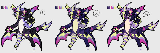
how i make color palettes of my ocs before i pick one, an art tutorial?
hello, whenever i made a new design for myself i found a way to make lots of color palettes and pick one! i see this method more in paintings and rendering but not much on character designs? here are some examples i used that on.
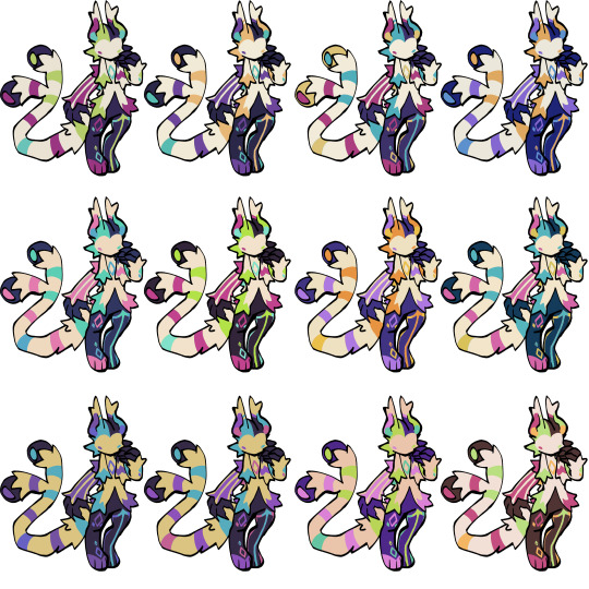
it helps me so much when i feel experimental with colors. here are what you need
a wip character design. sketchy or pixel art works better since the colors can have some anti aliasing issues
a program with gradient maps. i'm using clip studio paint but ik photoshop also has it. like i said this is used more on photos or paintings
and here's what you do!
draw your character. i'm making a new fursona for myself but anything should work.
2. decide on their markings/color placement in grayscale. i recommend doing grayscale so you can easily see the values. split your grays into however colors you want. i like doing 5-6 the most. i reccomend duplicating the color layer if you wanna try multiple palettes.
3. this part is program dependent but in csp's case go to edit > tonal correction > gradient map.
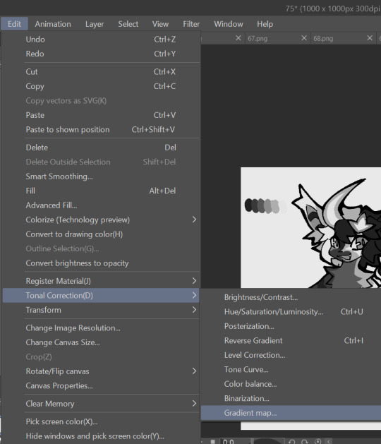
4. i made a few default 5 color gradient maps but if don't use gradients like me i reccomend making the graph like this so they become solid color. split the map into however many colors you used. i'll add a color to the red-orange one bc my character has 6 grays.
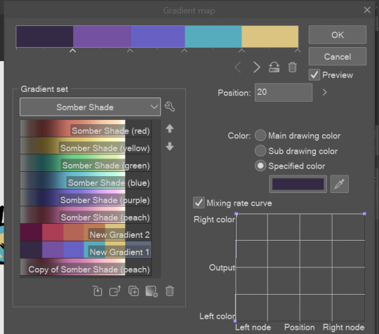
5. replace the colors by clicking below specified color. it all depends on your creativity and what you want. experiment til you like it.
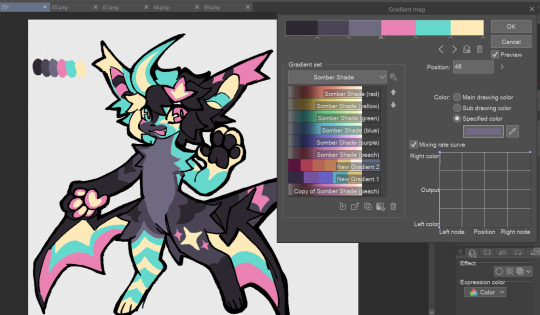
6. fuck around, try stuff, put them together to see if you like any of em. i made 9 to see if i can focus on one of them and i actually ended up loving the bottom right. it really makes them shiny
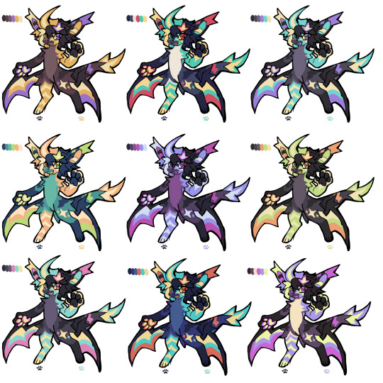
7. (optional) if you like a palette you can further and play with colors while keeping the palette. you can use color balance (in the same menu as gradient map in csp) or layers to mess around, have fun!
also a color tip because people seem to compliment that a lot in my art: digital art has millions of colors! don't be afraid of using wacky tones unless you're going pantone. if you want to get something physical i recommend being open to alternative colors as they tend to be more limited. i know whoever is doing it will try their best to keep the colors close.
color theory is something i don't...care much about mostly because this is something i'm doing for fun. i'll consider it in professional work.
#artists on tumblr#digital art#ika's showtime#ikarnival#art tutorial#art tips#drawing tips#art resources#clip studio paint
380 notes
·
View notes
Text
the race loser x lando norris + part one

in which you see your ex best friend again after he cut of contact between you two.
not proof read - angsty
sunday - red bull ring
It can’t be. Lando doesn’t believe his eyes. His eyes must have lied to him. It doesn’t take his brain longer then a few seconds to fill up all his thoughts with you. Is there a possibility that you’re here? Here at Red Bull Ring during a race? He shakes his head. He should stop thinking like this. This is the kind of behavior that makes him lose focus which makes him lose points at the end. He tries to discard every thought he is having about you, but he can’t stop himself from looking in the same direction again while hoping to see you.
He knows his friend Max is here. He also knows that Max is one of the people who’s still in contact with you. Lando always tries to get information about you out of Max, but he never succeeded. Not that he deserves it, but still.
Before the start of this season Lando spend his whole vacation with you. Of course his friends were there as well sometimes, but you were the one who was always around him. He already knew that he had a crush on you, but that holiday it turned into so much more. At least, for him. It took him one week after his vacation to ruin everything between the two of you. It was the first race weekend. Even now when it’s more then a couple months ago, it still hurts him to think about it. He hates the way he acted that day. He hates himself for causing this. It’s all his fault.
sunday - bahrain international circuit
“Don’t,” Lando speaks up with a loud voice, “Don’t come in here to tell me it will all be better soon. Because it won’t.”
He doesn’t notice the way you shake a bit because of the harsh undertone in his voice. He also doesn’t notice the way you can’t stop looking at him. Lando doesn’t look at you, he’s focused on his phone. The race is barely over and he’s already reading multiple tweets about the failure of McLaren. It doesn’t surprise him that there already memes made. Normally he can laugh about them, but when he sees a McLaren photoshopped tractor with himself and his teammate inside he doesn’t laugh. He’s closer to crying then to laughing.
You don’t know what to say. Lando is getting annoyed by his own thoughts. He wants nothing more then to bathe in your comfort. Would it be a bad thing if he would let you comfort you? He already imagines himself laying with his head on your lap while you try to encourage him about the car. As quick as he can he discards his thoughts about you.
This kind of behavior makes him a loser he thinks. He can’t even focus half of the time because he keeps thinking about you. Even in the car it’s always like that. Whenever he makes a good move, the first thing he wonders is if you saw him. He’s way too distracted by his own thoughts and they are all about you.
“Lan.”
He barely hears you at first, but he does look up at you. He notices the way you look at him. The pitiful look almost pains him. This isn’t how he wants you to look at you.
“Don’t,” Lando says again, “Please don’t pity me.”
“I’m not,” you tell him softly, “I’m here for you.”
He notices the way you try to come closer to him. It costs him all of his energy to move away from you. He can’t be weak. Not now. His mind if made up. He needs to regain his focus. You are a distraction. As long as he’s crushing on you, he can’t focus fully on the races. He needs his focus.
“Maybe I don’t want you to be,” Lando states.
“What do you mean?” You ask him confused.
Lando lets out a soft sigh. This is already hurting him. It’s all for the better good. Zak told him about distractions before. You can’t become a race winner if you can’t focus. He has had this conversation with Zak so many times, he never did something with it. But now he feels like it’s the only chance he has left. He needs to focus on racing this season, he can’t focus all of his energy on you. It will be better. Zak told him that you would understand him, it was logical after all. Maybe his crush will even fade away, then it will be easier to be friends again.
“I need space,” Lando explains. He can’t help but notices the hurtful tone in his own voice. He tries to lose it. It’s his decision, he shouldn’t be sad about it. “And I need to focus on racing,” he goes on, “now I focus too much on us. I’m always busy with us.”
“What are you saying?” You ask him. Lando notices the sad tone in your voice. He doesn’t dare to look at you. “I can give you more space if you want? We don’t have to hang out every time you’re free.”
“I think I need to get away from you for a bit.” He can barely say the words. It already pains him. He tries to focus on his future as a race winner, but he doubts it will be worth it. Is he really giving up on your friendship? Fuck. His body fills up with regret, but he knows it’s already too late now. He said the words. There’s no going back.
“Oh.. Uh,” you can’t form the words you’re searching. Lando hears the soft sob coming out of your throat. “Why?” You ask him.
“I need to focus,” Lando repeats himself. It hurts him to look at you. It’s wrecking him to look at the tears he caused.
“Are you going to break with all your friends?” You ask.
Lando shakes his head.
“Why me?” You continue to ask.
Lando keeps silent. You let out a sob. When it has been silent for a few minutes you decide to walk away. You won’t get a clear answer. Lando watches you walk away. He knows it his own decision and his own fault, but in his mind he’s running after you. Telling you everything about his feelings, kissing you and keeping you close to himself. But he can’t. He tries to focus on Zak his words. He hopes it will soon feel better like Zak told him, because he can’t see himself focus better if this memory is the last one he has of you.
sunday - red bull ring
When he races past the same corner, he notices it again. Is it actually possible that you’re here? He tries to think back at what Max told him before the race. Where was Max seated today? Is it in the same place he thinks you are? Could it be possible that Max took you with him?
After Lando broke off the contact with you - which included blocking you on almost every social media platform, another advise from Zak, he didn’t feel any better. He uses his socials to write messages to you, messages that you will never receive. He writes about missing you. About loving you. About not being able to focus any better now. It’s shit. He uses his fake Instagram account to look at your account. He scrolls back through all the photos of you and sometimes you with him. He can’t stop looking at your highlights, he tries to experience every memory over and over again.
He can’t. He can’t get his cheerful feeling back. He doesn’t feel the same anymore, he only feels shittier every time. Whenever he looks at the memories, he reminds himself of what he threw away. He should never broke off the contact between you two. It was a mistake. The biggest mistake he ever made. Not because it isn’t even working - his focus is only away further, but because it isn’t worth it. He misses you. Sometimes he wakes up at night gasping for air because he realized again that he’s never getting you back. Other nights he cries himself to sleep while thinking about everything he threw away.
Zak told him it would be hard at first. But now after a few months Lando can safely say it’s still hard. He can’t find out one small benefit from his actions. The car is getting better, but only because the updates are finally working. And now when the car is finally good enough, Lando himself isn’t. He thinks about how it would have worked out if he didn’t cut you off. Then there would have been the same updates and he would feel good. Yeah, a bit distracted because of his feelings for you, but still happy.
+++
“Why did you bring me here Max?”
Max looks up at you as if it’s a dumb question, but you can’t figure out what you’re doing in Austria right now.
“I had a spare ticket,” Max shrugs.
You know he’s lying.
“So you decided to bring the person your friend, who gave you to tickets, doesn’t want to see anymore? That seems like a stupid plan,” you say a bit annoyed.
“Just wait y/n,” Max tells you, “It’s about time you see how this focussing on racing is treating him. And then the two of you are going to talk.”
“He doesn’t want to talk to me,” you say softly, “he wants nothing to do with me.”
“We both know that isn’t true,” Max states, “We just don’t know what happened yet. I’m sure there’s some sort of explanation for this.”
“It has been months, I don’t think he regrets it.”
You’re a bit distracted from the race for a couple minutes while talking with Max. When you’re about to search for Lando his McLaren again, you hear a loud banging noise. Did something happen? You look around at the track. At first you don’t see it. Until you look right under your nose. Fuck how did you miss that? When you we’re busy searching for Lando and talking with Max, the papaya McLaren car crashed right under your nose.
Is Lando already out of the car?
You try to find an answer to your burning question, but it seems like Lando is still in the car. That can’t be good right? You feel yourself getting more panicked.
“What happened?” You ask Max, “Is he okay?”
“I don’t know,” Max whispers. “Fuck. Fuck. Fuck! I knew this would happen.”
“What do you mean?” You ask.
“Because his focus is even worse, fuck. I took you here to show you that his action didn’t make any difference. I wanted to show you that Lando was in a worser shape without you, but I didn’t expected him to crash right in front of us,” Max explains.
You don’t look at Max. You can’t look away from Lando. There are multiple people around his car. They are trying to get Lando out of his car. At least that’s how it seems. You feel like you can finally breath properly again when you see Lando getting out of his car. You let out a relieved sigh when you see him walking without support from the stewards.
“Can we go see him?” You ask Max.
Max is also letting out relieved sounds now he knows his friend is walking on his own.
“Yeah, I think he needs to get checked out first by the medical team. But we can already go to McLaren so we can see him right after,” Max tells you.
+++
“What was that Lando?” Zak is standing right in front of him. The medical staff is still busy with checking him. Lando lets out a sigh.
“I crashed,” he dryly comments.
Zak mutters something, but Lando can’t hear. It’s probably some sort of curse word. “Why did you crash? It seemed like you just let go of the car in that turn.”
“I was distracted,” Lando states. He doesn’t tell Zak what caused him to lose focus. When Lando took that turn again, he couldn’t help himself and tried to find you again. Then he actually saw you. Of course, he saw you just enough to knew it was you, but still. Before he knew it he lost control over his car and ended up crashing.
“By what?” Zak asks annoyed.
“By how I need to fix things with y/n because cutting contact didn’t do the trick,” Lando says softly. “I want her back here. And I’m never listening to your idiotic advise again.”
After he said those words the door is opening again. Lando lets out a relieved sigh, he isn’t sure how mad Zak will be at him so he can use a small distraction. A nurse is appearing in front of them, “It seems like you were lucky today. There’s nothing major going on, but you do need some rest.”
“Can he race next week?” Zak is quick to ask.
“If he gets enough rest this week,” the nurse answers quickly, “I suggest a couple nights of going to bed early and making sure you sleep eight hours a night.”
Lando almost snorts. He won’t do that. He can’t. Every time he tries to fall asleep, he ends up thinking about you for hours.
“There are some of your friends here as well, can I let them in?” The nurse continues.
“Yes,” Lando quickly responds.
“In the mean time you can come with me,” the nurse tells Zak, “We can share some ideas for fast recovery.” She walks out with Zak, but does tell Lando that his friends will be here in a couple seconds.
Lando wonders which friends are coming. He knows Max is here, so he thinks he will be one of them. Maybe the race is already finished and his other friend from the grid - Max Verstappen - will also visit him? Lando doesn’t know who else should be here for him. His mind goes over to you again, but he’s sure you’re not one of the friends that’s waiting to visit him.
It doesn’t take long for Max to enter the room. Lando isn’t surprised to see him.
“Are you okay mate?” Max is quick to ask.
“Yeah, I’m fine,” Lando assures him, “nothing too bad.”
“What happened?” Max asks further.
“You’re going to think that I’m insane,” Lando says, “but I was so sure about seeing y/n. I got distracted. I thought I saw her and then I lost control over the car. I probably made it up, but I couldn’t focus during the race at all. Like every other race. I told Zak I’m going to find a way to fix things between me and her. But I think she hates me. Can you help me?”
“Mate you’re rambling,” Max says with a small smile, “Why did you tell Zak that you’re going to fix things?”
“Because he was the one that kept telling me to cut ties with her!” Lando exclaims annoyed, “He told me I needed to do that so I could focus properly. At first I didn’t listen, but then I was so mad after the first race this season that the words flew out.”
“I might have brought someone with me today,” Max says after a while of thinking, “but you need to promise me to stay calm. The nurse is going to kill me if you’re going to panic yourself into a heart attack.”
Lando can’t stop himself and thinks about you. Is it possible that Max is talking about you as well? It can’t be.
“I promise,” he quickly says.
Max walks away, only to return a small minute later with you next to him.
Lando doesn’t know what to do. Are you actually standing in front of him? He stands up from the chair he was sitting in earlier. He walks closer to you. In the corner of his eye, he notices Max walking out of the small room. He can’t stop looking at you. The first thing he notices it the tired look you have, you even seem worried. Then he notices the shirt you’re wearing. A simple Quadrant one. Normally you always wore his own merch while attending races, but he’s still glad you’re wearing at least something that’s close to him.
You don’t know what to do as well. Lando is standing closely in front of you. You notice the way his eyes are looking at every part of you. You realize that you’re probably doing the same.
“I’m so sorry,” Lando says after a while.
“I heard about Zak,” you respond, “Is it really true that he made you cut ties with me?”
Lando nods. “I shouldn’t have listened to him. I’m so sorry Y/N.”
“Let’s talk about it later,” you say.
“Can I hug you?” Lando asks you with a few doubts. You nod quickly. Lando moves even closer towards you and drapes his arms around your body. You feel yourself warming up.
“I’ve missed you so much,” you tell Lando with a soft voice.
“I’ve missed you too.”
Lando thighs his grip on you. Hugging you even closer then before. He can’t stop thinking about how lucky he is to have you in his arms like this again. He knows things aren’t fixed yet, but he’s hopeful to make things right with you. Everything. Even telling you all about his feelings.
i think there will be a part two of this! let me know if you guys want that as well :)
part two
#lando norris#ln4#lando norris imagine#lando norris x y/n#lando norris x reader#lando norris fanfic#lando norris fanfiction#formula one#f1#lando norris x you
906 notes
·
View notes
Photo
HOW TO: Make a Pantone “Color of the Year” Gif
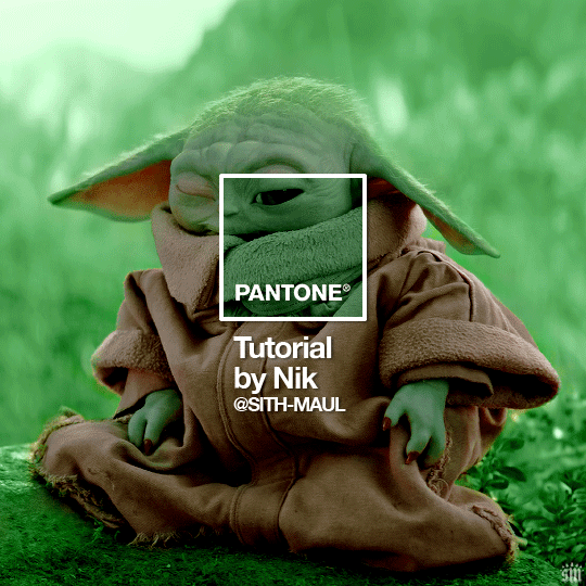
A few people have asked about my Pantone sets which use the “Color of the Year” swatch design. So, here’s a full tutorial with a downloadable template of my exact overlay! Disclaimer: This tutorial assumes you have a basic understanding of gif-making in Photoshop.
PHASE 1: PICKING A SCENE + PANTONE COLOR(S)
I’m starting with this because it’s crucial for planning your gifset as well as making sure the execution is smooth sailing. The steps in this phase won’t necessarily be literal steps but some tips for how I usually go about making a Pantone set:
1.1 – Picking a scene.
Scene selection is everything. To make things easy on yourself, I suggest choosing scenes where the background is mainly ONE color — for example, a scene where the subject has a clear blue sky behind them. To make things even easier, choose a color that isn’t the same color as the subject of your gif. Like, if your subject is a human, I’d avoid using a gif with a red or yellow background unless you want to do a lot more work to mask their skin.
Rip me using a scene of green lil Grogu in green grass lmao. But I guess that goes to show you could really do this with any scene (I just did lots of masking and keyframe animations to perfect this green shade). BUT selecting your scenes wisely = a lot less work.
1.2 – Picking Pantone colors.
People often ask me how I choose my colors and there are a few methods which I’ll go over below.
But note that not all Pantone colors have a cute name, or any name (fun fact: only Pantone textiles have official names and they end with TCX, TPX, or TPG).
METHOD A: Google Search “Pantone [Color]”
Source: Google
Easy but not always fruitful, all you do for this method is open Google and type “Pantone [insert color here].” For example, when searching for teal colors, I searched several things including: Pantone Teal, Pantone Turquoise, Pantone Blue, Pantone Green, Pantone Blue Green, etc. Then, just sift through the Google results and click on whatever comes up from the official Pantone website! Since Pantone’s site blocks some info behind a paywall, you won’t be able to get a hex code from them. But you can just screenshot the swatch from their site, put it in Photoshop, and use the eyedropper tool to figure out the color.
METHOD B: Color-Name Site
Source: https://www.color-name.com/
This handy website lets you search by colors using the upper navigation bar. Or you can just type something like "magenta" or "blue pantone" or even “frog” and see what comes up lol. Color-name can put together palettes too! I like that this site also tells you the hex code of a color, which is really helpful for getting the right code to put in my overlay. Note: Not every color on this site is a Pantone textile, so not all of these names are Pantone-official names. You can tell it’s official if, in the Pantone row of the Color Codes table on the middle of the page, it has a code that’s 2 numbers, a dash, 4 numbers, and either TCX, TPX, or TPG.
METHOD C: User-Made Pantone Colors Archive
Source: https://margaret2.github.io/pantone-colors/
For my Wednesday characters as Pantone colors set, it was all about matching the color name to the character’s vibe. So, before looking at the actual colors themselves, I wanted to find the perfect color names. I stumbled upon this page. The pros = it lists pretty much all of the current official Pantone names. The cons = it’s not convenient since there’s no filtering tool. You can do Command+F and search for keywords, but that’s it. I literally scrolled through this whole page for my Wednesday set and read every single name, which... I think means... something’s wrong with me /lh /hj
METHOD D: Official Pantone Color Finder
Source: https://www.pantone.com/pantone-connect
This is last on my list because I don’t actually recommend it. Unless you already have access to this resource from your school or work or something, I would never pay for it and it is a paid feature only. Boooo 👎 But there is a free trial (which I’ve never used), so if you want to see what it’s about, you can definitely go for it.
PHASE 2: MAKING THE BASE GIF
Again, just some super quick tips for making a gif that, I think, looks best with this kind of set — but if you’re still learning how to gif, I do have a basic gif-making tutorial here for extra guidance!
2.1 – Uncheck “Delete Cropped Pixels” before cropping your gif. When you use the crop tool, this checkbox appears in the top toolbar. Unchecking it allows you to move the positioning of your gif later on, which is handy in this case when you want to choose which part of your gif will be underneath the Pantone swatch. You can read more about this tip in my basic gif-making tutorial (linked above; Step 1.5 – Tip B).

2.2 – Make your gif 540px width. My gifs for these sets are usually 540x540px but I think 540x500px will also look good. I think it’s more impactful though to make a big gif to show off your coloring.
PHASE 3: ADDING THE PANTONE OVERLAY
3.1 – Download my template
I made this template myself, so all I ask is that you don’t claim it as your own and that you give me proper insp or template credit in your caption if you decide to use it! Get the PSD with the transparent background here!
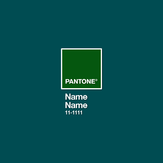
3.2 – Download the font Helvetica Neue Bold
The font I use (and I’m pretty sure it’s the same font Pantone uses) is Helvetica Neue Bold, with some very specific letter spacing (which I determined by studying Pantone’s official Color of the Year Very Peri design). It’s already set in my .psd but here are specs in case: color name spacing = -40, color code spacing = -75 (sometimes I’ll do -25 for the numbers after the dash if I don’t like how tightly they’re packed together).
I uploaded Helvetica Neue Bold to my dropbox here!
3.3 – Import my overlay
You can either drag the whole folder onto your gif from tab to tab or right-click the folder, select Duplicate Group, and select your gif as the destination document. Just make sure this overlay group is above your base gif!
3.4 – Fill the color swatch
In my .psd, on the layer labeled “Pantone Swatch,” just grab the hex code of your chosen Pantone color and fill that layer using the Paint Bucket tool! I’ve already put a layer mask on the layer for you so it fits perfectly inside the square outline.
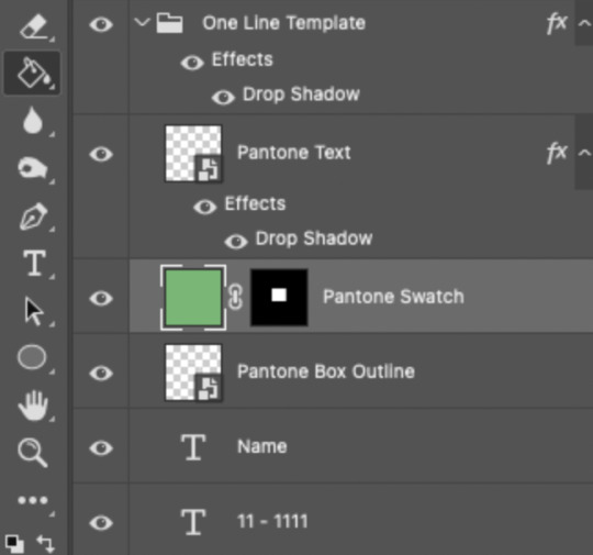
If you’re using my .psd, all the blend mode settings are already in place! I usually set the colored square behind the Pantone logo to the Color blend mode, but sometimes, I prefer the way Hue looks. It’s up to you!
You can also adjust the drop shadow settings to make your text more visible as needed. The layers are arranged in this order so the drop shadows don’t interfere with the semi-transparent part of the colored swatch.
3.5 – Insert the color name and code
My .psd has two versions to choose from: (1) a color name that fits on one line and (2) a color name that requires two lines. Use the one that applies to your color name and simply type that and color code into the corresponding text layers!
Note 1: Pantone doesn’t keep their font size uniform for every color of the year. They’ll sometimes shrink the text to fit longer names, but I like being consistent. So, I use this one font size for all my colors.
Note 2: My template has all the text left-justified and matching the starting point of the P in Pantone. BUT, sometimes the gif looks better if you nudge the text a bit so it looks more centered. Use your discretion when aligning the text!
Note 3: Btw, you definitely don’t have to use the TCX/TPG codes like me. (I’m a nut and there’s no way I’ll ever do a Pantone set and not use those types of codes to maintain uniformity across this series lol.) I’ve seen others do sets inspired by mine using different color codes or even just the hex code itself!
PHASE 4: COLORING THE BASE GIF
The key here is to make a majority of your gif feature your chosen Pantone swatch. If you’re really smart with your scene selections, this should be a breeze! If you’re stubborn like me and want to use specific scenes with the opposite color of your chosen Pantone swatch, there will be a bit more color manipulation involved... However, this isn’t a coloring tutorial, so again, I’m going to give some tips and resources that will hopefully help you out!
4.1 – Color matching.
Now that you have the Pantone swatch on your gif, you should be able to reference that center square set to Color/Hue to match the rest of your gif to that color. Feel free to paint a little blob of your color onto another layer anywhere on your gif so you can refer to it closer over a specific part of your gif. For example, I put a little circle over Grogu’s head to see how closely I matched Pantone’s Peapod color, then I tweaked my adjustment layers a bit more until the colors matched near perfectly and I couldn’t tell where that blob begins or ends. The left is the solid color and the right is set to the blending mode Color (like the square):
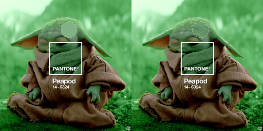
4.2 – Moving the base gif.
This isn’t really about coloring... but remember when I said to uncheck “Delete Cropped Pixels” in Step 2.1? Well, here’s your chance to adjust your canvas and move the gif around so the exact part you want under the color swatch is in the right position. I personally think these kinds of sets are more impactful when you put a differently colored part of your gif under the swatch so you can see through it and the difference is clearer. In my example, I put Grogu in the center so the green box would cover some of his brown potato sack robe.
4.3 – Color manipulation.
Color manipulation is when you transform your media’s original color grading into a completely different color. The Grogu gif isn’t a great example because the original scene was already a green-yellow color:
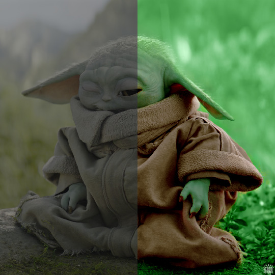
I mean, the difference is still pretty drastic but that’s mostly because my file was HDR and washed out as a result.
So, here’s an example I made using a gif from my first Pantone set for ITSV (I’m not doing this demo to the Grogu gif because it’d be too much work to manipulate a green background with a green subject. This ITSV scene is perfect bc the majority of it is blue while the subjects are mostly red.)
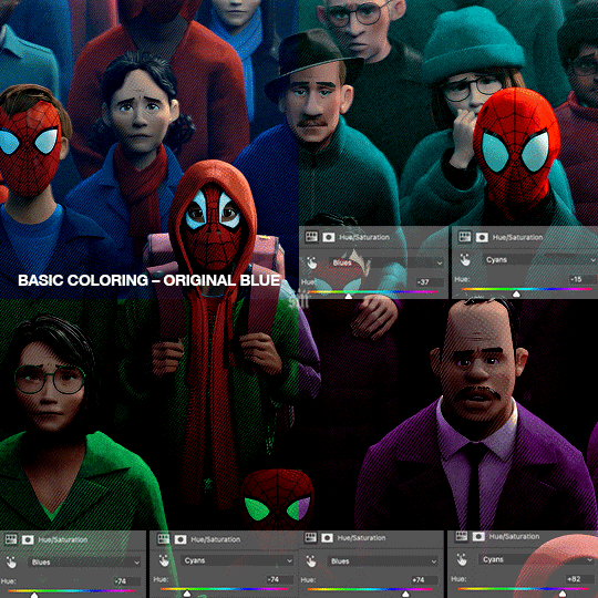
For the “basic coloring,” I did everything as I normally would: mostly levels and selective color layers.
For color manipulation, my fav adjustment layer is Hue/Saturation (those are the screenshots that are on the gif above). When you’re smart with your scene selection, it’s pretty easy to manipulate colors with one Hue/Sat layer because you usually only need to tamper with 1-2 colors and, hopefully, they shouldn’t interfere with skin tones (obviously you’ll do other layers to further enhance your gif’s brightness, contrast, etc. — but I just mean the heavy lifting usually only takes me one layer with a good scene choice).
All you have to do is figure out what color the majority of your gif is, toggle to that color’s channel, and fiddle with the hue slider. In the gif above, you can see that I played with both the Blue and Cyan channels. Here’s why:
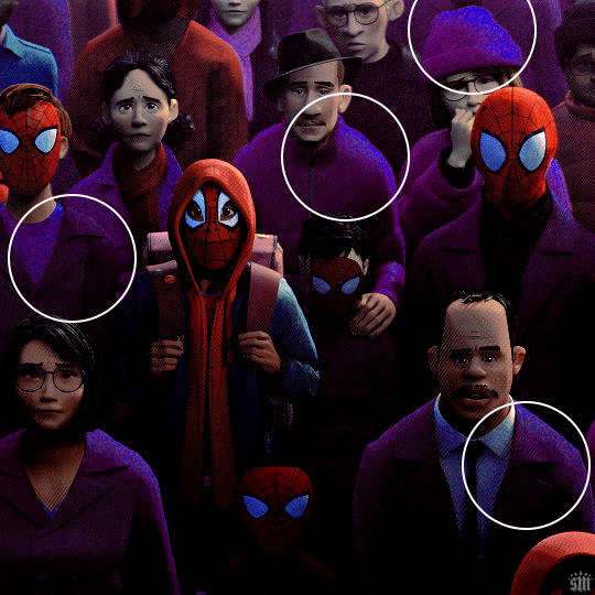
If I only adjust the Blue hue slider, I get those speckles of cyan peaking through in the gif above. Unless you’re working with completely flat colors — like 2D animation with zero shading/highlights — a color is never just one, solid color. Blue isn’t just blue, it may have some cyan. Purple isn’t just purple, I often have to toggle the Blue channel too. So, yeah, be mindful of that!
I’ll sometimes go in with the brush tool and paint over some areas of my gif to really smooth out the color and make it uniform. When I do that, I just set that painted layer to the Color blend mode. Some of the resources below go into that technique a bit more!
4.4 – Coloring resources.
While not all of these tutorials cover the same type of color manipulation I did in my gifs, I think the principles are similar and would be helpful to anyone who’s a beginner:
– color manipulation tutorial by usergif/me: I go a bit more in depth here (I think lol)
– how to change the background of any gif by usergif/fionagallaqher: a great tutorial for using keyframes so you can manipulate the background of a gif with lots of motion
– bea’s color isolation gif tutorial by nina-zcnik: this tutorial has more tips about hue/saturation layers as well as masking your subject
– elio’s colouring tutorial by djarin: this tutorial shows a lot of examples of first manipulating the colors then brushing over the gif with a matching color for extra coverage
And just one last note on coloring, I always try to appreciate gifs with the mentality that “good” coloring is 100% subjective. One of the only things I would classify as “bad” coloring is when you whitewash or [color]wash someone’s skin tone. So, as long as you keep the integrity of your subjects’ natural skin — especially if they’re a POC — you should feel good about your coloring, because it’s yours and you worked hard! <3
PHASE 4: EXPORT
That’s it!! If you work in Video Timeline like me, just convert from Timeline back to Frames, export your gif, and voila!
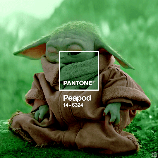
Easy PEAsy. 🥁
If you have specific questions about this tutorial, my ask box is open <3
Also, check out these other Pantone-inspired sets by my friends @nobodynocrime (Mulan set) and @wakandasforever (Ponyo set)! There are so many ways to use Pantone colors in your set, so I hope this inspires you to create something beautifully colorful <3
#gif tutorial#completeresources#usershreyu#useryoshi#userelio#userannalise#userzaynab#userives#usermarsy#usertreena#usercim#userrobin#userkosmos#usersalty#usermills#userhella#alielook#resource*#gfx*#pantone*
1K notes
·
View notes
Note
Hey!! I just wanted to say that your recent speak now gif set is sooo stunning. I was wondering how you managed to create that cassette tape effect if it isn’t any trouble? It’s really so pretty.
Have a great day! ✨
ahhh thank you so so much! first of all, i cannot take any credit for this effect, as it was greatly inspired by this amazing yellowjacket gifset by @thewintersoldier!!
but here's how i recreated the effect, from a cassette png (found on pngwing here), to this animated cassette effect (as seen in my speak now set):
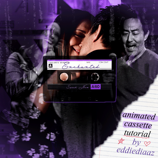
psst: i usually always create in photoshop cs5, but for this effect you need a recent version of photoshop because it's using transform keyframes (i think cs5 doesn't let you do that, or i just don't know how to lol). i used cc 2019 for this.
sorry if this is lengthy or has too much or too little details haha, but i hope it's comprehensible! english is not my first language so i also apologize in advance for any mistakes!
I. PREPARING THE CASSETTE
so, starting with the png here:
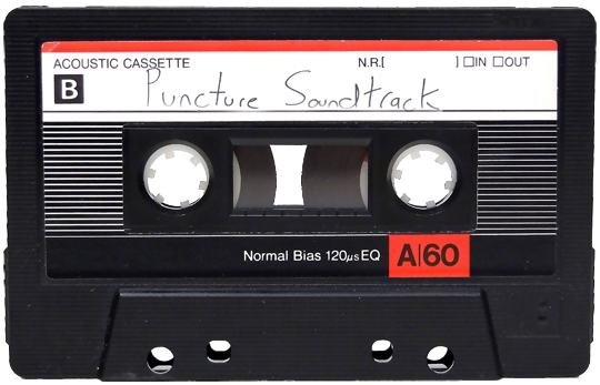
i removing everything i didn't want on the cassette png with the brush tool by just drawing the right color over the unwanted text. for the color, i then went to image > adjustments > hue/saturation and in the red tab, i played with the hue slider to get that purple color. finally, i added some text to my liking, and this is what i ended up with:
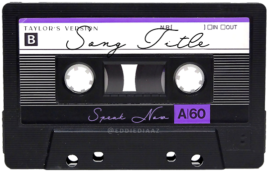
(not necessary but: i also selected the white lines on each side with the magic wand tool because i wanted these lines to be transparent. once your selection is done, go right click > layer via cut. it will create a new layer of the cutout you just made. you just need to disable or delete the layer to make the selection (lines) transparent.)
at this point you want to have only 2 layers: the revamped cassette and the text layer. you can remove the text layer actually, and just add the title back at the end, as it is not necessary for this effect. i just like to have the visual.
if you have multiple layers, you need to select all of them (except the song title layer), right click on the png layer and click on merge layers. this will create one layer with all the editing you made on the cassette. if you think you will need to edit this later though, i would save the file as a psd before merging the layers.
II. THE EFFECT
okay, so now that you have your cassette, make sure your video timeline is activated, not frame animation, and you are ready to go.
first, you want to create a perfect circle shape around one of the reel with the elliptical marquee tool (hold shift while dragging the circle). make sure it covers the entire area that will later be rotated. make sure this circle is perfectly centered around the reel or otherwise the animation will be a bit lopsided.
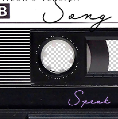
then right click on this selection and go "layer via copy". this will create a layer of only that circle selection. important step: right click on that new layer and go "convert to smart object". the layer should look like that, i've renamed mine:
now if you go to your timeline and open that new smart object layer, you will see that you have 3 keyframe options. we only need the transform one.
go to the start of the timeline and activate the transform animation by clicking on the stopwatch button. a keyframe will be created automatically.
to create the actual animation, move the position of the cursor on the timeline further, i put mine at the 01:00f mark so it's easier to create the right timing.
then what you want to do is select the reel smart object layer and hit ctrl + T. a box will appear and this is how you will make the reel rotate.
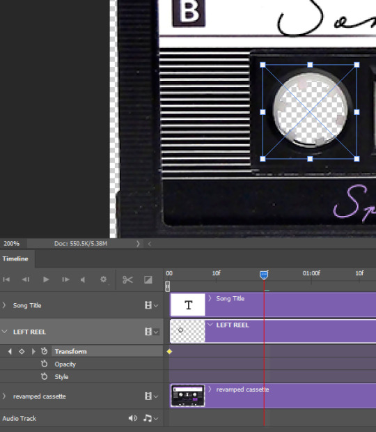
to rotate the reel shape, move your cursor near the blue box on your canvas and drag it until you have rotated the shape halfway through and hit enter. another keyframe will be created and if you play your animation, the reel should rotate on itself for half a turn

move your position on the timeline to 02:00f and do the same thing: select the left reel smart object, hit ctrl + T, rotate for another half turn, and hit enter. this third keyframe should be the last one needed for the animation and you should have a full animated rotation of the reel.
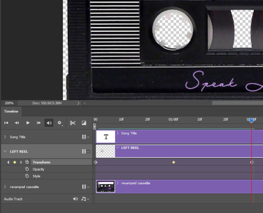
play your animation, and adjust the speed to your liking by dragging the keyframes on the timeline (but make sure they stay within the same distance from each other). the closer the keyframes are, the faster the animation are, and the further they are, the slower it'll be.
then you can just trim the smart object to your animation's length, and duplicate (right click the smart object > duplicate layer) this layer the amount of times needed (i find this less finicky than duplicating keyframes), and placing them one after the other. three full turns should be enough. this is what my timeline looks like right now:
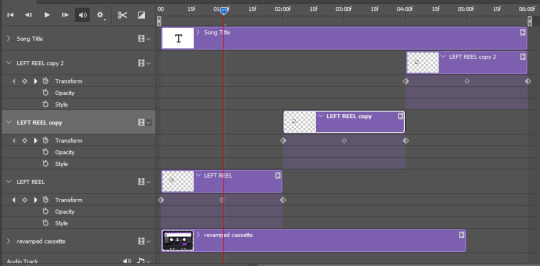
and my animation for the left side looks like this:
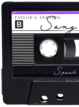
as you can see, we can see the little "dents" peeking through behind the animation. we don't want that! to remove it, select the revamped cassette layer (that should be under the reel smart object), and create another perfect circle around it with the marquee tool. this time make sure it's smaller than the previous one, it just needs to cover these dents.
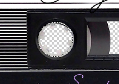
then right click on this selection on your canvas and go "layer via cut". this will create a new layer with that selection, and all you need to do is to disable it. this is removing the information in that circle.
once you are happy and the animation works, you can just delete that cut layer. now the animation is done and looks like this:

III. SECOND ANIMATION
one you have done it on the left side, you just gotta do the same thing on the right side. you can also try duplicating it, but i found it finicky for some reason (or maybe i'm just not used to the controls of this 2019 photoshop version?).
this is what i have once i've done the same thing on the right reel:
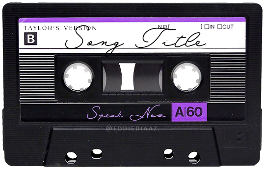
once i am happy with the speed and everything, i want to have only one layer so it's easier to use on gifs. first, i will save this animation as a psd file, in case i want to reuse it. then i am removing the song title layer and will be flattening everything and creating frames from this animation. to do so i am using the "save" action from here.
i'm not sure why it does that, but it's creating a couple of frames where the reels are a bit offset from their position everytime there's a full circle done, so i just delete these 5-6 frames. you can also change the speed here, but by default it should be 0.05.
once you are happy with it, just turn these frames into a smart object with the video timeline again (convert frame animation to video timeline and select all the frame layers > right click > convert to smart object)
now you have a smart object that is ready to be used anywhere!
IV. FINAL TOUCHES
for my particular speak now gifset, i have multiple layers of the animated cassette on each gif:
1, bottom one - cassette layer set to the blending mode "hard light" and set to opacity 86%:
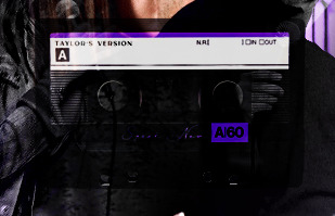
2, middle - this same cassette layer set to hard light, but with the opacity at 100%, AND with a layer mask so it's only applied to the animated reels (i wanted them to show up more):
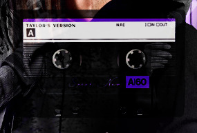
3, top one - and finally a third layer with another layer mask because i wanted the white label and speak now area to be less see through. it's set to the normal blending mode and the opacity is at 75%

and then i just added the song title on top at 100% opacity and normal blending mode, and added some drop shadows, and tada!
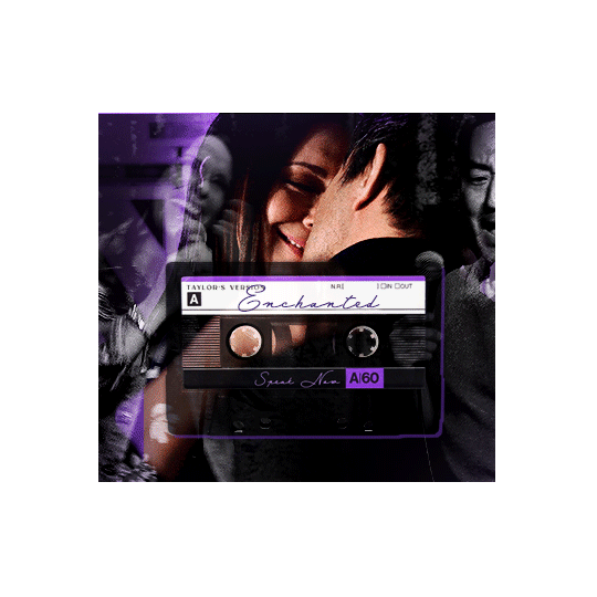
there we have it, i hope this was helpful <3
#alie replies#Anonymous#photoshop#tutorial#*ps help#completeresources#allresources#resourcemarket#userrobin#userraffa#userpjo#usertreena#tuservaleria#tuserheidi#userdean#userrainbow#usersalty#userzaynab#usernik#swearphil
380 notes
·
View notes
Note
Hi! I saw a post where you had a game made in godot with old school rendering, do you maybe have any tips on how to make godot render a game like that instead of its normal rendering method?
I'd be right happy to!
I'll try to make this concise lol, I always end up overexplaining and then getting lost in the weeds. Buckle up, it's a loooooot of little little things that all add up.
First off, you should decide which look you're going for. N64 and PS1, the two consoles I'm emulating, both had drastically different specs. (plus, there's plenty of other early 3D systems I've not even touched!)
The N64 had texture filtering (textures were interpolated aka "blurry"), it had floating point vertex precision (points moved correctly), it had perspective correction on its textures (no warping)
The PS1 had no texture filtering, no floating point vertex precision (vertices snap and pop around), affine texture mapping (textures warp weird). I also think the color space they operate in is different? Don't quote me
So you can go hard one way or another or pick and choose what you think looks good! We don't have anywhere near the hardware restrictions they did in the 90s so go nuts.
RESOLUTION
To get a low resolution window, I set the window size of the game and the window override size to different amounts

In green is actually how big the window is on my screen (4k monitor) and in red is the retro resolution I want. If you set the stretch mode correctly (an option a little further down the Window tab) then it'll make the pixels big
COLORS
Now the PS1 had the capability of showing you over 16 million different colors, but it could only display 50,000-150,000 at a time, so in order to get more fidelity out of it, the engineers implemented a dithering effect to better blend the otherwise sharp edges between colors.
I used this shader to achieve the dithering effect. If you don't understand shader languages, that's fine. There are a few different pre-built ones for looking like the PlayStation 1 out there.
TEXTURES
Textures for the PS1 could be as big as 256x256, but they were typically 128x128. And they would squish everything a model needed into there usually, at least with like player models and objects and such.
As mentioned, if you're not good with shader language don't worry. There are countless resources out there that people will either let you use or teach you how it works. But I'm gonna touch on it a little bit here.
PS1 textures had no pixel filtering, so you could see individual pixels.
This is what determines that in the shader code. If you want it to look like the N64 (blurry lol), the proper hint is "filter_linear". Note that it won't be 1:1 with N64, cuz they used bilinear filtering (which kinda sucks and causes weird quirks) whereas now you'll only find linear or trilinear filtering. It's a negligible difference imo.
PS1 textures also were only saved using 15 bit color. I'm told that Photoshop's "Posterize" filter set to 32 can achieve this, but don't use photoshop if you can help it. I use GIMP, and while a newer version might have a posterize filter, or there may be a plugin out there, my version doesn't so I cluge it a little.

Change your color mode to "indexed", set color dithering to how you like it, and the number of colors in the palette to a number to get a good result. Usually I'll do 16, 8, 32, but occasionally I'll cheat and do a non-multiple-of-8 teehee >:3c
You can change it back to RGB after to make further editing easier.
LIGHTING
N64 and PS1 both implemented vertex lighting, as opposed to the more modern and (now) ubiquitous per-pixel lighting. Godot as it is right now (4.2 i think?) claims it has vertex lighting that you can set as a shader property but they're lying and it doesn't work yet.
The old consoles could only handle like, 2 lights though so it doesn't matter much.
The real star of the show, and in my opinion the one thing that makes a game most look like the 90s is the inclusion of vertex colors.
By multiplying the color of your texture by its stored vertex color, you can do all the shading yourself!
Plus you can reuse textures like crazy just by coloring them differently. The N64 also made heavy use of vertex colors by forgoing a texture on models entirely and just painting them using verticies. The only textures on SM64 Mario are his eyes, stache, hat emblem, buttons, and sideburns. Everything else is done with vertex colors.


Here you can see this level from my Crock Land with no vertex coloring, with some of the vertex colors only, and then with the two combined.
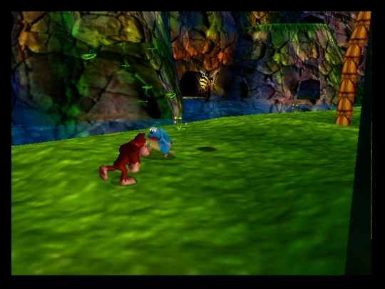
Rare loved this. Look at how colorful that cliffside is in Jungle Japes. It makes it so much more interesting than just a brown cliff face. Plus you can see the vertex coloration instead of textures at work on DK and the Gnawty.
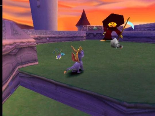
My go-to example for PS1 is always Spyro, what a gorgeous game. All of those colors there are not made by a light or an environment. They're hand painted babey! Also! With spyro! The skyboxes are actually just huge domes made up of vertices that are colored in different ways! That's how they can look so colorful and "hi-res".
There's plenty more you can do, like adding a CRT filter or a little bit of chromatic aberration which I haven't gotten into yet.
The way I've learned all this is just by being curious as to how the old consoles did their thing, and slowly accruing the knowledge over time. There's still infinite stuff I don't know too.
I hope that helped! And wasn't too longwinded or confusing! Like I said, it's all about piling up tons and tons of little things, small details, weird graphical quirks that really bring out the retro 3D feel for me.
And I didn't even get into the modeling side of things! That's an entirely different "color-of-the-sky"-sized post though.
I'd be happy to re-explain or explain more about any of this!
162 notes
·
View notes
Text
kyoho | ksj

You love your grape boy, and your grape boy... well, he might just love you a little too much.
pairing: seokjin x f!reader
rating: pg13
genre/warnings: established relationship, swearing bc when is there no swearing in my fics, mentions of seggs, suggestive themes, fluff, crack?? idk, my brand of fics is Unedited y'all know that's how we roll
word count: 1.8k
notes: i've been buying a lot of grapes lately (am i a grape person now??) and i've been eating them almost every day and of course i had to think about grape jinnie my beloved, my ultimate favorite seokjin and i want him to come back to me :((( idk that's how this lil thang came to me lmao it's the most crackhead shit i've ever written sOoOoOoOo please laugh or else ! 👿 jk but not really
— as always, i’d appreciate any thoughts or comments you may have, and please drop a like and/or reblog if you enjoy reading ♡

"If you do this, we're done."
"Y/N."
"I swear, if you go through with this, we are over!"
Seokjin sighs, rubbing a hand over his face, clearly not expecting you to be so passionate about the subject at hand. "The appointment is in an hour," he says.
"Cancel it. I don't care!" you cry. "Please don't do this. Don't take him away. He means the world to me."
Your boyfriend stares at you, mouth agape, then points to his head incredulously. "Him? My hair?"
"Yes!" You crawl over to his side of the couch to straddle his lap, actual tears welling in your eyes. You run your fingers through his hair, marveling at how soft and silky it feels in your hands. His gorgeous, gorgeous purple locks. The ones he's ready to sacrifice in favor of half blond, half red hair by demand of one Jeon Jungkook.
You shouldn't be this upset over him dyeing his hair, but you are, despite knowing full well that the purple will be gone soon anyway. His dark roots are starting to show already.
It's shark week, and there are not enough words in the dictionary to express how devastated you are that he's taking away your emotional support Grape Jinnie.
A couple months ago, when he told you that he'd be dyeing his hair purple, you were highly skeptical of the decision. You didn't know if he had the face to pull off purple of all colors, even though you had already seen him sport every other color of the rainbow and absolutely rocked every single one.
The whole week leading up to his salon appointment, you teased him endlessly - started calling him Grape Boy, bought him box after box of Kyoho grapes, photoshopping Kylie Jenner's purple hair onto his head and making it your lockscreen... It was mostly just grape puns, you were really milking that whole thing.
But then he came home, hair freshly bleached and colored, and your jaw dropped to the ground and stayed there for ten whole minutes.
Your eyes almost fell out of their sockets from how good he looked.
No, he didn't just look good. He was stunning, breathtaking, mindbogglingly beautiful and all the other synonyms that one could name.
The man fucking ate and left no crumbs.
That night was one of the best sex you two have ever had.
To say that you were obsessed with this shade on him is the understatement of the year.
"Don't do it," you plead. "If you really love me, you won't do it."
"You're being so dramatic. It's just hair." Seokjin puts his hands on your waist while you keep yours on his head, clutching his strands like a lifeline. "Plus, I have to honor the bet!"
Your expression turns stony then, as your eyes travel from the silky purple down to his face. You tighten your grip on his hair and tug on it sharply until your boyfriend is scowling in discomfort.
The bet. The stupid fucking bet he made with Jungkook.
You had explicitly told him there no chance in hell that he could win, but Seokjin could be an overly confident asshole sometimes.
He was in way over his head, and now you're the one suffering.
"You idiot," you hiss, pulling on his hair again, "why the fuck did you think you could do more pushups than Jungkook?"
"I don't know! We were tipsy and it seemed possible at the time!"
Releasing his hair, you tuck your face into the crook of his neck and inhale deeply.
"Why am I being punished for your actions?" you mumble against his skin, then you ask, voice full of futile hope. "What if you just... don't do it?"
"Then I have to buy him a new mattress. He cut his mattress with scissors to make it fit into his bed frame and now it's all fucked up."
You give yourself a minute to think. There has to be a solution to your distress. You just gotta think. Think, brain, think!
And then you remember. Seokjin is still a man.
You lean back to look at him properly, straightening your position on his lap. You give him your biggest puppy dog eyes before you say, "I promise I will blow you every day from now on if you keep the hair."
If he was drinking water, you're fairly certain that he would've choked. Your boyfriend's eyes widen in surprise, his skin turning a dozen shades warmer, blushing from his cheeks all the way to the top of his ears.
Bingo.
"What?" he asks, like this is something so scandalous.
You lean forward to pepper kisses all over his face, putting more weight on your offer. "I promise," you say, pecking his cute cheek, "to blow you," then his forehead, "every single day," then his nose, "from now on," and finally his lips.
You linger near his mouth, not pulling away just yet. Your lips brush against his once more until you feel his hands tighten on your waist. You wrap your arms around his neck to hold him closer as you press forward, giving him a proper kiss to seal the deal.
Seokjin practically melts underneath you. Victory is so close that you can taste it. You're doing this for the greater good of mankind, for Grape Jinnie. Jungkook can fuck off with his half seasoned, half fried bullshit.
But then, Seokjin abruptly rips away from you to shriek, nearly blowing your eardrums out. The suddenness of his movements almost make you tumble off the couch.
"No, don't try to tempt me! Mattresses are expensive as fuck!"
It's been a few hours. He should be back any minute now.
Ever since Seokjin left to go to his hair appointment after having to peel you off of him because you were clinging to his body like a goddamn koala, you've been wallowing in your misery. You even busted out the big guns - Ben & Jerry's Peanut Butter Cup ice cream (with real peanut butter cups!) - to help you through this difficult time.
You're in full grieving mode now. Goddamnit. Fate is a cruel mistress.
Or in this case, Jungkook. Jungkook is a cruel mistress. That fucking guy.
When you hear the door open and the subsequent clanging of Seokjin's keys as he hangs them on one of the hooks in the entryway, you prepare to give him the biggest pout you can manage.
But then, he comes into view a few seconds later, and you gasp. You actually gasp. Before he knows what's happening, you're rising from the couch and sprinting toward him, launching into his arms with the biggest smile on your face like a kid on Christmas morning.
"You're still a grape!" you squeal joyously.
Seokjin lets out a surprise Oof! at the sudden force of your body knocking the breath out of him.
"What a warm welcome," he mutters. "I don't think you've ever been this happy to see me."
"What happened?!" you ask, eyes wide, grin even wider. "Did you change your mind because you love me so much?"
You run your hands through his hair to make sure that it's real, that you're not hallucinating this because you just love the purple so goddamn much.
And it is! It's still here! His hair is still that luscious shade of purple that you adore with your entire being.
Seokjin eyes you for a moment before he says, "I compromised with Jungkook. Did something else instead."
"What did you do?"
"I got a tattoo."
"You what?!"
"He said I wouldn't have to dye my hair if I got a tattoo of his choosing."
"Oh, no," you try to sound sympathetic but fail miserably. You cover your mouth with your hand to hide your smile, already sensing the absolute crackhead chaos that will ensue in a matter of minutes. Having been friends with Jungkook for years, you know that dude comes up with the craziest shit sometimes.
Seokjin turns around and pulls up his shirt, and you almost die from the fit of ugly snorting laughter that immediately rips itself free from your mouth. His skin underneath the transparent cling film is still slightly red, but the letters adorning the expanse of his lower back is clear as day.
You cannot find it in yourself to blink, not when the black ink is just staring at you like that. The font, so formal and classic, and yet the content of it... what a contrast.
"Kim Seokjin!" you wheeze, wiping tears from your eyes and struggling to catch your breath. "How could you possibly think that this is a better idea than to just dye your hair!"
"You begged me to keep the hair!"
"I did," you agree, clutching your stomach as giggles continue wracking through your whole body. It's almost painful at this point. "But I don't want my boyfriend to have a tramp stamp that says fucking Chicken in Times New Roman!"
"It was either this," he says, turning back to face you, "or a sketch of his head on a chicken's body."
"What is up with him and chickens? Is that his new thing now?"
"I don't fucking know!"
"Well, thank you for doing that for me," you say appreciatively as you pull him in for a kiss, which isn't very graceful because you're still tittering the whole time. "But please tell me that's not permanent."
Seokjin stays quiet, his eyes dropping to the floor, and you stop laughing immediately.
"Oh my god," you say. "Is the Chicken tramp stamp permanent?!"
"No," he finally admits after a moment of hanging it over your head. As funny as the whole thing is, you do not want the love of your life to walk around sporting the most ridiculous tattoo in human history. "It's supposed to fade after a month."
You lean into him again, heaving a giant sigh of relief and wrapping your arms around his neck. One of your hands go for his hair again, weaving through the soft locks with your fingers because how could you not? "I love you, Grape," you say, pecking his cheek with a grin.
Seokjin rolls his eyes affectionately, but returns a peck to your own cheek. "I have a tramp stamp of the word Chicken and my parents might disown me for that, but at least you get to keep your Grape Boy," he says, making you giggle again.
"Because you love me so much, right?"
"Hmm. You're lucky I do."
You give him another kiss, one full of gratitude, for indulging your antics. When you move to return to the couch, Seokjin tugs on your wrist, pulling you back into him.
"Now correct me if I'm wrong," he says, acting all coy and shit, "but I recall you making me a promise earlier, no? What was it again?"

— all rights reserved © jeonqkooks. reposting, translating and/or modifying is not permitted by any means. [posted 16.04.2023]
#seokjin x reader#seokjin fluff#seokjin smut#seokjin angst#seokjin x you#seokjin fanfic#seokjin imagines#bts x reader#bts x you#bts fluff#bts smut#bts angst#bts scenarios#bts imagines#bangtanbathhouse#bangtantheatrenet#btshoneyhive#clubzerooclock#52hertz#fic: kyoho
579 notes
·
View notes
Note
What's your process in making comics
And how do you make something so good with such a simple art style!? 🥺
(if this has been asked before could you send a link to the post?)
Alright so ive been sitting on this ask b/c I already know it's a long answer aflskdjf
Write dialogue/text down in my notes app
Sometimes it's just me sitting there like hghghg as music plays and I stare at my phone for 10min. Usually it's 12am thinking about stuff while I'm in bed and I type some piece of dialogue down real quick. I'm nowhere near as comprehensive as comic script I've seen online that they give examples for, like there's no direction on what's happening in panels or anyth because it's just for myself and I just sort of remember composition ideas if I have them on the spot
Literally start drawing 😂
As previously said I sometimes go into comics with comp ideas already, like for this one I knew I was going to divide the page going in. Or like I know this is gonna be 4 panels and pretty static. Other stuff I fully wing it sentence to sentence because I can't bother with thumbnailing 😅 sometimes this bites me on the ass because I spend forever drawing smth I have to toss, but I've gotten better at doing stuff fast
I use photoshop, so for vertical comics I've been following this tutorial for years
Vertical comics are a lot easier to structure composition-wise for me, I started out making those because it was less intimidating
The red arrow is your eye direction as you read it. For me it's always the bottom of a page is one less boundary to worry about. You can be less precise if the reader is automatically drawn to looking down b/c they're scrolling and never sees a full page laid out. 😂 Also if I want to pace something slower/further down I don't have to worry about having to cram it in y'know?
This might be a weirdly specific thing to mention but I'm always thinking about it when I make comics because...

lol I gotta make up for being too lazy to spend more than 30 seconds drawing a character
jkjk but yeah my interests are more in slapping the story in my head on the page. I like doing compositions and writing stuff that interests me. I get tired when I spend too much time fiddling with stuff, so if I can get smth across with a rough estimation I'm happy. This does limit the type of stories that can be told cuz certain more rendered styles just work better when you're trying to convey certain things but! there's lots of things you can do drawing simply too!
there's defs more stuff out there that doesn't follow what I'm doing, lots of different styles. Eg American superhero comics are super text-heavy and boggle my mind. This is just what I like to do cuz I like reading way too much manga/webtoons lol
you don't have to be super technical to make comics! go out there and make one if you've got an idea!
if you want to of course haha
hope this explains my process a little
(thank you for the compliment it means a lot 🤠🙏)
146 notes
·
View notes
Text
HAPPY BIRTHIVERSARY part 1 - THE SIMS 2 IS 20???
FUN FACT: The Sims 2 (2004) was released 3 days before the date upon which I was released from my mother's womb, therefore making me younger than The Sims 2 by 3 days as of September 14th 2024, but objectively older by 6 years as of September 17th 2024. The march of time is inevitable and frightening! Let's celebrate!
Admittedly I didn't have very much to give when it came to sharing content for the Sims 2's anniversary because I've been battling the Chronic Exhaustion Demon, but then I realized I still haven't released those hair colors I showed a while back. And then I realized I could share EVEN MORE content by spreading it out across a few days instead of condensing it into one day. And it just so happens that, as stated above, there are two special occasions (for me at least... lol) close together on the calendar. SO. HERE'S SOME COOOONTEEEENT.
Today's bundle is mainly a resource for creators who use GIMP 2.x, and includes 11 UNNATURAL HAIR COLORS in the form of Curves that can be used on just about any texture you want, as long as you use it on a Volatile base These only come in Curve form, but if anyone would like to convert them into Photoshop actions, you're more than welcome to.
The colors are named, in order of appearance above: Sapphire, Tanzanite, Azurite, Alexandrite, Moonstone, Aquamarine, Bloodstone, Ruby, Entropy, Blue Moon, and Lily. You can read more about them under the cut.
DOWNLOAD (sfs)
(btw I made the Gemstone colors and the Alien black and brown a year ago, and I made Ruby and Lily this year, which is why they're in separate folders in the .zip)
The Gemstone colors were inspired by, of course, gemstones. They were my first attempt at making a hair color palette of my own. Out of them all, Moonstone, Bloodstone, and Alexandrite are my favorites.
I wanted to go for something fantastical. I also wanted to push GIMP's Curve function to the limit and see how many shades I could put into one color without it looking like garbage.
I use Bloodstone, Moonstone, and Aquamarine as Red, Blond, and Grey respectively in my (still hypothetical) Alien hair color family.
Entropy - intended to be alien "black", a very desaturated indigo color. since Alien sims born in game typically have black hair genetics (unless using a pt mod that changes this), I wanted it to really stand out against both the Maxis mint green and any alternative Alien themed skin tones despite its overall 'plainness'.
Blue Moon - intended to be alien "brown", I wanted to go for a color that was strange and unsettling in comparison to human brown hair. I think I originally intended it to be more blue but it came out more desaturated teal instead. Attempts to change this made it too similar to Entropy for my liking, so I left it as it is.
These colors were originally created and named after the sims I specifically made them for, and I was going to use them only on a small handful of hairs. But I liked the shades so much that I decided to incorporate them into my personal palette. And so, with that in mind, it didn't feel right to keep them to myself.
'Lily' maintained its name as a color, but 'Ruby' was renamed to what it is now. In my game I bin them as Brown and Black respectively because they're meant to be considered 'dyes' in-universe and I wanted to be able to make their associated sims in CAS without having to make them go to the mirror in-game every time I put them in a new hood, but you can do whatever you want with them lol.
#ts2#s2cc#ts2cc#sims 2 cc#the sims 2#the sims 2 anniversary#ssd cc#dl curves#dl resources#happybirthiversary2024#i will have something of real substance to give later on. probably
34 notes
·
View notes
Last Seen Blogs
takkarulz
✨Espérame junto a la laguna Estigia✨

yellowpeach
don't overthink this, look in my eye

theworldofstartrek
The World of Star Trek

rolavisblog
I love my dead gay son

denisehq
sincerely yours