#replace colors
Explore tagged Tumblr posts
Visit Tumblr Blog
Explore Tumblr blogs with no restrictions, modern design and the best experience.
Last Seen Tumblr Blogs


Fun Fact
After the announcement of the deal with Yahoo!, there were 170K signatures of unhappy Tumblr users petitioning to prevent the sale in 2013.
Text
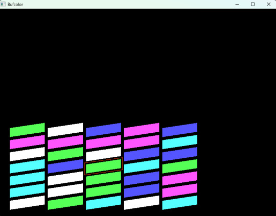
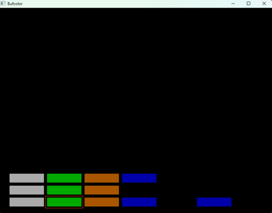
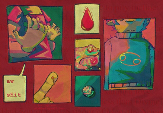
Bufcolor – this is a new word
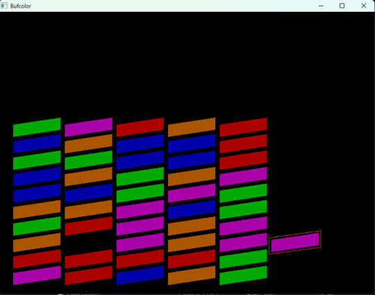
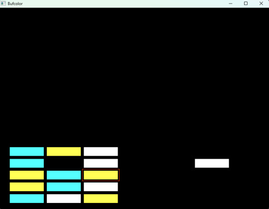
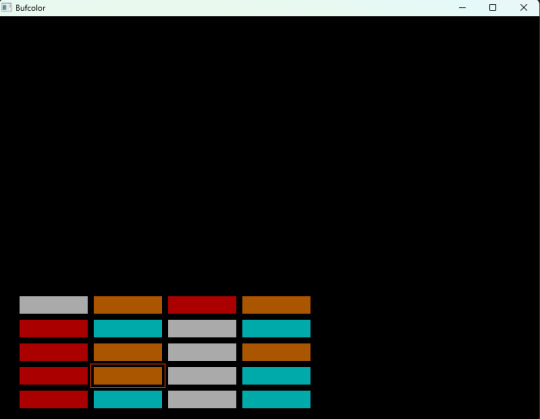
Game about different colors. You need to collect/build columns with colors. Fill every column with its own color. Control with keyboard. Arrows and space. And, also, there is a buffer. It is additional little column, where you put a little cube, that you do not need now. Buffer contains only one little cube. It is need for exchange.
For a long time, I wanted to make lots of small games with Basic. And, this time, I achieve this point. It is, exactly this kind small game. About different colors. Little cubes. There are several columns. For example, 3 or 5.
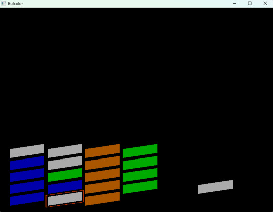
And, also, there is little column number 6 – this is buffer. Withing this you put little cube for exchange. In buffer it can be only one little cube. And you need to set all the colors in columns, except buffer with same colors. First little column with green, second with red. This is about you. You select colors. But only one idea – each column need to be with its own color. With the result. In this case you complete the level.
youtube
This kind of entertainment can be with Ms Dos, Nes, MSX, other 8 bit computers in 80s. It is funny thing, entertainment for engineer at the evening. To collect columns.
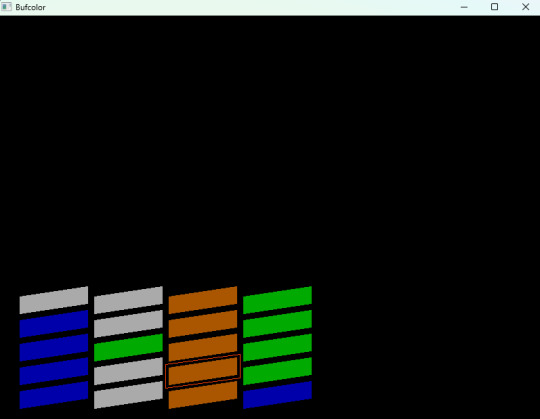
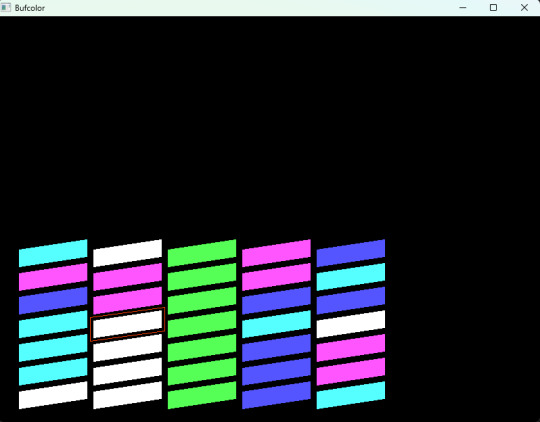
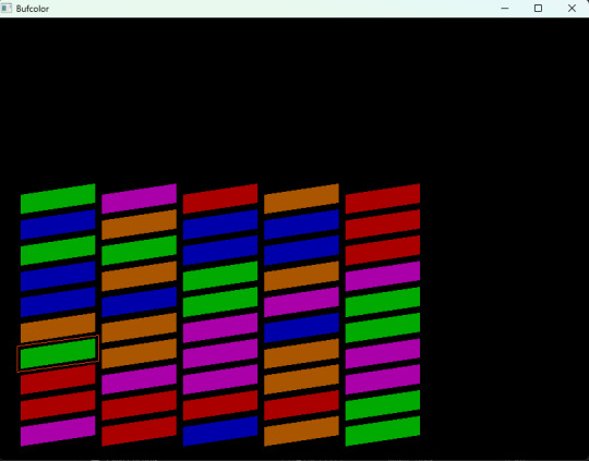
There are several color palette. And two types of visual view. First – it is simple columns. Something like to down view. Everything is straight. Second - it is isometrical. Something like pseudo 3d. With some angle. So this way it is more beautiful. But a little less with understanding. Amount of columns is different from 3 to 5.
I had for a long time lots of ideas. I think they are for Basic. Ideas for simple games. And so this is a moment of realization – it is here. With using of Basic. This is one more small game.
Title is consist with two words. But it is as a one word. New word. Bufcolor. This is after word buffer. And color. This is all the idea. You collect columns with colors. And you need one more little column as buffer for exchange. And here it is to appear a new word – bufcolor.
So, how it is cool to know how to programming with Basic. With suing this language you can do realization of lots your ideas. For example, computer games. Spirit of 80s. 8 bit computers. This is just amazing. Once again, little plus goes to side of the Basic. And dialects of Basic. Such as Free Basic. This time for this thing. And amazing code editor – Gvim.
Little columns and colors. And, also, a buffer for 1 little cube. To replace little cubes, when all of them are full in columns. With most beginning, they are filled with chaos order and random order. And you need to sort them. And to have a situation – that every column is with its own one color. You need this buffer. It is very valuable term. Without it - it will be impossible. And buffer -it is so minimal length little column with 1 little cube. You can put in buffer only one little cube. But this is enough. To start to make exchanges between little columns.
Select little cube. Put in a buffer. Later, select little cube from columns and put it to the empty place. Later, take from buffer little cube, which is already there and put it at the empty place in columns. For example, this way.
Control is simple. With arrows from the keyboard. And space to select a column. Or cancel your selection. Select you made and next do move. This is a fantasy, dream about little columns and different colors. There are max columns with 5. And number six for buffer, always 6 -it is buffer. So, palette is with 5 colors. But colors for little cubes are random way to go. So, every time you launch -you see different color picture. Firs little cube was green.it is now red during next start. And alter blue. So, neat again – some else color.
And yes - have your excellent Basic day!
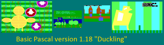
Basic Pascal version 1.18 "Duckling" – most newest version. In this version there are 4 new games! Puddles at Countryside, Duckling Pseudo 3D, Road to Countryside, Duckling Goes 2D. And even more retro games! It is a pack of retro games with modern versions of Basic and Pascal.
It is now in development new version Basic Pascal pack games. This game will be included in a new version.
Basic Pascal: http://www.dimalink.tv-games.ru/games/basicpascal/index_eng.html Website: http://www.dimalink.tv-games.ru/home_eng.html Itchio: https://dimalink.itch.io/basic-pascal
#retro game#retro programming#qbasic#free basic#arcade#logic#puzzle#8 bit#ms dos#msx#simple game#colors#columns#row#lines#exchange colors#replace colors#buffer with color#1980s#8 bit computers#build collumn#collect colors#sort#devlog#gamedev#Youtube
7 notes
·
View notes
Text

i love being late to trends. my new years resolution is to be late to every trend ever. and you know im serious because im even late to new years.
(theres an inverse version of this by @chamiryokuroi , you should go check it out! i started making this before i saw theirs, but i think its cool that now theres both versions)
#art#fanart#digital art#dc comics#bernard dowd#timber#timbern#tim drake#tim drake fanart#bernard dowd fanart#red robin#red robin fanart#dc fanart#i dont usually do more graphic styles like this so it was a fun challenge#theres so many little parts to the original that i had to notice and include#i didnt wanna download or make my own heart and star stamps just to use them maybe 6 times each so those are all hand drawn#i adjusted the colors of the heart outlines like 6 times before i was satisfied#also the fact that bernard has a red jacket and pink shirt in this changes the color profile completely so i had to change some things about#-the OG colors so it fit in well#but im happy to report that i didnt use any major blend mode layers over everything at the end to get the colors to mesh well#which is a thing ive been doing for a long time but isnt very conducive to actually learning color theory#also also i spent like a full 45 minutes trying to get the text to look right#bc i dint have whatever font that is so i had to improvise with the fonts i did have and a little bit of editing#and then i had to duplicate it for the shadow and outline it and everything#it was pretty fun tho#seeing the end product was especially satisfying#i havent read ‘go for it nakamura!’ but i assume from context clues the little squid things on the cover are-#-calling him a simp/being supportive wingmen so i replaced them with steph and dick#who i imagine are watching bernard and tim’s relationship like a soapy romcom#and occasionally heckling them (affectionately!) when theyre being lovey-dovey
1K notes
·
View notes
Note
YO TREY CLOVER IS HERE !!!
TREY NOOOO you weren't supposed to look so cool, I was supposed to be able to save my keys for all the upcoming birthdays, how could you do this to me --
also hey. hey Trey. what's in that bowl.

#art#twisted wonderland#twisted wonderland spoilers#twisted wonderland episode 7 spoilers#twisted wonderland book 7 spoilers#twisted wonderland episode 7 part 12 spoilers#twisted wonderland book 7 part 12 spoilers#don't get me wrong i am a trey enjoyer and i was expecting some pretty art but MAN they just went as hard as possible didn't they#i want to scoop up that color palette and spread it on some toast#love that they've just gone full neon casino lighting for the hearts boys 🤌🤌🤌#this card art is doing its darnedest to make up for the general lack of trey ssrs#anyway looking forward to freaking out about the rest of chapter 12 for the next couple of weeks!#can't wait to see how trey saves the day by making a cake taste like dirty socks or something#(no but i maintain that trey is actually the most ridiculously overpowered character in twst if you think about it)#(he could end malleus' reign of terror by replacing his head with a potato but he simply chooses not to)#(he has chosen a quiet life of culinary arts and dental hygiene over glorious power)#(i am only like...60% joking about this)#(somebody's gotta make sure riddle doesn't actually explode after all)
2K notes
·
View notes
Text

holding onto the remains of my innocence.
#john egbert#homestuck#john posts#look. man. like. its so dirty to draw john in blue clothes. not his favorite color. haha.#it's funny even for me. it's so emo man.#> Replaced by breath blue forced to be represented by his role in the story rather than what makes him Him. -#-dib from discord who Gets It.#just like the ghost on his shirt. he disappears. :)
3K notes
·
View notes
Text
So god created us in his image, right? And that’s cool and all but what if it turns out god, like, hates his own image??? What then????
#Yeah okay#I don’t even like this as much anymore#But whatever#He makes me insaneeeeer#literally nuts#Bg text is just a snippet from paradise lost because I thought it would look neat and like. Idk biblical symbolism ig#Whateverrrrrrr#How do you think he feels abt humans having red blood. Like.#Okay I know that with Jack he was really big on it#Like excited#But Jack was just some other guy who happened to have red blood#He created us and he created us wrong#And it just so happens we also have his fucked up awful mutant blood color?#Yeah okay sure#It’s gotta feel like one last slap in the face in the cosmic joke that is his existence#It is inescapable!!! You flow through their very being!!! You are a cancerous presence that has invaded their very veins!!!!#You are the force that keeps them alive as well as the thing that kills them in the end!#Does this make any sense actually. Let me know#Anyway yeah that’s all#Byeeeee#i might draw more Erivris later but idkkkkkkk#My ipad is getting replaced soon so I won’t have to steal my brother’s to draw anymore#So hopefully more art then#okayyyy bye 4real this time#homestuck#homestuck fanart#karkat vantas#homestuck karkat#art#digital art
689 notes
·
View notes
Text
People keep on saying Gideon has Alecto's eyes, and like yeah, it makes sense. Alecto had them first. Most people in a position to know knew Alecto first. But Harrow didn't. Harrow opened the Tomb after a savage fight with Gideon, believing Gideon wanted her dead and thinking she was right to do so.
I wonder what it meant to her, when the Body appeared to her with Gideon's eyes.
#I know it says in Harrow the Ninth that the Body's eyes were black when she was a child#but her childhood memories were very specifically edited in Harrow the Ninth#what that tells me is that the Body's eyes made her think of Gideon#the color was a casualty of her lobotomy and she replaced it with something familiar#the locked tomb#harrow the ninth#harrow and the bod#harrowhark nonagesimus
425 notes
·
View notes
Text
eclipse and y/n are finally done!! (you can find EBY sun & moon here)
these refs aren't that much different from the old ones aside from small changes :3
(old) EBY DCA ref
(old) Y/N ref
#fnaf daycare attendant#fnaf dca#dca au#dca#dca fandom#dca community#fnaf sb#daycare attendant x reader#fnaf eclipse#dca eclipse#pingdoobles#EBY#eclipsed by you#sleep schedule is atrocious rn im so sorry DCA i failed you#i work in less than an hour and couldn't sleep rip (tbf im used to closing shifts and this is my first morning shift in ages)#i did NAWT color check i will fix it later i need to power nap before its too late#<- ok i edited some colors cause something was bothering me we're good now!!#btw eclipse's party has is CRUCIAL. do not forget it and if lost please replace it#he's very fond of his silly hats let him have his fun#cw bright colors#cw eyestrain#bright colors#eyestrain#im so sorry i forgot the cw tags thanks for reminding me! <3#EBY eclipse
627 notes
·
View notes
Text


2 year anniversary since these guys first popped up in my head. I guess it's time to make some new colored refs of these three...
#WIP#I never liked the first color refs I made for them...#I am excited to replace it haha#no reblogs...bcus....wait till they're finished lmaaoo
225 notes
·
View notes
Text

Requested by lxvenderjewel
#qprs are not your romantic replacement#lgbtqtext#lgbtq text#animated text#word art#queerplatonic colors#queerplatonic#queerplatonic text#queerplatonic pride#queerplatonic positivity#qpr#qpr pride#qpr positivity#qp#qp pride#qp positivity#lgbtq#lgbtq pride#lgbtq positivity#queer#queer pride#queer positivity
232 notes
·
View notes
Text


TrekBuks Bookcase from Apartment Life, remapped and recolored!
All this talking about books and bookcases got me looking for books not yet recolored and I realised this bookcase was being chronically ignored by everyone which makes sense, I mean, it is more bookcase than books. It's a typical bookcase for people who don't read.😄
But it looks pretty and it is actually pretty easy to recolor, so:
I remapped and repositoried the books to the Cinderbooks Bookcase so I didn't have to recolor books again. Which would have been a lot quicker in hindsight but who cares at this point, what has been done is done.🤡 This means that if you have my Cinderbooks Bookcase recolors I did earlier, the new textures will fit prettily on this bookcase as well. The red bookcase on the first picture shows the new Cinderbooks Bookcase Maxis textures. If you need more, these ones from plasticbox will work too. If you don't want to see the Maxis texture at all, Vickie has you covered with her defaults.
Important! My file (LotteTrekBuksBookcaseUVMapEdit.package) will conflict with CEP if you have it. That is why my file should load after the _EnableColorOptionsGMND.package that you placed in the downloads folder for CEP. I don't remember exactly where CEP puts that file but one way to make sure my file does not conflict is to put it in a folder lower than the one for _EnableColorOptionsGMND.package. For example; put that file in a folder named A and my file in a folder named B and it will load after it.
I've also made recolors in the usual Cluedo Woods and Colors. I liked both white and black metal for the rods so all recolors come with both versions (the one with 1 behind the name are white rods and 2 are the black rods). I have also included a file to replace the four default options if you so wish (see last picture to see which replaces which).
Credits: @shastakiss (textures and colors)
It is possible to use my recolors and not download my remapping file, it is completely optional to use both!
Download (UV map edit)
Download (recolors)
#sims 2 cc#s2cc#ts2cc#ts2 cc#sims 2 recolor#sims 2 recolors#sims 2 objects#sims 2 download#sims 2 default replacement#sims 2 default#cluedo woods#cluedo colors#default cluedo#mydownloads#mydownloads recolors objects#mydownloads default objects#mydownloads uv map edit#mydownloads theme books
213 notes
·
View notes
Text

Wanted to show off Alé and her dynamic with Doey a little more. She's a sass machine, fluent in sarcasm and crank. Her comments tend to be very curt and she is a hard nut to crack or to warm up to.
She is very reckless in her behavior, much to Doey's panic, frequently scuffling with Yarnaby and has returned to Safe Haven badly injured on many occassions, but is too stubborn to change her approach.
On the note of being stubborn, she's also keen on Doey's behavior and will push the guy to sit down and relax. If she could sit on him to keep him in place, she would. She knows he's stressed to hell and back with all the responsibilities he's put on himself and tries to ground him one way or another.

Though she can be rough around the edges, Alé is far from cruel. The other toys were very scared of her starting off, but as they've come to realize she's mostly bark and no bite (only in their case), they have since warmed up to her. She has as well, but would rather die than say it out loud.
Her and Doey tend to shift who resides in Safe Haven and who's outside. Most of the time, Alé is the one patroling the area, but when Doey has to look for something, he leaves the area to her... much to her annoyance.
In short, she's a gruff and snarky toy who is easily annoyed, but cares very deeply for those that get close to her, even if she doesn't say it outloud.
#working on part 2 of the doey comic and i wanted to show em off a little more#also if anyone tags this as ship art i will personally throw hands djfhgjdf#idk what is up with me and having grumpy sassy ocs but hey lemme have em#i had quiver with kirby and now its ale's turn#also might change a design thing for her#might replace the color changing thing with something else cause like#it makes more sense for her than that dfgfd#mine#my art#alé the gator#doey the doughman#craftycorn#dogday#hoppy hopscotch#bobby bearhug#poppy playtime#smiling critters
164 notes
·
View notes
Text

kaveh is too shy to be in the same banner as his boyfriend 🥹

#myart#genshin impact#kaveh#alhaitham#kavetham#haikaveh#sethos#he was replaced by another blond lol#wonder if i would ever clean the lines and color this 🤔 hmm
942 notes
·
View notes
Text
I wanted to do a quick experiment and swapped sg Thundercrackers helmet color and face color
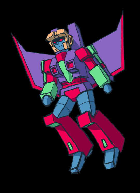
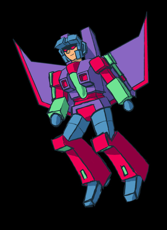
Honestly the right version I like a lot, I just like bright colors, but the orange helmet was just too much, another downside is that he doesn’t work well with a solid background color except black 😭
#his spike is def rainbow too#I do question how hard it is to replace his glass cockpit#like it could be tinted green but it could also be uranium and that’s why it glows#while I was making this post the mpreg poll for Megatron vs vaush ended and I immediately paused to go celebrate#DO YOU KNOW WHO ELSE HAS A MOSTLY BLACK COLOR SCHEME 🤔 🤔 🤔#transformers#transformers fanart#maccadams#maccadam#sg thundercracker#Thundercracker#tf shattered glass#shattered glass
96 notes
·
View notes
Text
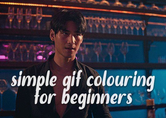
✨ Simple Gif Colouring for Beginners ✨
I wrote up my basic gif colouring process for a friend recently, but a couple of people here mentioned they'd also find it helpful! so, as requested, this is a beginner-friendly walkthrough of the way I colour my gifs :) it's aimed at brand new gif makers with no prior experience with photoshop or photo editing.
when I first started gif making I found colouring and photoshop in general suuuper daunting, so I've tried to simplify everything here as much as possible. hopefully this will be relatively easy to follow and not too intimidating!
a couple of things to begin with:
I'm only talking about colouring here - this is not a full gif making tutorial. I've linked to some of my favourites of those here!
I personally like to make bright, 'clean' looking gifs with vibrant but natural colours, so that is the style of colouring this tutorial is geared towards. most of gif colouring is subjective and about personal taste - the only thing that I'd say is possible to get wrong is skin tones, which I talk about a lot in this guide.
as I mostly gif Thai dramas, most of the advice is geared towards colouring for East Asian/South East Asian skin tones - but the techniques should be fairly universally applicable (and here are some tutorials that talk about gif colouring for other skin tones).
I'm not an expert! I'm not claiming this is the best or the only way to colour gifs - it's just how I do it.
this post is very image-heavy. if the images aren't loading (or the gifs are running slowly or cutting/looping weirdly), then try viewing the post in its own tab (rather than on the your dash or someone's blog) and refreshing the page.
okay, full walkthrough beneath the cut!
contents:
1. intro a. natural gif colouring goals b. very very basic colour theory 2. super simple colouring (the essentials) a. curves b. selective colour (and skin tone correction) c. hue/saturation d. saving and reusing colouring e. another simple colouring example 3. other adjustment layers a. brightness/contrast b. levels c. vibrance d. colour balance e. channel mixer 4. troubleshooting a. curves b. saturation 5. fin!
1. intro
the colouring part of gif making can be super overwhelming, especially if (like me when I first started!) you're completely new to photoshop and/or have no experience with colour theory or photo/video editing.
if you're opening photoshop and making gifs for the first time, I highly recommend getting used to making a few basic, uncoloured gifs to begin with. just to practice, rather than post anywhere (though you can always come back and colour them later if you want) - but it'll make the rest of the process much easier if you're already beginning to get used to working in timeline mode of photoshop. give yourself a bit of time to practice and get a feel for things like how many frames you tend to like in a gif, where you like to crop them for the best loop, what kind of aspect ratio you like etc* - so that you're not trying to navigate all of that for the first time on top of everything else!
* frames: for me between 60-90 frames is ideal, but 40-120 frames is the absolute min-max I'd personally use in a normal gifset loops: for the smoothest loops, try to avoid cutting someone off mid-movement or mid-word if possible. aspect ratio: for full-size (540px) gifs, I tend to go for either 8:5 (slightly 'skinnier' gifs), 7:5, or 5:4 (particularly big, thick gifs lmao)
✨ natural gif colouring goals
part of what can be so daunting about starting gif making is not knowing where to start or what you want to achieve. this is definitely something that gets easier with practice - the more gifs you make, the more you'll get a feel for what kind of look you like and the more instinctively you'll know how to get there. it also helps to see if any gif makers you like have made "before and after colouring" posts - these can help with getting a sense of the kinds of changes made through gif colouring. here's one I made!
in general, I like to make my gifs bright and 'clean' looking, with vibrant but natural colours. these are the things I'm usually hoping to achieve with colouring:
brighten dark scenes
remove muddy, yellowish lighting or filters
saturate colours
correct any skin lightening filters or overexposure
make lighting and colours as consistent as possible between gifs within a single gifset, especially gifsets featuring gifs from multiple scenes/episodes/videos
this guide is focusing on natural colouring, but of course there are many cool ways to make stylised/unnaturally coloured gifs. imo you'll need to master these basics first, but if you want to learn how to do things like change the background colour of gifs or use gradients or other cool effects, then @usergif's resource directory has loads of super helpful tutorials!
✨ very very basic colour theory
[disclaimer! I don't know shit about fuck. I do not study light or art. this is just an explanation that makes sense to me exclusively for the purposes of gif making.]
the primary colours for light/digital screens are red, blue, and green. having all three colours in equal measures neutralises them (represented by the white section in the middle of the diagram).
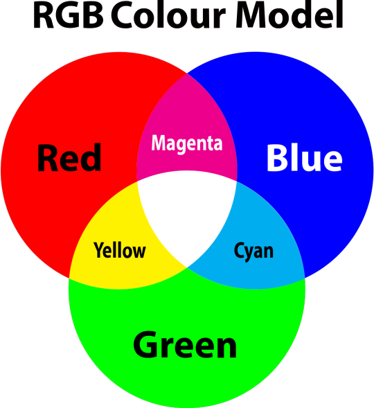
so to neutralise a colour within a gif, you need to add more of the colour(s) that are lacking.
in practice this usually means: the scene you want to gif is very yellow! yellow is made of red and green light, so to neutralise it you need to add more blue into your gif.
it can also mean the reverse: if you desaturate the yellow tones in a gif, it will look much more blue.
looking at the colour balance sliders on photoshop can make it easier to visualise:
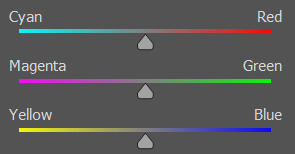
so making a gif more red also means making it less cyan.
removing green from a gif means adding magenta.
taking yellow out of a gif will make it more blue.
tl;dr:
neutralise yellows by adding blue (and vice versa)
neutralise reds by adding cyan (and vice versa)
neutralise green by adding magenta (and vice versa)
2. super simple colouring (the essentials)
starting with a nice sharpened gif in photoshop in timeline mode. (these are the sharpening settings I use!)
some scenes are much harder to colour than others - it helps to start out practising with scenes that are bright/well-lit and that don't have harsh unnaturally coloured lights/filters on. scenes with a lot of brown/orange also tend to be harder.
I usually save a base copy of my gif before I start colouring just in case I end up hating it, or find out later that it doesn't quite fit right into a set and need to redo it etc.
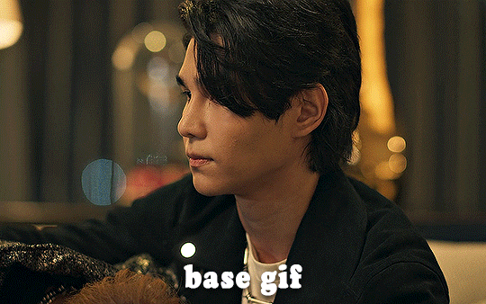
so here is my base gif!

it's an okay gif, but it has a bit of a yellow tint to it that I want to reduce.
colouring is easiest to do in adjustment layers, which can be found under layer -> new adjustment layer - or for me they are here:
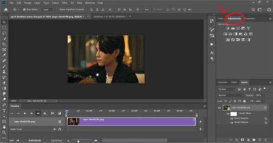
there are lots of different types of adjustment layers that do lots of different things - but for me the absolute essentials for colouring are curves, selective colour, and hue/saturation.
I also use brightness/contrast, levels, exposure, vibrance, colour balance, and channel mixer sometimes, depending on the gif - but I use curves, selective colour, and hue/saturation on every single gif.
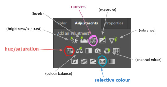
✨ curves layer
the first thing I always do is a curves layer. when you first open one it will look like this:
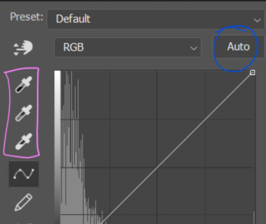
first I usually click the ‘auto’ button, just to see what happens. sometimes it makes a big difference (it usually brightens the gif a lot) - but on this gif it didn’t do much.
if it had made the gif look nicer then I would have kept it and added a second curves layer on top to do the rest of these steps.
the next step is selecting the white and black points with the little eyedropper tools.
the bottom eyedropper lets you pick a white point for the gif. click somewhere super light on the gif to see what happens - for this gif, I clicked on the lampshade on the left. if it looks weird, I just undo it and try somewhere else - it usually takes a few goes to find something that looks good.
here's what that did to the gif:

then I pick the top eyedropper and use it to pick a black point by clicking somewhere really dark, again playing around until I find a black point that looks good.
here's what the gif looks like after picking the white and black points:

this can take some experimenting, but you can make super easy drastic changes to your gif just with this. in this case, the curves layer took out a lot of that yellowy tint.
and this is what the curves graph looks like now:
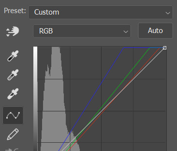
you can click and drag those lines to make further changes if you want - I usually leave them alone though. the colours of the lines indicate which colours have been changed in the gif - for example, you can see from that steep blue line on the graph that blue has been added to neutralise those yellows.
next I usually do another curves layer and just press the ‘auto’ button again to see what happens. usually it brightens the gif a bit more, which I like.
‼️if nothing is working: usually with a bit of fucking about a curves layer works well - but sometimes you can’t find a good white and black point anywhere, and instead your gif turns wacky colours and nothing looks good. this happens more often with very heavily colour tinted scenes :( the troubleshooting section at the end goes over some options, including starting with a levels layer instead.
✨ selective colour (and skin tone correction)
skin tones are made up of a mixture of yellow and red.
removing yellow (or adding blue or red) to a gif will make the skin-tones too red - and removing red (or adding cyan or yellow) to a gif will make the skin-tones too yellow.
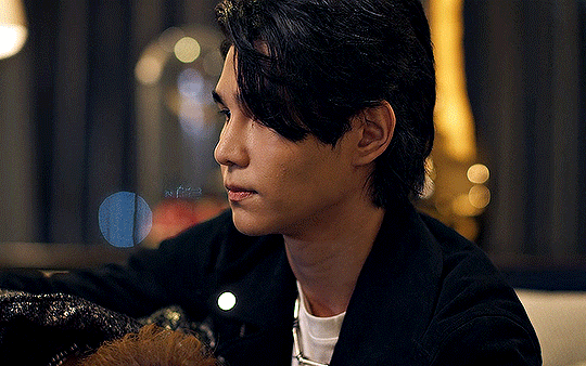
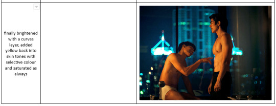
adding blue to this gif with the curves layer took out the yellowy tint, which I wanted - but it also took the yellows out of Kim's skin tone, which I don’t want. so I need to put yellow back into the skin tones specifically - without putting it back into the rest of the gif.
selective colour layers let you select an individual colour and adjust the levels of other colours within that colour. you can change how yellow the green shades are, or how much cyan is in the blues, for example.
I need to add yellow back into the red tones to correct the skin tones on this gif. this is the case for most gifs in my experience - the vast majority of the time, unless a scene is very heavily tinted in another colour, a curves layer will add blue/remove yellow.
in the 'colors' dropdown, select the 'reds' section and drag the 'yellow' slider higher - this will add more yellow into just the red shades within the gif.

the amount of yellow you need to add back into the reds depends on how much yellow was taken out of the gif initially - I just play around with the slider until it looks right. if you're not sure, it helps to have some neutrally-coloured (not white-washed!) reference photos of the people in your gif to compare to.
here's the result. Kim's skin is a lot less pink toned and much more natural looking:
✨ hue/saturation
this adjustment layer lets you adjust the hue and saturation of the gif as a whole, and also of each colour individually.
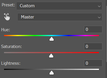
I don't use the hue or lightness sliders unless I'm trying to do something more complicated with the colouring.
clicking the dropdown menu that says 'master' lets you edit the saturation of each colour individually. this is useful if your gif is still super tinted in one colour.
I thought the yellows on this gif were still slightly too bright, so I switched to the yellow channel and desaturated them slightly. (remember if you do this then you need to go back to selective colour and add more yellow into the red skin tones to balance out the desaturation!)
then I increased the 'master' saturation of all the colours to +5:
I usually find the right amount of saturation is somewhere between +5 and +12, but it depends on the gif.
‼️if the gif feels undersaturated, but the saturation slider isn't helping/is making the colours worse, try a vibrance layer instead.
done!
✨ saving and reusing colouring
you can copy and paste adjustment layers between gifs to make your colouring even across each of your gifs for one scene - so if you're making a set of multiple gifs of the same scene, or you think you might want to gif the same scene again in the future, you can save it as a psd so you can reuse the colouring again later.
each gif's colouring will then still need tweaking - different cameras/angles/shots of the same scene can still start out with slightly different colouring.
I recommend uploading the gifs as a draft post on tumblr so you can see what they all look like next to each other and catch any inconsistencies.
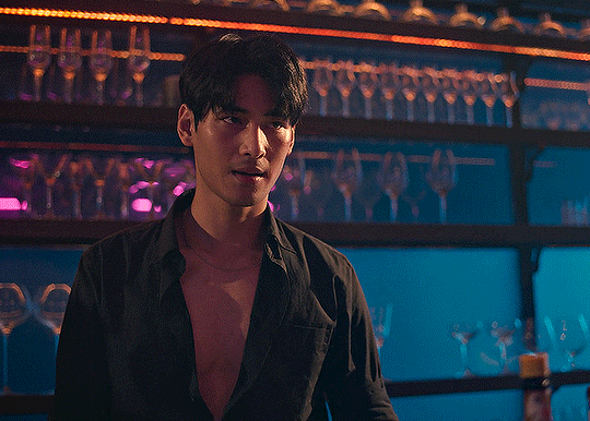
✨ another one! (speedrun!)
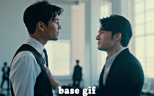
HI KEN!
the white point for the curves layer was in the window behind them.
the curves layer removes the muddy yellow tint, but again it makes their skin tones (especially Ken's) very red toned, which is adjusted by the selective colour layer.
3. other adjustment layers
imo many many gifs can be coloured really nicely with just those three adjustment layers, but some need different adjustments.
✨ brightness/contrast
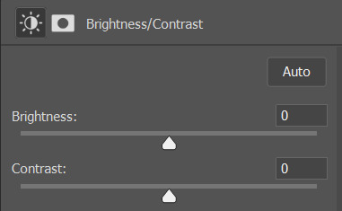
pretty self explanatory!
I personally usually avoid using the 'brightness' slider because I rarely like the effect - I only tend to use the 'contrast' one.
the 'auto' button is sometimes useful though, especially if you’re struggling with the curves layer.
✨ levels

levels alters the white and black points of the gif, like curves - but unlike curves it doesn't also alter other colours.
use the sliders beneath the graph to alter how dark/light the gif is. you can slide the black slider further to the right to make the blacks darker, and the white slider to the left to make the whites lighter.
levels is a good place to start if your curves layer isn't working.
(I'm going to hit the image limit for this post lol so here are some screenshots of a table I made to demonstrate this rather than actual gifs. sorry!)

on both sides, I dragged the sliders up to where the big jumps are on the graph - this is usually a good place to start!
✨ vibrance
vibrance... makes the colours more vibrant. it's more subtle than saturation.
it's really helpful for gifs that feel grey. sometimes adjusting saturation just makes the greys kind of weirdly tinted, but a vibrance layer can fix that.
vibrance is much more subtle!
✨ colour balance
colour balance affects the overall balance of colours within a gif.
it's good for scenes with heavy tints.
I tend to stick to the 'midtones' dropdown, but you can also alter the colour balance within the shadows and highlights if you want.

✨ channel mixer
I avoided channel mixer for such a long time because it scared me. but it's great for scenes that are very heavily tinted in one colour.
basically, it works with the levels of red, green, and blue within a gif. you select an output colour and then play around with the levels of the colour you selected within each other colour.
kind of the reverse of selective colour?
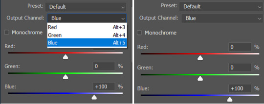
so in the 'blue' channel, the levels of blue are at 100%, and the levels of red and green are at 0% - but you can impact how much blue is in the reds and greens and blues.
this tutorial explains it well - but imo the best way to get to grips with channel mixer is just to play around with it a bit (sorry)
(when I made this guide for my friend, I also made a slightly more complicated gif colouring walk-through that included using channel mixer. there isn't space to include it within this post, but if anyone is interested I could always upload it as an 'intermediate' gif colouring tutorial - lmk!)
4. troubleshooting
‼️curves
usually with a bit of fucking about a curves layer works well - but sometimes you can’t find a good white and black point anywhere, and instead your gif turns wacky colours and nothing looks good. this happens more often with very heavily colour tinted scenes :(
for example, with this base gif:
using many of the brightest points as a white point turn it wacky colours, like this:

yikes :(
some options for these cases:
try brightening the gif first with the 'auto' button on the curves layer or with a levels layer. having a brighter gif to start with can give you better options for picking a white point.
try finding an alternate, whiter/brighter white point. look for places the light reflects - on this gif, using the light on Porsche's cheekbone works well as the white point. it also helps to find places that would be white if the scene wasn't tinted - the lightest part of a white shirt is often a good place to start, for example.
skip the curves layer, and instead use a levels layer to alter your white/black points, and colour balance or channel mixer to balance the colours.
‼️over/undersaturation
if your gif (especially the skintones) is looking a little washed out or lifeless, it might be undersaturated. boost that saturation - or if that's not working, try a vibrance layer.
oversaturation is often easiest to spot in the mouths and ears of any people in a gif. if the mouths are looking unnaturally, vibrantly red, then you've gone too far with the saturation.
5. fin!
and done! I hope this was coherent helpful to somebody.
if there's anything that I've missed or that doesn't make sense pls feel free to shoot me an ask or a message and I'll do my best to help! I've also collated a bunch of additional reading/resources below.
happy gifmaking 🥰
✨ some links!
photoshop basics by @selenapastel
gifmaking for beginners by @hayaosmiyazaki
gifmaking guide for beginners by @saw-x
dreamy's gif tutorial by @scoupsy-remade (includes instructions on how to blur out burned-on subtitles or annoying video graphics)
beginner's guide to channel mixer by @aubrey-plaza
how to fix orange-washed characters by aubrey-plaza
colour correcting and fixing dark scenes by @kylos
does resampling matter? by usergif
how to put multiple gifs on one canvas by @fictionalheroine
watermarking using actions by @wonwooridul
resource directory by @usergif
#i got a couple of asks about this so i figured i'd type it up as a post#it's been sitting in my drafts for a while now though i'm so sorry omg.#i had to replace my laptop and it took me a while to get round to downloading photoshop on the new one#but i hope this is helpful!!#gif making#tutorial#photoshop tutorial#colouring tutorial#coloring tutorial#gif colouring#gif coloring#photoshop resources#gif tutorial#gif resources#userbunn#uservik#darcey.txt#darcey.gif#usergif
866 notes
·
View notes
Text
this has been on my todo list for actual goddamn months. do you know how long i've been waiting to draw this fucking t
#why couldn't i draw it earlier#you may ask?#first of all how about you don't ask#second of all i was lazy#speaking of lazy i was like. half lazy in the coloring department?#its confusing#but anyways yeah i always thought this was a funny visual#i think i stole the idea from an @uzi-doorknob post a while back#but replaced n with v cause she seemed more likely to do dumb shit like this#i would've made this three days ago had i not gotten addicted to a certain something. thanks iz#murder drones#murder drones uzi#murder drones v#serial designation v#you can tell exactly where i got even lazier somehow (the board)#art
2K notes
·
View notes
Text
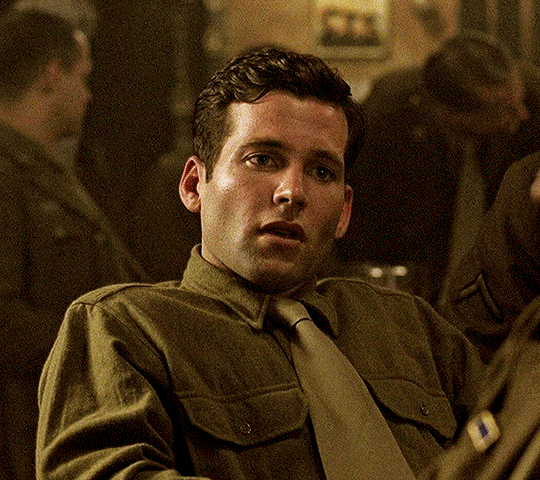
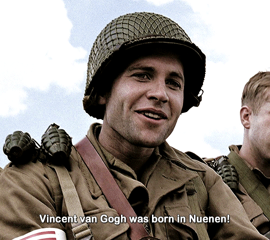
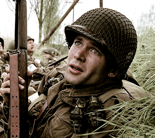
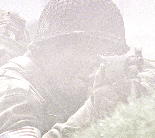
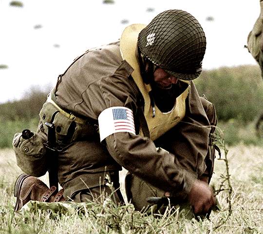
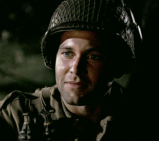
Eion Bailey as David Kenyon Webster in BAND OF BROTHERS (2001) ↳ Part Four: Replacements
#bobedit#bandofbrothersedit#hbowaredit#tvedit#tvandfilm#hbowardaily#dailyflicks#band of brothers#david webster#bob: replacements#is it just me or is this ep especially hard to color#anyway david webster you'll always be famous for spreading misinformation and for serving face while a war was going on
241 notes
·
View notes