#responsive navbar html css
Explore tagged Tumblr posts
Visit Tumblr Blog
Explore Tumblr blogs with no restrictions, modern design and the best experience.
Last Seen Tumblr Blogs


Fun Fact
Tumblr has a 66 index score for customer satisfaction in the US.
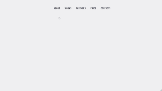
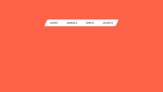
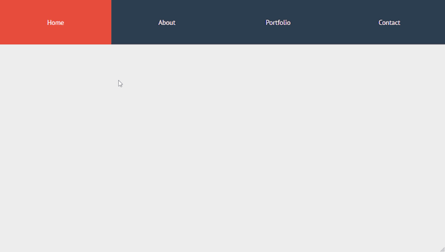
Text
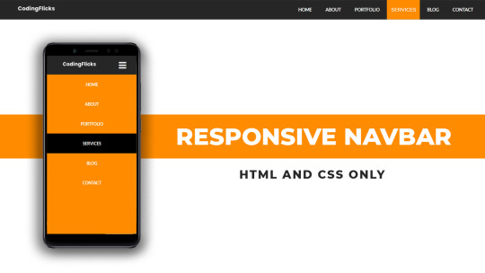
Responsive Navigation Menu
#responsive navbar#responsive web design#css#frontend#html css#neduzone#html#css3#frontenddevelopment#learn to code#webdesign#responsive navbar html css#html css menu#menu css#css menu
1 note
·
View note
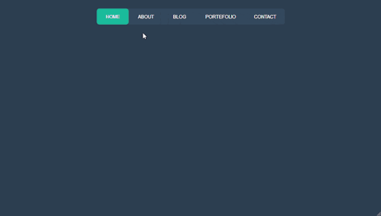
Text

Responsive navbar
#responsive navbar#html css#divinector#css#webdesign#frontenddevelopment#css3#html#responsive web design#html css menu#css menu
4 notes
·
View notes
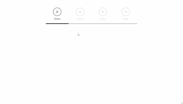
Text

Responsive Mega Menu
#Responsive Mega Menu#flexbox mega menu#css navbar#css menu#html css menu#css megamenu#responsive menu#codenewbies#html css#css#html5 css3#code#responsive web design
3 notes
·
View notes
Text
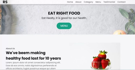
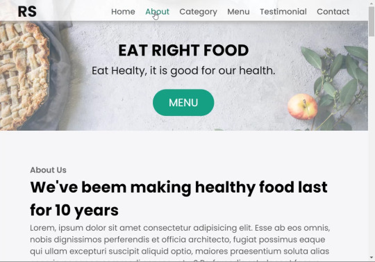
Restaurant Website Using HTML And CSS With Source Code
Restaurant Website Using HTML And CSS With Source Code
Hello coder, Welcome to the Codewithrandom blog. In this article, we create a Restaurant Website using HTML and CSS with Source Code. This is a Simple Restaurant Website with a main home page, types of food available, a food menu, customer reviews, and a contact form section on the restaurant website.
The HTML code for the Restaurant Website is the first thing we develop, and after that, the CSS for styling and JavaScript code. we add JavaScript for smooth scrolling on our website otherwise javascript is optional for this project.
Let’s Start a Responsive and Amazing Restaurant Website Using HTML and CSS. Let’s code a Simple website, We use 1,000+ lines of code to make our Restaurant Website Fully Responsive.
100+ HTML,CSS and JavaScript Projects With Source Code ( Beginners to Advanced)
Basic Knowledge About Project
It’s a front-end intermediate-level project that uses some advanced frameworks like CSS and JavaScript to make the project more elegant and responsive. We have provided you with the project with step-by-step explanations, which will help you better understand the project.
Before we dive into the step-by-step solution to the project, let’s understand some of the basic concepts about restaurant websites using HTML, CSS, and Javascript.
What is an online Restaurant Website?
An online restaurant website is a digital version of any restaurant that allows users to order food directly from the restaurant while sitting at home. These websites were created for customers who wish to eat restaurant food at home. The consumer can select items from the food menu and make payments for faster deliveries.
What are the benefits of Online Restaurant Websites?
reaches the maximum number of customers.
Easy to order
Hassle-free payments
increase in customer reach.
increase in profit.
Live Preview Of Restaurant Website Source Code:-
Restaurant Website Html Code:-
In this HTML code, we create a complete navbar for the footer structure of the restaurant website. first, we link our CSS and JavaScript files in html code. now we add a font awesome icon CDN link in the code because we create the What Our Customers Say section on the website and we show that review with a star so we use a font awesome icon.
Gym Website Using HTML ,CSS and JavaScript (Source Code)
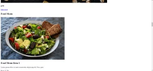
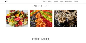
then we create the structure of the navbar and it’s very important in our website because we create a responsive navbar in the project. then we create some simple sections of the restaurant website like what food is available and a food menu list.
and lastly, we create a contact form and a footer copyright line at end of the website.
This is almost 300 lines of HTML code for the restaurant website, and you can see the output below with only the HTML code output of the restaurant menu. Then we add CSS code for styling our restaurant website.
Output Of Only HTML Code For Restaurant Website:-
This is all image output that we create using only HTML code. Now the time is to style our restaurant website using css😍.
Restaurant Website HTML CSS Code:-
In CSS code we include Poppins font from Google font. then we style all sections of the website step by step. we write comments in CSS code so if you want to customize any of the restaurant website parts you can change that section code and it’s all done.
Responsive Resume/CV Website Using HTML & CSS
This is our whole CSS code with 600+ lines. We style our Restaurant Website step by step. We style the utility class and then style our navbar. After the navbar, we styled every html section🔥.
At the end of the code, we use media queries to make our Restaurant Website completely responsive and mobile-friendly. So you can see the output with CSS code. Then we add a little bit of javascript for the scroll effect otherwise our website is completely ready with code.
Ecommerce Website Using HTML, CSS, and JavaScript (Source Code)
Output Of HTML CSS Code Restaurant Website:-
You can see this awesome👏 output with HTML + CSS Code for Restaurant Website. Now we add JavaScript for smooth scrolling.
this is completely optional to add JavaScrpt to this project.
That’s it for our Whole restaurant website code. We write every useful code like making the website mobile-friendly and adding media queries for this. Add JQuery code for smooth scrolling on the restaurant website.
50+ HTML, CSS & JavaScript Projects With Source Code
[su_button id=”download” url=”https://drive.google.com/drive/folders/1Wx9W99uIH3WiO1nkz6aJYCuXVv_ibGmA?usp=sharing” target=”blank” style=”3d” size=”11″ wide=”yes” center=”yes” icon=”icon: download”]DOWNLOAD NOW[/su_button]
Final Output For Restaurant Website Using HTML and CSS Code
You can see this video output to see the complete output. You can see how smooth the website scrolls and this design.
Hope you like this Restaurant Website Project, we create your own and use this project in any project as a part project like the reviews section, and a contact form. If you need any more project-related frontend. Visit our homepage and you get 100+ projects💝.
Age Calculator Using Html Css Javascript ( Source Code )
if you have any confusion Comment below or you can contact us by filling out our Contact Us form from the home section. 🤞���
Code By – Sanket Bodake
was written by – Codewithrandom
FAQ For Restaurant Website
Which code editor do you use for this Restaurant Website project coding?
I personally recommend using VS Code Studio, it’s very simple and easy to use.
is this project responsive or not?
Yes! This project is responsive.
What is an online Restaurant Website?
An online restaurant website is a digital version of any restaurant that allows users to order food directly from the restaurant while sitting at home. These websites were created for customers who wish to eat restaurant food at home. The consumer can select items from the food menu and make payments for faster deliveries.
What are the benefits of Online Restaurant Websites?
1. Reach the maximum number of customers. 2. Easy to order 3. Hassle-free payments 4. Restaurant Like food at Home. 5. Increase in profit.
2 notes
·
View notes
Text
Tried Every Major AI Model for Frontend Coding Only One Truly Delivered.
Let’s face it. As web developers, we’re all chasing the dream of faster, smarter, and more efficient coding. After all, the clock’s ticking, and there’s always more to build. Enter AI. You’ve probably heard all the buzz—AI tools that promise to help us write code faster, debug smarter, and even suggest better practices.
So, I did what any curious developer would do: I tested every major AI model for frontend coding. The verdict? Only one truly delivered. Spoiler alert: it wasn’t the one you might expect.

Let’s break it down.
The AI Hustle: The Tools I Tested GitHub Copilot – The AI-powered sidekick that lives inside Visual Studio Code, claiming to write code for you based on context.
ChatGPT – The famous conversational AI that answers all your questions and generates code snippets on demand.
Tabnine – The autocomplete tool that promises to help you code faster by suggesting relevant code as you type.
Kite – More of a Python fan favorite, but I thought I’d give it a shot for frontend tasks.
IntelliCode (Visual Studio) – Microsoft’s answer to AI code suggestions, integrated right into Visual Studio.
GitHub Copilot: Feels Like Magic—Until It’s Not At first, GitHub Copilot felt like something straight out of a developer’s dreams. You start typing, and bam—there it is: a perfectly crafted function, just like you wanted. For straightforward tasks like creating forms, loops, or boilerplate code? Copilot is on fire.
But… here’s the kicker:
The Caveat: When things got more complex—like building dynamic React components, handling state, or trying to integrate with APIs—Copilot just couldn’t keep up. It would suggest solutions that didn’t align with my project’s unique needs.
Code Quality: While the code worked, I often found myself rewriting it. It wasn’t exactly best practice material.
Don’t get me wrong—if you're cranking out basic pages or static HTML, Copilot is your friend. But for anything more nuanced? Not so much.
ChatGPT: Close, But Missing the Magic Touch I was honestly pretty pumped to try ChatGPT for frontend coding. It could explain things, generate code snippets, and even walk me through complex concepts. Plus, it was fast. But… as much as I loved it for learning and brainstorming, there were some glaring problems:
The “Old-School” Problem: Sometimes, ChatGPT would suggest outdated methods or libraries that were no longer considered best practice. So while it was fast, it wasn’t always on the cutting edge.
Context? What’s That?: ChatGPT is fantastic at answering questions, but it’s like that friend who has one really good idea and sticks to it. If you’re trying to build something specific, like a responsive navbar with flexbox and media queries, it often needed a bit of extra clarification from me.
Here’s the thing: ChatGPT can absolutely help with quick fixes or answering questions about web development. But when I needed it to generate more complex, customized code? It wasn’t perfect.
Tabnine: Fast, But Feels Like Auto-Pilot Tabnine was the next tool I dove into. It’s designed to speed up your workflow by predicting what you want to write and giving you the perfect code snippet. When it worked, it was like a breath of fresh air.
The Speed Factor: For simple functions or repetitive CSS rules, Tabnine sped up my workflow dramatically.
The Problem: But the minute I started getting into custom JavaScript components or more involved frontend logic, Tabnine became… well, a bit too generic. It felt like I was getting the same suggestions over and over. The more unique or specific the task, the more irrelevant the suggestions became.
So yeah, Tabnine is great when you’re doing basic stuff. But when you need it to adapt to your project’s unique context? Not so much.
Kite: More Python, Less Frontend Now, Kite is a popular AI assistant for Python developers. But hey, why not try it for frontend, right?
Turns out, that was a bad idea.
Wrong Fit for the Job: Kite’s suggestions were often off-track when it came to JavaScript, React, or even CSS. It’s not that it was a bad tool; it’s just not built for the frontend world.
Learning Curve: The lack of deep web development intelligence meant that Kite often gave me Python-flavored suggestions that weren’t very helpful.
If you're coding in Python, Kite’s your jam. But for frontend tasks? It felt like I was trying to put a square peg in a round hole.
IntelliCode (Visual Studio): A Little Too C#-Centric IntelliCode is another tool that’s integrated into Visual Studio. It’s solid—if you’re a C# developer. But I was working with JavaScript and React. Here’s how it went down:
Solid, But Static: IntelliCode tried to help, but it mostly focused on C# coding patterns. When it did suggest something for JavaScript, it felt like it was trying to adapt to a framework it didn’t really understand.
Not Frontend-Friendly: The AI behind IntelliCode just didn’t seem to “get” the way frontend development works, especially with React or complex HTML/CSS layouts.
If you’re in the Microsoft ecosystem, IntelliCode will help, but it won’t make you a frontend wizard.
And the Winner Is… ChatGPT (With a Twist) Here’s the plot twist: ChatGPT came out on top.
But before you roll your eyes, let me explain.
Here’s Why ChatGPT Works:
It’s Flexible: ChatGPT adapts to your needs. Whether I needed help with React state management, CSS animations, or even troubleshooting a weird bug, ChatGPT could jump in and help.
It Explains, Don’t Just Autocomplete: The real beauty of ChatGPT is that it doesn’t just give you code—it explains it. I could ask it to explain the difference between useEffect and useLayoutEffect, and it would break it down for me.
Context-Aware: While it still has room to improve, ChatGPT is surprisingly good at understanding your project’s flow, especially if you’re clear about what you need.
Pro Tip: Don’t rely on ChatGPT to write your code from start to finish. Treat it like a coding assistant—ask for help when you’re stuck or need a quick answer, then tweak the code to make it your own.
Final Thoughts: AI Isn’t Here to Replace Developers (Yet) It’s clear that AI tools aren’t perfect—yet. GitHub Copilot speeds up basic coding, Tabnine is great for fast suggestions, and IntelliCode can help if you’re in the Microsoft world. But for frontend development, ChatGPT emerged as the true game-changer.
The secret? ChatGPT is not just a code generator—it’s a powerful assistant that can teach you, help you troubleshoot, and give you contextual advice. It can’t replace your creativity or problem-solving skills, but it can certainly amplify them.
So, what’s the takeaway here? If you’re serious about AI tools for frontend development, ChatGPT is your best bet. Embrace it, and let it be the sidekick you always wished for.
0 notes
Text
Bootstrap 5: A Comprehensive Guide for Web Developers

Introduction:
Bootstrap is a popular front-end framework that simplifies the process of building responsive and visually appealing websites. With its pre-built components, grid system, and utility classes, Bootstrap offers a robust toolkit for developers of all levels. In this guide, we’ll explore the key features of Bootstrap 5 and provide practical examples to help you get started.
Core Concepts
Grid System: Bootstrap’s grid system is highly flexible and responsive. It uses containers, rows, and columns to create layouts that adapt to different screen sizes.
Components: Bootstrap offers a wide range of pre-designed components, including buttons, forms, navigation menus, alerts, and more. These components are fully customizable and can be easily integrated into your projects.
Utilities: Bootstrap provides a variety of utility classes for styling elements such as spacing, colors, typography, and more. These classes can be used to quickly and efficiently customize the appearance of your website.
Advanced Features
Customizing Bootstrap: Bootstrap can be customized to match your specific design needs. You can override default styles, create custom components, and use variables to manage your project’s theme.
JavaScript Plugins: Bootstrap includes several JavaScript plugins, such as carousels, modals, and tooltips. These plugins can add dynamic functionality to your website without requiring extensive JavaScript knowledge.
Responsive Design Best Practices: Bootstrap is built with responsive design in mind. It automatically adjusts to different screen sizes, ensuring a great user experience on all devices.
Real-world Examples
To illustrate the power of Bootstrap, let’s consider a simple example: creating a basic landing page.
<!DOCTYPE html>
<html lang=”en”>
<head>
<meta charset=”UTF-8″>
<meta name=”viewport” content=”width=device-width, initial-scale=1.0″>
<title>Bootstrap
Landing Page</title>
<link href=”https://cdn.jsdelivr.net/npm/[email protected]/dist/css/bootstrap.min.css" rel=”stylesheet”>
</head>
<body>
<! — Navbar →
<nav class=”navbar navbar-light bg-light”>
<div class=”container-fluid”>
<a class=”navbar-brand” href=”#”>Navbar</a>
</div>
</nav>
<! — Content Section →
<div class=”container text-center mt-5">
<h1>Hello, Bootstrap 5!</h1>
<p>This is a simple example.</p>
</div>
<script src=”https://cdn.jsdelivr.net/npm/[email protected]/dist/js/bootstrap.bundle.min.js">
</script>
</body>
</html>
To learn how integrating these elements can transform your business, read the full article on our website Algorizon Technologies.
For an in-depth look at the benefits of integrating web development, software solutions, and digital marketing, click here to read the full article on our website.
0 notes
Text
Webflow 101 (LO1)
I researched webflow not only for my final outcome but for my website. Also, it's important as a designer to learn all these necessary terminologies.
The box model for beginners
All content can be expressed in a box. This is why wireframes and rough sketches are often done in box.
The boxes flow like a text document.
It allows control of the document. This allows designers to have a fit structure and not place elements recklessly on the page.
Padding - Space inside the element.
Margin - Space outside the elements.
Intro to HTML (HyperText Markup Language)
HTML - Content
CSS - Style
HTML elements - Heading, paragraph, button, div (boxes that contain other elements together)
Inspect pages to see html and css (right click and inspect) Inspecting allows you change things. Inspecting is temporary and done locally.
Intro to CSS (Cascading Style Sheets)
CSS - Color, font, background image, spacing and layout, 3d perspective, animated transitions on hover.
Selectors - Applies similar style to objects.
Classes - Similar to component group as features are passed down.
Site Build (Part 1)
Content used in Section - Similar to chapters in a book.
Containers - put everything in it as a form of structure to contain things. It follows the box model and has default margins set on it (mostly placed in the center). Like every other element it's often placed in the Section.
Flexbox - In layout (make it vertical) not manually arranging everything.
CSS - Create Color Swatches (It keeps things consistent)
Typography - Select body and child elements will change type instead of manually. (add fonts)
Alt and drag affects the padding on both sides (top and button is different)
Styling a button creates a class
180 degrees is the modern angle for a shadow.
Body > Section > Containers > content (e.g grid, divblock, flexblock, etc)
Website navbar (Part 2 of Site Build)
Add navbar
Navlinks are link blocks with the menu components
Create style class for navlinks by adding features
Comboclass - in selector for contact page as it's a different button (this will bring up the contact page or form which is important for users as that's every designer's end goal)
Website logo section (Part 3)
(Structure) Add section and container for footer.
Add div block and change layout style to grid
Turn on flexbox
CCS grid - switch to grid in CSS - (Add columns and remove rows) align it,
Website cards section (Part 4)
Create heading 2
Add div block within the grid.
Hold Control and drag elements into div so they stack up on each other.
Create card style.
Style manager - to remove unused elements.
Headings don't need class.
Website form (Part 5)
Add section and container
Command + E = to add elements
Add form block which contains field label and text field
Alt + drag in div to duplicate
Remove heading from container
Flexbox on form
Add divs
Settings in the right hand panel to check success and error state for form.
Website footer (Part 6)
Text link
Alt G for copyright logo
Responsiveness (Part 7)
Navbar settings panel shows the hamburger menu and screens it's visible on.
Custom Interactions (Part 8)
Change style on hover in the selector pane.
Transitions can be made in the none or default state
2d and 3d transformations can be done (use child perspective to give a more 3d feel)
Page load animation
Interactions - bolt
Ease in out quart for animation
Control click - select multiple objects
Accessibility review (Part 10)
Alt text for people using a screen reading
Page settings for SEO Search Engine Optimization (Metadescription)
Open graph title (social media)
Publish custom domain
Add domain
Introducing QuickStack
Presets - quickstacks - grids filled with divs. - grids
Flexbox is good for building 1d
CSS grids is for 2d
Grids - good for auto-layout (the disadvantage is you have to manually add divs)
Quick stacks = divs and grids
V flex and h flex = similar.
0 notes
Text
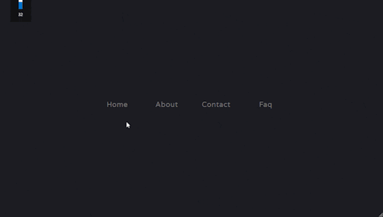
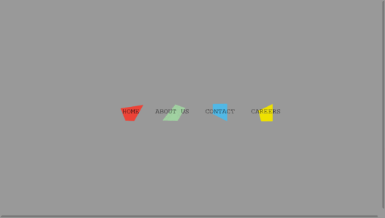
Explore 15+ CSS Horizontal Navigation Menus
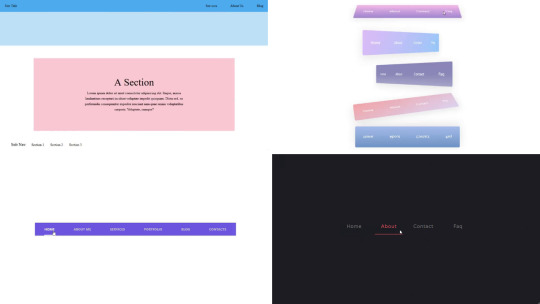
Welcome to CSS Monster, your premier destination for exploring 15+ CSS horizontal menus! In this comprehensive article, we've meticulously curated a collection of free HTML and CSS code examples for horizontal menus, meticulously sourced from respected platforms such as CodePen, GitHub, and other reliable resources. Horizontal menus are a favored choice for displaying navigation options prominently across the top of websites or applications. Our collection goes beyond the conventional, showcasing a diverse array of horizontal menu styles, including dropdown menus, mega menus, and more. This variety ensures that you'll discover the perfect design to elevate your project's navigation. With our latest update in August 2023, we're excited to introduce 2 new items to our collection, reflecting the cutting-edge trends in horizontal menu design. Whether you're a seasoned web developer, a designer seeking inspiration, or someone looking to enhance your website's navigation, these customizable code examples stand as a valuable resource. Dive into our hand-picked selection and witness the stunning diversity of horizontal menu designs that can truly enhance your user experience. Feel free to explore the latest trends, experiment with customization, and seamlessly integrate these code examples into your projects. Our collection is designed to cater to your needs, offering a blend of functionality and aesthetics. Embark on this journey to discover and implement captivating horizontal menu designs, and let your coding endeavors bring a new level of sophistication to your projects. Happy coding! Author seto89 March 4, 2019 Just Get The Demo Link How To Download - Article How To Download - Video Author HTML / CSS PURE CSS MAGIC LINE NAVBAR Compatible browsers: Chrome, Edge (partial), Firefox, Opera, Safari Responsive: yes Dependencies: - Author tris timb February 7, 2019 Just Get The Demo Link How To Download - Article How To Download - Video Author HTML / CSS (SCSS) POSITION STICKY SUBNAV Compatible browsers: Chrome, Edge (partial), Firefox, Opera, Safari Responsive: yes Dependencies: - Author Mehmet Burak Erman June 3, 2018 Just Get The Demo Link How To Download - Article How To Download - Video Author HTML (Pug) / CSS (Stylus) PERSPECTIVE MENUS Compatible browsers: Chrome, Edge (partial), Firefox, Opera, Safari Responsive: yes Dependencies: - Author Stas Melnikov March 5, 2018 Just Get The Demo Link How To Download - Article How To Download - Video Author HTML / CSS HOVER EFFECT FOR HORIZONTAL MENU Compatible browsers: Chrome, Edge (partial), Firefox, Opera, Safari Responsive: yes Dependencies: -
Author Mehmet Burak Erman December 18, 2017 Just Get The Demo Link How To Download - Article How To Download - Video Author HTML / CSS (SCSS) MENU HOVER LINE EFFECT Compatible browsers: Chrome, Edge (partial), Firefox, Opera, Safari Responsive: yes Dependencies: -
Author Charlie Marcotte September 5, 2017 Just Get The Demo Link How To Download - Article How To Download - Video Author HTML (Pug) / CSS (Sass) CSS HORIZONTAL MENU Compatible browsers: Chrome, Edge (partial), Firefox, Opera, Safari Responsive: yes Dependencies: -
Author Artyom June 23, 2017 Just Get The Demo Link How To Download - Article How To Download - Video Author HTML / CSS (SCSS) STRIKETHROUGH HOVER EFFECT FOR MENU Compatible browsers: Chrome, Edge (partial), Firefox, Opera, Safari Responsive: yes Dependencies: -
Author Irvine Potok February 22, 2017 Just Get The Demo Link How To Download - Article How To Download - Video Author HTML / CSS LAVALAMP CSS MENU Compatible browsers: Chrome, Edge (partial), Firefox, Opera, Safari Responsive: yes Dependencies: -
Author Marco Biedermann June 16, 2016 Just Get The Demo Link How To Download - Article How To Download - Video Author HTML / CSS (PostCSS) HORIZONTAL ICON NAVIGATION Compatible browsers: Chrome, Edge (partial), Firefox, Opera, Safari Responsive: yes Dependencies: -
Author Aaron Benjamin April 30, 2015 Just Get The Demo Link How To Download - Article How To Download - Video Author HTML / CSS SLIDE HORIZONTAL MENU Compatible browsers: Chrome, Edge (partial), Firefox, Opera, Safari Responsive: yes Dependencies: -
Author Claudio Holanda March 7, 2015 Just Get The Demo Link How To Download - Article How To Download - Video Author HTML / CSS (Less) SKEWED MENU IN HTML AND CSS Compatible browsers: Chrome, Edge (partial), Firefox, Opera, Safari Responsive: yes Dependencies: -
Author Dominik Biedebach January 19, 2015 Just Get The Demo Link How To Download - Article How To Download - Video Author HTML / CSS HORIZONTAL NAVIGATION EFFECTS Compatible browsers: Chrome, Edge (partial), Firefox, Opera, Safari Responsive: yes Dependencies: -
Author Karim Balaa January 6, 2015 Just Get The Demo Link How To Download - Article How To Download - Video Author HTML / CSS SIMPLE MENU NAVIGATION Compatible browsers: Chrome, Edge (partial), Firefox, Opera, Safari Responsive: yes Dependencies: - Author Justin October 8, 2014 Just Get The Demo Link How To Download - Article How To Download - Video Author HTML / CSS ANIMATED UNDERLINE HOVER Compatible browsers: Chrome, Edge (partial), Firefox, Opera, Safari Responsive: yes Dependencies: -

Author Andy Tran September 2, 2014 Just Get The Demo Link How To Download - Article How To Download - Video Author HTML/Haml FLAT HORIZONTAL NAVIGATION Compatible browsers: Chrome, Edge (partial), Firefox, Opera, Safari Responsive: yes Dependencies: -
Author MrPirrera August 23, 2014 Just Get The Demo Link How To Download - Article How To Download - Video Author HTML / CSS TRANSPARENT FADING NAVIGATION BAR Compatible browsers: Chrome, Edge (partial), Firefox, Opera, Safari Responsive: yes Dependencies: -
Author Bogdan Blinnikov April 15, 2014 Just Get The Demo Link How To Download - Article How To Download - Video Author HTML / CSS (Less) RESPONSIVE MENU EFFECT Compatible browsers: Chrome, Edge (partial), Firefox, Opera, Safari Responsive: yes Dependencies: - Author Carl Rosell October 9, 2013 Just Get The Demo Link How To Download - Article How To Download - Video Author HTML / CSS (SCSS) HORIZONTAL MENU Compatible browsers: Chrome, Edge (partial), Firefox, Opera, Safari Responsive: yes Dependencies: -
FAQs
1. What are CSS horizontal menus? CSS horizontal menus are navigation elements displayed horizontally at the top of a website or application. They provide an organized and visually appealing way to present navigation options. 2. Why choose horizontal menus for a website? Horizontal menus are a popular choice as they prominently display navigation options, making it easy for users to access different sections of a website or application. They offer a clean and efficient design. 3. What styles of horizontal menus are included in the collection? Our collection features a diverse range of horizontal menu styles, including dropdown menus, mega menus, and more. This variety ensures that you can find the perfect design to suit your project's needs. 4. How often is the horizontal menu collection updated? We regularly update our collection to stay current with the latest trends in horizontal menu design. The August 2023 update introduces 2 new items, reflecting the cutting-edge developments in this space. 5. Can I customize the CSS horizontal menu code examples? Absolutely! The CSS horizontal menu code examples in our collection are customizable, allowing you to tailor them to match your website's design and aesthetic preferences. 6. Are these horizontal menus suitable for all types of websites? Yes, our collection caters to a variety of needs, making it suitable for different types of websites and applications. Whether you're working on a personal blog or a business website, you'll find relevant designs. 7. How can I integrate these horizontal menu designs into my project? Each horizontal menu design in our collection comes with its HTML and CSS code example, making integration into your projects a straightforward process. Copy and paste the code to enhance your website's navigation.
Conclusion
In conclusion, CSS Monster invites you to explore and implement 15+ CSS horizontal menu designs into your web projects. With diverse styles, including dropdown menus and mega menus, our collection reflects the latest trends in design. Elevate your user experience, streamline navigation, and bring a touch of sophistication to your projects. Happy coding! Read the full article
0 notes
Text
Programming notes
1) Project Modal the project is supposed to be able to transition with a button press
2) Project Pomodor isn't working at all/incomplete
3) Project Personal Website It's bland and the css page isn't working at all
4) Project Navbar Incomplete
5) Project quizgame Bland,not resposive,and css page not responding
6) Project Review Carousel Not responsive
7) Project sidebar Complete failer
8) Project survey bland
9) Project calculator success but could be better
10) Project addressbook unresposive
11) Project FaQ the project is incomplete constant repeating not in the way wanted bland
12) Project stciky navigation bar Didn't work at all final product came out like an article for the newspapaer thinking this is either 1)My laptip is trash 2) software needs to be updated
13) Project Resturant I made it simpistic but even if edded features from the tutuorial don't know if possible with either the laptop or an outdated vs ide
14) Project Tabs As per usual the tabs aren't appearing like in the tutuorial. I beleive it has something to do with the link that I didn't use.Or better yet addess the elephant in the computer for some reason the code isn't hhiding itself like in the tutorial so it's basiclly the same as yesterday's project.The conent should basiclly be nested behind one another.
*So I think I shouls take a day off from coding and finally update viusula studios.Apart of me feelis like an ass continuing event though it's not coming out right *as of 3/31/23 updated
15) Project Simongame after updating the ide i somehow gained another ide version of vs. the code is semi-acting up but i belive its on me and choose to slow down on this project because the tutorial guy is showing his mistakes showing a thought/problem-solving i miss rethonking my learning approach
16) Project Musicplayer *Previewing a file that is not a child of the server root. To see fully correct relative file links, please open a workspace at the project root or consider changing your server root settings for Live Preview. -decided to miimic the mp3 skull website for the project and after completion to saticfaction I plan on watching a tutorial to findout the differentces -the website can be broken down into I. two major containers II.about 5 lists III. 3 paragraphs IV. 2 -3search bars I also which to add tabs Taking longer than I thought it would but it's apparent to me that the problem lies in the div classes and compartmentalizing the aspects of the website into classes for better control.I have been making this harder for myself. I beleive the best course of action is to reread w3school and do simple projects using tags I don't use or understand often after this project. I stareted to get a better feel for web development but still aways to go with html and css
*I want to hit over a 100(150-200) projects before moving on to hacking,machine-learning,AI's and algrothims *ultmainte end game is to have an acquired skill that not only puts money in my pocket but allows me to map major citites *approprate termanoligy is nested div tags
17)blog website replica (yola) got the basics of the site down but the css is stomping me so essintay in a sense I have gone nowhere
*the background image,all images refuse to load
*the loading of thge background images is not working because i am not communicating to the right folder,
*the folder that I need to communicate with is either one abouve or ine over either or It's a pain to try and learn the proper technique and describe the issue correctly into the search engine
The problem comes down to not beeing able to move effectivly thorough files just like in hacking *sections tag to divide the web-site
-now the plan is to alter the json file to allow me permisson to the image folder after the link didnt work else play with bash for other alterations to the file In Unix-based systems like Linux and macOS, the user can use the “sudo” command to run the command with administrative privileges. In Windows, the user can right-click the Command Prompt or PowerShell and select “Run as administrator”.
Some key takeaways are given below that will help you get rid of the error efficiently:
The error message permission denied @ dir_s_mkdir indicates that the user does not have the necessary permissions to create a directory in the specified location. The location in question is “/usr/local/frameworks” which may be a protected system directory or owned by another user. To resolve the issue, the user may need to change the permissions on the directory or run the command as an administrator or superuser. They may have to re-install the python dictionary as well. In some cases, it may also be necessary to check if the directory already exists, and if so, delete it before attempting to create it again
Problems: 1)background image wouldn't load -solution attempt one:fix the syntax successful in connecting css to html page -learned about file paths only for it not to affect anything,nor Bash commands to transfer ownership of file -brandonostewart is user and owner/group so why not work -terminal states I don't have permission or excess to file -image files is above linux files can't acess,no permisson,doesn't excess in list function in terminal -I now believe all the problems I'm facing now is because i didn't have the laptop fully setup I just jumped right in -everythiong has perseduers,a setup,order a recipie -vmc container termina penguin ERROR vsh: [vsh.cc(171)] Failed to launch vshd for termina:penguin: requested container does not exist: penguin I beleive at this current step the problem lies in the fact there is no container,this means all work was setup in space I was building on nothing and it appears obviuos that I have reached the ceiling. As i see it I only have two options left 1) powerwash and start over from scratch 2) take the neccesary steps regardless of how far back it sends me in order to setup each individual aspect of chromebook
18)ToDo list I got it to work but the trade off was all my linux files got deleted,therefore I'm starting over.
the first project is the simple todo list,I wwant to make this one nicer than the first one I did I plan on adding css and java script so it workes the inistal layout I want is a decorated background with a list that takes off taskes that are finished moving said task fromn one side of the list to the other side of the list This issue I;m currently having is an html issue. From doing some projects the issue I have is always a small technincal detail or syntax issues. The more boxes better control so the issue is what technicallity do I need to insure my list transfer infomation as well as takes info in -I have no idea how to get the program to hold onto input value,then display it.Only thing holding me from finishing right now -I think the problem is I didn't add a display box for the code Where I'm at: Have a basic setup for the website -I need my info to be taken in by the display box -then displayed on the website,once task is done it adds itself to the second half of the website 1)header 2)box1 inital info original diplay 3)box2 where finished task lays -I need display boxes javascript not linking to html page,this was the hurdle that has been fucking me over all day. While syntax is correct the program still hasn't worked problem fro the past reoccured asked for permisson for the javascript file,first it said it didn't exist then I needed permission I still can't get that syntax correct for the terminal
6/01 -since I couldn't get the javascript to work and I restarted all the files in my linux folder my next course of action was to delete vs and try my luck with another ide,plans were holted after putting in my javascript in my repl.it finding out my syntax was indeed wrong
-but now i'm not so sure becasue I tried another basic web design program from youtube with correct syntax and it didn't load correctly somehow I think it's my computer at this point -after re-opening the apllication 2/3 of it worked -this time javascrirpt and html,not css -like with the to do list css,html not javascript -I feel like giving up on full stack development but I have learned to much to not have an Idea on what needs to be done.I can vividly describe and analyze the problem just can't put it together
I am going to start app development on vs and come back to full stack development
6/10 After downloading the framework .Net and discovering the difference between visual studio code and visual studio I wanted to develop at least one of the each programming application made possible with the framework(including machine learning/ai) including but not limited to Flutter development. currently struggling to understandings of the sync capabilities of git hub with visual studio code( what I have) also I saw the flutter development intro video I am really just out of the woods intermediate of beginner and am steadily heading to intermediate currently stuck on trying to finish this web application tutorial terminal commands for web application,branch work
Changes to be committed: (use "git restore --stageg <file>..."to unstage)
Untracked files: (use "git add <file>..."to include in what will be committed)
11/14 since last recordings,my current laptop slowed down it says less memory so i tried transfiring to my tablet for programming which was increadably
0 notes
Text
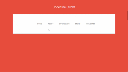
How To Use CSS To Create Menus And Navigation Bar
CSS stands for Cascading Style Sheets, and it is a language that can be used to style and customize HTML elements on a web page. CSS can create custom menus and navigation bars by using properties such as display, position, flexbox, grid, hover, etc.
To create a CSS menu, you need to define two things: the menu items and the menu style. The menu items are the links or buttons that you want to display on your menu. The menu style is the way you want to arrange and decorate your menu items.
For example, if you want to create a simple horizontal menu with four items, you can use the following code:<!-- Define the menu items --> <ul class="menu"> <li><a href="#">Home</a></li> <li><a href="#">About</a></li> <li><a href="#">Services</a></li> <li><a href="#">Contact</a></li> </ul> /* Define the menu style */ .menu { list-style: none; /* Remove the bullet points */ display: flex; /* Use flexbox to arrange the items horizontally */ justify-content: space-around; /* Distribute the items evenly */ align-items: center; /* Align the items vertically */ } .menu li { padding: 10px; /* Add some space around the items */ } .menu a { text-decoration: none; /* Remove the underline */ color: black; /* Set the text color */ } .menu a:hover { color: white; /* Change the text color on hover */ background-color: blue; /* Add a background color on hover */ }
This will result in the following output:
![menu]
As you can see, the menu items are displayed horizontally, with some spacing and styling. You can also use different properties or values for different items to create more complex and creative menus.
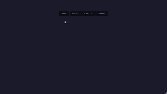
To create a CSS navigation bar, you need to define two things: the nav element and the nav style. The nav element is a semantic HTML element that represents a section of a page that links to other pages or sections. The nav style is the way you want to position and decorate your nav element.
For example, if you want to create a simple fixed navigation bar with four items, you can use the following code:<!-- Define the nav element --> <nav class="navbar"> <ul class="menu"> <li><a href="#">Home</a></li> <li><a href="#">About</a></li> <li><a href="#">Services</a></li> <li><a href="#">Contact</a></li> </ul> </nav> /* Define the nav style */ .navbar { position: fixed; /* Fix the position of the nav element */ top: 0; /* Set the top position to zero */ left: 0; /* Set the left position to zero */ width: 100%; /* Set the width to 100% of the viewport */ height: 50px; /* Set the height to 50 pixels */ background-color: blue; /* Set the background color */ } .menu { list-style: none; /* Remove the bullet points */ display: flex; /* Use flexbox to arrange the items horizontally */ justify-content: space-around; /* Distribute the items evenly */ align-items: center; /* Align the items vertically */ } .menu li { padding: 10px; /* Add some space around the items */ } .menu a { text-decoration: none; /* Remove the underline */ color: white; /* Set the text color */ } .menu a:hover { color: black; /* Change the text color on hover */ }
This will result in the following output:
![navbar]
As you can see, the nav element is fixed at the top of the page, with a blue background and white text. You can also use different properties or values for different elements to create more complex and creative navigation bars.
CSS menus and navigation bars can make your web pages more user-friendly and attractive. You can use them to create different types of menus and navigation bars, such as vertical, dropdown, responsive, etc. You can also combine them with other CSS properties and selectors to create more unique and customized menus and navigation bars.
If you want to learn CSS from scratch must checkout e-Tuitions to learn CSS online, They can teach you CSS and other coding language also they have some of the best teachers for there students and most important thing you can also Book Free Demo for any class just goo and get your free demo.
0 notes
Text
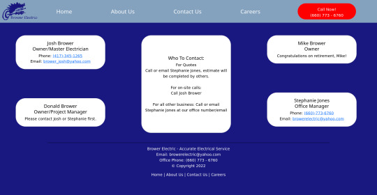
Brower Electric - Commit #6 - Contact Us
This push, I added the Contact Us page.
On Desktop:
On Mobile:

The HTML:
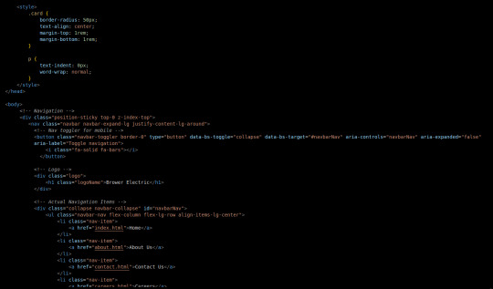
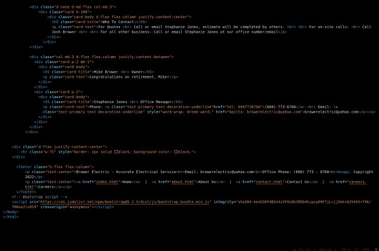
I used some internal CSS in the head tag because I wanted the cards and text on this page to look a little different.
Our nav bar (and this is standard on all pages) is contained in a div that sticks it to the top of the page, even as you scroll. The z-index-top class makes the z index 100 so it overlaps everything.
The rest of the navbar is the same as other pages.
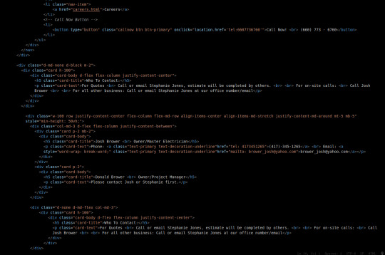
So the first div you see after the nav bar is only visible on medium screens and below. This div contains a card that has been flexed to center it's content. This card is the instruction card for who to contact. On bigger screens, a nearly identical one will appear in the center of the Contact Us grid.
Our Contact Us grid uses Bootstrap rows and cols. The row has a 100% width and a minimum height of 50% of the viewport. It justifies it content to the center of the column on mobile but otherwise it justifies content by the space around in a row. It aligns items center on mobile and stretches them out on other devices. It also has a margin on the top and bottom.
The cols are flex columns that justify their content based on the space between. That's how we get the vertical spacing on desktop.
The cards have some padding and a bottom margin, and the contact links are formatted.
The middle col only contains the who to contact div that reveals on medium devices and up.
The footer is the same as the other pages.
The CSS:
I did not add any external CSS for this page besides the z-index-top class I mentioned earlier. I'm pretty proud of this because it means that I am getting better at utilizing Bootstrap 5 classes.
Conclusion:
I should learn more about Grids. Their responsiveness is powerful because you can manipulate more than one direction at a time but I always find myself using Flexbox tools. Maybe it is because Bootstrap is built on flexbox or more likely because I like my comfort zone. Either way, I need to branch out.
12 notes
·
View notes
Text

Responsive Navigation Menu
#codingflicks#html css#responsive navigation menu#css menu#css#html#css3#frontend#frontenddevelopment#webdesign#navbar#learn to code#responsive web design#menu html css
5 notes
·
View notes
Text

Responsive Navbar HTML CSS JS
#responsive navbar#responsive menu#responsive navigation menu#responsive navigation menu bar#responsive web design#html#css#javascript#navigation menu#divinector#html css#learn to code#css3#code
4 notes
·
View notes
Text

Responsive Navigation Menu
#responsive navbar#responsive menu html css#codenewbies#html css#frontenddevelopment#html5 css3#navbar html css#responsive web design#css#html css tutorial#pure css tutorial#html css menu#css menu
1 note
·
View note
Text
100+ Navigation Bar HTML and CSS (Free Demo +Source Code)
Navigation Bar Using HTML and CSS
Hello Developers! Welcome to Codewithrandom with another informative blog. Today we’ll see how to make a Navigation Bar with Source Code. Here is the Latest Collection of free Navigation Bar codes in HTML and CSS. This is the Updated Collection of April 2023 with 36 New Navbar Source codes added.
What is a navigation bar?
A Navigation bar or a side menu is an integral part of any website, used for quick navigation links, a search bar, login/signup links, company logos, etc. Without a Navbar, any website looks incomplete.
Here we’ll show you how to create a Simple Navigation Bar In HTML and CSS with 100+ examples.
Related article — 100+ HTML, CSS, and JavaScript Projects With Source Code ( Beginners to Advanced)
Restaurant Website Using HTML And CSS With Source Code
Let’s see some cool Navigation bars in HTML and CSS.
1. Responsive Side Navigation Bar
Let’s start our list with a simple, light-themed left-sided navigation bar. Only navigation bar icons are visible on load but on clicking the hamburger icon side bar expands.
2. Bootstrap Navigation Bar
Simple and responsive navigation bar. This one is on top with several different categories and also a search bar. Additionally, it also has a login and signup button.
How To Build Interest Calculator Using JavaScript
3. Transparent Navigation
This is a very well made Navigation bar by Manas Yadav, when you click a navigation bar button it auto scrolls to its location on the page. Can be used for homepages.
4. Sticky Slider Navigation (Responsive)
Another navigation bar auto-scrolls but this one is even better with more satisfying animations and design.
5. Navigation bar design
A navigation bar with a gradient in its background with a cool gradient and blinking effect on hover.
That’s it, folks. In this article, we shared the Navigation Bar In HTML And CSS Source Code with cool and different designs. We covered everything from simple and minimal Navigation bars to bars with auto scrolls, cool transitions, and even 3D icons. Hope you liked this article. Share this with your fellow developers. Comment down below with your thoughts and suggestions
See our other articles on Codewithrandom and gain knowledge in Front-End Development.
Thank you
read full article and get complete source code
1 note
·
View note
Text
RESPONSIVE NAVIGATION MENU BAR
Hello guys, today I am going to show you how to make a cool responsive navigation menu bar which will work on all devices. Suppose, we want to create a navigation menu bar for a website/blog and want it to work perfectly for all kinds of devices.
First of all, let me show you how this menu will look on different devices.
ON LAPTOP / DESKTOP


ON MOBILE

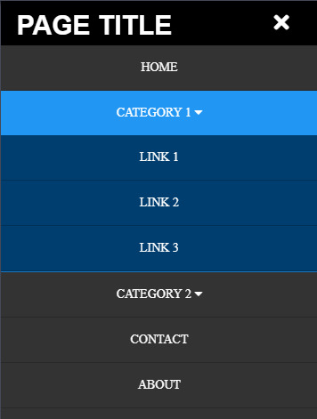
Hope you would have liked the look of this navigation menu bar. Yes?
Ok great, let’s start by writing an HTML code for all the items we need for the Menu Bar.
HTML
<header> <div class="logo">PAGE TITLE</div> <nav> <ul> <li><a href="/">HOME</a></li> <li><a href="#!" class="sub-menu">CATEGORY 1 <i class="fa fa-caret-down"></i></a> <ul> <li><a href="">LINK 1</a></li> <li><a href="">LINK 2</a></li> <li><a href="">LINK 3</a></li> </ul> </li> <li><a href="#!" class="sub-menu">CATEGORY 2 <i class="fa fa-caret-down"></i></a> <ul> <li><a href="">LINK 1</a></li> <li><a href="">LINK 2</a></li> <li><a href="">LINK 3</a></li> </ul> </li> <li><a href="">CONTACT</a></li> <li><a href="">ABOUT</a></li> </ul> </nav> <div class="menu-toggle"><i class="fa fa-bars" aria-hidden="true"></i></div> </header>
Now, copy and paste the above HTML code between <body>...</body> tag (Preferably just after <body>).
CSS
After writing HTML code for our navigation menu bar, Now it’s time to style them. So now we are styling them in a dark color. You can change the background colors and text colors as per your preference.
And also we are adding media query to change how it might look for different screen sizes i.e Responsive. Here we are adding two media query breakpoints as (max-width:1024px) and (max-width: 768px).
Now copy and paste the code shown below, inside the <style>...</style> tag.
header { position:absolute; top:0px; left:0px; padding:0 50px; background:#000; width:100%; box-sizing:border-box; z-index:999; } header .logo { float:left; height:50px; line-height:50px; } header .logo img { height:50px; }
header .logo h1 { font-size:30px; color:#fff; font-family:sans-serif; line-height:.5; }
header nav { float:right; } header nav ul { margin:0; padding:0; display:block; } header nav ul li { list-style:none; display:inline; position:relative; } header nav ul li a { font-size:14px; font-weight:normal; height:50px; line-height:50px; padding:0 20px; color:#fff; text-decoration:none; display:inline-block; } header nav ul li.active { background-color:#2196f3; display:inline-block; } header nav ul li ul { position:absolute; left:0; top:50px; background:#003e6f; display:none; } header nav ul li.active ul { display:block; } header nav ul li ul li { display:block; width:200px; border-bottom:1px solid rgba(0,0,0,.2);} header nav ul li ul li a { display:block; padding:0 20px; } header nav ul li a:hover,header nav ul li a:active { background:#2196f3; color:#fff; } .menu-toggle { color:#fff; float:right; line-height:50px; font-size:24px; cursor:pointer; display:none; width: auto; height: 50px; padding:0 15px; box-sizing:border-box; background:#000; }
@media screen and (max-width:1024px){ header{padding:0 30px;} header nav ul li a{padding:0 10px;}
@media screen and (max-width:768px){ .headerads{display:none;} header{position:absolute;padding:0 5%;} .menu-toggle{display:block;height:50px;} header nav{position:absolute;width:100%;min-height:100vh;height:120vh;min-height:550px;background:#333;top:50px;left:-100%;transition:.5s;} header nav.active{left:0;top:50px;} header nav ul{width:100%;display:block;text-align:center;} header nav ul li{width:100%;display:block;border-bottom:1px solid rgba(0,0,0,.2);} header nav ul li a{display:block;} header nav ul li.active ul{position:relative;background:#003e6f;top:0;} header nav ul li ul li{width:100%;text-align:center;}
And to show the Font Awesome icons, we have to add font awesome library CSS file into the head section. Copy and paste the code which is shown below in <head>...</head> section.
<link rel="stylesheet" href="https://cdnjs.cloudflare.com/ajax/libs/font-awesome/4.7.0/css/font-awesome.min.css">
JAVASCRIPT
Now copy and paste the javascript code given below just before the closing body tag i.e. </body>
<script type="text/javascript" src="https://cdnjs.cloudflare.com/ajax/libs/jquery/3.4.1/jquery.min.js"></script>
<script async type="text/javascript"> $(document).ready(function(){ $('.menu-toggle').click(function(){ $('nav').toggleClass('active') $(this).find('i').toggleClass('fa-bars fa-times') }) $('ul li').click(function(){ $(this).siblings().removeClass('active'); $(this).toggleClass('active'); }) $(document).on("click", function(e) { if ($(e.target).is(".sub-menu") === false) { $("ul li").removeClass('active'); } }); }) </script>
Save the document and THAT’S IT!! Voila!! Now your navigation menu bar is ready and responsive.
VIEW DEMO
If you still facing any problem with the code or still have doubts about how and where to put the codes, feel free to ask in the comment section below. I will reply to your question as soon as possible. And if you liked this, then don’t forget to like, comment & share. Thank you.
#menu bar#navigation#navbar#menu#html#css#code#website design#responsive menu#responsive#website#blog#tumblr blog#tumblr menu#unbelievable hacks#tips#tips and tricks#tech tips#javascript
1 note
·
View note