#responsive navbar
Explore tagged Tumblr posts
Visit Tumblr Blog
Explore Tumblr blogs with no restrictions, modern design and the best experience.
Last Seen Tumblr Blogs


Fun Fact
Total funding amounts to $125.3M.
Text

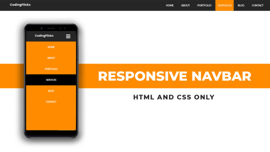
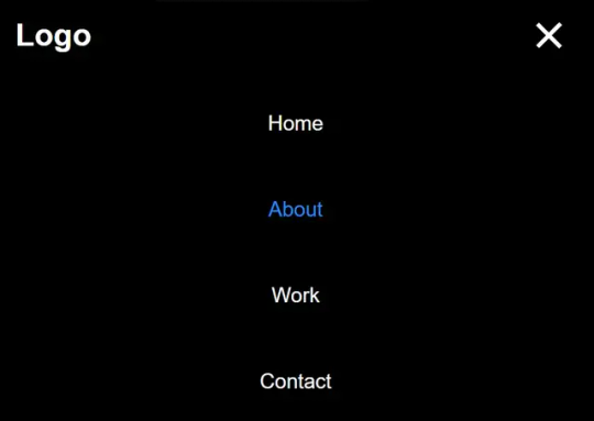
Responsive navbar
#responsive navbar#html css#divinector#css#webdesign#frontenddevelopment#css3#html#responsive web design#html css menu#css menu
4 notes
·
View notes
Text
Responsive Navigation Menu
#responsive navbar#responsive web design#css#frontend#html css#neduzone#html#css3#frontenddevelopment#learn to code#webdesign#responsive navbar html css#html css menu#menu css#css menu
1 note
·
View note
Text

Responsive Navigation Menu
#responsive navbar#responsive menu html css#codenewbies#html css#frontenddevelopment#html5 css3#navbar html css#responsive web design#css#html css tutorial#pure css tutorial#html css menu#css menu
1 note
·
View note
Text

okay so im back in navbar hell (when i thought i escaped...!!!) but ive managed to get this set up today :D
#my issue is that im trying to make the navbar properly responsive and have a toggle option once the screen gets too small#if u look on my blog i had it on my last attempt at this because i was using bootstrap but i was like okay i gotta make a new project!#cause i wanted to use nextjs#and not have to worry about backend stuff as much#okay so like..... i know im being kinda stubborn here lol#i could just slap bootstrap on and copy my old code but i dont wanna#i already have tailwind on here and i dont want to confuse myself anymore#so ive been looking for navbar tutorials using tailwind to help and omg#i thought i found a good one and then i realized it used a specific js package which i cant use cause im using typescript...#and i cant find a ts version#so now im just set on doing it without any outside stuff#like just show me how to make the thing with just html and javascript#at least that way i can just translate the the js to ts on my own!!!#anyways lol i found a video that should help...pls#ill watch it later....#but today im tired#webdev#codeblr#wip#this site will happen i swear I SWEAR#AHHH#there so many things to help but after a certain point its like...i dont even know whats happening and now im confused#and god forbid things start conflicting with each other#so i just want something that will spell it out clearly#but yea if u see this and think im confused (which i might be)#im always open to links to videos
5 notes
·
View notes
Text
misc changes to site art! (mainly just me testing out krita) most of the art i changed was just. "oh hey this was made in jspaint. i should change that." check out some new art on thepersonver - remember 2 clear ur cache!!

#html#web design#neocities#misc tpe#thepersonever#psst. also made the navbar more responsive on the homepage. yopre welcome
2 notes
·
View notes
Text
25/09/2023 || Day 87
LeetCode
I started doing the questions on Stacks and couldn't figure out how they wanted me to implement it, so I opened up Eclipse and just implemented a Stack on my own from scratch. Still didn't technically solve the LeetCode implementation, but whatever, we can't win everyday.
FrontendMentor Space Tourism Website - Log #1
Officially got started on this project today and I spent 3 hours trying to get the header to look right. I don't think it would've taken me 3 hours to get that done, but I decided to use React Routing for this project and I had to figure out how the CSS and elements worked with routes. I finally have a somewhat decent header that's close to the original, so despite my struggles I did achieve something. Also, getting the navbar to have a blurred background ended up being a lot easier than I thought it would be. I guess I struggled in a previous project to do that, so it went a lot better this time. I gotta be careful though because I haven't made it responsive...I normally go mobile-first route when building the layout, and I haven't done that today, so tmr I'll switch gears and do that. I find it easier to work mobile-first anyways...
Here's a photo of what the header looks like. The background image changes depending on what tab you click on the header:

9 notes
·
View notes
Text
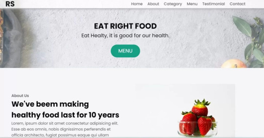
Restaurant Website Using HTML And CSS With Source Code
Restaurant Website Using HTML And CSS With Source Code
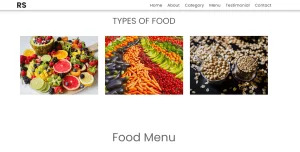
Hello coder, Welcome to the Codewithrandom blog. In this article, we create a Restaurant Website using HTML and CSS with Source Code. This is a Simple Restaurant Website with a main home page, types of food available, a food menu, customer reviews, and a contact form section on the restaurant website.
The HTML code for the Restaurant Website is the first thing we develop, and after that, the CSS for styling and JavaScript code. we add JavaScript for smooth scrolling on our website otherwise javascript is optional for this project.
Let’s Start a Responsive and Amazing Restaurant Website Using HTML and CSS. Let’s code a Simple website, We use 1,000+ lines of code to make our Restaurant Website Fully Responsive.
100+ HTML,CSS and JavaScript Projects With Source Code ( Beginners to Advanced)
Basic Knowledge About Project
It’s a front-end intermediate-level project that uses some advanced frameworks like CSS and JavaScript to make the project more elegant and responsive. We have provided you with the project with step-by-step explanations, which will help you better understand the project.
Before we dive into the step-by-step solution to the project, let’s understand some of the basic concepts about restaurant websites using HTML, CSS, and Javascript.
What is an online Restaurant Website?
An online restaurant website is a digital version of any restaurant that allows users to order food directly from the restaurant while sitting at home. These websites were created for customers who wish to eat restaurant food at home. The consumer can select items from the food menu and make payments for faster deliveries.
What are the benefits of Online Restaurant Websites?
reaches the maximum number of customers.
Easy to order
Hassle-free payments
increase in customer reach.
increase in profit.
Live Preview Of Restaurant Website Source Code:-
Restaurant Website Html Code:-
In this HTML code, we create a complete navbar for the footer structure of the restaurant website. first, we link our CSS and JavaScript files in html code. now we add a font awesome icon CDN link in the code because we create the What Our Customers Say section on the website and we show that review with a star so we use a font awesome icon.
Gym Website Using HTML ,CSS and JavaScript (Source Code)
then we create the structure of the navbar and it’s very important in our website because we create a responsive navbar in the project. then we create some simple sections of the restaurant website like what food is available and a food menu list.
and lastly, we create a contact form and a footer copyright line at end of the website.
This is almost 300 lines of HTML code for the restaurant website, and you can see the output below with only the HTML code output of the restaurant menu. Then we add CSS code for styling our restaurant website.
Output Of Only HTML Code For Restaurant Website:-

This is all image output that we create using only HTML code. Now the time is to style our restaurant website using css😍.
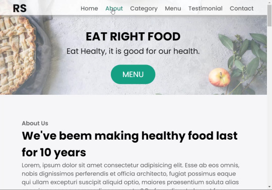
Restaurant Website HTML CSS Code:-
In CSS code we include Poppins font from Google font. then we style all sections of the website step by step. we write comments in CSS code so if you want to customize any of the restaurant website parts you can change that section code and it’s all done.
Responsive Resume/CV Website Using HTML & CSS
This is our whole CSS code with 600+ lines. We style our Restaurant Website step by step. We style the utility class and then style our navbar. After the navbar, we styled every html section🔥.
At the end of the code, we use media queries to make our Restaurant Website completely responsive and mobile-friendly. So you can see the output with CSS code. Then we add a little bit of javascript for the scroll effect otherwise our website is completely ready with code.
Ecommerce Website Using HTML, CSS, and JavaScript (Source Code)
Output Of HTML CSS Code Restaurant Website:-
You can see this awesome👏 output with HTML + CSS Code for Restaurant Website. Now we add JavaScript for smooth scrolling.
this is completely optional to add JavaScrpt to this project.
That’s it for our Whole restaurant website code. We write every useful code like making the website mobile-friendly and adding media queries for this. Add JQuery code for smooth scrolling on the restaurant website.
50+ HTML, CSS & JavaScript Projects With Source Code
[su_button id=”download” url=”https://drive.google.com/drive/folders/1Wx9W99uIH3WiO1nkz6aJYCuXVv_ibGmA?usp=sharing” target=”blank” style=”3d” size=”11″ wide=”yes” center=”yes” icon=”icon: download”]DOWNLOAD NOW[/su_button]
Final Output For Restaurant Website Using HTML and CSS Code
You can see this video output to see the complete output. You can see how smooth the website scrolls and this design.
Hope you like this Restaurant Website Project, we create your own and use this project in any project as a part project like the reviews section, and a contact form. If you need any more project-related frontend. Visit our homepage and you get 100+ projects💝.
Age Calculator Using Html Css Javascript ( Source Code )
if you have any confusion Comment below or you can contact us by filling out our Contact Us form from the home section. 🤞🎉
Code By – Sanket Bodake
was written by – Codewithrandom
FAQ For Restaurant Website
Which code editor do you use for this Restaurant Website project coding?
I personally recommend using VS Code Studio, it’s very simple and easy to use.
is this project responsive or not?
Yes! This project is responsive.
What is an online Restaurant Website?
An online restaurant website is a digital version of any restaurant that allows users to order food directly from the restaurant while sitting at home. These websites were created for customers who wish to eat restaurant food at home. The consumer can select items from the food menu and make payments for faster deliveries.
What are the benefits of Online Restaurant Websites?
1. Reach the maximum number of customers. 2. Easy to order 3. Hassle-free payments 4. Restaurant Like food at Home. 5. Increase in profit.
2 notes
·
View notes
Text
Responsive Sliding Hamburge Menu System
A responsive navigation system that transforms the regular horizontal navbar into a mobile-friendly hamburger menu when visiting on small screens. How to use it: 1. Add the hamburger toggle button to your navbar. <header> <nav class="navbar"> <a href="#" class="logo">Logo</a> <ul class="nav-menu"> <li class="nav-item"> <a href="#" class="nav-link">Home</a> </li> <li class="nav-item"> <a href="#"…
View On WordPress
2 notes
·
View notes
Text
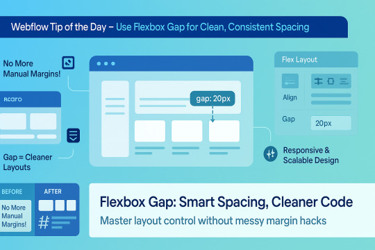
🌟 Webflow Tip of the Day – Use Flexbox Gap for Clean, Consistent Spacing
When building layouts in Webflow using Flexbox, don’t manually add margins between elements. Instead, use the “Gap” property for smarter, scalable, and more elegant spacing.
🔧 How to Use Flex Gap:
Select your Flex container
In the Style Panel → under Layout → enable Flex
Use the Gap field to set uniform spacing (e.g., 20px)
This works both for horizontal and vertical spacing!
✅ Why It’s Better Than Margins:
Maintains consistent spacing across breakpoints
Cleaner code — no messy margin overrides
Easier to manage on large-scale layouts
Improves responsiveness and scalability
💡 Practical Examples:
Equal spacing between buttons in a CTA
Neat rows of cards or feature boxes
Structured menu items in navbars
🔄 Bonus Tip: Use with Grid layout too — Gap is a game-changer there as well!
🚀 Want to build pixel-perfect, responsive Webflow sites like a pro? 📌 Connect With Me:
🌐 Portfolio: www.webflowwork.com 🎯 Upwork: https://bit.ly/4iu6AKd 🎯 Fiverr: https://bit.ly/3EzQxNd
#webflow#freelancewebdeveloper#web design#web development#webflowdesign#webflowexperts#webflowlandingpage#website#nocode#ui ux design#fiverr tutorial#fiverr#freelancing#upwork
0 notes
Text
Everything You Need to Know: Pros and Cons of Using Webflow
Table of Contents
What is Webflow, and Why Should You Use It?
Benefits of Developing Your Website Using Webflow
How Webflow Compares to Other Website Builders
Is Webflow Worth It for Your Next Website?
Features for Web Design and Development
Responsive Website Design with Webflow
Webflow Pricing Options
Understanding Webflow’s CMS
Pros and Cons of Using Webflow
Hiring Webflow Experts
Webflow FAQs
Building a website has become easier than ever. Yet, choosing the right tool to create and manage your website can be confusing. Among many options, Webflow has emerged as a popular platform. It offers a unique mix of visual design freedom and coding power. But is it the best choice for your needs? This guide explains everything about Webflow — its benefits, limitations, and who should use it.
What is Webflow?
Webflow is a cloud-based website design and development platform launched in 2013. It combines the ease of a drag-and-drop visual editor with the ability to generate clean, production-ready code. Webflow appeals mainly to designers, developers, marketers, and business owners who want high-quality websites without fully coding from scratch.
Unlike basic website builders such as Wix or Squarespace, which limit design options, Webflow gives you detailed control over layouts, styles, and animations. It also offers CMS (Content Management System) features, e-commerce tools, and hosting services.
How Does Webflow Work?
Webflow works in three key parts:
Designer Tool: This is the visual editor where you build your website by dragging, dropping, and styling elements. It looks similar to design software like Adobe XD or Figma but outputs real web code.
CMS & Editor: Webflow includes a flexible CMS where you can create collections (like blog posts, products, or portfolios) that dynamically feed content into your site design. The Editor allows content managers or clients to update text and images without breaking the design.
Hosting & Publishing: Once your design is ready, you can publish your site using Webflow’s fast, secure hosting or export the code to host elsewhere.
Why Do People Choose Webflow?
Webflow bridges the gap between traditional no-code builders and fully custom development. Here are some reasons it’s popular:
It empowers designers to create visually stunning sites with custom interactions.
It generates clean, maintainable code, unlike some drag-and-drop platforms.
It supports dynamic content and e-commerce without plugins.
Hosting with Webflow is simple, secure, and scalable.
In-Depth Pros of Using Webflow
1. Full Design Freedom and Pixel-Perfect Control
Webflow gives you granular control over every design detail. You can:
Control positioning using flexbox and grid layouts.
Customize typography with full font control.
Add interactions and animations without coding.
Create reusable symbols (like buttons or navbars) that update everywhere.
This level of freedom lets you build unique, branded websites that stand out, unlike template-based builders.
2. Clean, Standards-Compliant Code Output
When you publish your Webflow site, it outputs semantic HTML5, CSS3, and JavaScript. This code is clean and organized, making it easier for developers to:
Optimize for speed and SEO.
Add custom features by editing the exported code.
Ensure cross-browser compatibility.
This is a major advantage over builders that generate bloated or obfuscated code.
3. Responsive Design Made Simple
Webflow has built-in tools for responsive design. You can create styles specific to desktops, tablets, and phones. This ensures your website looks great on any device, which is critical today as mobile traffic often surpasses desktop.
The visual interface helps you preview how the site behaves at different screen sizes and adjust layouts accordingly.
4. Flexible Content Management System (CMS)
Webflow’s CMS allows you to build collections of content (like blog posts, products, or team members) that automatically populate pages.
It supports custom fields (text, images, dates, references).
Non-technical users can easily add or update content via the Editor interface.
Dynamic lists can display content in grid, list, or custom formats.
Content updates instantly reflect on the live site.
This system is ideal for blogs, portfolios, or small online stores that require content updates without developer help.
5. Growing E-commerce Functionality
Webflow offers e-commerce features for online shops, including:
Product catalogs with custom fields.
Shopping cart and checkout flows.
Payment gateways like Stripe and PayPal.
Customizable product and checkout page designs.
Order and customer management.
While it’s not as full-featured as Shopify or WooCommerce, it’s great for small to medium stores needing design flexibility.
6. Fast, Reliable Hosting With Security
Webflow’s hosting runs on AWS and Fastly, providing:
Global Content Delivery Network (CDN) for fast load times worldwide.
Free SSL certificates for HTTPS security.
Daily backups and automated updates.
Scalability without manual server management.
Hosting on Webflow means less hassle maintaining servers and security settings.
7. Excellent for Prototyping and Client Work
Many freelance designers and agencies use Webflow because it allows:
Rapid creation of interactive prototypes.
Easy sharing with clients for feedback.
Quick iterations without developer bottlenecks.
Seamless handoff by exporting clean code if needed.
Webflow also offers team collaboration features, helping designers and developers work together.
Detailed Cons of Using Webflow
1. Steeper Learning Curve Than Simple Builders
Though Webflow is easier than coding from scratch, it is more complex than beginner builders like Wix or Squarespace. New users may struggle with:
Understanding CSS box model, flexbox, and grid layouts.
Managing styles and classes efficiently.
Setting up interactions and animations.
Users without any design or web knowledge might feel overwhelmed at first.
2. Pricing is Higher Than Some Competitors
Webflow’s pricing consists of:
Site plans: For hosting individual sites.
Account plans: For designers/agencies managing multiple projects.
The costs can add up, especially for e-commerce sites or multiple projects. Cheaper alternatives exist, but they may offer less design freedom or features.
3. Limited Third-Party Integrations and Plugins
Webflow has fewer third-party plugins than WordPress or Shopify. While it supports essential integrations (Google Analytics, Zapier, etc.), specialized marketing tools or CRM systems may require custom development or API use.
This can limit functionality for businesses needing complex ecosystems.
4. No Built-In Multilingual Support
If you want to build a website in multiple languages, Webflow does not offer native multilingual management. You have to:
Duplicate pages for each language.
Use third-party tools or custom scripts.
This approach is less efficient and can impact SEO and site maintenance.
5. Exporting Dynamic CMS Data is Difficult
You can export the static code of your site, but dynamic CMS content does not export easily. If you want to move your content to another platform later, migrating CMS data can be tricky.
This limits portability for growing sites.
6. SEO Configuration Requires Manual Effort
Webflow gives you control over SEO metadata, URLs, and alt text but does not automate SEO best practices. You must manually:
Set meta titles and descriptions.
Manage sitemap and robots.txt.
Configure redirects and canonical tags.
Users unfamiliar with SEO might need additional help.
7. No Built-In Blogging Features Like WordPress
Although Webflow has CMS for blogs, it lacks:
Built-in comments or community features.
Large ecosystems of blog-related plugins.
Extensive SEO tools specific for blogging.
If blogging is a major focus, other platforms might offer more convenience.
When Should You Use Webflow?
Webflow is best for:
Professional designers wanting complete design control.
Businesses that need custom websites with CMS or small online stores.
Freelancers and agencies creating interactive prototypes or client websites.
Users wanting all-in-one hosting and design tools on a managed platform.
Projects requiring custom animations or advanced interactions without coding.
When Might You Avoid Webflow?
You might want to consider other options if:
You are a complete beginner looking for very simple site building.
You want the cheapest possible hosting and domain setup.
You need large-scale e-commerce with complex inventory and shipping.
You require multilingual websites with SEO-friendly language switching.
You prefer a large ecosystem of third-party plugins and themes.
Conclusion: Is Webflow Right for You?
Webflow is a powerful and flexible platform that gives you design control and clean code. It is especially suited to designers, agencies, and businesses wanting a modern, responsive site with dynamic content or e-commerce.
However, the learning curve, pricing, and some missing features like multilingual support and large app ecosystems may be limiting for some users.
Understanding your project needs, budget, and skills will help you decide. If you want a unique, beautiful website that you can manage without deep coding, Webflow is an excellent choice.
0 notes
Text

Responsive Navbar HTML CSS JS
#responsive navbar#responsive menu#responsive navigation menu#responsive navigation menu bar#responsive web design#html#css#javascript#navigation menu#divinector#html css#learn to code#css3#code
4 notes
·
View notes
Text

Simple Responsive Navbar
#responsive navbar#css menu#css navbar#html css navbar#html css#codingflicks#frontend#css#html#code#css3#learn to code#html5#webdesign#navigation menu html css#responsive web development
1 note
·
View note
Text

Navigation Menu with Search Box
#responsive navbar#search box#search bar#html css#codenewbies#css#html5 css3#code#frontenddevelopment#css menu#css navbar#css tricks#pure css tutorial#html css tutorial
1 note
·
View note
Text
New bug fixes and features - April 2025
New Features
UI
Introduced a Glimmer component for managing pipeline secrets in the new UI to enhance user experience and functionality. See PR.
Introduced a new Glimmer component to manage API tokens, allowing users to create and manage them more efficiently. See PR.
PR Desync: a feature in the UI to detect and notify users of desynced pull requests in the database due to prolonged pipeline inactivity, providing a convenient resync button. See PR.
Support for reverting overridden secrets and improved ambiguity in secret deletion messaging in the new UI. See PR.
Introduced a new navigation bar for switching between secrets and tokens in the new UI. See PR.
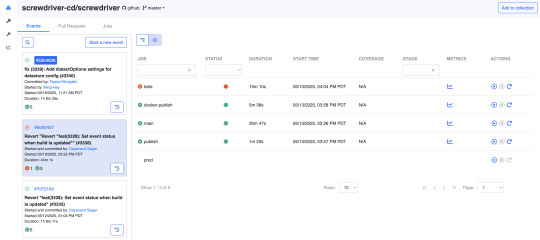
Default status sorting added to the event jobs table, with sorting based on build color and then alphabetically by stage and job name. As depicted below, the failed build is sorted at the top. See PR.
API
Added feature to trigger jobs when a pull_request closed webhook event is received in Screwdriver. See PR and guide.
Added feature to set event status when a build is updated, tracking overall execution status for an event. See PR.
Added a DELETING state to the pipeline to prevent updates during pipeline deletion, addressing remaining pipeline data post-deletion issue. See PR.
Implemented a feature flag to control log payload logging, aiding log volume management. See PR.
Pipeline admin user list now updated based on SD user permissions table. See PR.
Bug Fixes
UI
Implemented a fix to allow navbar to be displayed when the hamburger menu is expanded on small devices. See PR.
Fixes issues with edit secret modal in new landing page by setting secret value properly for API request and returning full response when “allow in pr” field is changed. See PR.
Ensures that the workflow graph maintains the toggle state of downstream triggers when switching between different pipeline events. See PR.
Event rail reloading logic in the new pipeline landing page was adjusted to align with the vertical collection component. See PR.
Fixes an issue where cacheKey was incorrectly removed during data reloading in the pipeline workflow, ensuring the latest commit SHA is correctly reset. See PR.
Pipeline header updating issue resolved by adding necessary tracking to update properly when a pipeline changes. See PR.
Pipeline root directory now included and displayed alongside branch name in new UI. See PR.
API
Added a check for adminUserIds for backward compatibility in situations where old pipelines have a null adminUserIds column due to inability of MySQL 5 version to set default values in TEXT fields. See PR.
Fix for triggering the next build on the child event when some builds are restarted before all builds are completed. See PR.
Compatibility List
In order to have these improvements, you will need these minimum versions:
API - v8.0.26
UI - v1.0.1272
Store - v7.0.0
Queue-Service - v5.0.1
Launcher - v6.0.221
Build Cluster Worker - v5.0.1
Contributors
Thanks to the following contributors for making this feature possible.
Akinori
Keisuke
Ming
Pritam
Sagar
Vonny
Yuki
Yuta
Jithin
Questions and Suggestions
We’d love to hear from you. If you have any questions, please feel free to reach out here. You can also visit us on Github and Slack.
Author
Vonny Jap, Senior Manager, Software Dev Engineering, Yahoo
0 notes
Text
Building Stunning and Accessible Navigation Menus with ShadCN

Navigation menus are super important in any app or website. They help users find their way around easily. ShadCN makes it easy to create menus that look amazing and work perfectly.
This blog will show you how ShadCN simplifies menu creation. Let’s explore the key design ideas behind ShadCN and provide practical examples to help you build menus that are both user-friendly and visually appealing.
Why ShadCN for Navigation Menus?
ShadCN is a special toolkit that brings together the power of Tailwind CSS and the flexibility of Radix UI. This unique combination makes it the perfect choice for building stunning and user-friendly navigation menus. Here's why:
Effortless Style: ShadCN seamlessly integrates with your existing Tailwind CSS design system. This means your menus will automatically look and feel consistent with the rest of your application, saving you time and effort.
Accessibility Built-In: ShadCN components like dropdowns, sidebars, and tabs are designed with accessibility in mind from the very start. This ensures that everyone, regardless of their abilities, can easily navigate your application.
Easy Customization: Want to tweak the colors, add a unique touch, or make it truly your own? ShadCN gives you the freedom to customize each component to perfectly match your brand's style and personality.
By choosing ShadCN, we're not just building menus; we're creating an exceptional user experience that is both beautiful and accessible.
Step-by-Step Guide to Building Navigation Menus with ShadCN
Here’s how you can get started:
Install ShadCN
npx shadcn-ui@latest init
Create a Sidebar Menu Let’s build a responsive sidebar menu using ShadCN and Tailwind CSS:
//Example Navbar.tsx import { Sidebar } from "shadcn-ui"; export function Navbar() { return ( <Sidebar> <Sidebar.Section> <Sidebar.Item href="/dashboard">Dashboard</Sidebar.Item> <Sidebar.Item href="/profile">Profile</Sidebar.Item> <Sidebar.Item href="/settings">Settings</Sidebar.Item> </Sidebar.Section> </Sidebar> ); }
Add a Dropdown Menu Use dropdown menus for nested navigation options:
import { Dropdown } from "shadcn-ui"; export function UserMenu() { return ( <Dropdown> <Dropdown.Trigger> <button>User Menu</button> </Dropdown.Trigger> <Dropdown.Content> <Dropdown.Item href="/profile">Profile</Dropdown.Item>{" "} <Dropdown.Item href="/logout">Logout</Dropdown.Item> </Dropdown.Content> </Dropdown> ); }
Role-Based Navigation with Conditional Rendering Implement dynamic menus based on user roles using conditional rendering:
import { Sidebar } from "shadcn-ui"; export function RoleBasedSidebar({ role }: { role: string }) { const menuItems = { admin: [ { label: "Dashboard", href: "/admin/dashboard" }, { label: "Manage Users", href: "/admin/users" }, ], user: [ { label: "Dashboard", href: "/user/dashboard" }, { label: "My Profile", href: "/user/profile" }, ], }; return ( <Sidebar> <Sidebar.Section > {menuItems[role]?.map((item) => ( <Sidebar.Item key={item.href) href = { item.href } > { item.label } </Sidebar.Item> ))} </Sidebar.Section > </Sidebar > ); }
Enhancing Accessibility in Navigation Menus
ShadCN ensures accessibility by default, but here’s how you can take it further:
Use ARIA roles like role="navigation" for the main menu container.
Add aria-current="page" for active menu items to improve screen reader support.
Use keyboard navigation to ensure menus are operable without a mouse.
Key Benefits of Using ShadCN for Menus
Ease of Use: Pre-built components save time and effort. Customizability: Modify styles and behaviors to fit your brand. Accessibility: Fully ARIA-compliant for a better user experience.
Common Challenges and How to Overcome Them
Responsive Design: Ensure menus adapt seamlessly to different screen sizes using Tailwind’s responsive utilities. Deep Navigation Hierarchies: Use nested menus or breadcrumbs for better usability.
Conclusion
ShadCN is a game-changer for building navigation menus, offering a seamless blend of design, functionality, and accessibility. Whether you're creating a simple dropdown or a complex sidebar, ShadCN’s components empower you to craft intuitive navigation experiences effortlessly.
0 notes
Text
Bootstrap in WordPress: Setup, Themes, Pros & Cons, and Alternatives
Web development keeps to conform, with responsive layout emerging because the gold trendy for web sites. At the leading edge of this movement is Bootstrap, a effective the front-give up framework. Paired with WordPress, the sector’s maximum famous content cloth control device (CMS), Bootstrap offers developers a streamlined technique to constructing responsive, netherland rdp at&t vps residential rdp cell-first web sites.
This manual explores the whole thing you want to realize approximately the use of Bootstrap in WordPress, from setup and issues to pros, cons, and alternatives. Throughout the blog, we’ll also display how tools like Netherlands RDP, AT&T VPS, and Residential RDP can enhance the improvement, finding out, and website hosting system.
What is Bootstrap?
Bootstrap is a front-give up framework that simplifies net improvement. Created thru Twitter in 2011, Bootstrap has grown into a comprehensive toolkit with pre-designed CSS lessons, responsive grid structures, JavaScript plugins, and reusable UI additives.
Why is Bootstrap Important?
The primary motive for Bootstrap’s popularity lies in its functionality to create websites which are responsive, mobile-first-class, and visually attractive. Integrating Bootstrap with WordPress permits developers to:
Rapidly prototype responsive websites.
Create visually cohesive difficulty topics.
Optimize consumer revel in throughout devices.
Use Cases for Bootstrap and WordPress
Bootstrap’s flexibility makes it quality for a number of WordPress tasks, including:
Business web sites.
Portfolios.
E-commerce systems.
Blogs.
While working on those use cases, gadget like Netherlands RDP can offer a stable, remote surroundings for trying out usual performance globally. Similarly, an AT&T VPS ensures that the hosted internet site on line runs seamlessly underneath heavy site traffic.
Why Use WordPress with Bootstrap?
WordPress and Bootstrap together provide the exceptional of each worlds. WordPress manages the backend, at the identical time as Bootstrap handles the the front-quit layout, ensuring a seamless workflow.
Advantages of Combining WordPress with Bootstrap
Rapid Development: Pre-designed additives reduce coding.
Responsive Design: Ensures a regular person experience at some stage in devices.
Customizable Themes: Easy to regulate with Bootstrap’s grid and software instructions.
Community Support: Both systems boast widespread communities for troubleshooting and assets.
For builders operating remotely, a Residential RDP allows brief get right of entry to to files and servers, making sure paintings continuity.
How to Set Up Bootstrap in WordPress
Setting up Bootstrap in WordPress involves three essential steps: including Bootstrap, customizing the subject matter, and trying out responsiveness.
Step 1: Adding Bootstrap
Bootstrap may be introduced the use of:
CDN: Quick and lightweight.
Local Files: Provides extra manage however requires net web hosting Bootstrap documents in your server.
Here’s an instance of together with Bootstrap via CDN on your functions.Php report: -\code\- function add_bootstrap_to_theme() { wp_enqueue_style('bootstrap-css', 'https://cdn.jsdelivr.net/npm/[email protected]/dist/css/bootstrap.min.css'); wp_enqueue_script('bootstrap-js', 'https://cdn.jsdelivr.net/npm/[email protected]/dist/js/bootstrap.bundle.min.js', array('jquery'), null, true); } add_action('wp_enqueue_scripts', 'add_bootstrap_to_theme');
Testing the mixing the usage of Netherlands RDP permits make certain the scripts load efficiently for the duration of numerous networks.
Step 2: Customizing Your Theme
Bootstrap calls for modifications to the WordPress situation count number documents, along with header.Php, footer.Php, and index.Php. Add Bootstrap instructions to factors like menus, buttons, and paperwork.
Bootstrap Navbar Example
Here’s a clean Bootstrap navbar in your WordPress theme:
<nav class="navbar navbar-expand-lg navbar-light bg-light"> <a class="navbar-brand" href="#">Site Name</a> <button class="navbar-toggler" type="button" data-bs-toggle="collapse" data-bs-target="#navbarNav"> <span class="navbar-toggler-icon"></span> </button> <div class="collapse navbar-collapse" id="navbarNav"> <ul class="navbar-nav"> <li class="nav-item"><a class="nav-link" href="#">Home</a></li> <li class="nav-item"><a class="nav-link" href="#">About</a></li> </ul> </div> </nav>
Tools like Residential RDP can be used to test the ones adjustments for the duration of numerous devices with out disrupting neighborhood environments.
Step 3: Testing Responsiveness
Bootstrap’s grid tool is the coronary heart of its responsive layout. Create layouts that adapt to unique display sizes:
<div class="container"> <div class="row"> <div class="col-md-6">Left Column</div> <div class="col-md-6">Right Column</div> </div> </div>
Testing on an AT&T VPS ensures your website performs properly under awesome situations, collectively with low bandwidth or immoderate traffic.
Top WordPress Themes Built with Bootstrap
Several WordPress subjects leverage Bootstrap’s skills. Here are a few famous alternatives:
Shapely
Features: A one-web page layout suitable for portfolios and corporation internet websites.
Ideal For: Showcasing awesome snap shots or merchandise.
Use Case: Hosting on AT&T VPS guarantees speedy loading instances for photo-heavy pages.
Sparkling
Features: Minimalist format with a focal point on clarity.
Ideal For: Blogs and private web web sites.
Testing: Use Netherlands RDP to assess international net page overall performance.
Newspaper
Features: A modern-day difficulty designed for content material-heavy web sites.
Ideal For: Online magazines or records blogs.
Advantages: Pairing this with Residential RDP ensures seamless a long way flung updates.
Pros of Using Bootstrap in WordPress
Responsiveness
Bootstrap guarantees your internet site is cellular-first, providing fantastic usability in the course of gadgets. Test the responsive features the use of Netherlands RDP to validate global overall performance.
Customization Options
With pre-designed additives and grid structures, Bootstrap permits countless customization. Accessing those files remotely thru Residential RDP guarantees consolation.
Developer Efficiency
Using Bootstrap minimizes the time spent on repetitive coding obligations. Hosting on an AT&T VPS similarly hurries up improvement with quick loading environments.
Cons of Using Bootstrap in WordPress
Learning Curve
Beginners may additionally find Bootstrap’s application instructions overwhelming. Using Residential RDP for committed studying durations can assist decrease downtime.
Code Overhead
Bootstrap consists of capabilities that might not be used, which includes unnecessary bulk. Testing load times on an AT&T VPS can spotlight regions for optimization.
Limited Originality
Websites constructed with Bootstrap on occasion appearance comparable. Customizing designs on Netherlands RDP ensures a completely unique appearance.
Alternatives to Bootstrap for WordPress
While Bootstrap is strong, a few developers select different frameworks. Here are tremendous alternatives:
Tailwind CSS
A software-first CSS framework that gives flexibility with out Bootstrap’s bulk. Test its integration with WordPress the usage of Residential RDP.
Foundation through Zurb
Known for advanced responsiveness and accessibility functions. Hosting it on an AT&T VPS affords fast net web page masses.
Bulma
A lightweight framework with a simple syntax. Use Netherlands RDP to test its basic performance in splendid regions.
RDP and VPS in Bootstrap Development
Netherlands RDP for Global Testing
Testing your WordPress internet web site via Netherlands RDP ensures compatibility throughout particular areas and net situations.
AT&T VPS for Hosting
Using an AT&T VPS provides immoderate-tempo website hosting, decreasing downtime and making sure clean average performance for Bootstrap-powered web sites.
Residential RDP for Remote Work
A Residential RDP lets in developers to paintings securely on their WordPress tasks, even on public networks.
…Conclusion…
Bootstrap and WordPress are a dynamic duo for growing responsive, feature-rich internet websites. By leveraging tools like Netherlands RDP, AT&T VPS, and Residential RDP, developers can streamline their workflow, take a look at successfully, and host effectively.
Whether you pick Bootstrap or explore alternatives like Tailwind CSS or Foundation, the essential thing to fulfillment lies in adapting the device and technology for your specific wishes. With the proper setup and assets, you may construct a internet site that not best meets man or woman expectations however exceeds them.
0 notes