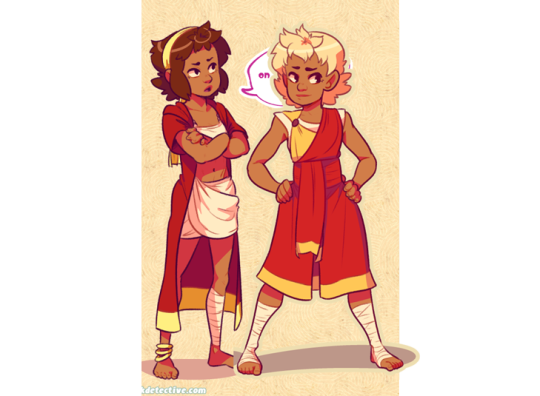
#simplifying and stylizing everything is so fun
Text

fcgs new design amirite
#critical role#fcg#fresh cut grass#taters does art#simplifying and stylizing everything is so fun#also yes i know the changebringer coin should be in their chest#changed it to a clover#for 1 stylization/simplification#2 bc avandras all lucky iirc#3 excuse to add more hearts#i love shapes a normal amount
158 notes
·
View notes
Text
OK, but hear me out
Say Ride the Cyclone were to be adapted into a film; imagine how much fun it would be to see it animated.
Because for the main plot, like the intro song and the mostly dialogue scenes in limbo, you could easily do a stylistic, but still grounded in realism style that a lot of modern animated projects are doing right now (think Arcane or Into the Spider Verse). But once each of the kids go into their respective songs/fantasies for what their life could have been? What if those were done in completely different styles?? Imagine the additional, visual storytelling that would tell about who they are as characters?
Like say, for Ocean's number, WTWN, everything became more simplified, and the characters (especially Ocean herself) turned into a more rounded, chibi-like style to enhance just how cutesy and likeable she's trying to portray herself throughout that number.
Or for Noel's Lament, everything goes black and white, and the characters become even more 2D stylized, and the film scales down to a smaller millimeter frame, more reminiscent of cartoons from the early 20's, when animation was just starting out, to enhance his idealization of "the olden days" (as Ocean puts it).
Mischa's song, This Song is Awesome could be animated with a more choppy frame rate, and the character designs turn a little more jagged around the edges, kind of like animated music videos (I'm thinking a Gorillaz band vibe). But as he transitions into singing about Talia, the colors start to bleed out over their lineart, and become more paint-like and Talia herself moves like a rotoscoped character (think Loving, Vincent that came out a few years ago) to enhance the sense that she's somewhere between a real person and a fantasy Mischa's built in his mind.
Ricky's song would, of course, be stylized after those sci-fi cartoons from the 90's, like X-Men or Captain Planet.
For the Ballad of Jane Doe, I would love to see something like what Wolfwalkers did back in 2020, where most of the characters (in this case, the other kids) are for the most part, animated like traditional, 2D characters with very clean lines and neat movements, whereas Jane herself stands out for having messier, sketchy line art, and looks more and more unfinished in her animation as the song goes on, because she can feel more and more of her own identity being lost.
Constance's Sugar Cloud I could see done in the classic 2D Disney style (i.e., the Renaissance era of Disney, like the Lion King or Little Mermaid days) because not only is it really smooth and colorful and just all around nice to look at, but it reminds the average moviegoer of their childhood growing up with those movies (among others, obviously), which ties in nicely with Constance's preceding monologue about remembering her own life, and the good that came with the bad.
I'm even tempted to envision the first half of the finale song in a different style, when the stage production would show a quick projection of Jane/Penny's life after she returned to the world of the living. Imagine watching this animated film, and for that segment alone, it becomes that really hyper-realistic, almost uncanny valley CGI animation style, to show that she really has joined the world of the living, i.e. our world, among us, the living breathing movie goers watching this, and watching the other kids still in limbo fade back to that main art style for the final number.
I don't know; it just feels like something that would be so engaging to see from an already compelling storyline and characters. Especially with more experimental animation projects on the rise right now
#random rambling#Ride the Cyclone#Ocean O'Connell Rosenberg#Noel Gruber#Mischa Bachinski#Ricky Potts#Jane Doe#Penny Lamb#Constance Blackwood#idk I just really love animation you guys#so naturally I have to bring my latest hyperfixation into that world#might even sketch these different styles#for a better visual idea#but I haven't done any sketches in a hot minute#so who knows
986 notes
·
View notes
Note
OH GREAT ONE! Please. . . Can you please give us a tutorial on how to make Pixel Character sprites on Asepeite? You do them so beautifully. . . *Sheds a tear*
please don't call me "oh great one" even as a joke; don't put me on a pedestal. I'm just Some Guy.
anyway there are plenty of cool tutorials on youtube, just search stuff like "pixel art tutorial" or "pixel grass" or "pixel trees" for specifics
but what i'd recommend as my top rule: experiment! make more art! Have fun! just make things and you'll naturally improve
but past that, for some more tangible advice:
look into stylization. pixel art NEEDS clarity and simple shapes to work. you can achieve this by thinking of the shapes (thus the importance of stylization) and by doing simple math or consistent "scales" of going down or up in number. see how the second line goes from looong to long to short shorter then a dot vs. how the left one just does things randomly, there's no scale here. it shows purpose and confidence when you use more math-based art. see how the circle uses the scale/ math vs. this blob where i purposefully didn't?
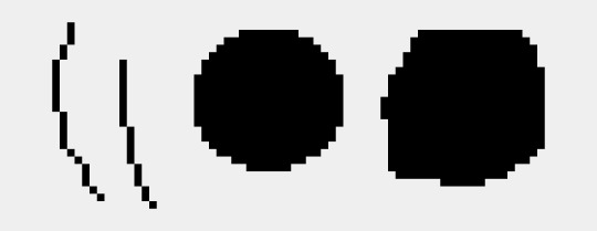
keep the linework clean:

aesprite has a feature called "pixel perfect" which prevents jaggies, which are these clumps of pixels as you can see on the right.
keep the art consitant. don't use blur effects or gradients, i'd say that's more so for VERY rare circumstances and should only be approached from a more experienced hand. (ie, bigger background pieces and used sparingly)
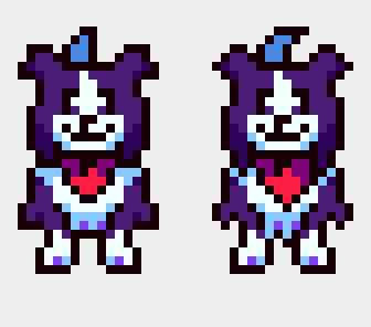
how you draw the shapes/angles matters a lot as well.
left, i kept things more "blocky" and less "sharp" I also simplified the shape (note the fur on the side of the legs) is more clumped together while the other has a larger emphasis on separating them and making them sharper. overall, the right one is a lot more complex which I don't want for a character who is moving a lot, and seen from a smaller size. its a SMALL cartoon! i want it to be clear to the viewer without any details to muddy things.
note how by making the sideburn fluff more jagged removes some of the room for the white fur. you only see ONE shaded white/blue pixel on the left, which adds more contrast and emphasizes that spot. there's less of a clear distinction between he had and the body.
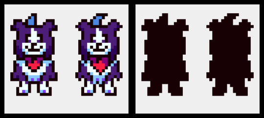
here's the silhouettes, you cans see how the body on the left is more clear in what part is what. Tail, ear, head, body and legs. the other one, sure, i know what those are, but its less distinct.

add "weight" to the shapes. have one side of the shape be bigger in proportion. note how the head has a wider bottom than the top, even from the jaw to the tip of the head. the overall body is bigger than the head as well.
symmetry is important and your life savior in pixel art. but not EVERYTHING should be symmetrical. look at the head stripe, mouth, chest fluff, and handkerchief. have one side favored or the other and not a perfect head-on position creates this asymmetry as well a more "organic" view of the character. (typically you want to avoid direct head-on looks unless it's for 3d modeling or character reference sheets, otherwise your character won't feel as "alive." it's not natural to stand perfectly 1-1 facing the camera perfectly)
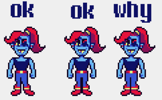
note on legs and bodies: you can't always get an accurate symmetry based on the head size. depending on if it's an odd or even number of pixels wide, it'll affect how the body becomes symmetrical to it. in this case, there's a pixel difference that prevents a gap. note how the middle looks like a SUPER thick line because there's no room for a single pixel line. my solution was to have her favor one leg over the other, which works nicely as it adds a more weighted interest to the right leg while her bangs favor the left, creating balance. toby's solution to this problem was to give the humans one wider leg and it haunts me.
another example of this is toriel

toriel's side mouth would be fine if it was a consistent choice and other characters did it (sonic is famous for this stylistic choice) but because she doesn't even match her family regarding this, it stands out and confuses people. i originally, and many people I've met have thought this was her nose. EVEN THO you can see her mouth open when speaking in-game.
btw even tho this also haunts me, i don't mind it as much cause i know this is a result of early game development inconstancies born from inexperience. its a cute quirk honestly, even if it was an easy fix. i actually ADMIRE that toby doesn't go and retroactively fix things, and instead prioritizes making new things with the information of how to do better now. its very easy and exhausting to go back and fix things rather than move on. mad respect for that.
34 notes
·
View notes
Note
do you have any tips for getting better at drawing anatomy? your poses are always so fluid and realistic
first of all THANK YOU!!! that makes me happy to hear!
under the cut because i got long winded... i hope something in here is useful! some of it may stray from the point, and i have no idea what stuff you already know.
in my experience a lot of it is about paying attention to form/volume. at one point or another i realized i vastly prefer art that emphasizes this, as opposed to flatter more stylized anatomy, as far as things i want to emulate in my own work go (flat styles can be cool when other people do it; this is a huge thing with art i think, developing a sense of discernment when it comes to the art you Want To Make versus the art you like but wouldn't want to mimic...)
so i add contour lines to everything i draw as i sketch because it helps me figure out where the object is in space, in relation to the viewer. doing this immediately establishes where the subject is in relation to the "camera" because lines curving one way mean you're looking up at something, and vice versa. if you've ever seen the coil method of foreshortening before, it's the same principle.
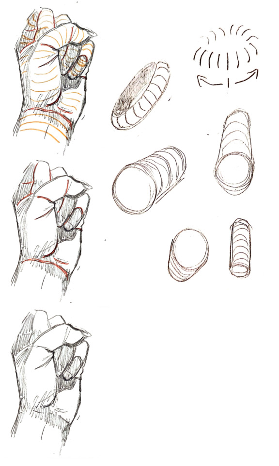
while construction lines won't always be there in a finished piece, you can communicate form in the curves of your lines. the round end of a sleeve is a countour line, so are fabric folds (although they have their own volume too), etc.
the feeling of looking up at someone, or their arm moving towards you, or their back turned away from you, that's where a lot of tension and dynamism comes from--some of the "fluidity."
another thing is to focus on weight, and how things interact when they touch... if you grip someone's arm, how does the skin fold/warp under pressure? can you actually draw it doing that, instead of leaving the arm being grabbed unaffected? stuff like that. a huge inspiration for this (and i think it shows in some of the artistic choices i've been making lately) is margot maison's work. like, check out this panel from bora the brain:
or this one of mine, where i just grabbed my own arm like that to see how it felt and what the skin did...

these are both examples of smaller details but the same principle applies any time you're drawing two people touching, or even a bent leg where the thigh and calf meet. i'm more interested in how skin/fat moves around than i am in getting the nitty gritty details of muscle groups and bones right. knowing the muscles and bones certainly HELPS; my personal favorite bones are the radius and ulna in the forearm, and keeping the way they move in mind Is useful because it reminds you that the arm isn't a uniform tube shape, it's a flat rectangle type thing, and it'll look wider or narrower depending on the angle... etc. see pronation/supination gif below:

they get recomended all the time but the morpho books are my favorite reference for doing actual intentional anatomy practice & in redrawing stuff from them a ton of tricks for constructing bodies have stuck in my head. like, here i was focusing on how they simplify the shoulder/armpit in relation to the ribcage:

(you can download most of 'em for free off of libgen btw.)
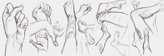
you can also get something kinda special drawing bodies from life. if you don't have other people to draw, your own hands/legs work too, and it's good for foreshortening and perspective because you're always seeing them in relation to your own viewpoint:
granted both this and the morpho studies are things i find fun to do. on the off chance that you're someone who finds studies tedious or boring, rather than pushing through it you might want to paint a character you like onto the pose you're practicing or something like that to keep yourself invested?
i also use references gratuitously. usually many pictures at once, where i'm combining them to get the pose i want. either just referencing different photos as i draw different things or literally editing them together depending on what it is. over time, i've gotten better at coming up with dynamic and interesting poses without a ref, because using them has built up my understanding of the body (it's actually way easier IMO to draw a dynamic pose without a ref than it is to draw a dude just standing there without one ?!)
there's sort of a push and pull for me between accuracy/realism ("can the arm Actually bend that way???") and exageration/stylistic liscense ("if it doesn't, does it look cooler like that?") where it helps to KNOW if you're drawing something that isn't technically "anatomically correct."
there's also a lot to be said for tracing over photos for practice!

thank you for the question, i love to talk about these things ^_^
17 notes
·
View notes
Text
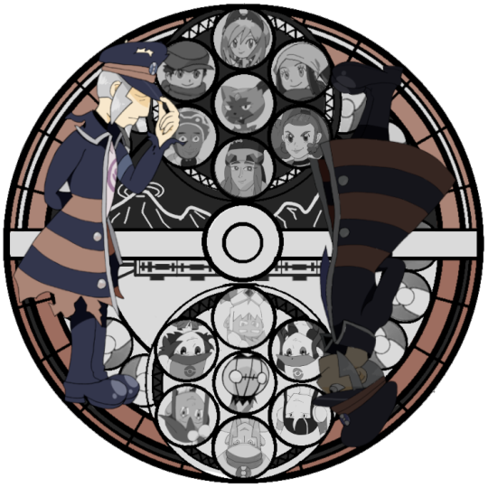

Happy 2000-- er... 2400 followers! I suppose this is what I get for overestimating how long it would take me to do two full bodies and 14 busts which I wound up cropping anyway lol.
Bonus commentary under the cut!
Link to the version with no commentary (x)
So first off, this was a considerable challenge for me since I don't normally draw in an anime style, and I think that shows. There were a lot of wonky proportions that I ended up having to go back and sort of fix in post. Irida, Rei, and Akari were especially bad-- my own sister told me that Rei looked like "a cross between a Victorian orphan and a frog". I decided to redraw all three of them, but since I drew them on a smaller canvas, I think it messed with the resolution a little when I shrank them down. I'm not sure anyone would notice if they weren't looking for it, but I've been staring at this for so long that I can't unsee it.
Next was the brilliant decision to put Emmet, Elesa, and Drayden on a light background. They initially faded right in, so I went back over some of the outlines to make them more readable; I had also tried putting the whole Unova set on a darker background, but found that it drew too much attention and unbalanced the piece.
On to the good things!
I adore how Melli and Zisu turned out. I don't know what it was, but my art game was on point that day.
I also had a lot of fun trying out different motifs. I knew from the outset that I wanted to play around with the duality of black/white, the duality of past/future, and the idea of making the whole disk resemble a PokéBall. The center design had me stumped for a while; I had initially used screenshots of the Highlands and Gear Station as placeholders during my planning stage, but around halfway through I decided that would be too busy and changed it to a simple railway track design instead. Then I decided I didn't like that either, and at the last minute I went back to a simplified version of my original concept. I think the stylized Coronet mountain range and subway train work nicely.
Other trivia:
During my planning phase, I used everyone's official art as placeholders-- except for Zisu, who for some reason I couldn't find any for. I used a screenshot for her placeholder, and referenced her TCG card for the final drawing.
Emmet being the only character drawn from a head on angle was deliberate. I wanted to subtly highlight his importance while still being able to place a key Pokémon in the center of both groups.
I drew all of my initial sketches on paper, lined and colored in Clip Studio, and compiled/edited everything in GIMP. I am a chaos gremlin and I will not apologize.
The reason I settled on a Station of Awakening as a follower celebration is threefold: The first is that I was hanging out with some good friends, and we wound up playing Melody of Memory. I forget exactly how it came up, but it was definitely a joke at the time as I do recall saying that it would take me forever... which it did, lol. The second reason is that I later realized that my first post on the blog (after the original "Ingo shouldn't be in old timey Hisui" (x) post) was Kingdom Hearts themed (x). The circle of stupidity is complete! And finally, I'm old enough to remember when making one of these for your blorbo was The Big Fandom Thing ™ that everyone did, and I wanted to indulge in a bit of nostalgia.
#my art#I'll keep this version out of the main tags so I'm not spamming#I'll add links to the other version of either post in a sec
135 notes
·
View notes
Note
Oh heck, my apologies (for not proofreading and/or being specific)
I was thinking more about like how do you figure out lighting, colour picking and the methods you use to finish up a piece. I was also really curious about your favourite anatomy tips and how you do so many dynamic poses.
Uhh tl;dr
I am fuckin stupid and I'm sorry
Lighting, colour picking, methods for putting the colours down, anatomy tips, and how do you do dynamic posing so well??
I only draw busts and it's making me mad :D
HMM lets see:
I don't color pick unfortunately, it's not a method I use so I can't help u there sadly. As for lighting and shading, I don't really use any tutorials but I just apply the same types of questions to it that I would to any other part of my work while drawing, which are broad question types like :
- where is my light source
- is this piece calling for any unique light source? (universal/generic lighting is just fine to keep using!)
- how MANY light sources do i have, and what are their distances to my figure
- what's the MOOD of the piece, is dramatic lighting necessary
- if im just here to have a bop and do an art what light source do I want to play with for practice
If it was something like a more polished and finished piece I'd definitely be thinking on these questions harder, or multiple revisions and potential references would be pulled up. But normally for references I just refer to my memory of shows that I've seen, since it's a LOT of visual library, and animated or live action, light source is heavily calculated. So you'll get a good display of these ranges you can apply. Lately I've been watching The Bad Batch and I'll always recommend that and clone wars as good examples of environmental lighting, especially given the style of animation they do with how shapely their figures are. It's a good simplified breakdown of the planes of a figure, so paired with their hard lighting choices u get an even exaggerated easier format to look at for guessing light source. (very reminiscent of comics like the more stylized/cartoon you get in art the more u can push and pull these dynamics. or like easier to spot then live action)
SO UHH, im disclaimer: not in any industry and im sure gonna be missing some terminology, but I just nabbed some random images off the google of bad batch to show case a few broad categories of lighting:
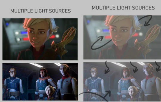
Multiple light sources are ur most common type, and to me the most fun especially when it's like Two light sources. U can often play with the fun lighting types like rim lighting, u often have a warm side and a cold side for contrast/directions sake. The distance of the light determines how sharp or broadly lit something will be, and the size of the light can determine how much of that light hits the figures. So Omega here is surrounded by the lights on their ship, there's likely a very broad top light that's gently lighting the entire area, but the reds and blues of the buttons and screens around her are what's shaping the figure more dramatically. You can see the blue is coming from the top/behind her, where the red is more in front/bottom side to her, since it's the way she's facing and looking at you/the viewer. The second one, still on their ship, features the more broad top down lighting, but the screens in front of them are more important as they're all facing it. both lights in this image are broad wide lighting, so there isn't much of a sharp focus.
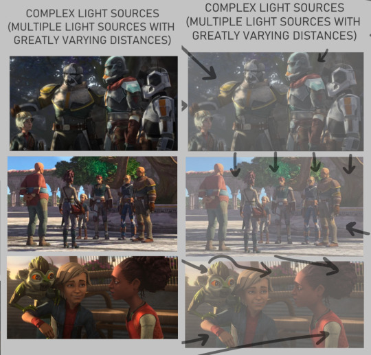
COMPLEX LIGHTING to me usually just means 'there are many light sources of greatly varying distances and brightness' or that there's a lot of figures in the image so it's got a lot more to organize so that the whole image may look readable at the end. You get a lot of environmental lighting for these types, meaning like hey the SUN is one of ur major light sources. it is super fucking bright but it is also FAR away, it's lighting EVERYTHING. and closer to sunset/sunrise u get more direct, highly saturated light from it because of the angle it's often shining- there's a lot to play with for just an outdoor lighting! The three images I picked here are a more morning shot, a mid day shot, and an evening shot. Talking about the angle of the sun especially at the last image with the grookey on Omega's shoulder, which casts a shadow over her and her friend. But her friend is positioned in a way so that she's not entirely over shadowed, because we're here to look at all three figures, and their faces matter in this shot. VS the middle images which is more about the scene/setting as a whole, and the figures are all more or less equally lit/shaded according to just standing in bright daylight.

there's also this fun lighting type, singular light sources can usually add a WIDE RANGE of emotion to the piece, depending where you flash the light. You've probably seen tons of light study gifs or shots where a face is shown with one light passing around their entire face and it highlighting the different planes that illuminate based on where the light is. So the first image, the classic Morticia Addams eye drama light, is focused hard on the figures, and what they're looking at. The second image of crosshair is another type of foreboding emotion, but instead with the eyes in the dark. Singular light sources aren't always for drama or asking you to focus on one specific thing but I feel like end of the day, the sharper and closer the one light source is, the more the artist is usually asking you to focus on the scene for.
There's also some examples here of multiple light sources being used for the same storytelling dramatic effect. There's crosshair's entire front lit up to focus on not just him but by extension the rifle he's holding, with a backlight to catch the edge of his helmet and the barrel, because those are where we want you to look. They're the most important parts of the image, and they wanted to make lighting appropriate for reading that. With the last image there's what's his face (bro i forget my b) looming over him in a common type of dominant lighting. With how the lighting is assigned to this scene his face is shadowed, vs crosshair's who is partially under that shadow.
IDK IM RAMBLING NOW i doubt this is the concise easy to read tips anyone's asking for sorrY I am not a teacher. IN SHORT FOR LIGHTING I JUST think about shows I've watched. I won't go into anymore but I think a GREAT example of super well done lighting in all categories of art are the John Wick films. They're both lively, highly direct, and superficially colored to fit the mood of each character and scene. I'll suck these movies dicks i'm obsessed:
Anatomy I always generically recommend people continue loose study/education from skeletal and muscular anatomy cause if you can build a figure from the inside out, the surface is going to be loads easier. And then when I'm too lazy to look up any muscular break down cause I sure don't remember every part at every angle I kind of just fudge it which is super common, like how many of us draw an ear correctly to it's bends and shapes. I sure as hell don't I just like to draw them the way I'm familiar with lining it (unless it's some really polished piece) cause end of the day my ear is still getting interpreted as an ear. So If I can't recall which muscle overlaps the other given a certain angle I just take a guess and usually it's not something blaring if I threw it down confidently enough. Studying not just muscle though, but how all body types sit and tense and move is crucial. Like fat is obviously going to have a much different type of hang and sit on the body, and then there's deciding how much fat to muscle you want on a figure. There's also skin to consider- older skin is looser, scarred skin has a tighter more custom pull to the areas, skin otherwise is just a big elastic band around ur body. So when that becomes overstretched or cut in any irregular way it's going to have a much different look to the muscles and bones it wraps around.
Muscle reference I don't have anything specfic to refer other then using actual anatomy charts. Some 3d modelers have made great reference to body parts with full turn arounds i'd suggest. Since big fantasy muscles can be exaggerated so much (and they should!) it's the only reason why id only Lightly suggest for observing other artists individual drawings of buff characters. cause lotta us are fudging parts and u will end up picking up an incorrect anatomical trait (we literally all do it, just a silly unlearning process once ur hand is so familiar and used to drawing something a certain way)
I think something specifically that's really helped me slowly gain a very diverse understanding of the fat to muscle ratio is getting into sumo wrestling. (NOT TO PUSH MY FAVORITE SPORT BUT I HAVE SOURCES IF U WANNA HEAR ABOUT IT/FIND A SPOT TO WATCH)
In sumo there's no weight division like other forms of wrestling, and because of that you can have a very diverse set of ways to go about your own style of fighting. Entirely setting aside the fighting STYLES, there's broadly the categories of how much fat do you want to put on and the advantages that has against your opponents, vs how much muscle, or where that muscle needs to build on your figure, height and the like also play into it but basically 'what is my body shape, how can i build/ play it to the advantages of how i fight my opponents'
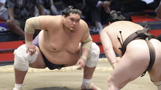
so like terunofuji is a fucking MOUNTAIN of a man, he's the current yokozuna (top banana rank) and his sheer height and weight plays greatly into his fight style. All of them are fucking jacked and watching Sumo has been a great general visual library builder because:
- its a huge sport so it has a lot of coverage and footage on high def cameras
- they're mostly nude and you're getting incredible displays of muscles in slow mo as they collide, fight, and throw each other. s2g you'll have an entirely new appreciation for the human body and just how many ways it can shape itself from watching this sport.
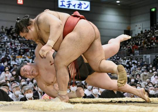
Always a ton of fucking leg muscle but Takayasu is one of my faves i gotta show him.
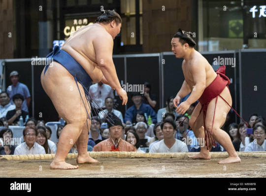
with no weight limitations not only are you seeing all the different levels of weight to fat, but you're getting an excellent display of how fat builds and forms on different people. there is no one way to gain fat, its pretty cool how diverse it can form, where it prefers to store fat, how quickly someone might gain weight vs overtime, genetics, what types of fats you're storing, lots of shit to look up on! this last image is ichinojo vs enho who are like usually one of the biggest and the smallest wrestlers, and both play to their size and shape and have become very high ranked. ANYWAY THIS POST REALLY WENT PLACES HUH
idek if i answered the questions right i think i gave more questions back but i tried to touch a little on my thought process and where ive specifically gone in the art study journey.
For poses I really don't look up anything I just try to think of the figure and do a lot of preliminary sketches. No i don't have the 'picture a perfect apple in my head' noggin i too suffer from looking at a blurry void when i try to think of shit so yes im hitting a brick wall by not utilizing all the model posing references that are probably out there hsuogjdhk
96 notes
·
View notes
Text
Continuing onward, page 2 of 6, the rest of which you can see here.


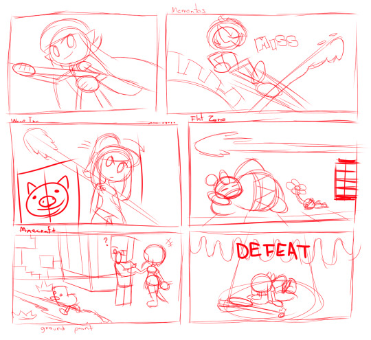
Honestly this page was a lot of fun, I love recreating areas in gaming a lot, so this was a lot of fun with the whole playing around with multiple universes in smash to give the idea that the Inkling girl just can't hit a shot.
Of note:
I like to think that Inkling Girl's first mistake was skipping Sheldon's explanation. Like, I get it, but his bios do give you a hint of how the thing is supposed to work. Just because you're familiar with a thing it doesn't mean you should skip the manual.
I could have straight up taken a picture of Mementos, but I instead re-drew the whole bit (if anything I just reused a re-draw of the main mementos map which I have done in a previous drawing project).
I honestly do not skip steps, if I can recreate a thing for the shot, I'll go out of my way to do it. It makes things look more seamless and in-line with the drawings as a whole if I do everything from scratch, though I'm not above re-using previous drawing assets if I can get away with it (since the mementos map never really changes, I can just reuse that isolated re-draw I have).
If you want it for whatever reason, here it is.

Oh, by the by, I kinda based Joker's render off his appearence in Tactica since that had been recently released by the time I was doing the drawing. I do like the tactica renders so I may base the persona characters off that to simplify them a bit style-wise.
I know WarioWare being used for Samus is a bit of an odd choice, but I figured I could just do a simpler area rather than going with either Norfair (all that lava would get in the way of the ORANGE paint), Brinstar (same, but Yellow) or Frigate Orpheon (I didn't really need the parasite queen in the background). Adding Pikachu in was a later idea just to highlight how much she's missing the shot.
Dedede and a Pikmin laying down was funny enough already, but here's a bit of hilarity I thought about (and I know that explaining the joke ruins it, but you know, this is supposed to be a commentary): this is flat zone, it's entirely 2D, the inkling girl somehow missed the shot even when you only needed to aim left or right.
I like Minecraft a lot, but when DRAWING the universe its a bit dull if everything is just cubes. So while I totally can do that I just choose to make a stylized version that is semi-cubey for most everything. Though Alex I prefer to go full proportions.
Alex being more human proportioned does bring some challenges since I do want her to look like a country bumpkin of sorts, so this comic helped me finalize how I would do it. Honestly its kind of based on how artist Peargor does it. Though I'm gonna go with a longer braid and some freckles.
I do largely prefer Alex over Steve though, so you'll likely see her whenever I involve minecraft on my drawings. If I were to draw steve though? I'd likely make him buff. I tend to think of Alex as the builder/farmer (which is my playstyle) whereas Steve is the adventurer (how my friends play the game).
I didn't actually borrow any textures from Minecraft, they were self made. Which is kind of why they're kind of shit.
Honestly drawing the regular Charger was a bit of a thing. The Splatoon weaponry can be very complex in its detailing so for the first few panels it was kind of traced. Over time I just did it on my own for later panels.
Tracing isn't a bad practice, just as long as you don't pass an entirely traced work as your own. Trace responsibly kids, it helps learn how to do a thing.
#splatoon#nintendo#smash bros#SSBU#Super Mario Bros#King Dedede#Kirby#Pikmin#Metroid#Samus aran#Minecraft#Persona 5#Joker#Wario#independent artist#commission
17 notes
·
View notes
Photo
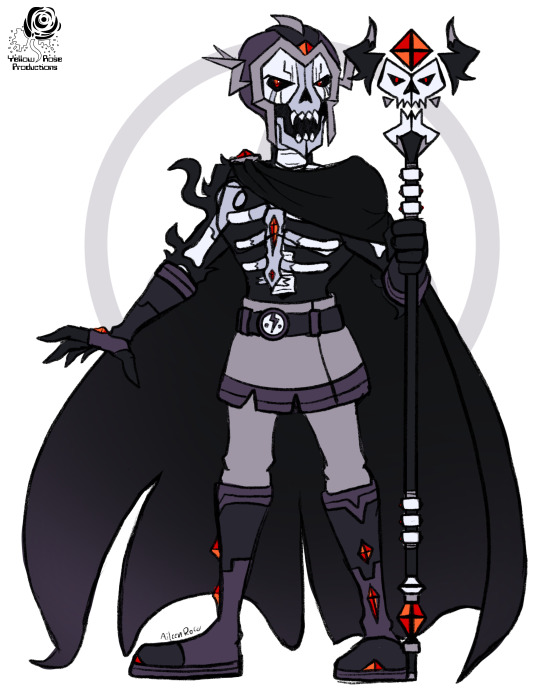


Finally this guy appears.
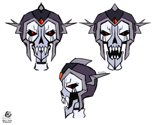
Dear GERSH it took me awhile to get this design right. I did an initial design back in November of last year that I was... eh... about. Mainly it didn’t feel creepy enough. So I let it sit for a bit and focus on some of the other characters. Finally came back to it today after having a dream and seeing this version of him.
So, Storm and I sat down, watched some episodes and I sketched while watching. (Fun fact I am still making my way through the series properly. XD I’m in season 3 and having a good time.) And so... we get all this.
I basically broke Skeleton King into pieces to try and improve the original design I had. Started with his head, then worked towards everything else. Cause truth be told the hardest thing for me to nail down was his head. Mainly in that... I had to allow myself to break way from giving him a realistic skull. Odd thing to say but this is due to the fact of doing things in my style rather than doing as the show did. The show stylized his skull in a way that made sense. I can’t get away with it as well in my style. So hence I had to think of something. The solution being allowing myself to warp his skull into something monster like due to what happened to him. So skull was stretched out, jaw is detached and he has his sharp teeth. Very happy with this skull over the realistic one. Again, I know, odd to say but I really wanted to keep the essence of what it was like in the show since I do like the design. Just a matter of translating. And with the realistic one I just didn’t think he was scary enough. He’s supposed to be the stuff of nightmares for Chiro. This realistic skull wasn’t it. This one? Absolutely.
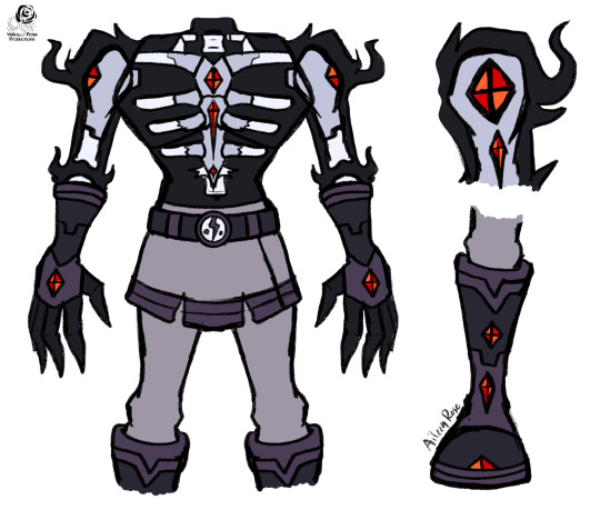
Then as for the rest of of him, the body was honestly the easiest part since what I had done initially I was already okay with. Just made minor tweaks like simplifying how much bone we see, how much bone he has, and modifying his outfit, Like giving him full on pants since admittedly, have his leg bones showing came off as a bit goofy to me. Same with the claw feet. Just seemed to silly so he gets full on boots.
Last piece was his staff and I just decided to redesign the whole thing from the ground up. Kept elements of his canon one but wanted more power to exude from it.
After all that, we then get the concept art render at the beginning of the post. Where we see his cloak as well and all the pieces put together.
Tough challenge, but very happy with the end results. I look forward to doing full renders of this guy in the future.
And yeah. Hope you all enjoy my take on The Skeleton King.
Catch ya on the next one.
28 notes
·
View notes
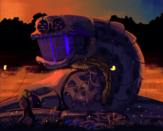
Text
something i realized about comet:
his current form is less like a bird, or a spider, but more similar to an extremely fucked up crocodilian
like, one key part in his initial development from pigeon to Giant Spider Thing is that he noticably kind of de-evolves? There's many stages i left out in this very simplified chart, not to mention that these are all headshots and don't show everything below, which is a lot to leave out

Like, his beak grows teeth and his wings grow claws again, and his beak retracts and he was, at one point, the Oort Cloud's pet dromaeosaurid for awhile. But he kind of begins to de-evolve to the point BEFORE the dinosaurs and back into an archosaur, where he is more reptilian, his feathers have retreated into scutes and calcified into osteoderms and on a smaller note, this is also where his very wide-armed stance comes from.

Also, there are hints of actual croc in his design, just not very outwardly.
While Comet's bite using his Music Man garage-door front teeth is ultra weak balls, his actual bite using his whole jaw is very much NOT - I made a muscle diagram for him a while back, very old and outdated, i don't like it, but nonetheless. Making his jaw was kind of problematic since there's already not a lot of muscle references that I can understand very well for insects, and to my knowledge there's not very much insects or any invertebrate that has a jaw that opens like ours, so I opted for something similar to what crocs have going on: instead of a saggital crest the jaw muscles attach.... on that cheek bit.

I looked back on that muscle diagram and realized because it shows a literal, like, cross section of Comet, it showed literally nothing, but I think this shows it better.
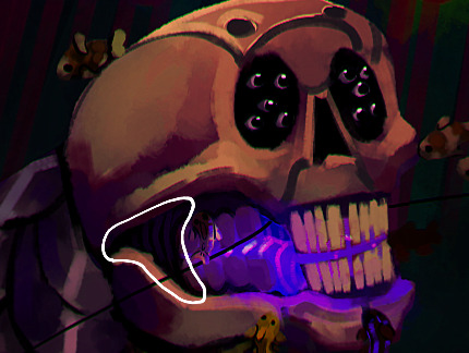
it's really ought to be more pronounced and bulky than it is but, nonetheless. gator jaw
also i would like to note that comet was not literally de-evolving, it is specifically shapeshifting but "shapeshifting" is a little different for Comet because it's less magical and an actual, like, slow development of his body parts that can take a week or more, and he was not directly de-evolving as during this time his legs were slowly becoming nothing and 6 of his floating ribs were detaching and becoming a shoulderblade, then into extra arms, but. still. Comet's transformation is complicated in particular since we're going from a pigeon to THAT THING so the oort cloud was trying to accomplish that by turning back the clock a little.
also, fun facts about comet's body:
that weird plate between his eye sockets is actually slightly loose and it's actually there to easily expose the frontal lobe for the brain surgery.
Also, on top of the 10 pairs eyelids for his extra eyes, he has a giant, extra, blue-ish pair that he uses to emote with the helmet on - the helmet's tinted glass "eyes" has slits around the edges so those eyelids can go through.
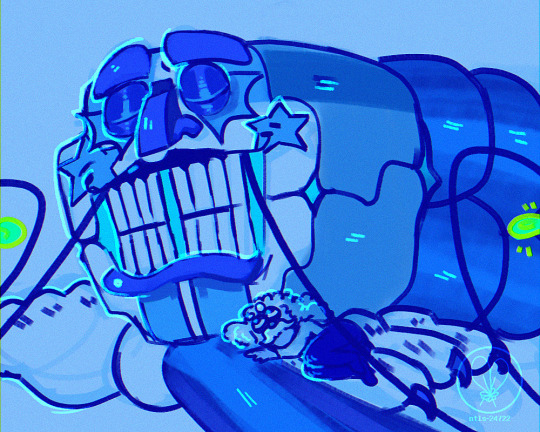
This wasn't a stylization like his eyebrows and lips moving, and they don't disappear when the helmet's off.

helmetless comet is very inexpressive, but by god, can he judgementally squint at you.
13 notes
·
View notes
Text
art things i wish i could tell younger me under the cut
if ur working on something and the only thing keeping u going is "it'll look better once i add colours/shading/lighting" then chances are ur not gonna be happy w/ the final product.
learn what the word draftsmanship is and study it.
"learn from real life" /=/ learn realism/use ONLY real photos as reference. learning how things are commonly stylized and how your favourite artists draw is just as if not more important. understanding what u are simplifying and stylizing /=/ having to draw that thing hyper-realistically to earn the right to stylize it.
on that note LEARN FROM ANIME. YOU LOVE ANIME.
more than anything find ppl to idolize for specific elements of their process and apply that to urself. u can like someone's colours but nothing else for example and just take the colours and mash it up with another style u enjoy to make ur own thing
YOUR PROCESS IS JUST AS IMPORTANT AS THE FINAL PRODUCT. legit stop seeing drawing as the laborious journey to get to Picture. You will learn more and have more fun if you figured out a way to draw u actually enjoy trust me. (stopdoingcleanlineworkyoufuck)
use ur brain and think when ur at each step. don't just go into autopilot. HOW do you want to do this tho.
question question question everything u've seen online. every tutorial every pro artist interview every Thing. just because they're good at doing art their way doesn't mean the same thing will apply to you. people who started their careers 20+ years ago can be incredibly skilled but have no clue what it's like trying to get your first job now. people use different techniques. find alternate POVs where ever possible.
you are NOT talented, you are SKILLED. stop pretending you're one of those people who just "get" perspective, anatomy, colour, etc. you're a medium-sized fish in a small pond with no frame of reference. everything you know now you worked for and that's way more badass than "i just Get colour". Keep studying keep learning keep kicking ass. you are rock lee, not gaara.
you will get more knowledge and progress out of self-study than any course Ever.
and finally BE MORE CRINGE. BE SO SO SO CRINGE. BE MORE VULNERABLE MORE RAW MORE UNFILTERED MORE FUN. the people who dislike your work will dislike it either way. draw what you want to see and you'll end up near people who you'll engage with much better.
4 notes
·
View notes
Note
Do you have any character design tips? I was thinking about making a Beanish OC and I think Jolligig has the actual best design ever so I felt like I would ask maybe..
OMG WELL FIRST OFF THANK YOU HAHA seriously I appreciate it so much!!!! y'all gonna make me cry over here qwq
I'm actually super flattered you'd ask me so YES I can try?? I think the biggest tip I would give for designing a Bean in particular is to remember that they are not just green-skinned humans. Hands down, that is the most common thing I see with Beanish ocs that I would advise against. Get humans out of your mind when you're designing a bean and get into a more 'toony creature' mindset.
Start by looking at the sprites in Superstar Saga and check out the Beanish people. They're not walking around with super complex hairstyles and even the few beans who do have hair keep it simple (and in Prince Peasley's case may even be wearing a wig LMAO) nor do they have very human-like facial features.
Most of them continue to look like BEANS in shape/body and when they do skew more human, their faces tend to be extremely stylized and amplified even for their world and in comparison with other races. Some have noses, some don't. Some have black dot eyes, some have more human-like eyes. You have SO many options.
I kept Jolligig's design simple and more like the regular town NPCs walking around because I wanted to make him stand out with other features like his hair and glasses vs facial shape and body type- but you may choose to do the opposite! I will just say it's good to stay modest to an extent when you're designing a character no matter how much you wanna go crazy and slap EVERYTHING YOU LOVE AT ONCE on them because it can end up overcomplicating the design, especially in the case of a character you're designing for a world like Super Mario.
Another question to ask yourself: would my OC be absolute hell to animate even doing the most basic of things? You don't have to be an animator imho to be able to answer this question. If he answer is yes, maybe consider simplifying their design further.
If you want inspiration to get weird and creative, check out the odd designs in the likes of a few of the shopkeepers and somebody like Harhall, for example. LIKE?? LOOK AT THESE:

There are absolutely ways you can have a TON of fun with a Beanish character that still keeps them within the bounds of what the game does.
Hope that helps you. <3 LONG LIVE THE BEANBEAN KINGDOM AND ALL ITS GLORIOUS SMILES!
24 notes
·
View notes
Note
Seriously your art is such *chef kiss*, I'm so happy you're sharing your work with us!! I have many questions if that's okay haha
Have you been to art school or are you self-taught?
What got you interested in art in the forst place?
Do you plan on making it a career, or is it """just""" a nice hobby?
Would you ever be interested in art collabs?
Do you take commissions/do you sell prints? (u should)
Is there something about your art you feel needs improvement and what are you the most proud of about your work?
Do you have timelapses I can look at/have you considered making tutorials on how to draw our fav Kpop boiz?
I hope you have a lovely day <3
😭Hiiii ooh these r good questions...
Have you been to art school or are you self-taught?
I've been to art schools as in private art classes when i was a kid + taking art in public school (my high school had a rly good art program) so I don't consider myself self-taught, but I also didn't go to art college (I took 1 art class that I actually liked in college, the rest were for easy As oops). In the last year I've been watching more art theory stuff on my own thru youtube
What got you interested in art in the forst place?
Idk just been drawing since I was a kid... always liked drawing and painting. Really liked anime in middle school and found digital art as a result of a friend who was really good at drawing manga style digitally. Alice X Zhang was a big inspiration for me because she's such a success story of transforming fan art into a career. At the same time I did a lot of oil painting in high school.
Do you plan on making it a career, or is it """just""" a nice hobby?
Right now it's """just""" a hobby :') My day job is entirely unrelated to art
Would you ever be interested in art collabs?
Ya :) that sounds fun
Do you take commissions/do you sell prints? (u should)
Lol no not now.. Commissions i feel like i'm not disciplined enough to be responsible to draw for money oop. I always thought prints could be cool in the future but I want to like...test sample prints first and stuff. If i were to sell prints I dont wanna do it thru like redbubble or s6 i'd prefer to find a local printshop n set my own system up :) it'd be fun and more direct ... but like not now :''')
Is there something about your art you feel needs improvement and what are you the most proud of about your work?
So much needs improvement always! I am recently working on speed... drawing faster, which goes hand-in-hand with simplifying my drawings and not overworking stuff when I dont need to make everything so detailed. And ofc I always work on improving w likenesses and that balance of realism vs stylization. I think I'm most proud of having developed a style that I feel like is recognizably me (lol "spaghetti squiggly lines") but also sort of having "multiple styles" that I can develop too (like just lineart sketch, black & white shaded sketches, the darker charcoal style I have going on, and full color paintings).
Do you have timelapses I can look at/have you considered making tutorials on how to draw our fav Kpop boiz?
bruh i wish i knew how to draw them well consistently. i think bc i have such a realistic-approach I have to relearn how to draw them each time :'''''''') i've seen those kinds of tutorials on twt which is so cool how ppl stylize drawing X kpop boy but i can't do that 😭 i sort of did one w haechan a while ago? but that was more generically about my process
#ask#millartiste#ya um i hope that was helpful ! sorry so many words mobile users forgive me#some of these questions i've been thinking about a while... always on the back of my mind#especially the money ones :''''') but nah#these r such good questions tho... thank u lol i think this deserves a faq tag so i can find it later#faq
13 notes
·
View notes
Note
Art tips for young artists? I really admire your style!
Aw thank you!
Alright so you’ve probably heard how practice makes perfect, and while that’s obviously true, it’s not the only thing that’s important!
Observation and references are really important.
My school forces us to fill up observation sketchbooks where you gotta draw a bit of everything you see, as a training for anatomy, clothing folds, hands, but also perspective, seeing in 3D and objects.
Obviously you don’t have to fill 200 pages in 2 months like us, but you can from time to time draw from real life stuff, it’s a good exercise! (Teachers will say you shouldn’t use pics for those drawings but honestly who cares lmao)
Also those help a lot developping your style, as you figure out yourself how you would simplify x or y.
Observation how your favorite artists do stuff (stylize hands, ink, use colors etc.) can help yourself develop your art style! I have many artists that greatly inspired my art, don’t hesitate to take inspiration from others!
Never hesitate to use references either. Look on pinterest, on picture websites like Unsplash, use 3D models (like on CSP or the MagicPoser app), or take pictures of yourself / your friends for poses (I especially do that for hands references). You can also do the pose yourself before drawing it to know if its possible or not.
References have been and are always used by pros to make their life simpler, ignore purists that think you shouldn’t use references.
The thing that helped me a lot these past few months is to visualize in 3D. It’s something that I struggle a lot with due to my adhd, but if you’re like me you can start but trying to decompose body parts into simpler shapes in 3D. It helped me a lot with my anatomy but even more for shading (to know where light arrives and such).
And lastely don’t compare yourself to much. You will probably feel down at one point because you can’t do X as good as this person, but art should be fun. We all progress at our own pace, try your best to turn jealousy into inspiration
Hum yeah I’d say those are my biggest advices, if you have more questions feel free to ask them :0
#i'm mostly self taught#i've joined an art school 2 years ago so i know how both feel like#uuuuuuuuuuuh have fun and draw what you want#sol mumbles#Anon
40 notes
·
View notes
Text
TBOSAS THEN:
For reference the last time I read a Suzanne Collins was probably seven years ago but die to the quarantine and lingering goodwill I had towards the series I decided to pick up her prequel focussing on *gasp* the big bad of the original, President Snow himself.
Full spoilers follow.
This book frustrates me. For two thirds of the story I was engaged and enthralled. The central character of Coriolanus Snow is fascinating and a complete departure from every YA trope Collins herself helped establish almost a decade ago.
In contrast to the virtuous heros and heroines; angsty bad boys; and strawman villains prevalent in this genre Snow is a driven, ambitious, paranoid, amoral, charming and deeply insecure character whose internal monologue and external actions are constantly at odds.
Somewhere between anti-hero and villain, Snow is a struggling Capitol youth dealing with the lingering psychological stress of a destructive war. Even as the populace begins to physically recover it's apparent that the collective psyche of the Capitol's citizenry was shattered in the conflict. The need to maintain a facade of luxurious living while bodies are being eaten in the streets has created a society where prestige and victory are valued above all else.
This is why the first two Parts of this novel, set before and during the 10th hunger games, work so well. Against the landscape of the devastated and barely recovering Capitol, Snow is forced to navigate a fiercely and twistedly competitive environment in order to maintain his family name and further his own ambitions.
With his family on the ropes, it's hard not to root for Coriolanus as he navigates his way through a much more primitive, subdued and brutal rendition of the children's gladiatorial game show. Whereas Katniss was a crack hunter, Snow has all the physical capabilities and training of a soggy chocolate biscuit and he is thus forced to rely on his emotional intelligence and cunning to maneuver himself and his underdog tribute through a hunger games that is less gameshow and more execution chamber.
The stripped down, simplified hunger games and surrounding media coverage is a welcome change from the glitz and glamour of the original trilogy. Collins really reinforces how brutal and uncomplicated the hunger games ultimately are by imbuing them with a sense of administrative formality and bureaucratic dullness which removes any illusion that this is anything other than Victor's justice for a horrible war. The fact that half the tributes die before the games begin is brilliant as is the insinuation that no one in the Capitol really seems to care/enjoy the games (especially initially).
Part 1 and Part 2 proceed with a pacing and urgency that feels natural. The framework of the ticking clock of the games proves extremely effective in facilitating a natural plot progression as the games draw closer and then the body count slowly ratchets up once they begin. The depiction of violence in the novel also feels much more mature and thus more poignant. There's no stylization or excessive gore just flat and blunt murder
So What Happened? What the fuck happened?
By the time Part 2 ended I was riveted. Coriolanus's victory is undermined and he loses everything. It's a wonderful set up for an emotionally charged and deeply introspective third act.
But then Part 3 rolls around. On paper Part 3 (titled "The Peacekeeper") seems so promising. Coriolanus is deployed to District 12 as a Peacekeeper. Stripped of his family's status, Coriolanus is faced with the harsh reality of life on the frontline of a War he was told was over. But this segment of the novel is rushed, muddled and confused.
At part 3's core are four plot threads:
1)Coriolanus's training as a Peacekeeper.
2)Sejanus and Coriolanus's persisting dynamic.
3)the persisting rebel/anti-Capitol elements in District 12.
4)Coriolanus's relationship with Lucy-Gray and her band of misfits
Threads 1) and 3) go no-where. I don't mean this hyperbolically. I mean they literally have no impact on the story and affect none of the characters. A significant amount of time is dedicated to establishing Peacekeeper training and the quirky characters in Coriolanus's squad but by the end of the novel they've contributed nothing to the story and one has to wonder 'why?'. Why dedicate any effort towards characters who do nothing. The idea of the arrogant Snow being inducted into a laddish 'Boy soldier' unit is incredibly interesting but nothing is done with this idea besides some fun nicknames.
Same with the rebel remnant plotline. A bombing, escape attempt, double murder, and gun smuggling is all detailed, built up and then instantly forgotten bar a contrived tie with the climax (which I'll get to). It feels like another interesting idea tossed to the wind in favour of more "romance" scenes with Lucy-Gray.
Instead of the character driven action of Part 1 and 2, Part 3 feels meandering and unsatisfying. It's like a first act got so lost it wound up in the finale slot instead. Interesting concepts are poorly executed to create something which feels disconnected and barely relevant to the plot which had been so well established. The 'final confrontation' in which Lucy-Gray and Snow turn on each other is supposed to be tragic but comes across as bizarre. Its here that Snow is implied to have a paranoid breakdown but nothing comes of this. Lucy-Gray dissapears, Snow has a bout of insanity and then returns to the Capitol. It's surreal and not in a good way. A brief epilogue where 'Snow wins. The end' is salt in the wound.
The symbolism, which was subtle and enjoyable in Part 1 and 2 becomes heavy handed and patronizing in Part 3. The repeated 'Snow hates mockingjays get it?' becomes tiresome as do the various musical numbers whose lyrics are about as nuanced as a sledgehammer in telegraphing upcoming events.
In the end TBOSAS is an interesting subversion of YA tropes with a brilliant main character, realised and relevant setting, insightful commentary on the media's portrayal of violence and the mental impact of War on a 'privileged' populace . It's also got a confusing and rushed final act which collapses under the weight of its own ideas and is unable to commit to a single central idea to bring the story home.
It's not a bad novel, in fact parts of it are brilliant, but its deeply flawed final third left me feeling frustrated and disappointed.
#tbosas#coriolanus snow#the hunger games#lucy gray baird#suzzane collins#the ballad of songbirds and snakes
2 notes
·
View notes
Note
i'm really shy but i just wanted to say that i love your art and how you draw will and his facial features i've studied your art a lot and i honestly think it's made me a better artist. i feel way more in tune with my work and it's easier for me to translate real facial features into something stylized and cartoonish so thank you
oh wow thank you that’s so cool!!!!
honestly a great Art Technique really just is that if you like some element of someone’s art, just look at how they do it and incorporate that into how You do it and just use that influence/inspiration to help figure out your own approach and how to be more comfortable with it…..that’s all i’ve ever really done and like, even now that i’ve got a better sense than ever of how i Like to draw, it’s still always changing around in little ways……really that’s awesome if my art’s helped you out re: working with your own
really like yeah i’m Especially motivated to keep will’s features in mind while i’m drawing because of how like, unfortunately it seems a lot more common that people like, don’t do that at all…..because you don’t have to be shooting for Realism in your art style to draw someone in a way that still looks like them cuz you can draw features in a recognizable way without that photorealism or whatever. we’re just out here drawing lines and shapes and it’s more about how those lines/shapes work together in your drawing and how you ~translate~ things into your style….like it’s not about what looks closest to a photograph of the person, you can pretty much draw something Resembling someone in whatever style you have b/c all the visual elements you’re working with like the shapes and angles and placement of everything are gonna be at play in the real life example and in your interpretation of that, despite the fact they won’t look exactly the same. like, the way you break things down into shapes and probably simplify / stylize things doesn’t mean you’re gonna have to deviate a ton from how things “”””really”””” look…..i mean for will roland specifically for example, i already mentioned how like, i draw his nose to have that slight convex silhouette like how it really does, and that’s gonna do a lot to make it look more like him than if i do the real small concave upturned deal which…..is nothing in the least like how it actually is
anyways yeah!! it’s always a bit of an ongoing challenge figuring out how to take something and “translate” it into your style, whether its Something From Life or Something From Another Art Style, and sometimes in the process you end up shifting your own style around as you figure out what works for you and what it would help to change. i guess sometimes it can feel like your approach might “break down” if you try to make it work a certain way, but really your style is always going to be shifting and evolving one way or another, so it’s cool to just explore that development and know that your art is usually more flexible than you might think. it’s intimidating and frustrating sometimes but that’s not actually an indication that you’re doing something wrong lol……just keep at it b/c really the answer to “how do i get to [whatever point you want to get to]” is just oh make more within whatever medium you’re working in. draw/right/paint/collage more or whatever it is you’re doing. just Make More of it and that’ll get you further than really trying to think out the theory of what you’re trying to do (cuz that’s part of the whole thing too but no amount of Thinking About It is gonna make it so that you can pick up your pencil and be Fully Ready and make something perfect exactly how you want it to look). it’s annoying when sometimes you might just wanna scrap something entirely, but if you’re spending eons on something and it still just doesn’t look right, don’t be afraid to just throw it out and start again from scratch cuz ultimately that’s gonna be more Productive and helpful than trying to finetune something for a million hrs and still not end up that happy with it. and really even what you finish doesn’t have to feel perfect or like a total masterpiece. it’s fun when something you make really Does feel like something you’re super proud of, but a lot of times for me those kinds of pieces are more of the General Feeling / Effect of it rather than me going “aha perfect can’t spot any mistakes or imperfections or things i would never ever change” etc yknow
and like really Eventual Improvement isn’t as much as feeling like “wow my rate of Masterpieces vs. ‘what i’m not really 10,000% perfectly thrilled with’ sure has increased,” but rather your average piece of art that isn’t either a failure or something you’ve knocked your own socks off with will still be something you’re happier with than how happy you might’ve been with ur average work of art from years prior. and that’s a pretty cool feeling really. and for me it’s definitely been sort of both about figuring out how to handle more Abstract/General Art Things like all the shapes and lines and form and figure and etc etc etc and also the more personal stuff like say, your style…..which, one thing that’s nice is you definitely Have a personal style no matter what, it’s just about figuring out how to make it more into how you like your art to look.
anyways i did not need to get into very general art talk but i have. the point is thank you so much!!! that is so cool and nice to hear and ty for sending this!
#Anonymous#oh one thing i Meant to Mention!!#once someone commented on some wroland-role art i did like ''oh a heart shaped smile'' and i was like hell yeah...#...i drew it like that cuz of how his smile really works like that lol...#love is stored in the wrol
9 notes
·
View notes
Note
How hard is it to choose colours for your (and my favourite) art style?
Eheh, well I canonly speak for myself, not for whoever you’re flattering by callingyour favorite, so I’ll stick to that! ;)
I suppose theliteral answer is “Usually not too hard?” but that’s boring solets see what I can ramble about color choice and such! Also I’ll put some links to James Gurney’s stuff because he is amazing and I cannot recommend his books enough!
(This’ll be in 3 sections - Color schemes, Contrast and leading the eye, and picking colors for shadows~ from longest to shortest too)
Part 1: COLOR SCHEMES
So I used to bereally bad at this until I got really into pixel art where I learneda few important lessons. First, the entire color palette workingtogether is what’s most important, not any single color, and second,colors work together in surprising ways COMPLETELY dependent on what’s around them!
For example, this isthe color palette for the Commedore 64 from back in the day. All whopping 16 colors the system could possibly display:
Individually thosecolors look pretty muddy, muted, and dull. But when you put them alltogether in an image they actually work pretty well together, because none of them completely break from the others. Usingmy own stuff as an example, I used the C64 palette to challengemyself with remaking a very colorful, very saturated screenshot from the Nintendo 64game Mischief Makers (because I love that game and both systems have“64” in the name so why not~)
So I turned this: (Nintendo 64 version, with waaay more colors available)
Into this:

Now, there’s clearly a BIG difference in the colors used, but I feel like everything still looks fine on its own. The muddy colors look a lot more harmonious when seen in an image than individually, with the brighter colors, such as the gems, even popping quite a bit.
For that second point I mentioned about colors working differently based on the colors around them, look at the character’s green hair, the green gem, and the green on the top of the blocks. They are all the exact same color. The green gem and hair, though, are shaded with a deeper, more saturated green and contrasted with a bright white, making it appear more saturated than the exact same green on the platforms, because the platforms’ green is surrounded by duller colors.
So it’s important to keep in mind that not only is each color important in the context of the whole, but also that what’s immediately around a color will massively impact how they appear, even when they are the exact same!
Important things to consider when picking colors is how close/far they are to each other in hue (the color itself, represented by the outer wheel in the image below), the saturation (how much gray is in the color, which effects how vibrant it is, which is the left->right in the box) and value (how much black is in the color, which is the top->bottom in the box).

Essentially the further away two colors are from the each other in any of these 3 directions the more they will stand out from each other. I’m not much of a teacher for color theory in general, so the best advice I can give is just to practice and to check out limited palettes other people have made and see how they handle it. In general, though, I try to keep most of the colors relatively close to each other in saturation and warm/cool colors, and then use one accent color that stands out in small amounts to make certain bits pop~
Links time!
Gurney’s post/video on Color Gamut, or manually limiting colors and how surrounding colors alters our perception of them (check out what appears as yellow in the cool colored image as opposed to the warm)
Gurney’s post on color in context and how many colors still register as bright yellow
Fun little tidbit about old cartoons made with limited palettes
Part 2: Contrast, and leading the eye!
Okay, so these other two might be a bit shorter. Basically, when you’re picking colors you want some to stand out and some to fall back. If everything is competing for attention it can be really hard to look at and the eye doesn’t know what’s important! One of the main things to look out for with this is contrast, as the eye is easily drawn to areas that are different than their surroundings.
Let me use two designs I’d had for my character Caelia - the left is her old color scheme and outfit and the right the new one:
Now, aside from minor differences in saturation, they’re actually pretty similar, but the one on the right I think works a lot better. In both of them the yellow acts as a strong accent color that can pull the eye, but on the old design on the left it pulls your eye in two directions - towards the headband and the coat trim, neither of which are actually important. Almost the entire rest of the design lacks that yellow so your eyes are actually drawn -away- from the character’s face and body. Imagine the coat being blown behind her as she’s doing an action pose and, yeah, the accent color doesn’t actually help anything.
The new design, I think, fixes that. Even though it remains an accent color the yellow now appears throughout the design. Her hair is now a lighter shade of yellow which is distinguished from the yellow on the clothing while also framing her face. Her torso now has a yellow accent on it so it draws the eye and, combined with the hair, has a strong distinction between her upper half (which is more yellow) and her lower half (which is mostly red). And finally what was the coat now wraps around her with an additional little strip on a waist sash. Now the yellow trim can easily allow the eye to figure out how her legs are positioned by how they wrap around them, instead of just hanging behind them.
It’s also important to point out that the hair is less saturated along with being lighter than the rest of the yellow - it both looks a bit more natural, blends with her skin color more, and also doesn’t compete with the high saturation in the clothing.
None of this is to say the left one is necessarily a bad design or conveys information poorly, just that the right one is a more unified design that is easier to understand at a glance. It’s something to keep in mind, but not a hard rule or anything. But remember that if EVERYTHING tries to stand out you’ll just end up with a mess.
LINKS!
Gurney on leading the eye with contrast and why what everything I just said might be bunk but might not be and also I think what I said applies better to simplified, cartoon forms as opposed to realism, since lines and blocks of color read differently than natural forms and lighting.
Spokewheeling - a composition technique that can be applied to character design as well.
Shapewhelding - another composition technique to think about, and can be important to AVOID at times (happens a lot in pixel art - dont want things melding together accidentally)
Gurney on why all of that might be bunk for general art composition anyway but might not be, but again I believe is still important for more stylized art
Part 3: SHADOWS!
Okay, so it’s nearing 1am as I write this and I’ll be honest I have the absolute least technical knowledge on this part, so I’ll tell you how I go about it but I STRONGLY suggest reading Gurney’s information on it (Again, seriously, I love his books, and “Color and Light” in particular is amazing and contains many of these posts and more)
When it comes to shading I have a pretty quick and dirty way to figure out what to do:

in case the text isn’t legible:
Choose a color for all shadows to move towards (usually a purple or blue)
Grab the base color for the thing I’m adding shadow to
Shift the color towards the direction of the shadow color I chose, and then make it darker and more saturated
And I do the exact opposite for highlights - I move away from the shadow color and then make it lighter and less saturated
Usually, anyway. And this method works best on the kind of color wheel I have there, but it can be adapted to most anything. And how far you move towards the shadow color and how dark/saturated you make the shadows will change the mood of the piece a lot. The colors in the screenshots are for a pretty light colored, low contrast piece.
I would go on more about it but I don’t actually have solid reasoning behind it other than it tends to look alright and I don’t want to spread incorrect thinking. Just… for the love of all that is colorful, DONT just shift the color towards black or white. It looks muddy and gross. Please. I beg you~
ON THE PLUS SIDE, Here’s a slew of awesome links!
Gurney and Chromatic Shadows Part 1!
Chromatic Shadows Part 2!
Relative color on skin tones!
Complementary shadows!
Induced colors! (or how our eyes can make highlights appear as different colors)
And I cant stress enough how great Gurney’s Color and Light book is for this stuff. I just can’t explain much ‘cuz I’m bad at actually studying this stuff well enough to talk about it!
Anyway, that about does it for my waaay longer than I thought and hella reply to a single sentence question! Hope that helped you, or SOMEONE at least! It was fun to ramble on about regardless~ (oh geeze yeah maybe rambling after midnight was a bad plan? Hopefuly this actually makes sense lol. If anyone needs any clarification just let me know!)
Cheers! (ノ◕ヮ◕)ノ*:・゚✧
132 notes
·
View notes
Last Seen Blogs
spnwithoutpeople
spn without people
daydreaming-memories
a madd/para blog

naarichhabi-blog
NAARI CHHABI

reeddraws
ReedDraws
lunarvir
lunarvir