#the blue background with white pixellated text much like a blue screen when you get an error...
Explore tagged Tumblr posts
Visit Tumblr Blog
Explore Tumblr blogs with no restrictions, modern design and the best experience.
Last Seen Tumblr Blogs


Fun Fact
Tumblr is available in 18 languages.
Note
hi!! i am absolutely obsessed with your mulan edit (and the rest of them like. holy shit they're all fucking incredible. but that one in particular) and i was wondering if you'd mind sharing how you made the fifth gif? if you're not feeling it or don't do that sort of thing, no worries, it's just so unique and i think i can parse it but i really would love to hear about your process! regardless, thank you for sharing it and i hope you have a lovely day/night!
Hi there!! Thank you!!! 🥺 I'm always happy to talk about gif-making! 💙 (I also just made a new tag for tumblr/photoshop help and some of my other mini tutorials)
I used a few techniques in this gif. So, I'll quickly talk about the typography + shapes and multiple blended gifs. But I'll go more in-depth on the delayed fade-in transition since, I think, that's the most unique aspect of this gif (I haven't seen anyone do it before, but I'm sure I didn't break ground here either lol). I didn’t expect to get so detailed but hopefully that’s a good thing. 😅 More under the cut!
If you’re not here for the typography and if you already know how to blend, skip to the end for the delayed fade-in transition effect. But since I’m not sure what you already know (and because I hope this can be helpful for others too), I’ll try to explain in as much detail as I can.
PART 1: TYPOGRAPHY + SHAPES
Here are all the specs for the typography and shapes!
The pen tool is my best friend for interesting typography. Just click to create a point and continue clicking to connect the dots with straight lines! To create a curve, you just long-press and drag your cursor until you get the curve you want. You can also use this tool to create paths, like wavy lines, and write text on them (I did this in the second gif of the same set).
PART 2: MULTIPLE BLENDED GIFS
There are lots of tutorials about how to blend gifs so I’m mostly just going to talk about the details for my gifs.
For context: I use the Timeline method — so I make my screencaps, load into stack, convert frames into smart object, sharpen, etc. [For any blending beginners: When you use Timeline to blend, it’s important to have the same amount of caps for each scene, otherwise, your gif will create duplicate frames for one scene while the other scene continues to move. This makes the animation look choppy/not smooth.]
Start with your base gifs as sharpened smart objects, then put them all into one canvas. If you don’t have a clear idea for your composition, my advice would be to make sure you have “Delete Cropped Pixels” unchecked when you use the crop tool. This will preserve the cropped out parts of your gif, so you can still use them if you decide to move things around. Do this all with the upper gif layers set to Screen, so you can see how the gifs will intersect and blend. Now, let’s talk about the coloring and blending modes I used.
THE BG: Let’s start with the background gif. I’m going to call it the BG (the one with Mulan grabbing Mushu from the sword and running away). I colored the BG as I normally would on its own. Since this was a rainbow set, I also made the blue pretty saturated. Whenever I blend, I always put all the layers per scene into groups. So I put the adjustment layers and the gif into a grouped folder. Keep this group below everything else and leave the group’s blending mode set to Pass Through.
THE FIREWORKS OVERLAY: This is the wide shot gif at the bottom. I colored this so the lighter portions (the reds and yellows of the explosion) were as vibrant as possible and the darker portion (the sky) was as black as possible. When you set the blending mode to Screen for blending, it’s important to have this contrast to make the blending as seamless as possible. The light portions are most visible when it’s overlaid above the BG. And because I made the sky super black, I didn’t have to erase the edges with a layer mask to blend it into the BG.
THE BW OVERLAY: Next is the black and white overlay gif (the one that fades in but I’ll go over that later). Color this however you like to do black and white coloring. I like gradient maps and levels. But remember, like before, creating contrast is crucial. Set this group to Screen as well and you can always go back to your adjustment layers and tinker with them until you like how the gifs blend! Here’s what it looks like broken down with the frames on their own and then blended on top of each other:
PART 3: DELAYED FADE-IN TRANSITION
So, this idea came about because I didn’t like how all the light areas of the smoke blocked Mulan’s face in the BG as she was running off screen. So, I thought, if the overlay explosion happened later, just as Mulan’s face goes off screen, it wouldn’t overlap!
Now, before I get into how I did it... remember how I said you need to have the exact same amount of caps per scene when blending, otherwise things get choppy? Well, that all kind of goes out the window here for two reasons:
Problem 1: We’re moving one smart object gif. Once you move a smart object gif layer away from the beginning of the timeline, the frame synchronization can go wonky if you’re not paying attention.
Problem 2: We’re using Timeline’s fade tool. It’s such a handy tool, but when you convert back to Frame Animation (which you absolutely MUST do if you do the bulk of your work in Timeline), you’ll see it: revenge of the duplicate layers.
I’ll go over how to mitigate these issues as I continue explaining. I’m going to reference the different colored lines and boxes in the screenshot below as we walk through the steps I took.

1. First, I moved my BW Overlay gif so it started a little later than the other gifs. You can see I moved it almost to the halfway point of the BG, where I placed the playhead (the vertical red line).
2. Problem 1 — If you were to export your gif right now and if you were lucky enough to move your gif to the perfect spot on the first try, your gif would look smooth. But if you didn’t move it to the perfect spot, you’d notice some choppy animation. Timeline does a weird thing with frame delays. You see this when you convert back to frames: some frames are at 0.07 sec and others are at 0 sec or something (that’s why we always have to reset the frame delay before exporting). I don’t know how to explain why this happens, I just know it does. But because of this, making gifs start at different points in Timeline creates gaps. The way I fixed this was by zooming in on the Timeline as much as possible. Then I kept clicking the next frame button while moving my BW Overlay over one frame at a time until all the gifs were all moving at the same time and stopped at the same time. It’s really just trial and error, and you keep nudging things til it’s in sync and the animation looks smooth.
3. Now, if I had only done these two steps, my BG and Firework Overlay would have just stopped and you would have seen the BW Overlay blended over nothing. See the vertical pink line? That’s where the gifs all stopped before I did Step 1. They wouldn’t be moving behind my BW Overlay. They wouldn’t even be visible. That’s where the green boxes come in. I labeled those green boxes “Freeze Frames” because they’re the very last frame of each gif, frozen. So, it’s as if the original gifs simply stopped on the last frame for an extended amount of time. You can have your BG continue to loop instead, but to minimize the distraction as my BW Overlay faded in, I decided to make them still frames. (You can make a freeze frame by duplicating your layer, moving the playhead/red line to the last frame of the scene, right-clicking, the layer and selecting “Rasterize Layer.” Move the freeze frame so it’s after your gif.)
4. Problem 2 — The easy part here is adding the Fade transition. The annoying part is the magically appearing duplicate layers. To do this simple Fade transition, just click that square in Timeline with the diagonal split. Then, I dragged the Fade effect (yellow box) over the beginning of my BW Overlay (other yellow box). The Fade effect is indicated by the right-angle triangle. All looks fine and dandy until you finish the rest of your gif, convert back to frames, adjust your frame delay, and see choppiness due to some duplicates. Luckily, the duplicates only pop up where the fade transition is. Again, idk how to explain why this happens, it just does. And to fix it, I simply go to the spot where the fade starts and delete all the duplicate frames until I get to the end of the fade. Once the duplicates are gone, it’s all good and the animation should be a lot smoother!
And ta-da! That’s pretty much how I made this gif:

I’m sorry this was so long a;slkdfjs 😅 Please feel free to ask any specific questions if I made something unclear!! I hope this helps!
#cosmiccas#ask#gif tutorial#photoshop tutorial#completeresources#allresources#resourcemarket#onlyresources#resource#photoshop help#tutorial#nik.help#resource*#gfx*
438 notes
·
View notes
Text
System Update
Fuck me, Master! It feels so good when you fuck my mind away!
Dagny was reclined in the most unladylike manner, her legs splayed as she slouched in her chair. Situated properly, her clothes would make her look ready for bed: loose fitting short shorts with a flirty message on the butt and a baggy t-shirt. They were not situated properly. She held her computer mouse with one hand as she lazily scrolled down. The other hand...
It wasn’t her favorite way to end the night, crawling through porn on this glorious hell site, but it was certainly cathartic after a long day of not being able to embody her inner slut.
The most debauched images were not holding her attention on this particular evening. This was a night for fiction, for getting to immerse herself in a story and imagine the part she might play. That and the occasional spiral she would lose a little too much time watching. They paired well, she thought. The swirling image allowing her to dissociate that little bit more and rest the part of her brain that could then more completely live in whatever she read next.
It had gotten far too late, and Dagny told herself for the nth time that she would stop and go to bed after the next one. The next what wasn’t exactly clear to her, but she was confident she would know it when she got to it. Or she would keep scrolling until the next one.
The current vignette ended, and while very exciting, Dagny decided the next one would probably be her last for the night. She noticed a thumbnail rising from the bottom of the screen and sat up slightly in anticipation of what she was sure would be wonderful content. And then the window flashed for a moment and closed. Before Dagny could move to try to reopen her browser, the screen flashed again and her desktop was replaced by that demonic blue. A single word appeared in white text beneath a familiar disk of spinning circles.
Restarting...
Another flash and the disk reappeared, circles speeding up and slowing down, appearing and disappearing. New text became visible for a moment and then vanished again.
Working on updates 0% complete.
Dammit, Dagny silently cursed her misfortune adjusting her shorts. The automatic updates always picked the dead of night to go through, because of course no one would be up late doing anything they wouldn’t want disturbed. Maybe she should just go to bed. The screen had changed again, showing programs that still needed to close. The circles continued to spin. Fast and slow. Appearing and disappearing.
Dagny moved to stand when something in those circles caught her eye. They were normally white against the deep blue background, but she could have sworn they were the colors of the rainbow that last cycle. As she focused on them again, they were that same pale white. She paused, waiting to see if it happened again. And they continued to spin. Fast and slow. Appearing and disappearing.
She didn’t notice the system closing the first program: CriticalFactor.exe The circles refused to change color again, but every time Dagny thought they were behaving themselves, something would be different. It was always too subtle for her to be sure. Did they spin faster that time? Were they a little larger? A little smaller? She stared and the program closed. And the circles continued to spin. Fast and slow. Appearing and disappearing.
Closing: NeuroMusculatureLink.dll
Dagny sank back into her seat. She could just watch and eventually she’d figure out...that is she’d see...eventually it would happen again. She could wait to do whatever it was she was going to do. The disk was spiraling now. In and out to match the fast and slow. Appearing and disappearing. And something else now. It felt indescribable, like a spiral mixed with a QR code. Her eyes scanned every pixel and she sank deeper. Deeper into her chair. Deeper...
Closing: Inhibitions.exe
Her hand drifted back to where it had been not long ago. Her body was still aroused and it felt wonderful to just stare. The system was right. It was even better. Even more titillating. She thought about the stories she had read minutes earlier. How hot it had been to imagine staring at that spiral while the words took her deeper. While she gave in. Faster and slower. Appearing and disappearing. She thought she might stay up for a while even after the updates were applied. She thought –
Closing: Thoughts.txt
Dagny stared. She sat motionless save for her eyes scanning the screen, watching the spinning disk. Eventually the updates prompt appear again and the percentage began to tick up. Images and symbols and code flashed on the screen constantly updating. Dagny saw it all. Her mind absorbed it all. An unconscious moan escaped her lips as her fingers twitched. 50%
File after file was rewritten. Registries changed. Drivers installed. Dagny’s mouth hung open, a drop of drool forming at the corner. Her eyes darted, seemingly at random, her face showing no sign of comprehension or that she even saw. Fast and slow. Appearing and disappearing. In and out.
The screen was just line after line of symbols now. 1′s and 0′s and pointers gushing into an open mind. The counter paused for a moment at 99% as various windows closed. Dagny stopped breathing for the duration of the pregnant pause. Her eyes quivered in place without anything new to read. She hung. And then the counter ticked over: 100% complete
Dagny’s body shivered in pleasure. The screen flashed a final message before going black: Restart
Her eyes rolled up, showing only white. Her head fell back and rolled to the side as her body continued to convulse with aftershocks. Her mind switched off. After a moment, everything spun down, her body sagged, her eyes closed, and every muscle relaxed. Dagny slept.
The morning found her in the same place, her skin still slick with sweat. Her eyes opened, and Dagny 2.1 awoke.
488 notes
·
View notes
Text
Beyblade: Evolution Review
Finally got around to writing this review for the person who asked for it
I’m going to break this review into sections so I don’t forget anything.
◉ Mechanics ◉ Graphics ◉ Gameplay ◉ story/Plot
⚠️ I’m not a game reviewer and these opinions are just that opinions ⚠️
Mechanics
Ok so the big thing about this particular game is that you launch the beys through gyro and motion sensors using the Nintendo 3DS’s camera...or at least that’s how it’s supposed to be done. I’ve found all you really have to do is flick your 3DS towards or away from you and it counts as a launch. You do have to launch it at the right time however as you get spirit bursts that “ make your bey stronger for a short time”. If you do launch it off it really doesn't matter much you just start off with less spirit burst which I’ll explain later why it’s fine. There's really not much else to this gimmick though you only use it to launch beys and that's it so it's only about 2 secs of a beybattle despite being one of it’s biggest selling points.
Another mechanic is changing the bey parts to make your own, which is one of the best parts in the game. You can even try and recreate character beys or just come up with your own! They draw back to this though is if you want to win you really can’t use some of the beys at all. The game has the 4 types of beys in it Attack, Defense, Stamina, and Balance but it might as well just be Defense, and Stamina only. The Attack beys are so useless using them is an instant loss unless you get a lucky knock out really fast. They have no stamina at all so once you launch them they run out faster than the ps5 did, you have seconds to knock out the longer lasting beys with no help from your spirit bursts since you won’t have time to gain them. Balance beys suffer from the jack of all master of none curse, even if you build it with mostly stamina , you might as well instead make a full Stamina instead. Side note: Orion is one of the best beys to use its really OP though it’s only able to be bought late game Sagittarius is a good early game one to pick up.
Now let's talk about spirit bursts, they suck. There's not really a gain to using them, yes your beyblade gets stronger by spinning fast but it goes so fast it usually misses the other bey and if they other hits you while your going so fast you have a higher chance of just flying out the ring. After 35 hours of playing this mechanic has helped me exactly zero times but has caused me to lose 7 times that I remember.
Graphics
There's not actually much to talk about with its graphics seeing as how it’s almost identically to other beyblade games. They did put a lot of effort into trying to make the beyblades look realistic, but there's only so much early 2000s graphics can do. The sprites look like they were drawn and then squished down to look pixelated; they still look good however, resembling the show's art while the pixelated effect gives it a more game feel. The text boxes however are really bad imo...There are solid blue boxes that go across the entire bottom of the screen with plain white letters over it for the dialogue. The worst part about them is the characters' names are in the same front, size, and colour of the dialogue so it all just blends together.
The backgrounds are all neat and nice nothing to complain about….except the “special backgrounds”. These are for Battles and some Mini games and they're just real life pictures of parks or buildings. There so blurry and pixelated they look like they were taken from google earth. I know they wanted to give this game the feel of playing an actual bey battle in real life but starting at a clearly modeled and textured bey and area with real grass and buildings behind it is strange and out of place. This is just a nitpick since you really don't notice it much and again I know it’s early 2000s graphics so I can't complain much I still feel just putting in backgrounds from the show or just drawn ones would have looked better.
Gameplay
So the game is like a RNG where you go to different places on the map, meet characters from the show, battle them and enter tournaments and shop for parts. It’s very simple and easy to get the hang of and progress. You have 50 turns to do all this and become the champion™. On your 10th turn you enter tournaments to win beypoints to buy new parts. There are two stadiums for tournaments and you can go to each to do this, they have different rules so pay attention to this before entering. One you can use 3 beys and the other only one, if you can only afford one good bey you need to enter the one bey only one or else you will get crushed. On your turns you progress by going to random places on the map and meeting and talking to the characters to earn points, and their friendship. By befriending a character you get to unlock their mini game plus they will give you parts of their beys as gifts which is great if you befriend Kenta but Ginga might as well be giving you trash. Each talk/battle with a character takes up one turn and it takes a couple of times fighting and beating them to get to a high friendship level enough for them to fork over there bey. Since you only have 50 turns if you want a certain bey from a character focus on them only until you get it. Fully befriending a character will also unlock more characters that show up on the map as well.
You can buy beyparts at the two stores in game the B-pit and WBBA store with Madoka and Hikaru running them. The WBBA has better choices and higher ranking beyparts but the B-pit is cheaper so starting out with the B-pit is usually the best option and then switching over after earning good parts from characters. Going to the shop does use up a turn so buy what you need in one go.
The actual battling is boring and not fun at all. Like I said earlier they really wanted this game to give you the feel of real life beybattling so after you launch your bey you just sit there and watch it spin you can’t control it all so when you get knocked out or win it feels less like skill and more like luck. I get the skill is supposed to come from customizing the best bey but unless you're using the meta beys you kinda lose so you're forced to use beys you might not like to win there's really no room for innovation. The spirit burst was supposed to cover this by giving you a sense of doing something in the battle but it’s so useless most of the time it feels like you wasted it. It’s not even an auto thing you can’t just press the spirit button and your beys instantly get its power you have to aim it and hit your bey with it while its spinning and if you hit your opponent they get it or its just gone.
The minigames aren't a big thing in the game once you befriend a character you unlock his/hers game, which two characters can have the same one, to play and earn points from it. So far I’ve only played 5 different minigames: Balloon pop: you shoot a bey at balloons rising upwards different coloured balloons will give you different number of points the faster balloons give the most Track: you tilt your DS side to side to keep you bey on the track the faster you get to the end without falling off the more points you get Ring: You shoot your bey threw moving rings the more rings you shoot threw in a row the more points you get What part is it: parts of the bey will show up on screen and you have to guess if it's a Facebolt, Energy ring, Wheel, spin track, or tip. The more you guess right the faster they fly across your screen and the wheel and energy rings can look so close together since they are zooming so fast Guess: It gives you a Facebolt, Energy ring, Wheel, spin track, or tip and you have to guess what beyblade it's from.
Story/Plot
The game was marketed as the bridge between Fury and Shogun but there is nothing about it that does that. It’s clearly set after Fury but you don’t know when. It plays out with you battling character after character shopping and mini gaming in between and then on turn 50 battling in a tournament and hoping you win and become the champion. There’s no story to it other than that no underlying plot or an evil villain you need to stop. Just battling and becoming champ.
Talking to the character is fun but you don’t get anything else, no new secrets or facts about them. Also after you become champion the game just starts you over. You start back at turn 0 and have to do it all again and unlock everything again. The game does let you keep 25% of your beypoints the first time you beat it and 100% of them the 4th time if I remember correctly.
Overall: It’s a good game if you prefer talking to characters over battling and story. You can still have fun with the battling system since strange things can happen with beys getting shot out or just spinning out. And the wonky gyro system can cause you to shoot your bey right out the ring which makes for some laughs. It’s a very repetitive game which isn't a bad thing inself just depends on what you like. The Metal Masters game was way better with a decent storyline and fun battle mechanics which I’ll review at a later time, and this game just fails to compete with the other beyblade games. Of course you are allowed to like the game. I enjoyed it a fair bit, and there are really good parts in it. I just think it has so much more room to be better.
Another notes: Some characters that are mentioned to be in the game I have not seen at all such as Nile, and Zero from Shogun. There is a battle area where you just battle for fun that's not a part of the story. I have only done it once though. You are allowed to have two save files on it.
If you want to see more of it you can look through my blog I have it tagged as I play beyblade also again I do not have gameplay footage of it but if it’s something that is requested or wanted I don’t mind recording it
33 notes
·
View notes
Text
The big Conscript accessibility + options update!
Hello everyone, hope you are all doing well. I’ve been hard at work getting a new demo revision ready for mid-October.
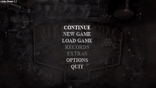
MAIN MENU
Here’s a look at the initial main menu for Conscript. I find it quite atmospheric and have found myself just keeping it on in the background while I work. The last menu for the previous demo was quite rushed so I’m happy with how this one has turned out.
ACCESSIBILITY
Recently, the topic of accessibility has been on my mind. As a developer it’s easy to find yourself resisting against a player’s ability to alter your “vision” of the game. I can understand this sentiment - as I’m somebody who holds my project VERY close to my heart. This topic was inspired by a conversation on the Conscript Discord where I was asked how accessible the game would be. My immediate internal reaction to any questions relating to adding a new unplanned feature is generally “isn’t my damn Trello board already big enough??”
After some reflection and research however, this is a silly way to look at things. Yes, any new feature takes hours or even days to implement - but that doesn’t mean it’s not worth doing. For example, as a developer I end up putting in many extra days and weeks trying to get the game on different online storefronts or even other consoles, all in hopes of trying to expose the game to more people but I would never question this time as anything but time well spent.
Accessibility is the same thing really. There are extra hours of work I can put in to ensure that MORE people can be exposed to the game and enjoy it. So that’s what I’ve been doing, even if it has meant putting extra work hours in every day for the past few weeks.
PAUSE
First, you can now visit the options menu at any time without having to go through the inventory. A tiny change, but it was requested quite a few times.
VISUAL OPTIONS
Something I wanted to solve was text readability. There are now a variety of settings to adjust different properties of the text in-game.
You can now choose between HD and pixelated fonts. Even though low-res pixel font is coherent with the general art style, it is not the most legible typeface to read. Now you can have the option to “HD-ify” the font, which makes for greater readability.

For those with dyslexia who may have trouble discerning between serif style characters, you can now opt for a simple sans-serif font style. This can also be toggled between HD or pixelated.
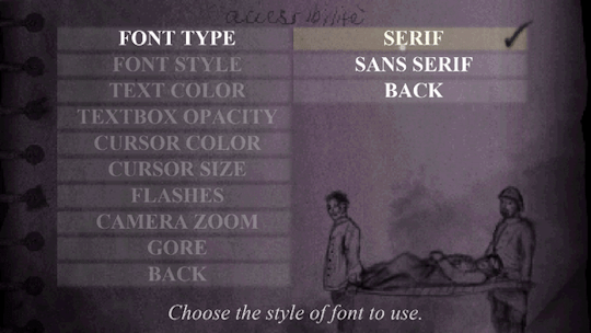
Text colour can also be changed between white, yellow, green, red or blue.

This is applied to all standard text throughout the game!
And finally, the background opacity of the standard textbox can be customised from 0 to 100. If you are struggling to discern between the text and background it may be easier to have this on 100 so the text stands more.
I feel like all these extra little options will solve the text readability issue for the majority of players. Any colour specific elements will also have non-colour related visual indicators. They are small changes but hopefully go a long way for some.
There are also some extra little visual accessibility options for those who may have trouble focusing on certain elements of the game’s artstyle. You can now zoom the camera in up close to our protagonist, and also alter cursor, crosshair and interaction icon properties such as size and colour. HUD opacity can also be lowered, but it is set to 100 by default.

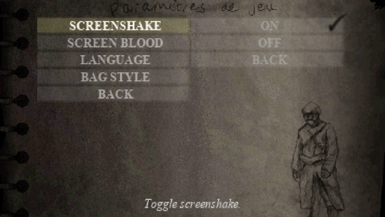
The screen blood that appears when you take damage can also be turned off now, as can any bright flashes in the game for those who are photosensitive or epileptic. For those who don’t enjoy screenshake, that can be turned off too.
It hasn’t been implemented yet, but I am working on having brightness and contrast settings too in the future. Even though the game won’t feature much voice acting, I am going to work on having subtitles available not just for voices but also for any kind of hard-to-read environmental text.
AUDIO OPTIONS
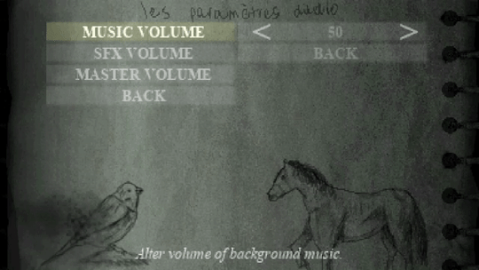
Nothing too fancy, but you can now adjust SFX, music and master volume all independently. This required a rework of the audio system so it was actually quite challenging, but happy to have it completed and working.
BLOOD TOGGLE
Blood and gore effects can now be toned down substantially, although it will be left on by default. The reason I decided to include this is because there may be some who are more interested in exploring the history of Conscript without the intense and bloody combat . In my opinion, Conscript is equal parts a history game and a survival horror game, so there will be cross pollination between those two demographics. Most of you will probably leave this on but it’s nice to have it there anyway.

DIFFICULTY MODES
During the Kickstarter campaign, we reached the stretch goal for two difficulty modes but I am going to include some extra ones in the final game. There will now be six difficulty modes in total.
Training (Assist Mode)
This mode will feature checkpoints, increased health capacity and player damage will be increased.
Recruit / Soldier / Veteran
These three will be the standard easy/normal/hard sort of thing from every other game in existence. Enemy damage and item quantity variables will be the main differences between these modes.
War Hero
This will feature more “realistic” elements from modes like Resident Evil Remake’s “Real Survival” difficulty. Item boxes will be unlinked from each other and limited saves will be mandatory. It will contain the same gameplay modifiers as Veteran mode.
Grognard (French for “old soldier”)
This ultimate challenge will include all the features of War Hero mode but with PERMADEATH. Yep, you heard right.

LIMITED SAVE TOGGLE
Limited saving has always been controversial. The reason I opted for this old-school survival horror mechanic is because it introduces a risk/reward style of gameplay where players generally try and squeeze in one extra “task” before the next save, leading to extra hard decisions being made during gameplay. Understandably, not everyone wants to deal with this though. Despite this being the intended way to play, it will an optional toggle at the start of any Conscript playthrough. Note that on the very hardest difficulties it will be mandatory however.
Here’s a look at the game parameter screen before you start a new save:
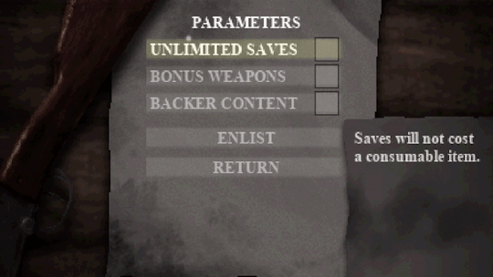
You will also have the ability to toggle off Kickstarter backer easter eggs if you so wish.
CONTROL SETTINGS
Any action that requires you to hold a button - such as aiming and running - can now be toggled with one button press instead.
Also, I’m going to implement both a quick melee and quick heal feature so that you don’t have to go into the inventory just to break some barrels or use a healing item.
You can also turn off mouse support to play the game with a keyboard only.

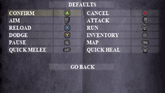
CONTROLLER REMAPPING
Full control remapping is now available for both keyboard and gamepad control schemes. This was a complicated and time consuming thing for me to implement but I’m glad to finally have it available.
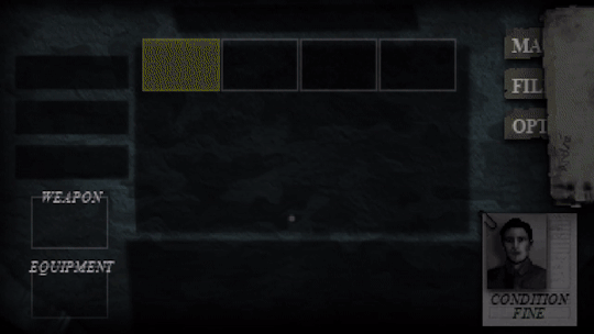
Hang on a second… did the inventory just change?
BAG STYLES
By far the biggest feature in Conscript history....
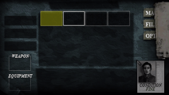
This was a fun little extra I decided to make when I was testing out the flexibility of the new options menu. Admittedly it has nothing to do with accessibility, but it is related to the options menu! You can now change the colour of the inventory background. You will be spending a lot of time there so I figured it would be cool to give some small level of customization... there may even be some extra unlockable styles in the full game! Any ideas for patterns or designs?
So that’s what I’ve been working on the past two weeks! What do you think? I know menu heavy things aren't exactly the most marketable features, but I felt it was important to share. Are there any other reasonably in-scope accessibility options you all would like to see?
20 notes
·
View notes
Text
A Quest Never Completed
Adrienne had to admit, when he committed to something, Yvarian went all out.
The wedding, although digital, was spectacular. Glowing motes of light shimmered through the air, provided by half a dozen players all using the same memento. Their friends and guildmates, who knew Adrienne only as Dria Shalla, surrounded the shrine.
Their guild channel had never been so loud. Everyone had turned out.
“Who are all these people?” Adrienne asked Yvarian as their characters walked towards the shrine. She had dug out a costume from one of their first dungeon runs together, and dyed it white. The floating dress was supposed to belong to the Queen of the Elves, and it was one of her favorite costumes even though it didn’t suit her character most of the time.
No one would be adventuring in silks after all.
“Friends,” Yvarian told her. He was laughing. She could hear him. There was some noise in the background, and Adrienne thought it might be the rest of their small guild. She kept catching an echo here and there of their actual voices on the chat. “People I’ve done favors for. Our Guild. Some are just spectators who saw something going on and decided to show up.”
“This is crazy. It’s just a little game thing.”
“Anything worth doing is worth doing right.”
“You are so extra.”
“Says the woman who was soloing the hardest world boss in the game when we met.”
That had been a good day. She wasn’t losing against that boss, not exactly, but it wasn’t a battle designed for one player alone. And then a sorcerer all in white robes showed up, blasted her with three healing spells in a row, and sent his undead army in to help.
The rest was history.
That was two years ago.
She still didn’t even know his real name.
The cleric of the Shrine stepped forward when they reached him, and the usual text popped up, asking if Adrienne accepted the Pledge. It was binding and permanent. Once they got into this, there was no going back.
She clicked (Yes).
(Your Pledge has been accepted by the gods,) the screen said cheerfully. (Your souls are now forever bound together.)
A notification went out across the public chat. (Yvarian and Dria Shalla have shared a Pledge. Their Fates are now as one.)
Their guild went wild, and everyone began firing off their fanciest attacks, a gamer’s way of celebrating. Adrienne couldn’t help but laugh, and joined them, blasting off her most powerful area spells. Yvarian chuckled over their chat, and did the same. His best was a massive-range healing spell, and for a minute, the whole screen went blue as everyone in range was blasted to full health.
“So now what?” she asked when the glow faded and people started trailing away. “Do we go on a honeymoon?”
She was mostly joking.
Yvarian didn’t laugh.
“I was thinking,” he said slowly. “That we might take a run at that couple’s quest. The big one.”
“No one’s ever managed to complete that!” Adrienne yelped. She knew the quest. It was rumored that it was cursed. A few people had tried it, but all of them vanished from the game shortly after. Rumors flew. Everything from aliens, to shame at failing, to succeeding and being taken to a private server for only the best players. Whatever else, the quest, and the achievement that went with it, remained uncompleted.
“We can do it,” Yvarian said persuasively. “We’re higher level than the last people to try, and we’ve been playing longer.”
“Are they still missing?” Adrienne had read the forums too, and she had concerns. She wasn’t superstitious by nature, but none of the people who took a run at that quest were ever heard from again, even outside the game. “I dunno, Var. It seems weird.”
“Don’t you want to be the first person ever to complete it?” he asked her, even as his sprite teleported out. He was probably going to his in-game house to resupply. It was a good idea, whatever they planned to do next, and Adrienne did the same. “We could take it on. We could be the first couple to pull it off.”
“You’re gonna be the death of me,” Adrienne complained as she got everything squared away in her house and changed her gear from the beautiful white dress, to her adventuring armor. “Yeah, okay. If we get cursed, I’m gonna kill you.”
“If we get cursed,’ Yvarian told her sincerely. “I’ll let you.”
The notification popped up.
(Do you accept the Quest of Paired Fates?)
Adrienne hesitated for a long minute, and finally, nervously, clicked (Yes)
Her vision went black, and she toppled out of her chair as she reached for something, anything, to anchor her.
She landed on something hard. Much harder than the wood floor of her dorm room.
When she opened her eyes, it was to a brilliant blue sky, towering pillars, and a ceiling that shouldn’t be familiar. She sat up, unaccustomed to the weight of leather and chainmaile, silenced and tailored to her form. It felt like a second skin, comfortable in a way nothing else had ever been.
It was her house. The house she spent hours customizing, and which had,, until moments ago, been nothing but pixels on a screen.
“Oh crap.”
+++
Cybersecurity 101
Adrienne is one of her server’s top players, but the game is more than a game, and she will have to face love, and betrayal, to survive.
Cyber Finals
For the Experience
+++
More Stories!
+++
Support me on Patreon
37 notes
·
View notes
Note
what exactly do you do for the divider? i downloaded photoscape but im so lost
1. when you go onto photoscape, go onto the editor at the top left.

2. you’ll be taken onto a screen and since you’re making a divider, i click new since i can specifically put in the dimensions i want. this is the dimension i usually use for dividers, but the preference is up to you! if you can see underneath, the background is chosen as white but my there’s no opacity. it means if you want to use pngs as dividers, that can be possible! but it makes the effort of the final creation look much easier. (keep in mind sizes are also very important. making it too small means it’ll be pixelated and making it too big might be too much)
tl;dr - click new, select dimensions, you can choose whether or not you want opacity or not, click OK

3. the four lines highlighted in blue are VERY important. when you dont have any opacity on your canvas(?) they show the outlines of it, so you don’t have to guess half of the time whether or not you’re doing something right or wrong.

3i. turning that on would look like this!

4. on the top right, you click the insert.

5. after clicking that, it’ll show a new set of icons and a row underneath, and you can play around with what you want to put in your divider here!

6. one example is a simple colour fill. to do that, you click the full square and drag it across the screen.

6i. you click the first box next to colour and select your colour there. sure, you can do it on the first step with the background thing, but it’s much nicer to see the colour on screen rather than guessing what colour you wanna see and not liking it.
(you can also do gradients too! but make sure your shape is rotated 90 degrees before doing so~)

7. if you want to use an image, you click on image (ofc).

7i. once you’ve chosen your image (make sure the preserve aspect ratio and anti-alias on to not squish or elongate your image), you can mess around position it wherever you like.

8. press save on the bottom right corner and press no, we don’t want the same image we already have lol.

9. make sure you use save as! you can use save afterwards when you look at your final product and maybe want to change it, but it’s easy to get those two confused, so i’d say using save as is easier. name it and save it wherever you like.

10. and you’re done! in regard to photoscape, you can use text and change the layer of what object/text would be where. if anyone wants that information, don’t hesitate to send me an ask! you can also edit in photoscape, but i find that a little bit harder, so i always edit on my phone using vsco or the simple edit tool on my camera before sending it to my laptop.
i hope this helps you! please tell me if you still have any questions~
final product:


6 notes
·
View notes
Text
9 Essential WEB SITE DESIGN Methods for DIY Beginners

Let’s get right down to it, shall we? Below are a few of the very most useful styles and guidelines to learn when building your first website:
1. SET ASIDE the Mouse, GRAB a Pencil
Your site may already exist as a lovely, complete entity in your mind which is the reason why you immediately leap into Photoshop (or worse, an internet browser and HTML) to plan it out. Whoa, whoa-cool your jets for another! Don’t place the cart before the equine. First, get out a pencil and pad of paper and start putting your ideas into something easily tangible. That is an important stage to map out the framework of your site using only rectangles, doodles and influenced ideas (categorized as wireframing). Things can be very tough at this time; no one’s heading to view it nevertheless, you.
It is more easily at this time to alter designs you originally thought works however now discover are cluttered and confusing in writing. This can save you many hours of disappointment instead of making the same finding after the site is coded and in a web browser. Plus, it can help significantly to create a web page when you have research at hand to seek advice from rather than moving in blind.
2. Follow a Hierarchy
It’s an undeniable fact that a lot of web surfers tend to only check out webpages rather than take time to read everything. You should be ready because of this by placing the most crucial content first. This means that a consumer can break down the most essential information on a full page all in a single screen on preliminary load, and never have to focus or scroll. That is, of course, easier said than done. Here are some tips to help you better understand the significance of the design theory:
Keep Content “Above the Collapse”
We call that preliminary display of loaded content “the fold”-and everything below it that must be scrolled to be observed is considered supplementary. Generally, your most significant information rests “above the collapse”. The crucial thing to perform within this area is to entice a consumer to do this or generate the motivation to scroll down further.
Utilizing a “Hero” Image
A common trend in web site design nowadays is to fill this “above the fold” area using what is named a “hero” image or banner. They are full-screen history images with very succinct and to-the-point overlaid text messages, usually combined with a call-to-action button. Feasibly the whole purpose of the net web page could be included within this banner area, although it also acts as a great primer for this content to follow.
“The Collapse” May Change With regards to the Device
Here’s where things become complicated-and why you shouldn’t overburden yourself attempting to match everything above this marvelous line. Concerning the user’s device, the display screen sizes could differ greatly. A jaw-dropping 5K screen has a vertical quality of 2880 pixels, whereas an iPhone 5 has not even half of this. This means that mobile users just aren’t heading to have the ability to fit as much content to their display real property. (More upon this later.)
3. Typography Is Your Design
Unless you’re owning a photography business, the text is the solitary most important component of any website, so it’s important to get this done part right. Your web page’s hierarchy is greatly reliant on the typography you select: how your headings, subheadings, and body text message follow an all-natural circulation and stay aesthetically distinctive in one another
Make sure the written text is legible (avoid flowery fonts!) and large enough (usually around 16px for your body).
Stick to only two fonts-and make sure they set well together!
Give your paragraphs some room to inhale between one another, and arranged enough top cushioning or margin on your headings to symbolize clear breaks in content.
Avoid long lines of text. It’s easier on the eye for paragraph lines to be approximately only 15 words long-and a little significantly less than that for mobile displays.
Serif fonts are usually best only in print-unless they may be found in large headlines on the net
4. Colors & Comparison Are Crucial
We’ve discussed color mindset at length, however, the idea bears duplicating. The colors you select for your website play a massive role in how users understand your brand, as well as how motivated they could feel in taking action (i.e.: buying things) through your website. Why? Well, every color evokes certain feelings, and either for their natural character or by social fitness, these colors have grown to be associated with certain types of businesses. If a children’s toy company or a financial consultant painted their whole website in the stark dark, it could send the incorrect indicators with their meant viewers. Around the flipside, a shiny orange or an enjoyable blue, respectively, would catch the perfect firmness and consciousness for his or her customers.
If you’ve already established the colors of your brand, use those on your website then. It’s best, however, to keep it at only three colors for your site; like fonts, you don’t want to overdo it here or your site could finish up with multiple personality disorder. Also, be skeptical of way too many splashes of color across your website; our eye is attracted to them like honey traps, plus they could interrupt the natural movement of your articles. Use color only once it is most needed, such as links or control keys.
In contrast, your text message must stick out from the backdrop. Using light greys, yellows or greens for your fonts will likely render them unseen on the web page. Black on the white background is the foremost combination of comparison and is normally what you ought to stick to.
Additionally, you want your text message to pop against background images. Using very occupied photos can distract from the written text, to avoid this issue either use less comprehensive photos or use an overlay of, say, rgba(51,51,51,0.5)to help soften the image within the text.
Contrast also is important in how users are attracted to certain important elements of your site. Your most significant call-to-action control keys must get attention through the use of contrasting colors. A blue “Buy Now!” button manages to lose its urgency and well worth it when it's swallowed by a niche site that uses blue everywhere-but a red button on that same web page grabs a user’s attention by shouting “Hey! Click me!”
5. Using Pictures
Deciding on the best images to use on your website partly boils down to your artistic aptitude, but there are also intellectual considerations to consider that should assist with your selection process. First of all, avoid embellishing your site with extraneous photos because they could look nice. Instead, think of how each image you utilize serves its purpose, and how it functions as content. A well-chosen picture can convey your brand, service, product, or audience a lot more effectively than words. Use photos to help your users understand something, to evoke feelings, or even to inspire trust and self-confidence; with them solely for visual reasons should be supplementary.
Understanding Document Types & Compression
There can be an extra step that must be taken for using images on the net. Those elegant photos you have from sites like Shutterstock and iStock could be very substantial (5,000+ horizontal pixels and 10+ megabytes in proportions) which is okay for printing, but they’re unfit for websites. Not everyone has superfast Dietary fiber Internet, and that means you must decrease the size of your images to support for launching times (not forgetting 40% of site visitors will leave if the website takes much longer than 3 mere seconds to weight!). Typically, you want to keep each of your images at no more than 500 kilobytes in proportions, though your average quality should of times be around 100 kilobytes.
JPEG is the typical format for photos. It is a lossy format, this means its image quality is reduced when compressed. If you’re utilizing a JPEG for a full-width history image I quickly recommend keeping its horizontal quality at a minimum of 1200px. For general purposes, stay away from any image with significantly less than 600px horizontal quality, as it'll likely show up blurry on modern displays.
PNG is the most well-liked choice for images or for images that want transparency. It is a lossless format, which is ideal for keeping image quality but may also greatly increase document sizes. Generally, you’ll use PNG images for illustrations, symbols, or smaller images that may be stacked together with other elements for their transparency. You’ll hardly ever need a PNG to be bigger than 1000px.
SVG (Scalable Vector Image) is a more recent format that is changing GIF and even PNG in some instances. SVG wonders that it could be as large or as small onscreen as you will need it to be, all while keeping perfect clearness and crispness (but still be a little quality). You should think about using SVG for just about any logo design, icon, or vector visual on your website; as high DPI shows are becoming commonplace, the sharpness of SVG provides the best image quality.
6. Mobile-First Design
We’ve now reached a period where most people consume online quite happy with their cell phones rather than on the desktop computer. As a total result, there is much larger precedence in web site design to tailor specifically to the mobile experience, which has resulted in the “mobile-first” design viewpoint.
This means that essentially, throughout your initial sketching and planning phase in some recoverable format, it is best to focus on the site’s mobile layout first. Only the most crucial content necessary for the functioning of your site will be displayed on smaller screens. This causes you to simplify your design and slice out any distracting elements immediately. Think back again to your “above the flip” content: if you first ensure that the important info can fit on the original screen of the phone, then you’ll know for several it'll fit on bigger displays. Once you’ve nailed the fundamental mobile layout, you'll be able to start adding in embellishments or bigger images for desktop displays.
Your mobile layout assumes a far more vertical design that inspires scrolling, as opposed to the wide landscape of the desktop. If, say, your product web page displays entries in a grid of 3 across on desktops, then usually your mobile layout will display them as only a single column.
Yes, which means that you essentially need to produce several layouts for every web page of your website. Fortunately, a worthwhile website contractor should provide reactive templates that change these designs automatically so you’ll then just need to fine-tune them.
7. Keep Things Aligned
When elements appear sporadically laid across your site it is often due to an alignment issue. Imagine your website on the sheet of graph paper. Individual it into even columns by sketching, for example, six right lines. You now want to ensure that the remaining sides of your elements are distributed and aligned to only these six vertical lines.
8. Keep It Simple
It is said that the best web site design moves unnoticed; it is a poor design that phone calls focus on itself. As stated earlier, the main facet of any website is merely its text message. If you can offer outstanding typography that is a joy to learn, you won’t do much more. Wanting to overdesign your site will just mess and complicate things.
Are the package shadows necessary? The crazy, ornate patterns? A large number of colors? Not probably.
9. Big Open up Spaces
Your articles need room to breathe. White space is the prevailing design choice for modern websites: wide, open up areas of nothingness to pad areas between content. It’s a far more pleasant way to process information, looked after stimulates you to eliminate superfluous text messages and images to keep carefully the site clean.
Get more advice Thought Media is a leading Chicago web design providing professional website development services, and one of the top SEO companies. The agency has worked with hundreds of clients all over the world! Creating high converting website designs, providing reliable website hosting, and successful Search Engine Optimization Marketing campaigns!
Conclusion
Web site design can be considered a sprawling field of technology to learn, ideas to practice, dialects to review, and artistry to understand. Only with experience will all of these components start to make sense, however, you already are well on the way simply by grasping the basics of why is a good website work. I am hoping that guide acts as your launching-off point, which offers you the self-confidence to consider your website into the own hands and build it just how that only a business proprietor knows best.
1 note
·
View note
Text
A Complete Beginner’s Guide to Masking in Photoshop
Several years ago a friend of mine asked me to teach him how masks work in Photoshop. This is my incredibly late response.
We’ll go over the basics of what masks are, what they’re used for and how wielding them properly will take your Photoshop skills to an entirely new level.
What Is a Mask?
Layers are probably the single most important addition to Photoshop since the original version, but layer masks are a close second. I would posit that until you thoroughly understand how and why to use masks, you simply don’t understand the power of Photoshop.
The term “mask” isn’t immediately understandable to someone outside the realm of graphic design. At its simplest definition a mask is a way to apply something to a very specific portion of an image.
There are two primary types of masks: clipping masks and layer masks. These two tools are closely related in concept, but very different in application. Let’s start by discussing layers masks, which are generally what people are referring to when you hear them discuss Photoshop masking.
Layer Masks
A layer mask is something that you apply to a given layer to control the transparency of that layer. Where layer opacity controls the transparency of the entire layer at once, a mask gives you more precise controls over very specific areas. If you want the entire layer to be at 30%, you would lower the opacity, if you want just the left side of a layer to be at 30%, you would use a mask.
When you add a mask to a layer, it covers the entire thing with an invisible grayscale canvas. There are ways to see it that we’ll check out later but just know that as a general rule, applying a mask to a layer won’t cause any immediate visual differences unless you have an active selection at the time.
On this invisible canvas, you can paint white, black or any level of gray in-between. The color that you paint tells Photoshop how opaque to make the pixels at that point. White means 100% opacity and black means 0% opacity.
With this in mind, try to imagine what the mask below would do to a layer:
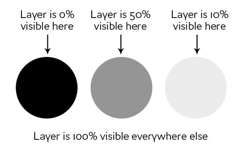
As you can see, if our mask was all white with the three circles shown above, we would have a completely visible layer where in all the white areas, and spots of transparency in the circles. If we apply this mask to a layer, this is the result:
Clipping Masks
Clipping masks are very similar to layer masks only they use one layer to determine the transparency of another. In this scenario, you stack two layers on top of each other with the bottom being the determining factor of the transparency of the top.
Instead of using black and white values though, clipping masks simply borrow transparency from the layers used to make them, namely the bottom layer. If the bottom layer has some areas that are opaque and some areas that are transparent, a clipping mask will apply these values to the top layer.
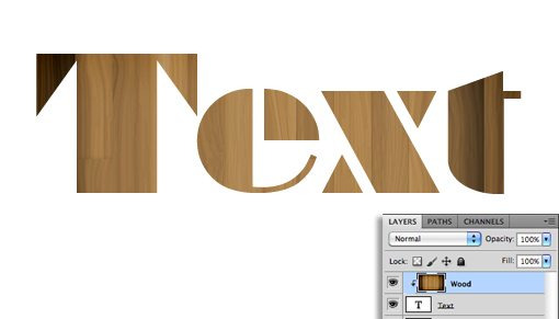
This one is hard to explain without an example, but becomes crystal clear when you see it in action. Let’s use the two layers shown below and say that our goal here is to cut or “clip” the wood layer to be in the shape of the letters. Notice that, at this point, the wood is the bottom layer and the text is the top layer.

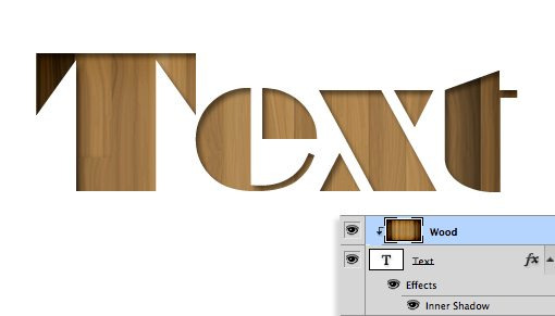
To achieve the effect that we want, simply swap the position of the layers so that the wood is on the top, then go to the Layers menu at the top of your screen and select “Create Clipping Mask” (Command-Option-G). Voila, we now have the effect we were going for. Where the text layer was opaque, the wood layer is now opaque and where the text layer was transparent, the wood layer is now transparent.
There’s some really interesting functionality here. You can still position and make changes to each of the two layers independently. By dragging around the wood layer, you move the position of the texture inside the bounds of the letters while the letters themselves stay stationary.
Also, you can apply layer effects to the compilation via the bottom layer. For instance, here’s what happens if we select the text layer and add an Inner Shadow.
Clipping masks fun, functional and underrated, but the truth is that layer masks are far more common in every day use. The information above should be enough to get you off and running with clipping masks so from here on out we’ll focus purely on layer mask functionality.
How Do I Make a Layer Mask?
Now that we have a strong grasp of exactly what masks are and how the two different types of masks differ, let’s see how to create and work with a layer mask.
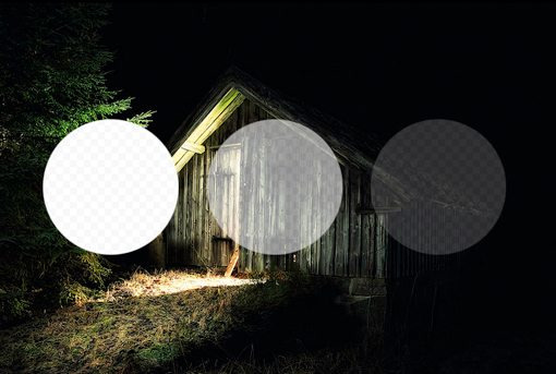
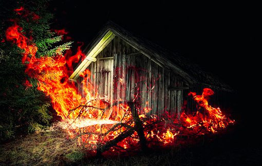
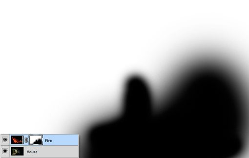
The first thing we need is two layers. I grabbed the two images below from photographers Adrian Durlea and Erik Soderstrom. The shack image is on the bottom and the fire is on the top.

The general idea here is to take some, not all, of the fire and apply it to the shack. The first step is to stack the two images as we see above and set the fire layer’s blending mode to Screen. This will make all of the black pixels transparent, which blends the two images together nicely.
With that one change, this is already a pretty decent image! Let’s say though that we want to only have fire near the door of the shack. To accomplish this, we’ll need to add a mask to the fire layer. Select the fire layer and click the mask icon shown in the image below.
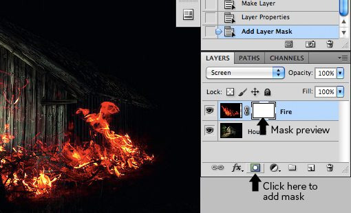
Now, with the mask selected in the layers palette, we grab a soft, black brush and paint out the portions of the fire that we don’t want to see. As we do this, the fire begins to disappear. To bring it back, we simply paint white.
As you can see in the image below, with just a little painting, our fire is now much more centralized to the portion of the image that’s already lit up and therefore looks decently natural.
To see the actual mask, Option-Click (Alt-Click on a PC) on the little mask preview in the layers palette (Shift-click to hide the mask completely). After painting out some of our fire, this brings up the following:
Notice that we’re not just constrained to hard edges. The beauty of masks is that you can do anything you want with them as long as you can pull it off in values of gray. This means you can paint, clone, create and fill selections, copy and paste, and all kinds of other actions you perform on the main canvas.
Why Not Just Erase?
Upon first learning how to use masks, most rookies think the same thing: “I can already do all of this with the eraser tool.” Wrong! In fact, as far as I’m concerned, once you learn to mask, you should literally never pick up the eraser tool again because it tends to be so destructive.
What do I mean by destructive? Think about what happens when you use the eraser tool: it erases pixels. Mind you, it doesn’t hide them for a while until you want them back, it “destroys” the pixels. The changes that you make by deleting portions of a layer are permanent and can’t exactly be tweaked later.

This is simply a horrible way to work. With every new iteration of Photoshop, Adobe gives us more and more ways to make non-destructive edits, meaning those that don’t truly alter the original pixel data. For instance, Filters used to be a permanent and destructive change, if you blurred a layer, it was stuck that way! Now, with Smart Filters, you can always go back and adjust or even delete the blur.
This same concept gave birth to masks many years ago. With a mask, you not only have the ability to make remarkably detailed decisions about the transparency of a layer or group of layers, even better, you have the freedom to go back and refine or scrap those changes at any time. If I had erased my fire in the example above, it would be gone forever and bringing it back would involve importing the layer all over again. However, because I used a mask, all I have to do is fill that mask with white and immediately all of my fire detail returns.
To use the metaphor of an actual mask, imagine that you want to change your appearance for Halloween. You have two options: the first is to undergo plastic surgery to permanently change your face to look like that of a scary creature and the second is to wear a mask. In this scenario, the eraser tool is plastic surgery. It’s simply a bad choice when you’re not sure that you want the changes to be permanent. Go with the mask instead.
Advanced Masking Techniques
The information above is an absolute beginner’s guide to masks. Odds are, if you’ve been using Photoshop for a while, not a single piece of this was news to you. In fact, you may be thinking that masks are so incredibly simple that they barely merit conversation.
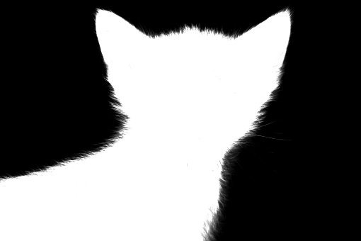
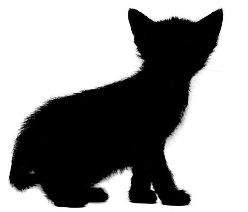
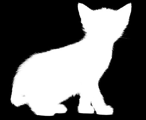
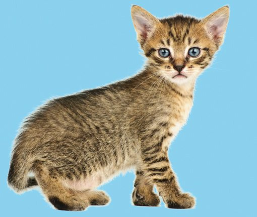
However, masking techniques go from simple to wickedly complex really fast. It’s easy enough to paint some broad strokes to erase large portions of an image, but what if you want to do something more complex? For instance, let’s say we want to take the cat below off of its white background.

Furry animals make particularly difficult masking subjects. All of that fine hair detail means making an accurate selection will be time consuming. The Magic Wand or even the Pen Tool are of no use to us here. So how do the pros start with the image above and create a mask like the one below?
If you’re ready to find out, keep reading as we undertake this feat!
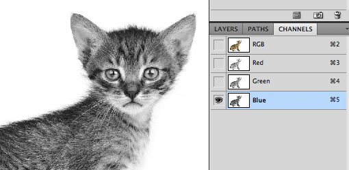
Change the Channel
The good news about the cat image is that there is plenty of contrast to work with. The key to making a good mask is finding contrast and knowing how to pull it out. Here we have a fairly dark cat on a bright white background, which means all we have to do is figure out how to leverage our good fortune and convert the contrast already present into a suitable mask.
The first step in a project like this is to jump over to the Channels Palette and look for the channel with the most contrast. So in our case, we want the channel with the darkest cat and the brightest background, which turns out to be the blue channel.
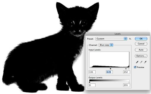
Make a copy of the blue channel, select it and hit Command-L to bring up a Levels Adjustment. Darken the shadows and the midtones so that there is a crazy amount of contrast like in the image below. Be careful to no go too far with this adjustment. You’ll want to zoom in and watch the hair detail on the fringes of the fur to make sure you’re not clipping too much. It doesn’t have to be perfectly black and white at this point, some dark grays are acceptable.
At this point you encounter one of the trickiest steps of the entire process. The goal is to get as much of the cat as closest to black as you can. This is easy for the face potions and other random spots near the center, just grab a black brush and fill them in. But what about the edge of the hair?
It turns out one of the best ways to handle this task is to use a couple of unlikely candidates: the Dodge and Burn Tools. The reason these work so well is that they can accurately target certain ranges of gray extremely accurately. I set the Dodge Tool to target the highlights and the Burn Tool to target the shadows, grab a medium size soft brush and make my way around the edges of the image, burning shadows and dodging highlights until I like the level of detail that I’m seeing.

This may sound like a time-intensive task, and it can be for some images, but in truth the Dodge and Burn Tools feel like magic when you’re using them and take much of the work out. I was able to come up with a great looking silhouette in only a minute or two.
Once you’re done here, hit Command-Shift-I to inverse the channel so that the cat is white and the background is black like in the image below. Remember that, in masking, white is opaque and black is transparent.
Converting the Channel to a Mask
Now that we have a channel that accurately represents what we want from a mask, how do we convert it? There are a few ways to do this but the easiest is just to Command-click on the channel to load a selection. With a selection loaded, return to your cat layer and click the New Mask button. That’s all there is to it!
Defringing the Mask
As you can see, despite a super detailed mask, we still have some white fringing occurring around the edges. Getting rid of this can literally take hours of tedious work if you don’t know what you’re doing. For starters, we can use the fantastic new Masks Palette in conjunction with Refine Edge to make some live adjustments to our mask.
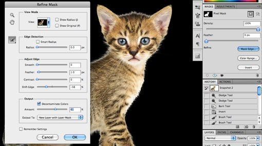
Utilizing these tools properly takes practice. I won’t cover them closely now because it would take so much time but I encourage you to dig in and play with all of the controls to get a feel for what they do. Often, you can patch up a rough edge in seconds with these sliders, but with our cat project I wasn’t really getting any results that I liked so I cancelled out this operation altogether.
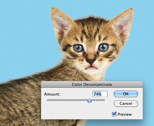
Instead, I went to the Layer menu at the top of the screen and selected Matting>Color Decontaminate. This is an almost hidden command that has the ability to yield some amazing results. As you can see in the image below, it went a long way toward reducing our halo. Note that this command is actually destructive so you should always duplicate your layer before using it.
From here, the last trick I use is to look for problematic areas and actually run the clone brush over the fringes. The mask keeps everything looking nice and cloning replaces unnatural colors with those from the actual fur of the cat in other places. Compare the back and head of the cat in the image below to that above to see the improvement.

Finishing Up
From here it becomes a factor of how much time you want to spend refining your result. With complicated masks like these there is always room for improvement but you’ll find that the point of diminishing returns on your time spent becomes easier and easier to spot as your skill level improves.

The technique we just discussed is just to give you a taste of how advanced masking can become. There are a ton of different types of images to mask and therefore a million different tricks and techniques to figure out along the way which can be mixed and matched on a per-project basis. Practice makes perfect, just be bold and never become intimidated by a masking job that seems too complex. Think through the process one step at a time and find ways to pull out the detail you need.
Conclusion
To sum up, there are two primary types of masks in Photoshop: layer masks and clipping masks. Layer masks use values of gray to assign levels of transparency to specific portions of a layer or group of layers while clipping masks use the transparency of one layer to define that of a different layer or group of layers.
Also, while masking in simple in concept, the actual art takes considerable time, education and practice to master. Leave a comment below and let us know if you learned anything from the information above. Also be sure to share any unique masking techniques or tricks you might have!
Photo Credits: Adrian Durlea, Erik Soderstrom, and Sergiu Bacioiu.
4 notes
·
View notes
Text
Give Me A Try (New Chapter)
Gay Instagram Model/Bartender Phan AU Part 3
(Part One)
(Part Two)
(Read on Ao3!)
Dan’s in the middle of his break, scrolling through his phone, when a text notification appears at the top of his screen. He drops his bagel into his lap, cursing.
The text is from Phil. He doesn’t know any other Phil’s, so it has to be AmazingPhil, texting him, inexplicably.
He clicks the notification, eyes wide, simultaneously scooping up the bagel bits that have fallen onto his knees.
From: Phil To: Dan im in makeup for a weird photoshoot for some korean clothing brand and they just put loads of silver goo in my hair to make it chromey
As Dan is reading the message, searching between the lines for a reason Phil might be telling him this information, another text pings through.
From: Phil To: Dan whoops, i kinda meant to send that to PJ. but hey, if you’re interested, here’s a pic of me with ‘Kpop Idol Silver Hair Paste’ in lol xx
From: Phil To: Dan [image]
The phone slips from Dan’s fingers, clattering through his legs to the floor of the staff room. Phil has sent him a selfie. An un-edited, un-Instagrammed photo of his breathtaking face, up close. Sure, there’s a weird silvery goop in his usually raven hair, but still. Gingerly, Dan retrieves the phone, a small, strangled sound escaping from his throat as he surveys the image in front of him.
It makes a little more sense now that Phil has informed him that he had actually mistakenly texted the original message, but did the guy really have to follow up with a photo? He must, surely, be aware of Dan’s crush. He witnessed the brunt of Dan’s obsessive stalking in person on his phone, after all.
Bagel entirely forgotten, Dan just stares down into the pixelated blue of Phil Lester’s eyes, wondering how to respond, and if he even should. Deciding eventually that it would be rude not to, Dan shakily types out something he hopes is vaguely witty.
From: Dan To: Phil hahaha wow :’) kpop? more like kpoop. (it looks like bird poop, sorry dude.) x
From: Phil To: Dan hahaha it does ur so right. and if you think thats bad you should see the outfits… xx
Settling back into his chair, Dan bites his lip. As he thinks of a potential response, his eyes wander over to the spot, just to the right of him, where he and Phil had stood not long ago, when it had seemed like maybe, possibly, Phil might’ve…
But obviously that’s absurd.
Dan’s wishful thinking had clearly driven him to the point of hallucination, because the very notion that Phil Lester, AmazingPhil, the famous Instagram model, would ever have looked at Dan as anything more than a random bartender, is laughable.
Dan sighs to himself, then smirks. Well, just because he has no chance, doesn’t mean he can’t utilise his semi-connection to the celebrity to get some behind-the-scenes footage of his fave.
From: Dan To: Phil well now i have to see x
There’s a noticeable pause, and Dan wonders, panicking vaguely, if he may have pushed too far. Is it a little much to ask this of Phil? Maybe he just won’t respond, and Dan will have to quit his job forever, or maybe just spend his shifts on red alert that Phil will wander into the bar, and hide from him if he does-
He texts back.
From: Phil To: Dan [image]
From: Phil To: Dan hot, right? xx
For two long, uninterrupted minutes, Dan is frozen. Then, he lets out a muffled groan of frustration. The photo Phil sent is a full body shot taken by someone else; he’s dressed in an asymmetrical long white t-shirt with several long rips through the chest, some bright pink camouflage trousers, and a shiny silver puffer jacket with a black fur-lined hood. The outfit is a complete disaster, but it doesn’t matter in the slightest. His chest is visible through the slits in the tee; having seen it twice now IRL, Dan is drawn to the slivers he can see. The trousers make his eyes pop, and the jacket matches the silver streaked through his hair.
His pose is casual, feet apart, smirking at the camera, with his hands gesturing to his body as if to say ‘see what i mean?’. If he’d posted this on his Instagram, Dan gets the feeling he’d have saved it to his camera roll anyway, maybe even made it his phone background.
Dan’s done that with a few of his favourite photos of Phil in the past. He won’t even dwell on the time when Phil posted a photo of himself in the bath and Dan, in a semi-sleep-deprived fit of insanity, printed the photo out and stuck it on his wall.
Tyler came over once, weeks later, saw the photo taped above Dan’s bed, and tore the thing down. He’d told Dan, quite rightly, to stop being such a creep and keep his crazed obsessive behaviour to social media like everyone else.
“Who even has physical photos these days?? You’re like a fucking serial killer!”
Dan chuckles at this memory. He’s glad for Tyler, sometimes, even if he’s only good for keeping Dan’s stalkerish behaviour within the realms of normalcy.
Belatedly, he realises it’s been over five minutes and he still hasn’t responded to Phil. Also, his break is close to being over.
From: Dan To: Phil woww. please, phil of the future, tell me what life is like in 2087 x
From: Phil To: Dan stawwp. i keep laughing out loud at what ur saying and now the designer is sending me death glares :’’’D xx
Trying hard to ignore the fact that his dorky jokes are apparently literally making Phil ‘lol’, Dan checks the time, and sighs, typing out another message.
From: Dan To: Phil is the designer a martian? or maybe secretly one of those reptile-people? maybe skin him just to be safe. also my break is over so i gtg. have fun on set of NASA’s moonlanding recreation x
From: Phil To: Dan aww ur at work too? that sux. i forgot that u work at night lol. hope u stay dry this evening ;) xx
From: Dan To: Phil speaking of… why are u at work? isnt it kind of late for a photoshoot? x
From: Phil To: Dan well its 8am here so no haha xx
From: Dan To: Phil where are you? x
From: Phil To: Dan seoul :) hence the… unusual fashion lol xx
Dan’s eyebrows shoot up his forehead. He stands from his chair, throws his half eaten bagel in the trash, and looks around himself. He’s in the staff room - a small, dusty space with a row of falling apart lockers, a couple of chairs and a small table. There’s a hook on the wall which holds a load of unused aprons, and a rusty heater for when it’s especially cold.
He’s about to go back out to serve a load of rowdy customers some overpriced cocktails, then mop a dancefloor sticky with sweat, alcohol, and whatever other liquids might have found their way there. Then, he’s going to go back to his crummy flat way across in Kemptown, unfold his sofabed, and fall asleep to Netflix.
Phil, on the other side of the world in Korea, is having his hair, makeup and wardrobe done by professionals. He’s being treated like a celebrity, no doubt, and pampered excessively. Later, he’ll receive high-definition, professional photographs of himself looking gorgeous, and post them to his Instagram, where millions of people will tell him how stunning he looks.
Dan sighs to himself. How the other half lives.
*
The following day, Dan wakes up to find that Phil has updated his Instagram story, and posted the photo with the silver goo in his hair. The same one he’d sent to Dan. The caption reads:
Not sure silver hair was a good idea! The designer was going for Kpop, but ended up with Kpoop… can’t wait to show you guys the photos from this shoot! xx
Two things cross Dan’s mind.
First, Dan can now officially state that he had a sneak-peek at an official AmazingPhil photo before it was posted.
Second, the bitch totally stole his joke.
He smiles to himself ruefully, then decides to leave a comment. There’s no way that Phil will even see it - he’s never seen any of Dan’s others, or at least Dan sincerely hopes he hasn’t, as they’re mostly things like ‘choke me’ or ‘slap me round the face with your yaoi hands dad’.
Okay, maybe he tends to leave those sorts of comments when he’s less than sober.
This time, Dan just taps out a simple:
danisnotonfire: joke stealing is a low form of theft phil smh ;)
Still smiling to himself, Dan rolls over onto his side, and settles in to watch Phil’s story. The stories are usually long, silly, and full of adorable clips of Phil being clumsy and cute. As expected, this one is no exception. It’s a tour of Phil’s hotel room in Seoul, which is very posh.
Phil exclaims over the origami hand towels on his bed, the robe provided for him in the wardrobe, and the multiple options on the ‘disco shower’ as he calls it. Just as Dan is marvelling at the panoramic shot Phil has filmed of his view from the balcony, a notification pings at the top of his screen.
amazingphil replied to your comment: joke stealing is…
Dan sits bolt upright in bed, the sheets falling off him. He runs a hand through his messy hair, eyes wide. He clicks the notification before it disappears, heart pounding.
Oh no, oh no, oh no. Dan hadn’t intended for him to actually see. What if Phil thinks he’s being rude? He doesn’t actually mind Phil stealing his stupid joke about the hair goo. It’s an honour, if anything, that Phil finds his dumb joke good enough to post as a caption millions of people will read.
Heart thrumming, Dan finds the response Phil left.
danisnotonfire: joke stealing is a low form of theft phil smh ;)
amazingphil: @danisnotonfire aha i was kinda hoping you wouldn’t see ;D
Another notification pings at the top of his screen.
amazingphil started following you
“Holy shit,” Dan says to nobody.
amazingphil liked your photo
“Fuck,” Dan squeaks, clutching his pillow for support. “Stop it Phil, I’m gonna have a heart attack.”
Curious, Dan clicks the last notification, wondering which photo it was that Phil pressed the little heart for. To his surprise, it’s a selfie, one he took at work around a month ago. He took it during a lull between serving, if he remembers correctly. The lighting hadn’t been awful when he was doing his hourly fringe check in his phone camera, so he’d snapped a pic. It’s nothing special, just a moody expression and a wash of pink lighting across one half of his face.
amazingphil commented on your photo
amazingphil: nice pout ;) xx
Dan falls back into the pillows, mind obliterating itself into a thousand, tiny pieces.
*
Over the next few weeks, Dan has several text conversations with Phil. They’re usually started by Phil himself, who will - out of what Dan assumes is boredom - sometimes send him a random meme, a musing about his surroundings, or a selfie. For obvious reasons, Dan prefers the latter.
No matter how many times Phil reaches out via text, the surreality of it never fails to send Dan’s mind freewheeling. It always knocks the wind out of his lungs, it always makes him stop dead in his tracks, and it always leaves him struggling to recover for the next few hours. Whenever this happens at work, Tyler never fails to tease him mercilessly.
“Whoops! Please excuse him, sir, his mind has been blended by a single text from his crush,” Tyler tells a customer the fifth time Dan drops a glass behind the bar.
Dan scowls at his friend, but doesn’t try to defend himself. It’s true, after all. One text from Phil has him behaving like a moron. He becomes physically inept, unable to make the simplest drink.
One night, after the bar has closed, Dan and Tyler are cleaning up.
“So when’s he gonna stop torturing you over text and come sweep you off your beer-drenched tootsies?”
Dan rolls his eyes at this. “He’s not, Ty. He’s a rich and famous superstar, and I’m clearing up puke for the third day in a row.”
Dan wrinkles his nose as he continues mopping up the patch of vomit. He’s suspicious at this point; three days in a row is unusual. Is the same person coming in each night and spewing their guts all over the dance floor out of spite? Perhaps it’s some sort of hate crime.
“It’s like a Cinderella story!” Ty exclaims, pirouetting around his broom. “Except it’s gay, which makes it even better.”
Dan scoffs at him. “I’m pretty sure fairytales don’t involve stalking someone over social media and having them find out. He’s just taking pity on me because he saw that first night that I’m a fan.” Dan dunks the mop back in the bucket, turning to Tyler. “Besides, I’m pretty sure he has a boyfriend.”
Tyler sucks in a scandalised breath. “What! Who?”
Dragging the mop back to the supply closet, Dan laughs. “Remember the drunk guy he came with? The one who gave me a lovely Rainforest shower?”
“Him?”
Dan sighs, locks the cupboard, and nods. He digs into his pocket for his phone, and brings it over to show Tyler the photo of Phil and Charlie kissing. Matt, the security guard wanders over to see as well, letting out a low whistle.
“He’s a nonce if he thinks that guy’s behaviour was attractive,” Matt says. “He puked ‘soon as I got him out the door that night. All over the pavement.”
Dan looks at Matt, tilting his head in interest. “He did?”
Tyler plucks the phone out of Dan’s hand, zooming into the photo to have a better look, a frown on his face.
“Yep, your friend there came out, called him an Uber and sent him off,” Matt says. “Doubt pukey there would’ve made it home without him.”
“Nice guy,” Dan mutters, cheeks warm.
“This is staged,” Tyler announces abruptly.
“What?”
“Look,” he says, bringing the phone back over for Dan to see.
He zooms in on the crux of the kiss, right onto Phil’s face. Dan grimaces.
“Ty, I don’t want to see-”
“Shut up and look at his face,” Tyler interrupts, grabbing Dan’s chin and angling it towards the phone. “See how his lips are puckered? All stiff and pointed, like he’s kissing his grandma. And his eyes are open.”
“He’s looking at the camera!”
“Nah, Tyler’s right mate,” Matt says. The gum he’s chewing is making gross squishy sounds right in Dan’s ear as he leans over to look. “He looks awkward as hell.”
Dan narrows his eyes at the photo, trying to see what the others see.
“Besides, didn’t you say he hated that guy?” Tyler asks, clicking off the photo.
Dan tuts, snatching his phone back. “Well, apparently he was just being nice to compensate for the fact his kissing buddy covered me in sugary cocktail.”
He makes the smart decision to step away from this preposterous conversation before he does something stupid. Like allow either of these morons to give him hope that Phil is actually single.
Not that Phil being single would even matter.
“Or he was making it clear that he’s available!” Tyler calls after him as Dan stalks over to the staff room. “He whipped his shirt off for you twice and gave you his number. Do you think he’d do that if he had a boyfriend?”
“Drop it, Ty!” Dan calls back, shutting the staff room door behind him.
He will not let himself fall into the trap of daring to believe he could get someone as gorgeous, as hilarious, as pure and… amazing, as Phil Lester.
He won’t.
*
This is a good philosophy, in theory.
In practise, it turns out to be a lot more difficult. Dan finds this out to his cost when Phil strolls into Habenero the following Friday with Charlie Hickory at his side. Dan’s stomach sinks as soon as he sees the pair, the butterflies that appear each time Phil so much as acknowledges exploding into dust the moment he registers who Phil is here with.
Phil makes a beeline for the bar, a big smile on his face as he sees Dan. Warily, Dan smiles back, very aware that he is not exactly Charlie’s biggest fan.
“Dan!” Phil sings, chipper as ever.
Blushing already, Dan waves an awkward hand. He will never, he’s sure, get used to hearing his name on Phil Lester’s lips. “Hi. You’re back.”
“Of course! This is my local hangout now,” Phil says, winking. “Great cocktails, cute bar staff, crazy Bingo nights… this place has got it all.”
“Some people might not agree with you about the cocktails,” Dan can’t help himself saying, glancing at Charlie.
Charlie shuffles awkwardly on the spot. “Right,” he says, casting a look at Phil. They share a look that seems loaded with something Dan is not privy to, and then Charlie sighs, turning to Dan. “I wanted to, uh, apologise. About last time. Totally not cool of me to… tell you off like that. I was wasted.”
For an awkward moment, Dan waits for the actual word ‘sorry’ to leave Charlie’s mouth. It becomes obvious fairly swiftly that the dude feels he’s already said enough, so Dan just gives him a tight smile, and clears his throat.
“Oh, yeah man,” he says. “Let’s just… move on, I guess.”
If Charlie won’t say sorry, then Dan’s sure as hell not going to say he forgives him.
“So, drinks?” Phil asks, seeming to sense the taut atmosphere. “Maybe not cocktails?”
Dan can’t help the splutter of laughter, but Charlie shoots a dagger-like glare Phil’s way. It makes Dan’s lip curl; how could anyone be angry with Phil, of all people?
“Maybe some beers?” Dan suggests, teeth clenched. “We have a load of craft beers, or if you’re more into spirits I could make you guys a-”
“I’ll have a vodka and light tonic, no ice,” Charlie interrupts. “A double. If you use regular tonic, I will know.”
“Charlie,” Phil hisses under his breath.
They exchange another loaded look, and again Charlie sighs, turning to Dan with a fake smile. “Please.”
Swallowing the urge to roll his eyes, Dan nods, then gladly turns his attention to Phil. “And for you?”
“Oh,” Phil says, like it’s only just occurred to him that he needs to order as well. “God, I’m so bad at deciding, err…”
As he’s dithering, Charlie sighs. “Are you cool to get these, Phil? I’m gonna go find us a table.”
“You don’t wanna dance?”
“Not in the mood.”
Phil nods, obviously disappointed. “Okay, yeah, I’ll meet you in the back.”
With that, Charlie is gone, slipping into the crowd. The look of distaste must be more evident on Dan’s face than he thinks, because Phil laughs at it.
“I know,” Phil says. “But he does have a few… marginally amiable qualities.”
‘Why have you chosen to be with someone that’s marginally amiable when you’re so great,’ is what Dan wants to ask. Instead, he simply shrugs, deciding to change the subject.
“Have you decided on a drink yet? I’d better get on with making his low-cal dishwater.”
Phil laughs a little, then leans forwards, his smile deepening as he leans across the bar. “Surprise me.”
Something sparks a roman candle in Dan’s stomach, and his skin prickles with the heat it creates. He drags his eyes free of Phil’s with some difficulty, nodding, and turns to make the drinks.
He prepares Phil a ‘PopQueen’ cocktail, which is one of their most popular. It’s inspired by popcorn, along with the trio of Pop Queens that rule the gay music scene: Gaga, RiRi, and Bey. The moscato vodka base is made from Italian grapes to represent Gaga’s heritage, the spiced rum is a shoutout to Bey’s favourite drink, and Riri comes in in the form of a smoky splash of passion fruit bitter. The rest is topped up with popcorn syrup, lemonade, a sprinkle of caramel popcorn kernels, and as many sparkly cocktail sticks as Dan can fit in.
He explains the whole concoction to Phil as he presents it, a little smug because he knows this is an impressive looking cocktail. It’s probably his favourite one to make; the Viniq shimmery moscato vodka makes the drink swirl and shimmer - always exceptionally pretty.
Sure enough, Phil’s mouth drops open at the sight of it. “Okay wow,” Phil says, chuckling. “I’m gonna get drunk tonight, aren’t I?”
“If that’s your plan, this should definitely help you on your way,” Dan says, laughing too. “I wouldn’t recommend having a second if you want to remember your evening.”
Phil leans forwards to take a sip of the PopQueen, moaning around the straw, much to Dan’s dismay. He plucks one of the popcorn pieces off and eats it, eyes closed. In related news, Dan struggles not to fall to the floor. “Dan, you are an artiste,” Phil says. “Popcorn is my all time favourite food.”
“Oh, wow, that’s... lucky, I guess,” Dan stammers, a swell of pride surging up into his chest. “Glad you like it.”
“So, how much?”
“Oh, on the house.” Dan smiles, sliding the cocktail across the bar along with Charlie’s vodka tonic. “I feel bad for not letting you in on the forfeit for Bingo last time.”
The look on Phil’s face softens into something so sweet Dan can taste sugar on his tongue.
“You don’t have to do that,” Phil says softly.
“It’s fine, really,” Dan assures him, all but sliding his elbows across the bar towards him. “I insist.”
A twitch in the corner of Phil’s mouth, and then he’s leaning across the bar. It happens slowly, but Dan still manages to be caught off guard. One moment, he’s watching, bemused, as Phil inches towards him, and the next there’s a light press of paper-soft lips to his cheek. A scratch of stubble grazes over Dan’s skin as Phil leans away.
“Thanks,” Phil tells him, smiling. “You’re sweet, Dan.”
And then he’s turning away, drinks in hand, slipping into the mass of people.
*
For the next few hours, Dan hopes for Phil to return to the bar for another round. He waits, eagerly, for this moment to come. Instead, Charlie is the one who brings his and Phil’s glasses back over, and waves to flag down Dan’s attention.
He nods in acknowledgement, finishing up the drinks order he’s in the middle of, and sidling over to Charlie. He forces a strained smile.
“Same again?”
“Yeah,” Charlie says, digging out his phone. “And a couple of vodka shots.”
He says nothing else, eyes glued to his phone screen. Dan waits for a moment before moving off, eyes stuck to Charlie’s face. He’s the kind of gorgeous that shouldn’t exist in real life. Unblemished, tanned skin. Clean, dark stubble, lacing his perfect, razorblade jawline. His hair is a swoop of glossy mahogany; even the cut of it looks expensive.
Charlie’s eyes flick up to Dan’s, obviously questioning why he’s staring, so Dan nods, embarrassed, and hurries to make the drinks. From a superficial standpoint, it’s obvious why Phil is with Charlie. Obviously, in Dan’s eyes, Phil is the most attractive man on the planet, but that’s just because he’s Dan’s type. Even he can tell that Charlie is objectively a beautiful human being.
It’s just a shame about everything below the surface level.
Dan pours the two shots Charlie ordered. “All together it’s twenty pounds, please.”
Charlie snorts, then pockets his phone at last. “Figures you’d give Phil the discount.”
He pulls out a twenty and slaps it on the counter.
“Sorry, I can’t give you guys free drinks all night.”
Charlie just stares back at him, a faint, knowing smile caught on his dusty pink lips. One of this thick eyebrows is slightly quirked, sliding an irritation under Dan’s skin. “Listen, Danny, is it?”
“Dan,” he grits.
“Dan,” Charlie says, leaning across the bar. “A little advice, yeah? Don’t be so transparent. It just comes across as pathetic.”
He downs both the shots in quick succession, baffling Dan, who is frozen, mortified, to the spot. Before his brain can thaw enough to stammer out some witty rebuttal, Charlie has swept the drinks off the counter, and is moving away.
Cheeks burning, Dan turns around, trying to calm his boiling blood. He squeezes his fists together, counting to ten, the way he makes himself after all encounters with dickhead customers.
“Hey, sweetcheeks, can we get some drinks over here, please?”
With a deep sigh, Dan unclenches his fists, and turns to the next customer.
*
At around one in the morning, Dan runs to the bathroom for a minute, and on his way, he sees Charlie. He’s against the wall of the club, near the DJ booth. There’s a muscular, dark-skinned man pressing him there; their faces are close. Dan can’t stop, he’s left Tyler and Dodie to the mercy of the drunks in their worst state - things get rowdy an hour before closing - and he needs to get back there. So, instead, he simply tucks the image away in his mind, to think about later on.
That man, leant against Charlie in a less-than-innocent seeming stance, was certainly not Phil, after all. As he exits the bathroom, he notices that Charlie is gone, as is whoever was with him.
*
At 1:55am, the lights come on. As usual, an enormous groan chants out of the crowd of patrons on the dance floor, followed by a few pairs awkwardly stepping out of the shadows, some squinting and eye-covering, and the slow, jelly-legged walk to the coat-check area.
“I think I just saw some guy getting up off his knees in the corner,” Tyler says despondently. “Shotgun not mopping the floor tonight.”
“Oh for fuck’s sake,” Dan sighs. “On the dance floor? Really? Why can’t they suck each other off in the bathroom like normal people?”
“Oh, there were definitely people doing that in one of the stalls about an hour ago,” someone says to Dan’s right. The voice, for some reason, sends the hairs up on the back of Dan’s neck.
He turns, wondering when Matt’s voice got so low, only to find that Phil has perched himself on one of the bar stools, the dregs of his cocktail still in a glass in front of him. For a moment, Dan is too stunned at the sight of him to reply. Then, he registers that the lights are on, and cringes, knowing he likely looks frightful. Phil, of course, looks radiant as ever even under the harsh fluorescents, apart from a faint tiredness, visible in the dark circles underneath his eyes.
“You’re still here,” Dan comments. “I thought you guys had gone.”
“Charlie left,” Phil says, looking away from Dan. “Or I assume he did.”
Out of sight, Tyler catches Dan’s eye, making an obscene gesture with his hands before snickering and running off in the direction of the supply closet. Dan just glares after him, pink-cheeked, and turns back to Phil.
“Wait, he left without telling you?”
One of Phil’s shoulders moves towards his neck, then falls. “He does that.”
“Wow that’s… kind of shitty.”
As soon as the words are out, Dan regrets them. He can’t help but think of Charlie’s comment from earlier; it rings in his ears as if the guy had screamed it at him.
Don’t be so transparent. It just comes across as pathetic.
He was right, probably, though Dan had hated hearing it. He should stop being such a suck-up. It must be awkward and cringey for Phil to see Dan so obviously smitten.
Still, Phil throws him a faint smile. “It’s cool. He’s just a flaky guy. A bit of a princess. He grew up rich, so he’s always been a bit superficial. I’m trying to wring the bourgeoisie out of his blue blood.”
Dan snorts with laughter. “In my experience, you can’t filter the dickishness out of people very easily.”
There’s a silence, then. Phil regards him with a faintly curious expression.
“Maybe I’m wrong,” Dan says once the silence gets too uncomfortable. He shrugs, grabbing the rag from his back pocket and starting to wipe down the bar. “I don’t know the guy, really. I’ve just had a couple of unfortunate experiences with him.”
“Oh no,” Phil says, face falling. “What did he do this time?”
Dan laughs, bitterly. “Don’t worry about it. He’s just a little mouthy, is all.”
“Ugh, I’m sorry.”
“Nothing I can’t handle.”
“So, when do you get to leave this place?” Phil asks, playing with his glass. He still hasn’t drunk the remainder of his cocktail. “Or do you sleep here?”
“On weekdays, the bar closes at two, so I get out of here at around two-thirty.”
“Christ,” Phil mutters. “And I thought my job was long hours.”
A laugh bursts out of Dan’s throat, but he covers it as best he can with a cough, turning away. Busying himself with ‘dusting’ some liquor bottles, Dan tries to compose a straight face. Is Phil honestly going to try and argue that his job is difficult? When was the last time that guy ever grabbed a broom, or handled someone’s sticky change?
In a minute, Dan is going to go into the corner of the dance floor, get down on his knees, and clean up some randomer’s come. A few weeks ago he saw Phil swanning about a five-star hotel in Korea. If AmazingPhil’s worst complaint is that he had to have a few questionable outfit choices put on him, and some silvery goo in his hair, then he needs a reality check.
Nevertheless, Dan knows that he can’t say any of this. Not only would he never dream of insulting Phil Lester, but it’s pointless to try and explain the differences between classes to someone in a privileged position. They’ve usually forgotten how to understand.
“Are you close by, at least?” Phil asks, interrupting Dan’s thoughts.
Dan turns back to him. “Kemptown. It’s half an hour’s walk, more or less.”
“You walk?” Phil asks, eyebrows skyrocketing towards his quiff. “At two in the morning?”
“Five in the morning on weekends,” Dan confirms, hiding a smile at Phil’s surprise. “It’s okay, you get used to it. Besides, it’s mostly just drunk idiots chugging cans of cider and threatening to run into the sea. Not too scary.”
Despite Dan’s reassurance, the look of pity and concern on Phil’s face doesn’t subside. After a while, Dan turns from it, feeling awkward. He busies himself with clearing away the last of the empty glasses, yawning into the crook of his elbow. Tonight was rough.
“You should crash at mine,” Phil blurts.
Sure he must have misheard, Dan faces Phil slowly. “Um, what?”
“If you’re exhausted, I mean.” Phil fidgets, fingers tapping against his glass. “Like, on the nights you can’t face walking all the way home, you can totally just sleep on my sofa.”
Speechless, Dan simply stares.
“The couch is pretty comfy,” Phil continues in a ramble, not meeting Dan’s eye. “And my flat is just up the road, literally like a minute away. I’m not saying, y’know, come over every night, ‘cause obviously… that might be an issue, but you can absolutely stay round on, say, Saturday nights when you finish later. That wouldn’t be a problem.”
He’s just being nice. That’s Dan’s only explanation. Phil Lester is a sweetheart of a person, and he got so worried about the hypothetical danger involved in Dan’s walks home, that he offered something big, even though he didn’t really mean it.
Dan is a stranger to him. He needs to decline the polite offer, and let Phil off the hook he accidentally created to string himself up on.
So, Dan forces out a small chuckle, and says: “Oh, no, it’s really fine. Thanks for the offer, that’s really good of you, but I quite like the walk. It’s a nice come down after a busy night.”
Phil nods, chewing his lip. He looks unconvinced. “I’m not just saying it, though.” His voice has dropped to a lower tone. “Like tonight… you’re so tired, I can see it. Just grab some sleep at mine before you head back across town.”
As soon as Phil mentions it, the quilt of his own exhaustion flops around his shoulders, dragging Dan’s bones towards the floor. He tries to picture the stumble back to his crummy flat in Kemptown, loathing each imaginary step.
“You barely know me,” Dan says - one last attempt at refusal.
Sensing he’s won, Phil smiles very slightly, then downs the rest of his cocktail at last. “I don’t know if it’s just me, Dan, but I have this feeling that we’re going to be good friends.”
(Part 4!)
231 notes
·
View notes
Text
Arcade Game Progress
Gonna get the current problems out of the way first, the numbers are mismatched with the rest of the font. I tried to make a font but when uploading the characters the site just wasn’t allowing it and didn’t give a clear answer as to why. I redid the sheets many times in different sizes and formats but nothing worked sadly, so all text aside from the numbers are sprites rather than text typed in the engine itself. Procreate was the easiest thing for me to use as I have more experience using it and I am more comfortable drawing on an iPad rather than a computer, while it meant I could animate and draw better it did mean that the image sizes were smaller than ideal and most things look rough and vaguely pixelated in Unreal. This isn’t too much of a bother as the style is supposed to be messy and with most things being rough they all fit together which I guess sorts that out a bit but either way it is still a bit disappointing.
Current problems aside, there was a lot of stuff that was added and fixed. For a while I was stuck on the background, initially I wanted it to be grey so that everything could be seen and so that the colour wasn’t too out of place in terms of it’s surroundings and also with how it fits into the space theme. At one point a bright colour was suggested, so I went with that, however the initial colour was way too out of place and way too bright. While it was nice on it’s on, it was hideous when lumped together with everything going on with the game.

The colour was changed to a more purple hue which seemed to fight better as it didn’t completely stray from the accidentally established warm colour palette. It certainly worked better than the blue, and it did stick for a while although it was mainly as a placeholder. While it was more fitting that the blue, I still wasn’t fond of it despite it being a nice colour within itself. It was suggested by someone else to change the sky to black, which is something I wanted to avoid otherwise I would have done it from the get go. The ants, the outlines and the widget backgrounds are all black so making the background the same would render them invisible and awkward to see. I ended up changing the sky to an off-black, however everything was a bit too difficult to see so a second background was made to go behind the other backgrounds and draw attention to them and help them to be seen better. The ants are still hard to see as well as the boost bar, but everything is looking better than it did. I am still unsure about the sky colour, but it’s an improvement from the blue at least.

The ants are more difficult to see, but at least their jetpacks are visible, right?

As you can see from the first comparison, Garden Chair is facing the wrong way. He is supposed to start horizontally like shown in the attract screen but being the chaotic gremlin he is, a simple task of rotation has been proven to be impossible. I have had three experienced people try to fix it thinking it will be a quick and easy thing to solve but not a single person succeeded and there is no reason for the solutions not to work. There is a plausible solution being that when rotating the character and the controls rotate to simply rebind the controls but that was a bit of a stupid solution to that problem so I was advised against it.

You can see the font change mentioned before in these two comparisons.

The outline of the bar isn’t too important, it is still visible without it so the background doesn’t pose much of an issue to that specifically, the only problem right now seems to be the ants so it might be an idea to change their colour to a lighter grey maybe?

Looking at the attract screens I think I should move the animation down a bit, which would be a bit annoying to do but I think it will look a lot better in the end.


The white borders help the widgets to feel more finished and the black background feels a lot more space-like and a bit more fitting, so I’m inclined to keep the black background over the purple.
Another issue that was found with the background colour was with the anteater’s tongue not being visible either. I opened all the frames that feature the tongue in photoshop and changed the colour to a light pinkish red by adding a new layer and setting it to clipping mask.
I initially wanted to avoid using colours at all costs in order to make it look more like those messy paper animations or something of the like but half of that idea was essentially scrapped in favour of visibility and convenience. It still looks good though so not much was sacrificed.

There were quite a number of problems with my code as expected (I can never escape the curse of broken and sometimes unsolvable code it seems), the health, the camera jerking when overlapping the ants, some flipbooks being smaller than others despite being made in the same canvas, etc, etc. The flipbooks were easy to solve, however it was a pain when I had to upload forty images to discord twice as the first time they for whatever reason didn’t export transparent. It was just a case of importing all of the frames onto the same canvas again, moving a few of the images and lining them up and then doing the same on photoshop afterwards to be safe. Aside from the amount if time it took because of the wifi, it wasn’t too tedious.
The health was a pain to deal with multiple times, when I was first making the animations the opacity wasn’t working, so setting all of them to zero didn’t work for whatever reason so I spent time changing the opacities of twenty four images in seven different animations to achieve a frame by frame animation in widget form. It didn’t help that I forgot about the fact that you can change how abrupt the changes of the animations occur so there was more changes than needed when I tried to manually make it abrupt albeit it worked it was just overly long winded. When setting up the animations to play, two of them were not recognised and didn’t work until all of the animations were recreated in a less non winded way when the opacities decided they were going to cooperate.

Above is the overly complicated animation for the hearts where every image had to have their opacity changed every single time and the switch between opacities used two very abrupt dots instead of one. Below is the new animations with less frames needing to be messed with each time and less shapes being needed to be added, they only needed to be switched to something else.

When that was solved the problems didn’t end, however. Despite the animations telling the widgets to hide when they weren’t needed, all of the animations layered on top of each other when they appeared. In order to fix this I put a background behind every four sprites in the widget blueprint that was set to appear when it’s respective animation did, this hid the previous animations and while they are technically still there in the game, the player cannot see them. I don’t know if that fix is contributing to the current problems but I believe it is something to do with the timing more than anything else. Occasionally when taking damage, the wrong animation will be looping but overall the health works as it should despite that. Sometimes the health will deplete to zero immediately but I am unsure whether the player happened to be bombarded with ants then making the health drop not faulty but it is unclear. On the topic of being bombarded with ants, I found out that Garden Chair can become immortal. It only happened once, but when he was on one heart he was bombarded but about ten ants at once and instead of the health dropping to zero it disappeared altogether. I was not away that the health widget could completely vanish like that but it did. Garden Chair was not dead, and every time they got hit the damage animation still played but no matter what this anteater would never die. Furthermore with the player not being able to die, the ants just kept spawning, and eventually there were so many that formed a massive ant sphere in the middle of the game and doing anything or merely breathing would make the game struggle. I never put a limit on how many ants spawned in order for the difficulty of survival to increase, however I never anticipated this darn anteater to become immortal. Garden Chair started as a cute little no thoughts head empty character but it’s starting to seem more like they are a force of pure chaos and borderline deity.
With the camera jerking upon colliding with ants, a few solutions were tried and failed including reducing the collision for the ants and the anteater to zero however the issue still occurred. It was theorised that the issue lay with the floor and the actors falling through it but in the end the problem turned out to be the camera arm, once the collision for that was reduced to zero all was fixed.

Above is the old animation for Garden Chair eating the ants, it worked for a while and initially Garden Chair wasn’t supposed to move when eating the ants as I wanted there to be a detriment to doing that just so it discouraged the player from constantly holding down left click. The abrupt stop didn’t look overly great so it was changed to the player going noticeably slower than normal. Of course that then looked weird again because then the anteater was moving forward without moving their legs which technically isn’t in character (the whole reason they move their legs at all is because they think that that is what is allowing them to move in space when in reality it is the jetpack, Garden Chair maybe be turning out to be an evil mastermind but that doesn’t mean their common sense is great). Furthermore the movement or rather lack there of looked to stiff and awkward so I redid it to include the legs moving in a more paddling motion rather than a walking motion to try and help tie in with the fact that they are going slower, I don’t know how well I did with that but the animation looks better than it did nonetheless.

Something that surprised me was that the amount of code used in the arcade game was about four times as much as what what used in the first person project, although I guess that’s to be expected when the last project I did was blatantly less and simpler than the one before and after it.

I am very aware of the state of my code, and in my defense I am literally a Webb, it’s in my blood to make structures that resemble as such. I have a habit of making things needlessly complicated and having a warped perception of what would be the easiest solution or way about something so this is nothing out of the ordinary. I think an accurate comparison of how my code looks compared to how code should ideally look is the same difference as there is between the old London Underground map and the present one:


After playtesting the game again I figured out that the cause of the animations looping at the wrong time is caused by two ants attacking at once, I also found that the player gets and extra life that way. Basically the ants are just as much of an issue as Garden Chair is themselves, as they can mess with the laws of mortality and mess up animations.
I tried messing around with the length of the delays how ever that seemed to only create more problems, the main one being that the transition between one heart and another was on loop when it shouldn’t be. Despite liking having the animations of the heart breaking, I decided that they were too much trouble to deal with and that the delays didn’t help how they looked at all so I took them out. There is still a one second delay between the remaining heart animations but now it doesn’t look nearly as awkward. Every time an ant hits the anteater, the health goes down by one once rather than point five twice which probably helped with the iffyness of the animations. The animations seem to be working fine now, however the ants can make that annoying to test. Despite moving randomly, having multiple ants hit the player at the same time is hardly uncommon and it is annoying for both a testing standpoint and a playing standpoint. I tried giving the player a very short duration of immunity between hits but it has been proven to mess quite a bit up instead of pose a solution, I might try it again at some point if reducing the rate at which red ants turns proves to be unhelpful.
Changing the rate at which ants turn and stay red helped to make everything less chaotic, there was an issue with the damage flipbook repeating on either one or two hearts but never both. At the end of each check for damage and heart animation trigger I added a set to walk flipbook which seemed to clear up any repeating issues, furthermore I changed the colour of the ants so they too could be seen against the background and with that fix I think that solves all the colour related problems.

Now only one problem seems to be remaining which surprise surprise is the animations. The repetitiveness of the damage flipbook was dealt with but now the duration of said flipbook varies for some reason. There are times where it plays out normally with no issues, but most of the time the second flipbook and sometimes the third barely plays and I am unsure as to why.
0 notes
Text
Taming Blend Modes: `difference` and `exclusion`
Up until 2020, blend modes were a feature I hadn’t used much because I rarely ever had any idea what result they could produce without giving them a try first. And taking the “try it and see what happens” approach seemed to always leave me horrified by the visual vomit I had managed to create on the screen.
The problem stemmed from not really knowing how they work in the back. Pretty much every article I’ve seen on the topic is based on examples, comparisons with Photoshop or verbose artistic descriptions. I find examples great, but when you have no clue how things work in the back, adapting a nice-looking demo into something that would implement a different idea you have in your head becomes a really time-consuming, frustrating and ultimately futile adventure. Then Photoshop comparisons are pretty much useless for someone coming from a technical background. And verbose artistic descriptions feel like penguin language to me.
So I had a lightbulb moment when I came across the spec and found it also includes mathematical formulas according to which blend modes work. This meant I could finally understand how this stuff works in the back and where it can be really useful. And now that I know better, I’ll be sharing this knowledge in a series of articles.
Today, we’ll focus on how blending generally works, then take a closer look at two somewhat similar blend modes — difference and exclusion — and, finally, get to the meat of this article where we’ll dissect some cool use cases like the ones below.
A few examples of what we can achieve with these two blend modes.
Let’s discuss the “how” of blend modes
Blending means combining two layers (that are stacked one on top of the other) and getting a single layer. These two layers could be two siblings, in which case the CSS property we use is mix-blend-mode. They could also be two background layers, in which case the CSS property we use is background-blend-mode. Note that when I talk about blending “siblings,” this includes blending an element with the pseudo-elements or with the text content or the background of its parent. And when it comes to background layers, it’s not just the background-image layers I’m talking about — the background-color is a layer as well.
When blending two layers, the layer on top is called the source, while the layer underneath is called the destination. This is something I just take as it is because these names don’t make much sense, at least to me. I’d expect the destination to be an output, but instead they’re both inputs and the resulting layer is the output.
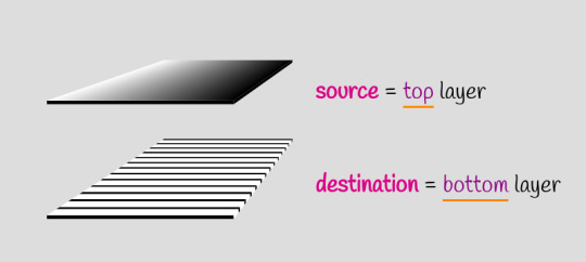
Blending terminology
How exactly we combine the two layers depends on the particular blend mode used, but it’s always per pixel. For example, the illustration below uses the multiply blend mode to combine the two layers, represented as grids of pixels.
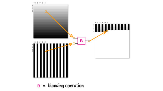
How blending two layers works at a pixel level
Alright, but what happens if we have more than two layers? Well, in this case, the blending process happens in stages, starting from the bottom.
In a first stage, the second layer from the bottom is our source, and the first layer from the bottom is our destination. These two layers blend together and the result becomes the destination for the second stage, where the third layer from the bottom is the source. Blending the third layer with the result of blending the first two gives us the destination for the third stage, where the fourth layer from the bottom is the source.
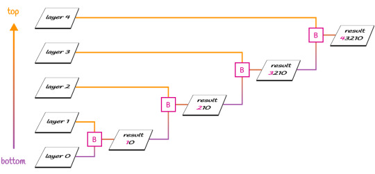
Blending multiple layers
Of course, we can use a different blend mode at each stage. For example, we can use difference to blend the first two layers from the bottom, then use multiply to blend the result with the third layer from the bottom. But this is something we’ll go a bit more into in future articles.
The result produced by the two blend modes we discuss here doesn’t depend on which of the two layers is on top. Note that this is not the case for all possible blend modes, but it is the case for the ones we’re looking at in this article.
They are also separable blend modes, meaning the blending operation is performed on each channel separately. Again, this is not the case for all possible blend modes, but it is the case for difference and exclusion.
More exactly, the resulting red channel only depends on the red channel of the source and the red channel of the destination; the resulting green channel only depends on the green channel of the source and the green channel of the destination; and finally, the resulting blue channel only depends on the blue channel of the source and the blue channel of the destination.
R = fB(Rs, Rd) G = fB(Gs, Gd) B = fB(Bs, Bd)
For a generic channel, without specifying whether it’s red, green or blue, we have that it’s a function of the two corresponding channels in the source (top) layer and in the destination (bottom) layer:
Ch = fB(Chs, Chd)
Something to keep in mind is that RGB values can be represented either in the [0, 255] interval, or as percentages in the [0%, 100%] interval, and what we actually use in our formulas is the percentage expressed as a decimal value. For example, crimson can be written as either rgb(220, 20, 60) or as rgb(86.3%, 7.8%, 23.5%) — both are valid. The channel values we use for computations if a pixel is crimson are the percentages expressed as decimal values, that is .863, .078, .235.
If a pixel is black, the channel values we use for computations are all 0, since black can be written as rgb(0, 0, 0) or as rgb(0%, 0%, 0%). If a pixel is white, the channel values we use for computations are all 1, since white can be written as rgb(255, 255, 255) or as rgb(100%, 100%, 100%).
Note that wherever we have full transparency (an alpha equal to 0), the result is identical to the other layer.
difference
The name of this blend mode might provide a clue about what the blending function fB() does. The result is the absolute value of the difference between the corresponding channel values for the two layers.
Ch = fB(Chs, Chd) = |Chs - Chd|
First off, this means that if the corresponding pixels in the two layers have identical RGB values (i.e. Chs = Chd for every one of the three channels), then the resulting layer’s pixel is black since the differences for all three channels are 0.
Chs = Chd Ch = fB(Chs, Chd) = |Chs - Chd| = 0
Secondly, since the absolute value of the difference between any positive number and 0 leaves that number unchanged, it results in the corresponding result pixel having the same RGB value as the other layer’s pixel if a layer’s pixel is black (all channels equal 0).
If the black pixel is in the top (source) layer, replacing its channel values with 0 in our formula gives us:
Ch = fB(0, Chd) = |0 - Chd| = |-Chd| = Chd
If the black pixel is in the bottom (destination) layer, replacing its channel values with 0 in our formula gives us:
Ch = fB(Chs, 0) = |Chs - 0| = |Chs| = Chs
Finally, since the absolute value of the difference between any positive subunitary number and 1 gives us the complement of that number, it results that if a layer’s pixel is white (has all channels 1), the corresponding result pixel is the other layer’s pixel fully inverted (what filter: invert(1) would do to it).
If the white pixel is in the top (source) layer, replacing its channel values with 1 in our formula gives us:
Ch = fB(1, Chd) = |1 - Chd| = 1 - Chd
If the white pixel is in the bottom (destination) layer, replacing its channel values with 1 in our formula gives us:
Ch = fB(Chs, 1) = |Chs - 1| = 1 - Chs
This can be seen in action in the interactive Pen below, where you can toggle between viewing the layers separated and viewing them overlapping and blended. Hovering the three columns in the overlapping case also reveals what’s happening for each.
CodePen Embed Fallback
exclusion
For the second and last blend mode we’re looking at today, the result is twice the product of the two channel values, subtracted from their sum:
Ch = fB(Chs, Chd) = Chs + Chd - 2·Chs·Chd
Since both values are in the [0, 1] interval, their product is always at most equal to the smallest of them, so twice the product is always at most equal to their sum.
If we consider a black pixel in the top (source) layer, then replace Chs with 0 in the formula above, we get the following result for the corresponding result pixel’s channels:
Ch = fB(0, Chd) = 0 + Chd - 2·0·Chd = Chd - 0 = Chd
If we consider a black pixel in the bottom (destination) layer, then replace Chd with 0 in the formula above, we get the following result for the corresponding result pixel’s channels:
Ch = fB(Chs, 0) = Chs + 0 - 2·Chs·0 = Chs - 0 = Chs
So, if a layer’s pixel is black, it results that the corresponding result pixel is identical to the other layer’s pixel.
If we consider a white pixel in the top (source) layer, then replace Chs with 1 in the formula above, we get the following result for the corresponding result pixel’s channels:
Ch = fB(1, Chd) = 1 + Chd - 2·1·Chd = 1 + Chd - 2·Chd = 1 - Chd
If we consider a white pixel in the bottom (destination) layer, then replace Chd with 1 in the formula above, we get the following result for the corresponding result pixel’s channels:
Ch = fB(Chs, 1) = Chs + 1 - 2·Chs·1 = Chs + 1 - 2·Chs = 1 - Chs
So if a layer’s pixel is white, it results that the corresponding result pixel is identical to the other layer’s pixel inverted.
This is all shown in the following interactive demo:
CodePen Embed Fallback
Note that as long as at least one of the layers only has black and white pixels, difference and exclusion produce the exact same result.
Now, let’s turn to the “what” of blend modes
Here comes the interesting part — the examples!
Text state change effect
Let’s say we have a paragraph with a link:
<p>Hello, <a href='#'>World</a>!</div>
We start by setting a few basic styles to put our text in the middle of the screen, bump up its font-size, set a background on the body and a color on both the paragraph and the link.
body { display: grid; place-content: center; height: 100vh; background: #222; color: #ddd; font-size: clamp(1.25em, 15vw, 7em); } a { color: gold; }
Doesn’t look like much so far, but we’ll soon change that!

What we have so far (demo)
The next step is to create an absolutely positioned pseudo-element that covers the entire link and has its background set to currentColor.
a { position: relative; color: gold; &::after { position: absolute; top: 0; bottom: 0; right: 0; left: 0; background: currentColor; content: ''; } }

The result we now have with the pseudo-element on the link (demo)
The above looks like we’ve messed things up… but have we really? What we have here is a gold rectangle on top of gold text. And if you’ve paid attention to how the two blend modes discussed above work, then you’ve probably already guessed what’s next — we blend the two sibling nodes within the link (the pseudo-element rectangle and the text content) using difference, and since they’re both gold, it results that what they have in common — the text — becomes black.
p { isolation: isolate; } a { /* same as before */ &::after { /* same as before */ mix-blend-mode: difference; } }
Note that we have to isolate the paragraph to prevent blending with the body background. While this is only an issue in Firefox (and given we have a very dark background on the body, it’s not too noticeable) and is fine in Chrome, keep in mind that, according to the spec, what Firefox does is actually correct. It’s Chrome that’s behaving in a buggy way here, so we should have the isolation property set in case the bug gets fixed.

The mix-blend-mode: difference effect (demo)
Alright, but we want this to happen only if the link is focused or hovered. Otherwise, the pseudo-element isn’t visible — let’s say it’s scaled down to nothing.
a { /* same as before */ text-decoration: none; &::after { /* same as before */ transform: scale(0); } &:focus { outline: none } &:focus, &:hover { &::after { transform: none; } } }
We’ve also removed the link underline and the focus outline. Below, you can now see the difference effect on :hover (the same effect occurs on :focus, which is something you can test in the live demo).

The mix-blend-mode: difference effect only on :hover (demo)
We now have our state change, but it looks rough, so let’s add a transition!
a { /* same as before */ &::after { /* same as before */ transition: transform .25s; } }
Much better!

The mix-blend-mode: difference effect only on :hover, now smoothed by a transition (demo)
It would look even better if our pseudo grew not from nothing in the middle, but from a thin line at the bottom. This means we need to set the transform-origin on the bottom edge (at 100% vertically and whatever value horizontally) and initially scale our pseudo to something slightly more than nothing along the y axis.
a { /* same as before */ &::after { /* same as before */ transform-origin: 0 100%; transform: scaleY(.05); } }

The mix-blend-mode: difference effect only on :hover, now smoothed by a transition between a thin underline and a rectangle containing the link text (demo)
Something else I’d like to do here is replace the font of the paragraph with a more aesthetically appealing one, so let’s take care of that too! But we now have a different kind of problem: the end of the ‘d’ sticks out of the rectangle on :focus/:hover.

The problem illustrated: the end of the “d” sticks out when we :focus or :hover the link (demo)
We can fix this with a horizontal padding on our link.
a { /* same as before */ padding: 0 .25em; }
CodePen Embed Fallback
In case you’re wondering why we’re setting this padding on both the right and the left side instead of just setting a padding-right, the reason is illustrated below. When our link text becomes “Alien World,” the curly start of the ‘A’ would end up outside of our rectangle if we didn’t have a padding-left.
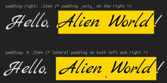
Why we have padding on both lateral sides (demo)
This demo with a multi-word link above also highlights another issue when we reduce the viewport width.

The problem with multi-line links (demo)
One quick fix here would be to set display: inline-block on the link. This isn’t a perfect solution. It also breaks when the link text is longer than the viewport width, but it works in this particular case, so let’s just leave it here now and we’ll come back to this problem in a little while.

The inline-block solution (demo)
Let’s now consider the situation of a light theme. Since there’s no way to get white instead of black for the link text on :hover or :focus by blending two identical highlight layers that are both not white, we need a bit of a different approach here, one that doesn’t involve using just blend modes.
What we do in this case is first set the background, the normal paragraph text color, and the link text color to the values we want, but inverted. I was initially doing this inversion manually, but then I got the suggestion of using the Sass invert() function, which is a very cool idea that really simplifies things. Then, after we have this dark theme that’s basically the light theme we want inverted, we get our desired result by inverting everything again with the help of the CSS invert() filter function.
Tiny caveat here: we cannot set filter: invert(1) on the body or html elements because this is not going to behave the way we expect it to and we won’t be getting the desired result. But we can set both the background and the filter on a wrapper around our paragraph.
<section> <p>Hello, <a href='#'>Alien World</a>!</p> </section>
body { /* same as before, without the place-content, background and color declarations, which we move on the section */ } section { display: grid; place-content: center; background: invert(#ddd) /* Sass invert(<color>) function */; color: invert(#222); /* Sass invert<color>) function */; filter: invert(1); /* CSS filter invert(<number|percentage>) function */ } a { /* same as before */ color: invert(purple); /* Sass invert(<color>) function */ }
CodePen Embed Fallback
Here’s an example of a navigation bar employing this effect (and a bunch of other clever tricks, but those are outside the scope of this article). Select a different option to see it in action:
CodePen Embed Fallback
Something else we need to be careful with is the following: all descendants of our section get inverted when we use this technique. And this is probably not what we want in the case of img elements — I certainly don’t expect to see the images in a blog post inverted when I switch from the dark to the light theme. Consequently, we should reverse the filter inversion on every img descendant of our section.
section { /* same as before */ &, & img { filter: invert(1); } }
Putting it all together, the demo below shows both the dark and light theme cases with images:
CodePen Embed Fallback
Now let’s get back to the wrapping link text issue and see if we don’t have better options than making the a elements inline-block ones.
Well, we do! We can blend two background layers instead of blending the text content and a pseudo. One layer gets clipped to the text, while the other one is clipped to the border-box and its vertical size animates between 5% initially and 100% in the hovered and focused cases.
a { /* same as before */ -webkit-text-fill-color: transparent; -moz-text-fill-color: transparent; --full: linear-gradient(currentColor, currentColor); background: var(--full), var(--full) 0 100%/1% var(--sy, 5%) repeat-x; -webkit-background-clip: text, border-box; background-clip: text, border-box; background-blend-mode: difference; transition: background-size .25s; &:focus, &:hover { --sy: 100%; } }
Note that we don’t even have a pseudo-element anymore, so we’ve taken some of the CSS on it, moved it on the link itself, and tweaked it to suit this new technique. We’ve switched from using mix-blend-mode to using background-blend-mode; we’re now transitioning background-size of transform and, in the :focus and :hover states; and we’re now changing not the transform, but a custom property representing the vertical component of the background-size.
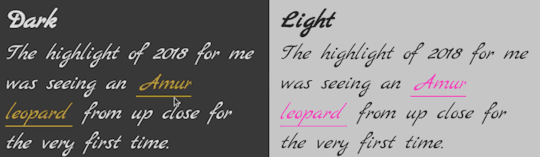
The background layer blending solution (demo).
Much better, though this isn’t a perfect solution either.
The first problem is one you’ve surely noticed if you checked the caption’s live demo link in Firefox: it doesn’t work at all. This is due to a Firefox bug I apparently reported back in 2018, then forgot all about until I started toying with blend modes and hit it again.
The second problem is one that’s noticeable in the recording. The links seem somewhat faded. This is because, for some reason, Chrome blends inline elements like links (note that this won’t happen with block elements like divs) with the background of their nearest ancestor (the section in this case) if these inline elements have background-blend-mode set to anything but normal.
Even more weirdly, setting isolation: isolate on the link or its parent paragraph doesn’t stop this from happening. I still had a nagging feeling it must have something to do with context, so I decided to keep throwing possible hacks at it, and hope maybe something ends up working. Well, I didn’t have to spend much time on it. Setting opacity to a subunitary (but still close enough to 1 so it’s not noticeable that it’s not fully opaque) value fixes it.
a { /* same as before */ opacity: .999; /* hack to fix blending issue ¯_(ツ)_/¯ */ }
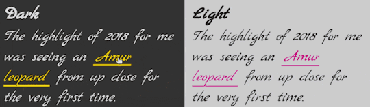
Result after fixing the blending issue (demo)
The final problem is another one that’s noticeable in the recording. If you look at the ‘r’ at the end of “Amur” you can notice its right end is cut out as it falls outside the background rectangle. This is particularly noticeable if you compare it with the ‘r’ in “leopard.”
I didn’t have high hopes for fixing this one, but threw the question to Twitter anyway. And what do you know, it can be fixed! Using box-decoration-break in combination with the padding we have already set can help us achieve the desired effect!
a { /* same as before */ box-decoration-break: clone; }
Note that box-decoration-break still needs the -webkit- prefix for all WebKit browsers, but unlike in the case of properties like background-clip where at least one value is text, auto-prefixing tools can take care of the problem just fine. That’s why I haven’t included the prefixed version in the code above.
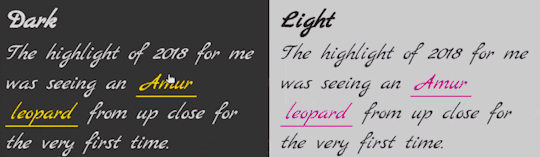
Result after fixing the text clipping issue (demo).
Another suggestion I got was to add a negative margin to compensate for the padding. I’m going back and forth on this one — I can’t decide whether I like the result better with or without it. In any event, it’s an option worth mentioning.
$p: .25em; a { /* same as before */ margin: 0 (-$p); /* we put it within parenthesis so Sass doesn't try to perform subtraction */ padding: 0 $p; }
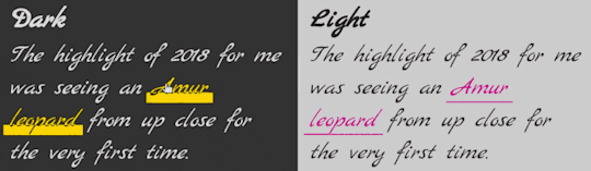
Result when we have a negative margin compensating for the padding (demo)
Still, I have to admit that animating just the background-position or the background-size of a gradient is a bit boring. But thanks to Houdini, we can now get creative and animate whatever component of a gradient we wish, even though this is only supported in Chromium at the moment. For example, the radius of a radial-gradient() like below or the progress of a conic-gradient().
Bubble effect navigation (demo)
Invert just an area of an element (or a background)
This is the sort of effect I often see achieved by either using element duplication — the two copies are layered one on top of the other, where one of them has an invert filter and clip-path is used on the top one in order to show both of layers. Another route is layering a second element with an alpha low enough you cannot even tell it’s there and a backdrop-filter.
Both these approaches get the job done if we want to invert a part of the entire element with all its content and descendants, but they cannot help us when we want to invert just a part of the background — both filter and backdrop-filter affect entire elements, not just their backgrounds. And while the new filter() function (already supported by Safari) does have effect solely on background layers, it affects the entire area of the background, not just a part of it.
This is where blending comes in. The technique is pretty straightforward: we have a background layer, part of which we want to invert and one or more gradient layers that give us a white area where we want inversion of the other layer and transparency (or black) otherwise. Then we blend using one of the two blend modes discussed today. For the purpose of inversion, I prefer exclusion (it’s one character shorter than difference).
Here’s a first example. We have a square element that has a two-layer background. The two layers are a picture of a cat and a gradient with a sharp transition between white and transparent.
div { background: linear-gradient(45deg, white 50%, transparent 0), url(cat.jpg) 50%/ cover; }
This gives us the following result. We’ve also set dimensions, a border-radius, shadows, and prettified the text in the process, but all that stuff isn’t really important in this context:

The two backgrounds layered
Next, we just need one more CSS declaration to invert the lower left half:
div { /* same as before */ background-blend-mode: exclusion; /* or difference, but it's 1 char longer */ }
Note how the text is not affected by inversion; it’s only applied to the background.

Final result (demo)
You probably know the interactive before-and-after image sliders. You may have even seen something of the kind right here on CSS-Tricks. I’ve seen it on Compressor.io, which I often use to compress images, including the ones used in these articles!
Our goal is to create something of the kind using a single HTML element, under 100 bytes of JavaScript — and not even much CSS!
Our element is going to be a range input. We don’t set its min or max attributes, so they default to 0 and 100, respectively. We don’t set the value attribute either, so it defaults to 50, which is also the value we give a custom property, --k, set in its style attribute.
<input type='range' style='--k: 50'/>
In the CSS, we start with a basic reset, then we make our input a block element that occupies the entire viewport height. We also give dimensions and dummy backgrounds to its track and thumb just so that we can start seeing stuff on the screen right away.
$thumb-w: 5em; @mixin track() { border: none; width: 100%; height: 100%; background: url(flowers.jpg) 50%/ cover; } @mixin thumb() { border: none; width: $thumb-w; height: 100%; background: purple; } * { margin: 0; padding: 0; } [type='range'] { &, &::-webkit-slider-thumb, &::-webkit-slider-runnable-track { -webkit-appearance: none; } display: block; width: 100vw; height: 100vh; &::-webkit-slider-runnable-track { @include track; } &::-moz-range-track { @include track; } &::-webkit-slider-thumb { @include thumb; } &::-moz-range-thumb { @include thumb; } }

What we have so far (demo)
The next step is to add another background layer on the track, a linear-gradient one where the separation line between transparent and white depends on the current range input value, --k, and then blend the two.
@mixin track() { /* same as before */ background: url(flowers.jpg) 50%/ cover, linear-gradient(90deg, transparent var(--p), white 0); background-blend-mode: exclusion; } [type='range'] { /* same as before */ --p: calc(var(--k) * 1%); }
Note that the order of the two background layers of the track doesn’t matter as both exclusion and difference are commutative.
CodePen Embed Fallback
It’s starting to look like something, but dragging the thumb does nothing to move the separation line. This is happening because the current value, --k (on which the gradient’s separation line position, --p, depends), doesn’t get automatically updated. Let’s fix that with a tiny bit of JavaScript that gets the slider value whenever it changes then sets --k to this value.
addEventListener('input', e => { let _t = e.target; _t.style.setProperty('--k', +_t.value) })
Now all seems to be working fine!
CodePen Embed Fallback
But is it really? Let’s say we do something a bit fancier for the thumb background:
$thumb-r: .5*$thumb-w; $thumb-l: 2px; @mixin thumb() { /* same as before */ --list: #fff 0% 60deg, transparent 0%; background: conic-gradient(from 60deg, var(--list)) 0/ 37.5% /* left arrow */, conic-gradient(from 240deg, var(--list)) 100%/ 37.5% /* right arrow */, radial-gradient(circle, transparent calc(#{$thumb-r} - #{$thumb-l} - 1px) /* inside circle */, #fff calc(#{$thumb-r} - #{$thumb-l}) calc(#{$thumb-r} - 1px) /* circle line */, transparent $thumb-r /* outside circle */), linear-gradient( #fff calc(50% - #{$thumb-r} + .5*#{$thumb-l}) /* top line */, transparent 0 calc(50% + #{$thumb-r} - .5*#{$thumb-l}) /* gap behind circle */, #fff 0 /* bottom line */) 50% 0/ #{$thumb-l}; background-repeat: no-repeat; }
The linear-gradient() creates the thin vertical separation line, the radial-gradient() creates the circle, and the two conic-gradient() layers create the arrows.
CodePen Embed Fallback
The problem is now obvious when dragging the thumb from one end to the other: the separation line doesn’t remain fixed to the thumb’s vertical midline.
When we set --p to calc(var(--k)*1%), the separation line moves from 0% to 100%. It should really be moving from a starting point that’s half a thumb width, $thumb-r, until half a thumb width before 100%. That is, within a range that’s 100% minus a thumb width, $thumb-w. We subtract a half from each end, so that’s a whole thumb width to be subtracted. Let’s fix that!
--p: calc(#{$thumb-r} + var(--k) * (100% - #{$thumb-w}) / 100);
Much better!
CodePen Embed Fallback
But the way range inputs work, their border-box moving within the limits of the track’s content-box (Chrome) or within the limits of the actual input’s content-box (Firefox)… this still doesn’t feel right. It would look way better if the thumb’s midline (and, consequently, the separation line) went all the way to the viewport edges.
We cannot change how range inputs work, but we can make the input extend outside the viewport by half a thumb width to the left and by another half a thumb width to the right. This makes its width equal to that of the viewport, 100vw, plus an entire thumb width, $thumb-w.
body { overflow: hidden; } [type='range'] { /* same as before */ margin-left: -$thumb-r; width: calc(100vw + #{$thumb-w}); }
A few more prettifying tweaks related to the cursor and that’s it!
CodePen Embed Fallback
A fancier version of this (inspired by the Compressor.io website) is to put the input within a card whose 3D rotation also changes when the mouse moves over it.
CodePen Embed Fallback
We could also use a vertical slider. This is slightly more complex as our only reliable cross-browser way of creating custom styled vertical sliders is to apply a rotation on them, but this would also rotate the background. What we do is set the --p value and these backgrounds on the (not rotated) slider container, then keep the input and its track completely transparent.
This can be seen in action in the demo below, where I’m inverting a photo of me showing off my beloved Kreator hoodie.
CodePen Embed Fallback
We may of course use a radial-gradient() for a cool effect too:
background: radial-gradient(circle at var(--x, 50%) var(--y, 50%), #000 calc(var(--card-r) - 1px), #fff var(--card-r)) border-box, $img 50%/ cover;
In this case, the position given by the --x and --y custom properties is computed from the mouse motion over the card.
CodePen Embed Fallback
The inverted area of the background doesn’t necessarily have to be created by a gradient. It can also be the area behind a heading’s text, as shown in this older article about contrasting text against a background image.
CodePen Embed Fallback
Gradual inversion
The blending technique for inversion is more powerful than using filters in more than one way. It also allows us to apply the effect gradually along a gradient. For example, the left side is not inverted at all, but then we progress to the right all the way to full inversion.
In order to understand how to get this effect, we must first understand how to get the invert(p) effect, where p can be any value in the [0%, 100%] interval (or in the [0, 1] interval if we use the decimal representation).
The first method, which works for both difference and exclusion is setting the alpha channel of our white to p. This can be seen in action in the demo below, where dragging the slider controls the invrsion progress:
CodePen Embed Fallback
In case you’re wondering about the hsl(0, 0%, 100% / 100%) notation, this is now a valid way of representing a white with an alpha of 1, according the spec.
Furthermore, due to the way filter: invert(p) works in the general case (that is, scaling every channel value to a squished interval [Min(p, q), Max(p, q)]), where q is the complement of p (or q = 1 - p) before inverting it (subtracting it from 1), we have the following for a generic channel Ch when partly inverting it:
1 - (q + Ch·(p - q)) = = 1 - (1 - p + Ch·(p - (1 - p))) = = 1 - (1 - p + Ch·(2·p - 1)) = = 1 - (1 - p + 2·Ch·p - Ch) = = 1 - 1 + p - 2·Ch·p + Ch = = Ch + p - 2·Ch·p
What we got is exactly the formula for exclusion where the other channel is p! Therefore, we can get the same effect as filter: invert(p) for any p in the [0%, 100%] interval by using the exclusion blend mode when the other layer is rgb(p, p, p).
This means we can have gradual inversion along a linear-gradient() that goes from no inversion at all along the left edge, to full inversion along the right edge), with the following:
background: url(butterfly_blues.jpg) 50%/ cover, linear-gradient(90deg, #000 /* equivalent to rgb(0%, 0%, 0%) and hsl(0, 0%, 0%) */, #fff /* equivalent to rgb(100%, 100%, 100%) and hsl(0, 0%, 100%) */); background-blend-mode: exclusion;
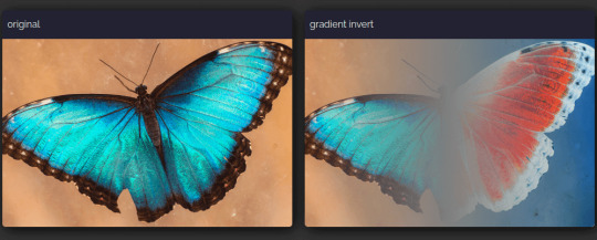
Gradual left-to-right inversion (demo)
Note that using a gradient from black to white for gradual inversion only works with the exclusion blend mode and not with the difference. The result produced by difference in this case, given its formula, is a pseudo gradual inversion that doesn’t pass through the 50% grey in the middle, but through RGB values that have each of the three channels zeroed at various points along the gradient. That is why the contrast looks starker. It’s also perhaps a bit more artistic, but that’s not really something I’m qualified to have an opinion about.
Gradual left-to-right inversion vs. pseudo-inversion (demo)
Having different levels of inversion across a background doesn’t necessarily need to come from a black to white gradient. It can also come from a black and white image as the black areas of the image would preserve the background-color, the white areas would fully invert it and we’d have partial inversion for everything in between when using the exclusion blend-mode. difference would again give us a starker duotone result.
This can be seen in the following interactive demo where you can change the background-color and drag the separation line between the results produced by the two blend modes.
CodePen Embed Fallback
Hollow intersection effect
The basic idea here is we have two layers with only black and white pixels.
Ripples and rays
Let’s consider an element with two pseudos, each having a background that’s a repeating CSS gradient with sharp stops:
$d: 15em; $u0: 10%; $u1: 20%; div { &::before, &::after { display: inline-block; width: $d; height: $d; background: repeating-radial-gradient(#000 0 $u0, #fff 0 2*$u0); content: ''; } &::after { background: repeating-conic-gradient(#000 0% $u1, #fff 0% 2*$u1); } }
Depending on the browser and the display, the edges between black and white may look jagged… or not.

Jagged edges (demo)
Just to be on the safe side, we can tweak our gradients to get rid of this issue by leaving a tiny distance, $e, between the black and the white:
$u0: 10%; $e0: 1px; $u1: 5%; $e1: .2%; div { &::before { background: repeating-radial-gradient( #000 0 calc(#{$u0} - #{$e0}), #fff $u0 calc(#{2*$u0} - #{$e0}), #000 2*$u0); } &::after { background: repeating-conic-gradient( #000 0% $u1 - $e1, #fff $u1 2*$u1 - $e1, #000 2*$u1); } }
Smooth edges (demo)
Then we can place them one on top of the other and set mix-blend-mode to exclusion or difference, as they both produce the same result here.
div { &::before, &::after { /* same other styles minus the now redundant display */ position: absolute; mix-blend-mode: exclusion; } }
Wherever the top layer is black, the result of the blending operation is identical to the other layer, whether that’s black or white. So, black over black produces black, while black over white produces white.
Wherever the top layer is white, the result of the blending operation is identical to the other layer inverted. So, white over black produces white (black inverted), while white over white produces black (white inverted).
However, depending on the browser, the actual result we see may look as desired (Chromium) or like the ::before got blended with the greyish background we’ve set on the body and then the result blended with the ::after (Firefox, Safari).
Chromium 87 (left): result looks as desired; Firefox 83 and Safari 14 (right): cloudy from being blended with the body layer (demo)
The way Chromium behaves is a bug, but that’s the result we want. And we can get it in Firefox and Safari, too, by either setting the isolation property to isolate on the parent div (demo) or by removing the mix-blend-mode declaration from the ::before (as this would ensure the blending operation between it and the body remains the default normal, which means no blending) and only setting it on the ::after (demo).
Of course, we can also simplify things and make the two blended layers be background layers on the element instead of its pseudos. This also means switching from mix-blend-mode to background-blend-mode.
$d: 15em; $u0: 10%; $e0: 1px; $u1: 5%; $e1: .2%; div { width: $d; height: $d; background: repeating-radial-gradient( #000 0 calc(#{$u0} - #{$e0}), #fff $u0 calc(#{2*$u0} - #{$e0}), #000 2*$u0), repeating-conic-gradient( #000 0% $u1 - $e1, #fff $u1 2*$u1 - $e1, #000 2*$u1);; background-blend-mode: exclusion; }
This gives us the exact same visual result, but eliminates the need for pseudo-elements, eliminates the potential unwanted mix-blend-mode side effect in Firefox and Safari, and reduces the amount of CSS we need to write.
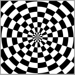
Desired result with no pseudos (demo)
Split screen
The basic idea is we have a scene that’s half black and half white, and a white item moving from one side to the other. The item layer and the scene layer get then blended using either difference or exclusion (they both produce the same result).
When the item is, for example, a ball, the simplest way to achieve this result is to use a radial-gradient for it and a linear-gradient for the scene and then animate the background-position to make the ball oscillate.
$d: 15em; div { width: $d; height: $d; background: radial-gradient(closest-side, #fff calc(100% - 1px), transparent) 0/ 25% 25% no-repeat, linear-gradient(90deg, #000 50%, #fff 0); background-blend-mode: exclusion; animation: mov 2s ease-in-out infinite alternate; } @keyframes mov { to { background-position: 100%; } }

Oscillating ball (demo)
We can also make the ::before pseudo the scene and the ::after the moving item:
$d: 15em; div { display: grid; width: $d; height: $d; &::before, &::after { grid-area: 1/ 1; background: linear-gradient(90deg, #000 50%, #fff 0); content: ''; } &::after { place-self: center start; padding: 12.5%; border-radius: 50%; background: #fff; mix-blend-mode: exclusion; animation: mov 2s ease-in-out infinite alternate; } } @keyframes mov { to { transform: translate(300%); } }
This may look like we’re over-complicating things considering that we’re getting the same visual result, but it’s actually what we need to do if the moving item isn’t just a disc, but a more complex shape, and the motion isn’t just limited to oscillation, but it also has a rotation and a scaling component.
$d: 15em; $t: 1s; div { /* same as before */ &::after { /* same as before */ /* creating the shape, not detailed here as it's outside the scope of this article */ @include poly; /* the animations */ animation: t $t ease-in-out infinite alternate, r 2*$t ease-in-out infinite, s .5*$t ease-in-out infinite alternate; } } @keyframes t { to { translate: 300% } } @keyframes r { 50% { rotate: .5turn; } 100% { rotate: 1turn;; } } @keyframes s { to { scale: .75 1.25 } }

Oscillating and rotating plastic shape (demo)
Note that, while Safari has now joined Firefox in supporting the individual transform properties we’re animating here, these are still behind the Experimental Web Platform features flag in Chrome (which can be enabled from chrome://flags as shown below).

The Experimental Web Platform features flag enabled in Chrome.
More examples
We won’t be going into details about the “how” behind these demos as the basic idea of the blending effect using exclusion or difference is the same as before and the geometry/animation parts are outside the scope of this article. However, for each of the examples below, there is a link to a CodePen demo in the caption and a lot of these Pens also come with a recording of me coding them from scratch.
Here’s a crossing bars animation I recently made after a Bees & Bombs GIF:

Crossing bars (demo)
And here’s a looping moons animation from a few years back, also coded after a Bees & Bombs GIF:

Moons (demo)
We’re not necessarily limited to just black and white. Using a contrast filter with a subunitary value (filter: contrast(.65) in the example below) on a wrapper, we can turn the black into a dark grey and the white into a light grey:
Discovery: two squares/ four triangles (demo, source)
Here’s another example of the same technique:

Eight triangles (demo, source)
If we want to make it look like we have a XOR effect between black shapes on a white background, we can use filter: invert(1) on the wrappers of the shapes, like in the example below:

Four bars (demo, source)
And if we want something milder like dark grey shapes on a light grey background, we don’t go for full inversion, but only for partial one. This means using a subunitary value for the invert filter like in the example below where we use filter: invert(.85):

Six triangles (demo, source)
It doesn’t necessarily have to be something like a looping or loading animation. We can also have a XOR effect between an element’s background and its offset frame. Just like in the previous examples, we use CSS filter inversion if we want the background and the frame to be black and their intersection to be white.
Offset and XOR frame (demo).
Another example would be having a XOR effect on hovering/ focusing and clicking a close button. The example below shows both night and light theme cases:
CodePen Embed Fallback
Bring me to life
Things can look a bit sad only in black and white, so there are few things we can do to put some life into such demos.
The first tactic would be to use filters. We can break free from the black and white constraint by using sepia() after lowering the contrast (as this function has no effect over pure black or white). Pick the hue using hue-rotate() and then fine tune the result using brightness() and saturate() or contrast().
For example, taking one of the previous black and white demos, we could have the following filter chain on the wrapper:
filter: contrast(.65) /* turn black and white to greys */ sepia(1) /* retro yellow-brownish tint */ hue-rotate(215deg) /* change hue from yellow-brownish to purple */ blur(.5px) /* keep edges from getting rough/ jagged */ contrast(1.5) /* increase saturation */ brightness(5) /* really brighten background */ contrast(.75); /* make triangles less bright (turn bright white dirty) */

Discovery: two squares/four triangles — a more lively version (demo)
For even more control over the result, there’s always the option of using SVG filters.
The second tactic would be to add another layer, one that’s not black and white. For example, in this radioactive pie demo I made for the first CodePen challenge of March, I used a purple ::before pseudo-element on the body that I blended with the pie wrapper.
body, div { display: grid; } /* stack up everything in one grid cell */ div, ::before { grid-area: 1/ 1; } body::before { background: #7a32ce; } /* purple layer */ /* applies to both pie slices and the wrapper */ div { mix-blend-mode: exclusion; } .a2d { background: #000; } /* black wrapper */ .pie { background: /* variable size white pie slices */ conic-gradient(from calc(var(--p)*(90deg - .5*var(--sa)) - 1deg), transparent, #fff 1deg calc(var(--sa) + var(--q)*(1turn - var(--sa))), transparent calc(var(--sa) + var(--q)*(1turn - var(--sa)) + 1deg)); }
This turns the black wrapper purple and the white parts green (which is purple inverted).

Radioactive 🥧 slices (demo)
Another option would be blending the entire wrapper again with another layer, this time using a blend mode different from difference or exclusion. Doing so would allow us more control over the result so we’re not limited to just complementaries (like black and white, or purple and green). That, however, is something we’ll have to cover in a future article.
Finally, there’s the option of using difference (and not exclusion) so that we get black where two identical (not necessarily white) layers overlap. For example, the difference between coral and coral is always going to be 0 on all three channels, which means black. This means we can adapt a demo like the offset and XOR frame one to get the following result:

Offset and XOR frame — a more lively version (demo).
With some properly set transparent borders and background clipping, we can also make this work for gradient backgrounds:
Offset and XOR frame example — a gradient version (demo).
Similarly, we can even have an image instead of a gradient!
Offset and XOR frame — an image version (demo).
Note that this means we also have to invert the image background when we invert the element in the second theme scenario. But that should be no problem, because in this article we’ve also learned how to do that: by setting background-color to white and blending the image layer with it using background-blend-mode: exclusion!
Closing thoughts
Just these two blend modes can help us get some really cool results without resorting to canvas, SVG or duplicated layers. But we’ve barely scratched the surface here. In future articles, we’ll dive into how other blend modes work and what we can achieve with them alone or in combination with previous ones or with other CSS visual effects such as filters. And trust me, the more tricks you have up your sleeve, the cooler the results you’re able to achieve get!
The post Taming Blend Modes: `difference` and `exclusion` appeared first on CSS-Tricks.
You can support CSS-Tricks by being an MVP Supporter.
Taming Blend Modes: `difference` and `exclusion` published first on https://deskbysnafu.tumblr.com/
0 notes
Text
Ruin The Friendship (part III)

Title: Ruin The Friendship (mini-series) Part 3
Word-Count: 6.3k
Pairing: Jay Park/ Reader (kinda)
Summary: Best friends to lovers. Inspired by Ruin The Friendship - Demi Lovato.
Genre: Smutty Fluff
Part 1 Part 2 Part 4
There’s a picture of me on Jay Park’s Instagram.
This wouldn’t be the first time. He used to post dumb pictures of me edited to look like I had a mustache or drawn on huge boobs. This picture isn’t like that. Taken the last night Jay was home almost a week ago, it’s hard to tell who exactly is in the picture. I’m lying on my chest, my bare back facing the camera while my hair fans out messily covering my face. Posted with a black and white filter, the photo looks too intimate to be just anyone.
He’d disabled the comment section so I’m spared any attack from some of his more “protective” fans. I reread the caption, unable to stop the silly grin from taking up my face. I look around making sure my assistant, Bora, isn’t around to tease me yet again for being infatuated.
As always, I miss her the most.
He’s disgustingly cute. I send him a text message telling him it’s still a no on the pictures he’s been asking for since he left.
Y/n: I’m still not sending you nudes, even if you did post a fake cute picture of me.
He texts me back almost immediately.
Jay: fake!? I’m offended.
Y/n: Go to sleep
Jay: I can’t. Can I call you?
I look at my phone. It’s about one am on the east coast in the states. It’s usually around this time that he’s been calling either before he goes out or when he’s in bed. I won’t pretend like I’m over the butterflies in my stomach at being the person he calls at night. Back when he’d just become a trainee, he’d call me before he went to bed every night. He’d been so lonely back then, wanting so badly to be apart of something successful yet wanting to come home at the same time. Those were the hardest times for us. I’d been helpless. I couldn’t make it better for him, and I also couldn’t let him know how much I’d wished he’d come home too.
I call him, deciding to take a break from the work on my laptop. He answers on the first ring, his smooth voice filling my body and causing goosebumps to rise on my skin. He shouldn’t have so much control of my body from across the world, but he does and it’s apparent in the way I sigh involuntarily like I’m finally at ease when he speaks.
“Hi, baby,” he says. He sounds so tired. It seems like every day he becomes more and more drained but there’s still that hint of Jay optimism that says whatever is happening is going well. He still hasn’t told me what exactly he’s up to, other than that I should expect some big news by the end of his trip.
“Hey, you ok?” I ask. He yawns loudly, there’s shuffling in the background like he’s shifting around.
“Yeah, everything is good. What about you? How’s work going?”
He’ll never admit to being tired. Even as he drifts off to sleep in the middle of our conversation, leaving me talking to myself for a good five minutes, he’ll still insist on blaming it on how melodic my voice was or some shit.
The time difference is the worst. Tonight when I’m headed to bed, and he’s got a free moment in between work, it’ll be the same. We’re figuring it out, I think. I mean, we always have. In the past, I’d chalk up our times of lack of communication as being us just growing up. We’ve always been able to go through time without contacting each other then coming back together when we could. Now, it seems like there’s no other option but to tough through it. I try not to complain because I know there will be longer stays, times when he’s touring, times when I have to travel. This New York trip is a test of our newborn relationship. If we can’t get our shit together for this, it’ll never work out.
I hang up the phone on a snoring Jay and reopen my laptop.
“How’s boyfriend?” Bora bounces in, her shoulder-length lilac purple hair swinging behind her. She’s carrying an arm full of clothes probably double her petite weight, yet she moves quickly; hanging up items and ordering them for our next fitting.
I shrug. “I don’t know he fell asleep again,”
Bora shakes her head smiling at her busy hands. “You two love to torture yourselves for each other,”
“What do you mean?”
“You’ve gotten like five hours of sleep every night since he left. I’m sure he’s in the same boat if not worse. Believe me, I think it’s cute and all but I don’t see how you guys do it,”
I want to tell her that it’s not a question. When he’d kissed me, he held a part of me that he hasn’t yet returned. I’ve become so obsessed with him ( more so than before) that it’s a no-brainer. I’ll stay up as long as I need to if it meant seeing him through a grainy pixelated screen as long as he promised to come back.
I don’t tell her any of that. Instead, I shrug and go back to replying to an email, requesting us to style a Korean rapper who was invited to an American awards show.
“How are we feeling about the L.A gig?” I ask her.
“I’m in. I have a few options in mind we could think about, so I think we should do it,”
I nod at her and confirm a consultation for tomorrow morning. Bora has been my assistant for about a year now. She’s good enough to work on her own, but thankfully for me, she’d rather not. With her apart of the company, I have much more time to actually sleep in my own bed sometimes. She knows the ends and out of my business sometimes better than I do.
“So, we’re all set up for the Zino shoot,” I tell her putting the La event into the calendar. “I want you to put together a profile of what you were thinking about for tomorrow, and I’ll go through some stuff that we have maybe we have something he might like,”
“How about you go home and get some rest, and I’ll take care of the fitting today. I’ll even sort through some stuff for tomorrow. You look like you’re dead on your feet,”
I roll my eyes at her. “Oh, thanks a lot, but no. I can’t just sleep in the middle of the day,”
“You’re half asleep now, y/n,”
“Stop trying to get rid of me,” I laugh.
Still, I take her advice and head home after another hour.
My place feels emptier than it did this morning. With Bora handling everything at the studio and Jay sleeping, there’s really not much to do but sleep myself I guess. Bora is right. I haven’t slept at all these past couples of days. Jay and I haven’t put any official title to this thing between us. ‘Boyfriend’ sounds kind of lame if I think about it too much. He’s still who he was before; my favorite person in the world. Of course, I can’t go around calling him anything like that; for one his head would get so big, I wouldn’t be able to live it down. It seems so juvenile. Eighteen year old me would be having heart palpitations at the thought of being Jay’s girlfriend. I’m over the novelties. I just want him, all the time.
I end up falling asleep on my couch. By the time I wake up it’s nearly ten, and Jay’s usually up by now. I check my phone to see if I have any missed messages. He must be still sleeping. I stretch out my limbs, getting up to shower and drink some sleepy time tea to put me back to bed. After an hour, I can’t force myself to stay up any longer. I fall asleep again after sending Jay a text telling him that I miss him and not to work too hard.
In the morning it’s the same thing. I have no missed calls from him or even so much as a text message. Even his socials are dead aside from the occasional tweet supporting a project from another artist. The only interesting activity comes from the hundreds of thousands of retweets and likes on the picture he’d posted of me yesterday morning. Quickly, I exit out before I’m tempted to read exactly what his fans think.
I check my email, seeing that Zino emailed me early this morning asking if we can reschedule the consultation a little bit later tonight. I forward it to Bora who immediately sends me a thumbs up saying she’s free.
I spend the rest of the morning trying to forget about the fact that my boyfriend is too busy doing god knows what (because he hasn’t told me anything) to text me back. I’m not a clingy person, I can respect wanting space and time to focus on work, but it’s not like him to go completely quiet. I’ll give him until I go in tonight to respond before I go searching again. Chase has always been my go-to when I need answers.
I’ve already wasted away Friday, trying to catch up on sleep and worrying about Jay. I’m determined to be productive today, even if I am a little annoyed.
I go over the prep work Bora had emailed me last night, adding a few things that I wanted to ask Zino about. Dressing men for events, especially American award shows like this had at some point become my favorite part of my job. It’s all about what an artist likes, and in America, you can go as bold as you want as like as you make it yours. Zino being invited was kind of a big deal for Korean hip-hop. People are looking at him to represent the culture. Bora and I were completely honored when he contacted us to dress him.
When I get to the studio, there’s still no word from Jay and Chase hasn’t answered his phone either. I’m trying not to panic. I’ve never been in the know exactly when they were going and coming. I guess just like everything else, this is an aspect of this new thing with Jay that remains unchanged.
Bora texts me that she’s running a bit late. By the time I’ve pulled some a few of the things we have in the back, Zino shows up to the studio.
He smiles a little less than politely, holding my hand a little longer and tighter than necessary.
“Bora should be right around the corner so we can probably start getting you dressed. I have a royal blue suit that I think you might like and it might fit you too,” I tell him running to the back to pull the rack of options out. I hand him the slacks and gesture toward the curtain for him to get changed.
“And I have these black loafers I want you to try on just for a reference but I’m thinking it might look better with white sneakers. I have to steam the white button up really quickly,”
I wait for him to come out in the blue slacks and hand him the dress shoes.
“You guys work quick,” he says while zipping the pants. I look at them noticing they’re a little short.
“We have to. It’s only her and I and we have too many clients at once. We get everything rushed, and send it back later if we don’t use it. Or we can just buy it outright if we really like it. You said you wanted blue so Bora was right on it,” I gesture for him to spin so I can see the fit in the back.
“They’re a little short but that’s how the guys in the states are wearing them now. I think with white converse or vans it would look pretty cool-,”
“The guys in the states? You know American fashion well then?”
I shrug, starting to steam the dress shirt. “My boyfriend travels to LA and New York a lot. I pay attention to what he’s wearing. He’s very into grungy styles, layers, and denim is his thing right now,”
“You’re Jay’s girl, right?” He smiles smugly at me while stuffing his foot into the shoe.
“Excuse me?” I ask looking up from the shirt I’m steaming. His eyes glisten with mischief like he knows something I don’t.
“The tattoo on your back. It’s the same one from the picture he posted,”
I look down at my yellow halter top that no doubt exposes the black ink on my shoulder blade. I still don’t see why it matters, though. Whether it’s because I’m still not comfortable being called “Jay’s girl” for some reason or because I don’t like how he says it, it annoys me. I don’t like how smug he seems, like he knows just how emotionally and physically fickle Jay could be. Or maybe I’m just projecting my own feelings of not hearing from him for two days. It’s late and I’m tired. I get it, he’s doing his own thing right now and usually, I wouldn’t bat an eye at having gone hours without talking to him. It’s just that, everything seems so fragile. Maybe I’m the fragile one and just need to learn to get over my own shit.
I clear my throat and pull the white steamed dress shirt off the rack. When I hand it to him, his fingers brush mine for a long second. He smiles at the ground, his dimples appearing. Where the hell is Bora? Jay would kill me if he knew I was alone at my studio at night with a stranger, no matter how known he is. He’s always saying I don’t take my own safety seriously, never mind the fact that there’s clearly something I’m missing between these two.
“Are you two close?” I ask, busying myself on the other side of the room with ordering papers that are already in order. Instead of stepping behind the curtain, he pulls his T-shirt off and pulls the crisp white shirt on.
“Well, we used to be ok, I guess. We were supposed to do a song or something,” he trails off, his fingers moving up the buttons of the shirt. “Then he slept with my girlfriend,”
There it is.
He waits like he’s waiting for my reaction. I’m saved from giving one by my phone ringing. When I see it’s not my assistant, I roll my eyes. Of course, he’d call me at this exact moment. Asshole. I have half a mind to decline his call. Instead, I answer, smiling brightly if only for my guest.
“Hi, Jay,”
“Y/n, baby, I’m so sorry. I’ve been running around all day, in and out of meetings, I didn’t mean to not get back to you last night,”
“It’s ok. Listen I can’t talk right now,” I tell him. “I’m working,”
“Working? At the studio? Where’s Bora? Is she there with you? Do you have a client?” He asks so many questions, and it would be a little bit funny if I didn’t know what his reaction would be to all of my answers.
“Yes, working at the studio. A client rescheduled and we weren’t doing anything else,” I look over at Beenzino who’s pretending he’s not listening to my half of the conversation. He straightens the leg of his slacks and holds up his thumb as if to ask me what I thought.
“Where’s Bora?” Jays repeats.
“She’s on her way,” I tell him moving into the other room.
“Fuck, Y/n. You literally don’t give a shit whether some guy-,”
“It’s work, Jay. I’m working, just like you did all yesterday,”
He laughs humorlessly on the other end. “So you’re mad that I didn’t call?”
“That’s not what I’m saying at all,” I sigh. I rub at my temples feeling a headache start to pound. “I miss you, I don’t want to fight,”
“We aren’t fighting,” he says softly. “I just want you to take care of yourself, baby. I’m fourteen hours away. I can’t just be there if something happened,”
“I know, I know,” I say. “I didn’t expect Bora to be late, I promise. I was trying really hard not to stress you out about this,”
He laughs. “You always find a way to get in trouble,”
I smile. “Am I in trouble?”
Jay blows a loud breath into the phone. “I can see you biting that fucking lip, Y/n,”
I laugh. “I have to go, he’s waiting, and I think Bora just came in,”
“At least tell me who it is so I know it’s not some famous gangster or something,” he laughs.
Shit.
“It’s Zino,”
He’s silent. He doesn’t say a word for at least twenty seconds. Even when I call his name, he stays quiet like either he’s choosing his words or just doesn’t have any.
“Send him home,” he says finally.
“Jay,”
“I don’t want to hear it, Y/n. Send him home. Have him reschedule with Bora. I don’t want him anywhere near you,”
“You have to be fucking kidding me, Jay,”
“I’m serious. I’m not dealing with the shit, Y/n,”
“You don’t have to,” I laugh. “Listen, I’m going to go finish my session, I’m going to stay at Bora’s tonight, and then you can call me later if you find the time,” I hang up before he can say anything else.
My headache is in full force right now. I’m ready to go do exactly what he told me and send him home. My phone vibrates in my pocket but I ignore it. When I step back into the room, both sets of eyes are on me like they know I’m literally on the edge of sanity.
“Sorry I’m late,” Bora offers holding up the camera. I nod saying nothing as I start directing Zino where to stand while she takes the pictures.
“Do a few with the jacket, and we’ll look into jewelry after,” I instruct. They both quietly do as they’re told with little to no other interaction. Bora looks at me over the frame of her glasses, letting me know we’ll be talking on our way back to her place.
We finish the session with two more looks, promising to send Zino a copy of the photos so he can choose what he wants later. When he leaves, I release a breath like it’s the first time I’m breathing in the last hour. I pull out my phone to check the time. It’s just past nine-thirty.
My screen is filled with notifications from Jay that I’d ignored. Three missed calls and a bunch of text messages.
Jay: Y/n
Jay: I’m so fucking mad at you.
He does the thing where he thinks stating the obvious will make a difference somehow. Well, I’m so fucking mad at him too. This is my job. He can’t just expect me not to do business with someone just because he couldn’t keep his dick in his pants. Mad at me? I’ve done nothing wrong.
Jay: I don’t want you working with him, y/n. I’m asking you not to.
Jay: let him work with Bora but I don’t even want him in the same room as you. And this isn’t a possessive boyfriend thing.
Jay: I mean it is, but he’s going to try to get back at me through you and I’ll go crazy
Jay: I’m not trying to be a dickhead. I’m trying to keep you safe.
Jay: and I didn’t forget you hung up on me too...
The ellipse feels like a promise that turns me on despite how upset I am. I sigh, dropping my head on my desk. This is Jay. This isn’t crazy new boyfriend Jay who wants to keep me in a box. He’s never been like that. If he says it’s serious, I have to trust him. He’s never lied to me a day in his life. He’s never been selfish when it came to me. This, whatever is going on between the two of them has nothing to do with me, but if I ignore him, if I ignore how uncomfortable Zino made me even if for half a second, this can and will become an even bigger problem.
“You think you cannot look so depressed at the fact that we’re going to La for free in three weeks?”
I lift my hand, flipping my friend off. “He’s all yours Bora,” I rub at my temples again staring at my phone.
“What?”
“I’m not going to La. You take whoever you want, and have fun. Zino is your client now,”
“But you’ve already started planning out the looks,”
I raise an eyebrow at her. “Do you want to change it?”
She shakes her head. “No, I think it’s perfect,”
“Well, you have a free trip to LA,”
“Shit, Y/n. What happened?”
I don’t feel like explaining anything right now. I actually just want to climb into Jay’s memory foam bed and sleep all day tomorrow.
“I don’t actually know,” I shake my head looking at the next text that comes in from my boyfriend.
Jay: Call me when you get home so I at least know you’ve made it
“This is what happens when you date your best friend,” she says holding out her hand to pull me out of my chair. Her arms come around me, and I lean against her shoulder.
“A fight is never just a fight. You want to be on your own side, but you’re on his too right?”
I hate that it makes sense. And I hate that I’m fighting with Jay. We never fight. This is exactly what I was afraid of. If we weren’t together, would working with Zino even be a big deal?
“I think I’m going to stay at Jay’s place tonight,” I tell her. She rolls her eyes looking at me like I’d just told her the sky is blue. I can’t be that obvious, can I?
“Come on, I’ll drop you off,”
Bora’s boyfriend picks us up from the studio. He drops me off at Jay’s condo, and I let myself in. I haven’t been here since the night he left. I drop my bag on his couch and beeline for his shower. When I’m done, I pull one of his T-shirt’s over my head and step into a pair of his boxers. I crawl into his big bed, finally feeling a piece of my heart relax just a bit.
When I call him, he answers on the first ring. “Y/n,”
“I’m at your place,” I say around a yawn.
“What?”
“I’m in your bed and wearing your clothes. I’m yours in every sense of the word, but you think some guy I just met who’s not you is going to make a difference to me,”
“It’s not like that, baby,” he sighs.
“It doesn’t matter,” I say. “I’m letting Bora in charge of him. I told her to go to LA without me,”
“I’ll take you to LA myself,” he says like it’ll make up for how dumb he was earlier.
“It’s not about me going to LA, Jay. I can go anytime I want. It’s about you expecting me to obey what you say just because you say so,”
“I’m trying to protect you,” he sighs. I’m kind of getting tired of his sighs. It’s like I’m the one being exasperating.
“You’re trying to protect me from your secrets, Jay. I already know everything,”
“How do you always find a way to make me feel bad about being mad at you,”
“Because I’m a woman,” I laugh tiredly.
“You hung up on me,” he says.
“I’m looking forward to how you’ll get me back for it,”
“Stay at my place tomorrow night too,” he tells me. “I want to come home to you in my bed,”
“You’re finally coming home?”
“You sound a little bit like you miss me,” he laughs.
“I miss your-,”
“Hey,” he says cutting me off. I laugh, pulling the blanket tight around my shoulder. “Watch your mouth,” he whispers.
“Or what-,”
There’s a sound out in the living room that stops me mid-sentence.
“Jay, I think someone is in your apartment. What should I do?” I whisper.
He’s quiet on the other end, I pull the phone away to see that I must have disconnected the call accidentally. I stay still, afraid that if I moved they’ll hear me. There’s definitely footsteps moving in the apartment. Whoever it is, moves without turning on any lights. I grasp my phone in my hand ready to throw it and make a run for it.
“You really think your phone is going to keep me from getting you back for hanging up on me,”
I look over at the doorway to see my boyfriend. I scramble off the bed and jump at him, wrapping my legs around him. He catches me easily, his hands going to my bare thighs. I press my lips against his neck, squeezing him in my arms.
“Are you crying?” He laughs while pulling back. I drop down to my own two feet, but he doesn’t let me get far.
“I thought I was going to die, you bitch,” I wipe at my eyes, failing to pull away from him as he traps me against his chest. His lips press against my cheek.
“And your only defense was to throw your phone at me. I really can’t leave you alone,”
He walks me backward toward his bed. “I wanted to surprise you. Now turn around,” he says against my hair. The tone of his voice has me eager to do whatever he says. I turn, and his hand drags up my back before he forces me to bend over his bed, my ass sticking up in the air.
His fingers peel the boxers away from my skin. He lets out a breath when he has the underwear around my knees. Two hands reach up, palming my ass. He squeezes my flesh, his fingers digging roughly into my skin.
“I owe you for hanging up on me,” he says. Before I can prepare myself, his hand comes down hard on my skin. He soothes it away with his lips, kissing where his palm connected. When he pulls away I’m expecting another sting, instead, he drags his fingers along my clit, making me gasp. I look back at him to see him bringing the three fingers against his tongue before he repeats the motion. Without notice, he plunges two fingers into me.
“Fuck,” I call out.
His wrist flicks back and forth, moving his fingers inside of me. His free arm wraps around my waist as to get a better grip as his speed increases. I move my hips with his rhythm, wanting more.
“You look so pretty like this, baby,” he says.
I’m panting, knees shaking barely holding myself up. Just when I think my legs will give out, Jay twists my hips so that I’m on my back. He pulls the boxers all the way off. His mouth presses against the inside of my left knee, looking up at me while his lips move higher toward my thigh. He bites my flesh hard before running his tongue over my skin. He moves further up, kissing where my thigh and hip meet.
I close my eyes as his mouth finally settles on it’s intended destination. His tongue presses into my clit, alternating between flicks and circles. My hands move to his hair, holding him against me. A hand reaches up, two fingers enter me once again. His thumb follows his tongue, rubbing my clit in between licks.
“Jay, I can’t hold it,” I try to pull him up but he stays put, his hand moving faster. His free hand moves up to touch my skin under the T-shirt, settling on my breast.
My legs start to close around him but he quickly pushes them down, keeping me open and helpless. I pull at his hair as I start to quiver again.
“Come for me baby,” he says against my skin. Almost like I’m programmed to follow whatever he says, I tighten around him as I cum. It feels like it lasts forever, as his mouth continues to work me over.
When my body finally relaxes, he moves up, covering me with his own body. His lips touch mine gently like he’s the most innocent person in the world. I wrap my arms around his neck, squeezing myself against him.
“I missed you so much,” I tell him. My hands go down to the waistband of his pants but he grabs my wrists.
“Not tonight. I want you to rest. You look exhausted,”
I feel my lip poke out at being denied his body. He takes my lip between his, before pushing his tongue against mine. He groans against my mouth, flipping me over so I straddle his waist. I peel my T-shirt off leaving me wearing nothing. His hands cup my breasts before he bends to kiss the center of my chest.
“You haven’t fucked me in more than a week,” I press my lips to his ear. “I want you,”
“You’re the devil, I swear,” he shakes his head at me. When I reach over for the condom, he pulls his joggers down. He lets me get the latex in place before I sink down on him, holding his shoulders. I can’t go slow, it’s like my body won’t allow it. I move against him, grinding my hips over his while his hands hold onto either side. He watches where we connect, and I can see his eyes appreciate every time I slide against him. When I can’t take it anymore, he flips me over, finishing what I started. We come together, a loud gasp and groan. He moves to pull away but I wrap my legs around his hips holding me tight against him.
“Welcome home,” I say
He laughs against my neck, his chest still moving too fast. I reach up to run my fingers through his wet hair. He’s too heavy, yet I can’t find myself pushing him off. I only cling to him tighter.
“Are you still mad at me?” He says against my skin.
“Yes,” I say around a yawn. Still, I move grab at his T-shirt, trying to pull it over his head. He does it for me before standing to go take care of our mess. When he comes back his boxers are back in place. He slides in bed beside me, wrapping my naked body up in his arms.
“Y/n,” he says my name looking at me like I can’t be serious.
“You’ve been ignoring me for like three days,”
“I was on a fourteen-hour flight,” he says laughing.
“And you still haven’t told me what you were doing in New York,”
He presses his face into my neck, drawing me close. “We’ll talk about it in the morning,”
We sleep wrapped around each other. We’re both so tired we don’t stir until probably noon. When I do finally get up, Jay’s still knocked out. I untangle myself from the sheets and slip out of his arms so I can get in the shower.
His bathroom fills with steam, fogging up the glass that takes up the large space. I step in, finally feeling relaxed in what feels like a week. I’ve never been one who needed to be around my boyfriend twenty-four seven, and I still don’t think I am. Jay could spend all day at his office and I don’t think it would make a difference. It’s when he’s away that makes me a little anxious. When he’s home I at least have the option to see him.
I step out of the shower after washing up with Jay’s very manly shower gel. I grab the towel I used last night and wrap it around my midsection before brushing my teeth and heading out toward his closet. Every time I come over, I always find something I want to add to my own closet. I go directly to his row of designer T-shirt’s, sifting through them.
“I’m getting a little tired of having my shit go missing,” his says from behind me.
I look back at him. His hair sticks up in every which way. He scratches at the lion on his chest tiredly. He looks so freaking adorable, but I refuse to let on just how much I like looking at him.
“I don’t know why you don’t just expect it by now,” I say pulling out the black Givenchy T-shirt I’ve seen him wear often. He also has a red one, so I don’t think he’ll miss this one. I pull it on before going to grab another pair of his boxers and a pair of his jeans.
I pull his clothes on while he watches in amusement. Sitting on one of the stools he has in the closet, I cuff the bottom of the pants. When I stand, the jeans sag just a bit, but it’ll have to do.
“Go shower,” I shoo him. “We’re actually going out into the world,”
Jay grabs my hips as I walk past him, pressing himself against my backside. “I thought we were staying in bed all day,”
“You assumed we were staying in bed. We need to go pick up some stuff you wanted from my studio that you never got. Then I need to make sure Bora’s all set on the Zino event. I also want to go to that new vintage place that just opened up,”
Jay raises an eyebrow at me. “And I need to be along for all of that?”
“Yes, because you have to tell me about New York, and because I refuse to build a relationship solely on the sex,”
“We’ve known each other for half of our lives, Y/n. What else kind of building do we need to do,”
I roll my eyes at him for being such a man. He’s right though, but I’m not going to admit that I just missed him too much to not want to spend the day with him. My phone rings saving me from having to answer his question. I push him toward the bathroom while answering the unknown number.
“Hello?”
“Y/n,”
It’s Zino.
“Hey, what’s up? Is everything ok?” There’s really no reason for him to call me. Bora told me she’d sent an email right after she dropped me off, explaining that she was going to take over her event.
“Actually I was just calling to ask you the same thing,” he laughs. “Bora told me you weren’t coming to LA. Did I overstepped last night when I asked about Jay?”
Yeah, kind of. I don’t say that though. Instead, I curse my boyfriend who’s singing in the shower for being so messy and making my life more interesting than I care for.
“No, it’s not that,” I tell him. “I just don’t see why both Bora and I need to go to the event when she’s more than capable-,”
“And your boyfriend wants you to stay away from me,” he adds. I don’t deny it.
“Bora will take care of you,”
“Tell Jay I’m not trying to steal his girlfriend, no matter how much he deserves it,”
I roll my eyes at my phone. “Listen, I don’t care to get into whatever shit you and Jay are into,” I say while pulling on my white vans.
“I’m just saying he has nothing to worry about. I can behave myself,”
“Email Bora if you still want to work with her. I’m available to help with whatever you guys need. I’m just not going to LA,”
Jay comes out of the bathroom, a towel wrapped around his waist. He frowns at seeing me a little peeved on the phone. I shake my head, pointing for the closet for him to get ready. The less time he spends naked, the easier it’ll be to get out of his bedroom.
“Ok, Y/n,”
“You can email me if you have any more questions. I’ll see you around I’m guessing,”
“Yeah, see you,” he hangs up leaving a slimy feeling. He’s harmless I know, but I can just hear the ulterior motive in his voice. I’m feeling a little better about not working with him so directly.
“Who was that?” Jay asks pulling on a hat to cover his messy hair. I walk over to help him tuck his T-shirt in the waistband of his jeans the way he’s been wearing it lately.
“Zino asking if there’s a reason I’m no longer going to LA,”
Jay’s quiet while I fix the shirt making sure it doesn’t look weirder than it already does. He pulls it off I guess. I wait for him to say something, instead, he just presses slings an arm my shoulder. I pick up my bag on the way out the door.
“So, New York?” I prod when Jay slides into the driver’s seat of his Bentley. He looks over at me a wide smile on his face. And in a second he’s that young kid again, on the verge of something amazing. I can see it before he says anything.
“Roc Nation, baby,”
115 notes
·
View notes
Photo
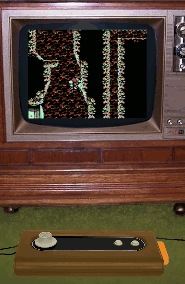
My dream 1977 console/computer
Imagine it's 1976. Current home consoles are Pong clones, but the 2nd gen consoles are just around the corner.
What would your dream 1977 console have been like (or some other year)?
Keep in mind that if it's too expensive compared to the Atari VCS, then it will fail like the Bally Astrocade. Here's mine, which uses the console itself as an arcade style controller:
- - - - -
My dream 1977 console/computer:
Less expensive than the Atari VCS
Arcade-like 360 spinner and two buttons on the console itself
.895Mhz 6502 CPU
2K RAM (BASIC cartridge adds another 2K RAM)
No hardware sprites - all "sprites" are software rendered using custom characters
20x12 character tiles; each tile is 16x16 pixels (32x16 with jitter)
320x192 normal resolution, each scanline has 4 colors (out of 8)
640x192 jittered resolution, 15 composite artifact colors
Total of 19 colors - 6 directly supported colors plus 13 jitter mixed colors
Despite being simpler and less expensive than the Atari VCS, the dream system has vastly superior 15 color backgrounds and software sprites. It also has large "arcade style" controllers suitable for placing on the floor/table/lap.
- - - - - SPINNER CONTROL - - - - -
My dream 1977 console/computer integrates the P1 controller into the console mainboard itself. The corded P2 controller is also very large - the size of a keyboard with numeric keypad. This minimizes costs on the 1P option. Initially there are 3 different packages:
1) "1P" budget option - just the console itself, with the integrated P1 controls (spinner and 2 buttons)
2) "2P" option - the console, and a corded P2 controller (spinner and 2 buttons)
3) "PC" deluxe option - console, and a corded keyboard (keyboard between spinner and 2 buttons), and BASIC cartridge
The "1P" option is less expensive than the Atari VCS, although the "2P" package could be more expensive because of the large P2 controller.
The dream console is a single board computer with P1 controls integrated into the main board. The left side has RF output and power connector; the right side has an edge connector for the cartridge and the P2 controller port.
The spinner control is inspired by driving games and Space Wars - steering on the left, along with thrust/fire action buttons on the right. The controls are ambidextrous simply by flipping the console around 180 degrees. Note that unlike an arcade stick being wrenched around, a spinner controller would not impose brutal bending stresses.
A spinner with two action buttons is suitable for a large variety of games:
Asteroids/Space War Driving games Breakout/Pong Vertical shooters (with fast left/right movement) First person shooters like Star Trek Tempest/Gyruss tube shooters Chess/Checkers/card games where the spinner quickly selects square/item. Puzzle games like Tetris and Puzzle Bobble where the spinner is great for quick precise left/right aiming Platformers with fast left/right movement
Still, it is not very good for Pacman, and many games would have to be rethought. Sometimes, it just means a minor adaptation. For example, Missile Command could use the spinner for aiming without range. Each missile uses a proximity fuse to detonate whenever it gets near to a target.
Sometimes, a game must be radically rethought. Gunfight used an 8 way joystick for movement and a 2 way joystick for aiming. The spinner could be used for aiming, but what about movement? Gunfight could be reimagined with a Joust-like fantasy theme. The spinner aims a bow and also turns you around left/right. The action buttons flap and shoot.
This Joust-like fantasy shooter could be the "killer app" for the dream console, offering frenetic gameplay unlike anything else out there.
- - - - - HARDWARE SPECIFICATION - - - - -
For the hardware, I want something that can generate text characters so it can be used as a home computer. To minimize costs, text generation is the ONLY thing the hardware directly does. No sprite hardware is included, and colors are done with composite artifact tricks.
Fundamentally, the graphics are similar to the Apple ][, but with 8 pixels per byte. It uses the Apple ][ idea of half-pixel shifting to boost base colors from 4 to 6. The video chip is extremely simplified, relying upon the CPU to race the beam and do all timing related to hsync, vsync, etc. The CPU is also needed to set SCREEN and FONT pointers each scanline. The CPU is also responsible for DRAM refresh.
During an active scanline, the video chip loads 20 characters and 2 bitmap bytes per character (total of 40 bytes of bitmap, or 256 pixels). This consumes 3/4 of the bus cycles, so the 6502 CPU at half speed. The screen is only active 52% of the time, so the CPU essentially runs at 74% speed. Between scanlines, the CPU updates the SCREEN pointer and the FONT/SHIFT registers. Clever coding can get the CPU to perform other useful work during active scanlines such as drawing sprites rather than just doing DRAM refresh during that time.
Because of how composite artifact color works, all modes have a practical horizontal resolution of only 320 and a horizontal color resolution of only 160. Alternating pixels get smeared into colors, as with the Apple ][ and CoCo.
The two main modes are NORMAL MODE and JITTER MODE:
NORMAL MODE = 320x192 8 colors (4 per line)
JITTER MODE = 640x192 15 colors
NORMAL MODE is 20x12 tiles, where each tile is a 16x16 bitmap (32 bytes). This gives 320x192 resolution, similar to Atari 800 high resolution mode. Composite artifact colors mean that the "color" of each pixel is either green or purple; they mix together to form white. The palette is thus:
BLACK, GREEN, PURPLE, WHITE
This video chip can delay a scanline by half a pixel, like the Apple ][. The shifted palette is:
BLACK, ORANGE, BLUE, WHITE
Additionally, the shift may be jittered every other field. This results in a 1:1 mix palette:
BLACK, yellow, indigo, WHITE
JITTER MODE augments the jitter concept by swapping the font while jittering. This doubles tile size from 32 bytes to 64 bytes, but it means 15 mixed colors are available. It also boosts B&W resolution from 320x192 to an incredible 640x192. The 15 1:1 color mixes are:
BLACK, orange/2, green/2, blue/2, purple/2 red, yellow, cyan, indigo, grey50% light orange, light green, light blue, light purple WHITE
These colors are NOT the same as the 15 Apple ][ LORES colors. The jitter effect shifts the mixed pixels a quarter pixel and also desaturates the colors a bit.
JITTER MODE is very colorful and great resolution, and easy to program. However, it can only cover 12% of the screen with custom RAM tiles (28 out of 240 tiles). This mode is most useful when most of the screen is covered with mostly ROM tiles or repeating tiles, with either a small number of smooth moving sprites or enemies moving in formation.
Both of these modes may be scanline doubled to halve the vertical resolution (from 192 to 96), thus halving the tile memory (16 bytes or 32 bytes per tile). DOUBLE NORMAL MODE has a color resolution of 128x96 with 4/8 colors, similar to the Bally Astrocade. Despite the low resolution, this mode is good for lots of fast action and oodles of software sprites. At 16 bytes per tile, it can cover 47% of the screen with custom RAM tiles (113 tiles out of 240 tiles).
The CPU driven video can do interlacing simply by ending the last scanline halfway through. This opens up various interesting possibilities such as 2:1 mixing (for a 36 color display with 16 colors per scanline).
Despite the extremely simple hardware, the dream console has amazing graphics capabilities. I'd say the capabilities are roughly NES-like, which is seemingly outrageous for a cheap 1977 console. It achieves these capabilities with a combination of tricks:
1) Composite artifact color provides high resolution with 4 colors "for free" (a trick used by the Apple ][ and CoCo)
2) Jitter doubles horizontal resolution/color without doubling bandwidth requirements (a trick the Apple ][ could have used, but this was not historically done)
3) Tile based graphics instead of full bitmaps massively reduces RAM requirements.
- - - - - ATARI VCS COMPARISON - - - - -
So, how does the dream system stack up next to the Atari VCS?
Color - Atari VCS. The Atari VCS had 128 directly supported colors, organized to easily do beautiful gradient/fade effects. The dream system has only 6 directly supported colors. They can be mixed into 15 color in JITTER MODE, but the general "look" is still pretty garish and generally Apple-like.
CPU - Atari VCS. Its CPU is 50% faster. Both require the CPU to race the beam to assist display.
Scrolling - equal. Both the Atari VCS and dream system can easily do smooth vertical scrolling, due to the CPU driven updates each scanline. Neither is very good at smooth horizontal scrolling, but both can use tricks to do it.
Resolution - Dream System. The 320x192 practical resolution is twice the Atari VCS's 160x192.
Sprites - Dream System. Software rendering allows practically unlimited 15 color sprites.
Background - Dream System. The Atari VCS just had very blocky and bland 40 pixel background - only two colors on a scanline. The dream system can do multicolor backgrounds, with a practical resolution of 320 pixels.
Text - Dream System. The Atari VCS pretty much couldn't do text modes. The dream system's 20x12 character screen is adequate for a home computer.
Controls - Dream System. The dream system has an "arcade quality" two button spinner controllers
Computer mode - Dream System. The Atari VCS would eventually get a couple BASIC cartridges, but they just weren't capable. The dream system's "PC" option makes it a usable 1977 class 4K home computer, albeit with only 20 column text.
RAM - Dream system. 2K of RAM is a good 1977 compromise between economy and power, and the cost of RAM would go down.
Cost - Dream system. The dream system cuts corners compared to the Fairchild Channel F, which itself was less expensive than the Atari VCS.
So basically, the dream system would be greatly superior to the Atari VCS in most important respects. The smoother color gradients of the Atari VCS would not be very evident in the early titles, and the faster CPU would not confer any obviously visible benefits.
Historically, the sluggish Fairchild Channel F looked blocky and primitive compared to the Atari VCS. It devoted almost all of its RAM to a full screen frame buffer. Similarly, the more expensive Bally Astrocade devoted almost all of its RAM to an even bigger frame buffer. This made it more expensive than the Atari VCS. In contrast, the dream system conserves RAM usage with custom tiled graphics rather than a full frame buffer.
The Magnavox Odyssey 2 would put up more of a fight against the Atari VCS. Its graphics limitations were a bit weird, being better than the Atari VCS in some ways, but worse in others and being generally less flexible. It actually had pretty nice joysticks. The Odyssey 2 did well, considering Atari's head start and its lack of compelling hardware advantages. Why was that? Oh yeah - K.C. Munchkin came out well before Atari would have Pacman ready...
The Intellivision would try a whole different approach. Mattel would market it as the "intellectual" alternative, with more complex games that usually required reading the manual first to play. Was this a good move? Well, at least they were trying something a bit different. As it was, the Intellivision did have compelling hardware advantages that made it look advanced compared to the Atari VCS. So, it did okay despite some awful design decisions (like those controllers).
This dream system would be doable in 1977, but would have had incredible graphics. Focusing the hardware to be a CPU assisted character generator using jitter, interlacing, and composite color artifact tricks gives it advanced graphics at low cost. Integrating the controller into the mainboard also minimizes cost, while giving the controls an "arcade quality" aura.
I think many early games would use NORMAL MODE with only 4 colors because it's easiest to program, and the relative lack of color wouldn't be a big deal to people with B&W sets. But there would be extreme pressure on developers to switch to JITTER MODE because its colorful graphics would make those cartridges show room darlings. The additional color possibilities of 36 color interlaced modes could also be used to try and get showroom attention.
I'd concentrate on the Joust-like fantasy shooter as a "killer app" launch title. It shows off JITTER MODE's 15 color backgrounds and sprites. It has only 5 smooth motion sprites (2 players, 2 arrows, and one computer arrow). The computer archers are aligned to tiles, but one at a time shoot an arrow at a player. The game is mostly supposed to be a duel between the players, but they can cooperatively shoot at the computer archers instead. The archers don't move around, but they are animated in place.
1 note
·
View note
Text
Apple iPhone 12 mini Review
The iPhone 12 mini (starting at $699) is the smallest and most affordable phone in Apple's late 2020 iPhone quartet. It's sure to appeal most to owners of older iPhones (particularly the iPhone 5 through 8), as well as anyone fed up with a handset that doesn't fit into their pocket. The mini is also the best value in the iPhone 12 family, packing premium power and the latest features (including 5G and a very capable Night photo mode) into a smaller build for less money than its siblings. It's our top-pick iPhone this year and easily earns our Editors' Choice award.
Where the mini Fits in the iPhone 12 Lineup
Apple has a rich crop of phones this year. In addition to the iPhone 12 mini, there's the iPhone SE ($399), the iPhone 12 ($799), the iPhone 12 Pro ($999), and the iPhone 12 Pro Max ($1,099). Last year's iPhone 11 is also still available for $599.
If that long list makes your head spin, turn to our iPhone 12 series review for a fully detailed analysis of all the iPhone 12 phones and guidance on how to choose the right one for you.
The mini looks and feels like an iPhone 12, just smaller. Like the iPhone 12, it comes in glossy black, blue, green, red, or white, with a new "ceramic shield" glass front that Apple claims is less prone to smashing than previous iPhone fronts. The backs of our iPhone 12 review units haven't yet shown scratches when being knocked around in my pocket, which is a good sign. You're probably less likely to drop a small phone, but if you do, it's IP68 rated and should survive a voyage to the bottom of the bathtub.
At 5.18 by 2.53 by 0.29 inches (HWD) and 4.76 ounces, the mini is the smallest, lightest premium phone I've seen in a while. That 2.53-inch width measurement is the key, since width affects how easily you can reach across a phone. In my experience, when you get over 2.7 inches, you start to have to stretch, and many people's comfort limit is just about at 2.8 inches. The main iPhone 12 and iPhone 12 Pro are 2.83 inches wide; the Pro Max is over 3 inches wide.
The mini's luxury experience starts with the screen. The highly saturated OLED display makes the iPhone SE's LCD look washed out. At 5.4 inches and 2,340 by 1,080 pixels, it's even denser than the iPhone 12's display, with 476 pixels per inch. Yet it's the same brightness, averaging 625 nits, brighter than previous-generation iPhone screens.
Removing the big top and bottom bezels gives the phone significantly more screen real estate than the iPhone SE, 6, 7, and 8. With a Microsoft Word document open in portrait mode, with very small type, I saw nine more lines of text on the mini than on the iPhone SE. On NYTimes.com, which has a more readable text size and freer line spacing, I got three more lines of text. Of course, bigger phones with larger screens will give you more, but it's impressive that the mini delivers more information than the SE despite being smaller.
Little But Fierce
All of the iPhone 12 series phones are powered by an Apple A14 processor running at 3GHz. Like the iPhone 12, the mini has 4GB of RAM and comes in 64GB ($699), 128GB ($749), and 256GB ($849) storage sizes. Those prices are for carrier models; the unlocked model costs $30 more.
Our benchmark results were the same as the iPhone 12, as you'd expect. Its Geekbench scores of 1,602 single-core, 4,029 multi-core, Basemark Web score of 593, and GFXBench graphics benchmark scores were all very similar to both the iPhone 12 and the 12 Pro. They're also all better than the iPhone SE, to the tune of 20% higher on Geekbench Multicore and 10% on the Web browsing benchmark. It's pleasantly surprising to me that the mini even benchmarks the same as the iPhone 12 Pro Max, which costs $400 more and feels twice as large.
Like the other 2020 iPhones, the mini runs Apple's iOS 14. For more details on what's new in iOS, see our iOS 14 review.
Top-Notch Night Vision
No expense was spared for the cameras on the iPhone 12 mini; they're the same as in the iPhone 12. On the back, there are 12-megapixel regular and ultrawide cameras. On the front, there's a 12-megapixel selfie camera. Both the front and back cameras feature Apple's excellent Night mode, and they can record 4K video at up to 60fps. For a comparison of the iPhone 12 cameras with other leading flagships, see our main iPhone 12 review.
I took care to compare the mini directly with the iPhone SE. The biggest difference is Night mode. The SE doesn't have it, and Night mode makes a huge difference in terms of the quality of low-light pictures. That alone is a reason to upgrade to the mini. The SE also lacks the wide-angle camera; has slightly less light gathering in the main camera; and has a 7-megapixel, not 12-megapixel, selfie camera.
The mini also has better HDR than the SE. That means you get richer colors in shots with bright backgrounds and darker foregrounds, for instance. You can see that in the shot below: The sky is a bit overexposed on the SE photo, but it's rich and blue on photos from both the 12 and the mini.
If you want a better iPhone camera, you have to step up to the 12 Pro, which starts at $300 more than the mini. With the Pro, you get a 2x zoom lens and LiDAR, which improves focusing and gives you a gorgeous Night bokeh mode. I found that when I tried to focus on very close-up berries and branches with the iPhone 12 mini or the regular iPhone 12, the phones had trouble figuring out what the foreground object was, but the LiDAR on the iPhone 12 Pro and Pro Max really locked that in.
In test shots of complex, non-human objects, the iPhone 12 Pro performed better than either the iPhone 12 mini or the iPhone 12. On a portrait-mode shot of an apple, the mini and the 12 had some trouble keeping the whole fruit in focus while also blurring the background; the 12 Pro handled it well. When I photographed a cup, the bokeh blur went a bit wonky around the handle with the mini and the 12, but the Pro's LiDAR focusing clearly helped it judge focus there. I didn't see any difference between the models in my portrait-mode photos of myself, a human.
Clean and Clear Audio
The iPhone 12 mini has the same 4G and 5G capabilities as the bigger iPhone 12 models. That means much better cellular connections than the iPhone SE, the iPhone 11, or any previous iPhone. It supports all US carriers, including Verizon's millimeter-wave 5G network, and is the first line of phones to be certified for the "C-Band" networks that will be coming in late 2021.
Voice call quality is very good. It's worth noting that the dual (top and bottom) stereo speakers on this phone are much louder, clearer, and richer than the single speaker on the bottom of the iPhone SE and older iPhones. Of course they don't have bass, but they're surprisingly non-tinny considering the size of the phone, with treble that's rich, not squeaky.
I tested the mini against the iPhone 12 and SE on the Bell and Rogers networks in Canada. Speeds and reception were very similar between the Mini and the iPhone 12. On Bell's 5G network, the mini averaged 366Mbps down while the iPhone 12 averaged 393Mbps; on Bell's 4G network, the mini averaged 296Mbps down while the 12 averaged 261Mbps. Given the relatively small number of samples I took, both of those differences are within the margin of error.
But wow, the mini and the 12 deliver much better performance than the SE does. The SE doesn't have 5G, so I compared 4G results with 4G results. On Bell's 4G network, the mini got 296Mbps down where the SE got 147Mbps. On Rogers' 4G network, the mini got 111Mbps down where the SE got 77.8Mbps. That is a significant, real performance improvement, probably down to the mini's improved carrier aggregation and 4x4 MIMO antennas. I'd expect to see the same gains over the iPhone 11 or XR as well (they don't have 4x4 MIMO antennas), though the iPhone 11 Pro should perform closer to the mini and 12 (it does have 4x4 MIMO).
For those wondering whether these are Canada-specific results, never fear; the iPhone 12 and 12 Pro were tested in the US and showed good results, so I'd expect the same from the mini.
Dual-band Wi-Fi performance is similar to the iPhone SE's. Range on 5GHz Wi-Fi was a few feet short of the iPhone 12, meaning the 12 could get past one more wall where the mini and SE couldn't.
Battery: Not Bad for the Size
Battery life is the biggest concern with the iPhone 12 mini. It's a smaller phone, and it has a smaller battery than the bigger phones do. Comparing it to the iPhone 12, Apple says it gets 10 rather than 11 hours of streaming, and 50 rather than 65 hours of audio playback on a charge.
Our video streaming test didn't reveal much here: I got 10 hours, 37 minutes of streaming video over Wi-Fi, similar to the iPhone 12. But when left alone all night, the mini's battery dropped 9% while the iPhone 12's battery dropped 6%; I saw a similar difference on the second night. If you often forget to charge your phone, you might find that difference frustrating.
The mini's stats look better when it's compared with other small iPhones. Apple says the mini has better battery life than the iPhone 6, 7, 8, or SE. Overnight, the SE dropped 14% and the mini dropped 12%. Running some speed tests for two hours killed 13% of the mini's battery, but 18% of the SE's. So yes, the mini does have more battery capacity than the 2020 iPhone SE.
The speed test suggests that the iPhone 12 mini's battery can handle 7 to 8 hours of heavy use; my video rundown test and Apple's estimate put its use time around 10 hours on a charge. So the mini will last you a day if you aren't looking at it the whole time.
There's no charger in the box, but there are lots of options for charging your iPhone. The mini works with up to 20-watt wired charging and with Apple's own MagSafe wireless charger. I also have a Qi wireless charging stand, and the Mini worked on it once it had been propped up with a folded piece of paper—unassisted, the phone is just a little too short to properly link up with the coil on the stand. It'll work better on flat pad-style chargers.
Mini Price, Mini Size, Maxi Power
I really like the iPhone 12 mini. Now, I am biased. For years, I've wanted phones to be much more manageable in one hand. When there isn't a pandemic happening, I spend a lot of time out and about, holding on to a subway pole or a shopping bag or a child's hand. I gave into the large phone trend a while ago, but I definitely felt like I was giving up a bit of facility in the world in exchange for the big screen.
This year, we've spent a lot of time sucked into our phones. But just for today, I'm going to dream of the future when we'll go outside to shop and hold hands again. The iPhone 12 mini isn't the phone for the life I've had in 2020, but it's the phone for the life I want.
The mini has the best price-to-power ratio of any iPhone right now, with a beautiful screen, a lovely design, a terrific camera, and 5G for $100 less than the iPhone 12. It will serve you well for up to four years; it's a good investment. If I have to choose one iPhone right now, this one is it.
I won't fault you for choosing a different one, though. Bigger screens may appeal to you more than they do to me. Larger phones have bigger batteries; that's just physics. The Pro models also have better features for serious photographers, such as their LiDAR focusing system, their 2x or 2.5x zoom lenses, and improved Dolby Vision color video capture.
Should you upgrade from an earlier iPhone? If you want 5G (especially on T-Mobile, Bell, or Telus, where it makes a real difference) or photo Night mode (which makes a big difference for everyone), then yes! Many potential iPhone 12 mini buyers are likely currently using iPhone 6, 7, or first-gen SE models, which probably feel sluggish at this point. The mini will zip right along. All of this makes the 12 mini our Editors' Choice winner for iPhones, and one of the best phones of the year.
0 notes
Text
Apple iPhone SE (2020) In-Depth Review: Buy This iPhone

“The new iPhone SE is the fastest phone you can buy for $400.”
Light, compact design
Class-leading performance
Loud, enjoyable audio
Great camera
iOS is excellent
Not a great display for $400
Battery life is just OK
Apple designs devices to last, and not just because it pleases customers. It also lets Apple polish up an old device with fresh specs and sell it as new. The iPhone SE is the latest example, but hardly the first. Apple took a similar approach to the iPhone 8, and still sells a MacBook Pro 13 with Touch Bar that’s essentially identical to the model launched in 2015.
It’s a polarizing strategy, and the new iPhone SE created a schism the moment it was announced, for all the usual reasons. Some see smart reuse of a great design that still has purpose. Others see lazy rebranding of an obsolete phone. People in both camps tend to have their opinion ready before ever laying hands on the phone in question.
Whatever your thoughts going in, one fact is indisputable: The iPhone SE ($400) is the least expensive iPhone, and that makes it important, no matter its design or hardware. Plenty of people will buy it because it’s the new default choice.
But is it a good phone?
Design
I’ll get an awkward admission out of the way. As a tech reviewer, you might expect me to upgrade my gear every year. I don’t. My everyday phone is an iPhone 7 Plus, which despite lacking many knockout features you’ll find on more modern devices, is still a nice phone.
The one thing I don’t like about it is a drawback it shares with the iPhone SE: Chunky bezels around the display. They’re massive compared to other modern phones. Every Android competitor in this space offers slim bezels that maximum screen size for a given footprint.
Can you live with them? Certainly. I have for years. Still, this is easily the biggest problem with the iPhone SE’s design. You’ll feel a tinge of jealously when a friend pulls out a Google Pixel 3a or Moto G Stylus. While the iPhone SE is replacing the iPhone 8, its design is rooted in the iPhone 6 — a phone that came out in 2014. It’s not unfair to say that the new iPhone SE looks like a six-year-old phone.
Thankfully, that’s where the bad news ends.
Matthew Smith / Digital Trends
Despite its bezels, the iPhone SE remains a slim, sleek, pocketable device. It’s 5.45 inches tall, 2.65 inches wide, .29 inches thick, and weighs only 5.22 ounces, making it the lightest of the current iPhones. The Google Pixel 3a, which is among the smaller mainstream Android Phones, is still a half-inch taller, more than a 10th of an inch wider, and a 10th of an inch thicker — though it does manage to weigh the same.
You’ll find more of a difference when comparing the iPhone SE to a beefy Android phone, like the Moto G Stylus. That phone, which packs a 6.4-inch display, is three-quarters of an inch taller, a quarter-inch wider, and far thicker. It’s also about 30 percent heavier. That’s a difference you’ll easily notice, and I complained that the G Stylus felt too heavy and thick in my review.
As a small phone, the iPhone SE answers the prayers of those preaching the path of one-handed smartphone use. I’m 6 feet, 1 inch, and never needed two hands to use it — in fact, placing two hands on it feels a bit silly.
Owners under 5-foot, 4 inches might find reaching the top edge a stretch, but the maneuver is still possible with a slight shimmy. In that sense, the new iPhone SE falls short of the supreme one-handed utility of its 4-inch predecessor. Still, it’s small enough that I don’t think most people will find this a problem.
All the usual buttons are here: Power, volume up and down, and a physical switch for turning vibration on or off. They’re all made of aluminum, like the chassis, and feel great to use.
The Touch ID sensor, which provides flawless fingerprint login, continues to serve double duty as a home button. This a subtle but significant design choice. Because it has a home button, the iPhone SE doesn’t use the new gesture navigation system found on other new iPhones. I like this. Gesture controls are clearly the new normal, but I like having the button, which I think is more intuitive.
As for ports, well, you get a Lightning connector – a proprietary dead horse that I don’t feel the need to dig up and flog. Just know that you’ll need either wireless audio or a Lightning-to-3.5mm audio adapter, which isn’t included in the box.
Display
The iPhone SE has a 4.7-inch IPS multi-touch display that serves up a 1,334 x 750 resolution (or 326 pixels per inch). It’s a True Tone screen (meaning it adapts to the light in your environment) with wide color support, haptic touch, and reaches a maximum brightness of 625 nits, per Apple.
Is a 4.7-inch screen too small for a smartphone sold in 2020? No … but it’s close.
This is an undeniably small screen next to what you might find elsewhere. Plenty of Android competitors offer 6.2-inch to 6.5-inch screens for the same price, and some might even be OLED. I won’t say those displays look more “realistic,” but they’ll please your eye in a way the iPhone SE’s 4.7-inch IPS screen can’t match. They’re bigger, of course, and often have a punchier, more vibrant look.
Matthew Smith / Digital Trends
Let me put it another way. The new iPhone SE’s screen is about 23 percent smaller than a Google Pixel 3a’s, and 40 percent smaller than that of a Moto G Stylus or Samsung Galaxy A51. It’s also 33 percent smaller than that of Apple’s iPhone 11. It’s a lot smaller than other phones you’ll be looking at in this price bracket.
I didn’t have a problem using it on a daily basis. In fact, normal day-to-day use is where the smaller size feels more comfortable.
The new iPhone SE is a great device for thumbing out a quick text reply, snapping a couple photos, or popping up Yelp to see what food is nearby. It’s small, nimble, easy to reach, and displays just enough information to get the job done.
The longer I used the device, though, the more I felt constrained. This starts on the Home screen, where apps are icons sit noticeably closer together than on most iPhones. Text can be harder to read, since it’s smaller, and you’ll need to scroll more while navigating websites.
Then there’s video. Mobile video consumption is a big deal for many people, and it’s a place the iPhone SE must make a sacrifice. Viewing a video on the 4.7-inch display isn’t nearly as enjoyable as it is on a larger 6.4-inch or 6.5-inch screen. Even the 5.5-inch display on my iPhone 7 Plus is in another league.
Audio
While the iPhone SE’s display left me precisely as whelmed as I’d expected, its audio quality delivered a surprise. This little phone can rock.
The iPhone SE delivers stereo playback with enough volume to fill a living room with sound. There’s even a hint of bass, which opens the soundstage and reduces distortion during complex tracks.
Listening to lo-fi hip-hop beats, I noticed a depth of sound that I don’t often hear in a midrange smartphone. It sounds like an older Oontz speaker I frequently use, though the iPhone SE’s maximum volume is much lower.
Matthew Smith / Digital Trends
The clear mid-range helps in movies as well. Big explosions and deep bass soundtracks tend to wreck smartphone speakers, with smaller and less expensive phones suffering the worst of it. The iPhone SE isn’t free of muffled dialogue, particularly in action scenes where explosions and dialogue often occur simultaneously, but it does better than most.
And yes, it’s a huge upgrade for anyone still stuck on the original iPhone SE.
As mentioned, there’s no 3.5mm audio jack here, so you’ll need wireless audio or a Lightning-to-3.5mm audio adapter to use external audio devices.
Camera
Glance at the specs, and the iPhone SE’s camera doesn’t look impressive. It’s a single-lens system with a 12MP shooter. It has optical image stabilization, portrait mode, panorama mode, and Smart HDR, among other features, but none of that truly stands out.
Apple claims the secret sauce is its image pipeline, powered by the powerful A13 Bionic’s Neural Engine. And you know what? It’s good sauce. This is all the camera I’ll ever need on a phone.
Outdoor image quality
Matthew Smith / Digital Trends
Matthew Smith / Digital Trends

Matthew Smith / Digital Trends
The new SE takes pleasing outdoor photos. I wouldn’t call its look neutral, but the iPhone SE is less prone to dramatic, vibrant shots than most Android phones. That can leave the iPhone SE looking flat, but the iPhone largely avoids excessive color saturation. Photos look realistic and balanced.
I must praise the new SE’s ability to handle bright lighting. This is a place where midrange Android phones often fall short. It’s not perfect, but blue skies are less likely to overwhelm a photo’s background, and the new SE usually settles on the right white balance without the need for finicky adjustments.
Indoor image quality

Matthew Smith / Digital Trends
Matthew Smith / Digital Trends
Matthew Smith / Digital Trends
I was less inspired by the new SE’s indoor quality. The phone still settles on the right white balance. However, its tendency to take neutral, realistic shots can leave some photos looking flat.
This is a different problem from the noisy, grainy images you’ll see on a subpar smartphone camera. I think the photos look plenty sharp. They just lack the wow factor you might see from a flagship smartphone.
However, I still think the new SE performs well for its category, and you can take excellent indoor photos. I don’t like to stage test photos, and I did nothing to improve lighting. Simply turning on a lamp will significantly improve your results.
Low-light image quality

Matthew Smith / Digital Trends
Matthew Smith / Digital Trends

I can’t fault the iPhone SE’s low-light performance. Color saturation and contrast remain wanting, to be sure, but I’m a little surprised by how clear and sharp these photos turned out. You can see grain in the photo, but it’s not so bad that the photo looks downright ugly – which is certainly true with some midrange phones.
Remember, however, that the iPhone SE has no Night Mode (or anything similar). If you try to take a photo outdoors at night, you’re going to see a whole lot of nothing.
Zoom image quality
Matthew Smith / Digital Trends
As a single-lens shooter, the iPhone SE lacks a zoom lens to help taking shots of far-off subjects. It only supports digital zoom up to 5x. Yet I’m not sure that’s much of a disadvantage.
Adding an optical zoom lens felt like a big deal when it first came to phones, but reception of the idea has cooled over time, particularly if the lens is merely a 2x, 3x, or 5x zoom. I’ve found them hard to use and have largely come to ignore them when I’m not testing their quality.
I think the new SE’s zoom performance is fine, even solid, for a midrange phone. Zooming all the way in certainly results in a quality hit, but the photo is still sharp enough to be usable. That’s better than some inexpensive phones I’ve tried.
Front-facing camera image quality
The iPhone SE has a 7MP front-facing camera, and it didn’t impress me. It struggles indoors, often delivering grainy, flat photos. Take it outdoors, and it struggles with white balance and contrast. It’s a functional shooter that can take good photos in ideal situations, but it’s not great for snapping quick selfies. The saving grace is the fact that all phones in this price range have similar issues.
Portrait image quality
3. Portrait mode on front facing camera
Portrait mode remains stunning.
Suddenly, photos from the front-facing camera are elevated from disappointing to not bad. The main camera, meanwhile, can take awesome portrait photos. Remember, I am not staging the accompanying photos. I’m not using any special lighting or even turning on a light in a room to make photos better. Despite that, I’d be happy sharing the photos I took in portrait mode with friends.
It’s not perfect. Portrait mode is handled entirely in software, and it can make mistakes. Look closely at my curly locks and you’ll see they’re sometimes blurred when they shouldn’t be, a common problem for single-lens phones that attempt depth of field.
On the plus side, you can manipulate the images after taking them in all sorts of ways. You can change lighting and aperture or omit the background entirely. It all happens with surprising speed and is a lot of fun to play with.
Photo quality: iPhone SE vs. Google Pixel 3a
The Google Pixel 3a is priced at $400, just like the iPhone SE, and is often considered the champion of mid range phone photography. Fortunately, I have a Google Pixel 3a XL, so I could compare them head-to-head.
iPhone SE (left) and Google Pixel 3a XL (right)
1. iPhone SE (2020)
2. Google Pixel 3a XL
3. iPhone SE (2020)
4. Google Pixel 3a XL
5. iPhone SE (2020)
6. Google Pixel 3a XL
7. iPhone SE (2020)
8. Google Pixel 3a XL
I prefer the new SE, but it’s not a blowout. I think Apple’s phone does a better job with white balance. This is most evident in the photo of the pizza logo against a partly cloudy sky. The iPhone does a much better job delivering an accurate photo, while the Pixel 3a XL’s color temperature ends up too cool.
The new SE also takes the lead in portrait mode. I think image quality is comparable – but look at my ‘fro! The Pixel 3a XL’s algorithm is clearly less aggressive. While the iPhone blurs some wayward locks, the Pixel 3a gives me an odd halo.
Apple doesn’t win every photo, though. I prefer the Pixel 3a XL’s photo of the lush garden sidewalk. It’s more vibrant, yet still looks natural. You can almost smell the crisp spring air. The iPhone SE’s photo is too flat and fails to capture my memory of the scene.
Photo quality: New iPhone SE vs. original iPhone SE
You might wonder what 4 years of progress will get you. What’s the answer after pitting the 2016 and 2020 versions of the iPhone SE against one another? A lot.
iPhone SE 2nd-gen (left) and iPhone SE 1st-gen (right)
1. iPhone SE (2020)
2. iPhone SE (2016)
3. iPhone SE (2020)
4. iPhone SE (2016)
5. iPhone SE (2020)
6. iPhone SE (2016)
7. iPhone SE (2020)
8. iPhone SE (2016)
9. iPhone SE (2020)
10. iPhone SE (2016)
The new SE’s huge improvement in white balance and color temperature stands out most. The original iPhone SE suffers in many outdoor situations. It can’t even handle a cloudy sky. This leads to overly bright images that lack color, contrast, depth, and any other trait you’d associate with a good photo.
The indoor photo of a hearty slice of coffee cake shows less difference in lighting and color, and you might confuse the photos from each SE briefly. Look closer, though, and it’s obvious the new iPhone SE’s photo is much sharper.
Portrait mode isn’t available on the original iPhone SE, of course, and that makes a big difference. Portraits from the new iPhone SE look sharper, with better contrast and far better focus on the subject.
iPhone SE camera quality summary
The new iPhone SE has a great smartphone camera. I think it beats the Google Pixel 3a, commonly considered the benchmark in this category, by a hair. It works well in most situations and can deliver some truly excellent shots.
I do somewhat miss the lack of any additional camera, such as an ultrawide, to improve versatility. You can find that on some competing phones. However, those phones won’t keep up with the iPhone SE’s main camera.
What the new SE lacks in versatility, it makes up for by snapping solid shots with little preparation.
Video quality
You can shoot 4K video up to 60 frames per second on the iPhone SE, or extended dynamic range video up to 30 fps. Optical image stabilization helps keep shots steady, and digital zoom works up to 3x. The phone also supports slo-mo 1080p video at up to 240 fps.
I don’t frequently shoot video on phones — or at all — so I’ll admit I’m not the best judge of quality. I think it looks great, particularly at 4K. I imagine most casual users will, too. Professionals and enthusiasts may have a different opinion.
What stood out most wasn’t quality, but speed. The new SE is a snappy performer, even when recording 4K 60 fps. There’s no lag to begin recording and no lag while recording. That’s definitely not true for midrange phones, some of which can’t shoot 4K at 60 fps.
Performance
Apple’s decision to buy P.A. Semi in 2008 easily ranks among the most important in the company’s history. Excellent performance is a key trait of Apple phones and tablets across all price points.
The iPhone SE is a testament to that. Though it starts at $400, and is considerably smaller than other recent iPhones, the SE has the same A13 Bionic processor you’ll find in the iPhone 11 and iPhone 11 Pro. That’s paired with 3GB of RAM.
Geekbench 5 Single-Core: 1,324
Geekbench 5 Multi-Core: 3,192
Antutu: 484,479
3DMark Sling Shot: 4,024
The iPhone SE might be a mid-range phone, but its performance is equivalent to a flagship. The new SE’s single-core Geekbench 5 score of 1,324 is nearly four times quicker than a Google Pixel 3a, and its multi-core score is nearly two-and-a-half times better. The iPhone SE’s CPU easily defeats the more expensive Google Pixel 4 XL. It goes toe-to-toe with the Samsung Galaxy S20 Ultra and the OnePlus 8 Pro, winning in single-core and nearly tying in multi-core.
All this performance is thrown at a 4.7-inch screen with a resolution well below 1080p. The iPhone SE doesn’t merely fly. It shrieks through apps and games like a supersonic jet. Its performance is as close to perfect as I’ve ever witnessed. It’s not just great. It sets a new high bar for mid-range phones, one I doubt Android competitors will hit within the next few years.
The iPhone SE doesn’t merely fly. It shrieks through apps and games like a supersonic jet.
This is the part where I’d normally try to dig deeper and highlight a few nitpicks that detract from the experience. Not here. I have nothing to add. It’s perfect.
Storage
The basic $400 iPhone SE comes with 64GB of storage. You can upgrade to 128GB for $450, or you can choose 256GB of storage for $550. You’ll need to pick the right amount from the start because, as with other iPhones, you can’t add more storage later.
Unlike some past entry-level iPhones, the new SE’s base storage is adequate. My iPhone 7 Plus has 256GB of storage, but I only use half of that, and well more than half of what I use is old podcast episodes and unnecessary photos. I think a lot of people can get by with the 64GB model.
Matthew Smith / Digital Trends
That said, spending an extra $50 on the 128GB model is not a bad idea. Storage is something you won’t care much about until you run out, but once you do, it can be annoying. The 128GB model lets you rack up podcasts, photos, and apps without constantly deleting old files.
I don’t recommend the 256GB model. Anyone using that much storage is a serious smartphone enthusiast, and the iPhone SE’s small screen takes it out of consideration for most heavy users. I know there’s a handful of die-hard small phone enthusiasts who will want the 256GB model, but it’s overkill for most.
Wireless connectivity
The iPhone SE isn’t a 5G phone. Apple has been slow to embrace 5G, and the tech hasn’t filtered down to this price point yet. This makes little difference to me, and most buyers, because 5G availability is limited. As far as I know, I’d have to travel more than 250 miles to get a 5G signal.
This is a dual-SIM device, which can be useful for travelers, and is a bit surprising given the phone’s price. The iPhone SE supports Bluetooth 5.0 and the Wi-Fi 6 standard.
Battery life
A 1,821mAH battery powers the iPhone SE. Apple quotes up to 8 hours of battery life while streaming video, or 13 hours when playing video from the phone’s local storage. The phone supports fast charging with an 18-watt adapter (unfortunately not included) and supports wireless charging via Qi chargers.
Like all iPhones, the new SE sucks down very little juice on standby; I suspect it could last a week, though I haven’t had it for long enough to test that out.
As a PC geek at heart, I’m not a heavy smartphone user. My personal iPhone tells me I tend have the display on for between one hour and one-and-a-half hours each day. Its been years since I last tested a phone that can’t last me all day, and many can last me two. The iPhone SE is no exception.
Matthew Smith / Digital Trends
I suspect heavy users would have more trouble. A half-hour benchmarking the phone knocked 12 percent off a full charge, for example. If you like to play demanding 3D games, or you use the phone to watch streaming films, you might find it necessary to pick up a midday charge.
As I mentioned earlier, the iPhone SE doesn’t target those owners because its small display size isn’t ideal for either gaming or movies. If that’s what you want to do, buy a larger phone.
But let’s be real: Android phones can crush the iPhone SE’s battery life, just as the iPhone SE can crush Android’s performance. The Moto G Power, which I recently reviewed, has a 5,000mAh battery. It could last two to three days in my hands. The iPhone SE certainly can’t match that.
For me, however, battery life isn’t a problem. The iPhone SE can last all day in my hands, and I gain nothing from a phone that lasts longer.
Software
The iPhone SE, of course, runs iOS 13. It’s the phone’s killer feature. I’ve swapped back and forth between iOS and Android phones ever since I bought my first “real” smartphone, the HTC Thunderbolt, in 2011. I’ve always found iOS preferable.
Apple’s iOS is quicker, more secure, and more attractive. I despise the bloatware and barrage of pointless notifications that assail most Android phones. Yes, it’s possible to configure Android in a way that (mostly) fixes the problem, but I’d rather not have to.
I’m not going to cover every aspect of iOS 13 here, but there are a few important features you should note.
The iPhone SE of course runs iOS 13. It’s the phone’s killer feature.
Switching from another iPhone is an absolute breeze. Place the new and old phones beside each other, then snap a photo of a pattern shown on the old phone’s screen with the new phone. This starts the transfer, which can take minutes if you have an iCloud backup available. Your apps and files make the leap, and while you’ll have to log back into some accounts, this isn’t true in every instance. I had the iPhone SE ready to go, with all my previous data available, in 20 minutes flat.
Because it lacks Face ID, and has a Home button, the new SE doesn’t use the new touch-gesture navigation found on the iPhone X and later models. If you own an aging iPhone like me, you won’t mind. If you own a new model and want to downsize, however, beware. You’ll have to unlearn everything you learned about navigating new iPhone models. That could be a frustrating experience.
The iPhone SE also lacks Face ID. I love facial login when it’s fast and secure, as is true on the iPhone, but it’s pure luxury. Touch ID is fast, fluid, and secure. And again, the iPhone SE is targeting people who own older phones. If you’ve never used Face ID, you won’t miss it.
Warranty
Apple ships the iPhone SE with a one-year limited warranty. That’s the industry standard.
You can purchase added protection through AppleCare+, which extends the warranty and covers some accidents. AppleCare+ is $80 for 24 months of coverage, or you can pay month-to-month for $4. AppleCare+ with theft protection is $150, or $8 monthly.
I don’t recommend AppleCare for this phone. This is an inexpensive phone, and a small phone that (in theory) you’re less likely to drop. Just slap a case on it and call it good. Breaking a phone sucks, but it’s not likely in this case, so you probably won’t have need for AppleCare service.
It’s worth remembering that Apple, unlike most brands, has a large network of physical stores that can provide service. I’ve had better luck solving issues with a visit to an Apple store than through the phone support provided by other brands.
Our Take
Matthew Smith / Digital Trends
The iPhone SE is a good phone, and well worth $400. It’s not for everyone, but it’s great for many, and I’d seriously consider it if I had to buy a new phone right now.
Is there a better alternative?
Google’s Pixel 3a is the clear competitor. It’s a great Android phone at a low price. The iPhone SE is faster and has a better camera, but the Pixel 3a has a larger display, and you can opt for the Pixel 3a XL for a slightly bigger one. Right now, the Pixel 3a XL is just $420 on Amazon. I prefer iOS, so I would buy the iPhone SE, but you might go with the Pixel 3a if you’re a fan of Android.
The wild card is Google’s Pixel 4a, which is anticipated but not yet announced. It’ll likely bring camera improvements and an even better display. It will still lag in performance, however, because nobody’s silicon can outgun Apple’s A13 Bionic right now.
You might also consider the Samsung Galaxy A51 or the Moto G Stylus. These midrange Android phones throw more features at you, some of which are nice to have. The Galaxy A51 has a lovely OLED display and the Moto G Stylus has, well, a stylus. They’re larger phones with big screens that cater to heavy users despite budget pricing. They’re solid phones, but the iPhone SE offers a more cohesive, intuitive device, with a processor that runs circles around both.
Some shoppers will consider the iPhone 11. It’s significantly more expensive, but has a much larger screen and an ultrawide camera. Make no mistake, the iPhone 11 is a better phone. The $300 gap between the iPhone SE and the iPhone 11 is sizable, though, and not everyone will find the bigger phone’s advantages worth the bump in price.
How long will it last?
The iPhone SE is a five-year phone. Its performance is excellent and Apple, unlike most Android brands, delivers OS updates for years after a phone is released. The only issue to note is battery life. It’s merely OK and, after five years of wear and tear, you’ll probably have to deal with midday recharging.
Should you buy it?
Yes. The iPhone SE is a solid entry-level iPhone. You can buy a better device, but you don’t need a better device. If you, like me, consider a smartphone to be just one of many gadgets you could spend money on, opting for the $400 SE can make a lot of sense.
Editors’ Recommendations
Source link
Tags: 2020, apple, Buy, InDepth, iPhone, Review, SE
from WordPress https://ift.tt/352hgvy via IFTTT
0 notes
Photo

New Post has been published on https://magzoso.com/tech/vivo-s1-pro-review/
Vivo S1 Pro Review
Vivo recently launched a new phone in its style-centric S series, called the S1Pro. This model is a follow-up to the Vivo S1 (Review), which launched last year. Just like the its sibling, the focus for the S1 Pro is on design, in particular the new minimalistic, diamond-shaped camera module on the rear. Also, unlike the Vivo S1, the S1 Pro gets a modern USB Type-C port.
Vivo has launched just a single version of this phone, priced at Rs. 19,990 in India. This puts it against phones such as the Realme X2 (Review), Redmi K20 (Review), and a more recent entry — the Oppo F15 (Review). So, is the new Vivo S1 Pro worth buying at this price? Let’s find out.
Vivo S1 Pro design
The Vivo S1 is a good-looking phone, and the S1 Pro follows that tradition. The diamond pattern on the back has gone and in its place, we have a choice of three different gradient finishes. The one we have is called ‘Jazzy Blue’ but this phone is also available in ‘Dreamy White’ and ‘Mystic Black’ trims. The S1 Pro feels a little chunky at 8.68mm thick, and after prolonged one-handed use, the 186g weight is noticeable. The rounded edges and tapering back make it easier to hold, and despite the glossy finish, we didn’t find it to be too slippery. The back isn’t glass though, as Vivo still uses laminated plastic.
In the front, we have a 6.38-inch Super AMOLED display with a full-HD+ resolution. There’s an in-display fingerprint sensor too, which works well. Vivo has also thrown in some nice unlock animations to choose from. Face unlock is present too, which is reliable but just not as quick as the implementations on other phones at this price level. The display has a screen protector pre-applied, which gets annoying quickly as the edges graze against your skin when using gestures.
The Vivo S1 Pro has a vivid display, with good brightness and saturation
The button placement on the Vivo S1 Pro is good. On the left, there’s a tray for either two Nano-SIMs or a single Nano-SIM and a microSD card. We would have preferred a dedicated slot for memory expansion. At the bottom, we have a USB Type-C port and speaker, and there’s a headphone jack on the top.
The back of the phone is where the S1 Pro stands out in terms of design. Apart from the jazzy colour, we really liked the slim profile of the camera module, which barely protrudes at all. The LED flash is placed outside the camera module. Below that, we have Vivo’s logo and tagline.
In the box, the Vivo S1 Pro ships with the usual accessories such as a silicone case, a Type-C cable, an 18W charger, and a headset.
Vivo S1 Pro specifications and software
The Vivo S1 Pro is powered by the Qualcomm Snapdragon 665 octa-core SoC, which we’re a little surprised to see, considering that it’s typically found in phones closer to the Rs. 10,000 mark, such as the Realme 5i (Review) and Redmi Note 8 (Review). This isn’t a bad processor by any means, but driving a full-HD+ display in heavy games could be challenging. Thankfully, Vivo has also kitted this phone with 8GB of RAM and 128GB of storage, and this is the only configuration on sale.
Other specifications include dual 4G VoLTE, dual-band Wi-Fi ac, Bluetooth 5, FM radio, GPS, USB-OTG, and support for Google’s Widevine L1 DRM certification. There’s the usual suite of sensors too, including a gyroscope and compass.

The Vivo S1 Pro has a hybrid dual-SIM tray
For software, we have Vivo’s Funtouch OS 9.2, which is based on Android 9 Pie. The phone also had the December 2019 security patch, is fairly recent too. The interface is still unnecessarily complicated, and we really wish Vivo would overhaul this soon. The swipe-up gesture to access system shortcuts can be confusing for novice users, since we’re used to seeing them in the notification shade. Also, when using the phone in landscape mode, the gesture still has to be made from the same side of the screen, which is annoying.
There’s a lot of bloatware preinstalled on the Vivo S1 Pro, but all the third-party apps can be removed. There are some redundant ones form Vivo, such as its own browser and app store, which can’t be removed. We’ve already covered the various shortcuts and customisation options for Funtouch OS in our earlier reviews of the Vivo V17 (Review) and Vivo U20 (Review), so you can take a look at them for more details.
Vivo S1 Pro performance and battery life
The Vivo S1 Pro works well as a daily driver, and is something you’ll want to show off. The design of the camera module sets it apart from the rest of the phones in its segment, most of which have similar vertical camera strips. The display gets very bright, making it easily legible even under direct sunlight. The colours are also very vivid thanks to the AMOLED panel, and text and icons are adequately sharp. The Snapdragon 665 handles multitasking well but it’s not the strongest chip for handling heavy games.
PUBG Mobile struggled to run at a smooth framerate even at the Low graphics preset. The game was playable but a little jerky at times. We didn’t notice any overheating, thankfully, even after 30 minutes of gameplay. The single speaker doesn’t get too loud and the sound is a little tinny. Videos are enjoyable thanks to the vivid display, though.

The Vivo S1 Pro looks stylish, thanks to a neat gradient finish
The Vivo S1 Pro packs in a 4,500mAh battery, which easily lasted us for a day and half, if not more, even with rigorous usage. In our HD video battery loop test, the phone ran for 17 hours and 7 minutes, which is a good amount of time. Vivo uses its Dual Engine Fast Charge feature, but the charger you get in the box isn’t very quick to top up such a large capacity quickly. In our testing, we managed to get the S1 Pro to 31 percent in 30 minutes and about 61 percent in an hour. Charging the phone completely took about two and a half hours.
Vivo S1 Pro cameras
Vivo has set up the S1 Pro with four rear cameras. These are a primary 48-megapixel camera with an f/1.8 aperture; an 8-megapixel wide-angle camera with an f/2.2 aperture; a 2-megapixel macro camera; and a 2-megapixel depth camera. In the front, we have a 32-megapixel selfie camera with an f/2.0 aperture. The camera app is easy to use, with most of the shooting modes placed above the shutter button. Some commonly used and important controls, for the ultra-wide camera, bokeh, and macro modes, are placed in a separate carousel menu, which needs additional taps to get to. We didn’t find this to be very convenient during our usage.
In daylight, the Vivo S1 Pro managed to capture average-looking landscape shots. Details were decent and colours were alright, but images lacked depth. Objects at the sides of the frame also had a bit of grain. HDR kicks in when needed, but the end result wasn’t always very good. Some images had a very cool, bluish hue to them, which looked unnatural. Close-ups fared better, with good bokeh and details in objects. The wide-angle camera offered a nice perspective, but colours weren’t very accurate.

Landscape shot taken with the Vivo S1 Pro (tap for full-sized image)

Wide-angle shot taken with the Vivo S1 Pro (tap for full-sized image)

Close-up shot taken with the Vivo S1 Pro (tap for full-sized image)
With bokeh mode enabled, the Vivo S1 Pro’s depth camera did a decent job of detecting edges, and blurred out the right areas. Colours and details were also good. The macro camera was handy at times, but it’s not something we found super useful.
Low-light photos were just strictly average. Focusing was a lot slower in the dark, and it took a second or two longer to save each photo. There’s no dedicated night shooting mode either. In landscape shots, we noticed that details were generally mushy and there was visible grain in the shadow regions.
The S1 Pro redeemed itself somewhat with the selfie camera, which captured detailed photos when shooting under ideal light. Results were fairly good even when shooting against the light. However, the photos captured were at the full 32-megapixel resolution, instead of pixel-binned shots, which is what we’d have preferred. Low-light selfies were grainy, but the screen flash can help a bit. The ‘Portrait’ shooting mode lets you add beauty filters but there’s no option for a background bokeh effect with the front camera.

Selfie taken with the Vivo S1 Pro (tap for full-sized image)

Low-light shot taken with the Vivo S1 Pro (tap for full-sized image)
Videos can only be recorded at up to 1080p, which is not great, especially at this price. Unfortunately, there’s no stabilisation either, which is a big letdown. The selfie camera can shoot up to 1080p too, but again, without any stabilisation. Low-light video was not very good, and had lots of grain as well as weak details. The wide-angle camera shot even poorer footage in low-light, making it unusable.
Verdict
The Vivo S1 Pro is a good looking-phone with a crisp display and solid battery life. True to the theme of the S series, the design is eye-catching, and the new gradient finish as well as the diamond-shaped camera module helps this phone stand out among its peers. However, just like its sibling, the S1, and even the recently launched Oppo F15, Vivo seems to have prioritised style over everything else and gone with a pretty underpowered processor for this price bracket.
We’re not sure if there’s a method to this madness, but if you’re hoping to play heavy games and take great photos, the S1 Pro is not the phone for you. Other options at this price level,such as the Realme X2 (Review) and the Redmi K20 (Review), have much more powerful SoCs and will hold up much better over the next few years.
We quite liked the performance of the selfie camera though, and it will work well as long as you’re shooting under good light. The rear cameras are a bit underwhelming, and while you can get usable shots, consistency is definitely missing. The S1 Pro also lacks a dedicated microSD card slot, and Vivo’s custom software could really use an overhaul.
Overall, the Vivo S1 Pro is not a bad pick if all you want is a stylish design, good battery life, and a punchy display. If you’d prefer a more well-rounded phone though, we suggest looking at offerings from Realme and Xiaomi instead.
0 notes