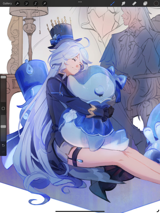
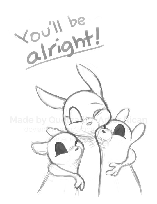
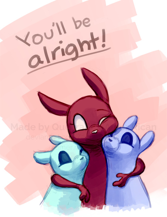
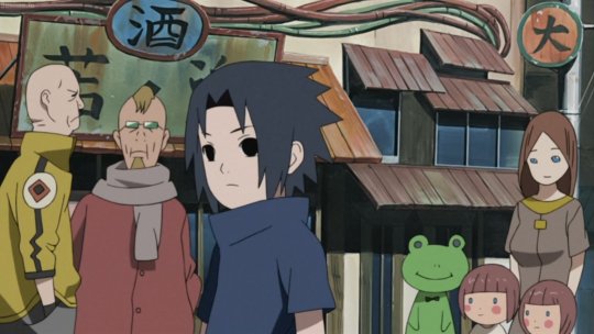
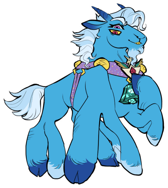
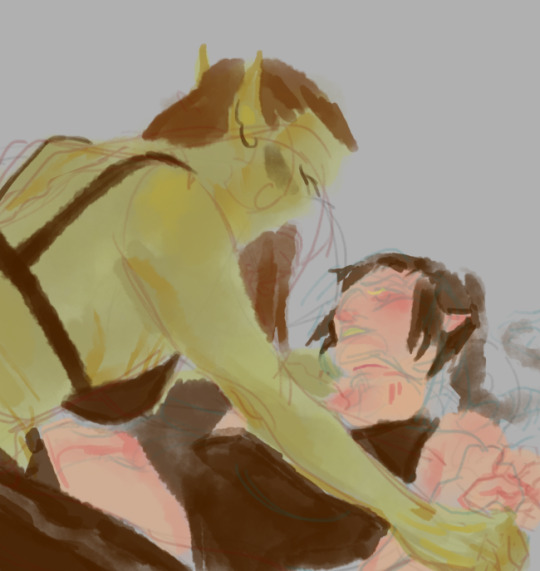
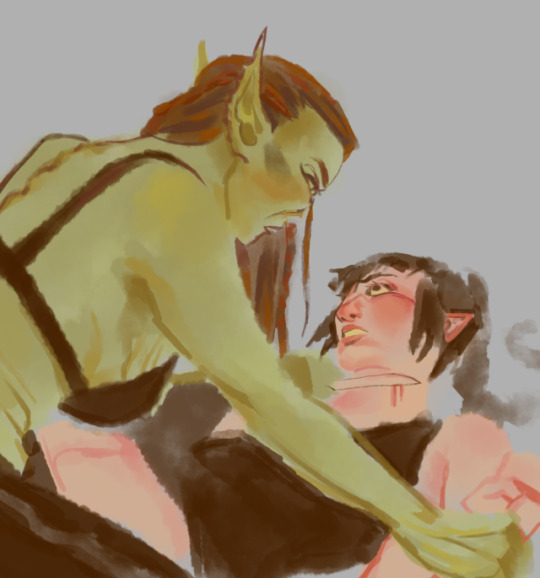
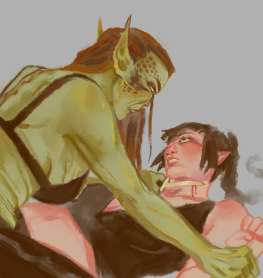
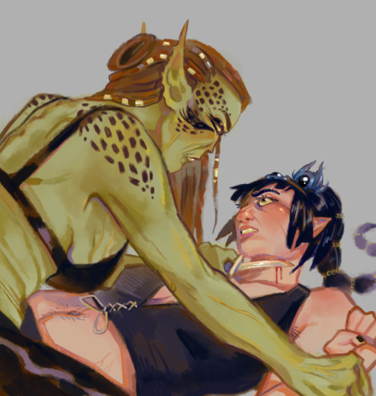
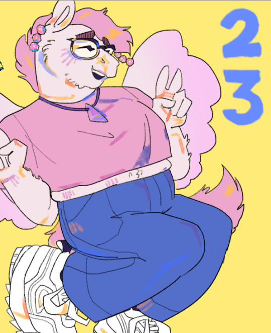
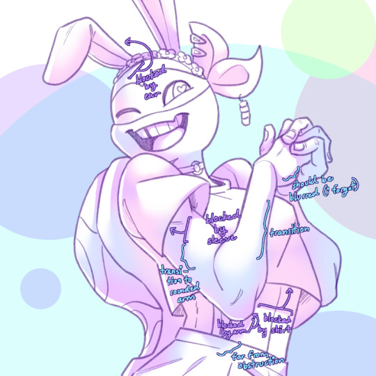
#the character was entirely painted on one layer with no lineart
Text
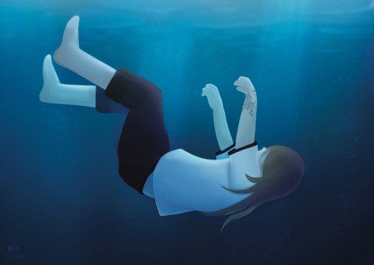
“Cast away unto the tide” 🫧
#another piece of Matatabi#the character was entirely painted on one layer with no lineart#was a fun challange emulating the colours of someone underwater#my artwork#original character#original work#oc#underwater
1 note
·
View note
Text

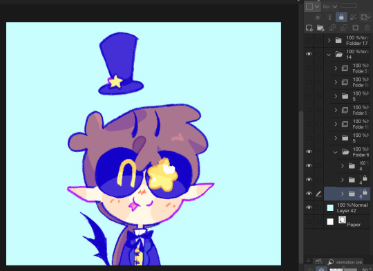
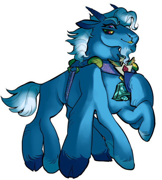
i got some questions on the brushes i used for drawing kezia so i'd like to make a short guide on it!
keep in mind that this is very clip studio specific so it may not be for everyone

most of kezia and the props were drawn with this brush that almost everyone seems to have (it's one of the most downloaded csp brushes i believe)
it's nothing fancy, i just like that it can do lineart and rendering in the same brush
to answer the question on the thickening and wavering lines, that was just my drawing habits breaking out of containment, star rail linearts are a lot more consistent in terms of thickness compared to mine (i like doing that thing where the line intersections are really thick)
and i don't know if this is a tip but i like to do shading above the lineart layer since it's a lot easier to make changes on the go, it doesn't work for every artstyle but i think it worked for star rail

for simple-shaped details like her buttons and necklace i used the border effect to save time

the background sky was entirely this cloud brush just for texture, filling the negative space with this kind of light texture helps the detailed character blend in better with the scene

not the most proud of this part, but the fence and the ground were drawn on top of open source assets to save time (the brick is a default csp material)

i added the prism effect at the last minute because i realized aventurine's splash art had it, but found out that it's actually pretty useful for filling up negative space. might try it on other drawings too

there's probably a different prism brush out there that's better suited to my needs but i didn't want the hassle of looking for it, it does the job

for the paint-like edges i used the dry ink brush, i believe it's one of the default brushes

i think that's about all i have on my mind, tbh drawing this was a wild shot in the dark but i definitely learned a lot more about game art in the end!
#havanillas art guide#also sorry if you got a notification for this when there was nothing in here#i accidentally hit the post button before i was done with it
461 notes
·
View notes
Text

it was suggested I post this to the tags as well >:D
fuck it ima tag @transcendence-au as well because tbh I'm very proud of my silly little animation
some me being a nerd under the cut!
okay so this all started when I read the original post this was inspired by and though 'wouldn't it be silly to add some art to this 3 year old post?' but then I decided to animate it for funsies!
and gosh I sure do love animating!
So I got the base sketch and then got into the lineart animation for each component!
i don't have the sketches/wips saved at all sense this wasn't really a project and it took less than a day to complete. but here's a peak at the timeline
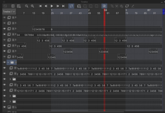
I animate entirely in my ususal drawing software: clip studio paint. It's just what's easiest for me.

all of these layers outside that folder are just the sparkles! after I finished I added some sparkles for fun! there's a lot of them because it involved a lot of copy and pasting sparkle layers
the bottom folders here are the wings body and facial expression! for everything like the wings arms and flags I was able to just copy paste, reverse, and then align the timing correctly in the timeline
one thing unique about this animation is that the lineart and colors are in separate layers! I tend to do line and colors on the same layer but this time I was using a brush that doesn't have the same lack of anti-aliasing and sense it's a small animation I wasn't as worried about keeping a minimum of layers like usual.
also the movement of the body is only 4 frames! and one one of those is just the hat shifting position
initially I wasn't going to have the second facial expression but when I got stuck on animating the flags I added the second facial expression while taking a break.
the arm animation is just 8 frames! honestly the only tricky part in this is the flags, everything else was pretty simple, which made it super fun to work on because I got both a challenge and mindless therapeutic drawing out of it.
NOW THE FLAGS
there was 3 throw away attempts before I got it: you see the thing that made this tricky is finding the balance between believability and visual appeal. a big part of animation is creating the illusion of physics, this is the 'believability' part, I need these to look like flags that are moving and made of flat fabric, HOWEVER if I animate these one-to-one with realistic physics: it won't look good! I can't apply wind to the whole drawing because then the hair would have to react, and wind goes one way, and I wan't the flags to be pointing opposite directions. so without wind the flags would be laying down flat, but that won't look good at all! and furthermore realistic physics would have the flag not being all nice and front facing most of the time. so the trick here was figuring out how much physics to apply to make it look believable, while still making it look good.
one trick I did to help me animate the flags is I actually made a plan rectangle flag as a guide so that the general mass/volume of the flag would stay consistent, this is something i highly recommend when animating! like having a circle guide along a characters head to keep their height and proportions consistent.
after I finally found the balance with the flag lineart coloring wasn't too hard! sense I just had to follow the lines, and THANK GOODNESS the trans and aroace flag have the same number of stripes: saving me time!
and then it all comes together to make a satisfying perfectly looping bundle of cuteness >:DDD I feel like the tau fandom doesn't have as many artists with particularly cartoony/chibi art styles so I've gotta play my part in spreading the joy-whimsy-adorable-sillys >:D
anyway! hope you get to see a cool beetle today :D
#kyukyudraws#animation#alcor the dreambender#tau#transcendence au#the transcendence au#gravity falls
70 notes
·
View notes
Note
Hi, I'm sure you get this often but I really love your recent genshin artwork, do you think you could explain your painting process? I love the colouring effect in that piece especially. Thank you.
Thank you so much! I got a few messages like this from my previous piece (thank you guys for the staff pick & blaze btw, I really didn't expect all the support😭) so I thought I'd share a bit of my process below as thanks.
I always do my lineart first because it feels less daunting to me when applying colours. I will do some rough colours first so I can easily adjust it to my liking.

Next, I make sure to separate each character into different layers when I clean it up. I like to work one character or object at a time, it's less overwhelming for me that way, and I can use clipping masks for ease of rendering.

I'll usually apply some adjustment layers on top of the base layer for shadows and highlights. When I say base layer, I just mean a layer of the colour without any effects.
I like using 'hard light' for shadows, and 'screen' for highlights, but you can really use whatever clicks with you.
Rinse & repeat this process for every character in the illustration. Note that I make Furina the focus so everything behind her will be less rendered than the elements in front of them (Neuvillette is a lot less rendered compared to Furina, and the painting in the back barely has much shading).
Once I render out each asset in the illustration and add shadows & highlights to my liking, I then to merge foreground/ midground/ background elements so I can make the overall illustration clearer to read. I don't want it to feel messy or overcrowded, and I think it's easy to get tunnel-visioned in small details and lose the clarity of the entire illustration.
Make sure to zoom out constantly and make your illustration B&W to check the values to see if the drawing is clear.

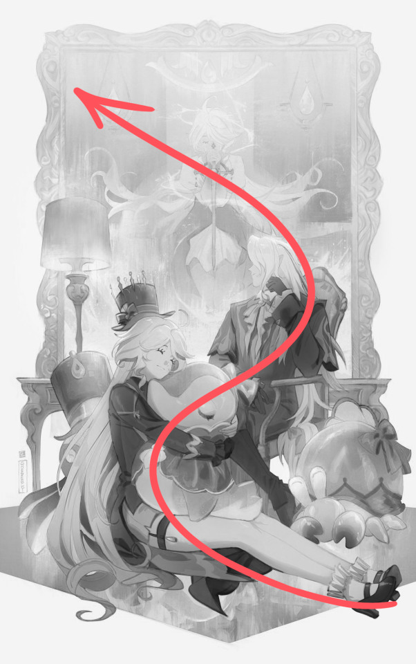
I created a simple S curve with the values for readability, and have the foreground elements have darker values & contrasts.
As for the BG, I wanted to add more textures into the drawing, particularly the painting in the back. Here's an image of it when I only added in the base colours.
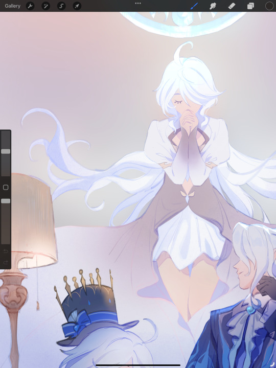
I use the smudge tool to create more texture once I fill in the base colours. Since I don't really 'paint' anything with the textures in, I just put in the base colours and take a textured brush to smudge it. However, over-smudging can lose the painterly texture I want, so I usually smudge vertically or horizontally in a single stroke to create a sense of movement.
Another thing to note is that I only textured the BG, I thought it would help it blend into the background a bit better. I usually wouldn't do this for the foreground because I want those elements to be clearer.
At the very end, I tend to spend a fair bit of time just fiddling with more adjustment layers, various filters (such as blur, or noise), or liquify small details to really finalize the piece. Just vibes...basically this is me

Anyway, I hope that was helpful & it made sense!! Feel free to message me if you have any other questions & I'll try my best to answer! I might've glazed over a lot since I didn't wanna make this too long.
236 notes
·
View notes
Text
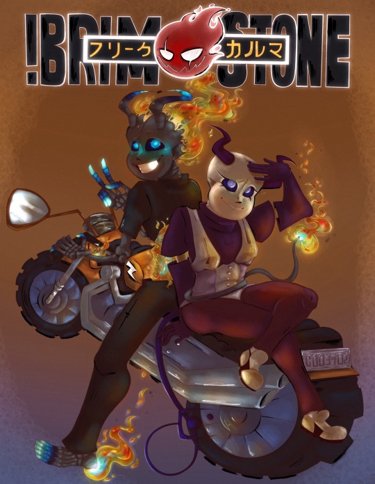
Context- I had been commissioned for this piece. Being in a financial pickle I picked it up and immediately set to work on it. Since I’m in need of money I put my all into the request to make sure it checked every box they could need. It turned out amazing I think! However I just checked our chat where I put the almost finished piece to find their account deleted. What’s worse is I had given them an update without my signature on it since it was unfinished and all…so if you see it floating around please message me!
Without further adeu~ the piece!
╔══*.·:·✧ ☎️ ✧·:·.*══╗
Information
I was messaged by the user Freaky (later changed to Dust) for the commission of their two Characters Brimstone and Karma. Ecstatic we began consultation!!
They decided on a photo reference from the anime “Soul Eater”. They liked the old anime style and requested their piece would be similar. That meant a full body with simple background but a lot of technique put into the old anime style! Ofc I wouldn’t shy away from the challenge (since my bills won’t shy away from me- the apple did not work on the doctor….no matter how hard I threw it)
Upon requesting their budget they said between 130-200$ which worked fine with me. I always tend to under charge anyhow. Due to my needs this time was no different. I assured they would receive updates to let them know how the piece was going and that I would collect their input on any fixes needed. They agreed and without further wait I began.
『•🪱•✎•🪱•』
[ T o o l s ]
✦ Cheap sketchpad
✦ Mechanical Pencil 7.0 lead
✦ My Phone (to send to the iPad)
✦ Fathers IPad (Im broke don’t judge)
✦ Procreate
✦ Color Pencil procreate brush pack
✦ Lineart procreate brush pack
✦Paint procreate brush pack
*ੈ✩‧₊˚ˏˋ°⁀✎ 🫎 P R O C E S S 🫎 *ੈ✩‧₊˚ˏˋ°⁀✎
Once saving the many provided refs I began by creating character reference sheets. Due to the customer not being artistic they provided me with several other commissioned pieces of their characters. Not all…looked the same… so I created these sheets to compile the parts that fit the personalities portrayed. Then I checked in with the user to figure out which features looked most like what they imagined for the characters.
Then I continued with the base sketch of the pose. The original reference for the pose didn’t entirely fit the characters so I chose to tweak it. I think I like the way they interact on the piece. I even made them doing rock paper scissors if you pay close enough attention! Karma lost but well…Brimstone would get what was coming for it later lol.
After all that it was finally digital art time!!! So I put my color references sent to me before adding the anime ref and my character refs. On the iPad I started with adding the details of the characters and sketching the pieces in further.
When that looked good I shifted the background a little to see it all before doing the motorcycle. (This is the first one I’ve ever drawn too- I know it’s funky! Don’t look too close)
Once the sketch was confirmed I began lineart. The title was changed to say Brimstone in big and in Japanese it reads “Freak Karma” the user of the customer and their second character.
Following that was color blocking which absolutely murdered me! I simply started with a big blob and did Alpha lock. Then I continued to block out base colors. Probably the worst experience of my life…goodness..
After I did a big dark brown layer with the opacity lowered for the look of a darker environment. From there I lightly erased the spots for lighting.
Then it was additional coloring and shading to the color block layer followed by additional erasing on the shadow layer. Building it up until I was satisfied.
Finally I did two layers- a layer for specific color lighting such as the flames reflection and the color to their skulls and a layer for the black and white liner.
All that was left was adding noise, Bloom, and a little bit of halftones to achieve the desired look.
With everything done I added my signature into the mirror on the bike!
ALL THIS ON ONLY 4 LAYERS! Due to the sheer size of the canvas (6000 pixels by 5000 pixels (ish)) I was only able to have 4 MAX layers. So pain…
🪳✨ Time ✨🪳
//this is the longest I’ve ever spent on a piece btw! (These are timed and rounded down to the simplest form. So these are all slightly UNDER what I actually did.)
Ref sheets 🎨 45 min
Layout Sketch 🔆 24.3 min
Digital Sketch 🛏️ 1 hour 30 min
Lineart 🍿 8 hours
Color Blocking 🥲 23 hours
Lighting + Final touches 👍 1 hour 25 min
Total- WAY TO FREAKING LONG! This has 26,543 strokes on it!!!!
Anywho! I hope you enjoy the piece as I sure as heck have not due to my suffering and now lack of money that I now have to try and find elsewhere with bills gripping my now every thought.
If you’d like to commission me I’ll have to ask for a base payment upfront now due to this situation. I am unable to spend such time to provide my very best just to be left when I truly need the money.
Thank you for your time!
#undertale au fanart#au undertale#sans undertale#undertale au#undertale#alternate universe#au sans#au fanart#sans au#soul eater#commission#scammers#digital art#digital illustration#digital drawing#anime art#anime au
23 notes
·
View notes
Text
Current digital art process!
Acting on @shkika 's request because making my redraw for this post actually ended up giving me more confidence in my digital art process! As such, I'm gonna use it as a reference. And if this walkthrough of sorts turns out nice, I might do it again as my process evolves!
I started off with a quick sketch of sorts, trying to focus both on movement and volume, and get the general idea of where each element is located. I edit the image dimensions and placement of things a lot in this phase, as my ideas often tend to change once I actually begin drawing them. In this case, as I got it down, I decided I wanted it to look like some cheesy animal motivational poster, so that influenced where the text was.
From there, I began to clean and sometimes edit the sketch, mainly by thickening the lines to make the shapes more definite, and erasing what wasn't necessary and interfered with other parts. Volume is one of my biggest focuses in my drawings, so I try my best to get the volume of each character at least hinted at with the lines. This is something that will probably remain in my process for a while, as I quite dislike doing separate lineart and like the messy, sketchy feel anyway.

I also wanna mention, in addition to having references and such in other windows, I've recently begun having a second mini window of my current drawing off to the side so I can see what it looks like overall more easily, regardless of how much I zoom in on and flip the main window. It's quite helpful!
For reference, this is what the final sketch looked like:
Then, I went on to add the flat colors. Another tip: I almost always set my sketch layer to "Lumi & Shade" because I think it makes the line colors a lot richer, but since it's based on what colors are underneath, it colors the lines a lot more individually than changing the sketch color as a whole. Here's some comparison to a version without the effect (left):

Then, I add some shading using a (really nice) marker brush. This is honestly one of my favorite parts of the process, just trying to carve out all the volumes, especially since I usually use a pretty blue color for shadows!
Sometimes, I honestly just leave drawings finished at this step, because I adore the sketchy look so much, and because I really don't like the tediousness of more realistic rendering in the painting process; from what I've seen/experienced, it often involves having to basically paint the entire image over again, which I've realized I find REALLY boring (and is also why I clean the sketch instead of making a new lineart layer). As such, one of my hopes is to reach a point where I could almost completely avoid having to clean up the image in a traditional painting method, instead being able to lay down lines and colors so well that they convey nearly all the volume necessary on their own, still have that sketchy appeal, yet also look finished and professional.
Alas, I did do a bit of clean up on this image, but I think it still turned out alright!

Here's the finished drawing! I'll have to practice with this process a bit more to truly solidify it as my digital go-to, but nonetheless, I think this came out adorable! Thanks again shkika for the ask, and thanks to @mintscampi for the sweet prompt! I hope you guys like it!
#art#artwork#artists on tumbr#digital#digital art#digital artwork#painting#digital painting#process#painting process#art process#tutorial#fanart#rain world#slugcat#rw slugcat#slugpup#artificer#rw artificer#quetzalli draws#quetzalli's notes
98 notes
·
View notes
Text
Avenging Troy


14 hours and 48 minutes, let’s go!! Honestly, the fact that this didn’t take nearly as long as Mehmed’s 1st ascension (≈27 hours) either means that I’m getting better at pain-ting or this piece wasn’t as intense in the detail department. Regardless, I am very proud of this! I suck at drawing profiles, so perfecting it this time around was certainly a major personal victory for me. Now, enough about me patting myself on the back. Let’s get into the behind the scenes for this piece.
The context—or perhaps what this piece IS may be a better way of phrasing—is Mehmed II doing exactly what the title of the piece says, avenging Troy. The top picture is Hector’s duel against Achilles in front of the Trojan gates. His pose is that of his NP, Durindana. The bottom picture is of Mehmed II striking a similar pose to Hector, but instead of calc’ing the angle of a spear it’s the super-awesome-big-fucking-cannon. Pretty cool concept right? Mehmed, 10 years post-conquering of Constantinople, going to what’s left of Troy and saying that he ‘avenged the Trojans’ is a thing that has some evidence to it actually happening (or so I’m told), so it’d be pretty cool for Mehmed to strike the same (or similar) pose as Hector during one of his campaigns as a homage to Hector since the Iliad was one of his favorite books in life.
There’s just one teeny-tiny problem. I originally drew this up with the intention of it being during the Siege of Constantinople because my dumb ass thought he said that RIGHT AFTER he got Constantinople, hence the very specific BFC in the back there. I only figured out my mistake when I was finished and showing it off to my pops who then promptly asked me “Huh? When did he say that?” And then he corrected me and I was in shambles.
Now. I can make the case that, since Durindana was Hector’s most powerful weapon and the BFC was Mehmed’s most powerful weapon, it’d make sense as an artistic parallel to have Mehmed with his BFC instead of some regular cannon and it’s just more iconic that way. It doesn’t have to make sense because of artistic liberties! Which is a neato way of making a positive outta this but…eh. That minor hole will always remain no matter how it is justified.
On to something else more light, you may have noticed that Hector’s section is significantly less detailed than Mehmed’s. It’s completely lineless, no lineart was had in that entire section. Just fills and clipping layers, baby! The reason for this is because Hector is a character in a book, therefore I thought he should be drawn as though he IS in a book. If that makes sense. His arm is a tube, the Trojan gate looks like a cardboard stand and he has no eyes—typical storybook vibes, I’d say. Plus you could also interpret this as Mehmed imagining what Hector’s final moments were as an ‘in-universe’ explanation for why it looks that way.
On the other hand, Mehmed’s section is much, MUCH more detailed. Just look at those lines! The reason for their existence is because I based Mehmed’s outfit on a painting of him walking through into Constantinople (because that’s what his section was originally about) but I couldn’t quite make out the details of his armor was. In hindsight this was probably denial. So, I searched up what Ottoman armor looked like and mother of god it was mostly chainmail. I wanted to throw myself out of a window. Drawing that many circles and shading that many circles would have been a maddening experience, so I got creative and this was the result. Not bad if I do say so myself. His helmet was another thing that made me want to throw myself out of a window. Mehmed II’s helmet is sick as fuck to look at and I bet wearing it gives you a major buff in the style department, but drawing it? Nope. Nope, I am not doing that. There is way too many specifics going there with the inscribed prayers and awesome ornate design, I could never draw that with the helm being this small in the picture. So I opted for a line texture on the green parts instead.
On his greaves? brace? and back plates there is a strange texture. At this point I ran out of ideas on how to fill up the space to make it look cool, so I drew the bog-standard vertical lines but this time I took an eraser with a specific shape (Procreate havers, look at Textures and it’ll be the first one you see) and erased it, leaving behind the specific shape in the negative. I thought that leaving it textureless would be lame, so I put that in.
As for that lovely cannon in the back, it wasn’t that hard to draw. I just had one hell of a time looking for clear crisp images of the pattern on the cannon for reference. Really, the most time consuming aspect of drawing the cannon was painting it. My dumb ass colored it as one whole thing instead of breaking it into pieces, which led me to have to erase a bunch of shit. Thank goodness I thought of using the selection lasso when I did or this would have taken WAY longer.
Last post, I said that this would be a trial run for Mehmed’s hypothetical 3rd ascension. It’s based off the aforementioned painting and I figured that Mehmed would need actual battle attire (y’know, armor) since his 1st and 2nd don’t exactly scream “I conquered Constantinople and almost got Europe” now do they? I like how I did the armor for this piece, but as an ascension it feels lacking. Like it needs MORE but I’m not sure what to add. A cool cape? A cool light halo? Or should I just say fuck it and make it a mech? <-Never drawn one before. Wouldn’t be the first time that happened in FGO, but it feels cheap! It should make sense but also look as bombastic and awesome as the man himself! So, if anyone has suggestions, please let me know.
During me fiddling around with the finished picture, I thought it would be cool to make Hector’s section desaturated to make it look like a flashback. But I found that it didn’t look as good. Even an orange hue for sepia vibes didn’t make the idea any better so it was scrapped.
Annnnd them’s my thoughts as well as the making of this piece. This had been gnawing at me ever since I learned that Mehmed said what he said and that Iliad was one of his favorite books. it’s such a cool thing, y’know? When if Mehmed comes to Grand Order, I really hope that his NP has him doing the pose as a call back to Hector. Would it make sense? Probably not. Do I care? Nah! I’d just be jumping for joy that Mehmed was in the game in the first place. Lasagna better make him one of the best buster archers to have ever lived, I hecking swear—!
Anywho, under this red line (ha-ha) are the individual pictures for Hector and Mehmed’s sections as well as a bonus black and white version of the sultan. It doesn’t jive with what I was going for, but it has a cool vibe to it that I just couldn’t let sleep. Plus it shows off my linework, so that is a plus. I hope you enjoy these and the piece itself. Oh, and I hope you have a good one!
—Redline, over and out.


#mehmed ii#mehmet ii#mehmed the conqueror#Hector fgo#Hektor fgo#hector of troy#Hektor of Troy#hector of the shining helm#Hektor of the shining helm#fate/school life#himuro’s world#Mehmed II fate/school life#Mehmet II fate/school life#Mehmed II Himuro’s World#Mehmet II Himuro’s World#fate series#fate grand order#fate/go#fate go#fgo#fgo fanart#redline can draw?!#One of the people I showed this to said that ‘the guy on the bottom looks evil’#Which is funny because that wasn’t my intention#Oh and to those who’re wondering where his glasses went#I tried drawing them but soon found it to look a bit ridiculous for him to wear glasses in battle#Especially with that metal piece from his helmet that’s right between his eyes.
10 notes
·
View notes
Note
if it's okay, would you mind sharing your art process? your style is SO gorgeous dude. keep it up spardacest nation!!!
Thank you so much anon, and of course!
I kinda posted about it on twitter a while ago, but for anyone not also on there, here's a paraphrasing of what I said there!
(under a cut bc it's gonna get a bit long)
(speedpaint video from procreate mostly bc like I also said in that post, it's one of the few pieces I've done entirely on procreate and thus entirely recorded kdfjhdk I usually don't do the sketching + painting parts on there but every now and then I get lazy and want to get it all done quick in one program lol! It's not as good as it would look if I were using krita to render (which is what I normally use) but it gets the idea across decently of what it is that I do)
The short version of my process is:
sketch, clean up sketch for lineart, then flat colors, then paint over the flats (i make the flats my shadows and paint on the light), then a multiply layer for skin details (like lips, eyebags, etc), then an overlay layer for skin transparency details (red over the ears/nose/fingertips etc), then i do hair over the lineart, then a multiply layer with the contact shadows in a light beige/grey/neutral tone on top of everything else, and then i unify layers, paint over the details, and color correct the HELL out of it
The longer version is:
SO, first of all, I will say, my entire process for a finished/fully redered piece is pretty scattered and uses a lot of different apps, because after many years of trying out different drawing apps I found that I just worked better when I could incorporate the parts I liked best from each individual one rather than having to adapt to another app entirely!
In total, what I use is: autodesk sketchbook and procreate for the first half I do on my ipad, then krita and photoshop on my computer when I'm actually rendering (but any photo editing app instead of ps will do, I'm just used to photoshop bc that's what I learned as my first drawing app WAAAY back in the day lol), and then meitu on my phone for color filters (also any phone editing app with filters in it will do), AND also optional just for references: blender and daz3d on computer + magicposer on my phone
The actual step by step of what I do:
First of all, if I want to do a detailed, well rendered piece I will start by getting my references ready. That means either just grabbing a screenshot from the game if it's like, a simple portrait, or a photo reference, taking a picture of myself in the right pose/lighting, and if it's something more complex I will recreate the scene in Daz3D to simulate a realistic lighting, OR even just blender (i have the game models for the dmc characters downloaded, so I can just pop them in, pose them and change the lighting to get a realistic idea of what shadows their faces will cast in that specific angle/lighting.)
Note: references are pretty essential to me, and there's nothing to be ashamed about for using them! Personally I don't struggle a lot with the drawing/sketching part of art, but my tiny little pea brain cannot fathom how to make an object 3D in my mind, and how to visualize shadows realistically... thus the reliance on 3D programs to do that for me, and then all I have to do is draw what I'm seeing lol. My art improved significantly ever since I started making 3D refs so I could get /exactly/ what I needed - there's still a lot of leeway you need to learn though, because as realistic as the lighting will be in a rendering program, you'll never really get a fully natural looking image, as far as stuff like the body stretching/squishing/pulling when it's in movement, facial expressions, folds in clothing/fabric, etc... so really it's more a guide than something meant to be followed 1:1.
Then, once I'm confident I know exactly what I'm gonna draw/have the idea in my head, I start sketching it in sketchbook. Not really getting very in depth, just blocking out rough shapes - I like sketchbook and to be on my ipad for that because it feels very reminiscent of traditional sketching on paper to me, which while I'm not super confident on my traditional art abilities, I do get the most natural/fluid/non-stiff figures out that way.
Then when I think I have the general idea ready, I export the sketch layer as a png and import it into procreate - which is where I kinda start picking at the sketch and polishing it like i'm carving it out haha. Lots of liquify tool, flipping the canvas to check if it's even, blending out some of the lineart to help out with the rendering later, and then polishing up what was once the sketch into serviceable lineart. I usually reimport it back into sketchbook at this stage - while I like procreate for drawing I don't love the brushes I can use for lineart there, and so I usually only draw the "base" naked figure in there - when I'm in sketchbook I use a hard pencil to refine the details, then on a separate layer add all the things "on top" like hair, clothing, etc - usually I can get it pretty easily in one go, and once I'm satisfied I erase the naked body under the clothes and unify the lineart layers.
Then I will just do the flats with a hard brush, turning the lineart layer into an overlay layer and coloring things in with the shadow colors.
At this point, I export the file as a psd and import it on my computer - I give it a once over in photoshop first to see if there needs to be any adjusting (like whether any layer that has an effect needs to have a different effect, if all the colors look right since the ipad screen isn't the most faithful, if i wanna change the background color, etc), and once I think it's ready enough, I open it up in krita, where I do the actual bulk of the painting/rendering (as to why specifically krita: it's because I've gotten very comfortable with the brush/painting brush dynamics there and cannot seem to get as good results anywhere else, it's just the goldilocks spot of a brush for me haha.)
If anyone's curious, here's the brushes I usually use for painting:
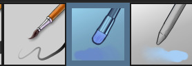
The one in the middle is my go to painting brush, left one for tinier/more refined details, right one for blending out soft shadows (though I learned the hard way to not overuse it, or it will look like I went ham with an airbrush tool lol).
(I don't change any of the settings on these brushes, so if you wanna try out the exact ones I use! Just fresh off how they come out the app haha)
I paint on the lights on top of the shadows, and just focus on that for the time being - once I'm done with the basic painting, I'll make a separate multiply layer for details like lip color, eye waterlines, makeup if there is any, eyebags, etc, and then adjust the opacity until it feels right - then I'll make an overlay layer with skin translucency details (like, when you hold your hands in front of a light and see the tips of your fingers become bright orange - many parts of your body are always a bit translucent to the blood underneath, specifically parts where the skin is thin like noses, cheeks, joints, knuckles, etc, and I found it makes the character look a lot more alive to add that subtle coloring in) - then usually I do hair on a separate layer on top of the lineart (because that way I can add small flyaways, more details, etc, and just use the lineart as a guide)
After that, I'll usually make a multiply layer on top of everything where I'll add contact shadows in a neutral color (usually pretty pale, it'll be darker anyway since it's multiply), and once I feel like I've rendered everything out properly, I save the psd and re-open it on photoshop.
In photoshop, I'll mess around with the layers a little bit more (changing hue/saturation, opacity, etc), fuck around with the background to make it look pleasing, and once I'm happy with it, I'll unify the layers and start color correcting - usually by duplicating the unified layer and messing with the curve/hsl of the image and then changing the opacity of that edited layer until it's as strong or muted as I want it to be - then I also edit the RGB curves individually and adjust the opacity of that also (because I just really like how it ends up looking if I give a bit of a red/warm tint to the shadows lol), and at that point often I will reimport the finished image into procreate for some finalizing touches! Like, blending out shadows that came out too harshly, painting over anything that came out not the way I wanted it, redefining the lineart if it got messy during painting, and adding any extra small detail that might have gotten lost like catchlights, hair shines, hair flyaways, tears, etc. I also do one last round of flipping the canvas and liquify if needed!
At this point, I export the finished image both to my computer and my phone - on my phone I open it up on the photo editing app, and add a bunch of different color filters - I don't hesitate from going completely balls to the walls here, and just kinda applying as many filters as will make an image look pleasing to my eye.
Once I think it looks good, I'll export the edited image to my computer - and then open both the version without filters and the one with them on photoshop, and use the filtered version as an opacity layer, and adjust it until it doesn't look as crazy anymore lol.
One last step I recently started incorporating was also changing the image to grayscale after I'm done, and doing one last round of curves in greyscale to make sure the values look right, and nothing is getting too lost because the values are too similar (because i know i get a bit swept up in getting repulsed by harsh contrasting lighting and can end up washing out all of rendering if I don't check myself kjdfgk)
AND that's it!
Yes it's a pretty long and chaotic process, but it's coming from years of trial and error and realizing I can just let myself fo whatever makes me happier with the results, and I don't have to stay constrained to one program if I don't like every tool it has to offer/don't have to accept the final image fresh off the painting app as the "finished" image with no adjustments allowed after, lol. I don't find it takes a lot more time than if I didn't do it this way, but YMMV.
Hope this was helpful and sorry for taking so long to explain! I just wanted to give a thorough explanation dfhdkhkx
#asks#sorry i know its a bit chaos hfdgd#but i hope its helpful anon! thanks for asking#also for anyone wondering#no i am not paying for ps lmao#fuck adobe#it is always morally correct to pirate adobe products people#if you have an alternative photo editing app you like best youre welcome to use it#but if youre too used to photoshop. everything is free on the internet if you know where to look#i also wouldnt recommend meitu bc it feels like a pretty sketchy app all things considered#im just too lazy to care to change my go to app but i would look for a different phone app#p sure theres billions that let you add funky color filters instead#actually i think you could use photoshop camera raw filters for that too#its just way too intensive of a process for my tiny potato computer and it feels a lot faster + seamless on phone
13 notes
·
View notes
Note
hi tamelee!
I'm here to ask for a little bit of advice if that's okay (: about a month ago I bought a Wacom drawing pad so I could start experimenting with digital art. artists like you here on tumblr have really inspired me to start making art. but I feel kinda.. lost. I've been mostly drawing naruto manga caps and I'm getting better but I guess I don't know where to go from here. coloring and shading scares me lol. I'm using clip studio paint and it's just a little.. intimidating. I feel discouraged, like I won't be able to do it. how did you do it tamelee? did you watch a lot of tutorials, or did you experiment until you figured things out? any advice you'd have for a beginner artist I'd really appreciate.
thank you veryvery much for your time ^^
Hi Nonee! 🧡
Sure!
Oh I think that’s a very good place to start. As well as drawing subjects you like ^^!
Hmm, tbh I’ve just experimented a lot, but I don’t think my way of having done things was the most efficient. You might want to follow tutorials step by step? You can try coloring only with flat colors until you feel a bit more confident with that as well as cell-shading (toon-shading/non-realistic, like in anime) instead of rendering further as that can all be confusing at first. I personally never truly understood shading until I studied cell-shading and made my art a lot more readable. A lot of Anime uses this;
You see how there is a base color, a darker color for shadows and highlights? (Sometimes not even highlights.)
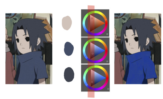
When you start to study it from existing work you’ll start to notice things like color always being in the same area of saturation and when you suddenly have a color that is way more saturated than the other it can look off. (See example.) But this is a guideline, not a rule. In your own art you can especially use saturation and brightness to help aid you to direct a viewer's focus and even tell a story.
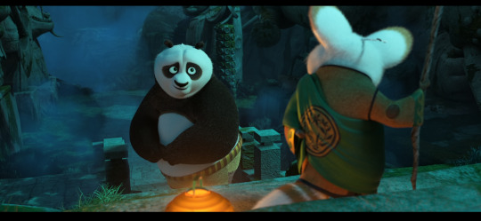
I LOVE ‘How to train you dragon’ and ‘Kung Fu Panda’ for this because their coloring is so inspiring and if you truly want to learn from professionals... well those are the type of media to look for of course! I have an entire folder to inspire me just based on those.
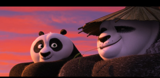
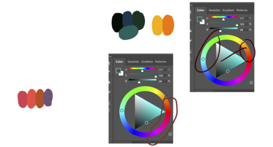
Do you see how calculated those color combo’s are?!?! Here you see both analogous and complementary schemes and it is actually through looking at the things I like that I learned it >< The orangey colors stand out and are bright which helps you to focus on that area whereas the complimentary scheme is used to bring characters together.
If drawing Manga-caps is something you love to do, then maybe for coloring you can study screen-caps from Anime or even other animated films. I’d recommend to take it step by step, though I haven’t really applied it myself, from the video’s I’ve seen and artists I’ve followed it is always advised to have an art-goal that you can work toward. Maybe you first want to focus on lineart and then laying down a base color where the colors are harmonious and next would be cell-shading maybe and then you can start adding another light-source etc- eventually you can decide to create more depth or practice with monochromatic coloring, maybe even greyscale to learn values. But right away that can all sound a bit intimidating doesn't it?
Find things that you like and then maybe you can open them in your program and just study. Find a brush you like, put on some music or a show on the background and for a moment play around with it without needing to create a finished piece. This is also how I learned how things like adjustment layers work or what all the different kinds of tools do. I have to agree with you, CSP is intimidating for me as well >< so this is kinda how I approach it as there are so many add-ons and additions within it but I try to only learn what I need for that moment so I don't overwhelm myself. I definitely try to find video’s that can help me with creating Manga though! ^^ There are plenty!
It'll get easier eventually, you'll learn the program and you start to recognize placements for shadows and you will get a feel for the coloring- no worries 💪 Learning something new will always stay intimidating, every time I open up a new document I feel it too. It's not easy at all, but you kinda have to allow yourself to experiment and even make mistakes because practice is never perfect.
I have some beginner tips written here- I hope any of this is somewhat helpful 🌷🫶
16 notes
·
View notes
Note
wow looking at your rat king thing, you improved SO MUCH in the last two years. what did you feel helped you improve?
There’s a handful of things I would say but the main one was switching from a screenless tablet to an iPad!! Obviously iPads are kinda pricey so I can’t recommend it for everyone, but I genuinely feel like switching from a screenless tablet (I used to use Huion) to screened one REALLY helped me get a better grasp of everything, along with procreate just having an easier layout to use compared to the other programs I used (SAI and CSP) which made me less afraid to mess around with brushes and other fun things like halftone textures and chromatic abbreviations, ect ect . Definitely play around with brushes!! While a different brush won’t suddenly make you the Best Artist Ever, finding a brush that works well with your style/art process can help a TON (almost all my brushes are from @/thedawner brush packs, I highly recommend their brushes!! Lots of free packs too, I use the bonobo chalk as my main painting brush)
The other big thing is references!! I rarely used any references until like last year, I’ve been taking my own pose/expression/ect references (yes that means looking at a weird picture of you for like an hour to get the pose right but you get used to it) and going on walks to get nice landscape shots for my work (all my giant ass floating fish drawings are based on images I personally took), but if you don’t wanna do that websites like unsplash, Pexels, and pixabay are great for royalty free (VERY IMPORTANT, I have seen LOTS of artists end up in legal battles because they just used a random photo they got off Google that ended up being copyrighted) pictures and vectors to help get ya started.
The last major big thing is my drawing process in general!! I was hardwired to believe you HAD to do art in the steps of sketch, lineart, color, then shading all on separate layers. Don’t be afraid to use what process works for you! When I threw lineart out the window and started painting all on one layer it became WAY easier for me to block out shapes (highly recommend doing greyscale paint studies, it helps SOO much with more coherent color pallets and lighting) and really helps the entire work fell connected rather than a character that feels poorly overlaid on a separately drawn background.
Don’t be afraid to fuck around! Its art! It’s supposed to be messy and weird! Merge your layers! Use 30 different brushes because you feel like it!! Have fun and mess around with the process and see where it takes you!!!
#there’s two other attributes which was finally getting art classes that were more geared towards developing my style rather than the basics#and my brain fully developing at 25. I wish this was a lie but I feel like my brain can just suddenly understand anatomy better#ask#long post#behold my text wall
15 notes
·
View notes
Note
hiii!! your artstyle is SO COOL to me- as in sometimes i'll just stare at some of your pieces because theyre all so great. i was wondering if you were comfortable sharing your process when it comes to art?? i'd love to see how you do things!
Hi!! I'm sorry this took so long to answer, I hope you still find it useful. It means a ton to me that you enjoy my art so much! <3 It's easy to feel discouraged by the Invisible Hand of Internet Engagement, so I really appreciate your ask.
General thoughts (NOT rules, just things I consider or do a lot):
Things that appear one solid color irl can be broken down into multiple colors through artistic interpretation. I see a lot of beginner artists paint trees as solid green, when there's a lot of yellows, blues, and browns in there! A FANTASTIC example of this is jadenvargen, whose color use is masterful and I can only aspire to emulate one day.
Base colors are not saturated; saturation is reserved for pops of color and details
Shadows are purples, blues, and greens
Reference is your best friend!!!
So the nitty gritty for those who want to see: with digital art there's two main avenues I take. The first one is lineart, and the second is painterly. All IDs are in alt text.
My process for lineart pieces:
I always start off with a sketch; for this example I'm using one of my pieces from @/mylittlefusions (that isn't actually posted yet but will be later today) - a Grogar and Trixie MLP G4 fusion. I like to fiddle with brush selections until I get the effect I want, and then go slow on the lineart to make sure it's how I want it, so this can be time consuming!
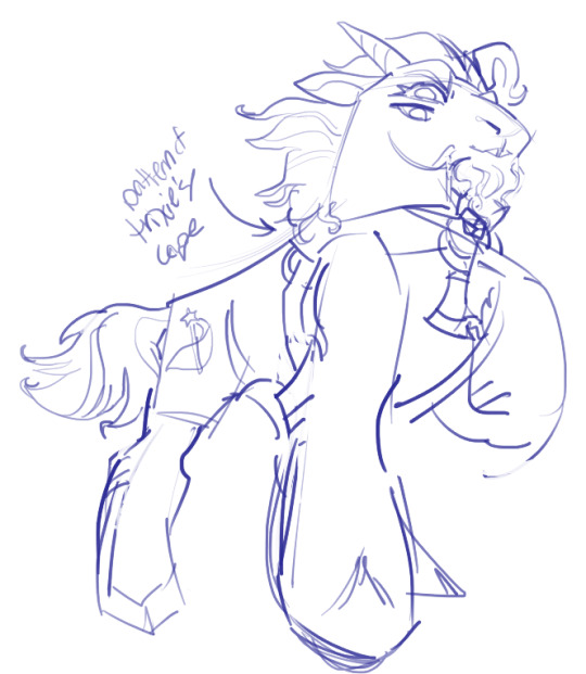
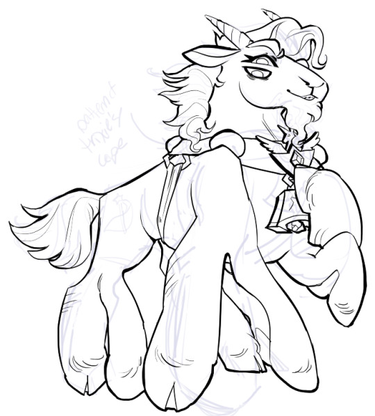
I've been trying for distinct shapes; I hate when my art gets muddled, I feel like the end piece is less impactful when I don't put in the right amount of contrast and distinctive silhouettes. Just something I've been thinking about and trying to improve.
Then I add base colors, going for slightly desaturated colors. I like to use saturated/bright tones to contrast or draw attention to something. I put the base-base colors down in one layer and then add details as a mask layer:
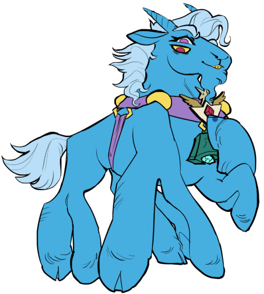
Then comes shading!! I'm a big fan of a multiply layer set to cool tones like blue, so I usually start there. If I think it needs to be different I can change it later. In this instance, I filled the whole canvas in the shading color as a mask over the base colors, and then erased where needed. Now that the shading is done, I often go back and color the lineart :)
Last but not least is my favorite part, painting on top! The extent to which I do this depends on what I think is needed, but I usually at least paint on top of the multiply shading to add some nuance, i.e. the greener bits on the background limbs. Here I added bright magic outlines to pop from the more desaturated character.
My more painterly style is a different story though! I use the same thoughts about color and shading, but I usually forgo multiply layers entirely and just do colors by eye. I still do a sketch, usually. Here is an example using my Lae'zel / Shadowheart piece.
The sketch is a disaster zone lol - but I painted below it using base tones, again desaturated. Once I feel I don't need the sketch anymore, I keep painting, making a new layer when I feel like being cautious about a change I'm making.

After I feel that I've got base colors down, it's time to get more contrast in using darker and/or more saturated colors! Then, like with my lineart process, I paint more details on top of everything else - reflections, jewelry, body hair, etc. I try to communicate shadow and distance with purples and blues, but I'm still working on it.

Another example real quick, where i did my typical lineart process base work and then painted on top of the shadow layer and the entire piece as a whole:
Thanks for reading if you stuck around, and thank you for the ask, friend! ^^
6 notes
·
View notes
Note
saw you were looking for crit on your arcana oc and thought i’d weigh in as someone who also struggled with recreating the arcana style. the first thing that stuck out to me as being different from the arcana style was the brushes you used, your lineweight and the shading.
the arcana game uses a pretty distinct brush set which was once available by a user called like savenkey or something?? you might be able to find the brush set just by looking around online but it definitely comes in handy when getting that slightly textured & tapered linework. as it currently stands, your lines are quite thin, made of a pretty smooth brush, can be a teensy bit wobbly in some places and dont have any tapering towards the ends. to make this close to the arcana style i’d recommend upping the thickness a little bit (if you’re struggling with space between pixels just bump up the canvas size a bit) and increasing the amount of stabilisation. the tapering could potentially be done by hand (ie erasing the ends of lines to make them thinner) but it’s super time consuming so i’d recommend just using the arcana lineart brush (on a side note, if you don’t manage to find the set but are still interested i could try work out how to send them over?). another thing to note when drawing lineart is that the arcana game uses a lot of sharp edges, especially around the elbows, jawlines and fabric folds, don’t be afraid to thicken those approaching edges up, just to create a spike where the two lines intersect
as for the shading, the whole brush thing also comes into play as the arcana style shading brush has a bit of roughness and is on a slight angle, that’s what creates these areas on the in-game sprites. i can also see you’ve begun to alternate between hard and soft shaded edges but i think a few harder, more definitive edges would help it look closer to in-game art. the arcana shading is also all done in a pale lavender colour on a multiply layer. it looks like you’ve done it on the face but it’s also the case for the rest of the body and clothes too & really helps make that distinctive arcana vibe. it can definitely be difficult shading curly hair and i also struggle with it, but curly haired ingame characters (especially those with shorter hair) do still have big blocks of highlights, doing one big swathe across the side of the skull would better mimic the style, with additional smaller highlights (sometimes less is more) to denote extra curls
and then a few extra details that might come in handy:
- the arcana game uses a textured overlay over their characters’ images, i don’t know if this is the exact one they use but it definitely works! slap it over your character as a clipping mask with the overlay layer filter (you might need to lighten or darken the grey to ensure it doesn’t mess with your characters colours too much) and then just drop the opacity to wherever you think looks best
- (as far as i’m aware) all arcana characters have fingernails drawn on, adding some to your character (whether they’re painted or not) might be a nice touch
- no matter how small or thin, generally all smaller details like tassels/string ties/jewellery or other metal details are all given lineart and coloured, the details are such a pain in the arse to draw but it definitely makes the final look worth it imo
- i’m not 100% sure how you’ve drawn on the blue details but in-game, they’re usually drawn using a screen layer with slightly lowered opacity over both the colour and lineart, and some of the edges are slightly shaded out

however, as far as art style mimicry goes i can’t recommend bast_art13’s tutorials enough, i’m not entirely sure if they’re still active in the community either (i was mainly active in 2020 and have only just started crawling back in💀) but their tutorials are still up on tumblr i think (somewhere). they really break down how the arcana artists draw faces/facial features and explain recurring stylistic choices, for example, how metal is shaded
anyway! that was a lot and i do want to say that you’ve made a really brilliant effort, the style is really difficult to emulate and the way you’ve drawn your oc is really nice!! you did so well, especially when seeing the improvement between this one and your previous drawing. and ofc it’s needless to say i’m a stranger on the internet, take what i say with a pinch of salt or just completely ignore the bits you think are stupid if you want ! it’s a perfectly acceptable response to unwanted pieces of criticism :]
while i’m here i also want to say that i’m obsessed with ur valdemar fanart + you’re doing the lords work with the amount of content you make for them. with that aside, good luck on your future drawings in the arcana style!! i’m sure you’ll do great & apologies if my handwriting was unreadable! also if you have any further questions feel free to ask :3
ohhhhh thank you! this is all very helpful and I'm grateful you took the time out of your day to share with me what you've learned, I'll definitely be taking this to heart for my future efforts
#this response seems so short compared to what you wrote RAHHHHH i dont mean for it to be i just dont have much to add#just picture me nodding and 🤔ing and such intently as i read this#asks#sco07ut#arcana spam#apprentice finn#helpful
6 notes
·
View notes
Note
how long does it take you to draw and colour? since you post everyday which is great for me :D
any tips for colouring cause Im still tryna figure all that out
hmm welllll, i don't exactly time how long it takes to draw but my partner said that sometimes i'll be working on a piece when they go to sleep and i'll still be working on it when they wake up 7 hours later so...my guess is anywhere from 3-8 hours each depending on complexity? at least for the art that i normally post, most of which is relatively simple.
not entirely sure what kind of tips you were looking for, but i'll just throw out some of my thought processes and stuff i try to keep in mind whenever i color. i'm gonna try and keep these relatively to the point so i won't go into much detail on art terms n whatnot, BUT i am also pretty terrible at explaining things so if you need clarification on anything, feel free to ask!
(sorry it's so longggg, i got carried away. i am...very wordy when it comes to art lol)
i like to block in the colors during the sketching stage before i do the lineart, especially for pieces where i know i want to do something funky with the color palette. you can see this in a lot of my process shots. doing colors in the planning stage just gives me a lot more freedom to focus purely on the colors and shading and how they work with the composition, without having to worry about the minute details like making sure the colors are inside the lines.
in order to save time while coloring, i'll usually just select the negative space (after making sure all the lineart is closed) > expand selection by 1 pixel (to make sure the edges are hidden within the liineart) > invert selection > fill bucket, then use clipping layers above that to color individual areas.
layer modes are your friend! i use multiply, overlay, and glow dodge (this one may be specific to mangastudio?) in almost every one of my drawings, but it's definitely worth playing around with all of the modes just to familiarize yourself with them if you haven't already.
color is honestly SO subjective. i'm never a fan of color picking (from source material or my own refs or whatever) bc while it may have its uses when it comes to consistency, imo it's much more fun to make them up as i go. you get a lot more variety from piece to piece while also familiarizing yourself with the character's palette that way. usually i'll start by deciding on the overall mood/palette (cool/warm, de-saturated, neon, pastel, etc), filling in the background color, then picking the characters' colors based on that. like with this venti pic, i started with a purple background and based my colors around that purple so they all fit the specific look i was going for. i could maybe get a similar effect by starting with the normal colors and using filters, shading, layer modes, etc to get the funky colors, but it will be much harder/more work and doesn't get as drastic of an effect imo.
on that note, don't be afraid to use shades/colors that may seem odd! you'd be surprised how many times i've used gray in place of blue, orange, purple..basically any color. in the above example, you can see just how different the colors ended up being from the original. after i decide on my palette + bg color, i'll just throw down the color i think will work and then (bc that first guess is usually wrong and meant only as a ballpark estimate) see if it needs to be warmer or cooler/darker or lighter/more or less saturated/etc and adjust accordingly. it's like mixing paint or tuning an instrument! it takes a little bit of practice, but after a while you start to get the hang of what colors will look like in which color palettes. white is usually the easiest to start with bc it will always just be tinted whatever color your palette is (like how the "white" in the above example is just a light purple).
this and the next point are more about shading but i include it as part of the coloring process: the easiest way i've learned to do shading is to darken the entire image/character/part you want to shade (usually with a solid color multiply layer) then add in the lighting either by erasing parts of the multiply layer or by using a separate layer set to overlay or glow dodge (or a similar lightening layer mode). it works a lot better than drawing the shadows imo because it kind of mimics how light works in real life; things are dark by default until you let light in and it hits what it can while leaving the rest still dark.
if you want to blend shadows, i usually still use the above method, but just blur certain areas of it and when i'm deciding which parts to blur (bc i don't just do so indiscriminately) i'll mentally sort all of the shadows into 2 categories:
shadows created by light being blocked by an object: like putting your hand in front of a flashlight. these shadows will retain their sharp edge, but can transition into the 2nd category if they are far enough from the obstruction, like how your hand's shadow will become blurrier the further you move it from the flashlight. the more distance between a light source and the surface it's projecting onto, the more chances for the light to scatter = softer edges
shadows created by light "rolling" off the surface: like the shadows on a ball or rounded surface. these will get blurred and i usually like to put a little bit of color along the blurred edge (a different and usually brighter/more saturated color than the rest of the shadows) just to add some life to the shadows.
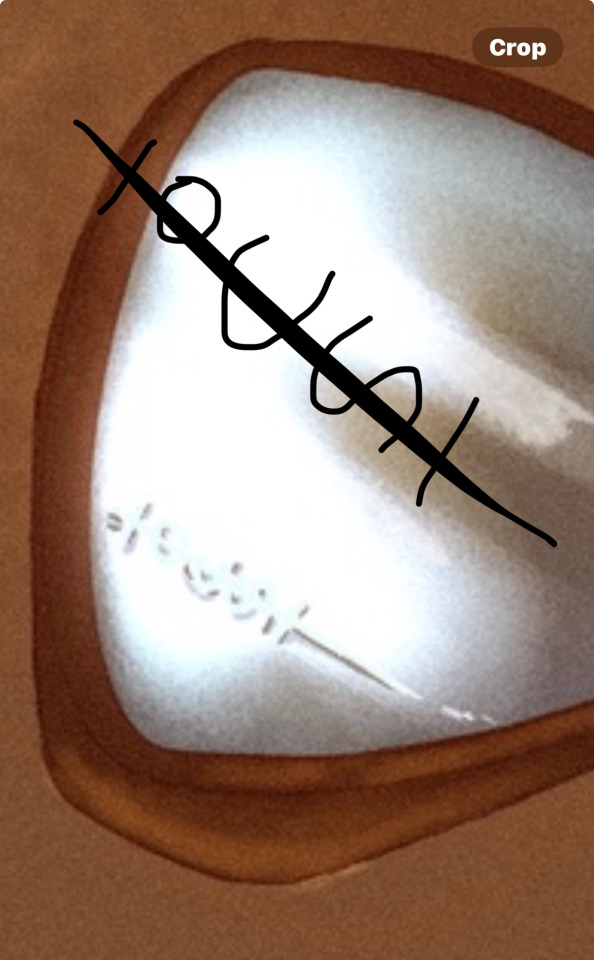
here's an annotated version of this mikey pic with just the shadows so it's a lot easier to see :) sorry im bad at annotating..
aaaand this post has probably gotten way longer than you were hoping for so i'll cut it off here 😭 hope this has been at least somewhat useful, and good luck with your art!
27 notes
·
View notes
Note
Just wanted to say I admire how *much* art you make. Comic making isn't easy and you do it with a lot of attention to detail and keep characters voices & the pace of the story moving in an exciting way. It's work i respect and I'm curious about your workflow? Like your software, how you organize layers, unreleased sketches before lineart, commentary on how you turn writing into a page structure. Any behind the scenes would be cool if you want to share
this is such a sweet message, thank you so much! I actually get nervous a lot that I'm not producing enough content, since I tend to post like 5 drawings at once and then disappear for an entire month. I appreciate you saying that :)
As for my work flow, I draw using MediBang Paint Pro. I originally got it in highschool just cause it was free and now I can't imagine making comics in a different program. I will say tho, if you're used to adobe products MediBang is a bit of a downgrade. I've had to use and learn adobe products for school and the ease of use is definitely a step down, but it is WAY easier to learn
I generally have a 7 step system in my workflow process. I'll put it under the cut tho cause it contains spoilers for the next chapter
first I write out the contents of the chapter in a google doc that I have. It just contains general key notes that I want to hit in that chapter, all the minute details of how to get to those points are generally thought of on the spot.
They either have very little instructions (from chap 11)
or a LOT of instructions (from chap 16)
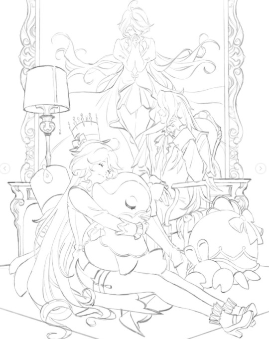
next I'll usually write out a rough sketch of all the pages and dialogue to go into that chapter. This is an example of one page (spoilers)
these sketches are very rough, as well as the dialogue. At this stage when I'm writing dialogue I usually just go for a general idea of the dialogue or a feeling, or if there's a specific way I want something to be said then I will write that down specifically how I say it. Otherwise, the dialogue is subject to change even up to when I post the chapter, like this example from chapter 7

When I'm writing dialogue I usually like to act out the scene and mouth the words (thank god my desk is very much out of the view of my family), both to envision the tone of voice, the vocal fluctuations, and how one might act if they were being spoken to in a specific way. My goal is to make the dialogue as diegetic as possible without compromising the reader's ability to interpret what's being said.
The next step in my process is to refine the sketch (spoilers all the way down)

then line it

colour it
shade it

and sign it and ad the dialogue
planning the chapter and the dialogue and rough sketch usually takes about 1-2 days, whereas detailing the sketch up to finishing the page takes about 1-4 hours, depending on how many characters are in each panel.
And that's basically my entire process from start to finish!
27 notes
·
View notes
Note
I am curious, how do you do your ministrifes? I was wondering if you had a tutorial or anything because I absolutely love how you do them and I wanna learn!
I'm sorry this took over a month! I've been away from home, and busy, and struggling with other issues. But I have been working on it and I am finally delivering it to you now today!
This is going to be very long, so I placed it under a cut with image descriptions within the post text for clarity.
First of all, for any type of sprite- it's extremely helpful to know pixel art basics. There's tons of tutorials online and on YouTube if you go looking for them! You don't need to know everything, though. The things I'd personally recommend learning about are jaggies, doing curves, and conserving colors.
However, I also encourage you to just jump in and see what works for you! There's no wrong way to do pixel art, or any kind of art for that matter, and making something imperfect is still better than making nothing.
Anything with a pixel brush will work as a program. Some free pixel art oriented programs you can use are Piskel and Libresprite. If you don't mind paying, I've heard good things about Asesprite. Personally, I use Paint Tool Sai 2. You can also just use MS Paint, especially with the layers add on that was released recently.
Here's some process descriptions for both original sprites and swap edits.
Character swap edits:
Using an indigo Dave and Dirk I did for a request as an example, but much of them are made in the same way as this.


[ID: Two process images of Dave and Dirk's home stuck mini strife sprites being turned into indigo blooded trolls. Both characters' original sprites appear, followed by a recolored version with blue lineart, skin, and symbol, and with black hair. Dave has horns and Dirk has sea dweller fins but no horns. End ID]
I start with color correction and adding easy troll features. I pull skin and lineart tones from other sprites and adjust for any value differences. I often use a lighter color for indigo trolls because the base tone gives me eyestrain. Dave's horns got pulled from a different sprite as a base, but this was the first troll Dirk I did so I did his horns with his hair in the next section.


[ID: The first two sprites in these images are Dave and Dirk being given different outfits. Dave has a dress outlined over him and then colored in to be a light blue. Dirk's shirt is lengthened and turned white while his pants are turned blue. Both of them have troll signs.
The second two have Dave with a pony tail and larger horns. Dirk is given horns that curl in as well as thicker hair. End ID]
I outline an outfit before coloring it in if I'm making significant changes. If I'm not I just move parts around with selection and move tools. The signs always look a little funny on such a tiny scale.
For the hair, I try to keep something of the original silhouette while changing it enough to be distinct. It's a hard balance to strike. Usually there's a lot of minor tweaks and adjustments, especially if I'm changing the entire hairstyle like I have before.
If I'm changing existing horns I do about the same thing I do with the hair. For creating new horns, I mostly blob out a shape and tweak it till I'm satisfied.


[ID: Both finished sprites of Dave and Dirk. Dave and Dirk have both been given blue glasses. End ID]
Final touches, which can include color alterations or changes to small accessories or additions of new accessories entirely.
The intent behind my swaps specifically are to communicate an altered personality from the original, while still keeping the character recognizable enough. It's a hard balance to strike and some sprites are more successful than others. Best of luck if you try to do swaps of your own :)
--
Completely original sprites:
For this, I'm going to walk you through two character sprites I've made recently. This is more complicated than the other one, so it'll be longer.
These ones are for a fantroll I posted recently (Citral Mimali), and a fan kid request between Jade and Karkat (Kari Harley-Vantas).


[ID: Two process images of Home stuck mini strife sprites being made. The first image, of a character named Citral, starts with several abstract blocks of color and the second image, of a character named Kari, starts with a loose sketch. End ID]
For these sprites, I started them in two distinct ways- with blobbing out abstract colors and a sketch. Abstract colors can be helpful for keeping a lot of parts distinct from each other, while sketching is helpful for having a decent idea of what the finished product looks like from the get go. Other options include shrinking down a pre-made sketch and drawing over it, and just winging it.
(Post making Citral's sprite, and far too late to correct, I realize I didn't do the abstract color method correctly. You want to block out everything at once usually with the colors you'll be using in the finished product. But I'll keep it in anyway, because the method I did might still be helpful to someone. It's not normally what I do so I wasn't super experienced with doing it.)
When making a pose for a sprite, you want to make sure you center the character's personality first and foremost. For Citral, I wanted to make it look like she was smirking, almost jeering at someone else, while Kari is supposed to look confident and friendly. The silhouette matters a lot too, you want to be thinking about how the future parts you'll add will interact with the pose.
I also usually start with having other sprites on the canvas both for size reference and pose inspiration. I sprite the head first, it helps me lay out the proportion for the rest of the sprite. You can see I change the arms in both poses- I never get the arms right the first time.
In my non-Homestuck ministrife sprites I often play with the proportions and style a lot. I'd recommend it! It's fun and expands your sprite capabilities. You absolutely don't need to feel held to a specific style.


[ID: Two images of process sprites. The first is of Citral. It starts out with a bright purple hair outline into a finished hair sprite, two long pig tails. The second is of Kari. It has a couple vague shapes into a ponytail with a hairband and small horns. End ID]
For me, the hair always takes the longest. Citral's hair was more complicated, as it interacts with her silhouette more, so I had different processes for both of them.
For Citral, I started with a sketch outline then blocked it out into colors. I took the right pigtail, flipped, rotated, and tweaked it to save myself the work of doing it twice and keep the hair consistent. Doing a hairline is easy- you follow around the outline of the head further down.
I was making up Kari's design as I spirited her, so her hair started out with shapes that I enjoyed the look of and I expanded from there. Her horns and hairband were added as I made her hair as they don't change the silhouette.

[ID: Four process sprites of Citral showing the creation of the character's horns. It starts with a vague shape and is refined into a complete horn, then copied and flipped to create the other horn. End ID]
Horns are done in much the same way as hair, but smaller, and easily flippable. Blocked them out, refined them, colored em in, took one and flipped it to the other side.
I forgot to do so immediately, but you want to make sure with horns you're taking the tilt of the head into account. Her right horn should be one pixel lower than her left one. Blending them into the hair can make a big difference too.


[ID: Two process images. The first is of Citral and has four sprites showing the character being colored in with a skin tone, being given facial details and a pin in her hair, an outfit outline, and a colored in dress. The second shows a mostly finished sprite of Kari with an offwhite skin tone, gray shirt, and black pants. End ID]
Here's where I started focusing on the body and outfit of the sprites. I colored them both in with their respective skin tones and added other details like Kari's glasses and Citral's freckles, hair pin, and makeup.
Citral's outfit got an outline first because it broke her existing silhouette, but Kari's outfit was done in one go because it was just adding some inner outlines and colors. Citral's dress is colored in a lighter outline because it's darker than her outline color. Usually ministrifes use the outline color as black, as you can see with Kari's pants, but using a lighter outline keeps darker colors distinct, and using the outline color would have made Citral's sprite muddy.
Make sure clothes look like they're wrapping around the body- adding slight curves to the necklines or the bottom of a skirt or shirt can make it blend much more.

[ID: Three sprites of Citral showing her dress being finished, given three necklaces, and the legs and shoes being colored in. End ID]
Coloring the rest in, and adding small details. The sign never looks perfect, it just needs to be vaguely comprehensible.
A word of caution: don't make your sprites too detailed. These are tiny- less than 100x100 pixels. Putting too much detail in will make your sprites read as noisy or muddy, especially if you use a lot of colors.


[ID: Two images. The first is of Citral and has two sprites, one having an outline of a tail and the other one having it colored in along with many other touchups. The second image is of Kari's finished sprite with an alien on her shirt and gray shoes. End ID]
I remembered Citral's tail last. But I did remember it! You may notice I made her ponytails darker in this so her tail is visible.
Kari's final sprite is not much different from her last one- I added her symbol, an alien ship, and made her shoes gray, and touched up the body some. This sprite actually differs slightly from the ones I've posted as I've edited her sprites slightly more afterward.
After you're done you want to probably look at it a couple times the day or so after, to catch all of the little things you won't have noticed while making the sprites- this is when a lot of little tweaks happen, like all of the little changes on Citral's final sprite (blending and moving her horn, adding her hairline, lengthening her sleeve, etc) or Kari's body pose changes.
For me I do ministrife sprites because they're a lot of fun to use for simplifying design exercises and to communicate personality in posing where a normal full-styled panel sprite won't. Plus they're so small that I find them nice and easy to work on compared to a full sprite. Of course, the absolute top thing to do is to have fun with it :)
That's all I've got for now, but if anyone has any more specific questions please don't hesitate to let me know!
3 notes
·
View notes
Text
I posted this on my Facebook (only for irl friends and family) but I wanna post it here too, I got really into talking about how I did the art process on my Neptune piece. This is only how I did one drawing, but I wanna share it because I think it’s so cool.
1. MS PAINT START
Pretty self explanitory. I get super perfectionist on other program so MS Paint is a good place to start because I lose my perfectionism there for some reason. I do my sketching, first lineart and first coloring there.
Lumine’s lines are colored as you can see, and the coloring is sadly a but inconsistient with one spot being more red. Her eye lineart is also colored.
2. MOVE TO KRITA

I basically trace over and recolor the ms paint drawin in krita, refining it and putting the coloring and lineart on different layers, I also put the eye’s coloring and lineart on it’s own pair of layers.
I also make adjustments to the expression, anatomy and design where I see fit. I was gonna add the darker color in the flower still but I actually just forgot about it.
Her line color for her fur is now consistientm and her eye lineart, while still colored, is much darker, which in my opinion looks much better.
I used Krita for the rest of this piece.
3. MAKING THE BACKGROUND PART 1
Pretty self explanitory, I begin my background. I expanded the canvas size and all of Lumine’s pieces in a group layer and moved it. Just basic blobs, but I ended up detailing the sky a bit. There is a loud brush on Krita, but I like how the watercolor brus looked more, I used a handful of layers to make it.
3. MAKING THE BACKGROUND PART 2
Same thing kinda but more additions. I used a waves brush tool for most of the water, using a handful of layers to get the look I wanted but I thought the water looked too flat so I started adding more waves.
I also detailed the sky a bit more, and added grass.
I want to make an entire post about how I did the grass but I didn’t take screenshots. So stay tuned for that, next time I have a piece where grass is involved.
3. MAKING THE BACKGROUND PART 3

Not super important but I had this screenshot of more waves.
4. MY FAILED SHADING ATTEMPT

I struggled with the shading at first and my first idea was not good but I wanted to share it. I used a blue-grey color and used multiply for it, which is what I still do for my good shading.
It’s important to see that sometimes you have an attempt at something that doesn’t go well and you have to start over, this does not mean you’re a bad artist. You’re just human.
I also just cropped it so Lumine’s little bubble self underneath is no longer visible. I probably should have just moved her but that’s alright, we all make mistakes, and even finished pieces have errors. But thankfully this was a minor one and more down to my personal opinion.
4. MY SECOND SHADING ATTEMPT

A lot simplier than my first try, this one was instantly better as a starting point. I just slapped the whole character with the blue-grey I used from before and then on a different layer grabbed a lighter shade of blue-grey and put the luminosity fliter over it. I put both layers over my lineart. She’s now starting to look like she belongs in this piece.
5. MORE SHADING AND RAIN

I added more shading which I think looks good, exact same method from before with the same shade of blue and the multiply tool, just less shaded.
I also added rain. There’s a dots tool on Krita so I used that to put in the rain and added motion blurr to varying degrees.
I didn’t take screenshots sadly but I added a layer underneath the water for the first rain, making the dots super tiny, and i made the motion blur on the very little.
The second layer is over the water, slightly bigger with more motion blur, I made sure all drops were still going in the same direction.
And the last layer is in front of the water, bigger dots with more motion blur. I did this to hopefully give the illusion of depth.
6. MORE RAIN

I added rain in front of Lumine. And made her fur look wet by adding squiggily white lines, using the same shade I used for the rain, and adjusting the opacity.
I probably could’ve added a few little dots in the wter to look lish splashes from the rain at this stage, but I forgot to.
7. SHADING, RAIN, AND EYES, OH MY

So I adjusted the opacity of my rain squiggilies (maybe a bit too much if you want my honest opinion) and put in highlighted rain bits.
I added more shading, first just a big gradient over it for a big shadow at low opacity, and then some more refined soft shadows. I also added some purple-red shaddows in some areas to add depth.
The eyes are a bit complicated because I barely remeber what I did there, all O reember was using the blur tool and the luminosity filter a lot and using a good handful of layers for the eyes and the tears.
8. OVERLAY AND BLUR HACKING

If you take away anything from this, use overlay and blur tools. I used a blue overlay for the whole piece. In fact, I used multiple overlay layers, one for lighting and two for everything else, it ended up being more blue than I intitially intended, but I like how it looks so not a problem.
I worried the background and it’s amount of details would overpower the focus od the peice, so I blurred everything in the background by a low amount. I think it worked but I’m still not entirely sure.
1 note
·
View note
Last Seen Blogs

palehumanpaperdiplomat
Untitled

febyz
Baliesky

lesliegray86
LaLa In LaLa Land

beerbhadrasingh
Beerbhadra Singh

bloodstained--fangz
hound , helena