#the color palette and the composition are boring
Explore tagged Tumblr posts
Visit Tumblr Blog
Explore Tumblr blogs with no restrictions, modern design and the best experience.
Last Seen Tumblr Blogs


Fun Fact
Tumblr.com is the 103rd most visited website in the world.
Text
This blog is on hiatus. I could come back to post in a day, a month or never, I don't know.
Info: Asks and messages will be active and at some point I will make a post about a jjk zine I was in. That's all.
#i should have done this post at the start of january#things aren't great for me#i almost write a long-ass venting post but i don't want to talk about personal things here#anyway i can speak about an art related thing that happened that influenced me and this hiatus#i tried to draw for a children book contest and when i was searching references and previous winners of the said contest i realized that...#everything in my illustration is wrong#the color palette and the composition are boring#the art style is anonymous#the only word i can use to describe my drawings is “garbage”#for 8 years of my life i tried to improve and achive somenthing but in the end i just chose the wrong path again and again#i'm so tired of everything
9 notes
·
View notes
Text
finally getting somewhere with drawing . thank god
#been in my struggle era#compositions are haaarrddd#lately its been too boring to just draw Character doing pose on blank background#needs more substance....#but. im pushing through#also been struggling with color palettes lately. struggling with Everything#hashtag Room for Improvement. or whatever. growth phase#anyways#sunnfish.txt
9 notes
·
View notes
Text
easily the most annoying thing about beethoven 9 is that the finale really actually is as good as everyone makes it out to be.
#sasha speaks#caught a bit of this one on the radio on the way home tonight#gd damnit. but the finale is so good. why does it have to be so good#the rest of the symphony is honestly just fine. like i think it's still quite good in the scheme of symphonies as a whole#but among beethoven's symphonies i think it's on the mid side#and good lord the grip this stupid piece had on every composer ever for the next hundred years.#i won't say it's a net negative for composition because it objectively is not but some of the Trends it kicked off do annoy me#and that fucking theme. it SHOULD be annoying it SHOULD be boring. it's so simple and trite#it certainly is in the shitmillion covers and quotations and commercial underscores it shows up in#and yet when it's Actually Beethoven. my gd. it's brilliant. it's Glorious#speaks to the man's fantastic grasp of orchestration i suppose#but like. how the fuck does he do it.#the repetition is just like schubert.#tchaikovsky has a broader palette of colors in his orchestrations.#bach or mendelssohn could've written circles around him with counterpoint.#and yet. and YET#it's crap when other people try. but by gd. beethoven makes it work. it's incredible
9 notes
·
View notes
Text
🎨✨️Art Magic✨️🎨
Uses, Forms of it, and Why I Think Everyone Should Try it at Least Once.

Foreword
Right before the COVID-19 pandemic hit, I had been trying and failing to rekindle my flame for magic work. No matter what I tried to do I just couldn't get back into my studies and I was reaching a point where I was convinced I lost my spark and was doomed to live an empty life. Then it all changed when a YouTube Channel challenged how I thought about everything: Molly Roberts. That's when I was opened to the possibility of art magic, and I'll now share my love of it with anyone willing to read on.
What Is Art Magic?
A means to utilize art for spellwork, raising magical energy, or for exploring your magical subconscious. It encapsulates multiple different types of art and is generally not confined by conventional expectation (unless that's what you prefer).
You can utilize art magic by. . .
Using traditional art methods
Digital art methods
Collages
Music composition
Jewelry making
Embroidery
And much more!
How do I know if Art Magic is Suitable for Me?
There isn't a specific thing that'll indicate this form of magic is perfect for you, however I have some anecdotes from my personal experience as both a witch, and a regular artist that form a sort of idea on what could denote this being perfect for you!
First off, craving freedom from personal restraints was a big factor that pushed me towards blending my craft with my passion for art. If you want to run from the monotony of life, if you feel trapped by the social construction of boxes, or if you simply want to challenge your own mental restraints... then this idea might resonate with you.
Challenging yourself with a new form of magic, similarly, can also be a good enough reason to try. I'm the type of person who loves to constantly learn new things and I unfortunately get bored really quickly if I can't get new source materials. Using Art Magic has proven a fun challenge for me that allows me to explore a lot more topics you can't just open a book to find.
For those that may not be able to safely perform a lot of traditional style spells, this form of magic provides a discreet way to practice witchcraft. Most people wouldn't really question someone if they picked up the hobby of making art, and even if they did there's plenty of reasonable excuses out there.
How you prefer your spells to manifest themselves can also affect if this journey is a good idea or not. I find that Art Magic is really good when it comes to subtle spellwork that is more longform (though depending on how you construct them you can definitely create a spell that's the opposite).
Catalog aspects of your magical journey. Imagine a grimoire filled with pages of drawings, each one telling a story of something you experienced or learned as a witch. This especially may be more beneficial for visual learners.
You could use it as a means of meditation, sometimes art can be calming and it can open the door to your mind (so-to-speak). Especially if you're like me and struggle with staying completely still while trying to clear your mind, this may be helpful for you.
Trying to better understand archetypes, deities, types of entities, or even your own self can also be a big part of this. I've used art magic as a way to embody the "energy" of something before so I could better understand it. Especially when you're trying to seek knowledge that isn't often written on, it can provide a great way to explore more.
How Can I perform an Art Spell?
I have a step-by-step process that can give you some insight on how you may approach it:
1) Think of the intention you want. I like to close my eyes and meditate on it for about a minute then I write down if my mind wandered to any specific imagery or ideas.
2) Think of visual symbolism and colors that can help you capture the mood you want. Perhaps you need a warm color palette to invoke positive feelings, or maybe there are specific objects or animals you can include on the composition that represent something.
3) If you feel it fits your composition, you can include sigils, symbols of significance, and include shapes that have certain associations. It doesn't even have to be obvious either. You can use a circular composition to convey something endless for example, or a triangular composition to show priority over something.
4) In general follow what your heart tells you. This is a little cliche, but ultimately follow what seems best to you. Art isn't about boxing yourself in and my guidelines are just general ideas for anyone who's lost!
Why do I think that everyone should try it at least once?
From my experiences as a witch, I find that a lot of paths to be followed are quite rigid. By no means am I implying that a rigid structure is bad-- it creates a foundation from which we can work upon. I myself am exploring rigid, 'traditional' (for lack of a better term) ways of working magic. Art magic pushes you out of your comfort zone in a safe way. It makes you consider how you associate things. It makes you create new sigils and makes you research new symbols you previously wouldn't have used.
So next time you're lost on a spell, or you've lost your way in your Craft and you don't know what to do, think about maybe giving Art Magic a try. I hope my guide was a helpful starting point for anyone interested in the topic!
#witchcraft 101#witchcraft#witch#witchy#witchblr#witch community#art magic#art magick#spellwork#grimoire#book of shadows#grimoire prompts#grimoire inspiration#grimoire ideas#bos prompts#bos inspiration#bos ideas#art witch
207 notes
·
View notes
Text
oh finally making that post on lore olympus and rachel smythe's supposed 'decline in art style' before I forget about it .
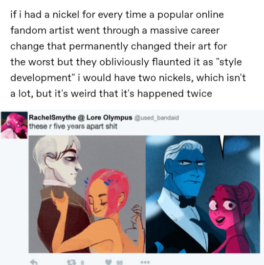
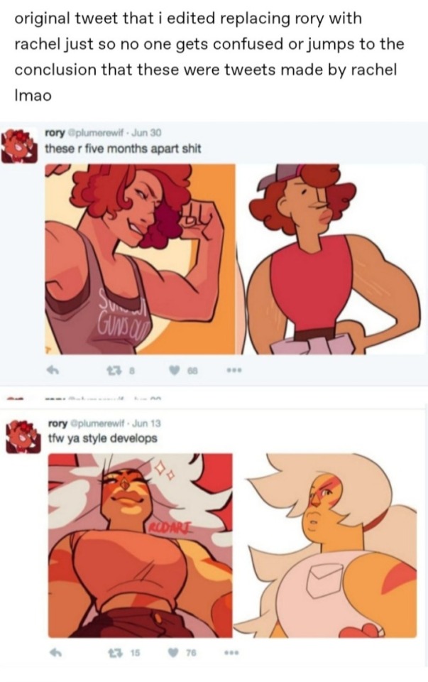
so in the original post, the blogger jokingly edited this tweet in reference to the original tweet on the right made by infamous ex-tumblr fan artist rcdarts. my problems with this post stems from in my opinion an unwarranted comparison and kind of 'grasping at straws' type of complaint to the way lore olympus' art looks. op of the post makes it seem like Smythe's art devolved; but if this is the type of critique you're trying to make it's got pretty weak legs to stand on. the above pictures are not good examples if you're trying to have a valid argument that lore olympus' proto art is better than how the comic ended up looking. you can argue that the character designs of the series are boring and safe considering they're based off of Greek gods as opposed to say the art in the supergiant Hades series. That's all well and good but to say that legitimately that first picture with gray Hades and orange Persephone is 'better' than the second feels disingenuous. From a technical standpoint, the art of the second image is better. The art in the first picture while decently drawn is much flatter and dull than the second. Second pic is definitely more visually interesting and has better usage of its colors/painting style. Though the palette is limited there's still visual depth and volume to it. Design wise I get a much better read of who these characters are and what they're like. Also second pic Hades and Persephone are much better proportioned than the first. Albeit it first pic looks like a wip, Hades' head looks huge in comparison to Persephone's (her torso also looks like it's kind of just floating over his, the limited composition and coloring doesn't make it feel like these two are actually touching/interacting with each other). I think a lot of the smoke lore olympus got (and still gets) is due to the main characters looking like a stereotypical 'booktok' romance couple; Hades being a tall sharp featured fit man in a suit and Persephone being a big bright eyed button nosed Disney princess esque young woman. But the first pic doesn't even divert from those tropes. It's pretty much the same visual dynamic except Hades gives less sugar daddy/mafia boss and more academic(?) shut in. And Persephone's is face is less rounded and her hairs shorter but that's about it in terms of design differences. I've never read lore olympus and don't plan to so I can't give any actual criticism to the series, but in this specific case where we're just judging art and visuals the claim of the older art being 'better' seems unfounded. I think what a lot of people that rag on how the series looks hate it because Smythe's style is very much a product of when she started getting popular. It's very much that early to mid 2010s tumblr fantasy style that a lot of women artists were doing (hence why I feel low-key why this and also Steven universe had/has so many haters is mainly due to misogyny, this is a very feminine art style). y'all need to understand that a person developing a more simplistic style is not equal to their skill devolving. The comparison to rcdarts to me is unjustified cause rcdarts actually did change for the worst. like how I just said simpler style =/= worst art, but rcd's work not only got simple but less visually interesting, less dynamic, utilized more static and dull posing/coloring, and over exaggeration to the point where characters were unrecognizable.
42 notes
·
View notes
Text
I read "Star Wars Jedi: The Dark Side", which is the 5-part comic depicting Qui-Gon Jinn and Xanatos's breakup as a Master-Padawan pair, and the art was... fine? It wasn't good. Every time they drew the female Jedi Master Tahl in an overly sexualized pose like she didn't have any internal organs, I wanted to bite someone, but they did some kind of neat things with color / lighting sometimes? Eh. It was competent enough. It worked.
I didn't really like their composition or posing most of the time, because the camera kept swinging around 180 degrees a lot, trucking in and out, which made it hard to keep track of who was where sometimes. Especially when the character design wasn't... uh... great at differentiating between the characters sometimes? I didn't really like any of the character designs in this comic. They could have been way more distinct. It took me a "wait a fucking second" to realize that Qui-Gon was sparring against both Xanatos and Feemor at the start, because the boys looked so, SO similar, with mostly just a palette swap between them. The character faces could also shift a lot from page to page, issue to issue.
Given how Qui-Gon Jinn looks here, if you had taken this character design for Xanatos and told me it was supposed to be Obi-Wan Kenobi, I would have 100% believed you.

Which is disappointing? Xanatos looks way, WAY too much like Obi-Wan or Anakin for me. He's like a fusion. And this is a really boring character design compared to some of the other Jedi character designs in "The Clone Wars". It's also hilarious, because I was browsing some books and honestly thinking to myself just last night: "They have GOT to stop making skinny, white brunette girl protagonists in Star Wars, if only because I can't easily tell them all apart with the way they get drawn most of the time."
What I was ABSOLUTELY NOT expecting: Xanatos's dad looks like a buff Lex Luthor and Xanatos's sister, Nason, looks like SPACE OPERA PRINCESS BARBIE. It cracked me up a little. Look!


So, uh, look, I know that the Telosians characters in the background there are functionally wearing Jedi robes themselves in non-brown colors, but I think that's incredibly boring design again. So, I'm going to imagine that Nason's dressy outfit and hairstyle here is closer to what your average Telosian noble would wear. (Xanatos and Nason's hair colors here could both be natural, but maybe it's fashionable to dye it?) Now that Xanatos has left the Jedi, he's going to need a new fit! A new wardrobe! He can grow his hair out!
I presume that Xanatos is going to be wearing the villainous black robes later on in the "Jedi Apprentice" series, of course! It's classic like the little black dress! But I am nevertheless now not going to be able to shake the image of young Obi-Wan Kenobi being tormented by a Dark Jedi Xanatos, evil overlord of the Offworld Mining corporation, who looks and dresses like Space Opera Princess Barbie. Revenge can be achieved in hot pink.
#tossawary star wars#spoilers#xanatos star wars#nason star wars#qui gon jinn#you can do evil in hot pink; there's no reason 'pink is for girls' should exist in the Star Wars setting#jedi master tahl
39 notes
·
View notes
Text
My Creative Process.(W/o the thinking.)
I do not have a very stable and consistent creative process, but I will try to explain the general things I can see from all the artworks I have made.
References for this post V


---
Ignoring my inconsistent artstyle, I start off by picking a pose and use it as a starting point.(Note: This is very unreliable, I have deleted way too many W.I.P's just because of this.)
In picking a pose, I choose between two things: Search through Pinterest or making up a pose using my imagination. (First image were poses mushed from Pinterest and the second image was entirely by me ditching it and trusting the process.)
I've recently been starting to make more grounded and "fun" illustrations like the characters-inside-these-boxes and things, so while I do the poses, I sometimes make the "composition" as well.
The first image was me using the sketches themselves as for the final piece, the second image was me doing the lineart, so yes, that explains the absurd amount of artstyles I have, because even when I choose one from both, the brushes also changes the way I draw characters. Strange, am I right?
I use color palettes sometimes if I have the chance(I used one in both our ref), but if I get too tired, bored, insane, etc. I just ditch it.
(Never ditch it, you can literally see it between the differences of my illustrations on whether I use a color palette or not💀.)
Is there more to add here?
...
Oh!
I used screentones! Lolz. Here's the ones I used from the two piece:


I like the Japanese texts, why? Because I vibe with them. (I listen to J-pop in a concerning amount of time).
---
Again, not very reliable, not very good, but that's the fun part! Show me YOUR creative process and let's have fun together:).
#ADA#arthur talks#my rambles#sbg#school bus graveyard#school bus graveyard webtoon#ben clark#taylor hernandez#how to#creative process#illustration#digital drawing#drawing#digital illustration#art#art work#digital art#screen tones
14 notes
·
View notes
Text
TIME FOR THE LONG ASS 2024 REVIEW

i am once again gonna review each highlighted piece i have made in 2024 so far like last year even though it's sort of unnecessary i have a bit to commit to
yappery under the cut
JANUARY
jan's piece is my smash poster celebrating the 25TH anniversary! this after i got rlly into making giant multi-character ensemble pieces, and i've wanted to do a poster like this to celebrate smash, so i'm glad i was able to step up to plate. usually i think my art from january ages pretty bad in these reviews, but i actually still like it from the composition, colors, and the drawings of the characters. i still have the print of it hanging in my room! ^o^ other highlights from the month is the complimentary poster i did with smash ultimate's dlc cast... well i kinda mention that out of obligation because i actually do think this one aged like ass, mainly the shading on the characters looking pretty bad (especially as a print). i think i shoulda saved this idea for later in the year to time it with smash ultimate's release day of december 7 (i am extremely deadline-pilled) but i probably wouldn't have cared by then so i just did it like, immediately after the 64 poster. so it probably smacks of burnout + i can't shade with blue that well
FEBRUARY
this one sorta represents seven whole drawings i did for one series. it's my seven piece set of artworks based on mothy's evillious chronicles, and i chose rilliane's because i think at the time i was putting this together i thought she came out the best (i began assembling this starting april 2024 lol), but idk! i still think she's pretty solid but i think she's tied up with kayo and banica. one thing's for sure, i know sateriasis is my least favorite of the bunch by a wide ass margin, i really wish i executed it better! not much other interesting highlights for this month besides my other vocaloid art series, the alice of human sacrifice ace cards. i think they aged alright but again this is another idea that i wanna execute better in the future.
MARCH
oh boy another series!!! this was part of my four part series redrawing the crossed paths artwork from octopath traveler ii. i chose the one featuring partitio and osvald because it was my favorite at the time. i still think it aged pretty nicely but it has some rendering hiccups that rlly bother me but in terms of colors/the background i still like it. if i had to pick a new favorite, it might go to throné and tenemos or cassti and ochette. another notable highlight of this year was a piece of oc art i made. i need to do something unabashedly overdramatic and angsty with my ocs again cuz i still like this one too. i think i opted out of selecting this one to highlight since cropping a face was kinda awkward lol.
APRIL
an overdramatic oc art has been highlighted! another one i like (it's almost like i picked my best for this chart). it was sorta the origin of me using my favorite watercolor brush in procreate to have an extremely rough idea of the colors that naturally blend together, creating a pretty cohesive palette when i render it (which is the current basis for how i render in my current style). april otherwise is kinda boring idk i don't like a lot of the other drawings here lol. this utsu-p album redraw ft robin is still pretty cool tho imo.
MAY
i feel like i had some nice variety to pick from, but i chose my improvisational and edgy grima drawing since i think stylistically it stands out the most. i found my new favorite sketching/doodling pencil brush in procreate and made a whole drawing using it, and the texture is so niiiice. other highlights: COOL OC ART (ft kandy). part of me feels like it's kinda corny but i was born on da cob so whatever, this one was fun and i still like it!!! there was also my art based on bad end night. i'm a tiny bit mixed on the rendering/colors, idk i was experimenting with a different brush for lining and shading and the slight difference in texture makes it a little weird but that is shit that only matters to me. i think it's a hell of a lot better than the bad end night drawing i made back in 2022, so in terms of "redemption" i think it was successful.
JUNE
kind of a boring month tbh, i got miitopia-pilled again so i was probably busy playing that this month + i was home for the summer and i am extremely lazy when i am at home lol. but to compliment the dive back in my miitopia era i made a sorta sketchy drawing with kandy as my great sage. check it, it's another with my new pencil brush, and i definitely remember having fun with this one (though her robe physics kinda make no sense based on how i drew her ref, i never look at my refs for my ocs/i usually break their designs to fit certain poses silhouettes 💀💀💀). uh i guess the one other interesting piece (imo) from this month was my giant miitopia poster that i was too chicken shit to share proper until recently (if you missed the edit where you can fully see it, there ya go). it's kinda oversaturated vomit and i'm not crazy proud of the execution but it was ambitious and kandy's section still looks really good imo so it has value in that regard to me.
JULY
i participated in my first artfight this july! i drew many cool ocs. by about the halfway mark i got hella burnt out tho and started doing my own stuff to freshen things up (it was also around here when galasynth entered production and i met MANY AMAZING VOCALOID ARTISTS!!! SHOUTOUT TO THOSE MUTUALS :)))))). for this month i chose my poster based on touhou eosd since i think this might be the most gracefully aged piece the whole year (it's probably my favorite!!). the colors just came out real nice.... idk!! a notable piece from this month that couldn't be posted in july cuz of zine nda's was my actual galasynth piece. this was a pretty significant piece since it permanently altered my current rendering/coloring workflow (sorta established in the highlighted piece in april but now with lineart and with a differently textured brush). the touhou poster was created shortly after as a response to this new workflow! other one of note was my perfect cherry blossom poster
AUGUST
brave frobin's design for feh was revealed and i drew it 😼😼😼 (AND I CALLED IT earlier this month. not that i needed to use a lotta braincells but). this was a further step in practicing my new rendering style and see how detailed and meticulous i could get with the colors when i had ONE character to focus on with NO background and i think it was pretty successful. though im glad i posted the wip cuz the colors were probably better there than the rendered... what overthinking does to a mf. another banger from this month was a piece of oc art, it's nothing special but it was a rendered panel redraw of an unpublished comic i made of them and i liked it so yeah. (i also posted my decora una drawing this month which was my scrapped concept for galasynth, but according to my notes it was actually finished in july... but shoutouts to it regardless)
SEPTEMBER
aaaagh this month didn't have much goin on, probably cuz i went back to school around here and the work was getting crazy 💀💀 but i still found time to make something i'm proud of! i drew my oc based on a twitter prompt a mutual of mine shared and i reeeaaally still like it!! especially the details on the corals waow... (i don't really have much else from this month that i consider noteworthy enough to mention here so :P)
OCTOBER
spooky art!!!!! i didn't have much interesting going on this month because again i got very academically demanded of and didn't have much time to draw, BUT i vowed to make a tribute piece to "trick&treat" by oster project for halloween, so i hauled ass to get something ready for that and to have ONE traditional drawing this year (yeah i didn't draw a lot on paper this year unfortunately ☹️☹️☹️☹️☹️). other highlights: a traditional drawing of gekiyaku pills for vsynthtober which i did a whole two prompts of (you just saw all of them) + a digital drawing of geki (i really started to like gekiyaku around this time). as much as i still like the latter's colors and texture it sorta started a bad trend where i sorta just drew characters from the shoulders up with not much pose to speak of + no interesting background just for the sake of coloring it. not that it's completely devoid of value but it was a pattern i was starting to get a little to comfortable with. i'll touch more on this in the closing thoughts section, but this new rendering style did sorta hinder my want to experiment with my digital rendering styles compared to previous years where i prided myself on having a bunch.
NOVEMBER
BOTH of my favorite pieces from this month fall in the same trap as the thing i mentioned above. i picked my drawing of hibiki koto for the chart since the pastels added a nice value shakeup. i STILL LIKE IT, it's nice, but did perpetuate this bad habit/shortcut. the other one was my drawing of great sage kandy (current pfp!). the colors here are pretty fuckin nice still imo, so as a coloring tech demo like this flavor of drawing i was doing i think it succeeded.
DECEMBER
AND FINALLY, the end of the year. i finished my december piece early in the year kinda just to check the box off and get this chart off my back (a totally normal thing people do when drawing art throughout the year). i have wanted to do a legacy of lunatic kingdom poster like my eosd one for a while after falling in love with its ost, but it just felt scary. the characters were very detailed and also there were moreeee 😭😭😭 but i got myself to do it cuz i found myself tempted to fall in the same trap as described in october/november (i was gonna draw koishi with the same crop/thought for the bg/emphasis on rendering. you might see her done by the end of the year), but i was like "NO, i must earn this laziness" and finally did something ambitious again. and yeah, i think i did pretty good with this one, even if the crowding of characters and details is sorta unruly.
ok so maybe i'm a little artistically constipated rn
doing this thorough review has sorta gotten me worried. i talked about this in my review last year, but i wondered if my progress has plateaued since i liked a lot of my art throughout the year and didn't see much significant improvement. but looking back no i definitely improved from 2023, and i'd say i broke some new ground with experiments i did throughout the year (the piece from december is still my banner!!). i also had a few different digital rendering styles i played around with for some variety.
this year, after the completion of my galasynth piece, i got really stuck in a specific rendering style and didn't rlly experiment that much with shaking it up. i also didn't feel compelled to try doing solid lineart or rough paintings, and i got stuck in a "halfbody with basic poses and backgrounds" pit when i know i can do better and more cool if i just TRIED.
i am writing this pretty early in december so hopefully i can bring something new to the table..... idk, maybe the differences in my digital coloring styles are only visible to me, but i certainly notice this repetition and wanna break out of my current bubble! i am working on a collab piece that should go live by spring next year that will hopefully do this :) (and i certainly won't be abandoning my current style, at least not overnight/without trying to evolve it, cuz i really like it and have received many kind compliments from people about it! so thank you thank you!!!!)
i look back at some of my pieces from last year and earlier this year and see some variety in how i go about rendering or textures or colors and wanna go back to that. so that'll be my goal for the rest of december + 2025!!!!! ^_^
anyway that's that, it was a good year despite my current crisis, i think i made some good art. also don't be like me and feel obligated to make nice art every month for an aesthetic chart, i do it cuz i draw fast and i am easily satisfied by them. take breaks touch grass drink water, play and draw. yay!
#not art#year in review#year in review 2024#art review#sorry if this is kinda self-deprecative and only relevant to me#i all of a sudden feel like my harshest critic because i feel like i can do better.... i can actually improve if i put in the work#i'm just kinda scared to do that work cuz i'm complicit with where i'm at rn 🙁
14 notes
·
View notes
Text
MY PERSONAL ART TIPS! A big thread I'll be adding to
I too, was once a 10 year old gacha kid whose only drawings were a way too detailed catgirl persona and friends. I didn't have much in-person or online inspiration and help for a long time! So I'll help others earlier in their art journey (and perhaps the masters too, never not a good idea to try some advice!)
So let me spare some of you a few of the unnecessary mishaps during everyone's art life.
If you've never seen my blog before, hello! My name is Clara. I'm a neurodivergent teen artist, aspiring animator, and resident cat person. It's nice to meet you! If you'd like to know who you're taking advice from, here is some of my latest work!


Now without further ado, LET THE HELP COMMENCE!
STROKES: Fix stiffness in your poses!
To start off, a BIG thing I recommend for newish artists, is don't be afraid to draw loosely! The looser the lines, the less stiff the pose. And stiff poses are a very common issue within the community. Sure, your anatomy may look bad for the first while of drawing looser lines, but it will help you be more confident in strokes. The more confident the stroke, the more efficient an artist. The more efficient an artist, the faster you learn.
To practice loose lines, simply draw a long line as fast as you can. Over and over again. I know, that may seem boring, but it helps train your hand and arm to be faster. But if it's so much a hassle to do in your free time, then do it on the side of a worksheet if you're in school, or a sticky note if you're at work.
Speaking of practicing...
PRACTICE MAKES BETTER: Get over it!
I said the phrase wrong, didn't I? Oh wait, no I didn't. NO ONE IS PERFECT. And don't forget that! There will always be issues, problems, and mistakes in your art that you don't realize until the day after you've shared it with everyone you know. The artist is always their worst critic. So the best thing you can do is to keep at it. Practice your weak points to support the composition more, hone in your strong points to better make a focal point. Practice will always help, even if you don't see it. A slow pace is better than no pace!
"But Clara, what are my weak points? How do I know what I always mess up on!?" you may ask...
ANALYZING YOUR ART: Pros and cons!
Well, pick your latest finished piece and tear it apart (NO NOT LITERALLY OH GOD NO PLEASE-) I mean analyze it. Grab your pen and a separate paper, or just your notes app, and make a list of pros and cons in it. Doing this with multiple pieces is especially important, as with multiple examples, it's easier to find a pattern.
How about this, I'll give you an example!
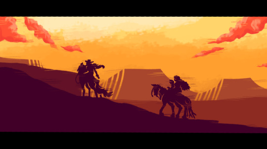
Here we have a piece I made a few weeks ago. It's of my Western AU of my main cast of OCs. TIME TO NITPICK!

WEAK POINTS
- The clouds are too detailed compared to the rest of the composition
- The right horse seems very stiff (I already am aware I struggle with drawing animals nowadays)
- The funky hatching I did with the plateaus in the background just isn't working out as well as I thought it would anymore
- the god damn horse on the right
- The sky in the middle just seems far too empty. I could have added more indication of the sun at the top to add more noise
STRONG POINTS
- The color palette I chose blends well while having the colors still be sharp and clear against each other
- The entirety of the woman and her horse on the left
- The glitchy effect adds some zestiness to it that I love
- The whole thing looks quite cinematic, with a successful wide shot and the black bars imitating that of a movie's
- The inlines of the otherwise completely flat-colored silhouettes help define the overlapping shapes quite well
And there you have it, 5 pros and cons each I found in something you probably only noticed were little to none. No, I'm not bragging, it's an actual psychological phenomena where the artist notices so many more intricacies than the average outside viewer. Your mom isn't hanging up your art out of pity, GET THAT OUT OF YOUR HEAD! People love your art so much more than you do.
That's it for the first post. Don't worry, there'll still be more helpful tips coming! I just won't be able to fit everything in here with Tumblr's picture limit and all. Happy drawing!
#art help#art tips#my art#art advice#oc art#artists on tumblr#drawings#oc artist#art community#art#artwork#audhd artist#autistic artist#adhd artist#teen artist#drawing#Clara's Art Advice Thread#remy_theratking
16 notes
·
View notes
Note
i am so obsessed with your art how do you come up with your compositions :0
You are very kind [thank you]. A great way to motivate the brain for compositions is looking to other freelance artists for styles that make your spirit go HELL YEAH I GOTTA MASH THIS INTO DUST AND SNORT IT TILL MY NASAL CAVITIES BEG For example: I have recently purchased this book -

Within it is a vast array of different artists currently working in the illustration scene, all of diverse styles and compositions. Other books such as SPECTRUM and Visions Illustration are lovely collections of creators that could inspire you.
in summary: keep your brain cheeks open to art that really touches you and practice compositions [or even lineart styles / color palettes] based on what you find - it not only could help you out of your comfort zone, but you might even find a new calling to work on more similar works.
ps: If you are ever bored at work or school, check out this site and indulge
37 notes
·
View notes
Text


"Primal Radiance" Is a striking fusion of contemporary wildlife art and digital expressionism, this stylized portrait captures the raw power of a grizzly bear in side profile. Rendered in a vibrant, almost psychedelic palette, the piece pulsates with energy, its bold, jagged lines creating a sense of movement and intensity. The digital medium mimics traditional pointillist and stippling techniques, layering color in a way that gives the artwork rich texture and depth. Instead of blending, the highly saturated hues—deep reds, fiery oranges, luminous yellows, and electric purples—collide, forming a mesmerizing visual contrast that enhances the bear’s commanding presence.
Dominating the composition, the bear’s golden-hued form fills the frame, its fierce expression exuding strength and intensity. Without a deep background, the space remains shallow yet immersive, drawing the viewer directly into the animal’s gaze. The raw, unpolished outlines and textured application of color lend the piece an impressionistic quality, while the dynamic interplay of tones conveys a sense of primal energy. This contemporary reimagining of wildlife portraiture transforms the grizzly into an emblem of strength, spirit, and untamed beauty—a bold statement piece that captivates and commands attention.
#art#digital art#digital artist#artwork#home & lifestyle#wall art#wall decor#art print#artists on tumblr#artist#my art#animals#abstracart#abstract#bears#grizzly bear#grizzy#wildlife#wild animals#wildlife art#animal art#bear art#animal portrait#wall poster#poster#poster art#graphic art#contemporary art#modern art#abstract art
4 notes
·
View notes
Text
Downton Abbey Fashion 41 - indoors fashion in 1922
Rose’s initial stringent color palette of either red outfits or blue ones is loosened up once she becomes a regular; she gets to wear pink shades and, as a quasi-adopted Crawley, purple. Side note, I’m not including the scene when she dons a maid dress because that’s just Anna’s uniform that she borrowed for five minutes and I already have a post about the servant uniforms in use this season.


A very girlish drop waist dress, this one has a print that almost makes it look like dotted with strawberries. Or like one giant strawberry. Never mind, it’s cute. A spread collar of white lace, short sleeves – Rose looks so young in this. Granted, she is the age Sybil was at the beginning of the first season, but Sybil was never the bubbly airhead that Rose starts out as.

Speaking of youthful vibes, Rose has this adorable cream sweater with a sailor collar and some blue piping, plus a band of blue checker around the drop waist. And I have an inexplicable weakness for this lacing closure on the front. By the way, this sweater is recycled from 1997’s Rebecca, and Rose will have another piece from the same movie next season.

Hm, I’ve seen shirts of this cut on the show that I liked better. But I guess that’s a matter of taste; this pattern isn’t really for me and neither is this shade of purple, despite looking good on Rose. I’m in favor of the neckline, so there’s that. Since she is wearing this at the very beginning of the season when Mary is still in black (and Edith in grey), this might be less of a fashion choice and more half-mourning decorum, although Rose also wears purple for fashionable purposes.

Like she does here. Rose’s former colors were red and blue, her new color is purple – let’s just throw them all together! Okay, in all fairness, this print is adorable. And with the top being cut in triangles instead of the more common rectangles of the time, the dress does have a little shaping to it. Somehow, they picked the exact right shade for the little piping trim, blue enough to blend in, yet electric enough to pop.

Technically, she wears this dress while going out for a dance, but she’s not running around on the air without a coat, so I’ll call it an indoors look. Lighting is not the priority at the dance, but believe me that it’s purple with a white print all over. And more white with a little lace trim for the under layer and collar; the overall composition is not glamorous, but quite nice, another playful and girly look to which she adds a cloche hat with a white flower ornament.


Back on blue, a simple long skirt and a long-sleeved shirt that looks like a silk satin. Rose likes this collar shape, doesn’t she? The geometric print keeps this from looking too boring, but I wish Rose would have gone with a contrasting skirt.


This shirt is nice; can I see more of it? It’s another cream one with blue square elements, a darker and a lighter blue shade that do something almost like an adventurous meander on one side, but otherwise are demoted to trim duty. Nice one, a bit baggy, but nice.

And now for one of the prettiest shades of pink I will get my eyes on around here and that Rose will repeat a few times next season: This dress is just on the meeting point between petal pink and peach, and it’s practically shining in and of itself. There could be no bigger compliment for Rose’s English Rose complexion, even though this is one of the few occasions when she’s not beaming. With the pearl strand and the white embroidery in orderly squares, this is one of her tamer looks, but the dress is of one of the drapier fabrics and looks like it could have some flow to it in motion.
6 notes
·
View notes
Text
"Cartoon" Book Covers - What's with them?
These are just some musings of mine. Just thoughts kinda organized with some things linked. Lately, there have been discussions about the recent trend of "cartoon" covers for books that have been coming out. As like any discussion of art, a lot of it depends on subjective opinion on how the covers look, the feel they evoke, and if it encourages people to read the book. Before I continue, I think it's important to define some terms and scopes and all that. Ready? (Also this is very long)
"Cartoon" covers seem to be the most prevalent in recent romance releases, however, cartoon covers exist in any genre and are not just a recent thing. (Recent here being loosely defined as within the last 10 year) Romance as a genre is derided, pretty much all throughout history until now which is awful. By talking about this, I am not trying to say that romance is a worthless genre that has nothing to say, in fact, I think the opposite! Romance is extremely important and worthwhile, from brain candy romance to literary romance. It is not a genre I read a lot, just because of my interests and such, but I do read them because I believe in reading a wide variety of books and that exposing yourself to different things is extremely important. But, since many romance books have cartoon covers nowadays, a lot of the books I'll be talking about are romance. Also, I am talking about the covers, not the books. Cover does not indicate book quality, but covers do serve as a sort of "appetizer" for them. I also will only be talking about books, as in novels and such (I am not sure how best to put this, I mean books mostly composed of words alone), not comics or other different types of books.
There's also the issue of how you would define a "cartoon". I will be using the definition of "Cartoon" given by the Oxford Learner's Dictionary, with a bit of modification.
Cartoon - a simple drawing showing the features of its subjects in a humorously exaggerated way, especially a satirical one in a newspaper or magazine. (X)
The modification being that humor/satire is not required to be considered a cartoon. Thus, the definition becomes this:
Cartoon - a simple drawing showing the features of its subjects in an exaggerated way.
Regarding Cartoon Covers, the recent prevalent opinion seems to be negative, with a variety of reasons as to why readers dislike these covers, which line up with my own reasons I dislike *some* of them.
For me, personally, they do not have enough thought or effort put into them. The compositions are not very creative and tend to be static, which is quite boring. They are generally quite simple, but not in a good way. Generally cartoon covers look cheap. However, Being simple does not equate to looking cheap. And yes, while there is something to be said here about how cartoon covers are cheaper for publishers and thus that is a reason they have become prominent, this is a separate (though related) issue. Figures rarely have actual eyes or features, and are not really anchored within the "scene" and they look stiff. Limited (if any) shading means these covers lack depth. The backgrounds are often silhouettes that are a slightly different cover than the overall background color. Honestly, they tend to have very limited color palettes in general. Since I am from the U.S, the covers will probably be U.S Versions.
However, there is a distinction to be made I think between the types of cartoon covers drawing ire and cartoon covers that are not. IE "Good" covers and "Bad" covers. Of course, this is subjective and many love cartoon covers I would consider "bad", and inversely many that would dislike covers I love. In order to illustrate my point, I would like to present to you this cover of the Hate U Give, by Angie Thomas.
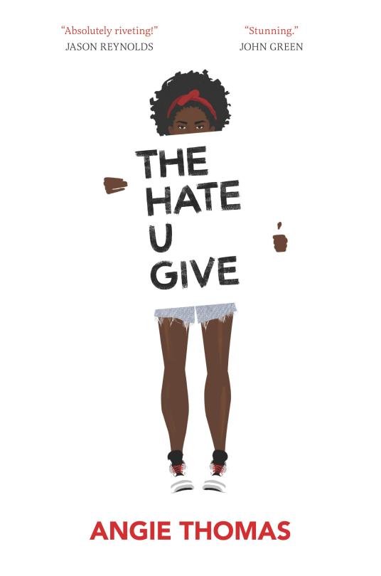
By the definition above, this is a cartoon cover. (This book is a YA Contemporary bildungsroman) It also matches some of the characteristics of covers I dislike. The composition is simple and the figure is not traditionally "anchored". But, I LOVE this cover. The symbolism of the title being on a protest sign is amazing and extremely fitting for the work. The sign itself serves to anchor the the young girl, and the contrast between the figure and the background, interrupted by the sign adds visual interest and makes the figure and title stand out. To me, it this cover feels "cared for" if you know what I mean.
In contrast, there is this cover of The Hating Game, by Sally Thorne:
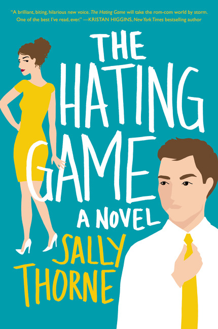
This cover is so awful. My first issue is the woman is so undefined that her pose looks unnatural. Her torso looks unnaturally twisted, as if she's both facing the reader and has her back to them. The man looks like a poorly done papercraft (No hate on papercraft itself) blob with his floating hand and the amalgamation of simple "layered" shapes. (Though there's not a lot there) The figures just float, and the composition is boring. This is a nitpick, but I dislike that the words overlap with the woman. Word placement and font are extremely important to book covers.
Some more examples of covers that I think are unappealing and that I think are the types of covers contributing to the dissatisfaction with covers that are "lazy, cheap, and hollow". Some are more unappealing than others.
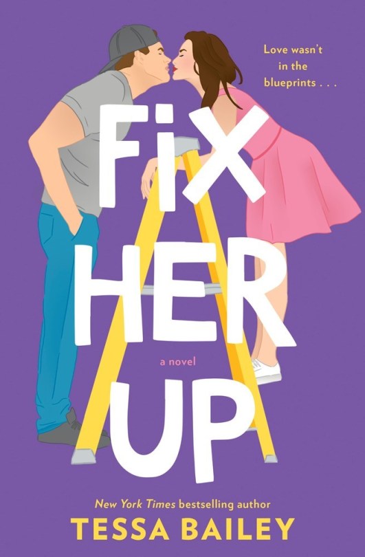


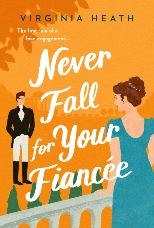
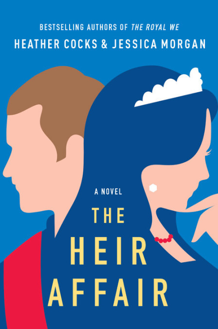

While I find these covers to be bad, the thing is that a lot of them actually have aspects that "could have been good." For instance, I like the Idea of the Covers for "Happy Place" and "The Heir Affair." "The Charm Offensive" Has a boring cover, yes, but I like the spotlights separating the figures. But overall, these covers seem poorly done, and "corporate." It's especially sad, I think because it discourages people from reading books they may enjoy and creates a negative association with cartoon art. There is also a metric FUCKTON of these types of covers. They're ubiquitous. In contrast, I want to highlight some cartoon covers that I think are good (Though not without flaws), and are not the same type as those above.


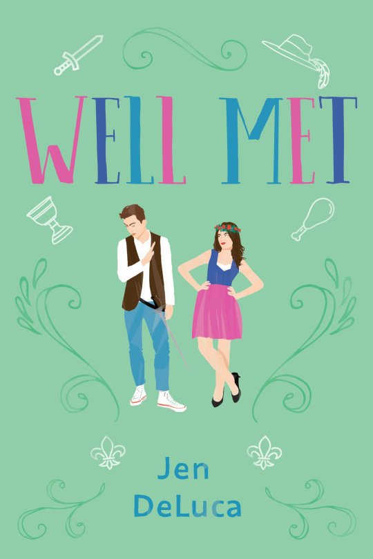
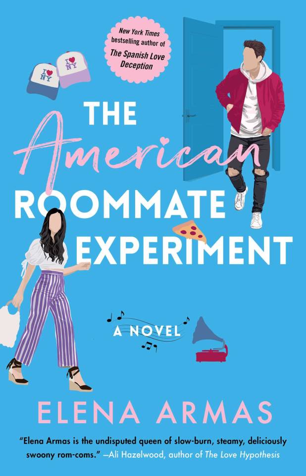
For me, all of these covers are leagues better than those above. They are visually interesting and dynamic. The figures don't look lifeless and stiff, and they all look unique to their own book. Arguments about if I should be comparing books of different genres and aimed at different audiences might unfold, but I think that's reductive. Cartoon covers exist in all genres for all audiences. Case in point:


Some of these I like and some I don't. I actually do think that *poorly done* cartoon covers are a legitimate problem. Since the genre most plagued by these covers is romance, it can encourage further dismissal and invalidation of the genre. If romance covers are largely perceived as cheap, hollow and insipid, those perceptions further color the perception of romance as a whole. I do not think that romance is any of those things, or that the covers should cater to people who hate romance. But, romance being generally a feminine interest is, like a lot of things considered feminine, mocked and considered inferior. I worry that prolific bad cartoon covers only serve to reinforce this horrible association. Additionally, the saturation of these covers begins to homogenize the romance genre covers making it hard to identify the type of story the book holds. Romance readers (AND AUTHORS) deserve book covers with effort and thought put into them, that match up with the type of book it is. Silly fun books should get silly, fun covers! More serious books should get more serious covers to match. (Of course, cartoon covers can be both but when silly cartoon covers are the only thing being created it's bad and leads into stuff I mentioned) And I know book covers, like most things, have trends. But still.
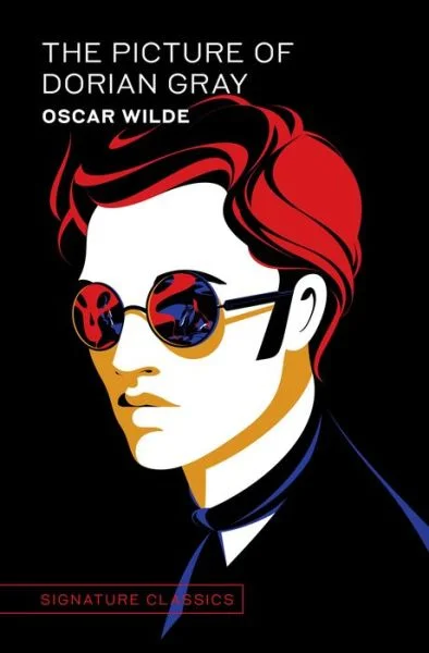
Book covers looking similar is not a crime, and it generally doesn't bother me. And I'm not trying to be mean or attack the designers of the covers I don't like, I'm just trying to critique and distinguish certain types of covers. I know a lot of this is subjective, and this is by no means anything definitive. This is just my thoughts on something I noticed. This is not -serious- analysis! I did not do any *in-depth* research. And I'm not even touching on AI images. It's just. This trend of simple, flat, blobby, cheap art in covers worries me. I know the publishing industry is beyond fucked and tiktok is NOT helping. Cartoon Covers can be quite lovely and amazing! That Cover for "The Picture of Dorian Gray" is one of my favorite book covers of all time. But the push for cheap mass appeal is creating/exacerbating problems. There's not even really anything wrong with going for mass appeal, (especially since book covers are supposed to draw the audience in) but when it becomes the ONLY aim, instead of being a fun/creative way to enhance the book/add to the experience through visual means as WELL as to appeal to readers, something very important is lost.
#eta#books#book covers#cartoon book covers#booklr#reading#romance books#romance genre#cover art#booktok#book cover art
9 notes
·
View notes
Note
do you have toploader deco tips i tried to make my own and i suddenly felt like i was looking at nuclear codes once my stickers arrived. what is your process like when choosing what to place and how to organize it
i'm pretty disorganized when it comes to making mine and i'm not very confident on my toploader composition skills yet, but the tips i usually stick to are:
1. pick out a theme and color palette and sort your stickers by whatever fits both best first! i usually go with 3 or 4 main colors with most of them being complimentary and the last one contrasting.

as an example: for the frmc deco i did i used pink/peach/yellow and threw in a light blue as a little subtle contrast. you don't have to follow it strictly; i've done lots of mono/duochrome toploaders but it helps to pin down which ones you can use especially when you have hundreds of stickers like i do lol
2. when it comes to sticker placement, decide which Big stickers you want to in the piece early. you're gonna want to place them first just because it's easier to go from largest to smallest. you can scrape off small stickers easy but it's a lot more work to try and replace big ones. also visually it just looks better but that's just me
3. small stickers, usually of simple shapes (stars hearts circles etc), objects, food, swirls and text are your best friend!! throw them on there if you think a spot looks boring. my favourites are white stars just because they tend to contrast just enough without being too jarring :) you're probably gonna be using those the most too just because you can't have every sticker on your toploader be a cute animal or face or something. i mean you can do that but you run the risk of it all blending together which probably isn't ideal when you want them to be the centrepiece. does that make sense? i hope it does lol
4. pinterest/tt/insta/yt have big toploader deco communities; if you're dry on inspo for themes or composition i always find that watching ppl make their own helps
5. remember that you can put literally anything paper on a toploader as long as you can stick it on. i know it sounds obvious but you don't have to stick to stickers! like. i've used lined notebook paper and newspaper clippings for frames you can really just put anything on there.
6. When All Is Lost Just Throw Transparent / Holographic Stickers On There. It Always Works. I Don't Know Why But It Does
7. not specifically about composition but i find tweezers help a lot with picking up stickers just because you risk damaging stickers more when you peel w your hands!
hope this helps i am still pretty new to deco and am by no means an authority on the hobby ^_^ <3. happy crafting!
5 notes
·
View notes
Text
IVE - Ive Switch
Average score of 7.5, fair enough. It started out quite strong, I liked the first couple of tracks a lot. But the sound in general kind of didn’t go anywhere. Ice Queen is probably the biggest deviation, but even that was so electronic and processed and … ugh. I kinda want to revisit Ive Ive, I think I remember enjoying that album more. But Accendio from this album was Quite good, and Heya was fun too. I’ve added them all to my playlist, we’ll see what stays. Not much to say though. Some of it is trendy, some of it is Ive, it’s all good but nothing super special either.
- Heya
I dunno if I like the Song very much, but the color palette is So good
Okay, I buy this. This is like, almost Young Posse, in how it uses the bass
At least in the verses
Okay, yeah, this is IVE
The “dada dadada” is really fun
I don’t know what any of them sound like or look like, but I sure can tell who Yujin is based purely on “stage presence” haha
Mkay, this bridge is a nice break, let’s see where it goes
Damn, I was kinda hoping for a blackpink style breakdown at the end
8/10, I had no expectations, and I actually quite like what I got
Accendio
Beep boop
Almost Love Divey in the vibes
HAHA IT IS OMG
After the “5,6,7,8” I was like “if they did an anti-drop here it would be so Love Divey” and they DID lmao
The post-chorus is nice
Actually I do really like this song, this is good
This song actually Goes places more than Love Dive does
Yeah, the bass in the post chorus is so good
Oh my god this bridge, I literally just got goosebumps
9/10, jesus christ IVE
Blue Heart
This is the Wonyoung song
I don’t think she has any composition credits, but I think the lyrics are all her
(In other words, the one part I literally can’t judge)
Not convinced by the song itself yet
In terms of vibes of the album, this album feels very 4 Walls so far
I think I’m won over. It’s kind of the same as the previous songs in terms of vibes though, and I do expect a bit more from the album. So we’ll go with:
7/10
Ice Queen
Like Elsa?
Oh okay, I hear this chorus
It doesn’t feel … hm. What am I even trying to express here?
I don’t buy the “ice queen” part of it. Like, it feels too electronic to me
Yeah, and the song itself just doesn’t do enough for me
7/10
WOW
And now we’re a bit less edgy and a bit more upbeat
The vocals feel super processed to me, why?
They’re doing the same thing in this chorus, with the Big synth bass
Lol “MBTI got it”, is that what they said?
7/10
Reset
Based on the opening alone, feels kinda like Rose by GOT the Beat
Mkay, more upbeat and less(?) electronic
Or maybe, electronic in a different way
Maybe Better Things is a better comparison? I definitely prefer both Rose and Better Things though
Or maybe Smart?
Yeah idk. I don’t totally vibe with this song, it feels Trendy and Boring. Illit would release this, Newjeans would release this, LSF would release this. (Oh how LSF have fallen)
It does fit with the vibe of the album though, like it Fits
Still, a runtime of 2:41 tells you all you need to know
7/10
2 notes
·
View notes
Text
Style Research - 2
Following up on the last post, I'll continue to share what I learned from the art styles of the next artists.
Renz

First up is the Japanese artist Renz. I chose this artist because their character proportions and colors immediately struck me as aligning with the style I envision for Cardomnia. I also deeply admire how this artist uses color! So, I wanted to observe and think more closely about how this artist designs their characters and utilizes color and composition.
1. Character Design
First, regarding character design: although this artist primarily creates illustrations and doesn't explicitly "design characters," a close look at their illustrations reveals that their characters consistently have specific proportions and distinctive features, and this is what I want to learn!
This artist's characters are approximately 6 heads tall. While this is a body proportion closer to realistic human proportions, they choose to render the facial features, torso, and limbs in a more cartoon/anime style. This alone already creates an interesting contrast!
Upon closer observation, the characters' most prominent features are their slender limbs and torso. However, unlike in Splatoon mentioned earlier, this artist uses "straight lines" to simplify human muscle lines, leaving only the joints. This further enhances the "slender and light" feel of the characters. Even the torso is outlined with "straight lines." But such straight lines could make the characters a bit boring, so for the face shape, facial features, feet, and hands, this artist opts to use "curved lines" for outlining! This balances out the excessive straight lines, adding a touch of softness and cuteness to the characters!
As for character proportions, this artist also elongates the calves and forearms. But because the head-to-body ratio is closer to realistic proportions, it gives the characters a "model-like" appearance!
2. Use of Color and Composition
From this artist's use of color, you can see that they consistently choose one or two main colors, then use extended, similar color palettes to enrich the image! However, the pairing of these two main colors tends to lean towards vivid contrasts, such as orange and blue, pink and orange, pink and black, and so on. Since the colors and objects on the canvas are already quite rich, this artist doesn't use strong light and shadow to make the image overly cluttered. Instead, they choose to have only one layer of light and shadow, leaning towards a flat coloring feel. But in contrast, this artist uses more interesting composition and perspective to diversify the image!
I really admire this block-coloring approach. Although color blocks seem simple, making an image look interesting and vibrant purely with color blocks and composition is quite challenging for me, so I've learned a lot from this artist's illustrations!
あぼとま (Abotoma)

Next, I'd like to talk about another Japanese artist, Abotoma. I was immediately drawn in by this artist's colors and distinct character style at first glance!
1. Character Design
This artist's characters typically fall within a 5-6 head body proportion, which is also closer to a realistic body ratio. However, unlike Renz whom I discussed earlier, this artist uses abundant "curves" to outline the human body. As you can see in the image on the right, this artist heavily emphasizes the body's curves, even extending this approach to facial features, face shape, hands, and feet! Upon closer observation of the facial features, you'll notice that the artist draws faces in a way similar to chibi characters. This extensive use of curved lines creates a very cute feeling, forming an even stronger contrast with the relatively realistic body proportions!
2. Use of Color
This artist's use of color is quite bold. You can see that they select just one main color, for example, a rosy purple, and then, using large color blocks, a few similar shades, and one contrasting accent color, they achieve a remarkably dynamic image. I started to wonder how this was accomplished. Upon closer inspection, you can see that, first, this artist's lines are incredibly clean and sharp, and the curves of the poses also act as visual guides! Next is the use of "double lines": they use white or an accent color to draw two layers of lines in key areas, quickly distinguishing the main subject from other parts! Then, regarding color, because most of the image consists of the main color paired with similar shades, to prevent visual clutter, this artist opts for a more "flat coloring" approach, using simple light and shadow to merely create a basic foreground-background separation for the characters. More importantly, however, they use composition and character poses to guide the viewer's eye, and intricate lines to differentiate key elements within the image!
I really love this bold approach to color and hope to incorporate it into my project's style.
はなぶし KUNG-FU-PIGGY (Hanabushi KUNG-FU-PIGGY)
youtube

Finally, there's another Japanese artist, Hanabushi KUNG-FU-PIGGY. He's a 2D animation illustrator, and I absolutely love his strong and memorable art style. So, when I first planned my style research, I didn't hesitate to put this artist on my list!
1. Character Design
This artist's characters all have very iconic features. Firstly, most of his characters are 6 heads tall, which is also close to a realistic body proportion. However, considering the production cost for animation, this artist clearly enlarges and elongates the most expressive parts: the "facial features and limbs." You'll notice that most characters have elongated hands and feet, with the feet even being maximized in some cases. For the facial features, he cleverly uses incredibly exaggerated "single-line eyelashes and circular eye shapes" to create very distinctive features! However, because the characters have slender limbs, smaller heads, and oversized feet, this artist's characters can easily appear "top-heavy" (literally "heavy head, light feet") if not careful. But this artist, of course, noticed this, so most of his characters use "objects" on their heads or upper bodies to balance out this "top-heavy" situation! Of course, there might be cases where character design prevents adding objects to the upper body. In such situations, the artist will, depending on the circumstances, slightly reduce the proportion of the feet to prevent the character from becoming "top-heavy."
As for objects (clothing, accessories), also considering animation, the characters' clothing items are typically not designed to be overly complex. Instead, the core elements are magnified and then rendered using clean geometric shapes for clothes and objects. The only relatively complex elements are usually the shoe structures, but these complex shoe designs create an interesting contrast with the minimalist clothing items.
I really love this distinct and memorable character design, and since my project also involves animation, I think this artist's character design philosophy is highly valuable for reference!
2. Use of Color and Composition
This artist is also amazing with color and composition!!
For color, he also uses "one to two main colors" paired with "one to two accent colors." But what's most unique is that this artist consistently chooses "fluorescent-like colors"! This creates a powerful visual impact! While it might not be as apparent in still illustrations, what I admire most in this artist's animations is how he handles the entire screen using purely color blocks. The clean, comfortable shape treatment and light-and-shadow contrast make the overall visuals incredibly beautiful! He also cleverly uses pixelated backgrounds and character color blocks to create contrast and distinguish the characters from the background! This also made me realize that, if handled well, different art styles can coexist on screen (and of course, Spider-Man: Into the Spider-Verse comes to mind here).
Since this artist primarily creates 2D animations, his design thinking has truly benefited me greatly! I hope I can actually apply what I've learned from this artist to my project.
Reference
X (n.d.) @RENZzzCORE. Available at: https://x.com/RENZzzCORE (Accessed: 16 June 2025).
Bluesky (n.d.) @avotoma.bsky.social. Available at: https://bsky.app/profile/avotoma.bsky.social (Accessed: 16 June 2025).
X (n.d.) @hanabushi_. Available at: https://x.com/hanabushi_/media (Accessed: 16 June 2025).
0 notes