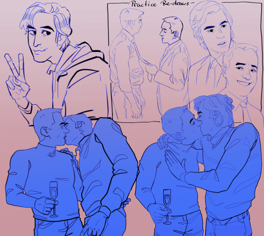
#they make me feel insane actually
Text
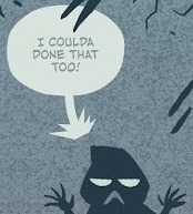
Remember when Cale told Alver that the White Star gave him cookies and that they even tasted better than Alver's cookies? And then for some 'odd reason', Alver felt upset? And he also felt as though he had lost to White Star?
Because I think about it everyday. The whole Naru Von Ejellan arc was insane in so many ways and this is just one small part of it.
#they make me feel insane actually#They never fail to make me blank out#Whether as a hyung or... more alver wants to be the one with the best spot for both Cale and the children#and people ask me why they make me insane this way#cale is oblivious to these things which makes it even more funnier#he wants to be a slacker so bad but that is so far away sorry cale#alcale#albecale#alver crossman#alberu crossman#alver#alberu#cale henituse#cale#lcf#lout of the count's family#tcf#trash of the count's family
1K notes
·
View notes
Text


be careful what you wish for, Fordsy
commission info here
#gravity falls#the book of bill#stanford pines#bill cipher#billford#ford pines#my art#my fanart#that one scene in lilo and stitch but make it the beggining of toxic yaoi#holy shit the bgs actually look great on this what possesed me#Ford's self isolated ass like “please I need a higher power to help me and maybe make me feel less lonely”#and a higher power answered#but powerfull does not mean bening as Ford was soon to find out#they make me insane#less shippy than my other stuff but
20K notes
·
View notes
Note

YOU CANT JSUT SAY THAY SHIT

I'M SORRYSJEHEB

1 note
·
View note
Text
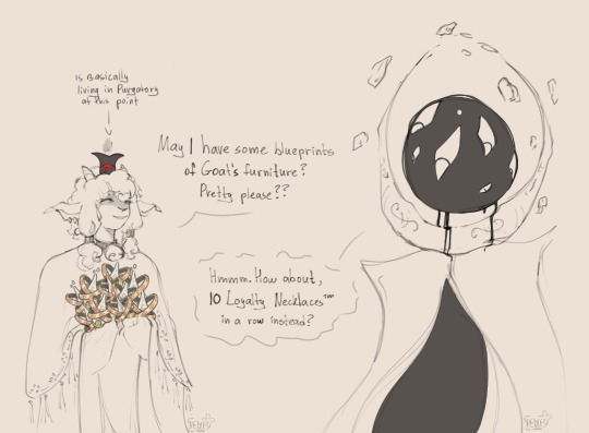
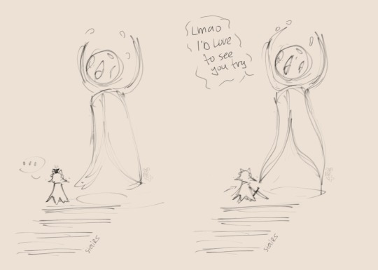


Life footage of me grinding god tears for 2 days straight in my new safe + narilamb being sickeningly soft
#i actually did get 10 necklaces in a row it was insane#lamb: nothing can make me stray from my goals#narinder: mmrrpp?#lamb:... shit#gotta respect the cat. if hes feeling cuddly you gotta drop everything to cuddle him#the crown is so tired#narinder has tear stains from when he bled ichor for a couple of years straight btw#and hes covered in bandages bc. joints go ouch :((#3rd pic gotta be my best narinder face to date#cotl#my art#narilamb#cotl narinder#cotl lamb#cotl fanart#cotl narilamb#cotl mystic seller#cult of the lamb pilgrim pack#pilgrim pack#pebbles (me) ramblers#cult of the lamb
2K notes
·
View notes
Text
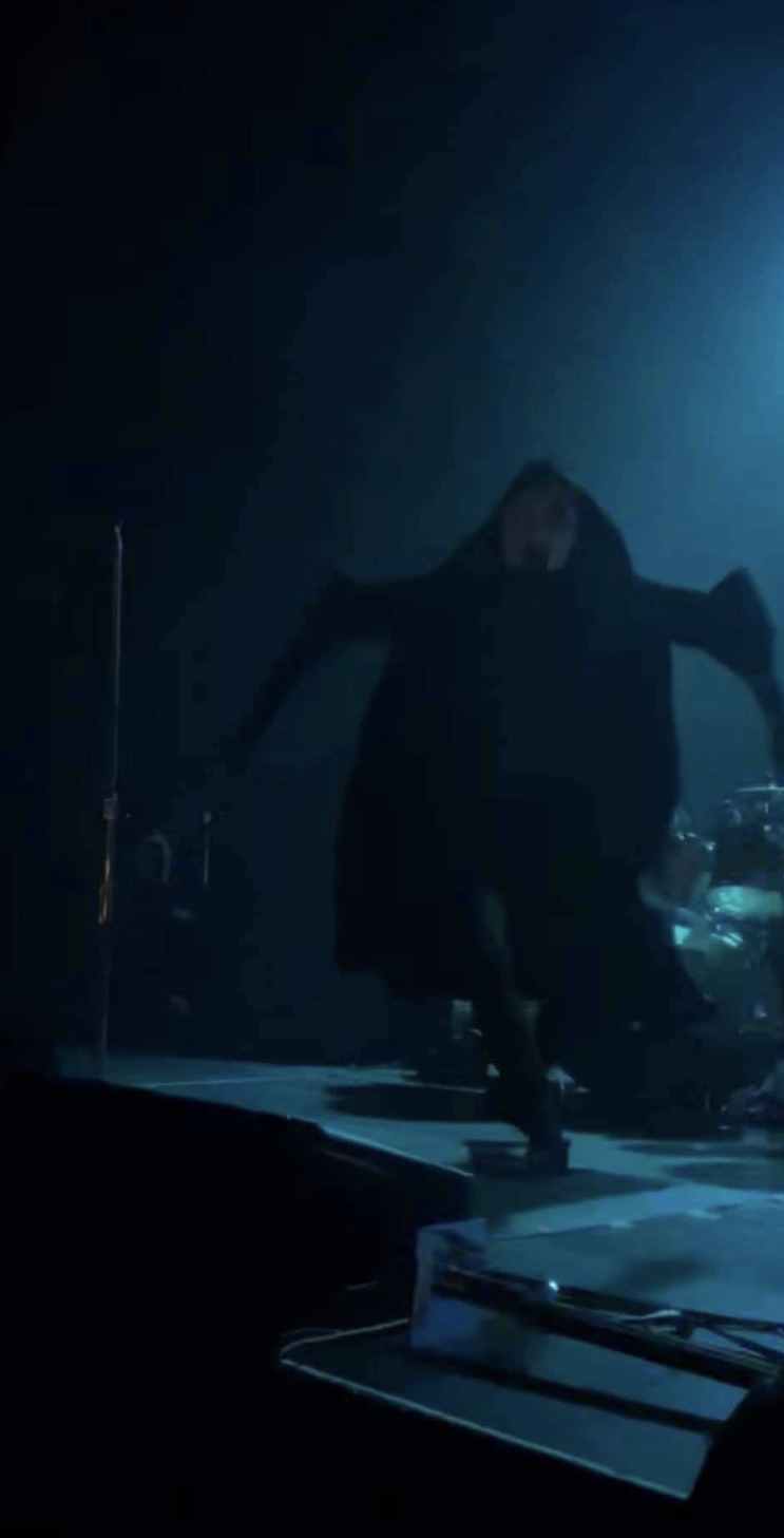
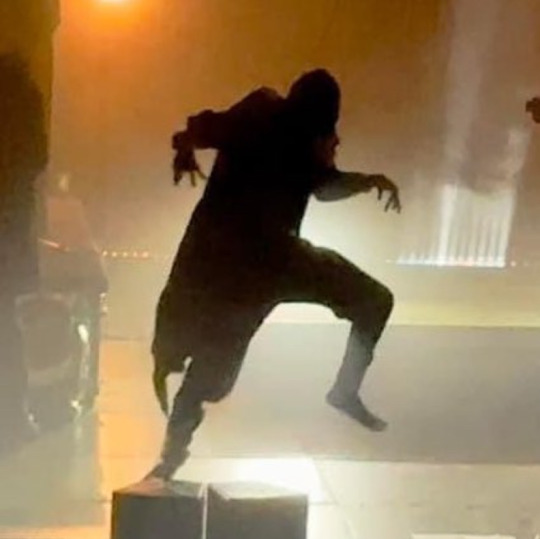
Some cryptid photos of Vessel (+ ii) that I've collected over the past week. The fact that almost all of them look like they came out of trail cam footage is absolutely sending me
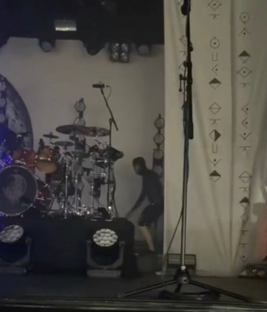
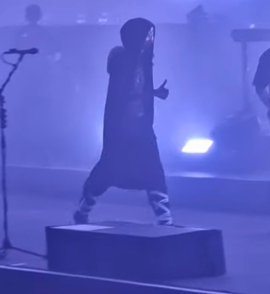
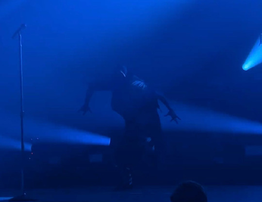
#add a grainy overlay and the date and time text from an old camcorder and I think I could convince someone it *is* trail cam footage#the fact that this odd pose where he's got his arms out with his fingers spread is a common part of his dance routine makes me giggle a lot#like you go you funky music man#there are so many photos of ii out there where he legitimately just looks like he's either edited into the photo or ->#an actual creature of the night as well#this is just my favourite because he looks so insanely out of place#if anybody has an editions feel free to add! I'd love to get a good giggle out of some more crypid photos#sleep token#st#vessel#vessel sleep token#ii sleep token#mel's rambles#cryptid token#1k
2K notes
·
View notes
Text
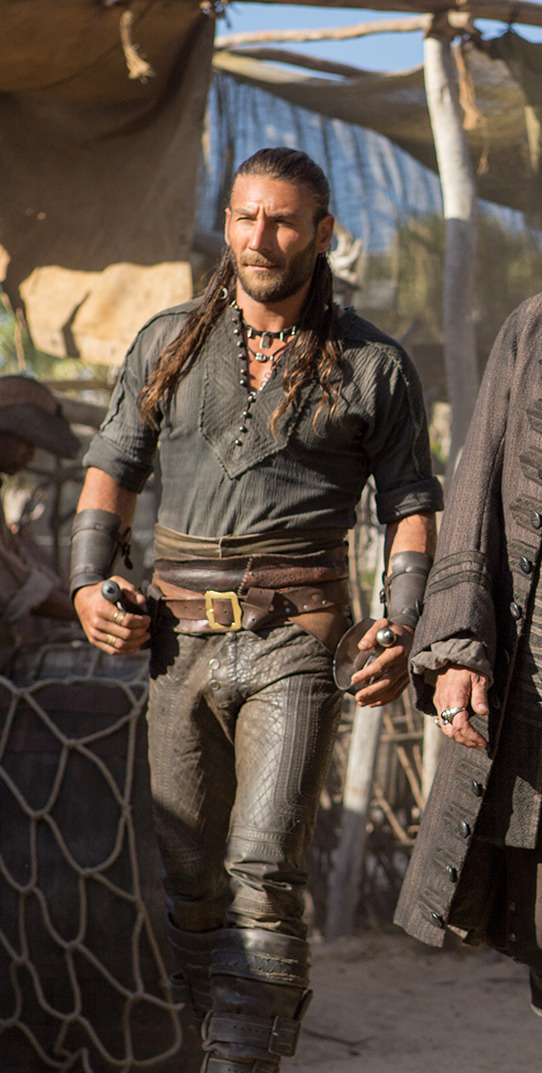
So I accidentally almost got into an argument on Twitter, and now I'm thinking about bad historical costuming tropes. Specifically, Action Hero Leather Pants.
See, I was light-heartedly pointing out the inaccuracies of the costumes in Black Sails, and someone came out of the woodwork to defend the show. The misunderstanding was that they thought I was dismissing the show just for its costumes, which I wasn't - I was simply pointing out that it can't entirely care about material history (meaning specifically physical objects/culture) if it treats its clothes like that.
But this person was slightly offended on behalf of their show - especially, quote, "And from a fan of OFMD, no less!" Which got me thinking - it's true! I can abide a lot more historical costuming inaccuracy from Our Flag than I can Black Sails or Vikings. And I don't think it's just because one has my blorbos in it. But really, when it comes down to it...
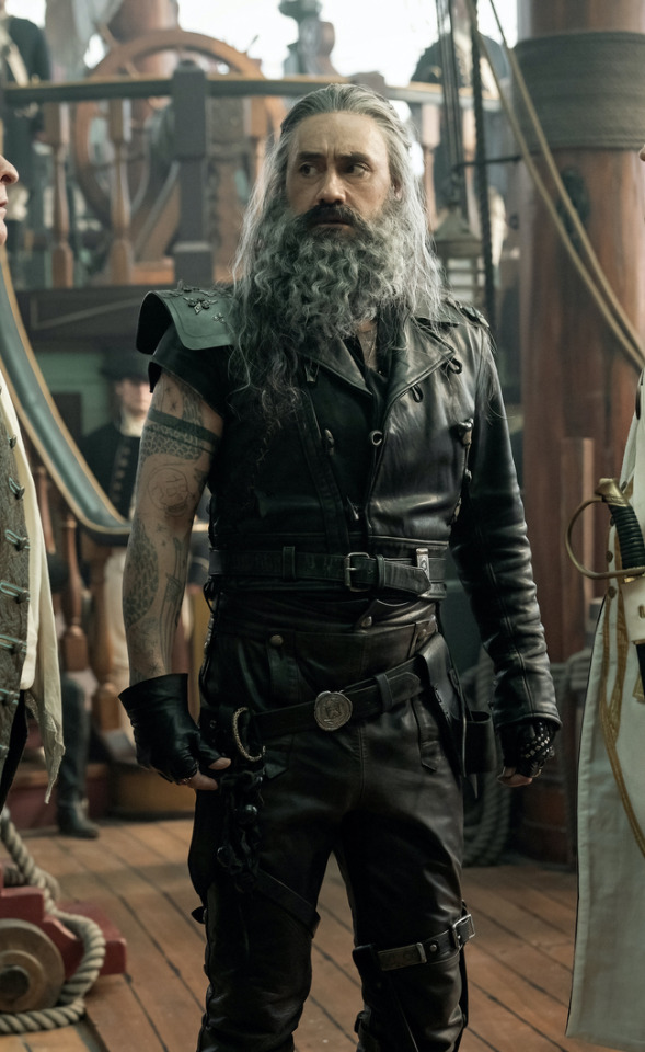
What is the difference between this and this?
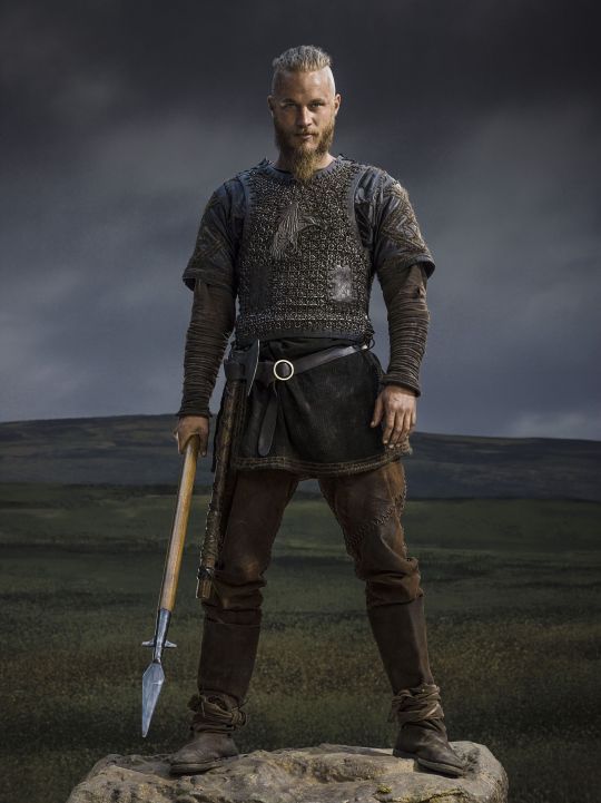
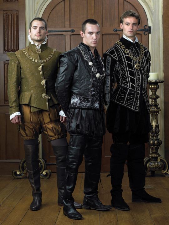
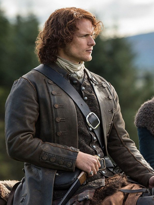
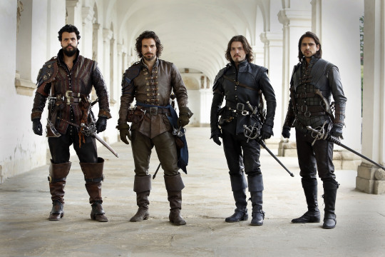
Here's the thing. Leather pants in period dramas isn't new. You've got your Vikings, Tudors, Outlander, Pirates of the Caribbean, Once Upon a Time, Will, The Musketeers, even Shakespeare in Love - they love to shove people in leather and call it a day. But where does this come from?

Obviously we have the modern connotations. Modern leather clothes developed in a few subcultures: cowboys drew on Native American clothing. (Allegedly. This is a little beyond my purview, I haven't seen any solid evidence, and it sounds like the kind of fact that people repeat a lot but is based on an assumption. I wouldn't know, though.) Leather was used in some WWI and II uniforms.
But the big boom came in the mid-C20th in motorcycle, punk/goth, and gay subcultures, all intertwined with each other and the above. Motorcyclists wear leather as practical protective gear, and it gets picked up by rock and punk artists as a symbol of counterculture, and transferred to movie designs. It gets wrapped up in gay and kink communities, with even more countercultural and taboo meanings. By the late C20th, leather has entered mainstream fashion, but it still carries those references to goths, punks, BDSM, and motorbike gangs, to James Dean, Marlon Brando, and Mick Jagger. This is whence we get our Spikes and Dave Listers in 1980s/90s media, bad boys and working-class punks.
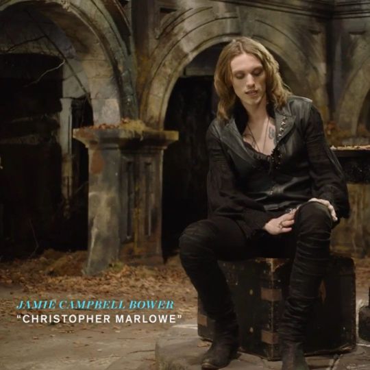
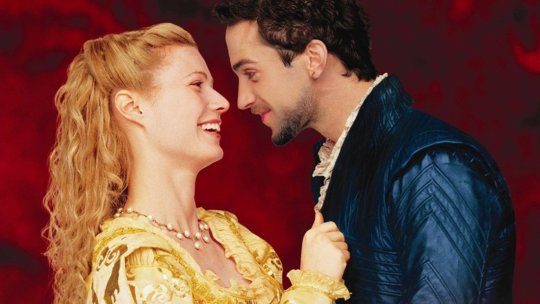
And some of the above "historical" design choices clearly build on these meanings. William Shakespeare is dressed in a black leather doublet to evoke the swaggering bad boy artist heartthrob, probably down on his luck. So is Kit Marlowe.
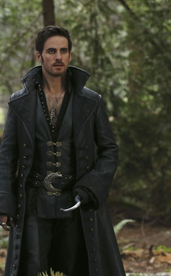
But the associations get a little fuzzier after that. Hook, with his eyeliner and jewellery, sure. King Henry, yeah, I see it. It's hideously ahistorical, but sure. But what about Jamie and Will and Ragnar, in their browns and shabby, battle-ready chic? Well, here we get the other strain of Bad Period Drama Leather.
See, designers like to point to history, but it's just not true. Leather armour, especially in the western/European world, is very, very rare, and not just because it decays faster than metal. (Yes, even in ancient Greece/Rome, despite many articles claiming that as the start of the leather armour trend!) It simply wasn't used a lot, because it's frankly useless at defending the body compared to metal. Leather was used as a backing for some splint armour pieces, and for belts, sheathes, and buckles, but it simply wasn't worn like the costumes above. It's heavy, uncomfortable, and hard to repair - it's simply not practical for a garment when you have perfectly comfortable, insulating, and widely available linen, wool, and cotton!
As far as I can see, the real influence on leather in period dramas is fantasy. Fantasy media has proliferated the idea of leather armour as the lightweight choice for rangers, elves, and rogues, a natural, quiet, flexible material, less flashy or restrictive than metal. And it is cheaper for a costume department to make, and easier for an actor to wear on set. It's in Dungeons and Dragons and Lord of the Rings, King Arthur, Runescape, and World of Warcraft.
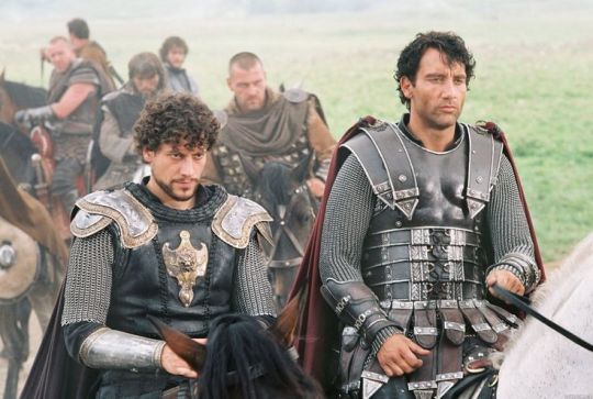

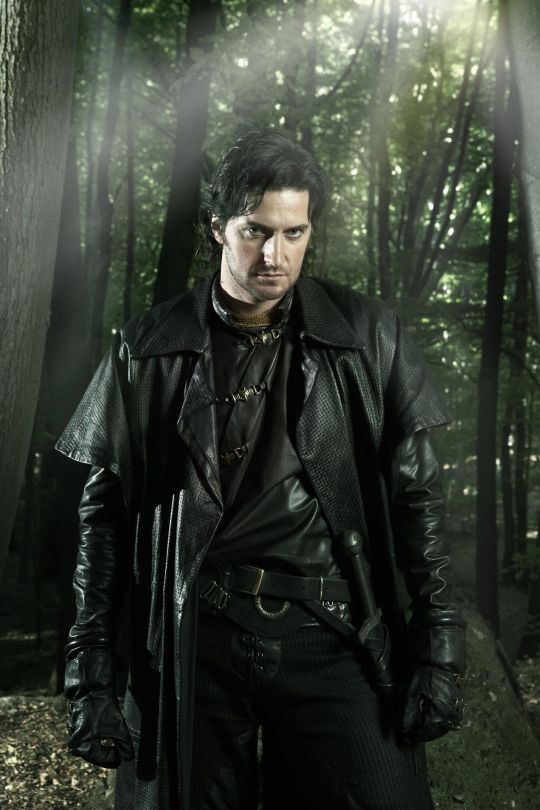
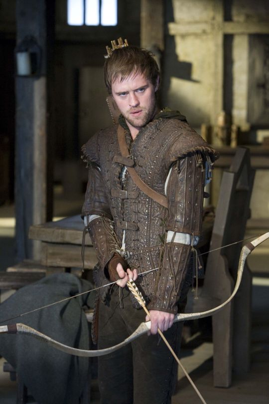
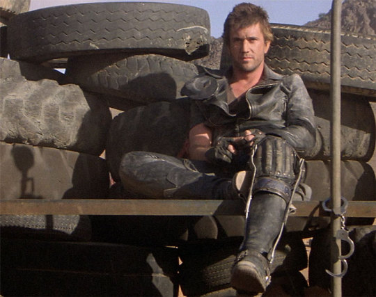
And I think this is how we get to characters like Ragnar and Vane. This idea of leather as practical gear and light armour, it's fantasy, but it has this lineage, behind which sits cowboy chaps and bomber/flight jackets. It's usually brown compared to the punk bad boy's black, less shiny, and more often piecemeal or decorated. In fact, there's a great distinction between the two Period Leather Modes within the same piece of media: Robin Hood (2006)! Compare the brooding, fascist-coded villain Guy of Gisborne with the shabby, bow-wielding, forest-dwelling Robin:
So, back to the original question: What's the difference between Charles Vane in Black Sails, and Edward Teach in Our Flag Means Death?
Simply put, it's intention. There is nothing intentional about Vane's leather in Black Sails. It's not the only leather in the show, and it only says what all shabby period leather says, relying on the same tropes as fantasy armour: he's a bad boy and a fighter in workaday leather, poor, flexible, and practical. None of these connotations are based in reality or history, and they've been done countless times before. It's boring design, neither historically accurate nor particularly creative, but much the same as all the other shabby chic fighters on our screens. He has a broad lineage in Lord of the Rings and Pirates of the Caribbean and such, but that's it.
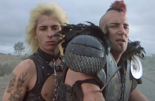
In Our Flag, however, the lineage is much, much more intentional. Ed is a direct homage to Mad Max, the costuming in which is both practical (Max is an ex-cop and road warrior), and draws on punk and kink designs to evoke a counterculture gone mad to the point of social breakdown, exploiting the thrill of the taboo to frighten and titillate the audience.
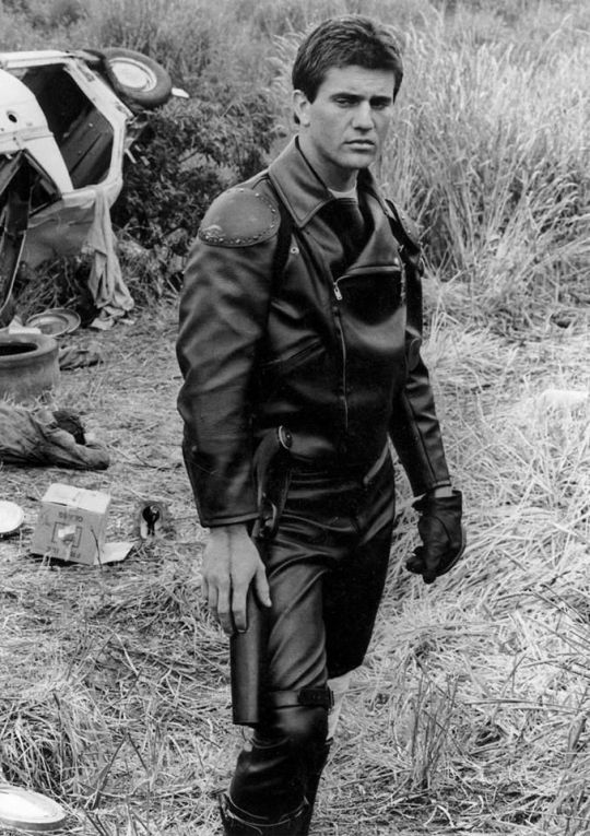
In particular, Ed is styled after Max in the second movie, having lost his family, been badly injured, and watched the world turn into an apocalypse. He's a broken man, withdrawn, violent, and deliberately cutting himself off from others to avoid getting hurt again. The plot of Mad Max 2 is him learning to open up and help others, making himself vulnerable to more loss, but more human in the process.
This ties directly into the themes of Our Flag - it's a deliberate intertext. Ed's emotional journey is also one from isolation and pain to vulnerability, community, and love. Mad Max (intentionally and unintentionally) explores themes of masculinity, violence, and power, while Max has become simplified in the popular imagination as a stoic, badass action hero rather than the more complex character he is, struggling with loss and humanity. Similarly, Our Flag explores masculinity, both textually (Stede is trying to build a less abusive pirate culture) and metatextually (the show champions complex, banal, and tender masculinities, especially when we're used to only seeing pirates in either gritty action movies or childish comedies).
Our Flag also draws on the specific countercultures of motorcycles, rockers, and gay/BDSM culture in its design and themes. Naturally, in such a queer show, one can't help but make the connection between leather pirates and leather daddies, and the design certainly nods at this, with its vests and studs. I always think about this guy, with his flat cap so reminiscient of gay leather fashions.
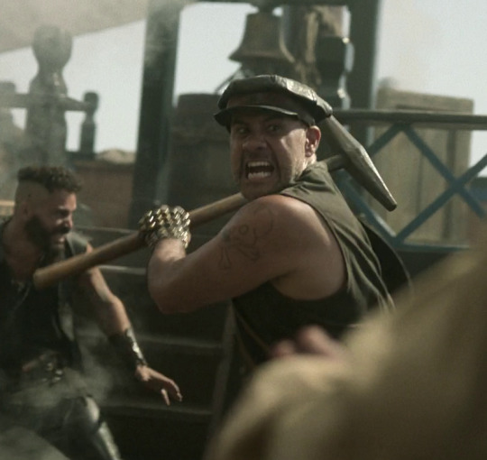
More overtly, though, Blackbeard and his crew are styled as both violent gangsters and countercultural rockstars. They rove the seas like a bikie gang, free and violent, and are seen as icons, bad boys and celebrities. Other pirates revere Blackbeard and wish they could be on his crew, while civilians are awed by his reputation, desperate for juicy, gory details.
This isn't all of why I like the costuming in Our Flag Means Death (especially season 1). Stede's outfits are by no means accurate, but they're a lot more accurate than most pirate media, and they're bright and colourful, with accurate and delightful silks, lace, velvets, and brocades, and lovely, puffy skirts on his jackets. Many of the Revenge crew wear recognisable sailor's trousers, and practical but bright, varied gear that easily conveys personality and flair. There is a surprising dedication to little details, like changing Ed's trousers to fall-fronts for a historical feel, Izzy's puffy sleeves, the handmade fringe on Lucius's red jacket, or the increasing absurdity of navy uniform cuffs between Nigel and Chauncey.
A really big one is the fact that they don't shy away from historical footwear! In almost every example above, we see the period drama's obsession with putting men in skinny jeans and bucket-top boots, but not only does Stede wear his little red-heeled shoes with stockings, but most of his crew, and the ordinary people of Barbados, wear low boots or pumps, and even rough, masculine characters like Pete wear knee breeches and bright colours. It's inaccurate, but at least it's a new kind of inaccuracy, that builds much more on actual historical fashions, and eschews the shortcuts of other, grittier period dramas in favour of colour and personality.
But also. At least it fucking says something with its leather.
#everyone say 'thank you togas' for not including a long tangent about evil rimmer in red dwarf 5x05#Our Flag Means Death#Togas does meta#and yes these principles DO fall apart slightly in s2 and i DON'T like those costumes as much#don't get me wrong they're fun and gorgeous - but generally a bit less deep and more inaccurate. so. :(#I'm not sure this really says anything new about Our Flag but I just needed to get my thoughts out#i hate hate hate Gritty Period Drama costumes they're so boring and so ugly and so wrong#god bless OFMD for using more than 3 muted colours and actually putting men in heels (and not as a shorthand for rich/foppish villainy) <3#looking at that Tudors still is insane like they really will go to any lengths to not make men feel like they've got bare legs XD#image descriptions in alt text#and yes i DID just sink about two hours into those so you'd better appreciate them
1K notes
·
View notes
Text


"tyler, how'd you come to do this work?" / "well, when you love something, you'll spend your whole life trying to understand it."
TWISTERS (2024)
#TAKING A BREAK FROM POSTING GIFS CHRONOLOGICALLY BY SCENE#CAUSE THIS SHIT APPEARED ON MY FACE AS I WAS MAKING A TYLER/KATE EDIT#THEY MAKE ME SO SICK CAUSE#look at them staring at each other#and you literally have cathy looking at kate in this shot#MOMMA KNOWS SOMETHING'S UP!!!#oh god i will never not shut up about this film will i?#they make me insane#i actually feel sick#this is the most unhinged tags i have ever written in this app#i may need professional help#or jesus#twisters#kate carter#daisy edgar jones#tyler owens#glen powell#cathy carter#maura tierney#katecarteredit#tylerowensedit#tyler x kate#filmgifs#filmedit#movieedit#moviegifs#twistersedit#twistersgif#twisters 2024#kaizschetwistersgifs
758 notes
·
View notes
Text
the fact that irving canonically survives through the end of asunder to be at wynne's funeral is so fucking funny to me. nothing but love and respect for MY unstoppable cockroach morally grey machiavellian mage dad!!! he's survived in his position through multiple attempted rites of annulment and blood mage plots popping up left right and center around him. the chantry keeps trying to stamp him out but his dodge game is simply out of this world, divine. civil wars, political machinations and minefields, chantry atrocities, this wily old motherfucker is dodging and weaving his way through it all, not-quite-no-hits-taken-running-it-but-honestly-close-enough-under-the-circumstances style. if solas does succeed in tearing down the veil I would fully believe that one of the like three people still alive at the end of it all would be a very weary 90 year old first enchanter irving going 'oh this shit again huh'. the maker has cursed him for his hubris and his paperwork is never finished (affectionate, it's fine he canonically loves paperwork)
#we should have had the option to leave him in the fade instead of hawke or a warden#he would've just annoyedly shuffled his way back out of there a week later#dragon age#dragon age origins#first enchanter irving#he must be SO annoying to the chantry because it's heavily implied he's made his playground#out of tirelessly finding technicalities and loopholes to exploit that they can't *quite* call him on without domino effects going off#I think first enchanter in the circle system at origins times is a position that invariably and inevitably leaves you morally compromised#but I feel he really does his best within the rules he's given to play with and personally i love him a bit for that. and also#for being an unkillable lil shit. insufferable. inconquerable in his 'I'm about to be such an annoyance to you' impish spirit.#the I'm going to suffer but guess what. so are you of it all. traumatize the chantry back#I just imagine sophia sending letters home right before the vote for independence like '...dad I am hearing some INSANE rumours out here#what the actual fuck is going on back home???'#and he's like 'nothing that you need to worry about sweetie just keep living your best life and have fun killing darkspawn <3'#(there's something that makes me feel So much about how consistently his stance is like... 'you'll always be welcome here#but the circle doesn't *need* you; go be a warden and live your life'. he managed to fineagle freedom for you somehow and won't let you#turn and glance back. not even once. I feel somehow both so abandoned and so incredibly loved it's wild)#oc: sophia amell
823 notes
·
View notes
Text
There's something so sad to me about the fact Lan Xichen goes from happily encouraging Lan Wangji to befriend Wei Wuxian to Considering Wei Wuxian to be Lan Wangjis 'only mistake'
Like... Imaging getting a miracle second chance not only at life but to have be loved by the man you've always admired only to find out that his family detests you because during the worst time in your life, physically and mentally you didn't take into account the idea that a man who'd always treated with cool acquaintance at best, active distaste at worst actually cared about you and that his constant reproach and effort get you do give up the one method you have to protect yourself while everyone was literally actually out for your head was honestly because he was badly wording his concern and not because he hated you and the methods you used to survive.
#wei wuxian#was in active crisis from like... the burning of lotus pier till his death#all with next to no real support#i know lan xichen couldn't possibly know all the details#but it makes me sad#and i think with the information he did have#the amount of blame he placed on Wwx insane#like sorry#your brother is terrible at communicating his feelings and comes off as cold to even the people who spend the most time with him#and you know this#but wwx despite barely getting to spend any real time with him is supposed to just magically divine that he actually cares#while in active crisis#having lost pretty much all of jis support system#AND having the entire cultivation world litteraly out to get him?#sure man#mdzs#mxtx mdzs#mo dao zu shi#mxtx characters#lan wangji#lan xichen#grand master of demonic cultivation#grandmaster of demonic cultivation
537 notes
·
View notes
Text
ok ok yes yes jensen making his voice deeper to match misha’s whatever. there’s something very compelling to me about dean’s voice being raspier after forty years of screaming in hell
#it just. makes me feel things on a shrimp level#i don’t mean like actually physically obv but. from a subtextual standpoint….. i’m insane#lu.txt#spn#dean winchester#castiel
505 notes
·
View notes
Text
Uploading all my Tomgreg art at once from the past few week before season 4 hits, who knows in what kind of mental state i'm gonna be once it does :')
#tomgreg#succession#dont even talk to me i started watching this show when i had nothing to do at work and now i watch it with averiel my good friend averiel#and we are going to watch s4 together and i feel physically ill from bein so excited#so ya thats what ive been up to... anyway. i love these idiots they desever nothing but the worst (affectionate)#im also a tomshiv lover btw. im the one who yells 'THIS IS HOW TOMSHIV CAN STILL WIN' while they are actively losing on screen#thats the kind of person i am#dont look at me (lying on the floor)#okay i was not going to say stuff in the tags and let the art speak for itself but i NEED to point out details in the wine Painting..#i put a lot of work into that one. thinly veiled metaphors and symbolism yknow..#greg is gripping the stem of the wine glass with his full fist. tom and greg are dressed in the same outfit (sock garters included)#greg look appalled but he is not doing anything about the spill. tom is fondly pouring greg more and more wine. he is doing him a favor#i colored the red wine the same way i would color blood :) oh and tom is not really touching greg#only holding the chair in place. greg is making himself look smaller than he is like usual#oh and @ the person who said that it's the inverse of the tom and nate scene i love the way you think. i did not think of that before#but god. yeah. i actually thought about the scene change from when roman uhh.. christens his office in s1. the one with the coffee machine#i always go insane at that cut. this is not exactly the same since it's more.. about emotions but yknow.. it can be.. the same...
4K notes
·
View notes
Text
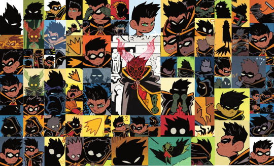
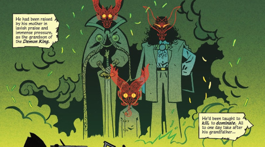
The Boy Wonder #1 by Juni Ba rambling about why every time i open this book, i stare in wonder...HAHA and ofc!! how cute Damian is!!
Juni Ba’s style is so absurdly effective in telling a fairy tale for the ages. It’s a stunning blend of simplicity and complexity I'M GRIPPING THE PAGES AGAINST MY EYES…
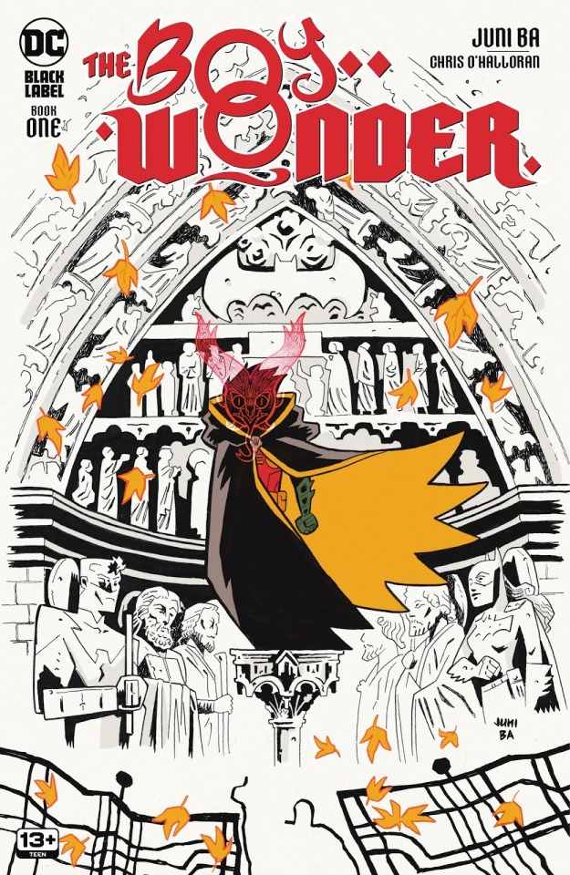
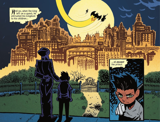
Before getting into the interiors, THE COVER!! It associates autumn leaves to Damian's Robin title through the iconic cape shape/color; and on top of that, for a Robin going through a big transition in his life...a season of change one might say...Juni Ba your brain...
Damian and the leaves being the only colored parts of this cover is nice in focusing on those elements, but i also like to think by not coloring the background it prepares you to expect impressive inkwork in this book.
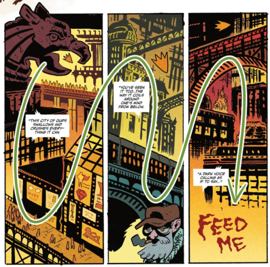
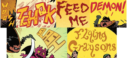
On that note, the interiors!! Starting off with Ba's backgrounds of Gotham as it establishes the strange new world that our young hero has been thrust into:
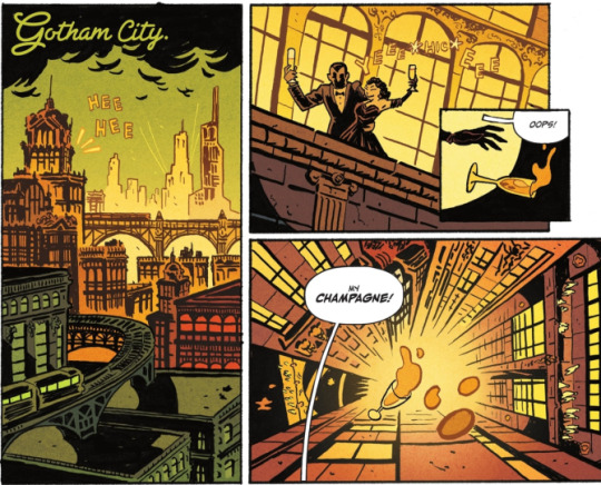
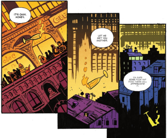
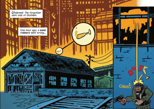
We get a neat tracking shot following a champagne glass that gives us a glimpse of Gotham from the upper echelons to the downtrodden in "Underwell"
This opening sequence quickly lays out the environment Damian will be traveling through in this series! It also sets the tone for some silliness with the cute zoom on the champagne glass before it BOKs the robber lol. Along with Ba's inks, O'Halloran's colors makes every part of Gotham pop - especially love the golds of the higher society shifting into the blues of the underbelly!!
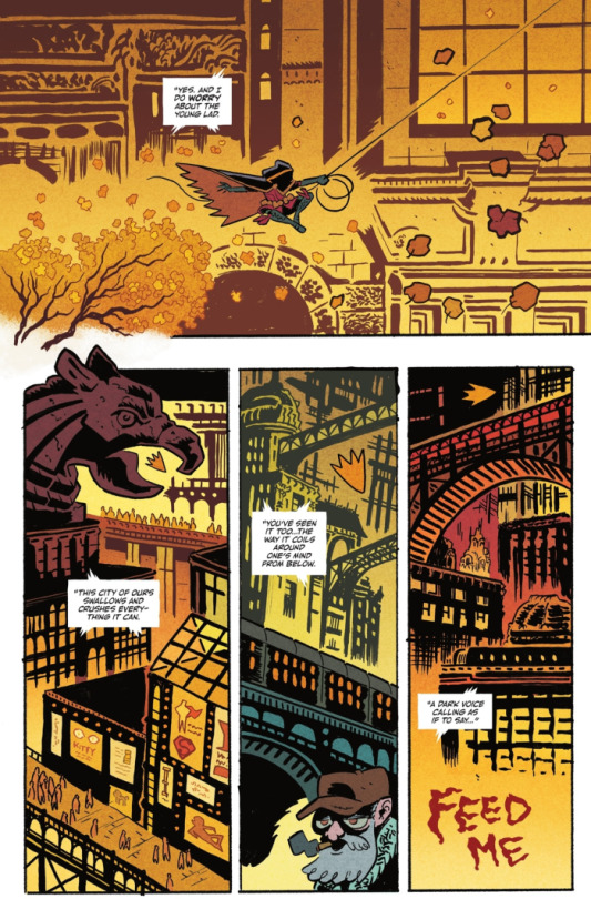
Besides Damian’s personal conflict, Gotham feels like its own entity that he has to contend with. The dialogue speaks for itself, but within the art as well!!
"This city of ours swallows and crushes everything it can" -> a gargoyle's beak over Damian, crowds of people, and walls of advertising
"You've seen it too...the way it coils around one's mind from below." -> bridges and a passing train on a rail viaduct towering over a civilian
"A dark voice calling as if to say..." -> literally, "FEED ME"
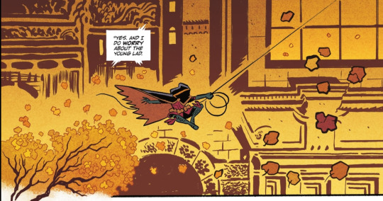
LOVELY SHOT OF MOVEMENT... and i love how Damian's venture into Gotham opens with him passing a tree - its branches and leaves are the most organic element on the page before getting into the gritty details of the city! Some yammering because the inks are. so cool: the delicate lines of the leaves in the tree to the thicker/bigger lined ones closer to the camera on the right; the background inks allowing space around Damian's form + the fine line of his grapple!! More O'Halloran praise - PRETTY, and love his coloring over Ba's bg lines, particularly here, keeping the leaves darker on the right.
It's not only a pretty page it's just a really clean layout!! Ba exhibits this throughout the book but i really enjoy it here - from Damian nyooming, we head into these last 3 panels. his cute lil "Robin" shape easily draws the eye to the tops of the panels as we take in Gotham's liveliness alongside the lettering/narration
and the "Robin" shape?? SO CUTE. it's instantly familiar to us as Robin!! bold outline and filled with yellow...it's a Robin in movement!!...AN AUTUMN LEAF IN THE WIND... yeah, still not over that 😭
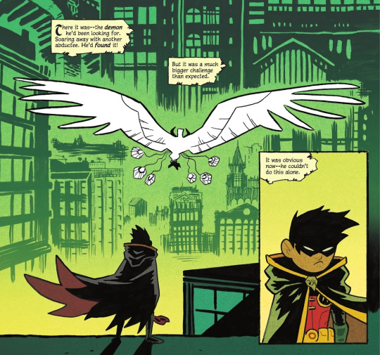
Damian's inciting incident is introduced in the former panel with a gorgeous backdrop of Gotham in the distance (plus itty bitty Trinity cameo haha). The shot parallels!! beautifully!! in the final page!! Damian is now in the depths of Gotham, his objective out of reach. The colors are of note too, where the familiar yellows of Gotham are suddenly a startling green after the demon makes its appearance. The Gotham land looks even more unfamiliar, which prompts Damian to seek help.
Some speculation, but the green could also be associated with the more mythical side of demons and such (like the ghost?? of the thief), but it could even imply there's a connection to the Al Ghuls themselves as it's the only other time green is so prominently used.
Now that the land of Gotham is established, popping in other fav bgs!
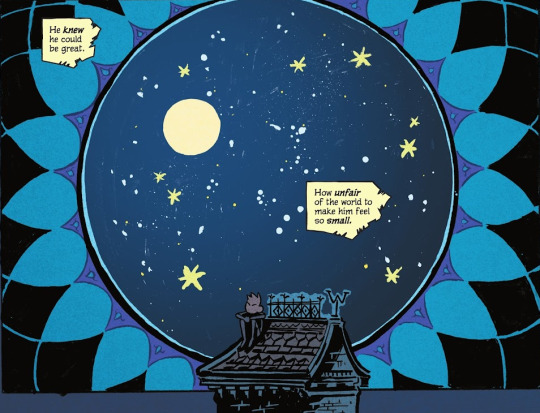
More lovely mix of Ba's inks and O'Halloran's colors!! especially allowing some of the brush/marker strokes to show faintly as part of the twinkling sky...STUNNING!! 😭 i love this whole page but this panel gets me weepy, SMALL DAMIAN IN THE VAST UNIVERSE COMBINED WITH THIS LINE "He knew he could be great. How unfair of the world to make him feel so small." KICKS MY ASS... i need to lie down
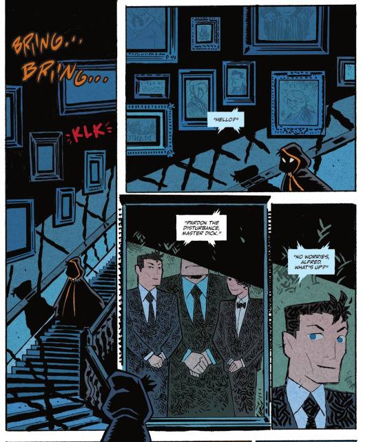
YAPPING AT MORE WONDERFUL INKING: the suggestion of windows offscreen from the frames casting these thick lines over the walls and stairwell; the minute shadow details over the railing; the hatching on the suits in the portrait; the framed portrait being its own panel!! cute hooded Damian in the gutter space looking in on the portrait/panel!! CUTE HOODED DAMIANS!!
SPEAKING OF PANELS, along with general effectiveness and efficiency, there's more whimsy in others!! like this kickass page of Nightwing whipping his escrima from first panel -> afterimage lines going POWPOWPOW hitting demons from a distance to ones closer to the camera -> and back into his hand!! IT'S SO GOOD AND SO FUN!!
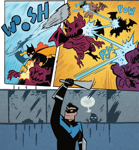
Ba's action employs more diagonal panels, and characters are less restrained within boxes - there's more energy and freedom across the page!
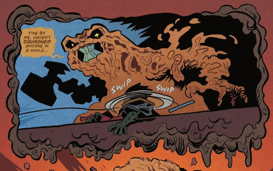
not necessarily focusing on the action for this one, but THE WHIMSY!! the border itself is goop!! Also gotta point out that looming hammer shape!!
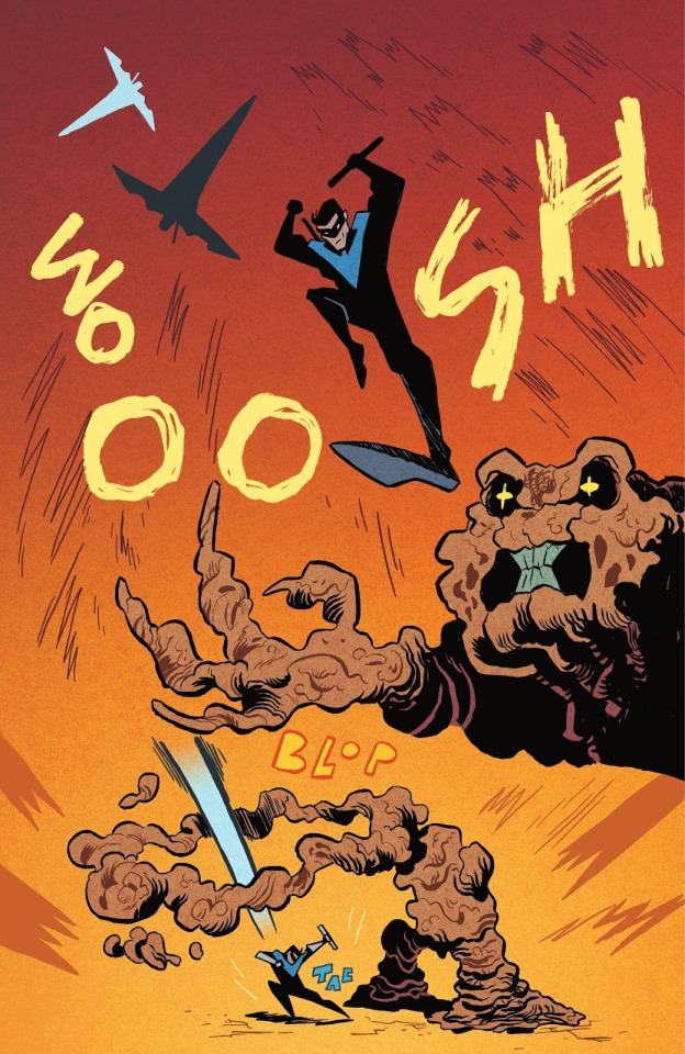
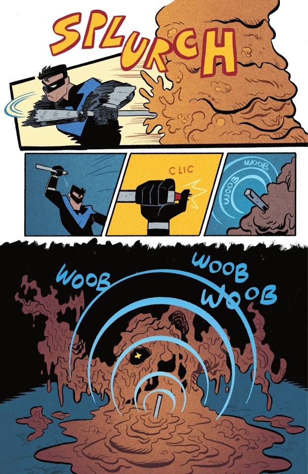
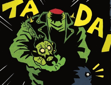
Nightwing's critical hit spans the entire page!! from silhouettes of a flip -> flashy stomping pose/Clayface -> to a distant shot of Dick landing
and a smooth finisher page!! love the motion lines on Dick's arms and waist + his head and arc effects popping outside of the borders; then the smaller panels for quick activity, and the final WOOB WOOB WOOB LOL i can hear this sound effect just as much as i can see it
Along with O'Halloran on colors, Aditya Bidikar on lettering works seamlessly with Ba's vision!! The text boxes for the fairy tale narration are like strips of yellowing pages from an old storybook!! Had to look up the term for this lol, but also reminiscent of those storybooks, there's even a use of "drop caps" - the big fancy capital letter!
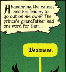
Smaller things of note, but the bit of "Weakness" text from Ra's has a kind of. grandiose feel to it. Then the cute B< Damian behind the window!! Love how the bubble and text are faded behind the glass too! The end of the bubble tail is a nice touch as it matches well with Ba's bg inking :0
Otherwise, it seems Ba has done a majority of the lettering - dropping a couple of my favs below!!
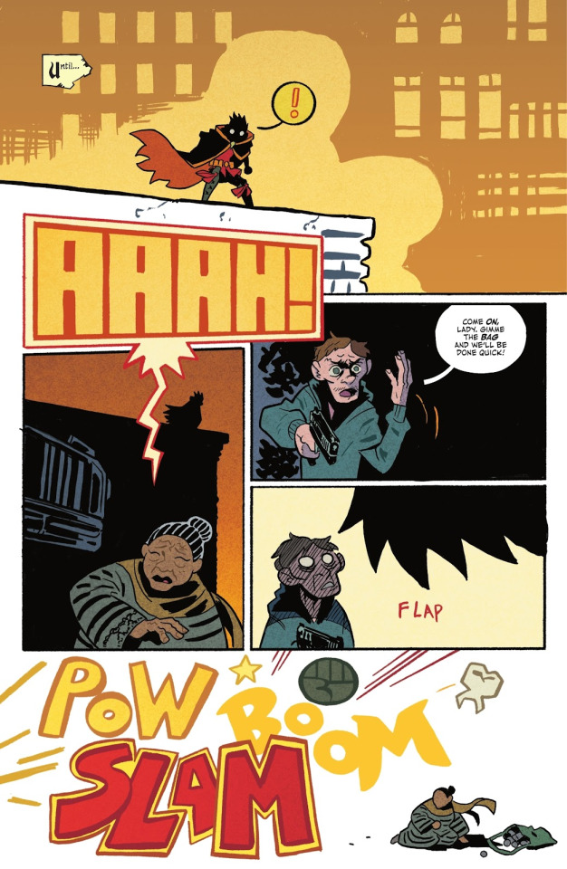
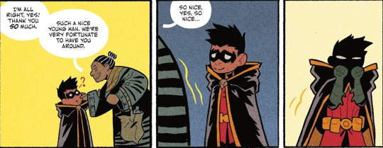
also just this whole page: the very loud AAAH! text draws both Damian's and the reader's attention to the panel below!! it's a cool transition to a new shot where you can see Damian's silhouette on the building! The final panel is cartoony violence off-page through the bold POW BOOM SLAM haha + DAMIAN'S LIL FIST!!🥺 and the guy's tooth RIP
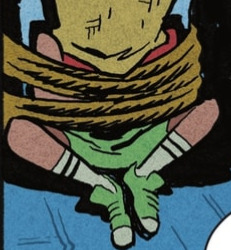
Pure speculation - Juni Ba's concept art included Carrie Kelley, so i'm wondering if the hostage in the beginning could be her and we'll be returning to this moment in time by the end. The worn Robin colors are similar to the design + their head is conveniently covered.
In terms of story, I'm obviously heavily biased, but the initial read got me rolling in emotions with how it has you caring for Damian. Damian as a character is so fantastical in essence - it’s part of his individual charm in the batfam cast! an heir of two kingdoms, born and raised with great expectations suddenly thrust into an unfamiliar land. he has a sword. he has a dragon bat for a companion. he is haunted by the sins he has committed. he is two apples tall. he's truly fairytale material!!
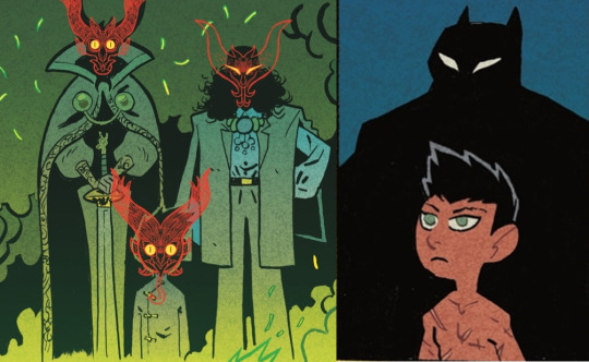
LIKE...past the panels of only his silhouettes, this is our introductory appearances of Damian. It's laid out clearly in the narration, but this parallel is SO GOOD: from the powerful and ornate visuals of Damian and the Al Ghuls -> to a simple panel of Batman's shadow behind a boy littered in scars, stripped of his home and status
Damian is out of his element and proves himself in the way he knows how!!
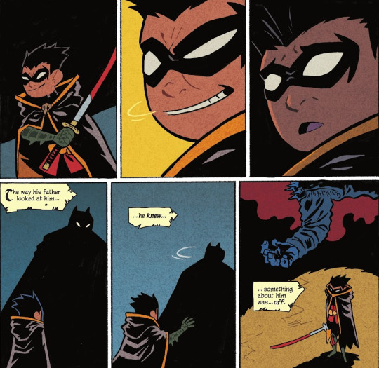
just kick me down a flight of stairs why don't you. i don't know which messes me up more, the top 3 or bottom 3 panels. His facial expressions!! his expectations for approval dashed!! Damian's hand reaching for his father!! only to be left alone with the body. The page after this is the final nail in the coffin in feeling just how lost he is in the world before he acts on it. And you root for him the entire way!!😭
Despite Damian's fanciful background there's so much heart to be shown in his struggles and discoveries - and this classic form of a fairy tale lays it out so brilliantly!! It's shaping up to be an amazing balance of heavier elements and whimsy based on this first issue, and it leaves you wanting more!!
Besides being a thoroughly enjoyable read, it's inspiring work!! i've ordered Juni Ba's other books to consume more of his storytelling, and here's the ones i've found so far if you're interested in checking them out as well!!
Mobilis: My Life with Captain Nemo
Monkey Meat
Djeliya: A West African Fantasy Epic
The Unlikely Story of Felix and Macabber
okay shockingly, i didn't blab about how cute Damian is as much as i thought i would, but i think the collage at the top speaks for itself lol
this is all you need to know how cute Damian is in this!! his cheeks are so pinchable, it was done on page!! 🥺 these panels obliterate me
#rambling#damian wayne#it's been 2 weeks since this issue came out and i'm still cracking it open every other day#throwing my chattering into his tag to possibly get more people into the series especially if you're a fan of Damian!!#i even used capitalization for slightly easier reading LOLL#the Damian collage was taking so long i was laughing how i'm taking more time to do that than the actual ramble#then i started rambling and then i realized i couldn't shut up sdfgh#feel like i sound delusional most of the time so these are maybe my most coherent thoughts LOL#pointing at pages over my brother's shoulder 'love that...so cool...look how pretty that is...' articulating WHY makes me sound insane😭#the boy wonder
639 notes
·
View notes
Text
one of my favorite things about zedaph is that on a server full of people that find strange and oft-overlooked minecraft mechanics or rare events and then see just how far they can push them in the name of spectacle or efficiency or world-breaking, zed is over here finding these mechanics in order to do the weirdest things he can think of in as entertaining a manner as possible
like i 100% have faith in zedaph's theoretical ability to be just as efficient or spectacular or world-breaking. if he wanted to do that stuff, i trust that he absolutely could. but thats so far from being his priority. instead, hes going to spend around a week of irl time focused entirely on eventually having the good luck to spawn in something insanely rare so that he can convert it into something even rarer, the result of which being something that 99% of the server reacts with complete and utter shock that it even exists in the first place, just because its zany and funny and he wanted to. and i love that
#zedaph#hermitcraft#genuinely i adore the clucky few project im not even done watching the episode and i had to pause and make this post#i saw impulses video first and went ''that HAS to be some sort of datapack or something-''#only to immediately go ''no. no it cant be. because this is zed#and its practically a trademark of his to push the limits of the game as far as possible in the direction least expected#not for the purpose of efficiency or spectacle or intimidation or whatever like some players who push limits#but purely for the purpose of making something so funny you cant help but laugh at whats going on#and maybe being a bit impressed that he ever thought of it in the first place''#at which point i went ''holy shit. since its zed doing this. somehow he ACTUALLY got a villager on a chicken. with no cheats. thats INSANE'#i was relieved when i checked my subscriptions to see what the next video i had to watch was and saw he would be next in line#bc if i had to sit through 19 other hermits videos before i could watch his and find out what the fuck he was doing i would have been so sa#sidenote but i feel like a zed video where he interacts with this many other people all in the same video is so rare#idk i didnt watch season 9 and i know he started collabing a lot more w/ other hermits then#so maybe its not nearly as rare these days#but like the last one that *i* saw where he interacted with this many people at once was towards the end of season 8#when all the people he experimented on earlier in the season came back to experiment on him#and like i would like zeds videos with or without the collabs. but its a lot of fun to see him interact with people#so its very cool to me when he does it with a lot of people all in the same video
732 notes
·
View notes
Text
I think some of you are claiming to be leftists and have never done anything other than buy an eat the rich sticker from Etsy and participate in internet moral purity culture 👀
#seeing posts on the dash that miss the entire fucking point#making me feel so insane#like this is actually textbook marxism that could be being discussed here#and youre just dismissing it as lol american burger#al is talking
2K notes
·
View notes
Text
do you ever think about how harry potter as a canon is about a secret cabal of a (((superpowered minoritized and ghettoized ethnic group))) (<- wizards) who control the minds and perceptions of the sheepled masses (<- muggles).
and also that same cabal is the one attempting to commit a holocaust. because it is the muggleborns who are the jews! and it's (((those guys))) who are... well!
do you ever think about it.
#when people get mad about the goblins it actually makes me feel legitimately insane because like. please refine your scope.#is that how bad it has to be before you notice? you can notice inhuman hook-nosed bankers and not EVERYTHING ELSE???
445 notes
·
View notes
Note
😬
Thank you so much! I have the feeling that I never saw that one. So truly, thank you! 💚💙
How's that even possible that I've never seen it? Well I don't know!
Maybe my brain erased it because it was too much! Because this IS too much! What am I supposed to do with that?
#erase it again?#and see it for the first time later#like weeks or months later#anyway I'll let everyone that never saw it look at it too#so I'm not alone feeling insane about this and late to the party#cockles#jenmish#jensen ackles#misha collins#cockles makes me smile goofily#but also wow#like that's actually hot#did they choose to do this?#I have millions questions now#emms answers
232 notes
·
View notes
Last Seen Blogs

sorry-for-this-mom
shy away

beyondimpressions-blog
Beyond Impressions
yokolitner123654
These Bitches Bad

18thseptemb3r
Got a heart so cold...

kavi-vish
God Of Fashion