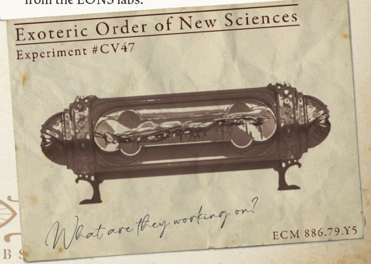
#this logo will likely change I just like this concept art a lot
Text
Every good band of misfits/prank criminals needs a calling card/emblem. Even if it is over-the-top, cheesy, and painfully obvious who it’s supposed to represent.
Even then, those so-called professionals and evil masterminds at Westminister keep getting hoodwinked by three very identifiable 16 year olds within their own organization.
#my art#oc: danny castere#small towns campaign#this logo will likely change I just like this concept art a lot#I want to run a oneshot/mini arc covering these guys soooo much#OC: Bad Dad Club#oc stuff
5 notes
·
View notes
Text
I’m going to assume that at this point you’ve all seen Critical Role’s new show Candela Obscura and at least skimmed through the Quickstart Guide (you have done all that riiiight??) So I wanted to compile all the things I’ve done that have been shown so far. Its long so read below the line!
I’m going to try to avoid spoilers. So feel free to read without worry. I’m also going to try and avoid breaking any NDA like a good professional. So I will not be doing some deep dive behind the scenes thing. Only visuals that have already been publicly shared are going to be on here
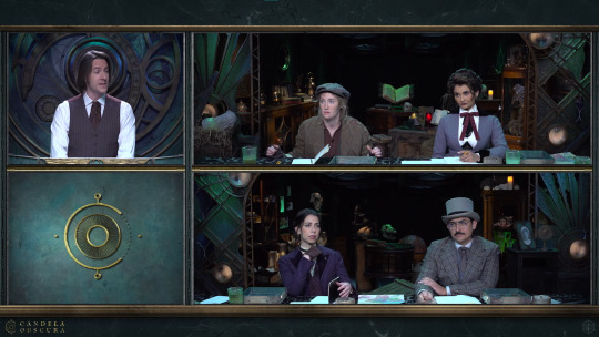
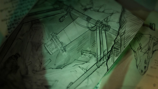
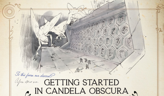
The very first thing I did on this show was the concepts for the main set. Everything is practical. Nothing is green screen or cg or whatever. Some people think it’s just good cg but nope that's all real. You could touch it! (don’t touch it, there are ghosts)

There were multiple iterations on the design, each with their own vibe and statement piece. CR narrowed it down to what you see in the show: a sort of storage hall with an odd clock contraption behind the GM. I think I called this design version the “Abyssal Hall” or something like that (I gave the different versions names to better keep track of which design was being discussed)
The company Flip This Bitch built the physical set. They turned my silly little art into a real thing. So they did all the actual magic of making this set come together in the end! They deserve a lot of the credit for it looking so good in the end.
Also that little piece of art in the bottom left of the preshow is a section from the final concept art of the set.


That contraption behind Matt is based on astrolabes and clocks. This isn’t really meant to be a literal astrolabe or a clock as we would use them in our world. Narratively this isn’t a device that measures either of the things that a traditional astrolabe or clock does. This is a special magickal tool that does a secret third thing.

Also I did concepts for the GM screen. You don't really see it besides in the fancy-shmancy preshow. There were a number of more intricate designs for it but CR went with the simpler option since the only part that would be visible on stream is the top, so that's where I put the most detail.
I should also note that I did not design the logo! It’s pretty prominent on the GM screen but I was supplied an already existing logo for this.
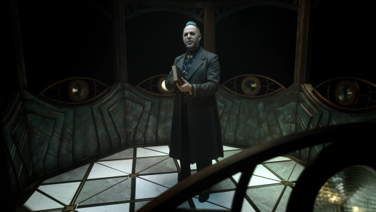
NEXT is the Taliesin enclosure set that you see in the trailer. This is actually meant to be like the lantern room on the top of a lighthouse, minus the big light beacon (You could say Taliesin is the beacon).
Also in the trailer you see a couple brief sketches I did for some world building concepts:
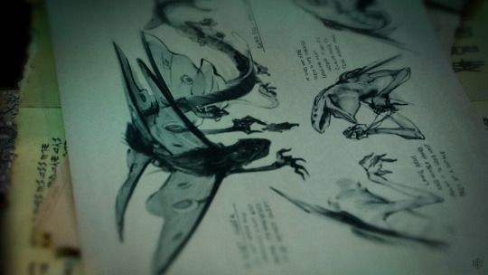
Speaking of sketches there are a number of art pieces of mine in the Quickstart guide


A lot of my art is sketches. They’re all meant to be like notes and drawings from members of Candela as they travel and notate their findings. Most of the notes on these sketches are my actually my notes when I was doing world building concepts, but they replaced my handwriting with a font because my handwriting sucks lmao (also likely for ease of future localization).
Also the cover of the Quickstart guide uses line art of a part of that astrolabe clock set piece. This line art was part of the deliverables that was sent over to Flip This Bitch for construction. They’re just using pieces of those set concepts everywhere!

As you can see I’ve done a lot of art for this project. I was part of this project when it was still early in development. It’s changed quite a bit from where we started.
I wasn’t the only one that made all this art happen though. Other artists, writers, and designers got to add their own vision to this. It was very much a collaborative effort that took a long time to happen. It’s very exciting to see everyone’s hard work come to fruition and there is a lot more to come!
#candela obscura#critical role#my art#ttrpg#illustration#art#cr#candela spoilers#I could say a lot about what went into each thing#but that would be too long#this is already too long#more art is coming#you’ll see it in the final release of the rules/setting book#also it’s very likely a significant amount of art won’t ever be show to the public#such is the life of a concept artist
1K notes
·
View notes
Text
chaotic ckr c6d squee propaganda (?) post
This, started half a year ago for @ds30below, was initially a general c6d short reviews post but kinda skewed majorly towards CKR's repertoire and wasn't too review-y. So I gave up on making sense and on including the non-CKR works. I don't know who the audience for this is, because I never give basic details for people who don't know about this stuff but say too much for those who do. I giffed what I could and tried to avoid what I know a lot about but haven't actually seen. Here goes.
Frank's Cock (1993)
Not much to say. It's only 8 minutes, it's beautiful and you should see it if you haven't. I won't spoil the subject, but you can likely guess. Watch it, cry a little. Then go watch some more of Mike Hoolboom's stuff, the vimeo link above is from his channel.
Two X-Files episodes (1994 – 1995)
Well, I haven't actually seen X-files since I was about fifteen and watched the like two seasons, and I remember none of it. I rewatched the two early episodes CKR appears in and they were fun. I did not watch the, the movie or whatever where he's doing the evil gay thing. But really, this one is on the list so I can show you this self-indulgent gif of him being Very Long:

Double Happiness (1994)

You shouldn't watch this one for CKR. I mean, you absolutely should see him here, looking like he's barely out of his teens and playing up the insecure act and having devastating chemistry with devastatingly beautiful Sandra Oh, but this is not why it's great. And it's really, really great. It's touching and funny and sincere. If you wanna have some feels about complicated family relationships and identity and growing up (at any point in life), you'll find them here.
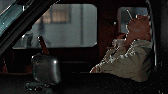
Curtis's Charm (1995)

Don't regret watching it, can't recommend. Not gonna lie, I was emotionally affected. But I usually am by things as in-your-face bleak as this. Mostly, it's trying very hard to be smarter than it is, I think.
However: CKR's One Wild Curl is everything to me (see above, on the right. It was, like, actually curly. I was rendered speechless). And like two seconds of Hugh Dillon made me do a double-take, lol. Incredibly weird knowing this was shot like half a year before HCL began shooting. Feels like it must've been a decade earlier.
Hard Core Logo (1996)


I could make three separate posts about this one, so of course I have no idea what to say.
This one, you should watch for CKR, actually, he's something, but so is every single other aspect of this film. I wouldn't change a thing about it. It hits you like a 16 wheeler. Perfectly cast, unimaginably beautiful, hysterical and melancholy and disgusting and compelling.
Related recs:
A wonderfully fun article/retrospective/interview for its 20th anniversary a while back.
You should also absolutely read Hard Core Roadshow if you enjoyed the film. It's a book documenting the whole thing from conception to release. It touched me for its own sake, not just a backstage glance, full of love for the craft and the people and carrying this tangible bittersweetness about the heightened and fleeting nature of this kind of work.
(here, I feel compelled to include a quote from another c6d-related interview on Slings & Arrows, which I read after the book and went like man, it's really a universal experience isn't it.
Coyne: <...> But I also think, and this is my experience, what we were all experiencing, because we were all talking about our lives, our life in the arts — there’s something very melancholy about doing something you love, because it will never be good enough, it will always break your heart.
McKinney: Or it will be fleeting.
Coyne: It’ll be fleeting. You come together with people you feel passionately connected to and two weeks later they’re tearing down the sets.)
Quotes from the article and the book respectively include:
McDonald: So there was a kind of mutual dependency society with Hugh telling Callum, “Don’t worry, man, I got your back, I’ll tell you how high or low to wear your guitar, I’ll tell you how you should dress, I’ll tell you what you should drink…” and Callum was like, “I’ll tell you what hitting your mark is, I’ll tell you why they pull out fucking tape measures, I’ll tell you why you have to do it again, I’ll tell you about not overlapping dialogue..” and you know they clung to each other, like the other one was gonna fucking save them.
And:
A final gathering at the back of the tour bus with Bruce, Callum, Hugh, Bernie. We listen to the tape of HCL songs, all the way through, one last time. And we belt the words out. Bernie sings loudest, performing for Salerno's camera. Hugh and Callum sit back, looks of sadness. I get the sense that if they could do it, they'd chuck their lives and be Joe Dick and Billy Tallent forever. Callum leans to Bruce and says exactly what everyone else is thinking: "I don't want it to end."
There's much more to both texts than *gestures* the whatever those two had, but it certainly doesn't hurt.
And Xeriscape is the best HCL fic I've read. Granted, I read very few because it's not a source that creates in me a craving for fic. But this one perfectly matches the film's fucked up beauty with its language while also adding a quieter, more fraught layer of humanity that we only get glimpses of in canon and that perfectly fits John. 10/10, would recommend.
Anyway. Watch it. Read it. If you haven't. Otherwise, come scream with meeee! And go reblog my gifs or something. Idk.
Letters From Home (1996)
Mike Hoolboom strikes again, with another short. This goes into the "don't watch it for CKR, watch it because it's great" box. Yes, you will cry.
For Those Who Hunt The Wounded Down (1996)
Another bleak one! It sucked to watch, I mean, on purpose. There were a couple of very effective scenes. I really enjoyed the opening. They say the book is decent too, I haven't checked that out.
Actually, let's just switch back from coherent thought to undignified staring at his mouth with this one. What the fuck is that cigarette thing. I couldn't help myself.
Last Night (1998)


These gifs are not representative of the whole movie. There is more happening than CKR kissing or hugging people. He's also doing more than just kissing and hugging. It's all very... impressive.
Guess who's also here again? Sandra Oh! And say hi to Don McKellar, who is an absolute champion for writing/directing/starring. You'll be seeing more of him.
Another one for the "watch it for its own sake" box. Seriously, that late 90s indie stuff is banger after banger. It's so beautiful! Look at those colours! Look at those shots! It's very uneasy and charming and melanchioly and itself in the best way.
Twitch City (1998 – 2000)


Don McKellar is back to murder you with discomfort! Bruce McDonald lends a hand. Molly Parker is also here. And Daniel McIvor, who'd go on to direct, for example, Wilby Wonderful. It's a party. If you watched some stuff from above (or below) on this list, most faces and names will be familiar to you, tbh (another Hugh Dillon double-take happens).


If you liked Spaced, you'll love this. You might also love it because it commits to its weirdness with an admirable resolve and is genuinely hilarious. (Honestly, CKR's outfits alone warrant a watch.) The idiosyncrasy is definitely Don McKellar's doing 200%. It couldn't be more different from Last Night, but if you've seen one, you'll recognise the other.
Battlestar Galactica (2003 – 2009)

I don't think a person should be allowed to look this pretty in the sweaty-and-dying makeup in that light (this sentence probably looks very weird to those not under the CKR magic spell).
I don't know what to say about BSG because I really, really enjoyed early it initially, but by the middle of S2 it got... well, whatever that was. If you know you know, if you don't, still give it a go. You might get invested enough to suffer through it all, as I have been, slowly.

The unfortunate thing is that CKR got to be there mostly in the "what the fuck" years and not the "wow that's so cool" years. That, as you might be aware, is a pattern with him. But! When he was here, he was so genuinely, wonderfully creepy not in the typecast-baddy way, but in this slow, half-absent way, which really worked. You can also see him tortured a little, as a treat!! <3

Also, a wild John Pyper-Ferguson appears! If you're looking at him thinking you know him from somewhere but not immediately remembering, you'll figure it out, I believe in you. I was very happy to see him.
Wilby Wonderful (2004)
Another win for the put CKR in more good shit team!!! Guess who's here again? Sandra Oh! Also, Paul Gross. Don't watch it for him either though haha.
Another one for whoever wants to look at pushing against the weight of others' (or your own) expectations and growing into who you are or reconsidering who you are or finding meaningful connections with others even when you're kind of a mess and they are too.
Not nearly the first time CKR's gotten to play a queer character, but man, this one really is the heart of the in-universe community, and, through that, of the film. A rare chance to see him so far out of the prickly persona! He's just so solid and calm and there for others in this one and, and soft, ough. It's awesome.

By the way, if any of you have the commentary track or know someone who has, please drop me a line here or on discord (emotionalrisotto), I really wanna hear that.
Supernatural (2005)
I love Supernatural a lot. It was a formative experiences (albeit a very late one) and I owe a lot of my favourite stuff about fandom-ing to the buddies I met through it. I can't believe I'm telling you this (because who hasn't seen it, not because I'm reccing it), but you should really try it if you haven't. It's pretty rad.
I had no idea who this guy was when I saw that episode (the second ever one!), though. I simply cannot fathom what @nigeltde-fic felt when she first saw it. I think I personally got very lucky she didn't combust on the spot. It would've been unfortunate.
On a sillier note, CKR's character has weird tension with both Sam and Dean in this episode, which is par for the course. I personally think they should've... no, I shan't say it. You can probably imagine.
Californication (2008 – 2013)
I haven't actually seen it, lol (and I suspect I won't enjoy it, but I'm very curious and also CKR looks really really good).
The real reason for this one on the list is to share a fic rec. Really, it's a due South F/K fic featuring Lew Ashby. It's ridiculously hot and very satisfying in its romantic resolution, too (but then, I'm kind of big on selfcest. And consensual voyeurism. And pretend relationships when done like this. And sublimated yearning. Erm.)
Shattered (2010 – 2011)


I wish this never happened. I badly, badly wish this never happened. I can't turn back time, but I can warn those luckier than me: do not go there. Yes, even for this dude. You'll sleep better not knowing just what it is he was the EP on. And the only important part — the mascara — can be seen above (yes, the show does look that bad, it's not just the gifs).
Just kidding — I watched it, didn't I? You'll have fun hating it! Just prepare for industrial grade cringe, lower your expectations (No, lower. No, still lower than that. And just a bit more.) and you'll have a great time!
Star trek: Discovery (2024)

Or, as I call it, Star Trek: The Mediocre Show. Discovery S5 was... what it was, but it was a wonderful viewing experience — mostly thanks to the gang (@kittkatk and @feroxargentea especially!)
What a joy it is, to follow a show week by week, yelling and laughing and discussing the whole time. And giffing, too. I was very happy to contribute to the Disco fandom from my own little obsessive corner, and I was glad to see people adoring Rayner, haha.
He's a pretty neat character — very much a stereotype, yes, but with CKR's usual twist of odd vulnerability and weirdness. Also, I loved the ears. I miss the ears. The ears were great.
I even wrote a fic! Although it's not within my usual range to write for canons and universes I don't know well — and back then, I'd only seen S5 of Disco. It was a lot of suffering, and a lot of fun.
Closing thoughts
I'd really love the dude to get a better agent. And possibly better taste, but I realise that's a tougher ask. Seriously, it's been too long since he was in something majorly cool. I'm grateful to him, at least, for not making terrible music on the side. And I still have a lot of his back catalogue to get through, some of it even good, so there will be more insanity. Until then!
#remember how it was ckr's birthday a week ago? well#c6d#callum keith rennie#hard core logo#last night#fic rec#twitch city#battlestar galactica#wilby wonderful#star trek discovery#californication#supernatural#shattered#frank's cock#letters from home#for those who hunt the wounded down#double happiness#curtis's charm#x-files#lmao some of these tags are really excessive
45 notes
·
View notes
Text
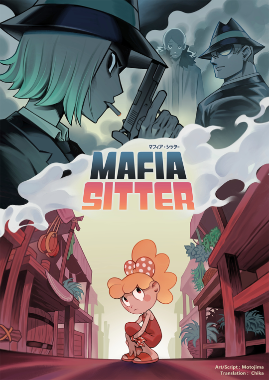
↑You can read all the pages from the link above!
[Comic] Mafia Sitter
I started writing in mid-January to submit to the Global Comic Award 2024 and finally completed it. Continuing from there is a long feedback.
The working time is two months for the main text and two weeks for the cover. Around January 11th, I received a DM from a friend saying, "There's a contest like this," and thought, "The deadline is the end of March... it's impossible for me (I've never drawn a completed comic before)." But it's a comic contest aimed at the world... My art style is only recognized in this contest... I couldn't ignore this contest. I was in the middle of making another piece, but I interrupted it, and I was full of anxiety about whether I could draw a comic in just two and a half months. However, the thought, "Instead of worrying, I should act quickly," came to my mind, and I started writing from January 13th, changing my mindset.
I spent 1 day on the script, plus 1 day typing the dialogue, and started the "completed 1 page per day" lifestyle from January 16th.
The goal was to complete 45 pages, but at the plotting stage, it was about 56 pages. When I actually started drawing the manuscript, the planned page allocation didn't match, and the total number of pages increased to 65. (I learned the importance of page allocation.) At a pace of 1 page per day, I wondered if I would make it by March... (I'm easily bored, I didn't think I could do 1 page per day.) So, I rearranged my schedule to make 3 pages on weekends, which would give me some leeway. This idea turned out to be a big success.
As a result, I achieved 1 page per day and was able to finish drawing all the pages by early March, leaving the remaining time to work on the cover, which is like the face of the comic.
Since I work as a company employee, I had to finish work by 8:00 p.m. to make time for the manuscript, which was a daily pressure. There were times when I finished the manuscript at 3:00 or 4:00 a.m. on weekdays. I fell ill. At that time, I felt like giving up. (On the day I fell ill, I slept for about two hours and resumed manuscript production after my condition improved a bit.)
It was truly a life of "pushing myself to the limit", but accomplishing it gave me confidence. 'Oh, I can make a 65-page full-color comic in 2 months.' It became an advantage for me. (I don't want to push myself like this anymore, though... haha.)
Thank you for participating in the survey for the title logo! The survey results leaned towards the left logo. While the left logo was packed with concept, its font style and thickness varied, resulting in imbalance when aligned in a row and making it difficult to use in monochrome. If the left logo had overwhelmingly won the votes, I would have chosen it. However, since the right logo also received a considerable number of votes, I decided to adopt the right logo.
Now all that's left is to see the results on Global Comic Award. I'm really aiming to win. Both the script and the art are amateur-level when viewed separately, but I balanced them out to make them good enough.
It's my first comic work... I really want a lot of people to read it!
*If enough people like the comic and want to get a copy of the comic book, I can make and sell it:)
121 notes
·
View notes
Text
Kalki 2898 AD thoughts (spoiler-filled and long af)
Ok so.... I watched it in Telugu, and 3D. 3D wasn't that special methinks cz only the huge jaguar jumping scene in the start got me. Nothing much 3D-wise.
Now, watching it in Telugu........... Um... Even the dubbing sounds like wonky Telugu and I didn't like that.
Time for points I liked and didn't like--
Liked:
1. The idea of that world: how Kaasi is the first city and now the last city of this Yuga. Priyanka Dutt really headed a dedicated team. I loved the tarot scene because it reminded me of Godavari and made me want a Shekhar Kammula cameo too👀😭
2. I liked how the Vyjayanti logo took us into the world. And the whole premise it started off on. Love the Pareekshit and Ashwathhama Athah...! Kunjarah premise references
3. Loved how the Shiva Linga Ashwathama is meditating near is most likely The Kaasi Viswanath Lingam
4. The CGI with Mr. Amitabh Bachhan
5. Bujji. Unpop opinion maybe, but I liked Bujji more than Bhairava. Was I the only one who wanted Bujji to be the genderbent preserved consciousness of Bujjigaadu (Bujjigaadu: Made in Chennai reference 🤭)
6. How the flames give way to the bearer of Kalki avataram while just a Yuga before, the sea gave way to Vasudeva - the carrier of Krishna avataram. Nice nice. Probably the thing I liked most about this movie.
7. The cameos (will talk about this later)
8. The scale of the vision.... HATS OFF. I want into that man's head istg. All 3 movies: Yevade Subramanyam, Mahanati and now Kalki 2898 AD are three distinct visions and superb visions. I'd love to even see all the concept art for this movie!!!!
9. Call me silly but APRIL ONE VIDUDALA REUNION!!!! (iykyk)
Didn't like (hyper spoilers ahead):
1. Bhairava's character needs more depth. A LOT OF PEOPLE WILL PROLLY TEASE ME/ DISAGREE WITH ME ON THIS POINT. But he does. He's shown as a selfish mercenary whose aim is to settle in the Complex. (I have dreams like you no really a little less touchy feely. But they mainly happen where it's warm and sunny. On an island that I own tanned and rested and alone surrounded by enormous piles of money). He's got debts all over Kaasi and he uses all his money for things like building Bujji and automobiles and thrusters and stuff. But what makes him tick (other than scratching Bujji who he abandons half the time)? What is he scared of? I feel like it would have worked better if Bhairava didn't go to the Complex at all and was banned from it. It gives his hope to see the Complex a touch of whimsy and desperation.
2. Disha Patani's character. The story just forgets about her after the party song which is the most pointless song of the movie btw. I feel like even Nag Ashwin didn't want it there on first thought.
3. SRI KRISHNA DID NOT REMOVE ASHWATHHAMA'S MANI!!!! It was Arjuna who did it as far as I know. After causing the death of Abhimanyu and fellow warriors and family members by unfairly means, Ashwathama almost faced the wrath of Bheema after being dragged to the Pandavas' tents However, Krishna couldn't let the Pandavas commit a sin to revenge a sin. He said, though Ashwathama caused the death of unarmed unaware Kshatriyas, he himself is a Brahmin by birth and thus killing him would be an unforgivable sin. Therefore, completely cutting his hair and taking his mani would be comparable to death. So it was Arjuna who took out the mani on Sir Krishna's advice. (As far as I read and heard from pravachans since my childhood) I disliked how the story started with this inaccuracy and it took me out of the flow. Or maybe Nag Ashwin wanted to change this part of the story to include the curse and pave the story's base? Dk
4. The fights never stop (not in the good way): Bhairava's first fight was SO. LONG. Actually, Bhairava's every fight was so long. Most unnecessarily so. His fights with Ashwathama go on for so long I actually started wondering why the all powerful giant hadn't killed our hero. I'm mean, I know, but I get annoyed by such drags.
5. Late emotional connect: Mrunal Thakur's character dying didn't even pinch. Because I had no emotional connect to even feel the horror of what had happened. But yes, I did cry when Rajendra Prasad's character died soon after bcz that meant the death of the one character who spoke the best Telugu in the movie.
6. As I mentioned, I watched the Telugu version and was disappointed by the lack of diction, even in the dubbing!😭
7. The main point: Almost every scene reminded me of a different movie. A lot of people keep saying it's Dune + Star Wars but here, all I've got to mention -> Loki morphing into many Lokis, Sakaar's neck electrocution thingy (EXACT SAME), Troy: Legacy and Aagardian vehicles with the flying vehicles of that 5000 units bounty hunter. Coco wrt to the city's inner infrastructure (resembles the city in the afterlife, except make it sepia tone). Star Wars with the jedi light saber that Bhairava's dad teaches him to use. Bujji = JARVIS without the English politeness. Prince of Persia: sands of time and John Carter wrt the setting and vibes of the outdoor fight sequences. Mariamma's light rope handles??? From Iron man 2 as well as Wonder Woman. When Sumati imagines everyone dead at her feet it gives Tony from Age of Ultron. The Complex looks a lot like the Singing kingdom from The Marvels. There was an episode of Nebula in Marvel's What If? Animated series -> the concept of the complex or dystopia and the bar seems a lot like it.
8. Ashwathama and Karna weren't friends per the Mahabharatam. "Ashwa uncle" keeps calling Karna "sodara" (pure telugu word for brother) and not "mitrama" (pure telugu word for friend/ally) and it sort of irks me. Also, I think Sri Krishna's voice could have been sweeter (the pitch, Krishna could melt mountains with his voice. Here Krishna's voice sounded something like what we could match to Balarama)
Ok done with that.
Now, cameos..... I mean it's a Nag Ashwin movie and I went in expecting cameos after my experience with Mahanati tbh.
Ones I liked: Malvika Nair as Uttara (that was how I had imagined Shakuntala to look like in Shaakuntalam btw), DQ as Captain/Pilot, Brahmi garu as the fed up landlord, Avasarala Srinivas as gambler (missed him in Mahanati), RGV as the food vendor, Rajendra Prasad bcz the man speaks the best Telugu in this movie (as I mentioned before)
Ones I found Meh: Mrunal Thakur as the pregnant lady (only bcz there was no emotional connect, didn't know anything abt her character except that she's pregnant), Faria Abdullah as the showpiece-angel-dancer??, Disha Patani
Ones I wanted to question: Vijay Devarakonda as Arjuna (like........... I feel like Rana would have been the perfect Arjuna despite that opinion originating from his KVJG days. But maybe Tarak? Maybe you could have CGI-ed NTR sr and reminded us of Nartanasala!!) I have nothing against Vijay Devarakonda, but he just didn't fittttt
Overall: a beautiful effort and a mindblowing idea but the lagging screenplay, some music choices and slight misinformation reduces its impact. Liked it and would recommend bcz this is all people would be talking about and you wouldn't want to stay uninformed on a global phenomenon.
#kalki 2898 AD#kalki 2898 ad#indian cinema#manu recommends movies#manu is feral tag#prabhas#deepika padukone#amitabh bachchan#kamal hassan#nag ashwin
49 notes
·
View notes
Text
i'm bored and was trying to hunt something down (spoilers: i didn't find it) so i present to you: amazon POD she-ra merch that actually pops off a little bit. what i'm looking for is not just the plain key art, preferably with some kind of dynamic silhouette. there's 27 pages of this shit and it's a lot to slog through for the average person when most of it is boring, so here's my highlights. also, i'm tying to link every version of a specific design i notice, but some designs only look good/interesting on certain pieces so stuff definitely slips through and if you see one you like, you should search its keywards to make sure you get all of its designs. also these default on white or black but if you open that specific item (hoodie, etc) you can try it on multiple base colors on that item. you can also select various mens, womens, youth, etc sizing options.
the horde:


horde logo: baseball, pullover, shirt, tank, hoodie, tank, .
the horde (lineup): shirt, shirt, shirt, vneck, hoodie, longsleeve, sweatshirt, . there's a variant of this design that is instead a square, but i hate it.
the horde (squad): tote,
okay by character now:
glimmer:

glimmer orb: shirt, tote, shirt, hoodie, vneck, sweatshirt, tank, longsleeve, raglan, shirt, pullover, . idk she's just cute!
adora: yeah slim pickings here almost everything is she-ra

split adora: shirt, sweatshirt, pullover. i don't like just slapping a rectangular graphic on a tshirt, but i do think this art is pretty cool and unique and it's like the ONLY time adora herself shows up.


catra dorito: pullover, shirt, tank, longsleeve, raglan, sweatshirt, tote, shirt, shirt, tank, raglan, longsleeve,
she-ra:


"fierce she-ra": shirt, tank, v-neck, sweatshirt, hoodie, longsleeve, pullover, longsleeve, raglan, . more debatable inclusion but i like the colors
for the honor of grayskull: shirt, hoodie, tank, tote, hoodie, vneck, raglan, longsleeve, tank, . this style of shirt isn't so much my thing but if it is yours then it's well-done.
rainbow circle she-ra: shirt, tank, sweatshirt, vneck, hoodie, vneck, longsleeve, . i didn't actually like this one until i saw it with the blue background and i still hate that the logo is the wrong color?? but here it is anyway.
honorable mentions: only hunting down one link example of these, you can search the rest.


entrapta, scorpia, mermista, angella, bow, catra, sea hawk, glimmer, perfuma, netossa, spinnerella, frosta. this "line" series is just the character key art with some color palette-apropriate lines in the background, plus their name. i'm not grabbing all the variants of these since there's so many, but see some examples below.
there's also a variant of the same concept where they just change the shape of the background lines/image size


scorpia, hordak,
also honorable mention: this weird series where they're in a geometric shape surrounded by a line with a circle in it that i feel like is supposed to emulate the first ones language aesthetic?


catra (triangle), she-ra (circle)
things i don't like but are unique and i think kids would like:


she-ra sts, girls never quit, kind heart.
dishonorable mention: whatever the fuck is going on with this eyes thing


catra, glimmer, mermista, scorpia, bow, frosta, perfuma, netossa, angella, spinnerella, entrapta, sea hawk,
also if you want just the logo on a shirt you can do that too ig.
29 notes
·
View notes
Note
ab the ferrari suits, there are a few things I'd change like the little square around the shell logo and the saturation of hp (what could they have done realistically lbr that's a title sponsor) but I??? Like it?? I think the dedication to the engineers is cute?? And the kits honestly ate idc same w the trophy
I really like the traditional trophies but sometimes trying smth different it works out and sometimes it doesn't (zandvoort sorry some of the messages were nice but overalllll ehhhhh)
at the end it's just personal preference but I do think it's getting disproportionate hatery
imo they could come out in actual trash, but if the car is fast I'll take it
literally i get people hate logos but they need to move on from it because at the end of the day sponsor logo readability and adherence to brand standard will always come first...like they are Not Allowed to display sponsor logos in "incorrect" ways its just part of what they agree to when they bring on a sponsor and that means bright blue hp and shell being displayed on a solid color bg. i actually think they managed very well with shell by putting it in the yellow square, it fits in very modularly and reads well into the overall concept w using yellow as the dominant color there...like they couldve just slapped it on a white square like some other teams are stuck doing for their sponsor logos cmon..theyre overall really lucky to have so many sponsors who DO allow them to display their logos in a color like yellow that is most certainly not in their brand guidelines. personally i think that alone speaks to how well these sponsors view ferrari as a brand and a partner, its like kind of insane to imagine a huge company ALLOWING the recoloring of their logo like that, easily they couldve been required to keep every sleeve logo white or something..
I think we are way too harsh on ferrari when they are LITERALLY the only team that even tries to do anything interesting with race suits and has pretty consistently given us a bunch of different designs. and not even just recolors!! new designs! its great and i wish more teams would take the risk, it makes it a lot of fun. I think the hate on the carbon fiber look is lame, its a pattern thats so quintessentially racecar, i think the sleeve on the jerseys looks great and very fashionable. and I think the race suits are FUN i think they feel kind of old school and are very striking, they almost remind me of like a subtle jockey silk. i already love the vintage racing stripes feel of the regular suits this year, and i think the yellow striping + the pattern looks great and is really bold and refreshing. so much fucking better than a boring ass black race suit. try thinking about sports gear as something meant to be eye catching, iconic, memorable, collectible, and not just like. idk...sexy for an aesthetic post...idk
dont get me started on trophies, i really do view the trophies, especially ones by contemporary artists, as just that. contemporary art. and while im all good w people having their opinions and having discussions on that art, i hate how often it turns into just like. the tired old takes of Modern Art Bad, Classical Art Good. i actually really loved the zandvoort trophies lookswise, the sentiments written were a little eh, but i thought it was a great way to refresh the trophies, a very cool technique used, and a great way to get people talking! I love the monza trophies, as I said, i think theyre really beautiful n compelling sculptures...
i just think generally a lot of people do in fact have narrower vision if what they believe is "good art" than even they think they do, and i think a majority of people completely misunderstand sports design and just don't like seeing things that are different/not sexy 🤷♂️
17 notes
·
View notes
Note
Ok, several questions bc you have my dream job lol:
1. How did you get into the video game industry as a concept artist?
1a. Was it hard?
1b. What kind of degree did you need to work with the company ur currently employed with?
2. Is it hard being a full time artist?
Hi! Thanks for asking these questions. I'll do my best to answer based on my experiences.
1. How did you get into the video game industry as a concept artist?
I spent a year after graduation from college taking on any work that came my way. All really low budget stuff, a real hodgepodge of things: some of it was games, some of it was like... logos for local businesses. In that year I also took a trip to Burbank to attend the CTN Animation Expo (there's another one called Lightbox now) and I brought my college portfolio with me to show recruiters. I ended up meeting some folks who worked at a studio that interested me and they passed my name along to their recruitment department.
I do want to note: I didn't start as a concept artist. My first position involved concept art, but was primarily creating 2D game assets. As I kept working I was given opportunities that eventually earned a concept artist role.
1a. Was it hard?
At times it felt really difficult. Between jobs during that post-grad year, I was online researching what studios were out there and sending my portfolio to any hiring email I could find. Here are some of the places I was looking (originally I thought I'd get into the animation industry)
ANW
Canadian Animation Resources
These are newer resources that I know of since then:
Game dev jobs
Canadian Game Devs Discord
I often felt discouraged and out of my depth. I had no idea how to get in, and it could feel hopeless when I'd never get any worthwhile responses. It took a lot of patience, perseverance and determination to keep at it.
1b. What kind of degree did you need to work with the company ur currently employed with?
I have a bachelor's degree of Visual Communication and Design with a character design specialization. I don't think I needed it to get hired, but it certainly helped. I think it helped most in getting hired for a position that was slightly above entry-level.
I've been part of the hiring process and I can confidently say that while post-secondary education credentials are great to see on a resume, they've never been the deciding factor. I've seen more importance assigned to a portfolio with strong fundamentals, examples of work that prove an artist can match the project they're applying for, and that they interview well.
2. Is it hard being a full time artist?
It can be challenging, especially when you're starting out, but I don't think that's exclusive to the art profession. My biggest challenges were lifestyle changes when I was suddenly no longer a teenager/student but now an employee who has to be accountable to others and be good at managing their time.
Challenges specific to the career: you'll have to learn how to be willing and open about having your work critiqued, by both peers and superiors (art director, professors, etc). You'll have to disconnect yourself from the work you create on the job otherwise you risk taking every piece of feedback personally.
There are many days where you have no will to draw or design, but you have to do it anyway because it's your job. And there's no secret to getting through those days: you just force yourself.
There are also days, sometimes weeks, where you have to work on an assignment that doesn't interest you at all, but you're responsible for getting the work done.
90 notes
·
View notes
Text
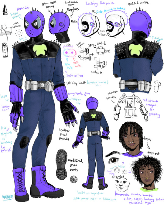
blurple time.
finally finished this~ months after he appeared 😅
you can tell there's a bit of a punk/industrial vibe infusing the whole design. i also drew from various details in the comics, and other random things like bulletproof leather jackets.
closeups, ramblings, (and a version with a cape) under the cut:

i was originally not planning to add a cape cause i wasn't sure if i could make it work and tbh. still not sure. i like the way the purple cape looks from behind but the inside is like. idk. if it's purple then it looks weird, but the black feels off to me too... I don't think any of the other colors would work.
oh also i decided this glows in the dark (predictable as always)
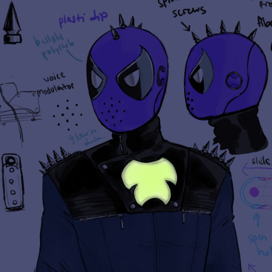
Helmet's been through some sketches and stuff, spent a while figuring out the mechanisms and so on and settled on this design in the end.
Obviously you can see here the top is leather, it's based on a combo of a motorcycle cowl (with an angled zip you can just see there, and then the shoulders from an armored motorcycle jacket i was looking at. then the blue is meant to be a (heavily) modified like, boilersuit or whatever those are. mechanic's jumpsuit.
Plus all the spikes. Obviously there's no spider-punk in this setting but I like the aesthetics, and I like giving Hobie like a little thing of his own in terms of hobbies/interests so I thought adding that punk aspect would be fun, esp as it ties into his whole thing with being unsure of himself and being a little different and so on.
the lenses are one piece each, just with different colors of film on them, like you see on a variety of custom motorcycle visors. used chrome silver for the white "eyes," which i think would look cool and matches the metal hardware. very reflective. hobie prob won't be the only design with chrome/mirrored lenses for reflective purposes (thinking about the hobgoblin) (well. technically peter will also have aluminized lenses at one point but that's a spare mask for fires, not a main look)
earlier concept which i drew on my phone actually lol. some of this i obv jus copy-pasted cause it was fine as is, other stuff got tweaked, like i ended up changing the lens shape to look a little more like the comics and i did end up scrapping that shape for the faceplate/chin.
and you can see there i edited a pic from the comics playing with what colors i wanted to use. i liked the steel blue that showed up in some of the older painted art from the Prowler's earliest appearances, and I felt like I wanted to give him a color other than purple and green, though I didn't wanna ditch the purple either, so I ended up with this kind of neon blurple + navy combo that I liked a lot. And the silver too.
back of the jacket and helmet. Didn't originally plan on adding all those spikes but then I was sketching this out and I was like, oh... that would look cool... so i committed!! i like how it looks.
Originally I also had no logo/symbol on the front of the chest so I decided to put one on the back. Then I ended up adding that flat panel to the chest and added the symbol there too, and decided to keep the back one as well. i can def see a 19 year old being like, hell yeah... sick... people will definitely take me seriously now. and you know what. he's right.
i will admit i ended up a little dissatisfied with the story i told involving the Prowler in the linked fic, but... I also probably shouldn't have tried to wedge it between like five warring subplots. But it was like, the spot that made the most sense. If this was a cartoon I think it would be a like... 1-2 issue special focused more on him. And also peter would jump out the window. (The real tragedy that I didn't include cause it's hilarious, poor Hobie XD)
Anywho. Is this mechanism needlessly complex? Perhaps. I tried to simplify it at one point but then the more I thought about it the less the simplified version worked so I stuck with the OG idea here. I mean, i guess I could have ditched the locking mechanism entirely but i thought it would be fun if the helmet was self-locking! I also wanted a way for it to rotate/go visor up even with the spikes, thus it being a pretty large rotating faceplate with the spikes on it instead of elsewhere. not that he ever puts it up in the fic. peter just takes hobie's helmet off there 😂
He's also wearing a balaclava under there which I didn't bother really drawing, mostly to protect his hair (which I put in twists for related reasons of helmet-wearing) (I briefly had been considering braids but then, well, ATSV and Miles G. happened and I said, well now I cannot do that XD) (I mean I COULD have but I wanted to do something else here lol) Anyway. The idea here is that it's a kind of slide lock with a spring-loaded peg that slots into the holes, and the square hole with the square peg locks the faceplate in place and prevents it from rotating, but when the square peg is in the round hole, the faceplate can rotate freely. The only wrinkle here would be that Hobie has to pull on both locks simultaneously or as close to it as possible or he'd risk cracking the helmet (i assume? stress and pressure etc.)
Sliding the lock forward also slides the whole plate forward, which lets me (in theory) have a flush, smooth silhouette while still allowing it to come forward enough to push up. It's not vacuum sealed or anything though. But it does have like... air filters and a voice modulator and some other things. MOST of the suit is super low tech and doesn't require electricity but the helmet probably has batteries or something. (peter's new webshooters at this point are also battery powered lol)
Helmet is pretty typical fiberglass construction with foam pads inside. Idea there is that Hobie made a lot of this stuff using campus workshop resources like autobody or machining shop on campus, for stuff like getting fiberglass, having a space to work in, making polycarbonate lenses etc. Though it's totally possible to do fiberglass work at home too. (peter also uses campus resources for his lenses specifically btw)

Gauntlets!!! Uhhhh ngl very difficult. Trying to design armored gauntlets that don't look like knightly armor is very hard for me cause I always just google reference pics of knightly armor. LOL. I think these came out alright. There's a hint of motocross influence there too (though really even in modern days armor is armor so there end up being shared traits) The gloves ended up being mostly leather with some armored parts, though there is probably some inner armor which is not visible. The claws I left bare since you would not be able to sharpen claws coated in plasti dip—
oh yeah the purple color on all the hard parts is plasti dip, which is basically rubber paint.
The wrist gauntlets are very very very loosely based on a guy's grappling rope web-shooter thing which you can see in this youtube video: link. though i didn't wanna just rip him off so i mostly just said, alright, tubes and a harness—which the prowler already has in the comics anyway, albeit smaller. so really it's pretty much like the comics anyway.
Right wrist has the green laser dazzler, both have grapples, left wrist has EMP (not pictured) which Hobie uses in the scene I have him and Peter fight except then I realized recently I didn't actually explain what that was or how it was working 😂 I probably should have done that scene from Hobie's POV in retrospect. It's an EMP though and it scrambles Peter's spidey sense via interference/signal noise.
(electromagnetic signals being responsible for several cases of irl "hauntings" —> spider-man's haunted)
waist utility belt... I like the way the silver belt on the old art looks! So I decided to make these hard silver hinged cases instead of soft pouches (originally were soft but I changed my mind while coloring) — IDK if these really are metal or if they're just fiberglass with chrome paint lol but either way, shiny chromey, hinged to open, the insides are probably padded... buckle is actually metal though.

Boots—modified snow boots. These are loosely based off of a real thing btw: link to blog post
The silver things are the magnets. Gauntlets are probably also magnetic but those are not visible like the boot ones. I also read some comments saying certain kinds of electromagnets would be preferable for something like boots but ultimately, IDK how to draw that, so I just drew it like they look in jen foxbot's prototype.
There was some other stuff I initially planned on including that didn't make the cut, aside from the cape. I was toying with stuff like a jetpack (or really, a jump jet), gliding/wingsuit, etc. but... I didn't use any of those. Kept it simple and streamlined for the most part. so no gliding for this Prowler, but hey, he's got magnet boots.
maybe in the future if Hobie ends up with an Iron Man-esque collapsible suit, perhaps he'll be able to fly, but for now, he's a college student making a supervillain persona so he can keep himself from getting evicted...

And his face!!! cutie :3 loosely inspired by Greg Eagles' face (the voice actor for grimm from billy and mandy) Not that ATSV had no impact on this design but that was the main thing. Twists to keep his hair protected in the helmet under the balaclava etc. and something he can do himself, and then a twist out afterward.
plus you can see the nose rings I mention in Creep here.
#yes i did use the Peter base for this—they are supposed to be the same height and similar build#nadiart#fanadiart#arghdesign#hobie brown#the prowler#came in through the window last night#shiny art
23 notes
·
View notes
Text
Movie Posters and Book covers reimagined as FNAF [concept not art]
Warnings: discussion of disturbing imagery, gore, and horror.
None of these ideas are based off the plot of the story and more of the way the poster looked. Just wished to say that before someone told me why poster idea was wrong because of said story plot.
[Feel free to use these ideas but I ask to be tagged if the idea is used so that I can see it. I like looking at cool artwork.]

This poster but redraw it as Michael Afton from FNAF during his Ennard era. Change out the stuff with wires, blood, and some of the remaining internal organs. Blood dripping down his now purple eyes. Clawing at his decomposing face with some of the skin peeling off as he does. It would be a wonderful horror image.
-

FNAF 4 Crying Child. Here's my idea. CC kneeling in front of a television playing the Freadbear and Friends cartoon, but have the image be staticed over a bit. Fretboard plushie being on it's back as well in the same position as the poster. But to add onto the image have the nightmare be standing slightly seen in the dark background behind the TV in the same standing order as presented on the TV with the nightmare Fred bear even further behind them with the menacing teeth covered in blood be the most prominent part. The wording on the poster even fits the idea. Have the Poltergeist be turned into Nightmares or something similar.
-

Pizza-plex horror poster. I have two ideas that can be mixed and matched around. This isn't as concrete of an idea but spinning of multiple concepts.
1. Have the hand holding the bag be Vanny's and the head in the bag be Vanessa's to symbolize the way that Vanny has taken over Vanessa.
2. Have the hand stay as Vanny but have Gregory's head be in the bag. Showing the worst case scenario that could have happened.
3. Have it be the mimics hand [real or digital] holding Cassie's head in the bag either bare or with the discarded Vanny mask.
But whatever is choosen the bag is changed to a fazbear gift bag, a simple 80s inspired logo, nothing too busy. To add to the horror you could add blood coming from the hole in the bag or from the head in the bag. Either way it's an interesting concept
-

William Afton as the man with the bloody knife and the five figures as the five missing children. Make the background the pizzeria and while a simple change over it would be really cool to see where an artist might take it.
-

Another FNAF 4 poster idea. This one being from outside the Afton house and the spirits over the top being the nightmares. There's enough faces for it to include a lot more faces. Keep the bedroom window but have the light come from a side view child holding up a flashlight or something similar.
-
Another Michael idea. The G in the poster kinda looks like a stylized scooper doesn't it. Keep the clock and blood dripping down it the same, put Michael in his matentence worker uniform and it would make a cool poster. The clock face could even be turned into Baby's face to symbolize where her face appears as a clock face during the game.
-

Honestly Just an excuse to draw Bonnie's spirit Jeremy shredding on Bonnie's guitar. Nothing too deep about this one, just a really cool image I wanted everyone to think about.
-
Ennard in the sewer. Ennard right after it left Michael's body. The blood still on the sidewalk and some loose wires that didn't make it. Turn the paper boat into Ennard's party hat. Have glowing eyes be seen in the darkness and dried bloody hand like metal be clamping onto the grate.
-
Tales from the Pizzaplex with Tiger rock holding the book. Simple one but one I thought would be fun to show for the book fans.
-
William holding up a knife to one of his victims. I was thinking Charlie or Cassidy. Have there be some speckles of blood if you believe the missing Children's incident took place over the course of an extended period of time or have it be covered in the blood of the recently killed other children if you believe the killing happen over a very short time span.
-
[I might make more parts with more of my ideas later.]
#fnaf#fnaf art ideas#fnaf games#fnaf books#william afton#michael afton#circus baby#ennard#crying child#mega pizzaplex#tales from the pizzaplex#fnaf vanessa#fnaf gregory#fnaf cassie#fnaf cassidy#horror movie posters#reimagined ideas#feel free to use as inspo please tag me so i can see what you made if you are inspired#i might draw these later#i dont have nearly enough skill but it would be fun
15 notes
·
View notes
Text
what the dog doin???


more about him below break!!! :]
this is my stupid dog he's a workaholic and plays bonescape on the job at HQ
art is a bit old, ham looks kinda different than i draw him now, and i wanna change the spider logo on his back, but dogg..
he and ham have that coworker love-hate-but-usually-hate dynamic because i say so‼️
stupidly long dog infodump incoming vv
-his entire dimension is populated by silly dogs !!
-chased a frisbee thrown by his Uncle Bernard during a game of fetch into a bush with a spiderweb in it. this is when he was bit by his spider
-hes a medical journalist/intern at the Daily Beagle in his dimension. he got a veterinary degree since he wanted to learn more about his abilities on that level, and had always been interested in the concept, but ended up being stuck with an internship instead of a vet job. he uses his Spider-Hound battles to get photos of rare injuries and the like.
-speaking of the Daily Beagle, Spider-Ham physically attacked him once, accusing him of plagiarism.
-he juggles his internship with also being the head of the medical wing at HQ. most work he does is logging information about the various Spider-People that come and go, so he and anyone else there can more easily treat them in the future. he's gained a lot of dumb jokes and weird looks when a dog steps out to treat wounds, though, and every time he does he's gotten used to saying 'i don't shed' before anything else.
-he will sleep in his office under his desk on a dog bed a lot, just so he can go right back to work easily the next day.
-while his world has a somewhat cartoony appearance, toon force is a lot less significant than in universes such as Ham's.
-he has heightened hearing and smell because he's a dog, but it was heightened further after the spider bite. he often wears earplugs, only taking them out when in his office, so he can hear when someone walks into his wing.
-organic webbing, but it usually doesn't hold well since he's always exhausted.
-he can run on all fours, able to outrun most Spider-People like this.
-he's weaker than other Spider-People, and while the toon force's resilience provides some protection, he still struggles to physically fight your usual, non-dog villains.
-he hates any kind of smoke.
-he is 100% the guy to tell you to sleep and drink water and then stay awake for 5 days straight only drinking room temperature pepsi.
-he made a translation collar for hq so that he could talk to others. otherwise, he just makes huffs, gruffs, and woofs. (100% inspired by dug)
-he can be understood by standard quardopedal dogs without the collar on, and can understand them regardless. they don't usually have much to say that anyone would find interesting. food! squirrel!
-if someone is rude to him about being a dog and their ailment is minor, he'll refuse care until they own up to their actions. he's been reprimanded for this before, but knows he won't get fired.
-he's kind of on Miguel's side, but only because he's put his entire life into HQ and wouldn't risk losing it. once he's attached to something, he's locked down, loving like a dog.
-he loves great pyrenese (his gwen was one, named gizmo)
-when miguel came to recruit him, he had to write down 'give me a dictionary and come back in 48 hours' on a notepad, and made his translation collar within that time. miguel was a bit impressed by his dedication, which helped him get his position.
canon events: vv
-a rabid dog broke into his home, still somewhat conscious of decisions and continuing his life of crime in his haze. Pawter had let the man go earlier that day, before the furious rabies had set in, and Pawter had thought the guy was just a bit strange. the rabid dog bit his Uncle Bernard, leaving him to not die then and there, but slowly, with nothing to do to help. this both encouraged him to become Spider-Hound, and encouraged his medical interest onwards.
-lost Gizmo Stacy and Harry Pawsborn in a similar way to the classic 616 Peter Parker
-when his Aunt May's health began to deteriorate, after he'd lost his uncle and closest friends, he began to work at HQ more than back at home, ashamed of it, but too scared to watch as his aunt faded away too.
#i love him sm#spiderverse#spidersona#spiderman oc#itsv#atsv#peter porker#spiderham#into the spider verse#across the spiderverse#8-bitsart#itsv:btl
20 notes
·
View notes
Text

001. MISC. PHYSICAL HEADCANONS
(( here is a bunch of miscellaneous physical headcanons i have about the guys, going from the ones with the least changes to the most! Vash and Chai .. are going to have a lot more due to the nature of my insane fixation on them. ))
👇THIS IS A LONG ASS POST! YOU'VE BEEN WARNED.👇
ASH WILLIAMS
Ash has five different prosthetic hands, and several chainsaw stumps to attach to his hand.
He prefers to keep his hair as swoopy and voluminous as he had it in army of darkness ( even old ash. sorry ihate his slick combed back look )
GARY GOODSPEED
Gary naturally has heterochromia and blue + brown eyes, but after his possession by invictus, they are a striking bright pink. and it's permanent! Here's a ref i drew of him with them.
Post invictus, he grows his hair out and wears a far more complicated outfit. Like the concept art for the FS graphic novel.
JOSEPH JOESTAR
On top of having a prosthetic right arm, Joseph ALSO has a prosthetic left leg. This is because of the fact that LAVA HIT HIS KNEE CAP IN THAT FINAL BATTLE WITH KARS THERE IS NO WAY THAT DIDN'T DESTROY IT BEYOND REPAIR!!!!! So, double amputee.
When he is upset or mad, Joseph's hand clicks and wriggles around every joint independantly, and it is typically the only tell that he's angry or upset in any way if he's trying to hide the fact.
Joseph's arm was made by the SPW. not. who they're from in canon. <:) On top of that, it has several different functions, and a different appearance from canon. There are 5 star shaped buttons on it with varying uses. I.. still need to decide them, though.
He is NEVER ever seen without the remaining burnt headband of Caesar's. Ever. A common stim he has is twirling the ends of it.

CHAI
Now, i have a big ol' about page coming for Chai soon, but let's start here.
To get things out of the way; Chai has HORRIFICALLY poor vision. He refuses to get glasses though, because he is certain it makes him look like a nerd. He really, REALLY NEEDS THEM though. He's more farsighted.
Chai always had arrhythmia and other heart defects before his surgery at Vandelay. On top of that, he did not have mobility in his left arm at all, which is why he went in for the arm surgery. They told him they'd help with his heart too, but ...
.. the MP3 player + core replaced his heart entirely. And also gave him top surgery for free, even though he'd been too poor to afford it, as his breasts got in the way of the core. However, his top scars are more than just that; there are thick scars, branding him with the vandelay logo down his entire torso, becauuuuse...
His insides and organs had to be reworked to physically accept such a drastic change to his body. I'm talking moved around, and more than just his heart and arm replaced with robotics.
He straight up is an eldritch, terrifying mess of organs and wires in there. He doesn't know how much of him is robotic and how much is organic anymore. I draw this from the factt hat when electrocuted, Chai's skeleton shows up -- but his skeleton also includes the magnetic waste management tool in his arm, as well as the fact that the things he survives physically NOBODY ELSE CAN. AT ALL. like jesus christ he is somehow so resilient to things literally nobody else in game is under the same circumstances. Also, his body and brain can be hacked directly from his arm. You can't do that with organics, only tech.
So... that's why I think he's more robot than person now. Or cybernetic, if you want to get technical. W/e
His life span has been extended by an unknown amount, and he will age significantly slower if at all due to this change in his body. Oh, and the outer shell of the arm is made of a compound that is not metal. Dont know what it is, but it's still just as strong and durable.
It is possible for Chai to sync with other robotic beings in the same way he synced with 808( his cat ); you have a 50/50 chance of hearing the music that always plays in his head forever, like 808 now does, OR hearing the world moving to a musical beat for the rest of your life. Until he dies, anyways -- if / when he does.
His music core is shown to thump and beat like a heart, and if it pounds hard enough, it's enough to jerk his chest and cause him to get a little dazed-- it's definitely uncomfortable when it thumps so hard. I think he watches it cause he's nervous if his heart is fucking up or something, given that was a BIG health anxiety his entire life. Only 808 managed to snap him out of it, as you can see here.
Speaking of that, post surgery? He LITERALLY can not process anything beyond music and beat he can not hear. For the rest of his life, he will always move to a beat nobody can hear; the environment makes music around him; you can see in this example here how everything in the environment and even his own movements fall largely to the beat of the song. See the video below for an example of this.
youtube
He will never be able to hear or see the world regularly again. Not that Chai minds; he LOVES music. Adores it, even. He'd be happy to live with this the rest of his life. Which is good, cause he really has to.
He picked up cat tendencies from 808 when they synchronized, just as 808 picked up chai mannerisms ( like the way he fights & love of rock and roll ). They often mirror each other because Chai is influencing 808's expression more than you'd think! They pretty much share a single braincell now.
And, to close it all off; the surgery also gave him insane durability, as already discussed.. but it ALSO gave him nuts dashing techniques, and an ability to jump to a ridiculous degree. He's a very sturdy man now!
VASH SAVEREM
Vash only LOOKS human, but as we know, he certainly ISNT. He's a Plant; an independant variety, which is exceedingly rare. Plants are strange fusions of literal plants, angels, and mechanical blueprints that all meld together to make a more techno-organic being.
Because he only LOOKS human, I have PLENTY of hc's about his body and form and how they actually differentiate from your typical human.
First and foremost; he's trans. ALL plants are born female, no exceptions, as said by canon; which makes vash canonically trans. Pretty cool, right? but, in canon, where he doesn't have this -- he has plant private parts ( flower based ) and one of his breasts left. He has no desire to bind or for top surgery, as his chest is small anyways -- but he lost one of them a long time ago. More about the state of his body later, but this is important to still note.
Now, his teeth. He has fangs that he has filed down to look smaller, but they are still pretty sharp. His teeth are NOT defined like a humans; it's like .. kind of a solid plate of metal for bone? Teeth? With only vague outlines of where they should separate.
His eyes are an unnatural piercing blue, which we already know; however, the reason he wears those big orange glasses may surprise you! They're actually marksman glasses, which are known to be orange; however, they also serve as a neutralizer to his eyes. If you look at his glasses head on, through them, his eyes look like a neutral blue-gray. However, if you take off his glasses, they're still a BRIGHTLY inhuman blue.
And yes, they glow in the dark.
In BLUE and UV LIGHT specifically, his plant marks will show no matter what. Though, in blue light, they're much fainter / mostly in the eyes ( and they make them glow as you see in the example below ), while in UV all light patterns are exposed. When he heals plants, these also become pretty visible -- but if he has too use TOO much of his angelic power, one of two things could happen.
He goes comatose and unresponsive for a short while; blank stare, unable to react or process anything around them. Sometimes he can snap out of it, sometimes he can't. It really depends.
His hair will brown or blacken. If you know what this means, have a gold star! If you don't, this means he is ACTIVELY shortening his life span and using too much of his power at once. When a plant's hair browns or blackens, it means they no longer have limitless energy.
Side note; since we see that since birth, Vash has had BROWN EYEBROWS ( whereas all plants are born with blonde hair and blonde eyebrows, and blue eyes, NO MATTER WHAT ); i have a headcanon that because Nai is based on a toxic albino plant that was never meant to live in the reboot, he subconciously saved Nai at birth. He was always the stronger twin in terms of health, where Nai was sicker.

Also .. despite his glasses being pretty normal marksman glasses, he can do this thing where he reflects everything in the environment BUT his eyes subconciously; it's a big tell that he's trying to stay distant and not let people read his next expressions. He often does this to distance himself or when he's being vague. It happens a bunch in moments specifically where he does that in show, so im adopting that as a little weird plant quirk he can do. Call it manipulation of light and reflection, I suppose, since he IS a plant...

He's way taller than he looks. He will keep continuously growing for the rest of his life til a certain point, to which his true height would be around 9 ft to 10 ft tall at the least when in humanoid form. However, as of right now, he is 7'5 in his natural body. Here's the fun part though; he actually SHIFTS HIS BONES and condenses his weight and appearance to look more humanlike, but that still leaves him at a hefty 6'5. Even despite this effort to appear smaller and more unassuming, due to the poor nutrition on Gunsmoke, nearly every human is much, much smaller than him. Unless they've been genetically and unethically modified, of course. Then they can get fucking giant . But, nobody matches his height on an average basis there.
when he's in his full 7'5 ( and growing!! ) form, his limbs are gangly, and too long. His eyes look Bigger, and his skin a little bluer; his fingertips get elongated with a black gradient like all his plant sisters. Example here.

His angel arm is something he does not bring out due to a great deal of trauma with that and knives; he does not have access to a full plant angel form. What he DOES have access to is a gigantic angel arm, and three pairs of wings; parts of his body transform into an eldritch mechanical angel kind of being, but not all of his body can. This is because of his twin, Nai / Knives having the other half. Had Nai never existed, Vash would have full access to his plant angel form. He is one of the most powerful plants of his kind with said angel arm, but ... he'd sooner kill himself than ever use it. There'sa a whole rant i have about how he feels having been forced to have it out, but .. that's for later.
Now, for this paragraph, heads up for y'all for mentions of starvation and body dysmorphia, over all bad condition of a body. The next red text you'll see is where discussion of this stops. as is pretty heavily established, Vash has a great deal of body dysmoprhia. He is absolutely letting his body fall apart at the seams, and frequently punishes himself for "failing" to protect people by starving himself, despite needing it to survive / have energy and heavily enjoying food. That is why he's so damn scrawny! Which is unfortunate, but he has so so many complexes ( shout i make a separate infodump about this too? ) tht this is just par for the course. Now, he could heal the scars and shit on his body faster if he wanted to, but he's pretty self conscious about it. He will let any humans hurt him if he deems it justified, and unforch, he usually does. He lets them beat him senseless, cut him up, shoot him -- nothing he couldn't survive, anything goes. his body is straight up canonically barely held together by thick staples and grates of metal over exposed muscle.
This is part of why he never takes off his coat, ever. Or those long sleeved shirts of his. I mean, he might to shower or clean up wounds, but...... very rarely does he do this. He just takes whatever beating humans give him cause he feels he deserves it, and deals with it.
Warning over!
With all the heavy stuff said, here's a few final short hcs.
He photosynthesizes some, and really enjoys basking in the sun.
He's a very light sleeper and rarely ever gets decent sleep. He's pretty much always exhausted, but never lets it show.
CAN'T EVER LISTEN TO CLASSICAL MUSIC. it puts him into SERIOUS triggered mode and gets him too panicked to think straight, even after Nai / Knives died.
His hair looks like normal hair, but it absolutely DOES NOT feel like it. It feels like really soft velvety flower petals, and will always keep this consistency.
He's got inhumanly amazing marksmanship, yet somehow, being drunk ( should he ever GET drunk ) improves it more. Yes, I stole this bit from 98 vash but i think it's funny and it's my interpretation so this is what i keep. ok? :)
And lastly ...
He stims by reloading and loading guns :3
Anyways, hope you guys enjoyed! Should I make a part 2 sometime? :p
#oops. i accidentally spent all day on this ... ahahaha#* fuckboy lip bites *#╰┈➤ 🎸 [ STUDY ] chai#╰┈➤ 🚀 [ STUDY ] gary#╰┈➤ 🪓 [ STUDY ] ash#╰┈➤ 🌿 [ STUDY ] vash#╰┈➤ 🌟 [ STUDY ] joseph
9 notes
·
View notes
Note
I want to make my own version of AP's 2022 lyrical bunny coat. I have an embroidery machine and digitizing software. I've already digitized the lyrical bunny patch. The other patch says Angelic Pretty. I don't want to put their name on something I made. I was planning on making it say just AP. Do you think that's too close? I could do LB for lyrical bunny or my own initials. I'm changing the colors of the jacket to what fabric I have in my stash, so it won't be identical to the real one.
For starters, copying existing things so that you can learn how to do something is totally legitimate. Referencing, especially when you're doing something complex like embroidery, is completely valid.
For people who don't digitize embroidery, it's a lot more complex than just vector art. There's a ton of stuff out there that no one's going to teach you how to do, and you have to learn how to render an image in thread by looking at how others rendered it in thread. Just looking at how someone draws it isn't the same, in the same way that looking at a photograph of a person isn't going to teach you how to blend oil paint on wood to perfectly capture their skin texture. "Learn how to make your own without copying," is not a valid argument here.

That said, you're completely correct in that copying a brand logo and trying to pass it off as legitimate is not the same as copying a brand to learn their style. I'd definitely want to do something to make it clear that it's not trying to be counterfeit.
You could easily get something that's similar looking, but upon inspection is clearly not the original brand. "Angelic Petty" kind of comes to mind.
You could also pick something that's absolute gibberish, but has a similar uppy-downy-curly-shape (some typography nerd please tell me what that's called) as the AP logo. Skerple brand sharpie markers come to mind.

You could also definitely just put your own initials or your own signature. You could make a patch with a shape that feels like it should match the bunny. You could pick something else from the release (I liked this key chain) and turn that into a patch.
But if you're asking if I think it's a good idea to just digitize AP's logo and stick it on a patch, well? It's not really doing anything morally wrong as long as you're exclusively using it for personal use and are not attempting to gain some kind of money or social status from it, but you have such a good option to make something to elevate the concept.

So, if you can, try taking the image in a different direction. What is something that you can add to it that makes it something no one else could make? How can you make this yours?
For further reading: I answered another ask similar before.
30 notes
·
View notes
Text
i cut myself while trying to slice an apple so to distract myself from the sensory hell that is bandaids i watched the v3 prologue and took notes!! here’s my thoughts:
-yknow i really like the team danganronpa logo, it’s very clean. they may torture children but the graphic design is on point!!
-kaede’s opening monologue is interesting...no form, no voice, no sound...i believe in the VR theory so i’m gonna say this is just the moment before she loaded in hphsdgsgjs
-kaede says she fell on the ground, and then we immediately cut to a cg of her standing up. never change v3 CGs, never change.
-i forgot how much kaede talks to herself...i know it’s just for Protagonist Monologue Reasons but it’s a very cute quirk.
-THE UNSHADED HATTT. this whole thing is just gonna remind me of how comically terrible v3′s art is huh
-the pregame kids were EXPLICITLY KIDNAPPED, and the “flashback” tsumugi shows us in trial 6 literally never happens. also no-one reacted to kaede being shoved in a van in broad daylight but the world is definitely very peaceful and good. sure, tsumugi.
-pregame kaede is ingame kaede with zero filter and it’s very funny. important note though: she APOLOGIZES for yelling at shuichi!! she’s not a remorseless regina george y’all, she’s just snarky and doesn’t have a lot of patience.
-v3′s aesthetic is so bizzare to me. the overgrown building and the bright electronics clash, but they don’t clash enough for it to feel deliberate..? it’s just kind of ugly i’m sorry. i wish there were fewer electronics but they were more clearly contrasted against the building.
-notes abt the classroom: kaede says the LCD blackboard is “something you don’t see every day” but technology has apparently advanced enough for robots to be sentient...? ‘sure, tsumugi’ x2. also the lockers are clearly shoved in last minute and it’s very funny. lockers shouldn’t be in a classroom in the first place, and when you zoom in you can see they’re half-covering a schedule.
-i forgot how ugly the exisals are...why is “ape with a coffin for a head” the design they chose. why.
-kokichi doesn’t stutter or cower, but he DOES immediately offer to go look for the giant monster robots with guns, so like. maybe not great self-worth/preservation there.
-kaede and shuichi both say their parents aren’t rich and that they’re not very important, and tenko calls them all “commoners” - i wonder if rich kids don’t get picked for the killing games? the more i analyze in v3 the more i’m concerned this is less truman show and more hunger games.
-they don’t recognize the monokubs specifically, but they do recognize the concept. maki says “talking stuffed animals...?” and seems nervous about it, not surprised or confused. kaede also says “if you guys really are the monokubs, then that means-” and gets cut off. i bet the pregame guys would recognize monokuma, but the monokubs seem to be Tsumugi Originals™.
-when the monokubs ask if they have ultimate talents, they say no - but don’t really act like they’re completely fictional? “no, i’m just a normal high school student :(” is not how i would react if someone asked if i had a stand. this doesn’t necessarily mean thh and sdr2 aren’t fictional in this universe, though - they could be thinking of previous killing game contestants who still count as ultimates?
-kaede already has a “talent she dedicates herself to” and iirc kodaka said in the artbook that she’s talking about piano here! obviously their memories and personalities were edited, but tsumugi was lying when she said they’re completely different people.
-i love how concerned tsumugi is when the monokubs start talking about the ultimate hunt. she doesn’t say anything before this but they bring up the backstory and she goes “what?? are you talking about???” it’s great. their incompetence has GOT to be killing her.
-kiibo’s armor is in the clothes that get flung in the air during the transformation sequence and that makes me very uncomfortable :[ i know the implication is that he’s not really a robot but like...they peeled him :[[[
-THE BAD CONCEPT ART PNGS IN THE FINAL SHOT 😭 what a perfect way to end this.
29 notes
·
View notes
Text
In that Over the Garden Wall Facebook group, that Jason Nesbitt person, who was too rude to actually read why I was saying Crooked Moon is based on Over the Garden Wall, doubled down on his claim that I only see the similarity because of Americana.
This is very insulting because I went into pretty graphic detail about the similarities, and not merely the use of early American folklore, folk art, and vintage postcards.
Yeah... That doesn't account for the actual use of the Over the Garden Wall opening narration with just a few words changed. In fact the first change nearly rhymes. "Clouded" became "Shrouded."
Jason Nesbitt also falsely accused me of ableism, saying my first reply to him was ableist and that I deleted it and replaced it. Saying "Don't think I didn't notice you deleted your first ableist reply to me." There was no other reply to him.
I did no such thing. I babble when I try to explain something. The reply I posted was the only one. I edited it a few times but I never deleted it. The "edited" marker was right there on the post.
I pointed that out to him, that all versions of my reply were still readily available and also I don't "Do" ableism. I'm borderline legally blind. And the guy doesn't even have a Facebook picture. How would I know he has a disability to be ableist about?!
Again I pointed out to him that had he actually read my post and my reply to him he would have noticed I was talking about a lot more than the Americana aesthetic, such as The Crooked Moon using the same opening narration with just a few words changed and other things that do not come from just using the same American folklore.
Next thing I know I was banned from the group. I think he wanted to create the narrative that I said something ableist and he banned me, rather than face the humiliation that I had given him plentiful examples that it was more than just the use of Americana that made Crooked Moon like Over The Garden Wall.
As I write this I realize now, I'm not entirely sure he knew what Americana means. He kept using it over and over again but so vaguely I'm not sure he understood why it's not just the Americana usage that makes it similar to Over the Garden Wall. At first I felt like he wasn't reading what I wrote. Now I realize he may not have understood it at all. He never addressed that I said over and over again that it's more than just the aesthetic. The premise isn't actually from Americana itself.
Here's just a few "similarities."
1 . They use the same word-for-word opening narration just with five words changed. "Clouded" for example becomes "Shouded."
2. The promise is the playable characters wake up on a black late nineteenth century style steam engine train and don't know how they got there. Hardcore Over the Garden Wall fans will know this was originally how Over the Garden Wall was going to open before they changed it Wirt and Greg walking through the woods. You still hear the train though a the scene fades into view from a mist (a mist described in Crooked Moon, by the way.)
The train is talking souls to the afterlife, which was originally planed for Over the Garden Wall, by the way.
3. The concept art for Crooked Moon depicts a Jack-o-lantern Maypole. This can be scene as a trapping of Americana but it's pretty obscure as it comes from an early twentieth century Hallowe'en postcard adapted by Patrick McHale for Over the Garden wall.
4. A hunch backed dog (or wolf) with glowing, round eyes and a tiny pupils is depicted in the Crooked Moon concept art and in Over the Garden Wall's first episode. This is not from any Americana. No old postcards or folklore. This was an original creature of Patrick McHale.
5. The logo for Crooked Moon is nearly identically the SAME font as Over the Garden Wall! They even use the same chapter wood cut style art like Over the Garden Wall's Death's Head art.
6. They literally got the same people who did the music for Over the Garden Wall. Yes, both use Americana but it's Americana as it had already been filtered through Patrick McHale's style.
7. Actually, it would be easier to list the differences. The realm in Crooked Moon isn't The Unknown. It's Endless Night. That's the biggest difference. The Unknown still had day and night cycles while Endless Night is eternally Night.
_________
It's a shame there are so few Over the Garden Wall Facebook groups out there to discuss things like Crooked Moon. The fandom for Over the Garden Wall feels so tiny, like being into Nightmare before Christmas in 1994, only Over the Garden Wall hasn't earned the cult status it deserves... yet.
3 notes
·
View notes
Text
@thicketville: meta: how does john feel about his punk-rock days? did he ever delude himself into thinking the band would go anywhere? does he regret spending so much time on it? how'd he start it up, anyway? — META TOPICS
it's mostly head-shaking fondness and warm nostalgia! he loves the concept of those days, the memories of everyone in the band packed into the back of chas's van or whatever couch they were crashing on / one-room flat they were only half-paying rent for at the time, the fights and the fun and the stupid shit you can only get away with in your early 20s. it was one of the few times in his life where he was precisely where he wanted to be, doing what he wanted to do, suspended from ultimate consequence.
but there's always going to be a twinge of bitter anger at himself in there, too, because fuck did he take it all for granted. the friends, the freedom, the normalcy of it all; running to feel alive instead of running to stay alive. he burnt all of that with his own hands when he kept fucking around in the occult, when they opened that basement door in newcastle and he made a plan instead of running away screaming like they all should have. he didn't know it then, but the punk rock days were the last time he was truly secure in the world — not just temporarily stable, but secure.
as for going anywhere, i think, abstractly, he hoped they might, but he wasn't ever thinking that far ahead. a lot of john's outlook on life all the way up until newcastle was about living one day at a time and making the most of that day; i can't emphasize enough that he didn't expect to make it to adulthood, and nobody else expected him to either, so just making it to tomorrow was already the best possible outcome for him. everything before astra, including the band, was about living as hard and fast as possible and having the maximum amount of fun along the way. didn't matter if they made the big time or not as long as he was out playing music with his mates and earning the love — or hate, they were the same thing to him back then — of the crowds, and that was it. that was all he ever needed.
he doesn't regret it in the slightest. he regrets how it ended, he regrets what came after, but like i said, that was the first time in his life where he was exactly where he wanted to be, doing what he wanted to do, and he wouldn't have changed that part for the world. if anything, he'd say it was better that he spent all that energy nobbing around with his dickhead friends instead of actually trying to contribute to the world, because the way he was back then, irresponsible and futureless, he probably would have ended up causing more harm than good in the long run.
it started pretty simply: it was 1977, he and gary lester had just gone to see the sex pistols play live at the roxy, they were walking home piss-drunk and hopped up on the music, and one turned to the other and said "bet we could do that bollocks." when they got back to their friend beano's flat, the three of them stayed up well into the next morning coming up with names, with art-school-dropout gary scribbling up logos and posters and symbols until they all fell asleep. when they woke up later with hangovers and bleary eyes, it didn't seem any worse an idea than it had six hours ago, so they said fuck it and started a band. constantine doesn't even remember why they called it mucous membrane, but he remembers someone calling someone else a slimy git that night, so that's the reason he usually gives whenever anyone asks.
and while i'm talking about the punk days, there's a spiderlegs cover of their single, venus of the hardsell! it's not particularly good, but that's the point!
#thicketville#i LOVE thinking about his punk days i will talk about them ALL DAY LONG#they were an absolutely terrible band and constantine knows that about himself but FUCK did he love that time in his life#and they DID canonically put out a music video!! it didn't do well bc that was not The Medium at the time#but he does have a tape of it!! and i think it is incredibly funny#( headcanons. ) I'M JUST LIKE THE BASTARDS I'VE HATED ALL ME LIFE.#( answered. ) THIS IS JOHN CONSTANTINE. FUCK OFF.
6 notes
·
View notes
Last Seen Blogs

shattered-soul-au
Shattered Soul AU

askryomen
sukuna.
seherbaba
cici kızlar için uygun değil

whitesheepleather
Leather Jackets

estairwaytohell
Stairway to Hell