#triadic color palette
Text

#Design Home#living room#triadic color palette#red yellow blue#primary colors#this is one of the biggest cases where I feel like voters on Design Home are cowards whenever a color palette has more than one color in it#to me this is a 5 star design or very nearly. definitely one of my most coordinated rooms#the red in the wall art the footstool and the rug. it draws the eye across#the blue in the couch the footstool and the wall creates a triangle that sits evenly across it#the yellow in the chair and the pipes creates a smooth underline and echoes in the gold accents#I am so proud of this design and I can't believe it barely broke 4 stars#plus! the shape theming! all my light fixtures are round!#gentle touches of green in the plant and the teaset but not enough to weaken the palette#not to brag but..well I guess bragging is a little bit the point of this blog#look at this pretty thing I made!#and my side table is a fox :)#love this room#it's not even my favorite colors but it's so well coordinated
2 notes
·
View notes
Text
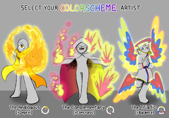
twitter has been losing its mind over this "choose your starter, artist" image that someone made- doing what the internet does and rehashing it over and over lol. I like how mine came out!
#rnanimations#digital art#art#my art#colors#color palette#color scheme#analogous#complimentary#triadic
594 notes
·
View notes
Text
So! I've been working on the My Home(TM) kitchen in Design Home, and I've got it juuuuust about perfect (or as much as it can be within the limited options of design home), but I keep going back and forth on which rug I want. And then I thought, why not ask tumblr? So, behold:
Option 1:
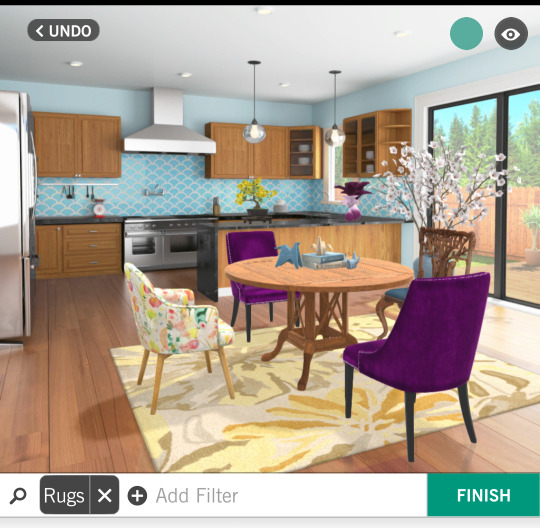
I've always wanted a yellow kitchen, but there was no option to make the walls yellow in design home, so a nice bright yellow rug seems like a good compromise. However, my yellow/multicolor floral accent chair doesn't shine as well against this background.
Option 2:
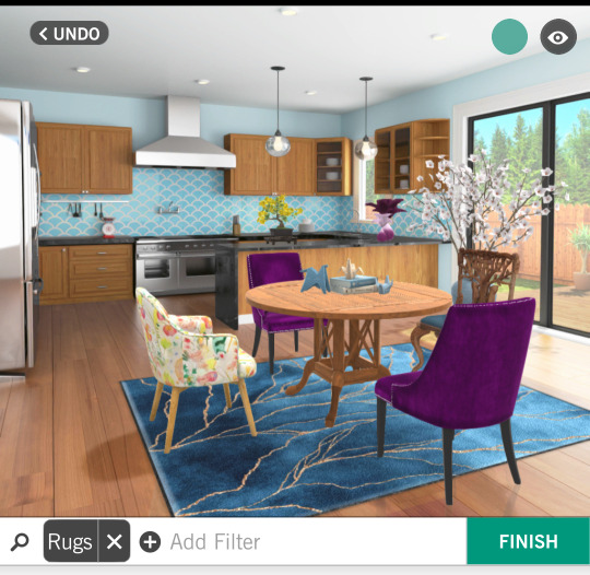
The blue complements the rest of the kitchen well and gives my table and chairs a solid background to pop against. However, I worry it makes the room too dark and the color palette too cool for my goal of a bright, sunshiney kitchen.
Option 3:
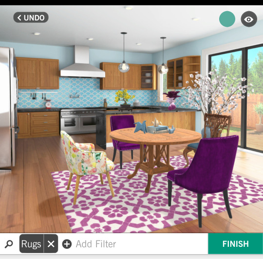
Purple is my favorite color (quelle surprise if you know me at all, lol) and it's a good inbetween tone-wise I think. However, I worry the pattern of this rug is a touch busy.
If you pick the fourth one, you're legally obligated to tell me what rug you're thinking of. Also legal disclaimer that I am not bound by the results of this poll and I'll probably make up my mind on my own eventually, but I'm curious to see how things shake out, and also I lowkey wanted to show off my home designing.
Yeah I'm a gamer (*spends hours playing a home design game on my phone*)
#Design Home#my home kitchen#specifically it's the#main home kitchen#polls#vote now!#you can critique other elements of my design if you want I guess but at this point I'm not changing it most likely#I'm really pretty happy with this but none of the rugs feel quite perfect#mobile gaming#interior design#I could almost call this art or something but I don't want to spam too many tags ;)#I do think I've got a certain composition going though#but yeah opinions welcome! (be nice) (or the laser cats will get you) (I am not legally responsible for the actions of the laser cats)#lol#color theory#hehe#but I do have kind of a purple/blue/yellow palette going‚ which isn't a proper triadic palette technically but I dig it#I do love design home... I might be a little too into it but it's fun#the hgtv kid to wish I owned a house pipeline. oof lol#anyways look at my pretty kitchen. love my pretty kitchen with me#even in the tags i ramble
12 notes
·
View notes
Text

Grand Arbiter Augustin IV
Artist: Greg Hildebrandt
Expansion: Double Masters 2022 (Card #379)
0 notes
Text
Color Scheme: Mastering the Art of Choosing Perfect Colors
Hey there! Ever stumbled upon the term “color scheme”? Chances are, you’ve been hanging out with it more often than you think!
Take Staples®, for instance – they rock a cool red and white vibe with their logo, website, and even those price tags in the store. Then there’s HomeDepot®, strutting its stuff in orange and white. And, of course, who can forget the golden arches of McDonald’s® bringing…

View On WordPress
#Analogous Color Scheme#color#Color Palette#Color Scheme#Color Wheel#Complementary Color Scheme#Cool Color#Monochromatic Color Scheme#triadic Color Scheme#Warm Color
0 notes
Text
i wanna take a minute and talk about my friend coleman.

coleman and i have been buds for a long time! when we both moved to the same city we achieved a bond that many service workers do: that of mutual discounts. coleman was a barista across the street from where i was a bookseller, and we passed each other as many free/discounted books and coffees as we could get away with. i always felt i had the better deal, however, because while i got cheap lattes i also got a glimpse into what coleman was thinking about and working on.
"do you have any patricia highsmith" he'd text me, and i'd raid the mystery section and think what story is going to come from this? he got very into oskar schlemmer's Triadic Ballet and i started checking any books we got in about the bauhaus for new images and texting them his way, knowing i was going to see it reflected in art someday soon. because the thing about coleman, maybe my favourite thing about him (among many, many things) is the way he will pursue a set of interests and then synthesize them all into a work of art that is entirely new and entirely him and like nothing i've ever seen before.
coleman makes comics. you might have seen his art in steven universe issues, or on tapas, or here on tumblr (like this one, about creating a personal color palette for himself, which literally changed my life). most of them you haven't seen, however, which kills me. i've edited a number of graphic novel pitches for coleman and i can tell you the stuff he comes up with is GOOD. it's weird and queer and earnest and original, all of it, every time. i really hope y'all will get to see some of it someday. but my point is that you can see this one thing right now:

coleman has been working on stone fruits for months and as of january 1st it's updating every day. it's a love letter to newspaper comics and early webcomics. it's about losing the spark of creativity and having to keep going anyway, and queer communities and weirdos and going home. this thing is so lovingly crafted, from the hand-drawn buttons (which change on certain days) to the fact that the website is .net. No element was too small to be considered, and it has been a joy to watch coleman consider them.
i want coleman to find his audience. he deserves it, and so does the audience. read stone fruits.
#tldr COLEMAN RULES. READ STONE FRUITS#friend coleman#stone fruits#this post shows admirable restraint btw#coleman is truly an incredible creator and y'all need to get on this train
435 notes
·
View notes
Note
I love the colors you use! Do you use an undertone/overtone layer? How do you pick your color palette?
Thank you! My style is pretty simple so I don't use any effect layers for color unless I'm doing lighting, which I usually don't. A lot of the time I color pick naturally from a start/base color. If you set a background color before you pick the rest of the colors, you'd be surprised how the rest will follow that tone.
Here's some additional notes on one of my best pieces color-wise!
You can also implement a little Stealing-Like-An-Artist and make a pallet from another work.
Also color theory! Complimentary, triadic, analogous, and all that.
#art#digital art#character art#digital artist#art account#character design#fanart#artists on tumblr#art blog#asks#color
256 notes
·
View notes
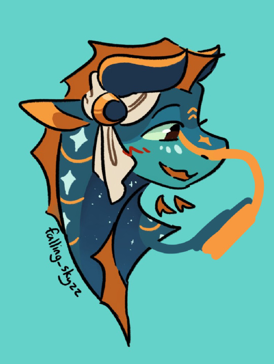
Text

lil doodle of the boys with opposite triadic color palettes :)))
(texture is a bit weird because i haven’t fully grasped how to use glaze yet but i will not have a robot snatching my 3 am sketches 😤)
#dan and phil#dan and phil games#daniel howell#philip lester#dan howell#phil lester#dan and phil crafts#dapgames#dapg#phanart#phandom#dan and phil art#dapg 2.0#dan and phil fanart#dnp art#dnp#dnpgames#dnp fanart#dnp games#milesedgeart
71 notes
·
View notes
Text


The two best Nintendo games ever crossed over! Ghost Trick girls outfits in Style Savvy! I had a lot of fun making them, for Memry there was no curly hair I liked so I thought bubble pigtails would be cute, I also took liberties on what her casual/work outfit would be so I went with an inverted palette from Lynne's (primary colors vs triadic colors).
#ghost trick#ghost trick phantom detective#nintendo#cosplay#style savvy#style savvy styling star#citra#lolita fashion#lynne#lynne ghost trick#kamila#kamila ghost trick#amelie#amelie ghost trick#memry#memry ghost trick#video game cosplay#fashion#crossover#nintendo 3ds#ootd
23 notes
·
View notes
Text
You may think we are nothing alike but me, you and your best friend actually form a perfect triadic cyan-magenta-yellow color palette with our core colors so unfortunately even though you fucking hate me you will never be complete without me and you will see things my way eventually
165 notes
·
View notes
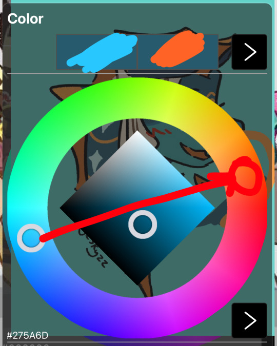
Note
Hey !! I just wanted to say your art is CRAZY good and I was wondering if you had any tips on picking color palettes?
Sorry for taking forever to respond, but hi!!! Thank you so much!!! wahh always wild when I am percieved, makes me v happy :)) As for color, your ask got me really excited since it my favorite part of the artistic process!
The long and short of it is that I like to use color theory (complimentary, analogous, triadic colors, etc) to minimize the amount of color in my work while using a variety of saturation and value to create the variation! Complimentary being colors across eachother on the color wheel, analogous are the colors next to eachother, and triadic are colors equidistant from each other,,, triangularly.
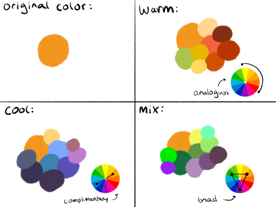
I typically don’t like starting out with a rigid number of colors of specific shades when I do my work cause it feels really limiting, and I enjoy adding color when it feels right. However, when I do color pick, I like to get a main big overall color scheme in mind then start placing various shades and saturations within that minimized pallete. The important part for me is not to stray too far from my pallete without some intent.
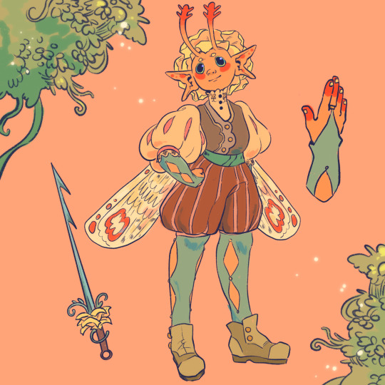
For example, when creating my character Peter, my goal was to make her a very warm colored character. To do that, I used an analogous color scheme of oranges and yellows with green sparingly. By minimizing the amount of different colors used, it helped the piece feel far more cohesive, but the amount of saturated and desaturated forms of the color created a lot more energy. And even though the colors I used were all next to eachother on the color wheel, the green provided a cooling contrast that I used in the eyes and portion of her costume to connect the two and emphasize. I also tried to use saturation and value to separate her from her outfit. Her skintone, hair petals, and markings are all very bright, while the outfit is desaturated tones. This made the seperation of the two more apparent to the viewer that this is body and this is clothes. I also like throwing in multiple color schemes to create even more visual interest. For example, for the lineart I used a deep saturated blue since blue is the complimentary to orange, her main color. This caused the lineart to stand out against her even more so than black lineart would.

To the upper right I also sketched out a different costume for her while maintaining the motif of orange and green (though some of the colors I’m not necessarily happy with).
Here are examples of some of my other stuff to show the “main colors” of the work. And as a secret, if a color isn’t matching my scheme, I like putting a color from my color scheme over it with a lower opacity and color pick from there ;) helps with melding it into it.

Of course these rules are not set in stone and I break them when I gotta, but this is generally how I like to find my colors. Anyways,, I hope this made some sense!! I really enjoy color :)
60 notes
·
View notes
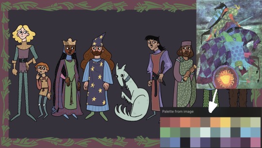
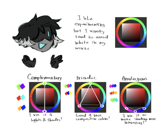
Note
How. How does one make good character design and pleasant color palettes. How to make a color palette without reusing colors. How to make patterns or designs?? 😭🙏
cracks knuckles. you see theres but one trick i reuse over and over.
✨color theory✨
(well, at least i think it is. i never learned this stuff properly, so i dont have names for these things)
its gonna get a little long so ill put all of this below the cut, but tldr be aware of certain color combos relating to their positions on the color wheel + remember scales (??? they prob arent actually called that erm) + fuck it we ball with markings
OKAY SO im typing this at 1:21 am on my phone and my right eye is hurting so pls forgive any typos and mistakes, and if i sound like i know my stuff but i dont PLEASE point it out to me so i can correct myself ;;;;
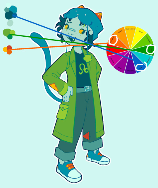
first of all, color combos. yes, all the stuff u learned in grade 5 art class actually works.
take a look at this bad boy. (i use autodesk sketchbook to draw, not ibispaint, but its the same on both programs)

color combos are always relationships between any given color with other colors based on their positions on the ring around the diamond.
for example, complementary colors are always opposite each other on the ring.

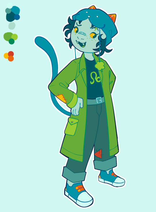
i use this for opah (my oc)’s design, with her dark blue-green and orange.
(as far as i know color combos dont care about the diamond in the middle, just the ring, so the actual colors themselves are pretty flexible)
(bonus auklet)


theres a lot of other combos besides complementary but you can research that urself, ill just provide an example if i have one of the most common ones
—
triadic
ermm i actually dont use this one very much so im just gonna put a hilda (which is an AWESOME show that has INSANE color theory)
(this isnt technically triadic but its the best example i have and vaguely in a triangle trio formation okay…….)
—
analogous
this is my FAVORITE combo ever, because it lets me stay in the strict wof tribe color range while still being interesting. honestly u could take any design of mine and 99% chance theres analogous in there

if u wanna know more combos just google color theory schemes, theres more than i could ever remember and i dont really bother to use them all; for wof, i usually just stick with analogous and complementary.
uhm i dont know if tumblr has a word limit but i dont wanna make this too long so i shall reblog with part 2 soon !!!!!! (if u dont hear from me in the next hour i fell asleep)
#tumbly stop eating my fucking drafts challenge impossible#i have so much to say about color theory#i did not check this over so if u see any mistakes#reblog or comment nd point them out plssss thank u#ava rambles#ava askbox
53 notes
·
View notes
Note
What color scheme-palette-thing does the evangelion mech follow?
I just realized that the purple and green colors are sooo associated with evangelion but like… purple and green arent complimentary colors. Nor is there a prominent third color thay could make it split-complimentary or triadic or whatever all the other names are. They kinda clash so i guess thats why its such a recognizable palette?
-
10 notes
·
View notes
Note
Hello!! Ive been a big fan of your art for a while now and I really adore your use of colour to shade/make compositions (like in your pfp piece!! (of jack and tim on the blue/orange background) it’s one of my favs i admire it and think ‘how did this wonderful artist come up with this’)
so i suppose i was wondering if you had any tips on colour choice, or what your thought process is behind picking colours or textures (like the water-like lines from the aforementioned pfp) for a work? thank youu sm <3
Hello! First of all, thank you so much for your kind words, it means a world to me! Although I usually just go with the flow and usage of any means to achieve my idea in art, I tried to at least pick something, that might help, but it`s very far off from professional advice.
firstly, even if it was said a thousand times before, it`s best to get accustomed with the color wheel and color theory, because the use of color depends on the intended composition and mood of the drawing! For me personally, I like to use triadic and complementary palettes for my drawings, so the contrast is more visible and you have more freedom to play with the shades in the rendering process! Try to use colors that you associate with the mood that you want to have in your drawing, let them be your partner in telling the story, accents and the mood (like how I used opposite colors for the background behind Jack and Tim in the pfp)
secondly, gradients and layer effects are a lot help! not only they can give you palette ideas, they help to accumulate the color that you already have!
I don`t really know, what to say about the textures and stuff, other that forms can tell as much as colors can. Use references, your understanding of forms and patterns to set the right atmosphere in your work!
I really hope, that you will find my rambling helpful, and thank you so much again for your words and your questions!! If anything, you can always message me, and I'll try to explain things better!

15 notes
·
View notes
Photo
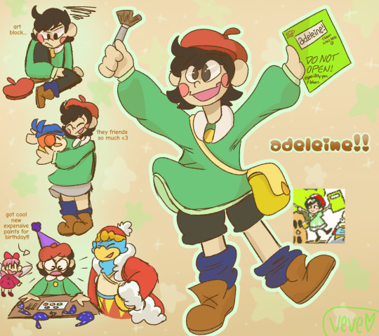


adeleine appreciation squad!!! time for me to project artist problems all over her and headcanon the heck out of this gal :]
adeleine is the type to go through a set of 24 prismacolors in a week and constantly has to get new supplies (dw, having a king as your friend means unlimited art supplies)
is adeleine’s age ever confirmed?? idk anyways i hc her as no more than 12
after the oil pastel incident, ado only lets kirby and ribbon use her leftover supplies to keep them busy while painting
bandana dee is the exception. bandana dee is allowed free range of adeleine’s supplies. bandana dee has earned her trust.
the first time ado hit art block, she cried for hours on end because she thought she had lost her talent forever
what’s in ado’s notebook? we will never know.....(its old 2014 deviantart ocs)
she loves oversized clothing sososo much
adeleine and ribbon have a weekly friendship bracelet making ritual :]]
i forgot to add it in the doodles, but adeleine’s hands and clothing are perpetually covered in paint splatters. always.
she’s also always got at least one bandaid somewhere plastered on, hard to avoid injuries when you’re a one-hit KO, and also when you’re the last human and nobody knows quite how to treat your wounds right
OH YEAH last human stuff here we go:
going to shiver star was lowkey traumatizing for her. ado always knew she came from shiver star, sure, and she still holds a couple of memories from there (she was 5 when she came to popstar. why? idk im still working on that). but nothing could have prepared her for the barren, abandoned, frozen wasteland that was left behind. it was as if every last shred of life was torn away, nothing but amalgamations of creatures that she had once read in storybooks floating in test tubes. it was so strange and so scary for her to realize that the beautiful, lush landscapes she held in her mind and in her paintbrush-- her home planet, were gone.
yikes that was dark what else uhh
when she met meta knight for the first time, she couldnt stop talking about how cool he looked, how his color palette was a perfect complimentary/analogous mix, etc. meta knight took this as a very deserved ego boost
adeleine gives a lot of odd compliments about someone’s geometric symmetry or color scheme
dedede’s not sure what a triadic color scheme is but damn if he isn’t proud of it
IM GONNA STOP HERE ACK THAT WAS LONG I HAVE MANY MORE THOUGH!!!!
#adeleine is underappreciated af#cmon yall shes awesome#i love her#adeleine kirby#kirby adeleine#ado#kirby ado#kirby 64#kirby crystal shards#kirby 64: the crystal shards#kirby#kirby series#king dedede#bandana waddle dee#bandana dee#kirby ribbon#my art woag#ITS TWO AM TAKE THE ADO POST#NO BUT LIKE?? WE ARE SLEEPING ON HER POTENTIAL#IMAGINE THE ANGST FICS#THE BURNED OUT ARTIST MEMES#BIG SISTER ADELEINE#YALL.
145 notes
·
View notes
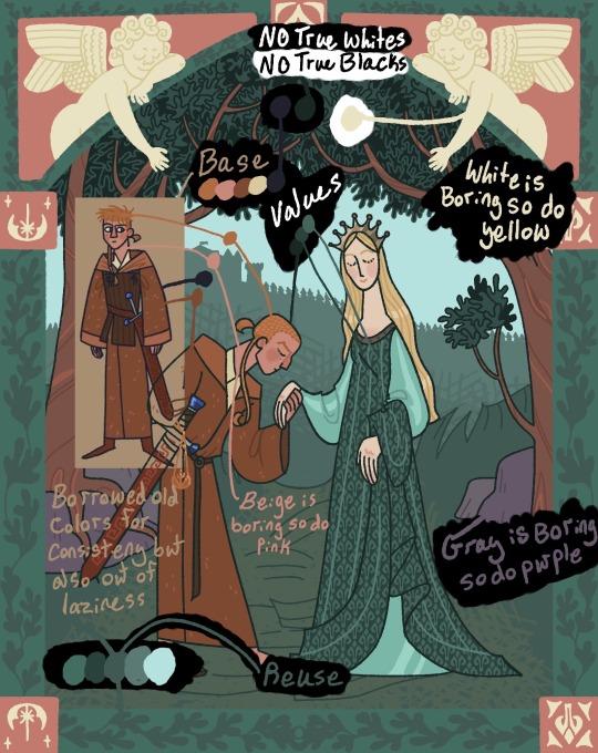
Note
your colors are alwasy SO GOOD.... do u have any advice for how u pick them
thank you! for advice, i have a few tips:
the first is to always keep in mind what color palette you are using. as you become more experienced this will likely become something you do subconsciously, but when i was starting out with drawing i would usually deliberately choose a color palette and reference that while coloring in my drawing.
i'll go into some basic color theory (ha ha) but feel free to skip this if you're already familiar with it.
there are many different types of palettes to choose from, but the most common ones are:
monochromatic
analogous
complementary
split complementary
triadic
square
tetradic
for example, the drawing i just posted follows a split complementary palette (which is favorite scheme btw)
i can explain this more in-depth if anyone want me to but for the sake of brevity i'll leave it at that. the only other thing that i think is important to note if you're following a color palette is that it's important to balance out the values of the colors that you are using (how light and dark they are) as well as use it as a guide but you don't have to strictly adhere to your pallete 100% if the time within your piece. for example, the my drawing uses MAINLY blue, green, and red-orange, but there is also some orange, yellow-orange, yellow-green, blue-green etc. in there as well
my second tip is to experiment! i hear the phrase "learn the rules before you break them" a lot when people are giving advice to beginner artists, which i don't always agree with because i think experimenting and finding out what you like and what you think works is very valuable (especially when you are drawing for fun and not professionally!) have fun with it, do the opposite of what people tell you to do just to see how it looks, etc. i remember getting the advice to always shade warm tones with a warmer tone and cool tones with a cooler tone (this is only a rule of thumb btw) and one day i started doing the opposite and found that it can look cool in certain circumstances
my third tip is to use references! i joke a lot about colorpicking from the most random images but i think that looking at other images and asking yourself "how is the artist/photographer using the colors to make it look this way? how do i recreate that?" and using that as a way to study their use of colors can be really helpful. i you find a drawing that has cool colors, try using those colors in your own drawings and see how they look!
the fourth tip is to play around with contrast. some drawings will look better with LOTS of contrast (where the darkest points are black and the brightest points are white), while others will look better with low contrast. stylistically, i prefer using low contrast. going back to the drawing above, there is no true #000000 or #ffffff used anywhere (except the white outline). i find that in certain situations this can help colors stand out. but like i said, it's more of a personal preference
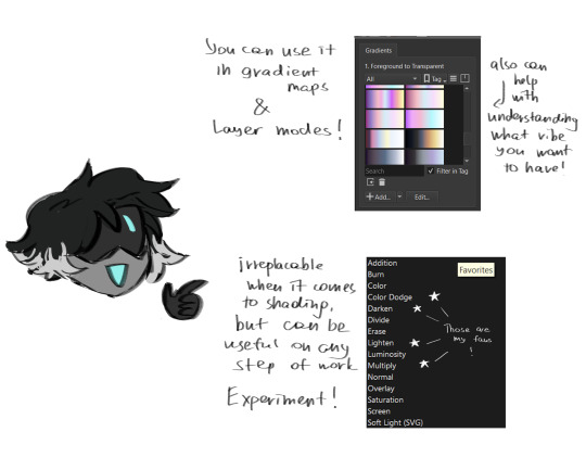
the fifth tip is more for digital art, but it's to play around with blending layers, adjustment layers, and gradient maps if you don't like your colors but have no idea how to fix it. some programs don't have this feature but using blending layers/adjustment layers/gradient maps is sort of like using a filter to change the hue/value/saturation of your art in different ways
hope that helps! if there's anything i need to explain further please lmk!
40 notes
·
View notes
Last Seen Blogs

lxmbs
Ni_20

los-qualia-blog
Los Qualia

susufromheaven
Grace's Secret

realjetcomics
JET Comics
realjetcomics
JET Comics