#trying to figure out proportions and this is the one sketch that turned out good ^^
Explore tagged Tumblr posts
Text
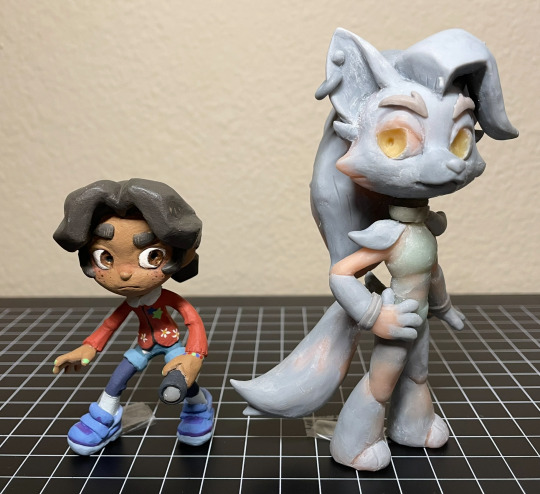
Abandoned wip Cassie & Roxy figures. From ~2023
They’re about to go into storage, so I took some photos. And I figured I might as well post them since they’re never getting finished. So yeah
More photos & notes below the cut :)
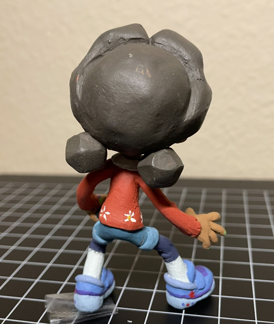
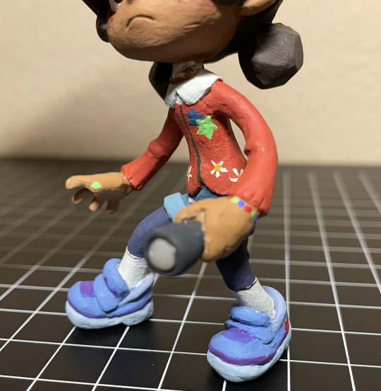
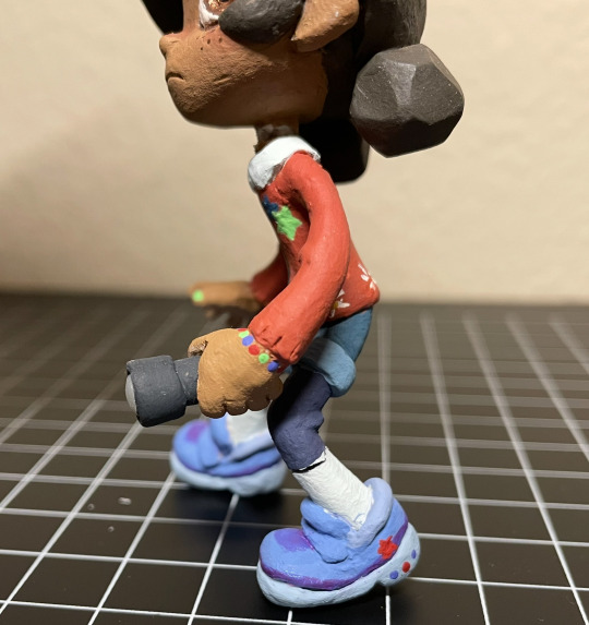
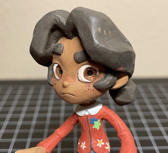
Cassie! Her design is sooo cute. I enjoyed translating her into my style + into 3d. I was (& still am) really happy with how I sculpted her face and hair. Up until this point I rarely sculpted human faces, so I was surprised how well it turned out (then again it’s very stylized so. Whatever). And her hair came out almost exactly like my reference drawing! Which doesn’t happen as often as I would like it to. The paint job came out nicely as well, I’m especially proud of the sneakers and the tiny stars & flowers on her cardigan. Anyway, She was looking really good overall! That is until she fell off my shelf and broke her neck. Unfortunately, that was the breaking point (lol) for me, as I was already having problems with Roxy, and I didn’t want to go through the trouble of repairing her tiny little neck after she was almost fully painted, so I scrapped the project entirely.
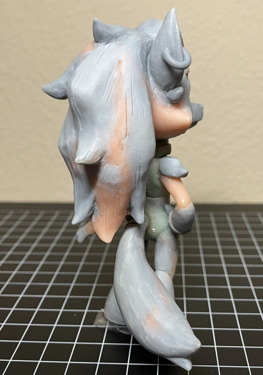
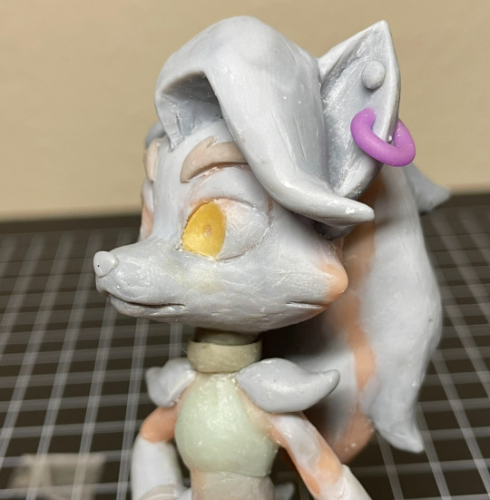
Only a few Roxy photos since she wasn’t painted. I had made her before cassie, (I was originally going to only make Roxy) but never managed to get to the painting step for mainly one reason: Her neck kept breaking. (I have bad luck when it comes to necks, it seems. Probably because I like chibi proportions.) I had to repair her neck, like, 5 times, before finally deciding to use apoxie sculpt instead of my regular polymer clays. (Which I probably should’ve done sooner) But then the apoxie dried in the wrong position, so she couldn’t stand on her own anymore (she needed to be in a very specific pose to stand. her hair is heavy!!). Thinking back on it, I’m really sad I never got to paint her, because I think her form ended up looking really nice. If you’re wondering why neither Cassie nor Roxy have eyelashes, that’s because I was planning on doming both of their eyes with resin, then sculpting eyelashes on top. But I never got to that step. Fun Fact!: Roxy’s eyes are glow in the dark :) so is Cassie’s flashlight
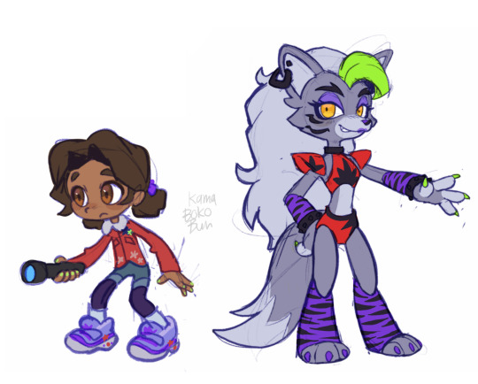
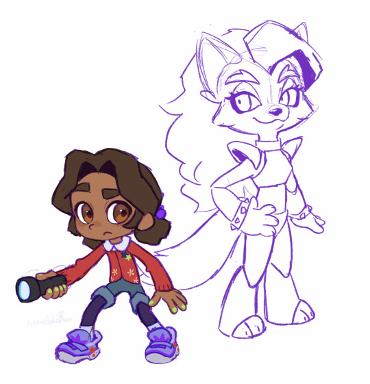
And lastly, here is the art I made for me to reference. Left is the original sketches, and right is the revised poses/designs + traced off of the figures I had already started making. Fun fact: halfway through sculpting (after baking in the pose) I realized that, in-game, cassie holds her flashlight in her left hand and not her right, so I had to completely remove & remake her hands.
I really want to try remaking these two someday, not only because I think I can make them better than I did before, but because Cassie & Roxy are probably my favorite SB characters and I still want to have cute figures of them to display on my desk lol.
Alright that’s all bye bye
187 notes
·
View notes
Note
I adore your art! I especially love how you do faces and capture the small details in expression/clothing! Do you have any tips about how to go about getting anatomy and facial structures correct? I do drawing as a hobby but I always find it so frustrating. Thanks for sharing your art with us on here :)
Thank you so much! Trust me I totally understand and I don't fully get anatomy myself.
The way I draw faces kinda kicks off from the Loomis method by drawing the circle first and then working around that. I think that's a good place to start, it's really good for face proportions and knowing where to put everything. After you do it so many times you don't need to lay everything out and you'll just know by hand. I can churn out so many faces now just drawing the circle part. I went ahead and looked online and I found a free PDF of one of his books you can take a look at :)
I still struggle with anatomy but whenever I try to figure it out I usually block in what I want on a canvas with a big dark pen and shave it down. I turn down the opacity and then try to sketch over.

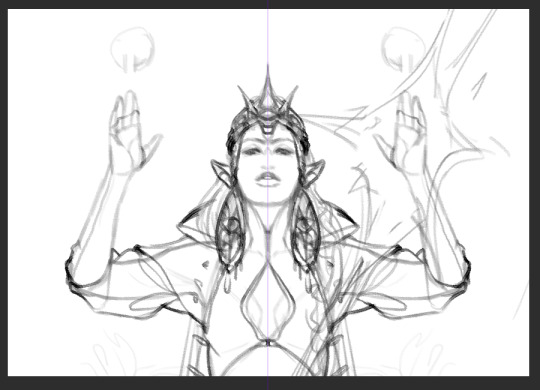
I will say, use any resources you have available to you - they are there for you to use. I always use references and If I'm still struggling to get my idea out, I'll pull up a 3d model and sketch over. It saved me a lot of tears and frustration in the end and a lot of options out there are completely free or one-time purchases.
CSP has built-in software for modeling and lots of downloadable poses, Magicposer you can use for free but some stuff is locked behind membership subscriptions. DAZ studio software is free but that one has a bit more of a learning curve to operate. Handy I think is a one-time purchase and there are many options for hand and lighting reference. These are just ones I've tried for anatomy that worked for me but I definitely encourage looking around and doing some testing with other software if you're interested!
Best of luck lovely!
52 notes
·
View notes
Text

So some more sketches from my AU, from yesterday and this morning
On the left, we have Elita and my constant struggle with her, as always. You know the drill. I had to write "stop it" so I'd give up this endeavor for now and move on. I think that's when I switched over to drawing the Megatron ref yesterday
I wonder if maybe giving her a full body design would help me? Because I mean, Optimus and Megatron started out with those, even if I only use the top half. And I'm convinced I draw her proportions wrong anyways
But other than that, you can see I'm thinking of moving her cones to her top horns instead of her side. I like them on the side, but I think they're part of the thing holding me back, along with potentially her glasses
I spent my shift on Monday drawing various Elita head designs I found to see if I could find anything that could stick. I'm too lazy to take a picture of it right this second, but it's probably why I was trying to give her another shot in her design
But moving on, I also tried drawing Blackarachnia, since I was reminded recently that Sentinel is supposed to be associated with the spider ladies, and because a thing I gave one of my Elita designs I thought would look good on a spider character, namely the side triangle things
I kind of like the design I gave her, but I do also wonder if I'm just sticking to the first thing I thought of. I don't think it's bad though. I would like her head to be more trapezoid though
But her colors on the other hand definitely need some work, because I was not sure what to do with them. I knew I wanted to incorporate black and gold, mostly because I love her Beast Wars design the most, at least color wise, but I also thought it'd be good to incorporate the purples and reds too. And then I was just trying to move colors around until I got something that actually looked cohesive together. But I don't know if I like it this way. I think one thing I want is for her to have gold eyes and a darker "skin" tone, but I didn't know how to incorporate it
She's probably going to need more time to cook
As for her role in the story? I really don't know, other than being connected to Sentinel
When I made this, my mental thought was that she was Sentinel's complicated love interest. But that wasn't my initial idea, and she's supposed to have some connection with his old partner. I don't know if I want to keep the TFA idea of BA having once been his partner, thought dead but is actually still alive, but I also don't want to keep the initial idea that she ate his old partner, because why would he ever be interested in her after that?
And there was also me thinking on what Airachnid and Blackarachnia should be in this story, particularly with their differences between each other, like how Airachnid is a fully techno bot that just looks spider-like in her robot form, while Blackarachnia is a techno-organic who turns into a full-on spider. So I feel like if I were to make both connected to Sentinel's lost partner, Airachnid would make more sense as the one eaten, and Blackarachnia the one who ate her, since she's the more animalistic one. But that doesn't really jive with how Airachnid is usually the eviler of the two
I'm really not sure what I want to do with the spider ladies, I think they need more time in the oven lore wise as well. And I need to figure out if I want both or not. And who Sentinel's dead partner was, because I also had the idea of them being built alongside Sentinel, being more like a sibling, but dying soon after, possibly due to malfunctions in their systems. But I'm not sure about that, leaves little room for the spiders
But moving on from them, we also have Kiloton, who honestly I half feel like slightly altering the name of. Like my brain sometimes corrects it to Kilotron, which I like a bit more but I'm also aware is even closer to Megatron's name
I tried to give him a design here, and I don't think it's horrible, though maybe it needs a bit more work. Granted, I am working with very little when it comes to his design, given how basic the original Kiloton is, but oh well
I was going to give him his silver/grey, but it didn't look right with all his other colors, so I changed it to that sort of brassy color. I think I like it a lot more
But it was with him that I realized I probably need to adhere a bit closer to the Mega Man style, because I am simplifying it more than I need to, at least anatomy wise, and it could look a lot better if I did
Will I change? I don't really know, because I'm lazy and I like how I'm drawing them now. But maybe I should practice Mega Man characters too to get a feel for this style I'm trying to evoke. Well, I say style, I more mean the designs and robot things rather than things like how the face is drawn or stuff like that
But anyways, I do have more on Kiloton than I do Blackarachnia, but I don't really have all his essential details down
What I do know is that he and Megatron used to be a thing, though unfortunately Kiloton ended up dying. Details later
But they first met around the time Megatron first got infected. At that point, after whatever event caused him to get infected, he ended up wandering around the wastes of Cybertron, mangled from whatever battles he had been in, and with his processor on the fritz from the virus, until he eventually collapsed. Kiloton ended up finding him and nursing him back to health, as he only saw a damaged bot in need of help
I'm also thinking maybe Kiloton was the one to give Megatron his purple gem, or that when he had found him, his initial gem was broken, or whatever was in that place before it
Kiloton was the first bot Megatron met while infected, and so he never really felt the need to do violence onto this bot, which surprised him at the time. His time with Kiloton and the time after he had recovered was the start of his new life with a clear mind not clouded by violent thoughts, and it gave Kiloton a special significance to Megatron, even if Kiloton wasn't aware of this
It's the time after this that I don't really have the details on. I want to say that while Kiloton helps fight Decepticons, he's not necessarily part of the Autobot force, possibly some other independent party from them. And he's also a support bot as opposed to a field bot. I also don't know when he and Megatron went their separate ways or even if they did, and when their relationship turned romantic
And while I also don't know the circumstances, I do know that eventually, Kiloton died, and Megatron was the one who had to kill him. I'm not sure Kiloton got infected with the virus, he might have fought Megatron on his own terms, after something Megatron did despite his protests. I'm not sure, but Megatron was forced to kill him, and it weighs heavily on him
I also think that at this point in time, Optimus had feelings for Megatron, but didn't act on them because of his relationship with Kiloton, and it was only sometime after that they got together. Optimus was probably also the person to help Megatron deal with the death of Kiloton, as he took the event pretty hard, but I don't want to say Optimus used this as an opportunity to come in with his own romantic feelings, as I don't imagine Optimus would ever be that selfish. Megatron was his friend in need first, even if he had feelings for him at the time. I also don't know how long afterwards that they got together
I also think now with the addition of Kiloton, I may need to slightly tweak Optimus and Megatron's dynamic, because now Megatron had someone before Optimus. Also maybe Optimus needs some tragedy, because Megatron and Sentinel both have some while he doesn't really have any at this point
But yeah, those are the current updates to this AU. Not much solid, but some new things
Though if I'm being honest, I'm debating now how much people care for this AU. Maybe I'm being egotistical, but I don't know, I was kind of sad that my last two reference drawings for them have basically gotten no attention, and same with other more recent posts about it
It's making me think people are sick of this, particularly since AU ideas tend to die out with me, but like, this time I'm actually holding onto an idea, and I don't want it to die like all the rest. Do I just need to give it time and eventually people will come around, or are people genuinely sick of this and sick of me trying to do anything here, particularly with my bad looking designs and me butting in on things I have no real knowledge of? Or am I just being egotistical and annoyed that I'm not getting as much attention as I want, despite there not actually being a problem?
I don't know, I just wish someone would tell me what I'm doing wrong
#sorry about that bit at the end it's just been getting to me these past few days or so#maybe I'll make a post on it idk#but yeah new stuff#but also not because like half of it is getting reworked or isn't solid at all#transformers#transformers au#transformers x#my art#my designs#elita one#blackarachnia#tf kiloton#kilomegs#a bit
21 notes
·
View notes
Note
It's may be an odd question but do you think you could maybe post a couple tips of anatomy and/or proportion that helped you sometime? I notice I have a hard time learning from videos or guides, but sometimes when I learn on my own or hear someone else's personal experience it just clicks and it's nice.
I know this may sound strange, but for me it was a class I took with Matt Faulkner, who had a very refreshing approach to mark making and drawing from life. We did have a live model, and drawing people from life teaches you two important things that books cannot: textbook anatomy is idealized, not everybody will look like that and foreshortening and perspective are things that are easier to see in person (at least, for me they were).
As you draw things like that over and over, you will build a mental library that will help you draw those tougher perspectives from imagination. I still use a reference, because the human body can bend and distort in a lot of ways and I am nowhere near having all of that memorized, and WE DON’T HAVE TO! If it gets committed to memory, great! But artists should never feel shame from using a reference because that is how we learn and that is how we improve. Even professionals use a reference.
The mark making that Matt taught us was a little different than some of the other classes I had been through in the past. I typically would draw a human with basic shapes and a “wire-frame” skeleton for my foundational rough sketch, but Matt would have us start drawing our figures with different lines. Contour lines, is just drawing the outside of what you’re observing, while periodically flashing your eyes at the paper. Blind contour would have us looking only at our subject and drawing what we were seeing without ever picking up the pencil (some of these actually turn out pretty cool).
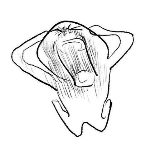
Volumetric drawing was the one that I had never come across before. Matt uses a lot of crosshatching and volume lines in his work. See the below example:
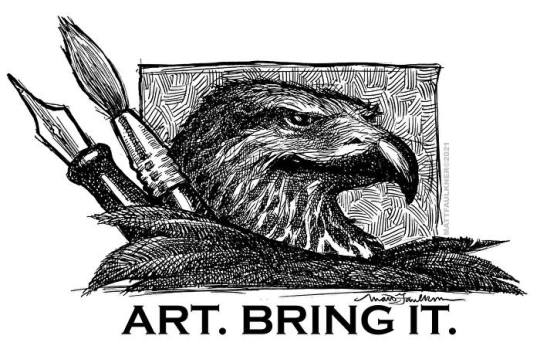
The way this applies to anatomy is that his way of volumetric drawing is helpful in finding the space that your figure takes up. Sometimes Matt would have us draw our figure with ONLY volumetric lines. It would look like a tornado person, but this practice wasn’t to make something visually appealing, it was to help us train our brain and our eyes to see the volume. In that volumetric study we would be wrapping lines in a width and curvature that followed the subject. Here is a visual example of a volumetric drawing by Monika Zagrobelna that shows what I mean:
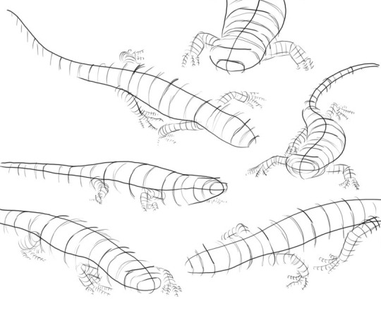
The volumetric drawing helps to grasp how much space something takes up, whereas the wire-frame doesn’t really convey that kind of information. A lot of people reference the Andrew Loomis books and Figure Drawing For All It’s Worth [ISBN: 978-0857680983] is a good resource to learn from. But Loomis does idealize the standard figures in his works and books. I am not saying don’t draw like him! There is nothing wrong with his style! Just don’t fall into the assumption that every body type will align exactly with the proportions and measurements that he covers. For example, he usually has a standard height that male and female figures are drawn at and certain points where knees are expected to reach and other body part milestones:
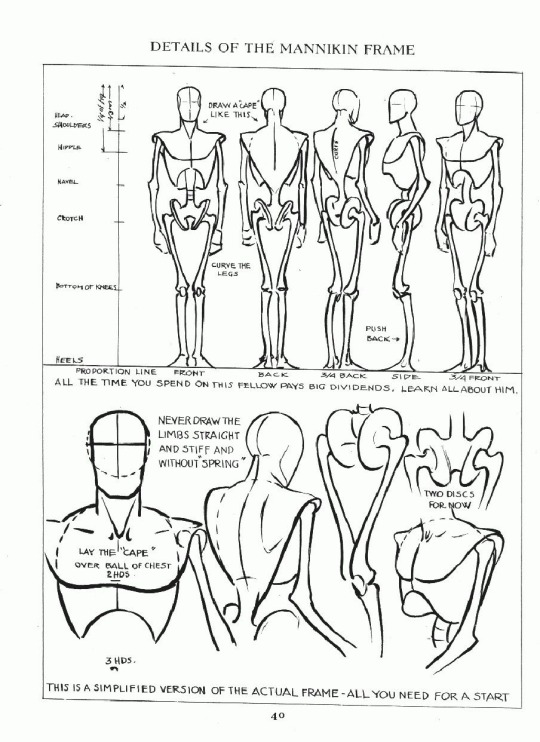
It is a guideline, and it is useful, but I found that the best exercise that you can do is to do a study on separate pages. No one taught me this, I just did it out of curiosity to see how it would go. Set one aside for male and one for female. First, draw your standard Loomis figure, then get five other male/female reference photos (or drawn from life if you can) of people with different body types. Try drawing them from observation and see how much of the Loomis concept applies to them. You’ll find that you can bend a lot of the Loomis ideas to fit, but you have to throw out some things entirely in order to accurately portray your subject (like the number of heads tall something has to be, or posture, for example).
Hopefully, despite that being a little long-winded of me, you found this experience helpful? Everyone learns differently, so I feel your struggle. I am a big visual learner and need to see what is happening with something to understand it. I also learn best by struggling. So what were the “aha” moments for me, may not necessarily work for another, but it is here if you can find any value or use in it.
#art#anatomy#perspective#draw from life#use a reference#Matt Faulkner#Andrew Loomis#Monika Zagrobelna#volumetric lines#drawing volumetrically#volumetric drawing#figure drawing#art advice#art help#art asks
46 notes
·
View notes
Text
i've spent nearly 47 hours over the last ten days drawing nothing but kiana (and hov)
yeah.
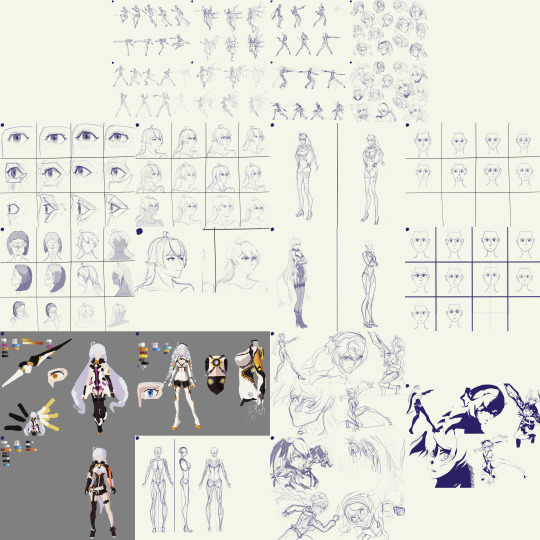
anyways, since I've had about enough of drawing Kiana for the rest of my life (/hj) I'm gonna put a pause on this project; but I'll turn it from a sprint into a marathon and try and work on it occasionally instead of all at once
I want to draw other things again x-x
Close-ups of the drawings below, as well as the reference image set, and some other misc. thoughts
.
Portraits drawn from imagination
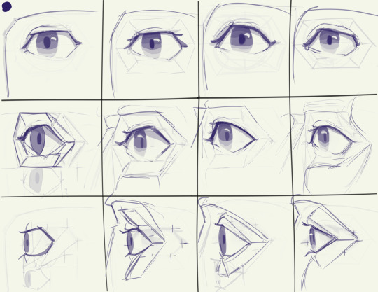
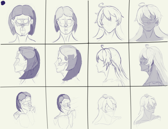
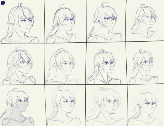
Started the process by trying to draw Kiana's head from imagination; then after each drawing I'd pause, look at some references, see what mistakes I made, then put away the references and drew from imagination (and referring to previous drawings) again. I also took breaks at two points to practice drawing eyes & hair before going back to drawing Kiana
For the last 4 portraits, I'd draw a head from imagination as a warm-up to a drawing session, and then do another head much later on instead of doing it immediately. Around halfway through this "phase" I started the other phases at random points, and finished this portion of the process in the first ~10-15 hours of drawing time. The rest of the time was split across the other exercises
Also I gave her an angry expression because I felt it was the easiest for me to do from memory since I've drawn HoV more than just "Kiana" herself. I also used a boring level 3/4 view without much perspective because it forced me to really make sure I was doing everything accurately and with care.
Basically my thinking was that if I could make a boring level 3/4 portrait look good enough, then I'd have no trouble getting it to look good in other perspectives. That seemed to be true when I got to the stage where I was doing expression practice and had to deal with more head tilt and other perspectives, lol
.
Studies of still images from screenshots of gameplay, character art, and stills from animated shorts
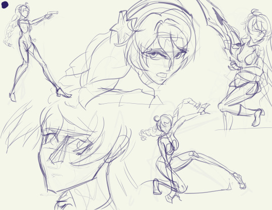
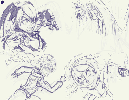
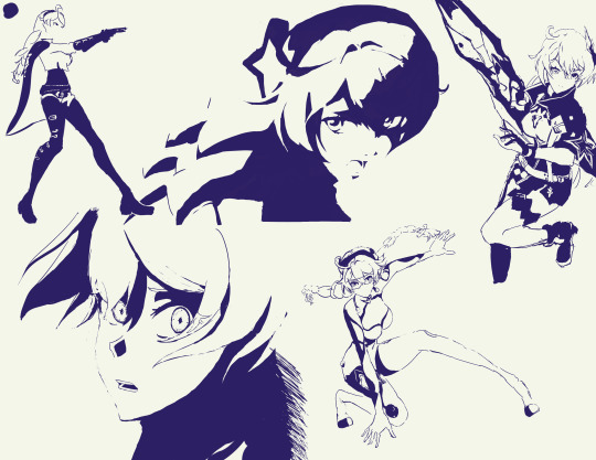
Did rough sketches first, then drew with solid color over the sketches on a separate layer. not much else to say here, lol
.
Full-bodies
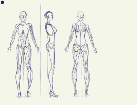
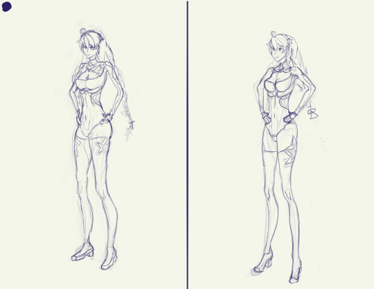
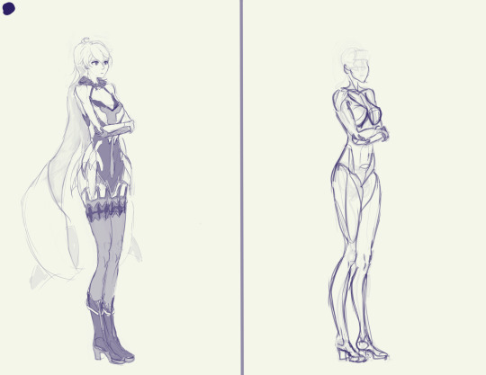
Started with an anatomy model loosely based on the proportions of Kiana's in-game model, and then two attempts at doing full-body drawings from imagination before realizing that it's bloody insane to try and do that much detail from imagination and I have much better things to do with my life than that x-x
.
Color studies
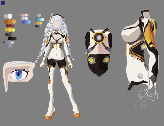
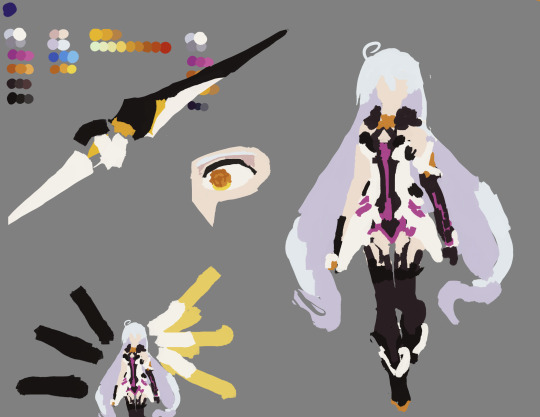
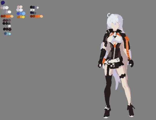
yaaaay color! yippee!
.
Action sketches/"gesture" drawings
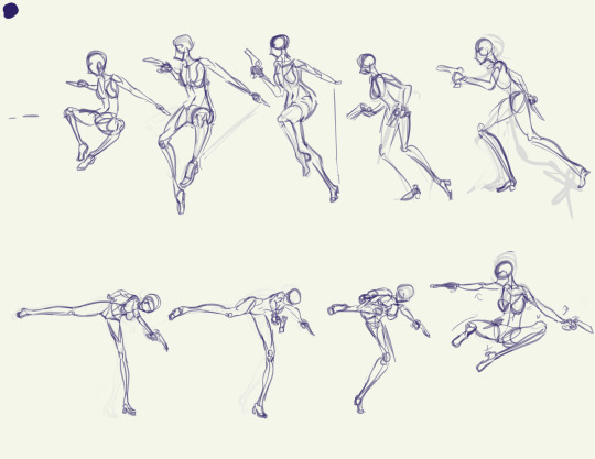
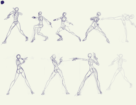
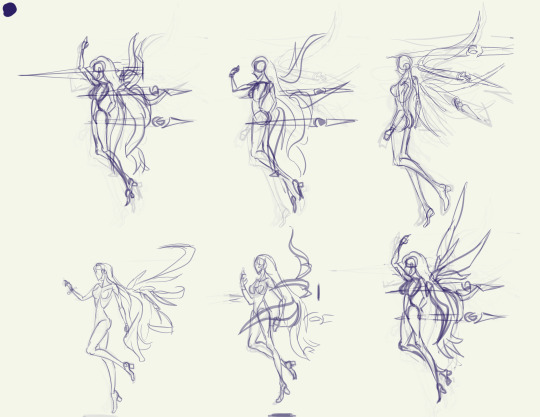
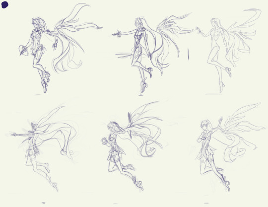
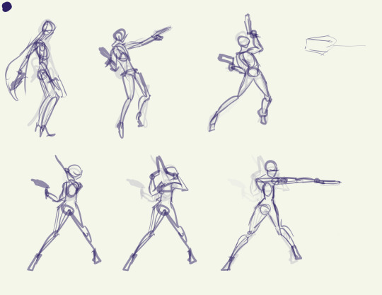
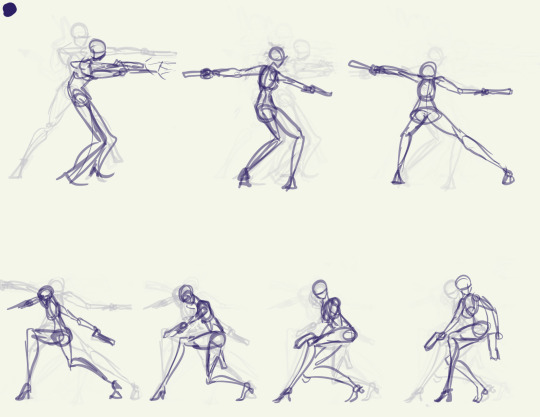
"Gesture" is in quotes because I was way too slow with these for it to really count as proper gesture drawing, imo. But the intention was to start with gesture, and I got closer to that as I went on.
It's way too tempting to start adding detail so I had to metaphysically slap myself with a frying pan to keep myself from getting derailed by that >.>
To get references for this, I did screen recording of gameplay on the PC with OBS studios, then used DaVinci Resolve to play back the recordings.
On PC, when using the mouse controls you can hold the camera fairly still when doing an attack sequence, making it awesome for getting unique angles. For instance, when I recorded Void Drifter's attacks, I was able to get at least 4 different PoVs of her attacks: from the left, the right, behind & above, and in front & below.
Unfortunately, though, it was a bit of a hassle to get good recordings because I had to go into an actual combat stage to record it instead of being able to use an empty testing stage.
With DaVinci Resolve I could "split" clips to make cuts in the timeline that let me easily mark the spots where different attack sequences started, and I could also easily play it in .5x speed to help me figure out how the animations were going from one set of frames to another.
Plus if you close the program after saving, when you open it up again it remembers which frame you were last on and takes you straight there, making it easy to continue from one day to another.
I used White Comet, Herrscher of the Void, and Void Drifter attack animations here, but I also did recordings of Knight Moonbeam and Herrscher of Flamescion, and I might give those a try someday.
.
Facial expressions practice
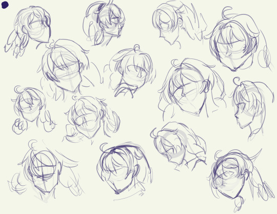
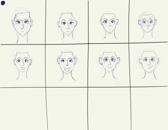
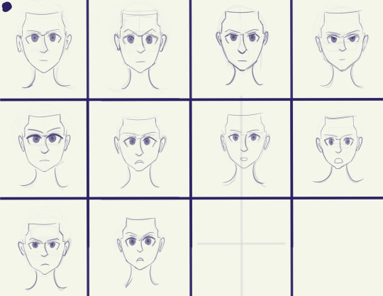
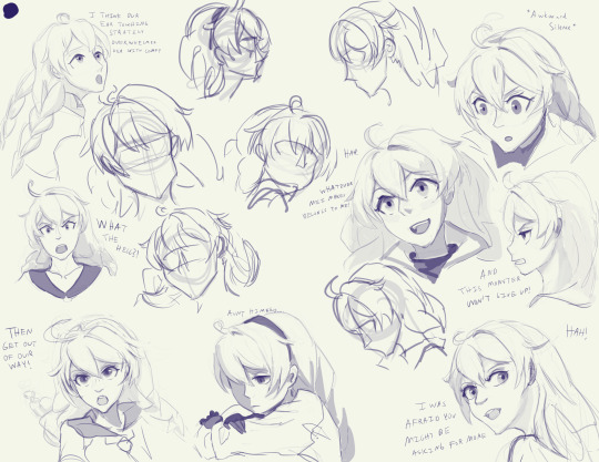
Started with the set of rough sketches (first image), then did some expression practice from imagination (second and third images) to try and get used to how the proportions of the face change slightly with movement of the eyebrows/eyelids/jaw, since the shape of the eyes and mouth is especially important when doing stylized faces (like the anime style that HI3rd uses)
Then this morning I started working through the original rough sketches and developing them one-by-one, getting through 8 before I decided to call it quits and wrap up the project for now
So the facial expression practice pretty much the culmination of all my practice. All the practice with proportions, the contours & forms of the hair, monochromatic shading, line quality, shape design, etc.
This was also one of the few times I've ever taken stylized references and actually adapted them to some extent instead of directly copying them!
This is especially noticeable in the hair, where I used a more standard style for the hair, in contrast with the variety of hairstyles and shapes used in the various manga references (i.e. black-and-white Escape from Nagazora Kiana's messy hair vs the neat and solid hair in the colored Gratitude Arc, AE Invasion, and Moon Shadow Kiana)
.
Reference images
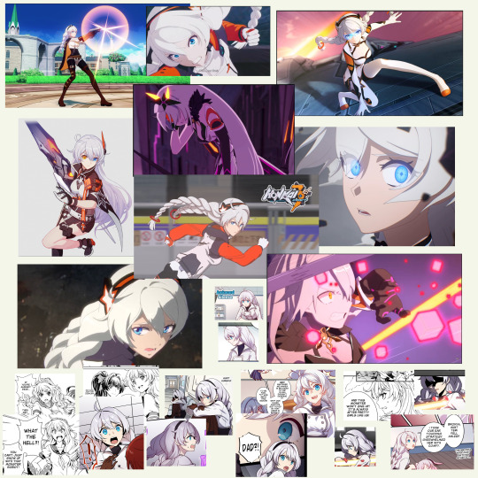
#kiana kaslana#herrscher of the void#never doing this again /j#for real though this was honestly pretty amazing practice#I've long struggled with blending my traditional art skills with my digital art aspirations#i have literally hundreds of hours of studio time drawing with charcoal and paper but nowhere near as much time drawing digitally#basically if you give me a photo of a real person or a live model I'd do better than if I were drawing an anime or game character#I think I learned a lot about working from stylized references while still using my realistic-human anatomy knowledge#I was having trouble with that when doing some studies of Sushang (hsr ver) the other day and this was directly inspired by that struggle#honkai impact 3rd#honkai 3rd#hi3rd#honkai fanart#honkai impact#this practice was meant to address that!
33 notes
·
View notes
Text
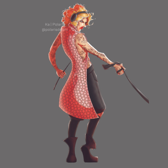
Back on posting old art I never posted, Frau Schneider, my beloved 🖤
I'm seriously considering turning her into a sticker and slapping it everywhere I need to remember something to do. Drinking water? Frau is there judging me. Writing? Frau is waiting. Sleeping at a decent time? She's at the clock, looking at me with hatred in her eyes.
Jokes aside, this was more of a try on stylized drawing, which I completely suck. Since I studied Schneider's face thoroughly once for another drawing, I figured stylizing him would be easier for me as a first try.
I love his nose HAHAHAHA that's my anchor on his likeness xD
Sketches, breakdowns on how I got here, what I thought on shapes and more on his features - and just general artist blabbering, down below!
It was born from these loose sketches:
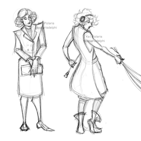
And I do like the ~proper~ one too. Took a lot of screenshots of the video's making of to understand his mannerisms when ~in Frau~, and there's a big change between the video and the live versions.
Video is a proper, collected, older woman with a dark side from repressed unfulfilled desires, live one is a brute, angry, harshly dominant one. 100% angry all the time, taking her dogs for a walk 🖤
Keeping some harsh shapes on the first one 'cause we all know she's evil, and some more organic ones on the second one 'cause she's UNHINGED.
(Also, Frau's coat are a thousand little Edelweiss 'cause you know. Schneider, Austria, his wife hahahaha aaaaand I have roots from there too, so I decided to shamelessly slap Edelweiss everywhere xD)
Another interesting thing to note, was trying to keep the male proportions on a female presenting appearance. Because we all learn about better shapes for women, how they usually are ~smaller, softer and more delicate~ than males (please read with sarcasm) but Schneider is still a man in woman's clothing, acting like a woman. So I had to keep in mind what I'd draw if it was just him as himself - big hands, big feet, tall as a fucking tree, very large shoulders, toned arms and muscles, all that. No ~delicate~ features 'cause he's still a man, but in here he's a woman.
I'm not saying I succedeed. But it was a good first try :)
Given I have so many drag queen original characters, it's something I think it was nice to study and have in mind T-T
About his features, like I said, I studied him once 'cause I was trying to go for stylized Live aus Berlin Schneider illustration once, but all I got is: I can draw his likeness from memory now, that's it *cries in incompetence*
I said before, I'm not good at stylizing.
So, his key features are: very slim and small mouth, big nose (gods I love his nose, I'll always say that), kinda small eyes and there's almost no distance to his eyebrows (on the video they paint his brows to make a LOT more arched, almost like original Maleficent), longer face, big and square chin, sharp and high cheekbones. I figured if I kept all that in mind, I'd have his likeness.
That's what I used to go figuring out how to draw Frau like that :)
And why am I blabbering all this?
I just hope it helps other self-taught artists out there who have a hard time finding resources and see other people's drawings and go "oooh man how do I get there?" and the artist always go "I dunno just draw a lot and you will get there :)"
Yes, yes, draw a lot. If you don't practice, you won't learn. But there ARE tools, observation studies, drawing studies and a WHOLE lot of things you can learn from other people to get where you want to faster and easier - but most of these resources are, nowadays, behind a paywall. So I just figured I'll share what I learned and hopefully it'll help someone struggling with the same things I did less than a year ago ;)
#schneider#christoph schneider#art#stylized art#illustration#character art#I'm just having nonsensical fun at this point hahaha#I do pity enourmously my mentor#getting all these crazy unhinged people drawings to analyze#but hey I don't make the rules#frau schneider lives rent free in my head#and schneider too for that matter 'cause he's the reason why I remembered I can't live without music#rammstein#frau schneider
35 notes
·
View notes
Text
i've started a little series of weekly posts documenting every MoC i made (digitally) over the last few years:
Week 9: 2022
some old MoCs returning, lego art, 90th anniversary toa team, video game stuff and more Rock Raiders (yay)
this one will be the penultimate week.
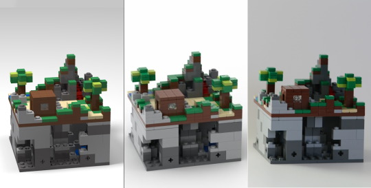
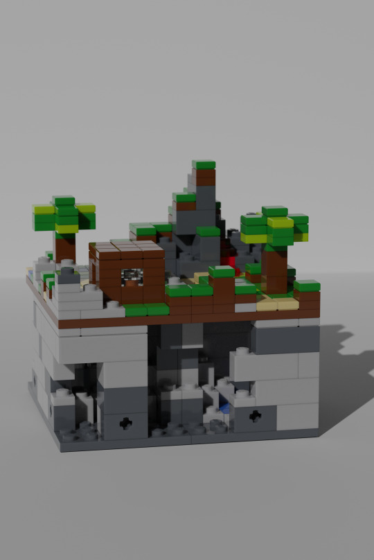
remember back in week 2 (2018) where i tested out the differences in rendering between stud.io 1 and 2? i tested out the mecabricks extention for Blender to render some digital bricks.
this took way too long to setup and render, so i decided to not use blender for rendering after that (escpecially after the win11 updated fucked with my graphics card)


another mandalorian s2 set MoC. din djarins N1 starfighter, based on the last N1 set we had back in 2015. i think these proportions aren't good, but a bit better than the official set. (its still too big though)


the Horizon: forbidden west set was also teased/revealed around that time, so i decided to make a diorama with just the watcher (and one with a corrupted one) that would be a bit more managable in both cost and size than the tallneck.
i still got the tallneck, becauce those robot dinos are cool as hell and i want to support video game based sets, even though i am a big supporter of the concept that LEGO should make more original themes instead of big and expensive licensed sets (like rivendell....)


some greebles inspired by the ones on the Icons (formerly master builder) "theme" of sets, also my header image for tumblr.
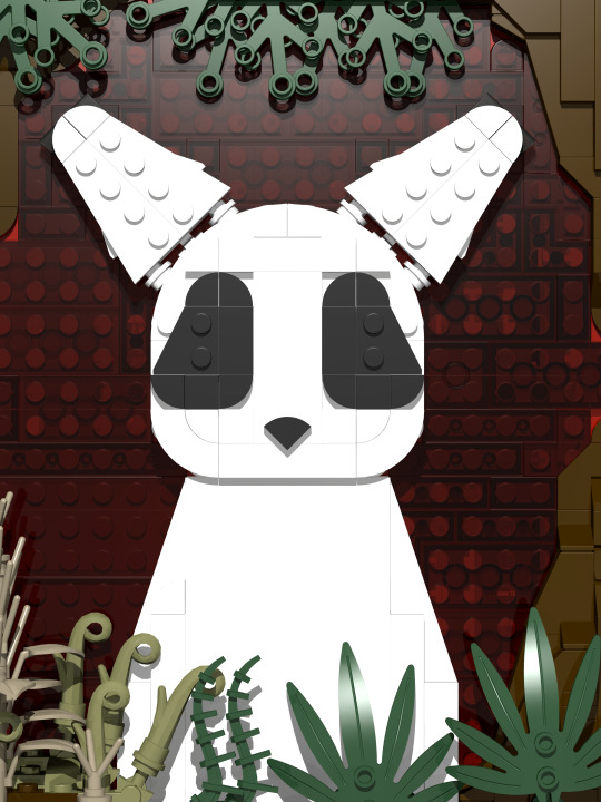
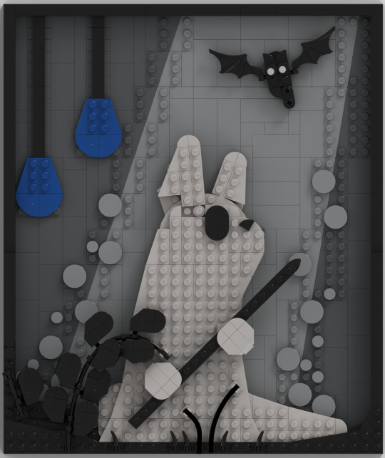
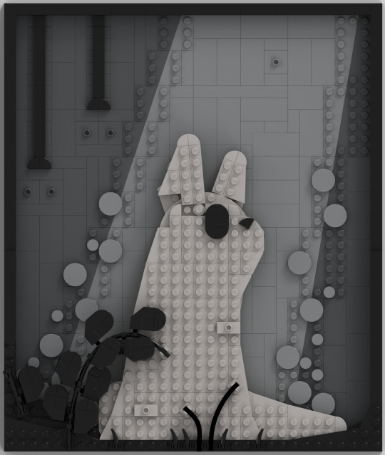
back in 2017 (week one) i made The Slugcat Portrait mosaic, and i decided in 2022 that i would remake it to be more in line with the way i would built with bricks at that time. i think i improved wuite a bit.
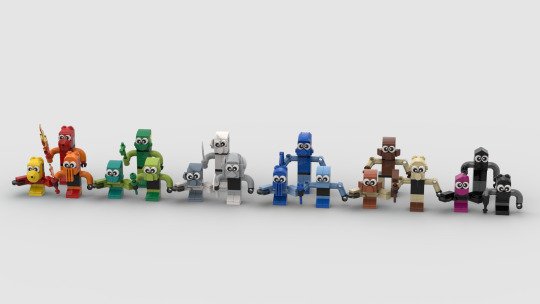
i like the 90 years of play tahu, even if his design was considered to be controversial, so i decided to make the full 2001 set lineup for bionicle. i think they turned out pretty good, but i find it a bit annoying that the maccaroni piece does not exist in tan or medium blue (a dicontinued colour)

anyone remeber Valley? the momentum-based FPS platformer? no? it wasn't really mind-blowing, but i still enjoyed the movement and flow of the game. i also always wanted to try out the Legoland Miniland style of character building. this was the perfect opportunity to combine both of these things.
i think the proportions might be a bit off, but i still like this little desk friend
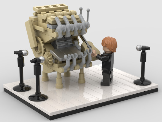
someone asked me on twitter to send them the instructions for my marble machine MoC (as seen in week 7), but i didn't want to give them such and outdated build, so i re-designed it to be more up to date.
they ended up giving me about 14 $ for these instructions, which made me pretty happy.

i tried to make a micro-scale version of the exo-force set 7701 Grand Titan. i really dislike the way this one turned out.
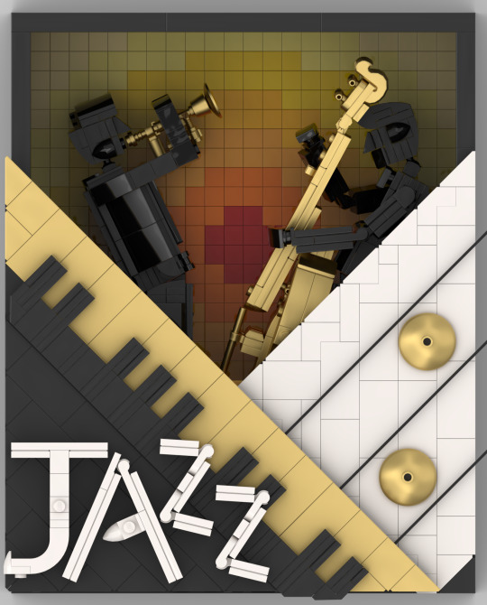
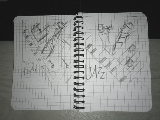
Lego Ideas had yet another contest. this one was about designing a poster for the then new 21334 Jazz Quartet. i called this one "Golden Sounds" and it is the first mosaic-type MoC that i made where i first sketched it out to kinda figure out how i wanted it to look.
i like the way this one turned out, but i think i should've built it in such a way that the colours in the background wouldn't be as dim.

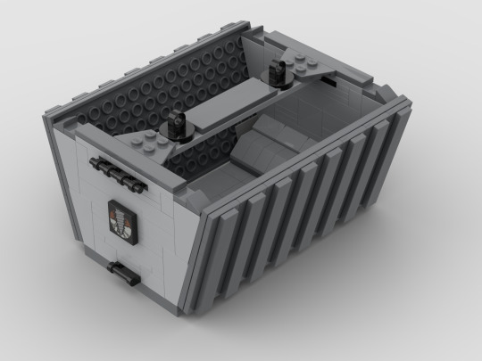
remember last week when i said i wanted to make more Rock raiders MoCs? turns out i did. a lot too.
this VTOL-style transport vehicle was kinda inspired by those industrial transport helicopters and was supposed to be some sort of reimagining of 4980 tunnel transport. i think it's a bit too clunky and a bit too skinny at the same time. not my favourite.
also there's a modular open container (is that what they're called?) that can be fixed under the vehicle. (as well as the room container that you'll see next)
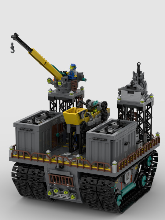
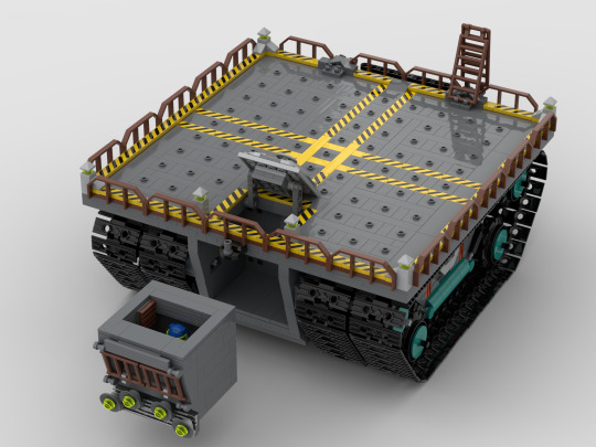
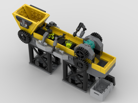
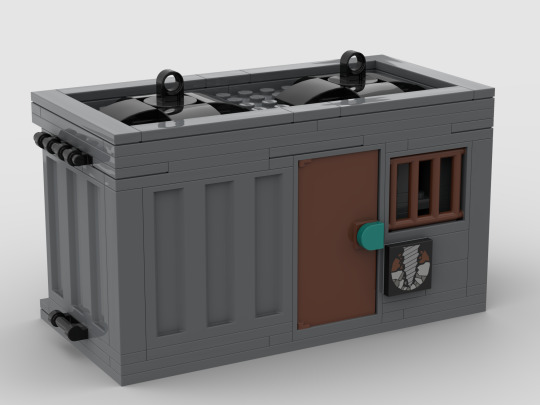
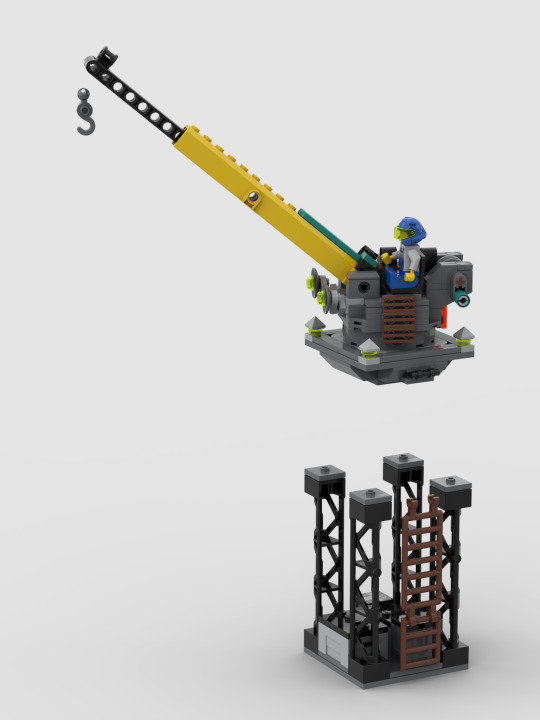
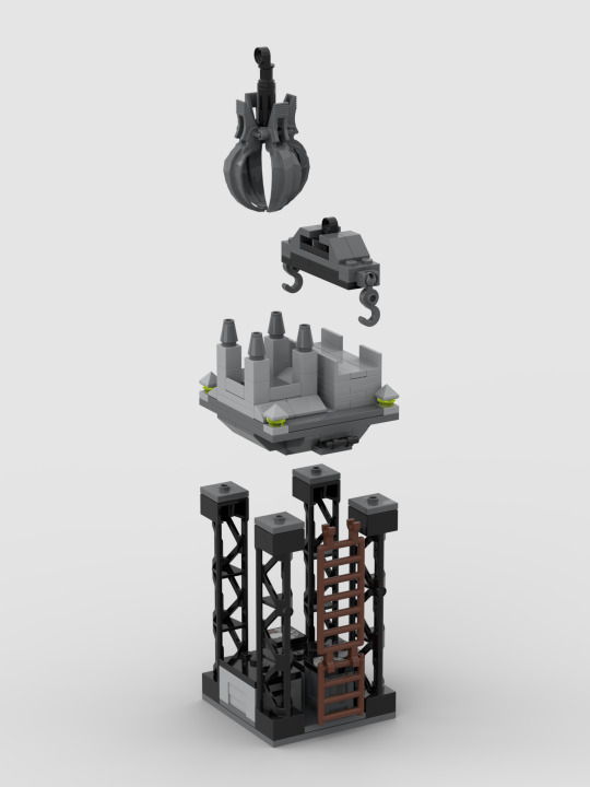
Modular bases are so cool you guys. this one is inspired by 4990 Rock Raiders HQ and those big old moving platforms Nasa uses. it could be controlled with a motor, has a removable cockpit (with an access hatch) and the platform has a lot of room for modules. like the crystal refinery, the room container, the high platforms, the crane and the crane attachment holder.
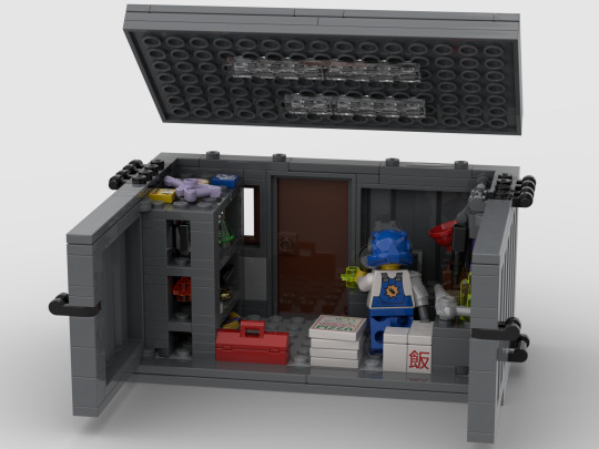


here are a few variants for the room container: an artifact storage with workbench, a small break room and a laboratory. i like those and i might do more in some time in the future. idk yet.

my take on the rock monsters. some crystal infested/energized Fauna.
first some bipedal designs (the left one is a modded version of a deviant form an eternals sets) that could be more agressive carnivore types.
in the middle are some quadrupedal guys that could be a bit less agressive and even friendly. Left is a modded version of my SCP 860 creature from week 4 (which was based on either an legendary beast from Chima or a dragon from elves) and the right one is a recolour from the fluffy-tailed Hog from my satisfactory series from week 3
and lastly, some insectoid designs, a kind of beetly creature and two ants, one of them with wings. these could be some sort of neutral (like in minecraft) swarm that might be a problem for buildings and cocky miners.
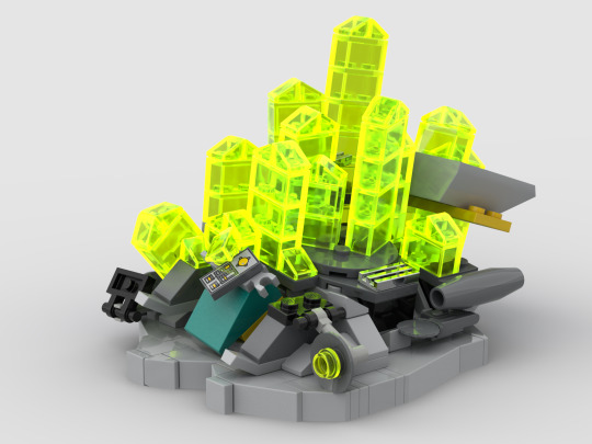
this is probably my favourite of my Rock Raiders Builds from 2022. it's 4920 rapid rider built with modern pieces that has been overtaken by the energy crytals. it can be fully freed from crystal and reassebled, which is nice.
we'll see another rapid rider next week...
first week last week final week
#lego#lego moc#lego minecraft#the mandalorian#horizon zero dawn#rain world#valley#wintergatan#marble machine#exo-force#lego jazz quartet#90th anniversary tahu#rock raiders
7 notes
·
View notes
Text
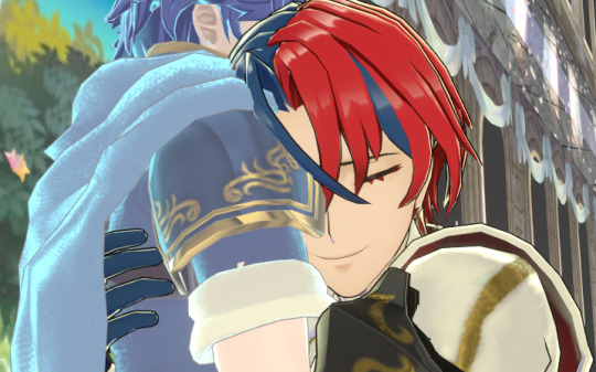
Bonus Content & Bloopers for the fake marlear screencaps
(I love behind the scenes stuff ok can you really blame me)
Ripping animations to help with some basic expression work was..... it was an adventure.
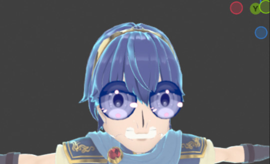
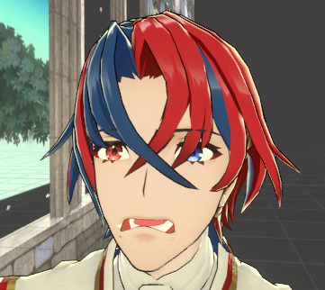
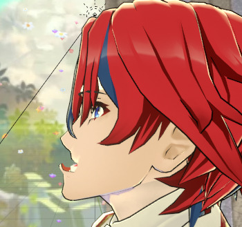
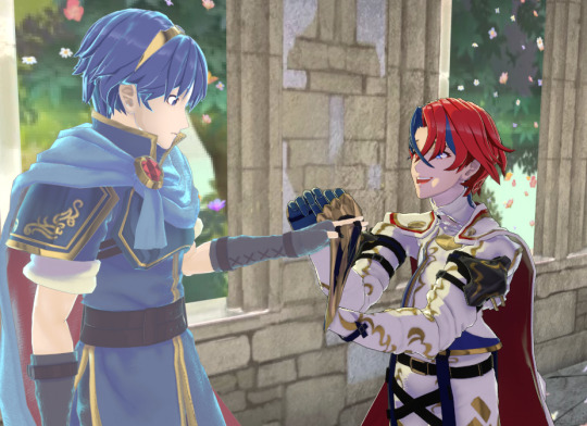
The first image above is an attempt to blend Marth's "surprise" and "smile" faces together but I uh...... Hit the wrong setting in the dropdown. I nearly died from laughing too hard pff.
The Alears there are what happens when you import the characters face rigs with different settings (still screaming at myself for that one) and then try to use a facial expression from one of them on the other one of them. That was supposed to be an :0 face.
The FEH players among you may have recognized the setting of that piece as the scenery for S supports in FEH! Figured if I'm setting the scene in Askr anyway I may as well go for the cheekiest spot. :P
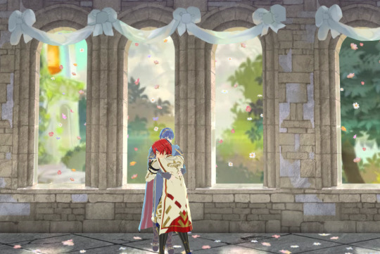
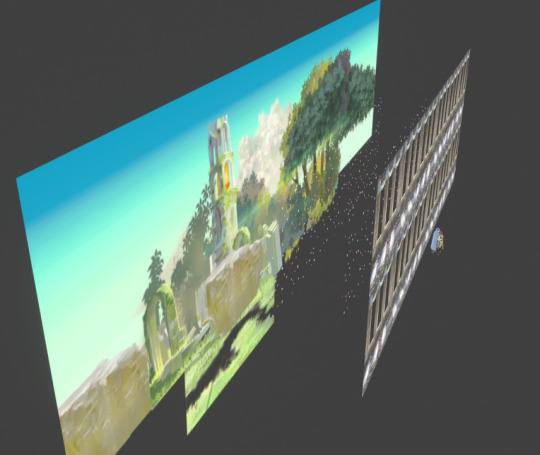
While it probably would've looked great if I'd modelled all that out, after the effort that went into getting the character models looking good I really just did Not have it in me to do that, so this scenery is... A complete and utter lie made of layered image planes.
This was part of why I opted to crank the depth of field so much in the final piece. Helps hide that everything aside from the guys themselves are crusty PNGs. :P It does a half-decent job of looking like a 3D scene even in motion though, so long as you don't rotate the camera TOO far.
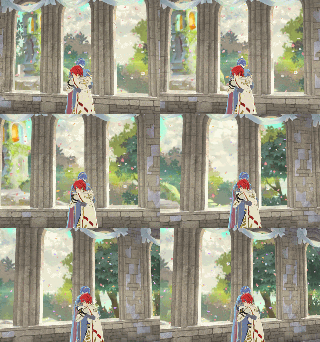
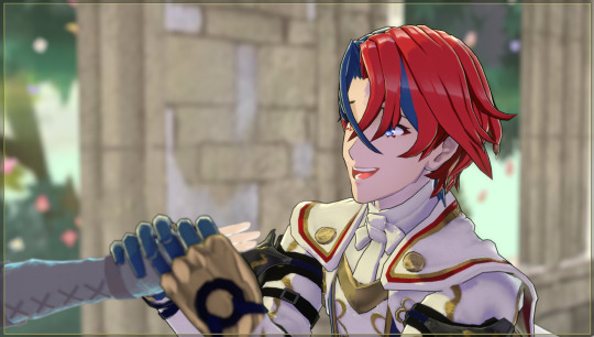
I REALLY liked how these close shots of Marth and Alear for the first pose turned out, but in the end I didn't think they fit with the other two poses. There was a timeline where I modified the expressions a bit and made fake dialogue boxes where they're talking about how surprised and happy they are they can actually touch each other in Askr, but I didn't feel confident enough to write in their voices for that.. So in the final shots that story just gets to be implied in their poses and expressions instead.

For the hug shot, I feel it is important to reveal that Alear's head is clipping halfway into Marth's shoulder and armour there. It's fine though. Animate for the camera, professionals always say! If it isn't gonna be viewed from every angle it doesn't have to look good from every angle. :P
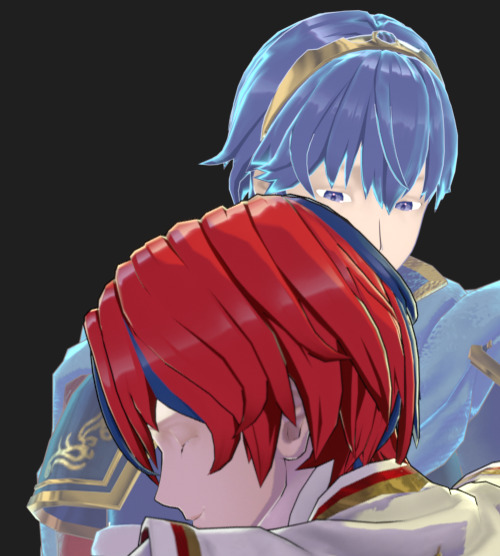
Engage renders their characters' eyelashes and eyebrows ABOVE their hair, no matter what, in order to help the readability of facial expressions. I wanted to stay true to that look, so I had to render their eyebrows and eyelashes separately and then combine them in post. Enjoy eyelash-free Marth and Alear. :P
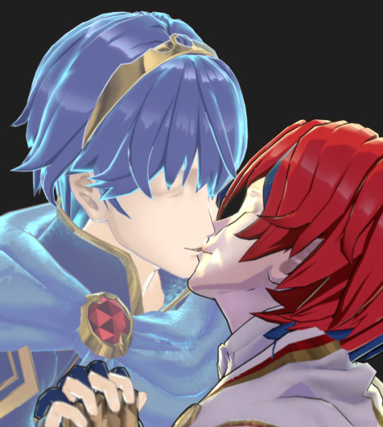
You can also see some areas there where I had to manually fix some shading and outlines in post, too. Blender has a bug with rigging right now that was affecting the face shading in odd ways, so I painted over that; and the inverse hull method I've been using for most of the outlines is very much imperfect and needed touching up in some areas, lips especially.
Since these character rigs were.......... We'll say not intended for use in Blender, they were fairly tedious to get posed right. No rotation or location constraints. These were joint-only rigs with no connections between bones so you couldn't use the auto-IK feature to, say move the whole arm at once. (Which made hand posing the WORST THING EVER AAAA EVERY FINGER JOINT MOVES INDIVIDUALLY why did i pick TWO poses where hands were a critical component)
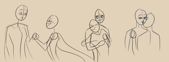
Part of my process ended up being doing rough sketches of what the final shots were going to be first, so I could keep in my head what sort of poses and expressions and camera angles I was going for. And by rough I mean ROUGH. I kept laughing looking at these little egg head guys for reference as I worked.
Engage's models also come with some "extraneous" bones; "piv" bones that I can't figure out what they do, spots where weapons and shields can snap to, "vol" bones for changing the thickness of specific body parts as defined in the big XML file of character proportions buried in the game. Unfortunately these bones overlap the actual posing joints in many cases, so until you get fed up enough to find and hide them all, you'll try to move the character around and end up doing shit like this by accident
(Me too Marth, idk what the hell his skeleton is doing either)
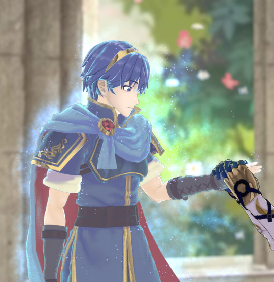
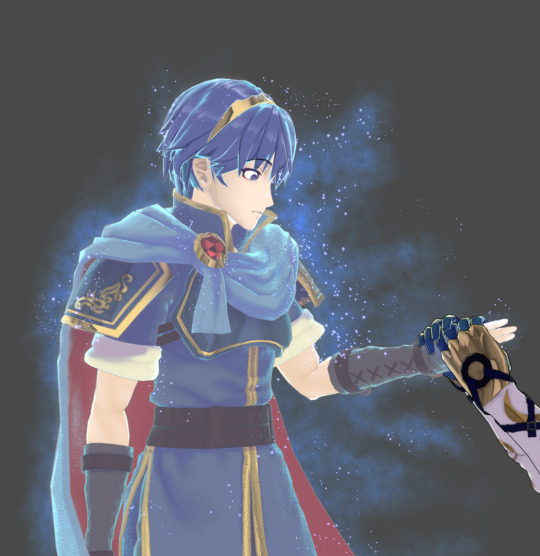
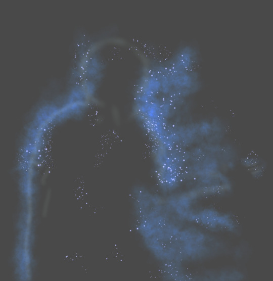
And as you may have noticed - no particle effects in these behind the scenes shots so far! That's because I both A) couldn't for the life of me figure out how to do that smoke effect, and B) couldn't render a particle system with anywhere NEAR the number of objects I would need to get a similar look to the game. So, I drew those in post! Shoutouts to the random sparkle and smoke brushes in my collection, you're the real ones.
#my art#i like treating my art like the DVDs from my childhood and including blooper reels and bonus contentwhenever possible#i just think its fun to do! documenting the process n all that#also nicely proves that i made this shit with my own two hands. i struggled for this y'all
4 notes
·
View notes
Note
Bumblebees and comissions!
Eeeep!!! So glad someone picked that!!
So basically it's one of the final chapters of Eyes and Fanart fic I have.
I'm so excited and happy to share this snippit!!
"Yes! Her!! Her name is Pollen and she's a kwami." Chloe smiled brightly at Marinette. "Do you think you could incorporate her somewhere?" Chloe asked, her eyes pleading. "Yeah, I can." Marinette nodded, going to her sketchbook and pulling up a blank piece of paper. Taking out her sketching pencil, she began to sketch Pollen from memory. Meanwhile, Chloe looked at the patterns going and studying how each one looked next to a different button, before going to the next one. Marinette stopped her sketching, going and holding out the book to Chloe. "Is this close?" She asked. Chloe took the sketchbook in hand, going and looking at it. Her heart squeezed as she saw her Pollen. Some of the proportions were off but she could easily tell it was her kwami. "So, she has more fur around her neck. Her arms and legs aren't the same size, but other than that, yes." Marinette nodded, taking her notebook back, jotting down the changes. "Alright, have you-" Marinette's words were cut off as the lights flashed on, causing the girls to squint in the random light. Looking at the door, they saw Kim standing in the doorway. "Why are you guys in here with the lights off?" He asked, tilting his head as he was looking at the girls. "I wanted to make sure the patterns worked well in the darker time also." Chloe said, gesturing to what was before the girls. "Oh! That outfit that Marinette's making?" "Yes." They nodded, sharing a strange look as they spoke together. "Oh that's neat. Rose is right, you should really consider making it more of a thing." Kim said, peeking at the stuff before going up to his seat. The girls watched him before turning back to the materials infront of them. "Alright, so, these are the pairings I thought looked good in the dark." "Ok, which ones do you like in the light also?" Marinette asked, jotting down notes as Chloe began looking through the options. "Definitely not this one." She removed one that was a darker pastel yellow and a solid gold button with a diamond in the middle. She looked through more of the options, replacing options with other options. A light yellow against the black was considered before she shook her head, moving around to see a pale yellow but not quite pastel, resting a sapphire against it. Possibly, but she still wasn't satisfied. "Marinette, do you think I can take these with me and figure it out later?" "Sure, Chloe. That'll be fine. Just don't lose the samples." "Like I'll lose anything." Chloe rolled her eyes, beginning to place the items back in the respective bags and placing them into a safe holding spot. By the time they were done, students started filling in more. Marinette went to her seat besides Alya, opening her sketchbook to a page and started showing Alya something. Meanwhile, Chloe was trying to figure out if she could somehow get ahold of Ladybug to show Marinette Pollen so she could incorporate her sweet kwami into her outfit.
#eyes and fanart#my fic#wip#my wips#hehehe#Chloé being good#marinette dupain cheng#miraculous ladybug#miraculous#ml#Chloé misses Pollen
6 notes
·
View notes
Text
Silhouette Process


It goes without saying that I started with silhouettes. But I've always been a bit unaccustomed to drawing them. I know silhouettes allow you to quickly experiment with various shape combinations using geometric forms. Still, my problem is that when a character is more realistic and straightforward, I'm not sure how to approach the silhouette. When a character is fantastical, there are many elements you can play with (like in the image above). However, my current female protagonist is just an ordinary, average 25-year-old woman, a bit anxious and negative. Her defining elements are also prevalent: glasses, loose clothing, and a slightly fuller figure. So, when I first tried drawing her silhouette, I was a bit stuck.
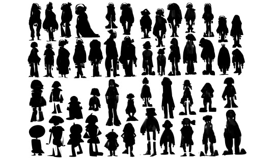

Learning and Realization
You can see in the bottom left of the image above that those shapes weren't very appealing. I genuinely didn't know how to explore the silhouette for such an ordinary character. It wasn't until I started observing silhouettes from 90s American cartoons that I realized their characters were also quite simple and ordinary, with no particularly cool elements. Yet, their silhouettes were very appealing and recognizable. I gradually came to understand that drawing silhouettes has nothing to do with whether the elements themselves are cool or not. The key is to boldly experiment with various proportions and combinations based on the character's personality and distinguishing features.
Also, when drawing silhouettes, you can't just draw aimlessly. Instead, you need to experiment consciously. For example, for this silhouette, should I try big glasses? A tall and slender proportion? Big shoes? Which personality trait do I want to highlight? Which characteristic? You need to constantly think about these things during the silhouette drawing process. Then, after translating these thoughts into combinations of geometric silhouette shapes, the silhouette will emerge. At the same time, these silhouettes are designed with purpose, which makes it very easy to see at a glance which attempts don't look good and which ones work!
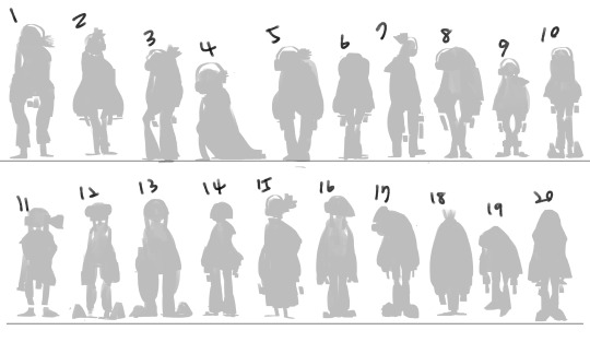

From Silhouette to Line Art
After developing the silhouettes, I picked out 20 character silhouettes that I thought were promising and simply drew their line art directly. After all, sometimes a silhouette looks interesting, but it can turn out quite differently once you pull the lines. But as I just said, because you're drawing silhouettes with a clear purpose, it's pretty easy to sketch out the lines at this stage. This also allows you to verify whether the purpose you had in mind was achieved through the silhouette shape and line art, giving you the desired feel.

From Silhouette to Refined Line Art
After completing the previous stages, I selected six silhouettes that I found most interesting and proceeded with initial proportion adjustments. When I first drew the silhouettes, I did it very quickly without much thought about proportions, mostly focusing on whether the shapes were interesting. This often leads to overly balanced, uninspired, stair-step proportions. So, after making the initial proportion adjustments, I redrew slightly more refined line art to achieve a more detailed representation of the character's conveyed essence.
Finally, during my discussion with the instructor, we both agreed that numbers one, five, and six were worth developing further. So, I will likely continue to develop the female protagonist design based on this outcome.
Reference
Pennyfarthing, D. (2011) Cadbury Silhouettes. Available at: https://dppennyfarthing.blogspot.com/2011/01/cadbury-silhouettes.html (Accessed: 22 June 2025).
ArtStation (n.d.) [Artist Name if available]. Available at: https://www.artstation.com/artwork/lxno3k (Accessed: 22 June 2025).
Valdivia, P. (2015) 31 Cartoon Network Characters You Probably Haven't Thought About In Years. Available at: https://www.buzzfeed.com/pablovaldivia/cartoon-network-characters?epik=dj0yJnU9dlM0T2pfVlZEU0NJYktzMDl4ajkxZ0N0dDZXeHBGcW4mcD0wJm49LTFoYnNJVXRzZWhYU2FkMldCQ242USZ0PUFBQUFBR2hXM01r (Accessed: 22 June 2025).
0 notes
Text
I drew some TMNT sketches
These are all pictures that are taken at weird angles to avoid shadows getting on the drawings themselves.
Everything's under the read more cause it gets LONG 🥲
This was the first one. It was alright, although looking at it now, I wish I had not done the shadows 😅
I drew Mikey second and DANG this boy gave me trouble! He looks so PRECIOUS, so I forgive him.

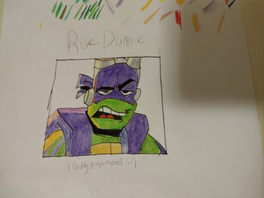
This is when I realized that I could use a piece of scrap paper to test my colors. I think Raph turned out GREAT, and this is also when I figured out how to do the block shading (I added it to Donnie and Mikey after)

I did not do Leo next (mostly cause I couldn't find a good pic) so I did this sketch that I HATE because Donnie's face is bad. Like... it's just bad.
Then I finally found a good pic for Leo! His face is so pointy tho, and it REALLY bothers me cause I can't get it to look right for me. Other than that, the only problem was I have to use a highlighter for his mask and sash thingy and it gave me grief. He also looks too buff. Like I couldn't get the right proportions, so he just looks slightly strange. (I end up having this problem with Mikey and Donnie too 🥲)

Next I did 2012 Donnie. I'm not used to drawing 3D, so I did 2D. It was a nightmare and I wish I had used the crossover episode as a reference instead. Overall, Donnie turned out decent.
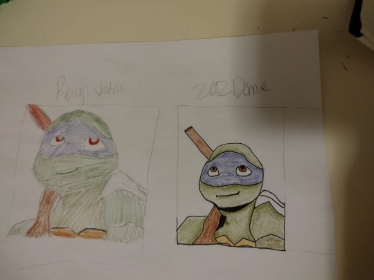
After Donnie, I did 2012 Raph. I did NOT learn from all my mistakes and I used another reference from a normal episode. I did know what to do differently drawing wise, and Raph looks way better than Donnie. (He does look like he's holding the camera. He isn't)

I was out of the house when I drew 2012 Leo (plus a Rise Leo), so I didn't have access to my colored pencils or normal paper. I really like 2012 Leo, but AGAIN Rise Leo has SUCH a pointy head!

(the text on Rise!Leo's drawing says "Rise Leo being responsible," and then the whole "Donnie, DAD'S on that thing." Quote.)
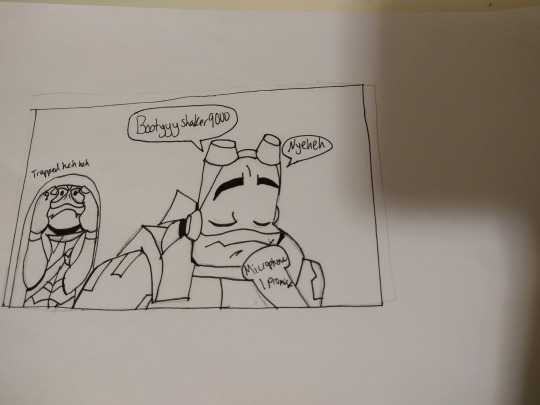
And then, finally, I made a collage/series thing. I am SO proud of this, although there are parts I despise. Leo's face? Hate it. Kinda made me want to cry drawing that. Mikey's whole self? (Not to mention the fact that I used the wrong color for one of his mask tails?) Hate it. Donnie's whole positioning with Raph? Also hate it. I got real lazy at the end (cause I'd been working on this for 2 days and couldn't find good poses for the other three)
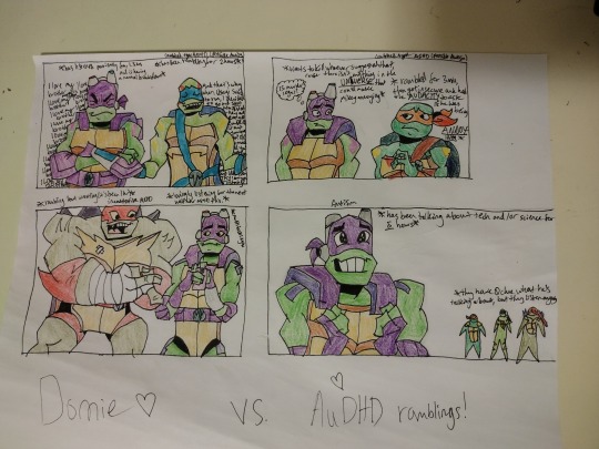
In case my writing is both too small and too messy to read, here's the translations from left to right:
1st pic: on Donnie's right "I love my brother" is repeated all the way down, getting aggressive at the end. This is what Donnie is thinking. Above him the text says "has listened patiently for 1.5 hours and is having a mental breakdown."
Above Leo the text says "has been rambling for 2 hours." On Leo's left he is saying "And that's why when Usagi said to run, I decided to go and SAVE him instead- hey, and- [missing text going behind Leo] ever get- [missing text] cause I'd- [missing text] it and- [missing text] you live- [missing text] -igh? Oh! - [missing text] -ormally- [missing text] -nd you- [missing text] not that- [missing text] so- [missing text] but- [missing text] and I did- [missing text] even TRY! Are you listening to me?"
Additionally, there is text outside the box, above Leo, that says "combined type ADHD (possibly Autism)"
2nd pic: above Mikey the text says "rambled for 3 min, then got insecure and had the AUDACITY to ask if he was being ANNOYING."
The text above Donnie says "wants to kill whoever suggested that, cause there isn't anything in the UNIVERSE that could make Mikey annoying." The text in the thought bubble says "Is murder legal?"
Outside the box, above Mikey, there is text saying "combined type ADHD (possible autism)"
3rd pic: the text above Raph says "rambling 'bout wrestling (it's been 1 hr)"
The text above Donnie says "lovingly listening for the next half hour after this." The text beside him says "multitasking"
Under the text about Raph there is also text saying "inattentive ADHD"
4th pic: The text next to Donnie says "has been talking about tech for and/or science for *5* hours"
The text above the three spikey blobs says "they have zero clue what he's talking about, but they listen anyway"
Outside the box, above Donnie, the text says "Autism"
That's all for now. I haven't made 2012 Mikey yet, just cause 2012 intimidates me because of its 3D nature. I'll get to him eventually! (He and Leo are my favs in 2012)
#disaster twins#rise of the tmnt#rottmnt headcanons#tmnt 2012#tmnt fanart#rise of the teenage mutant ninja turtles#tmnt michelangelo#tmnt mikey#tmnt donnie#tmnt doodles#tmnt donatello#tmnt raphael#tmnt raph 2012#tmnt raph fanart#tmnt leonardo#tmnt leo 2012#tmnt leo fanart#teenage mutant ninja turtles#fanart#my headcanons#sunset duo#rottmnt fanart#rottmnt#tmnt 2018#ramblings#technically i guess#Kinda#save rottmnt#save rise of the tmnt#Celeste does art sometimes
20 notes
·
View notes
Text
NO BECAUSE YOURE SO REAL FOR THIS 😭😭😭
SRSLY THE AMOUNT OF FUCKING TIME I’VE SPENT TRYING TO FIGURE OUT HOW TO DRAW SONIC AND SHADOW THE FUCKING HEDGEHOGS EVER SINCE MY SPECIAL INTEREST ON THIS FRANCHISE GOT REIGNITED BECAUSE OF HOW GOATED SONIC 3 IS. A MONTH. It took me. A fucking MONTH TO BE SATISFIED!!!!!!
(Special thanks for the ppl who gave me tips on how they draw their hedgehogs as well as my best friend for encouraging me to continue <3 body doubling n stuff while they also drew them as well. Theyre amazing and i love them ahsnwhsjzhxg)
ANYWAYS! QUILLS! A tip i got from either the idw video for how to draw sonic or the how to draw movie sonic video by Tyson Hesse from paramount is to work your way from the bottom quills to the top(?) especially bc the bottom ones are the ones that tend to be the longest— especially with the case of Sonic. This still depends on how you wanna go with your artstyle tho; overtime i would go back end forth through all the quills till i feel that they are proportionally right. Augh i swear— low key shadow’s was easier for me than sonic’s, but i realize that is most definitely because of how much i love to draw swoop-y and fluffy hair in my illustrations that has the tendancy to point upwards. And with Sonic’s iconic quills turned downwards and how i’ve struggle with drawing hair thats slick down, clean cut, and or not messy? Yeah. Of course i struggled with sonic ahsjbwjwh sobs TwT
Also OMFG DID THEY LOOK WEIRD AS SHIT TO ME WHEN I WAS FIRST FIGURING OUT HOW TO DRAW THEM WITH JUST THE SKETCH. LINING IT HELPED BUT GUHGHGHGH DID THEY FUCKING ELUDE ME FOR A WHILE. Learning the rules then bending and simplifying the process of how i do it definitely also helpse hsjwhwjwhjehe
AUGH THERE’S ALSO THE MATTER OF PERSPECTIVES AND ANGLES AND HOW DIFFERENTLY THE QUILLS CAN LOOK WHEN YOURE LOOKING AT THE CHARACTERS FACE TO FACE, AT A 1/4 (or was it 3/4?) angle, sideview, and their backside. Again, shadow is low key easier for me personally bc of how his quills are structured— HAVE YOU SEEN HIM????? CUTIE PATOOTIE SPACE HEDGEHOG HAS HIS QUILLS SHAPED LIKE A STAR AND IT LOW KEY KINDA HINTS BACK TO HIS RELATIONS TO THE BLACK ARMS IF YOU THINK ABT IT. Dictatorial colonizer space starfishes. SORRY OKAY HE’S MY BABYGIRL AND SONIC IS MY SHAYLA i cant i will ramble about them both another time if i can because low key theyve become so important to me elpshwkabsmsbsjbw maybe as much as moomin and snufkin maybe elppppp.
BUT TO CONTINUE! i strongly recommend also watching not only tutorials and tips on how to draw them, but also watch the speedpaints of other fanartists <33 especially when you aren't actually planning on having the way you draw them to be close to how they canonically look like. i especially had to figure out how i personally wanted to draw them and such pfffft— bc actually! even in canon, they do give him a slight variation on how he looks and such! (and im refering to sonic here mostly but really pfthwnsbjxdnwn)
And through my journey on figuring out how to draw the silly little hedgehogs, i found that its not just the quills that i struggled with, but low key also the eyes and how their body proportions work exactly. But goodness is it so fucking worth it 🥹🥹🥹. Once you figure out how to draw one character, it becomes much easier to draw the rest of the cast bc you can adapt the lessons you learned in drawing the first one into drawing the others as well and catering it to them and how their world’s anatomy and physics works <3 (in your own interpretation and style <3) especially with a cast as diverse as STH’s 🥹
The inspirations i drew from with adapting how my style/how i draw into sonic and shadow is their movie counterparts and sonic prime, especially bc these are currently the two sonic medias that i am impacted to the most (even though i also grew up with a lot of the animated series and a bit of the games). This also works for me (esp with movie sth) bc AUGH I STRUGGLE WITH HOW THEIR EYES AREN’T AND SUCH WHICH IS AUGWHWVQJGQHABAHABA FOR ME PERSONALLY SHHWHWJWB. OOH ALSO! OTHER REALLY COOL STH FANARTISTS WITH REALLY COOL STYLES THAT I LIKE RAGHHHHH
But anyways, in the end, just remember to have fun and enjoy the experience!! <33 i may also link some of the shit i used while figuring out how to draw them elp ahsjwhwjhw but that is gonna depend on whether or not my audhd decides to work with me or against me with this </3 but i really hopes this personal account helps even a bit! 🫶
INSERTING MY FIRST SONIC SKETCHES HERE AS WELL FROM THE PAST FEW MONTHS TO ALSO MAYBE LIKE. SHOW AND SUCH THE PROGRESSION AND A BIT OF MOTIVATION FOR YOU TO KEEP GOING <3


AND THIS IS A WIP I’M CURRENTLY WORKING ON GEKWFWJSGDKGDF

SEEING ALL THE GOOD ART WORK OF SONIC AND SHADOW IS GREAT. BUT WHO MADE HEDGEHOG QUILLS SO HARD TO DRAW?!?!
#SPEAKING OF. I SHOULD. POST THAT ONE ILLUSTRATION I HAVE OF SONADOW. GOODBYE….#and maybe reblog this later to add resources to it elp so wbgshf#Sonic the hedgehog#shadow the hedgehog#sonadow#shadonic#QUILLS. A STRUGGLE.#sth#sth fanart#sonic art#sonic#shadow#sonic fanart#sonic fandom#sonic the hedghog fanart#Aster rambles
90 notes
·
View notes
Text



Animation Practise Week 1: Character Design (Home)
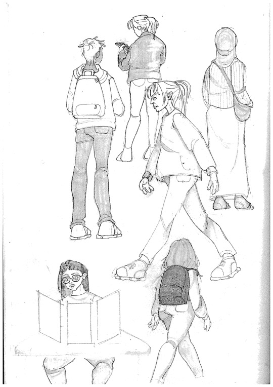
Our home task for the week was to create 2-3 A4 pages of observational people drawing. I wanted to experiment a bit more and develop my proportion skills, so I decided to make 6 pages. I used graphite pencils, charcoal and alcohol markers for my pages. I started off with graphite, a medium I've become quite used to over the past few months, using it in my personal sketchbook. I wasn't too concerned with creating much tone while using this, as I wanted to put focus on understanding the body and human anatomy first and foremost. I did still use a blending stump to add some dimension, but I now wish I had some time to include deeper tones as I feel like the figures look more flat compared to the other pages. That said, I am very proud of almost every figure I drew, and proud of how quickly I could draw the movement of some people. Granted, some of my references were standing still and allowed me to get a more detailed drawing in, but a good amount were also mid-walking, giving me the opportunity to capture some movement in my studies. One more criticism I have for myself is in the hands, which I really struggled with drawing quickly enough, and ended up making quite stylised, defeating the point of the exercise. Other than that, I'm happy with my pencil observational drawing.
Next, I decided to try and experiment with alcohol markers, a medium I hadn't used in years. I had seen some excellent observational drawings online using alcohol markers, but actually ended up struggling quite a lot while trying to use them myself. Even though they blended well, it was very difficult to make a blended drawing of a moving person. trying to put down shadows first made the art look far too stylized and smeared and bled when lighter colours were added over it. My solution was to make a somewhat 'wash' of my lightest colour as a general shape first, and then quickly refine it with the darker colours on top, making a more layered and dimensional look. I think that, while this technique ended up working well, it is a fine line as I believe some figures looked excellent and dynamic, while others seemed stiff and unrealistic. I do think this was helpful though, as I learned to better control where I place the darkest shadows and defining lines onto a figure.
This lesson was especially helpful in my last experiment, where I worked with charcoal. In all honesty, I was dreading this the most as I generally immensely hate working with charcoal. I think it's hard to work with, and hard to control. However, after learning techniques from my previous exercises (along with some online tutorials) These actually ended up being some of my favourite pages. I started out struggling, as I was trying to use a willow charcoal stick directly and make all of my tones using it, which didn't work out. After restarting, I tried using the willow charcoal stick to lightly sketch out the silhouette and basic shapes of people walking by or sitting near me, and then used a dense, round paintbrush to diffuse the lines, filling in the shapes with the excess charcoal, similar to the 'wash' I made with the alcohol markers. Then, after grinding part of my charcoal into a powder, I was able to use the brush to delicately apply deeper shadows onto my figures, making a much softer, more subtle tone. I built up the shadows with more powder until I was happy with the general shape, and finally went over some areas with a thin piece of charcoal stick to define anything I wanted to stand out. I think that this technique worked better with some figures than others, but I was still extremely impressed by how well this page was turning out. I tried to keep very dark areas and very bright areas to a minimum, instead focusing on having a range of mid-tones in each figure. Now that I've finished this assignment, I can say that I'm happy I experimented and developed my techniques, as I feel I now have a better grasp on some mediums I previously didn't enjoy, and also improved my observational drawing skills, in being able to capture a figure quickly and accurately.
0 notes
Text
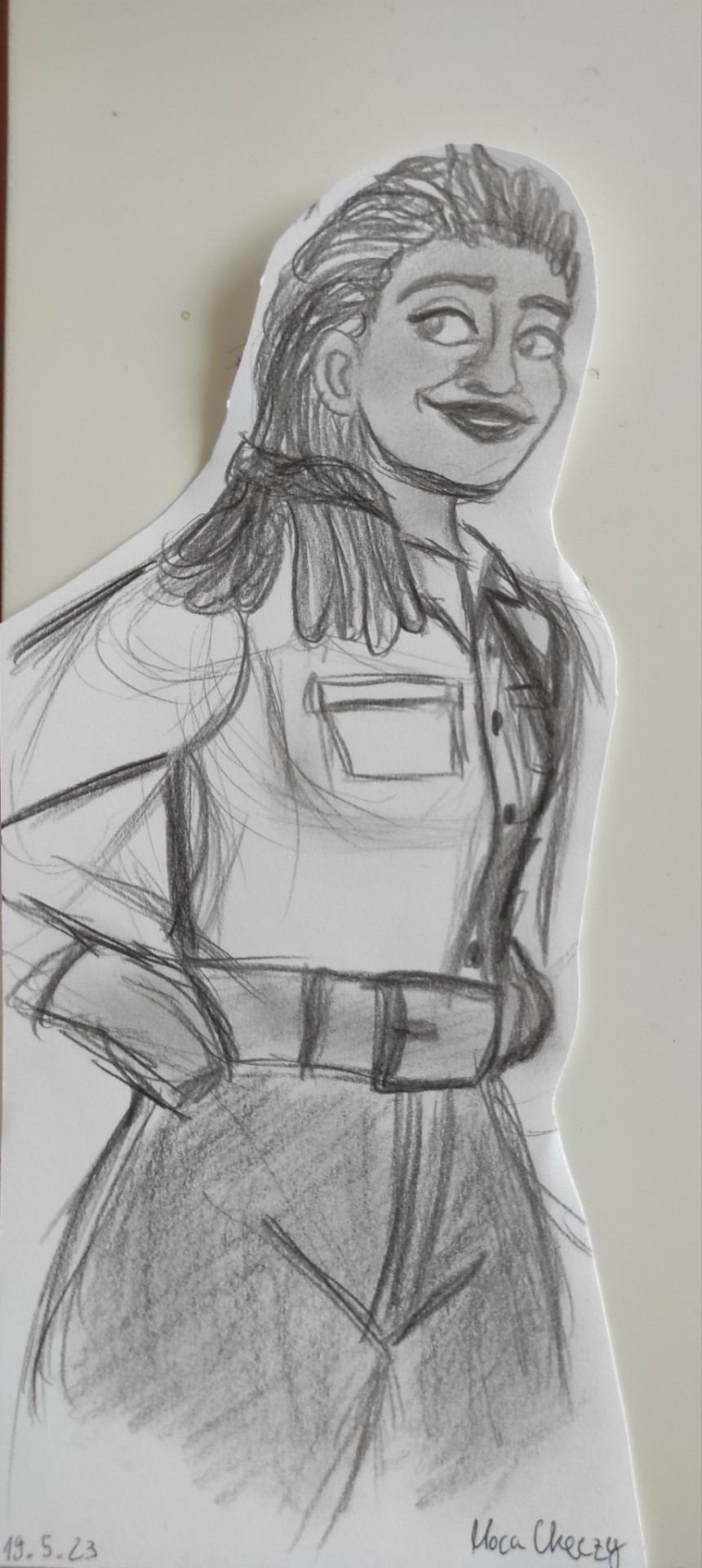
Sketch of the coolest ranger mom!
#moca draws#trying to figure out proportions and this is the one sketch that turned out good ^^#can't wait to be able to actually do details and practice the coloring!#tfe dot malto#tfe#transformers#transformers earthspark#sketch#pencil drawing
41 notes
·
View notes
Text
MH doodles and concepts
First just random fanart
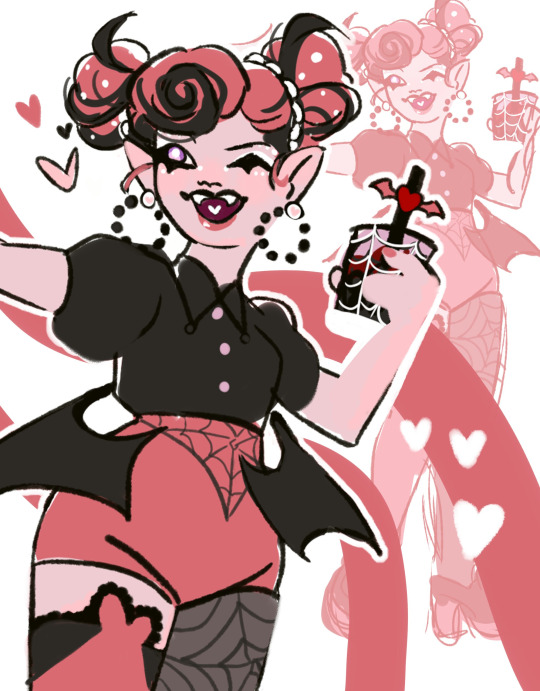
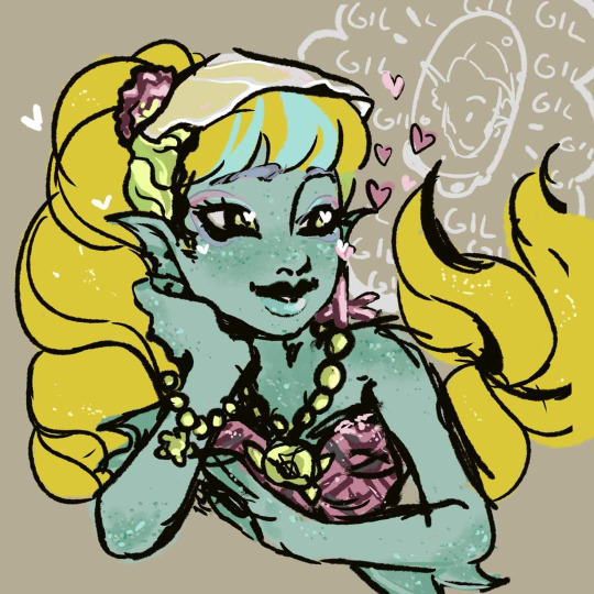
I love sweet water lagoona im sorry shes so cute
Now then those are mostly designs i stopped working on for many reasons and i can barely find good images of them now cause theyre not even on my computer. Maybe i revisit them in the future but who knows
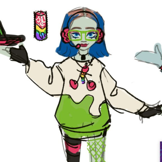
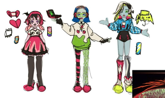
First something i tried together w the beach fan design- literally a gamer inspired line lol called gamer ghouls. i hate how drac turned out but the heart-shaped switch is something cool- i like frankie’s outfit and ghoulia is my fave here. its funny cause something i always think when i make g3 designs is ‘’how can i include drac in this’’ cause realistically my line of thinking is ‘’would these sell’’ and drac sells. i also try to keep in mind materials and how well the items would perform as toys too. drac is hideous here tho. the ghouls drinking monster was super funny in my head
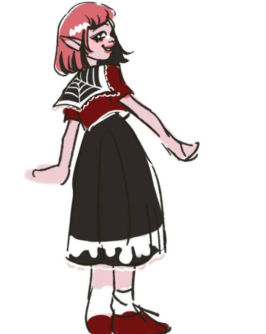
drac in uniform sketch cause why not
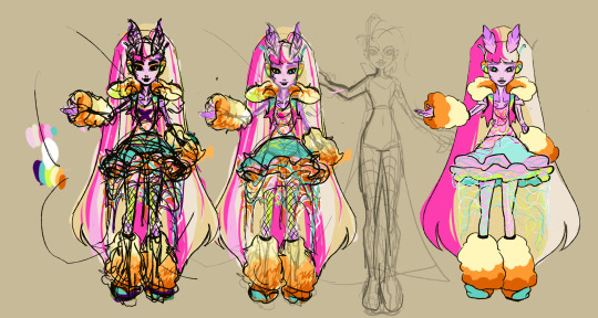
this is a rough one. its for g1, i came up w the concept talking to an old friend, bonita and venus were her favorite dolls and i came up with the concept of a cybergoth inspired Bonita doll and a more slick also cyber inspired figure for venus (shes barely sketched there).
we had LOTS of creative differences (i came with a color pallete much, much different from that since i was inspired by cybergoth, focusing on neon and dark colors) and specially after some personal stuff i just gave up. i still like the concept but i cant really stand working with a concept in mind just to realize the other person isnt interested unless its their way. i wish i can revisit her in the future and apply the stuff i actually envisioned for her- but well, so far thats what we got. cant say im happy aside from the silhouette.
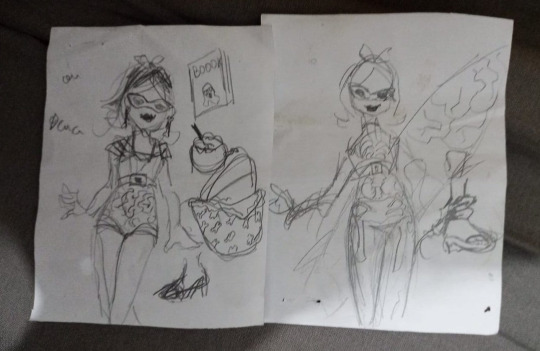
some other reaaally rough ideas for the beach line project for g3. i did most of those during my office work lol. those are for ghoulia. for her i wanted to keep in mind her 50s theme from g1 actually cause i love it so much. thats where the glam chill look came from. then i was like eh its nice but new ghoulia is way more rad and sporty so i tried to think of her doing surf (i also have sketches for deuce in surf attire so they would be fun) i have so many of those all over my house cause when g3 was barely launching i was so excited. and so bored at work. so i just got every paper note i could to sketch random ideas lol Also SILLY OC ALERT!!!
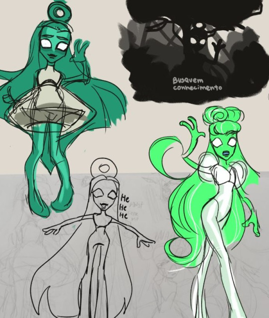
This was mostly a joke but i made her thinking of ET Bilu from a brazilian urban legend lol. thinking of her as a scary skinny legend w stereotypical and hilarious proportions common to old MH dolls was what inspired me at first but then also the whole 2012 pop diva look. Shes just a funny little gal. busquem conhecimento!
#monster high#monster high lagoona#monster high g3#monster high oc#monster high design#monster high fan design#monster high fanart#draculaura#lagoona#doll design#zitro vee sketches#sketch dump
210 notes
·
View notes
Note
Hello, I was wondering if you could do headcannons for a silco x female reader (romantic), where she is Vi and Jinx's older sister (20 y/o) and went with jinx when vander died and believes that Vi abandoned them, and her and silco are like Jinx's main parental figures.
Thank you and have a good day!
You becoming parent's to Jinx w/Silco + extra drabbles
Note: ya'll blew up my inbox with Silco and I love it
Reader: female
Arcane Masterlist ♤♤ "Here's the Dump"

You usually take the blame for everything for your sisters
Nah no one touches my sisters
But of course Vi likes to argue, saying that its your fault your parents are dead, because you left to try and make a better name for the family outside of Piltover and the Lanes
You stormed out in anger not wanting to esclate things with powder begging you to stay; you said you'd come back for her
Did come back for her but just a bit too late.
Found you near Vander, with a large shard of glass in your calf.
Powder ran into your arm so quickly, crying her eyes out
Vi only contuined to argue blaming you once again, Powder tried standing up to her, resulting in her getting slapped.
Angred you pulled the shard from your calf and threatened Vi with it holding it to her neck.
Tried to reason with her as well though.
"I did everything trying to help you two. To help our whole family"
Passing out from blood loss.
Vi leaving still
Powder begging for help and for Vi not to leave
Silco comes in, Powder crying into your barely rising chest, begging you to come back.
He helped both you and Powder now Jinx
Waking up in a bed and like: bitch Im t r i p p i n:
Meeting Drabble: With a groan Y/n woke up, trying to sit up.
"You'll be light headed," a voice spoke, "don't try and get up."
"P. Powder..." she called, trying to get out of bed but someone grabbed her arm.
"Lay down,"
Her eyes finally came into focus, and glared up at him, "do whatever you want to me just leave her alone."
Silco forced her onto the bed causing her to wince, "then go back to sleep."
Laid down but didnt go back to sleep
Eventually helped to sit up and brought food.
It was hard trusting any of them but then Powder rushed in you went fuck food and held her close.
Offered to stay and work for Silco, by the man himself
Yeah it went a totally diffrent way within like two weeks: there he was, putting you on his desk, ya'll making out.
Accepting of Jinx, and her chaos
He asking you to put injections into his eye even though you kinda hate it: seems painful
It was pretty early on you told Jinx that you and Silco ended up becoming a thing.
She was pretty happy for you actually, and made you both matching mugs.
She was pretty attached to the idea of you two being her parents.
As she got older she learned how to do more things, and made breakfast for both of you
"Is this ceral? Where did you get this?" "Oh! You know! I stole it! Didn't know how to cook it exactly." "Its wonderful thank you"
Both of you with eat burnt ceral to make her happy
Please hold them both together, like on the couch heads resting on your shoulder while you read
Good night kisses for Jinx 110%
Good night kisses for Silco too
Working with Sevika
Calming Jinx down turning her flashes of the past
"I've got you! I've got you! Jinx! Look at me!"
Pressing her forhead to yours helps her calm down
Holding Silco back from going to her when she needs to take a breath, "Let her breath."
You usually end up putting most before you, so Silco treats you once an a while even if its just a new book you've been eyeing
Took up sketching/drawing, you have pages filled with just him sitting at his desk and him smoking
He figures out your drawing him:
Y/n was silent, sat on the chair infront of Silco's desk he was busy doing paper work.
She lifted up the fancy pen Jinx had snatched for her while top side, using it as a sort of reference for proportions.
"Are you going to stab me with that pen?" Silco spoke drinking from the glass of brandy infront of him.
"Want me too?" Y/n questioned dropping her arm tilting her head with a small smile.
He held out a hand as she sighed handing over the hand made book.
"Don't smudge it." Y/n protested.
Silco set the book down on his papers, bringing his glass back to his lips taking another drink, he skimming through it. It must've been a family thing, both her and Jinx drew like crazy.
"Impressed?" Y/n spoke with a teasing smile the pen loosely swinging in her fingers.
"It's a family trait." Silco spoke.
"A common intrest." Y/n corrected softly, "unless you want to tell me your a secret artist and make it a family trait."
He stiffled a laugh, leaning back in his chair
"Imagine it now." Y/n teased, "the all mighty Silco shimmer dealer and industrialist, sits infront of a blank canvas wondering what will be carved out of the paints still in there tubes."
"You a writer too now?" Silco questioned Y/n smiling.
"The adventures of a gangster family. Nice title huh?" Y/n questioned, standing up from her seat and leaning over his desk, hands planted on the edge, "or...maybe something more...personal?"
On impulse he leaned forward she smiling but the door bursted open.
"Oh Y/n! It's me and you time!" Jinx cheered as Y/n chuckled.
"The next chapter later today then I suppose." Y/n teased pecking Silco on the lips and walking off to join a Hyper Jinx.
He loves seeing you with Jinx, especially if the young woman falls asleep in your arms you reading book peacefully
He often finds you gone from bed, just to find you in Jinx's room, barely able to keep awake as the girl sleeps in her arms.
If you fall asleep on the couch, Jinx will wait till you either wake up or Silco come gets you
Big titty identity crisis wine mom
Can drink Silco under the table
Family Chaos time atleast once a week
"Ha! 21 I win!" "We're playing monopoly" "wait we're not playing Yathzee?"
Y/n on the phone: no. I don't care! Just break there knee caps!
Y/n putting the phone down and looking back at Silco: so you say Jinx blew up a building
Figuring out how to cook and going to Pilltovee to steal actual ingredients: ta dah! Family meal time!
Surprisingly a decent cook
Taking care of Jinx and Silco when there sick, Jinx loves it but Silco hates it.
If your sick you just try and stick through it to the point of passing out
Jinx won't leave your side, culred up on a chair trying to read one of your books, she doesnt understand much of it
Silco often checks in on you if sick, and gets roped into silently reading with Jinx in his lap.
Honestly a wholesome yet dysfunctional family but you all love each other and are willing to do anything for each other.
#silco headcannons#lol silco#silco x reader#silco arcane headcannons#silco arcane#arcane headcannons#arcane silco#arcane#arcane x reader#x reader#female reader
2K notes
·
View notes