#web components
Explore tagged Tumblr posts
Visit Tumblr Blog
Explore Tumblr blogs with no restrictions, modern design and the best experience.
Last Seen Tumblr Blogs


Fun Fact
US Tumblr user growth rate is estimated to slow down to 4.1%.
Text
Web Components & Modular UI
You might have heard the term ‘web components’ being thrown around in UI discussions. But what are web components? And how did they come about? In this article, I will attempt to cover a brief history of web components and the benefits they bring to teams today. I will also dive into how my team uses them. But first, let’s talk about what they are: Web components are a suite of different technologies that allow you to create reusable custom elements for use in your web applications. The functionality of web components is encapsulated away from the rest of your code. This goes a long way to making them more reusable. There are three main technologies: custom elements and their behavior, the ‘hidden’ shadow DOM, and the flexible HTML templates. These are used together to create versatile custom elements with encapsulated functionality that can be reused wherever you like, without fear of code collisions.
Back in 2011, a guy named Alex Russell first introduced the concept of ‘standard’ web components. A couple of years later Google jump-started the web components ‘revolution’ with the release of the Polymer library. The library was based on web components, and served as the authoritative implementation of Material Design for the web. It was soon after this time, a little over a decade ago, that I began to work on a new web application UI project, for which I decided that web components would be a key technology in my front-end tech stack. There were regrets, especially because of the flood of browser errors. I remember a lot of searching and sifting through obscure documentations and blogs to understand how to ‘glue’ the web components together with my application. A lot of the web component implementations felt experimental and it seemed like they were not completely ready for production, to say the least. It felt exciting for the wrong reasons: It was a new frontier of development, but ultimately it bred discouragement because of the challenges.
The React framework soon came along and changed many things. I, for one, rewrote my application in React and ‘never looked back’. It was so much easier to work with. And I’m sure that other developers, who were once web component hopefuls, had a similar experience. At the time, Facebook didn’t want to use web components and build on top of them because they didn’t fit React’s JSX model used for declaring elements. This was yet another reason to be doubtful about them. But obviously, not everyone was. In 2016, the Custom Elements v1 specification was released, which laid the foundation for designing and using new types of DOM elements. Soon after, in a bold statement by Google, YouTube was rewritten in Polymer web components. They kept evolving Polymer knowing that web components were a web standard, an approved spec that modern browsers had to implement.
In 2017, a few developments started to reaffirm web components as a viable modern front-end technology: First of all, the Polymer team started to develop LitElement, a lightweight framework for creating web components. Secondly, the Ionic team created StencilJS, a JavaScript compiler that generated web components. Both of these became reference technologies for web component development. In 2018, Firefox 63 enabled web component support by default and updated developer tools to support them. With Angular 6, came Angular Elements, allowing for packaging Angular components as custom web components. By the time the Lit framework was released in 2019, people were already realizing the value of having a layer of web components, especially because of the headaches from having so many different front-end frameworks. None of those frameworks were ‘native’ like web components.
In the last five years, web components have matured significantly, gaining wider adoption and becoming a more viable alternative to framework-based components, with key advancements through new features, the development of frameworks, and increased browser support. More recently, there has been a move towards more declarative APIs and the potential for fully declaratively defined web components. Web Components are now a commonplace part of front-end development practices, with major players like GitHub, Apple, and Adobe embracing them. They continue to evolve, with ongoing efforts to improve accessibility and other features like server-side rendering. They also continue to gain traction, with increasing browser support and usage in various projects.
Meanwhile, companies are feeling the pain of having built components using a specific framework. Of course, web components solve this problem; they live in harmony with other frameworks, not against them. Teams don’t have to change their frameworks either. Web components adapt to any JavaScript framework because they are natively supported elements in HTML. It’s the standard for components and it’s in every browser. This also makes debugging never too overly challenging because of framework abstractions. They are easy to share across teams and applications, and building a design system around web components means that your design system is framework-agnostic. Libraries have made web components very easy to add anywhere and to incorporate into logic systems, e.g. through native JS events. They work seamlessly across React, Vue, Angular, or plain HTML. This ensures long-term maintainability and prevents vendor lock-in , unlike framework-specific solutions. Web components are also compatible with micro-frontends and module federation, so clearly they are being considered during development of new technologies. Related to this, I’d like to point out that the ‘staying power’ of a technology is greatly enhanced when the technology is built into a specification required to be adopted by popular modern competitors. Such is the case for web components. This is important because some even speculate that native solutions such as web components could replace all frameworks.
So how have we used web components on my team? Our web components live in a repository dedicated to developing them, testing them, and publishing them. They are published and distributed as NPM packages, making them easy to share and import. Each component comes with a Storybook story that is also imported into a separate design-focused Storybook application, our ‘design lab’, where you can visually browse our inventory and interact with the components. Two application teams have adopted most of their components to be from our design system. Three other teams have adopted some of our web components. A few other teams are evaluating our components. The set of components used, and how, varies between application teams. Most will start with the Side Navigation component, especially because it serves as a visual backbone for our platform application UX. Our Grid System component is useful as it provides spacing alignment for all other components on your web page. Of course, our data grid component is central to the functionality of important data-driven UI pages.
Our design lab application has become a great place to start exploring our component offering. Storybook gives you the tools to display each individual component in an organized way and allows people to not only learn about them but also ‘shop the look’ by changing the controls of the component and playing with the component to see if it makes sense for them. We have also built a demo application in our design lab, showcasing visual integrations of these components. This allows users to see an entire UI built with our components, but this also allows us, under the hood, to test these component integrations. More recently, we have built theme-ing previews into our design lab, allowing users to apply a completely custom theme, and see how it affects the built-in demo application and each individual component separately. This ability is quite important, because our web components are compatible with theme-ing changes, and the design lab allows one to preview these ahead of time before you apply a specific theme in your application.
It probably goes without saying that we have used the web component technology to build all of these components. This means that, no matter what front-end framework you are using, you could bring these components into your application already, and even apply theme-ing through them. Using a common set of components that work anywhere, allows you to build applications faster and with a consistent look and feel. This has huge implications, and web components are the best technology suited to deliver this kind of central, modular approach to building UI elements. We don’t want to be limited by a less-robust technology that serves as a barrier to cross-application modularity.
Thank you for reading!
Be sure to also check out this wonderful resource for web components in general: https://github.com/web-padawan/awesome-web-components#articles
0 notes
Text

i'm not a DNI person but actually do not fw me if you're like this
#what a pretentious POS#fuck gatekeeping!!! if you wanna use the sadgrl layout do it!!#if you wanna collect blinkies and buttons from gifcities DO IT!!#gatekeeping fucking OLD WEB DESIGN is LOSER BEHAVIOR and will NOT be tolerated at melis industries#newsflash - my neocities is based on the sadgrl layout#heavily modified and customized#BUT is has helped me learn CSS and HTML!!! it is a GODSEND!#sadgrl and yesterweb in general is a GODSEND!!#i've looked at how people create navigation buttons and other components#and applied these tactics to my own site!#old web is about taking inspiration from each other!!!#FUCK this commenter!
21 notes
·
View notes
Text
ended up having a longwinded convo with sister about What Would Be Considered Subversion Vs Genre, I feel like I know nothing about narratives actually
#my ramblings#ok so I think I consider pmmm a dark magical girl story and utena a subversion#because with pmmm it’s more like a twist that gets solved#and utena is more like… a web of interlocking components#role of prince + role of witch + function of the academy + ending#without being contempt for genre because it’s not a statement against the magical girl genre it’s the construction of the world#ok… I think I understand…
8 notes
·
View notes
Text
"going outside" horseshoe theory
#like it's either hermitmoding or you know like actually interacting with the world#otherwise it's just ant spirals and pacing around in circles like a stressed animal#most people are doing the latter#and i mean it kind of metaphorically but you get it hopefully#well the collective unconscious has those stressed animal currents because well i think this is a kind of a fundamental thing#not all there is but a motif one of the component architectures#also i have begun to think about computer gaming - gpus - deep learning - neoteny - computing sort of web of connections#not much concrete to say yet. also i never elaborated on my aliens post from like two years ago. or any other things#but i will elaborate. someday they will teach me syntax. and i will write a book#maybe i should've gone into like film idk i could be cyberpunk/biopunk david lynch#/delusions of grandeur#but then i would not have the data or information so i would not have my ideas#does anyone who makes moving pictures want to collaborate with me that is listening and learning while i explain my ideas#come on cia guy...... i know you have connections
2 notes
·
View notes
Text


Kathy Carter, Arthur I, Duke of Brittany, in History and Literature Julia Smith, Province and Empire: Brittany and the Carolingians Jean Markale, Celtic Civilization Bernard S. Bachrach, The Origin of Armorican Chivalry dir. Anthony Harvey, The Lion in Winter Euripides tr. David Rudkin, Hippolytus Céline Fallet, Arthur de Bretagne Gwenno Piette, Brittany: A Concise History Tri Yann, Arthur Plantagenest
#what's that? you almost completely changed your identity to your wife's country and customs?#and the most accepted version of your death is after you fell off the most necessary component of said country's combat? 🔍👀👀#Duke Geoffrey#web weaving#twelfth century#*the 2nd one is 100% addressing xenophobia in chroniclers of the time but I do find interesting#that the stress on horsemanship echoes Bachrach‚ Littleton‚ Malcor‚ etc.
8 notes
·
View notes
Text
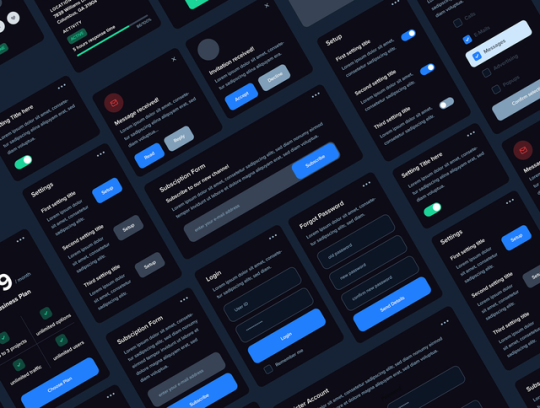
Component Libraries: Should You Build Your Own or Use a Prebuilt One?

Component libraries are a vital tool in web application development in maintaining uniform design, shortening the time taken to develop web applications and improving reusability of the code. Some developers find this dilemma; should they create a component library or use an existing one? In addition, they help reduce the struggle while building well-designed and interactive websites because of the availability of animation-oriented UIs such as Accentricity UI among others. Now, let’s get more to the point in order to help you find the right way.
What is a Component Library?
Component libraries are collections of reusable UI elements such as buttons, forms, modals, and more— and are intended to reuse the components across several projects. Such libraries not only guarantee a consistent look of an application but also save time and costs during its implementation because the elements have been already coded. So, there's no need to build components from scratch.
Prebuilt Component Libraries

Prebuilt Component Libraries
Prebuilt component libraries are the ready-made collections of different UI components that are specifically designed and optimized for common use cases that developers can face during development. Some well-known examples include:
Material-UI (MUI):
A library based on React and it follows Google's Material-UI design, MUI allows a comprehensive set of components customization.
Ant Design:
It's an UI design system framework for enterprise-level products, ant design offers built-in themes and a rich set of UI components.
Bootstrap:
It's an widely-used CSS framework that provides basic components and a responsive grid system.
Pros of Prebuilt Libraries :
Rapid Development: Prebuilt libraries save a lot of time of the developers by providing pre-designed reusable components that you can quickly integrate into your project.
Standardized Design: They help ensure a consistent user experience across different screens and features.
Community Support: Many prebuilt libraries come with robust community support, providing a wealth of tutorials, plugins, and enhancements.
Cons of Prebuilt Libraries
Limited Customization: Customizing components to fit your unique design can sometimes be difficult, leading to constraints on flexibility.
Performance Overhead: Many prebuilt libraries come with extra features you may not need, which can bloat your codebase.

Pros And Cons of Prebuilt Libraries
Animation-Centric Libraries: Bringing UIs to Life
In recent years, a new category of libraries has emerged, specifically focused on providing built-in animations and smooth UI transitions. These libraries not only offer pre-designed components but also emphasize adding dynamic, interactive features to web applications.
Here are some popular examples of animation-focused libraries:
Lottie
Category: Animation Integration Library

Lottie:The industry standard for motion design
What it Offers: Lottie allows you to render animations created in Figma or Adobe After Effects as JSON files using the built-in plugins. These animations are then rendered natively on the web, offering high-quality motion without a heavy performance impact.
Why It’s Useful: Lottie is perfect for apps or websites requiring rich, scalable animations that are lightweight. It’s commonly used for logos, loading animations, and subtle UI effects. Unlike other component libraries, it focuses purely on bringing visual design elements from tools like Figma & After Effects into the web environment.
Accentricity UI
Category: Hybrid Component and Animation Library
What it Offers:
Accentricity UI combines traditional UI components with built-in support for smooth animations and transitions. It offers a wide range of components like buttons, forms, modals, and navigation menus, but with an added layer of predefined animations, making it easier to create interactive, dynamic interfaces.
In addition to these standard components, Accentricity UI provides responsive behaviors and subtle animation effects like hover states, fade-ins, and sliding transitions that enhance user engagement. The library's components are fully customizable, allowing developers to easily adjust animation timings, easing functions, and durations to match the look and feel of their brand, ensuring both visual appeal and performance across devices.
Why It’s Useful:
Think about it, what would be easy for a dev? Making a custom component with tons of animation which the dev has to write from scratch and polish it before the deadline or use a library, where the dev can make use of the library with the built-in support to combine the custom designed elements with smooth animations and transitions offered by the library.
It’s particularly helpful for developers who want the convenience of a prebuilt library but need polished, built-in animations to enhance user experience without writing complex animation code from scratch.
Framer Motion
Category: Animation-focused Component Library (React)

Framer Motion
What it Offers:
Framer Motion is a powerful library for React that allows you to create fluid animations and micro interactions with minimal effort. It supports interactive features like drag, scroll, and spring-based animations, which makes it ideal for interactive & highly animated UIs. It also provides easy-to-use APIs for gesture-based animations and layout transitions, offering developers extensive control over complex animations while maintaining simplicity in implementation.
Why It’s Useful:
Framer Motion combines the simplicity of component libraries with the flexibility of advanced animation frameworks, making it easy to enhance user interfaces with dynamic visual effects. It’s a great choice for React developers who want to integrate animation without compromising performance or adding significant overhead. With its built-in optimizations for smooth rendering, Framer Motion ensures high-quality animations that enhance both usability and visual appeal.
Should You Use Prebuilt Animation Libraries?
The role of animations is really important in web applications to enhance the UX(user experience), by making interfaces feel more fluid and interactive makes user's remember the website due to its great experience. Since users are constantly getting used to smooth effects, micro-interaction and dynamic feedback, animations are no longer viewed as a good to have feature but are rather considered as a must have feature. Prebuilt animation libraries like Framer Motion and GSAP (GreenSock Animation Platform) simplify this process by providing powerful, flexible tools that allow developers to integrate complex animations without having to manually manage every aspect of motion or dive deep into animation theory.
Advantages of Animation-Centric Libraries

Advantages of Animation-Centric Libraries
Ease of Use
Prebuilt animation libraries abstract away the complexities of coding animations from scratch. Without manually writing keyframes, easing functions, or browser-optimized transitions, developers can simply use predefined APIs to implement fluid animations. This drastically reduces development time, as many animation details are handled by the library, letting developers focus on building features and interactions rather than tweaking animations for performance or cross-browser compatibility. For example, with a few lines of code, animations can be applied to any UI element, making the development process much more efficient.
Advanced Features
Many animation libraries offer advanced features that go far beyond basic transitions like fade-ins and slide animations. These include timeline control, scroll-triggered animations, physics-based interactions, and even 3D transformations. For instance, timeline control allows developers to create synchronized sequences of animations, which can be used to create smooth, coordinated interactions across multiple elements. Scroll-based animations enhance user engagement by triggering effects as the user scrolls, perfect for parallax websites or content reveal effects. Physics-based animations, such as spring-based drag-and-drop or object bouncing, add natural, realistic movement to interactive elements, elevating the overall experience. Additionally, 3D transformations provide extensive control over how objects rotate, scale, or move in three-dimensional space, something that is cumbersome to achieve with native CSS alone.
See What Happens Next
#webdevelopement#werbooz#own website#build vs prebuilt component library#custom UI components#prebuilt UI libraries#web development#Material-UI#Ant Design#Bootstrap#Framer Motion#Accentricity UI#animation libraries#best UI libraries 2024#component library pros and cons#web app development#UI design optimization#web performance#web development trends
2 notes
·
View notes
Text
ngl lowkey miss the lootboxes of OW1
#I hate the new shop model. I hate it.#acti-blizz really gutted the FUCK outta overwatch and watching it flounder now is just. sad lmao.#LIKE WHAT DO YOU MEAN YOU FUCKED THE ENTIRE PVE COMPONENT. WHAT DO YOU MEAN I GOTTA PAY FOR IT EVERY TIME THEY RELEASE A BATCH#also the fact that the battle pass doesn't pay for itself? THAT'S BATTLE PASSES 101 MY GUY#;out of webs.#I wish I was more into overwatch (again) but every time I play a match I just feel. so unencouraged lmao#so many Live Services so little time
8 notes
·
View notes
Text
Add Numbering to Pre and Textarea - line-numbers Web Component
<line-numbers> is a lightweight web component that adds line numbers to <pre> and <textarea> elements. It even dynamically updates with <textarea> input. Features: Non-Selectable Numbers: The numbers are rendered in the Shadow DOM. Multi-element support: Works with both <pre> and <textarea> elements Real-time updates: Line numbers automatically adjust when adding or removing lines in…
0 notes
Text

Perfecting hero props in Framer ✴︎
for X UI KIT
1 note
·
View note
Text
Two effective techniques for creating modular, reusable user interface elements—React Components and Custom Elements—are contrasted in this guide. While custom elements, which are a component of the web components standard, offer a framework-agnostic method for constructing encapsulated elements, React Components, a fundamental aspect of React, offer a dynamic way to handle state and rendering. We'll go over their main distinctions, benefits, and compatibility with various development processes so that developers can choose wisely for their upcoming project.
0 notes
Text
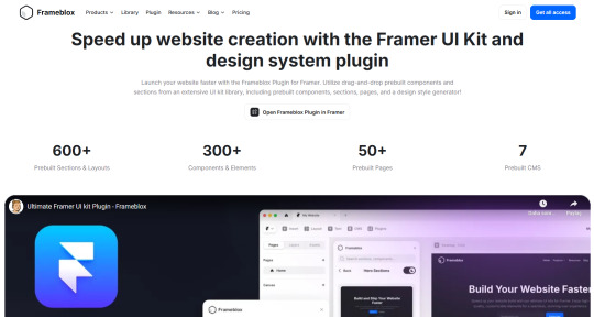
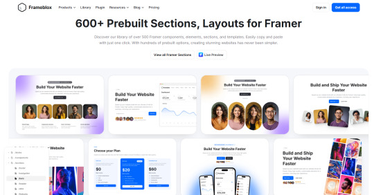
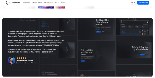
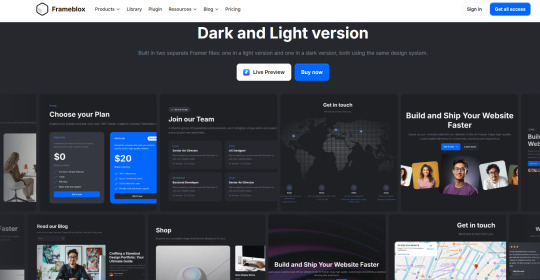
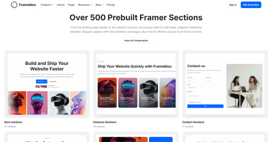
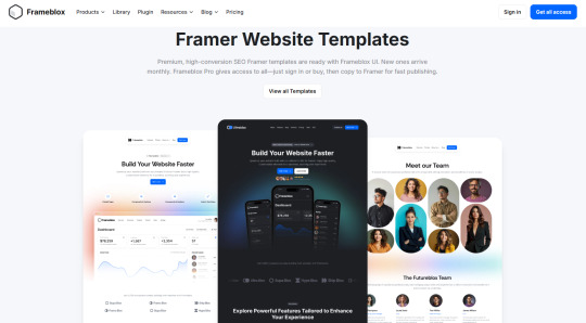
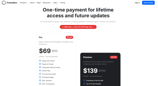
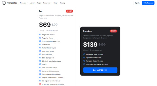
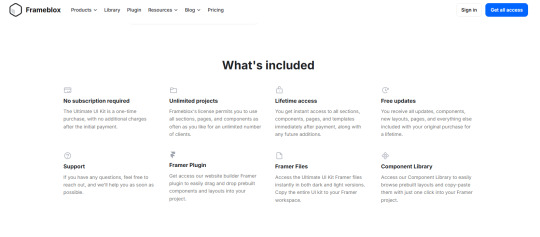
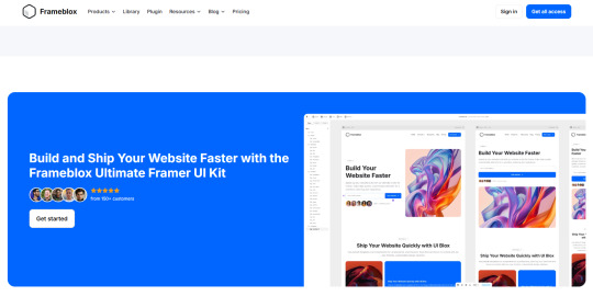
Frameblox
Ultimate Framer UI kit and Prebuilt Templates
Frameblox is an Ultimate Framer UI kit and prebuilt website template library. Build and launch your website faster, save thousands of hours, and elevate your website.
300+ components, 500+ sections, 50+ pages, and more coming.
One payment, limitless websites, endless projects, forever free updates.
Live preview:
Download:
Telegram: ahmetmertugrul


#ui#kit#library#component#section#limitless#project#update#website#framer#framertemplate#framertemplates#template#web#web3#ux#uxdesign#uidesign#design#cms#crypto#btc#eth#usdt#telegram#not#ai
1 note
·
View note
Text
How to render Dynamic Component in Angular 18

Introduction
In the fast-paced world of web development, the ability to create dynamic, user-centric interfaces is more critical than ever. Angular 18’s Dynamic Component Rendering offers developers powerful tools to adapt web applications based on real-time data and user interactions. At DJ Computing, we harness this technology to build flexible, high-performance web applications. This blog will explore how Angular 18's dynamic component rendering works and how DJ Computing implements it in real-time, ensuring responsive, modular, and scalable web solutions tailored to the needs of modern businesses.
Dynamic Dashboards:
DJ Computing employs dynamic rendering to create personalized, user-driven dashboards. Based on user roles or permissions, specific components like graphs, analytics, or task lists are loaded at runtime. For example, a financial application might render performance charts for managers, while a regular user sees only their transactions and tasks. This modular and flexible UI management reduces the need for complex conditional logic in templates, focusing instead on dynamic runtime rendering of components.
User-Driven Interactions:
In business and data-driven web applications, users often interact with forms and data that change based on real-time inputs. DJ Computing leverages Angular 18’s dynamic rendering to alter forms, buttons, and table components depending on the user’s data, preferences, or selections. This allows users to engage with the application in a more intuitive, context-aware manner, where they see only what’s relevant to them at that moment. For example, in CRM systems, certain fields in a contact form might only appear when a user selects a particular type of contact.
Improved Performance and Scalability:
In Angular 18, lazy loading plays a critical role in boosting performance by loading components only when they are required. DJ Computing utilizes this feature to ensure that only essential UI components are rendered during the initial load, enhancing both performance and user experience in large-scale web apps. This makes the application lightweight and fast, as only necessary parts of the UI are rendered dynamically based on user interaction.
Modularity and Reusability:
Dynamic Component Rendering promotes the reusability of web components. DJ Computing takes a modular approach by creating individual components that can be dynamically rendered across multiple pages or sections within the same web app. For instance, a product listing component can be reused across the entire e-commerce application but dynamically rendered with different configurations or data inputs depending on the category or user behavior. This reduces redundancy and simplifies long-term maintenance.
Real-Time Data Handling:
In data-intensive web applications, DJ Computing integrates real-time data streams with dynamic component rendering. For example, in monitoring systems or stock trading platforms, data-driven components such as live charts or price tickers are dynamically rendered or updated based on incoming data feeds. This ensures that the application UI remains up-to-date without requiring manual refreshes, providing users with immediate, actionable insights.
Rendering components dynamically
To render the component, you need to make use of the ComponentFactoryResolver service. This allows you to create an instance of the dynamic component and inject it into the ViewContainerRef:
In your parent component (e.g., AppComponent), inject the ComponentFactoryResolver and use the directive to dynamically load the DynamicContentComponent:
Conclusion:
For DJ Computing’s web applications, dynamic component rendering in Angular 18 offers flexibility, scalability, and performance improvements. By loading components on demand and customizing the UI for each user, they provide a responsive, data-driven experience, which is critical in modern web app development.
#dynamic component rendering#web development#website development#UI flexibility#performance optimization
0 notes
Text
Exploring Component-Based Architecture in NextJS
Unlocking the Power of Component-Based Architecture Component-based architecture is a powerful approach in modern web development that allows for modular, reusable, and scalable code. With frameworks like NextJS, developers can leverage the benefits of component-based architecture to build efficient and maintainable web applications. What is Component-Based Architecture? In component-based…
#component-based architecture#component-driven#efficient frontend development#Frontend Development#NextJS#NextJS component-based architecture#React#scalable web development#web development
0 notes
Text
An accordion web component is a handy UI component that allows users to show and hide blocks of content with the click of a button.
It is often used for FAQs, display long comments, and break up any lengthy content into easy bites.
0 notes