
KATE MARIE LEWIS – FIGURATIVE ARTIST - www.the-art-of-flying.com
Don't wanna be here? Send us removal request.
Statistics
We looked inside some of the posts by theartofflyingartist-blog and here's what we found interesting.
Average Info
Notes Per Post
0
Likes Per Post
0
Reblog Per Post
0
Reply Per Post
0
Time Between Posts
16 days
Number of Posts By Type
Text
17
Last Seen Tumblr Blogs


Fun Fact
Tumblr was attacked by a cross-site scripting worm deployed by the Internet troll group GNAA on Dec 3, 2012.
Text
New trio of forward fold yoga pose watercolour paintings focusing on hands and feet
I think hands and feet are beautiful. This may not be an opinion shared by many people but their shapes and shadows are fascinating to me. So when I saw some stunning seated forward fold yoga pose photographs on a friend’s instagram I was inspired to create a mini collection of watercolour paintings called Forward Fold Trio.

The Forward Fold Trio is a mini collection of monochrome watercolour figurative yoga paintings on watercolour paper. This collection is made up of ‘Pink‘, ‘Green‘ and ‘Purple‘ each depicting a female yogi in a variation of a yoga forward fold pose.
youtube
Forward Fold Yoga Pose Inspiration
The inspiration for my Forward Fold Trio came from a series of photos taken by Mariela Alvarez who was featured in one of the paintings in my Elemental Yogi collection called ‘Heart‘ where she was balanced in a handstand. The photos that inspired the Forward Fold Trio were taken from the direction of her feet looking up at her top half folded over in a forward fold yoga pose.
The pose she was in is seated forward fold yoga pose which really made the focus on her hands and feet. I have had mixed responses from my family and friends when I told them about my plans for this trio. Often I will talk to my grandpa about what I am working on and his response to these paintings was ‘Why would you want to paint someone’s feet?’ 🙂 But I guess that just shows you that subject matter that inspires some people will not have the same response from others, which is the great thing about art.

The ‘Green Forward Fold‘ is a monochrome painting in pink watercolour on A3 watercolour paper. This figure painting is of a female yogi in a forward fold yoga pose. It is part of a mini collection called Forward Fold Trio.

The ‘Green Forward Fold‘ is a monochrome painting in pink watercolour on A3 watercolour paper. This figure painting is of a female yogi in a forward fold yoga pose. It is part of a mini collection called Forward Fold Trio.
Why paint hands and feet?
I really love the complicated lines, light and shadowed areas on hands and feet. This is especially true when they are used to make interesting shapes. I guess I might have a bit of a foot and hand fetish ;P
The ‘Purple Forward Fold‘ painting has a particularly interesting shape with one of the hands in a gyan mudra shape. The gyan mudra is used by yogis to symbolise peace, calm and spirituality. In addition the opposite hand is clutched around the wrist of the one making this symbol. This gives the fingers such interesting positioning.

The ‘Purple Forward Fold‘ is a monochrome painting in pink watercolour on A3 watercolour paper. This figure painting is of a female yogi in a forward fold yoga pose. It is part of a mini collection called Forward Fold Trio.

The ‘Purple Forward Fold’ is a monochrome painting in pink watercolour on A3 watercolour paper. This figure painting is of a female yogi in a forward fold yoga pose. It is part of a mini collection called Forward Fold Trio.
Colour Choices
Each of the pieces in my Forward Fold Trio are monochrome watercolour paintings. I chose to use a single colour for each piece because I really wanted to familiarise myself with how some of the colours from my new Schmincke Horadam watercolour set that I wrote about last week.
I used a purple, pink and green for the three pieces in this mini collection. The specific colours that I used from my Schmincke Horadam Aquarell 24 half pan watercolour set were Manganese Violet, Magenta and Phthalo Green.

The ‘Pink Forward Fold’ is a monochrome painting in pink watercolour on A3 watercolour paper. This figure painting is of a female yogi in a forward fold yoga pose. It is part of a mini collection called Forward Fold Trio.

The ‘Pink Forward Fold’ is a monochrome painting in pink watercolour on A3 watercolour paper. This figure painting is of a female yogi in a forward fold yoga pose. It is part of a mini collection called Forward Fold Trio.
Brushes Used
For all three paintings I followed a similar procedure, starting with lighter more translucent layers. I built up the shadows gradually using more watercolour paint mixed with less water. As such, I started off using larger brushes and progressed to smaller ones. The brushes I used in these pieces include Princeton Snap round brushes in sizes 10 and 4 along with Princeton Elite round brush in size 6 and a Princeton Elite liner in size 1.
The Forward Fold Trio is a mini collection of monochrome watercolour figurative yoga paintings on watercolour paper. This collection is made up of ‘Pink‘, ‘Green‘ and ‘Purple‘ each depicting a female yogi in a variation of a yoga forward fold pose.
The products that I talk about using for these paintings are my own art supplies and this post was not sponsored by any of the brands that I mentioned.
All three of my Forward Fold Trio paintings are available to purchase for either $300 each or $600 for all three. If you are interested in buying one or all of them please send me an email at [email protected]
New trio of forward fold yoga pose watercolour paintings focusing on hands and feet was originally published on the art of flying
#feet#figure painting#foot art#foot painting#forward fold#green#gyan mudra#hand art#hand painting#hands#monochrome painting#mudra#mudras#pink#purple#seated forward fold#watercolour paint#watercolour paintings#yoga art#yoga painting#yoga pose
0 notes
Text
Unboxing and review of Schmincke Horadam Aquarell 24 half pan set of watercolour paints
For my birthday this year I received an extremely generous gift from my grandpa. He gave me a 24 half pan set of Schmincke Horadam Aquarell watercolour paints. These are professional grade watercolours so I thought that for this week’s blog post I would share the unboxing and swatching experience. I also share my initial thoughts on the paints after I used them to create two seascape paintings.

youtube
Receiving my Schmincke Horadam Aquarell 24 half pan set of watercolour paints
These professional grade watercolours were an extremely generous gift from my grandpa. He has always supported me in my artistic expression and was one of the first people to teach me the basics of drawing.
As a thank you for this amazing birthday gift I wanted to create a painting for my grandpa. His taste in art leans more towards landscapes than my normal figurative style. So I created two sunset seascapes using my brand new watercolour set for him to choose from.

The Specs of Schmincke Horadam Aquarell watercolour paints
One of the things that stands out to me about Schmincke Horadam Aquarell watercolour paints is that they use the same formula for their tubes as their pans. This is very appealing to me, as I really like the portability of the pan sets. I hate wastage and I feel like with watercolours from the tubes I often use way too much so the pan set is much more appropriate for my painting style.
In addition, these watercolours have excellent light fastness. This is something that I care about because I want my clients to be able to enjoy the artworks that they purchase for years to come.

My thoughts on the Schmincke Horadam Aquarell 24 half pan set of watercolour paints
My impressions of this paint set are very positive. The colour selection is lovely and really suits me. There are some beautiful jewel tones that really appeal to me, as I use them a lot in my figurative work. I rarely paint people using natural skin tones, but rather prefer to use bright vibrant colours like purples, pinks, turquoise and blue. In my opinion there is a particularly good selection of blues in this set and I tried out a lot of them in my seascapes.
The colours were very easy to reactivate with only a little water. They go onto the paper smoothly and seem ideal to use for layering as I like to do in my watercolour paintings. The paint is easy to control but also flows nicely.

Overall I am super happy with this watercolour paint set and can’t wait to create lots more watercolour paintings with them in the coming weeks.
Unboxing and review of Schmincke Horadam Aquarell 24 half pan set of watercolour paints was originally published on the art of flying
#art materials#art supplies#art supplies review#colour swatching#paint review#review#Schmincke#Schmincke Horadam#Schmincke Horadam Aquarell#Schmincke Horadam half pan set#Schmincke Horadam review#seascape#seascape painting#sunset#sunset painting#timelapse video#unboxing#watercolour#watercolour paint#watercolour painting
0 notes
Text
How I created movement in my new male aerial silks watercolour portrait
Recently I have been wanting to push the envelope with my figure paintings and try to include elements of movement in my work. I had the idea to layer two figures on top of each other to create a feeling of movement in my artwork. My friend Sean sent me some absolutely stunning photographs of him on an aerial silk. There were two in slightly different poses in the photos that I thought would be perfect for this challenge.

‘Aerialist Movement’ Watercolour painting on watercolour paper
youtube
Aerialist Inspiration
Sean is someone that I have written about in this blog before when we attended a yoga and aerial arts retreat in Costa Rica together. He is an amazing aerialist who I have learned so much from. If you want to check out his instagram page you can find it here.
Sean had a very cool photoshoot done by the very talented Bradley Cox and sent me some of the beautiful photographs in case I found them inspiring. It is so lovely when aerialists that I admire follow my artwork and want to be part of a painting.
Two of the photos he sent me really captured my imagination. I have been playing with the idea of movement in art for some time now. I thought that the two photos you can see below were similar enough, but with enough differences that I could overlay them on top of each other.
My aim with overlaying the images is to create a feeling of blurred movement like you would see in a photo with a long exposure if the subject was moving.


Reference photographs of Sean on the aerial silks taken by Bradley Cox Photography
Figure painting creative process
For this piece I decided to do two watercolour paintings on top of each other to create the feeling of movement. I chose pink, purple and blue for the colour scheme. The purple made up the background and I wanted it to provide the transition between the two coloured figures in the piece.
The first figure was created in pink using a negative style of watercolour painting. This means that I painted around the outside of the figure in the negative space. I like the way that the first figure is quite loosely defined.
I was conscious of not making the overlapping sections of the two figures muddy looking or too confusing. So in contrast to the first figure, I painted the positive space for the second figure. I also used a contrasting navy blue to make the second figure the focus of the piece. In addition, I added some highlights to the front figure to make it really pop.

Close up of ‘Aerialist Movement’
Overall I was very happy with how this piece turned out and the movement effect. I plan to try similar techniques to create movement in the future but perhaps experiment with different materials. If you have photos that you think would be inspiring for this type of artwork and would be happy for me to use as a reference, please feel free to send them through to me at
How I created movement in my new male aerial silks watercolour portrait was originally published on the art of flying
0 notes
Text
Why I keep coming back to aerialist inspired artwork
I started The Art of Flying when I was inspired by the wonderful men and women in my aerial silks classes to create figurative artwork. Since then I have expanded to include other types of figures in my paintings like yogis, nudes and dancers, but I always keep coming back to aerialists. In this blog post I will talk about why these incredible humans continue to inspire me. I will also describe my newest aerial artwork commission ‘Lady’s Lunch’.

‘Lady’s Lunch’ is an aerial silks / aerial tissue / aerial fabric acrylic figure painting on canvas. The aerialist is in the aerial silks pose Lady’s lunch.
youtube
Inspiration
At first I exclusively created aerialist inspired artwork for The Art of Flying. I like to try new techniques and subject matter in my artwork so did eventually broaden my horizons to include yogis, dancers and nudes in my body of work for The Art of Flying. However, I always love coming back to exploring the beautiful lines, shapes and fabric movement created by aerial artists.
Aerialists are particularly inspiring to me for a multitude of reasons. Their strength and flexibility is often astounding. I have a background in anatomy and so having muscle definition visible in reference photos is one of the things I love about working with aerial artists.
Their flexibility allows them to create beautiful shapes with their bodies. I love seeing what creative new poses aerialists come up with. Even the simple ones can be so stunning to capture in a piece of artwork.
‘Lady’s Lunch’ was commissioned by Annie as a gift for her granddaughter Tara for her 18th birthday. I thought this was such a wonderful idea to commemorate this milestone for Tara with a custom aerial portrait. Tara is extremely involved with the Adelaide circus community through her work at Circobats Community Circus and I wanted to create an artwork that would do her justice.

‘Lady’s Lunch’ acrylic painting on canvas
Creative Process
I asked Annie if she had a reference photo in mind for her commission. I managed to source a beautiful shot of Tara in the pose Lady’s lunch. This pose has lovely lines with the aerialist reclining in the wrapped silks.

Reference photo for Tara’s artwork ‘Lady’s Lunch’
Once we had settled on the reference photo, I asked Annie if there was a style that I had used previously in my artwork that she would like me to emulate for the piece? She ended up coming over to see the work I had in my studio. Her favourite was ‘Inverted Diamond’ which I used for style inspiration for Tara’s painting.


‘Inverted Diamond’ is an aerial silks / aerial tissue / aerial fabric acrylic figure painting on canvas. The aerialist is performing an inverted split pose in belay
Annie wanted Tara to decide on the colour scheme for the artwork and so I called her and she said she would either like a cool or a warm colour scheme but that she didn’t like the two mixed together. Eventually we settled on a cool colour scheme using blue, purple and turquoise for ‘Lady’s Lunch‘.
If you would like to commission an aerialist inspired artwork of yourself or as a gift please email me with your ideas and I can give you a quote
Why I keep coming back to aerialist inspired artwork was originally published on the art of flying
#acrylic paint#acrylic painting#aerial artist#aerial arts#aerial dance#aerial fabric#aerial pose#aerial silks#aerial tissu#aerialist#circus#circus community#commission#figurative#figure painting#ladys lunch#painting#portrait#silks
0 notes
Text
What is my ideal type of client for figure painting commissions?
Thinking about the clients that have commissioned me to create a figure painting for them, the ones that I love the most are the ones who know what they want. This may sound a little counterintuitive since people may think that as an artist I would like to have creative freedom. However, commissions can be stressful because I am always nervous about whether the client will be happy with the results. So if my client knows exactly what they want it is a load off my mind and makes me feel a lot more confident about delivering artwork they love.

‘Air II’ and ‘Air Cat‘ on display in a satisfied client’s home
Recently I was commissioned to create a mate for one of the pieces in my Elemental Yogi collection ‘Air II’. My client wanted a matching colour scheme and to make the pair look like there were two women doing yoga together against the same background.

‘Air Cat’ is the mate that I created for ‘Air II’
youtube
Time lapse video showing the creation of ‘Air Cat’
The Brief
Originally the client who commissioned ‘Air Cat’ wanted to purchase a few of the pieces from the Elemental Yogi collection. However, he mentioned something about the fact that he wished that the colours matched in the pieces he had chosen. That is when I suggested that I could create something especially for him. I would much prefer to create something that is exactly right for a client rather than selling them something that is not their ideal artwork.

‘Air II’ surrounded by other pieces from the Elemental Yogi collection
‘Air II’ was the piece from the Elemental Yogi collection that was the client’s favourite. Once he had decided to commission a matching piece rather than buying one of the other pieces in the collection, he looked through my other artworks to decide exactly what he wanted.

‘Cat Stretch’ was the inspiration behind the figure in ‘Air Cat’
My client found ‘Cat Stretch’, one of my previous watercolour yoga paintings, and requested that I paint a piece in the style and colour of ‘Air II’ with the figure composition of ‘Cat Stretch’.

‘Air II’ and ‘Air Cat’ side by side
So I knew that I would be creating a new piece in a restricted palette of blue in different shades. I also knew that I would be using the negative style of watercolour painting that I used for the Elemental Yogi collection. In addition, I knew I could use the figure from ‘Cat Stretch‘ as a reference.

The finished paintings up on the client’s wall of ‘Air II’ and ‘Air Cat’
Knowing exactly what the client wanted with example of each the colour, the style and the figure made me feel really confident. I knew that I would be able to create something that he would be really happy with.
Clients who don’t already know what they want
All is not lost if I have a commission client does not know exactly what they would like yet. Usually I would recommend that they have a look through my past work and see if they can identify a colour scheme or style that I have used before that they might like. Often my clients have pictures of themselves, family or friends to use as a reference. However if the client does not have a photo in mind I can provide some ideas and recommendations.
If you would like to commission an artwork I would love to hear your ideas
or to find out more about the commission process, please check out my commissions page

What is my ideal type of client for figure painting commissions? was originally published on the art of flying
0 notes
Text
My top 5 artistic moments for 2018
At the start of 2018 I wrote a blog post about what I hoped to achieve during the year. So I thought that I would write another one this week to recap the artistic moments that I am really grateful for from 2018.
1. Held my first solo exhibition
I was so proud to complete my Elemental Yogi Collection of negative style watercolour paintings and to be able to exhibit them all together. What made that experience even more exciting was that the exhibition was just for my work. Whilst I love participating in group exhibitions, it was nice to be able to have my first solo exhibition. I feel like it was a real milestone in my artistic career. It also meant that I could invite all my friends and family to come and see it and celebrate with me!


My Elemental Yogi Collection on display at Pane E Latte for my first solo exhibition
2. Participated in the South Australian Living Artists Festival (SALA)
I absolutely adore the SALA festival. It is such a great time in South Australia when everywhere you look there is art. I was fortunate enough to be involved in 5 different exhibitions during SALA 2018. One was my first solo exhibition that I talked about above, but I also had one joint exhibition in a dress shop and was part of 3 group exhibitions.

Joint exhibition in Showies Boutique
3. Had more consistent commission requests
This year I have had requests for commissions steadily increase to become quite regular. I am not saying that all of those requests actually turn into commissions, but it is still nice that people are making the effort to contact me. It is so nice to know that when people are thinking about commissioning artwork, that I am one of the people that they think about. Below are some of the more interesting and varied commissions that I got during 2018.

‘Bow Pose‘ a surprise birthday gift for an avid yogi from her husband

‘Flower Crown’ a birthday gift commissioned by a group of friends

‘On Point’ commissioned ballet slipper painting for a ballerina

‘Friendly Boatman’ Commissioned for a 50th birthday party that was international themed
4. Got my work in front of more people
There is no point in creating artwork if nobody gets to see it. So I was thrilled to have the opportunity to exhibit so much work in 2018 and in a diverse range of venues. I had the five exhibitions for SALA in a cafe (Pane e Latte), a dress shop, a community centre gallery, the Henley and Grange Arts Society gallery and even in the Henley Square Pavilion. In addition , I had my work in the Crown and Sceptre pub and Salt Yoga Studio. I would love to have more exhibitions like the one in Salt yoga as I think that the clientele are the perfect audience for my work.

Exhibition at the Crown and Sceptre pub in the newly renovated dining room

Exhibition at Salt Yoga Studio in Christies Beach

Henley and Grange Arts Society members exhibition
5. Collaborated with awesome aerialist boss ladies
In 2018 I was thrilled to begin working with some amazing aerialists that I really admire. First I contributed art prints for the Aerial Swag subscription box for aerialists. Then more recently I was commissioned to create a book cover for Aerial Yoga Girl.

‘Hoop Trio‘, ‘Bend Over Backwards‘ and ‘Hanging by a Thread‘ were the pieces I contributed to the Aerial Swag subscription box

‘Floating on Air‘ was commissioned to be cover art for an aerial silks book
If you want to hear more about my artistic adventures in 2019 make sure you subscribe to my mailing list and follow me on all my social channels.

My top 5 artistic moments for 2018 was originally published on the art of flying
#aerial swag#aerial swag subscription box#aerial yoga girl#art festival#book cover art#collaboration#commission#commissioned art#commissioned painting#crown and sceptre#dress shop#elemental yogi collection#exhibition#group exhibition#henley and grange arts society#henley square pavillion#pub#sala#showies boutique#solo exhibition#south australian living artists festival#yoga art
0 notes
Text
How I approached a commission to create book cover art
Two weeks ago I showed you all how to create a beautiful mandala painting using watercolours and masking fluid. This week I am using that mandala painting as an engaging background for a new aerial silks portrait. This portrait was commissioned by the awesome boss lady behind Aerial Yoga Girl to use as cover art for a book. It was such a thrill for me to be creating a pice to be used as a book cover!

‘Floating on Air’ Watercolour on watercolour paper of aerialist in splits
The Commission Process
youtube
In this weeks video I go into detail about how I approach commissions. Make sure you watch it with the sound on as I talk through my thinking behind this commission. I try to make sure that the commission process is enjoyable for both my clients and me. This involves managing expectations and lots of open communication.

Hard at work on ‘Floating on Air’
Inspiration
The inspiration for this commission came from the client Karlene. I was asked to create a book cover artwork that included the figure from the reference photo. The mandala from the background also needed to be a feature. Purple seen in in the silks and the mandala on the wall in the reference was also to be a prominent colour.

Side by side comparison of the reference photo, taken by Jenna Carmichael, and the finished painting ‘Floating on Air’
Artistic Process
For this piece I wanted to make sure that the mandala and the figure on the split silks did not look disjointed. So I changed the composition from what was in the reference photograph just slightly. I made the mandala really large so that it took up the whole page. Then I painted the figure on top in multiple layers of watercolour paint. That way the figure was fully enmeshed with the background.


Progress photos of ‘Floating on Air’
Since floating on air was a commissioned piece the original artwork is already spoken for. However I will be offering limited edition signed and numbered prints for $132 for a 13″ x 17″ print. Please email me if you are interested in purchasing one

How I approached a commission to create book cover art was originally published on the art of flying
#aerial artist#aerial fabric#aerial ribbon#aerial silks#aerial tissu#aerial yoga girl#aerialist#artistic process#background#book cover#commission#commissioned painting#cover art#double footlocks#footlocks#mandala#masking fluid#splits#watercolour painting#watercolour paper
0 notes
Text
How to create your own beautiful mandala watercolour painting using art spectrum masking fluid
I was commissioned to create a painting to be used as a book cover. The brief was to paint a portrait of a figure in the splits on silks with a mandala background. In this post I will describe the step by step process I used to create this beautiful mandala to be used for the commission. I will teach you how you too can create your own mandala painting.
youtube

‘Mandala Meditation’ watercolour on watercolour paper
Mandala Inspiration
To create this mandala I took inspiration from batik. Batik is a technique that originated in Indonesia where wax is applied to cloth that is then dyed. Since I took a trip to Bali just over a week ago, this technique seemed appropriate 🙂
The technique that I used to create my ‘Mandala Meditation’ painting looks like batik. Instead of using wax on fabric, I used masking fluid on watercolour paper to create a similar effect. The masking fluid created areas where the watercolour paint could not contact the paper underneath, like the wax does in batik.

Getting my zen on working on this ‘Mandala Meditation’ painting
What is a mandala?
Mandalas are a very popular art form among the yoga community. They actually have their origins in Hinduism and Buddhism as symbols of the universe.
Today mandalas can be used as a mediation or centring tool. Plus they are super fun to make.
I like the freedom of expression they provide. Repeating, somewhat symmetrical patterns can be utilised to convey whatever the designer or viewer desires. Another aspect of mandalas that I enjoy is the fact that the interpretation can change from day to day. So they really are an artwork for whatever mood that you are in.


Pictures from the Mandala Workshop that I ran at the Sanctuary Yoga Festival
Creative Process for my Mandala
Since this mandala is going to be used as a backdrop for one of my figure paintings, which I will talk about in next weeks post, I had a colour scheme specified by my client. She requested a similar style and colour to ‘Air’ one of the pieces in my Elemental Yogi collection.

‘Air’ from my Elemental Yogi collection, used as colour and style inspiration for this mandala
So I knew that I would be using blue, pink, turquoise and purple watercolour paint to create this mandala.
I personally like quite a loose flowing mandalas which are not perfectly symmetrical. So that is what I created, but you can create a pattern to your own taste.
How to make your own mandala
There are many different methods that you can use to make a mandala, limited only by your imagination. In this post I will talk about just one way that you can make your own mandala. But I would encourage you to try out this method but also to experiment with different ways of creating patterns and texture that appeal to you.

My collection of materials with my finished ‘Mandala Meditation’ painting
Materials:
Art Spectrum masking fluid
Watercolour paper
Watercolour paint
Large brush (for applying the watercolour layers)
Small, old brush (for applying the masking fluid, don’t ruin your good brushes)
Lots of creativity and inspiration
Patience (waiting for each layer to dry!)
Mandala Method:
Choose your watercolour colours. You can use as many or as few as you would like, but I would recommend a maximum of 4 colours.
Put a base wash over the whole of the watercolour paper. This can be only one colour or can incorporate more than one.

Let your base wash dry completely (this is a very important step and the one that I find the most difficult).
Choose where the centre point of your mandala is going to be. Mine is offset from the centre of the page.
Paint on the first layer of your mandala pattern with the masking fluid.

Wait until the masking fluid to dry completely (again super frustrating because you just want to get on with the next step)
add your second layer of watercolour paint. I would suggest using a mixture of the colour(s) you used in the base layer plus one or two other colours.
wait until the paint dries
Paint on the second layer of your mandala pattern. I would suggest building on the structure that you put down in the first layer. In mine I put small frill-like patterns on and around the big loops and petals that I had already put down.

Wait for the masking fluid to dry
Add as many more watercolour and masking fluid layers as you would like. I did four layers of watercolour and three layers of masking fluid for my ‘Mandala Meditation’ painting.

Hot Tips
Colour Scheme: I would suggest that you do not use all three of the primary colours together, as when they mix they will create brown, which is an aesthetic that I do not particularly enjoy. However you should feel free to experiment and see what you like.
Base layer of watercolour: I would suggest keeping the base layer simple, as you will be building up more colours that will mix as you go along.
If you want your mandala to be centred in the middle of the page: I would suggest measuring the exact centre point.
Mandala design: I would suggest keeping your first layer quite simple to get the base structure down and make it consistent.
Number of layers: The number that you use will depend on how complex you want the pattern to be. Just keep in mind that the later layers will have less contrast with the background paint than the first ones you applied.
Let me see your artwork
If you use this post as inspiration to create your own mandala artwork I would love to see the results! Please send me your mandala artworks 🙂

How to create your own beautiful mandala watercolour painting using art spectrum masking fluid was originally published on the art of flying
#art#artist#artistic process#arts spectrum#artwork#bali#batik#blue#capture#DIY artwork#do it yourself#how to#indonesia#mandala#mandala workshop#masking fluid#meditation#painting#pattern#pink#purple#Sanctuary festival#the art of flying#turquoise#watercolour#watercolour paint#watercolour painting#yoga#zen
0 notes
Text
Seated male nude mixed media artwork, third piece in my Masculine Nudes mini collection
This week I am talking about the third and final piece in my Masculine Nudes mini collection. This is a seated male nude mixed media artwork called ‘Knee‘. After reading about ‘Back‘ and ‘Front‘ in the previous two posts I hope you love this mini collection in purple and turquoise as much as I do.
youtube

‘Knee‘ showing a seated male nude
Inspiration
As the third and final piece in my Masculine Nudes collection, ‘Knee‘ depicts a seated male nude. I like the way that they figure is folded half with the left knee raised supporting the chin. It is quite a contemplative pose that has more stillness than the repressed energy of ‘Back’ and drama of ‘Front’.
I am always a big fan of contrasts in my work and I think that the Masculine Nudes collection really exemplifies this. The folded shapes of ‘Knee’ contrasts greatly with the simpler silhouettes of the other two pieces in the mini collection.


Progress photos of ‘Knee’
Creative Process
My approach to ‘Knee‘ differed from that for ‘Front‘ and ‘Back‘ slightly because there are extremely dark areas. The shadows created by the knee folded into the chest are deep and dramatic. I wanted the artwork to reflect that.

Putting the first layer of purple watercolour paint on ‘Knee‘
The other point of difference is that ‘Knee‘ is perched on a surface visible in the artwork. I let the purple paint mix with the turquoise background on that surface that the figure is sitting on. This is because I didn’t want the figure to look like he was floating on mid air. I used the mixing of paint to anchor the nude into the image.

Adding the turquoise paint to the background of ‘Knee’
I then used heavy shading with the charcoal to create the dramatic shadows around the chest and groin. The arms of the figure also cast strong shadows onto the outstretched leg.

Side by side comparison of ‘Knee‘ before and after the finishing touches of the charcoal
The darkness of the charcoal contrasts sharply with the strong white highlights on the left shoulder of the figure. I also left the top of the knee white by utilising masking fluid to protect the paper from the watercolour paint in those areas. The overall effect is one of contrasts.

The whole Masculine Nudes collection all finished and framed
The three original mixed media artworks in the Masculine Nudes collection are available for sale at $300 each or $600 for all three (plus shipping). Limited edition, signed and numbered prints are also available at $132 for each (13″ x 17″). Please send me an email if you are interested in finding out more or making a purchase:

Seated male nude mixed media artwork, third piece in my Masculine Nudes mini collection was originally published on the art of flying
#arms#art#art nude#artist#artistic process#artwork#charcoal#charcoal drawing#drawing#figurative#figure#fine art nude#knee#male#male nude#masculine#masculine nude#masking fluid#mixed media#nude#nude art#nude painting#painting#seated figure#shadow#shoulder muscles#strength#the art of flying#watercolour#watercolour painting
0 notes
Text
Dynamic front view of a male nude chest created using watercolour and charcoal
Last week I talked about ‘Back’ the first piece in my Masculine Nudes mini collection showing the back and shoulders of a male nude torso. So this week I will be sharing the process behind ‘Front’. ‘Front’ is a watercolour and charcoal mixed media artwork showing a male nude chest from the waist up.
youtube

‘Front‘ mixed media painting of a male nude chest
Inspiration
I wanted the pieces in this collection to focus on the torso rather than the face of the male figures. However, I still wanted to convey feeling with the figures even though you cannot see the emotions on the faces.
Keeping this in mind, when deciding on how to create a forward facing torso showing the male nude chest, I decided to have the face covered. I like how the pose in ‘Front‘ is dynamic and full of emotion. There are several ways that the emotions in this figure could be interpreted and would leave it to the viewer to decide if the feeling it gives is uplifting or anguished.


Progress photos of ‘Front‘ depicting a male nude chest
Creative Process
This is the only figure in the Masculine Nudes mini collection that was not painted in purple. The male nude chest is defined using turquoise watercolour, emphasising the musculature of the torso. I did this by leaving stark contrasts between the bright whites and darker watercolour areas.

‘Front’ before and after the addition of charcoal
To deepen the shadows in ‘Front‘, I applied charcoal to create darker areas. This was particularly important around the neck and shoulders of the figure to show the male nude chest to its best advantage.

‘Back’, ‘Knee’ and ‘Front’ from the Masculine Nudes collection

Masculine Nudes mini collection pieces framed
The three original mixed media artworks in the Masculine Nudes collection are available for sale at $300 each or $600 for all three (plus shipping). Limited edition, signed and numbered prints are also available at $132 for each (13″ x 17″). Please send me an email if you are interested in finding out more or making a purchase:

Dynamic front view of a male nude chest created using watercolour and charcoal was originally published on the art of flying
#abdominal muscles#abs#arms#art#art nude#artist#artistic nude#artistic process#artwork#charcoal#charcoal drawing#chest#chest muscles#drawing#emotion#figurative#figure#fitness#front#hands#male#male nude#male nude art#man#masculine#masculine nude#masking fluid#mixed media#mixed media artwork#muscles
0 notes
Text
The male nude torso mixed media artwork 'Back' from my Masculine Nudes mini collection
The first piece in my Masculine Nudes mini collection is called ‘Back’. It is so named because it shows a nude male torso from the posterior aspect. This piece has well developed musculature which provides high light and shadow contrast. I think this is my favourite piece in the collection and I hope you like it too!
youtube

‘Back’ Mixed media watercolour painting and charcoal drawing of a male nude torso as part of the Masculine Nudes Collection
Inspiration
I love how there are so many interesting lights and shadows in the male figure, particularly from this posterior aspect. It is almost like a topographical map of a mountain range taking the viewer’s eyes from the shoulders down to the waist. Even better that there are so many different trails to make that journey 🙂


Progress photos of ‘Back’
Creative Process
I created the highlights in this piece using masking fluid so that they would be stark and provide structure to the artwork. The first layer of paint that I applied was the purple in the figure and cloth around the man’s waist. I started out applying the paint lightly at the top of the piece where the light source was coming from.
I concentrated on creating darker areas using the purple watercolour paint in the stomach and legs of the figure. The shadows there really needed to be strong in order for the male figure to look three dimensional.

Before and after the charcoal layer was added to ‘Back’
I used a very washy layer of turquoise for the background but was not yet happy with the depth of the shadows. So I then applied a layer of black charcoal into the darkest parts of the figure. The charcoal really gave the piece a much more finished quality.

Masculine Nudes Collection including ‘Knee’, ‘Front’ and ‘Back’
The three original mixed media artworks in the Masculine Nudes collection are available for sale at $300 each or $600 for all three (plus shipping). Limited edition, signed and numbered prints are also available at $132 for each (13″ x 17″). Please send me an email if you are interested in finding out more or making a purchase:

The male nude torso mixed media artwork ‘Back’ from my Masculine Nudes mini collection was originally published on the art of flying
#art#art nude#artist#artistic process#artwork#back#charcoal#charcoal drawing#drawing#figurative#figure#fine art nude#male#male nude#masculine#masculine nude#mixed media#nude#nude art#nude painting#painting#strength#the art of flying#torso#watercolour#watercolour painting
0 notes
Text
Announcing my mini collection of male nude art in watercolour and charcoal
I am super excited to launch my brand new mini collection of male nude torso mixed media artworks. Most of my artwork is focused on the beauty of the feminine. Male nudes are just as stunning as the females and I wanted that to show in this trio collection Masculine Nudes.

Masculine Nudes Collection of mixed media artworks created using watercolour and charcoal on watercolour paper
Inspiration
I have created many feminine nude paintings in the last year. However I have not painted any male nudes besides a resin mate for ‘Side Stretch‘ called ‘Blue Nude‘. So I thought I would create this collection to give the dudes a look in 😉


‘Back’, ‘Front’ and ‘Knee’ are the three artworks that make up the Masculine Nudes mini collection
Colour Scheme
I chose a restricted colour scheme of purple and turquoise for this mini collection. The colours link together the pieces of the Masculine Nudes collection as well as their subject matter and composition.
Mixed Media Style
This collection was painted in a loose watercolour style. I used masking fluid to give the pieces structure. Masking fluid allows me to decide what parts of the painting will remain as white spaces. I put it on before I start painting in the watercolour. It means that I can be very free in how I apply the paint.

Putting the purple into the collection Masculine Nudes
I used contrasting colours for the figures and the background. Two of the figures were painted purple and the other one turquoise. I wanted the three images to look like they belong together but not to be identical to each other.


Progress photos of the mini collection Masculine Nudes
I put the finishing touches on this mini collection of Masculine Nudes using charcoal. It deepened the shadows and added extra details. I also like how the hard lines of the charcoal contrast with the washy loose watercolour. So there is both softness and hardness in this trio.

I love how these three dudes compliment each other
In upcoming blog posts I will go through more detail on the creative process for each of the pieces in this mini collection. The three original mixed media artworks in the Masculine Nudes collection are available for sale at $300 each or $600 for all three (plus shipping). I am offering the special price for all three of them because I think that they look so good all together 🙂

My mini collection Masculine Nudes all framed up and ready to be hung
Limited edition, signed and numbered prints are also available at $132 for each (13″ x 17″). Please send me an email if you are interested in finding out more or making a purchase:

Announcing my mini collection of male nude art in watercolour and charcoal was originally published on the art of flying
#art#artist#artistic process#artwork#bust#charcoal#charcoal drawing#collection#dudes#figurative#figure#green#male nude#man#masculine nude#men#mini collection#mixed media#muscles#nude#nude art#nude drawing#nude painting#purple#strength#strong#strong men#the art of flying#torso#trio
0 notes
Text
The only semi-nude painting in my Elemental Yogi collection
Even though I have been painting nudes for some time, I don’t feel comfortable asking people to send me their nude photos as inspiration for my artwork. So I was thrilled when I received a stunning semi-nude fish pose shot when I called for photo submissions for my Elemental Yogi Collection of negative style watercolour paintings. This blog post is dedicated to the artwork ‘Sun‘ that photo inspired me to create.

‘Sun‘ semi-nude painting in the Elemental Yogi Collection
youtube
Inspiration


‘Sun’ side by side with the photo taken by Bronwyn Muirhead
“I started my journey of yoga 14 years ago after an accident that caused a serious Brian injury that started my life from the beginning again. Yoga is a tool that I have been learning to keep me out of the darkness and into the light.”
Lorie is from Canada.
Creative Process
The arched back of the fish pose, opening the heart towards the sky, is what inspired me to call this painting ‘Sun’. So I used a restricted palette of sunny yellows, oranges and reds. I love how the warm colours radiate our from the figure through the flowing watercolour in the negative painting style.

Close up of ‘Sun’
All of the ‘Elemental Yogi’ collection pieces are for sale and will be exhibited during the SALA festival in August at Pane e Latte. However the original of ‘Sun‘ has already been SOLD. There are still 20 signed, numbered, limited edition prints of ‘Sun’ available for pre-order.
Sun – 17″ x 13″ / 43.18 cm x 33.02 cm – $132
If you would like to put in your order please contact me at: [email protected]

The only semi-nude painting in my Elemental Yogi collection was originally published on the art of flying
#acro#art#artist#artistic process#artwork#backbend#collection#elemental yogi#exercise#figurative#fish pose#fitness#flexibility#inverse painting#negative painting#nude#orange#painting#portrait#red#semi-nude#strength#sun#the art of flying#warm colours#watercolour#watercolour painting#yellow#yoga#yoga pose
0 notes
Text
Reflections on my first time exhibiting figure artwork in Adelaide during the SALA festival
This year was my first time exhibiting in Adelaide during the SALA festival. SALA is the South Australian Living Artists festival and I have often visited exhibitions as part of the festival over the years, but this is the first year I have taken part. I had several pieces in group exhibitions and in addition had my first solo exhibition to launch my Elemental Yogi collection. This blog post is about my impressions of taking part in the SALA festival and what I learned from the experience.
Gratitude Exhibition

Crossed Nude was on display at Gratitude exhibition
I was very happy to be able to put a piece in the City of West Torrens group SALA exhibition called Gratitude. The pieces submitted for this exhibition needed to fit in with the theme of Gratitude. I thought that my piece ‘Crossed Nude‘ which is an acrylic painting on canvas, would be perfect.
To me yoga is a form of gratitude to your body and the pose depicted in ‘Crossed Nude‘ really conveys this gratitude. Furthermore, I think that we should be grateful for our bodies and all that they allow us to do in our lives. So I always try to get this across in my figure art, particularly in my nude paintings.
Totems Exhibition

‘Totem Polers’ was on display at the Totems exhibition at the Henley and Grange Arts Society Fraiser Hay Gallery
Henley and Grange Arts Society (HAGAS) also had a themed group exhibition. The theme was Totems and I created a painting of a trio of pole dancers. I took a slightly tongue in cheek interpretation of this theme. Since I am a figure painter I thought it would be fun to paint a stack of figures on a single pole as my Totem.
I named this resin and acrylic painting on canvas ‘Totem Polers‘.
SALA at Henley Square Exhibition

‘Fire Night in Elder Park‘ was exhibited at the Henley Square Pavilion
As part of The Henley and Grange Arts Society, I was also involved in a large group exhibition at Henley Square in Henley Pavilion. This exhibition did not have a theme so I decided to put on of my largest scale pieces in. I thought that this large mixed media piece ‘Fire Night at Elder Park’ would be impactful in the often busy space.

Took a quick after gym selfie with ‘Fire Night in Elder Park’ at the Henley Square Pavillion
‘Fire Night in Elder Park‘ was created using acrylic paint and epoxy resin on canvas. I also thought that some of the people who saw the piece in Henley Square might recognise some of the background features in the painting that are iconic landmarks of Elder Park in Adelaide.
Celebration of the Human Form Exhibition

‘A Giant Leap’, ‘Golden Hoop’ and ‘Blushing Nude‘ were up in the window of Showies in a Celebration of the Human Form exhibition
Showies is a dress shop that approached me and a sculptor to have a joint exhibition. Since we are both figurative artists the exhibition theme was a celebration of the human form. The shop owner thought that all the female inspired artwork would complement the feminine dresses in the shop. I selected a diverse range of my figure paintings for this exhibition.

‘Starry Hoop‘ and ‘Inverse Nude‘ at Showies in a Celebration of the Human Form exhibition
There were several framed watercolour pieces including ‘Starry Hoop‘, ‘Inverse Nude‘, ‘Blushing Nude’ and ‘Rainbow Seahorse‘. I hung some of the paintings on the wall beside the window displays. Others fit perfectly on high shelves that ordinarily are used in the shop for handbags and accessories.

‘Flight Path‘ through the window at Showies in a Celebration of the Human Form exhibition
I also included ‘Flight Path’ and ‘A Giant Leap‘ in the celebration of the human form exhibition. Using acrylic impasto paint applied with palette knives, I created these two different styles of impasto figure art.

‘Starry Hoop‘, ‘Inverse Nude‘, ‘Rainbow Seahorse‘ and ‘Blushing Nude‘ at Showies in a Celebration of the Human Form exhibition
Elemental Yogi exhibition

Launched my Elemental Yogi Collection at my first solo exhibition at Pane e Latte
If you have been reading any of my recent blog posts you have probably seen the pieces in my Elemental Yogi Collection. This collection was launched in my first ever solo exhibition at Pane e Latte.

‘Heart’, ‘Breath’ and ‘Spirit’ from my Elemental Yogi Collection at Pane e Latte
This whole collection was inspired by photographs sent in by 12 beautiful yogis from around the world. They were painted in a negative style of watercolour painting.

‘Sun’, ‘Leaf’, ‘Air’, ‘Tree’, ‘Air II’ and ‘Fire‘ from the Elemental Yogi Collection on display in Pane e Latte
The pieces in my Elemental Yogi Collection are still on display in Pane e Latte. There will be there for a limited time even though SALA finished at the end of August. So if you would like to check out the exhibition in person there is still a chance.

‘Earth’, ‘Water’ and ‘Heart’ from my Elemental Yogi Collection exhibited at Pane e Latte
In two weeks time I am going to be launching a new mini collection of male nude torsos. I used watercolour and charcoal together to create these mixed media pieces. So subscribe to my mailing list if you don’t want to miss out on getting the announcement.

Reflections on my first time exhibiting figure artwork in Adelaide during the SALA festival was originally published on the art of flying
#adelaide#adelaide art#adelaide artist#aerialist#art exhibition#city of west torrens#elder park#exhibition#figure artist#figure painting#fire hoop#fire night#flow arts#gratitude#group exhibition#henley and grange arts society#henley beach#henley square#joint exhibition#negative painting#nude art#nude painting#painting#pole dancer#sala#solo exhibition#totems#yoga#yoga pose#yogi
0 notes
Text
Reflections on my first solo exhibition of my Elemental Yogi Collection at Pane e Latte
During August, as part of the SALA festival, I held my first ever solo exhibition at Pane e Latte. At the end of August, in conjunction with the lovely owners of Pane e Latte, I held an exhibition closing event. I was so grateful to everyone who attended the event to celebrate a successful first SALA exhibition.

Elemental Yogi paintings on display, from top left ‘Sun’, ‘Leaf’, ‘Air‘, ‘Tree’, ‘Air II’ and ‘Fire’
I was so pleased with how my first solo exhibition at Pane e Latte went. Natalie and Matteo from Pane e Latte were an absolute dream to work with and were generous enough to open the cafe after hours to hold a closing event for my friends and family. They even provided some delicious food for all of the guests to enjoy while they perused my Elemental Yogi Collection.

The main wall of paintings from the Elemental Yogi Collection that greet you as you enter Pane e Latte
The paintings looked lovely on the walls with the newly installed picture rails above the black tiled walls. Natalie and Matteo were even lovely enough to install some lighting so that the artwork looked its best even though the closing night event was in the evening.

Me posing with my lovely friend Monique
When we hung the Elemental Yogi Collection paintings we grouped the works on paper and the works on canvas together. I also made sure that we put contrasting colours together on each wall. Each wall looked like a riot of rainbow negative style watercolours against the black tiles.

Three of the Elemental Yogi paintings on canvas, from left ‘Earth’, ‘Water’ and ‘Heart’
It was a lovely evening where I got to show my friends and family the Elemental Yogi Collection that I have been working so hard on for most of this last year. My friend Clare is responsible for the photographs in this post so a big thank you for the photography skills and documenting my first solo exhibition for me 🙂

Caught having a laugh with some lovely new friends at the event
I even got to make some new friends during the closing event, in particular Deanne who is featured in ‘Leaf‘. Deanne and I have been corresponding for a long time since she submitted some photos for my yoga inspired artwork. However, I had not yet been able to meet her till she came along to see my first solo exhibition.

Deanne Kong was the inspiration behind ‘Leaf’
The 12 pieces fill the walls of the whole cafe. Since my first solo exhibition has been so successful, it has been extended for a short time. So if you missed out on visiting during August, you can still go and see the exhibition for a limited time. Get in fast before I take the remaining paintings back home with me!

Loved seeing Deanne side by side with her portrait
I am always on the lookout for new and interesting ways to get my artwork out in the wild and seen by people who love what the human body can do. So if you have a space that you would like to fill with colour please feel free to send me an email at [email protected].
You know it is a good party when the food platters look like this 😉
Also one of the people at the exhibition closing event left their umbrella behind, if that was you please let me know because I have it in my car ready to return 🙂
All of the ‘Elemental Yogi’ collection pieces, are for sale. They are also still being exhibited at Pane e Latte. Additionally, there are 20 signed, numbered, limited edition prints are available for pre-order.
If you would like to put in your order please contact me at: [email protected]

Reflections on my first solo exhibition of my Elemental Yogi Collection at Pane e Latte was originally published on the art of flying
#acro#art#artist#artistic process#artwork#backbend#balance#canvas#charcoal#circus#closing night#dancer#elemental yogi#exercise#exhibition#figurative#fitness#flexibility#graceful#handstand#painting#portrait#rainbow#side stretch#solo exhibition#the art of flying#watercolour#watercolour painting#yoga#yoga art
0 notes
Text
Why I love a simple composition for negative style watercolour figure painting
I have lots of fun experimenting with different background effects, but for me the most effective figure paintings or drawings are simple. The simplicity of a full figure right in the centre of the page with little or no background can have so much beauty. So for this blog post I am going to feature the two paintings from my watercolour Elemental Yogi collection that have a simple composition.


‘Fire’ and ‘Air II’ from the Elemental Yogi collection
youtube
youtube
Inspiration


‘Fire’ side by side with the photo taken by Nadine Johnson of herself
“I kept falling out of my scorpion. I finally made it a controlled fail, I mean fall. When I saw the timer light flicker on the camera, I lifted one leg up. Voila, fancy pic.”
I have previously painted a portrait of Nadine on lyra. She teaches yoga on retreats with Go Well Beyond and is based in San Francisco, California.


‘Air II’ side by side with the photo taken by Leslie Granda-Hill
“I fell in love with playing with movement about five years ago, and we’ve been going steady ever since. I practice Ashtanga yoga every morning, and some form of acroyoga or other flow movement at night. I’m passionate about many forms of dance and movement research, both solo in my body and with a partner.”
Emily is based in San Francisco, California and her photo was shot at Burning Man last year.
Creative Process
When I saw the beautiful shots that Nadine and Emily sent in, I was struck by the beautiful simplicity of the poses. Both featured only sparse background features and I wanted to keep them that way in my watercolour paintings.

‘Air II’ work in progress
For ‘Air II‘ the sparseness of the background was due to the location of the photograph. It was taken in the middle of the desert during Burning Man. I wanted my painting to convey the bareness of the location and the stillness of Emily in the downward dog yoga pose.

Close up of ‘Air II’
I chose to create this piece in a restricted colour palette of shades of blue. This may seem like an odd choice for a photo of a dry desert, but for me blue is the colour I think of for wide open spaces. I imagined the wind blowing the sand around the still figure which is why I called the piece ‘Air II‘.

‘Fire‘ finished and sitting on my mantle piece
The shape of Nadine’s pose that I used as inspiration for ‘Fire’ reminded me of a candle shape. That was why I chose to paint this piece using different shades of purple, red and yellow. I like the way the negative painting style is emphasised in the negative space surrounding Nadine’s up-stretched leg.

Close up of ‘Fire’
All of the ‘Elemental Yogi’ collection pieces, including ‘Fire’ and ‘Air II’, are for sale and will be exhibited during the SALA festival in August at Pane e Latte. Additionally, there are 20 signed, numbered, limited edition prints of ‘Fire’ and ‘Air II‘ available for pre-order.
Fire – 18″ x 13″ / 45.72 x 33.02 cm – $132
Air II – 17″ x 13″ / 43.18 cm x 33.02 cm – $132
If you would like to put in your order please contact me at: [email protected]

Why I love a simple composition for negative style watercolour figure painting was originally published on the art of flying
#acro#air#art#artist#artistic process#artwork#backbend#blue#burning man#candle#circus#composition#dancer#desert#exercise#figurative#fire#fitness#flexibility#inverse painting#negative painting#painting#performer#portrait#red#simple composition#strength#studio#teacher#the art of flying
0 notes
Text
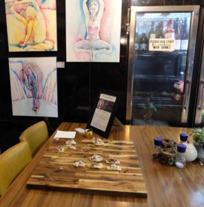
Announcing my exhibition of mixed media yoga paintings at Salt Yoga Sudio
Salt yoga studio is located at Christies Beach just outside of Adelaide and often features artwork by different local artists on their walls. This week I delivered a selection of my yoga inspired mixed media paintings to Salt Yoga Studio. I was so pleased with how my work looks in the beautiful space that I thought I would share it with you all this week.
Mixed Media Pieces
‘Floating Yogi‘ and ‘Uplifted Yogi‘ are two of my mixed media artworks inspired by lotus handstand and boat yoga poses respectively. They were created using a combination of acrylic paint, chalk and oil pastels. I thought that the bright rainbow colours looked amazing against the grain of the wood panelled wall at the back of Salt Yoga Studio.

‘Floating Yogi‘, ‘Uplifted Yogi‘ and ‘A Light Touch‘ against the wood panel back wall of Salt Yoga Studio
Resin Artwork
‘A Light Touch‘ and ‘Splatter Cat‘ are two resin artworks that were inspired by cat/cow and pigeon yoga poses respectively. They were created on acrylic painted canvases and the figure painted using epoxy resin mixed with acrylic paint pigments.

‘Splatter Cat‘ below the back window of Salt Yoga Studio

‘Floating Yogi‘, ‘Uplifted Yogi‘ and ‘A Light Touch‘ ‘Splatter Cat‘ along the back wall of Salt Yoga Studio
Fine Art Prints
An extra large print of my charcoal and watercolour nude painting ‘Flying or Falling‘ was one of the pieces that I took to Salt Yoga Studio. This piece is a whimsical artwork inspired by a nude dancer. Her blue and green toned skin and hair complements the purple wall behind her beautifully.

‘Flying or Falling‘ just inside the door to Salt Yoga Studio
Watercolour Paintings
‘Yogi Twist‘, ‘Rainbow Seahorse‘, ‘Inverse Nude‘ and ‘Starry Hoop‘ are all watercolour paintings that are on display in Salt Yoga Studio. ‘Yogi Twist‘ was inspired by a classic yoga twist pose. This nude artwork was painted on canvas using watercolour paints and masking fluid.

‘Yogi Twist‘ hanging next to all the yoga equipment in Salt Yoga Studio
‘Rainbow Seahorse‘ is one of my more textured watercolour paintings with stencils creating a rainbow pattern in the background. This piece was hung in the foyer of Salt Yoga Studio so that it is one of the first pieces of artwork that people see when they walk in. It depicts a stunning pole dancer.

‘Flying or Falling‘ and ‘Yogi Twist‘ just inside the yoga area
‘Inverse Nude‘ and ‘Starry Hoop‘ are some of my simplest nude paintings, but I think that simple can sometimes be even more effective, especially when there are so many different colours. In both pieces the nude figure is picked out in masking fluid whilst watercolour paint was applied to the background using a loose technique.
These pieces were also hung alongside ‘Rainbow Seahorse‘ in the foyer of Salt Yoga Studio.
Ink Paintings
‘Blushing Nude‘ and ‘Golden Hoop’ were both painted using drawing inks. Both of these pieces were hung alongside ‘Rainbow Seahorse‘, ‘Inverse Nude‘ and ‘Starry Hoop‘ in the foyer of Salt Yoga Studio.

‘Rainbow Seahorse‘, ‘Inverse Nude‘, ‘Blushing Nude‘, ‘Starry Hoop‘ and ‘Golden Hoop’ hanging in the foyer of Salt Yoga Studio
‘Blushing Nude‘ is currently my favourite of my nude paintings. It was created using black and white ink on mid tone paper. The special feature of ‘Golden Hoop’ , as its name indicates, is the gold leaf used to pick out the hoop that encircles the figure in the lyra/aerial hoop.

‘Amongst the Trees‘ watercolour painting in the very front of Salt Yoga Studio
The first thing that you see when you walk into Salt Yoga Studio is a watercolour painting that nearly became part of my Elemental Yogi collection but was replaced by a piece that was more true to the negative watercolour painting style. ‘Amongst the Trees‘ depicts Deanne Kong in ashtavakrasana (8 angle pose).
If you have a yoga studio, or know someone who runs one, and would like some artwork to brighten up the space please feel free to contact me at:

Announcing my exhibition of mixed media yoga paintings at Salt Yoga Sudio was originally published on the art of flying
#acro#acrylic#aerial dance#aerial dancer#aerial hoop#art#art nude#artwork#drawing#drawing ink#epoxy resin#exhibition#feminine nude#figurative#figure#fitness#flexibility#graceful#ink#lyra#mixed media#nude art#nude figure#nude painting#painting#portrait#resin#strength#studio#teacher
0 notes