
Don't wanna be here? Send us removal request.
Statistics
We looked inside some of the posts by thorntencrop and here's what we found interesting.
Average Info
Notes Per Post
27
Likes Per Post
20
Reblog Per Post
7
Reply Per Post
0
Time Between Posts
5 days
Number of Posts By Type
Text
11
Video
2
Photo
4
Last Seen Tumblr Blogs


Fun Fact
In Q3 of 2020, 31% of US users access the Tumblr app daily.
Text
Semiotic Analysis

Impact BBDO, Walid Kanaan (2010), Samsung: Optical Zoom, Dog [ONLINE]. Available at: Adsoftheworld.com
The print advertisement shown above was produced by Advertising Agency Impact BBDO, Beirut, Lebanon and published in December 2010. It markets, what appears at first, to be a new brand of camera. However there is no mention of a specific camera model, only references to the corporate branding; Samsung. This implies that the Company wanted to advertise new breakthroughs in technology, across multiple products and platforms, as opposed to features available in one specific camera. Whilst a camera itself does appear in the advertisement, it is rear-facing for the viewer and anchored along the bottom of the image. This connotes it’s proud sense of functionality, rather than aesthetics; referencing again the new breakthroughs in technology with Samsung products.
In terms of imagery itself, there are multiple levels of interpretation; but one main target audience. The photo manipulation shows a young lady walking a dog in the park. At first glace, from a distance maybe, nothing appears out of the norm. It’s a nice sunny day with no visual clutter to juxtapose the composition and Mise en Scene. However, the dog’s head has been digitally inflated in ways that are physically impossible in everyday life. This, by default, produces a caricature-looking scene or even a screenshot of a cartoon / animation. Nonetheless, it appears humorous in its form. This, as a result, draws in direct attention to the advertisement which, in turn, sparks a viewer’s curiosity and imagination. They begin to question the narrative and wonder what is trying to be portrayed. This naturally leads the target audience to understand the visual metaphor being depicted. It shows how disproportionately large the dog’s head would have to be in real-life to match the camera’s zoom capabilities.
A young lady walking her lovable dog in a park on a sunny day is typically associated with friendliness and positivity. This structuring creates a family-friendly design that further connotes the ease-of-use. It is visually implying that their products are technologically advanced, but still not overly complicated. This is further enhanced by the use of humor within the Advertisement; by exaggerating of the dog’s head. The technology is marketed towards a unisex target audience with little to no experience in photographic practices. It attempts to illustrate the power of this technology without revealing too much technical information; which may discourage certain viewers. The fact that it was published in December also means that it would have been targeted towards Christmas shoppers; hence the lack of detailed text / information. It would have acted as a subliminal push towards buying Samsung products; as they probably would have been viewed in a rush without any particular attention.
1 note
·
View note
Text
New Instagram Logo

This redesign was created by Mackey Saturday, a designer from Denver, Colorado, that focuses his efforts on Visual Identities and Branding. At first, there doesn't appear to be a lot of change in the Logo; A change in colour, the removal of the 'ink brush stroke' emulated within the type, minor changes to the capitalised 'I' and lower-case 'g' etc.
However, what do these all accumulate towards? It represents Instagram, as a brand, developing within a corporate world. It's a visual story of The transition from a small-time app run by a few developers and creatives, to internationally renowned multi-billion dollar company.
But how?
The original logotype used Billabong as it's official font. A typeface designed to compliment 1940's / 1950's hand lettering and script type. To an untrained eye, the changes may not be all that drastic; it still follows a very natural handwriting form that we're all comfortable with.

However the dramatic changes in line weight have been completely removed. It was used originally to emulate a personal handwritten feel; as though the designer had drawn the logotype with an ink brush. Instead, it has been replaced by strong uniform widths. Whilst it does still alternate in depth, it's a much more stylised script with strong contemporary elements.
The legibility of the logotype has been drastically improved as well, creating a much more fluid and dynamic design. It seems Instagram wanted to create a more professional branding to compliment it's stance within the industry.
1 note
·
View note
Video
youtube
This print-based ad is not only an amazing display of contemporary design, but a great example of interactivity too. The campaign is based around the abuse of children, with a goal of communicating a secret message to the target audience; young children.
0 notes
Photo


Nobody here even knows they were photographed.
3 notes
·
View notes
Text
Glitch Experiment
It all started when our boiler broke down. For days, there was no heat in our house; and this was during all the snow not so long ago! When finally decided to send a mechanic round, He opened up the boiler and I fell in love. The wiring, mechanics, the old pipes. kwepsfkrogkgokeogskre.

I took this photo on my phone, whilst he was fixing it all. It became the background of the design I produced. I wanted to create something that appered futuristic in it's form; reciting those well known cliches of random code, clean cut edges, and the sleek, yet complicated, geometry that we're all so used to seeing. However, I also wanted it to appear moderately grungy; as though the futuristic objects had been left to erode.

This is the first iteration. i've cropped in on the photograph, Added type on top and, as mentioned before, added the 'random code' The code you actually see here is the result of opening the original JPEG into a text edit software (notepad).
It looks okay? The composition is balanced and the colours definitely appear grungy. But it's just lacking that futuristic kick I want. Time to bring out the big guns.

THE GLITCH. I used Hexfiend to create this particular glitch. Definitely looking a lot better. However, as with most glitches, it's too much. The colours certainly appear somewhat post-modern; just not reflective of future times.

I started by desaturating the colours slightly, overlaying a few pre-made textures, and adding a little bit more of the 'random code'. Starting to look a bit better now, but it's still not enough.
Ladies, let me introduce you to the Gradient map.

And thus, the 'Mechanized' poster was born.
1 note
·
View note
Video
youtube
#glitch#art#PBS OFFBOOK#pbs#offbook#digital#design#graphics#corrupt#jpeg#distortion#tutorial#documentary#interesting
1 note
·
View note
Photo

Did I mention I like Glitches ...
4 notes
·
View notes
Photo

In the same shop as I mentioned in the previous post, I found this gorgeous piece of typography ... on a plate.
"Other planets cannot be as Beautiful as this one."
0 notes
Text
Creative Manifesto
I was in a little shop I had found in Huddersfield town centre that sold lots of novelty gifts and memorabilia. However I found this little treasure hidden away in a corner.
It's a designer's manifesto that has been printed onto various objects, such as pencils, a tea towel, and a notebook. The design itself is not only gorgeous, but the production itself! Next time I have money I'm definitely picking up some of these for the flat!
They were produced by wildandwolf.com - a website I could not recommend checking out more!
2 notes
·
View notes
Text
I am for a design that knows when to keep quiet, but instead questions. I am for a design that looks for vulnerability and embraces it. I am for a design that breaks assumptions and exceeds expectations. I am for a design that is never finished. I am for a design that steps out of it's comfort zone to tackle the real problems. I am for a design that has been iterated all night-long, under the heavy influence of coffee. I am for a design that strives to accomplish the unimaginable, from the basement of it's parents' house. I am for a design that carries experiments along side it as though they were polished trophies. I am for a design that is new, that is old. I am for a design that bends, breaks, stretches, crushes, folds. I am for a design that avoids mac.
I am for design.
After reading the manifesto by Claus Oldenberg, I am for an Art, I wanted to write my own (MUCH SHORTER) version about design. Whilst nowhere near as in-depth, I'm hoping to revisit this post and add more in the weeks to come
0 notes
Text
Good, or Bad, Design
Design is everywhere; period. I'm not just talking about Graphic Design either. Since the mid-19th Century, with the rise of the Industrial Revolution, corporations and business have applied the world of design to a commercial market. Everything was suddenly becoming consumerist-orientated with the proletariat at it's core. the Bourgeoisie were needing designers within all fields to produce professional creative solutions to their corporate work; whether that meant designing a new car, designing a corporate identity, designing new machinery at a factory, or designing a new tailored suit.

Obviously things have changed a lot since the late 1800's, but I think the core principles of what makes an effective design are still applicable.
So what does make good design? Or Better yet, what makes a design bad?
In my opinion, there are 3 basic conventions that underpin the successfulness of a design.
Social and Political context
Aesthetics
Content
I should point out that I'm going to be discussing design in terms of the visual platform (Graphic Design etc.); however I may refer to other types of design too.
I'll start by talking about Aesthetics; one of the biggest problems when producing visual work. When I say aesthetics, I'm referring to the observable front of a piece - the colours, the style, the fonts, the layout, the tone, the images etc. The biggest problem is that whether or not a client, designer, or customer find it visually appealing is entirely down to individual preference. Whilst It is true that there are certain generic clichés that we can associate to a stereotypical audience (e.g. skulls found attractive within a design aimed at metal music fans), this isn't a reliable method when communicating a message towards a targeted market. A designer can only produce work that is theoretically appropriate for the specific project in hand. Often you will find examples of design that may be aesthetically remarkable, but lacks in legibility, function and any specific communication; or vice versa.

Clearly, this poster has been created by a non-designer; a perfect example of bad communication. It is meant to be a visualization of data in a more appealing format than a report / essay - or as it is known in the world of graphics, an Infographic. However, the point of an infographic is to reduce all the information into as simple of a format as possible using diagrams and illustrations to describe the paragraphs of text. As you can see this process hasn't even been applied to the work. The creator has certainly attempted to improve the visuals by applying backgrounds, logos, graphics and colour throughout a space orientated theme. It doesn't take a trained eye however to point how miserably it has failed. Instantly, by overlaying a background with a black star image a dramatic contrast is defined within the composition - a strong contrast which is not intentional and hasn't been used to support any concept behind the piece. It, by default, makes any copy within the poster hard to read and greatly over complicates the process of trying to communicate the message itself. The creator, and other viewers, may believe these effects to be aesthetically pleasing, but in reality they only make the design look cheap, tacky, and very amateurish.
I could go on and on about the vast number of mistakes within this poster but instead I'll simply assume you understand my point by now and move on.
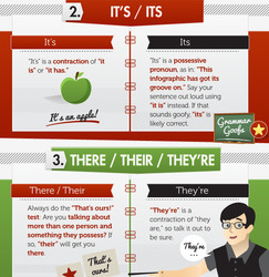
The above infographic was produced by BlueGlass at the beginning of last year. It is clearly very aesthetically pleasing and instantly communicates it's given message. The use of bold vivid colours, simple illustrations and structured layouts makes it not only easy to understand, but allows anybody to immediately appreciate the work gone into this particular design. Contrast is used to emphasise specific elements, all text has been appropriately kerned and leaded and a clear heirarchy has been defined within the piece which all help balance the composition and design in whole. There is very little to be criticized here which, in turn, leads me to argue why this is a good example of effective design. A clear ideology is represented within the design that communicates efficiency and formality, in what appears to be a friendly manner.
"Good Design is obvious. Great Design is transparent." Joe Sparano
My next point is around the Social & Political context of a creative solution. In any given project / brief the context is one of the top factors needed to be considered and designed around. This principle can be implemented in various way however, whether that means the context as a time-period (e.g. a design produced in 1960's) or the context as physical interaction (e.g. a design for serious corporate publicity). I know this sounds confusing, as per usual, but let me explain.
Imagine you are a graphic designer and have been contacted by Lloyds TSB about a new type of bank account they wish to offer to customers. It is your job to create the visual branding and set the tone for the advertisements. So as you could imagine the typeface's, photographs, colours etc. all need to shout out CORPORATE. They can be humorous or light-hearted in their form, but need to still communicate the bank's own ideology non-the-less. Consumers need to view the posters & flyers and immediately say "That's for a bank".
You will expect to see a design similar to this;
and NOT this.
Whilst it's not a particularly bad design, the context of the work is completely mismatched. The poster seems informal at it's best, connoting a sense of creativity and / or youth - a possible design more appropriate for a band poster or concert. Not a corporate campaign. This is exactly why the context is vital.
Now I cannot stress this enough. The things I have talked about should be merely taken with a pinch of salt. I am only a undergrad student currently partaking on a Graphic Design course, with little knowledge nestled under my tree within the world of Contemporary design. There will be things that people may both agree, and disagree, with here; things that people may love or hate. This is simply my own thoughts on visual imagery based on my current position within the creative industry. But please feel free to elaborate or discuss any of my mentioned thoughts!
1 note
·
View note
Text
Claes Oldenburg
I am for an art that is political-erotical-mystical, that does something other than sit on its ass in a museum.
I am for an art that grows up not knowing it is art at all, an art given the chance of having a starting point of zero.
I am for an art that embroils itself with the everyday crap & still comes out on top.
I am for an art that imitates the human, that is comic, if necessary, or violent, or whatever is necessary.
I am for all art that takes its form from the lines of life itself, that twists and extends and accumulates and spits and drips, and is heavy and coarse and blunt and sweet and stupid as life itself.
I am for an artist who vanishes, turning up in a white cap painting signs or hallways.
I am for art that comes out of a chimney like black hair and scatters in the sky.
I am for art that spills out of an old mans purse when he is bounced off a passing fender.
I am for the art out of a doggys mouth, falling five stories from the roof.
I am for the art that a kid licks, after peeling away the wrapper.
Read the full Manifesto here.
0 notes
Text
Processing 3 - The Glitch
Within the lecture in which Processing was introduced to myself and fellow students our tutor, Roby Lycett, demonstrated a live example. He wrote a piece of code that loaded a JPEG image, converted it's individual pixels into a binary code, randomly selected a piece and then replaced with with another random bit of binary (e.g. 100101101110101110101 ...), converted it back into a JPEG and proceeded to open the file. The visual output was a 'Glitch' - something in which I have fallen in love with.

Due to the manner in which JPEG compression works, the images alignment, colour and tone were all drastically manipulated, producing imagery reminiscent of old faulty CRT TV monitors. To put it simply, It creates randomly generated Gorgeousness.
Unfortunately, I don't know enough about processing, yet, to be able to recreate this type of code myself. Using a similar technique however I have managed to produce aesthetically similar results using 2 techniques. The first, and easiest, is to open a JPEG image within notepad. This automatically converts the image into digital code which can be copied, pasted, deleted, shifted, and manipulated in any which way you see fit. Experiment. Play around with it. Often you will find the results to be very interesting; be careful though, it is all too easy to over-distort the file and loose all it's original qualities!

The second method consists of converting a JPEG into a 1-bit BMP and opening this RAW data within Audacity. This not only creates a audio version of your file, but allows you to apply audio-based effects and compressions and edit it in a sound format. The file is then exported back out as either a BMP or JPEG.
Alternatively there are websites available that have converted this programming into an automated process using HTML5; whilst the results are restricted in resolution, they can quickly produce results that are often beautiful in form.
Try it for yourself at http://www.airtightinteractive.com/demos/js/imageglitcher/
As a demonstration of these types of effects, I have taken some of my own artwork / designs and applied these glitch effects. Whilst I personally adore them, it is down to your individual taste whether or not you enjoy this kind of randomness.


If you enjoy this kind of work I highly suggest you check out the book "Glitch: Designing Imperfection" by Iman Moradi and Ant Scott

#thornten#haywood#lecture#glitch#processing#programming#random#image#corrupt#design#art#imperfection
6 notes
·
View notes
Text
Processing 2
One of my favourite examples of the application of Processing is the Digital Natives project by Matthew Plummer-Fernandez. Everyday items, such as toys and watering cans, are digitalized in a 3D format using a digital camera and subjected to algorithms (programmed using Processing) that distort, abstract and taint them into primordial geometric vessel forms. In some cases, the manipulation is so extreme that only close inspection reveals traces inherited from their physical predecessors. These 3D models are then printed using the latest 3D printing technology and re-photographed in their original context. This 'Flip-Flop' process jumps between both the physical and digital world regularly during the production of work to create a very creative and distinct body of work; all based upon the programming within Processing.


As you can see by the work itself, there were specific parameters set within the programming that controlled the colour, the shape edges, the masking of the overall shape, there were constraints so the size of the individual polygons weren't too small so they created visual noise, but weren't large so that the tone and depth of the objects were still visible. Once these rules were defined, it was down to the computer to calculate and randomly generate the objects necessary to compose and recreate the original 3D models. This is exactly what I meant earlier when talking about randomly generated work.
#processing#programming#artist#3D#model#3d print#language#design#scan#creative#matthew plummer-fernandez#Digital natives#digital#natives
1 note
·
View note
Text
Processing
"Processing is an open source programming language and environment for people who want to create images, animations, and interactions. Initially developed to serve as a software sketchbook and to teach fundamentals of computer programming within a visual context, Processing also has evolved into a tool for generating finished professional work. Today, there are tens of thousands of students, artists, designers, researchers, and hobbyists who use Processing for learning, prototyping, and production."

In layman's terms, processing is a programming language that produces work with a visual output at it's core. The author of the code strives for aesthetics based upon a digital input - essentially tearing back software, like Adobe's Photoshop, to it's very basics. It encourages an artist / designer to create imagery using a somewhat monochromatic interface (programming screen) as opposed to visual input into the layout and design.
RANDOMNESS TAKE HOLD
As a result, the process of randomly generated work plays a major role. The production and manipulation of work no longer relies heavily an artist / designers trained eye to create perfect aesthetics, but rather a computer to digitally process and calculate exactly what is told. Digital parameters are defined, constraints are met, and randomness explores it's boundaries within these pre-defined rules.
I know this sounds a little confusing, but trust me when I say it's not. We are used to physically interacting with the placement of an image within a composition in Photoshop; having the ability to move around a subject by mouse an place it exactly where the eye may compositionally find it pleasing. When we apply filters and colour manipulation, we critique it in real time as the slide-bar within the software's UI is adjusted and the work changes before our eyes. Processing encourages you to step away from this direct interaction and create work simply based upon principles of design - e.g. you want to tint a photograph and lower's it's opacity on top of another layer. So instead of physically viewing these alterations immediately, you type in the code (set the parameters for which you manipulate the image) and allow randomness to take hold. The result could be horrific, or it could be beautiful.
This whole process itself reminds me of old film photography. Plenty of photographs would be taken to capture the one 'perfect shot', but it wasn't until the photographs were developed could we see the final output. This directly resulted in a variety of unintentional shots that were quite often beautiful as a piece on their own. This influenced the birth of lomography; A whole collection of photography based upon the principles of distortion and randomness.
Processing is free to download and available at www.processing.org
1 note
·
View note
Photo

A very clever and creative manifesto written by Holstee.
5 notes
·
View notes
Text
So what is a Manifesto?
“A manifesto is a paper written to explain what you're all about - and why you believe that way. Or perhaps what your plan or intentions are. If you developed a purpose and direction statement for your life, it would be a manifesto.” Wiki.answers.com
“A manifesto is a written public declaration of the intentions, motives, or views of the issuer, be it an individual, group, political party or government. A manifesto usually accepts a previously published opinion or public consensus and/or promotes a new idea with perspective notions for carrying out changes the author believes should be made. It often is political or artistic in nature, but may present an individual’s life stance.” Wikipedia.org
“A manifesto is a document that sets forth the principles and goals of an organization. Typically, it is designed to be widely distributed to the public, and it serves as an official declaration. Often, the document is political in nature, as is the case with the Communist Manifesto, although it can also be employed by artists and other collective groups as a medium of communication. In many instances, a manifesto is highly revolutionary, and is designed to stimulate public dialog.” Wisegeek.com
These are just some basic definitions sampled from various online sources attempting to explain what a manifesto is. Typically, they appear to be political in their form. However, these political views can be implemented across various subject areas. They are not only the political views of somebody in a parliamentary position, but rather the political views of an artists living in his basement, or the views of a designer in her office. They are a personal set of views about a particular topic; whether that be a world orientated opinion, or design ethic relevant to a specific project.
0 notes