✨ Catalina Maria Cimpoesu ��� 19034277 ✨ MA Graphic Design
Don't wanna be here? Send us removal request.
Statistics
We looked inside some of the posts by catalinacimpoesu and here's what we found interesting.
Average Info
Notes Per Post
0
Likes Per Post
0
Reblog Per Post
0
Reply Per Post
0
Time Between Posts
4 days
Number of Posts By Type
Text
13
Last Seen Tumblr Blogs


Fun Fact
The average Tumblr user visits about 67 pages every month.
Text
Methodology
Regaining equilibrium
The whole experience established a clearer path when it comes to my first impulses and preferences. Using reflective research as my method was not a surprise for me. The effectiveness of my research led me to narrow my area of interest. Analysing the posts in a sequential order can show an insignificant difference in the approached style. I truly enjoy reflecting on any of my actions or general subjects, to discover my way of thinking and shaping my future reactions.
Constantly dreaming, wondering and questioning my inner-self are traits established in my personality. Reflection is the main step into gaining full awareness and it triggers the possibility of finding the desired answers (Knapp, Gottlieb & Handelsman, 2017).
The posts are based on personal experiences and are approaching either chapters from my past or ideas that at some point caught my attention. Thinking about my feelings, choices and ways of creating artworks helped me selecting intriguing ideas to debate, research and reflect on, following my instinct.
Complete objectivity was never an existing aspect for me. Philosophically speaking, under any circumstances, there will always be a form of subjectivity involved trough a functional human mind exposing its point of view. After researching about the subject, my view expanded in general terms comprehending the fact that objectivity represents the highest form of respect for the approached subject and it creates its surroundings when no other form of emotion is present (Ratner, 2002).
My approach tends to be subjective on a certain level, despite always trying to show objectivity as much as I can when it comes to reflective topics. Having an overall view on a specific subject, along with analysing different perspectives and scenes helps with fully understanding an issue. There are chances to makes it even more complex, depending on the scenario. I tend to put in balance facts and common knowledge, without involving any political, religious, or moral idioms. Thinking about a possible wider approach can be spotted in each open conclusion of the posts.
My actions are mostly based on feelings, this being one of my characteristic traits since I was young. One of my guilty pleasures is just to understand the deeper reason for feeling or acting in a visible way. Many topics were chosen by introspection and my need to understand people’s point of view to create my own opinion. One of my objectives was to make the reader feel exactly what I felt while writing every word. To grow along with me and leave with new information in mind or raising eyebrows. Some of the posts are exploring taboo subjects or daily struggles every artist has, without being aware of them, making the whole atmosphere of the blog as being a non-judgmental place.
Feelings are playing an enormous role in my writing style. Depending on the surroundings, emotions or my overall mood, tiny changed details can be observed in how I tend to speak about the presented issue. Besides, my soft skills would never let me down when exposing my beliefs to an unknown public and make me overthink and twist the problem on every side.
On a few posts, I have tried to replicate the research discussed there in a particular way. Based on my experience, I analysed my inner-self, regarding the approach subject. Trying to visualise myself dealing with a specific problem, for a better understanding, I tried to be a part of the practical side of the topic. I tackle some of the discussed statements by making myself the guinea pig and develop my” live” reaction, placing it as the starting point of the whole scene.
My current choices are influenced by past positive and negative experiences on a large scale, as I have mentioned in the “Self-love-time-machine” post. Defining my way of seeing things I can say not much had changed in comparison with a younger version of myself, but the only observable difference is that now I know my priorities, I am more secure in taking actions and I am not afraid of being wrong, always choosing to assume everything I say and receive constructive feedback when needed. Also, my sense of preferring the most unconventional topics to face things people are afraid of remained one of my priority values.
Because I love writing and engaging people into being introspective, I consider my posts to have a high percentage of originality. All the presented statements are original even if in that the inspiration came from revised articles or books. I always had believed that before making an idea public you need to filter your thoughts through many layers of your imagination and realistic perspectives. Treat everything with a pinch of salt despite the awards a published source has.
Reliability and validity were present during the whole process, representing key factors into gaining trust-worthiness from other people. I mainly analysed in-depth each unanswered question I had so far. Using peer-review materials, rather than unverified articles in most of the cases provides a relief sensation at some stage of the reading process. Although I prefer reading online blogs and magazine articles more, verified sources showing case studies, experiments and measured researches are always a safe way to build an indestructible opinion on.
Nevertheless, on some of the posts, I started contemplating about multiple complementary situations. At some point, the initial idea is not even related to the one I started the post with, due to the presence of curiosity, increasing the importance of the question, step by step. I do not consider that I have gone too in-depth with any of my exposed ideas and as a perfectionist, I could have found many more solutions or solving alternatives to many queries I have had, which I did not do. Repeating this task over time would lead to a performance in my analytical skills and in a better understanding of the concept of objectivity and subjectivity (Inayah et al., 2017).
Moreover, I had limitations when speaking about many aspects and as much as I desired to embrace the efficiency of my critical skills I am afraid I will not be able to, at the moment. Due to the lack of orientation or the presence of never-ending fields of research, when I got stuck between words I used the “So what?" question and like an annoying toddler, I was suddenly surrounded by plenty of unexplored territories.
To conclude, the importance of owning an informed-based opinion rather than making hypotheses and speculations on rumours is more powerful now than ever. This journey helped me to develop my hard and soft skills, on multiple plans, along with bringing back my passion for writing any thoughts I am concerned about.
-------------------------------------------------------------------------------------------
Inayah, A.T., Anwer, L.A., Shareef, M.A., Nurhussen, A., Alkabbani, H.M., Alzahrani, A.A., Obad, A.S., Zafar, M. and Afsar, N.A. (2017) "Objectivity in subjectivity: do students’ self and peer assessments correlate with examiners’ subjective and objective assessment in clinical skills? A prospective study", BMJ open, (Online) vol. 7, no. 5, pp. e012289-e012289. Available from: http://dx.doi.org.ezproxy.herts.ac.uk/10.1136/bmjopen-2016-012289 [Accessed: 5th January 2021]
Knapp, S., Gottlieb, M.C. and Handelsman, M.M. (2017) "Enhancing Professionalism Through Self-Reflection", Professional psychology, research and practice (Online) vol. 48, no. 3, pp. 167-174. Available from: http://dx.doi.org.ezproxy.herts.ac.uk/10.1037/pro0000135 [Accessed: 29th December 2020]
Ratner, C., (2002) September. Subjectivity and objectivity in qualitative methodology. In Forum Qualitative Sozialforschung/Forum: Qualitative Social Research (Online) vol. 3, no. 3. Available from: https://doi.org/10.17169/fqs-3.3.829 [Accessed: 5th January 2021]
0 notes
Text
Visual manipulation
Beware of the what you actually see
Nowadays is very common to post our thoughts on social media and compare them with others, usually seeking validation. Equality leads to lots of uncertified opinions spread throughout the Internet (Clark & Sikkink, 2013) which play a significant role in the society’s perception about a specific subject.
Without going further into details, we can say that especially when a worldwide problem is discussed, the chances of creating fake news and spread rumours are quickly increasing. Approaching the variety of events that happened in the past year, I started observing from a distance the created sides and their shared opinions. Furthermore, with the existing accessibility of social media, we, as social creatures, have online platforms that are transforming themselves in “mined territories” in a blink of an eye, when populated by non-experts.
Moreover, having an opinion represents a human right, but spreading rumours that are not based on statistics and proved knowledge can cause real chaos (Suzor, et. al, 2019). Regarding the recent pandemic, I have started seeing multiple posts about many conspiracies that had photoshopped images as “proof” for the mentioned arguments. The problem was that not all people have the ability of spotting a retouched image, due to their lack of knowledge in this domain.
I immediately started questioning myself if is it legal to use editing programs as a clickbait in the support of an argument and how useful is social media in decreasing these scenarios that can confuse the audience. While scrolling on Facebook, I realised that many people were influenced by the lack of credibility of their sources of information and by copying someone else’s behaviour because of their trust put in that person (Meel & Vishwakarma, 2020). This kind of behaviour encourages people to become more suspicious and usually, they have problems with discovering a pattern that covers the false news, ending up losing themselves in a polluted web content.
Double-check the “normality”
This habit exists since the beginning of the creation of the digital era and in over 20 years its outcome is gradually becoming sued for creating false stereotypes. What am I talking about? Adobe Photoshop and excessively photo manipulation. The software’s purpose is originally meant to retouch photos just to recreate the 3D live feeling a photographer is experimenting while taking the photo and choosing its subject, into a 2D from where all the senses, except the sight, are decreased to the lowest presence level (Kelby, S. 2016).
Over the years, this aspect dramatically changed and the usage of photo manipulation software created high-standardised guidelines exposing the public to many internal disorders based on their aim for reaching people’s admiration (Schirmer et a., 2018). Many magazines became known for using too many effects and strong retouches on their pictorials, changing the models’ features while underestimating the power of desiring the “common beauty standards”.
Disinformation can be created by anyone able to understand the functions of Adobe Photoshop or any other similar software. In simple terms, anyone can spread fake news and use overly-edited photos to manipulate a mass. The created rumours can and are usually debunked by professionals and not only, making the sectors fluctuate into a constant movement (Krafft & Donovan, 2020).
But can people use Adobe Photoshop to create rumours about a worldwide topic? Is this even legal? And more important: What are the implications of design in this kind of cases? The answer: Almost none. In fact, graphic design has nothing to do with spreading rumours, hence its purpose of visually educating the public and not taking advantage of its manipulative power in no other way except a creative one.
In addition, promoting fake news using graphic design’s proprieties is in theory illegal, but in the present moment the highest penalty received by the creator can be from the specific platform used for spreading his materials, in the form of blocking the user and ban his misleading information from reaching many more innocent people. Due to the freedom of speech there are no existing legal attributes added to the online removal and in my opinion this should require a revision of terms, for decreasing the created damages, in the future.
Overall, taking advantage of using graphic design for generating false information can be eliminated either by technology and the use of the powerful teams that own the main social media platforms, or directly by people and their social responsibility founded on asking hard questions (Busari, 2017).
To conclude, considering all available manipulation techniques, graphic design can be considered the owner of a small contribution in misleading viewers, but until legal terms will be renew, this aspect should be analysed in-depth with accredited sources.
-------------------------------------------------------------------------------------
Busari, S. (2017) How fake news does real harm. TED Talks (Online Video) Available from: https://www.youtube.com/watch?v=lwVYaY39YbQ [Accessed: 26th December 2020]
Clark, A.M. and Sikkink, K. (2013) "Information Effects and Human Rights Data: Is the Good News About Increased Human Rights Information Bad News for Human Rights Measures?", Human rights quarterly (Online) vol. 35, no. 3, pp. 539-568. https://www.jstor.org/stable/24518073 [Accessed: 26th December 2020]
Kelby, S. (2016) Why We Retouch People in Photoshop TED Talks (Online Video) Available from: https://www.youtube.com/watch?v=RDq-NiKBxi8 [Accessed: 26th December 2020]
Krafft, P.M. & Donovan, J. (2020) "Disinformation by Design: The Use of Evidence Collages and Platform Filtering in a Media Manipulation Campaign", Political communication (Online) vol. 37, no. 2, pp. 194-214. https://doi-org.ezproxy.herts.ac.uk/10.1080/10584609.2019.1686094 [Accessed: 26th December 2020]
Meel, P. and Vishwakarma, D.K. (2020) "Fake news, rumor, information pollution in social media and web: A contemporary survey of state-of-the-arts, challenges and opportunities", Expert systems with applications (Online) vol. 153, pp. 112986. Available from: https://doi.org/10.1016/j.eswa.2019.112986 [Accessed: 26th December 2020]
Schirmer, N.A., Schwaiger, M., Taylor, C.R. and Costello, J.P. (2018) "Consumer Response to Disclosures in Digitally Retouched Advertisements", Journal of public policy & marketing (Online) vol. 37, no. 1, pp. 131-141. Available from: https://doi-org.ezproxy.herts.ac.uk/10.1509/jppm.16.188 [Accessed: 26th December 2020]
Suzor, N., Dragiewicz, M., Harris, B., Gillett, R., Burgess, J. and Van Geelen, T. (2019) "Human Rights by Design: The Responsibilities of Social Media Platforms to Address Gender‐Based Violence Online", Policy and internet (Online) vol. 11, no. 1, pp. 84-103. Available from: https://doi-org.ezproxy.herts.ac.uk/10.1002/poi3.185 [Accessed: 26th December 2020]
0 notes
Text
Blindfolded mindfulness
Have you ever tried to draw with you eyes closed?
Involuntary inspiration
Since we are in kindergarten we are taught to colour only in between the lines and do not cross any edges of the shapes. I personally always hated doing that so I preferred to make my strokes instead of filling other person’s empty contour.
Recently, I have come to the concept of drawing losing the ability to rely on your eyesight. This exercise is not only helpful with identifying your emotions, but also with practising your creative skills. Through meditation, people aim to synchronise the movement of the body to the thoughts in the mind ending up in a relaxed present state. Reaching awareness through paying attention to the present moment can have long-term benefits to both mind and soul (Morr et. al, 2020).
Despite thinking this objective is easy to get to and is already made daily, in reality, it's pretty hard to obtain.In many cases, artists lose their creativity due to many external or internal factors or feelings generated either by their activities or by the interactions with others. Sensations such as stress and anxiety can occur but meditation can help by gradually eliminating them (Munoz et. al, 2018). Teaching the subject into thinking about the presence of constant hope is usually the key. For many, meditation sounds boring. In my opinion, the world would be a better place if people would include reaching momentum in their daily activities.
We, as creatures with stimuli, feel. We need to feel in order to understand. And we need to understand in order to create. When I first tried drawing while being blindfolded I immediately panicked. For some reason, my hand was afraid of touching the paper or leave any mark on it even if I was aware nothing bad can happen. Noting was pushing me and I had all the time in the world, but my senses were blocked. I was lost. But why your mind is not connected to your body as it should be?
Instead of using “empathic aesthetic” and drawing from observation, (Wolk, Barak & Yaniv, 2020) while representing the object in front of my eyes by illustrating the emotions from that moment, the subject needs to truly experience the item selected for representation. The insecurity and the realisation of becoming challenged triggers the mind and creates a blockage in the body.

Blindfolded drawings (Cimpoesu, 2020)
After that, all of a sudden all parts of the body start to cooperate, designing something that in the mind looks wonderful, but on paper, it ends up as an abstract asymmetric line collision. Until you stare at it and start giving it some colour. A strange phenomenon is happening and this is the moment when your mind is generating ideas.
For example, in my first experience of unguided blindfolded drawing I ended up with this having in mind: “I will draw a princess, a prince, a castle, a fuming dragon, some flowers and a river. That is it.”

Blindfolded sketch (Cimpoesu, 2020)
This cliché scene that appeared in my mind had been transformed into "The memorable story of the explosive party thrown while the princess was not at home". Just by gradually adding colours, my mind started generating ideas about a possible new story with endless scenes and characters. Showing in the front a river full of pink gin and the music that is making the castle's roof to jump, while people are making immense queues at the entrance are some details that appeared while I was adding details.

The explosive party (Cimpoesu, 2020)
Leaving the creativity part aside, this exercise helps reflect on your own emotions without judging your reactions. Hoping that the final result will look as detailed as it was in your mind, but opening the eyes and becoming disappointed for a few minutes until you realise the created artwork is fine represents therapy for the mind.
A step ahead
Approaching a slightly different aspect, a deviation of this manner whoud be asking if the action of drawing is essential in practicing graphic design. My initial thought was “yes, you need to know how to draw in order to create” but surprisingly many known graphic designers consider themselves bad at hand drawing in spite of their popularity.
Contemplating on this question and imagining different scenarios I could not only make myself dig deeper into an internal dispute. I have a lot of creative friends able to create and visualise amazing ideas without knowing how to draw realistic images. At the same time, despite their brilliant minds they do not work in creative fields because they do not consider themselves artists.
Nowadays graphic design is represented by different digital processes put together after learning using a specific program. You, as a graphic designer need to understand shortcuts and many buttons role in order to have the desired outcome. In the digital world, things such as hand drawing are not mandatory because of them being replaced by software is able to reproduce sketches. I truly believe that for a graphic designer drawing skills are not mandatory, but in some scenarios, they can make a significant difference regarding the way you are expressing yourself.
To sum up, creative exercises are a priority in every human’s inspirational path, but there comes a point where even their creativity needs to be challenged and these kind of spontaneous activities will have a massive impact, most of the times.
-------------------------------------------------------------------------------------------
Cimpoesu, C. M. (2020) Blindfolded drawings. Unpublished personal artwork.
Cimpoesu, C. M. (2020) Blindfolded sketch. Unpublished personal artwork.
Cimpoesu, C. M. (2020) The explosive party. Unpublished personal artwork.
El Morr, C., Maule, C., Ashfaq, I., Ritvo, P. and Ahmad, F. (2020) "Design of a Mindfulness Virtual Community: A focus-group analysis", Health informatics journal (Online) vol. 26, no. 3, pp. 1560-1576. Available from: https://doi-org.ezproxy.herts.ac.uk/10.1177/1460458219884840 [Accessed: 23rd December 2020]
Munoz, R.T., Hoppes, S., Hellman, C.M., Brunk, K.L., Bragg, J.E. & Cummins, C. (2018) "The Effects of Mindfulness Meditation on Hope and Stress", Research on social work practice (Online) vol. 28, no. 6, pp. 696-707. Available from: https://doi-org.ezproxy.herts.ac.uk/10.1177/1049731516674319 [Accessed: 23rd December 2020]
Wolk, N., Barak, A. & Yaniv, D. (2020) "Different Shades of Beauty: Adolescents' Perspectives on Drawing From Observation", Frontiers in psychology (Online) vol. 11, pp. 687-687. Available from: https://doi.org/10.3389/fpsyg.2020.00687 [Accessed: 23rd December 2020]
0 notes
Text
Creative resentment
From heaven to hell
During the quarantine, back in March 2020, one of my friend and I wanted to open an online Branding Agency. Having the same goal in mind, we started to build an organised Drive to gather all the required materials. Becoming a freelancer is not such an easy job but many people are voluntarily dreaming of being their boss more than ever (Hershey et al., 2017). A lot of dedication and self-thought skills are required, but in the end, it can be the most satisfying feeling. In simple terms, I was the one dealing with the Graphic Design part of the agency and my friend was coping with the Web Design area. Because both domains work together, our long-term idea could have become sustainable in terms of money and offered quality services. Purchasing a package containing brand identity services along with a personalised site is the bundle many customers aim for in the 21th digitalised century. Unfortunately, neither of us was certified in his subject and the other one’s subject, but we were willing to learn on the way.
Opening a business implies a lot of topics to cover, but despite all the issues we faced we got stuck at the one that supposed to be the non-existent. The mission of creating a brand identity reflecting our traits, emotions and personalities dramatically failed (Lin & Sung, 2014). If somebody would have guessed why our idea suddenly stopped (spoiler alert?), it might be because of a legal matter, the subject designers want to deal the least, but just thinking of not being that made the situation worst.
The struggle
After days of thinking about an interesting name, I came up with the idea of “iscreambrands”. The story behind? “Scream” represents a really powerful word. Whatever the sound is, it certainly makes “things” being observed anytime when is passing a closed space. I preferred thinking about a joyful shout when saying “scream”. A moment of sudden happiness. “Brands” are what we wanted to create. And especially powerful, outstanding brands that would make people wonder who was the artist behind them. “iscreambrands” was meant to describe the fact that “We eat brands for breakfast. We know what we do and we are doing it like professionals.”
Setting a buyer persona and our top 3 beliefs and features helped me understand better what we aim to show to the outside world (Neumeier, 2005). My and my friend had many online conversations where we set and wrote down every aspect that could have lead to strong brand equity (So, King et al., 2017) simultaneously understanding the customer’s and the company’s perspectives trying to create a balance between them. Only through fully understanding our purpose and emphasising with the others’ need we could have delivered unforgettable services and products.
Despite that our unique selling proposition did not reach my standards and now, looking back, the accumulated frustration was slowly appearing since this moment.

Brainstorming for logo creation process (Cimpoesu, 2020)
It was not the first time for me when I was creating a brand identity from scratch but just having in mind that it's a personal company made it 100% harder.
Creating the brand identity process begun with gathering inspiration and sketching the logo. From the first moments, I have known both of us wanted to be a typographic logo simply showing the entire name. This would have had represented a conversation starter when meeting a possible customer or competitor. Despite that I tried to sketch and explore more sides, looking for that brilliant idea. In my work, the main goal is always to find a story worth to tell when explaining the visual identity. I consider “How would you ever think of that?” type of questions as being the number one priority achievement when interacting with the public willing to discover one of your artworks for the first time. At the same time the logo should have had include any type of illustrated motion symbolising vibration and emotions. In a few words seeing the logo for the first time would have had create and shivery feeling.
Youth, spontaneity and empathy were our defining traits. Yellow was the main used colour and minimalism was the followed style. As simple as it sounds, creating a Mood board was an item that helped me visualising our preferences in order to go further on the right path. Or not.

iscreambrands Moodboard. (Cimpoesu, 2020) All sources and many more here & here
After many hours spent on researching, visualising, brainstorming, drawing, colouring, writing and vectorising nothing was good enough. The plan B was to start visualising the website of the brand. Again, ideas would not appear under any circumstances. Asking myself “Why do I have a blockage? Why could I not see anything even surrounded by al those materials?” while maintaining a positive attitude gave me shivers every time. “I followed all the steps the theory is listing and all I could create is a mainstream logo.”
Overthinking every step ahead and every possible scenario can be your closest friend and worst enemy (Kapferer, 2008, pp.15-17) if you are being realistic and have enough patience. All of a sudden nothing was good enough for me to have the will of promoting the agency further. In addition, I came up with a conclusion that there are not many materials published online, helping you overcome the lack of creativity issues.
(Not) all stories have happy endings
My mind is usually visualising things quickly after understanding the brand's needs and story but now it was different. Every learned and followed principle it was not applying on “iscreambrands”. I did not feel the need to create it.
Why? While I was aggressively waiting for the best idea to show up, I started to hate the whole concept and question my actions towards it. In addition, I did not see a bright future for the agency anymore as I started having other priorities. Despite all initial long-terms objectives I was not prepared enough to share ideas with someone else. It sounds a little bit selfish, but being totally transparent with myself I have finally let this though out after many attempts.

iscreambrands logo (Cimpoesu, 2020)
Creating a personal brand identity should be easier in theory because you, as a graphic designer know from the start all the steps, needs and the desired outcomes. On the other hand, it can be really stressful to reach your high expectations, especially when you are not seeing a stable final product. Graphic design includes emotions and despite the struggle of not take every client-based project as a personal one, in this case the opposite happens involuntarily. Exactacting yourself from visualising your personal brand as never too satisfying takes practice and many tries and failures.
“iscreambrands” remains a short journey while I have learned a lot about myself and the others present in the business environment. It is a goal I have stepped outside of my comfort zone for and met a lot of creative people from whom I have learned design tips and tricks and not only. These types of actions are recommended for people willing to challenge themselves because the desired change is guaranteed and visible.
As a future graphic designer, this experience left me with the two major following questions I cannot fully answer at this point in my life, despite of the research I made: “Is it going back to the drawing board always effective? What if you are not feeling that the outcome will be worthy from the beginning?”
To conclude, aiming to create a personal brand was a effective start, but only the experience of working with myself and with other clients will lead to reshaping my creative perspectives, over the years.
-------------------------------------------------------------------------------------------
Cimpoesu, C. M. (2020) Brainstorming for logo creation process. Unpublished personal artwork.
Cimpoesu, C. M. (2020) iscreambrands Moodboard. Unpublished personal artwork.
Cimpoesu, C. M. (2020) iscreambrands logo. Unpublished personal artwork.
Hershey, D., van Dalen, H.P., Conen, W.S. and Henkens, K. (2017) "Are “Voluntary” Self-Employed Better Prepared for Retirement Than “Forced” Self-Employed?", Work, aging and retirement (Online) vol. 3, no. 3, pp. 243-256. Available from: https://doi-org.ezproxy.herts.ac.uk/10.1093/workar/wax008 [Accessed: 20th of December 2020]
Kapferer, J. (2008) The new strategic brand management: creating and sustaining brand equity long term, 4th edn, London. Kogan Page
Lin, J. and Sung, Y. (2014) "Nothing Can Tear Us Apart: The Effect of Brand Identity Fusion in Consumer-Brand Relationships", Psychology & marketing (Online) vol. 31, no. 1, pp. 54-69. Available from: https://doi-org.ezproxy.herts.ac.uk/10.1002/mar.20675 [Accessed: 20th of December 2020]
Neumeier, M. 2005, The Brand Gap, 2nd edn, New Riders.
So, K.K.F., King, C., Hudson, S. and Meng, F. (2017) "The missing link in building customer brand identification: The role of brand attractiveness", Tourism management (1982) (Online) vol. 59, pp. 640-651. Available from: https://doi.org/10.1016/j.tourman.2016.09.013 [Accessed: 20th of December 2020]
0 notes
Text
Negative white & positive black
What about gray?
Negative space is usually considered one of the most important principles, especially in UI design. Because of its power to guide the viewer using subtle manipulation techniques many designers tend to use it without even notice its presence (Lee, 2007). I did the same for a long period until I was completing a task from the 365 Days of Creativity book that I have and that was “challenging me to draw objects using only negative space”.
Negative space and positive space are obviously completing each other. They depend on each other. You cannot have background without foreground and that is pretty clear. There is not matter without anti-matter. No good without bad. And so on.
Usually, white space is considered as being the negative space in a piece of art, most probably because of the newspapers and publication era where, because it was cheaper to only print the letters in black, the background was left a light colour. In this case, people are not that touched by its presence. Everything seems “normal”. Many optical illusions can be easily made for achieving the communication goals and make sure the public is perceiving the most important information first to keep reading or visualising the image.
But what if we switch the colours making the writing white and the background black?
The majority of the viewer will probably think the black space is bad and stands out in the wrong direction from the ordinary at some point. In the meantime, when the white background is presented, a low percent will find it disturbing. This way of seeing things can be influenced by many visual factors, but not only. Nowadays many mobile applications, sites and platforms are owning a “night version interface” with the purpose to make the whole content easy to read in darker space (Dubrivna & Dubrivny, 2020). Even with these recent innovations people are skeptical when understanding negative space and in my opinion, the existing stereotypes mainly influenced their first thoughts on this subject.
Breaking stereotypes
Racism was always a conflictive subject between people, but just in these past years, society realised its importance and started to become vocal. The bravery of “swimming in the opposite direction” made visible through social media posts, enhanced the disregarded discrimination. The movement is still developing and coping people all over the world, aiming to create efficient activists. This mentality starts in many cases with the provided education. This concept is induced by the society (Wijeyesinghe, Griffin & Love, 1997) through its active mentors that need to understand the problem by themselves first, in order to inspire the children.
Small details such as “when typing the word <<CEO>> on your mobile keyboard the white-skinned blonde emoji appears” are making a difference in equality-aware design teams and an ignorant one. Despite those “missed pieces” many campaigns were released during last years and were approaching the empowerment of race-equality topics (Examples here & here ).
Graphic Design has again the power to change collective thinking based on traditional and feudal perspectives. Simply by thinking that "black is evil and white is pure" is very comfortable for people to associate everything similar to these ideas. Adding the history aspects on top and the preconceptions passed through generations, leads to creating powerful stereotypes (Katz, 2003). People need to understand all of us are overall made out of flesh, minds and souls. The exterior is just what covers everything.

Ivascu (2017) “You’re wrong, Google.” Racism. It Stops With Me. Australian Human Rights Commission
In fact, stereotypes and racism are two different things, but racism leads to one major stereotype: all varieties of dark-skinned cultures are inferior to the white race. Some variations exist as well and are influenced by cultural factors, including the Asian people as being a sub-category, but in this post we are not referring to this matter.
Black design matters
The representation for the black designers is still positioned on a low level. Even in creative fields the lack of black people occupying the positions can be seen, in comparison with the proportions of other races.
Creativity is equal under any racial circumstances because it comes from the interior and it should not be limited by any impediment. The movements did not hesitate to appear. Increasing awareness through the “Where are the black designers?” campaign and its conferences made people stand out and fight for their rights, exposing their ideas and gain intellectual freedom.
This not only means that human rights are broken, but the art field is missing on many cultural creative masterpiece opportunities. Diversity is what makes art special. Without no judgements, people can fully express their personalities and cherish their in-born features.
Lastly, after a long period of constant battles anti-racism movements grow along with the people that are starting emphasising and understanding their fears and hidden traumas, mostly with the help of graphic design. Starting a new era begins with the people’s education and their way of understanding what they are surrounded by and in the near future more and more humans will be able to adjust their opinions before make them public.
-------------------------------------------------------------------------------------------
Dubrivna, A. and Dubrivnyi, P. (2020) Features of negative space in the design of mobile application. In Актуальні проблеми сучасного дизайну. Київський національний університет технологій та дизайну. (Online) Available from: https://er.knutd.edu.ua/bitstream/123456789/16096/1/APSD2020_V2_P021-023.pdf [Accessed: 15th December 2020]
Ivascu, A. (2017) “You’re wrong, Google.” Racism. It Stops With Me. Australian Human Rights Commission [Behance] Available at: https://www.behance.net/gallery/57885493/Youre-wrong-Google-anti-racism-campaign [Accessed: 15th December 2020]
Katz, J.H. (2003) White awareness: Handbook for anti-racism training. Oklahoma: University of Oklahoma Press.
Lee, D.H., (2007) Effective use of negative space in graphic design. Thesis. Rochester Institute of Technology. (Online) Available from: https://scholarworks.rit.edu/theses/6186 [Accessed: 15th December 2020]
Wijeyesinghe, C.L., Griffin, P. and Love, B., (1997) Racism curriculum design. Teaching for diversity and social justice: A sourcebook. New York and London: Routledge
https://wherearetheblackdesigners.com/
0 notes
Text
Simplicity in depiction
Back to the origins
My first meeting with the concept of depiction was while watching Lisa Bardot’s videos about learning how to draw the basic parts of the human body, around this time last year. In the Cambridge Dictionary, “depiction” is defined by: “noun meaning: the way that something is represented or shown”. On the other hand, Bardot mentions about minimal depiction as being “The least amount of information needed to communicate that part” (Bardot, 2019). When it comes to an existing tangible object this idea seems to make sense, but what about a philosophic proposal? Can intangible items be described through minimal depiction? My first thought was without a doubt “yes”.
Personally, when I think about minimal depiction in the graphic design context, I am first thinking about removing every unnecessary detail until the shown image gives the viewer an idea about the wanted object. This is happening without making any suggestions from the outside that can have any influence in shaping his internal perception. On a general scale, if an idea is presented to a crowd of people all of the subjects must understand the same thing at the same time.
A few months back I found this Instagram account and spent a few good hours just scrolling and analysing each post. Reading more in-depth, I became amazed by how the simplicity of the used style was so powerful after all. Basically, the content is trying to illustrate famous inspirational quotes when words are not suggestive enough.
Seeing the pictures first would not make sense but once you are reading the description attached to them the whole perspective is twisting at 180 degrees. A photo is worth 1000 words, right? But what happens when its simplicity gives too much freedom to the viewer that he only needs one or two sentences to understand its true meaning? Taking @visualzevalue as a case study, many of his posts can lead to misunderstandings because of the abstract geometric forms presented there.
On the other hand, if the viewer sees in the beginning both pictures and the texts of some posts, until the point he understands the artists’ style, the following interpretations of the pictures can be easily guessed. This is happening because of the anticipated philosophic approached topics. When you understand how a machine works are almost effortless to cope with his future actions. For example is now relatively easy for me to not guessing every word of the quote but anticipating the overall approached aspect. For the reader that just discovered the account might be challenging.
Complexity is not always the key
I always thought of saying “less is more” because usually most wise men would tell powerful words instead of using a long speech (Curhan, 2017). Many popular artists would refer at their art’s meaning by creating their overall style, trying to simplify their thoughts by using either rights words and shapes when describing it. My own preference when it comes to art is to see artworks with a complex backstory and plenty of room for interpretation, instead of having the message straight in front of your eyes. Of course, I represent only a minority in a large group.
People of every kind have the right to understand complex subjects affecting them directly or not. The action of simplifying the message is for having a chance of being aware of an important issue of any kind: to a problem existing in an area outside of their working domain or a philosophic argument. In design, artists can illustrate vague concerns and simply make people wonder. Giving too many details and exposing elements can be confusing to the public. Distinct backgrounds and ways of understanding things can differentiate the meaning of a concept. Furthermore, if the chosen topic represents an unproven universal aspect, the interpretation of it will lead to multiple choices.
At the same time, providing details aims to show the public the capacity and intellect of the artist (Eytam, Tractinsky & Lowengart, 2017). This concept can be seen in terms of product design (e.g. Apple’s devices, Google’s searching engine’s design, Tesla cars etc.). What makes them different is how they make their public think the way they did.
Mentioning the case study from before: is the artist not gifted with a high level of intelligence if he uses simplicity in expressing himself? Simplicity represents a principle in design and a benchmark in creation, at the same time. Minimalism is a massive trend during our times, after centuries of being surrounded by complex art objects when owning ornaments was a symbol of wealth and intelligence.
In contrast referring to a complex subject and using minimal depiction in order to make everyone understand someone’s point of view can become a real challenge. Needs, ideas and roles are not always similar. When removing details from an artwork, the designer needs to think backwards: from a particular approach to a general one. Simoultainously, he needs to put on a scale each details’ importance and ask himself: what can I remove and still communicate the exact idea is in my mind?
Details are not mandatory all the time. When illustrating a thing that have not been through changes in a long period, minimal depiction is more effective because someone who have already seen the object before has in mind all the “components”.
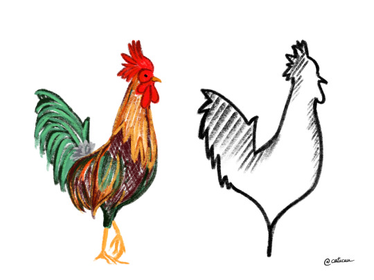
Rooster: complex vs. simple (Cimpoesu, 2020)
However, when people need to understand the utility of an object is better to be complex in its depth, but presented in a simple way. The terms quality and quantity are placed in a well known balance. (Norman, 2016) Complexity does not mean quantitative or qualitative. Neither simplicity. Depending on the context less showed information can be either a good or bad idea.
Suming up, complexity and simplicity, despite representing two opposite poles are meant to complement each other in every aspect of life, until humans will fully comprehend their equal beauty.
-------------------------------------------------------------------------------------------
Bardot, L. (2019) People Skills: How to Draw People with Style // Introduction (Online Video) Available from: https://www.youtube.com/watch?v=BblXE4culwM [Accessed: 12th December 2020]
Cambridge Dictionary (2020) Cambridge: Cambridge University Press (Online) Available from:https://dictionary.cambridge.org/dictionary/ [Accessed: 12th December 2020]
Cimpoesu, C. M. (2020) Rooster: complex vs. simple. Unpublished personal artwork
Curhan, J.R. (2017) "Wisdom in Simplicity", Negotiation journal. (Online) vol. 33, no. 4, pp. 363-365. Available from: https://doi-org.ezproxy.herts.ac.uk/10.1111/nejo.12200 [Accessed: 12th December 2020]
Eytam, E., Tractinsky, N. & Lowengart, O. (2017) "The paradox of simplicity: Effects of role on the preference and choice of product visual simplicity level", International journal of human-computer studies (Online) vol. 105, pp. 43-55. Available from: https://doi.org/10.1016/j.ijhcs.2017.04.001 [Accessed: 12th December 2020]
Norman, D. (2016) "Simplicity: A Matter of Design", She Ji: The Journal of Design, Economics and Innovation (Online) vol. 2, no. 2, pp. 174-175. Available from: https://doi.org/10.1016/j.sheji.2016.08.002 [Accessed: 12th December 2020]
0 notes
Text
Self-love-design-time-machine
Have you ever wondered if design and art can change you in any way trough time? Can they boost your confidence and discover some of your mysterious sides?
Looking through my older Tumblr account while spontaneously listening to some old songs I used to listen around six years ago, I was pleasantly surprised about how much my mind and behaviour changed because of all experiences I had been through on my own, during this time (Roux, 2017). Furthermore, many parts of my personality remained identical because they were the ones making myself unique in this world.
In comparison with the person I used to be back then, the only way I have made improvements to my weaknesses was through understanding and exploring art.
The teenage years are undoubtedly the most controversial ones and every adolescent is discovering himself in a different manner. During that timeframe in your life, you begin to understand some hereditary traits about your temperament that will eventually drag you down and name your decision-making mechanism your biggest enemy (Rothbart, 2016). After years, teens will recall those traits had a more profound reason for existing and they are maybe based on some childhood events.
Leaving this discussion aside, my biggest realisation is represented by the fact that at this point in my life I am dealing better with “self-love” and the difference is quite visible in everything I currently do. As an introvert, this chapter I had to wait many years until it started seeing the outside light. The thing that helped me the most was design: getting inspiration from it and realising I was not alone in many of my daily struggles.
I have recently tried practising meditation “to tame” my thoughts and focus on my inner-self more, to gradually become social-affective and social-cognitive (Trautwein et. al, 2020). Although, what helped me more were the posts exposed on social media. The examples are endless (Here, here or here) and only by using the keyword “self-love” a variety of projects around the world will appear, at the first click.
Graphic design changed my attitude: from being sad most of the times and complain about how I behave, feel or do things, I started asking questions, thinking twice, simply imagine and try to defend boundaries. Moreover, I started to think about solutions and do the opposite in many of the negative scenarios (Brewer, T. 2020). Expanding your horizon is essential in creating art and when it comes to your own mind. Both art and actions require contemplation, but either way people need to treat everything with a pinch of salt. Being critical with yourself can be a huge advantage, while you are capable of understanding when to stop it and start to improve through actions.
In design, there are no borders when it comes to creativity and usually, artists are trying to break the stereotypes already created by the previous generations, in order to fully express their thoughts, regardless of what people are thinking. This simple ritual is life-changing and when a person is truly starting to understand its meaning, something in his mind just clicks and never goes back.
Design also addresses to love your body, in extension to the mind and make them synchronising their evolution. Design is not defined by any particular shapes and it gives everyone permission to fully express themselves without following a patterns. Only by learning to embrace every curve, straight line, existing contrast and colour people start breaking presuppositions. The freedom of speech created by art counterbalance the old-fashioned patterns aiming perfection, by exposing everything as being already perfect.
My judgement is that perfection is a relative term, such as beauty. Self-love is not only about stressing over reaching a goal, either material or educational but by taking what you were born with and shaping it to its greatest form by learning through mistakes and always being supportive and curious about the next step.
Kids, for example, are not yet defined by any social preferences as they tend to make their choices based on their instincts (I am only referring to personal preferences such as their appearance, style, way of living and sexuality). When they grow and find out something is "bad" because society states that, their perception is becoming narrower and forced to follow an imaginary pattern.
Emotions and disorders such as anxiety, panic attacks or fear created due to social barriers cannot be cured in a short time but they can become clearer through graphic design, illustration and art in general. Usually solving an inconvenience is done by facing the problem, but in such psychological issues, art helps to contemplate and gives a widen battlefield to work in.
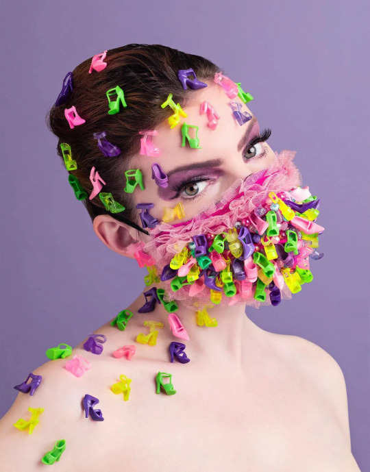
In order to put the theory in practice I have tried to create some artworks based on a personal photography session, that can be seen and analysed below.
To conclude, after reading the peer-reviewed sources based on this sensitive subject the only piece of advice people should bear in mind is “Less judgement and more self-love.”
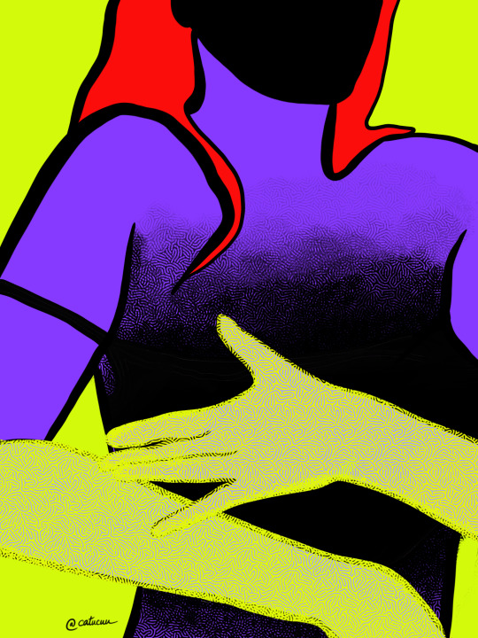
Self-love- part one (Cimpoesu, 2020)
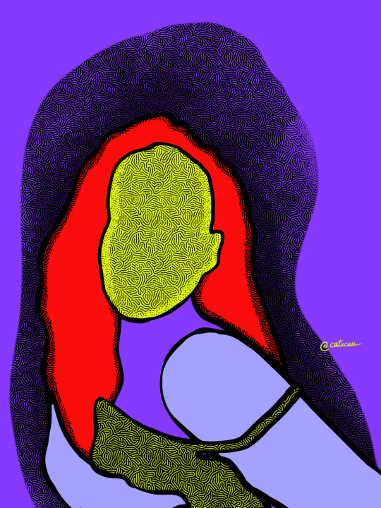
Self-love- part two (Cimpoesu, 2020)

Self-love- part three (Cimpoesu, 2020)
-------------------------------------------------------------------------------------------
Brewer, T. (2020) "Self‐Love and Its Forms", Journal of applied philosophy. (Online) vol. 37, no. 1, pp. 39-43. Available from: https://doi.org/10.1111/japp.12402 [Accessed: 11th December 2020]
Cimpoesu, C. M. (2020) Self-love in 3 parts. [Instagram] Available from: https://www.instagram.com/p/CIq_4wajnTK/ [Accessed: 11th December 2020]
Rothbart, M.K. (2016) "Temperament, Development, and Personality", Current directions in psychological science : a journal of the American Psychological Society, (Online) vol. 16, no. 4, pp. 207-212.Available from: https://doi-org.ezproxy.herts.ac.uk/10.1111/j.1467-8721.2007.00505.x [Accessed: 11th December 2020]
Roux, C. (2017) Self-Love, be Intentional. TED Talks (Online Video) Available from: https://www.youtube.com/watch?v=DCNOJmmHLkQ [Accessed: 11th December 2020]
Trautwein, F., Kanske, P., Böckler, A. & Singer, T. (2020) "Differential benefits of mental training types for attention, compassion, and theory of mind", Cognition. (Online) vol. 194, p. 104039. Available from: https://doi.org/10.1016/j.cognition.2019.104039 [Accessed: 11th December 2020]
0 notes
Text
Socially responsible design
A new start
From my recent experience of working in a new company that it's approaching eco-friendly and sustainable ways of reducing waste to help protect the environment along the way, I found myself struggling with delivering high quality design materials to promote such a tough topic on social media. Because the brand identity was not developed when I got hired, my job was to build a strong online presence for obtaining a high reach online.
In simpler terms, the company created a machine able to generate heat, electricity and smokeless fuels for the poor areas in Africa and the team wants to promote the concept in order to gain visibility. The term “green marketing” and “social responsibility” were now new concepts ready to be analysed in-depth.
Facing the task of creating a strategy I was wondering how do you present such a complicated subject to a public not used to understand all the scientific terms and processes. Mass communication represents a tricky way to spread information, especially in a creative way, as many people have different points of view and the message can be seen from distinct angles (Normoyle, 2019). But overall, this is a designer’s daily job.
The global environmental problems are not a new subject, but only in the recent years they have been taken seriously by the people around the world. Why? Because usually people are not used to think on a long-term and prefer to take ad hoc decisions related to their habits. Our daily activities are becoming more and more intrigued by the presence of the virtual media, leading to so many ways of spreading high-quality information. On the other side people need to divide qualitative content from false news and low-standard design projects.
Empowering educational sources through valuable design materials is a key factor to reach many more online and offline communities, along with making the real desired change (Ottman, 2011, p. 55). The viewers are most of the times intimidated by a qualitative design which has a powerful message placed on the right spot. This combination usually represents the trigger inside someone’s mind.
But how can you make your target understand the exact same message you were approaching through your design?

Orosz, 2010

Liu, 2019
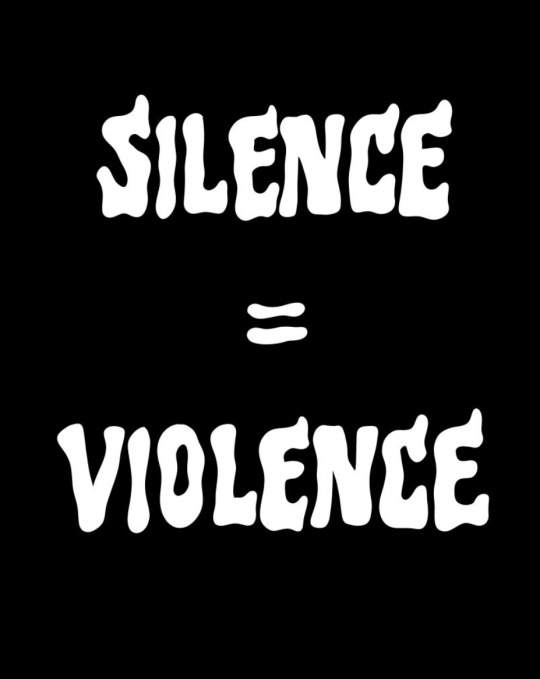
Broobs, 2020
For sensitive topics such as the ones above, the viewer needs to be aware of the context the image is placed in, even though many can be seen as universal issues. In other words, graphic designers and illustrators need to inform themselves from verified sources first and find a representative ways to deliver an eye-catching summary, while remaining objective.
The fear of not pleasing everyone
Designers’ choices can influence the viewer’s perception about a subject when is properly done. Being socially responsible while taking part in a proactive community can lead to a healthy society. Art, in any of its form, has the power to make people wonder about their actions. Simultaneously, art can be interpreted in many contradictory ways and the impact on the targeted community can be closer to none.
I truly think every-time when a thought, in any shape, is getting out of a person’s mouth and is meant to be addressed to a second person, this needs to be verified on many levels: on a theoretical and practical way. Moreover, a designer’s job is not only to illustrate his own ideas and opinions of a specific topic and cover the under a polished layer, but to consider the general view that is creating the problem.
Every detail of a designer’s artwork made public should include a long-term view and the used materials for communicating should also support the addressed cause. Targeting versatile groups can easily create disputes when any message, text or illustration is constantly offending a niche.
In these cases simplicity is needed. The designer’s part is to make the whole artwork become a fluid masterpiece where every detail complement the other parts. In order to make the message be understood by anyone a designer must find the balance between raw thoughts and images, creating a story to act as an umbrella.
Design = harm?
Despite of all design categories meant to address general social changes (Hernandez & Goñi, 2020, pp.3-5) they can also be the reason of contradictory disputes. The transparency shown in some pictures can cause bigger problems when not enough evidence is provided. The lack of a constant strong visual appearance can be the reason people will have doubts in creating an opinion about a certain subject. At the same time an unusual way of presenting the designer’s idea can cause disgust and immediately changing people’s mind about a particular point.
In order to avoid this kind of situations designers need to tackle both the bad and good consequences their final project would have and to be as objective as they can. Moreover, becoming aware of the two sides a project can have favourable arguments, helping the overall impact of it towards the public, through managing future reactions and anticipate opinions.
Social responsible design indicate educational improvement and the best factor for reaching this goal is through empathy (Cipolla & Bartholo, 2014). This characteristic can guide people to a better way of understanding and improving the education provided since young age.
In my opinion, design, expressed in any form and addressing any controversial subject, should make the public wonder and not give straightforward clues, but force the viewer to contemplate and make its own research from safe places. At the same time, if from a viewer’s perspective the design materials are not identical to his belief, this is a sign he is not fully aware of the subject.
In conclusion, some details need an upgrade, considering that the popular shown artworks are filtered by many experts before deciding to take sides.
-------------------------------------------------------------------------------------------
Broobs, C. (2020) Silence=Violence [Instagram] Available at: https://www.instagram.com/p/CA7GCR5gkl9/ [Accessed: 8th December 2020]
Cipolla, C. and Bartholo, R.B. (2014) "Empathy or Inclusion: A Dialogical Approach to Socially Responsible Design", International Journal of Design. (Online) vol. 8, no. 2. Available from: https://search-proquest-com.ezproxy.herts.ac.uk/docview/1562021788?pq-origsite=summon&accountid=14660 [Accessed: 8th December 2020]
Hernandez, R.J. and Goñi, J. (2020) "Responsible Design for Sustainable Innovation: Towards an Extended Design Process", Processes. (Online) vol. 8, no. 1574, p.1574. Available from: https://doi.org/10.3390/pr8121574 [Accessed: 8th December 2020]
Liu, J. (2019) [Instagram] Available at: https://www.instagram.com/p/B1J3r9zB5IY/ [Accessed: 8th December 2020]
Liu, J. (2019) Is not easy to be an ant [Instagram] Available at: https://www.instagram.com/p/B1XswSwgWTY/ [Accessed: 8th December 2020]
Normoyle, C. (2019) A Blended Perspective: Social Impact Assessment in Graphic Design. (Online) Dialectic, vol.2. no. 2 : pp. 71-94. Michigan: AIGA Design Educators Community (DEC). Available from: http://dx.doi.org/10.3998/dialectic.14932326.0002.205. [Accessed: 8th December 2020]
Orosz, I. (2010) Where Is My Vote? Posters for the Green Movement in Iran. Visual Arts Gallery. Available from: http://www.eyemagazine.com/blog/post/going-green [Accessed: 8th December 2020]
Ottman, J (2011) The New Rules of Green Marketing : Strategies, Tools, and Inspiration for Sustainable Branding, Oakland: Berrett-Koehler Publishers.
0 notes
Text
The language made out of logos
Look around and discover the symbols
Studying marketing for my Bachelor’s Degree made me see art more commercially at some point. Instead of reflecting about philosophical hidden meanings of an artwork, I immediately emphasise with the consumer’s mind and needs and place myself in his shoes. Is not the best approach when creating an artwork that is not related to any brand identity items and involves substantially much more creativity because of the absence of guidelines.
Reading the post about the LoCoS language discussed for the first time by Yukio Ota in 1964, found here the other days, created many points of interest in this topic, only because of the twisted simplicity of the entire concept. Starting from describing the whole process of making a logo which only represents a symbol that can be meaningful in some cases and ending up with a bunch of individual logos for each action, object or feeling understood by the human mind generates infinite combinations (Luffarelli, Mukesh & Mahmood, 2019).
Through logos, information about someone’s beliefs, style and perspectives are gathered and placed in one suggestive symbol. Complex knowledge is simplified in a way more comprehensive form. On the other side, for visual language individual symbols can expand their meanings and while more forms are added up. Defining visual language is quite tricky depending on the perspective you are detaining (Erwig, Smeltzer & Wang, 2017). Because visual languages can come with limitations some of the thoughts and feelings can become unvoiced, leading to lack of full expression to another person.
Expression missunderstandings
Visual communication is it known since the first discoveries of the human civilisation. From the first Egyptian hieroglyphs to the symbols used in languages such as Mandarin or Arabic where an item is represented by a symbol, as a logo itself.
Reading LoCoS for example is leaving much more room for experiencing differently. Similar to the fact that is it very hard for someone to describe colours to a blind person without pointing any object as reference, using symbols for describing a certain object or action differentiate people’s perceptions. In the other languages the whole process is almost identical because of personal backgrounds and past feelings a person had, but simultaneously the set benchmark help them to navigate closer to the general view.
In visual communication languages two major problems interfere: the missing capacity of counting or placing a specific aspect on a scale to measure its intensity and the differences in perception among a variety of cultures (Lor et. al, 2019). This is the reason many logos can be interpreted in distinct ways which lead to misunderstandings and wrong instructions.
Having a universal language comes with adaptation and finding solutions to every problem. But aren’t we surrounded by some kind of vocabulary illustrated by digital artists? The answer is yes: emojis. Considering that over the years emojis had an observable improvement when it comes to both quantity and quality.But are emoji representing exactly what a person wants to express or are they just a complementary way to visualise a feeling?
Graphic design is a key element in the presented problem because a designer choses to illustrate the feeling based on a worldwide research. Even if diversity is present as the main factor the findings need to be calibrated and simplified as a universal dictionary (Russmann & Svensson, 2017). In addition to that, even with a developed collection of different objects, feelings and contexts, many of them do not have a defined purpose and are not known by all the online users. For this problem https://emojipedia.org/ has all the answers, showing all existing version on each display on the market and this should be receiving appreciation form all users.
Despite of the different styles they are using, each emoji remains recognisable at some point, revealing the same internal idea, for viewers to associate their needs with every design it is shown at the surface. As in the LoCoS language, people can make sentences using emojis, but a theoretical part for creating this does not exist. This means the visual communication is involuntarily understood by the human mind just trough associations with the external items and past experiences. Many people are not even using the entire variety of the existing emojies and even if the usual way of communication would disappear, the majority of them will not be a necessity for describing people’s thoughts.
Intuition can create misunderstandings and developing the LoCoS language which includes important aspects, such as symbols for exact places, points in time and in-depth descriptions for intensity is more complex and has higher chances for becoming applied after some time.
Keeping this in mind just by thinking that a visual language would replace the ones we are using nowadays we can anticipate different scenarios. I remember once seeing a video where people were debating on what symbol should be placed on radioactive containers so the future outside generations or other species would recognise it as a poisonous thing and take care on how they manage it. Considering they do not own any information about the human perception, language, habits or enivornement, they automatically do not classify anything as being bad or good, from the start.
Here, the design of it counts the most and any minimalist styles should be left aside, giving as many visual details as possible for the outsiders to make associations in real time, if possible.
Lastly, the idea of creating a whole new way of communicating while gradually removing the existing ones seems to be a way of preparing the population for the future evolution phases, but as always is it coming with sacrifices and misleading information if not keeping all possible scenarios in mind.
-------------------------------------------------------------------------------------------
Erwig, M., Smeltzer, K. & Wang, X. (2017) "What is a visual language?", Journal of visual languages and computing (Online) vol. 38, pp. 9-17. Available from https://doi.org/10.1016/j.jvlc.2016.10.005 [Accessed: 4th of December 2020]
Lor, M., Vang, X., Rabago, D., Brown, R.L. & Backonja, M. (2019) “It Hurts as If…”: Pain-Associated Language, Visual Characterization, and Storytelling in Hmong Adults, Pain medicine (Malden, Mass.) (Online) vol. 21, no. 8, pp. 1690-1702. Available from: https://doi-org.ezproxy.herts.ac.uk/10.1093/pm/pnz268 [Accessed: 4th of December 2020]
Luffarelli, J., Mukesh, M. & Mahmood, A. (2019) "Let the Logo Do the Talking: The Influence of Logo Descriptiveness on Brand Equity", Journal of marketing research (Online) vol. 56, no. 5, pp. 002224371984500-878. Available from: https://doi-org.ezproxy.herts.ac.uk/10.1177/0022243719845000 [Accessed: 4th of December 2020]
Russmann, U., Svensson, J. (2017) "Introduction to visual communication in the age of social media: Conceptual, theoretical and methodological challenges", Media and communication (Lisboa) (Online) vol. 5, no. 4, pp. 1-5. Available from: https://doi.org/10.17645/mac.v5i4.1263 [Accessed: 4th of December 2020]
https://emojipedia.org/
https://medium.com/@chrisgaul/https-medium-com-chrisgaul-is-this-language-without-letters-the-future-of-global-communication-15fc54909c12
0 notes
Text
Layer masking
During these unpredictable times talking about masks can be either a taboo topic or a very controversial one. I have recently joined one of the biggest graphic design community in Romania after virtually meeting Stefan, the owner of “The Design Bookstore”, back in April this year. Representing the only community in Romania where designers of any king can meet and interact in the digital form, he recently created an open challenge (#BehindTheMask- #DincoloDeMasca) that is meant to encourage every member to illustrate the whole concept of wearing a mask and what the year 2020 meant for them, in their own style. There are no rules, no judgements and no boundaries.
Evolving to simplicity
Aiming to get out of my comfort zone I decided to try and reflect on the overall feelings created by wearing a mask, especially nowadays. However, I was trying to understand how a mask can change people’s mood along with their actions while interaction with someone else and how are they perceived. A mask can confer a feeling of safeness to some, while in other cases can be part of a placebo effect. People tend to perceive the outside world in a different way and forget to wisely select their words or be aware of their reactions (Rey et. al, 2015) when they are wearing a mask.
In my research for a better understanding I depicted the definition of a mask: covering made for either protecting your face from the outside physical possible dangers by making people be afraid of your unusual look or attracting curiosity and a cheerful sensation.
Nonverbal communication is crucial in understanding the person you are talking to, especially in topics such as graphic design and marketing (Yu and Ko, 2017). You can contribute to the final expression generated by the receiver of the message by inducing some points of view or setting some guidelines from the beginning, aiming to influence the perception of the individual and have the expected reaction in the end.
Starting from the traditional approach where masks are usually associated with religion and culture, resembling certain periods in time and embodying symbolism and expression of ways to adapt to the environment during evolving times, we can say they fostered self-awareness and the feeling of belonging to a group (Edston, 2015, pp.70-80). The sensation of fear vanished over time, as many artists tried to remake them in a less ferocious way, maintaining the major details on point. I think this was a wonderful approach, but because of that, people forgot the importance of masks from back then, since spirits and mythology are not representing an area of interest in the technology era.
Romanian Folk Mask (Sitaru, 2019)
Recently, masks were not seen as a practice of contemplating about spirits and old beliefs and they have transformed into a more practical version, keeping the original purpose alive: to protect the owner. Due to the events we are facing at the moment and the divided formed groups, the purpose of wearing a mask and its efficiency was questioned after many years, in spite of the ancient presumptions known so far (Violante & Violante, 2020).
Expressing feelings in design
Coming to a more modern approach, I had the chance to find Anne Sophie Cochevelou’s artworks created this year as a way of exceeding the pandemic boundaries and illustrating the concept of wearing a mask from another point of view. As mentioned earlier, the reason to wear a mask was doubtful by many and this is why she tried to twist people’s perspective including new materials in the making concept. The deffiniton of “protecting yourself from the outside dangers” was understood differently now, in comparison with the traditional masks.
Leaving the medical analysis aside and focusing on the feelings, people tend to think they are powerful while wearing a mask, because their gestures can not be read, misunderstood and used against them. On the other hand, the created shelter gives people the impression of not being able to express themselves and they also tend to feel trapped under a piece of material. Anne Sophie’s perception tried to prove the opposite. Masks can express more than mimics will. Masks offer intimacy and allow you to express your unknown styles and ideas, at the same time. Masks can attract smiles around yourself.
In a realistic manner masks are a really powerful source of coating feelings, mislead emotions and create interpretable postures.

Lego mask (Cochevelou, 2020)

Lips mask (Cochevelou, 2020)
Barbie shoes mask (Cochevelou, 2020)
Another mask behind the mask
Reading and analysing multiple non-academic and academic sources made my initial idea endure significant changes. As for my entry in the challenge, I have worked for a few days on the following artwork, while conceiving this post, attaching the translated description:
“A modern, unconventional and profound version of a Matryoska doll, embodying not only the mask worn for protection against the external environment, but also all the feelings, memories and emotions hidden under many other inner masks, of whose existence the world is aware, but too fearful to discuss because of avoiding consequences.
Facial expression sums up all the person's fears, the insecurity of the environment in which he lives and the inability to have authority over the decisions made by society, which will have a major impact on his quality of life at some point. The doll is completely covered, excluding the face in a surprising way. There you can see a stitch trace following the contour of the cheek and and the mask gradually fading.”
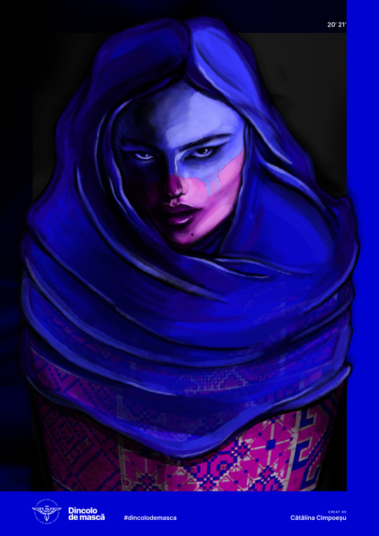
Matryoska (Cimpoesu, 2020)
“The rest is left to be interpreted.”
To conclude, I truly believe the initiative for the challenge should be highly appreciated and should have many more future editions to encourage any kind of artists to show their creativity without any hesitation without depending on their design experience.
-------------------------------------------------------------------------------------------
Asafti, S. (2020) Dincolo de mască. [Instagram] Available at: https://www.instagram.com/p/CJbKxdro4-G/ [Accessed: 30th of December 2020]
Cimpoesu, C. M. (2020) Matryoska. Published personal artwork
Cochevelou, A. S. (2020) Barbie shoes mask [Instagram] Available at: https://www.instagram.com/p/B_aOjl0p5Pq/ [Accessed: 25th of November 2020]
Cochevelou, A. S. (2020) Lego mask [Instagram] Available at: https://www.instagram.com/p/B_fX_ZYpGXe/ [Accessed: 25th of November 2020]
Cochevelou, A. S. (2020) Lips mask [Instagram] Available at: https://www.instagram.com/p/B_nGiWpJS0h/ [Accessed: 25th of November 2020]
Edson, G. (2015) Masks and masking: Faces of tradition and belief worldwide. North Carolina: McFarland & Company
Rey, A.E., Riou, B., Muller, D., Dabic, S. & Versace, R. (2015) "The Mask Who Wasn't There": Visual Masking Effect With the Perceptual Absence of the Mask", Journal of experimental psychology. Learning, memory, and cognition [Online] vol. 41, no. 2, pp. 567-573. https://psycnet-apa-org.ezproxy.herts.ac.uk/fulltext/2014-34444-001.pdf [Accessed: 25th of November 2020]
Sitaru, P. (2019) Romanian Folk Mask [Instagram] Available at: https://www.instagram.com/p/BoqcPHRD9y-/ [Accessed: 25th of November 2020]
Sitaru, P. (2019) Romanian Folk Mask [Instagram] Available at: https://www.instagram.com/p/BopWpsuBErN/ [Accessed: 25th of November 2020]
Violante, T. and Violante, F. S. (2020) “Surgical masks vs respirators for the protection against coronavirus infection: state of the art”, La Medicina del Lavoro | Work, Environment and Health [Online] 111(5), pp. 365-371. https://doi.org/10.23749/mdl.v111i5.9692 [Accessed: 25th of November 2020]
Yu, C. & Ko, C. (2017) "Applying FaceReader to Recognize Consumer Emotions in Graphic Styles", Procedia CIRP [Online] vol. 60, pp. 104-109. https://doi.org/10.1016/j.procir.2017.01.014 [Accessed: 25th of November 2020]
0 notes
Text
Folklore metamorphosis
Illustrated patriotism
The nearest post-mail in my neighbourhood is about 5 minutes away from my house. On the 6th of December important elections will take place back home and because I will be in the United Kingdom, I will need to vote from abroad. During that short walk to send my envelope, I felt a shivering sensation of excitement along with a bunch of flashbacks of old black&white photos that appeared in my mind. Photos of my grandmother wearing a traditional costume, photos of family gatherings, photos from important events such as baptisms, weddings and why not, funerals. Back then, showing their local beliefs on a small non-saturated paper with curved-cut-edges was people’s way of keeping visual memories through generations.
Leaving this aside, I was always attracted to traditional patterns from all over the world because every shape and colour makes the whole image seem recognisable in every context it is placed. Folklore’s authenticity is what makes it immortal (Foster et al., 2015, p.37) and a tough subject full of concerns.
However, what specific item defines the folklore of a country? As time passes and people change their mentality is the new one replacing the existing one or can we say some elements are not changeable?
I will only refer about patterns in this post. Patterns that can be found on either clothes and any other materials, sew by hand by our ancestors and duplicated in a digital version by the graphic designers and illustrators nowadays. A language along with all of its aspects, including written and oral sayings, beliefs and architecture are forms of expressing folklore over time, (Jones, 1994, p.3) but I prefer to focus on the synaesthetic side because usually the images and textures own the most frequently usage in my area of interest.
Along with the development of social media platforms people might think humans should evolve and include traditional details less in their artwork, due to the minimalist trend is currently developing. As a graphic designer I started thinking if my input in having the ability to change minor elements in a traditional pattern will create positive or negative reactions to the public. Traditionalism versus modernism: the never-ending debate.
Moreover, can any changes a designer makes influence the perception of the traditional culture overall? That being said, what is the boundary a graphic designer can reach to maintain a tradition alive but still apply his creative thinking?
Starting from the ideology that a graphic designer makes his work for commercial purposes, rather than the artistic expression to the public, I can assume that his inspiration to illustrate his ideas are coming from daily activities and way of living found in a certain area at a specific moment in time. In the section “Commercial Assemblange” (p. 52), Foster describes this term as the ability of gather information from different parts of a place to set a common desired frame of mind, while folklore is spreading its presence in the opposite direction: from a core to different separate displays.
In other words as a personal metaphor, I can say that the process of creating a brand identity for a new company is similar to the one that defines a folklore (because it is broadening its guidelines to multiple individual objects), but the process of creating the logo for the same brand is similar to a commercial assemblange process, previously mentioned (analyses external information to create something unfamiliar).
Virtual Folklore
I recently started working as a freelancer for a make-up remover brand, ready to release in Cologne, Germany. MixedSkins on its name, meant to have its debut on Amazon as a new seller, before December 2020. My work was just to follow the briefs Krisztina, the owner, was sending me and place all the elements in a joyful harmony. But something was missing. Even with the whole brand identity already set and all folk patterns finished and ready to be used, my mind could not perceive the whole picture as suggestive for the customers. I was starting to ask myself why it takes me so long to even imagine how the final photo should look like, especially fully-understanding the brand characteristics.
Krisztina had chosen the elements which individually would suggest East-European folklore: red and pink flowers, leafy-motifs and a flax-pattern background, all of them inspiring a very fresh rural environment. Therefore when combined these would not impress anyone and look cheap or unpolished.
In her eyes everything was amazing because it was her own brand that was developing so fast and. For me, everything could look better and communicate more trough the channels if more senses were involved.
Starting thinking what I would improve, without considering the classification of folklore items (Melnikova et al., 2020) I realised the entire user experience process was unsatisfactory. Music and motion gestures visible on the brand’s social media accounts and website were missing. Suggestive words, icons, fonts and a consistent structure of the components would have been improve the overall interpretation of the company’s beliefs. Especially now, when the information is travelling at the fastest speed (Salehudin et al., 2020). With this in mind, we are living the times where people get bored really quickly and only something outstanding would catch their attention. In order to do that, when analysed in depth a folklore themed brand can win people’s hearts by reinventing itself trough a full-experience trough different means.
Rebranding the folklore
Traditional aspects are changing and reshaping themselves without many people to be aware of the functions of the Internet, that surround us. Embracing digital culture while still maintaining the folklore features alive and visible to the world can now become a serious topic. I truly think the only word that can describe the evolution of folklore during time is interactivity. Freedom of expression can reshape the traditional patterns in an innovative way to stay connected with the world and history (Bronner, 2009). For graphic designers and illustrators nowadays this remains a challenge because of the struggle generated by the need of stand out while still follow the rules.
Despite of this, I think folklore, similar to a celule-multiplication process, always generating new data starting from the same origin, carries the challenge of people to adapt to its transition in all spaces while keeping its presence alive.
At the same time, in this situation designers and the public are concerned about setting the boundaries into making changes and try not to loose important information on the way.
To conclude, folklore will remain one massive source of information when creating a new project as a graphic designer. Telling a story to the viewer has the highest chance to win his heart just by approaching a sensitive personal side of internal proudness.
-------------------------------------------------------------------------------------------
Bronner, S.J. (2009) Digitizing and Virtualizing folklore. Folklore and the Internet: Vernacular expression in a digital world (Online) 1, p.21. Available from: https://www.jstor.org/stable/pdf/j.ctt4cgrx5.5.pdf [Accessed on 20th of November 2020]
Foster, M.D. and Tolbert, J.A. (eds) (2015) The Folkloresque: Reframing Folklore in a Popular Culture World, Logan: Utah State University Press. (Online) Available from: https://ebookcentral.proquest.com/lib/herts/reader.action?docID=4401371 [Accessed: 20th of November 2020]
Jones, MO (ed.) (1994) Putting Folklore to Use, Lexington: University Press of Kentucky. Available from: https://ebookcentral.proquest.com/lib/herts/reader.action?docID=1915074 [Accessed: 20th of November 2020]
Melnikova, O.K., Yahin, M.A., Burenkova, O.M., Makayev, K.F. & Makayeva, G.Z. (2020), "Internet communication: architecture and typology of digital folklore", IOP conference series. Materials Science and Engineering [Online] vol. 890, pp. 12212. Available from: https://iopscience-iop-org.ezproxy.herts.ac.uk/article/10.1088/1757-899X/890/1/012212/pdf [Accessed: 20th of November 2020]
Salehudin, M., Hamid, A., Zakaria, Z., Rorimpandey, W.H.F. & Yunus, M. (2020) "Instagram User Experience in Learning Graphic Design", International journal of interactive mobile technologies. (Online) 14 (11). pp. 183-199. https://doi.org/10.3991/ijim.v14i11.13453 [Accessed: 20th November]
0 notes
Text
Style hunting
Free the Monsterind
In my constant struggle of finding a unique drawing style, I faced many creative blockages that were crucial to my overall development.
The whole experience was like a rollercoaster of emotions: encouraging myself to draw, choosing a subject, letting my mind free and start sketching, adding colours, trying not to be picky on brushes and experiment different types and different textures without following any patterns, having that boost of energy and enjoying the moment while listening to music, feeling the dopamine rush, being excited when I considered the drawing looked good enough and any other changes would decrease its quality, then opening my social media account, returning to the drawing application and see the monster staring at me (Janda, 2013).
A long-phrase that sums up my past two years.
Is the “monster” that follows many artists worldwide. But it is the same “monster” or we all have different ones? At this moment my mind would turn to 180 degrees and see the final form of my drawing as being “ugly” and immediately my reaction would be to close everything and do not show my creation to the online world.
I found myself wondering how the monster would look like and this was the image that popped into my mind the minute after, so I started sketching again. Not a ferocious beast, but a snob fluffy mauve creature being too spoiled to remain grateful for what he has.
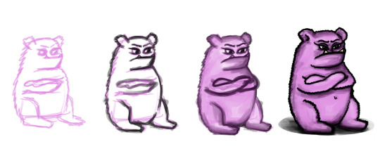
Mind monster (Cimpoesu, 2020)
Starting to ask myself what is happening in my mind whenever I finish a drawing, was a promiscuous start. Why was I so concerned about what the others might think about my work? And why all of a sudden I would just have transposed myself into somebody else’s body and start judging my art, forgetting all the feelings I have had when I was creating it? Was my art supposed to carry any hidden meanings to anyone that might have seen it?
Art is subjective and does not represent pure tangible knowledge. Moreover, its purpose is to suggest and be interpreted by anyone who sees it (Scrivener, 2002). Thinking twice, every piece of art can include a small amount of knowledge due to the power of imagination and analysis its creation process.
Scrivener’s vision was that art in any form cannot embody pure knowledge either in-the-making process nor in the final-created object. This statement is half true from my perspective, for one reason: art, in any shape, can pass intangible information through generations, only because people can imagine and empathise through their bodies and souls, without experiencing the same times as the person who created it, but placing themselves in the other’s shoes, as humans made from the same material.
To be more clear, it is normal that paintings, for example, will not express anything at first sight; the viewer cannot gain any skills while staring at a canvas, but through analysing it he can feel at some point, all the overlapping layers full of acrylics and rough brush strokes that resemble shadows and highlights. In my opinion, it just depends on whom the viewer is: an artist will probably connect with the painting and imagine every step concluding the creation of it, while at a mental levet he could even transpose himself into the creator’s position.
As I started to see the presence of the “monster” more often, I started to draw more frequently just to try to catch momentum to analyse the feeling in depth. The answer was simple: my mind would categorize any of my creations as being low-qualitative in comparison with the others I have seen before from a variety of artists. Focusing on the flaws I automatically assumed that in the future there will be people in the same position as me (age, gender, being a self-taught artist) but with higher-quality final products.
The way art should be experienced is generally seen as being a short period of curiosity, sometimes it can progress on a long-term as well, until the reflection instinct approaches, as Danto et. al. (2013) suggest. Art should be a representation of the time and the environment it was created in. Another factor should be included in the equation, such as the experience the creator had and the time he spent on that specific piece of work.
The right of criticising
Formal analysis represents the theoretical structure of the human perspective and it aims to categorise every element found into a pattern such as proportion, variety and unity, along with the emotional baggage a drawing is trying to express. Combining the intellectual effect with the feelings that are created just by looking at a piece of art can be considered the key to a high-rated critical analysis. This approach can be replaced with a pure intuition of someone who had experience and had seen plenty of evidence to have the right to classify any work (Heydat and Sabzali, 2014).
This made me think if art is such a versatile subject, it should not be fitted into some patterns conceived by somebody’s opinions and perspectives. At the same time if art does not follow these rules then anything can be considered a masterpiece. What a massive paradox.
Coming back to my twisted mind experience, I was starting to think what makes any of my drawings better than the others and why over time only a few of them still remain beautiful and worth to talk about in despite of others. As an interesting fact, the drawings illustrating objects won all of my sympathy, in comparison to the portraits and the artworks containing any kind of faces, on which I currently have doubts about their worth.
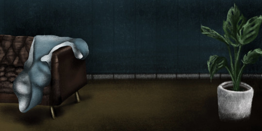
Restlesnesss (Cimpoesu, 2019)

Breakfast in Poznan (Cimpoesu, 2019)
Traditional house (Cimpoesu, 2019)
The way I perceived humans dramatically changed during time. Self-criticism help me to analyse the weaknesses of my artworks and what is representative for my vision. In addition, one reason for not recognise my digital drawings as being qualitative was the presence of errors in the proportions of the faces, along with the lack of accuracy of the shadows and highlights placed on the subject making the whole picture to have a flat look at the first glance. Improvement can be recorded in this area just by studying the basic human anatomy features and the basic principles of drawing. At the same time, art movement such as Expressionism and Surrealism are focusing on particular styles of representing the human features in an unfamiliar way and they are recognised as meaningful and interesting points of view.
Modern French girl (Cimpoesu, 2020)
False posing (Cimpoesu, 2020)

Eye contact (Cimpoesu, 2019)
Examining the artworks now, after a long time, makes me notice the above photos look similar when exposing some aspects and are illustrating a constant style because of the used techniques, colours and tools. Despite of using a birds-eye view and underlying their similarities, the images are still exemplifying my creativity.
Personal brand identity
Many artists point out that their style was shaped after many attempts of different ways to approach a subject and browsing through working instruments, tools and perspectives and in the end there is no defined path to follow to reach the goal in a specific period. The final form of an artwork is influenced by numerous decisions and environmental aspects (Zhao, Cao and Lau, 2018) aiming to reach the receiver’s feelings, along with his admiration and interest.
The personality created trough all the final decisions and the presented outcomes represents a graphic designer’s way of expression, seeking to reach people who possess similar views. Although aesthetic taste is subjective and in constant change phases, a few elements are still keeping their place on the sensitivity map and help building a strong brand image when seeing an artwork for the first time.
Building your own creative style as a designer, leads to a constant communication with yourself and the others around. In the end, only by experimenting different scenarios a graphic designer can mould his preferences and fully express his thoughts through art, without having second thoughts about showing the final version. Due to art’s ideology and skills’s perfectionism timeframe, there is always going to be room for reconsideration leading to improvement.
Considering that for each artist there will always be people sharing the same vision as him, the action of finding the personal artistic style should be a metaphorical rollercoaster itself, which in the end will bring to light each stage and its significant meaning throughout the whole process. Understanding to embrace failure and to forgive myself when I don't have the desired outcomes, helped me more than it was expected.
Art, drawings and design taught me that you don't need perfection (Airey, 2012). It is fine to post something you do not like anymore and to appreciate that you did it. You have to embrace any state you have and be curious about any project you make because it is yours.
In conclusion, you have to learn to work with what you own and cherish your goal for your mind to be able to create anything that appears in your mind.
-------------------------------------------------------------------------------------------
Airey, D. (2012) Work for Money, Design for Love: Answers to the Most Frequently Asked Questions About Starting and Running a Successful Design Business, 1st edn, San francisco: New Riders
Cimpoesu, C. M. (2019) Breakfast in Poznan. [Instagram] Available from: https://www.instagram.com/p/B5Laew2nahx/ [Accessed: 15th of November 2020]
Cimpoesu, C. M. (2019) Eye contact. [Instagram] Available from: https://www.instagram.com/p/B4uUYaBHinG/ [Accessed: 15th of November 2020]
Cimpoesu, C. M.(2020) False posing. [Instagram] Available from: https://www.instagram.com/p/B-iWyaHDHim/ [Accessed: 15th of November 2020]
Cimpoesu, C. M. (2020) Mind Monster. Unpublished personal artwork.
Cimpoesu, C. M. (2020) Modern french girl. [Instagram] Available from: https://www.instagram.com/p/B8MNRjwHcj-/ [Accessed: 15th of November 2020]
Cimpoesu, C. M. (2019) Restlessness [Instagram] Available from: https://www.instagram.com/p/BwxZJN_hbGf/ [Accessed: 15th of November 2020]
Cimpoesu, C. M. (2019) Traditional house. [Instagram] Available from: https://www.instagram.com/p/B5Laew2nahx/ [Accessed: 15th of November 2020]
Danto, A. C., Horowitz, G., Huhn, T. and Ostrow, S. (2013) The Wake of Art, Criticism, Philosophy, and the Ends of Taste. Amsterdam: Routledge
Heydat M. and Sabzali, M.K. (2014) Conceptualizing Art Criticism and Art Education for effective Practice. Saarbrucken: LAP Lambert Academic Publishing
Janda, M. (2013), Burn Your Portfolio: Stuff they don’t teach you in design school, but should, 1st edn, San Francisco: New Riders.
Scrivener, S. (2002) The art object does not embody a form of knowledge. Working Papers in Art and Design. [Online] vol. 2. Available from: http://www.herts.ac.uk/__data/assets/pdf_file/0008/12311/WPIAAD_vol2_scrivener.pdf [Accessed: 12th November 2020]
Zhao, N., Cao, Y. & Lau, R. (2018) "What characterizes personalities of graphic designs?" ACM transactions on graphics. [Online] vol. 37, no. 4, pp. 1-15. Available from: https://doi.org/10.1145/3197517.3201355 [Accessed: 15th of November 2020]
0 notes
Text
Introduction to my thoughts
“Trying to surround myself by art” was a quote that kept repeating in my mind for the past few years.
This blog will probably look like an explosion of thoughts and random mental pathways, as I enjoy to wonder about every obstacle that comes into my life. Assembling different perspectives of seeing any activities or tangible objects and create a personal vision about reality represents a way of shaping my creativity and theoretical skills.
Regarding my critical thinking, I cannot define it as being very polished at this stage in my life, but I truly believe that after posting on the blog the improvement will be visible and very satisfying to look back at.
The mission of this blog is to illustrate the development of my vision throughout the first semester of my MA Graphic Design at the University of Hertfordshire.
The content for my blog is distributed into four sections as follows: The Critical Analysis illustrating the impression of a qualitative article studied during my research; The Annotated bibliography is representing a list of meaningful references that contributed to my perception's development; The Blog posts themselves that are debating diverse approached topics of my interests during current interrogation sessions; The Achieve where the timeline of my evolution in writing and critical approaches can be witnessed.
Overall, this blog is examining personal experiences and past or current queries, comparing them with a peer-review approach. The purpose of it is to expand my points of view and explore different possibilities I was not aware of until the present moment. Its existance serves as the opportunity to reflect on my way to create artworks while improving my critical and analytical skills.
To conclude, the blog combines academic work with a personal view while maintaining the challenge of remaining open-minded while exploring ideas I was too afraid to make a research about. As a consequence is only going to open new chapters in my artistic journey.
0 notes