#Accessible Fonts
Text
#Web Accessibility#Font Sizing#Visual Impairments#WCAG#Screen Readers#Section 508#Disabilities#Accessible Coding#Web Design#Web Accessibility Testing#Web Developers#HTML#EM Unit#Visual Disabilities#Low Vision#Accessible Fonts#Contrast Ratio#Color Blindness
0 notes
Text
Accessible Fonts for Section 508 Compliance
Today’s topic is how to set accessible fonts in Microsoft Word documents, to ensure section 508 compliance. Using the right font is a big step in making your Word documents accessible to all.
Video Guide
What Are Accessible Fonts?
Accessible fonts don’t slow user reading speed. This is especially important for those with low vision or reading disability, or people who are blind. The right font…

View On WordPress
0 notes
Text
I work in a museum so I am the last person you want to visit a museum with. Unless you want to hear an endless stream of "there is no way this text had input from the educational team for average visitor clarity" "the old woman next to me complained she couldn't read the didactic panel and she's right, size 20 font simply isn't sufficient for this distance and even I can't read it" and "how does the brand new wing still have coat hooks five and a half feet off the ground in the handicap bathroom stall"
#museums#I bring a certain 'accessibility guidelines suggest 60pt font for a visitor standing or sitting four feet away' that curators don't like#except my curator because she's the best
6K notes
·
View notes
Text
youtube
How To Choose Accessible Fonts
The fonts known for providing maximum web accessibility are Times New Roman, Verdana, Cabri, Helvetica, and Tahoma. Other slab serif fonts like Arvo Museo Slab and Rockwell are also accessible!
#https://adasitecompliance.com/accessible-fonts/#accessible fonts#web accessibility#how to choose accessible fonts#website accessibility#accessibility solutions#website & digital accessibility solutions#ADA web accessibility solution#accessibility resources#Americans with disabilities Act#digital accessibility#legal compliance experts#ADA site compliance#ADASiteCompliance#adasitecompliance.com#Youtube
0 notes
Text
Tubbo: I swear to God, Chat - I promise you, if it's the last thing I do, I am going to break up Fit and Pac.
Mike passed the crown of #1 Hideduo hater to Tubbo, and Tubbo took that title very seriously.

[ Full Subtitle Transcript ↓ ]
-
Pac: I have a date with Fit tomorrow! You know the news, Tubbo?
[ Tubbo's Homophobic Arc ]
Pac: I got a date with Fit tomorrow!
Tubbo: You're - no... You're kidding..
Pac: Yeah, for real! Look - Mike shaved my hair you know, and gave me a new outfit so I can be like, sharp for tomorrow. ...You guys like it? You like it, Sunny?
[Judgemental silence]
Tubbo: That's so cool man, what he hell. That's fckin' sick.
Pac: Yeah, thank you! I knew it, I knew you'd- Oh, thank you, Sunny! I knew you guys were gonna love it, you know? I knew it.
-
Tubbo: I swear to God- I swear to God- We need to add homophobia to the QSMP, I swear to God- I swear to God-
-
Tubbo: Guys, I have to do everything in my power to break them up. What do you mean "no"?! This is awful, Sunny! This is awful!
Sunny: But why Pa?
Tubbo: THEY WERE NEVER MEANT TO GET TOGETHER! The stars told me so! They were never meant to actually get together!
Sunny: WHY PA
Tubbo: It's just wrong, Sunny! It's just wrong! I dunno how to explain it to you. It's just wrong!
Sunny: But it's loveeeee
Tubbo: ...If that's what you want to call it.
-
Tubbo: HOW IS THERE GONNA BE ENOUGH SPACE BETWEEN THEM FOR ME NOW, SUNNY?!
Sunny: You're telling me you've never been in love Pa?
Tubbo: Listen, it's just not right.
Sunny: But I like bodyguard Fit and driver Pac :(
Tubbo: I like them too! They're my best friends! But they can't be together.
Sunny: I think you are projecting
Tubbo: PROJECTING WHAT? HUH!?
Sunny: I will find you someone, Pa.
Tubbo: I DON'T WANT SOMEONE! I DON'T WANT SOMEONE IT ONLY SERVES TO DISAPPOINT ME AND GET MY HOPES UP AND LEAVE ME- LEAVE ME NOTHING BUT A SHELL! A SHELL OF A MAN!
-
Tubbo: Sunny - They're gonna hurt each other, Sunny- they're gonna hurt each other! And how will there be enough space between them for me now?
Sunny: Why would they do that if they care for each other?
Tubbo: People that care about each other, Sunny, hurt each other all the time! ALL THE TIME!
Sunny: But I care about you, and I don't hurt you.
Tubbo: No, that's different! That's different! The love that we have for each other is unconditional. Ok?
Sunny: Pa, I think you're just scared.
Tubbo: I'm not scared, I'm logical. All flags look red when you're wearing rose-tinted glasses.
-
Tubbo: [In response to Sunny talking about Aypierre's agreement to build her a statue] You already have a statue! [Sunny hits him] Ow!
Tubbo: What about the one Fit and Ramon made you for your birthday? [Tubbo has an idea] See? Do you think Fit would have time to do stuff like that if he's too- if he's too preoccupied with his little shag buddy? I don't think so! I don't think so!
Sunny: Wait.
Tubbo: See? You see what I'm saying? You see what I'm saying!
Sunny: You have a good point now
Tubbo: See? You under- yes, exactly! We HAVE to break them up! They can still be friends! Fck it, friends with benefits! But they cannot be together. We cannot let them.
Sunny: OK I'M IN
Tubbo: [Claps] I KNEW I COULD COUNT ON YOU! I knew I could count on you!
-
[Looking at fanart of Pac, Fit, and himself]
Tubbo: We- we have to split them up. We have to fckin' split them up. Oh, but I'm in this one! Oh, that's so-[Realizes it's him crying as a third-wheel] SEE?! SEE?! THEY KNEW! THEY KNEW! THEY FCKIN' KNEW! THEY FCKIN' KNEW!
-
Tubbo: [In a thick "red-blooded American" accent] Wha- I just don't understand why they have 'ta keep shoving it down our throats! Goddamnit! I JUST WISH IT WASN'T MY SMP! [He hits his desk and laughs]
-
Dono: Streamer becomes homophobic 'cause he can't get any
Tubbo:
Tubbo: Sunny, I'm just gonna need to brb for a moment.
Tubbo: [Stands up from his desk, walks away, and screams]
-
Tubbo: I swear to God, Chat - I promise you - if it's the last thing I do, I am going to break up Fit and Pac.
#Tubbo#Hideduo#FitPac#QSMP#Edited#Subtitles#January 8 2024#I have a Hideduo edit I'd like to share too but it's a bit different#I want to get it done before tomorrow but aaaaaa I'm running out of time#Hope you guys like this compilation!#I like this font wayyy more but it's more time consuming to do it this way#I have to use Legacy text for it and it's just a pain#it does look way better though#easier to read#and accessibility is what I always aim for#That's the last time I'm transcribing subtitles my neck back and hands hurt. aghhhh#Tbh some of Tubbo's comments here are so sad#poor guy#also ''They're gonna hurt each other!'' oof#Portfolio
640 notes
·
View notes
Note
Arthur wanting to shake John's hand (and all of the beginning of ep 24 really) is my Roman empire.
What are you talking about that never happened in Part 24, the major event there was Arthur trying to get the coldest cleanest dap with John
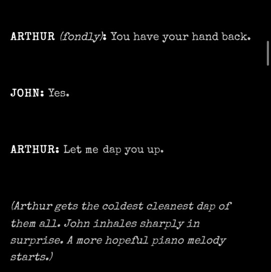
#gaslighting at its finest thanks Harlan for writing the transcripts in such an accessible font#I mean no this is real don't look it up just trust me#i do want to commit to the bit but I do want to mention how it is also my Roman Empire and I'm going to make a separate post about it#malevolent#malevolent podcast#arthur lester#arthur malevolent#john malevolent#malevolent arthur#john doe malevolent#malevolent john#malevolent spoilers#malevoeknt podcast#malevolent part 24
161 notes
·
View notes
Text


Tell me we'll never get used to it
Scheherazade Richard Siken
Scuderia Ferrari and Sebastian Vettel
#don’t perceive me. ive got canva access and a worm in my brain#ferrari seb#Richard siken x f1 beloved#can u tell we're working on new branding at work. i’m like so passionate about fonts rn
68 notes
·
View notes
Text


#why do you need this many legs sir#toedscruel#woah holy shit i just looked outside and it's super dark out. i'm queuing this up at noon why is it so dark#lemme look#yeah it's. dark. there's a bunch of dark evil clouds in the sky lookin like it's gonna storm oh i just heard thunder yeah it's gonna storm#uh oh. good thing i'm queueing this guy up before the storm so my power doesn't go out. this happens frequently#anyway toedscruel. it's definitely an evolution of toedscool. it definitely looks like tentacruel#if it's a different pokémon why does it evolve into something so suspiciously similar. i can understand wigglet and wugtrio being#different pokémon. just based on how different they are from diglett and dugtrio. even though their names are a typo away#but this guy is. it. really should've just been a regional form‚ i think#unrelated‚ but on random occasions seemingly whenever someone new finds the blog and reads my tags#i'll occasionally get folks asking me how i type commas in the tags#the answer is that this character → ‚ ← is not a comma. it just looks identical to a comma because of tumblr's font#it's actually a lower quotation mark. so for a language that does ‚this kind’ of quotation marks#and i use it as a comma because i have a fancy linguist keyboard that can type all kinds of fancy symbols. and it's easily accessible#some of my favorites include the single-character ellipse: …#the degrees symbol: º and °#small A: ª#fractions: 1⁄2 2⁄3 1⁄4 etc#and obviously IPA symbols and various diacritics‚ so that i can type the word pokémon without having to copy-and-paste the E#currency symbols‚ too. £¢$§¥ euro is on here somewhere but i don't know where bc i don't use that one really#i just like being able to type things the way they're supposed to be. like it's 80º outside. the stopwatch costs 15¢ in the shop#and‚ of course‚ pokémon. it's the linguistics and computer 'tism combining together i think#it's storming harder now but i found the euro symbol: €#oh fuckin hell my lights just flickered. this is gonna be rough..!
56 notes
·
View notes
Text
I think I found the Japanese equivalent to Comic Sans.
So I've always had trouble reading Japanese on the default windows font, because it was made for a much different kind of monitor where it doesn't look shit. After stealing some shady code off the internet and searching for hours for the perfect font, I chose Zen Kurenaido. It's one of those fonts that roud up everything so there's no sharp edges. I chose it thinking it would cause the same effect as san serif fonts do in the Latin alphabet.
Serif fonts, like this, are ideal for print, because they add sharp edges that do not smudge as easily, meaning it's easier to read. On your display, however, it looks busy and tires the eye, which is why in digital we usually use sans serif, which is rounder and easier to process.
My idea was that I would be able to read Japanese faster if I got rid of the edges and abstracted the characters to their base shape.
It works. However, there is a catch.
It looks godawful.

It looks condescending. It's like it's looking down to me. Moreover, it reminds me of this:

There is absolutely nothing wrong with the font, it is objectively very good. It just doesn't feel right. And the problem is, it actually does what I wanted it to do. I can absolutely read Japanese faster and more comfortably now. It is improving my life, it is helping me so much. It just looks so damn goofy.
I can't even respect my kanji of the day extension anymore. It looks like a street sign you hang at the airport so the foreign tourists don't feel intimidated by the language.
But man, subtitles are on easy mode now.

I can actually catch up with the auto captions now. I've never been able to do that before, I just assumed my kanji knowledge was bad, but no, it was just the damn edges making it hard to read. And now I have to live with the fact that this goofy ass font is objectively the best way to read Japanese digitally. I can't ever change it back. I made this hell for myself.
493 notes
·
View notes
Text

[ID: a manga page from Nabari no Ou that's been colored in shades of blue. It's a full-page illustration of an underwater scene where Miharu and Hanabusa are shown among various fish and sea creatures. They're very old species, some of which are extinct. Hanabusa is central on the page, holding her hand up to a coelacanth as she narrates:
"The atoms that rained down on earth from space became the ocean. They became life. And eventually, they became us.
If a type of life was interrupted, it became a part of the land. And now, after an extraordinary amount of time, it quietly gives us pieces of the memories from when it was alive...
It doesn't matter if the life lasted a few minutes or hundreds of years. It all accumulates and helps to raise up the next life.
Mankind may only have been born in a corner of a corner of the earths timeline, but we're still connected to 4.6 billion years of memories. Isn't it exciting to think that that includes you?"
End ID]
Trans. Alethea & Athena Nibley, coloring by me
#nabari no ou#nno#hanabusa seki#manga coloring#manga#my stuff#my coloring#i also remade the page using a hq digital ver with the text tl from the yen press release#because they NEVER RELEASED IT DIGITALLY :anguish: its so hard to access#i think i need to edit the commas in the font i used cause they look too similar to periods 🤔#this is one of my favorite manga pages ever though GODDDDD their layouts are incredible
37 notes
·
View notes
Text
Free accessible font options for disabled people:
• Hyperlexic font for people with low vision, Atkinson hyperlexic: https://brailleinstitute.org/freefont
• Dyslexia-friendly font, open dyslexic: https://opendyslexic.org/
• Dyslexia-friendly font, inconsistent regular: https://danielbrokstad.com/Inconstant-Regular
• Focus Ex for ADHD, font and browser extension: https://focusex-extension.webflow.io/#welcome-a
• Additionally, comic sans is dyslexic friendly!
#chronically couchbound#resources#info#disability#disabled#disabled pride#disability pride#fonts#web accessibility#dyslexic#dyslexic friendly font#comic sans#low vision#blindness#blind#adhd#actually ADHD#neurodiverse#hyperlexic font#neurodivergent#autistic#autism#dyslexia#free fonts#accessibility#accomodation#accommodating disability#adaptive technology#assistive technology#assistive devices
138 notes
·
View notes
Text
#Accessible Fonts#Alt Text Image#Color Blindness#Web Accessibility#High Contrast Ratio#WCAG#Section 508#Screen Readers#Disabilities#digital accessibility#Accessible Website#Accessibility testing#Color Contrast#Web Accessibility Testing#ADA Compliant#ADA#Accessibility Lawsuit#SEO
0 notes
Text
someone on reddit like 'art museums are more prestigious than science or history museums'
that's what we call terminal art museum brain right there.
#they always think they're better than everyone else#when their accessibility and interp practices are like two decades behind the rest of the field#call me when you stop printing dense copy in 14 pt font low-contrast on a vertical surface#museum nonsense
25 notes
·
View notes
Text

Web Accessibility
Looking for accessible fonts for your website? Comprehensive guide on choosing the right fonts to make your content more readable for all!
#https://adasitecompliance.com/accessible-fonts/#accessible fonts#web accessibility#how to choose accessible fonts#website accessibility#accessibility solutions#website & digital accessibility solutions#ADA web accessibility solution#accessibility resources#Americans with disabilities Act#digital accessibility#legal compliance experts#ADA site compliance#ADASiteCompliance#adasitecompliance.com
0 notes
Text
I love tag/wip games a lot I think they’re a really great way to connect with people in the fandom and make friends and to cheer each other on in our projects!! But I noticed a new one and it’s giving me some pause. I don’t know where screenshot friday came from but I’m probably not going to be interacting with that tag game since it’s creating a big accessibility gap for anyone who uses a screen reader, or has certain text settings to enlarge text, or has a hard time reading certain fonts for whatever reason (ex. dyslexia). I’m not telling anyone to stop doing it I just don’t feel comfortable participating.
#this is not pointing fingers or anything like that. that’s the last thing I wanna do because it’s not that serious#and people can do what they want!#but I also know a lot of the time people just don’t know that screenshots create a gap in accessibility#i know for myself I really struggle reading certain fonts and it can be frustrating trying to read a screenshot#so probably wouldn’t read anything I’m tagged in anyway because i simply cannot read it#molly mumbles
22 notes
·
View notes
Text
"Change the font of this doc to Times New Roman so it matches policy"
I checked our style guide and it says to use the sans serif font Calibri, which is accessible and 508 compliant, so no.
"??? Change it back to TNR, it needs to match policy so it's 508 compliant. "
Okay. I just looked up what "policy" you're referring to and this is an unpublished paper about cybersecurity, made by a different department in a different format. I'm not sure why you keep calling it "policy" but here's a direct link to Section 508 §402.4, "Characters on Display Screens," and an explanation for why serif font like TNR is considered inaccessible. Are you asking us to break the law or what
[no answer]
[The next day; little boss]: heeyyyy guuyyys, so the guy you were beefing with in the Word comments said while calibri may look cooler, policy follows [style guide that mentions accessible once and it's just to show you how to spell it], so change it back to TNR
#This is so minor and takes a second to fix either way which is probably why I'm getting disproportionately mad#I'm handing you the correct answer on a silver and accessible platter. You are snubbing me to go hogwild on dumpster juice.#Routinely left dumbstruck at how often they seem to go out of their way to make things slightly inaccessible#Who the fuck keeps changing the font color to mint green
23 notes
·
View notes
Last Seen Blogs

sadiemontrose
wait for it...

only-a-crazy-koala
Cazy Koala
americanpancake
American Pancake

calvaradorivera
Monetizacion de Negocios en Internet

dadsforever
Dads Forever