#Color Blindness
Explore tagged Tumblr posts
Visit Tumblr Blog
Explore Tumblr blogs with no restrictions, modern design and the best experience.
Last Seen Tumblr Blogs


Fun Fact
Premium Tumblr themes are available from anywhere between $9 to $49.
Text
Image shows traditional Pride flag (red, orange, yellow, green, blue, purple stripes), but with colors adjusted to be more distinct. End ID
Finding a colorblind friendly redesign of the rainbow flag has me happy to see a pride flag for once
#as queue like it#images described#described images#image description added#pride#lgbt#pride flag#color blindness
18K notes
·
View notes
Text
115K notes
·
View notes
Text


The Red Wire | part 2
PREVIOUS / NEXT
#tmnt#digital#hamato family#fanart#comic#cousins au#leonardo hamato#hamato donatello#hamato michelangelo#hamato splinter#color blindness#tmnt 2003#rottmnt#tmnt 2012
1K notes
·
View notes
Text
I don't mean to be annoying but some of you trans people have your profiles and bios customized to have pink letters on a blue background or vice versa because yknow. The flag colors. And that shit is actually impossible to read for colorblind people like me. I love you all and it's not the only color combo that does it but it's the most common.
Can we rb to bring awareness kuz i love you all and know I'm not the only one and I really wanna read your cute and sometimes horny lil blogs.
#transfem#transgender#gay#mtf trans#autism#trans girl#emo girl#lgbt nsft#lgbtqia#lgbtq community#lgbt pride#lgbtq#colorblind#color blindness#ableism#love
243 notes
·
View notes
Text


Glob.
326 notes
·
View notes
Text

Part 1 “Yellow?”
this took WAY too long. But yah here’s some color blind dogman comic
Poor fella can’t help it :(
#dog man#dogman#petey fanart#comics#lil petey#artists on tumblr#petey the cat#color blindness#uhhh yeah#“”wait aren’t dogs color blind.
104 notes
·
View notes
Text
Writing Notes: Color Blindness

Color blindness, also called color vision deficiency (CVD), is a group of conditions that affect the perception of color, characterized by the inability to clearly distinguish different colors of the spectrum.
The difficulties range from mild to severe.
Color blindness is a misleading term because people with color blindness are not blind. Rather, they tend to see colors in a limited range of hues; a rare few may not see colors at all.
There is no treatment or cure, and cannot be prevented.
Most color vision deficient persons compensate well for their abnormality and usually rely on color cues and details that are not consciously evident to persons with typical color vision.
Risk Factors
A family history of color blindness increases the risk since most color vision problems are inherited.
Another risk factor for color vision deficiency is aging:
The eye’s lens can darken and yellow over time, which can impair the ability of older adults to see dark colors.
Certain medications can also increase risk:
For example, the drug hydroxychloroquine (Plaquenil), used to treat rheumatoid arthritis, can cause color blindness.
Causes
Mutations in the CNGA3, CNGB3, GNAT2, OPN1LW, OPN1MW, and OPN1SW genes are known to cause color vision deficiency.
Color blindness is sometimes acquired.
Chronic illnesses that can lead to color blindness include Alzheimer disease, diabetes mellitus, glaucoma, leukemia, liver disease, chronic alcoholism etc.
Some medications such as antibiotics, barbiturates, anti– tuberculosis drugs, high blood pressure medications, and several medications used to treat nervous disorders and psychological problems may cause color blindness.
Industrial or environmental chemicals such as carbon monoxide, carbon disulfide, fertilizers, styrene, and some containing lead can cause loss of color vision.
Occasionally, changes can occur in the affected person’s capacity to see colors after age 60.
Symptoms
The inability to correctly identify colors is the only sign of color blindness.
It is important to note that people with red/green or blue varieties of color blindness use other cues such as color saturation and object shape or location to distinguish colors. They can often distinguish red or green if they can visually compare the colors. However, most have difficulty accurately identifying colors without any other references.
Most people with any impairment in color vision learn colors, as do other young children. These individuals often reach adolescence before their visual deficiency is identified.
Source ⚜ More: Writing Notes & References
#writing notes#color blindness#writeblr#dark academia#spilled ink#literature#writers on tumblr#writing reference#poets on tumblr#writing prompt#poetry#creative writing#writing inspiration#writing ideas#light academia#winslow homer#writing resources
114 notes
·
View notes
Text
(Disabled) player's guide to making D2 more accessible
because so far (correct me if I'm wrong) I haven't seen one on here, & maybe (hopefully) it'll help someone.
Alright, to get it out of the way, I'm disabled. I have neurological damage from a tbi, and more recently another concussion, and among many many other things it makes gaming a lot more complicated. It can (unfortunately) be difficult to find advice for disabled gamers online that isn't just "get good" or "then gaming isn't for you", so I figure this might be helpful, since it was for me.
I can't speak to other conditions, so this is more about adjustments for specific symptoms, but I can only really speak from experience. That said, I've had to learn quite a bit, so it's sharing time :)
(I play on Xbox. Some settings aren't the same between platforms, just a warning. For that reason, some of this post is going to be xbox-specific.)
This is divided up into menus & subjects of bullet points are bolded to be easier to skim.
Controller settings - (and explanations for some of them in case y'all don't know)
Test out different look sensitivity. The default is 3, I moved mine up to 5. I have issues with spacial awareness and saccades dysfunction, and this has made it easier for me to keep whatever I'm looking at on-screen.
ADS sensitivity- if you don't know, this is the speed when you aim down sights. The default is 1, I have mine reduced to .5, and I've found that the larger difference between the look & ADS sensitivity can really function as having two look settings available when using a weapon that doesn't have a very extreme scope.
The default sprint-turn scale is 0.4, I bump mine up to 0.8 for similar reasons to the look sensitivity increase. (Turning this up makes you turn faster, turning it down makes you turn slower.)
Alternatively, if you have more issues with overstimulation/visual clutter/quick movements/etc, you may want to turn everything down a bit to slow down your camera, but that may make combat harder to keep up with, especially pvp.
Axial & radial deadzone. This helps with stick drift. Stick drift is a pain for everyone but if you have fine motor issues, tremors, arthritis, etc, it's even worse. Finding what works best for your hardware will help make sure you're compensating less, which puts less strain on your hands.
I've seen people recommend turning off controller haptics for the same reason- the vibrations make you grip the controller harder and can cause worse strain. Personally, I leave them on because the sensory input helps balance out the awareness issues, but maybe it's for you! (this one's a system setting, not a d2 one.)
Video settings
Brightness can be important if you have issues with eye strain. I would recommend changing this relative to the lighting in the room, not just your monitor. Turning it up may help with visual issues with the tradeoff of risking overstimulation. Again, all of this is very dependent on the person.
Motion blur- Evil, evil, evil, turn this off. Visual problems or not, it's harder to follow things on-screen with it enabled. Combined with any garden variety problem with eye movements or cognitive strain it's even worse.
Chromatic aberration- I turn this off. It's a nice vfx, but it can wind up just being added visual stimulus and if that's a problem for it's worth losing. It can also make the radar harder to read. Not worth it (personally.)
Film grain- off for the same reason. It's a smaller change, but a clearer view is worth it if it helps you.
Sound settings
If you have problems with your hearing/auditory processing, I highly recommend turning the sfx & music drastically down compared to the dialogue, and then just turning up your system audio.
Personally, I often play with music entirely off, but I know that can be a very boring experience to a lot of people, so take that as you will.
(my current settings: sfx 8, dialogue 10, music 1)
if you're playing with an Xbox party or in a discord call, etc, I really recommend messing with the mixing settings there when you first get on to balance out peoples mics, regardless of processing problems.
Gameplay settings
HUD opacity- I turn mine down to high, the default being full. Just another thing that makes it easier to keep track of stuff.
Radar Background Opacity- Opposite here. If you have problems with spatial awareness you're probably relying pretty hard on the radar instinctively, so the clearer it is, the better. I play with mine on medium, you may want to play around.
Subtitles- Are on by default, so that's nice. Let's check out their settings menu for a moment.
Turning on show speaker name can be really good for hearing/auditory processing issues.
You can also change the color for the speaker name/caption text if the clearer contrast will help you.
The best background style for visibility is box, but it won't look as nice. Another trade.
Background opacity may be easier to lower if you switch to box, since the faded style isn't even. A lower background opacity may help you follow things on-screen at the cost of caption readability
If you don't need captions but do need to reduce visual clutter, try turning them off!
Colorblind mode is, obviously, helpful if you're colorblind, but I have also heard it recommended because the color changes can help improve contrast. Not one I've tried, but worth including.
Full auto firing/Full auto melee- Does what it says. Turning this on might help in the same way as turning off haptics/messing with deadzones, ie by changing how much you need to click. You can still fire normally with it on, so if anything it just gives you another option.
Reticle location is slightly below the center on d2. I prefer to center it, though it takes some getting used to. More helpful if you frequently switch between other games that center theirs.
Neutral/targeted reticle color- The defaults are white and red respectively. I prefer black for targeted because I feel like it makes it easier to see what I'm actually aiming at, but you may want to leave it for contrast. To each their own.
Other
Brief overview of Xbox accessibility settings
Xbox has a narration setting. I would assume anyone who needs it is aware of this, but just in case.
If you need more assisted play, there's controller assist where you can combine two people's input
Turning off haptic vibration (as mentioned) is in accessibility -> controller
You can make the on-screen keyboard larger!
There are party chat settings for both text to speech and speech to text
There's also game transcription!
Games that have the function can also do their own read-aloud. I don't know if/how this applies to destiny
Mono output for audio may make things easier to understand depending on your audio setup
There's also high-contrast mode for both dark or light
Colorblind filters are here, too
Night mode! You can change how much it dims/filters your device. If you have problems with blue light or eye strain, or have to limit screens for medical reasons like me, this setting is a lifesaver. The filter will affect how your games look, but personally it's worth the tint. Same is available on most PCs.
Hardware, etc.
The Xbox Adaptive Controller is highly customizable and great for anyone with physical impairments that make the standard Xbox controller difficult to use. Find it here.
I've seen thumbstick extenders recommended for arthritis, might also be helpful for similar conditions
If you have arthritis/fine motor issues/muscle weakness/tremors/etc/etc/etc controller grips might make holding a standard controller easier
If any of those are the case for you, then you might also benefit from a lightweight controller (or playing with a standard controller plugged in & removing the batteries for a lesser weight adjustment)
evilcontrollers also has one-handed controllers and a one-handed controller customizer much like the standard controller customizers
evilcontrollers for hardware accessibility in general
If you play on PC and have muscle or joint issues then you may want to look into different keyboard/mouse shapes. Lightweight, vertical, and ball mice are all options, though there's apparently some argument about using them for gaming. I've also seen good reviews of the Azeron keypad from people with muscular/joint problems. There's also split keyboards, wave keyboards, one-handed, etc etc etc.
If you have problems with auditory processing I would HIGHLY recommend gaming with noise-cancelling headphones. (Hell, do everything with noise cancelling headphones.) I would recommend these for everyday, but they also work pretty well for gaming. The mic is mid, but it works well enough, and there's multiple sound modes + active noise cancelling.
Other other (oh no I forgot these, editing now)
Compression gloves !!!!!
Pause and do hand exercises after a while
20/20/20 rule for eye strain
may come back and expand this as I think of more things
There is a lot that Bungie could do to improve the game's accessibility without causing an imbalance with abled players, but I'll save that for another post. Feel free to reblog this with any other advice/anecdotal stuff/whatever, I'm considering this as opening a discussion.
I don't know of any clans specifically for disabled players but I'm sure they exist? If anyone has recommendations for community stuff, please do throw that in.
As always, my dms are open. Being a disabled gamer can suck sometimes and if you need a space to vent w/ someone who gets it, I'm your guy. If you're just curious how it impacts gaming, I don't mind being asked, I just don't feel like posting about myself that much unprompted.
I think that's all for now. Happy gaming :)
#destiny 2#dredgenposting#disability#gonna tag a bunch of things for reach lol watch this get lengthy (i'm not adding these tags as conditions I have just asrelevant ones lmao#tbi#traumatic brain injury#cerebral palsy#physically disabled#physical disability#accessability#accessible gaming#arthritis#carpel tunnel#nerve damage#nerve pain#chronic pain#chronic illness#sensory processing disorder#dyspraxia#amputee#fibromyalgia#color blindness#dysautonomia#neurological disability#neurological conditions#vestibular dysfunction#vestibular balance disorder#brain injury#brain damage#acquired disability
63 notes
·
View notes
Text
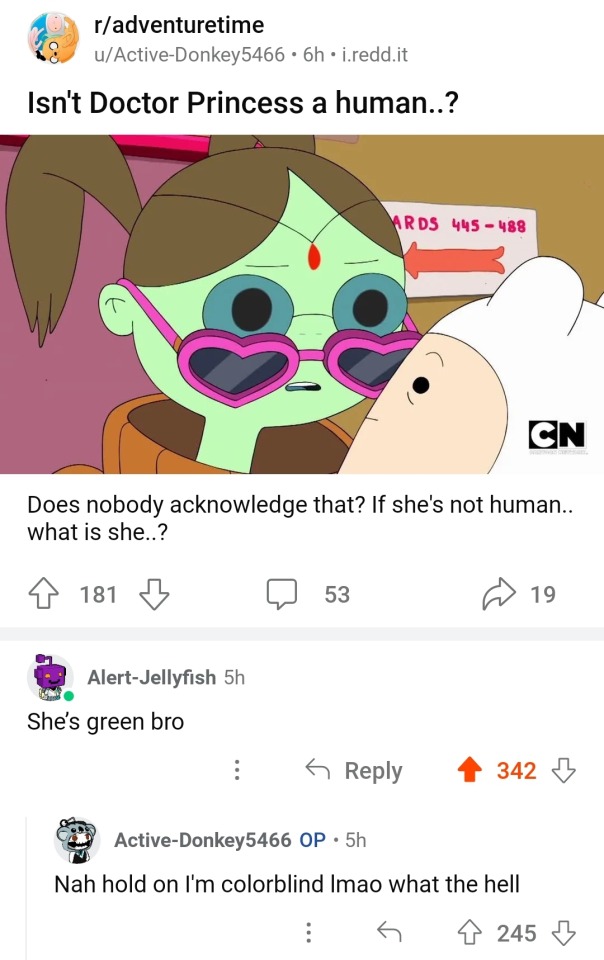
Did you know wolves are red-green colorblind?


So anyways I've adopted a new Gray headcanon have some screenshots put through an online color blindness filter


#sprunki#incredibox#sprunki incredibox#incredibox sprunki#gametoons#gametoons sprunki#headcanon#color blindness
36 notes
·
View notes
Text

Some queer stuff for Pride Month! Featuring Simon’s flags
Also it’s my brother’s birthday today say happy birthday to him
Also, here’s a bonus:

#gravity falls#simon pines#simon pines oc#son of stan au#stan pines#same coin theory#pride month#pride month 2024#intersex#aroace#asexual#aromantic#color blindness
161 notes
·
View notes
Text

116 notes
·
View notes
Text

Green tails in honor of my color blind cousin who absolutely is obsessed with the lil fox guy
Try going onto setting and color filter then turning on Red/Green filter for a surprise!!
or if your too lazy under cut lol

76 notes
·
View notes
Text


The Red Wire | part 1
NEXT
Have some B team content! I don’t even remember what inspired me to make up this headcanon, because I’ve started this comic in October 💀🤚🏻 I abandoned it for months but thankfully found the strength to finish it!
#Somehow I made the cover page look WAY more dramatic than the comic itself is - please don’t mind it lol#tmnt#digital#hamato family#comic#cousins au#hamato donatello#hamato michelangelo#color blindness#headcanon
1K notes
·
View notes
Text
I gotta say, rewatching TDP with color blind filters on is a novel experience.
Moonshadow colors are a lot of blues and purples, at least with blue shading if they're other colors, and Sunfire elves are a lot of yellows, and those are the elves we see the most of.
I uh. I'm slightly blue-yellow colorblind. I can differentiate blue from yellow, but there's really only like. Three shades of yellow that I can see, and while I see a lot more blues, I can mostly just interpret light and dark, different tones like blue-greens are hard. (I was surprised to find out Runaan's eyes look teal to everyone else, because my brain had interpreted them as just a bright green.)
Suffice it to say, the animation on the elves looks way more detailed now that I have filters on.
I See So Much More Now.
#the dragon prince#idk what to tag this with tbh#real stuff#tdp elves#tdp animation#color blindness#I kinda wanna inflict this on one of our characters now#which assassin am I nerfing with color blindness
21 notes
·
View notes
Text
On Online Accessibility
I painstakingly wrote this (or similar) out for a long, slightly ranty thread on BlueSky (which I had to restart several times as the app kept wiping it), so here it is in slightly expanded format with the points in the right order:
The Rant
I am literally BEGGING organisations, ESPECIALLY ones that are apparently supporting disabled people, to stop sending badly formatted, image-only mailouts.
This advice post is brought to you by a recent terrible email to a list of disabled people that was an Inaccessibility 101. (To their credit, they did respond fairly quickly with "Oh no! It was not supposed to do that!" and sent out a plain text one shortly afterwards. They didn't get all of the things below wrong, but this is a general "Here's how you can start to do better" list based on my - and others' - experience, including of personally getting it wrong.)
The List
If you feel that your formatting dream can only be fulfilled by a single large image, at least provide the means to access a plain text version of the relevant information. You've already had to type it, you can just copy-and-paste it elsewhere (alt-text or linked transcript, preferably both).
If you must use coloured text, please check that the contrast between it and the background is sufficient for people to access. You want to be able to ensure that they can read your message. There are plenty of sites that will check your Web Accessibility Standards, including this one, top of the Google search: https://accessibleweb.com/color-contrast-checker/
Unless accessibility standards have changed recently (and I'm happy to learn if they have), please avoid serifed fonts. Plain doesn't have to mean unpretty. Verdana and Tahoma are your friends, for example.
Plain backgrounds. But if you absolutely insist on having your text in front of an image, create a clear barrier between the words and the background (plain, thick outline or a box around the text like old-school subtitles). You want to minimise distractions.
Talking of which: paragraph formatting. Justified paragraphs will create distracting "rivers of white" that will make text processing difficult for e.g. folk with dyslexia or certain flavours of ADHD. Likewise, don't cram your lines too close together and distinguish clearly between paragraphs.
Don't make use of tiny images if people can't click through and see them in more clarity. And please try to describe your images, especially if they have relevant information in them. People who cannot process them will lose out, and you'll lose that connection. There are professionals who will describe for you (I'm one of them), or increasingly sophisticated apps.
Standard text emoji will be read aloud by screenreaders, so you don't need to supply descriptions for them, but do try to avoid long strings of them. Similarly, don't use a string of asterisks to divide sections. Imagine a robot voice saying asterisk asterisk asterisk asterisk asterisk each time. No. Use a line divider or even just a single *.
Please don't highlight text using underlining (too distracting), especially for text mid-paragraph. Use bold instead. Similarly, use italics sparingly, and certainly not for full paragraphs of text. If you want to highlight using colour, see point 2. above re: checking contrast.
If your hashtags are several strung-together words, make the beginning of each new word a capital letter e.g. #BetterAccessibilityNow to help both the screenreaders and folk who find it difficult to parse text generally distinguish between the words.
Some more thoughts:
"Why should I bother with all this? Surely it's only a handful of people who can't access stuff like this!"
a) Ugh. Bad attitude, friend.
b) But let's talk numbers of people not getting your message. Recent worldwide estimates: 49.1 million blind people. 224.1 million with moderate and 33.6 million people with severe visual impairment. 300 million people with colourblindness. 780 million (10% of the population) people are believed to be dyslexic.
It just makes business sense to not miss out on reaching so many folk. Let alone learning how to exercise empathy and thereby how to communicate with people who literally don't see the world as you do. And I know there's a spoons cost to making stuff more accessible - trust me, I know! But more and more platforms make it incredibly easy to add alt-text to your images, but there are always ways around it if they don't, and practising makes things easier.
And, while we're at it: subtitle your videos and provide transcripts for longer ones. Again: if you've already written a script, what's stopping you pasting it into another place for people to access as a bare minimum? And there are loads of reasonably priced transcription services out there (or do what I do and edit the auto-transcription)!
Anything to add (or correct me on)? Let me know!
#fay speaks#accessibility#visual impairment#dyslexia#adhd#blindness#colour blindness#color blindness#advice#know better do better#transcription
27 notes
·
View notes
Text
Hey, do I have colourblind followers? I'd like to ask you about your opinions on using dice colour as a game mechanic in a TTRPG.
My idea is that by default, players have a red die and a blue die, and certain classes and abilities can buff or debuff a certain colour of dice, change (or remove) the colour of dice, etc. but I immediately saw an accessibility issue for people who are colourblind.
Colourblind gamers, what are your thoughts on this?
67 notes
·
View notes