#Book Formatting
Explore tagged Tumblr posts
Visit Tumblr Blog
Explore Tumblr blogs with no restrictions, modern design and the best experience.
Last Seen Tumblr Blogs


Fun Fact
Tumblr is available in 18 languages.
Text
How to make your writing sound less stiff
Just a few suggestions. You shouldn’t have to compromise your writing style and voice with any of these, and some situations and scenes might demand some stiff or jerky writing to better convey emotion and immersion. I am not the first to come up with these, just circulating them again.
1. Vary sentence structure.
This is an example paragraph. You might see this generated from AI. I can’t help but read this in a robotic voice. It’s very flat and undynamic. No matter what the words are, it will be boring. It’s boring because you don’t think in stiff sentences. Comedians don’t tell jokes in stiff sentences. We don’t tell campfire stories in stiff sentences. These often lack flow between points, too.
So funnily enough, I had to sit through 87k words of a “romance” written just like this. It was stiff, janky, and very unpoetic. Which is fine, the author didn’t tell me it was erotica. It just felt like an old lady narrator, like Old Rose from Titanic telling the audience decades after the fact instead of living it right in the moment. It was in first person pov, too, which just made it worse. To be able to write something so explicit and yet so un-titillating was a talent. Like, beginner fanfic smut writers at least do it with enthusiasm.
2. Vary dialogue tag placement
You got three options, pre-, mid-, and post-tags.
Leader said, “this is a pre-dialogue tag.”
“This,” Lancer said, “is a mid-dialogue tag.”
“This is a post-dialogue tag,” Heart said.
Pre and Post have about the same effect but mid-tags do a lot of heavy lifting.
They help break up long paragraphs of dialogue that are jank to look at
They give you pauses for ~dramatic effect~
They prompt you to provide some other action, introspection, or scene descriptor with the tag. *don't forget that if you're continuing the sentence as if the tag wasn't there, not to capitalize the first word after the tag. Capitalize if the tag breaks up two complete sentences, not if it interrupts a single sentence.
It also looks better along the lefthand margin when you don’t start every paragraph with either the same character name, the same pronouns, or the same “ as it reads more natural and organic.
3. When the scene demands, get dynamic
General rule of thumb is that action scenes demand quick exchanges, short paragraphs, and very lean descriptors. Action scenes are where you put your juicy verbs to use and cut as many adverbs as you can. But regardless of if you’re in first person, second person, or third person limited, you can let the mood of the narrator bleed out into their narration.
Like, in horror, you can use a lot of onomatopoeia.
Drip Drip Drip
Or let the narration become jerky and unfocused and less strict in punctuation and maybe even a couple run-on sentences as your character struggles to think or catch their breath and is getting very overwhelmed.
You can toss out some grammar rules, too and get more poetic.
Warm breath tickles the back of her neck. It rattles, a quiet, soggy, rasp. She shivers. If she doesn’t look, it’s not there. If she doesn’t look, it’s not there. Sweat beads at her temple. Her heart thunders in her chest. Ba-bump-ba-bump-ba-bump-ba- It moves on, leaving a void of cold behind. She uncurls her fists, fingers achy and palms stinging from her nails. It’s gone.
4. Remember to balance dialogue, monologue, introspection, action, and descriptors.
The amount of times I have been faced with giant blocks of dialogue with zero tags, zero emotions, just speech on a page like they’re notecards to be read on a stage is higher than I expected. Don’t forget that though you may know exactly how your dialogue sounds in your head, your readers don’t. They need dialogue tags to pick up on things like tone, specifically for sarcasm and sincerity, whether a character is joking or hurt or happy.
If you’ve written a block of text (usually exposition or backstory stuff) that’s longer than 50 words, figure out a way to trim it. No matter what, break it up into multiple sections and fill in those breaks with important narrative that reflects the narrator’s feelings on what they’re saying and whoever they’re speaking to’s reaction to the words being said. Otherwise it’s meaningless.
—
Hope this helps anyone struggling! Now get writing.
#writing#writing advice#writing resources#writing a book#writing tools#writing tips#writeblr#for beginners#refresher#sentence structure#book formatting
7K notes
·
View notes
Text
If you are formatting a non-fiction book, think about making the margins a little wider for annotations. Sincerely a little annotation lover who is STRUGGLING with a tiny margined book right now.
62 notes
·
View notes
Text
Save formatting for last
Try to avoid formatting while you’re drafting — it’s a distraction.
Your first draft will never look the same as your final one, so formatting takes you away from the important business of writing. For many writers, it’s the reason they struggle to get words on the page.
#writing tips#writers#creative writing#writing#writing community#writers of tumblr#creative writers#writing inspiration#writeblr#writerblr#writblr#writers corner#tips for writers#helping writers#help for writers#let's write#writer#writers on tumblr#writing advice#writing resources#writers and poets#how to write#author#writer stuff#writing stuff#on writing#writing help#writing tips and tricks#book formatting#writers life
101 notes
·
View notes
Text


We've been reading more indie and self-pub books lately, and end up thinking "man this story deserves nicer typography" a lot. So here's some silly visual references we made to show off some of the differences between a well-composed page and ones that deserve better.
Going to put these on the Neocities site eventually, along with some actual explanations behind the differences between them.
34 notes
·
View notes
Text
Oh book formatting is a lot easier than I thought! It’s really fun!

#this is just a test but wow look at it 🥹#update#maelstrom series#book formatting#literally my first attempt at book formatting so it’s not the end results just a little test
5 notes
·
View notes
Text
Quick question for the folks on here that like to read. Which format do you prefer for a book?
A5
or B5
I'm having a hard time choosing. A5 is nice and concise, but I worry it will be too short. B5 has room to breathe, but I worry it is too large for a standard chapter book
#book writing#books and reading#bookblr#books#booklr#reading#currently reading#writing a book#writing advice#writing#writers#writeblr#writers on tumblr#readers#reading community#writerscommunity#book reading#formatting#writing help#reading addict#advice for writers#asking for help#book formatting#book opinions#writing opinions#asking for opinions
2 notes
·
View notes
Text

I'm so professional
#writers on tumblr#writeblr#writing#book formatting#medium morrows and the cameo knight#i just needed something in there for now so i could set up the page breaks on the chapters
4 notes
·
View notes
Text
Looking for books with unique chapter beginnings? Each chapter of Limitless Roads Cafe begins with a checklist to reflect the main character's reliance on and love of lists. Many chapters of Recipe for Confidence begins with a list of ingredients for items baked at her aunt's bakery or made in her free time.
See where you can get them by visiting my LinkTree.
Comment with a book that has unique chapter beginnings (or endings).

#books#writers on tumblr#author#writerscommunity#young adult#indie writer#self publishing#indie publishing#lists#bookrecs#chapter#unique format#youngadultbooks#youngadult#chapters#book formatting#support indie authors#authors of tumblr#book tumblr#book things#bookblr#bookish
2 notes
·
View notes
Text
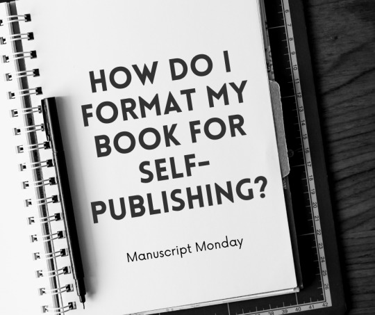
Hey writers! 📚✨ Welcome back to Manuscript Monday! Today, we’re diving into a crucial topic: the best way to format your book for self-publishing. Let's unpack the tools you can use and some key guidelines to follow.
First up, formatting your eBook. One of the simplest tools to use is Kindle Create. It’s free from Amazon and super user-friendly for eBooks. It lets you format text and add styling to ensure your book looks great on all Kindle devices.
For print books, Adobe InDesign is the gold standard. It offers incredible control over layout and design, which is essential for creating professional-quality print books. However, if you're looking for a more budget-friendly option, **Microsoft Word** or **Scribus**, a free open-source tool, can also do the job.
Now, let’s talk guidelines. For eBooks, make sure your images are high resolution and your text is reflowable—this means it adjusts to different screen sizes. For print, consider margins, bleed settings, and the quality of images, especially if your book includes illustrations or photos.
Remember, the right formatting makes your book not just readable but enjoyable. Take the time to learn these tools and follow these guidelines to ensure your book stands out!
Got more formatting questions? Drop them in the comments! Let’s make our self-publishing journey smooth and successful. Happy writing!
Need professional help doing this? Let me know! You can learn more about the services I offer here.
3 notes
·
View notes
Text
Disclaimer: Kindlepreneur produces and sells the formatting software Atticus.
By Dave Chesson, Last updated on July 27th, 2023
Knowing how to format a book for publication is crucial to your success as an author.
[...]
Some people hire professional designers to do it for them. While this can save time, it’s also expensive. If you have the time, you can do it yourself and save money.
With the help of this article, you can cut costs and design your book on your own. You’ll learn a new skill and still end up with a professional-looking book.
In this article, you will learn:
Which program or software to use
How to set up your file
How to design your pages like a pro
Common mistakes to avoid
7 notes
·
View notes
Text
hAVE YOU EVER WANTED TO PUBLISH A BOOK BUT DONT UNDERSTAND HOW THE FORMATTING WORKS? ARE YOU TRYING TO REACH A PAGE COUNT THAT LOOKS THICC ENOUGH TO YOUR PUBLISHER BUT JUST CANT GET THERE? YEAH? WELL DO I HAVE NEWS FOR YOU!
i’m fucking insane and feel like an absolute freak trying to compile the correct answers on this, but from one writer to another, why the hell shouldn’t i go insane over the formatting of books? i’ve already gone through (and still am going through) the brainrot of bookbinding so why not take this a step further
from my thirty minutes of shitty research here’s what i got:
Page Trims
Fiction: 4.25” x 6.87”, 5” x 8”, 5.25” x 8”, 5.5” x 8.5”, 6” x 9”
Novella: 5” x 8”
Children's: 7.5” x 7.5”, 7” x 10”, 10” x 8”
Textbooks: 6” x 9”, 7” x 10”, 8.5” x 11”
Non-fiction: 5.5” x 8.5”, 6” x 9”, 7” x 10"
Memoir: 5.25” x 8”, 5.5” x 8.5”
Photography: do whatever you like best
Average Fiction Format
(i am blatantly assuming this really is what you’re here for)
trim size: 5.5” x 8.5” to 6” x 9”
spacing: single or 1.15
font size: 9 to 11 pt
font type: Baskerville, Garamond, Times New Roman
Tips
the more words you write the bigger your book’s trim size can be. ie: more physical area = less pages needed
if you have a shorter book a smaller trim size can help it look more substantial
most authors choose a trim size that’s comparable to the mainstream trade paperback releases in their genre to get people interested in their work. ex: “this book reminds me of XYZ book! i’ll give it a try!”
try to look at some real-life examples for get a better sense of the trim size best for your book. if you’re really struggling to pick a book size (especially if the book relies on illustrated content or products that need the right paper or format), try finding a book production manager for advice!
these are all recommendations tho so have feel free to go ham doing whatever the hell you want my guy <3
10 notes
·
View notes
Text
How to Make Your Writing Less Stiff Part 3
Crazy how one impulsive post has quickly outshined every other post I have made on this blog. Anyway here’s more to consider. Once again, I am recirculating tried-and-true writing advice that shouldn’t have to compromise your author voice and isn’t always applicable when the narrative demands otherwise.
Part 1
Part 2
1. Eliminating to-be verbs (passive voice)
Am/is/are/was/were are another type of filler that doesn’t add anything to your sentences.
There were fireworks in the sky tonight. /// Fireworks glittered in the sky tonight.
My cat was chirping at the lights on the ceiling. /// My cat chirped at the lights on the ceiling.
She was standing /// She stood
He was running /// He ran
Also applicable in present tense, of which I’ve been stuck writing lately.
There are two fish-net goals on either end of the improvised field. /// Two fish-net goals mark either end of the improvised field.
For once, it’s a cloudless night. /// For once, the stars shine clear.
Sometimes the sentence needs a little finagling to remove the bad verb and sometimes you can let a couple remain if it sounds better with the cadence or syntax. Generally, they’re not necessary and you won’t realize how strange it looks until you go back and delete them (it also helps shave off your word count).
Sometimes the to-be verb is necessary. You're writing in past-tense and must convey that.
He was running out of time does not have the same meaning as He ran out of time, and are not interchangeable. You'd have to change the entire sentence to something probably a lot wordier to escape the 'was'. To-be verbs are not the end of the world.
2. Putting character descriptors in the wrong place
I made a post already about motivated exposition, specifically about character descriptions and the mirror trope, saying character details in the wrong place can look odd and screw with the flow of the paragraph, especially if you throw in too many.
She ties her long, curly, brown tresses up in a messy bun. /// She ties her curls up in a messy brown bun. (bonus alliteration too)
Generally, I see this most often with hair, a terrible rule of threes. Eyes less so, but eyes have their own issue. Eye color gets repeated at an exhausting frequency. Whatever you have in your manuscript, you could probably delete 30-40% of the reminders that the love interest has baby blues and readers would be happy, especially if you use the same metaphor over and over again, like gemstones.
He rolled his bright, emerald eyes. /// He rolled his eyes, a vibrant green in the lamplight.
To me, one reads like you want to get the character description out as fast as possible, so the hand of the author comes in to wave and stop the story to give you the details. Fixing it, my way or another way, stands out less as exposition, which is what character descriptions boil down to—something the audience needs to know to appreciate and/or understand the story.
3. Lacking flow between sentences
Much like sentences that are all about the same length with little variety in syntax, sentences that follow each other like a grocery list or instruction manual instead of a proper narrative are difficult to find gripping.
Jack gets out a stock pot from the cupboard. He fills it with the tap and sets it on the stove. Then, he grabs russet potatoes and butter from the fridge. He leaves the butter out to soften, and sets the pot to boil. He then adds salt to the water.
From the cupboard, Jack drags a hefty stockpot. He fills it with the tap, adds salt to taste, and sets it on the stove.
Russet potatoes or yukon gold? Jack drums his fingers on the fridge door in thought. Russet—that’s what the recipe calls for. He tosses the bag on the counter and the butter beside it to soften.
This is just one version of a possible edit to the first paragraph, not the end-all, be-all perfect reconstruction. It’s not just about having transitions, like ‘then’, it’s about how one sentence flows into the next, and you can accomplish better flow in many different ways.
4. Getting too specific with movement.
I don’t see this super often, but when it happens, it tends to be pretty bad. I think it happens because writers feel the need to overcompensate and over-clarify on what’s happening. Remember: The more specific you get, the more your readers are going to wonder what’s so important about these details. This is fiction, so every detail matters.
A ridiculous example:
Jack walks over to his closet. He kneels down at the shoe rack and tugs his running shoes free. He walks back to his desk chair, sits down, and ties the laces.
Unless tying his shoes is a monumental achievement for this character, all readers would need is:
Jack shoves on his running shoes.
*quick note: Do not add "down" after the following: Kneels, stoops, crouches, squats. The "down" is already implied in the verb.
This also happens with multiple movements in succession.
Beth enters the room and steps on her shoelace, nearly causing her to trip. She kneels and ties her shoes. She stands upright and keeps moving.
Or
Beth walks in and nearly trips over her shoelace. She sighs, reties it, and keeps moving.
Even then, unless Beth is a chronically clumsy character or this near-trip is a side effect of her being late or tired (i.e. meaningful), tripping over a shoelace is kind of boring if it does nothing for her character. Miles Morales’ untied shoelaces are thematically part of his story.
Sometimes, over-describing a character’s movement is meant to show how nervous they are—overthinking everything they’re doing, second-guessing themselves ad nauseam. Or they’re autistic coded and this is how this character normally thinks as deeply methodical. Or, you’re trying to emphasize some mundanity about their life and doing it on purpose.
If you’re not writing something where the extra details service the character or the story at large, consider trimming it.
—
These are *suggestions* and writing is highly subjective. Hope this helps!
#writing#writing resources#writing advice#writing tips#writing a book#writing tools#writeblr#for beginners#story structure#book formatting
4K notes
·
View notes
Text
Creating the ebook for an epistolary novel is proving exactly as obnoxious as I assumed it would. Every time I fix one thing something else seems to break.
31 notes
·
View notes
Text
I added a “formatting specs” page to my paperback proofs so I can easily see what I started from if I want to make changes.
There’s a 70% chance I accidentally leave this in the final file and discover it after I print 25 copies.
#romance author#romance books#indie author#queer authors#self publishing#book formatting#book production#adhd writer#my brain wasn’t built for this level of attention to detail
0 notes
Text
🚀 The Secret to Ranking #1 on Amazon KDP! 📚
Want your book to show up first when readers search on Amazon? Here’s the key: Mastering Amazon SEO!
🔑 1. Pick the Right Keywords – Use Amazon’s search bar to find popular phrases your target readers are searching for. Add these keywords to your title, subtitle, and description.
🎯 2. Optimize Your Book Description – Don’t just list what your book is about—SELL it! Use persuasive language, bullet points, and even bold text (HTML works in KDP descriptions!).
📈 3. Choose the Right Categories – Pick two categories that are specific but not too competitive. A well-chosen niche boosts your chances of becoming a #1 Best Seller in that category!
💰 4. Get Verified Reviews Fast – Ask your readers, friends, and ARC teams to leave genuine reviews. Books with 10+ positive reviews rank higher.
🚀 5. Use Amazon Ads – A small budget can push your book in front of the right readers and increase organic sales!
Start applying these strategies today, and watch your book climb the ranks! Need more self-publishing secrets? Follow me for expert KDP tips! 🔥
#AmazonKDP #SelfPublishingSuccess #BookMarketing #KDPSEO #WriteAndPublish
#amazon kdp#kdpamazon#kdp publishing#kdp#seo#amazon#kindle#kindle ebooks#bookblr#books and reading#children books#books#booklr#comic books#author#new writers on tumblr#new writer boost#new writers corner#new writeblr#new writter#book formatting#amazon kindle#self publishing#self publication#digitalmarketing#book marketing#writers and poets#writeblr#writers on tumblr#writerscommunity
3 notes
·
View notes
Text
The Role of Interior Book Design: Why Formatting Matters
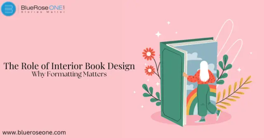
When people think of book design, they frequently consider the cover. But how about the inside of the book? Interior book design is essential to the reading experience, ensuring that the text is clear, well-structured, and visually appealing. A poorly styled book can make reading difficult, but a well-designed layout improves readability, engages readers, and adds a professional touch.
What is Interior Book Design?
Interior book design relates to how text, illustrations, and other materials are organized within a book. It addresses everything from font selection and margins to paragraph spacing and chapter titles. Unlike cover design, which attracts readers in, interior formatting guarantees that they are engrossed in the content.
Why Formatting Matters in a Book
A well-formatted book isn’t just about aesthetics—it significantly impacts how readers engage with the content. Proper formatting....Continue reading
#book publishing#book publication#book writer#publishing#book writing#book authors#literature#book#writing#self publishing#book publish#self publishing companies#book publishing companies#self publication houses#book publication houses#self published books#self published authors#self care#self help#literary#literary devices#literary elements#book formatting#book design#book interior design
0 notes