#CSS Gradient Background Generator
Explore tagged Tumblr posts
Visit Tumblr Blog
Explore Tumblr blogs with no restrictions, modern design and the best experience.
Last Seen Tumblr Blogs


Fun Fact
There are dozens of funny blogs to kill time on Tumblr.
Text

CSS Gradient Background Generator allows you to create beautiful and colorful gradient background using CSS. You can choose from a variety of gradient types, and customize the colors, angles, positions, and sizes of the gradient.
#CSS Gradient Background Generator#CSS Background Generator#CSS Code Generator#free online tools#web tools#online web tools#ai tools#a.tools
0 notes
Text
0 notes
Text
LOREM IPSUM
Lorem ipsum lorem ipsum lorem ipsum
lorem
Ipsum
Lorem
Lorem: Ipsum!!! Ipsum: Lorem!
eee
eee
ddd
ddddd
w
eelroiuei
s
ssss
s

0 notes
Text
Best Helper Sites for Web Designers
Web designers constantly seek ways to improve their workflows, enhance creativity, and accelerate the design process. Thankfully, there are countless online tools and resources available that make the job easier, whether you’re a seasoned professional or just starting your website design journey.

Download Infographic
In this post, we’ll explore some of the best helper sites for web designers, covering tools for design inspiration, code generation, asset creation, and productivity.
Get Waves

Get Waves is a fantastic resource for creating beautiful, customisable SVG wave patterns. These waves are perfect for adding a dynamic visual element to your website backgrounds or section dividers. The site offers a simple, intuitive interface that allows you to adjust wave height, colour, and smoothness before exporting the final SVG file. This makes it a favourite among web designers looking to add a touch of fluid design to their projects.
Key Features:
Generate unique, customisable SVG wave designs
Easy export options
No design skills required
Wordmark

Wordmark is a powerful tool for previewing and selecting the perfect font for your design projects. Simply type in a word or phrase, and Wordmark will display it in every font installed on your computer. This is a huge time-saver for designers who want to quickly compare different font styles without manually cycling through each option in their design software.
Key Features:
Preview text in all installed fonts
Filter by font style and weight
Supports Google Fonts and Adobe Fonts
Omatsuri

Omatsuri is a collection of simple, open-source tools for everyday web design tasks. It includes utilities for generating CSS gradients, SVG shapes, base64 encoders, and even lorem ipsum text. This all-in-one toolkit is a must-have for web designers looking to streamline their daily tasks without switching between multiple apps.
Key Features:
Wide range of design tools
Free and open-source
Clean, ad-free interface
Haikei

Haikei is a creative generator for unique, high-quality SVG backgrounds, patterns, and abstract shapes. It’s perfect for designers looking to add visually engaging elements to their projects. With its wide range of patterns, textures, and gradients, Haikei offers endless design possibilities.
Key Features:
Generate complex SVG designs
High-quality exports
Real-time design adjustments
Playbook

Playbook is a collaborative design platform that helps teams organise, share, and review design assets in one place. It’s ideal for agencies and freelance designers who need to manage multiple projects and clients. Playbook also offers powerful search and tagging features, making it easy to find exactly what you need when you need it.
Key Features:
Centralised asset management
Collaboration tools for teams
Powerful search and tagging
Tiny Helpers

Tiny Helper is a curated collection of small, free, and incredibly useful tools for developers and designers. It covers a wide range of utilities, including CSS generators, favicon creators, colour pickers, and accessibility checkers. Tiny Helper is perfect for quickly solving small design and development problems without the need for bulky software.
Key Features:
Huge collection of bite-sized tools
Free to use and regularly updated
Ideal for quick design and development tasks
Conclusion
Whether you’re creating custom wave backgrounds, selecting the perfect font, or managing your design assets, these helper sites can significantly improve your workflow as a web developer.
By integrating these tools into your daily routine, you can streamline your creative process, reduce time spent on repetitive tasks, and deliver polished, professional results to your clients.
Give these tools a try and take your web design projects to the next level.
Article first published on: https://dcpweb.co.uk/blog/best-helper-sites-for-web-designers
0 notes
Text
Ao3 HTML/Coding References-Part I
I recently made a code-heavy choose your own adventure fic, and I wanted to compile all of the really helpful resources I've found along the way. Basics, Text altering and Fancy Formatting (adding dividers, columns, photos, videos, tabs etc.) is below!
(Note: I've had to split this in two, so see Part II for all the website mimic HTML)
Basics:
This Ao3 Posting Doc converts Google doc into HTML, adding bold, underline, italics, strikethrough, paragraph breaks, and centered text. Major game changer for heavy HTML works
The Fic Writer's Guide to Formatting by AnisaAnisa: This is a masterpost in itself, covering links, images, boxes, borders, fonts etc. So I'm putting it here since it's amazingly helpful
HTML References by W3 schools- I've linked the HTML colors here, but this is a platform designed to help people learn/reference HTML
Ao3's own guide to HTML on their site Lovely Q&A for Ao3 specific HTML questions
A Guide to Ao3 HTML by Anima Nightmate (faithhope) This walks through what HTML code means SO WELL!
Text resources: (altering the color, font, emoji, style etc.)
Font's chapter: The Fic Writer's Guide to Formatting: okay I know I already linked it above, but listen it's very good so I'm linking again
Fonts colors and work skins oh my by Charles_Rockafeller takes fonts to a different level.
Multicolored text skin by ElectricAlice GRADIENT TEXT
All the Emoji by CodenameCarrot while Ao3 has signifigantly improved on hosting emojis, this code helps with using some more unconventional emojis. Amazing resource.
Upsidedown text and Zalgo text generators - these specific text generators allow for you to see their direct HTML codes
Fun CSS Text Effects by DoctorDizzyspinner
Workskin for showing and hiding spoilers by ElectricAlice makes text appear when hovered/clicked. Amazing for Trigger Warnings
Make text appear when you click [Work skin] by Khashana clickable end notes buttons for your work, similar to the spoiler button text
Hide spoilers like Discord by Professor_Rye
Desktop/mobile friendly short tooltips workskin by Simbaline
How to make Linked Footnotes on Ao3 by La_Temperanza
User-selectable Names in a Fanfic work by fiend Ever want people to select between different names in a fanfic? I could also see this used as ability to switch gender in a fanfic.
AO3 Comic Text Effects using CSS by DemigodofAgni Ever want a giant comicbook POW in your fic?
How to override the Archive's Chapter Headers by C Ryan Smith
Collection: CSS Guides by Goddess_of_the_arena (many helpful text walkthrough resources)
Fancy Formatting {Note: this got long so I split it up into more manageable sections}
Coding Masterpieces (Multiple things within the same fic)
Personal Experiment with HTML and CSS by MohnblumenKind This has a variety of help, Chapter 6 & 7 were great for choose your own adventure, Chapter 4 talks about columns and skins, and Chapter 10 even has a newspaper made entirely from site code.
Repository by gaudersan google searches, ao3 stats, instagram and text messages galore
CSS in Testing/Bleed Gold by InfinitysWraith Masterclass in cool formatting, including overidding default headers, Doors opening animation, Grid interactive photos, Hovering to change a photo, Retroactive text etc.
CSS in Testing:Second in Series by InfinitysWraith: Interactive keypads, Mock news site and interactive locking mechanism.
Coding Encyclopedia by Anonymous: chess, opening html envelopes, functioning clocks, HTML Art– this book is genuinely the most advanced stuff I’ve seen with HTML code on Ao3– and I’ve looked at every guide on this list.
Decorations (Boxes, Dividers, letters/background)
How to mimic letters, fliers and stationary without using images by La_Temperanza Really helped with box formatting
Decorations for Fic (HTML/CSS): Fanart, Dividers, Embedded Songs and More by Jnsn this has SO MANY cool coding features, including a chessboard that moves when you hover over it
Build a divider tool demo by skinforthesoul
How to make custom Page Dividers by La_Temperanza
Found Document work skin by hangingfire
Embedding other formats: (Images, gifs, youtube videos, audio, alt text)
Embed that Audio by Azdaema
Newbies guide to Podficcing by Azdaema
Embedding youtube videos on ao3 to scale with the screen by pigalle add youtube videos mid fic
Conlangs and Accessibility by Addleton this fic instructs how to have accessible translations in fic
How to make Images Fit on Mobile Browsers by La_Temperanza great image adding code
How to Wrap text around images by La_Temperanza image text wrapping
How to put pictures and gifs on Ao3 from Google Drive by gally_hin
Choose Your Own Adventure Code
How to make a Choose Your Own Adventure Fic by La_Temperanza allows for clickable links and hidden text.
Interactive fiction Workskin Tutorial by RedstoneBug BEST CHOOSE YOUR OWN ADVENTURE RESOURCE
How to make your fic look like the game by MelsShenanigans, ThoughtsCascade (I was a Teenage Exocolonist is the game but it’s a Choose your own adventure re-skin)
Newspaper/Article/Blog mimic
How to make a News Website Article Skin on Ao3 by ElectricAlice
Newspaper/Magazine Article Template by deathbymistletoe
Newspaper Article by lordvoldemortsskin --basic but adaptive for mobile
Newspaper Article Adaptation by KorruptBrekker modification for different columns
TMZ WorkSkin by Anonymous
Basic blogpost skin by Anonymous
Blog Post Work Skin by Anonymous
Journaling App by egnimalea
Email Mimic
How to insert Gmail emails in your fic by DemigodofAgni
How to mimic Email Windows by La_Temperanza
Gmail Email Skin by Sunsetcurbed
The idiot’s incoherent guide for learning css & html for ao3 in dystopia by anonymous (Gmail skin)
Search Engine Mimic
Google Search Suggestions Work Skin and Tutorial by Bookkeep
Baidu Search History Work Skin by Bookkeep
Repository by gaudersan
Misc. General formats with HTML (mission reports, spreadsheets, other documents)
Screenplay skin by astronought
Screenplay workskin by legonerd
Mock Spotify Playlist WorkSkin by Anonymous
How to make a rounded playlist by La_Temperanza Ever want to show a character's music playlist within your fic
Workskin for in Universe Investigative/Mission Report with Redaction by wafflelate case files/CSI reports
Learn to Microsoft Excel by ssc_lmth insert a spreadsheet in your fic
Ao3 Work skin: a simple scoreboard by revanchist shows how to code a scoreboard
Colossal Cave Adventure by gifbot Working Keyboard anyone?
Tabbing experiment by gifbot (clickable tabs)
Bonus: Ever wanted to see how crazy HTML can be on AO3? Try playing But can it run Doom? or Tropémon by gifbot
Happy Creating!
Last updated: Dec 28 2024 (Have a resource that you want to share? My inbox is open!)
See Part II for Website Mimics here!!
#html coding#archive of our own#ao3 fanfic#fanfic#fanfiction#ao3 writer#ao3#ao3 author#fanfic writing#fanfic authors#fanfic ideas#ao3fic#fanfics#archive of my own#fanfic help#fanfic coding
970 notes
·
View notes
Text
Understanding the Science of Gradients with a Gradient Color Generator
Introduction: The Visual Allure of Gradients
Gradients have become a cornerstone of modern design, effortlessly blending colors to create depth, movement, and emotion. Whether it’s the glowing hues in a mobile app interface or the soft transitions on a website background, gradients captivate audiences with their versatility. But what makes them so impactful? The answer lies in the psychology of colors and the science of their transitions.
In this blog, we’ll explore the emotional power of gradients, delve into their types—linear, radial, and angular—and reveal how tools like Gradient Color Generators bring these visual elements to life. Plus, we’ll look at real-world examples of successful brands leveraging gradients for a competitive edge.
The Psychology of Color: How Gradients Influence Emotions
Colors are more than just visual stimuli; they evoke feelings and shape perceptions. Gradients take this a step further by blending colors to create a spectrum of emotions.
Warm Gradients: Think of fiery oranges blending into deep reds. These gradients evoke energy, passion, and urgency. They’re often used in call-to-action buttons or promotional banners.
Cool Gradients: A smooth transition from aqua blue to emerald green offers calmness and serenity, ideal for wellness and nature-focused designs.
Multicolored Gradients: Combining multiple hues, like purples and yellows, creates a sense of playfulness and creativity, perfect for tech startups or entertainment platforms.
By leveraging a Gradient Color Generator, designers can experiment with these combinations, crafting transitions that evoke the desired emotional response.
Understanding Gradient Types
Gradients can take on different forms, each offering unique design possibilities. Let’s break down the three most common types:
1. Linear Gradients
Linear gradients create a smooth color transition along a straight line. Designers can specify the angle, direction, and range of colors to achieve various effects.
Applications:
Website headers for a sleek, modern look.
Call-to-action buttons to grab attention.
Dynamic text effects to make headlines pop.
Example:
A linear gradient transitioning from vibrant pink to purple creates a futuristic vibe, perfect for tech brands.
2. Radial Gradients
Radial gradients radiate outward from a central point, creating a circular color transition. They’re ideal for adding depth and focus to a design.
Applications:
Backgrounds that draw attention to the center of the page.
Logos or icons with a spotlight effect.
Abstract art pieces that exude creativity.
Example:
A soft radial gradient transitioning from light blue to white mimics the sky, offering tranquility and openness.
3. Angular Gradients
Angular gradients rotate colors around a central point, creating a pie-chart-like effect. While less common, they offer a bold and dynamic design option.
Applications:
Abstract patterns for eye-catching visuals.
Branding elements that convey energy and movement.
Backgrounds for tech or gaming platforms.
Example:
An angular gradient rotating through the rainbow spectrum creates a vibrant, energetic feel for a music app.
How Gradient Color Generators Work
Gradient Color Generators are powerful tools that simplify the process of creating visually stunning gradients. Here’s how they work:
1. User-Friendly Interface
Most tools offer an intuitive drag-and-drop interface. Designers can choose starting and ending colors, adjust angles, and preview changes in real-time.
2. Algorithmic Precision
Behind the scenes, these tools use algorithms to calculate the smoothest transitions between colors. They ensure that the gradient looks harmonious without harsh breaks or clashing tones.
3. Customization Options
From opacity adjustments to multi-color gradients, these tools provide endless possibilities. Some even allow exporting code snippets (e.g., CSS) for seamless integration into web projects.
Popular Tools to Explore
CSS Gradient: Ideal for developers, offering both visual and code outputs.
UI Gradient: A curated collection of gradient presets for inspiration.
Coolors: Perfect for generating unique gradient palettes with ease.
Case Studies: Brands That Nailed Gradients
Instagram: A Gradient Revolution
Instagram’s iconic gradient logo—transitioning from pink to orange—has become synonymous with the brand’s vibrant and creative community. It conveys warmth, creativity, and inclusivity, setting the platform apart from its competitors.
Spotify: Bold and Dynamic
Spotify often uses gradients in its playlist covers, combining bold colors like neon green and purple. This approach communicates energy and modernity, aligning with the brand’s youthful target audience.
Apple: Subtle Elegance
Apple’s use of gradients is minimalistic yet impactful, often featuring subtle transitions in product images and advertisements. These gradients enhance the sense of depth and premium quality associated with the brand.
Practical Tips for Using Gradients
Start with Two Colors: Simplicity is key. Begin with two complementary colors and experiment with their transitions.
Consider Context: Match the gradient’s tone with your project’s purpose. Warm gradients suit energetic campaigns, while cool ones are ideal for calming designs.
Play with Opacity: Adding transparency can create layers and depth in your design.
Use Contrast Wisely: Ensure sufficient contrast between text and background gradients to maintain readability.
Test Across Devices: Gradients can appear differently on screens. Use tools to preview how they’ll look on various devices.
The Future of Gradients in Design
As design trends evolve, gradients continue to thrive, driven by advancements in technology and user expectations for visually engaging experiences. From 3D gradients to dynamic, animated transitions, the possibilities are limitless.
Gradient Color Generators will play a crucial role in this evolution, empowering designers to push creative boundaries with minimal effort.
Conclusion: Experiment with the Science of Gradients
Gradients are more than a visual trend—they’re a powerful design element rooted in color psychology and science. Whether you’re crafting a bold brand identity or enhancing a website’s appeal, gradients offer endless possibilities.
Ready to experiment with gradients? Try a Gradient Color Generator today and unlock the potential of seamless color transitions in your designs.
0 notes
Text
Create Fluid Gradient Animations With JavaScript - NeatGradients.js
NeatGradients is a JavaScript library that helps you generate beautiful animated background patterns using CSS gradients, similar to those seen on many modern AI and SaaS websites. It’s perfect for adding visual interest to hero sections, headers, or any part of your website that needs a vibrant touch. Under the hood, the library uses CSS custom properties (variables) to animate the gradients and…
0 notes
Text
Gradient is type of image Shading between two or multi color which is developed by computer programming.Gradient is implemented Background color. Gradient can be Implemented Background for Html control like div,button,range input etc.Gradient works faster than image with minimum code.Gradient impress user experience.Gradient development is easy and quick.Works almost all device , almost all browser.
1 note
·
View note
Text
CSS Gradient Color generator , gradient generator , background gradient generator
Link: CSS Gradient Color Generator Now!
In the realm of web design, gradients add depth, dimension, and visual interest to websites, creating captivating visual effects and enhancing user experience. EditBoxPro’s CSS Gradient Color Generator offers a user-friendly solution for creating custom CSS gradients that elevate the aesthetics of your web projects. Let’s explore how EditBoxPro’s CSS Gradient Color Generator can empower web designers to unleash their creativity and bring their design visions to life.
Harnessing the Power of CSS Gradients
CSS gradients allow web designers to create smooth transitions between two or more colors, resulting in visually appealing backgrounds, buttons, overlays, and other design elements. Gradients add depth and texture to web interfaces, making them more engaging and immersive for users. With EditBoxPro’s CSS Gradient Color Generator, designers can easily experiment with different gradient styles, angles, and color combinations to achieve the desired visual effect for their websites.
Key Features of EditBoxPro’s CSS Gradient Color Generator
Intuitive Gradient Editor: EditBoxPro’s CSS Gradient Color Generator features an intuitive gradient editor that allows designers to create custom gradients with ease. Whether you prefer linear gradients, radial gradients, or conic gradients, our tool offers a range of options to suit your design needs.
Color Picker and Gradient Stops: Customize your gradients by selecting colors from a comprehensive color picker or entering hex codes manually. EditBoxPro’s Gradient Color Generator also allows you to add multiple gradient stops and adjust their positions and opacity levels for precise control over your gradient design.
Gradient Angle and Direction: Experiment with different gradient angles and directions to achieve the desired visual effect for your web design projects. EditBoxPro’s CSS Gradient Color Generator allows you to specify linear gradient angles, radial gradient shapes, and conic gradient starting points for endless design possibilities.
Preview and Code Export: Visualize your gradient designs in real time with EditBoxPro’s live preview feature. As you make changes to your gradient settings, our tool provides instant feedback, allowing you to see how your gradients will appear on the web. Once you’re satisfied with your design, you can easily export the CSS code and integrate it into your web projects.
Cross-Browser Compatibility: EditBoxPro’s CSS Gradient Color Generator ensures cross-browser compatibility by generating CSS code that works seamlessly across modern web browsers. Whether you’re targeting desktop or mobile users, our tool helps you create gradients that render consistently across different devices and platforms.
Advantages of Using EditBoxPro’s CSS Gradient Color Generator
Enhanced Visual Appeal: Elevate the visual appeal of your websites with stunning CSS gradients created using EditBoxPro’s Gradient Color Generator. Whether you’re designing headers, buttons, backgrounds, or overlays, gradients add depth, dimension, and sophistication to your web interfaces, making them more visually appealing and memorable for users.
Time-Saving Design Solution: Streamline your design process and save time with EditBoxPro’s CSS Gradient Color Generator, which offers a user-friendly interface and intuitive controls for creating custom gradients in minutes. Instead of manually coding gradients from scratch, designers can use our tool to experiment with different gradient styles and color combinations effortlessly.
Versatile Design Applications: Whether you’re designing personal websites, portfolio sites, e-commerce platforms, or corporate landing pages, EditBoxPro’s CSS Gradient Color Generator offers a versatile solution for integrating gradients into your web projects. From subtle color transitions to bold gradient effects, our tool empowers designers to create custom gradients that reflect their brand identity and design aesthetic.
Accessible Design Tool: EditBoxPro’s CSS Gradient Color Generator is accessible to designers of all skill levels, from beginners to experienced professionals. With its user-friendly interface and visual editor, our tool makes it easy for designers to experiment with gradients and create visually stunning web designs without the need for advanced coding knowledge.
Conclusion
Transform your web design projects with EditBoxPro’s CSS Gradient Color Generator. Whether you’re a seasoned web designer or just starting out, our tool provides the functionality, flexibility, and convenience you need to create custom gradients that enhance the visual appeal of your websites. Experience the power of CSS gradients, unleash your creativity, and elevate your web design game with EditBoxPro today!
Create Custom CSS Gradients with EditBoxPro’s CSS Gradient Color Generator Now!
gradient generator, gradient generator javascript, css gradient generator, background gradient generator, javascript gradient background generator, multiple color gradient generator, linear gradient generator, gradient color generator, gradient image generator, ultimate css gradient generator, background color generator, random color gradient generator, gradient, gradient color generator javascript, css gradient tutorial, linear gradient
1 note
·
View note
Text
CSS Gradient Generator
A CSS gradient generator tool is allows you to create a gradient background for your website. You can specify the colors of the gradient, as well as the direction and shape of the gradient.
0 notes
Text
0 notes
Text
Author Template
New Post has been published on https://www.aneddoticamagazine.com/tdb_templates/author-template/
Author Template
/* custom css - generated by TagDiv Composer */ /* custom css - generated by TagDiv Composer */ /* custom css - generated by TagDiv Composer */ .tdi_87_ad5 min-height: 0;
/* custom css - generated by TagDiv Composer */ /* custom css - generated by TagDiv Composer */ /* custom css - generated by TagDiv Composer */ .tdi_89_ea5, .tdi_89_ea5 .tdc-columns min-height: 0; .tdi_89_ea5, .tdi_89_ea5 .tdc-columns display: block; .tdi_89_ea5 .tdc-columns width: 100%; @media (min-width: 768px) .tdi_89_ea5 margin-left: -40px; margin-right: -40px; .tdi_89_ea5 .tdc-row-video-background-error, .tdi_89_ea5 > .vc_column, .tdi_89_ea5 > .tdc-columns > .vc_column padding-left: 40px; padding-right: 40px; /* landscape */ @media (min-width: 1019px) and (max-width: 1140px) /* custom css - generated by TagDiv Composer */ @media (min-width: 768px) .tdi_89_ea5 margin-left: -30px; margin-right: -30px; .tdi_89_ea5 .tdc-row-video-background-error, .tdi_89_ea5 > .vc_column, .tdi_89_ea5 > .tdc-columns > .vc_column padding-left: 30px; padding-right: 30px; /* portrait */ @media (min-width: 768px) and (max-width: 1018px) /* custom css - generated by TagDiv Composer */ @media (min-width: 768px) .tdi_89_ea5 margin-left: -15px; margin-right: -15px; .tdi_89_ea5 .tdc-row-video-background-error, .tdi_89_ea5 > .vc_column, .tdi_89_ea5 > .tdc-columns > .vc_column padding-left: 15px; padding-right: 15px; /* inline tdc_css att - generated by TagDiv Composer */ .tdi_89_ea5 margin-bottom:50px !important; .tdi_89_ea5 .td_block_wrap text-align:left /* landscape */ @media (min-width: 1019px) and (max-width: 1140px) .tdi_89_ea5 margin-bottom:40px !important; /* portrait */ @media (min-width: 768px) and (max-width: 1018px) .tdi_89_ea5 margin-bottom:30px !important; /* phone */ @media (max-width: 767px) .tdi_89_ea5 margin-bottom:35px !important;
/* custom css - generated by TagDiv Composer */ /* custom css - generated by TagDiv Composer */ /* custom css - generated by TagDiv Composer */ .tdi_91_8e0 vertical-align: baseline; .tdi_91_8e0 > .wpb_wrapper, .tdi_91_8e0 > .wpb_wrapper > .tdc-elements display: block; .tdi_91_8e0 > .wpb_wrapper > .tdc-elements width: 100%; .tdi_91_8e0 > .wpb_wrapper > .vc_row_inner width: auto; .tdi_91_8e0 > .wpb_wrapper width: auto; height: auto; /* inline tdc_css att - generated by TagDiv Composer */ .tdi_91_8e0 padding-right:0px !important; width:20% !important; /* phone */ @media (max-width: 767px) .tdi_91_8e0 margin-bottom:20px !important; width:100% !important;
/* custom css - generated by TagDiv Composer */ /* custom css - generated by TagDiv Composer */ .tdi_92_0dc .tdb-author-img width: 100%; .tdi_92_0dc .tdb-author-img padding-bottom: 100%; background-position: center 50%; .td-theme-wrap .tdi_92_0dc text-align: left; .tdi_92_0dc .tdb-author-effect position: absolute; top: 0; left: 0; width: 100%; height: 100%; background: -webkit-linear-gradient(0deg,#000000,#000000 9%,rgba(0,0,0,0.15) 65%,rgba(0,0,0,0.15));background: linear-gradient(0deg,#000000,#000000 9%,rgba(0,0,0,0.15) 65%,rgba(0,0,0,0.15)); z-index: 1; .tdi_92_0dc:hover .tdb-author-img:before opacity: 0; /* landscape */ @media (min-width: 1019px) and (max-width: 1140px) /* custom css - generated by TagDiv Composer */ /* portrait */ @media (min-width: 768px) and (max-width: 1018px) /* custom css - generated by TagDiv Composer */ /* phone */ @media (max-width: 767px) /* custom css - generated by TagDiv Composer */ .tdi_92_0dc .tdb-author-img padding-bottom: 65%;
/* custom css - generated by TagDiv Composer */ /* custom css - generated by TagDiv Composer */ /* custom css - generated by TagDiv Composer */ .tdi_94_85f position: absolute !important; top: 0; z-index: 1; .tdi_94_85f top: auto; bottom: 0; .tdi_94_85f, .tdi_94_85f .tdc-inner-columns display: block; .tdi_94_85f .tdc-inner-columns width: 100%; /* inline tdc_css att - generated by TagDiv Composer */ /* portrait */ @media (min-width: 768px) and (max-width: 1018px) .tdi_94_85f width:calc(100% + ( 14px * 2 ) ) !important;
/* custom css - generated by TagDiv Composer */ /* custom css - generated by TagDiv Composer */ /* custom css - generated by TagDiv Composer */ .tdi_96_6d9 vertical-align: baseline; .tdi_96_6d9 .vc_column-inner > .wpb_wrapper, .tdi_96_6d9 .vc_column-inner > .wpb_wrapper .tdc-elements display: block; .tdi_96_6d9 .vc_column-inner > .wpb_wrapper .tdc-elements width: 100%;
/* custom css - generated by TagDiv Composer */ /* custom css - generated by TagDiv Composer */ .tdi_97_688 .tdb-social-item display: inline-block; .tdi_97_688 .tdb-social-item i font-size: 16px; vertical-align: middle; min-width: 19.2px; height: 19.2px; line-height: 19.2px; color: rgba(255,163,1,0.7); .tdi_97_688 .tdb-social-item i.td-icon-twitter, .tdi_97_688 .tdb-social-item i.td-icon-linkedin, .tdi_97_688 .tdb-social-item i.td-icon-pinterest, .tdi_97_688 .tdb-social-item i.td-icon-blogger, .tdi_97_688 .tdb-social-item i.td-icon-vimeo font-size: 12.8px; .tdi_97_688 .tdb-social-item margin: calc(14px / 2) 14px 0 0; .tdi_97_688 .tdb-social-item:last-child margin-bottom: calc(14px / 2); .tdi_97_688 .tdb-social-item .tdb-social-text display: none; margin-left: 7px; .td-theme-wrap .tdi_97_688 text-align: center; .tdi_97_688 .tdb-social-item:hover i color: #ffa301; /* landscape */ @media (min-width: 1019px) and (max-width: 1140px) /* custom css - generated by TagDiv Composer */ .tdi_97_688 .tdb-social-item i font-size: 15px; vertical-align: middle; .tdi_97_688 .tdb-social-item i.td-icon-twitter, .tdi_97_688 .tdb-social-item i.td-icon-linkedin, .tdi_97_688 .tdb-social-item i.td-icon-pinterest, .tdi_97_688 .tdb-social-item i.td-icon-blogger, .tdi_97_688 .tdb-social-item i.td-icon-vimeo font-size: 12px; .tdi_97_688 .tdb-social-item i min-width: 18px; height: 18px; line-height: 18px; /* portrait */ @media (min-width: 768px) and (max-width: 1018px) /* custom css - generated by TagDiv Composer */ .tdi_97_688 .tdb-social-item i font-size: 14px; vertical-align: middle; .tdi_97_688 .tdb-social-item i.td-icon-twitter, .tdi_97_688 .tdb-social-item i.td-icon-linkedin, .tdi_97_688 .tdb-social-item i.td-icon-pinterest, .tdi_97_688 .tdb-social-item i.td-icon-blogger, .tdi_97_688 .tdb-social-item i.td-icon-vimeo font-size: 11.2px; .tdi_97_688 .tdb-social-item i min-width: 15.4px; height: 15.4px; line-height: 15.4px;
twitterpinterestfacebookyoutube
/* custom css - generated by TagDiv Composer */ /* custom css - generated by TagDiv Composer */ /* custom css - generated by TagDiv Composer */ .tdi_99_40d vertical-align: baseline; .tdi_99_40d > .wpb_wrapper, .tdi_99_40d > .wpb_wrapper > .tdc-elements display: block; .tdi_99_40d > .wpb_wrapper > .tdc-elements width: 100%; .tdi_99_40d > .wpb_wrapper > .vc_row_inner width: auto; .tdi_99_40d > .wpb_wrapper width: auto; height: auto; /* inline tdc_css att - generated by TagDiv Composer */ .tdi_99_40d width:46.66666667% !important; /* phone */ @media (max-width: 767px) .tdi_99_40d width:100% !important;
/* inline tdc_css att - generated by TagDiv Composer */ .tdi_100_d84 margin-bottom:0px !important; /* custom css - generated by TagDiv Composer */ /* custom css - generated by TagDiv Composer */ .tdi_100_d84 .tdb-title-text color: #ffffff; .tdi_100_d84 .tdb-title-line:after height: 2px; bottom: 40%; .tdi_100_d84 .tdb-title-line height: 50px; .td-theme-wrap .tdi_100_d84 text-align: left; .tdi_100_d84 .tdb-first-letter left: -0.36em; right: auto; .tdi_100_d84 .tdb-title-text font-family:Heebo !important;font-size:37px !important;line-height:1.43 !important;font-weight:500 !important; /* landscape */ @media (min-width: 1019px) and (max-width: 1140px) /* custom css - generated by TagDiv Composer */ .tdi_100_d84 .tdb-title-text font-size:33px !important; /* portrait */ @media (min-width: 768px) and (max-width: 1018px) /* custom css - generated by TagDiv Composer */ .tdi_100_d84 .tdb-title-text font-size:32px !important; /* phone */ @media (max-width: 767px) /* custom css - generated by TagDiv Composer */ .tdi_100_d84 .tdb-title-text font-size:28px !important;line-height:1.35 !important;
Sample Page Title
/* inline tdc_css att - generated by TagDiv Composer */ .tdi_101_8d7 margin-top:10px !important; margin-bottom:0px !important; /* portrait */ @media (min-width: 768px) and (max-width: 1018px) .tdi_101_8d7 margin-top:8px !important; /* phone */ @media (max-width: 767px) .tdi_101_8d7 margin-top:8px !important; /* custom css - generated by TagDiv Composer */ /* custom css - generated by TagDiv Composer */ .td-theme-wrap .tdi_101_8d7 text-align: left; .tdi_101_8d7 .tdb-author-descr color: #aaaaaa; font-family:Heebo !important;font-size:14px !important;line-height:1.5 !important;font-style:italic !important; /* landscape */ @media (min-width: 1019px) and (max-width: 1140px) /* custom css - generated by TagDiv Composer */ .tdi_101_8d7 .tdb-author-descr font-size:13px !important; /* portrait */ @media (min-width: 768px) and (max-width: 1018px) /* custom css - generated by TagDiv Composer */ .tdi_101_8d7 .tdb-author-descr font-size:13px !important; /* phone */ @media (max-width: 767px) /* custom css - generated by TagDiv Composer */ .tdi_101_8d7 .tdb-author-descr font-size:13px !important;
Sample author description
/* custom css - generated by TagDiv Composer */ /* custom css - generated by TagDiv Composer */ /* custom css - generated by TagDiv Composer */ .tdi_103_802 position: relative !important; top: 0; transform: none; -webkit-transform: none; .tdi_103_802, .tdi_103_802 .tdc-inner-columns display: block; .tdi_103_802 .tdc-inner-columns width: 100%; @media (min-width: 767px) .tdi_103_802.tdc-row-content-vert-center, .tdi_103_802.tdc-row-content-vert-center .tdc-inner-columns display: flex; align-items: center; flex: 1; .tdi_103_802.tdc-row-content-vert-bottom, .tdi_103_802.tdc-row-content-vert-bottom .tdc-inner-columns display: flex; align-items: flex-end; flex: 1; .tdi_103_802.tdc-row-content-vert-center .td_block_wrap vertical-align: middle; .tdi_103_802.tdc-row-content-vert-bottom .td_block_wrap vertical-align: bottom; /* inline tdc_css att - generated by TagDiv Composer */ .tdi_103_802 margin-top:22px !important; .tdi_103_802 .td_block_wrap text-align:left /* landscape */ @media (min-width: 1019px) and (max-width: 1140px) .tdi_103_802 margin-top:17px !important; /* portrait */ @media (min-width: 768px) and (max-width: 1018px) .tdi_103_802 margin-top:15px !important; /* phone */ @media (max-width: 767px) .tdi_103_802 margin-top:15px !important; width:100% !important;
/* custom css - generated by TagDiv Composer */ /* custom css - generated by TagDiv Composer */ /* custom css - generated by TagDiv Composer */ .tdi_105_508 vertical-align: baseline; .tdi_105_508 .vc_column-inner > .wpb_wrapper, .tdi_105_508 .vc_column-inner > .wpb_wrapper .tdc-elements display: block; .tdi_105_508 .vc_column-inner > .wpb_wrapper .tdc-elements width: 100%;
/* inline tdc_css att - generated by TagDiv Composer */ .tdi_106_65b margin-right:17px !important; margin-bottom:0px !important; /* landscape */ @media (min-width: 1019px) and (max-width: 1140px) .tdi_106_65b margin-right:15px !important; /* portrait */ @media (min-width: 768px) and (max-width: 1018px) .tdi_106_65b margin-right:15px !important; /* phone */ @media (max-width: 767px) .tdi_106_65b margin-right:15px !important; /* custom css - generated by TagDiv Composer */ /* custom css - generated by TagDiv Composer */ .tdi_106_65b display: inline-block; .td-theme-wrap .tdi_106_65b text-align: left; .tdi_106_65b .tdb-author-count color: #230e00; background-color: rgba(255,163,1,0.7); padding: 4px 6px; font-size:12px !important;font-weight:700 !important; /* landscape */ @media (min-width: 1019px) and (max-width: 1140px) /* custom css - generated by TagDiv Composer */ .tdi_106_65b .tdb-author-count padding: 4px 6px 3px; .tdi_106_65b .tdb-author-count font-size:11px !important; /* portrait */ @media (min-width: 768px) and (max-width: 1018px) /* custom css - generated by TagDiv Composer */ .tdi_106_65b .tdb-author-count padding: 4px 6px 3px; .tdi_106_65b .tdb-author-count font-size:11px !important; /* phone */ @media (max-width: 767px) /* custom css - generated by TagDiv Composer */ .tdi_106_65b .tdb-author-count padding: 4px 6px 3px; .tdi_106_65b .tdb-author-count font-size:11px !important;
1387 Posts
/* inline tdc_css att - generated by TagDiv Composer */ .tdi_107_88e margin-bottom:0px !important; /* custom css - generated by TagDiv Composer */ /* custom css - generated by TagDiv Composer */ .tdi_107_88e display: inline-block; .td-theme-wrap .tdi_107_88e text-align: left; .tdi_107_88e .tdb-author-url color: #aaaaaa; font-family:Heebo !important;font-size:12px !important;line-height:1 !important;font-style:normal !important;font-weight:500 !important; .tdi_107_88e .tdb-author-url:hover color: #ffa301; /* landscape */ @media (min-width: 1019px) and (max-width: 1140px) /* custom css - generated by TagDiv Composer */ .tdi_107_88e .tdb-author-url font-size:11px !important; /* portrait */ @media (min-width: 768px) and (max-width: 1018px) /* custom css - generated by TagDiv Composer */ .tdi_107_88e .tdb-author-url font-size:11px !important; /* phone */ @media (max-width: 767px) /* custom css - generated by TagDiv Composer */ .tdi_107_88e .tdb-author-url font-size:11px !important;
www.sample-website.com
/* custom css - generated by TagDiv Composer */ /* custom css - generated by TagDiv Composer */ /* custom css - generated by TagDiv Composer */ .tdi_109_a94 vertical-align: baseline; .tdi_109_a94 > .wpb_wrapper, .tdi_109_a94 > .wpb_wrapper > .tdc-elements display: block; .tdi_109_a94 > .wpb_wrapper > .tdc-elements width: 100%; .tdi_109_a94 > .wpb_wrapper > .vc_row_inner width: auto; .tdi_109_a94 > .wpb_wrapper width: auto; height: auto; /* inline tdc_css att - generated by TagDiv Composer */ .tdi_109_a94 width:33.33333333% !important; /* phone */ @media (max-width: 767px) .tdi_109_a94 width:100% !important; display:none !important;
/* custom css - generated by TagDiv Composer */ /* custom css - generated by TagDiv Composer */ /* custom css - generated by TagDiv Composer */ .tdi_111_896, .tdi_111_896 .tdc-columns min-height: 0; .tdi_111_896, .tdi_111_896 .tdc-columns display: block; .tdi_111_896 .tdc-columns width: 100%; @media (min-width: 768px) .tdi_111_896 margin-left: -40px; margin-right: -40px; .tdi_111_896 .tdc-row-video-background-error, .tdi_111_896 > .vc_column, .tdi_111_896 > .tdc-columns > .vc_column padding-left: 40px; padding-right: 40px; /* landscape */ @media (min-width: 1019px) and (max-width: 1140px) /* custom css - generated by TagDiv Composer */ @media (min-width: 768px) .tdi_111_896 margin-left: -30px; margin-right: -30px; .tdi_111_896 .tdc-row-video-background-error, .tdi_111_896 > .vc_column, .tdi_111_896 > .tdc-columns > .vc_column padding-left: 30px; padding-right: 30px; /* portrait */ @media (min-width: 768px) and (max-width: 1018px) /* custom css - generated by TagDiv Composer */ @media (min-width: 768px) .tdi_111_896 margin-left: -15px; margin-right: -15px; .tdi_111_896 .tdc-row-video-background-error, .tdi_111_896 > .vc_column, .tdi_111_896 > .tdc-columns > .vc_column padding-left: 15px; padding-right: 15px;
/* custom css - generated by TagDiv Composer */ /* custom css - generated by TagDiv Composer */ /* custom css - generated by TagDiv Composer */ .tdi_113_060 vertical-align: baseline; .tdi_113_060 > .wpb_wrapper, .tdi_113_060 > .wpb_wrapper > .tdc-elements display: block; .tdi_113_060 > .wpb_wrapper > .tdc-elements width: 100%; .tdi_113_060 > .wpb_wrapper > .vc_row_inner width: auto; .tdi_113_060 > .wpb_wrapper width: auto; height: auto; /* inline tdc_css att - generated by TagDiv Composer */ /* phone */ @media (max-width: 767px) .tdi_113_060 margin-bottom:55px !important;
/* inline tdc_css att - generated by TagDiv Composer */ .tdi_114_277 margin-bottom:0px !important; /* custom css - generated by TagDiv Composer */ /* custom css - generated by TagDiv Composer */ .tdi_114_277 .entry-thumb background-position: center 50%; .tdi_114_277 .td-image-wrap padding-bottom: 42%; .tdi_114_277 .td-module-container flex-direction: column; border-color: #eaeaea; .tdi_114_277 .td-image-container display: block; order: 0; .ie10 .tdi_114_277 .td-module-meta-info, .ie11 .tdi_114_277 .td-module-meta-info flex: auto; .tdi_114_277 .td-module-meta-info padding: 23px 0 0 0; border-color: #eaeaea; body .tdi_114_277 .td-favorite font-size: 36px; box-shadow: 1px 1px 4px 0px rgba(0, 0, 0, 0.2); .tdi_114_277 .td_module_wrap:not(.tdb_module_rec) width: 50%; .tdi_114_277 .tdb_module_rec width: 100%; .tdi_114_277 .td_module_wrap padding-left: 20px; padding-right: 20px; .tdi_114_277 .tdb-block-inner margin-left: -20px; margin-right: -20px; row-gap: calc(25px * 2); .tdi_114_277 .td-module-container:before bottom: -25px; border-color: #eaeaea; .tdi_114_277 .td_module_wrap:nth-last-child(-n+2) .td-module-container:before display: none; .tdi_114_277 .td-post-vid-time display: block; .tdi_114_277 .td-post-category margin: -1px 10px 0 0; padding: 3px 5px 4px; background-color: rgba(255,163,1,0.7); color: #230e00; font-size:11px !important;font-weight:700 !important; .tdi_114_277 .td-post-category:not(.td-post-extra-category) display: inline-block; .tdi_114_277 .tdb-author-photo .avatar width: 20px; height: 20px; margin-right: 6px; border-radius: 50%; .tdi_114_277 .td-excerpt display: none; column-count: 1; column-gap: 48px; .tdi_114_277 .td-audio-player opacity: 1; visibility: visible; height: auto; font-size: 13px; .tdi_114_277 .td-read-more display: none; .tdi_114_277 .td-author-date display: inline; .tdi_114_277 .td-post-author-name display: none; .tdi_114_277 .td-post-date, .tdi_114_277 .td-post-author-name span display: inline-block; .tdi_114_277 .entry-review-stars display: inline-block; .tdi_114_277 .td-icon-star, .tdi_114_277 .td-icon-star-empty, .tdi_114_277 .td-icon-star-half font-size: 15px; .tdi_114_277 .td-module-comments display: none; .tdi_114_277 .td-post-category:hover background-color: #ffa301; .tdi_114_277 .td-module-title a color: #ffffff; .tdi_114_277 .td_module_wrap:hover .td-module-title a color: #ffa301; .tdi_114_277.td_with_ajax_pagination .td-next-prev-wrap, .tdi_114_277 .page-nav, .tdi_114_277 .td-load-more-wrap margin-top: 55px; .tdi_114_277.td_with_ajax_pagination .td-next-prev-wrap a, .tdi_114_277 .page-nav a, .tdi_114_277 .page-nav .current, .tdi_114_277 .page-nav .extend, .tdi_114_277 .page-nav .pages, .tdi_114_277 .td-load-more-wrap a padding: 6px 13px; .tdi_114_277 .page-nav .pages padding-right: 0; .tdi_114_277.td_with_ajax_pagination .td-next-prev-wrap a, .tdi_114_277 .page-nav a, .tdi_114_277 .td-load-more-wrap a color: #888888; background-color: rgba(0,0,0,0); border-color: #444444; .tdi_114_277 .td-load-more-wrap a .td-load-more-icon-svg svg, .tdi_114_277 .td-load-more-wrap a .td-load-more-icon-svg svg *, .tdi_114_277.td_with_ajax_pagination .td-next-prev-wrap .td-next-prev-icon-svg svg, .tdi_114_277.td_with_ajax_pagination .td-next-prev-wrap .td-next-prev-icon-svg svg *, .tdi_114_277 .page-nav .page-nav-icon-svg svg , .tdi_114_277 .page-nav .page-nav-icon-svg svg * fill: #888888; .tdi_114_277 .page-nav .current color: #ffa301; background-color: rgba(136,136,136,0); border-color: rgba(255,163,1,0.7); .tdi_114_277.td_with_ajax_pagination .td-next-prev-wrap a:hover, .tdi_114_277 .page-nav a:hover, .tdi_114_277 .td-load-more-wrap a:hover color: #ffa301; background-color: rgba(136,136,136,0); border-color: rgba(255,163,1,0.7); .tdi_114_277 .td-load-more-wrap a .td-load-more-icon-svg svg, .tdi_114_277 .td-load-more-wrap a .td-load-more-icon-svg svg *, .tdi_114_277.td_with_ajax_pagination .td-next-prev-wrap a:hover .td-next-prev-icon-svg svg, .tdi_114_277.td_with_ajax_pagination .td-next-prev-wrap a:hover .td-next-prev-icon-svg svg *, .tdi_114_277 .page-nav a:hover .page-nav-icon-svg svg , .tdi_114_277 .page-nav a:hover .page-nav-icon-svg svg * fill: #ffa301; .tdi_114_277 .entry-title margin: 0 0 16px; font-family:Heebo !important;font-size:22px !important;line-height:1.3 !important;font-weight:500 !important; .tdi_114_277.td_with_ajax_pagination .td-next-prev-wrap a i, .tdi_114_277 .page-nav a, .tdi_114_277 .page-nav span, .tdi_114_277 .td-load-more-wrap a font-family:Heebo !important;font-size:13px !important;font-weight:500 !important; .tdi_114_277 .td-author-date, .tdi_114_277 .tdb-author-photo, .tdi_114_277 .td-post-author-name a, .tdi_114_277 .td-author-date .entry-date, .tdi_114_277 .td-module-comments a font-size:11px !important;font-weight:700 !important; html:not([class*='ie']) .tdi_114_277 .td-module-container:hover .entry-thumb:before opacity: 0; /* landscape */ @media (min-width: 1019px) and (max-width: 1140px) /* custom css - generated by TagDiv Composer */ .tdi_114_277 .td-module-meta-info padding: 20px 0 0 0; .tdi_114_277 .td_module_wrap padding-left: 15px; padding-right: 15px; .tdi_114_277 .tdb-block-inner margin-left: -15px; margin-right: -15px; row-gap: calc(20px * 2); .tdi_114_277 .td-module-container:before bottom: -20px; .tdi_114_277.td_with_ajax_pagination .td-next-prev-wrap, .tdi_114_277 .page-nav, .tdi_114_277 .td-load-more-wrap margin-top: 45px; .tdi_114_277.td_with_ajax_pagination .td-next-prev-wrap a, .tdi_114_277 .page-nav a, .tdi_114_277 .page-nav .current, .tdi_114_277 .page-nav .extend, .tdi_114_277 .page-nav .pages, .tdi_114_277 .td-load-more-wrap a padding: 5px 12px; .tdi_114_277 .page-nav .pages padding-right: 0; .tdi_114_277 .entry-title margin: 0 0 14px; font-size:20px !important; .tdi_114_277.td_with_ajax_pagination .td-next-prev-wrap a i, .tdi_114_277 .page-nav a, .tdi_114_277 .page-nav span, .tdi_114_277 .td-load-more-wrap a font-size:12px !important; /* portrait */ @media (min-width: 768px) and (max-width: 1018px) /* custom css - generated by TagDiv Composer */ .tdi_114_277 .td-module-meta-info padding: 18px 0 0; .tdi_114_277 .td_module_wrap padding-left: 10px; padding-right: 10px; .tdi_114_277 .tdb-block-inner margin-left: -10px; margin-right: -10px; row-gap: calc(15px * 2); .tdi_114_277 .td-module-container:before bottom: -15px; .tdi_114_277 .td-post-category margin: -1px 8px 0 0; font-size:10px !important; .tdi_114_277.td_with_ajax_pagination .td-next-prev-wrap, .tdi_114_277 .page-nav, .tdi_114_277 .td-load-more-wrap margin-top: 35px; .tdi_114_277.td_with_ajax_pagination .td-next-prev-wrap a, .tdi_114_277 .page-nav a, .tdi_114_277 .page-nav .current, .tdi_114_277 .page-nav .extend, .tdi_114_277 .page-nav .pages, .tdi_114_277 .td-load-more-wrap a padding: 5px 12px; .tdi_114_277 .page-nav .pages padding-right: 0; .tdi_114_277 .entry-title margin: 0 0 15px; font-size:18px !important; .tdi_114_277.td_with_ajax_pagination .td-next-prev-wrap a i, .tdi_114_277 .page-nav a, .tdi_114_277 .page-nav span, .tdi_114_277 .td-load-more-wrap a font-size:12px !important; .tdi_114_277 .td-author-date, .tdi_114_277 .tdb-author-photo, .tdi_114_277 .td-post-author-name a, .tdi_114_277 .td-author-date .entry-date, .tdi_114_277 .td-module-comments a font-size:10px !important; /* phone */ @media (max-width: 767px) /* custom css - generated by TagDiv Composer */ .tdi_114_277 .td-image-wrap padding-bottom: 55%; .tdi_114_277 .td-module-meta-info padding: 18px 0 0 0; .tdi_114_277 .td_module_wrap:not(.tdb_module_rec) width: 100%; .tdi_114_277 .tdb-block-inner row-gap: calc(21px * 2); .tdi_114_277 .td-module-container:before bottom: -21px; .tdi_114_277 .td_module_wrap:nth-last-child(1) .td-module-container:before display: none; .tdi_114_277 .td-post-category margin: -2px 10px 0 0; .tdi_114_277.td_with_ajax_pagination .td-next-prev-wrap, .tdi_114_277 .page-nav, .tdi_114_277 .td-load-more-wrap margin-top: 35px; .tdi_114_277.td_with_ajax_pagination .td-next-prev-wrap a, .tdi_114_277 .page-nav a, .tdi_114_277 .page-nav .current, .tdi_114_277 .page-nav .extend, .tdi_114_277 .page-nav .pages, .tdi_114_277 .td-load-more-wrap a padding: 5px 12px; .tdi_114_277 .page-nav .pages padding-right: 0; .tdi_114_277 .entry-title margin: 0 0 14px; font-size:21px !important; .tdi_114_277.td_with_ajax_pagination .td-next-prev-wrap a i, .tdi_114_277 .page-nav a, .tdi_114_277 .page-nav span, .tdi_114_277 .td-load-more-wrap a font-size:12px !important; var block_tdi_114_277 = new tdBlock(); block_tdi_114_277.id = "tdi_114_277"; block_tdi_114_277.atts = '"modules_on_row":"eyJhbGwiOiI1MCUiLCJwb3J0cmFpdCI6IjUwJSIsInBob25lIjoiMTAwJSJ9","limit":"12","hide_audio":"yes","art_title":"eyJhbGwiOiIwIDAgMTZweCIsInBob25lIjoiMCAwIDE0cHgiLCJsYW5kc2NhcGUiOiIwIDAgMTRweCIsInBvcnRyYWl0IjoiMCAwIDE1cHgifQ==","f_title_font_family":"820","f_title_font_size":"eyJhbGwiOiIyMiIsImxhbmRzY2FwZSI6IjIwIiwicGhvbmUiOiIyMSIsInBvcnRyYWl0IjoiMTgifQ==","f_title_font_line_height":"1.3","f_title_font_weight":"500","title_txt":"#ffffff","title_txt_hover":"#ffa301","f_meta_font_family":"","f_meta_font_size":"eyJhbGwiOiIxMSIsInBvcnRyYWl0IjoiMTAiLCJwaG9uZSI6IjExIn0=","f_meta_font_weight":"700","modules_category_margin":"eyJhbGwiOiItMXB4IDEwcHggMCAwIiwicGhvbmUiOiItMnB4IDEwcHggMCAwIiwicG9ydHJhaXQiOiItMXB4IDhweCAwIDAifQ==","modules_category_padding":"3px 5px 4px","f_cat_font_family":"","f_cat_font_size":"eyJhbGwiOiIxMSIsInBvcnRyYWl0IjoiMTAiLCJwaG9uZSI6IjExIn0=","f_cat_font_weight":"700","cat_bg":"rgba(255,163,1,0.7)","cat_bg_hover":"#ffa301","cat_txt":"#230e00","show_author":"none","show_com":"none","show_btn":"none","all_modules_space":"eyJhbGwiOiI1MCIsImxhbmRzY2FwZSI6IjQwIiwicG9ydHJhaXQiOiIzMCIsInBob25lIjoiNDIifQ==","show_excerpt":"none","meta_padding":"eyJhbGwiOiIyM3B4IDAgMCAwIiwicGhvbmUiOiIxOHB4IDAgMCAwIiwibGFuZHNjYXBlIjoiMjBweCAwIDAgMCIsInBvcnRyYWl0IjoiMThweCAwIDAifQ==","tdc_css":"eyJhbGwiOnsibWFyZ2luLWJvdHRvbSI6IjAiLCJkaXNwbGF5IjoiIn19","category_id":"","image_height":"eyJhbGwiOiI0MiIsInBob25lIjoiNTUifQ==","modules_gap":"eyJsYW5kc2NhcGUiOiIzMCIsInBvcnRyYWl0IjoiMjAiLCJhbGwiOiI0MCJ9","sort":"","image_size":"td_485x360","ajax_pagination":"numbered","f_pag_font_family":"820","pag_space":"eyJhbGwiOiI1NSIsImxhbmRzY2FwZSI6IjQ1IiwicG9ydHJhaXQiOiIzNSIsInBob25lIjoiMzUifQ==","pag_padding":"eyJhbGwiOiI2cHggMTNweCIsInBvcnRyYWl0IjoiNXB4IDEycHgiLCJsYW5kc2NhcGUiOiI1cHggMTJweCIsInBob25lIjoiNXB4IDEycHgifQ==","f_pag_font_weight":"500","f_pag_font_size":"eyJhbGwiOiIxMyIsInBvcnRyYWl0IjoiMTIiLCJsYW5kc2NhcGUiOiIxMiIsInBob25lIjoiMTIifQ==","pag_border":"#444444","pag_text":"#888888","pag_h_bg":"rgba(136,136,136,0)","pag_h_border":"rgba(255,163,1,0.7)","pag_h_text":"#ffa301","pag_a_border":"rgba(255,163,1,0.7)","pag_a_text":"#ffa301","pag_bg":"rgba(0,0,0,0)","pag_a_bg":"rgba(136,136,136,0)","block_type":"tdb_loop","separator":"","custom_title":"","custom_url":"","block_template_id":"","title_tag":"","mc1_tl":"","mc1_title_tag":"","mc1_el":"","offset":"","open_in_new_window":"","post_ids":"","include_cf_posts":"","exclude_cf_posts":"","installed_post_types":"","ajax_pagination_next_prev_swipe":"","ajax_pagination_infinite_stop":"","review_source":"","container_width":"","m_padding":"","m_radius":"","modules_border_size":"","modules_border_style":"","modules_border_color":"#eaeaea","modules_divider":"","modules_divider_color":"#eaeaea","h_effect":"","image_alignment":"50","image_width":"","image_floated":"no_float","image_radius":"","hide_image":"","show_favourites":"","fav_size":"2","fav_space":"","fav_ico_color":"","fav_ico_color_h":"","fav_bg":"","fav_bg_h":"","fav_shadow_shadow_header":"","fav_shadow_shadow_title":"Shadow","fav_shadow_shadow_size":"","fav_shadow_shadow_offset_horizontal":"","fav_shadow_shadow_offset_vertical":"","fav_shadow_shadow_spread":"","fav_shadow_shadow_color":"","video_icon":"","video_popup":"yes","video_rec":"","spot_header":"","video_rec_title":"- Advertisement -","video_rec_color":"","video_rec_disable":"","autoplay_vid":"yes","show_vid_t":"block","vid_t_margin":"","vid_t_padding":"","video_title_color":"","video_title_color_h":"","video_bg":"","video_overlay":"","vid_t_color":"","vid_t_bg_color":"","f_vid_title_font_header":"","f_vid_title_font_title":"Video pop-up article title","f_vid_title_font_settings":"","f_vid_title_font_family":"","f_vid_title_font_size":"","f_vid_title_font_line_height":"","f_vid_title_font_style":"","f_vid_title_font_weight":"","f_vid_title_font_transform":"","f_vid_title_font_spacing":"","f_vid_title_":"","f_vid_time_font_title":"Video duration text","f_vid_time_font_settings":"","f_vid_time_font_family":"","f_vid_time_font_size":"","f_vid_time_font_line_height":"","f_vid_time_font_style":"","f_vid_time_font_weight":"","f_vid_time_font_transform":"","f_vid_time_font_spacing":"","f_vid_time_":"","meta_info_align":"","meta_info_horiz":"content-horiz-left","meta_width":"","meta_margin":"","meta_space":"","meta_info_border_size":"","meta_info_border_style":"","meta_info_border_color":"#eaeaea","meta_info_border_radius":"","art_btn":"","modules_category":"","modules_cat_border":"","modules_category_radius":"0","show_cat":"inline-block","modules_extra_cat":"","author_photo":"","author_photo_size":"","author_photo_space":"","author_photo_radius":"","show_date":"inline-block","show_modified_date":"","time_ago":"","time_ago_add_txt":"ago","time_ago_txt_pos":"","show_review":"inline-block","review_space":"","review_size":"2.5","review_distance":"","art_excerpt":"","excerpt_col":"1","excerpt_gap":"","excerpt_middle":"","excerpt_inline":"","show_audio":"block","art_audio":"","art_audio_size":"1.5","btn_title":"","btn_margin":"","btn_padding":"","btn_border_width":"","btn_radius":"","pag_border_width":"","pag_border_radius":"","prev_tdicon":"","next_tdicon":"","pag_icons_size":"","f_header_font_header":"","f_header_font_title":"Block header","f_header_font_settings":"","f_header_font_family":"","f_header_font_size":"","f_header_font_line_height":"","f_header_font_style":"","f_header_font_weight":"","f_header_font_transform":"","f_header_font_spacing":"","f_header_":"","f_pag_font_title":"Pagination text","f_pag_font_settings":"","f_pag_font_line_height":"","f_pag_font_style":"","f_pag_font_transform":"","f_pag_font_spacing":"","f_pag_":"","f_title_font_header":"","f_title_font_title":"Article title","f_title_font_settings":"","f_title_font_style":"","f_title_font_transform":"","f_title_font_spacing":"","f_title_":"","f_cat_font_title":"Article category tag","f_cat_font_settings":"","f_cat_font_line_height":"","f_cat_font_style":"","f_cat_font_transform":"","f_cat_font_spacing":"","f_cat_":"","f_meta_font_title":"Article meta info","f_meta_font_settings":"","f_meta_font_line_height":"","f_meta_font_style":"","f_meta_font_transform":"","f_meta_font_spacing":"","f_meta_":"","f_ex_font_title":"Article excerpt","f_ex_font_settings":"","f_ex_font_family":"","f_ex_font_size":"","f_ex_font_line_height":"","f_ex_font_style":"","f_ex_font_weight":"","f_ex_font_transform":"","f_ex_font_spacing":"","f_ex_":"","f_btn_font_title":"Article read more button","f_btn_font_settings":"","f_btn_font_family":"","f_btn_font_size":"","f_btn_font_line_height":"","f_btn_font_style":"","f_btn_font_weight":"","f_btn_font_transform":"","f_btn_font_spacing":"","f_btn_":"","mix_color":"","mix_type":"","fe_brightness":"1","fe_contrast":"1","fe_saturate":"1","mix_color_h":"","mix_type_h":"","fe_brightness_h":"1","fe_contrast_h":"1","fe_saturate_h":"1","m_bg":"","shadow_shadow_header":"","shadow_shadow_title":"Module Shadow","shadow_shadow_size":"","shadow_shadow_offset_horizontal":"","shadow_shadow_offset_vertical":"","shadow_shadow_spread":"","shadow_shadow_color":"","all_underline_height":"","all_underline_color":"#000","cat_txt_hover":"","cat_border":"","cat_border_hover":"","meta_bg":"","author_txt":"","author_txt_hover":"","date_txt":"","ex_txt":"","com_bg":"","com_txt":"","rev_txt":"","shadow_m_shadow_header":"","shadow_m_shadow_title":"Meta info shadow","shadow_m_shadow_size":"","shadow_m_shadow_offset_horizontal":"","shadow_m_shadow_offset_vertical":"","shadow_m_shadow_spread":"","shadow_m_shadow_color":"","audio_btn_color":"","audio_time_color":"","audio_bar_color":"","audio_bar_curr_color":"","btn_bg":"","btn_bg_hover":"","btn_txt":"","btn_txt_hover":"","btn_border":"","btn_border_hover":"","nextprev_border_h":"","ad_loop":"","ad_loop_title":"- Advertisement -","ad_loop_repeat":"","ad_loop_color":"","ad_loop_full":"yes","f_ad_font_header":"","f_ad_font_title":"Ad title text","f_ad_font_settings":"","f_ad_font_family":"","f_ad_font_size":"","f_ad_font_line_height":"","f_ad_font_style":"","f_ad_font_weight":"","f_ad_font_transform":"","f_ad_font_spacing":"","f_ad_":"","ad_loop_disable":"","el_class":"","td_column_number":2,"header_color":"","td_ajax_preloading":"","td_ajax_filter_type":"","td_filter_default_txt":"","td_ajax_filter_ids":"","color_preset":"","border_top":"","css":"","class":"tdi_114_277","tdc_css_class":"tdi_114_277","tdc_css_class_style":"tdi_114_277_rand_style"'; block_tdi_114_277.td_column_number = "2"; block_tdi_114_277.block_type = "tdb_loop"; block_tdi_114_277.post_count = "12"; block_tdi_114_277.found_posts = "4283"; block_tdi_114_277.header_color = ""; block_tdi_114_277.ajax_pagination_infinite_stop = ""; block_tdi_114_277.max_num_pages = "357"; tdBlocksArray.push(block_tdi_114_277);
edit
Sample post title 0
Jan 5, 2024
edit
Sample post title 1
Jan 5, 2024
edit
Sample post title 2
Jan 5, 2024
edit
Sample post title 3
Jan 5, 2024
edit
Sample post title 4
Jan 5, 2024
edit
Sample post title 5
Jan 5, 2024
edit
Sample post title 6
Jan 5, 2024
edit
Sample post title 7
Jan 5, 2024
edit
Sample post title 8
Jan 5, 2024
edit
Sample post title 9
Jan 5, 2024
edit
Sample post title 10
Jan 5, 2024
edit
Sample post title 11
Jan 5, 2024
123Page 1 of 3
/* custom css - generated by TagDiv Composer */ /* custom css - generated by TagDiv Composer */ /* custom css - generated by TagDiv Composer */ .tdi_116_59d vertical-align: baseline; .tdi_116_59d > .wpb_wrapper, .tdi_116_59d > .wpb_wrapper > .tdc-elements display: block; .tdi_116_59d > .wpb_wrapper > .tdc-elements width: 100%; .tdi_116_59d > .wpb_wrapper > .vc_row_inner width: auto; .tdi_116_59d > .wpb_wrapper width: auto; height: auto;
/* inline tdc_css att - generated by TagDiv Composer */ .tdi_117_b55 margin-bottom:50px !important; /* landscape */ @media (min-width: 1019px) and (max-width: 1140px) .tdi_117_b55 margin-bottom:40px !important; /* portrait */ @media (min-width: 768px) and (max-width: 1018px) .tdi_117_b55 margin-bottom:30px !important; /* phone */ @media (max-width: 767px) .tdi_117_b55 margin-bottom:35px !important; /* custom css - generated by TagDiv Composer */ /* custom css - generated by TagDiv Composer */ .td-theme-wrap .tdi_117_b55 text-align: left; .tdi_117_b55 .tdb-search-form-input:focus + .tdb-search-form-border + .tdb-search-form-placeholder, .tdb-search-form-input:not(:placeholder-shown) ~ .tdb-search-form-placeholder top: -0%; transform: translateY(0); .tdi_117_b55 .tdb-search-form-input, .tdi_117_b55 .tdb-search-form-placeholder padding: 0 15px 2px; .tdi_117_b55 .tdb-search-form-inner border-radius: 4px; background-color: rgba(0,0,0,0); .tdi_117_b55 .tdb-search-form-border border-radius: 4px; border-color: #444444; .tdi_117_b55 .tdb-search-form-input border-top-left-radius: @input_radius; border-bottom-left-radius: @input_radius; color: #ffffff; font-family:Heebo !important;font-size:13px !important;line-height:3.3 !important;font-weight:500 !important; .tdi_117_b55 .tdb-search-form-btn i font-size: 15px; .tdi_117_b55 .tdb-search-form-btn-icon top: 0px; .tdi_117_b55 .tdb-search-form-btn padding: 0 15px 2px; border-radius: 0 4px 4px 0; background-color: rgba(51,51,51,0); .tdi_117_b55 .tdb-search-msg margin-top: 11px; .tdi_117_b55 .tdb-search-form-input:focus + .tdb-search-form-border, .tdi_117_b55 .tdb-search-form-input:focus + .tdb-search-form-placeholder + .tdb-search-form-border border-color: #555555 !important; .tdi_117_b55 .tdb-search-form-btn:hover background-color: #ffa301; .tdi_117_b55 .tdb-search-form-placeholder font-family:Heebo !important;font-size:13px !important;line-height:3 !important;font-weight:500 !important;
Search
/* custom css - generated by TagDiv Composer */ /* custom css - generated by TagDiv Composer */ /* custom css - generated by TagDiv Composer */ .tdi_119_0d9 position: relative !important; top: 0; transform: none; -webkit-transform: none; .tdi_119_0d9, .tdi_119_0d9 .tdc-inner-columns display: block; .tdi_119_0d9 .tdc-inner-columns width: 100%; @media (min-width: 767px) .tdi_119_0d9.tdc-row-content-vert-center, .tdi_119_0d9.tdc-row-content-vert-center .tdc-inner-columns display: flex; align-items: center; flex: 1; .tdi_119_0d9.tdc-row-content-vert-bottom, .tdi_119_0d9.tdc-row-content-vert-bottom .tdc-inner-columns display: flex; align-items: flex-end; flex: 1; .tdi_119_0d9.tdc-row-content-vert-center .td_block_wrap vertical-align: middle; .tdi_119_0d9.tdc-row-content-vert-bottom .td_block_wrap vertical-align: bottom; /* inline tdc_css att - generated by TagDiv Composer */ .tdi_119_0d9 margin-top:-5px !important; margin-bottom:20px !important; .tdi_119_0d9 .td_block_wrap text-align:left /* landscape */ @media (min-width: 1019px) and (max-width: 1140px) .tdi_119_0d9 margin-bottom:15px !important; /* portrait */ @media (min-width: 768px) and (max-width: 1018px) .tdi_119_0d9 margin-bottom:13px !important; /* phone */ @media (max-width: 767px) .tdi_119_0d9 margin-bottom:25px !important; width:100% !important;
/* custom css - generated by TagDiv Composer */ /* custom css - generated by TagDiv Composer */ /* custom css - generated by TagDiv Composer */ .tdi_121_890 vertical-align: baseline; .tdi_121_890 .vc_column-inner > .wpb_wrapper, .tdi_121_890 .vc_column-inner > .wpb_wrapper .tdc-elements display: block; .tdi_121_890 .vc_column-inner > .wpb_wrapper .tdc-elements width: 100%;
/* inline tdc_css att - generated by TagDiv Composer */ .tdi_122_00d margin-right:16px !important; /* landscape */ @media (min-width: 1019px) and (max-width: 1140px) .tdi_122_00d margin-right:15px !important; /* portrait */ @media (min-width: 768px) and (max-width: 1018px) .tdi_122_00d margin-right:14px !important; /* phone */ @media (max-width: 767px) .tdi_122_00d margin-right:15px !important; /* custom css - generated by TagDiv Composer */ /* custom css - generated by TagDiv Composer */ .tdi_122_00d i font-size: 34px; text-align: center; .tdi_122_00d i width: 34px; height: 34px; line-height: 34px; .tdi_122_00d i, .tdi_122_00d .tds-icon-svg-wrap position: relative; top: 0px; .tdi_122_00d display: inline-block; /* landscape */ @media (min-width: 1019px) and (max-width: 1140px) /* custom css - generated by TagDiv Composer */ .tdi_122_00d i font-size: 32px; text-align: center; .tdi_122_00d i width: 32px; height: 32px; line-height: 32px; /* portrait */ @media (min-width: 768px) and (max-width: 1018px) /* custom css - generated by TagDiv Composer */ .tdi_122_00d i font-size: 30px; text-align: center; .tdi_122_00d i width: 30px; height: 30px; line-height: 30px; /* phone */ @media (max-width: 767px) /* custom css - generated by TagDiv Composer */ .tdi_122_00d i font-size: 33px; text-align: center; .tdi_122_00d i width: 33px; height: 33px; line-height: 33px; .tdi_122_00d i, .tdi_122_00d .tds-icon-svg-wrap position: relative; top: 1px; /* custom css - generated by TagDiv Composer */ /* custom css - generated by TagDiv Composer */ .tdi_123_dc7 -webkit-transition: all 0.2s ease; -moz-transition: all 0.2s ease; -o-transition: all 0.2s ease; transition: all 0.2s ease; .tdi_123_dc7:before -webkit-transition: all 0.2s ease; -moz-transition: all 0.2s ease; -o-transition: all 0.2s ease; transition: all 0.2s ease; color: #666666; .tdi_123_dc7 svg fill: #666666; .tdi_123_dc7 svg * fill: inherit; /* landscape */ @media (min-width: 1019px) and (max-width: 1140px) /* custom css - generated by TagDiv Composer */ /* portrait */ @media (min-width: 768px) and (max-width: 1018px) /* custom css - generated by TagDiv Composer */ /* phone */ @media (max-width: 767px) /* custom css - generated by TagDiv Composer */
/* inline tdc_css att - generated by TagDiv Composer */ /* phone */ @media (max-width: 767px) .tdi_124_96b margin-top:9px !important; /* custom css - generated by TagDiv Composer */ /* custom css - generated by TagDiv Composer */ .tdi_124_96b text-align: left !important; .tdi_124_96b .tdm-descr color: #999999; font-family:Heebo !important;font-size:24px !important;font-weight:500 !important; /* landscape */ @media (min-width: 1019px) and (max-width: 1140px) /* custom css - generated by TagDiv Composer */ .tdi_124_96b .tdm-descr font-size:22px !important; /* portrait */ @media (min-width: 768px) and (max-width: 1018px) /* custom css - generated by TagDiv Composer */ .tdi_124_96b .tdm-descr font-size:20px !important;
Latest articles
/* inline tdc_css att - generated by TagDiv Composer */ .tdi_125_890 margin-bottom:50px !important; /* landscape */ @media (min-width: 1019px) and (max-width: 1140px) .tdi_125_890 margin-bottom:40px !important; /* portrait */ @media (min-width: 768px) and (max-width: 1018px) .tdi_125_890 margin-bottom:30px !important; /* phone */ @media (max-width: 767px) .tdi_125_890 margin-bottom:35px !important; /* custom css - generated by TagDiv Composer */ /* custom css - generated by TagDiv Composer */ .tdi_125_890 .td-image-wrap padding-bottom: 105%; .tdi_125_890 .entry-thumb background-position: center 50%; .tdi_125_890 .td-image-container flex: 0 0 20%; width: 20%; display: block; order: 1; .ie10 .tdi_125_890 .td-image-container, .ie11 .tdi_125_890 .td-image-container flex: 0 0 auto; .tdi_125_890 .td-module-container flex-direction: row; border-color: #eaeaea !important; .tdi_125_890 .td-module-meta-info flex: 1; padding: 0 20px 0 0; display: flex; flex-direction: column; justify-content: center; border-color: #eaeaea; body .tdi_125_890 .td-favorite font-size: 36px; box-shadow: 1px 1px 4px 0px rgba(0, 0, 0, 0.2); .tdi_125_890 .td-category-pos-above .td-post-category align-self: flex-start; .tdi_125_890 .td_module_wrap padding-left: 20px; padding-right: 20px; padding-bottom: 12.5px; margin-bottom: 12.5px; .tdi_125_890 .td_block_inner margin-left: -20px; margin-right: -20px; .tdi_125_890 .td-module-container:before bottom: -12.5px; border-color: #eaeaea; .tdi_125_890 .td-post-vid-time display: block; .tdi_125_890 .td-post-category:not(.td-post-extra-category) display: none; .tdi_125_890 .td-author-photo .avatar width: 20px; height: 20px; margin-right: 6px; border-radius: 50%; .tdi_125_890 .td-excerpt display: none; column-count: 1; column-gap: 48px; .tdi_125_890 .td-audio-player opacity: 1; visibility: visible; height: auto; font-size: 13px; .tdi_125_890 .td-read-more display: none; .tdi_125_890 .td-author-date display: inline; .tdi_125_890 .td-post-author-name display: none; .tdi_125_890 .entry-review-stars display: none; .tdi_125_890 .td-icon-star, .tdi_125_890 .td-icon-star-empty, .tdi_125_890 .td-icon-star-half font-size: 15px; .tdi_125_890 .td-module-comments display: none; .tdi_125_890 .td_module_wrap:nth-last-child(1) margin-bottom: 0; padding-bottom: 0; .tdi_125_890 .td_module_wrap:nth-last-child(1) .td-module-container:before display: none; .tdi_125_890 .td-module-title a color: #dddddd; .tdi_125_890 .td_module_wrap:hover .td-module-title a color: #ffa301 !important; .tdi_125_890 .entry-title margin: 0 0 8px; font-family:Heebo !important;font-size:14px !important;line-height:1.5 !important;font-weight:500 !important; .tdi_125_890 .td-editor-date, .tdi_125_890 .td-editor-date .td-post-author-name a, .tdi_125_890 .td-editor-date .entry-date, .tdi_125_890 .td-module-comments a font-size:11px !important;font-weight:700 !important; html:not([class*='ie']) .tdi_125_890 .td-module-container:hover .entry-thumb:before opacity: 0; /* landscape */ @media (min-width: 1019px) and (max-width: 1140px) /* custom css - generated by TagDiv Composer */ .tdi_125_890 .td-image-wrap padding-bottom: 115%; .tdi_125_890 .td-module-meta-info padding: 0 15px 0 0; .tdi_125_890 .td_module_wrap padding-bottom: 7.5px; margin-bottom: 7.5px; padding-bottom: 7.5px !important; margin-bottom: 7.5px !important; .tdi_125_890 .td-module-container:before bottom: -7.5px; .tdi_125_890 .td_module_wrap:nth-last-child(1) margin-bottom: 0 !important; padding-bottom: 0 !important; .tdi_125_890 .td_module_wrap .td-module-container:before display: block !important; .tdi_125_890 .td_module_wrap:nth-last-child(1) .td-module-container:before display: none !important; .tdi_125_890 .entry-title margin: 0 0 6px; font-size:13px !important;line-height:1.4 !important; .tdi_125_890 .td-editor-date, .tdi_125_890 .td-editor-date .td-post-author-name a, .tdi_125_890 .td-editor-date .entry-date, .tdi_125_890 .td-module-comments a font-size:10px !important; /* portrait */ @media (min-width: 768px) and (max-width: 1018px) /* custom css - generated by TagDiv Composer */ .tdi_125_890 .td-image-container flex: 0 0 0%; width: 0%; .ie10 .tdi_125_890 .td-image-container, .ie11 .tdi_125_890 .td-image-container flex: 0 0 auto; .tdi_125_890 .td-module-meta-info padding: 0px; .tdi_125_890 .td_module_wrap padding-bottom: 1px; margin-bottom: 1px; padding-bottom: 1px !important; margin-bottom: 1px !important; .tdi_125_890 .td-module-container:before bottom: -1px; .tdi_125_890 .td-author-date display: none; .tdi_125_890 .td-post-date, .tdi_125_890 .td-post-author-name span display: none; .tdi_125_890 .td_module_wrap:nth-last-child(1) margin-bottom: 0 !important; padding-bottom: 0 !important; .tdi_125_890 .td_module_wrap .td-module-container:before display: block !important; .tdi_125_890 .td_module_wrap:nth-last-child(1) .td-module-container:before display: none !important; .tdi_125_890 .entry-title font-size:12px !important;line-height:1.4 !important; .tdi_125_890 .td-editor-date, .tdi_125_890 .td-editor-date .td-post-author-name a, .tdi_125_890 .td-editor-date .entry-date, .tdi_125_890 .td-module-comments a font-size:10px !important; /* phone */ @media (max-width: 767px) /* custom css - generated by TagDiv Composer */ .tdi_125_890 .td-image-container flex: 0 0 18%; width: 18%; .ie10 .tdi_125_890 .td-image-container, .ie11 .tdi_125_890 .td-image-container flex: 0 0 auto; .tdi_125_890 .td-module-meta-info padding: 0 15px 0 0; .tdi_125_890 .td_module_wrap padding-bottom: 10px; margin-bottom: 10px; padding-bottom: 10px !important; margin-bottom: 10px !important; .tdi_125_890 .td-module-container:before bottom: -10px; .tdi_125_890 .td_module_wrap:nth-last-child(1) margin-bottom: 0 !important; padding-bottom: 0 !important; .tdi_125_890 .td_module_wrap .td-module-container:before display: block !important; .tdi_125_890 .td_module_wrap:nth-last-child(1) .td-module-container:before display: none !important; .tdi_125_890 .entry-title margin: 0 0 6px; line-height:1.4 !important; .tdi_125_890 .td-editor-date, .tdi_125_890 .td-editor-date .td-post-author-name a, .tdi_125_890 .td-editor-date .entry-date, .tdi_125_890 .td-module-comments a font-size:10px !important; var block_tdi_125_890 = new tdBlock(); block_tdi_125_890.id = "tdi_125_890"; block_tdi_125_890.atts = '"modules_on_row":"","hide_audio":"yes","show_btn":"none","show_com":"none","show_review":"none","show_excerpt":"none","show_author":"none","image_floated":"float_right","image_width":"eyJhbGwiOiIyMCIsInBvcnRyYWl0IjoiMCIsInBob25lIjoiMTgifQ==","image_height":"eyJhbGwiOiIxMDUiLCJsYW5kc2NhcGUiOiIxMTUifQ==","category_id":"","sort":"","f_title_font_family":"820","title_txt":"#dddddd","title_txt_hover":"#ffa301","f_title_font_size":"eyJhbGwiOiIxNCIsImxhbmRzY2FwZSI6IjEzIiwicG9ydHJhaXQiOiIxMiJ9","image_size":"td_218x150","meta_padding":"eyJhbGwiOiIwIDIwcHggMCAwIiwibGFuZHNjYXBlIjoiMCAxNXB4IDAgMCIsInBvcnRyYWl0IjoiMCIsInBob25lIjoiMCAxNXB4IDAgMCJ9","meta_info_align":"center","f_meta_font_family":"","f_meta_font_size":"eyJhbGwiOiIxMSIsInBvcnRyYWl0IjoiMTAiLCJwaG9uZSI6IjEwIiwibGFuZHNjYXBlIjoiMTAifQ==","f_meta_font_weight":"700","tdc_css":"eyJhbGwiOnsibWFyZ2luLWJvdHRvbSI6IjUwIiwiZGlzcGxheSI6IiJ9LCJsYW5kc2NhcGUiOnsibWFyZ2luLWJvdHRvbSI6IjQwIiwiZGlzcGxheSI6IiJ9LCJsYW5kc2NhcGVfbWF4X3dpZHRoIjoxMTQwLCJsYW5kc2NhcGVfbWluX3dpZHRoIjoxMDE5LCJwb3J0cmFpdCI6eyJtYXJnaW4tYm90dG9tIjoiMzAiLCJkaXNwbGF5IjoiIn0sInBvcnRyYWl0X21heF93aWR0aCI6MTAxOCwicG9ydHJhaXRfbWluX3dpZHRoIjo3NjgsInBob25lIjp7Im1hcmdpbi1ib3R0b20iOiIzNSIsImRpc3BsYXkiOiIifSwicGhvbmVfbWF4X3dpZHRoIjo3Njd9","modules_category":"","f_title_font_line_height":"eyJhbGwiOiIxLjUiLCJsYW5kc2NhcGUiOiIxLjQiLCJwb3J0cmFpdCI6IjEuNCIsInBob25lIjoiMS40In0=","limit":"4","f_title_font_weight":"500","all_modules_space":"eyJhbGwiOiIyNSIsImxhbmRzY2FwZSI6IjE1IiwicG9ydHJhaXQiOiIyIiwicGhvbmUiOiIyMCJ9","art_title":"eyJhbGwiOiIwIDAgOHB4IiwibGFuZHNjYXBlIjoiMCAwIDZweCIsInBob25lIjoiMCAwIDZweCJ9","show_cat":"none","show_date":"eyJwb3J0cmFpdCI6Im5vbmUifQ==","block_type":"td_flex_block_1","separator":"","custom_title":"","custom_url":"","block_template_id":"","title_tag":"","mc1_tl":"","mc1_title_tag":"","mc1_el":"","post_ids":"","taxonomies":"","category_ids":"","in_all_terms":"","tag_slug":"","autors_id":"","installed_post_types":"","include_cf_posts":"","exclude_cf_posts":"","popular_by_date":"","linked_posts":"","favourite_only":"","offset":"","open_in_new_window":"","show_modified_date":"","time_ago":"","time_ago_add_txt":"ago","time_ago_txt_pos":"","review_source":"","el_class":"","td_query_cache":"","td_query_cache_expiration":"","td_ajax_filter_type":"","td_ajax_filter_ids":"","td_filter_default_txt":"All","td_ajax_preloading":"","container_width":"","modules_gap":"","m_padding":"","modules_border_size":"","modules_border_style":"","modules_border_color":"#eaeaea","modules_border_radius":"","modules_divider":"","modules_divider_color":"#eaeaea","h_effect":"","image_alignment":"50","image_radius":"","hide_image":"","show_favourites":"","fav_size":"2","fav_space":"","fav_ico_color":"","fav_ico_color_h":"","fav_bg":"","fav_bg_h":"","fav_shadow_shadow_header":"","fav_shadow_shadow_title":"Shadow","fav_shadow_shadow_size":"","fav_shadow_shadow_offset_horizontal":"","fav_shadow_shadow_offset_vertical":"","fav_shadow_shadow_spread":"","fav_shadow_shadow_color":"","video_icon":"","video_popup":"yes","video_rec":"","spot_header":"","video_rec_title":"","video_rec_color":"","video_rec_disable":"","autoplay_vid":"yes","show_vid_t":"block","vid_t_margin":"","vid_t_padding":"","video_title_color":"","video_title_color_h":"","video_bg":"","video_overlay":"","vid_t_color":"","vid_t_bg_color":"","f_vid_title_font_header":"","f_vid_title_font_title":"Video pop-up article title","f_vid_title_font_settings":"","f_vid_title_font_family":"","f_vid_title_font_size":"","f_vid_title_font_line_height":"","f_vid_title_font_style":"","f_vid_title_font_weight":"","f_vid_title_font_transform":"","f_vid_title_font_spacing":"","f_vid_title_":"","f_vid_time_font_title":"Video duration text","f_vid_time_font_settings":"","f_vid_time_font_family":"","f_vid_time_font_size":"","f_vid_time_font_line_height":"","f_vid_time_font_style":"","f_vid_time_font_weight":"","f_vid_time_font_transform":"","f_vid_time_font_spacing":"","f_vid_time_":"","meta_info_horiz":"layout-default","meta_width":"","meta_margin":"","meta_space":"","art_btn":"","meta_info_border_size":"","meta_info_border_style":"","meta_info_border_color":"#eaeaea","meta_info_border_radius":"","modules_category_margin":"","modules_category_padding":"","modules_cat_border":"","modules_category_radius":"0","modules_extra_cat":"","author_photo":"","author_photo_size":"","author_photo_space":"","author_photo_radius":"","review_space":"","review_size":"2.5","review_distance":"","art_excerpt":"","excerpt_col":"1","excerpt_gap":"","excerpt_middle":"","excerpt_inline":"","show_audio":"block","art_audio":"","art_audio_size":"1.5","btn_title":"","btn_margin":"","btn_padding":"","btn_border_width":"","btn_radius":"","pag_space":"","pag_padding":"","pag_border_width":"","pag_border_radius":"","prev_tdicon":"","next_tdicon":"","pag_icons_size":"","f_header_font_header":"","f_header_font_title":"Block header","f_header_font_settings":"","f_header_font_family":"","f_header_font_size":"","f_header_font_line_height":"","f_header_font_style":"","f_header_font_weight":"","f_header_font_transform":"","f_header_font_spacing":"","f_header_":"","f_ajax_font_title":"Ajax categories","f_ajax_font_settings":"","f_ajax_font_family":"","f_ajax_font_size":"","f_ajax_font_line_height":"","f_ajax_font_style":"","f_ajax_font_weight":"","f_ajax_font_transform":"","f_ajax_font_spacing":"","f_ajax_":"","f_more_font_title":"Load more button","f_more_font_settings":"","f_more_font_family":"","f_more_font_size":"","f_more_font_line_height":"","f_more_font_style":"","f_more_font_weight":"","f_more_font_transform":"","f_more_font_spacing":"","f_more_":"","f_title_font_header":"","f_title_font_title":"Article title","f_title_font_settings":"","f_title_font_style":"","f_title_font_transform":"","f_title_font_spacing":"","f_title_":"","f_cat_font_title":"Article category tag","f_cat_font_settings":"","f_cat_font_family":"","f_cat_font_size":"","f_cat_font_line_height":"","f_cat_font_style":"","f_cat_font_weight":"","f_cat_font_transform":"","f_cat_font_spacing":"","f_cat_":"","f_meta_font_title":"Article meta info","f_meta_font_settings":"","f_meta_font_line_height":"","f_meta_font_style":"","f_meta_font_transform":"","f_meta_font_spacing":"","f_meta_":"","f_ex_font_title":"Article excerpt","f_ex_font_settings":"","f_ex_font_family":"","f_ex_font_size":"","f_ex_font_line_height":"","f_ex_font_style":"","f_ex_font_weight":"","f_ex_font_transform":"","f_ex_font_spacing":"","f_ex_":"","f_btn_font_title":"Article read more button","f_btn_font_settings":"","f_btn_font_family":"","f_btn_font_size":"","f_btn_font_line_height":"","f_btn_font_style":"","f_btn_font_weight":"","f_btn_font_transform":"","f_btn_font_spacing":"","f_btn_":"","mix_color":"","mix_type":"","fe_brightness":"1","fe_contrast":"1","fe_saturate":"1","mix_color_h":"","mix_type_h":"","fe_brightness_h":"1","fe_contrast_h":"1","fe_saturate_h":"1","m_bg":"","color_overlay":"","shadow_shadow_header":"","shadow_shadow_title":"Module Shadow","shadow_shadow_size":"","shadow_shadow_offset_horizontal":"","shadow_shadow_offset_vertical":"","shadow_shadow_spread":"","shadow_shadow_color":"","all_underline_height":"","all_underline_color":"","cat_bg":"","cat_bg_hover":"","cat_txt":"","cat_txt_hover":"","cat_border":"","cat_border_hover":"","meta_bg":"","author_txt":"","author_txt_hover":"","date_txt":"","ex_txt":"","com_bg":"","com_txt":"","rev_txt":"","audio_btn_color":"","audio_time_color":"","audio_bar_color":"","audio_bar_curr_color":"","shadow_m_shadow_header":"","shadow_m_shadow_title":"Meta info shadow","shadow_m_shadow_size":"","shadow_m_shadow_offset_horizontal":"","shadow_m_shadow_offset_vertical":"","shadow_m_shadow_spread":"","shadow_m_shadow_color":"","btn_bg":"","btn_bg_hover":"","btn_txt":"","btn_txt_hover":"","btn_border":"","btn_border_hover":"","pag_text":"","pag_h_text":"","pag_bg":"","pag_h_bg":"","pag_border":"","pag_h_border":"","ajax_pagination":"","ajax_pagination_next_prev_swipe":"","ajax_pagination_infinite_stop":"","css":"","td_column_number":1,"header_color":"","color_preset":"","border_top":"","class":"tdi_125_890","tdc_css_class":"tdi_125_890","tdc_css_class_style":"tdi_125_890_rand_style"'; block_tdi_125_890.td_column_number = "1"; block_tdi_125_890.block_type = "td_flex_block_1"; block_tdi_125_890.post_count = "4"; block_tdi_125_890.found_posts = "4283"; block_tdi_125_890.header_color = ""; block_tdi_125_890.ajax_pagination_infinite_stop = ""; block_tdi_125_890.max_num_pages = "1071"; tdBlocksArray.push(block_tdi_125_890);
edit
Vasco Gargalo: Abortion Rights
Jul 3, 2022
edit
La riunione dei BRICS e la creazione di un nuovo ordine economico mondiale
Jul 1, 2022
edit
Il caso Elisa Lam
Jul 1, 2022
edit
Alagon: Desideri
Jun 21, 2022
/* inline tdc_css att - generated by TagDiv Composer */ .tdi_127_4cc margin-bottom:0px !important; /* custom css - generated by TagDiv Composer */ /* custom css - generated by TagDiv Composer */ body .tdi_127_4cc .td-instagram-user a color: #dddddd; body .tdi_127_4cc .td-instagram-followers color: #aaaaaa; font-size:12px !important;font-weight:700 !important; body .tdi_127_4cc .td-instagram-button color: #888888; border-color: #444444; font-family:Heebo !important;font-weight:500 !important; body .tdi_127_4cc .td-instagram-user a font-family:Heebo !important;font-weight:500 !important; body .tdi_127_4cc .td-instagram-element:hover:before opacity: 0; /* landscape */ @media (min-width: 1019px) and (max-width: 1140px) /* custom css - generated by TagDiv Composer */ body .tdi_127_4cc .td-instagram-user a font-size:14px !important; body .tdi_127_4cc .td-instagram-followers font-size:11px !important; /* portrait */ @media (min-width: 768px) and (max-width: 1018px) /* custom css - generated by TagDiv Composer */ body .tdi_127_4cc .td-instagram-user a font-size:13px !important; body .tdi_127_4cc .td-instagram-followers font-size:10px !important; /* phone */ @media (max-width: 767px) /* custom css - generated by TagDiv Composer */ body .tdi_127_4cc .td-instagram-user a font-size:14px !important; body .tdi_127_4cc .td-instagram-followers font-size:11px !important;
InstagramInstagram data error: The data could not be retrived using the username Instagram ID. If you own this account, please connect to it in Theme's Panel Social Networks > Instagram Account Access Configuration section.
0 notes
Text
Drawing Vertical Lines with CSS: Creative Design
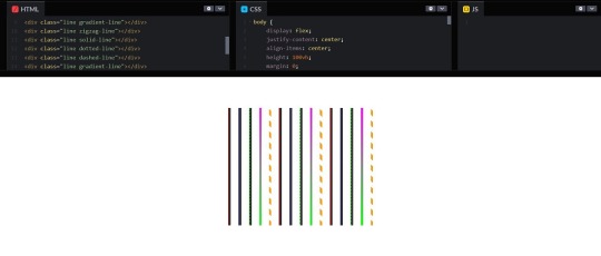
Introduction
Welcome to a creative journey into the world of CSS, where you'll discover how to draw vertical lines using cascading style sheets. Whether you're a web designer, developer, or just a curious enthusiast, this blog post will unveil the power of CSS to add visually appealing vertical lines to your web projects. We'll explore the basics, techniques, and best practices to help you unlock the artistic potential of CSS in your designs. Let's dive in and uncover the secrets of creating visually stunning vertical lines that will enhance your web content and captivate your audience.
Understanding CSS Basics

Cascading Style Sheets (CSS) are the fundamental building blocks of web design, enabling you to control the visual presentation of web pages. To draw vertical lines with CSS creatively, it's essential to grasp some core concepts: - Selectors: CSS selectors are patterns used to select and style HTML elements. They define what elements on a web page will be affected by the CSS rules. - Properties: CSS properties determine the visual characteristics of selected elements. These properties include attributes like color, font size, and border width, which are crucial for drawing lines. - Values: Values are specific settings applied to CSS properties. For example, you can set a border color to 'red' or '#FF0000', and a border width to '2px' or 'thin'. Understanding how selectors, properties, and values work together is key to using CSS effectively. For drawing vertical lines, we'll focus on properties like 'border' and 'margin' and values that define their characteristics. In the context of vertical lines, it's important to consider the following CSS properties: PropertyDescriptionborder-leftThis property allows you to specify a border on the left side of an element, effectively creating a vertical line.border-rightSimilar to 'border-left,' but for the right side of an element, useful for vertical lines on the right.margin-leftAdjusting the left margin can create space and achieve a vertical line effect by expanding the background color or content on one side.margin-rightSimilar to 'margin-left,' but applied to the right side of an element, useful for spacing and vertical lines on the right. These properties provide the foundation for drawing vertical lines using CSS. In the next sections, we'll delve into different techniques and methods to leverage these properties creatively and enhance your web designs with vertical lines.
Methods for Drawing Vertical Lines
Now that we have a solid understanding of CSS basics, let's explore various methods for drawing eye-catching vertical lines in your web designs. Each of these techniques offers a unique approach to achieve the desired visual effects: See the Pen Drawing Vertical Lines with CSS by CSS Monster (@CSS-Monster) on CodePen. Using the border Property: One of the most straightforward ways to create vertical lines is by applying the border-left or border-right property to an element. This adds a vertical border on the left or right side of the element, effectively creating a line. You can control the thickness, style, and color of the line using the corresponding properties. For example: CSS .vertical-line { border-left: 2px solid #000; } Using Pseudo-Elements: CSS pseudo-elements, such as ::before and ::after, offer an elegant way to insert vertical lines without adding extra HTML elements. By defining content for the pseudo-element and styling it with borders or background colors, you can create vertical lines. Here's an example: CSS .element::before { content: ""; border-left: 1px dashed #333; height: 100px; display: inline-block; } Using CSS Gradients: CSS gradients are versatile and can be employed to generate vertical lines by specifying a gradient that moves from one color to another in a vertical direction. This method allows you to have smooth transitions and gradients as your vertical lines: CSS .gradient-line { background: linear-gradient(to bottom, #00f, #f00); } These methods can be customized further by altering properties like line thickness, color, and positioning to fit your design requirements. You can combine these techniques for more complex and creative results. MethodDescriptionborder PropertyUsing the border property to add vertical lines by styling the left or right borders of an element.Pseudo-ElementsUtilizing CSS pseudo-elements like ::before and ::after to insert vertical lines without additional HTML elements.CSS GradientsCreating vertical lines through CSS gradients, enabling smooth transitions and gradients for a more unique look. These methods are just the beginning of what you can accomplish with CSS when it comes to drawing vertical lines. In the next sections, we'll delve into further customization options, responsive design considerations, and best practices to make your vertical lines truly stand out.
Customizing Vertical Lines
Now that you've learned different methods to create vertical lines with CSS, it's time to explore the exciting world of customization. Customizing vertical lines allows you to add a personal touch to your web design and make your lines visually appealing. Here are some key aspects to consider: Line Thickness: Adjusting the thickness of your vertical lines can significantly impact the visual hierarchy of your content. Use the border-width property to control the line's thickness. For example: CSS .thick-line { border-left: 4px solid #333; } Line Color: Choosing the right color for your vertical lines is crucial. Use the border-color property to define the line's color. You can specify colors using keywords, hex codes, or RGB values. For instance: CSS .colored-line { border-right: 2px solid red; } Line Style: CSS offers various line styles, such as solid, dashed, and dotted. You can apply these styles using the border-style property. Here's an example of a dashed line: CSS .dashed-line { border-left: 2px dashed #00f; } Background and Padding: Surrounding elements can complement your vertical lines. Adjusting the background color and padding of the container elements can create unique visual effects. For example: CSS.container { background-color: #f5f5f5; padding: 20px; } By customizing these properties, you can create vertical lines that match your website's style and enhance its visual appeal. Remember, experimentation is key, and you can combine multiple customizations to achieve the desired effect. Additionally, using CSS pseudo-elements and gradients, as discussed in previous sections, offers even more opportunities for customization. Customization AspectDescriptionLine ThicknessAdjusting the thickness of vertical lines using the border-width property.Line ColorChoosing the color of vertical lines with the border-color property, allowing various color specifications.Line StyleApplying different line styles, such as solid, dashed, and dotted, using the border-style property.Background and PaddingCustomizing the background color and padding of container elements to enhance the visual impact of vertical lines. Once you've customized your vertical lines to your liking, they can become an integral part of your web design, adding elegance and flair to your content. In the next section, we'll explore responsive design considerations to ensure that your vertical lines look great on all devices.
Responsive Design Considerations
As you enhance your web design with vertical lines created using CSS, it's essential to ensure that your lines look great on all devices and screen sizes. Responsive design considerations play a crucial role in achieving this goal. Here are some key factors to keep in mind: Media Queries: Utilize media queries to adjust your vertical lines' properties based on screen width. By defining different CSS rules for various breakpoints, you can ensure that your lines adapt to smaller screens gracefully. For example: CSS@media screen and (max-width: 768px) { .responsive-line { border-left: 2px solid #333; } } Percentage-Based Sizing: Instead of fixed pixel values, use percentage-based sizing for line thickness and positioning. This approach allows your lines to scale proportionally with the screen size. For instance: CSS.percentage-line { border-left: 1%; } Fluid Layouts: Implement fluid layouts that adapt to different screen widths. Design your website to be flexible, with elements that reflow naturally as the screen size changes. This ensures your vertical lines remain harmonious with the overall layout. Responsive design is crucial for providing a seamless user experience, whether visitors access your site on a desktop, tablet, or smartphone. By applying these techniques, you can maintain the integrity of your vertical lines while optimizing their appearance on diverse devices. Responsive Design AspectDescriptionMedia QueriesUsing media queries to adapt vertical line properties based on screen width and ensure a responsive design.Percentage-Based SizingApplying percentage-based sizing for line thickness and positioning, allowing lines to scale proportionally with the screen size.Fluid LayoutsImplementing fluid layouts that adapt to various screen widths, maintaining harmony with the overall design. By implementing these responsive design considerations, you can create a visually consistent and user-friendly experience across a wide range of devices. In the final section, we'll wrap up this exploration of drawing vertical lines with CSS by discussing best practices for optimal results.
Best Practices
As you near the completion of your journey into creating vertical lines with CSS, it's important to embrace some best practices to ensure your designs are both visually appealing and maintainable. Here are some valuable tips to follow: - Use Semantic HTML: Start with a solid HTML foundation. Ensure that your vertical lines are applied to the appropriate HTML elements. Semantic HTML not only enhances accessibility but also makes your CSS more manageable. For example, use elements for decorative lines within a container. - Keep CSS Separate: Avoid inline styles and keep your CSS in external stylesheets. This separation of concerns simplifies maintenance and allows for consistent styling across your website. - Optimize for Performance: Minimize unnecessary complexity in your CSS. Use CSS minification and compression techniques to reduce file sizes for faster loading times. - Test Cross-Browser Compatibility: Ensure that your vertical lines appear consistently across various web browsers. Regularly test your design on different browsers to identify and address any compatibility issues. - Document Your CSS: Add comments and documentation in your CSS code to make it more understandable for you and other developers who may work on the project. This can be especially helpful when dealing with intricate styling rules. - Implement Accessibility: Ensure your designs are accessible to all users, including those with disabilities. Pay attention to contrast, text alternatives, and keyboard navigation when using vertical lines for design elements. - Stay Updated: CSS is continually evolving. Stay informed about the latest CSS features, best practices, and web design trends to keep your designs fresh and relevant. By adhering to these best practices, you'll not only create visually stunning vertical lines but also ensure that your web designs are maintainable, accessible, and performant. Your commitment to quality and attention to detail will result in a positive user experience and a professional web presence. Best PracticeDescriptionUse Semantic HTMLApply vertical lines to appropriate HTML elements and follow semantic HTML practices for improved accessibility and manageability.Keep CSS SeparateAvoid inline styles and maintain your CSS in external stylesheets to ensure consistency and easy maintenance.Optimize for PerformanceReduce file sizes and improve loading times by minimizing unnecessary complexity and using CSS optimization techniques.Test Cross-Browser CompatibilityRegularly test your designs on different web browsers to ensure consistent appearance and functionality.Document Your CSSEnhance code readability and collaboration by adding comments and documentation in your CSS code.Implement AccessibilityMake your designs accessible to all users by addressing contrast, text alternatives, and keyboard navigation for vertical lines.Stay UpdatedStay informed about the latest CSS features and web design trends to keep your designs current and engaging. By following these best practices, you can ensure that your vertical lines not only look great but also contribute to an exceptional user experience on your website. Websites for free HTML & CSS templates:◉ uideck - https://t.co/CwFDNG2tCg◉ free-css - https://t.co/whAWPtPsiR◉ splawr .com - https://t.co/0wGOimKzBD◉ onepagelove - https://t.co/3OoqGpTq2K◉ tooplate - https://t.co/HhPldbSsrd◉ nicepage- https://t.co/gL8CrjVSGc… pic.twitter.com/rMNNdQO5bc— Rizwan (@mdrizwanalam72) November 4, 2023
FAQ
Here are answers to some frequently asked questions about drawing vertical lines with CSS for creative design: Q: Can I draw vertical lines on any HTML element? A: Yes, you can draw vertical lines on most HTML elements, such as , , and . However, it's important to choose elements that make semantic sense and align with your design goals. Q: Which method is best for creating responsive vertical lines? A: Using percentage-based sizing for line thickness and media queries to adapt properties based on screen width is a recommended approach for achieving responsive vertical lines. This ensures that your lines scale proportionally with different screen sizes. Q: How can I ensure cross-browser compatibility for my vertical lines? A: Testing your design on various web browsers and applying CSS resets or normalizations can help ensure cross-browser compatibility. Be aware of browser-specific quirks and use vendor prefixes if needed for specific CSS properties. Q: Are there any performance considerations when using vertical lines? A: Yes, performance is important. Avoid overly complex CSS, minimize file sizes through optimization, and use efficient CSS properties. Additionally, consider using CSS hardware acceleration for smoother rendering of lines, especially in animations. Q: Can I create animated vertical lines with CSS? A: Yes, you can animate vertical lines by applying CSS animations or transitions to their properties, such as height or position. This allows you to create dynamic and engaging visual effects. These frequently asked questions provide valuable insights into the world of drawing vertical lines with CSS for creative design. If you have more questions or need further guidance, feel free to reach out to us for assistance.
Conclusion
Congratulations on completing your journey through the art of drawing vertical lines with CSS for creative design. Throughout this blog post, you've gained a deeper understanding of CSS basics, learned various methods for creating vertical lines, and explored customization techniques. You've also delved into responsive design considerations, embraced best practices, and found answers to common questions about this exciting design element. Vertical lines have the power to transform the visual appeal of your web content, making it more engaging, sophisticated, and memorable. By mastering the techniques and best practices shared in this post, you're well-equipped to take your web design skills to the next level. As you continue to experiment with CSS and explore new design possibilities, remember that the creative potential is limitless. Use your newfound knowledge to innovate, craft stunning web experiences, and stay current with evolving CSS features and trends. Thank you for joining us on this creative journey. We look forward to seeing the remarkable designs you'll create using CSS to draw vertical lines. If you have any more questions or need further assistance, don't hesitate to reach out. Happy designing! Read the full article
0 notes
Link
CSS Gradient Generator
1 note
·
View note
Text
Revisiting CSS border-image
New Post has been published on https://thedigitalinsider.com/revisiting-css-border-image/
Revisiting CSS border-image
In my last article on “Revisiting CSS Multi-Column Layout”, I mentioned that almost twenty years have flown by since I wrote my first book, Transcending CSS. In it, I explained how and why to use what were, at the time, an emerging CSS property.
Ten years later, I wrote the Hardboiled Web Design Fifth Anniversary Edition, covering similar ground and introducing the new CSS border-image property.
Hint: I published an updated version, Transcending CSS Revisited which is free to read online. Hardboiled Web Design is available from my bookshop.
I was very excited about the possibilities this new property would offer. After all, we could now add images to the borders of any element, even table cells and rows (unless their borders had been set to collapse).
Since then, I’ve used border-image regularly. Yet, it remains one of the most underused CSS tools, and I can’t, for the life of me, figure out why. Is it possible that people steer clear of border-image because its syntax is awkward and unintuitive? Perhaps it’s because most explanations don’t solve the type of creative implementation problems that most people need to solve. Most likely, it’s both.
I’ve recently been working on a new website for Emmy-award-winning game composer Mike Worth. He hired me to create a highly graphical design that showcases his work, and I used border-image throughout.
Design by Andy Clarke, Stuff & Nonsense. Mike Worth’s website will launch in April 2025, but you can see examples from this article on CodePen.
A brief overview of properties and values
First, here’s a short refresher. Most border-image explanations begin with this highly illuminating code snippet:
border-image: [source] [slice]/[width]/[outset] [repeat]
This is shorthand for a set of border-image properties, but it’s best to deal with properties individually to grasp the concept more easily.
A border-image’s source
I’ll start with the source of the bitmap or vector format image or CSS gradient to be inserted into the border space:
border-image-source: url('/img/scroll.png');
When I insert SVG images into a border, I have several choices as to how. I could use an external SVG file:
border-image-source: url('/img/scroll.svg');
Or I might convert my SVG to data URI using a tool like Base64.Guru although, as both SVG and HTML are XML-based, this isn’t recommended:
border-image-source: url('data:image/svg+xml;base64,…');
Instead, I can add the SVG code directly into the source URL value and save one unnecessary HTTP request:
border-image-source: url('data:image/svg+xml;utf8,…');
Finally, I could insert an entirely CSS-generated conical, linear, or radial gradient into my border:
border-image-source: conical-gradient(…);
Tip: It’s useful to remember that a browser renders a border-image above an element’s background and box-shadow but below its content. More on that a little later.
Slicing up a border-image
Now that I’ve specified the source of a border image, I can apply it to a border by slicing it up and using the parts in different positions around an element. This can be the most baffling aspect for people new to border-image.
Most border-image explanations show an example where the pieces will simply be equally-sized, like this:
However, a border-image can be developed from any shape, no matter how complex or irregular.
Instead of simply inserting an image into a border and watching it repeat around an element, invisible cut-lines slice up a border-image into nine parts. These lines are similar to the slice guides found in graphics applications. The pieces are, in turn, inserted into the nine regions of an element’s border.
The border-image-slice property defines the size of each slice by specifying the distance from each edge of the image. I could use the same distance from every edge:
border-image-slice: 65
I can combine top/bottom and left/right values:
border-image-slice: 115 65;
Or, I can specify distance values for all four cut-lines, running clockwise: top, right, bottom, left:
border-image-slice: 65 65 115 125;
The top-left of an image will be used on the top-left corner of an element’s border. The bottom-right will be used on the bottom-right, and so on.
I don’t need to add units to border-image-slice values when using a bitmap image as the browser correctly assumes bitmaps use pixels. The SVG viewBox makes using them a little different, so I also prefer to specify their height and width:
<svg height="600px" width="600px">…</svg>
Don’t forget to set the widths of these borders, as without them, there will be nowhere for a border’s image to display:
border-image-width: 65px 65px 115px 125px;
Filling in the center
So far, I’ve used all four corners and sides of my image, but what about the center? By default, the browser will ignore the center of an image after it’s been sliced. But I can put it to use by adding the fill keyword to my border-image-slice value:
border-image-slice: 65px 65px 115px 125px fill;
Setting up repeats
With the corners of my border images in place, I can turn my attention to the edges between them. As you might imagine, the slice at the top of an image will be placed on the top edge. The same is true of the right, bottom, and left edges. In a flexible design, we never know how wide or tall these edges will be, so I can fine-tune how images will repeat or stretch when they fill an edge.
Stretch: When a sliced image is flat or smooth, it can stretch to fill any height or width. Even a tiny 65px slice can stretch to hundreds or thousands of pixels without degrading.
border-image-repeat: stretch;
Repeat: If an image has texture, stretching it isn’t an option, so it can repeat to fill any height or width.
border-image-repeat: repeat;
Round: If an image has a pattern or shape that can’t be stretched and I need to match the edges of the repeat, I can specify that the repeat be round. A browser will resize the image so that only whole pieces display inside an edge.
border-image-repeat: round;
Space: Similar to round, when using the space property, only whole pieces will display inside an edge. But instead of resizing the image, a browser will add spaces into the repeat.
border-image-repeat: space;
When I need to specify a separate stretch, repeat, round, or space value for each edge, I can use multiple keywords:
border-image-repeat: stretch round;
Outsetting a border-image
There can be times when I need an image to extend beyond an element’s border-box. Using the border-image-outset property, I can do just that. The simplest syntax extends the border image evenly on all sides by 10px:
border-image-outset: 10px;
Of course, there being four borders on every element, I could also specify each outset individually:
border-image-outset: 20px 10px; /* or */ border-image-outset: 20px 10px 0;
border-image in action
Mike Worth is a video game composer who’s won an Emmy for his work. He loves ’90s animation — especially Disney’s Duck Tales — and he asked me to create custom artwork and develop a bold, retro-style design.
My challenge when developing for Mike was implementing my highly graphical design without compromising performance, especially on mobile devices. While it’s normal in CSS to accomplish the same goal in several ways, here, border-image often proved to be the most efficient.
Decorative buttons
The easiest and most obvious place to start was creating buttons reminiscent of stone tablets with chipped and uneven edges.
I created an SVG of the tablet shape and added it to my buttons using border-image:
button border-image-repeat: stretch; border-image-slice: 10 10 10 10 fill; border-image-source: url('data:image/svg+xml;utf8,…'); border-image-width: 20px;
I set the border-image-repeat on all edges to stretch and the center slice to fill so these stone tablet-style buttons expand along with their content to any height or width.
Article scroll
I want every aspect of Mike’s website design to express his brand. That means continuing the ’90s cartoon theme in his long-form content by turning it into a paper scroll.
The markup is straightforward with just a single article element:
<article> <!-- ... --> </article>
But, I struggled to decide how to implement the paper effect. My first thought was to divide my scroll into three separate SVG files (top, middle, and bottom) and use pseudo-elements to add the rolled up top and bottom parts of the scroll. I started by applying a vertically repeating graphic to the middle of my article:
article padding: 10rem 8rem; box-sizing: border-box; /* Scroll middle */ background-image: url('data:image/svg+xml;utf8,…'); background-position: center; background-repeat: repeat-y; background-size: contain;
Then, I added two pseudo-elements, each containing its own SVG content:
article:before display: block; position: relative; top: -30px; /* Scroll top */ content: url('data:image/svg+xml;utf8,…'); article:after display: block; position: relative; top: 50px; /* Scroll bottom */ content: url('data:image/svg+xml;utf8,…');
While this implementation worked as expected, using two pseudo-elements and three separate SVG files felt clumsy. However, using border-image, one SVG, and no pseudo-elements feels more elegant and significantly reduces the amount of code needed to implement the effect.
I started by creating an SVG of the complete tablet shape:
And I worked out the position of the four cut-lines:
Then, I inserted this single SVG into my article’s border by first selecting the source, slicing the image, and setting the top and bottom edges to stretch and the left and right edges to round:
article border-image-slice: 150 95 150 95 fill; border-image-width: 150px 95px 150px 95px; border-image-repeat: stretch round; border-image-source: url('data:image/svg+xml;utf8,…');
The result is a flexible paper scroll effect which adapts to both the viewport width and any amount or type of content.
Home page overlay
My final challenge was implementing the action-packed graphic I’d designed for Mike Worth’s home page. This contains a foreground SVG featuring Mike’s orangutan mascot and a zooming background graphic:
<section> <!-- content --> <div>...</div> <!-- ape --> <div> <svg>…</svg> </div> </section>
I defined the section as a positioning context for its children:
section position: relative;
Then, I absolutely positioned a pseudo-element and added the zooming graphic to its background:
section:before content: ""; position: absolute; z-index: -1; background-image: url('data:image/svg+xml;utf8,…'); background-position: center center; background-repeat: no-repeat; background-size: 100%;
I wanted this graphic to spin and add subtle movement to the panel, so I applied a simple CSS animation to the pseudo-element:
@keyframes spin-bg from transform: rotate(0deg); to transform: rotate(360deg); section:before animation: spin-bg 240s linear infinite;
Next, I added a CSS mask to fade the edges of the zooming graphic into the background. The CSS mask-image property specifies a mask layer image, which can be a PNG image, an SVG image or mask, or a CSS gradient:
section:before mask-image: radial-gradient(circle, rgb(0 0 0) 0%, rgb(0 0 0 / 0) 60%); mask-repeat: no-repeat;
At this point, you might wonder where a border image could be used in this design. To add more interactivity to the graphic, I wanted to reduce its opacity and change its color — by adding a colored gradient overlay — when someone interacts with it. One of the simplest, but rarely-used, methods for applying an overlay to an element is using border-image. First, I added a default opacity and added a brief transition:
section:before opacity: 1; transition: opacity .25s ease-in-out;
Then, on hover, I reduced the opacity to .5 and added a border-image:
section:hover::before opacity: .5; border-image: fill 0 linear-gradient(rgba(0,0,255,.25),rgba(255,0,0,1));
You may ponder why I’ve not used the other border-image values I explained earlier, so I’ll dissect that declaration. First is the border-image-slice value, where zero pixels ensures that the eight corners and edges stay empty. The fill keyword ensures the middle section is filled with the linear gradient. Second, the border-image-source is a CSS linear gradient that blends blue into red. A browser renders this border-image above the background but behind the content.
Conclusion: You should take a fresh look at border-image
The border-image property is a powerful, yet often overlooked, CSS tool that offers incredible flexibility. By slicing, repeating, and outsetting images, you can create intricate borders, decorative elements, and even dynamic overlays with minimal code.
In my work for Mike Worth’s website, border-image proved invaluable, improving performance while maintaining a highly graphical aesthetic. Whether used for buttons, interactive overlays, or larger graphic elements, border-image can create visually striking designs without relying on extra markup or multiple assets.
If you’ve yet to experiment with border-image, now’s the time to revisit its potential and add it to your design toolkit.
Hint: Mike Worth’s website will launch in April 2025, but you can see examples from this article on CodePen.
About Andy Clarke
Often referred to as one of the pioneers of web design, Andy Clarke has been instrumental in pushing the boundaries of web design and is known for his creative and visually stunning designs. His work has inspired countless designers to explore the full potential of product and website design.
Andy’s written several industry-leading books, including Transcending CSS, Hardboiled Web Design, and Art Direction for the Web. He’s also worked with businesses of all sizes and industries to achieve their goals through design.
Visit Andy’s studio, Stuff & Nonsense, and check out his Contract Killer, the popular web design contract template trusted by thousands of web designers and developers.
#2025#ADD#amp#animation#anniversary#ape#applications#Art#Article#Articles#assets#attention#background#background-image#background-position#Blue#book#Books#border#borders#box#box-shadow#browser#buttons#Cells#challenge#change#Children#clockwise#code
1 note
·
View note
Text
How to Create SVG Images Using Code?
SVG (Scalable Vector Graphics) images are created using XML-based markup language. This markup language consists of various code elements that define the image’s shapes, paths, colors, and other attributes.
In order to create an SVG image using code, you generally follow these steps:
SVG element: You need to start by creating an SVG element, which serves as the container for your entire image and is denoted by the tag.
Here is the editor
(for icons)
Attributes Setup: Now specify the attributes of the SVG element, width, height, background color, and other visual properties for instance. These attributes are defined using code within the opening tag.
Add shapes and paths: Now you have to use the SVG code elements to define the shapes and paths of your image. Some of the commonly used elements include (rectangles), (circles), (lines), (connected straight lines), (closed shapes with straight lines), and (custom paths). These elements are inserted within the tags and then configured with appropriate attributes like coordinates, sizes, colors, and styles.
Apply styling and colors: Next, we got CSS (Cascading Style Sheets) or inline styles to use so that you can control the visual appearance of the SVG elements. You can apply stroke color, fill color, width, opacity, gradients, and other styling properties. CSS styles can be applied in three ways, inline, externally, and by referencing an external CSS file as well.
Add text and labels: Now it’s time to include text elements () to add titles, headings, or any textual content to your SVG image. You also can position and style the text using attributes and CSS properties just like other SVG elements.
Save and embed the SVG code: Finally when have written the SVG code, save it as an SVG file with a .svg extension or you can directly embed the SVG code within an HTML file using the tags. You can insert SVG code inline or reference it using the tag with the src attribute pointing to the SVG file.
We hope you understood all of the steps. By following these steps and using the appropriate SVG code elements, attributes, and styles, you can create and customize scalable vector graphics programmatically.
0 notes