#Color Picker from Image
Explore tagged Tumblr posts
Visit Tumblr Blog
Explore Tumblr blogs with no restrictions, modern design and the best experience.
Last Seen Tumblr Blogs


Fun Fact
Forty percent of Tumblr users are between the ages of 18 to 25.
Text
Color Exploration Made Simple: Lule Tools Online Color Picker from Image
Unleash your imagination with Lule Tools Online Color Picker from Image. Explore the spectrum of hues hidden within your images and bring your visions to life. With just a click, identify and capture the perfect shades for your designs. Whether you're revamping your website or refining your artwork, this tool simplifies the color selection process. Elevate your projects effortlessly with Lule Tools Online Color Picker from Image.
0 notes
Text
Effortless Image to PDF Conversion: Luletools' Free and User-Friendly Solution
Transforming your images into PDFs has never been easier with Luletools, your go-to image to PDF converter for free. Luletools simplifies the conversion process, providing a seamless and user-friendly experience for both beginners and tech-savvy individuals.
Luletools empowers you to convert images to PDFs effortlessly, without any cost. The intuitive interface ensures a smooth navigation experience, allowing you to convert single or multiple images into high-quality PDF documents with just a few clicks.

Luletools stands out for its versatility, supporting various image formats such as JPEG, PNG, and more. Whether you're a student needing to compile research images into a PDF or a professional streamlining document workflows, Luletools caters to all your online image format converter.
Conclusion: Luletools part is its commitment to simplicity without compromising on features. Enjoy a free, efficient, and reliable solution for transforming your images into PDFs. Experience the convenience of Luletools and elevate your document management without breaking the bank. Download Luletools today and unlock the power of hassle-free image to PDF conversion.
0 notes
Text
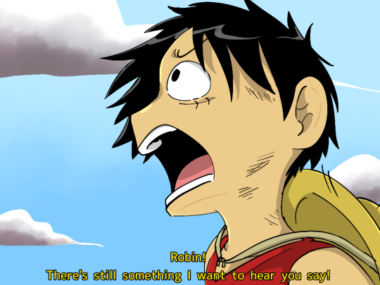

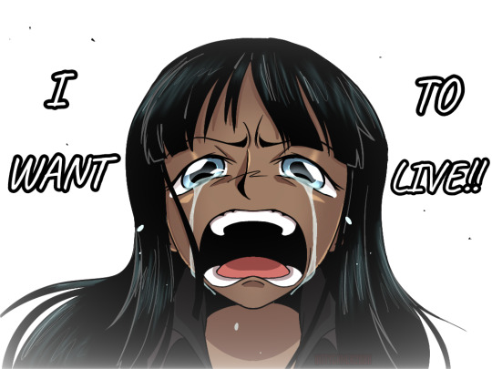

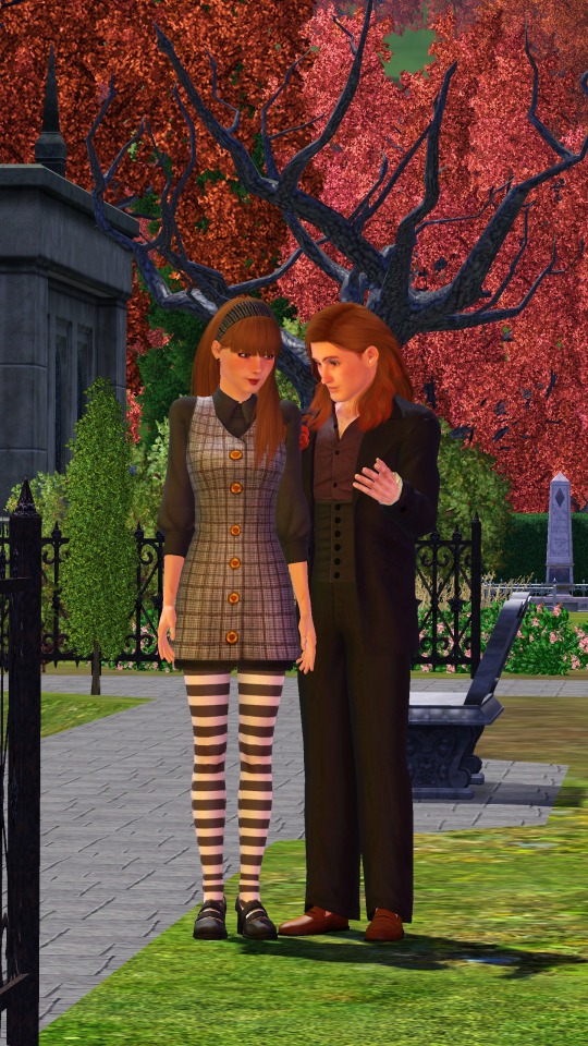
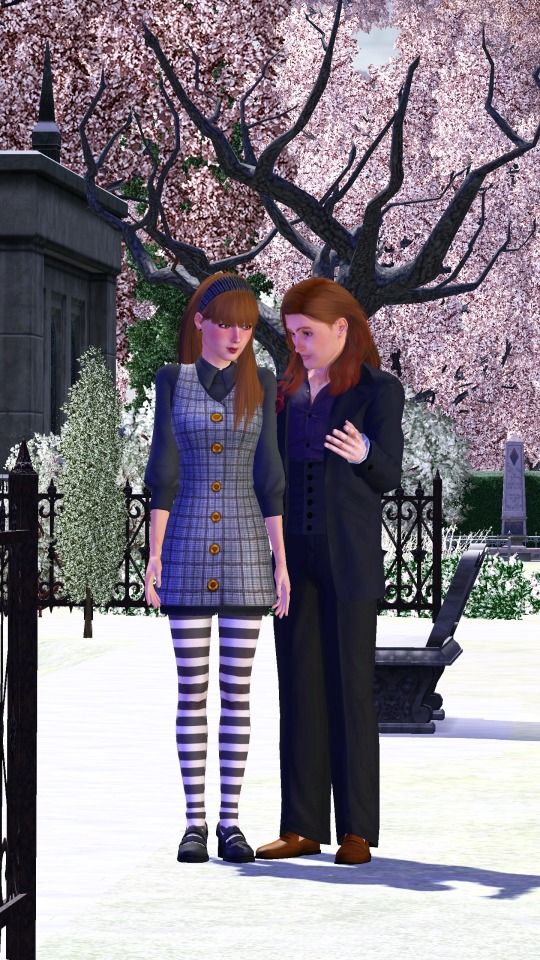
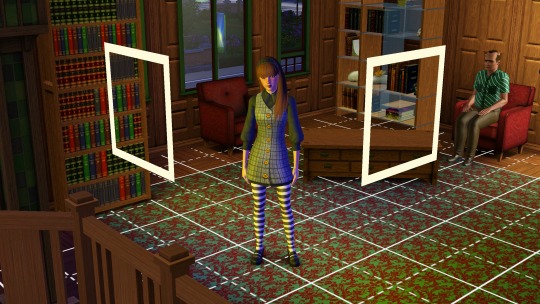
Yea, for some reason redraws have been pretty fun lately
Probably because I'm treating the like doodles tho, lmfao--
Anyways, I finally redraw this scene + a little extra in the beginning because I still remember that first part--
#nico robin#one piece#redraw#monkey d. luffy#op#art#doodle#<- sorta#♧♠︎my art♠︎♧#ALSO DAMN IT I DREW LUFFY THE WRONG COLOR#probably should've used a color picker tool to pick the color from the image of him#oh well--
15 notes
·
View notes
Text
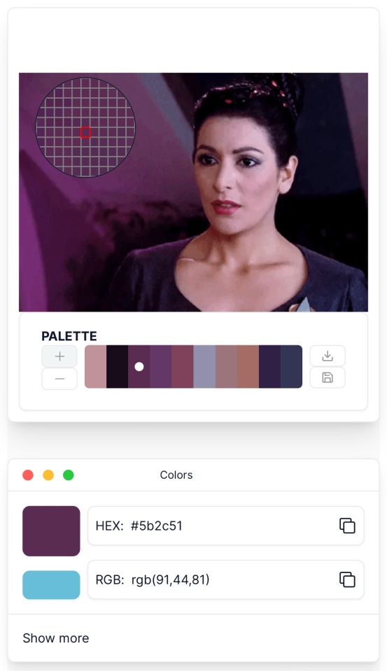
Best Color picker tool , image to color , image to pick color
Link: Image-to-Color Picker Tool!
In the world of design and digital art, color plays a pivotal role in conveying emotions, evoking moods, and capturing attention. EditBoxPro’s Image-to-Color Picker tool provides users with a powerful way to extract colors from images, enabling them to explore palettes, find inspiration, and enhance their creative projects with precision and ease. Let’s delve into how EditBoxPro’s Image-to-Color Picker tool can empower users to unlock the full spectrum of possibilities and elevate their designs.
Unlocking the Spectrum: Image-to-Color Picker Tool
The Image-to-Color Picker tool revolutionizes the way designers and creators interact with color by allowing them to extract and identify colors directly from images. Whether you’re working on graphic design projects, web development, or digital art, this tool offers a seamless way to capture the essence of any image and incorporate its color palette into your creative endeavors.
Key Features of EditBoxPro’s Image-to-Color Picker Tool
Precise Color Extraction: EditBoxPro’s Image-to-Color Picker tool utilizes advanced algorithms to extract colors accurately from images, ensuring precise representation of hues, shades, and tones. Whether you’re extracting vibrant primary colors or subtle nuances, our tool provides reliable results to inspire your creative vision.
Customizable Sampling Options: Tailor the sampling options to meet your specific needs with EditBoxPro’s customizable settings for color extraction. Whether you prefer sampling individual pixels, regions of interest, or entire images, our tool offers flexibility and control to accommodate your preferred workflow.
Comprehensive Color Information: Gain insight into each extracted color with EditBoxPro’s comprehensive color information display. Our tool provides detailed data on RGB values, hexadecimal codes, and color names, allowing users to understand and utilize color properties effectively in their designs.
Palette Generation: Generate cohesive color palettes from extracted colors with EditBoxPro’s palette generation feature. Whether you’re creating mood boards, designing brand identities, or selecting color schemes for websites, our tool offers intuitive controls for organizing and visualizing color selections.
Integration with Design Software: Seamlessly integrate color selections into popular design software and applications with EditBoxPro’s export options. Whether you’re using Adobe Photoshop, Illustrator, or other design tools, our tool allows you to export color data in formats compatible with your preferred software, streamlining your design workflow.
Advantages of Using EditBoxPro’s Image-to-Color Picker Tool
Inspiration at Your Fingertips: Gain inspiration from the world around you by extracting colors from images with EditBoxPro’s Image-to-Color Picker tool. Whether you’re inspired by nature, art, or photography, our tool provides a gateway to endless creative possibilities by capturing the essence of visual elements in color form.
Efficient Design Process: Streamline your design process with EditBoxPro’s Image-to-Color Picker tool, which offers intuitive controls and precise color extraction capabilities. Whether you’re creating digital illustrations, website layouts, or marketing materials, our tool enhances efficiency by providing instant access to color palettes derived from images.
Enhanced Visual Communication: Communicate ideas effectively through color with EditBoxPro’s Image-to-Color Picker tool. Whether you’re designing presentations, infographics, or user interfaces, our tool allows you to convey emotions, evoke moods, and engage audiences with captivating color schemes derived from images.
Flexible Integration: Seamlessly integrate color selections into your preferred design software and applications with EditBoxPro’s export options. Whether you’re working with Adobe Creative Cloud, Sketch, or other design tools, our tool ensures compatibility and interoperability, allowing you to incorporate extracted colors seamlessly into your creative projects.
Conclusion
Explore the spectrum of possibilities and elevate your designs with EditBoxPro’s Image-to-Color Picker tool. Whether you’re a graphic designer, web developer, or digital artist, our tool provides the functionality, precision, and versatility you need to extract colors from images and incorporate them into your creative projects seamlessly. Experience the power of color exploration and take your designs to new heights with EditBoxPro today!
Unlock the Spectrum Now with EditBoxPro’s Image-to-Color Picker Tool!
color picker, color picker tool, image color picker, how to use color picker, color picker from image, color picker online, add a color picker to website, how to use canva’s color picker, how to use the color picker tool in gimp, how to use the color picker tool in canva, how to use photopea color picker tool, how to use colour picker tool, css color picker, hex color picker, color picket tool, color picker online tool, html color picker, cmyk color picker
0 notes
Text


Shop Sign Wall Lights - UPDATED 15 May 2025
I put together a few sets of shop sign wall lights. But there are instructions. I kept some swatches as a default white color so that you could pick which color you want the light to be while in live mode. This saved on the file size of the package file because the more textures a file has, the more bloated the file size is.
I had some fun with some shop names although I mainly included generic titles in both English and Simlish.
DOWNLOAD for FREE: SFS
OR at Patreon*
*You must be over 18 to access my Patreon page.
INSTRUCTIONS ON CHANGING LIGHT COLORS
Once you place the light in build mode, then go to live mode. Click on the light and you will get the following pie menu.

Select SET COLOR AND INTENSITY and then choose THIS LIGHT. The color options will then appear so you can select which color you want.

If you use the name signs along with the Awning Lights, make sure to place the name on top of the awning so when you select the color picker, the correct sign changes colors. The other option is to place the name separate from the awning, go to live mode and change the color, then go back to build mode and add the awning light you want.
Enable the bb.moveobjects on cheat and then you can make adjustments to location and size of objects. You can adjust the position of the light on the wall by depressing the Alt key while placing the sign (on PC). You can adjust the size of the item by depressing the Shift key and either [ (for smaller) or ] (for bigger) (on PC).
CREDITS
Awning Shop Lights - 19 swatches of various awning wall lights. 18 are pre-colored and one is white so you can change the color yourself in game.
Candy Shop Lights - 20 swatches
Pottery Shop Lights - 25 swatches
Tattoo Shop Lights - 21 swatches
Enjoy!
Creations by SexyIrish7
These cc objects are new 3d meshes created using Blender and Sims 4 Studio.
Polygon Count: 6
All CC have:
*Ability to search catalog using search terms: sexyirish7 and si7
*Customized thumbnail
*******
CREDITS:
Software credits:
Sims 4 Studio v. 3.2.4.1 (Star): https://sims4studio.com
Blender 4.0: https://www.blender.org/download/
GIMP v. 2.10.34: https://www.gimp.org/
Inkscape v. 1.2: https://inkscape.org/
Thank you to the creators and moderators producing tutorials and answering questions!
*******
Model and Image credits:
Mesh created by me.
Simlish font credit to Franzilla: https://modthesims.info/
Image credits:
Awning Lights Image credits: Modified image from Adobe Stock
Candy Shop Image credits:
Swatches 1-3: Image by pch.vector on Freepik https://www.freepik.com/free-vector/christmas-candies-symbols-set-neon-style_11241813.htm#fromView=search&page=1&position=26&uuid=8b541325-0e62-4e37-9468-6bacd30f8963&query=neon+lollipop+candy
Swatches 4-8: Image by gstudioimagen on Freepik https://www.freepik.com/free-vector/sweet-candy-neon-seamless-pattern_5595774.htm#fromView=search&page=2&position=30&uuid=e2259de5-014d-4d04-af87-1198ee0f35e2&query=%40gstudioimagen+neon
https://www.freepik.com/free-vector/sweet-candy-neon-seamless-pattern_5595775.htm#fromView=search&page=1&position=27&uuid=e2259de5-014d-4d04-af87-1198ee0f35e2&query=%40gstudioimagen+neon
Swatches 9-10: Image by openclipart.org https://all-free-download.com/free-vector/download/peppermint_candy_clip_art_13182.html
https://all-free-download.com/free-vector/download/round_candy_with_stick_card_on_pink_background_6823183.html
Swatch 11: Image by All-free-download.com https://all-free-download.com/free-vector/download/round_candy_with_stick_card_on_pink_background_6823183.html
Swatches 12: Image by katemangostar on Freepik https://www.freepik.com/free-vector/ice-cream-cart-neon-sign_3238564.htm#fromView=search&page=8&position=42&uuid=2f82b4d1-5ca8-449c-ae22-4573861ebcb0&query=neon+sign+retail
Pottery Shop Image credits:
Swatch 1: Crafting icons created by andinur - Flaticon https://www.flaticon.com/free-icon/pottery_17392031
Swatch 2: Image by katemangostar via Freepik https://www.freepik.com/free-vector/aquarius-neon-sign_5561944.htm#fromView=search&page=2&position=5&uuid=c55e5e21-0550-46f0-b9be-cfa85ff38796&query=Ceramic+Neon
Swatch 3-4: Pottery icons created by Smashicons - Flaticon https://www.flaticon.com/free-icon/vase_3760867
https://www.flaticon.com/free-icon/vase_3760970
Swatch 5: Icon by istar_design_bureau via Freepik https://www.freepik.com/icon/pottery_1958438#fromView=search&page=2&position=20&uuid=096084ae-13fe-429c-a419-e6e13ccd37b9
Swatch 6:Icons by Eucalyp - Flaticon https://www.flaticon.com/free-icon/pottery_6552610
Swatch 7: Icon by berkahicon via Freepik https://www.freepik.com/icon/spin_13785816#fromView=search&page=2&position=0&uuid=096084ae-13fe-429c-a419-e6e13ccd37b9
Swatches 8-11: Icons by Freepik https://www.freepik.com/icon/pottery_8540816#fromView=search&page=3&position=43&uuid=096084ae-13fe-429c-a419-e6e13ccd37b9
https://www.flaticon.com/free-icon/machine_9200546
https://www.flaticon.com/free-icon/vase_8838322
https://www.flaticon.com/free-icon/pottery_3305262
Tattoo Shop Image credits:
Swatch 1: Modified Image by katemangostar on Freepik https://www.freepik.com/free-vector/tattoo-salon-neon-text-with-tattoo-machine-neon-sign-night-bright-advertisement_2438198.htm?log-in=email
Swatch 2: Image by Nippy Custom https://www.nippycustom.com/products/tattoo-neon-sign
Swatches 3-5: Image by bohlam via Vecteezy https://www.vecteezy.com/vector-art/2185717-tattoo-studio-neon-signs-style-text-vector
https://www.vecteezy.com/vector-art/34210463-neon-sign-tattoo-studio-with-brick-wall-background-vector
*******
TOU:
Do not re-upload and claim as your own
Do not re-upload and hide behind a paywall
*******
Changelog:
15.05.2025
*Updated swatches for compatibility with slotted signs.
*Added wall deco slot so that signs can be stacked on slotted signs for Awning Signs
*Added swatches with inverted images for Candy, Pottery, and Tattoo Shop Signs.
#the sims 4 cc#ts4cc#sims 4 cc#the sims 4#wall decor#sims 4#ts4#lights#wall lights#signs#shop signs#retail#pottery#ceramics#tattoo#ink#candy#lollipop#sweets#sugar#light tutorial#sexyirish7#updated cc#featured
305 notes
·
View notes
Text
GRADIENT TEXT TUTORIAL

HOW TO GET OMBRÉ STYLED TEXT ON TUMBLR
𝜗℘ I got a request on TikTok asking to do a tutorial on gradient text — tumblr doesn’t have an in-app option on doing gradient texts. This is how.
𝜗℘ Sites you can use: image color picker / stuffbydavid (gradient text).
𝜗℘ People say that you have to use a computer for this, which isn’t true. I am able to make gradient text on my phone, but you can use a computer if you want.

color picking from an image is optional, but highly recommended.
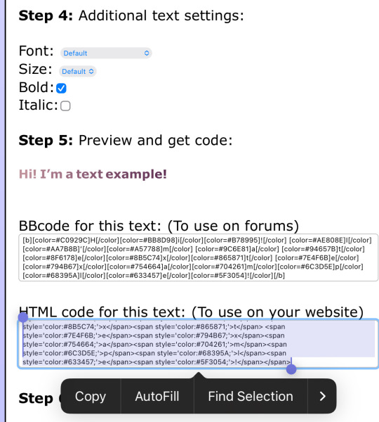
one: put the text you want to color for your tumblr post.
two: change the color of the text to whatever color you want. there are several options on how you want it. pick whatever option you want. the text will automatically generate for you.
three: copy the entire code then press “copy”.
four: go over to tumblr (website, not the app) and click “edit post” (the pencil) or create a new post.
five: click the settings button and change it from “rich text” to “HTML.”
six: paste the code from the gradient text website in the HTML where you want it to go. (I paste it then just save the post to my drafts then edit the text on the app)
#jasper’s tutorials#tutorial#gradient text#ombré text#text#tumblr text#text post#colored text#text tutorial#tumblr blog#tumblr tutorial
429 notes
·
View notes
Note
Hiii, im still fairly new to tumblr and I was wondering how do you get the pretty text colors in your blogs? Are they images or are you changing the color of your text?
Sorry if this is a weird question-..
Thank youuuu
hey ♡
no, it’s not a weird question at all! i‘ll give you a guide.
✿⠀all about coding
for the colour in my texts i use html coding and hex codes.
to simplify this, html is used to design or structure your texts (you know, the size, the colour, if it’s italic or bold,…) the hex code then determines the colour you choose for your text.
unfortunately, you cannot edit your texts' colours on your phone but make sure to do it on your laptop/computer.
✿⠀in steps
example · let’s say i want to edit my post and want the header to say "hello!" in a pinky shade (let’s use the hex code #c98ba3). this is what i would do ...
go on the tumblr website on my laptop
click create
choose text
click on the gear icon on the upper right corner
scroll to text editor and select HTML
click anywhere on the screen to make that page disappear and return to my post
switch from preview to HTML
type in the code <p><span style="color: #c98ba3">hello!</span></p> in the second row, not where it says "title"
switch back to preview and boom! now my text that says "hello!" is pink :)
✿⠀notes
if you are looking for colours to use and their associated hex code, just know that google's "colour picker" shows up once you look for a hex colour picker.
⠀⠀⠀i hope this could help you ♡
#not loa related#IVE BEEN WAITING FOR THIS ONE#coding#html#html codes#htmlcoding#hex code#help#how to use html#how to use hex codes#asks
413 notes
·
View notes
Text
Not-a-tutorial - Lighting (Advanced)
Previous parts:
Not-a-Tutorial - Lighting (Basics)
Not-a-Tutorial - Lighting (Basics - Indoor)
Intention:
While dialogues and body language can say a whole lot on what you're trying to tell to the reader, lights can as well! Here's a great example:
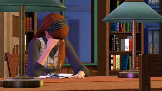
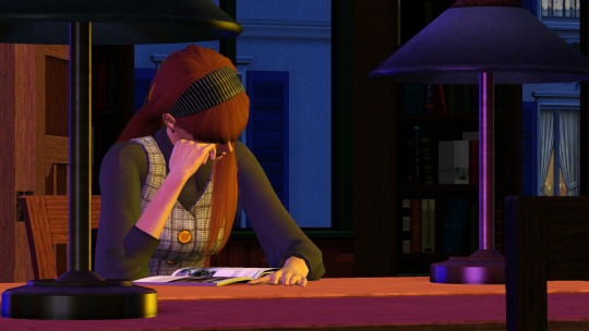
(Left is with the lights on, right is with the lights off).
As you can see, the left one feels much more like it's... let's say, a winter-y 6pm, and she's studying in the library...
Whereas on the right, it feels much more like she's skipping on sleep, and it's 3am, studying.
Moods:
You can also use lighting for more tenser scenes! Here are a few examples from my story:
Here the setup was the same, but I added softer rose/red pastel-y colours... (Though this scene did have like 6 lights :p)
Here I not only used a blue backlight for giving it a “night” feeling, but I also added an orange and white front-light to represent a sense of hope and that our poor Ethan isn't alone.
Here I gave Vita and Nick Alto a yellow, green and red lighting setup, to represent more jealous and angry colours for Nancy. As Nancy is staring at them.
However, the pink represents not only the stage light, but also a sense of Innocence given her background of not understanding the entrepreneur game.
Here I gave little Bella a red background and light foreground, keeping the left part of her face dark, as the speech is about the future of the town. And with the light, she represents a bright but unclear future.
Note: all of these images do use Reshade, so trying to get these results without it may look a bit different!
Seasons:
Representing the colours associated with the seasons can give a scene a really cool feeling!
Summer, Spring, Autumn, Winter.
Color mixing:
One thing I thought was pretty cool with TS3's Lighting engine, is how colors in certain highlights will mix just like paint!
Red + Blue looks a bit purple-ish.
Red + Yellow will look a bit orange-y.
Blue and Yellow will turn green-ish at parts.
Custom Coloured Lights
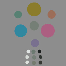
Sometimes, some of EA's colours aren't... quite there. Or really what you need. Here is a short list of colours I've made and used:
0, 150, 255 - Replacement of Cyan (More of a light blue):
0, 163, 108 - Jade
255, 195, 0 (better Yellow)
What's the easiest way to find new colours?
It's pretty easy! If you google for "Colour generator" then there you go! Do make sure to get the RGB values from those websites!
But, for the ones who don't want to google, here are a few suggestions:
Give them a try and see which ones are great! Do go for colours that are quite strong in contrast. Pastel will just end up being white, and darker colours will just turn... well it will look like there is no light on :p
That was it! Hopefully it was insightful, and obviously feel free to add your own discoveries to it! :)
#the sims 3#ts3#sims 3#the sims#sims#sims 3 story#sims 3 screenshots#sims 3 gameplay#thesims3#ts3 simblr#ts3 gameplay#ts3 screenshots#sims 3 blog#sims 3 simblr#sims3
144 notes
·
View notes
Text
Making a Gamut Mask in CSP
Strap in folks! I'm going to show you how to make a "gamut mask" and palette using nothing but a color wheel and Clip Studio Paint!
*I made this tutorial using CSP Pro 1, but the same principles should apply for any version.
Introduction
First, what's a gamut mask? The term comes from physical painting and printing, where artists only have so many pigments to work with. A 'gamut' is the set of all colors that can be mixed from a certain set of pigments. Painters and printers have been looking for 'wide' gamuts for a long time -- so they can make the widest variety of colors from the fewest number of base pigments or dyes. Some base-color sets you may have heard of are CMYK, RGB, or RYB.
One of the easiest ways of making a painting harmonious is to use color theory to limit the number of colors of your palette. The technique of covering up, or 'masking' your reference color wheel also lets the artist see what intermediate colors can be mixed and still remain part of the cohesive palette. And in the physical world, where more pigments means more tubes of paint you have to spend money on, it's important to know exactly how few pigments you can get away with.
In digital art, painters have access to every possible RGB color right out of the gate, which can sometimes feel overwhelming or make it harder to see relationships between colors. So let's try gamut masking! Using this tutorial, you'll make a general-purpose file you can change and adapt to your liking for future projects!
Part I: The Setup
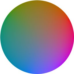
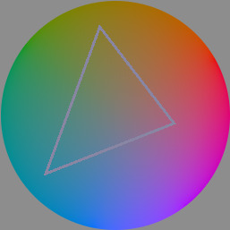
In this tutorial, I'm using a color wheel image obtained from Björn Ottosson's blog, showcasing the OKHSL color space. I like it because the OKHSL space has perceptually constant lightness and saturation per hue. Try out his comparative color picker here. (I also like this image bc it has a transparent background)
You can use whatever color wheel you like! Just one thing is important-- it should gradually become more unsaturated toward the center of the wheel. This saves you some manual color mixing down the road.
Here's our basic layer template. To get started, follow this:
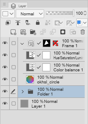
Open your color wheel in Clip Studio Paint. It will be the only layer.
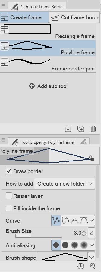
Select the "Frame Border" tool (U), pick the shape or subtool you think is best. I've picked 'polyline' since I'm making a triangle. (HINT: if you want an elliptical/circle shape, click the wrench in the tool properties window, then the "Figure" submenu, then you should see the option to choose an ellipse shape.)
Create the frame shape on the canvas over any section of the wheel. If it's not quite right, choose the "Operation" tool (O) and adjust the rotation, corners, or size of the frame!
You'll now see your frame border shape over the color wheel. Drag the color wheel layer into the Frame folder and it'll be masked!
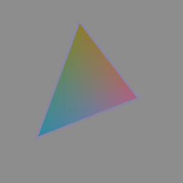
That's the very basics! Here's some extra steps I took to make it extra helpful:
*In the Frame folder, I added two correction layers: a Hue/Luminosity/Saturation and a Color Balance. The first is in case I want to work with darker/lighter tones. The second is if I want to apply a tint to my gamut while preserving the color relationships of the mask! eg: if I want to make a painting that's overall blue, but still want colors that 'feel' red, yellow, etc compared to the strongest blue.
*I've created a uniform neutral grey layer at the very bottom, so I can judge tones and colors without bias.
*("Folder 1" was unused, just some layers not relevant to this tutorial)
With that mask, you technically have everything you need! For each new painting you want to make a palette for, just edit the shape of the Frame Border layer and change the adjustment layers to your liking. Then you can save it as your favorite image type to use for reference!
But let's talk about how you can further use the mask...to be continued!
105 notes
·
View notes
Text

First half of my gift for @wispywinds for the LoZ AU gift exchange! Second half is being posted right after, just for like, pacing? Tagging, it’ll be better for my sanity in regards to tagging and images and junk.
This is an outfit swap between different Minish Cap(and a bit of Four Swords) Links from different Links Meet AUs. Under the cut is an explanation of who got whose clothes, and also the flat colors and drafts of this piece. Bonus.
Monstrous Fusion Minish has Mina’s Linkverse Minish’s outfit, Linked Universe Four has Bonus Links Minish’s outfit, ML Minish has LU Four’s outfit, and BL Minish has MF Minish’s outfit. I used a wheel picker to chose who got whose outfit.


#LOZAUGiftExchange2024#links meet au#linked universe#lu four#monstrous fusion#mf minish#linkverse#minish#bonus links#bonus mini#art fever#I think that’s all the tags lol#this is the most complex piece I’ve done so far. I’m not used to drawing this many characters in one drawing with this much interaction#I wish I could change a few details but it would take a long time to do so lol. especially with this taking a while to boot up in my progra#also would’ve loved to have a speed paint for this but again. my art program can’t handle it heh
100 notes
·
View notes
Note
hi girl!! i was wondering how you do gradient text on your posts! i keep looking for tuts but all of them are using features that tumblr removed…. anyways, whenever you’re free, i’d love a tutorial! thank you!🩷🩷
OFC!! i got you bby!!
Go to image color picker (this is for the color of your words) and scroll down a little until you see ‘use your image’ and upload the photo to your choice for color theme! Once you’re done with picking your photo, you can choose a color out of the palette and copy it! (Pick two colors for the start and end color for your text!!)
After you copy it, you wanna head over to another website: stuffbydavid (this is where you’re gonna get the gradient style for your text!!) You’re gonna enter your text in the first box, then choose the way you want your gradient like (I usually use horizontal gradient!!)
After that, you’re gonna paste the hex code of your color you picked from the image color picker website and paste your end and start color in the slots. When you’re done with that and feel like it, you can choose your font, size and either have your text bold or italic. Your choice! (I usually just let it be)
After you got your text all ready, you want to scroll down and get the HTML code, NOT THE BBcode cause it will not work. You’re gonna copy the HTML code and there you have your gradient text ready to be pasted!
For this part, i’m gonna put a video for this one, but i’ll still explain it anyway :) So with this part, after you copied your HTML code, you’re gonna open your tumblr account on the website on a browser and go to create or if you have any asks, you can click ‘answer’ and begin the steps. Once you open a inbox or create a new one, you’re gonna click the setting icon (⚙️) on the top right corner and click it! After you do that, you scroll down to text editor and see that it’s set on ‘RICH TEXT’, you’re gonna change it to ‘HTML’ for your code. After you do that, you’re gonna paste your code in the blank spot and then click ‘preview’ and now you have your gradient text!!
6. Next you’re gonna change to ‘post now’ to ‘save as draft’ and exit out of the website to open the app back up and there, you should see the saved draft with your gradient text!!
Hope this helped bby🫶🏾
22 notes
·
View notes
Text
Amazon-Style Product Photography Tips
I got this message from a lovely follower.
Now, a fairly large part of my new steady job is product photography. Not glamour shots, more documentation. The company I work for makes, among other things, licensed drinkware (think water bottles, mugs, tumblers, etc.). Part of my team's duties is to photograph a mockup or finished product both for our records and to submit to the license holder.
The routine typically goes: put item facing forward in lightbox. Click. Rotate to the left. Click, etc. for the back and right. Then a closeup of the copyright info.
Here, finally, is my question: one of the license holders decreed that all of our photographs must be taken at f/8 and shutter time (?) of 1/25s. This strikes me as… not always optimal, considering the range of colors of objects as well as different materials: polypropylene both transparent and opaque, stainless steel, and lacquered cardboard for packaging. I would love to hear your thoughts on how I might better (while being consistent!) adjust camera settings to account for these kinds of factors
As an added bonus, we let the camera decide white balance/color correction. But I don't think I'm knowledgeable enough to try and correct myself, considering none of the monitors/printers I use are color-correct in the first place. I just know there have been many times where I've submitted photos only for the license holders to be like, "Hmmmm, that green doesn't seem like the right kind of green…RESUBMIT!"
First, I'm going to answer this specific question, but at the end I'm going to recommend a full setup for taking these type of rapid fire product shots.
My answer:
f/8 makes sense. Outside of macro photography, this allows a deep depth of field assuring the photo is sharp and in focus for the entire depth of the product. It is usually the sharpest part of the lens and it is not so small of an aperture that you risk diffraction effects softening your image. They probably were told this by a photographer and thought it applied to all of the camera settings.
The shutter speed is problematic. By forcing it to a fixed setting, your camera is going to choose whichever ISO gives a good exposure. And if you don't have enough light, it will choose a high ISO that will possibly add a great deal of noise to your photo. Noise can corrupt the colors of your photo and it just looks bad.
If your camera is on a tripod and they want the sharpness and depth of field f/8 grants you, then I would set your camera to aperture priority mode (usually Av), lock your ISO to it's lowest number (usually 100) and then your camera will choose the best shutter speed on its own.
So… Camera on tripod Av mode f/8 ISO 100 Camera chooses shutter speed
This is all assuming you are using a tripod and continuous lighting. If you are handholding the camera or using flash, I can rewrite the recipe. Otherwise this will get you very sharp photos with minimal noise.
I'd also recommend getting a shutter release cable so you don't shake the camera when taking the picture. Just search your camera brand and “shutter release” and get the cheap wired version unless you really need wireless.
This is the Canon DSLR one, just to give you an idea.
Be warned, if you do not have powerful lighting, you may get some long shutter speeds. That is perfectly okay as long as it is on the tripod and you aren't shaking the camera when taking the picture.
As far as white balance goes, if you really want it to be accurate, you can order a cheap photography “gray white balance card”. They are as cheap as 10 dollars.
This is the one I use.
There are a couple of ways to utilize the gray card.
Option 1:
You put the gray card in the exact lighting as the product or just hold it directly in front of the product.
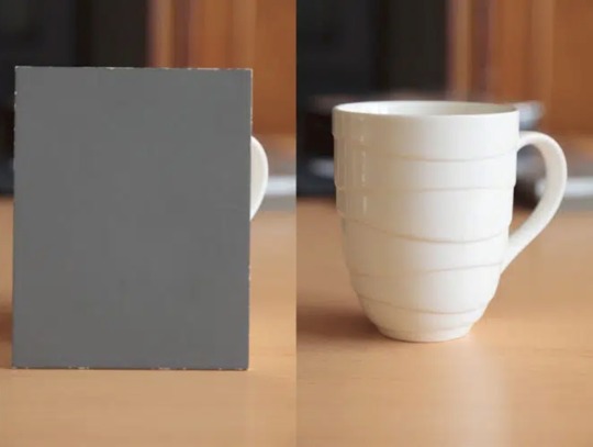
You take all your photos in RAW format (JPEG will not work) and adjust the white balance in Lightroom, Photoshop, or any RAW editing software. Use the white balance picker tool (looks like an eyedropper) and click on the gray card.
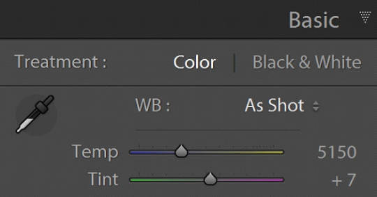
This will give you an exact white balance for that lighting environment. You can synchronize those white balance numbers across all of your photos. Lightroom has a copy and paste function or a "sync" button that will change adjustments in all selected photos as you go.
This is the most accurate option because it allows for “tint” adjustments for extra color accuracy.
youtube
Option 2:
Do the same as above and remember the white balance value. Then set your camera to a custom white balance matching that value. It will probably be around 3200K or 5500K depending on your lights.
Pro tip: If you have any ambient lighting from overhead or other room lights, it could contaminate the photo and skew the white balance into a weird color temperature. Try to make the room as dark as possible aside from your photo lights to avoid this. If you are using flash or have really bright photo lights, this isn't a huge concern.
Option 3:
Use your camera's built in custom white balance tool. It's different for every brand, so you will need to search for a tutorial. But the basic idea is the same. You put the gray card in the lighting of the products, take a picture, the camera analyzes it, and then sets a custom white balance. This can also be done with a white sheet of paper in a pinch.
Here is a video demonstrating the process. Remember every camera brand mau have a slightly different method.
youtube
Good white balance means accurate colors. That is important with product photography and a good value add for your clients. Just be warned, if you change the lighting even a little bit, you have to redo this process. If you bump a light or switch it out for a different one, redo your white balance calibration.
Also, some continuous lights have white balance drift, especially if they allow you to adjust the color temperature manually. Not only will the white balance change depending on the power setting, but it can also change over time. Especially if the lights are used frequently.
Move the lights, redo white balance. Change the power, redo white balance.
And if your lights are stable and on the same power all the time, I’d still redo the white balance every week or so. Personally I would do it before every shoot, but you’ll have to decide if that is worth it depending on how fast you need to turn things around. I usually do it as my first photo in the series so I can set the white balance, select all the photos, and copy the settings to all of them at once.
The nice thing about doing white balance with a gray card is that the results are display agnostic. Even if your monitor is poorly calibrated, you can be assured the white balance is accurate. And if someone says your photos are green, it will be their monitor and not your problem.
You just have to avoid doing any color specific adjustments to the images. Trust the gray card and white balance tool more than your eyeballs and display.
You can boost saturation a tad, but that is all I would mess with unless you know what you are doing. Even if the photos look a little drab or not very colorful, I would leave it alone. It sounds like the importance for this task is accuracy of color rather than making them as pretty as possible.
------------------------------
Okay, that is the question answered. Now I'd like to go through how I would build a setup to do this kind of work.
In the product photography world, this workflow is referred to as "pack shots." The idea is to create a consistent setup so you can just swap out the product one by one and speed through the shoot. It is best to control as many variables as possible so all you need to do is set the product down, take the shot, and repeat.
I'm going to show you my ideal pack shot setup with a light cube. I think it will be similar to what my follower is using. And, if not, it might help him streamline his process a bit.
A light cube is just a box made of diffusion material.

You drape a background with the color of your choice. White is usually preferred for Amazon-style pure white background photos. Though I prefer dark gray for aesthetic reasons. You just want to make sure the backdrop has that natural gravity curve so there isn't a hard line or wrinkles.
For lighting, you should get two *identical* lights. They can be desk lamps as long as they are the same and have the same light bulb inside. Then you just place them on either side of the cube. You want the ball of light on the cube to be in front of your subject.

Remember, your light source isn't your actual lights. It's the ball of light on the sides of the cube.
If you want to make it a little fancier, you can get a black or white acrylic sheet to create a reflective surface. You want it as far forward as possible and a little elevated. Here are some things I did in a simple light cube with the setup above.
Here is what the white acrylic looks like.
I placed a big book under the acrylic sheet like this.
This allowed me to hide the curve of the background and get a nice crisp transition between the acrylic and the background.
And if you do white acrylic, you can get the background to seamlessly blend.
As I said, two desk lamps will work, but if this is for a business and you want something fast, convenient, and reliable, I would suggest something more robust.
I'd probably get two daylight balanced COB (chip-on-board) LED video lights that have a Bowens mount attachment.
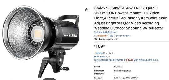
This Godox light is very reasonably priced for its features.
Daylight balanced means one consistent color temperature, so less chance of drift. These are very bright so you can use a quick shutter speed and you won't even need a shutter release cable (still a good idea). You also don't *need* a tripod, but you should still use one. The main advantage of bright lights is they can't be overpowered by room lights. You can be assured any overhead lights or window light will not contaminate your photo. A darker room is always preferable, but if you crank these it won't matter.
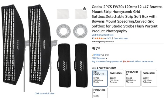
The Bowens mount allows you to place any modifier you wish on the light from softboxes to reflectors. But the standard reflector should be fine for the light cube. But if you are taking photos of tall cylinders, a couple of strip boxes might help.
Don't worry about putting the grids on. You just line them up towards the front of the light cube so you have even light from the top to the bottom of your cylinder. Again, this is optional.
Since these lights are so versatile, you can do any kind of lighting for any other photographic needs. Slap on a white umbrella and take company portraits if you want. Or you can use them as video lights to film a worker safety video.
So, here is my recommended ingredient list for a pack shot light cube setup.
Light Cube COB video light Black Plexiglass Seamless paper (color of your choice)
Colored poster board also works if you keep it from getting dinged up. And the light cube also comes with some cloth backgrounds, but watch out for wrinkles.
BONUS TIP: If you want that pure white background like in Amazon shots, add a third light from behind with no background paper. Make the light cube material your background and shine a light through it. You have to make sure it is bright enough to give you pure white, but not too bright that the light blasts your subject from the rear.
Otherwise just use a white backdrop and use Photoshop to brighten it to pure white.
Karl Taylor shows a pack shot setup without a cube, but the same principles apply. He shows you how to dial in that white but not too white background. Just imagine instead of shining a light onto a background, you are shining a light through the background (the back of the cube).
youtube
13 notes
·
View notes
Text
Heart Toy mayor update continuation
So now onto the other two parts
The album builder is used to build albums for the joi suite later the joi suite can only use the albums built here so its a pre requisite to build albums for later useI
mage Fetching from Image Boards: Fetch random images using tags from popular image boards: Danborou, R34, Realborou, The Great Image Board, and e621. Input your desired tags, separated by spaces, and press the button to fetch images. If the image cannot be found or if the HTTP request fails, an error will be displayed, and the fetch button must be pressed again to retry.
Invalid JSON Errors: If an invalid JSON error occurs, it typically means no image was found for the given tag on the selected site. Try fetching from another site or use a different tag. Album
Management: Create new albums by inputting an album name and saving images directly to them. If no album name is provided, images are saved to the root of the app's storage (counted as an album).
Image Selection from Local Storage: Pick images from your phone's local storage using the file picker. Save them directly to an album or create a new album.
Direct URL Saving: If you have the direct URL to an image, input it and save the image to your selected album. The process is easier on Windows, but somewhat difficult on Android. Album Deletion: Delete selected albums, but requires multiple clicks if the folder is not empty.
File Organization and Limitations: The app uses Android's file system for album management, which can involve some manual navigation (copying and pasting files into albums using the file picker). The app remembers the last location when accessing files via the file picker, making it easier to pick from specific folders. on pc this is much easier as the file explorer can access the persistent storage and copy images with control c control v

Joi Suite Feature List:
Interval Creation & Editing
Interval Object: Tempo: The tempo (beats per minute) for the interval.
BeatTightness: Controls how tight the beats feel, influencing the spacing between beats.
EndTempo: The tempo the interval will gradually reach by the end.
TempoAcceleration: How quickly the tempo changes during the interval.
BeatNumber: The number of beats within the interval.
SyncopalGalop: A setting that modifies the rhythm to alternate 1 and mltiple beat per metronome tick.
Duration: The length of time this interval will last.
Imageshiftperiod: The speed at which images will change during the interval.
Imagefadein: Controls how quickly images fade in.
EndPauseLength: The length of time the pause lasts at the end of the interval.
Interval Editor Window:Input fields for each of the interval parameters (Tempo, BeatTightness, EndTempo, etc.). Add Interval Button: Creates an interval based on the current input and adds it to the interval list. Suggest
Random Values Button: Generates random values for the parameters, which can then be added as a new interval. Range-Based Interval Creation: Enter two values for each and all parameter (in an "x-x" format) to generate random intervals within that range. Interval List: Displays all created intervals as cards.
Card Swap: You can swap the order of two intervals in the list by clicking on their cards.
Delete Last Interval: Removes the most recently added interval card from the list.
Sequence Creation & Management:
Sequence: The collection of intervals you’ve created. You can give it a name, save it, load it, or delete it. Once you’re happy with your sequence, you can start it by pressing the Start Button.
Sequence Start: The interface allows for fullscreen mode once the sequence starts. A small blinker will appear in the bottom right corner, showing the current BPM. The color of the blinker changes based on the rhythm:
Green: Downstroke
Red: Upstroke
Black: after-stroke pause
Inter-Sequence Notifications: before each interval ends, a 5-second message will fade in, showing the tempo, tightness, and beat pattern of the next sequence. If there’s an intermittent pause, the screen will fade to black, and text will instruct the user to breathe, relax, and wait for the pause duration.
Image Display & Album Integration:During the intervals, images from the selected album will fade in. The image transition speed is controlled by the Imagefadein parameter. Images will shift at the speed defined by Imageshiftperiod.
Album Selection: You can change the selected album at any time during the sequence. The next image will fade in from the newly selected album once it’s changed.
Timing & Pause Features:
End Pause: At the end of the interval , a pause will occur. If the inteval has an end pause, the screen will fade to black and instruct the user to breathe and wait. The countdown will guide the user through the pause.
Infinite Inteval: The last interval of the sequence will stretch infinitely until the user stops the sequence. Every 300 seconds (or configurable time), a warning will notify the user that the sequence is ongoing.
Overall User Experience:Interactive and rhythm-driven experience, combining beats, tempos, and visuals from the album. Ability to customize and randomize beats, tempos, and image transitions, creating a personalized rhythmic experience. Seamless transitions between intervals and a clean user interface that helps focus on the rhythm while enjoying the accompanying imagery. for a bit more detailed explanation consult the help menu in each section

Once Again i state that these parts can access adult image boards thus the app is now considered NSFW and ADULTS ONLY because of these additions
19 notes
·
View notes
Text
Announcing the completion of YGO Mini Bang 2024~!

We have just finished the postings for this year's YGO bang, so thank you very much to everyone from the mod team! You have all been so great, and we couldn't have done this without you!
With this completed, we will now start working on a bigger, better bang, so make sure to follow us for updates.
Below is a completed list of all YGO Mini Bang 2024 works. Please enjoy from the bottom of our hearts!
S0/Duel Monsters
Before//After by - IAmAllYetNotAtAll ↳ART by rymyanna - tumblr
A Day With A Girlfriend by millenniumwriter ↳ART by SaintArtemis - twitter
Checkered by mysticalflute - tumblr ↳ART by miran - tumblr | twitter
Do Not Pass Go, Do Not Collect $200 by dxmichelle - tumblr ↳ART by dreamydelite - twitter
Dungeons and Discord by yugirl - tumblr ↳ART by Raptor - tumblr
Freefall by lysimachias - tumblr ↳ART by Otter - tumblr
Let's Make A Deal by RosalindHawkins - tumblr ↳ART by Leech - tumblr
Love, and Other Things by Beni_O2 ↳ART by Elly - tumblr
Marmalade Skies by Soryenn ↳ART by rymyanna - tumblr
Should I Know You? by SerenaJones ↳ART by Artnijna - tumblr
Stop and Smell the Flowers by cynassa ↳ART by Kero - twitter
A Welcome Sight by ArienElensar - tumblr ↳ART by cait - tumblr ↳ART by Schatten-Light - twitter
GX
Again by PaulaAna - tumblr ↳ART by Meda Princess - tumblr
Friendship is Stored in the Frosting by TheEvilAuthoress ↳ART by Mint - tumblr
A mirror image by Dazy_izuzai - tumblr ↳ART by Meda Princess - tumblr
5D's
Colors Changing Hue by LuckyLadybug ↳ART by Alphabet - tumblr
Dew of Life by Firebull ↳ART by Kira - tumblr
if you want to be loved, say it out loud by Tenka - tumblr ↳ART by oudkee - tumblr | twitter
Zexal
All The Pieces by Michio_Mokota ↳ART by Kero - twitter
And Yet All in the Sunset Shall Listen by IVMysteryNumbers - tumblr | twitter ↳ART by Sky - tumblr | twitter
The Moon Man, Reporting From Earth Hours 17 to 19 by Scattered_Irises - tumblr ↳ART by Mint - tumblr
VRAINS
Do AIs Dream of Baby Dragons? by seiyuna - tumblr | twitter ↳ART by kuppatan - tumblr
The Inaugural Solo Debut by merryfortune - tumblr ↳ART by Sky - tumblr | twitter
my eyes locked on you/after holding my breath by Wayfinder_Rinku ↳ART by Sabella - tumblr
Selfish Unto Death by CrimsonfireSilvermelody ↳ART by Sabella - tumblr
SEVENS
Planless Plan by Gohan - tumblr ↳ART by Ryuu - tumblr
[Crossovers]
Curse of Rose by seventhdoctor - tumblr ↳ART by Porch - tumblr
Fusion Tag by rainbowkuriboh - tumblr ↳ART by Mint - tumblr ↳ART by Raptor - tubmlr
YGO Mini Bang 2024 Ao3 Collection Here
Our biggest and warmest thank you to the writers, artists, and betas of this mod team's first event!
@4lpabet | @arien-elensar | @artnijna | @caitlin-makes-stuff | @ciescen |
@cynassa | @darkmagicians | @distortedwhite | @dreamymochapie | @dxmichelle
@iamallyetnotatall | @ivmysterynumbers | @kaiseryuki | @kira-hayashi | @kuppatan
@kuriboo | @leechysmile | @meda-princess | @merryfortune | @mystical-flute
@neoasari | @nini-the-mirror | @oudkee | @raptorbooty12 | @rymyanna
@sabellabella | @seventhdoctor | @skiel-infinity | @texasdreamer01 | @the-kings-of-games
@winkle-pickers | @worstofyam6 | @yugirl | CrimsonfireSilvermelody (Ao3) | Firebull (Ao3) | LuckyLadybug (Ao3) | RosalindHawkins (Ao3) | RheaLightning (Ao3) | saint_artemis_ (X) | Schatten-Light (X) | seiyuna (Ao3) | SerenaJones (Ao3) | Soryenn (Ao3) | Temple of Bo
We hope to see you again in the future!
#ygo 5ds#ygo mini bang 2024#yugioh#ygo dm#ygo arc v#ygo go rush#ygo gx#ygo#ygo sevens#ygo vrains#yugioh zexal#yugioh go rush#yugioh vrains
68 notes
·
View notes
Text
A while ago, I quickly wrote a post about the OKLCH Color Picker, and the neat insight it gives about digital colors.
Ever since, however, I have heard the confusion of many people as to where the holes in those graphs come from. And although I am far from an expert in these things, I thought we could do a small exploration of one of the principles behind it.
Also, if any actual experts spot any mistakes or misconceptions I fell pray to, feel free to leave a correction in the replies!
On any discussions of color vision and/or digital color spaces, you are likely to see the following image:

This is the notorious xy chromaticity diagram for the CIE 1931 color space, rendered here in glorious GIF format, as you may notice from the dithering in the gradients. It is an inaccurate representation, sure, but so are all of them.
This color space was designed to mathematically represent all color sensations that are visible to the average person. The diagram visualizes only the chromaticity of this space, that is, only the hue and saturation of the colors, which is what we are really interested in right now. However, the critical issue is: the colors the average display can show are just a small portion of the colors the average human can see.
The sRGB color space is what the average display uses to represent color, probably the default color space of the digital world. If we were to show only the colors sRGB can represent on that diagram, it would look something like this:
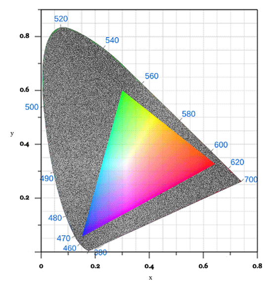
Hm. Not good, is it? Look at all the greens we're missing!
That's why we cannot display the accurate chromaticity diagram. The proportion of the colors your display can show is just that small when compared to the full gamut of human vision.
Okay, so how does that leave us with the holes on that colorpicker? Well, let's say I choose this blue color (#008EF7):

That's a nice, strong blue. Not too vivid, but also not muddy in any way. But I wish it was just a little bit greener. Some sort of "greenish blue" tone. Let's see what the color picker tells me:
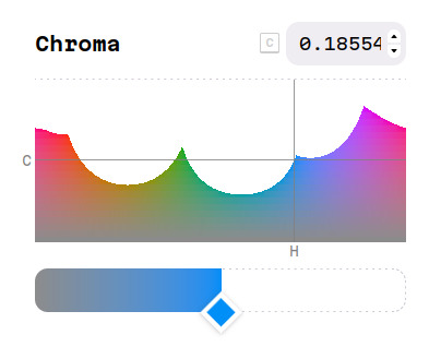
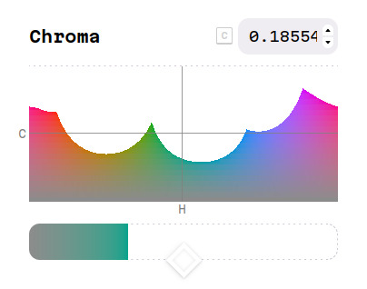
Hm. The color I want is in the hole.
In this graph, the color picker is showing all the available combinations of hue and chroma that have the same lightness of the blue I initially chose. To get out of the hole, I can either bring the chroma slider down, which will make the color grayer and less intense, or I can tweak the hue slider to the sides, going fully towards green instead.
But to be clear, the color I want is not impossible, see. If we use some questionable math tricks, we can pinpoint where those two colors would fall in that CIE chromaticity diagram:

In there, we can see that the blue is right at the edge of what the average display can show, while the "greenish blue" I wanted is straight out. Again, this is a color that I can see, and could very well be trying to take a photo of out there somewhere, only to face the cruel constraints of sRGB.
105 notes
·
View notes
Text
No one asked for this, but, we thought it could be useful : How we make flags + tips on how we do it
As stated in our pinned post we use krita, canva, arty click colors, color picker online, coolers create a gradient, coolers create a palette, and google for other resources. (We also have a small list of flag resources at the bottom of our pinned post too, and plan on expanding it.)

Krita :
(Its important to note that krita is a desktop/computer program, and does not exist on mobile. We make all our flags on our computer Vantablack.)
Our flags are 3500 x 2000 px
Using the line tool and symmetry tools is a MUST
You will most likely be using the horizontal and vertical symmetry tools for your flags all the time
selection tool is also your friend
if youre making a flag based off an image its always awesome to import the image as a reference on the side
Its smart to put your stripes on different layers
The middle of the symmetry tools turned on can help you center things
Making the resource stripes you use a lower opacity can help with placement
we also use more unique brushes sometimes for flags, such as a rain brush and a star brush for making rain particles and stars (you may have to go out of your way to find them online)
when drawing out the flags, its recommended to use a brush thats size DONT vary based off of how much pressure you put on it (\/ not bulleted because theyre kinda long) When putting in symbols, if you want them to be the opposite color you can just invert the layer. But if you want it to be a specific color or the colors of an image, you can put in the image/color as another layer, select your symbol with the selection tool, go to the color/image layer, invert selection, and erase all thats not selected. You can also do this with other things too. You can right click a layer, go to "layer style" and click "stroke" at the bottom if you want a symbol to have a outline around it. make sure to change it to the size px you want, change it to "normal" and opacity at 100% for a good basic outline. We usually use either 20 px, 10px, or 15px. This is also good for making stickers out of drawings!
How we use stripe resources :
We'd first start with the plain stripes. We would import the resource and center it then stretch it to where it fits the length of the flag width.
Position where you want the stripe to go.
Use the selection tool to select the stripe, and then hide the resourced stripe layer.
Switch to another layer and color in the selected area. Then you can deselect afterwards.
If you want to do the same resource stripe on the opposite side, you can go back to the resource stripe layer and flip it vertically and repeat the steps.
if we need to specify this later we will ^-^ (we were going to include images but we're kind of too lazy to)
Canva :
We have sometimes used Canva to make flags. We actually used the help of Canva to make the naturic flags. We usually use Canva for symbols and stuff, and for better centering and consistency with symbol size. You can also use Canva for adding in text to your flags if needed.
Arty click colors :
We use artyclick to find the names of colors, and thats it. We use it when we want to add a ID to our flags. We'll upload our flags sometimes and select over the individual stripes and colors and will easily get the names of the colors, or at least a close resembling match. Its a way to make ID descriptions more detailed.
Color picker online :
We use this color picker to easy get the color hex code from images, flags, whatever so on and so forth. It can also be helpful outside of flag making too.
Coolers create a gradient :
We'll use this website to make a gradient out of any colors. As many colors as you fucking want. We've also used this to make colored gradients out of our flags for some posts.
Additionally, you can use the create a gradient palette to make a color palette out of two colors.
Coolers create a palette :
This is excellent for making even stripes. if you cant manually draw them out with the line tool or are just too lazy to draw the stripes out yourself this is recommended.
When youre done making a palette with the stripes you can just save the palette and import it into your flag file and resize it and add it in from there. boom.

Hopefully this helped in any way ^-^ reblogs are heavily appreciated!
-Natasha/Angel

#xenogender#flag coining#mogai#xenogender coining#xenogenders#xenogender blog#xeno coining#xenogender flag#corporatecoinings#xenogender safe#flag resources#flag tips#xenogender making tips#mogai tips#liom tips#mogai pride#mogai gender#liom coining#mogai positivity#mogai community#xenogender community#liom community#extra tags for reach !
44 notes
·
View notes