#Large scale print files
Explore tagged Tumblr posts
Visit Tumblr Blog
Explore Tumblr blogs with no restrictions, modern design and the best experience.
Last Seen Tumblr Blogs


Fun Fact
Tumblr was attacked by a cross-site scripting worm deployed by the Internet troll group GNAA on Dec 3, 2012.
Video
youtube
Export Billboards | Hoardings Signages from Illustrator | Exporting Large Scale Print Files
Exporting or preparing large-scale print files can easily take up to 2 to 3 GBs if done wrong. Comparatively smaller file sizes can save lots of stress moments while sharing files with the printer, moreover, it provides more control and higher quality print. The technique you are about to learn in this video can be used to create & export billboards/hoardings/signages from Illustrator while keeping the smallest file size.
This technique is mainly used for printing large-scale billboards, hoardings, signages, and streamers for advertising or promotional purposes.
Tools that you’ll need are Adobe Illustrator or any other vector-based graphic application, Adobe Photoshop & a little bit of mathematics.
Create your file using this simple formula; “final size in feet” = “final size in inches”. For example; 60ft = 60 inches, 45ft = 45 inches & 20ft = 20 inches
0 notes
Text
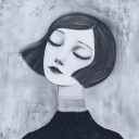
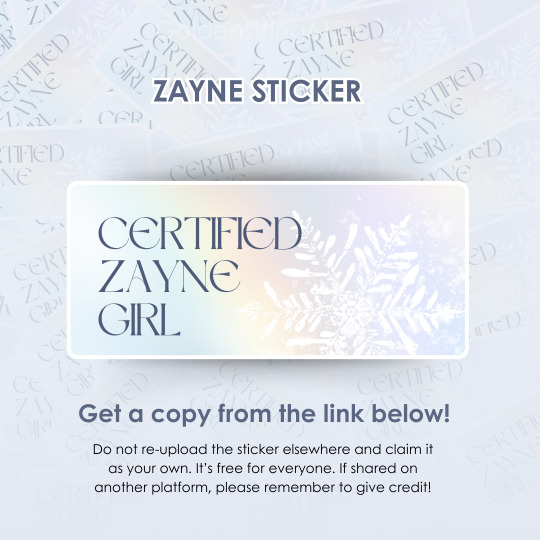
A FREE SMALL GIFT FOR THE LNDS FANDOM!

Tumblr notified me yesterday and said i managed to get a thousand notes which was very surprising! I try not too look at numbers too much but they (tumblr) suggested that I should post to celebrate, and I thought I should celebrate with my readers and fellow hunters as well!


What you can do:
Leave a note, Leave a comment & Reblog (Will be highly appreciated)
Share to another platform while also sharing the link to the original post.
Use the design in a non-profit/private post/graphic material. (give credit if possible)
What you can't do:
Profit off of this design in any way shape or form. (I made it free for everyone!)
Include the stickers in a layout which you/anyone can profit from.
Claim that this is your design (Is this even worth stealing?)

Mechanics/Instructions:
Use a sticker paper if you have one. If not, use what's available around you! Bond paper is good, you can use glue and and or double-sided tape!
Download the stickers from the link below: If the first link fails, try the second/third one! Access here! Access here! Access here!
Open the sticker/s on a document app (Word, Google docs, etc.) or a design app (Canva, Photoshop, etc.)
Scale it too your preferred size (not too large!)
and save as a pdf file or print directly!
There's also a print-ready file, though sizes aren't adjustable!
Again, Thank you so much for reading my content. I'm still growing, learning and brimming with ideas! Maybe if i hit another milestone, I'll make another printable!
#lnds#lnds zayne#lnds xavier#lnds sylus#lnds rafayel#love and deepspace xavier#xavier love and deepspace#lads xavier#xavier x reader#love and deepspace#love and deepspace sylus#sylus#lads sylus#l&ds sylus#sylus x reader#sylus love and deepspace#rafayel#rafayel love and deepspace#loveanddeepspace#love and deepspace rafayel#love and deepspace mc#zayne love and deepspace#zayne x reader#lads zayne#l&ds zayne#dr zayne#li shen#l&ds rafayel#l&ds#l&ds xavier
202 notes
·
View notes
Text

🍪 All preorders have shipped! 🍪
We're thrilled to announce that all preorders for "Batched" have shipped!
🍩 Everyone who purchased a digital or physical bundle should have received an email containing a link to the Dropbox that contains the digital files of the main zine, the OC Showcase zine, recipes, and digital wallpaper.
🍰Similarly, if you preordered a physical bundle, you should have received an email with a tracking number. You'll be able to follow your package's progress. Please be patient with your local carriers, as there may be delays due to international shipping or local weather.
🧁 Please be aware that these files are for personal use only, and any commercial use or reselling is prohibited. Every member of our team has worked hard on this project, and we ask that you respect their work. Please do not redistribute, repost, or otherwise replicate these files under any circumstances. This includes, but is not limited to: sharing the download link, posting images of any of the content to public (or private) platforms, or large-scale printing of any of the digital goods for distribution.
Once you get your bundle, you're welcome to take a picture of it and tag us - we'd love to see that you received it!
If you have any questions, please feel free to email [email protected]
🍦 We will announce the date for our Leftover Sale once we're confident that most (if not all) preorders have been delivered. We will then reopen the shop with the remaining copies of the physical zine and merch, available to purchase on a first-come-first-serve basis
We can't wait for you all to see the wonderful work our contributors have done! Thank you for your support!
#star wars#clone trooper#star wars the clone wars#sw the bad batch#the clone wars#sw the clone wars#star wars zine#zine#fandom zine#fanzine#preorders#shipping#preorders shipping#production update#zine production update#zine update#star wars the bad batch
21 notes
·
View notes
Text
Hello everyone! Mod Pi here! Mod Fox and I have been discussing our plans for our unique spin on a traditional Big Bang, which is that this is to be made into a compilation/anthology zine in the end! So, our question for you is: would you prefer a solely digital zine, pay-what-you-want with all proceeds going to charity, or a physical zine as well, which would be 200+ pages of fanfiction and artwork printed professionally with a wrap cover in full color.
Digital-Only Pros:
- pay-what-you-can!
- accessible to all
- no shipping costs
Digital-Only Cons:
- only provides a PDF file
- less money for charity
Physical Zine Pros:
- hefty, full-color physical illustrated anthology you can hold in your hands!
- would be the first physically printed purely Danger-Days-centric zine project to be published since Tales From the Zones/Letters to the Dead several years ago
- would allow us to collect more money for charity due to the large scale of the project
Physical Zine Cons:
- expensive! a 200+ page printed book would be upwards of $60 apiece before shipping
- shipping costs
We are excited about this project either way, and the anthology will have exclusive content only available in the purchased zine regardless, but we wanted to ultimately leave the decision up to you guys!
#danger days#charity zine#fan zine#fandom zine#ttlotfk#the true lives of the fabulous killjoys#killjoys california#killjoys#please vote! polls will be up on our twitter and informally on our instagram as well#we really want this project to be special & i would love to make a physical zine personally but it would be 1. expensive and 2. a lot of#extra work. which i’m willing and able to put in!#we would just want to know that it would actually sell before expending the effort if you understand!
20 notes
·
View notes
Text
Art printing tips for beginners
Make your canvas size the largest you think you'll print (if you're using raster, meaning pixels compared to vector). Scaling down is easy. Scaling up is much harder without losing quality.
Use at least 300 ppi (pixels per inch) for all art. I do this with art I don't plan to print just in case I want to in the future.
Use CMYK color mode when you send your files to the printer. Bright colors are going to be dulled if you're using basic CMYK.
The white in your art is only going to be as white as the paper you print on. White ink is not common in basic CMYK printing.
Paper can make a good project 20x better. Never underestimate the power of choosing the right paper for your prints.
DO TEST PRINTS!!!! (especially if you're printing a large batch)
Printing itself is an art form and it can take practice and effort to master it.
In an attempt to not make this 15+ points, I'm going to leave it at that but if anyone has questions please ask.
32 notes
·
View notes
Text
What are Optimal Character Recognition (OCR) Services?
OCR Outsourcing Services

Optical Character Recognition is a technology and resource that converts various types of documents—such as scanned and printed paper documents and sheets, PDFs, or images and physical documents captured and scanned by a digital camera or device—into editable and searchable data of information. OCR Outsourcing refers to hiring third-party experts to handle these processes, making data management more efficient and cost-effective for businesses.
How Do OCR Services Work?
OCR technology scans printed or handwritten text and translates it into digital characters using pattern recognition and machine learning. Once the data is converted, it can be edited, searched, and stored electronically. This is especially useful and beneficial for the businesses that manage and hold a high volume of paper records or image-based files as raw source data.
Key Benefits of OCR Outsourcing -
Faster Data Processing:
By outsourcing OCR services, businesses can process large volumes of data significantly faster than they can do in-house. Professional experts leverage tools and advanced resources and employ trained professionals to assure the prompt turnaround times and processing for faster data proceedings and operations.
Improved Accuracy:
High-quality OCR Outsourcing providers use AI-driven tools and resources that minimize and lower down the errors. As this guarantees that the captured data is examined up to as precise as possible, lowering the demand for manual corrections and errors.
Cost Efficiency:
Maintaining and leveraging in-house source OCR setup can be expensive and costly. As the outsourcing eliminates the demand for costly software and system, infrastructure, and specialized staff, offering a more affordable option for ongoing needs and business demands.
Better Data Organization:
OCR Outsourcing makes it easier to store and retrieve data as scanned documents become searchable. While this is quite helpful and considerable for industries such as healthcare, law, finance, and logistics.
Scalability:
Whether you need to process a few documents or thousands, outsourcing partners can scale their services to match your demand without affecting quality or delivery speed. Companies and professional experts such as Suma Soft, IBM, Cyntexa, and Cignex are known for offering reliable OCR Outsourcing services. They aid businesses to simplify the data capture process, lower down the workload, and improve the operational efficiency by handling document digitization with precision and care. Choosing a trusted partner ensures high-quality results and seamless data management. They combine technology, skilled teams, and secure processes to deliver high-quality OCR results tailored and personalized as per the settings of different industries and business sizes.
#itsolutions#techsolutions#it services#technology#saas#saas development company#software#saas technology#digital transformation
2 notes
·
View notes
Note
for the tarot ask game -
The Emperor — Do you have a process you follow with your design work? OR How important is mechanical complexity to you?
The Star — Talk about a game you’re working on and what excites you about it.
original ask meme
The Emperor
I'm kind of waffling on this one - I think it's a broad question, and I could answer it a lot of ways. Let me try to walk through the basics of writing a game for me, and we'll see how that turns out.
Generally speaking, I build games around a pretty simple pitch. "Skyrim Isekai," "Naruto Simulator," and "Classic Zelda with a Chess Board" all come to mind as examples. Either that, or I have an idea for a central mechanic, and try to build a game that justifies it. This would be Broke Wizards, or a couple of WIPs that may or may not ever see the light of day. This is my less preferred method; I tend to think vibes first, and systematize as I go.
Once I have a clear idea, I'll make a write-up document to codify those ideas into discrete items. It's usually bullet points interspersed with paragraphs about reference media or design goals. These docs are intentionally messy and incomplete - their purpose isn't to be readable, but rather to warm up the connection between brain and fingers and get me in the headspace for proper design.
From there, I build games version-by-version. I keep files organized like game updates (version 0.1, 0.2, 0.2.1, and so on), making saving a file as a new version whenever I make what I consider to be a major change or addition.
As I work on these prototypes, I'm also working on broad-scale things, like figuring out what order in which to present information, and settling on the voice of the game. Generally, I'm a pretty plain, straightforward writer, but I try to put some personality into the text of each game, especially since I have a tendency to build games from joke ideas. I refer you again to Skyrim Isekai.
I usually work on the text of the game before anything else, waiting until it's feature-complete (and usually text-complete) before I even think about layout or art. Most of the time, I have a pretty clear idea for how I want a game to look long before this point, but I save this part for last largely because it kind of scares me. I'm getting better at talking to artists and finding public domain work, but it's always daunting, and it's probably my weakest area.
Once I have all the assets I think I'll need, it's off to Canva I go. It's also at this point that, if I haven't so far, I bring in my wonderful partner to help. She has more experience with graphic design and art than I do, and she has a wonderful sense for what makes a thing look nice. Generally speaking, I always work next to her while I'm doing layout so that I can prod her with questions any time I'm not sure how to do something, or when I need another pair of eyes to make sure I haven't made something too offensive to the eye.
From there it's a matter of uploading a new itch project page, doing some blurb-writing, and noticing several typos after the game has been up for days.
The Star
I mean. It's CLASH!. You know it's CLASH!. You must, right? It's the only thing I've talked about since January.
Well lucky for you, I have more new things to say about it, because nothing I said above applies to the development of CLASH! so far.
Something that excites (and scares) me about CLASH! is that it's the biggest game I've ever worked on, and it's the first one written with the express purpose of being printed. Both of those come with an exponential increase in the overall complexity of the project, both in terms of design and production.
Design-wise, the path of CLASH! has been quite an experience. Its increased size means that, hopefully, people who play it will be playing it for longer periods, and I want it to stay fun and engaging as they do. That means that CLASH! is the first game I've ever playtested before releasing. That feels a little like an admission of guilt, honestly, but for what it's worth I think I've done a pretty good job of making games playable and fun so far anyway.
I also have a lot more things to juggle. What non-designers might not realize is that every feature added to a game is an exponential increase in complexity. As an example - I added Tech tags as a way of implementing the progression mechanic of the Specialist, which you can read about here. But in doing so, I had to make tags mean something in the broader context of the game's mechanics, so that they wouldn't just be a clutter of nonsense words that the majority of players would never find any use for. As a result, I ended up changing how the Vessel's progression works as well, and I'm considering doing something similar for the Powerhouse.
All to say - a more feature-rich game means one whose features all require a much greater depth of consideration and testing, which slows things down.
As for production, CLASH! has been a huge learning experience. This was intended from the beginning - I knew before I started that I wanted this project to be the center of a number of big steps forward in my career, and that translates into the game itself. For one, Canva isn't good enough anymore - I'm learning Affinity Publisher for it, and slowly driving myself mad in the process.
Seriously, if you have any resources for learning, like, the ABCs of graphic design software, please link me. I don't know what any of these buttons mean and I don't know how to make a text box.
I digress. I want CLASH! to end up on store shelves if I can help it. That means talking to local game stores, buying an ISBN number, and learning how printing works, which is a many-headed beast in its own right.
Alright, I think I've typed out CLASH! in all caps enough for one post. Thanks for the ask! And if you're reading this and you're so inclined, give he game a few dollars at the third hyperlink in this post, or by buying me a coffee. And go check out the work of the Artist for this game, @hakuryuu. They do good work, and they deserve your money.
9 notes
·
View notes
Text


Another epic paper mini to share with you all today, this time I have completed the gargantuan monstrosity that is the Purple Worm!
These took quite some time to finish, but I personally think they came out great and am really happy to add this one to the collection! I am hoping to keep doing some of these large epic boss style minis, time permitting, I am planing to release one every other month or so at a minimum. We shall see what I have for the next design, but in the mean time, the color options for these worms are coming up, so stay tuned for the next post!
As with the rest of these posts, these minis are available to grab over on my Patreon if you are interested.
If you like what you see and want to support me and get a whole bunch more printable minis like these, check out my Patreon page! All of them come in, pre-scaled easy to print PDFs / PNG files and work great with a myriad of ttrpg games, including DnD, Pathfinder, Daggerheart, Blades in the Dark, Call of Cthulhu and more. The front view for most minis is FREE and supporters get access to a whole lot more including unique back views, color options, alternative poses & variant designs, VTT tokens and so much more. With dozens of minis to choose from, and more uploading every month, you will always have a new option for your table. ❤
#d&d#d&d 5e#dnd#dungeons and dragons#art#artists on tumblr#d&d miniatures#miniatures#dnd miniatures#paper miniatures#printable miniatures#dnd minis#illustration#dnd community#dnd art#dnd resources#ttrpg#ttrpg community#ttrpg mini#ttrpg art#dnd5e#dungeon master#pf2e#dnd artist#dnd monster#creature art#monster art#creature design#purple worm#monster design
16 notes
·
View notes
Text
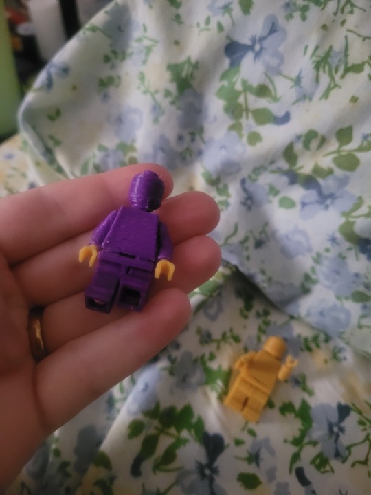
so my current 3D printing project is this: I am making a giant lego man
not super huge, just 5x regular lego size. It'll be about eight inches tall when complete
the reasons for this are, primarily, because it’s cool, and also. I just bought legos with my own adult money for the first time, and it turns out that lego people are for some reason considerably more expensive than lego bricks. I had a whole rant about it earlier that I'm not going to retype here, but the short version is, I did not buy any lego people
but then I went on thingiverse and I found a model for a large-scale lego person! (with this remix for better arms)
and I thought, that is very cool. I am going to make a giant lego person, who can sit on top of the lego box and guard the bricks
and then, because it would take quite a while to print the whole thing, I did a miniature test print at regular lego size, which is 20% of the original file size
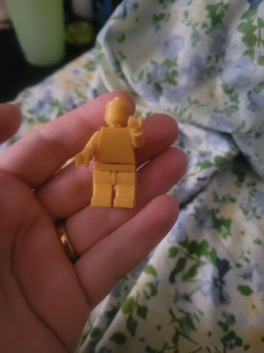
it took about an hour
and he is a pretty good little lego man!
His head's a little loose, but not too bad. I had to reprint the hands cause I originally oriented them stupidly and they broke immediately, but once I redid them in a smarter position, they just took a little sanding of support droopies before they fit great.
The shoulders took some effort to pop into place, but I had expected that. On the rare occasion an arm came off of a lego person when I was a kid, I remember it being extremely difficult to put it back on. Once I got the arms in place and wiggled them back and forth a few times, they moved perfectly smoothly
The legs were trickier to attach to the hips, and one of them keeps angling itself oddly, so that he stands a bit pigeon-toed. If you mess with it too much, it will fall off.
Also the hips keep springing back out of the torso, which isn't great.
Based on this, plus a couple comments on thingiverse which said several connections were not working great, I knew I might need to make some adjustments. And to know exactly how it needed to be adjusted, I needed to print it at full scale
but I didn't want to spend several days printing, only to have to make adjustments and potentially have to reprint every file
so, first, I made a connection test file
I cut the individual pieces up into just their connection points: a slice of neck from the torso, and the bottom of the head. the shoulder pin on the arm, and the shoulder hole in the torso. The hip pin and hole. the wrist, and the entire hand because it's the smallest piece and didn't make nearly as much of a difference if I printed the whole thing. Plus, it rests on the hand on the buildplate, and it would be tricky to get just the hand post to print without including the hand
the first printing attempt spaghettified
it slipped horizontally not far in, and I suspect that caused the spaghetti, when it tried to print over somewhere that should have been supported and now wasnt. Can't be sure, because nobody saw it happen. My husband called me down to stop the printer when he noticed.
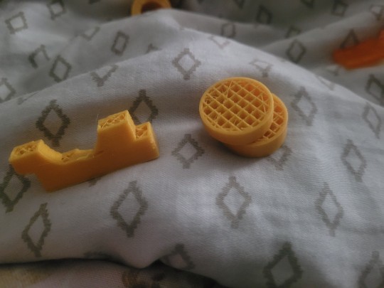
this is the shoulder hole and neck post
it wasn't a total waste, however. I was able to tell from what little had printed of the neck and head that the neck hole was far too large for the post.
So, I made an adjustment to the torso file, making the neck post larger, and restarted the test print with the new version. Unfortunately, restating meant that it went into the evening rather later than I had initially planned, sparking a conversation about what times of day would be most convenient for me to print things so as to not render the living room unhospitible (no hard feelings in either direction, it's just. a loud machine. and it can get annoying to listen to)
That test print went fine, and I was able to test all the fits
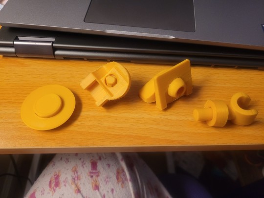
conclusions:
the neck now fits perfectly
the hand post is much too small for the wrist
the hip and shoulder joints are both too snug. I was able to force them together, but they will not rotate (they also now will not separate, and the layers around the shoulder hole split when forcing the shoulder pin inside)
so, back to the modeling program to make more adjustments. The simplest of these was to thicken the arm post
for the shouder, I measured all the bits and discovered that part of the problem is that the wall of the torso around the shoulder hole was thicker than the length of the pin before the flared head
in short, the pin was not long enough to reach all the way through the hole and have the flared head pop out on the other side
so, I lengthened the pin, and also put the slit on the flared head on the top as well as the bottom, for extra squishability
For the hips, they have a different pin shape than the shoulder, so I decided to replace it with the same mushroom-shaped kind of pin the shoulder has. I also widened the hole in the leg piece slightly.
You may notice that I didn't mention testing the hip-to-torso connection, despite noting that there was an issue on my initial miniature print. This is because in order to test it, I'd need to print a large enough portion of both the hip and torso pieces that I might as well print the whole thing, so I figured it would be better to get all the other connections correct first, and then adjust that one as need be.
I did take a look at it in the modeling program, however, and discovered that when assembled, the posts in the hips and the sides of the torso attempt to be in the same location. So I trimmed the hip posts to fit.
Then I printed all the altered files in miniature again, because that's a pretty quick test print
As I had hoped, the legs clicked on much better and more sturdily, and the hips fit into the torso much more securely as well.
The hands and head no longer fit at all, but I'd figured that would be the case as well, considering their fit on my initial test and my subsequent adjustments. I'd printed four hands when reprinting them earlier, testing two slightly different positions (the difference in results was negligible), so I used the extras for the new figure. I sanded down the neck post a bit to get the head to fit, and perhaps I should have sanded a bit more but I didn't feel like it
With that promising test, I prepared a new test print file to test the fit of all the adjusted parts at full scale (save the neck, already tested, and the hip-to-torso connection, will test later as explained earlier - so, just the hip and shoulder joints, and the hand, since I didn't change the wrist and can reuse it to test the new hand)
That's printing currently. Will update when it's done.
10 notes
·
View notes
Text
And Haematite is up and running. Annoying hum from the SATA power converters but only because it's sitting right next to me while I do initial setup. Total volume is something like 6.5 liters.
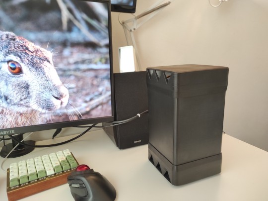

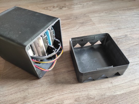
Single fan at the bottom because I've been dealing with a similar two-drive commercial NAS at work and those drives get SO toasty under sustained loads. Do not like.
It's very funny to see this next to my old storage server: a raspberry pi and a hard drive held together with rubber bands.
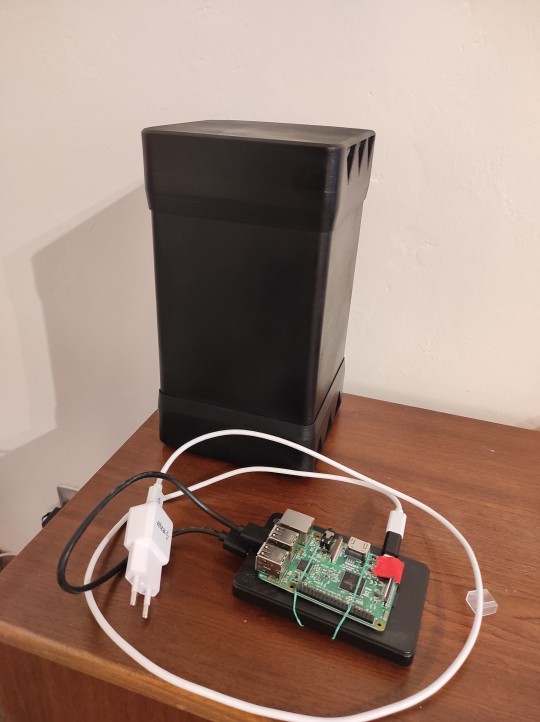
I have TrueNAS Scale up and running. Core was tempting but so much software just does not run reliably on BSD, plus I'd have to deal with bringing the Network drivers which isn't hard but I want this to be low-maintenance, so Linux it is, sorry BSD.
NextCloud is running in a container with access to the storage, busy doing a test upload of some photos from when my brother and sister-in-law were here to kick the tyres on Memories. 14TB of storage should last me a while. I'll set up a Deluge client and stuff for Linux isos and media but that's largely secondary to making it so I can go "what kind of animal did I see in 2012" and just go look at those.

I'll do a write up on the parts and printing and publish the design files sometime soon in case you want to make one of these. There are a few people making various printed PC cases, there's one guy whose designs mostly flat-print and then bolt together which is neat.
The system could do with more memory so I've ordered another RAM DIMM to drop in there, which will take me up to 24GB from 8GB. Yes that's mismatched. It's fine.
9 notes
·
View notes
Text


Ok, so I've been trying to decide between printing the full scale and the 80% scale fortress walls. To help me imagine how they would fit on the table I look up some old warhammer terrain to compare sizes to, and stumbled across the old Warhammer Fortress Terrain & even older Warhammer Mighty Fortress.
The Bone walls at 80% are about equivalent to the lower walls from the old fortress kits, which is a mark in their favor, but a lot of the tabletop impact and fortress/castle-like feeling of the old kit came from the Larger towers on the corners, where as the bone wall corners, while a bit bulkier, aren't any taller than the walls - they aren't towers, they're just wall corners. But you can play with STL files like legos, so I spent entirely too long last night chopping and combining files together in the slicer to turn the Bone Wall corners into proper castle wall Towers.
The result isn't perfect - some of the seams are noticeable if you look closely, especially a line of doubled rivets, but it should be easy enough to clean those up after printing. The tower is built on the 100% scale corners, and the top rampart is made mainly of 100% scale wall toppers, with the floor raised for mortek guard to see over the side, but it's made to fit with the 80% walls. If I wanted to use this tower with 100% walls, I'd need to print it at 125% scale, and make a few other changes for alignment if using the edited wall toppers with raised floors.
While I'm mostly very happy with the current result - at least pending printing it and seeing it in person - I do worry that it's maybe a bit plain next to the walls and gate. The unedited wall corners already felt a bit plain next to the walls due to lacking the bone-mold designs, and these towers are much larger and will thus draw far more attention. I'm considering adding some extra detail before I print the tower, but that'll be more difficult than just blocking in the basic shapes from the existing corner files and slapping some doors on. In the mean time I'm printing just the tower top at the 0.06 high quality preset for the 0.2 nozzle.
That print will take like a day and a half, well more than 2x the print time it would be using the 0.08 preset for the 0.4 nozzle. The difference was easily worth it printing the previous batch of actual miniatures, but for large pieces of terrain I expect I'll end up going back to the larger model for speed since I already thought the wall segments I printed with it were good enough, but it's worth the extra print time at least once just to be able to make the comparison.
5 notes
·
View notes
Text

✨All preorders have shipped✨
We're thrilled to announce that all preorders for "Starlight" have been shipped!
✨If you purchased a physical bundle, you should have received an email from our shipping mod that contains your tracking number so you can follow your preorder as it ships. Please be patient with your local carriers, as many packages are crossing international lines.
✨Everyone who purchased copy of the zine should have also received a separate email that includes the link to the digital copy of both the zine and wallpapers.
Please note that these files are for personal use only, and any commercial use or reselling is prohibited. Every member of our team has put great effort into their contributions, and we ask that you respect their work. Please do not redistribute, repost, or otherwise replicate these files under any circumstances. This includes, but is not limited to: sharing the download link, posting images of any of the content to public (or private) platforms, or large scale printing of any of the digital goods for distribution.
Once you get your bundle, you're welcome to take a picture of it and tag us - we'd love to see that you received it!
If you have any questions, please feel free to email [email protected]
✨We will announce the date for our Leftover Sale once we're confident that most (if not all) preorders have been delivered. We will then reopen the shop with the remaining copies of the physical zine and merch, available to purchase on a first-come-first-serve basis
✨ We are so excited to be at this phase, and we can't wait for you to see the amazing work that our contributors and mod team have done!
#star wars#zine#star wars zine#fanzine#star wars the high republic#the high republic#fandom zine#starlight the high republic zine#thr#fanart#fanfic#merch#zine production update#zine production#production update#zine update#zine shipping#zine promo#preorders shipped
6 notes
·
View notes
Text

I’m opening up my commissions again with sliding-scale pricing to support me during this challenging time. Due to a serious injury, I’ve lost my income and can't manage my Etsy shop or work in person due to mobility issues.
I had to spend a lot making my space accessible, which quickly drained my bank account.
🌿What is Sliding Scale Pricing?🌿
Sliding scale pricing allows you to pay what you can afford within a set range.
🌿How to Select Your Tier:🌿
Low Income: Struggling to make ends meet (students, part-time workers, high medical expenses).
Mid Income: Stable income covering living expenses comfortably.
High Income: Disposable income; please consider this tier if you make a good salary.
🌿Here’s what I offer for
Design Services🌿
Stickers, Shirts, Totes, Posters, Album Covers, Buttons, Cards, Repeat Patterns.
Sticker and button designs are provided digitally. Shirt designs add CAD 50 per additional colour due to screen printing complexities. If not screen-printed, we can discuss pricing via email.
I also offer regular digital illustrations; email me with details for pricing.
Pricing:
Low-Income Tier: CAD 125
Mid-Income Tier: CAD 250
High-Income Tier: CAD 500
🌿Tattoo Designs🌿
Tattoo designs are now priced based on size with sliding scale options:
Tattoo Designs:
Small: CAD 55-75
Medium: CAD 75-125
Large: CAD 125-200
Prices may vary depending on complexity.
💌How to Commission💌
Reach out at [email protected]. Provide your preferred colour scheme, deadline, inspiration photos, specific imagery, dimensions, and style preferences. You’ll get two rounds of input to refine the design. The final deliverables are high-res digital files.
I require a 50% upfront deposit, with the balance due upon finalization. Payments can be made via PayPal or E-transfer.
I also offer Teams meetings if you prefer to discuss your project over video. I know some folks find that easier to have an initial conversation.
#queer artist#queer art#canadian artist#illustration#artists on tumblr#deirdre sokolowska#asexual artist#artwork#unwashedace#digital art#sliding scale commissions#art commissions#commissions#commissions open#merch design#poster design#album design#sticker design#gay art
5 notes
·
View notes
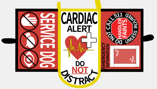
Note
hi!! where do you get yoshi’s vests from?? or do you make them yourself? and if so, literally how? is there a particular pattern you use? they’re honestly gorgeous, and i’ve been looking for something similar for my girl
😭 literally the nicest compliment ever I made it myself!!

I was disappointed with a vest I had purchased from a maker, quickly realized that most makers don't specialize in little dogs and as a result the gear isn't legible/ there's a lot of wasted space which is a big deal when you have limited space to work with on a little dog already! So I made my own to maximize usable space instead.
I'm sure there's patterns you could buy out there but I made mine from scratch (and it's not too complicated to figure out!). What I opted to do was measure her first, get an idea for how large the side panels and centre panel can be. I used a free art program (medibang) and dragged some rulers in there and drew things out to scale relative to the rulers. This way you have an accurate scale to work with to decide what can actually fit in the space. Print out the design (I put each panel in to a word file and printed that way) and check the size on your dog, make adjustments as needed until the paper printout sits how you'd like it to and your designs are legible! Word programs should have a ruler on the top of the page which allow you to see the exact measurement of each of your panels so it's easy to align them/ change the size as needed accurately.
There's lots of ways to make a vest, with or without webbing, multiple panels, one piece of fabric. Take a look at vests online and see what aspects you like and what you don't! I opted for webbing to stiffen the edges to prevent wear but it's not necessary! You can just stick two pieces of fabric together and call it done!
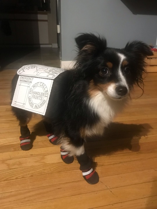
I colourized it on the computer first so I could ensure that the scheme would work and that all the fonts would be legible at their smaller size/ contrast well.
Embroidery will be the first thing you do once you're set on your design and it takes the most time. You CAN do it by hand! but it takes a long time and if you use a thick fabric it'll hurt! If you have a standard sewing machine you can embroider with that as well (which is what I did!). I literally bought my first personal sewing machine for this project, I used machines in middle school and to make a couple plushies like 7 years ago but that's it for my experience. You can absolutely do it if you're limited on experience! It's often referred to as 'free motion embroidery' which there's tutorials online for!
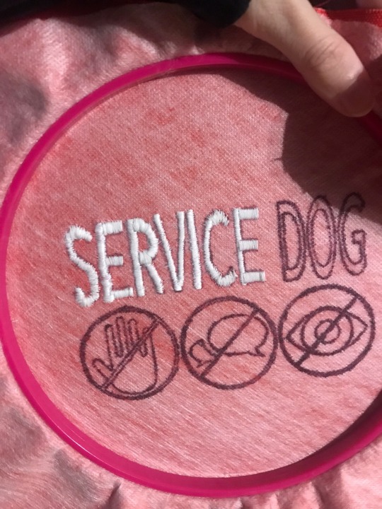
The basics of embroidery are to print out your design, you can sew right over the paper and follow it like tracing but paper will be stuck under the embroidery so if the set gets wet soggy paper will happen eventually! The better alternative is to get 'soluble embroidery stabilizer' which is a see through material that washes away with warm water! You can trace your design on to it with a pen, pin the stabilizer to your fabric, then simply trace the design with your thread!
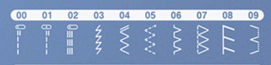
I used a zigzag stitch (#4 on my machine), think of it like drawing with a thick marker, you want the stitch to be wide enough to fill in the whole shape if possible. your machine will have two settings you can change, the width of your zig zag (thickness of your marker) and the amount of space between each stitch (opacity), so you want the zig zag to be as wide as the shape and the space between stitches to be as small as your machine will go without getting tangled ( I sit at 0.2)
Freemotion embroidery tutorials will tell you to drop the feed dogs down, don't do that. You'll break a lot of needles. Letters are just straight lines so you can leave them up, let the machine help guide the straight line, it'll be a LOT easier for you! Curvy letters like C and S will be hard the first few times but it gets easier, it's helpful to take it as a bunch of short straight lines instead of trying to turn with it. Fills in the shape better.
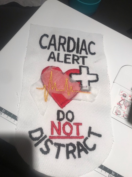
You'll end up tracing each letter 2-3 times at minimum to ensure it's nicely filled in and the fabric underneath doesn't show through. Don't forget to sew back over your ends to keep them locked in place otherwise it'll just unravel!
Once that's done the rest is EASY in comparison! 😂
When you're happy with your embroidery you can cut out each of your panels, be sure to leave a minimum 1/4 inch gap around the edge for the seam, you can leave more space if you want! if you think you'll be a bit wavy/ struggle to keep the needle near the edge then more seam allowance is better!
Attach the panels together (lay them together with the 'nice sides' together and sew along the edge)
You'll want a second fabric piece to be your underside, this makes the vest more sturdy, protects the embroidery, and makes a soft smooth surface for your dog! Once the top panels are all attached to each other you can cut out one big piece for the underside, a mirror copy of the shape of your top panels all sewn together!
The "best looking" way to leave a seam I would say is by folding the edges in and sewing around the outside, keeps the edges crisp and compressed. I would do it this way if I was leaving the edges of the vest panels exposed.
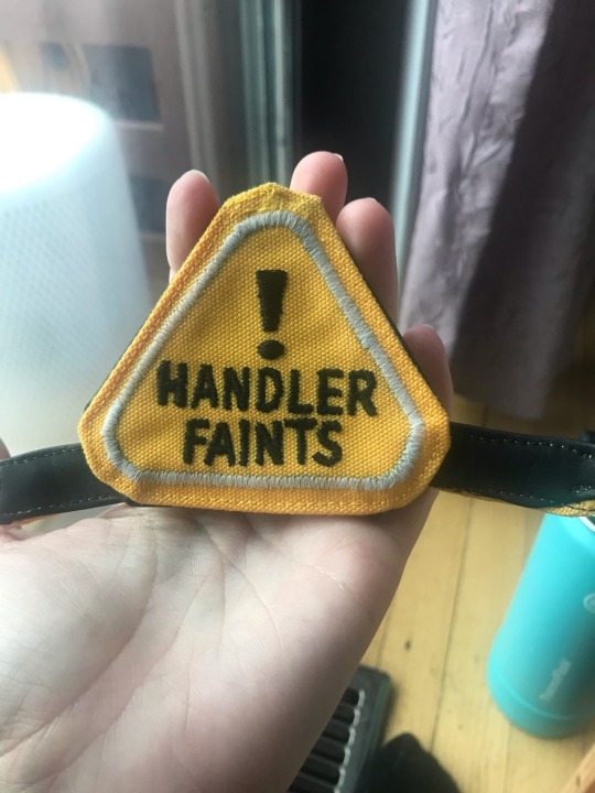
If you're going to put webbing along the edges anyways then you can do it a quicker way, just lay the two pieces (your top panels and your underside) together with the nice sides facing in and just sew quickly around the edge. Be sure to leave a space unsewn so you can flip it inside out again. This will be easier to do but leaves the piece looking a bit more bubbly and the corners will be a bit puffy/ not as crisp
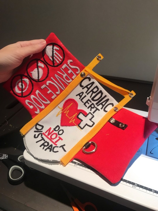
You can opt to put your buckles/ attachment points in now while you're sewing the top and bottom together or you can wait and attach it with the webbing. If you do it now you'll have to do the webbing as two separate pieces, if you do it later you can fold the webbing over the edge instead. I found two separate pieces (top and underside) to be cleaner and easier to work with on this tiny scale
From there you can seal up the little gap you left to flip it rightside out by hand stitching a 'invisible stitch' and attach your webbing to the edges. I learned the hard way that you should do the side panels first (the outer edges) and the centre panel last. You want the edge webbing to go underneath your centre panel's webbing so that it's a smooth transition when it flops down and bends at that joint! Otherwise the fabric ends up visible underneath when it bends there. So side panels first, centre panel last.
And that's it I think. it's a lot of trial and error as you gradually realize what order to do things in, what works and what doesn't.
If you do try it keep in mind that it's just thread! if you make a mistake it CAN be undone! cutting the threads is tiresome and redoing stuff sucks but it's nice to know that mistakes aren't permanent. If you're really happy with a panel and screw up an icon at the end it can be saved and you can try again without having to redo the whole thing!
Last note is that large fonts are easier than small ones. tiny font showcases every waver in your pathing, making shaky wonky letters: exhibit A my first try vs a few days later

So to avoid frustration I would stick to larger fonts at first. To go along with that try to allow the machine to go quickly, if you move really slow on a straight line it'll show every time you moved and turned it, letting it move fast on straights keeps them smoother and straighter!
For small fonts to limit frustration I would design your vest so they can be detached and you can work on them without having to change the whole panel while you work on your skill. You can make patches!
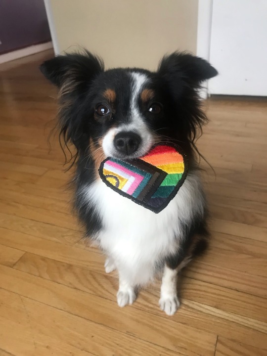
Same scrap fabric, do your design, and then cut it out right close to the shape and just do that exact same zig zag stitch around the edge. it'll be lined up so that the left of the zig hits the fabric (at whatever thickness you want your outline to be) and the right side of the zag is not hitting the fabric at all. this will cause the thread to wrap around the edge and give a clean look! the more passes you do the cleaner it'll be (above is just two or three quick passes, if I tried harder it could be way smoother). Then you have a patch you can tack on with thread, stick heat n bond on the back for iron-on, or secure velcro or make a little hanger. dealers choice really on that one.
Anyways this is a bit of a mess of information but I hope it gives you somewhere to start. If you want me to demo anything let me know I'm more than happy to help!

oh and feel free to take my pattern up there if you need somewhere to start! I just ask that you change the design up a bit so it's not a carbon copy
13 notes
·
View notes
Text

High-Quality Tiger Art Image Ready to Print - Digital Download
This stunning digital download features a highly detailed, high-resolution tiger image, meticulously crafted to deliver vibrant colors, sharp lines, and lifelike textures. Perfect for print, this image is designed to maintain exceptional quality even at larger sizes, making it ideal for home decor, office spaces, or any creative project that requires an impactful and striking visual.
The tiger, captured in all its majestic glory, stands out with a dynamic and natural pose, showcasing the powerful grace and beauty of this magnificent animal. Every strand of fur is rendered with precision, from the intricate patterns on its coat to the intensity in its piercing eyes. The background complements the tiger, providing a harmonious balance of color and contrast, without distracting from the animal itself.
Whether you're planning to print it on canvas, poster paper, or any other medium, this image offers the flexibility and high resolution necessary for producing professional-quality prints. With a file that ensures crisp detail and rich color depth, this high-definition tiger image is ready for immediate download, allowing you to create the perfect print piece at your convenience.
Features:
- High-resolution image for superior print quality
- Perfect for large-scale prints or framing
- Lifelike details and vibrant colors
- Instant digital download for immediate use
- Versatile for a range of print mediums (canvas, posters, etc.)
- Ideal for home decor, office, or nature-themed projects
Bring the raw beauty and power of the tiger into your space with this premium-quality digital download, ready to be printed and displayed for all to admire.
Please note: This is a digital product, and no physical items will be shipped. Print colors may vary slightly depending on your printer and paper type.
Get it now
#tiger#digital art#digital illustration#digital drawing#digital download#frame#frames#artwork#art#drawing#print#printable
2 notes
·
View notes
Text

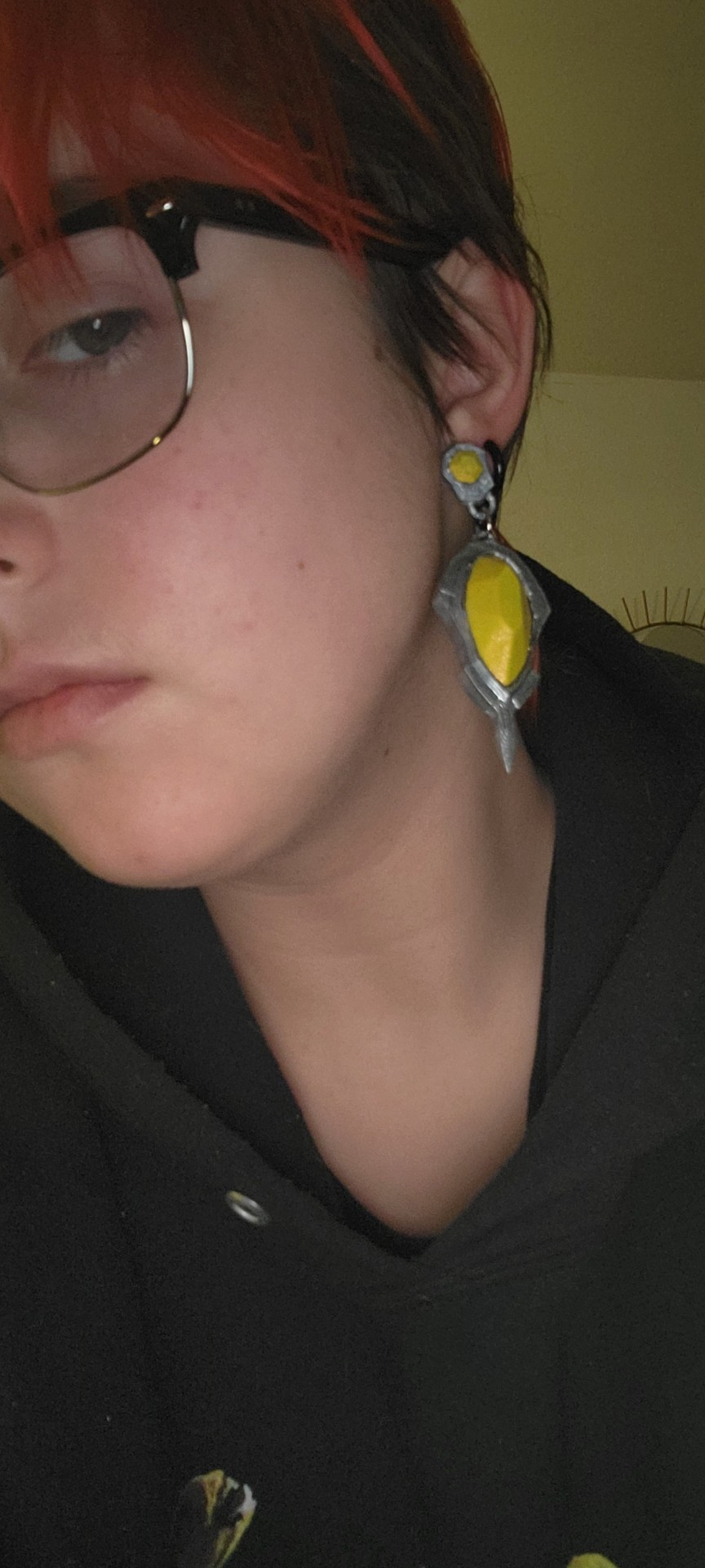
They look pretty bad because the silver paint I have is extremely thin, but I threw together a prototype of the topaz earrings. The print was slightly failed, one jewel warped on the bottom and the supports were so hard to remove that I didn't even finish the back or the second earring. I won't be using this support type again. However, I DO like how the color shift paint looks on the jewels!
The STL is $5 via CashApp only at the moment. To make a pair, you'll need at LEAST some jewelry loops and earring stud blanks. I sized everything by scaling the large jewel to what I wanted (27mm) and then used the percentage increase to size the rest of the pieces.
DM if you are interested in purchasing the STL file for these earrings. Amber and Opal earrings are also available, as is the Evil Spirit mask from the Ganon armor set. All funds go to opening an Etsy shop and getting proper paints and materials!
7 notes
·
View notes