#Material Design UI
Explore tagged Tumblr posts
Visit Tumblr Blog
Explore Tumblr blogs with no restrictions, modern design and the best experience.
Last Seen Tumblr Blogs


Fun Fact
If you dial 1-866-584-6757, you can leave an audio post for your followers.
Text


I've made hundreds of icons for Nightingale, here is a glimpse at some of them! The metal bases for ingots was hand painted, the ores are a mixture of painting, 3D models, and photobash. I referenced Soulslike icon conventions heavily, especially Elden Ring. The alchemical symbol alphabet was developed to help with accessibility (differentiate all the ingots accounting for colour blindness).
8 notes
·
View notes
Text
Component Libraries: Should You Build Your Own or Use a Prebuilt One?

Component libraries are a vital tool in web application development in maintaining uniform design, shortening the time taken to develop web applications and improving reusability of the code. Some developers find this dilemma; should they create a component library or use an existing one? In addition, they help reduce the struggle while building well-designed and interactive websites because of the availability of animation-oriented UIs such as Accentricity UI among others. Now, let’s get more to the point in order to help you find the right way.
What is a Component Library?
Component libraries are collections of reusable UI elements such as buttons, forms, modals, and more— and are intended to reuse the components across several projects. Such libraries not only guarantee a consistent look of an application but also save time and costs during its implementation because the elements have been already coded. So, there's no need to build components from scratch.
Prebuilt Component Libraries

Prebuilt Component Libraries
Prebuilt component libraries are the ready-made collections of different UI components that are specifically designed and optimized for common use cases that developers can face during development. Some well-known examples include:
Material-UI (MUI):
A library based on React and it follows Google's Material-UI design, MUI allows a comprehensive set of components customization.
Ant Design:
It's an UI design system framework for enterprise-level products, ant design offers built-in themes and a rich set of UI components.
Bootstrap:
It's an widely-used CSS framework that provides basic components and a responsive grid system.
Pros of Prebuilt Libraries :
Rapid Development: Prebuilt libraries save a lot of time of the developers by providing pre-designed reusable components that you can quickly integrate into your project.
Standardized Design: They help ensure a consistent user experience across different screens and features.
Community Support: Many prebuilt libraries come with robust community support, providing a wealth of tutorials, plugins, and enhancements.
Cons of Prebuilt Libraries
Limited Customization: Customizing components to fit your unique design can sometimes be difficult, leading to constraints on flexibility.
Performance Overhead: Many prebuilt libraries come with extra features you may not need, which can bloat your codebase.

Pros And Cons of Prebuilt Libraries
Animation-Centric Libraries: Bringing UIs to Life
In recent years, a new category of libraries has emerged, specifically focused on providing built-in animations and smooth UI transitions. These libraries not only offer pre-designed components but also emphasize adding dynamic, interactive features to web applications.
Here are some popular examples of animation-focused libraries:
Lottie
Category: Animation Integration Library

Lottie:The industry standard for motion design
What it Offers: Lottie allows you to render animations created in Figma or Adobe After Effects as JSON files using the built-in plugins. These animations are then rendered natively on the web, offering high-quality motion without a heavy performance impact.
Why It’s Useful: Lottie is perfect for apps or websites requiring rich, scalable animations that are lightweight. It’s commonly used for logos, loading animations, and subtle UI effects. Unlike other component libraries, it focuses purely on bringing visual design elements from tools like Figma & After Effects into the web environment.
Accentricity UI
Category: Hybrid Component and Animation Library
What it Offers:
Accentricity UI combines traditional UI components with built-in support for smooth animations and transitions. It offers a wide range of components like buttons, forms, modals, and navigation menus, but with an added layer of predefined animations, making it easier to create interactive, dynamic interfaces.
In addition to these standard components, Accentricity UI provides responsive behaviors and subtle animation effects like hover states, fade-ins, and sliding transitions that enhance user engagement. The library's components are fully customizable, allowing developers to easily adjust animation timings, easing functions, and durations to match the look and feel of their brand, ensuring both visual appeal and performance across devices.
Why It’s Useful:
Think about it, what would be easy for a dev? Making a custom component with tons of animation which the dev has to write from scratch and polish it before the deadline or use a library, where the dev can make use of the library with the built-in support to combine the custom designed elements with smooth animations and transitions offered by the library.
It’s particularly helpful for developers who want the convenience of a prebuilt library but need polished, built-in animations to enhance user experience without writing complex animation code from scratch.
Framer Motion
Category: Animation-focused Component Library (React)

Framer Motion
What it Offers:
Framer Motion is a powerful library for React that allows you to create fluid animations and micro interactions with minimal effort. It supports interactive features like drag, scroll, and spring-based animations, which makes it ideal for interactive & highly animated UIs. It also provides easy-to-use APIs for gesture-based animations and layout transitions, offering developers extensive control over complex animations while maintaining simplicity in implementation.
Why It’s Useful:
Framer Motion combines the simplicity of component libraries with the flexibility of advanced animation frameworks, making it easy to enhance user interfaces with dynamic visual effects. It’s a great choice for React developers who want to integrate animation without compromising performance or adding significant overhead. With its built-in optimizations for smooth rendering, Framer Motion ensures high-quality animations that enhance both usability and visual appeal.
Should You Use Prebuilt Animation Libraries?
The role of animations is really important in web applications to enhance the UX(user experience), by making interfaces feel more fluid and interactive makes user's remember the website due to its great experience. Since users are constantly getting used to smooth effects, micro-interaction and dynamic feedback, animations are no longer viewed as a good to have feature but are rather considered as a must have feature. Prebuilt animation libraries like Framer Motion and GSAP (GreenSock Animation Platform) simplify this process by providing powerful, flexible tools that allow developers to integrate complex animations without having to manually manage every aspect of motion or dive deep into animation theory.
Advantages of Animation-Centric Libraries

Advantages of Animation-Centric Libraries
Ease of Use
Prebuilt animation libraries abstract away the complexities of coding animations from scratch. Without manually writing keyframes, easing functions, or browser-optimized transitions, developers can simply use predefined APIs to implement fluid animations. This drastically reduces development time, as many animation details are handled by the library, letting developers focus on building features and interactions rather than tweaking animations for performance or cross-browser compatibility. For example, with a few lines of code, animations can be applied to any UI element, making the development process much more efficient.
Advanced Features
Many animation libraries offer advanced features that go far beyond basic transitions like fade-ins and slide animations. These include timeline control, scroll-triggered animations, physics-based interactions, and even 3D transformations. For instance, timeline control allows developers to create synchronized sequences of animations, which can be used to create smooth, coordinated interactions across multiple elements. Scroll-based animations enhance user engagement by triggering effects as the user scrolls, perfect for parallax websites or content reveal effects. Physics-based animations, such as spring-based drag-and-drop or object bouncing, add natural, realistic movement to interactive elements, elevating the overall experience. Additionally, 3D transformations provide extensive control over how objects rotate, scale, or move in three-dimensional space, something that is cumbersome to achieve with native CSS alone.
See What Happens Next
#webdevelopement#werbooz#own website#build vs prebuilt component library#custom UI components#prebuilt UI libraries#web development#Material-UI#Ant Design#Bootstrap#Framer Motion#Accentricity UI#animation libraries#best UI libraries 2024#component library pros and cons#web app development#UI design optimization#web performance#web development trends
2 notes
·
View notes
Text
Elevate Your Brand with Expert Graphic Design: Amina Rehmat’s Creative Touch
Welcome to my blog! I’m Amina Rehmat, a seasoned Graphic Designer with over three years of experience specializing in various aspects of graphic design. My work encompasses branding, logo design, print design, and packaging design, all tailored to elevate your brand's visual identity.
My Expertise in Graphic Design:
Branding: I craft comprehensive brand identities that resonate with your target audience and stand out in a crowded market.
Logo Design: My logo designs are unique and memorable, providing your brand with a professional and recognizable mark.
Print Design: From brochures to flyers, I design high-quality print materials that capture attention and communicate effectively.
Packaging Design: I create innovative packaging solutions that not only protect your product but also enhance its visual appeal and marketability.
Explore My Portfolio:
Take a look at my work to see how I can help transform your brand’s visual presence. Visit my portfolio on Behance to view a curated selection of my design projects.
Get in Touch:
If you’re looking for a graphic designer who brings creativity and expertise to every project, let’s connect! You can reach me via:
Email: [email protected]
Phone: 03419862750
Feel free to reach out to discuss your design needs or to get a quote. I look forward to helping you bring your vision to life!
#graphic design#branding#logo design#print design#packaging design#visual identity#Design Consultancy#Design Portfolio#Graphic Arts#Product Design#Packaging Art#Visual Branding#Creative Direction#Brand Identity#Print Advertising#Social Media Graphics#Web Design#Marketing Materials#Advertising Design#Illustration#Design Strategy#UI/UX Design#Digital Graphics#Typography#Creative Design#Visual Communication
2 notes
·
View notes
Text

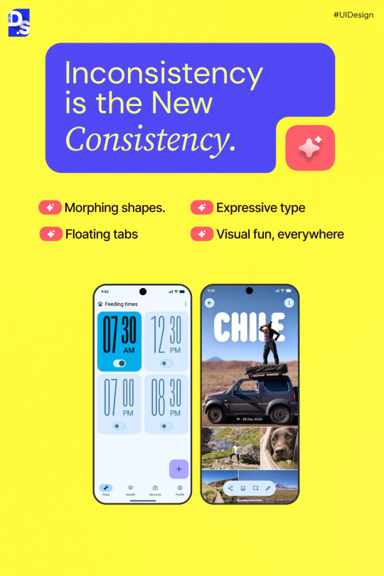


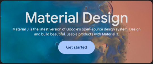
Forget flat. Forget consistent. Google’s latest UI language — Material Design “Expressive” — just flipped the script.
🎨 Morphing shapes 🌀 Spring-based motion 🔤 Typography that plays a visual role
It’s not just a design update — it’s a shift in how we build digital experiences.
But here’s the challenge: ⚠️ Freedom without clarity = chaos
👉 Swipe through to see what’s changing, why it matters, and what’s next for digital products.
0 notes
Text
Material 3 Expressive: a revolução visual do Android
O Android, sistema operacional mais utilizado em smartphones, acaba de revelar sua nova cara com o lançamento do Material 3 Expressive, trazendo mais personalização e expressão visual. O que é o Material 3 Expressive? O Material 3 Expressive representa uma evolução significativa na interface do Android, trazendo uma abordagem mais dinâmica, personalizada e emocional para o design de aplicativos.…
0 notes
Text
0 notes
Text
The Evolution of UI/UX
From Skeuomorphism to Neumorphism & Beyond

User Interface (UI) and User Experience (UX) design have undergone a remarkable transformation over the years. From the early days of skeuomorphism to the sleek, modern neumorphism, the way we interact with digital interfaces continues to evolve. In this blog, we explore the history, key transitions, and the future of UI/UX design.
For more design insights, visit our UI/UX blog collection.
The Era of Skeuomorphism: Making Digital Feel Familiar
What is Skeuomorphism? Skeuomorphism is a design approach that mimics real-world objects and textures to make digital interfaces more intuitive. This style was widely used in the early days of computing and mobile apps.
Key Characteristics:
Realistic textures and shadows (e.g., leather-bound calendar apps, glossy buttons)
3D effects and depth
Gradients and detailed illustrations
Why It Was Popular: Skeuomorphic design helped users transition from physical to digital interfaces by offering a familiar look and feel. Early Apple iOS interfaces exemplified this approach.
Downfall: As mobile-first design became the norm, these visuals began to feel outdated and cluttered.
The Rise of Flat Design: A Minimalist Revolution
What is Flat Design? Flat design focused on simplicity and usability by eliminating 3D effects and textures.
Key Characteristics:
Clean, minimalist layouts
Bold colors and sharp edges
Simple, legible typography
No shadows or depth
Why It Became the Standard: With better performance and mobile responsiveness, companies like Google and Microsoft embraced flat design, helping it become mainstream.
Material Design: Adding Depth Back
What is Material Design? Material Design by Google blends flat design with depth and motion to create more intuitive interactions.
Key Characteristics:
Soft shadows and layering
Card-based structure
Fluid animations
Emphasis on usability and feedback
This hybrid approach improved UX without sacrificing performance.
The Neumorphism Trend: A Fusion of Old and New
What is Neumorphism? Neumorphism, or “New Skeuomorphism,” combines depth and simplicity, giving UI components a soft, tactile appearance.
Key Characteristics:
Embossed look with soft shadows
Muted color palettes
Minimalist yet interactive elements
Rounded corners and subtle gradients
Why It’s Trending: Neumorphism aligns well with dark mode, reducing eye strain and enhancing modern UI elements. However, it faces criticism over accessibility and contrast limitations.
Beyond Neumorphism: The Future of UI/UX
The future of UI/UX is shaped by emerging technologies and evolving user expectations:
Glassmorphism: Popularized by macOS and Windows 11, it adds frosted glass effects and layered transparency.
AI-Powered Design: Adaptive interfaces using AI in UX to anticipate user needs.
AR & VR: Transforming navigation, e-commerce, and gaming with immersive experiences.
Sustainable & Ethical Design: Prioritizing accessibility, energy efficiency, and inclusive digital experiences.
Final Thoughts
UI/UX design has evolved from skeuomorphic realism to flat simplicity, material fluidity, and now to neumorphic softness. As technology and user behaviors continue to change, designers must focus on creating digital products that are not only beautiful but also intuitive and inclusive.
Stay ahead of the curve—explore more on Pixelizes for design trends, resources, and tips that shape the future of UI/UX.
#UI Design#UX Design#History of UI/UX#UI/UX Trends#Design Evolution#Skeuomorphism#Flat Design#Material Design#Neumorphism#Glassmorphism#AI in UX#AR/VR in Design#Future of UX#Ethical Design#Sustainable UX#Accessibility in Design#User-Centered Design#Visual Design Trends#Minimalist UI#Interaction Design#Web Design#Mobile UX#Creative Inspiration#Digital Interfaces#Design Thinking
1 note
·
View note
Text
i wish i was in a significant position, so that people could blame me for flat design, cause i love it, but because its not me doing it, i cant be the scapegoat
although, corporate memphis can still fuck off
(This is not advocating for flat logo designs and all that, this is purely for UI Design) (This is also not saying Frutiger Aero is bad)
Some guy: "I hate this flat design, who is at fault for it?" sees me on top, pointing accusingly "YOU" Me: does what he loves, not out of a need to make every corporate, but because he thinks properly executed flat design FUCKS
1 note
·
View note
Text
WordPress Material Design Theme: File Upload Material UI Theme Discover the perfect blend of style and functionality with our WordPress Material Design theme. Elevate your website's look and user experience with modern design elements.
1 note
·
View note
Text
10 Best Free Graphic Design Resources Roundup #210
This is a hand-picked list of the most popular and free Graphic Design resources we’ve collected from the past week (Feb 18 – Feb 24, 2024). iPhone 15 Pro High-Quality Mockups A set of 6k resolution iPhone 15 Pro mockups with transparent backgrounds. MARX Free Web UI KIT A comprehensive collection of meticulously crafted Adobe Photoshop (PSD) files that redefine your design process. Tailored for…
View On WordPress
#Android#Billboard#Cosmetic#Easter#Google Material Design#Illustration#Instagram#iPhone#iPhone Mockup#Mockup#texture#ui kit
0 notes
Text
#software developers#software development#web development#web developers#web design#web designers#angular#angular material#ui#ui ux design#uidesign#ux#design#user interface#accessibility#section 508#demonstration#united states#usa#virginia
1 note
·
View note
Text
Tercera entrega, de la serie de 3, donde presentamos el flujo de trabajo para el prototipado de interfaces de usuario con Material Design 3, empleando los recursos que la última versión de este framework nos ofrece para utilizar en Figma. Rápido, aprenderás a generar el UI kit, estilos de colores, estilos de textos, tamaños de frames, retículas y otros recursos en Figma. Indispensable si quieres trabajar profesionalmente en ambos entornos. A continuación, te comparto los enlaces la primera y segunda entrega de esta serie:
Primer contacto con Material Design 2, aspectos relevantes, componentes y más.
Primer contacto con Material Design 3, aspectos fundamentales, componentes, y más.
Tutorial completo, aquí: https://www.formaciongrafica.net/blog/tutoriales-online/uid/el-flujo-en-figma-con-material-design-3/
#material design#md#material design 2#md2#uid#ui#Formación Gráfica#tutoriales ui#tutorial de diseño#tutoriales de diseño#tutorial ui
1 note
·
View note
Text
MaterialDesign3に入門してみた ~ 概要/Color編
こんにちは、sktnです。 普段はバックエンド領域やフロントエンドのロジック側の開発を受け持つことが多いのですが、UI周りの知見も広げたく Material Design3の勉強を始めました。
https://m3.material.io/
こちらのサイトを読み進めつつ、ポイントになりそうな部分をまとめてみます。
Material Design3 とは何ぞや
Material Design3(M3) のサイトには下記のように書かれています。
Material 3は、Googleのオープンソースデザインシステムの最新バージョンです。Material 3を使って、美しく、使いやすい製品をデザイン、構築しましょう。 最新バージョンであるMaterial3は、ダイナミックカラーやアクセシビリティの強化から、大画面レイアウトやデザイントークンの基盤に至るまで、パーソナルでアダプティブ、そして表現力豊かな体験を可能にします。
M3はGoogleが提供(提唱)するデザインシステムで、プロダクトのUIを考える際の基準となりうるもののようですね。 M3を構成する要素は
Accessibility スクリーンリーダー等の支援機能を使うユーザーへの配慮について "見やすさ" "操作しやすさ" について
Layout 各パーツの役割に則った配置 適切なスペーシングやサイズについて
色 役割に応じた色の適用やカラースキームの設定について
デザイントークン 色やフォント、その他スタイルについて役割別で呼び分けるプロパティとその命名について
状態 各UIコンポーネントの状態( Disabled / Loading / Hoverなど )とそれに応じた見た目の変化について
など多岐にわたっていますが、ここでは色について見ていこうと思います。
色 - Color
サイト上ではこのあたりの内容が該当します。 https://m3.material.io/foundations/accessible-design/patterns#f72f3851-5184-4132-b871-bc8224e062e2 https://m3.material.io/foundations/customization https://m3.material.io/styles/color/roles
背景色とのコントラスト比は3:1が基本
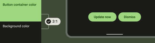
上記の画像のようにボタンの例が分かりやすいですが、私たちが普段Webを触っていて「この要素は押せるのか‥?」と迷うことが少ないのはコントラストが適切に設定されているためと言えます。
背景色と同化したボタンだったらどうでしょうか?ぱっと見で「押せる」「押せない」の判���ができず、カーソルを持っていって初めてボタンであることが分かる要素になってしまいます。 試しにこのtumblrの投稿ボタンの色を触ってみました。
どちらが迷わず「ボタン」と認識できるかは明らかですね。 ちなみにこのコントラストは「押させたい要素」に対して有効で、非活性のものやFABボタンについては要件を満たす必要はないとされています。
Color Roleについて
��はプロダクトのUIにおいて、色はどのように決めていけば良いのでしょうか。
優れたセンスを持つ人はもしかすると、適切な色をスマートに選択していけるかもしれませんが、誰もがそうとは限りません。 M3では "Color Role" として優先度 / 背景色とその上に乗る色などにそれぞれ名前を付け、扱えるように提唱されています。 https://m3.material.io/styles/color/roles#e9fc5b00-8355-4641-b35f-58b0bac639f3
初めて見ると英単語の羅列と種類の多さに身構えてしまいますが、よく見てみると命名規則が揃っており プログラマにとっては文脈としてとらえやすいと感じるのではないでしょうか。
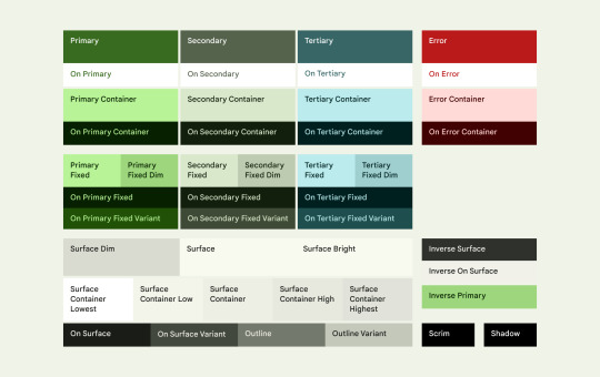
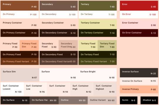
アクセントカラー (Primary / Secondary / Tertiary / Error)
UIの中で目立たせたい要素にはこれらのアクセントカラーを使用します。 強調したい順にPrimary > Secondary > Tertiary を使用します。 またエラー表示にはErrorのアクセントカラーを用いるとよいでしょう。
それぞれに4つのRoleが定められており、{accentColor}ごとに
{accentColor}: それぞれの優先度として目立たせたい要素の背景色に使用
On {accentColor}: 指定のアクセントカラーの上に乗せる文字やアイコンの色
{accentColor} Container: {accentColor}よりは強調度が低い部分や広めの要素の背景色として使用 ※Primary ContainerはFABボタンなどに使われるとされています ※この色は文字やアイコンの色としては使うべきではありません
On {accentColor} Container: {accentColor} Containerの要素の上に乗せる文字やアイコンの色
というように定められています。 親要素とその上にくる色 のセットになっているので使いやすそうですね。
固定のアクセントカラー ( Fixed accent colors )
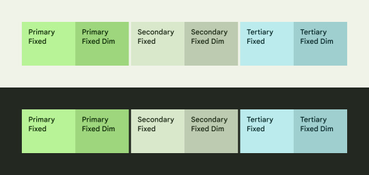
ライトテーマとダークテーマの切り替えの影響を受けたくない要素に対して使用できます。
一部新しい用語が出てきました。 {accentColor} Fixed Dim は通常のFixedカラーよりも濃い色が割り当たっており、Fixedカラーとは別で固定動作が必要なものに対して使用されます。 On {accentColor} Fixed Variant は通常のFixedカラーよりも強調度が低い文字やアイコンの色として使用されます。
Fixed accent colorはコントラスト要件を満たしていないため、強調するアイコンなど コントラスト要件を満たす必要がある要素に対しては使えないことに注意が必要です。

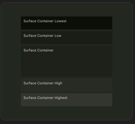
Surface Color
通常の背景色として使用される役割の色です。
カードやシート、ダイアログ要素には Surface Containerを用いると良いとされています。 Surface Containerには5つの強調度が定められており、"Surface Container" をデフォルトとしてそれよりも強調するかしないかで色を選択することができます。 これは拡張画面用のレイアウトで階層や入れ子のコンテナを作成するのに役立つものとなっています。
Outline
Surfaceに対して使用される輪郭の色を表します。
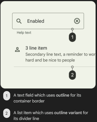
Outline: テキストフィールドの輪郭など、重要な境界線に使用されます
Outline Variant: divider要素など、装飾用として使われます
OutlineとOutline Variantはコントラスト要件が異なるため、適切に使い分けが必要です。 カードや異なる複数の要素の境界線としてはOutline Variantを使用するべきで、逆にchipの集合要素やinput要素など 明確に区分する必要があるものに対してはOutline色を用いるべきとされています。
各役割の色そのものはどう決める?
ここまで見てくると、それぞれの要素に対してどういう役割の色を当てれば良いかの指標が分かってきました。 配色に迷う時間が減りそうです。
では、そもそもの色はどう決めていくのが良いのでしょうか。 Primaryに対してSecondaryだったりSurfaceだったりを一つ一つ考えていくのは大変そうです。
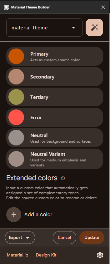
M3ではFigmaの拡張機能として「Material Theme Builder」が提供されています。 https://www.figma.com/community/plugin/1034969338659738588/material-theme-builder これを使うことで、自分で決めたPrimaryカラーをもとに上記のそれぞれのColor Roleに応じた色の定義を自動で生成することができます。
CSSやJSON形式でエクスポートできるので、時間をかけず色を決め それらを効率的に使うことができそうです。
ここまでMaterial Design3の色にフォーカスを当てて内容をまとめてみました。 これまで配色に迷うことも多かったですが、Roleをもとに考えていくことで違和感の少ない選択ができるようになりそうです。
色以外のM3の要素についても引き続き掘り下げていこうと思います。
0 notes
Text
A (not so) detailed post about the current project I'm working on

Bringing here a slightly more extended version of my post from bluesky.
Please be nice because I might have one more thing to share with TGCF fandom.
I want to make a short visual novel featuring hualian in post-canon. Emphasis on "want to" because with a project of this scale I can't guarantee that it'll end up as a fully finished thing.
The original idea behind me starting this was simply "hualian having a wholesome day", though the mood slightly shifted towards something a bit more melancholic after I picked up a poem after which I named the game. (The poem's "Spring morning" by Meng Haoran). There is no continious heavy plot, just various SFW and NSFW routes which aren't connected between themselves (or are they?)
I tried to include different dynamics, so you can expect to see the classics (Top HC/Bottom XL) as well as versatile hualian (these routes can be hidden if someone doesn't fancy it). I also should mention that my understanding of characters and their dynamic can differ from what's considered the "norm" in the fandom, but I refuse to slap OOC label on my work because that's how I perceived these characters while reading the book and I'll be sticking to it. Oh, and I'm also following the revised version so there could be offhand mentions of events from the new extra or other small details like that.
I'm planning to release the final SFW version of the game for free (if it'll be finished at all), though I'm still not sure if I should hide NSFW version behind a paywall. Maybe I'll make one-time purchase posts for intermediate beta-builds too, so people can have a glimpse of what is in the works. Ideally I'd like to have at least some monetary support while working on this project, but providing consistent updates and materials in the patreon format wouldn't work for me, since, aside from commissions to pay my rent, the other project I'm involved with as an artist already takes a lot of my time.
So I can't give any dates and promises and will be simply working on this at my own pace.
So far, I have a complete (not proofread and not fully edited) script for all the routes as well as a working base for the game in renpy. I'm also almost done with UI and I made a couple of backgrounds, but that's nothing compared to how many more of them I still need. (You'll be subjected to looking at the picture attached to the post over and over again at the every start of the game).
For the next step, I'll probably focus on one route at a time and start filling them with visual assets.
I also can't decide whether I should stick to British or American English because:
1) This stupid gaijin can't differentiate between the two anyway.
2) I already started using "arse" yet I lost all the "u"s from my "ou"s and now I don't know which to change.
I'd like to hear which one people prefer more.
If you want to help in some way—I'm having trouble with sound design part as I'm locked out of purchasing anything from international sites/commissioning someone from overseas, and I don't want to risk commissioning assets for a NSFW lgbt game from anyone local since it' simply not a safe move. If you know any good resources that distribute sfx/sounds/music under a free flexible license please share! I'm using GDC royalty free archives but this obviously doesn't cover all my needs.
Idk what else to say here. Send help? Prayers for my sanity? Donations so I can pay my rent??? God, what am I even doing.
Here's the assortment of some early wips I already shared elsewhere:


95 notes
·
View notes
Note
what’s your fav bloom and rage outfit/style choice for the girls? Also is any of the specific characters look your fav?
I can't choose just one! Now that DN is uploading their Artstation portfolios, these are really easy to share as well.
For Kat, I love her second casual outfit. I love the cutoff overall shorts with the oil stain, which implies she repurposed old overalls into shorts. I love the bandana to get her hair out of her face but also adds a cute girlish touch. I love her purple t-shirt with star motifs. It's just an overall fun outfit for a kid who wants to have a good time outside.

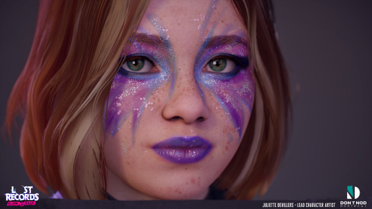
I love all the concert outfits and how very over-the-top, 90's riot grrrl they are. Swann's glam makeup look is my fave though for how the colors complement the others' while still feeling distinctly Swann with the moth shape. Also, purple lipstick! And GLITTER!
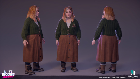
Adult Nora as a whole both intrigues and saddens me, because compared to how enthusiastic and excitable she was as a teen, it's so much more difficult to get on her good side as an adult. Her avoidant tendencies are much more pronounced and her overall monochromatic look is so much more conformist and generic than her wild teen self. She's literally wearing business casual when reuniting with her friends. Girl, you're at a bar!! Still, I love her overcoat. I love a good winter peacoat, it's so timeless and looks great on all genders.

I also like Autumn's second casual look as a teen. It's so funny how 90s and Y2K fashion is making a comeback with today's teens, because Autumn's outfit wouldn't look out of place in 2025. She really nailed the fashion rule "baggy top and tiny pants OR tiny top and baggy pants" to a tee! Her crop top contrasting with sweatpants conveys "I'm a confident, sporty, skater gal who also is down to laze on the couch with video games." The skeleton design adds a cool, slightly edgy touch to her normally very cautious and serious personality.

The "riot" masks that the girls wear during their raid on the ranch goes SO hard, but I love how it still has that slight amateur, teen crafter look to it. I love the thought of Nora staying up all night to design the perfect themed mask for each of them and how all the protagonists have an artsy, nerdy side to them. They're definitely well-made masks, but they have visible uneven stitches, streaks of paint, and the textures suggest cheap materials. But it amazes me how DN went the extra mile to enhance the visual language of the game with this rougher, DIY look.
All the girls have their own handwriting, and it's consistent. Swann leaves doodles and old homework assignments all over her room, and they were clearly hand drawn by an artist at DN and have realistic imperfections like stains and scribbles. Kat's journal is a generic composition notebook that she covered in personalized stickers and slogans. When Kat mentioned the Bloom & Rage stickers I thought, "That's weird, when did she have time to design and print her own?" But then you see them, and of course they're not custom designed stickers, but just dollar store stickers that she wrote "BLOOM & RAGE" on with marker. The girls make do with what they have, and it just adds this really nice cohesive, charming look to the whole thing. Especially compared to (again, sorry) Max's journal in Double Exposure with these cartoony, borderline stock image drawings and such boring, corporate UI all over the game.
But perhaps my favorite outfit is adult Swann's. It just looks SO cozy and SO comfy and SO her, exactly what a girl like her would wear by middle age. I bet the artists at DN pulled up Goblincore moodboards and said "That's it! That's our main girl!" She wears those earth tones beautifully. When Double Exposure was revealed, I was disappointed that (AGAIN, I AM SORRY!) Max seemed to be generically prettied up with feminine adult clothes of all random colors that didn't distinguish her from any other young working professionals her age. But what I love about Swann's adult look is that coupled with the fact that she learned to love herself as she aged, her 2022 outfit so clearly conveys that confidence and self-love. The overall silhouette hasn't changed (I bet Swann cried with joy when the low-rise jeans trend of the 2000s finally died off 😂), she still has her high-waisted clothes and backpack. But her visual evolution communicates way more narratively than Max's look in DE; Swann's outfit actually says something. At one point, adult Swann reveals, "I didn't feel like I was the type of girl who was 'allowed' to be into sexy, girly stuff." Aka, fashion choices that society said she wouldn't look "conventionally attractive" in due to her weight. So when we finally see her at the end of the game, it's extra rewarding to notice the longer hair, makeup, nail polish, jewelry, and skirt, which all wonderfully communicate that Swann has embraced her queerness, femininity, and inner and outer beauty as a plus-sized woman. I love Swann's character arc so much. Also, her tattoo is fucking sick.

Thank you for asking!! Dontnod (Juliette, Ricardo, Sam Bradley, and the rest of the art team) seriously knocked it out of the park with these character designs and the overall look of the game.
#I love them so much I love them so much!!#lost records bloom and rage#lost records: bloom & rage#lost records#lost records bloom & rage#lost records: bloom and rage#swann holloway#nora malakian#kat mikaelsen#autumn lockhart#lost records swann#lost records nora#lost records autumn#dontnod#juliette devillers#ricardo madariaga#dontnod montreal#my post#anon#answered asks#lrbr
59 notes
·
View notes
Text
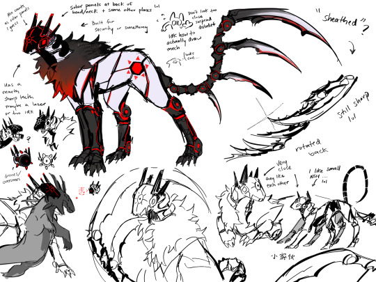

More of them,, but they’re robot cats this time lol… I’ll draw Moon and Pebbles soon, and some others maybe
I’ll do anything but actually draw them as Iterators apparently
Don't look too close, Ive never drawn such mech heavy designs until now...I don't know what I'm doing. I got a little more confident with NSH but I was absolutely just going blind with Suns. It took me 2 days to figure out how I wanted to start with Suns...
Some background info dump of them for this? Au??? Idk yet lol, under the line if interested
Erhm. Set in a post apocalyptic world, much like how Rain World actually is. Alternative timeline where iterators don't exist?? Failed??? The ancients have not yet ascended?? Maybe??? Idk the details are still blurry to me also 😞. They are in a high security lab facility ground type setting. (Perhaps just an excuse for me to draw apocalyptic higher tech designs????) It is cold outside, some failed iterator structures still produce rain, and occasionally the air may become toxic.
Suns is an offensive/surveillance model meant for fighting and protecting as one can probably tell with his tail blades. It folds back in an attempt to make it less dangerous and also functions as a way to swiftly cut into something if needed. They are the only one of them (excluding Pebbles for special reasons) to be equipped with a mouth hiding sharp teeth and/or lasers for even more attack prowess. They are also still huge. Sorry I run with the huge Suns agenda. He is a tower. Easily wrestles most lizards. I still like the idea of fluffy Suns, so he still has it as a robot cat. Some insulation for the colder outside temperatures, he's outside a lot. Suns is not built to be friendly. Mostly acts and behaves as an unassuming robot early on.
Moon and Suns were the first properly functional/successful projects. They were edited and reconstructed a lot from beginning to now. Maybe they were both originally purposed as therapeutic companions.
The overseers are little drones that fly around. They still project things and are still sometimes unhelpful with directions, follow at your own discretion. The lizards and predators mostly ignore them as well. They do recognize the different drones with time. They've learned to recognize NSH's drones, which sometimes might contain some edible collected material, so they do occasionally try to eat those. And most of the smaller predators try to leave the area if they see Suns' drones.
NSH is closer to a pet model. He is made for reconnaissance and scouting. He is still tiny because I like him tiny, he's adorable. NSH has three pairs of legs for rough terrain traversal, and is a fast little guy. He helps in collecting samples and materials from the outside, marking maps, as well as finding viable safe spots/shelters. He has no mouth but has a component in his chest where he can collect small samples, as well as storage units in his drones to store excess. He has small vials of decontaminate fluid to clean any samples he collects, they have to be refilled occasionally. Also, as mentioned in the art, he can open his neck and chest area and just swallow bigger samples. He can even keep them alive inside him if he wants to. Otherwise, they're killed and turned into power for him to use. Sometimes he finds lizards with cool patterns and tries to swallow them to show Suns, who oftentimes will kill it afterwards.
He was the experimental project for emotive programming alongside Unparalleled Innocence/UI, hence his fully functioning screen as a face. As opposed to Suns, who functions more as a security camera. I think NSH and UI are both similar in the more playful/chaotic personalities, so I decided for them to be created around the same time and put into the same testing. Overtime, UI did not respond very well and was repurposed (She's not gone). Emotive sentience was programmed into NSH first and then tested on Moon. It was generally successful in both cases. NSH really enjoys messing around and can even imitate his fellow iterators faces. It works really well temporarily scaring predators using Suns' color markings lol.
Because NSH and Suns are both outside often, they have solar panel components in their design for extra power. The two of them are very close because of their shared experiences. NSH likes the outside more, Suns has little opinions of it. They worry about NSH because he's so small and curious and occasionally brings back dangerous things.
Suns is a little bit of an outcast here because of his difference in role. He is mostly left to roam and function on his own/not approached as he carries his role. The others are research focused and Suns is more obviously purposed for battle, so there is a little bit of a divide. Not to mention, he technically does not have the programming for emotions that Moon and NSH have. Suns does learn on his own though :D, some of it is learned from NSH too
I will leave it here for now. I will probably talk more about Moon and Pebbles for their own post. And the others as well. I'm still thinking about their designs though.
Erhm hopefully this makes sense somewhat and was at least a fun read.
#rain world#seven red suns#no significant harassment#caterator#rain world au#rw downpour#rw iterator#rw srs#rw nsh#raintarts#they're robot cats#i have some thoughts#jumbled thoughts#but they're thoughts#i dont really know how tech stuff works#hopefully this makes sense#i just like thinking about them#nsh has 6 legs and antennas#is he an insect#hes tiny#hes effectively an insect
108 notes
·
View notes