#Accessibility in Design
Explore tagged Tumblr posts
Visit Tumblr Blog
Explore Tumblr blogs with no restrictions, modern design and the best experience.
Last Seen Tumblr Blogs


Fun Fact
Tumblr has 16.74 million mobile monthly users in the US.
Text
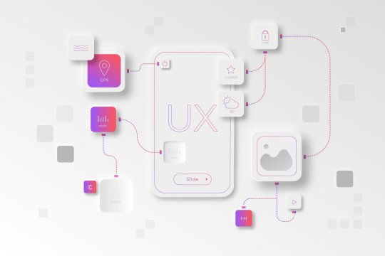
The Evolution of UI/UX
From Skeuomorphism to Neumorphism & Beyond

User Interface (UI) and User Experience (UX) design have undergone a remarkable transformation over the years. From the early days of skeuomorphism to the sleek, modern neumorphism, the way we interact with digital interfaces continues to evolve. In this blog, we explore the history, key transitions, and the future of UI/UX design.
For more design insights, visit our UI/UX blog collection.
The Era of Skeuomorphism: Making Digital Feel Familiar
What is Skeuomorphism? Skeuomorphism is a design approach that mimics real-world objects and textures to make digital interfaces more intuitive. This style was widely used in the early days of computing and mobile apps.
Key Characteristics:
Realistic textures and shadows (e.g., leather-bound calendar apps, glossy buttons)
3D effects and depth
Gradients and detailed illustrations
Why It Was Popular: Skeuomorphic design helped users transition from physical to digital interfaces by offering a familiar look and feel. Early Apple iOS interfaces exemplified this approach.
Downfall: As mobile-first design became the norm, these visuals began to feel outdated and cluttered.
The Rise of Flat Design: A Minimalist Revolution
What is Flat Design? Flat design focused on simplicity and usability by eliminating 3D effects and textures.
Key Characteristics:
Clean, minimalist layouts
Bold colors and sharp edges
Simple, legible typography
No shadows or depth
Why It Became the Standard: With better performance and mobile responsiveness, companies like Google and Microsoft embraced flat design, helping it become mainstream.
Material Design: Adding Depth Back
What is Material Design? Material Design by Google blends flat design with depth and motion to create more intuitive interactions.
Key Characteristics:
Soft shadows and layering
Card-based structure
Fluid animations
Emphasis on usability and feedback
This hybrid approach improved UX without sacrificing performance.
The Neumorphism Trend: A Fusion of Old and New
What is Neumorphism? Neumorphism, or “New Skeuomorphism,” combines depth and simplicity, giving UI components a soft, tactile appearance.
Key Characteristics:
Embossed look with soft shadows
Muted color palettes
Minimalist yet interactive elements
Rounded corners and subtle gradients
Why It’s Trending: Neumorphism aligns well with dark mode, reducing eye strain and enhancing modern UI elements. However, it faces criticism over accessibility and contrast limitations.
Beyond Neumorphism: The Future of UI/UX
The future of UI/UX is shaped by emerging technologies and evolving user expectations:
Glassmorphism: Popularized by macOS and Windows 11, it adds frosted glass effects and layered transparency.
AI-Powered Design: Adaptive interfaces using AI in UX to anticipate user needs.
AR & VR: Transforming navigation, e-commerce, and gaming with immersive experiences.
Sustainable & Ethical Design: Prioritizing accessibility, energy efficiency, and inclusive digital experiences.
Final Thoughts
UI/UX design has evolved from skeuomorphic realism to flat simplicity, material fluidity, and now to neumorphic softness. As technology and user behaviors continue to change, designers must focus on creating digital products that are not only beautiful but also intuitive and inclusive.
Stay ahead of the curve—explore more on Pixelizes for design trends, resources, and tips that shape the future of UI/UX.
#UI Design#UX Design#History of UI/UX#UI/UX Trends#Design Evolution#Skeuomorphism#Flat Design#Material Design#Neumorphism#Glassmorphism#AI in UX#AR/VR in Design#Future of UX#Ethical Design#Sustainable UX#Accessibility in Design#User-Centered Design#Visual Design Trends#Minimalist UI#Interaction Design#Web Design#Mobile UX#Creative Inspiration#Digital Interfaces#Design Thinking
1 note
·
View note
Text
Unpopular opinion: All games should have the option to enable pausing.
And to save almost everywhere.
Yes even in soulslike games.
I am an adult who has a full time job and responsibilities. I get to play maybe an hour a week. I do not want to lose that hour of progress because devs decided 'pause' was not allowed in their game and I had sudden unexpected things come up that meant I had to quit the game without saving/leave it playing and hope enemies wouldn't respawn.
Also it would massively increase accessability. I have fully working non-injured hands and they still need a break after a tough boss fight. I can't imagine how frustrating it must be for people with joint pain, arthritis, etc, etc.
#gaming#accessability#a solid portion of games these days are 18+#so they should be designed remembering that most 18+ people do not have hours every week to do nothing but game#I am in a loquacious mood tonight
43K notes
·
View notes
Text
Playing one of those Backrooms-inspired liminal horror games and my first sign that I've passed into some unnatural realm is that there's way too much accessible public seating.
#gaming#video games#backrooms#liminal horror#game design#accessibility#hostile architecture#ableism mention
2K notes
·
View notes
Text
UI/UX Principles
UI/UX Principles are fundamental guidelines governing both User Interface (UI) and User Experience (UX) design. They dictate how visual elements and interactive features should be designed to optimize user satisfaction!
#https://www.techaheadcorp.com/blog/best-ux-design-practices/#ux design#user experience#design best practices#ui/ux principles#mobile app design#web design guidelines#user-centric design#interaction design#usability tips#human-centered design#responsive design#user interface design#ux research#prototyping#wireframing#accessibility in design#visual hierarchy#information architecture#design thinking#mobile app usability
0 notes
Text

Museum staff push for all-gender restrooms
The [Manchester] museum’s new restrooms don’t just appeal to trans and gender-nonconforming visitors, though, Davies told Hyperallergic. They also feature baby-changing spaces and three different types of accessible toilets, including a “Changing Places” toilet, equipped with a full-size changing bench and hoist so people with limited mobility can use the restroom or have their continence pad changed.
“By combining these facilities under the All-Gender Toilets, visitors and families of any combination of disabled, neurodivergent, trans, and nonbinary identities can use the same facilities,” [Mattie] Davies explained.
#queer culture#trans activism#accessible design#i know it means a baby-changing station#but the men sign with a baby makes me chuckle#BABY MAN SELF-IDENTIFIED
932 notes
·
View notes
Text
a part of me goes out to all the monsterfuckers who are surely missing the old design. a bigger part of me is gay
#“where have you been lem” i've been playing hades 2#they dropped the early access a few days before my exam session concluded its like a gift for me specifically#ermmm anyways chaos design got me feeling things sorry#i tried to make them look as cool and regal as they do in the game i hope i did them justice#hades game#hades 2#chaos#hades 2 spoilers#fanart#art
5K notes
·
View notes
Text
THE ACCESSIBLE DESIGN SURVIVAL GUIDE: OUT NOW!
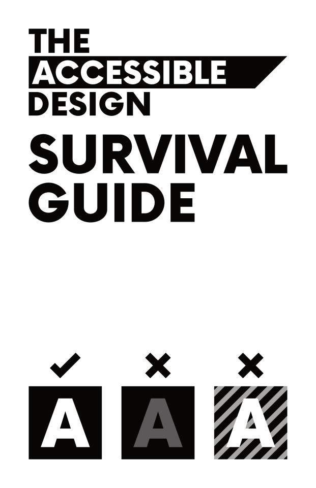
My zine covering accessible design basics is now free on itch!
If you'd like to start making your work more accessible for everyone— check a look, download it here!
Please share this with anyone you know who makes flyers for key events like protests and fundraisers, especially! We want to make sure these things are successful— and accessible design will help with reach!
5K notes
·
View notes
Text
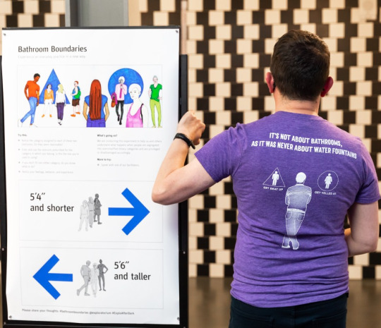
ONCE AGAIN LOOKING FOR FEEDBACK FROM WHEELCHAIR USERS! 💖♿😎
TL;DR - These are newly proposed blueprints for renovating the basement of an incredibly cool queer/BIPOC-run affordable housing co-op in my city, with the aim of creating an ACCESSIBLE community space and mutual aid hub!
If you have a moment, please take either a quick or a long look at these images, and let me know what stands out to YOU as good/bad/missing/in-need-of-change! Or just let me know what you need in a public space in order to feel welcome, especially as it pertains to wheelchair lifts!
ANY amount of feedback is so, SO appreciated!! ☺️
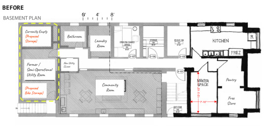
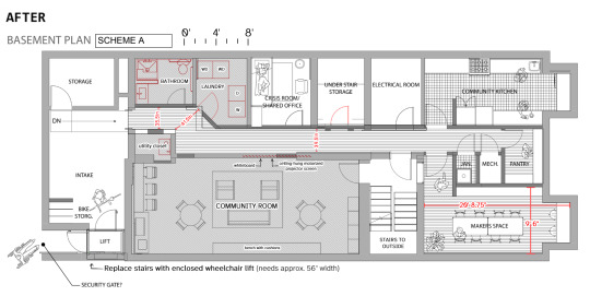
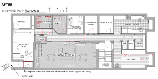
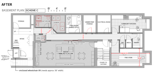
More (optional) detail, if you want:
I have one "BEFORE" blueprint, and three updated proposal blueprints for what the space could look like AFTER renovation.
In the long-term, the co-op is planning to install an elevator to serve all 5 floors of the building, including the basement. But in the short-term, with their current funding, the plan is to install a wheelchair lift that goes from outside the first floor, down to the inside of the basement.
The "AFTER" blueprints include widening the hallways by several inches.
I am going to recommend a changing table for the bathroom; ideally, an adult-sized changing table. Idk yet if they can afford to remove the shower that's there now.
I am also going to double-check with the designers that all the proposed door widths are wide enough for a large wheelchair to get through. In this current scale, several openings appear to be too small.
The goal of the community space is to provide a mutual aid hub - providing food, supplies, space to meet, and emergency preparedness for the community!
Thank you very very much!! :)
- Jack
#wheelchair user#wheelchair#mobility aid#wheelchair life#actually disabled#cripplepunk#motorized wheelchair#electric wheelchair#wheelchair users#wheelchair users of tumblr#wheelchair girl#wheelchair access#accessibility#accessible design#accessible living#accessible travel#original#accessible transport#wheelchair lift#cripple punk#crip punk#cpunk#physically disabled#actually physically disabled#disability
800 notes
·
View notes
Text


Outlaws in the Wild East ⋆。°✩
(AKA, The Habanero origin comic!)
#undertale yellow#uty#uty au#lucky clover au#uty ocs#starlo uty#clover uty#ed uty#ace uty#mooch uty#moray uty#feisty five uty#the cowboy hat draws#Here it is.... the self indulgent comic establishing my UTY OCs#I never know what to put on the caption for these comics#These must be so confusing to stumble upon out of context if you don't follow me LOL#The little boar guy is a reference to Starlo's earliest design! The cactus guy is. Just a cactus guy LOL#And of course Habanero is my silly scrunkly I'm really glad people like him!#I tried to ride that line of showing that the Feisty 5 are capable when they need to be#Buuuut they're still goofy LARPers even when they're catching real thieves#Hopefully I didn't make Starlo come across too cool he's still a dork LMAO#The formatting is hell because I still cannot figure out how to format comics for Tumblr LOL oh well!#I forget everything I wanted to put in the tags on this post#Next comic will be more accessible and focus solely on the UTY characters I promise! This was more of an experimental comic
463 notes
·
View notes
Note

How does this sink in the employee bathroom where I used to work make you feel?
a sink perfectly designed to piss in, that's impressive
535 notes
·
View notes
Text
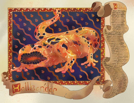
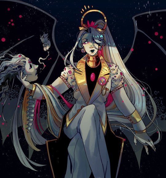
Misfits & Magic Bestiary Entry 1: Hellbender
#misfits and magic#dimension 20#mismag#misfits and magic season 2#mismag 2#Whitney jammer#k Tanaka#Sam Britain#evan kelmp#aabria iyengar#brennan lee mulligan#daniel radcliffe#lou wilson#erika iishi#artists on tumblr#procreate#accessible art#illustration#queer artist#trans artist#monster#monster art#monster design#creature design#fantasy#fantasy creature#beastiary
835 notes
·
View notes
Note
You draw the cutest Glinda and Elphie I've ever seen

It’s cause they’re cuties and I gotta capture it 😊
#fooze#thank you so much! I’m glad you guys are enjoying my take on the goobers#wicked fanart#wicked#wicked the musical#wicked the movie#gelphie#glinda upland#elphaba thropp#shh don’t squeal too loud you’ll wake Elphaba#Glindas ears are biologically designed for easy access to elphaba kisses#I like to think that after ozdust these two forever share Glindas bed and every bed after that#cough train cough
452 notes
·
View notes
Text
Look, there's a lot to be said about the contemporary gaming industry's preoccupation with graphics performance, but "no video game needs to run at higher than thirty frames per second" – which is something I've seen come up in a couple of recent trending posts – isn't a terribly supportable assertion.
The notion that sixty frames per second ought to be a baseline performance target isn't a modern one. Most NES games ran at sixty frames per second. This was in 1983 – we're talking about a system with two kilobytes of RAM, and even then, sixty frames per second was considered the gold standard. There's a good reason for that, too: if you go much lower, rapidly moving backgrounds start to give a lot of folks eye strain and vertigo. It's genuinely an accessibility problem.
The idea that thirty frames per second is acceptable didn't gain currency until first-generation 3D consoles like the N64, as a compromise to allow more complex character models and environments within the limited capabilities of early 3D GPUs. If you're characterising the 60fps standard as the product of studios pushing shiny graphics over good technical design, historically speaking you've got it precisely backwards: it's actually the 30fps standard that's the product of prioritising flash and spectacle over user experience.
4K notes
·
View notes
Text
User Experience

Crafting Exceptional Experiences: Best UX Design Practices Unveiled
In the ever-evolving landscape of technology, creating a seamless user experience (UX) is paramount, particularly for e-commerce websites and apps aiming to drive conversions. Therefore being aware of the best UX design practices is crucial. The significance of UX resonates throughout the entire customer journey, influencing everything from the initial click on the homepage to the ultimate order confirmation. Overlooking established UX best practices can jeopardize this seamless journey, potentially leading to missed sales opportunities. In this comprehensive guide, we delve into the realm of UX design, offering insights into the best practices curated by the expert team at TechAhead.
What Is UX Design?
User Experience design is more than just a process; it's a strategic approach that design teams employ to create products that resonate with users on a profound level. It involves a holistic design encompassing the entire journey, from the first interaction to the final integration of the product. In conclusion, UX design is the art and science of making products not only usable but also meaningful and relevant. UX design spans various dimensions, including branding, aesthetics, usability, and overall functionality. It's not limited to the digital interface but extends to all touchpoints associated with the product.
From the enticing allure of a marketing campaign to the practicality of after-sales support, every facet contributes to the user's overall experience. For UX designers, cultivating familiarity with these best practices is essential. This knowledge not only helps steer clear of common pitfalls but also elevates the customer's perception of your brand. Let's explore the key UX design principles every designer should be well-versed in.
Key UX Design Principles Every Designer Should Know
1. Deep Understanding of User Needs
Creating a seamless user experience starts with a profound understanding of user needs. You can conduct user research, user testing, and usability testing in order to gain insights into your audience and get a deep understanding of various touchpoints.
2. Design Consistency for Visual Appeal
Visual elements and design consistency are more than aesthetic choices; they impact user satisfaction. Users expect a seamless and visually consistent experience from the landing page to the last interaction.
3. Streamlined User Flow and Learning Curve
Optimize user flow and minimize the learning curvature. A well-thought-out design process ensures that users can intuitively navigate your website or app, reducing friction and enhancing satisfaction.
4. Embracing Mobile Responsiveness
In a world dominated by mobile users, prioritize mobile apps and ensure your design caters to the needs of iPhone users. Design elements should offer a consistent and visually appealing experience across different touchpoints.
5. Prioritize Accessibility Standards
Inclusivity is key. Adhere to accessibility standards, considering users employing assistive technologies like screen readers. Designing with accessibility in mind ensures that your platform is usable by a diverse audience.
Now let's delve into the UX Design best practices that should be followed in your UX design process.
Best UX Design Practices
In the dynamic landscape of digital design, ensuring that your product resonates with everyone is not just good practice—it's a fundamental principle of design ethics. As we delve into the realm of UX design, we uncover practices that go beyond aesthetics, focusing on creating inclusive and seamless experiences for users from all walks of life.
1. Prioritize Accessibility Standards
Good design should work for everyone, including those with sight and hearing disabilities. By conforming to accessibility standards in your UX practices, you're not just complying with guidelines but uplifting the user experience for a diverse audience. Consider the 8% of colorblind men—this seemingly small percentage translates to over 26 million American men. Empathy drives the design process, ensuring your product or site is accessible.
2. Keep it Consistent Across the Board
Consistency is the bedrock of UI/UX best practices. Whether it is design consistency or visual consistency, it isn't just about aesthetics; it's a strategic decision that limits confusion, builds trust, and reinforces your brand. Whether it's visual elements, functional controls, or the tone of your messaging, maintaining consistency ensures users can navigate your UI effortlessly. The various UX design elements from visual to functional elements, and even the voice and tone of your product, consistency makes the user experience predictable and intuitive.
3. Monitor User Behavior and Eliminate Friction
Your ideal user flow is the blueprint for an exceptional user experience. However, deviations from this flow can signal friction points in your design. Tools like heatmaps and session recordings become your eyes on user behavior. Identify pain points, remove blockers, and enhance the user journey. It's not just about designing a product; it's about refining it based on real user interactions.
4. Optimize the Browsing Experience
The homepage is often the first touchpoint for users. The UX on this page is critical in setting the tone for the entire experience. It should guide users on navigation, introduce categories, or search bar. Learn from common pitfalls and ensure your homepage stands out, builds trust, and establishes credibility.
5. Streamline Navigation Paths
Clear navigation is your users' GPS through your website or app. It informs them of their location, your site's content, and how to find what they're looking for. Well-thought-out navigation not only lowers frustration but also instills confidence in users. Make it user-friendly, ensuring your customers can effortlessly traverse your digital space.
6. Prioritize Mobile UX for All Users
With over half of all website traffic coming through mobile, responsive design is no longer a luxury—it's a necessity. Responsive designs look good on all screens, load faster, and rank higher in search engines. A poor mobile experience can impact your bottom line significantly, making it essential to optimize for mobile users.
7. Streamline the Checkout Process
The checkout process is a critical element of UX often overlooked. Complex checkout flows contribute to abandoned orders. Streamline the process, make it user-friendly, and conduct testing to eliminate roadblocks. A seamless checkout experience can significantly impact conversion rates.
8. Design Hierarchy for Visual Clarity
Establishing a visual hierarchy in UI design elements ensures users find primary functions faster. A clear hierarchy guides the user's attention through the interface, whether it's the size, colour, or placement of elements. Presenting functions in a logical order enhances the overall user experience.
9. Use Clear Navigation Tools
Users have pre-established behaviors and expectations. Sticky headers, search bars at the top, organized drop-down menus, and familiar page structures all contribute to a positive user experience. Align your navigation with user expectations to create a seamless journey.
These UX best practices are crucial for product managers, and the design team must inculcate these in their design process. These UX design best practices will enhance the user experience and help standardize the UX design process.
Mistakes for every UX Designer to Avoid
In the ever-evolving landscape of product development, pursuing an exceptional user experience (UX) can be riddled with common pitfalls. Let's unravel these challenges and explore how product teams can sidestep the most prevalent mistakes in UX design.
1. Failing to Prioritize User-Driven Decisions
The Mistake: It's easy for product teams to lose sight of the end-users needs, assuming that they inherently understand those needs. However, this assumption can lead to misguided product decisions.
How to Avoid It: Actively seek user feedback and let it steer your product decisions. Embrace user perspectives to validate features on your roadmap and ensure alignment with actual user needs.
2. Aimless Redesigning
The Mistake: UX design is iterative but constant and unnecessary redesigns can unsettle users. Change, even if beneficial, may be met with resistance.
How to Avoid It: Redesign with Purpose. Clearly define goals and establish a business case before embarking on any redesign. When changes are necessary, keep them small and iterative, incorporating user feedback through testing.
3. Neglecting Testing Before Iteration
The Mistake: Assuming you know what users need without thorough testing can lead to misguided design decisions.
How to Avoid It: Testing is crucial, especially during prototyping. Before launching iterations, conduct thorough testing, gather feedback, and iterate based on user insights.
4. Overwhelming Users with Information
The Mistake: Providing users with too much information, options, or features can overwhelm and hinder the overall user experience.
How to Avoid It: Embrace simplicity. If a feature or element isn't essential, consider omitting it. Avoid overwhelming users to ensure a seamless and focused experience.
5. Siloing UX Decisions Within the Product Team
The Mistake: Isolating UX decisions within the product team can lead to inconsistencies across the entire user experience.
How to Avoid It: UX design requires collaboration across teams. Work hand-in-hand with marketing, support, design, and other teams. Share user data, collaborate on design changes, and maintain open communication.
In the intricate realm of UX design, these pitfalls are roadblocks that can hinder product success. Product teams can carve a path toward a seamless and delightful user experience by actively avoiding these mistakes and championing a user-centric approach. At Techahead, we emphasize design and a holistic approach to crafting digital experiences. Explore our services and join us in creating user-centric design solutions that stand the test of user expectations.
Conclusion
From the initial interaction to the final confirmation, the user experience orchestrates a symphony of impressions. Neglecting established UX best practices can unravel this symphony, resulting in missed opportunities. In this guide, we've navigated through the core principles of UX design, exploring the essentials and unveiling the best practices curated by TechAhead's expert team. From a profound understanding of user needs to embracing mobile responsiveness and prioritizing accessibility, each practice is a thread woven into the fabric of seamless user experiences. Furthermore, we've dissected the pitfalls—common mistakes that can derail UX design initiatives. Product teams can fortify their journey toward exceptional UX by prioritizing user-driven decisions, avoiding aimless redesigning, and fostering cross-team collaboration!
youtube
#https://www.techaheadcorp.com/blog/best-ux-design-practices/#ux design#user experience#design best practices#ui/ux principles#mobile app design#web design guidelines#user-centric design#interaction design#usability tips#human-centered design#responsive design#user interface design#ux research#prototyping#wireframing#accessibility in design#visual hierarchy#information architecture#design thinking#mobile app usability#Youtube
0 notes
Text

And it was forever known as 'The Great Tea Spilling Incident of Cybertron'...
Secret Solenoid for @bonehearts !
#transformers g1#powerglide#moonracer#secret solenoid 2024#who tf gave Astoria the access#she probably bullied Megatron to make Shockwave tap in#in a futile attempt to distract Powerglide tells all the relationship things from Earth except his own#vaguely art nouveau armor designs brought to you by weird thoughts at 3 am
422 notes
·
View notes