#Minimal UI
Explore tagged Tumblr posts
Visit Tumblr Blog
Explore Tumblr blogs with no restrictions, modern design and the best experience.
Last Seen Tumblr Blogs


Fun Fact
Tumblr was named as a finalist in Lead411’s New York City Hot 125 in Aug 2010.
Text
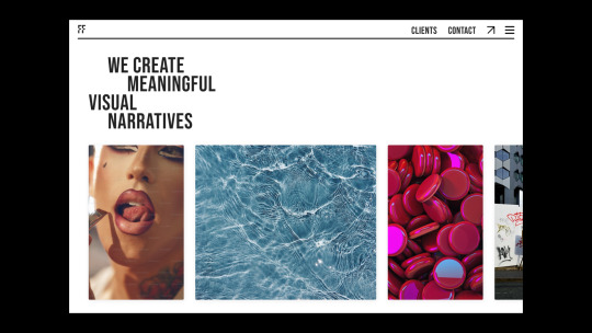
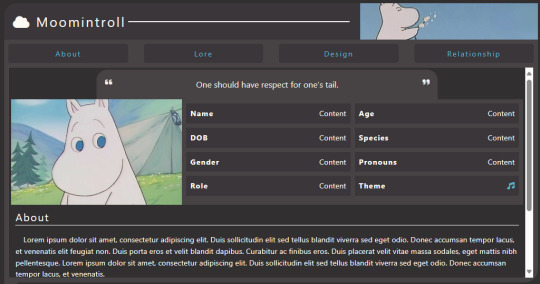
Potatoes & Dreams
🧩 Author: PinkDoggy 🔗 Code Link: (F2U) Potatoes & Dreams on Toyhouse 💠 Use Type: Free to Use (F2U) 📄 Purpose: Character Profile 📝 Description: A cozy, tabbed character profile layout featuring a minimalist cloud-themed header and a dark interface. Includes sections for about, lore, design, and relationships, with a dedicated sidebar for images, quotes, and key details. Ideal for soft-themed characters, slice-of-life worlds, or whimsical OCs inspired by cartoons or storybooks.
📷 Previews:
#toyhouse code#character profile#f2u#tabbed layout#soft aesthetic#storybook theme#minimal UI#cartoon OC#cozy profile#simple design#pinkdoggy#charactercodes
1 note
·
View note
Text
Maximizing White Space: Clean & Modern Web Design Tricks:
White space isn't empty—it's powerful! Learn how to use strategic spacing to enhance readability, focus, and elegance in web design. A quick tip-packed short for designers looking to create clean and modern websites!
Looking to for a developer to create a website, hire him here!
#White space in web design#minimal UI#clean layouts#modern website aesthetics#web readability#design focus#user-friendly web design
0 notes
Text
تحميل تطبيق Minimal UI لتثبيت لانشر السحاب على هاتفك الاندرويد
تطبيق Minimal UI for KLWP هو أداة رائعة لمستخدمي الهواتف الذكية التى تعمل بنظام تشغيل Android الذين يسعون لتحسين واجهة مستخدم هواتفهم بأقل جهد ممكن وبأعلى درجة من الأناقة والبساطة، هذا التطبيق مصمم خصيصًا لمنصة Kustom Live Wallpaper (KLWP)، والتي تتيح للمستخدمين إنشاء خلفيات حية مخصصة بشكل كامل. تحميل تطبيق Minimal UI لتثبيت لانشر السحاب على هاتفك الاندرويد عن تطبيق Minimal UI: مع تزايد…
0 notes
Text
#motion graphics#art#graphic design#animation#scifiart#scifi art#cyberpunk#scifi#cyberpunkart#digital art#typography#type design#minimalism#futuristic#ui#ui design#uidesign
616 notes
·
View notes
Text

GOOD or BAD day? 😇 Typography design
Get your unique & creative logo now!
PM for details & reservations! 💌
🙏🧡
#good#bad#ocean#sea view#water#typography#logotype#smart#minimalism#geometric#artwork#ui ux design#business#company#marketing#luxembourg
106 notes
·
View notes
Text
I love how every website and software maker are doing circle and sqircles to try and feel "natural" or whatever B.S. excuse they're trying to justify cheap, assimilative design with.
And then there's Pinterest who's just like, "Fuck it. We're doing squares again." And tbh? It's a good look for them. If only Pinterest hadn't devolved into A.I. Slop central, it would actually be a pretty nice place to use.
2 notes
·
View notes
Text
ok i REALLY need to give my eyes a rest what the freak they are so dry
#even phigros doesnt give me this much trouble. i guess thats a different thing since its quite literally the definition of minimal ui#UNBEATABLE could use more accessibility in its option settings i stand by this
2 notes
·
View notes
Text
I'm not one to use strong words but holy fuck pinterest I fucking hate your update and I'm certainly not the only one. fix your shit
I was willing to put up with the ads but seriously. change. it. back. No one likes it, and people are going to stop using the website.
#If y'all don't know pinterest fucked up their ui#can someone make a similar website with minimal ads and a functional format please and thank you#pinterest#pinterest update#I really came out swinging with this one#it kinda sounds harsher than I feel but it needs to be said
2 notes
·
View notes
Text

2 notes
·
View notes
Text
okay who is the buffoon that thought it was a good idea to change the home screen of twitch, a long video based app, to the ui of tiktok which is based on short videos
#twitch#cant see followings immediately cant minimize vods on home greater battery usage great job clowns that's the worst anyone's ever done it#👹👹👹👹👹👹#literally TWITCH is literally the worst app that could implement tiktok ui they are actually so stupid i am baffled 😭😭#installed p*rpletv. fucks
2 notes
·
View notes
Text
the beatmaps are gonna take a WHILE to get used to, especially with how jarring it is to swap between jp and global lol. probs gonna prefer the shiny og notes for a good while,,,
the ui on the other hand... MAN...... IT'S SO GOOD I LOVE IT SO MUCH... THE DETAILS WITH IT ALL BEING ON A PHONE BC THE SEKAIS ARE ACCESSED THROUGH A PHONE AND ALL THE NEW LITTLE ANIMATIONS AND STUFF AND THE COOL TRANSPARENT BACKGROUNDS AND STUFF AND HOW EVERY LEADER HAS THEIR OWN SOLO MAIN MENU SCREEN AAAAAAAAAAA I LOVE IT SO MUCH
#mine#i thought id dislike it being mostly monochrome since the og ui is so colorful but for once the minimalism DOES actually make it look good#like idk it just looks so crisp and fancy and cool and i love it so much man.#they clearly put a LOT of love into it and man does it SHOW... ughgjhfd#proseka#project sekai#proseka spoilers#still dunno how to feel abt the new sounds though... kinda prefer the old sounds but. idk. we'll get used to it ig#also we got to rank 300 on global today. v neat and lit. productive day we are very exhausted gn
7 notes
·
View notes
Text

Tane Bank is a leading financial institution dedicated to providing comprehensive banking solutions and exceptional customer service to individuals, businesses, and communities. Established with a commitment to integrity, innovation, and excellence, Tane Bank strives to be the preferred banking partner for those seeking personalized financial guidance and long-term success. With a focus on trust, transparency, and reliability, Tane Bank aims to empower its customers to achieve their financial goals and realize their dreams
#branding#designer#marketing#graphic design#business logo#brand identity#creative logo#logo design#financial#global#budget#west bank#ui#ui ux design#ux#minimalism#minimal fashion#minimalistic#minimalart
3 notes
·
View notes
Text

#madebywater#art#jordan vitanov#branding#minimal#product#vitanov#brand identity#visual design#ui#design#identity design#interface
2 notes
·
View notes
Text
What are you changing this time, youtube?

This new placeholder appearance before the content proper loads is what I call "testing the waters". Any time a site rolls out a big change, you get stuff like this beforehand, where they change an easily verifyable part of the UI.
My guess would be that they'll change the entire appearance of the site, maybe even going so far as to switching simple light/dark themes to something more gradient (or just generally more shit). Might even be the switch to one theme for everybody, knowing how little google actually cares for any user.
It's been said before and it'll be said again: Websites love getting shittier. It's their favourite thing. I just hope I'm wrong.
#.txt#youtube#UI changes#Though to be fair#if we get back to something colourful like the 90s#and it stays an OPTION instead of being forced#that'd be really cool#I've had enough of fucking minimalism for eons
2 notes
·
View notes
Text
fixed one problem. immediately ran into the next one...
#tütensuppe#daily programming woes. you know how it goes#im building an ui and found an amazingly effective way to build all the subwindows with minimal code!#but.. if you do it like this you can no longer grab the contents of user input fields (of which i have many).#solution: custom event handling! works like a charm!!#next problem: i dont know what all goes into a focusout event handler and now the input fields wont unfocus lol#upd: fixed!! if you intercept an event like this you can just pass it to the original implementation once you did your thing.
2 notes
·
View notes