#Raster Image Files
Explore tagged Tumblr posts
Visit Tumblr Blog
Explore Tumblr blogs with no restrictions, modern design and the best experience.
Last Seen Tumblr Blogs


Fun Fact
In February 2021, Tumblr had 518.6 million blog accounts.
Text
Raster Image Files | Filestack
Raster image files are digital graphics composed of a grid of pixels; each assigned a specific color. Common formats include JPEG, PNG, and GIF. Unlike vector images, raster files are resolution-dependent, meaning their quality is determined by pixel density. They excel at representing detailed and complex visuals but may lose clarity when resized. Raster image files are widely used for photographs and realistic images in digital media, offering a realistic portrayal of visual content.
0 notes
Text
Their is nothing wrong with webp at all. And if you are going to bitch about webp for Google reasons, you need to bitch about webm too, as webp is an image format based directly on webm scene encoding, and both were largely developed by Google.
The *only* issue with webp is that some software has been slow to add webp support. And it isn't clear why. It is not like the case of Apple not wanting to support non-MPEG video formats, which is largely due to them having a big stake in the MPEG patent pools. Nor does it seem to a be principled stand against Google (companies other than Mozilla don't really do principled stands 99.99% of the time, and the 0.01% also has a profit motive tucked inside if you look)(and Mozilla has implemented webp, because there is no real reason not to).
Nor does it seem to be a technical stand. Seems to be just dev laziness/not caring. Of course at *this* point in time they may now be putting it off even longer on the thought that .jxl (jpeg xl) or *possibly* AVIF or HEIC will take over as the dominate image format (jxl seems like the favorite at this point from what I can see, though Google is trying to kill it, and due to Chrome dominance might manage it). But that couldn't have been their thought at first, webp was around and pretty successful for *years* before jxl or AVIF got big ("big" relative to currently, which is small). HEIC/HEIF was around about as long as webp I think? but really it's always been a weird Apple thing cause they love MPEG stuff so much (HEIC being an image format based on HEVC aka H.265 video format. Same as webp is to webm, but those two are patent free, same with AVIF and AV1). Anyway no one wants HEIC except Apple.
I miss the days when, no matter how slow your internet was, if you paused any video and let it buffer long enough, you could watch it uninterrupted
#also jxl has the coolest file extension#and I bet we could wrangle a pronunciation war out it like gif#somehow#if jxl doesn't 'win' it should be avif#both beat out webp generally as they are newer tech#but that doesn't make webp bad#jxl especially is nice for seamless upconverting of jpg#and does the best job of covering use cases of both jpg and png#and gif#as jxl does have an animation profile#though like with basically all other animated images#nowadays would be better served with a straight video codec#with a more 'gif-like' presentation#rather than a 'video-like' presentation#but yeah jxl would be great as almost all raster images could just be served as jxl#maybe a few cases still best served by tiff#cause tiff is weird as hell and does stuff hardly anything else does#Oh and .dng/raw for well raw camera files#jxl has a lossless mode (why it can take over for png)#but I don't think it has the stuff for raw images#(oh and dng is based on tiff... like I said tiff is weird)#(tiff is mostly about the container format more than any specific image encoding is why)#seriously though the anti-webp people are so weird
323K notes
·
View notes
Text

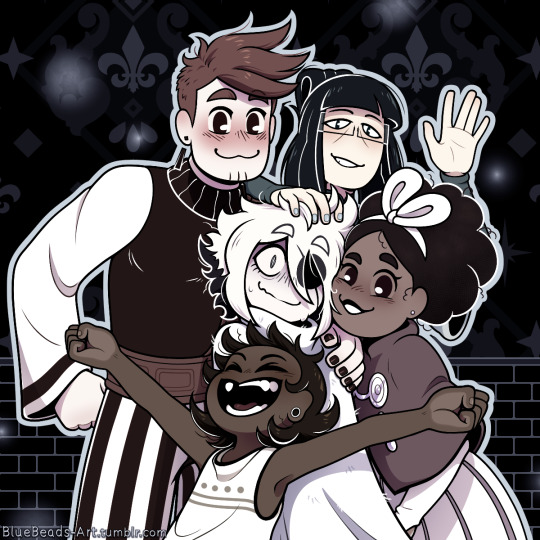
As the flash hits your eye, you feel something crashing into you from all directions. Below you is obvious, Bonbon situated themself to bump into you while the picture was taken. You look to your right, and Mirabelle’s cheek is pressed up to yours. On your left, Isabeau’s sheepishly hugged you to his side. There’s a hand in your hair, too, and it feels like Madame Odile. [...] “We need a souvenir of this trip,” Mirabelle adds. She rushes to the ground to pick up the picture and snort-laughs as she looks at it. “Oh no, Siffrin looks like we’re holding him hostage!” — Curtain Call, Chapter 9, by @openphrase123 (Link in the replies)
2024 October 22nd
Fanfic fanart fanfic fanart!! When I read the "hostage" line, it invoked such a clear image in my head of Siffrin tensed up like a startled prey animal that it got added to my list of things to maybe draw immediately.
Dooon't think about the words 'left' and 'right' in that quote too hard. I know how to read I prommy. :) (I did Not process those words and lost the coin flip in the composition phase...)
Close-up and ramblings about the cans of worms I unleashed upon myself under the cut
Time taken on this was [head in hands] 48 hours and 37 minutes.... That bloated number has two culprits:
1) I got a new tablet! My old one was 10 years old. Its plastic was melting and the electronics had ghosts in 'em, so it needed the sweet release of retirement. However, I had just gotten to the line art phase when the switch happened. Clumsily getting used to the new one during the most precise phase of the process did devastating things to my perfectionism.
2) I made a GRAVE mistake with how I chose to color this. I wanted to keep the grayscale layers for accuracy instead of just slapping a B&W filter over the colored version, so all the colors come from gradient maps, color balance layers, overlay layers, and raster layers clipped to other layers. Listen. I'm used to working with lots of layers. I like keeping things separate so I can edit them more easily. But this is the worst layer system I have ever created. Going from color to B&W requires toggling exactly 20 layers & folders on or off. There are 87 visible layers total. This file lags when you edit it. I've never wanted CSP v1.13 to have layer comps more in my life.
Not helping matters was Isabeau. I said he was the easiest to draw in my last post, but he took that as a challenge, apparently. It's a simple fist-on-hip pose, why was that so hard!?! His face gave me grief too.
Odile's lil' wave got added at the end of the line art phase. I've never added to a sketch that late in the game before, but I felt bad about how little screen area she got, haha. Girl, I tried, but this composition was not kind to you.
Giving Isa, Odile, and Siffrin skin colors felt cursed. Well... "color" is maybe a stretch for Sif. The pallor from being affection-jumpscared isn't helping. In the dev's nose reveal post, they said that Siffrin isn't white but is white-passing, so BOOM albinism headcanon. Like c'mon, they wear a big hat and have most of their skin covered because the sun is a deadly laser when you have little to no melanin and idk if sunblock exists in-universe. Heck, maybe most Islanders have it, their whole religion is about the night sky so maybe they're nocturnal. This makes perfect sense. :)
#in stars and time#in stars and time spoilers#isat#isat siffrin#isat isabeau#isat odile#isat bonnie#isat mirabelle#fan art#2d art
3K notes
·
View notes
Text
In accordance with Tumblr joining the rest of the internet 7 years late in asserting that all of its profile pictures must no longer be square, I am going to bring this development full "circle" (hehe) and allow it to reach its logical conclusion by developing a new raster image file format that stores pictures no longer as Rectangles in a Cartesian grid, but as Circles using polar coordinates. This file format will *assistant whispers in my ear* I don't fucking care. Start producing circular monitors then with rounded pixels then. Get out of my conference room
710 notes
·
View notes
Text
Comparative Sizes of Beleriand and the Lands to the East
I put this together as a resource for my own writing awhile back and at first just stared at it in utter bewilderment. Is Beleriand really this small?! It seems like the answer is yes, and I'll give a quick explanation as to why below.
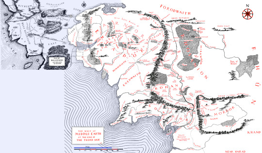
I've seen various stitched together maps of the First and Second/Third Ages, but the primary ones I've encountered still end up with the distance measurements not quite reflecting what we have in the text or map legends.
Without going into too many of the tedious bits, the basic overview is that I put this together by superimposing the maps in Photoshop, aligning Himring and Tol Himling, then drawing this out till the two iterations of the Ered Luin crossed. The primary thing here was ensuring the distance between Himring/Himling and the Ered Luin remained the same in both places.

There were various other details as well, but the key factor for determining whether this was feasible was to check whether it held up when comparing the numerical distances we are given as well.
This is simplest on the map of Middle-earth in the Third Age, since the official map was kind enough to provide a mileage legend. However, the Beleriand map was not nearly so forthcoming. So off we go to everyone's favorite chapter of the Silmarillion (Of Beleriand and its Realms) where we find that East Beleriand is described as being
at its widest a hundred leagues from Sirion to Gelion and the borders of Ossiriand
If this is 100 leagues, then we can convert that to roughly 345 miles and move that rasterized line down within the same file and line it up with our mileage legend from the map of Third Age Middle-earth (scaled as shown in the first image). Which gives us this:

Almost spot on!
Which, I'm not going to lie, really shocked me. I expected to find that this was wildly off since I've always assumed these maps to be fairly equal in my head. But no, it seems that all the epics of the First Age really did happen in an area no larger than Eriador.
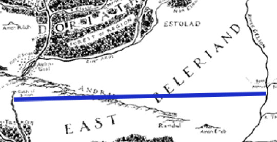
One last image that I find interesting is isolating just Beleriand from this stitched map while retaining the water's tint so you can see the approximate whereabouts of the new shorelines would have ended up.

726 notes
·
View notes
Note
idk who to ask for this but ,,
how do i put an image and a gif together? like those rentry graphics or any graphics with a static image and a gif playing in the background or somewhere.. thank you sm if you answer..!! (´-﹏-`;)

hii! no worries :3
How to mask gifs in photopea, under cut
Guys… i misread this help. ill make a seperate post if anon is still confused but i feel like this also explains it ☹️☹️
warning: you cannot use blur masks for your gifs. this is because the opacity will overlap and it will show up as a solid image. if you want to see how to make a blur mask just ask, the process is a bit different!

so first! import your mask.

import your gif via photos or files


if your gif does not show up as a “folder” double click it’s icon, this will bring you to another project, drag the folder to your project with the mask and delete the original import.


use the magic wand and select your mask!

layer > raster mask > reveal selection

et voila! you are done. o(^▽^)o

#。resource#editblr#rentry#rentry decor#rentry graphics#rentry inspo#rentry resources#rentry stuff#blog resources#rentry resource#carrd resources#rentry help#rentry template#rentry gif#sntry resources#rentry pixels#rentry dividers#rentry frame
358 notes
·
View notes
Text

Create Your Own Main Menu for The Sims 4 - Tutorial
Hey folks!
This tutorial will walk you through creating your own main menu override for The Sims 4 based on my custom repository.
_________
What is required:
JPEXS Free Flash Decompiler
Sims 4 Studio
Raster graphics editor (e.g. Photoshop, Gimp, Photopea)
Your Own Main Menu repository
_________
Step 1: Download and unzip the Your Own Main Menu repository
It's available on my Patreon page for free.
_________
Step 2: Prepare your custom images
There are two images that you need to customize:
SimMattically_YourOwnMainMenu_MainBG.pngThis is the main background image, where you want to put the desired graphic.Size: 1440px x 1200px
SimMattically_YourOwnMainMenu_BarBG.pngThis is the second background for the navigation bar on the right.Size: 480px x 1200px
Prepare your own images based on these templates. Do not change the size of the images.
Tips: If you're using a more complex background, such as a screenshot from your game, I recommend blurring the Bar_BG with a Gaussian Blur (~60px). Additionally, I suggest adding a white overlay with ~50% opacity and a 5-pixel wide white bar on the left edge with ~10% opacity. This helps improve the readability of the navigation bar buttons and adds an extra layer of detail to your menu design.

The repository also contains the optional file "SimMattically_RefreshedMainMenu_ScenarioButton.package" from my other mod, which replaces the Scenario button icon with a semi-transparent white version. It's up to you whether you want to use it.
_________
Step 3: Import the images to the .GFX file
Firstly, open JPEXS Free Flash Decompiler and then open my SimMattically_YourOwnMainMenu_Template.gfx with it.


Select "No to all" when prompted.

On the left, choose "images" and scroll to the bottom where you will see the images you just edited in their original form. Right-click on each and select "Replace." Select the custom images you prepared in step 2.


Save the file.
_________
Step 4: Import the .GFX file into the .package file.
Open Sims 4 Studio, then click on "My Projects" and open SimMattically_YourOwnMainMenu.package. Select "Scale Form GFX" (the one with the "gameentrylauncher" description) and click on "Import." Select the modified .GFX file and import it. On Windows OS, you need to switch from .binary to all file types to see the file.


Save the .package file via File -> Save As... Give it a custom name and place it in The Sims 4/Mods folder.
That's it! Enjoy!
_________
IMPORTANT INFORMATION/TERMS OF USE:
Main menu overrides can become outdated with some game updates, causing them to break the game. You will have to remake your custom main menu with a new, updated template in this case. Always make sure you are using the latest available template and that it's not outdated.
Since these mods can break the game, I do not advise sharing your custom main menus with other players. You are free to do so, but be aware that since you're relying on this repository to create your own version, you most likely won't be able to update the mod and resolve issues for other players on your own, so you take responsibility for breaking their game.
If you decide to share your version with other players, please credit my repository and link to my Patreon post.
Do not put your custom main menu based on this repository behind any paywall or early access. I made this repository and tutorial free for everyone, so keep it fair.
I do not take responsibility for people misusing this repository or breaking your game with incorrectly modified files. I do not provide support for custom main menu overrides created by other creators using this repository.
_________
#sims#thesims#thesims4#sims4#sims 4 mods#sims 4 custom content#simblr#s4cc#ts4#main menu override#sims tutorial
314 notes
·
View notes
Text
…make reply icons?
reply icons (or as i call em, replycons) are a weird kind of edit. they’re in the same genre as rentry or carrd graphics—i.e., that you can do whatever you want with no real rules. that said, these are some guidelines i follow
i. make your canvas much wider than it is tall
there’s no exact measurement for this. my reply icons for this blog are 600x150, but they’re fairly uniquely small. the general consensus at least amongst my peers is about a 4:1 or 3:1 ratio will work best.
the reason why your replycons should be wider than longer is because it keeps them from taking up a lot of space. here’s mine as an example:

enough space to be visible, but not so much as to be obnoxious. that should generally be your goal.
ii. collect a wide variety of expressions
this’ll be limited depending on your characters, but it’s best to have a good variety of expressions. i also save my files with whatever the expression is to me for easier searching but you don’t have to do that LOL
also, i feel obligated to mention it, but you don’t have to stick with just one character. you can use a whole group, either an in-game group (i.e. leo/need) or a visual group (i.e. blonde characters.) they don’t even really need to match, though it’ll look better if they do. with this blog and my old ones, i used a variety of characters with the same color palette so i could get the expressions i wanted.
iii. just make the damn thing
ah, the worst part of all editing—actually editing. god fucking damn it. now that you’ve got your canvas and your character(s) it’s time to grit your teeth and make some replycons
first thing i usually do is narrow down a theme. this can be as simple as a color or as complex as something like “cybercore” or whatever -core scratches your brain. for these replycons, my theme is just attempting to match the rest of my blog layout. god fucking speed.
it can sometimes help to make a thumbnail like this ^ but that’s 100% optional. i like to do it for tutorial purposes and it helps me to get my thoughts from my brain and into photopea. your thumbnail need not make sense nor be cohesive. it’s just for you to know
a good way to start is to make a shape and make it interesting—i usually make a shape and give it a border and some fun lines, rp style, but you don’t have to do that. all of those things can be done with just the shape tool. you can also find existing icon masks on tumblr or resource rentries (make sure you credit properly!!) and you can find some templates, like mine!
once you’ve got a theme and a base, start adding shit.

^ pretty easy base. i pixelated the lines around her eyes and added eyes, and added a stroke and drop shadow to the shape to make it easier to see! if you’d like, you can stop there. but i think it needs a background and some details so i’m going to keep going
background complete! for this i just used a color fill and went rasterize > filter > noise > add noise but you can add whatever you like—patterns, wallpapers, solid colors, etc. it’s up to you! i also added a small stroke around my character png so as to distinguish her from the background a little further :)
this one is a little blank on the left side so i’m gonna add some text and details!!

there we are. i added the cd png to break up the monotony of my base, added text because it’s my personal preference, and added a chibi so the text is distinguished! if you do add text, make sure it’ll be readable in any modes—light and dark. i typically add both a black and white stroke for this, and a drop shadow can help a lot, too!
an important thing to note here is any extraneous images of the character you add can’t be too distracting to the main image. if i had, for example, done this:
the new png is obviously too distracting, right? it takes up too much space and completely draws the eye away. this is even more true when the base and the png have conflicting expressions, like so:
because now i can’t tell what emotion you’re conveying—is the replycon happy or sad? what part do i focus on??
so it’s best to keep any extraneous decals pretty simple, for the sake of clarity. it’s also best to remember that english-speakers read from left to right, and native speakers are conditioned to interpret most things that way. you’ll want to draw the eye in that direction as you work, and not the other way around. hope that makes sense lmfao
iv. save as a psd
once you’ve got all your layers and details situated, make sure that you save your replycon as a psd. this is imperative, because it enables you to make new reply icons as the occasion arises, or you can recycle the basic components for a new theme!
if you’re unsure on how to save as a psd, click file in the upper left-hand corner and then ‘save as a psd.’ i recommend labeling it so you can file it more easily; i’m naming this file cobaltpegasi replycons, which is an easy template—just stick your url in instead.
once you’ve done that, keep adding expressions until you have a suitable amount of replycons! i usually made about five to ten to start with and then add new expressions as i see fit, but you can do whatever works best for you.
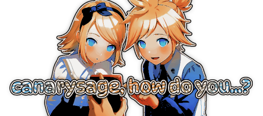
also, when saving your replycons, it helps to sort them by what emotion you think they convey. for example, my canarysage replycons are sorted by character and then by emotion—so this one is labeled “len smug” because that’s how it seems to me

you don’t have to do that, but i find it helps a lot when trying to find specific ones, especially if you have a lot.
v. go forth and use them
now that you’ve got your replycons done, you can use them! go forth and clear out those week old requests in your inbox (🤨) or whatever it is you want to do with them. that is all. canarysage signing off <3
…so that’s how you do it.
93 notes
·
View notes
Text
Making Gifs Part 2: Photopea
This is part 2 of my own personal gifmaking guide. Please read Part 1 to learn about how I capture the sequential screencaps to make my gifs.
Once you have your screencaps, open Photopea. They have a very simple guide on how to make animations in their help guide. I will be going into much more detail.
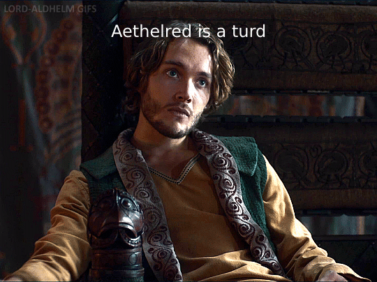
Note: ***Tumblr has a limit of 10mb for the filesize of each gif, and recommends no wider than 540 pixels. If your gif is wider than 540 pixels Tumblr will resize it, and it will cause the quality to be reduced, and also take much longer for the gif to load in your post.***
1. RENAME CAPS:
First things first. Rename all of your caps that you will be using for a gif to have the prefix _a_ on your computer. Select all and right-click on the FIRST file and select Rename (windows) and type _a_. Windows will add the numbers.
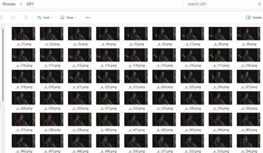
For most gifs, try not to have more than 60 frames as it will make the gif too large to upload to Tumblr. I usually aim for 45-50 frames max for most of my gifs.
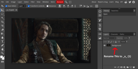
2. IMPORT FRAME #1:
Drag and Drop _a_ (1).png into Photopea. Rename the layer from Background to _a_ (1)
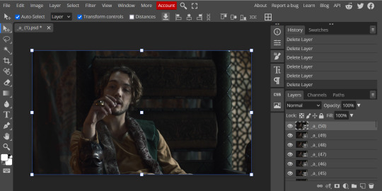
3. IMPORT IMAGES:
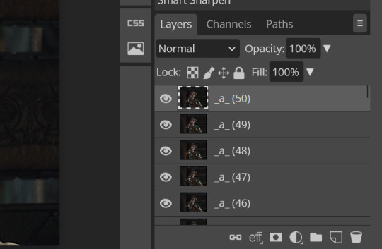
Select all the rest of your images from the folder on your computer, and drag and drop ON TOP OF the image (not the layers section). Make sure the file you grab to drag/drop is the next one in the sequence (so _a_ (2).png in this case. Otherwise they will be out of order. If you do it right, you will see the layers section on the right get populated with your caps in reverse order, with 1 at the bottom and the last one at the top.
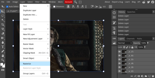
4. RASTERIZE:
Next, select all of the layers (on the right, by holding CTRL and clicking on each layer), go to Layer > Rasterize. They are currently Smart Layers, and if you keep them this way the sharpening will not apply (for some reason, I have no idea why that is)
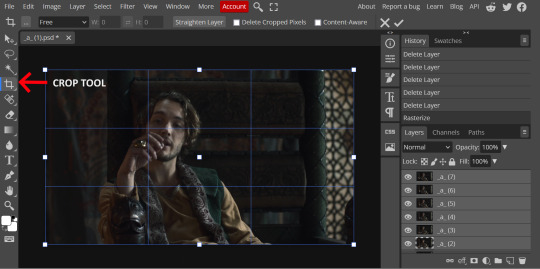
5. CROP:
Next, crop your gif. This tool is on the left menu. You do not have to have all the layers selected for this, it will crop all layers together. Move the blue lines at the edges until the frame is cropped how you like. Be mindful of the character moving in other frames; you may want to check your other layers to make sure nothing important gets cropped off in another frame. Once the blue lines are where you want them, click the checkmark at the top right to finish the crop.
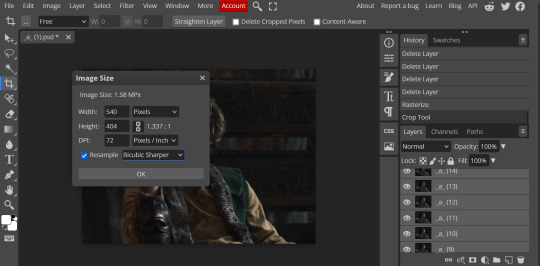
6. RESIZE:
Resize your gif so that it is 540 pixels wide. Go to Image > Image Size in the top menu. Make sure you choose "Bicubic Sharper" as the resample mode. Once this is done, you will see your image is tiny, so go to the Zoom tool (on the left menu, the magnifying glass near the bottom) and select Fit the Area at the top of the screen so you can see what you are doing.
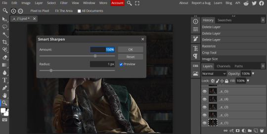
7. SHARPEN:
Next is sharpen. Select all your layers again (on the right), then go to the top menu: Filter > Sharpen > Smart Sharpen. The default settings here are for 150%, and that is good for most things.
8. ADJUSTMENTS
This is the tricky part. You now need to adjust the brightness, contrast, exposure, color balance, and saturation. This will vary from gif to gif how much to adjust these values. I will show how I adjusted this one and you can apply that to whatever gif you are making.
For starters, since this show is SO DARK, you will need to brighten it. There are many ways to do this, but I found the method that works best for me is adjusting the Levels.
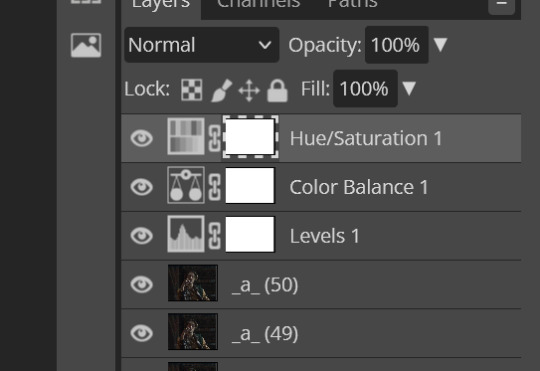
First off, in order to make adjustments, make sure you scroll all the way to the top of your Layers panel and make sure only the TOP LAYER is selected. Otherwise the adjustments will only be applied to whatever is BELOW the selected layer. You want all of them.
8a. ADJUST LEVELS
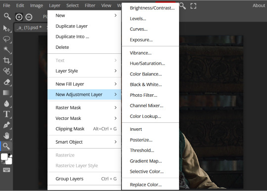
Next, go to Layer > New Adjustment Layer to pull up all your adjustments. For this first example we will use Levels, which is the second from the top.
You will see a histogram like this one:
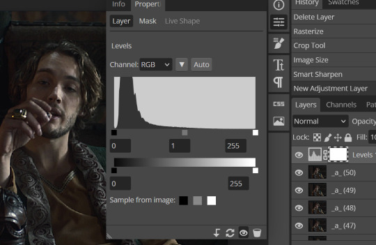
This is a lot of information about the image, but pay attention to where the curve starts and stops. On the left, you see a "0". That is your dark point. This image is slightly washed out so I need to move that adjustment to the right so that the little square is just below where the curve starts. The third number is "255" and this is your bright point. The images are very dark so most of the graph is shifted to the left (dark) so in order to brighten, move the third square (the white one) so that the second square (grey one) is just at the edge of where the curve drops off on the right.
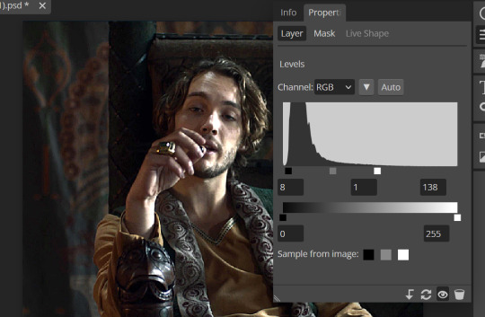
You can now see the numbers changed. Moving the first dark square will enhance your contrast, and moving the THIRD square will enhance your brightness. It is usually not necessary to move the second square, but you can experiment with this by moving things around and seeing how it affects your image. After this, it may be necessary to also increase the Exposure and Brightness if it is still not bright enough, but most of that can be done here.
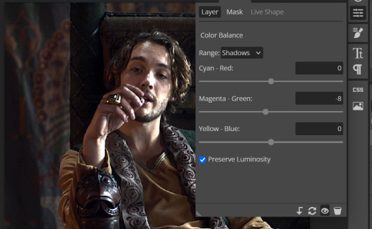
8b. ADJUST COLOR BALANCE
Again go to your Layer > New Adjustment Layer > Color Balance to get this tool. This is a neat one with A LOT of variables, so play around with it to get the colors to look how you want. A lot of the raw video tends to have a bluish or greenish cast to it, so you just move the sliders to get rid of the cast and make the colors look how they are SUPPOSED to.
In this case there is a very slight greenish cast to the pictures so I will adjust that slider to compensate. The Range (at the top) you can select Shadows, Midtones, or Highlights, depending on where the color cast is located. Usually I stick to Shadows but sometimes will use Midtones if the color cast is really bad. Make sure Preserve Luminosity is checked.
8c: ADJUST SATURATION
Layer > New Adjustment Layer > Hue/Saturation. This will brighten up your colors. This tool is VERY COOL in that you can select color families to selectively increase or decrease the saturation of. Under Range you can choose Master, which is all colors, or choose only Red, Yellow, Green, Cyan, Blue or Magenta. The slider at the very bottom (when a single color is selected) allows you to set the range of colors to. I chose Master and increased the saturation of all colors, but be careful as this can make skintones look VERY orange. So select other colors in the Range to adjust single colors only.
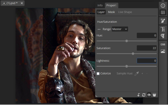
With this tool you can also change the HUE (which is changing the overall colors to a different color, like shifting all the reds to orange) and Lightness (which may or may not be necessary if you did the Levels correctly)
If you need to go back and change something in your adjustment layers, you can do so by clicking on the white box in the Layers section next to whatever you need to adjust.
There are many other Adjustment Layers you can play with, so have fun and experiment!
9. ADD YOUR WATERMARK AND TEXT
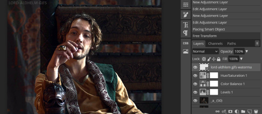
Next, you can add a watermark if you have a premade file, by dragging and dropping it on the image. Then move it around to where you want it, resize it if needed, and change the opacity if it is too bright. Make sure this layer is the TOP layer.
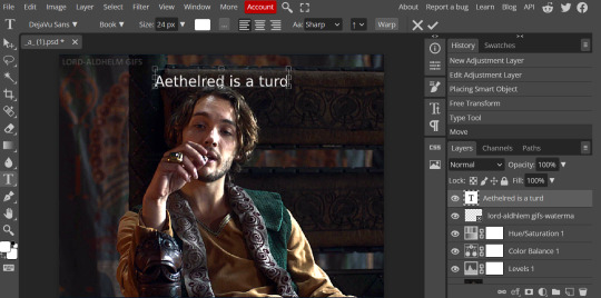
To add text (for subtitles or effects) simply click on the Text icon in the left menu (the T) and click anywhere on the image and start typing. You can change the font, color, size, and style in the menu on the top. Move the text around by using the Select tool (arrow on the left) Again make sure this is the TOP LAYER so that it will be present over the entire gif.
10: EXPORT YOUR GIF
File > Export as > GIF
A pop up dialog will appear and you can change some settings here if you want. I usually don't. Pay close attention to the filesize (at the bottom) and make sure it is under 10mb. Keep the quality at 100%. And most importantly MAKE SURE DITHER is checked! This will prevent compression artifacts from ruining your gif.
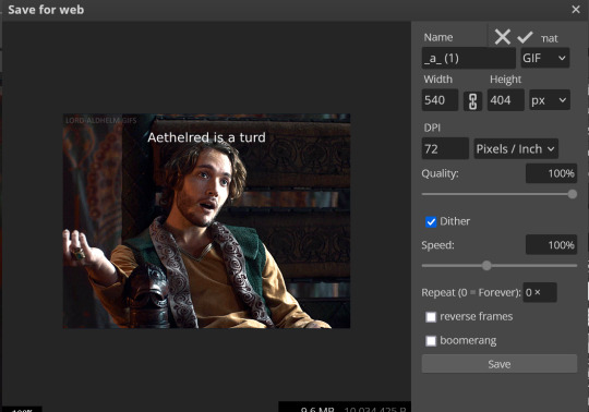
Save the file to your computer and VIOLA! Gif!
Have fun!
#gifmaking#gifs#gif makers#gif making resource#gifmakers#gif making#gif#gifmaking resources#gif making resources#my guides#giffing tutorial#gif making tutorial#photopea#photopea tutorial#photopea resources#photopeablr#photopea gifs#long post
65 notes
·
View notes
Note
hii, sorry if you've answered this before but what do you use to make your edits ? your stuff is so cool it's inspiring me to try it out for myself hdkghdkgj,,

oh my gosh tysm 🥺 i really appreciate this but ill just get straight into the list! underlined = link , highlighted is website names
sorry for the long post i ended up yapping.. tldr photopea, ezgif, lunapic, alphabetiser, nameberry, magic baby names, baby centre, sekaipedia, pinterest, tumblr, . also at the bottom is a tutorial on making stamps & some templates
for basic editing i use photopea - https://www.photopea.com/ , if its too confusing you can also try ibis paint but its too confusing for me. i click "new project" and then use the dimensions i need ( tumblr banner = 1280x720 , twt banner = 1500x500 ). i can also make basic photopea functions tutorial if you need it bc a lot of people find it difficult to navigate. i dont have any specific favourite layer blends but i recommend light colours -> use the section under "lighten" , dark colours -> use the section under "darken" , blacks and whites -> use the section under "difference". of course once ur more comfortable u can just do whatver layer blends u want ^ ^
for gif editing / merging (layouts, pixels, blinkies) i use photopea's layer -> animation -> merge settings, however if that doesn't work i use ezgif - https://ezgif.com/ , specifically the gif maker.
for adding animations to stamps, i use lunapic's animations tab - https://www6.lunapic.com/editor/?action=animation-examples . i also used to use this website a lot for old layouts before i knew how to use photopea. below i highlighted my fav settings (3x for sizing)

for npts i use alphabetizer - https://alphabetizer.flap.tv/ to organise name lists. if you use this make sure to turn ON "ignore case" in the side menu!! it sorts capital letters as normal, and then i delete the capital letters later when formatting a post. for names i use websites like nameberry, magic baby names, and baby center. not sure how to explain it but i just get a feeling that a name suits a character ^ ^. as an example in all of these i used "orchid". for titles and pronouns i just use my imagination based off the character's wiki page.

for resources: i find proseka transparents online at sekaipedia - https://www.sekaipedia.org/wiki/Characters , or at @prosekaipng or @sekaitransparents . i find frames and pngs on pinterest or tumblr, and use unscreen to remove the background of gifs and remove.bg to remove the background of any image i cant be bothered manually removing. when i need to do touch-ups myself i use photopea
i find colour matches for layouts on pinterest, and then edit the shit out of them until it looks close enough to a colour palette (example below of some colour editing i've done recently). most of the things i do are extreme changes but i started off by making subtle changes in my old layout posts on lunapic, which i still sometimes do today like in the last example from a post currently sitting in my drafts i havent finished. ( ̄  ̄|| )
(this is how i found out my emu photopea file didnt save btw so excuse the missing elements ...)


for overlays, btw i use A LOT OF THESE, and also lots of custom PSDs. a psd is basically a colouring file you overlay on top of something, and are similiar to smart filters. in photopea you can click "image -> adjustments -> (whatever)" and apply that to one singular image, and these are called smart filters because you can transfer them to other images by individually dragging them. OR you can click "layer -> new adjustment layer -> (whatever" and this is a PSD because it automatically applies to all images. in photoshop, there are no "smart filters" iirc. i use a combo of smart filters & psds & overlays. i find overlays sometimes on pinterest, but mainly on tumblr. my favs below. use layer blends on these!!

for stamps i use templates in photopea using a raster mask. you can find templates on tumblr and deviantart, majority of tumblr dumps are from deviantart, so i focus on using deviantart myself and finding original stamp works on tumblr rather than reposts. some accounts i recommend are caterpillar-with-a-crayon and dixons-graveyard. remember to credit artists!!
to do this, first open a template in photopea using either " file -> open " or " open from computer " . next select the magic wand and select the inside of the stamp. next open a new layer using the blank page (second from the right, bottom right, next to the trash can below the layers) and use the brush tool to colour in the selection from earlier. it may look like an eraser, or any other icons shown in the menu. right click and select the brush tool, then hold down to colour it in. you should have something now looking like the fourth slide, with a stamp template on one layer and the colour on a layer above it.
to make the raster mask, de-select the colour by clicking anywhere in the dark grey surrounding the canvas. while on the colour layer, select "layer" (fourth from the left, next to "image" and "select, menu in the top left), then select "raster mask" -> "from transparency" . your coloured layer will then split into the colour surrounded by black, and a white version of the colour. both connected with a chain.


now, create a folder above your stamp template by clicking the button shaped like a file (bottom right menu, 3rd from the right, between a sheet of paper and a circle cut in half). now, click on the RIGHT split from the layer (the white colouring) and drag it onto the folder. it should stick there. now, anything you put inside that folder will fit the stamp inside! remember to turn OFF the red layer by click the eyes next to the layer. this wont affect your raster mask. i used an image and the text tool.
you can also do more complex things involving stamps but this is a basic tutorial ^ ^.


21 notes
·
View notes
Note
sorry if you’ve answered something similar before but how do you format things for your website? in the collections you have for poems
i love how it looks. the book kind of format it has
and i want to do similar/the same formatting for my own works but im really struggling…
i've been asked stuff like this a lot and i don't mind explaining it often because i want people to make websites more. i made a tutorial video at some point but it's kind of hard to make a curriculum or tutorial or whatever around this kind of thing because it's really just a self expression thing. i'll try to break down as much of my thought process as makes sense.
i design my pages in photoshop with either double/single page display in mind and then i use html to set them next to each other. most of the choice here comes down to how overwhelming i want my designs to feel. in the case of the lonely leaver page, the entire book was designed to be something that could be a physical book, and so from the getgo i made the pages in that kind of format. i previewed things in acrobat which has a booklet view mode (which singles out the front and back cover around the contents of the file) & allows you to process double page view as well. as for the actual process in photoshop before that point, i typically will open a canvas that is the size of the full 2 page spread (i.e. 8 inches wide for 2 pages which are both 4 inches wide) and i set grid lines for bleed margins and to mark the center of the page so that i can make the composition something that im comfortable with having a gap in the middle from the book folding. with lonely leaver i had to reformat about half the book at some point because i wanted to make it a larger resolution which was annoying but i just keep my guidelines for a print size in mind while im working. often if im a certain amount of time into a project that i feel like i will be spending a lot more time with i'll create a dummy psd file at this point which is devoid of content but which has all of the margins/resolution stuff set up already so i can just open that up and save a different version of it when i'm done.
my actual writing process and my design process is generally extremely intertwined, that's why things tend to be varying degrees stream of conscious in my work i think. i'll for instance, have a thought im stuck on for several days, and then open photoshop without having a poem or comic in mind, but i'll fill the canvas with some kind of color like red or yellow or a photo or whatever, and then open a text box or start drawing. telling a story through composition (i.e. page layout itself) is generally my favorite aspect of art and design because i enjoy how violent and dramatic framing angles can make the content of a piece feel so i'll try to move stuff around as much as possible in order to get my desired effect, often times using place holder shapes in lieu of finished design elements in order to get a rough blocking. as i do this i tend to react to what i'm writing/making as i'm doing it, and i do a lot of selective self editing during this part. for instance, i'll start manipulating rasterized text or cutting around images or whatever. i'll reread and look at whatever im doing for a couple of hours and then when i'm done with a spread or whatever i will save the document as a psd with a combined full spread and then each page separately as pngs or whatever (split at the middle grid line, back to the example, i'll save 2 different 4 inch wide images by changing the canvas size).
when it's time for me to put stuff on my website i then batch convert whatever pngs i exported into webp's because they load faster and take up less space on the server/my computer. you can look at my direct html/css files in your internet browser's explorer mode to see exactly what i do but essentially i just have either 1 or 2 images in a block and then a series of repeating vertical blocks containing images. i don't have an extremely efficient way of uploading pages and i'll typically just copy the same
"<p><img src="01.png"> <p><img src="02.png">"
like, 30 or 40 times or whatever into a html document. i use visual studio code for this stuff because it lets me do a bunch of stuff like having several files open at once & the navigation pane is nice & there's a live server extension that automatically refereshes the html file in my web browser on file save which is really awesome. i have a css page that i made like, 5 years ago, and i usually just link new projects to that because it has a bunch of different settings in it which i'll toggle on or off depending on the needs of whatever page or i'll add new div id's to it. it's kind of messy at this point, but it gets the job done. i use filezilla and something like bluehost or something for webhosting/file management.
i arrange and organize all of my art extremely methodically so usually in my like "<root catch all poetry folder>" inside of my "<root catch all art folder>" there will be a "<name of specific poem book>" folder which just contains the poems named by their actual name e.g. "dedication to saint eulalia 4.png" and then another folder inside of that is called "paginated" where i, using the acrobat document i arrange stuff in as reference, rename copies of my pages which i have placed in that folder to be named things like "01.png" so that i can then manually flip through it sequentially in the windows photo viewer and also just so that i don't have to go through the arduous process of renaming and tracking stuff inside of the root folder i'm containing that project's files in.
i'm 26 now and i made my first website when i was like 18, and my first zine project and i'm tired of feeling feeling around that same time, so i've got like, coming up on a decade of trial and error behind this and this is generally what has worked for me. my website isn't super complicated and mostly just gets the job done but because i try to think about style and presentation up front with whatever projects i'm doing i tend to just make plans based around that as early as it makes sense. to me having a website for art presentation has always been the Primary Method and intended landing zone for my art so it's genuinely always been a consideration in my process to try to plan around how i will put it on my website. i do this because i believe having my own curated space for containing my art allows it to exist in a context which best heightens whatever message i'm trying to convey. if there's an issues with my website right now they are that i'm very bad at mobile browser formatting & i havent updated the main look of the website in something like 4 years barely at all.
anyway, at the end of the day i think really as long as you can identify whatever your intentions are and do some planning/problem solving around that you should probably be able to find your own method which works for you better than mine might but if you do just want to copy my website the tools to do so are within your brain and internet searches and i believe in you. i think the biggest strength of my website is that it shows how easy it is to just put art big as fuck on a webpage and how effective that kind of minimalism can be. i just want my website to be like a museum's walls. and it's not super complicated to get to that level of html knowledge.
11 notes
·
View notes
Text
Krita tutorial the way I know it.
Basics: What is where.
Gimmicks.
Specific advice on specific tools.
Basics: What is where.

Upon opening the program this is what you're met with. First of all, must comment: The layout is HEAVILY editable so you can just drag menus anywhere you want, even leave them floating amidst the sheet you're drawing on.
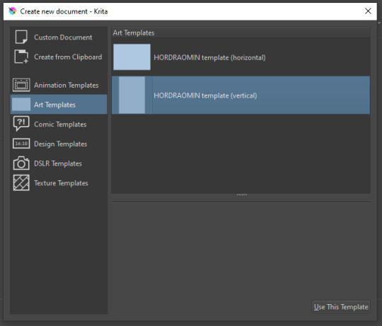
You can create custom art templates, I have two o'mine here as both have my signature background color.
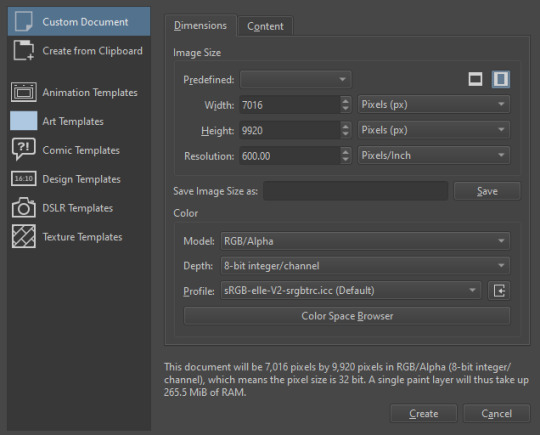
As well, you can edit the custom document settings, as in what size you want it, what resolution, even the initial content of the image. As well you can create from clipboard: Just copy some image from your browser and Krita will recognize it (useful for making meme edits lol).

Now, once you have your file, I will show you what is where.
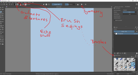
Brushes:
Brushes are easy to edit and there are tons of free bundles to download online. I myself only got one bundle, Jackpack (bit hard to find now due to original source being lost, it is still available but bit tricky to come by).
There. Are. Tons.

Some of these are my custom brushes for calligraphy in neography, you might even guess which ones. You can edit existing brushes, make new ones from the ones you've edited without changing the original, and all sorts of stuff (more below in the third chapter).
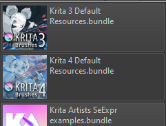
There are numerous packages of brushes once you enter Krita, but only one/two are available when you first open it. To unlock them all, click here:
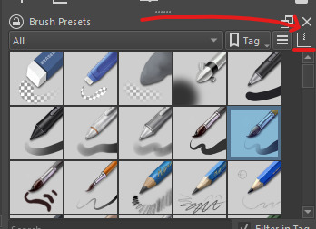
And make sure all bundles are dark gray in color (example of both dark and light below).
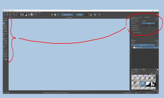
Now Tools Options: those will pop up depending on what tool you're using.
Symmetry: Fun stuff. You can drag the lines depending on how you need them and then center them back to the center of the screen if needed.
Gradients and Textures also have their tools options, you can play with those to get the feeling what they can do (more in third chapter).

The Filters tab is useful too. Blurring, motion blurring, color mapping, artistic filters and all that: Quite fun.
Gimmicks.
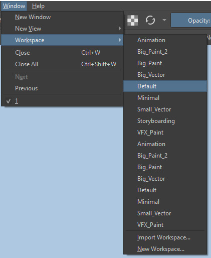
Krita allows you to customize your workspace freely. Floating menus, tabs, anything you want. It has quite many drivers at that-
To access the workspace templates, go to Window and choose Workspace.
Krita allows for copy-pasting any image onto the sheet. Though, for me it sometimes crashes if I accidentally copy-paste text into it without choosing the Text tool first.
The software allows for both raster and vector work. It is basically Photoshop sharpened to be used by artists primarily.
There are some interesting mechanics regarding the Eraser (default bind E).

You can use it with any brush, allowing for textured erasure/quick work. Good for sketching.
You can use it on gradients (given there's a transparent point on the gradient preset).
There's a Multibrush tool:

People say Krita is good for animation but my brain can't wrap around it yet honestly @~@.
The keybinds:
B - Brush tool.
E - Erase tool option.
M - Mirror (useful for checking accuracy from a new angle).
Ctrl - Color pick (when used with brush or other color-using tools).
Shift+L.Mouse+drag - Changes the size of the brush by dragging left and right.
Ctrl+E - Merge layer with the one below.
Ctrl+G - Group selected layers.
Ctrl+A - Select whole sheet.
Ctrl+Shift+A - Deselect everything.
F - Bucket tool.
G - Gradient tool.
Ctrl+S - Save document.
Ctrl+Shift+S - Save As document.
Ctrl+N - New document.
Ctrl+O - Open document (will be seen in a new tab on top of the sheet).
Ctrl+C - Copy selected layer or selection.
Ctrl+X - Cut selected layer or selection.
Ctrl+V - Paste copied/cut layer or selection.
Q - Multibrush tool.
R.Mouse - Interesting thing: Opens up a quick selector for brushes and colors you've already used in the piece.
1 - Zoom 100%.
2 - Zoom to fit the piece vertically.
3 - Zoom to fit the piece horizontally.
4, 5, 6 - Turn 15 degrees (4 and 6) or undo the turning whatsoever (5).
Ctrl+I - Negative filter applied to layer.
Ctrl+U - Color editing on the layer.
Ctrl+Y - Soft proofing mode (for color mistakes and stuff like that, mostly annoying for me tbh).
Ctrl+T - Transform selection/layer.
Ctrl+R - Square select tool.
Ctrl+J - Lasso select tool.
Honestly you can just hover your mouse over tools and see their shortcut binds, as well. Or edit them in Settings.
Specific advice on specific tools.
Brush:
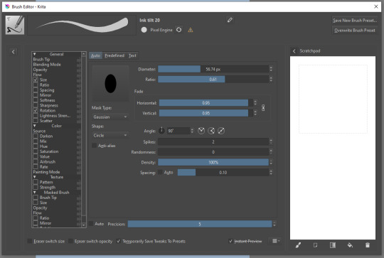
Brush editor is a great tool for making custom brushes, and it even has a sratchpad to test them out. Lots of settings, but no need to be afraid; Most of them you might never use on purpose.
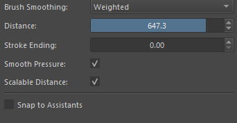
Use Brush Smoothing for great and pretty lines in lining pieces or making calligraphy.
Gradient:
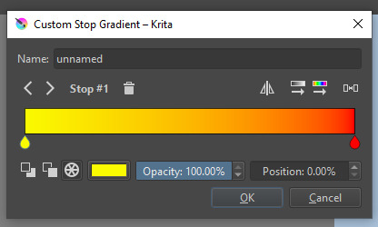
The four icons to the right top are:
Mirror gradient.
Arrange by lightness value.
Arrange by color value.
Space the stops evenly.
Click the gradient to add a new stop. The three things to the left are:
Make the stop use Primary Color.
Make the stop use Secondary Color.
Make the stop use a fixed color.
319 notes
·
View notes
Text
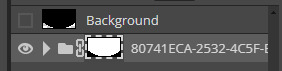
> Photopea "Clipping" GIF Tutorial
Import both your GIF and your selected image mask.
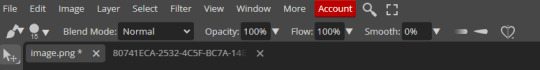
Select the entire GIF folder and duplicate it into your image mask file.

Resize your GIF to your liking.

Place your mask over your GIF, so that you can access it for the next step.
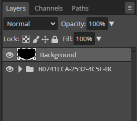
Use the Magic Wand tool to select your image mask. This will create the silhouette of the mask.
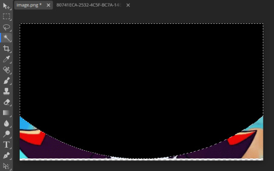
Select "Add Raster Mask" to your GIF folder.

Delete your original image mask layer. It is blocking the clipped GIF underneath.

7 notes
·
View notes
Text
🕸️ vectors; what are they? …☆
let's start with the basics:
vectors have "infinite" resolution, making them scalable. artifacting is what happens within the common image file .jpg during saving. every time a .jpg is saved, the resolution of the image goes down just so. at the same time, .png images can still suffer from artifacting when the file is resized too many times, blowing up the rasterized pixels which causes the very blocky look within a very resized image.

vectors are lightweight. file sizes are almost always quite small! especially with how we make our flags, a vector will take up less space than its raster counterpart. vectors are intuitively created. with the way vector programs work, all building blocks to vector graphics are shapes and lines, instead of a freehanded drawing or color-filling a raster template. pixels will always give away your image type, but if your image had been a vector, it has a higher chance of being a crisper, cleaner image. vectors are easily reusable. because of that small file size, saving vectors in a vector format lets you edit that very image any time you like! moving that file around, or duplicating it to share won't ruin its resolution or definition as easily. vectors are made to be reshared and reused, which is why a lot of logos, symbols, iconographics, and other recognizable icons are under a vector file format. there's far more to vectors that can really show off its benefits in more than just image usage, but that's what this blog is for first and foremost.
so what's the point of saving it as a vector if i'm going to rasterize it later?
why not have an hd image to make sure it's always legible before rasterization, then?
who cares? it's just an image format.
we do. and we cared enough to share, regardless of if you care to use these images.
what does it mean when you've vectored my flag?
well, it means it's been saved for posterity. many flag creators seem to have a problem with archivists, but it's a good thing this blog is run by archivists first and creators second. polycoins is only here to make a permanent, reusable resource for the public's usage. we try to explicitly state whether a flag has been vectored (closest 1:1 remake), redesigned (similar remake), or is original. tldr; we're trying to make your flag more accessible, not steal your image. any time a flag is vectored, it means it was never designed by one of polycoins' flagmakers, simply remade in a different file format.
7 notes
·
View notes
Note
wait so colors! on the ds isnt rasterized image editing? its vector?<- assuming this based on the exporting thing. if its all raster, i wonder what interpolation it uses to resize up...
Nope! All rasters! I believe colors! image resolution is 512×384 (smallest export size, but twice the size of ds' 256×192!) So yeah, some kind of interpolation for the larger sizes..
It takes a hot minute converting the file to a png on the smallest size as well. Must be difficult for the ds to do file conversions... or maybe my R4 card or SD card is just a bit crappy!
8 notes
·
View notes
Text
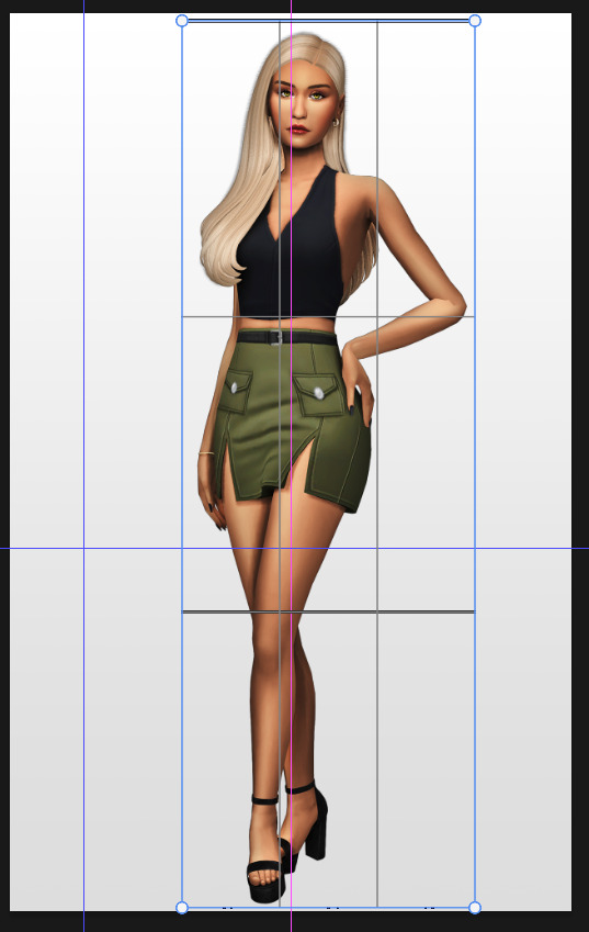
How I edit my Sims' shadow in Photoshop
as requested by @adelarsims
& based on this tutorial.
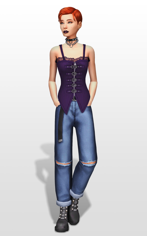
━━━━━━ ・❪ ☾ ❫ ・ ━━━━━━
1. Taking a screenshot
First of all take a screenshot of the Sim - I always do CAS but in-game works too ofc.
I take mine in front of a background that loosely matches the color of the background of my edit, in this case white. If you have a fancy CAS background, I recommend this CC by @sonyasimscc to easily get a simple background for screenshots.
I also use this tutorial by @katverse to get really good screenshots, I use 4000x3000px resolution, and this tutorial by @vyxated to not have a CAS UI in your screenshot if you use a reshade like me.
━━━━━━ ・❪ ☾ ❫ ・ ━━━━━━
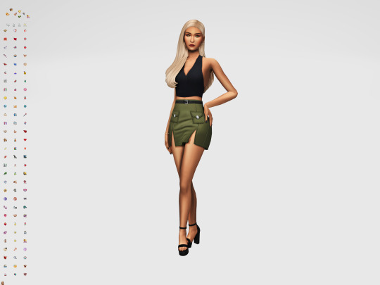
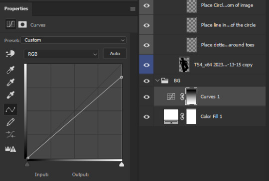
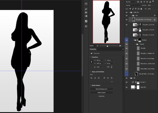
2. Setting up the Photoshop file
Now in Photoshop create a file, I use 1250x2000 px.
I made a few guidelines, pink being the middle of the image and dark blue guidelines for my shadow editing.

I have a usually white background and a slight Curves adjustment layer with a gradient layer mask so it gets slightly darker at the bottom, completely optional ofc.
━━━━━━ ・❪ ☾ ❫ ・ ━━━━━━
3. Removing the original background
Import the screenshot and place it however you want. I try to align the Sim in the middle and make it as big as possible.
Then select the layer and go to Select - Subject.

This will usually do a decent job.
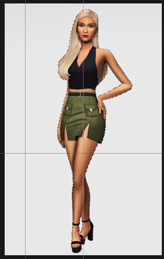
If there are some leftover unselected areas (like on her left hand on the hip) you can either add them to the selection now or edit the layer mask later.
Then create a layer mask.
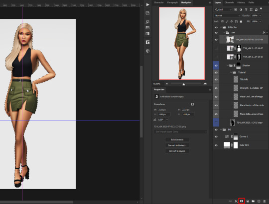
Since the screenshot has a similar background, it shouldn't show too much if it is not perfect.
━━━━━━ ・❪ ☾ ❫ ・ ━━━━━━
4. Creating the shadow
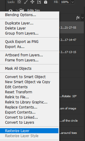
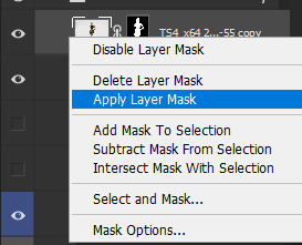
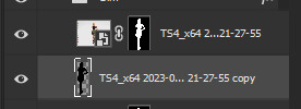
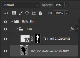
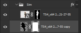
First duplicate the Sims' layer (Shortcut: Ctrl + J).
The layer is probably a Smart Object, so you need to rasterize it and right click the layer mask to apply the layer mask.
Now lock transparent pixels and paint the layer black.
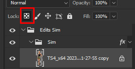
Next unlock the transparent pixels again and move the black layer below the actual Sim. Leave it selected.
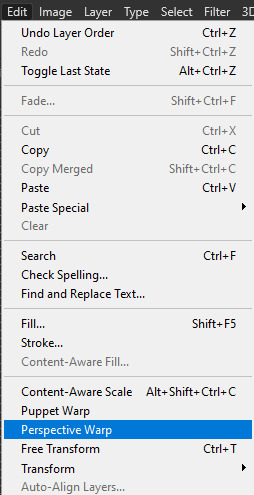
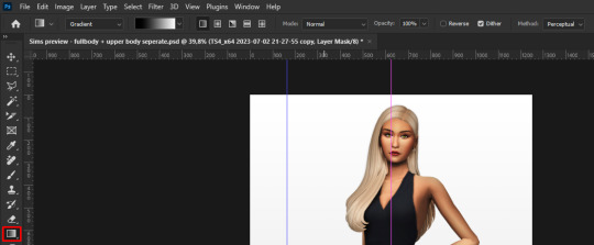
Now you will need the Perspective Warp tool.
Draw the grid over the Sim, it doesn't have to be perfect, but make sure every part of your Sim is in the grid and nothing pokes out.
Press enter.
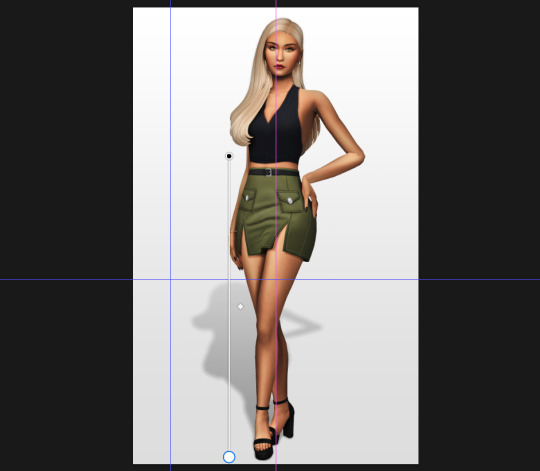
Now you want to drag the upper 2 corners separately wherever you want the shadow to be. I always put mine to the left and around the upper thigh area. I also try to match how slanted the left and right side are.
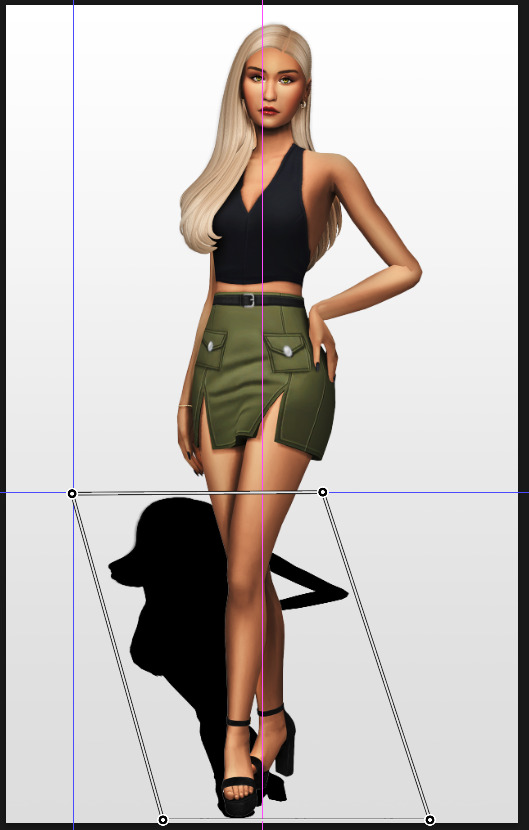
Now move the bottom 2 corners to try and match the shadow with the Sims' feet kinda. It won't work perfectly and you will need to fix it by hand after.
Press enter again.
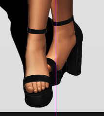
Now go in by hand and fix the shadow around the feet.
Simply paint with black on the same layer and erase parts if necessary.
━━━━━━ ・❪ ☾ ❫ ・ ━━━━━━
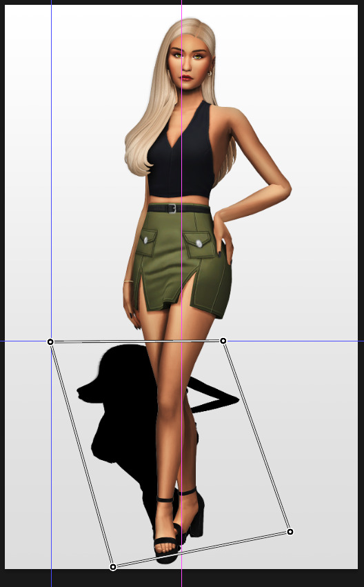
5. Making the shadow look nice
I like to change the layer opacity to 35%, but it depends how strong you want the shadow to be.
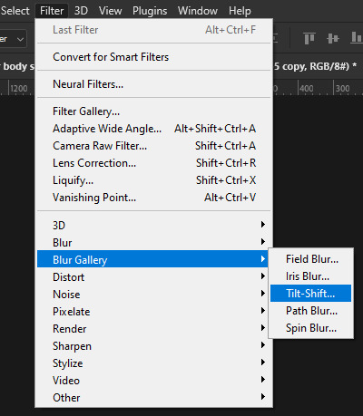
Next I apply a tilt shift blur, unlike in the video.
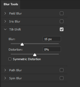
I use a blur of 15px.
Move the circle at the edge of the image basically or a bit below by dragging the middle of it. Then rotate it on the bottom line by around 10°.
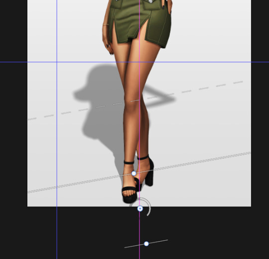
Next move the solid line to the middle of the circle and the dashed line around the ankles.

Then press OK at the top.

━━━━━━ ・❪ ☾ ❫ ・ ━━━━━━
6. Optional: Gradient layer mask
Lastly I like to make the shadow fade out a bit towards the top.
Apply a layer mask to the shadow.
Then get your gradient tool and the default black to white gradient.
Hold shift to make a straight line and drag the gradient down.
This is how I roughly place mine so it's not too strong.
━━━━━━ ・❪ ☾ ❫ ・ ━━━━━━
And that's it!
If you have any questions, let me know~
99 notes
·
View notes