#Typeset
Explore tagged Tumblr posts
Visit Tumblr Blog
Explore Tumblr blogs with no restrictions, modern design and the best experience.
Last Seen Tumblr Blogs


Fun Fact
Celebrities use Tumblr as well.
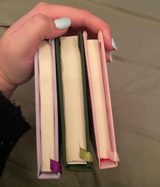
Text
Road Trip: A Final Fantasy XV Collection
IT'S HEEEEERE!
Now you too can make yourself a copy of this illustrated FFXV story collection! I've posted this 26-page PDF for download via my ko-fi shop FOR FREE! It's set up to easily print double-sided so you can cut and fold it into book shape!
It is formatted for 8.5"x11"; I want to make an A4 size available, too, but I don't have a way to test-print it at this point. Baby steps!
In any case, enjoy!
And if you end up making yourself a copy, I'd love to see pictures!
#final fantasy xv#ffxv fanfiction#ignis scientia#noctis lucis caelum#prompto argentum#gladiolus amicitia#ffxv fanfic#avianscribe's writing#bookbinding#fan binding#typeset
66 notes
·
View notes
Text
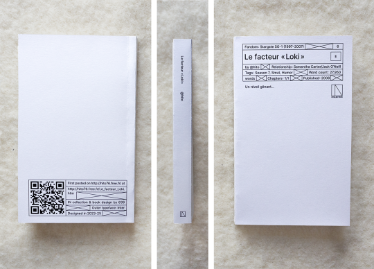
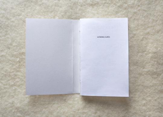
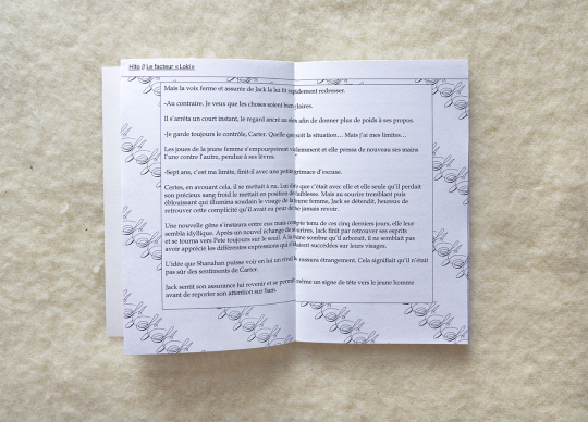
Le facteur « Loki » by @hito76
Stargate SG-1 (1997-2007) | Sam Carter/Jack O'Neill | 27,950 words | 256 pages

You can see the full typeset HERE.
You can also print it if you want a copy for yourself, I provide printable files below. The book is 11x18cm AKA 4,3"x7,1" & is bound with a coptic stitch. Mine's printed on 80gsm grey recycled paper & 210gsm grey paper for the cover.
DOWNLOAD THE FILES / PRINTING & BINDING GUIDE
This typeset breaks quite a few rules. First, it's a fic in French, and second it's not hosted on AO3, so I had to adapt the cover a little bit as best as I could. I don't intend to make this a habit, but this fic is quite special to me. Without getting too much into because it's very personal, it is one of the fics that introduced me to the world of fandoms, and I just had to typeset it.
What I tried to make is something less based on the text and more based on my memories of my first read-through. Those memories are fairly old and, I'm sure, very skewed by time and by my own feelings about the fic. They evoke mostly nostalgia and wonder at the fic and absurdity and annoyance at how inconvenient it was to read it. I invite you to click to link at the top to take a look at what it still looks like. That's a look people who where on Internet at the time (2007-8) will be quite familiar with: rough, clunky and blocky, full of awkward compositions and bright colors.
I tried to have all of that in the typeset. Surreal beauty, because this fic was nothing short of a miracle for me, mixed with weird clunkiness and inconvenient things, like the absence of folio (page number) which is really annoying but that was very much the way things were. The only clue you had as to where you were in the fic was how deep you were in the webpage. Good luck closing the tab and then finding where you left off lol.
Another example, I quite liked how at the time scene breaks were sometimes written with the pairing's initials - meaning JSJSJSJS. So 2010s.
Of course, there is also the text laid out on the full spread. Inconvenient? Hard to get printed? In bad taste? All of those, but that's kind of the point too. Stupid and beautiful. I hope I captured some of that.
This is also my biggest typeset so far. Nearly 2cm thick! It sure makes for such a satisfying book to hold!
One final note. I am not sure about the word count, actually. I usually take the count provided by AO3, but this time AO3 is not in the equation, and Word is giving me a number different than InDesign's. I went with InDesign's as it seemed more accurate but. Who's to say.
#bookbinding#ficbinding#fanbinding#book design#typography#typesetting#blog#graphic design#my typeset#stargate#stargate sg1#sg 1#sam x jack#typeset
26 notes
·
View notes
Text

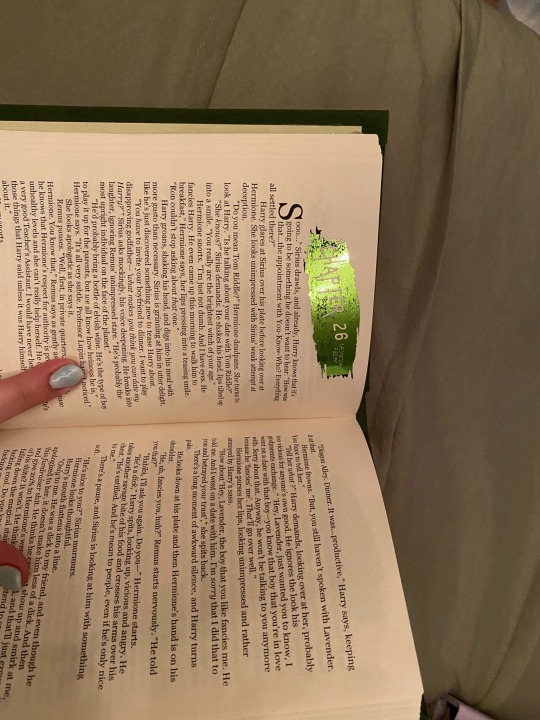
I’ve (very slowly) been bookbinding some of my fav fics. Thus far my typeset for The Disappearances of Draco Malfoy has been turning out better than I thought it would! (This is for my personal use only, of course!)
#typeset#bookbinding#fanfic#dramione#harry potter#a03 fanfic#draco malfoy#draco lucius malfoy#draco x hermione#hermione granger#hermione fanfiction
22 notes
·
View notes
Text


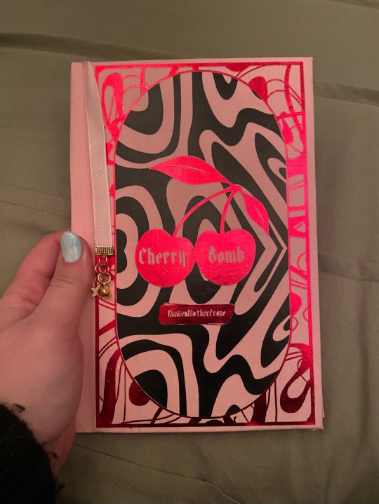


My completed bind of HEX by maidenmothercrone! This one gave me a little bit of an ass kicking bc I just had to gild every chapter heading, which ended up being like 200 chapters in all. But I’m so glad I stuck it out!!! This is one of m favorite timeline mash up’s ever and the way the author handles all of the plot lines is legit beautiful
#fanfiction#harry potter#harry potter fanfiction#tomarry#hermione x pansy#pansmione#harry x tom#Ginny Weasley defense squad#hex#maiden mother crone#cherry bomb#miseducation of Hermione granger#euphoria#fanbinding#book case#bookbinding#ao3 fanfic#typeset
116 notes
·
View notes
Text
Rounding up - for now!
With massive thanks to our creators who submitted 10 sets of creations celebrating Severitus across so many different media! We had fic, art, podfic, and even a typeset <3
As you can see, two teams had to postpone their submissions due to real-life issues, and ask for patience.
Here's a round-up of everything so far:
June 1: Desperate Measures
June 3: warmth; or the meaning thereof
June 5: The Potion Master's Apprentice
June 11: The Fall of the House of Evans
June 19: Escape Clauses
June 22: [postponed]
June 25: Letters of the Past
July 2: Encounter on Diagon Alley
July 7: Whispers in the Castle
July 14: Bloodsworn
July 20: The Prince Siblings
July 23: [postponed]
Enjoy all these masterworks!!!
And please remember to give our creators some love, especially now that all creators have been revealed!
#severitus big bang 2024#reveals#severitus#harry potter#severus snape#big bang#so excited!#fanfiction#fanart#fandom#podfic#typeset#pro snape
27 notes
·
View notes
Text
Anastasis Typeset
With @chthonion 's permission, I have posted my typeset for Anastasis to this Google Drive! You can print the PDF with regular 8.5x11 paper. More images of the full bind here.


Some notes:
I ask that you do not repost these files anywhere, and don’t even think about using them to bind a fan work for profit!! This typeset is being shared with author permission, but they may revoke that permission at any time and for any reason.
The PDF version is ready to be printed as-is, and can be printed with regular 8.5x11 printer paper. The signature size is set to be 6 physical sheets (so you’ll be folding in half every group of 6 printed pages – check the page #s line up)
The MS Word version is for if you want to adjust the typeset before printing. (This is set up as a Microsoft Word file. Idek what would happen if you tried opening it in Google Docs.) You’ll need to download the Bible Script LET font for things like the title page & chapter headers; and download the EB Garamond font for the main text. Note that the vertical chapter header images are part of the page header, so click up there to move or change them (This is so you can change all of the chapter headers at once). Note that the images look lighter than they really are until you click into the page header. Once done editing the doc, print it as PDF to get everything collated in a printable form (then print from that PDF).
Cover/spine/back art is also shared in the Google Drive
Endpapers I used was the back of this patterned paper.
Foil effects were done with a technique called toner foiling. You’ll need a laser printer (vs an ink printer), toner reactive foil, and a laminator. The rainbow foil I used for the cover/back is this laser golden foil. The gold foil I used for the chapter headers is this minc-brand gold foil.
Questions? If you have general questions about bookbinding, I’ll refer you to the Renegade Bookbinding Discord server. If you have more specific questions about this particular bookbind, you are welcome to reach out directly to me, @owlwinter8 on tumblr😊
I’d love to get tagged or DM’d photos if you do bind with this typeset! Happy binding!! <3
22 notes
·
View notes
Text

For the typographically-inclined, simply and elegantly designed cards for your loving correspondence by Jaymes Paper.
13 notes
·
View notes
Text

🖌️ Barbara Kruger
7 notes
·
View notes
Text
Typesetting with Adobe InDesign
I am going to teach myself to typeset with InDesign, and I will try to chronicle the process!
Starting point: I know there is a program called InDesign.
Step 1: Acquire InDesign.

Success!
53 notes
·
View notes
Text


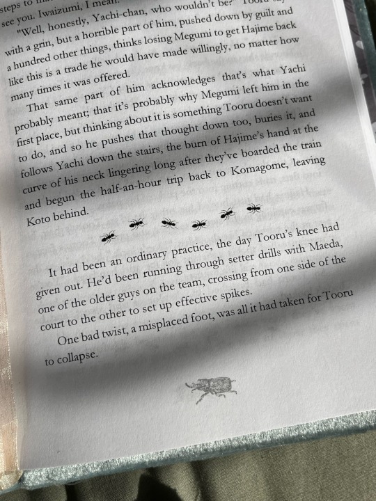
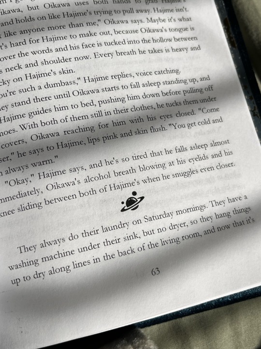
just some details for my recent binds of @whyiskisehere ‘s iwaoi fics :)
#typesetting#typeset#fanfiction#fanfiction bookbinding#iwaoi#haikyuu!!#haikyuu#iwaizumi hajime#oikawa tooru#bookbinding
100 notes
·
View notes
Text
Am I the only fandom girly disappointed that in the bookbinding community the only free typesets are for Harry Potter fanfic. I typeset all my stuff myself because I’m outside of the Harry Potter fandom but it’s so frustrating that the most beautiful typesets are made for honestly mid level fanfic because these creators won’t step outside of the hp world.
14 notes
·
View notes
Text
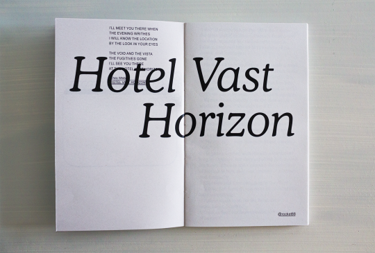
Hotel Vast Horizon by @rocket-eighty-eight
Heat (1995) | Vincent Hanna/Neil McCauley | 16,202 words | 100 pages
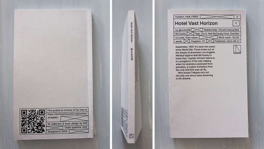

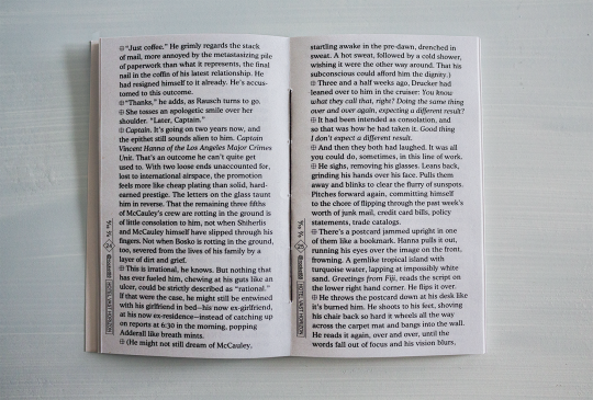
You can see and download the whole typeset HERE.
You can also print it if you want a copy for yourself! I provide printable files below. Check out the guide first ↓ The book is 11x18cm AKA 4,3x7,1" & can be printed with a coptic stitch or staples. Mine's printed on 80gsm grey recycled paper & 210gsm grey paper for the cover.
DOWNLOAD THE FILES / PRINTING & BINDING GUIDE
HEY!!!! HI! finally. If you've checked the Heat (1995) (Al Pacino and Robert De Niro Go on a Date: The Movie) tag on AO3 in the past year you've probably checked out Hotel Vast Horizon (Michael Mann Could Never: The Fic). Welp here it is on paper.
The common thread in the typeset was always the ocean (and shit, I said the o-word. did you know there are like 20 references to water, seas and storms in HVH, and yet never once "ocean" is said?). The other thread was the Bitstream Cooper typeface, which is round and curvy and so pleasing on the eye. Isn't it? Also Arial (underrated), because I needed it for the sequencing to show that Michael Mann is a loser. I'm kidding. Or am I? But this brings me to another major thing: the sequencing. (The common denominator between movies and books: the sequence.) That can only be apprehended on the full PDF/book, and it's really something that did not really exist (in so much depths) in the previous typesets.
As to what the sequencing is saying, or what the hell this intro is about (no I did not have a stroke when I did it), I will not say much if only that it is about the vocabulary, the image, the movie, the things that go beyond fate, a little bit Neil vs Vincent and a lot the reason vs the heart. More things shall remain unexplained because I feel they would be better experienced than laid out here.
If you'd still like to know what's actually going on in this thing don't hesitate to send in an ask lol.
More details on the technical matters + a visualization at the bottom, because there is work involved and my micro typography is so clean it could give Neil McCauley a boner.
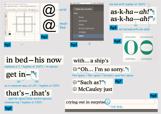
help where do i even begin? I learnt how to use FontForge to create a new typeface specifically for that symbol at the beginning of the paragraphs in order to implement it in InDesign (see fig.1 below), I changed the Arial's @ in FontForge too (fig.2) to have it fit with the underline in @ rocket88, what the hell.
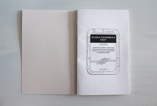
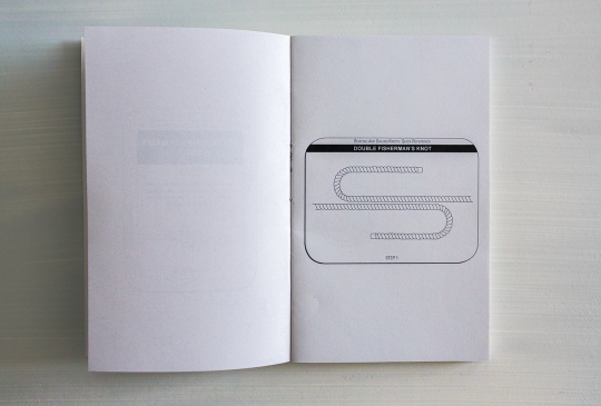
2. I also drew 11 (I think) illustrations for the intro (yes, those knots......), but that wasn't as complicated as I thought it would be. I do deeply curse InDesign's "Print Booklet" function for how much it hates images though.
3. I would like you to meet my InDesign characters styles (fig.3) as they simply are impeccable and the best you will ever see, I could not have been more professional if you had paid me 5 grand for this. The hyphens! The dashes! The custom small caps!
4. To get even further in the micro typography. It is, in most, most cases, much too time-consuming to properly kern (=modulate the space between your characters and/or words) your text for how little the average eye will get out of it, and/or your average graphic designer is certainly not getting paid enough to actually do it properly. I, on the other hand, am insane and unemployed, therefore yes, I kerned this shit. Micro typo is actually the sculpture of the white spaces of your page. When done thoroughly it does mean checking every characters with your own eyeballs.
So in english, since this typeset is in english, the rules are no spaces for punctuation. Right? and not right ? It makes for a pretty tight block. I do argue too tight - although of course you'll also have times where you want tight. (And this is all within the 5% of the time where kerning matters.) That might not sound too bad until you get to em-dashes, this '—' thing. Which is a literally useless punctuation mark that is so hysterically long it'll leave an unnatural horizontal void in your text and draw all attention to it—you know, instead of the text itself. Useless, because it can always be replaced by commas, colon, semicolon, or parentheses. Unnatural, because em/en-dashes do not follow a typeface's characteristics (when hyphens do! fig4), so they hardly fit with serifs, AND characters are generally vertically stressed in latin (fig5: which one looks normal?) except... well. So you'll have the tightest group of punctuation marks humping each other?!"— then a dash literally the size of a whole ass m that looks nothing like the rest. ridiculous. absurd.
Anyway the point is I said bye-bye to this aberration and used hyphens stretched at 260% (lmao. it works so well?). And sometimes 230%. Sometimes with a space after, sometimes not - if not the same meaning then why the same treatment (fig6)? I wondered at this point if I wasn't going too far (lol) but this is the point of micro typo, so, whatever. See fig7 for more kerning stuff.
5. I have far less things to say about this part than the last even though I must have spent twice as much time on it, but I just wanted to say that I manually set the text rag on all 69 pages, it looks nice, I love tetris, AND!!!! the greatest thing about the whole fucking book (fig8): the text starts on the top line of the first column, and ends, on p.91, on the LAST line of the column, at the very bottom of the page, and IT IS NOT. BY. CHANCE!!!!!! HAHAHAHAHA!!!!!!
thanks for reading. perfection has not been achieved and there might still be typos. see you later.
89 notes
·
View notes
Text

[image: A picture of a computer screen showing a Word document titled 'Creature Comforts.' Smaller text blocks read 'a Trigun Hurt/Comfort fanfic anthology,' 'the crossdressing fic isn't H/C, that’s just indulgence,' and 'OCCASIONALLY EXPLICIT.' A wanted poster of Vash the Stampede from the '98 anime and a wanted poster of Vash the Stampede from the Trigun: Stampede anime are on the right side of the page. On the left is a chibi-style manga panel of Nicholas D. Wolfwood straddling a prone Vash, caught in the act of punching him while Meryl Stryfe reaches out to stop them. Wolfwood and Meryl are staring at the viewer. Vash looks nervous, but it’s unclear where he’s looking because he has his sunglasses on]
Feeling incredibly smug about this anthology typeset title page.
I’ve been building a lot of anthology typesets because I love oneshots 20k or less and this is a great way to compile some of my favorite short fics under a vague theme umbrella. Pretty much any Trigun fic is probably Hurt/Comfort if you squint enough, though the referenced crossdressing fic really is just clothing/costuming porn with. Literal porn.
#fanfic#fic binding#trigun#hurt/comfort#typeset#cover page design#graphic design is my passion#fic anthology#fandom#process pics
15 notes
·
View notes
Text
*researches british military drill commands for the use in exactly one sentence that doesn't even need to exist in this goddamn fic*
writing fanfic is for the birds, lemme tell you.
#my fic#earlier my brain tripped on typeset#and i could not proceed until i found it#TYPESET#i could use other words! other words are available!#but noooo#pedantic brain wants a specific word and so i must harass my friends to help me find it and we settled on typeset#and then kinda squinted at each other like - was that it? i think so. i'm not sure. are you sure? i don't know. me neither. yeah.
9 notes
·
View notes
Text
Presenting:
The Fall of the House of Evans
Fic and typeset.
After spending fifteen years living in hiding in America following his mother’s murder and his own near-death experience, Harry Evans and his father Severus are obliged to return to England for a compulsory year of education at Hogwarts School of Witchcraft and Wizardry. But never fear—everything’s gonna be just fine, he just has to get through nine months of maintaining a secret identity, putting up with a trio of really weird godfathers, feeding the fantastic magical noodle he found in a sewer, and dodging the wrath of the surliest, prickliest, finickiest roommate one could ask for.
Check out the fic and the typeset on AO3!

[Description: The Fall of the House of Evans by fencer_x and kitsunerei88; Fic, 142k, and typeset; rating: E.
Severus and Harry are sitting on a bench, Severus having an arm around Harry's shoulders.
Banner by @trueliarose.]
#severitus big bang 2024#severitus#harry potter#severus snape#big bang#fanfiction#typeset#so pretty#142k!!
20 notes
·
View notes
Text
Dramione Fanfictions (PDF || Typeset)
Draco Malfoy and The Mortifying Ordeal of Being In Love PDF || Typeset (7 sheets per signature; non-illustrated)
Manacled [3 Volumes; Illustrated by Avendell] PDF || Typeset (Coming soon)
#typeset#draco malfoy#hermione granger#dramione#dramione fanfics#ao3 fanfic#fanfiction#fanfiction typeset
39 notes
·
View notes