#Visual texture in interior design
Explore tagged Tumblr posts
Visit Tumblr Blog
Explore Tumblr blogs with no restrictions, modern design and the best experience.
Last Seen Tumblr Blogs


Fun Fact
28.6 is the average number of monthly visits per US mobile user.
Text
Mastering the Art of Textures and Patterns in Interior Design
Mastering the Art of Textures and Patterns in Interior Design" is an essential guide for anyone looking to elevate their living spaces with depth, character, and personal flair. This comprehensive resource delves into the nuanced world of interior design, offering practical advice on how to skilfully blend textures and patterns to create cohesive, visually stimulating environments. From the tactile appeal of plush fabrics and rugged woods to the visual intrigue of intricate geometric patterns and bold prints, the book covers a range of materials and techniques. It also features inspiring case studies, expert tips, and stunning visual examples, making it an indispensable tool for both novice decorators and seasoned professionals eager to enhance their design repertoire. Read More Visit - https://freixadesign.com/2024/06/mastering-the-art-of-textures-and-patterns-in-interior-design/
#Combining Textures and Patterns#Interior DesignPatterns in Interior Design#Texture and Pattern Trends#Textures and Patterns in Interior Design#Textures in Interior Design#Types of pattern in interior design#Visual texture in interior design
0 notes
Text


for the past couple of days, i've been working on Boe's house in limbo and getting it to look close to how i've been picturing it in my head - here's a couple of shots so far showing off the exterior and interior, with the top screenshot being further along in progress than the other exterior shots.
#boe#boe tai marrow#my characters#my art#everything's mostly just in developer flat textures since idk what textures i plan on using yet#also part of me doesn't want to texture everything only because i kinda like how this looks#not that i'd point to this as being the artstyle for limbo or anything. just my brain seeing nice colour combos#my first attempt at this was based off an image of an old victorian house doll house. and because i only ever had one image -#it made working on anything besides the front angle kind of annoying#so i eventually resorted to looking up old victorian house plans and building off those. and then mirroring the plans horizontally#at some point i gotta try working on the cellar and attic#but im not ready to go about hollowing out the attic & its brushwork just yet.#i'll likely make a copy of the roof portion and design it separately. then plaster it back on once ive got it the way id want#thats what i did with both floors. laying them out separately then combining them and adjusting the connecting bits from top to bottom floor#also the houseplans i was working off of (for reference is like. design 10 of the daily bungalow) has an illustration of the house#but for the life of me. the roofing above the front porch that's above the stairwell is apparently supposed to slope more sharply#but genuinely i couldn't get it to match the illustration (which im guessing isn't 100% accurate anyway) without the interior being cramped#would've also liked for the porch roof to be a bit more sloped as well. but i couldn't go much higher due to the second floors windows#i think ive mentioned it before but with my ms paint art with Boe in it. the house in that (and the art itself) isnt canonical to Boes life#this essentially is the first time im properly visualizing that world#atleast in terms of blocking it out atleast
25 notes
·
View notes
Text

office cutaway (closeups+wip under the cut!)


#more college stuff haha#this was a three person office for people who ran a waldorf school#i wanted to show some different characteristics with the people who inhabited this space#and i tried a new liner#it was difficult to use but i think it turned out decently!#anyways have a great day :)#art#froggtogs#illustration#procreate#cutaway#3 point perspective#concept art#perspective#visual development#interior design#office#waldorf#waldorf education#environment#environmental design#design#lineart#greyscale#process work#texture#linework#gnome#detail#visdev
13 notes
·
View notes
Text


Element of Design: The Color Green
~ Part II ~
Final post, Part III, will be posted Tonight.
#fashion#art#fashion news#contemporary art#news#contemporary#elements of design#color#green#visual design#interiors#mixed media#graphic art#fashion editorial#pottery#nature#plants#architecture#installation art#fabrics#texture#cityscape#fashion design#fashion is art
7 notes
·
View notes
Photo

✨ Dive into the world of nostalgia with our latest wallpaper design, Timeless Patterns! 🕰️ This captivating wallpaper features a stunning arrangement of antique pocket watches, each one bursting with its own unique character and charm.
The intricate details and textures of these vintage timepieces create a visually striking pattern that perfectly blends the nostalgic vibes of yesteryear with a modern twist. Whether you're looking to add a touch of elegance to your workspace or simply want to embrace the beauty of time, this wallpaper is sure to impress!
Perfect for any room, Timeless Patterns brings a sense of sophistication and style. Just imagine these beautiful watches adorning your walls, reminding you of the precious moments in life. 💫
Ready to transform your space? You can easily enhance your environment by bringing this wallpaper into your home. Check it out and see how it can elevate your decor!
👉 Explore Timeless Patterns and let your walls tell a story!
#wallpapers#patterns#textures#antique#pocket watches#vintage#nostalgia#home decor#interior design#unique#charm#intricate details#modern#elegance#style#sophistication#visual art#decor#artistic#design inspiration
3 notes
·
View notes
Text


🤍🤍🤍🤍
#architecture#arquitectura#interior design#diseño interior#render#architectural visualization#visualizacion arquitectonica#wood#stone#kitchen#cocina#marble#marmol#modern house#materials#materiales#textures
3 notes
·
View notes
Text
Adding Interior Visual Dynamics
Adding Interior Visual Dynamics - #homeimprovementreferral #Interior, #InteriorDesign, #PopularPosts - https://www.homeimprovementreferral.com/adding-interior-visual-dynamics-2023-09/
#dynamic space#Enhancing Interior Spaces#furniture#Furniture Arrangement#interior#interior design#lighting#Material#Texture#Visual Dynamics
0 notes
Text

'Everything in this room is tongue-in-cheek.' The laminate fireplace contains a video of a burning log. The tiles on the floor, reminiscent of hopscotch squares, actually represent the elements of nature in their color scheme: white for air, red and yellow for fire, blue for water, and gray for earth. Celia (Vogel) and Mario (Mulea) wanted to create an emotional dissonance by using unexpected textures and patterns to generate tactile and visual excitement, hence this bath functions as a living area. Celia says 'It's a sybaritic environment imbued with contemporary pleasures.'
Interior Visions: Great American Designers and the Showcase House, 1988
#vintage#interior design#home#vintage interior#architecture#home decor#style#1980s#living room#bathroom#fireplace#laminate#modern#artwork#tube TV#Venetian mirror#contemporary
540 notes
·
View notes
Text
PANELLO - GOLD
Transforming Spaces: The Versatility of Slat Wall Panels, MDF Panels, and Wall Profiles
In contemporary interior design, versatility and functionality are key. This is where innovative materials like slat wall panels, MDF panels, and wall profiles come into play. These elements not only enhance the aesthetic appeal of a space but also offer practical solutions for organization and customization.
Slat Wall Panels: A Modern Solution for Display and Storage
Slat wall panels are an excellent choice for both residential and commercial spaces. Their design consists of horizontal slats mounted on a wall, which allows for the easy attachment of various accessories such as shelves, hooks, and baskets. This modular approach provides a customizable storage solution that can be adapted to fit different needs. Retailers and homeowners alike appreciate slat wall panels for their ability to create organized, visually appealing displays. They are particularly popular in retail environments for showcasing products, but their use is expanding into home decor, garages, and office spaces.
MDF Panels: A Blend of Functionality and Elegance
Medium-Density Fiberboard (MDF) panels are a staple in modern interior design due to their versatility and smooth finish. Made from wood fibers and resin, MDF panels are engineered to provide a stable, durable surface that can be easily cut, shaped, and painted. This makes them ideal for a wide range of applications, from cabinetry and wall panels to intricate moldings and custom furniture. Their smooth texture allows for a high-quality finish, making MDF panels a preferred choice for projects that demand a polished look.
Wall Profiles: Enhancing Architectural Elements
Wall profiles are essential for adding finishing touches and architectural details to a space. These profiles come in various shapes and sizes, including cornices, architraves, and skirting boards. They serve both decorative and functional purposes, framing windows and doors, covering joints between walls and ceilings, and adding character to otherwise plain surfaces. Wall profiles can be made from materials like MDF, polyurethane, or plaster, each offering unique benefits in terms of durability and ease of installation.
Conclusion: Combining Style and Function
Incorporating slat wall panels, MDF panels, and wall profiles into your design strategy can significantly elevate the look and functionality of any space. Slat wall panels offer flexible storage and display options, MDF panels provide a versatile and high-quality surface for various applications, and wall profiles add refined details that enhance the overall aesthetic. Together, these elements create a cohesive and stylish environment that meets both practical and design needs.
Whether you're revamping a retail space, updating your home decor, or designing an office, these materials offer numerous possibilities for customization and innovation. Embrace their potential to transform your surroundings with elegance and efficiency.
630 notes
·
View notes
Text
Breaking down Hotch's apartment layout until someone from Criminal Minds slides into my DMs with the damn floorplans

- CASE BRIEFING: HOW HOTCH'S APARTMENT GASLIT US ALL
As an architecture student, I have a very strong (borderline obsessive) interest in analyzing spaces and locations... especially when they don’t quite add up. And one that has always messed with my brain (sometimes in a good way, but mostly in a frustrating way) is Hotch’s apartment from seasons 4–11.
The transformation from the bare, depressing space in s5 to the warm, cozy atmosphere with antique furniture and clever spatial tricks later on… it’s fascinating.
But also confusing as hell.
Because one question has always haunted me:
Is the apartment we see in Season 4/5 (where Hotch was stabbed and possibly SA’d) the same one he’s living in by Season 10?
(And since I’m a visual learner, here are the pics, because this mystery needs solving... I'll try my best)
(05x01 ; 10x05 don't zoom in, you freaks)


Seems easy to solve, right? The civil number is the same! Great.
121
...But hold on - what’s this?
(07x23)


...Damn, Aaron, your mailman must be going through it - 121? 123? Pick a struggle.
So… is it the same apartment or not? Because at this point, I’m losing my mind.
- VICTIMOLOGY (TYPOLOGY)
As you all know, the starting point is always victimology—but in architecture, my go-to is typology.
So, what kind of apartment building does Hotch live in?
Because once we figure that out, we can finally make sense of all the architectural crimes committed in his apartment.
We get a glimpse of his building in 5x02, and - without dragging you through a full historical deep dive (unless you want me to, in which case, buckle up) - here’s what we do know: it looks like this...


The building looks pre-WWII, likely built in the late 1920s–1930s, or designed more recently to mimic that era.
My guess is primarily based on the architectural detailing of the ground floor - the stonework, arches, and classical elements that give it a grander, more “expensive” look - and the distinct visual separation from the upper levels.

Spencer Reid moment - you can skip it if you'd like -> This actually follows a common design principle (partly influenced by Louis Sullivan’s theories) where different sections of a building reflect their function. The ground floor, being more public-facing, is more decorative and inviting, while the upper floors (where the apartments are) are plainer, emphasizing privacy.
However, the upper levels look stripped down, almost too plain, like they went through a more recent renovation that removed some of the og character. While it was normal in the 1920s/30s to emphasize the lower level, the upper floors would still have had some kind of textured finish brick, terracotta, or even decorative stone accents. Instead, here, it looks like someone just painted over everything... a bit sad, honestly… much like the man living in one of these apartments. Sorry Hotch but it is the truth.

That said, based on the photos, I hypothesized a possible volumetry diagram and main floor plan of the apartment building, including its functions and layout.
Knowing that Hotch lives in 121 (or 123… whatever it is today), he could very well be on the first floor. Old man isn’t about to risk climbing seven flights of stairs, understandable.
(Or, if we lean into the conspiracy theory that he has childhood trauma related to fire, it’s very telling that he chose a first-floor unit, making for an easier escape in case of danger…)

Our lovely Emily Prentiss gave us a sneak peek at the ground floor interior in 5x01, which - combined with a study of the window placement on the facade - helped me piece together a small section of the central layout.

From what we see, I feel even more confident about the building’s era - especially because of the beautiful wooden decorated elevators (yes, those are elevators, not doors... check the buttons on the side)


And now, for another Spencer Reid moment, part two -> In the early 1900s, when elevators were first being introduced in residential buildings, they didn’t look like the modern ones we see today.
Why?
Because men fear change.
Just like with any new technology, people were hesitant, so architects and designers made elevators blend in by disguising them as something more familiar - often looking like grand wooden doors or classic entryways rather than the industrial metal boxes we think of today.
This same pattern happened with building structures - steel (and concrete too!) was widely adopted in the early 1900s because of its strength, allowing for taller buildings, but architects still hid the steel frame behind stone or brick facades to maintain the look of traditional palaces. Even early cars looked like carriages because people weren’t ready to embrace a completely new form.
So, Hotch’s apartment building? It’s yet another classic case of early 20th-century architectural reluctance to embrace modernity - which, honestly, fits him a little too well. The man bottles up his emotions behind the calmest face just like his home hides its innovations behind classic detailing.
I see you, Aaron. You’re not fooling me.
Now, you may be asking - "Phi, weren’t you supposed to expose all the inconsistencies in Hotch’s apartment and finally solve whether it’s the same place or if they changed it?"
To that, I say… we’re getting there.
Because before we dive into the madness, there’s something that really messes with my brain - the window placement in Hotch’s apartment.
But to even begin analyzing that, we first need to understand how a typical floor plan in a building like this would be structured. And once again, our queen Emily Prentiss in 5x01 unknowingly led us straight to the answer.


The bastard even has a vaulted ceiling - right where I believe the main distribution area (aka elevators and stairs) is located. You can spot it in the pictures near the exit signs.
Also, just a heads-up... in the diagrams, the apartments look smaller than they actually are because I was too lazy to make multiple detailed drawings. (But hey, if someone paid me - hi, CM - I absolutely would) So, for now, I’m using that as a quick reference.


Now… the interior! Or should I say… the everchanging interior.
In this issue, I’ll be analyzing the Season 5 version - I even sketched out a small section of the floor plan (which could be completely wrong, because things change every episode).
From these pics, we can see that his windows are on the opposite side of the entrance - which, so far, checks out.


But wait... look down here! Check out the window placement in the kitchen. Thanks to that little detail, we can hypothesize that Hotch’s apartment is located in what I’ve labeled as "Unit B" - aka the unit with double exposure (great for ventilation, Aaron, solid choice).
From this pic down here from the s4 finale, we also get a fun little bonus detail - there’s what looks like a tiny dryer (or washing machine?) just sitting out in plain sight. And right behind Hotch, there’s a door that, based on the dimensions, I suspect leads to a bathroom.

Enough details to sketch out a partial floor plan… and there you have it!
A (partial) floor plan of Hotch’s apartment in its saddest era: bare, empty, and drowning in case files from seasons 4–5

And seeing more of his apartment in later seasons should be a blessing, right? It should help us map out the whole thing, right?...
Right?
...Wait.
Is that... a full-ass door on the right that totally wasn’t there before?!
Aaron, you hypocrite - you shut down Spencer Reid’s physics magic, yet here you are summoning entire new rooms into existence in your apartment.
(05x02 ; 10x05)

Alright, fine... where does that door lead?
(10x20)


Hot damn.
Referring to the home office, of course… and here’s some solid proof of its placement. Now, I’m gonna… step away for a minute… process... this... architectural betrayal… but YOU - you make sure to study these pics. I’ll be quizzing you later, got it?


Alright… and now… now that you’ve hopefully been studying (and totally not getting distracted by Hotch’s shirt hanging on for dear life - OMG LOOK AT THE [REDACTED])… focus.
You nasty.
Window placement.
Where’s the home office window? Exactly... on the same side as the others in the living and dining area (you can tell by the way the light enters the room in the pic on the right)
And since you’re all very interested in the architecture (and definitely not drooling over a certain Unit Chief), let me ask you this:
WHY THE HELL IS THERE A WHOLE FIREPLACE IN HIS HOME OFFICE?!
Don’t worry - I’ll answer for you. Since y’all are nasty.
Can I just say that it UPSETS ME to the point where I’m considering a 30-day diet of just drywall that THAT MAN - THAT FEDERAL AGENT - HAS A FIREPLACE. IN HIS HOME OFFICE.
(HELLO?!?!?!?!?? Whore.)
Unhinged. Because:
1. A fireplace is quite literally a symbol of family and warmth (fun fact: Frank Lloyd Wright always designed homes starting with the fireplace! Oh, wait. You might not know who that is, so now this just sounds confusing. My bad. Anyway, he designed a lot of cool stuff... moving on). A fireplace belongs in a living room or dining area, where people actually gather. And considering Hotch’s building is old, there is no way it was originally designed to have one in a private office. That placement is categorically wrong. You’re a terrible designer if you stick a fireplace in an isolated office but not in the main living space where it actually makes sense.
2. The writers could try to lie to my face and say, “Oh, maybe the room was repurposed into Hotch’s home office.”Wrong. His apartment has a big open-concept living/dining area with the kitchen on the side. And unless his place is secretly Rossi’s mansion (spoiler: it’s not), there’s no way the original layout had a separate formal dining room. And even if it did, the fireplace is still in the wrong damn place because formal dining rooms are typically closer to the entry.
3. They could lie even harder and try to argue that Hotch having a fireplace in his office is some deep, symbolic artistic choice - like, oh, he’s so devoted to his job, he’d rather warm his ass doing paperwork than sit by the fire reading Jack a bedtime story like a decent human being. Like. Come on. He’s a family man, for god’s sake. Either give him a properly placed fireplace or JUST DON’T GIVE HIM ONE AT ALL.
(Less is more, people!!! Unless, of course, we’re talking about Hotch’s [REDACTED]... oof. Damn censorship. Right when I was about to say something deeply unholy. )
Goodbye. See you in the next issue.
Hopefully by the end of this series we'll manage to sketch down the entire floorplan
Phi.
278 notes
·
View notes
Text
Writing Notes: Neutral Colors

Neutral Colors - muted shades that appear to lack color but often have underlying hues that change with different lighting. Examples:
beige,
taupe,
gray,
cream,
brown,
black, and
white.
Types of Neutral Colors
The basic neutral color palette comprises black, white, brown, and gray, with varying shades in between. Here is a breakdown of the various types of neutrals:
Pure neutrals: The pure neutral color palette includes black, white, brown, and gray, all of which fall under the category of pure color, which means they are fully saturated and do not have an undertone (underlying color). By mixing different pure neutrals and primary colors, you can influence the resulting color’s saturation and vibrancy.
Near-neutrals: Mixing a primary color with a pure neutral color creates a near-neutral. For instance, to make the near-neutral color tan, mix the primary color yellow with the pure neutral brown. Near-neutral colors have lower saturation than pure neutral colors. Similarly, pairing a neutral color with a bright hue increases the vibrancy of the hue, attracting the eye to that particular spot of color.
Warm and cool neutrals: Mixing different pure neutral colors with primary colors creates either warm neutrals or cool neutrals. Warm neutrals have yellow, orange, or pink undertones, such as beige, tan, and gold, while cool neutrals have blue, purple, or green undertones, such as gray, taupe, and ivory.
Advantages of Decorating With a Neutral Color Palette
Interior designers use neutral color palettes to create different visual effects, playing with focal points, depth, saturation, and highlights to enhance a living space. Here are some of the advantages of decorating with a neutral color palette:
You can build off neutral tones. When you paint or decorate a space with a neutral color, you can build off that tone, incorporating accent colors or bold patterns. Overusing bold colors makes the room overwhelming and distracting for the eye. Neutral colors help balance a room so that you can add different accessories and patterns.
Neutrals pair well with a range of colors. Through different seasons, your style and preferences may change. Changing your home décor with a new pattern piece or set of curtains is easy when your room has a neutral color palette because it's versatile and pairs well with different color schemes and design elements. Simply adding new throw pillows to your couch can change the look of your living room and match your new style.
Neutrals can have a calming effect. While bright, bold colors are loud and vibrant, neutral paint colors are calming and gentle on the eye. With little saturation, neutral colors seamlessly flow from one color into the next. Most neutral palettes also reflect naturally occurring colors, shaping a living area into a relaxing, nature-based space.
You can use any decorating style. Different interior design styles incorporate neutral colors, from modernism to rustic to art deco. As a natural foundation for any background, neutral colors enhance different tones and patterns. For instance, neutral shades balance geometric patterns in an art deco room, whereas darker neutrals create a streamlined, sleek effect in a modern room.
Tips for Decorating with Neutral Colors
When working with a neutral color scheme, find subtle DIY ways to add texture and color ideas for versatility.
Use different tints: Tonal color palettes add highlights and accents to a neutral color palette, making areas of a room pop. Incorporate different tints and neutrals to create a more lively and engaging space. Consider pairing sage green with a predominantly gray and white room to add a tint of color—a pop of pink pairs nicely with warmer neutrals, such as gold or beige.
Consider the lighting: A room’s lighting influences how your eyes read a color. Artificial lighting tends to have a yellow hue, so it intensifies warmer neutrals. Consider factors such as the season, time of day, the sun’s position, and the room’s location when choosing your color schemes. For example, natural light from the north creates a blue tint, making neutral colors appear darker and less saturated, while eastern or western light creates a warmer hue. White paint comes in various shades; they also appear differently depending on the natural lighting.
Add color with accessories: Pairing neutral walls with neutrally colored large furniture pieces can create a calming effect, but that doesn’t mean you must sacrifice color. Instead, incorporate color in the different accessories in the room, such as throw pillows, artwork, or curtains. Choosing accessories with color makes it easier to change the room’s style and décor to match different seasons.
Choose the right color: Different near-neutral and pure neutral colors have varying effects on a room. Dark, cool colors create a cozy feel within a room, while lighter neutrals make a room appear larger. Choose a room color that aligns with the design and feel you want for the space.
While neutral colors are not on the color wheel, they complement primary and secondary colors.
You can combine primary colors—like red, white, and blue—to make a range of other colors.
Secondary colors are the result of mixing two primary colors, like green (yellow plus blue), orange (yellow plus red), and purple (red plus blue).
Neutral colors can be complex in tone, as mixing different colors creates unique shades.
For example, greige is a mix of light gray and beige, with yellow hues in natural light and gray in fluorescent lighting. (Natural light refers to lighting generated from a natural source like the sun.)
Source ⚜ More: Notes & References ⚜ Writing Resources PDFs
#colors#colour#writing reference#writeblr#neutral#literature#dark academia#writers on tumblr#spilled ink#creative writing#writing prompt#light academia#writing inspiration#writing ideas#worldbuilding#writing resources
86 notes
·
View notes
Text
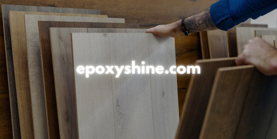
EPOXYSHİNE - DRAGON+ (3)
Epoxy floor coating is not just a practical choice for enhancing the durability of your flooring; it's also a stylish solution that can transform any space. Whether you're a homeowner looking to revamp your garage or a business owner seeking reliable commercial flooring solutions, understanding the benefits of epoxy will help you make informed decisions. As you search for "floor polishing near me," consider how an expertly applied epoxy coating can elevate your interiors while providing a long-lasting finish.
Epoxy Floor Coating
Epoxy floor coating is a highly durable and resilient flooring solution that has gained popularity in both residential and commercial spaces. This type of coating is made from a combination of resin and hardener, creating a strong bond when applied to existing concrete surfaces. The result is a seamless surface that can withstand heavy foot traffic, chemicals, and abrasions.
One of the major benefits of epoxy floor coating is its versatility. It can be customized in various colors and finishes, including high-gloss and matte textures. This means that property owners can choose a look that complements their interior design while still providing the durability they require. Additionally, the smooth finish of epoxy makes it easy to clean and maintain, which is particularly advantageous in commercial settings.
Furthermore, the installation process for epoxy floor coating is relatively quick, often completed within a few days. However, it’s essential to hire professionals who have the expertise and equipment to ensure a flawless application. The right team will properly prepare the surface, allowing for optimal adhesion and longevity of the coating.
Floor Polishing Near Me
When searching for floor polishing near me, it's essential to find a service that not only meets your expectations but also understands the unique needs of your flooring. Professional floor polishing can revitalize old surfaces, restoring their shine and luster while protecting them from future wear and tear.
Many local companies offer specialized services in floor polishing that cater to various materials, including hardwood, tile, and concrete. A quick search in your area will yield numerous options, allowing you to compare prices, services, and customer reviews to find the best fit for your needs.
Additionally, hiring professionals for floor polishing ensures that the job is done correctly and efficiently. They use advanced equipment and high-quality products that not only enhance the appearance of your floors but also extend their lifespan. So, don't hesitate to reac
Commercial Flooring Solutions
Commercial flooring solutions are essential for businesses seeking to enhance their aesthetic appeal while also ensuring durability and functionality. The choice of flooring can greatly influence the overall atmosphere of a commercial space, leading to improved employee morale and customer satisfaction.
Among the various options available, epoxy floor coatings stand out due to their seamless finish and resistance to heavy foot traffic. These coatings not only provide a sleek look but also protect the underlying surface from wear and tear, making them ideal for warehouses, retail spaces, and industrial environments.
Moreover, businesses often explore additional options such as vinyl flooring, carpet tiles, and laminate surfaces to meet specific needs. Each of these materials offers unique advantages, allowing business owners to choose the most suitable flooring solution that aligns with their operational demands and aesthetic preferences.
Metallic Epoxy Floor
A metallic epoxy floor offers a stunning visual appeal that enhances the aesthetic of any space. The reflective properties of the metallic pigments create a unique look, resulting in a three-dimensional effect that can mimic a variety of surfaces, such as water, marble, or even molten metal. This type of flooring is especially popular in modern homes, showrooms, and commercial spaces, providing an eye-catching yet durable surface.
One of the significant advantages of a metallic epoxy floor is its durability. This flooring solution is resistant to stains, chemicals, and impacts, making it ideal for high-traffic areas. Additionally, it is easy to clean and maintain, which means that business owners and homeowners can save time and resources. The seamless nature of epoxy flooring also contributes to a hygienic environment, especially in spaces like hospitals or laboratories.
Installing a metallic epoxy floor can be a customized process, allowing property owners to choose their preferred colors and patterns. Whether you’re looking for a sleek, industrial look or a vibrant, artistic finish, this flooring solution can be tailored to meet your unique vision. By consulting with professionals, you can ensure that your metallic epoxy floor is installed correctly and maximizes its longevity and beauty.
598 notes
·
View notes
Text
Favorite Visual Storytelling of 2024: Cdrama Edition

Although I spent the better part of 2024 complaining about the state of Chinese dramas, one thing I did appreciate seeing in this year's lineup was all the lovely cinematography and production design on display. Not only did these visuals look great, but they were meaningful to the story.
In no particular order, here are my top picks of the year...
Favorite Use of Color: The Double

Evocative and theatrical, The Double's cinematography definitely caught people's attention, splitting viewers into those who liked it and those who thought it was too much.
But what always struck me as refreshingly unique about the drama was its careful use of color . Check out how the following scenes have a completely different feeling because of their color palettes:


Whether it's the fairytale romanticism of a white blossom forest or the queasy yellow and pink of a brothel, the show's colors always give us a sense of mood (and character) without needing much exposition. Really efficient storytelling!
Favorite Production Design #1: Fangs of Fortune


If I included screenshots of all my favorite sets and costumes from my next pick, we'd be here all day.
I've always loved the energy and symbolism of Director Guo Jingming's visual storytelling, but his production design team in Fangs of Fortune really outdid themselves. The scale, shapes, and most importantly texture of each set gives the show a sweepingly escapist quality that we rarely seen in Cdramas. It is true high fantasy come to life, asking us to reflect on what it means to be human through the eyes of those who are otherworldly.
Favorite Use of Production Design #2: To the Wonder


I was uncomfortable with the tacit political messaging of To the Wonder but the amount of care and detail that went into its production design is undeniable. People seem to mostly praise the drama for its idyllic on-location shots but I think it's the prop design and interiors that really sing because they provide insight into lives we rarely see represented on screen.
Favorite Use of Light: Love in a Dream


When I see dramas like Love in a Dream, it makes me wish the industry would just throw money at all the talented and creative visual directors in the short drama circuit. A masterclass in contrast, this drama is absolutely gorgeous, and its dramatic use of chiaroscuro lighting makes it look like a cross between a Renaissance painting and shadow puppet show.
Was I always able to follow the plot? No, but who cares when every other scene looks like art.
Favorite Use of Camera Language #1: Tender Light


Tender Light is a great example of using cinematography to establish the right tone for a story.
The story follows a woman being accused of murdering her abusive husband and the camera language actually mimics the social fallout of his death. Look at how it uses dirty framing, overhead shots, tracking, etc. to give the story a voyeuristic and surveillant feeling. It's like we (the audience) are being forced to invade the privacy of these characters, and in doing so, the show implicates us in the nasty gossip that surrounds our FL as much as the local townspeople spreading it.
Favorite Use of Camera Language #2: Regeneration

From the opening shot of Regeneration , we learn that this is a world where it's difficult to distinguish reality from its equally compelling reflection. The drama is all about the stories people weave and the show plays with subjective cinematography to make us question what we perceive as the truth.
Runners-Up

I dropped Blossom before I could get a sense of its visual storytelling, but the drama has Director Zeng Qingjie's signature dreamy, romantic visuals . Bonus: Li Yunrui looking hot in his gray wig.

Riverside Code at Qingming Festival didn't quite work for me as a case-breaking story but the amount of research they put in the costuming and prop design is incredible. I hope Director Yang Fan gets more opportunities to direct big budget period dramas because his attention to detail is immaculate .
--
And that's a wrap!
What was everyone else's favorite Cdrama visuals of 2024?
#cdrama#end of year wrapup#cinematography#production design#meta#the double#fangs of fortune#to the wonder#love in a dream#tender light#regeneration#blossom#riverside code at qingming festival
82 notes
·
View notes
Note
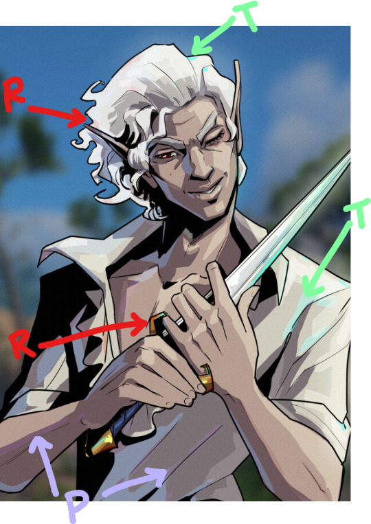
If you wouldn’t mind sharing your secrets, can you drop a quick tutorial for the hades art style? You seem to capture it very well!
Hey anon! Thanks so much, I’m flattered you think so!
To be honest there's really no secret, just a lot of trial and error. I am an amateur, but I’ll point out a few of my observations of the amazing Hades team’s work that I attempted to incorporate into this Astarion drawing, especially SuperGiant Games art director Jen Zee. Everything below is just my layman’s observation of her much, MUCH better work. You should check her out yourself!
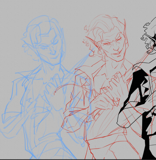
First off, here’s a simple split out of the whole process (this will be long, more below the cut:)
POSE & PERSONALITY
Hades art is full of personality so the first challenge was to pick a pose that illustrates just one or two aspects of the character. For example, Dionysus from Hades 1 below has a languid, draping pose that reflects his chill-guy party vibes. Just looking at him you get an immediate idea of his personality.
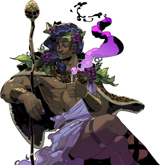
And as much as I love the later wet-cat version of Astarion as he matures as a person, for the purposes of illustration in this style I chose a pose and expression that leaned into his early, less complex, more wily self. The dagger, wink, jaunty hips and head tilt are meant to communicate, without additional context, that he’s both trying to be appealing and is not trustworthy.
LINEWORK & SHADING
Next is the linework and blocking! The Hades art team tends to use a combination of near-mono-thickness black lines, where exterior lines are thicker and interior lines are thinner or have no lines at all. They will often forgo an interior line to communicate form via color blocking instead. The style also makes heavy use of absolute black for the deepest shades, especially on more sinister characters or spooky aspects of a characters design. (See: Zagreus’ three dog head skulls and his red eye perpetually cast in deep shadow.)
It took some back and forth to find the right balance of black shading for Astarion. Too much and he looked too sinister and not approachable enough. Too little and he looked too innocent.
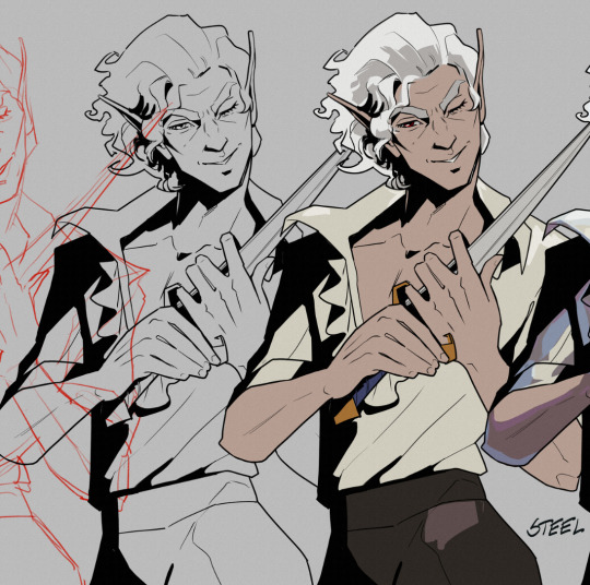
Picking a strong light source helped with determining the direction and placement of the shadows so that just enough was obscured/revealed. It also helps in differentiating forms from each other so that, for example, the arm doesn’t disappear into the chest and become unreadable.
Using heavy black shading was a particularly useful trick in Astarion’s case, because his camp clothes color palette is fairly monochromatic between his light hair, pale skin, and white/cream shirt. That much light color can easily blend in too much and become boring: the flats I used were slight variations of white, from a warm reddish-peach to a yellowy cream to a cool light gray for the dagger.
COLOR & LIGHTING
Last is color! In Hades 1 and even more so in Hades 2, the lighting schemes are deceptively complex. There are often multiple light sources and use of bounce lighting to add a lot of visual interest. For example, check out this lighting on Polyphemus from Hades 2:
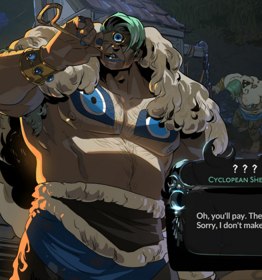
Not only does he have a cool moonlight hitting him from above, he also has a warm orange rimlight lighting him from the left, AND cool lavender bounce light bouncing off the ground and hitting him from below. All these combine and layer on top of one another to help emphasize the forms of the cyclop’s musculature and the textures of his sheep wool coat.
I don’t think I was as successful in my own lighting scheme, because I’m an amateur, but I determined that the scene in which I was placing Astarion has a high sun and was outdoors. This means that the light hitting him from above would be a light, warm yellow and the bounce light hitting him from the left would reflect the nearby water and blue sky of the environment.
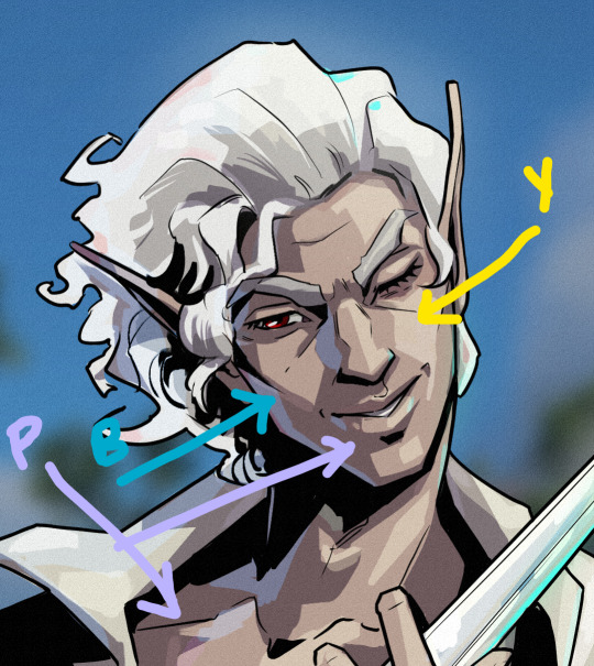

To achieve this, I made use of different layer modes in my art program (Clip Studio Paint) to apply purple shadows (via the Multiply layer mode) and highlights (via the Soft Light layer mode) in a light sky blue and a light yellow for the primary and secondary light sources.
I ran into trouble with the blade, because it was also a light metal in an already light-color-heavy color scheme. At first, it was blending in too much and hard to read. So I decided to give it a bit of a magic teal glow to help it stand out, which meant adding a few specks of magic light reflecting back onto the face and clothes as well.
INTEREST & DETAILS
Speaking of, Hades style art makes extensive use of adding little speckles of high-saturation color to add visual interest and cohesion. See this Zagreus portrait which is primarily made of grays, a tan bone-color, and reds:
But sprinkled in are neon teal and magenta that don’t relate to the lighting at all. It’s just there to break up the blocks of color, bring unique colors like his green eye into the rest of the portrait, and direct the viewer’s eye. These highlights are slightly less bright in Hades 2, but still there, such as in this depiction of Apollo, who mostly glows with a warm sunlight but also has random pops of sky blue and green flecking his armor and hair.
The pops of color are often placed more centrally on the figure to keep your eye on the important parts of the portrait, like near Apollo’s face and on his armor. The color pops aren’t as frequent at the extremities; too much on the arm and your eye would be drawn away from his face.
I took a similar approach where I grabbed some of the brighter colors (like Astarion’s red eye, and the teal glow of the dagger), to add dabs of color that normally would not “make sense” from a lighting perspective, but add a little visual interest:
Also I totally studied their approach to Apollo’s curly hair to create the impression of Astarion’s curls!
Anyway, I think that's all I got for now, I hope this helps! There's more but this is already REALLY long so I'll stop here. In the end, it's really just a process of observation and replication of things you love in artwork you admire. Give it a try, it's a lot of fun :)
143 notes
·
View notes
Text

Hplace Cafeteria is a minimalist space located in Dubai, United Arab Emirates, designed by ATELIER PROTOTIPI. The genius of this interior lies in its deceptive simplicity. What appears as minimalist at first glance reveals itself as deeply textural upon closer inspection. Travertine blocks—some polished to a sophisticated sheen, others intentionally raw—create a visual dialogue between refinement and ruggedness.
17 notes
·
View notes
Text
Textures' Influence On Interior Design
Textures' Influence On Interior Design - #homeimprovementreferral #InteriorDesign, #PopularPosts - https://www.homeimprovementreferral.com/textures-influence-on-interior-design-2023-08/
0 notes