#also I have no idea if I'll actually post the drawing when it's done
Text
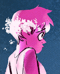
I just spent 4 and a half hours on a drawing because I was like "hmm, drawing a self portrait sounds fun" and then I spent the whole time working on it going "this is absolutely beautiful but that is not my fucking face and I can't work out why it doesn't look right"
#personal#thoughts#art rambles#🍬 post#it really does look great but it's just not quite right and I can't pinpoint why#I just looked at it again after doing something else for a while and it looks better than I initially thought?#but there's something about it that's kind of giving uncanny valley vibes#then again I think that happens whenever we draw anything in enough detail and then after a while it stops looking creepy#actually maybe I do just look creepy. that's absolutely a possibility that I'm willing to accept. a man can be both creepy and hot#this would explain all the times Lucy has called me both ''creepy'' and ''hot'' in the same sentence#also I have no idea if I'll actually post the drawing when it's done#I still feel kind of weird posting drawings that are specifically meant to be me rather than my source#especially if there's no context to show that it's specifically an in-system thing#with the one drawing I have posted of me and Lucy there's context so it's more obvious#it feels like if it's indistinguishable from the drawings we'd normally do of my source is there any point specifying that it isn't that#even though I know that's not true and it's absolutely fine for me to draw myself and say ''this is me''#if I think about this stuff to hard I start to feel really weird about being a fictive again#I swear most of the other fictives we have don't feel anywhere near as weird about being fictives#I don't get why I have such a weird time with it compared to the rest of the system#(also I say all this as if I draw myself all the time. I've only ever drawn myself a couple of times but yeah idk)#(the thing of feeling weird posting stuff applies to other stuff like source memories or whatever)#(or literally anything that references any traits I might have picked up from my source)
5 notes
·
View notes
Text
creepy music starts playing because naomi just came to from her fervour. something gross happens and then sachiko shows up again and is (going to be) gross as well but we’re not going into any detail about that.

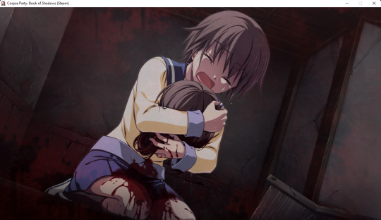
naomi is put through immense pain to assumedly be tortured by past and future memories and then told about this all being a repeat
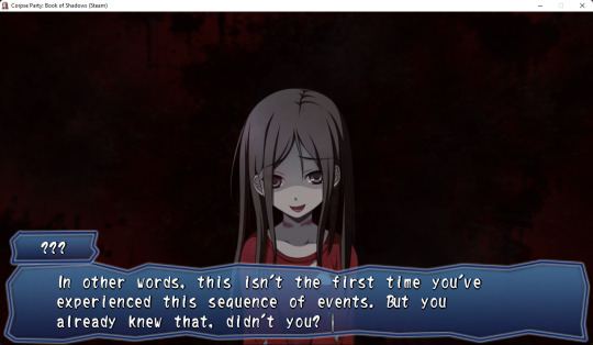

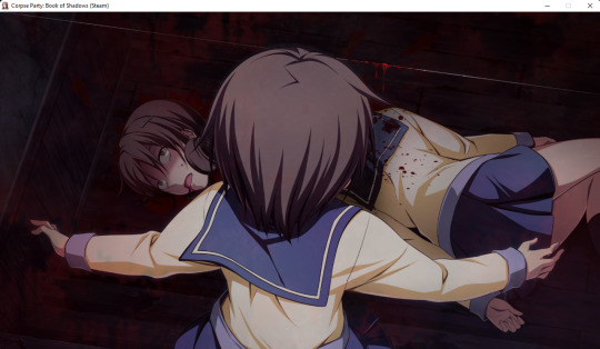
though sachiko isn’t actually being helpful, obviously. she just wants to see how much worse she can make it for naomi. during that whole time, naomi went back under the darkening and hanged seiko anyway.
like i said though, naomi gets seiko down successfully
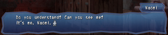
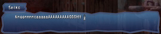
but as soon as seiko realizes who’s in the room with her she freaks out (obviously. and again, this is especially different than last time) and is the one to run away instead
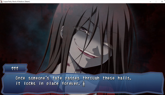
sucks. naomi is further taunted by sachiko, with her saying that fate is unchangeable and all that shit, and that she’s going to wipe her painful memories away so that they can try again and again to kill seiko in different, more painful ways
#it's so hard putting together nice posts for my live blog ... sigh#LOL#at least with BD though it's fullscreen automatically and doesn't react weird so i wont have to crop everything#oh actually. minor detail i like how the artist drew naomi in a normal kneeling position for once#copa lb#liveblog#done chapter 1 finally so i'm finishing up for now. hopefully the next few chapters will be quicker#i didnt actually get any bad endings this chapter. there were only 2 though and i'd already gotten them so it doesnt really matter i guess#i'll try and get them all for the rest of the chapters though since i like the rest of them better than this one#... well i dont hate this one but you know#anyway. i personally hate the idea of fate and i think sachiko is fucking with naomi for the most part since she's in control of everything#also because the 'survivors' can die themselves even though it isn't 'fated' so ...#ANYWAY#thr corpses when theyre partying. im gonna try and draw naomi now even though i dont like her
5 notes
·
View notes
Text
in my fic writing era i love writing it's my new passion friendship ended with drawing i'm never drawing ever again
#trying to get back into randomly talking to myself on my blog bc i've been too quiet these past few months oops#i've also been in this slump for probably the same length of time. hm. anyway#since i haven't been drawrin i somehow ended up starting an actual multichapter fic for the first time since like. 2012. and WOW i'm excite#i posted the first two chapters already and the third is like halfway done and it's not MUCH and it's SILLY but i'm having FUN#perhaps it feels a smidge more special when ppl like my writing (compared to drawings) bc i'm so *bad* with words i think#THAT ISN'T TO SAY I DONT GET ALL MUSHY EVERY SINGLE TIME SOMEONE SAYS SMTHN SWEET ABT MY ART THO DONT GET ME WRONG#it's just i'm still not rly used to uhhh talking about my interests or ideas and headcanons... i never rly get to discuss things so--#i get especially self conscious abt writing bc it's like aaaaa it's ALL coming outta my head and idk if ppl will like it or get it or AAAA#i might post it here when it's done bc it's not any of shay's usual fandoms sdfghjmjnhbgfdc#WHEN i DO finish it-- i swear i'll be happier than i've been with any drawing i've made all year. i'm NOT good at writing or finishing fics#ok that's all i'm gonna go eat some overly sweet cake#the void screaming
1 note
·
View note
Text

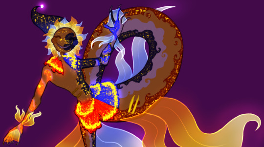
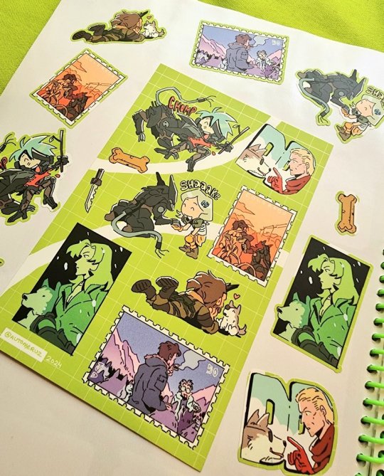
Obscenely late hermitaday day #23 & 25! - Impulse & Tango
Was this meant to be a simple cel shaded drawing on the 30th? Yeah, yeah it was lmao but somehow the power of fire excels at overtaking the rendering capabilities.
But since it's late I'll use this as excuse to ramble below about well, the headcanons and the process down yonder. Also there's variations.
(Also just realized that the compression is high with this one, please click on it to see the details pretty pleasee)


So! Let's talk about that haircut shall we? First off Tango's haircut is basically just me slapping my very neglected oc's haircut onto him lol. There's no function usage or any other lore about it, literally just I wanted to use that haircut more. But Miners and Crafters that's not all! The intensity of the flame actually has meaning believe it or not.
Since Tango in the headcanons is already a nether born blaze hybrid the redstone kinda didn't have an effect on him. This is because blazes produce glowstone which is a power source onto itself. He gets minor effects instead which is a mild (there's literally no other word) high, a intensified hair flame and a brighter eye night shine. Negative effects include mild joint & jaw pain, and a small localized headache behind the left eye.
I like to imagine that other blaze hybrids' hair flame aren't normally that intense, not white-hot heat but rather more red n orange hot similar to the flats. Mainly due to the fact that glowstone is not as powerful as redstone and it's also dependent on how strong a blaze is. Now imagine with me that blazes determine how strong each other are via the color they're emitting. Now remember the blaze boss Minecraft had a vote on to add or not to add? What if Tango is constantly mistaken as a high ranking blaze because of how intense his fire is and he doesn't get attacked a whole lot except for the few that want to challenge him. Meanwhile Tango is just highly infused with redstone like all the other redstoners and he doesn't know what's happening half time as seen by his terrified scream-laughs /hj
He's also semi modified with redstone for the pure purpose of comms just like the other redstoners minus mumbo. I also would've leaned into the steampunk aspect of this season but I figured I'd do a character sheet like etho for all of the redstoners and finalize the aspects on those.
Onto Impulse!
I like to imagine that Impulse was a regular human and over the course of redstone exposure he gained pointed ears and horns. For what reasons? I have no idea but redstone works in mysterious ways and mutates on whatever happens to be in their system. You may see that he has purple lines across his face but then red pupils, why is that? Well since he's cyperpunk themed this season he modified his redstone implants to be rgb. He can change everything else except his pupils because those are deeply affected by redstone and would require surgery to remove the build up of redstone. Will any of the redstoners ever actually get rid of it? No but you can beg all day.
You also might be wondering what's happening in their ears? Well those are the advanced comms that are actually used across all hermits except the ones who've opted out for glowstone variants. They kinda work like bluetooth except more hermit-magic way. I haven't had time to fully think of how it'd work down to the circuitry (that's my usual process for headcanons before I ship them out) but I'll post about it when I think of the full layout. Other design aspects on impulse are derived from his skin and the poster design by applestruda!
Process wise for this piece was kinda a rollercoaster heh. I had started this piece a while ago (can't remember the day on the dot) and then I got insanely busy during the last week of hermitaday. I had done sketch, refined sketch and flats in two days. Then events proceeded forth and we arrive on the 4th which I tried for an entire day to figure out how to render this piece. I then gave up and tried again the day after and pulled up references this round on Pinterest. Tango was surprisingly easy to paint with ref and went rather fast. I will admit the entire time I was rendering him I did say every minute or so "I love you man" because he was turning out so good. Halfway through I then realized I still had to render Impulse. That's when I pretty much ended that night because it was already 5 am working on Tango and demotivation was setting in fast. The next day I was able to continue with hesitancy on Impulse but I managed to keep on keeping on and in the early hours of today I finished up the piece. Where I'm now writing about it close to 2 pm in a restaurant. Man though it was kinda hard to make Impulse and Tango look like cohesive and as if they were painted together.
Enjoy!
(Side note I applied for inprint and if I am to be accepted this will be available along side the three different eefs I've drawn and doc.)
#hermitaday#(by the gods this is late)#hermitcraft#impulsesv#impulse fanart#hermitcraft impulse#tangotek#tango fanart#hermitcraft tango#par art
661 notes
·
View notes
Text
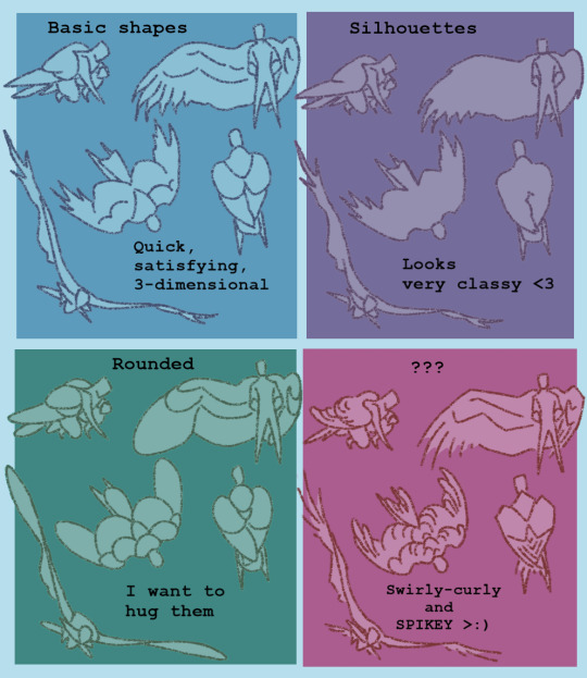
How I deal with shapes


@spadefish @kobothesmall So for shapes, the way I work with them is from studying how things break down individually, instead of following a broader ruleset for character design that you see a lot in tutorial posts (the triangle, square, circle theorem basically).
The way shapes work in humans is different from other animals (which also differ from each other), which is different from objects. The same shape can be used for different goals depending on what you're drawing. So there's no one size fits all, and especially in styles that have a bit more of realism going on, those shapes will behave differently than extremely cartoony styles.
Process wise, a lot of it ends up happening in my head than in the canvas, because I spent years dealing with this shape philosophy of "just bang your head for each thing you're drawing", which I understand is very tedious to some people, but I love studying individual things vs following tutorials because it teaches me 1. how that thing works in a context 2. gives me a new book to my visual library which I can pull from, which is often what happens! That, and a lot of it is just staring at references too. Still, I'll try to draw something up for this.
There are 2 ways to approach shape design. You either start with the shapes and then apply a concept to it, or you start with a concept and apply shapes to it. The former is much harder to do without practice (and also comes more in concept art which is rough, unfinished and meant to be done and redone dozens of times by design). So, I tend to do the latter: I start with a concept of what I want. This can be as simple as "I just want a character that's fat/standing" or more abstract like "I want a character that feels like a river/I want this to feel like an outburst".
Let's start with a concrete concept: I want a design that looks like a pacman frog, and just a standing pose that isn't too stiff.
I grab some pacman frog references, and sometimes if the pose is complex, I'll find references for that too. Pacman frogs are pretty pudgy, and their legs aren't that long compared to most frogs, even when unfolded, and their faces have a nice triangle-ish forehead with a nice shape for the mouth.

The result is that i use large shapes for most of the body. Curves contrast with sharper lines, giving the sense of something geometric but still organic. The line of action here helps me pose these shapes in a way that gives some movement to something as simple as standing (and you'll gain a lot of mileage from learning how to rotate shapes! this is how you're able to position them in different ways and create more dynamic poses).
For something more abstract, like a crouched pose meant to be angry, I take some references when i can and start doing something like this:

Note that these shapes seem weird because I'll have a naked fullbody wip below any clothed characters to have some anatomical guidance, but for actual final shapes and silhouette, what matters is the final elements, and that includes clothes! so i try to build shapes that emphasize this droopy, closed off feeling. This sketch isn't even that good really, there's plenty of errors, but I hope it gives an idea of whats going on.
I hope this weird rambly nonsense helped LOL
219 notes
·
View notes
Text

[Click for better quality]
Ok yay I'm back from my vacation yipeeeeeee. I started this drawing of Keiki before I left and I was half considering just giving up on it.... until I did a short study of facial planes and then got motivated to work on this again! I'm glad I didn't give up on it though, as I'm actually really happy with this one!
Artist's Notes;
So as I mentioned in my last post about Touhou 17, I wanted to finish this by the game's five year anniversary but with how progress was going I didn't want to rush this so I decided to take a long break from it. Mainly because of the face. For a while now I was kind of feeling like I was stagnating with my drawings, not really in the clothing but in the bodies. There was something about the way I was rendering them that I just wasn't happy with, and after talking with someone else about this issue, I realized that the reason I felt this way was because the faces were too flat and didn't match the rest of the drawing and that I needed to find a way to make the rendering of the face feel consistent with everything else. So after doing a short study of the plains of the face (I used this 3D head model from art station as a reference for my short study, please go give this person some love as they are a lifesaver) I went back into this drawing and applied what I learned here. It was only after that that I finally became motivated to finish the piece, and while it started off as just a simple character sketch like Saki and Yachie's were, the moment I added in Keiki's little fire dragon I knew I had gotten in too deep and now here we are with a full on background. OK it's not super crazy or anything, but it gets the job done and it's better than there just being an empty void behind her. It's rare moments like this when I use brushes other than the Clip Studio Default Charcoal Brush and use the Clip Studio Default Paint Brushes as well (god bless the oil paint and dry gouache clip studio brushes, they were amazing). I don't know why but painting fire has always been really fun for me, there's something oddly satisfying about it y'know? I do think that another reason for this problem was because I was drawing faces like I would in my more sketchy style that didn't mesh well with my lineless style, so I'm glad I've started remedying that.
After adding in the fire dragon I had an idea to kinda make it feel like splash art in the way the composition works... probably because I have been playing Reverse 1999 again and it has taken over my brain. I do feel like Keiki's tools get a little lost in the composition, and I didn't fully render the metal parts of them mainly because I didn't feel like they needed it, but that's just something for me to improve on later down the line.
If you guys are wondering where I went for my vacation, I went to New York and got to go to the MET and the Museum of Natural History. In both places I found Kofun period stuff and I was so happy to see it you have no idea. I remember one of the Haniwa I saw had some neat face paint under the eyes that I tried to replicate with the makeup under Keiki's eyes in my drawing, though I think I'll gave to figure out how to draw makeup on characters because this reads more like blush to me than anything. While drawing this I also looked up some references of Kofun period jewelry and really liked the stuff I found, which also meant that now she has proper Kofun earrings instead of earrings shaped like Kofun tombs. I put some of the things I referenced with a closeup of Keiki's face as well down below. I made her outfit more reminiscent of the outfit I gave her at the beginning of the year with the buttons and all, though I do want to try and draw her in some more period accurate clothing like the Haniwa I took a picture of at the Museum of Natural History. I wish I could find a way to make her handercheif look better though as I wish I made it a little bit bigger, though I think I'm saying this because I've looked at this drawing for too long lmao. Once again something to work on for when I next draw her. Also want to get better at rendering hair, as some details (like the little strands in front of her ears) kinda got unreadable due to the similarities in colour lol.

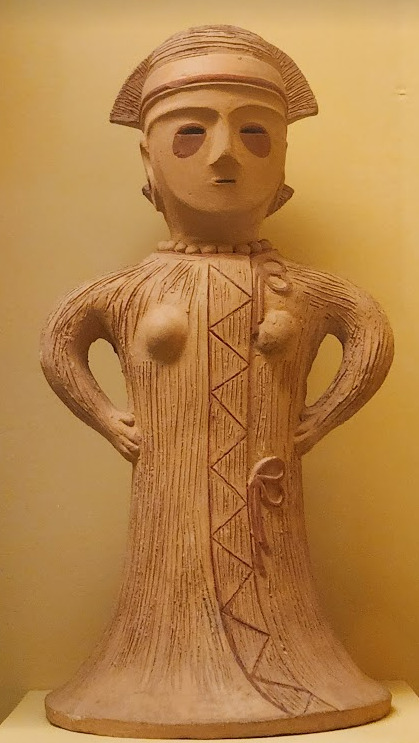


Now you may have also noticed the little cracks I added onto Keiki's face, and that's because I have fallen in love with the idea of Keiki's body being made from ceramic and that she crafted her body herself. While they aren't very visible I also tried to add some doll joints to her body, which is an idea I played around with in the past but never went to far with. I also want to get better at rendering cracks in ceramic, porcelain, etc, as I'm not sure how those read in the drawing. I also have a headcanon where the cracks in Keiki's face show up because of heightened emotions, and while Keiki is aware of this and does her best to make sure her face doesn't break off.... she will still end up with at least a few cracks during any given day, and she can often forget to repair her own body quite frequently so Mayumi has to remind her quite a lot. Mayumi even taught herself some basic sculpting techniques to help repair parts of her body that are so badly damaged to the point where Keiki can't repair them herself, i.e. if both her arms broke off, Mayumi would put them back together for her so Keiki can at least have something to repair herself with rather than nothing. I also like to imagine that if Keiki created her own body, if you took a look at Keiki from the beginning of her life she would look completely different compared to now.
BTW If you guys are wondering what a very very angry Keiki looks like....ok in order for this to make sense have any of you read volume 11 of Land of The Lustrous? Am I bringing back some memories for those of you that have? Ok good, glad we all got that mental image brewing in our minds, I'll probably draw a version of Keiki that is somewhat inspired by that one day as it's an idea I've had for a little while now. And to those who haven't gotten to that volume yet and are confused.... don't worry about it, just keep reading :)
#touhou project#art#fanart#touhou fanart#touhou 17#keiki haniyasushin#wily beast and weakest creature#touhou#東方project#own art
175 notes
·
View notes
Text
DCA Subnautica AU
Version #2 of the designs, including the bioluminescence! + fun tidbits on each of the goobers and a visual on Y/N!
(Edit: it’s out now! Check my bio for the link)
Eclipse is up first!
Theirs was the first design I drew out in any detail (as shown in the crude MS Paint drawing), so it's the one that needed the most work. Even after making the more detailed version with the lights, I still ended up changing things as I got a better grasp on what direction I wanted to head in. Fun lore tidbit! Eclipse is a freak of nature and should not look like that! They're properly split down the middle between day and night. Also I messed it up in the drawing because I was tired when I made it, but they're also covered in scars and bite marks.
Sun !!
I did Sun next, and here I had a better idea for what I was going for. There were still a few problems with this design though, which got changed. This is also where I started drawing the pattern on the tail, which I felt looked weird in this picture. Fun tidbit! Sun has an inability to express his feelings in the appropriate fish mermaid way, leading to much confusion.
Moon !!
Moon was done last. Once again, I learned from this drawing and changed Moon's design to match, however Moon is the one that remains the most unchanged! I knew what I was going for by the time I got to him each time, so I guess that helped. Something I did alter, however, were some of the lights. I found that they either blended together too much or weren't as visible as I would have liked. Fun tidbit! This is pose actually based on a scene in one of the chapters. It was actually one of the earliest written scenes.
Y/N, my beloved <3
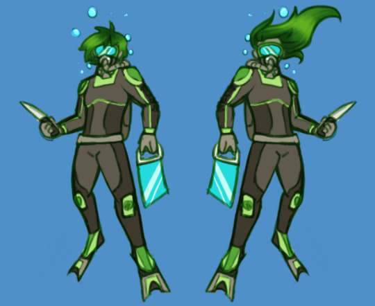
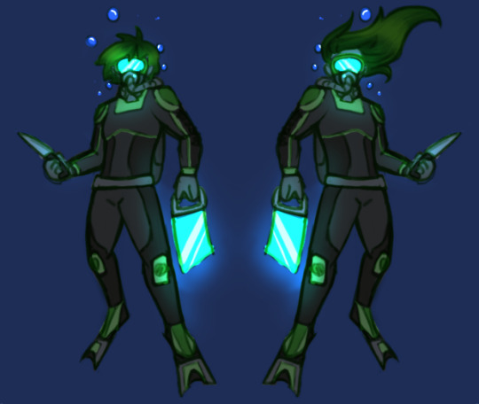
I did 2 versions of Y/N, one with longer hair and one with shorter. It was important for me, when writing the story, that I kept the person I'm imagining as vague as possible, with the only physical descriptions being "physically fit" and having a few scars (for plot reasons), so this is only for me and whatever drawings I do. As a result of trying to keep it vague, I ended up going with the shorter hair (though in the final reference I made it a bit longer than shown here). Fun tidbit! The green is because whenever I'm sketching, I have 4 colours I sketch in to differentiate parts of the picture (usually background vs foreground or different people), and green was the one I used here (red, blue and purple were taken, I'm sure you can understand why). It ended up sticking, since I didn't want to go with the orange that's on Ryley's suit in order to avoid possible confusion.
That's it for now! At some point, I'll post the full references for each of them, but until then, the next thing I post will probably be chapter 1!
#dca mer au#art#my art#fnaf#my goober#fnaf daycare attendant#fnaf au#mermay#fnaf mermay#fnaf y/n#fnaf sun#fnaf moon#fnaf eclipse#the daycare attendant#dca au#daycare attendent#mer sun#mer moon#mer eclipse#A Lucky Charm
221 notes
·
View notes
Text
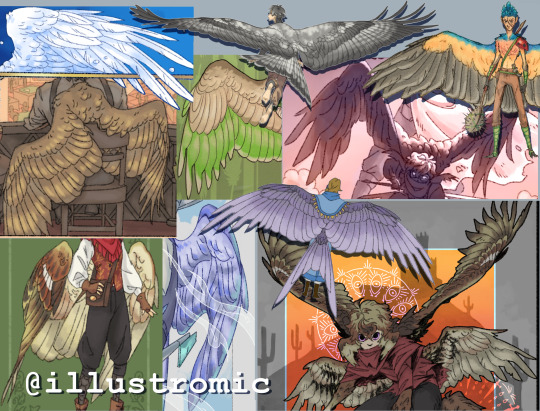
My thoughts on drawing wings (an unofficial tutorial)
Do you want to get better at drawing your favorite winged character? Do you have winged OCs? Just want to learn something new? I can't promise this post will help, but maybe it'll give you some helpful tips.
I know, I knowww, wing tutorials have been done to death. I don't care. This was initially inspired by a conversation on twitter, but actually I've wanted to write down my notes on the topic for a long time lol. Basically wings are one of my special interests so it's very important, for me, to draw them both nicely and also realistically.
On that note, let me first show you my resume *distant sound of floodgates opening*
Like what you see? Read on!
(Oh, and I will only be covering feathered/avian wings bc those are the type I know best.)
Now, I'm not here to give you a step-by-step guide on wing anatomy and aerodynamics, because there are plenty of other resources that cover this already, and I'll list my faves at the end of the post. Right now, I'm going to give you some easy guidelines and tricks that I wish more artists knew.
1: Wings do, in fact, have bones (crazy, I know) and are actually very rigid because they have to support the weight of a living creature. There are some positions you cannot physically force a wing into irl.
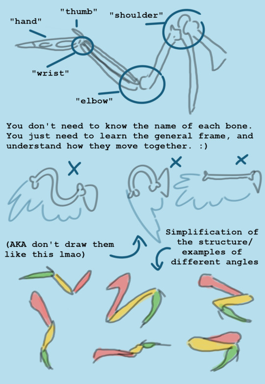
2: Flight feathers are not placed willy-nilly on the wing, because then they wouldn't catch the air properly. Again, like the bones, they are rigid and strong, so don't draw them like fur or ribbons. All wings have the same pattern of feather placement, with slight variation depending on species. If you learn the feather sections, it will automatically improve your drawings a lot.
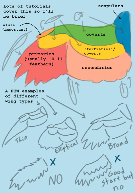
2.5: Feathers overlap each other like a handful of playing cards, and this looks different depending on which side of the wing you're drawing. They always do this unless they're extremely untidy.

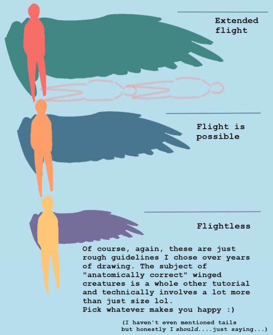
3: The size of the wingspan is important if you're going for a more realistic design. There is no "scientifically accurate" measurement when it comes to fictional creatures, but my general rule is when in doubt, you probably need to make them bigger. Personally, for my original winged human species, I give them wings that can be up to 12 feet long each (the artistic sacrifice is that it's really hard to fit the wings on the dang page lmao, so make your own call).
4: Get used to drawing folded wings. Most of the time, birds keep their wings folded because it prevents them from getting damaged and it conserves energy. The trick is to get good at visualizing how the joints bend and overlap (look at plenty of photos!) In general, they can fold much tighter than you think.

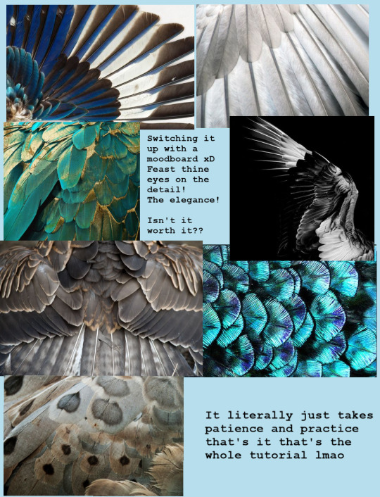
5: Wings and feathers take a lot of patience to draw, but the results are worth it. I've seen so so many incredibly beautiful and skillful artworks that are---well, maybe not ruined, but still negatively affected by a pair of wings that look like an afterthought, or not even like wings at all. You have no idea how much a little extra time and practice will add to your work until you see for yourself.
Finally, some notes on "stylized" wings: Of course it's perfectly ok to draw more simplified/cartoony wings if that's your preference!! BUT there is a difference between a stylistic choice and a lack of effort/poor understanding of the subject matter. Even cartoonists have to learn the fundamentals of realism so they know how to make their designs logical and appealing. Here are some examples of more stylized wings that I feel retain the core principles of anatomy/aesthetics:
And last but not least: A list of helpful links I use personally for reference and inspiration!
I made this pinterest board for general artsy inspo, and this board to curate my very favorite tutorials/refs/information, focusing on the scientific aspect of wings and flight in general. Feel free to use both! (I also suggest pinterest in general for pose refs and such, but try to only practice using photos at first and not other drawings.)
I highly recommend this blog and this blog if you want examples of artists who draw more realism-based winged creatures!! They are both huge inspirations for me and I think you should totally follow them even if you don't plan to draw wings lol <3
If you're REALLY serious about it, my favorite ref books are: Winged Fantasy, a lovely drawing book by Brenda Lyons; Proctor & Lynch's Manual of Ornithology; and Angelus vincens by R. Spano, which is essentially an artbook by someone who (I believe) designed biologically plausible "angels" for their senior thesis.
Ok, idk how to end this lol but I hope it helped! I know it's not my normal kind of post but I'm super busy with college stuff rn and this was all I had time for. If you guys have any questions or feedback, please let me know!!!
-Aloe <3
#my art#wings#drawing#tutorial#the way I could've talked for so much longer haha#but it's 3 am for me and I am fading fast so GOODNIGHT
2K notes
·
View notes
Text
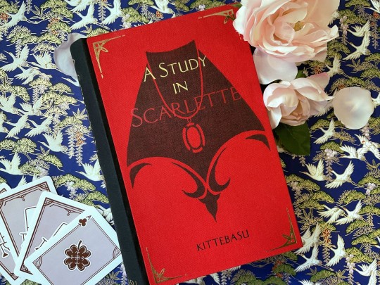

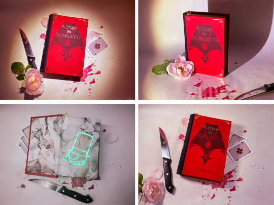
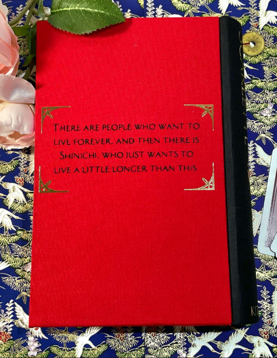
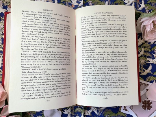
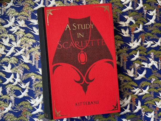
handbinding of A Study in Scarlette by kittebasu
There are people who want to live forever, and then there is Shinichi, who just wants to live a little longer than this.
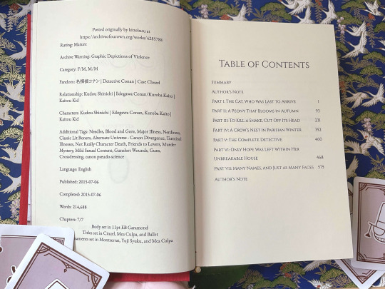

this bind has been in my head since i first read the fic like, three years ago. i dreamed up so many ideas for it, for so long, and now it's finally done! the typeset was actually done in early 2022, back when i was still using google docs, but it went through a few iterations because i was just. so. fiddly. with every aspect of this book. it needed to be perfect (as close to perfect as i, an amateur bookbinder out of my depth, can get) and it had to be absolutely over the top, to reflect the insane amount of love and care that the author put into the fic itself.
the first time i read this fic, i barely knew what detective conan was, much less all of the intricate plot details; i was just along for the ride, but by the end i was completely invested. i went back and watched through the anime as well as a few movies (it took me six months) and then read the fic again. and then a few more times. kaishin and the world of dcmk has utterly gripped me. it's 100% this fic's fault and i love it so, so, much.
i went through a few iterations of visual designs and i'm really happy with the little details i managed to squeeze in.
the entire color scheme is based around red, because 1) it's a murder mystery, 2) for scarlette shinamoto (and the title of the fic as well as the original holmes novel it references), and 3) the irony of "lady red" actually being red. the secret fourth reason is that i think red/gold is a super sexy color combo.
i sewed the textblock with red thread to reference holmes' "scarlet thread of murder".
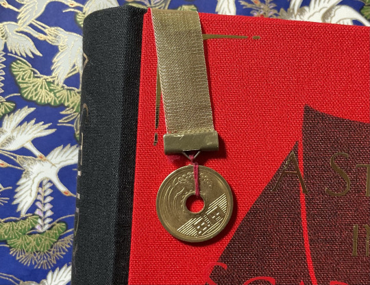
another detail i love is the five yen coin bookmark, it was one of my first ideas and it turned out even better than i thought.
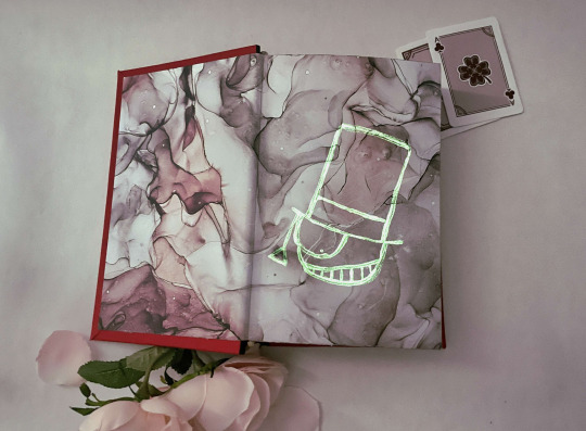
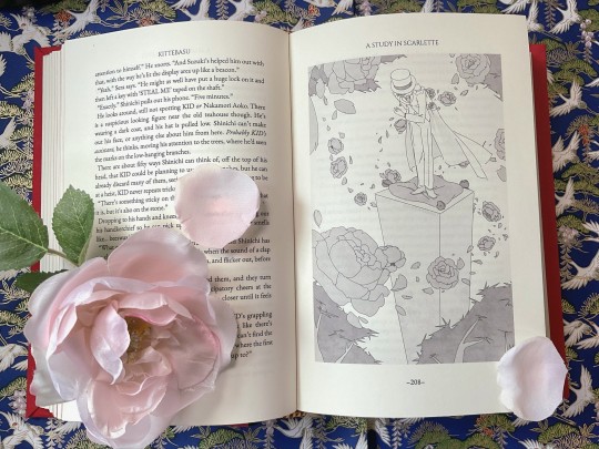
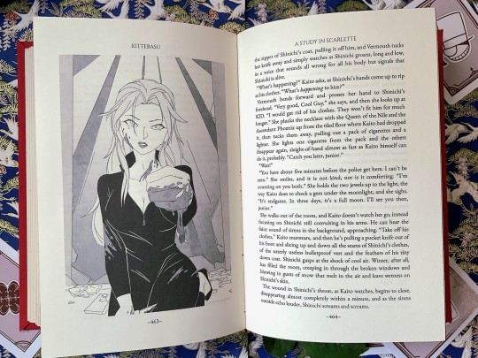
i wanted the endpapers to evoke a sense of the white marbled floor of the ballroom, with the glow-in-the-dark kaitou kid caricature being the luminol on the floor, and the little pops of red looks like blood that's been mixed in. i lucked out in that the other side of the endpaper was like a lavender-purpley color, i like to think of it as a little wink wink nudge to the color of the actual Lady Red.
the chapter pages got a few reworkings, but i'm happy with the illustrations i ended up doing for each of them. the chapter titles are one of my favorite things about the fic, each one has so much meaning packed into it and flows so beautifully, and i wanted to put as much care into making them pop as possible.


the cover was a linocut carving i designed and carved, which i then printed onto the bookcloth, and ironed on htv on top.
i also threw in a couple of my drawings of my favorite scenes.
this is getting way too long, so i'll end it here. i'll have a separate post detailing the process every step of the way, if anyone wants to take a closer look. this fic is kind of directly responsible for getting me into fanbinding, so it's safe to say it altered the course of my life. i now spend way too much time (and money) looking at book stuff.
kittebasu, if, somehow, you see this and would like an author copy, i would be honored to make one and ship it to you; i would be overjoyed to gift you with any art i have the ability to make, because the fics you wrote have irreversibly altered my brain chemistry, and being able to give back in any capacity would be a dream. (thank you.)
a few postscripts:
i am not selling any copies of this fic. partially because i believe in the gift economy of fandom as well as firmly keeping fanbinding a hobby that will stay unmonetized, but also because it took me months (years, if we are counting when i first finished the typeset) to finish this and i do not have the strength.
however, if you are also a fan of this fic and would like a copy, i honestly, fervently, encourage you to give fanbinding a try! renegade publishing and its discord server are an absolutely wonderful and free resource. i knew nothing about bookbinding and had zero materials when i first started, but i've learned so much thanks to the lovely people there. if you're still apprehensive about getting started, i'd be willing to share my typeset of this fic as well as answer any questions about the making of this book if you DM me.
#detective conan#detco#magic kaito#dcmk#名探偵コナン#my books#kaishin#kaitou kid#kaito kid#kuroba kaito#kudou shinichi#edogawa conan#handbinding#fanbinding#ficbinding#fanfic#bookbinding#a study in scarlette#book binding#guys#its finally done#im tearing up#this has been my dream bind for so long and its FINISHED#and im really really happy with how it turned out#i seriously cannot put into words how much this fic rewired my brain#ash knows though he's seen my 2 am red string theory corkboard#about what the sequel might be about#まじっく快斗#meitantei conan#case closed
472 notes
·
View notes
Note
Hello! I’m just here bc I’m a little confused on what you meant by Smythe drawing out “each individual asset” when she was making comics? Now, granted, I can see that it made her file ginormous, but me personally as someone who knows nothing about making online comics but is really wanting to get into it (and also as someone who has a ‘too many layers’ problem myself), is there a way to avoid using too many layers?
My current way of making comics has been to draw the panels individually and then format them (which I know is terrible management wise and also messes with the quality) but I honestly have no other idea of how to do it properly, and seeing how stunning Lore Rekindled looks, I don’t know how you would manage to put all that lighting effects and little details on the same layers. (But also I may be thinking of it wrong so I’ll let you talk qwq)
Ah I can actually give you a visual breakdown of what I meant by that!
So in this you can see there are a TON of layers, and not even all of them are visible because some of them are stuffed into FOLDERS that have been left closed. BUT if you look REEEEALLY carefully-

^^^ These layers right here? That's specifically Minthe from this panel in Episode 61:

(the unique pose here makes it real easy to tell that this is the corresponding panel, you can see the matching body shape with the dark shading that's clipped to the base layer below it!)
So what this means is that Rachel didn't draw all her characters on one base layer, she drew every single character in every single panel separately. Now of course, she could merge all these layers together as working on separate layers helps make it easier to work on elements that collide separately (like one character being 'underneath' another character like Hades is here) but because she has all of those clipping layers with the shading already added in, she likely didn't merge them afterwards because that would actually create MORE problems (because if she merged the Minthe layer in with Hades, then the shading for Minthe that she painted outside of the lines would show up on Hades and then she'd have to erase it which is just a bunch of extra work).
You can also tell all these characters are on their own layer because the layer thumbnail EXCLUSIVELY shows those characters. A layer will show as much canvas length as it needs to cover what's in that layer, so if the thumbnail is only showing one character, that means there's NOTHING ELSE on that layer. If there were more elements on this layer than just Minthe, the layer thumbnail would look more like this:
Now let's compare it to Rekindled's layers! I'll use a completed page to make it fair as we use a lot of extra layers in the post-production phase where we add the texture effects and glow and all that fun stuff, plus I'll even make it a more complicated page like that big nymph explanation spread from Episode 51:
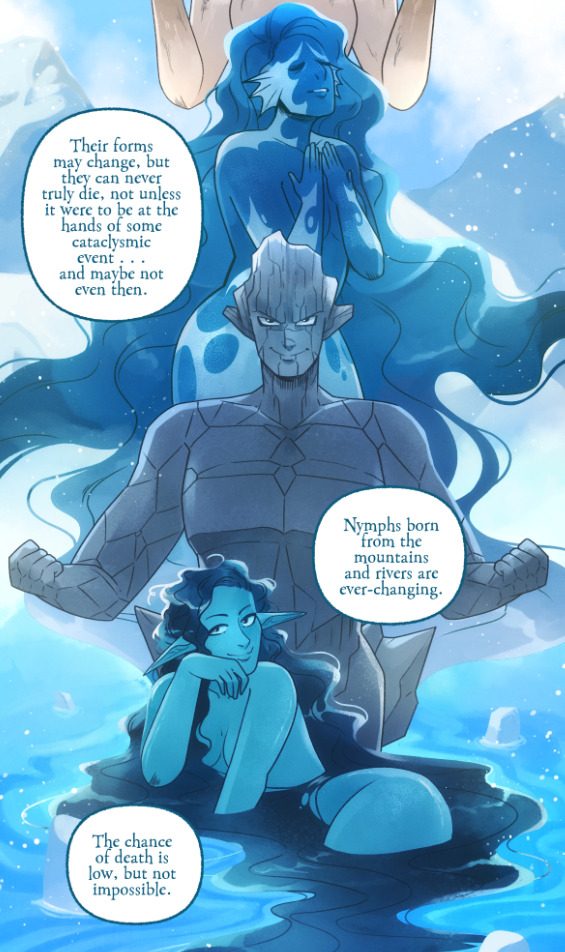
So I'll break it down to make this make more sense:
BG 2 Copy (technically this is supposed to be BG 1) - Basically the panel shapes, what I'll do is mark out the panels with flat blocks and through that we'll add background elements in a clipping layer (usually done by Banshriek). Often times they'll do multiple layers to make the process easier and then merge them all together in the end. With these shapes operating as panels, it means I can just auto select the whole layer, invert the selection, and easily erase whatever's outside of it (such as the lineart and base colors that I put down afterwards). I could just use masking layers like I did in [AFTERBIRTH] but I find this way works better for the process of making Rekindled.
BG 2 - This is where we add objects / foreground elements. So stuff like furniture, interactables, anything that needs to be kept separate from the larger background to make it easier to work with. This can also include "floating" panels that need to be above other panels, such as this:

All of the backgrounds are then nested in a folder for organization purposes (we also sometimes use clipping layers on top of those folders to apply extra effects over anything contained within that folder without affecting other folders, that's a common technique that Banshriek applies)
Then we get into our Characters folder:
BASE - This is where I do the majority of my work, all the characters in every panel on a page are flatted into this layer. Sometimes I do have to create separate layers to, again, make it easier to work with overlapping characters, but usually those layers will be merged before I go into the shading process. I simply shade on a single layer by using the lasso / magic wand tool to select my area for painting, the flat colors make it really easy to do that. Sometimes I need to create a secondary shading layer if I've put down dark colors that start to bleed into the lighter colors, but again, I merge when I'm done into a single shading layer. We also sometimes employ an Add (Glow) layer into the clipping set if we need a glow effect that's exclusive to the characters and doesn't travel outside of their base colors.
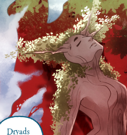
There's a (leaves) layer here that I used for the dryad because I needed the leaves to be above the base layer, after that I selected the leaves elements so that I could erase the lineart in the layer above it where needed.
LINEART - It's lineart, enough said haha That said, I do think Rachel actually uses clipping layers for her lineart in places, it seems to be visible in some of her process videos where you can see the lineart present in a clipping layer, and that would explain why there are panels where the lineart suddenly 'cuts off' and doesn't travel outside of the base layer, like so:
GLOW - This is where we do an Add (Glow) layer that isn't restricted to the base layer, it's where we add all the fun lil' glow and sparkle effects over the characters !
The CLOUDS layer is, like the leaves, a background element that needs to be above the base layers rather than constricted to the background.
Above the Characters folder you can see what I mentioned earlier where Banshriek has added more post-production effects that are exclusively clipped to the contents of the Characters folder. This means the effects / blend modes do NOT affect the background layers or anything above it.
The BLUR (Overlay) layer is something we just started doing over the past several episodes, it's a technique I actually picked up from 66 of City of Blank where I merge all the layers into a new visible layer which I then apply a Gaussian Blur to at around 60% and then set to Overlay (and then I adjust the layer opacity until it looks right, usually around 25-35%), it gives it a bit of a softer "dreamier" vibe in the final colors and really helps unify everything!
CANVAS - This is an Overlay layer which is also set to an opacity of 25-35% where I go over the panels with the Add Canvas brush from the Kyle Webster set, unlike the Canvas overlay texture in CSP I can actually choose the colors I want to use which means I can match the canvas texture color to the mood and environment of the scene (ex. I'll use a very light blue for scenes in the Underworld). Not only does it give it that signature texture from S1 of LO, but it also helps balance out the effects of the BLUR layer.
The SKETCH layer sits on top of everything and gets turned off once all the base layers and lineart are down, and ofc the SPEECH folder is just where all the text is kept.
I know everything I just laid out is a LOT but ultimately it's how we operate, it works for us! But it also begs the question of why Rachel operates the way she does because a lot of it seems extremely unnecessary and more likely to bite her in the ass (the more layers there are, the bigger your file size gets, the risk of drawing on the wrong layer increases as well as the risk of posting a panel that's missing elements because the layer was left turned off by mistake, etc.) And it's more so concerning with how she operates with her assistants because if she's still using this many layers when collaborating with other people, hooo boy. Though based on what I've observed of what her assistants contribute, I get a lot more of the sense that she circumvents this by having the artists do the flats separately and then importing them in as separate assets that she then just imports into the page and places them where they need to be. Still not a great workflow IMO because it's what's led to a lot of the issues of characters "floating" rather than feeling like they're actually in the environment-
-but that's still an issue that could be solved by Rachel just taking more time to actually flesh out the backgrounds and lighting to give more of an impression of the characters actually existing in the space. Like that Hestia panel could easily be fixed by just giving the background a bit more detail and putting actual shading underneath her (and lighting from whatever direction it's coming from).
Either way, regardless of whether or not Rachel's process is productive or not, I hope that breakdown helps explain how we do it in Rekindled! Learning how to manage layers is definitely a skill that can be tricky to harness, but once it "clicks" there's a lot you can get away with. Ultimately how you do it is up to you, but my best piece of advice to offer is to just be open to other types of workflows because you don't know how much you might be shooting yourself in the foot doing things the hard way when there are often way easier and more efficient ways to get the same job done. That's basically the vibe I get from observing Rachel's workflow, it seems like she's still using methods that she thinks are working for her (and probably did work just fine for her when it was JUST her) but could be vastly improved for her and her team if she'd just get over the initial hump of stepping outside of her comfort zone. Would probably make for a better comic too LOL
I hope that helps! Good luck! ( ´ ∀ `)ノ~ ♡
#ask me anything#ama#anon ama#anon ask me anything#lore olympus critical#anti lore olympus#lo critical#lore rekindled#webcomic advice
151 notes
·
View notes
Note
Hello! I love your art and your use of colors; I was wondering if you'll ever post a process video or a step by step to show how you approach your art?
hi!! thank you, im always glad people like my sense of color cause it's my favorite part :-) it's a bit hard to show process videos because i tend to work on multiple drawings within a same file, at the same time, so it looks very confusing. but i made this one for that! it shows my process from sketch to finish, and i'll also add some thoughts under the cut
the steps to my art are usually :
sketch, always in color (i dont like sketching in black, it doesn't work as well for me). i did this step on another file so you don't get to see it, but it did happen at some point
set the lines to black, or to whatever color i want the final lineart to be (to make sure the colors work well with whatever lineart i want to have ; if i changed it at the last second, it would look weird)
add very rough colors : here, making the background orange and the character dark blue. if you draw on a white background and try to change it at the last second when everything else is done, it might not work with the colors that well
i work from these basic colors to pick the actual shades. i usually start with skin and hair, then clothes. the idea is to find a color that evokes whatever color i have in mind without clashing with the base tone. so a character who has a bright red base tone, and has blue eyes, i will use very desaturated grey to give the illusion of blue, not actual blue. that would clash too much!
once all the colors are done, i start cleaning the lineart. i usually start with the face, and do that part pretty carefully, but then forthe rest of the body, i might erase the whole rest of the lineart and draw it from scratch. i alternate between cleaning the lineart and refinining the shapes on the other layer, giving them nice clean edges
i think that's about it! i hope this was helpful in some way :-) thank you for your kindness !
107 notes
·
View notes
Text
What Avvar mage training tells us
Not enough people talk about the Avvar, which is a shame because they have some amazing history and practices. I find the way they handle mages to be especially enlightening and based as fuck.
So I made this post to summarise it!
In the above video, I captured two conversations with the Augur of Stone-Bear Hold, and Sigrid - the mage-in-training who went into a self-imposed exile. I'll summarise what mage training looks like for the Avvar, and then delve into the implications.
Augurs are the spiritual leaders of the Hold, but are not necessarily mages - though they often are.
Spirits are called 'gods' by the Avvar. The Avvar do also have named gods, and these appear to be particularly powerful spirits.
Mages among the Avvar bind themselves to a spirit in order to be trained - i.e., they become 'abominations' in the eyes of the chantry, which Dorian confirms in the video. This occurs at a young age, in Sigrid's case when she was a child.
The spirit becomes the mage's trainer. Years later, when the training is done, the mage releases the spirit in a ritual which requires only a small sacrifice (like a bird) and a vial of lyrium.
If a mage cannot release the spirit, then the situation is handled carefully. In Sigrid's case, she just didn't want to say goodbye to a good friend. She goes to the Augur after this, and he confirms that they are working on helping her overcome her loneliness.
If the reason is they are truly incapable of releasing the spirit (they are 'weak', though it's unclear what this means), then the Hold and spirits watches over them to prevent them from growing 'sick'. The Augur implies that if the mage does sicken and endangers themselves or the Hold, they are euthanised and pass away peacefully in their sleep. He says it is a very sad event.
What are the implications of this, then?
Reversing 'possession' can actually be really easy. We knew it was possible from DAO, but now we see that it need not require a massive amount of lyrium or blood magic. If the 'possession' does not happen in a state of extreme desperation/distress (which the Circle and Templars love to put mages in), then reversal is simple.
Mages who cannot release the spirit might 'sicken' - and I suspect that's what they tried to show with Anders. What 'sicken' means is not clarified by the Augur, but from our Anders experience we can piece together that the Augur means they grow mentally and physically unwell. But even this can be prevented or mitigated with proper care.
It appears to be very, very rare that mages among the Avvar turn into the types of abominations we fight in the games, because the Augur never even mentions it happening.
So, in conclusion: The Avvar treat their mages with the most humanity and compassion of everyone, resulting in very few instances of violent abominations.
(Note: tbh I have no idea wtf the Dalish mage training is like because the games contradict themselves even within the same clan, so I can't really draw comparisons to the Dalish, unfortunately.)
#dragon age#dragon age inquisition#dai#da2#dao#avvar#mages#mage rights#the avvar#dragon age origins#dragon age 2
489 notes
·
View notes
Text
Rain World Art Month Day 8 - Saint

Another drawing done, and this time it was actually finished on the right day (even though I still didn't get to post it in time)! My idea for this prompt shifted a bit; originally I was thinking of something more simple like the first Rivulet drawing. But then this scene came into my head, and I had quite a bit of fun doing it, especially trying to capture the glow of the lantern and the overall gray-ness of the scene. The nature of lighting and shadows is something I've been growing more and more interested in when it comes to art, so I'm glad to have had another chance to experiment with it!
And of course, getting to do more colored pencil art is always fun! I'm definitely enjoying this medium. Especially since, for this particular piece, I think the natural grainy-ness works well here to convey a fur-like texture and the snow particles.
I'll most-likely have a lot of free time for the next couple of weeks, so I'm looking to do a decent number of other pieces for this Rain World Art Month, including going back for some of the first prompts I missed! In the meantime, hope you enjoy this next piece!
-.-.-.-.-.-.-.-.-
Also, some thumbnails down below because I thought they looked cool! Practicing composition and planning a drawing is also growing more and more fun!

#art#artwork#artists on tumblr#drawing#traditional#drawings#traditional art#sketch#sketches#thumbnails#sketchbook#colored pencil#fanart#rain world#rw art month#rw art month 2024#slugcat#rw slugcat#saint#rw saint#quetzalli draws
132 notes
·
View notes
Note
hi!! im sure ppl have asked this b4, but i scoured your asks tag for an hour or so looking to see if you answered anything abt it and couldnt find anything, so i was just wondering if youve made any posts on your process for making n selling merch b4? and how you know which franchises you can make merch for w/o getting into trouble w copyright n trademark stuff (hopefully that makes sense, im not sure,,,)
hi! got a bunch of asks abt merch stuff lately im gonna put it under a cut.
preface: i don't know if i'm the best person to ask about all this stuff because I'm doing merch on a strictly hobby basis LOL. I have a fulltime job which takes care of the bulk of my finances, I don't really make big quantities of anything and my main priority at cons is to just make enough money to see my friends in different cities at minimal expense. i pretty much always get a refund when i file my con taxes because my profit after all the deductions is like fucking..nothing.. lmao. So if you ultimately lose money following my advice don't blame me. OK NOW lets get into it
my process for making merch: when I have an event scheduled that I want to make merch for I start by brainstorming a bunch of stuff I wanna make. for mgscon this is what I wrote down in my sketchbook lol

i made a legend to denote which ones are actually just reprints. it gets easier to plan out merch when you already have merch. out of the new merch ideas here i actually only made like 4 of them. and out of the reprints i only reprinted like three. i also came up with like 4-5 other merch ideas after writing out this list that i actually did do. LMAOO UM. my point here is that nothing rly goes as planned.
when i get a merch idea i start with thumbnails what i want it to look like (sometimes this is based off merch ive seen before so its very realized and sometimes its really vague bc im kind of pulling it out of my ass)

then BEFORE i go into making the final art I research how I'm going to make the merch. whether its printing/constructing it myself or looking for a manufacturer. There's a lot of different places that you can get custom merch made, i used to go shopping around at local printing shops but nowadays it's really common to do it all online. For both these jet tags and the washi tape I did some of my own research into manufacturers and also asked friends for their contacts/referrals/recommendations etc. most manufacturers either have their specs/template publicly available or will give them to you when you ask. so once I've locked into a manu and gotten the specs I'll start designing the final art.
then it's sending it off and waiting! easier said than done.
i will say this process is a lot lengthier for some types of merch than others LOL. for prints... I've been doing prints for like a million years and I plan out almost none of it. I draw everything at print resolution so a week before I have a con scheduled I'll simply go through all the files I've accumulated since my last con, squeeze whatever drawings I want into standard print sizes lol (ie. 8.5x11, 11x17, 4x6 etc), and print them at a local shop. takes like a couple hours max.
how you know which franchises you can make merch for w/o getting into trouble w copyright n trademark stuff?
I mean. honestly I don't know. selling fanart is the kind of thing that IP holders kind of just let slide as long as they don't think they're losing a substantial amt of money on it. there ARE a couple franchises people avoid because they've been known to send IP lawyers after fanartists... disney is the big one and they're known for being pretty petty abt it... that's why you don't really see people selling fanart of the disney princesses at cons. ive heard pokemon will also crack down if your project seems to be making a lot of money lol, part of why i think a lot of pokemon fanzines operate on a charity basis. I do feel like the pokemon company has bigger fish to fry than someones artist alley table though so i wouldn't sweat it too much.
it's also generally considered impolite/bad taste to sell fanart of small franchises. webcomics and indie games especially if they only have like 1-2 devs who rely on the income that game makes.
I'm not a lawyer so you shouldn't consider this legal advice BUT I will say... I don't think you should let IP law stop you from selling fanart lol. especially if it's low quantities/not mass produced and you're not making crazy amts of money I think you kind of have a leg to stand on. Besides, most cases it seems like the worst you'll get is a cease and desist.
you Will notice that when people start turning their artist alley endeavors into a real business they'll generally ease up on selling fanart (the case most prominent in my mind is omocat lol). but i love fanart and thats why i will never make money and thats a promise [snake saluting gif]
SORRY IDK IF ANY OF THIS WAS HELPFUL. I've been doing merch and cons for a long time (10+ years lmao, you can find record of this on this very blog) and i think im kind of old fashioned about it. i recognize the artist alley/merch scene is a lot more demanding now than it used to be but start small at local low-risk events, online sales etc and work your way up and remember to have fun and itll be ok i believe this wholeheartedly.

its literally just layers of acrylic like any other dinky charm. I'm sure pretty much any manu that does acrylic charms could do it but this specific charm/template i did order through a group order server. they're pretty well known! heres a link to their twitter

@wheatormeat sorry for taking a full month to answer this... anyways. This is tricky because I've actually been changing up my sticker manu everytime LOL IDK if I've found one I actually love.

these ones i ordered thru an alibaba manu because I was jumping on a friend's group order to save on shipping. it was ok. they arrived a liiiitle late and printed a lil dark but i think thats kind of my fault LOL I use dark colors i always need to lighten things before i get them printed and i think i just didnt lighten these enough. otherwise i rly love the quality!

i realized i never posted these online and also this is not a good picture (the lighting in my living room sucks rn) but i printed these tmnt stickers thru stickerninja they feel really solid but they needed kind of a lot of space for the cutline. but their customer service was very nice and helpful!
these ones i got printed at washimill and i was so impressed with how fine their cutline is... pricing and quality of the sticker itself is alright they feel a lil flimsy? idk. but i do like the printing. i kind of elected to go with them solely because i was already ordering washi tape. A LOT of my manufacturing decisions are made based on how much money i can save on shipping tbh.
and thats my sticker manu reviews dont forget to like comment subscribe idk if i have one im gonna stick with forever or anything im rly indecisive. ideally id like a manu based in the u.s...? because im based in the u.s. and international shipping is pricey. but idk if i keep ordering washi tape maybe ill keep using washimill. who knows...
86 notes
·
View notes
Text


Waiting Room Problems | Eddie Munson x fem!Reader | 18+ | PREVIEW
Summary: a rough landing in a fight with your brother causes you to land in a crowded waiting room. Meanwhile a rough deal also sends Eddie the same fate. Somehow, somehow you try to keep your eyes on your phone and off his tiny little waist. It proves…difficult.
Warnings: strangers to lovers, fleeting glances, slightly cocky Eddie, sex in a public bathroom (trust me on this, just trust me), and general horniness at Eddie’s general appearance.
Authors note: I just spent 8 hours last night (when I wrote this) in the fucking waiting room. At two hours in a guy came in and he radiated Eddie’s energy so my mind ran away with it. (Everything is ok).
I'm posting a sneak at this one, because it was a surprisingly close call. I'm not sure when I'll be done, tbh. But here's the first 900 words!
As the night swallowed you whole, you sit in your mom’s passenger seat of her car while she drives you to the ER. While rough housing with your older brother you landed on your hand wrong and bent it way back. It’s definitely not broken, but it for sure needs to be looked at.
As the lights of the night pass you by you insist you’re fine and the sprain will heal after a few days. Your mom, however, was having none of it as you roll your eyes in exasperation.
She’s as stubborn as you are, so you sit arms crossed as you know you have no choice. Ouch, ok, crossing your arms was a bad idea.
She wishes you well, her kind eyes wide as she leans over to ask to keep her updated. You can’t help it, slamming the door after letting her know you will. You should’ve been enjoying some spiked eggnog and watching holiday movies, but now you’re spending Christmas Eve in the ER.
The large window to the waiting room lets you know there’s already a long line up just waiting for the triage and most seats are taken. Fuck, you’re in for a long night.
The kind and sunny nurse takes your vitals and information gently assessing your symptoms and palpating your wrist carefully. She lets you know it’s definitely sprained and will need a gauze wrap.
Soon, you find yourself sat in a brown, cracked, leather chair sitting close to a man who is coughing up a lung and groaning in pain at each one. Not that there are many options to begin with.
Your phone in your hand and your charger in your bag, you sit comfortably and wait for your name to get called to the back as you read the memes and watch with one headphone in.
Ninety minutes goes by while your best friend texts you to keep you busy and entertained, not even noticing you’ve been waiting for so long. Thank god for her.
For the first time in a while, you look up to assess the state of the waiting room. As far as you recall, about five people have been called to the back. Those seats have been replaced with new patients and their support, what seems to be a never-ending cycle.
Your eyes flick onto someone who walks into the line that is long enough to extend into the hallway, stepping up a place in line and finally in the actual waiting room. Your eyes scan him, the boots, the ripped jeans, the leather jacket covering a graphic tee, all leading up to his shaggy brown hair and gorgeous face.
Your mouth partially opens, momentarily taken aback by how unbelievably hot he is. There doesn’t seem to be anything wrong, at least, until you notice the tear in his shirt peeking at white gauze on his torso. From the stain, it’s clear he was injured.
His face doesn’t reflect such, patiently waiting as the two triage nurses take their time. By the third time he blinks, you realize you’ve been staring and shift your eyes back down to your phone.
As the line moves, his boots in the corner of your eye, you grow increasingly aware of how much you want to continue staring at him. Somehow, he was just so enticing, everything about him drawing you in. Especially his lack of response to a wound as such.
Time passes on and soon you find yourself bored of the videos and turn on your Spotify to the comfort playlist. Your eyes flicker to the triage, wondering around the room aimlessly. Unfortunately, it lands on the stranger you’ve been lingering on and witnesses him lifting his shirt to show the nurse the reason for his visit.
The black shirt lifts to show a slim waist scattered in black and white tattoos, lifting the white gauze to reveal a gnarly wound. You can’t tell but from its shape it looks to be a stab wound. However gory his uncovered wound looks; you can’t help but stare at his bare torso.
Then, it fucking happens. His eyes flicker to you, for a fraction of second, he keeps the eye contact. His mouth twitches, leaning into something you’d call a smirk. As a reflex you shift your eyes away from him, cheeks heating up in embarrassment from getting caught.
taglist: @pinkcowracing @yourthebrokengirl @skrzydlak @thirddeadlysin @sammararaven @bebe07011 @prettylovley @josephquinnschesthair @forget-you-morelike-fuck-you @names-were-taken @oddussy420
If you want to be tagged when the full fic is posted, just let me know in the replies. Again, I have no idea when that will happen, it's not done yet. Maybe this'll give me the motivation i need
#eddie munson fanfiction#eddie munson x reader#eddie munson x you#eddie munson x y/n#eddie munson fanfic
212 notes
·
View notes
Text
28 Asks! Thank you! :}} 🧜♀️

Nope. That's not me. I don't have a tiktok. :/
Remember folks! Like my pinned post says, if you find my artwork anywhere else other than here? Its stolen 100% of the time!

@cat7890
I don't understand what you're asking... <:0

My only opinion is that the eyes are really spooky looking <XDD

@spacewitchgardevoir
Thank you so much!! :DD Unfortunately I haven't thought much of that through yet.. I only have vague ideas so far. Like how the slimes in The Wilds will be hisuian pokemon for example. I plan to work more on the slimes soon! <XDD

@sora-the-air-wubbox (Oh hey! I know of wubboxes! :D )
I have not actually.. are those the roblox guys..? <:0

@an-aspiring-jester
Awe! Thank you!! :DDD I'll have to think of who to pass this to next! :00

AAAA THANK YOU!! :DD I haven't played the slime Rancher 2 demo but I still want to play it when the full game comes out! :))

(PLA inspired comic in question)
AAAA THANK YOU SO MUCH!!! Having my artwork compared to the beautiful works of studio Ghibili is such an honor!! 😭😭💞💞💞
And speaking of a continuation.. I actually finished drawing a short comic last night about Ingo and Emmet's reunion. It was all done and ready to post... but then I changed my mind. The quality of the comic was much lower than the PLA comic I just did. No backgrounds, rushed line art.. uninspired house design.. eh. I just wasn't satisfied.
I still plan to post a reunion comic mind you! I just want to put more heart into it and try drawing it again- <XDD

@blbllblblblll
A tempting offer I must say, but I'm still on break from the Octonauts fandom!.. <XD


@neo-metalscottic
Thank you!! :DDD And my favorite slime is the puddle slime.. 🥺💞 and my fave largo has gotta be the Mosaic x phosphor, but specifically the secret style pack version XDD
Now for Boom Boom and Pom Pom.. that's a good question.. I haven't really thought about them :00 I supposed they can be some higher ranking soldiers of some kind! (Also my Koopa Kingdoms has more primitive technology than in cannon <XD. Although they get quite a boost thanks to magikoopas.👀👀)
Also the super ball flower creates some interesting ideas.. maybe it could be a flower that allows Mario and Luigi to turn things into metal? But why would it be a flower.. hmm.. I think I'll have to do a lot of retconning If I wants to add this flower to my AU <XDD
Also thank you for the ask! Always appreciated :)))

@fizzy-stars
XDD Who knows? Maybe they are!

@wolfie-777
XDD Cant say I'll make a comic series for them, but if I did it would totally be like that! Mostly Dink being high energy and annoying the sleepy Doink XDD

So far my intentions are that they don't have a trainer :00

YOU ARE GIVING ME SOOO MANY ANGST IDEAS 👀👀👀

WAAAAAATHANKOTUUUU!!!! 😭💞💞💞💞

@gamesperger
You'd be surprised how often I get told that <XDD

@anikakitty11
AWWW I LOVE LUCAS!!! 😭😭💞💞💞

@samcat2
Draw something for me?.. weeell.... I do love Dusknoir... 🥺🥺👀👀👀

@yourstrulylightstar283
Not sick again, its the same unknown medical problem I've been dealing with for almost a year now.. 😔😔😔Thank you though, I'm doing my best to stay calm and take it easy <:}}}

Hi Timothy! I am afraid :D

His eyes always make me laugh <XDD

I have not.. though it looks good, maybe I should give it a watch! :00

(Furby Grimace)
Oh he's fine. He's just coming to grips with his own mortality that's all <XD

@red1sg0n3
:DD THANK YOUU!! :)))))

@justanintrovertedweirdo
WAAAHHGGGTHTHANK YOUUU SO MUCHH!!!!! 😭😭💞💞💞💞
And I'm so glad you feel the same way about the whole romantic love thing!! Sure they're great an all.. but I feel like the only kinds of relationships I see I fandoms are romantic ships..
Where are all the brotherhood comics? Characters motivated by a deep love for each other but its platonic and not romantic? I have so much more fun experimenting with those kinds of stories!

@cherrycreamfairy
:DDD Thank you! I'm glad to see Jangles getting some love! 🥰🥰

@kirshimadenkisero
XDD Go for it!

I know this was probably a drawing suggestion, but since they're closed now I'll answer it as a question....😅
My favorite legendary is a tough pick.. I love a lot of them.. 🥺💞💞but man, its hard to beat Xerneas. My favorite shiny is also a hard pick.. Its gonna have to be shiny Giratina. With shiny Rayquaza and shiny primal Kyogre as honorable mentions XDD
I know you didn't say this but I'll put it in there anyways XDD My favorite sub-legendary is Suicune. But my favorite shiny out of the sub-legendaries is actually Chi-Yu.. 👀👀
My favorite mythical Pokémon is Celebi , and my favorite shiny mythical is also Celebi. XDD I love that littol onion,,🥺💞💞💞
73 notes
·
View notes
Last Seen Blogs
ljgrealestate
GillandDebello

1775-2020-freedom-revolution
1775-2020 Fight For Freedom
art-that-is-alr-ig
Its Ok Ig

vintagesoft
All The Delicate Things In Life

gigil-beauty
Gigil-Beauty