#and calm down please
Explore tagged Tumblr posts
Text
crazy how i never hear more about taylor swift than from people who hate her, they just can't take her name out of their mouths
#taylor swift#fan behavior and honestly sad#i cant imagine spending all my time obsessing over an artist I hate#like find a hobby#touch grass#and calm down please
6 notes
·
View notes
Text
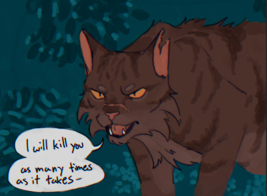
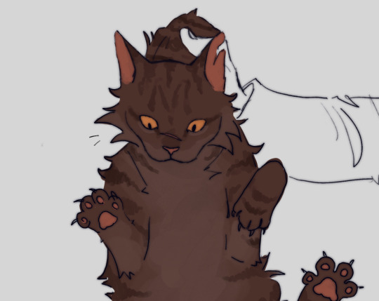

this is how i feel about any Warriors character
#like sir you are a cat calm down#warriors#warrior cats#tigerclaw#tigerstar#art#fan art#fanart#warriors art#warrior cat fanart#warriors fanart#also please be nice i haven’t drawn cats since 6th grade
61K notes
·
View notes
Text
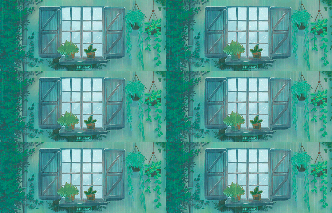
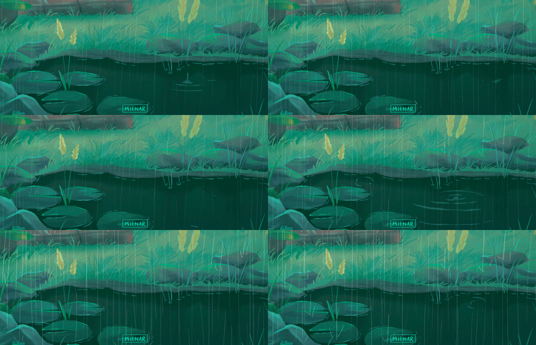
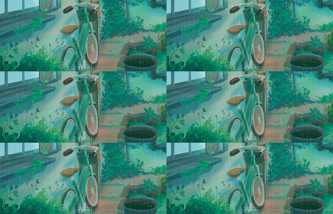
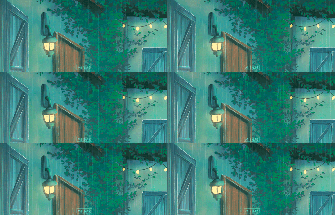
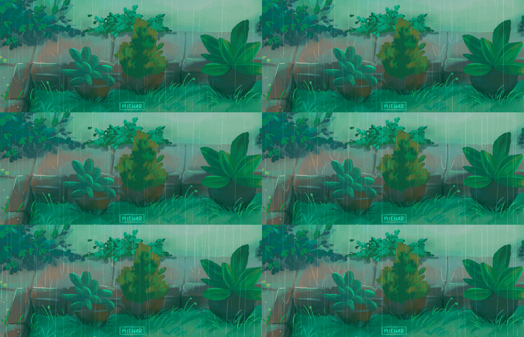
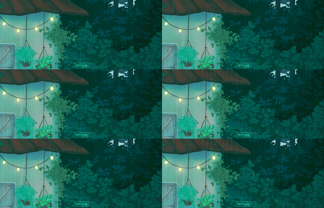
close-ups of a commission i did a while back! 🌱
instagram | shop | commission info
#artists on tumblr#animated illustration#animated gif#digital art#2d animation#backgrounds#environment art#environment illustration#myillust#cozy#rainy days#there were so many details in this commission that i rmb thinking to myself that they could be like b-rolls in a film heh#so i cropped it to 21:9 to get that ✨cinematic look✨ and it turned out so cool!!#i'm sorry for being so inactive for so long ;-; i really havent had the time to make new art#things are calming down for me now that i can get back to making more art#thank you so much for sticking around all this while ;; please know that i really appreciate it like really really really!#i hope you'll like this! :D
12K notes
·
View notes
Text
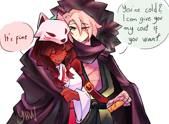
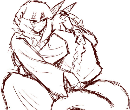
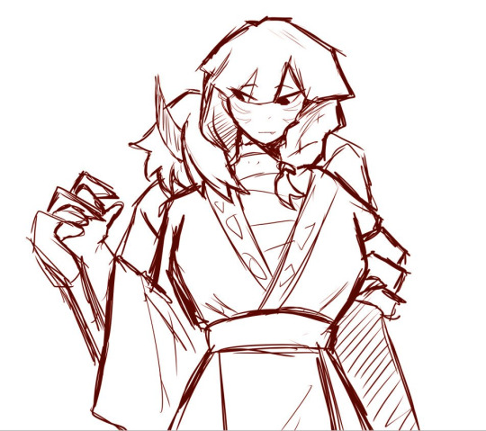
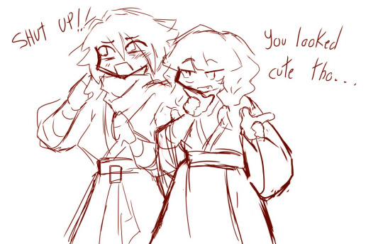
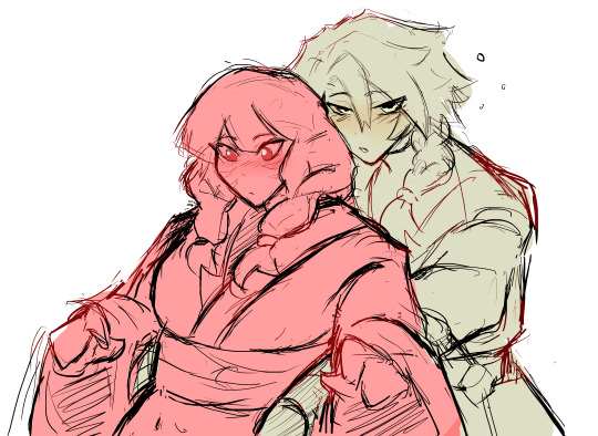
Some Lloykita sketches I forgot to put it here
#my art#ninjago#lego ninjago#lloyd garmadon#lego ninjago fanart#ninjago lloyd#lloykita#akita ninjago#akita#AKITA I MISS U#PLEASE COMEBACK#her calming him down during Oni form URGHHH#hear me out#the last one he's like like drunk or very sleepy and...#URGHH STOP I DON'T WANT TO TALK ABOUT IT I'M SO CRINGE#IM LIKE#me when characters kiss: :|#me when characters hold eachother lovingly: ASIJDOADIOADA#I'M#I'M WAY TOO AROACE FOR THIS#i need to calm down#everything is fine#I'm a adult
915 notes
·
View notes
Text


𝑦𝑜𝑢 ℎ𝑎𝑣𝑒 𝑒𝑥𝑐ℎ𝑎𝑛𝑔𝑒𝑑 𝑣𝑒𝑟𝑏𝑎𝑙 𝑗𝑎𝑏𝑠 𝑤𝑖𝑡ℎ 𝑠𝑜𝑙𝑎𝑠
#um sir please calm down#scrunkly face#but also a sMILE??#deceased about it#solas#dragon age the veilguard#datv spoilers#my caps
628 notes
·
View notes
Text
So y'all have seen the Williams F1 Logo before, yeah?
well get ready, becaues I am about to ruin your day!
where does one even begin with this. i am sorry in advance. -just a poor learning graphic design student, who simply tried to enjoy their saturday evening
The Logo
For anyone that doesn't know, here's the Williams F1 Logo. Entirely unedited, copied straight from Wikipedia:

Now like many fans, I actually quite enjoy this logo. I like the modern, sharp edges of it and it's simple yet intriguiging design. It's memorable, while also easily recognizable as a W. I also really enjoy the colour choice (this, however, is entirely a personal preference.)
(entire rant under the cut. please keep reading this took years off my life span.)
How did we even get here?
Let's start at the beginning. How did we even get here? Well I, a poor poor learning graphic designer, was watching this lovely video from Mr. V's Garage about bad F1 Logo's over the past 35 or so seasons. Very interesting, I can only recommend it (but you don't need to watch the video to understand this post)!
Now, to cleanse the palette at the end of the video, Mr. V included a top 10 GOOD logos from this time span, it was very kind of him.
On P4 of this "Good List," Mr. V placed the current Williams F1 Logo, as pictured above. At first I vaguely agreed with this, believing that he probably simply hadn't noticed one of the things that's been bothering me about that Logo since the first time I saw it up close.
The first sign of Trouble
So, what is this mystery issue, you might ask?
It's simple really. You don't necessarily notice it at a first glance, but something about that logo seems off. Taking a second longer, you may notice it yourself.
No, I mean it, take a minute and go look at the logo. It looks wonky as hell, doesn't it?
Well I can tell you the first thing that I personally noticed. The arms of the W aren't in line with the bottom half, see:

(Graphic by @girlrussell who was so kind to let me use it, as it is way prettier than the one I made)
It's a crooked W. There is no good explanation for this. The rest of the font is perfectly fine, geometrical shapes.

Anyway, the good person that I am I went to point this out to my partner ( @leftneb ) who proceeded to inform me that he, infact, was not aware about this and was, quote, "never going to unsee that."
Now, the good FRIEND that I am, I, of course, proceeded to rush into our broader F1 friendgroup to make them suffer for eternity.
What's the logical next step to take? Of course, fix the logo in Adobe Photoshop, you know, as a joke.
(Disclaimer at this point, I am not necessarily the biggest fan of Williams Management Team. I enjoy ALL their drivers this season. I do NOT enjoy James Vowels. Be warned.)(Also I am aware that he probably did not have an influence on the logo)
Trying to fix it. Oh god, I was so innocent back then
Trying to fix the logo in Photoshop is the worst mistake I could've made. THE worst path to take. I could've just giggled about making my friends suffer (which I succeeded in, by the way) and moved on. Instead I ruined a perfectly good Saturday evening, and for what? I don't know anymore.
Anyway, how was I gonna go about fixing the logo in the simplest way possible? Simplest way I could come up with: slap the thing in Photoshop and put two, mirrored boxes at each side to make the sides line up. Small issue, how do I make the thing actually even? Fix: line them up at the intersecting point with the bottom tips of the W.
Here's the result:

Hey, anyone care to explain to me why in THE LORDS NAME the arms are different sized? I mean, surely they weren't before. Surely, certainly, I must've messed up.
I double, I tripple checked. I made sure everything was lined up and made sense. But no.
It just couldn't be. Something was uneven in this logo, something even deeper. Something I could not have predicted when first taking a closer look. It was at this point I realized I had messed up. What rabbit hole had I stumbled across? Certainly, it couldn't get much worse.
And that's when I noticed.

(pictured above; my genuine reaction)
There's MORE? (oh god, the top isn't lined up)

I couldn't believe my eyes. This is the PINNACLE of the sport, and THIS was the logo of one of the competing teams? I mean, yeah, we have a Visa Cash App RB or a Kick Sauber or even a MoneyGram Haas which are all terrible logos, but at least they're CLEAN. (this has not been checked. If anyone wishes to ruin a nice Saturday evening, feel free to check them and tell me how wrong I was in the previous statement!)
But you can see that there is no end in sight for this post. I'm sure you're as scared as I was at this point. By now we were sitting in VC, discussing the horribleness of this logo. I had long informed my irl's about this, who take said design classes with me. And it was one of them who pointed out the next thing that had been bothering me, but I had not been able to put a finger on up to this point.
thE DISTANCE, HOW DID THEY FUCK IT?

I'm afraid I have to confirm your fears.
Yes, those lines are the same length. According to Photoshop, they're on the same level as well, so no flunking with angles.
The gaps of the arms to the main W are not the same. They're differently sized gaps.
It was clear to us, this logo is inherintely flawed. They're subtle issues, but once you pay attention you start to notice things. It all looks slightly wonky and off centre. And eventually, you get paranoid, and start comparing other angles and sizes. And you will keep finding things. This has ruined my life.
HOOOOOW

Honestly, I don't even know what to say. Yes, yes sadly those lines, too, are the same length. Just copied over from one side to the other and layed over on the same height. I admit, they're not layed over perfectly. I was honestly holding back tears at this point. But the point still stands, you can clearly see a difference in width.
Honestly, the only way I can explain it is that at some point there was a mess up of distance or proportions and whoever was designing the logo couldn't pin it down and tried to restore the visual balance by making manual adjustments. And in all honesty? They kinda did a good job, if that's what's happened. I mean, you notice the crookedness of the arms, and then maybe the difference in height, but the rest you probably will not notice if you don't spend too much time staring at it. (like some of us) And even those issues clearly aren't noticeable to the vast majority, considering I had to go point it out to a group chat for my friends at least to notice.
what the fuck is THAT?
Now, the thing about doing this investigative work of prooving a team you dislike is worse in more aspects than you previously thought, is that you do a lot of zooming in. And zooming in means you might notice bits that yours eyes simply overlooked before, because they were too small.

Here you can witness the top of the middle point, that, for whatever reason, really wants to touch the top border of the Logo. I'm relatively certain that's the highest few pixel in the entire graphic, considering earlier chapter "There's MORE?" I have no idea why it looks like that or why they thought it was necessary for it to not end in a clean point.

I just actually have no idea how to even describe what is going on on the top of the left arm. That left hand side, again, touches the side and is therefore the most-left-pixel in the graphic. I, once again, have no idea the purpose of this. However the RIGHT hand side also makes no sense, as it is the most prominent corner in the whole logo. There's pointed corners, and rounded OF corners, but nothing that is trying to form it's own colony in a distant land that hopefully isn't this god awful logo. I hope that blob gets away. I really do. You go king.
i'm loosing my mind
Anyway, the only reason I could come UP with those weird "reachy-outy-bits" was to establish the dimensions of the logo? But if that was the case, I don't understand why they managed to keep all the other potentially border touching corners clean?


Like, look. Those are clean, sharp corners with some clearance off the borders. I have no clue why they managed it here but not with the others.
guys. please.
Backtrackig a little bit, going back to the positioning of the arms.

Do I need to mention that those lines are both the same length and the same (mirrored) angle? I really hope I don't, because I don't think I could be making this shit up. Like, once you roughly know what you need to look for it just kinda becomes easy to find.
As said before, I genuinely do think that most of these issues happened in a chain-reaction. For example, the distances between the main part and the W wouldn't be as noticeable (and they do get noticeable once you start looking at it) if the angle wasn't fucked. And guess what, there's more fucked angles here! Which ALSO influence this specific area of the logo!
this is just embarrasing for you.

something something same line copied over and mirrored etc etc
It's not as visible but the angles defintely don't line up here as well. As mentioned before, these issues for the most part all influence each other. It doesn't really excuse the issues, in my opinion as a designer, because a big company like this shouldn't have these sort of issues in their logo.
So let's review;
to sum it up,

i cannot even BEGIN to explain to you how big of a fucking JOKE this FUCKING logo is. because, i thought to myself, to round the post out, hey, why not show ALL the issues i pointed out in one picture? that would round it out quite nicely, wouldn't it?
Yeah well, this logo sent STRAIGHT FROM HELL just could NOT let me rest. I had only done the lines visualizing the crooked arms in PAINT up until this point, i.e. I had only pulled both up individually. To make a nice "rounding out" picture I still had to add them into PHOTOSHOP. so i did. i pulled up the line. i mirrored the line.
THE ANGLE IS FUCKING DIFFERENT
none. and i mean NONE of my friends had noticed this before. i need you to understand that we looked at this thing with FIVE pair of eyes, and NONE of us noticed that until i thought to myself "Oh I still need to add these specific lines to have ALL the issues I pointed out in my SILLY TUMBLR POST in ONE image" and i get THAT FUCKING SURPRISE
I was PLANNING to round the post out with a statement on how obviously this isn't a serious post. Here, I even had it all written out already because I accidentally started writing it in the last paragraph:
Of course, this is nitpicking, and it's not that serious. I'm aware of that. AS MENTIONED most of these would not be noticeable if we hadn't gone specifically looking for them.
yeah, well, fuck that. i just spent two hours seething about this logo. i'm ending the post on this instead.

#i am ENRAGED#i managed to actually calm down about it#yk. just typing away#and then i just try to ROUND OUT THE POST#for fucks sake#anyway i know i'm posting this at an hourrendous hour#if you read all the way. reblog? maybe#pretty please#williams f1#williams formula 1#williams racing#formula 1#f1#also apologies for any spelling mistakes i do NOT have the nerve to go back and proofread this
952 notes
·
View notes
Text

#tsom#whistlecone#the sound of music#captain von trapp#georg von trapp#maria von trapp#georg x maria#captain and the governess#pinecone/whistle#my art#please don't repost#chewing on them like squeaky toys#listen. i have a problem#and my problem is christopher plummer and julie andrews#spinning them like rotisserie chickens in my brain#i am going mental#what am i gonna do oh my god#they need to fucking stop#“you don't look like a captain” “you don't look like a nun” hmmmm okay can we calm down#what if i drew them kissing what then
2K notes
·
View notes
Text
Xie Lian:
Shi Qingxuan: Can we be girlies together? Please?? For the mission. We'd be sexie- I mean more effective at the task. As women. Specifically. You know like the ones with the soft, smooth skin and the pretty lashes and the big ti- I mean stronger yin energy. That would help us blend in better. As seamlessly as I'd blend your makeup BESTIE PLEASE-
#ming yi's bitch ass got kidnapped so sqx has to seek female companionship from other men smh#someone please go be lesbians with this gal#let her fall asleep with her head resting on someone's ample bosom ONCE and she'd calm down#heaven official's blessing#tian guan ci fu#tgcf#shi qingxuan#xie lian
841 notes
·
View notes
Text
who is he giving these fuckable eyes to?!
#STOP STARING AT UR WIFE MAN#FOCUS#louis tomlinson#harry styles#calm down on the pda w#please#larry#louis and harry#larry stylinson#stylinson#harry and louis#larries#one direction#one direction fandom
332 notes
·
View notes
Note
nooo the boy, free him 😭😭😭

(See this post for reference)
#g/t#giant/tiny#g/t art#size difference#g/t fluff#remember this little guy being held by the scruff of his neck?#thanks to his anonymous savior he has now been freed#(please be gentle while he tries to calm down)#Lucent'sArt
433 notes
·
View notes
Text
Neal and Mozzie make such good partners in crime because Neal is all charming and silver-tongued, yes, but a lot of people are on their guard for people like that, despite how unfairly good at it he is. But if Mozzie walks in first and just starts being absolutely bonkers and insane, and they’re distracted and annoyed and not thinking, Neal now looks even more trustworthy and down to earth and, well, normal, which makes his natural charm work even better because they would so much rather be interacting with him than the guy who is actively being we obnoxious as possible for the sole reason of creating a distraction and making it too difficult for the marks to remember that sometimes people who sound trustworthy aren’t.
#prime example of this: Mozzie reciting watergate while Neal asks for the security access codes over the phone#white collar#neal caffrey#mozzie#neal: I need the security access codes#the guy at the bank: I can’t give you those over the phone#Neal: right#I know#I need to ask the lady who normally answers this phone#what’s she doing?#that lady: WILL YOU PLEASE CALM DOWN AND GO AWAY#mozzie: NOPE! *continues reciting court case*#the guy: uh… she’s busy#Neal: still? seriously#look I need these codes if I’m gonna send over these files. she was going to give them to me before whatever emergency this is happened#the guy: uhhh…#mozzie: *continues reciting watergate at the top of his lungs*#the guy: this is today’s access code#Neal: perfect! that’s all I needed ;)
233 notes
·
View notes
Text


#hey so what the fuck#calm down please#thanks#dan and phil#amazingphil#phil lester#dnp#dan howell#tit tour#phan#daniel howell#my glitter pics
409 notes
·
View notes
Text
rip 2009 Kent Parson you would have loved Good Luck Babe! by Chappell Roan (2024)
#check please#kent parson#you know he would have needed deep therapy to move on from this song after The Kiss#Kent: why is he out but also not with me?????#therapist: why dont we listen to hot to go again and calm down a little
177 notes
·
View notes
Text

Oathkeeper
#KAIRI#look at my daughter please#drawing her is a good calm down exercise lol .. she’s everything#kingdom hearts#KH
414 notes
·
View notes
Text
Penelope: Omg I'm lying to a room full of Men and undoing my tapestry every night, never thought I'd go this far for love
Odysseus: *loses friend* *gets played by a wind god* *loses fleet* *literally goes to hell* *becomes monster* *sacrifices men* *gets betrayed by other men* *becomes toy for a goddess* *almost murders a god or something*
#please penelope#calm down#Penelope#Odysseus#funny#shitpost#dumb#lol#epic the musical#epic the troy saga#jorge rivera herrans#epic the cyclops saga#epic the thunder saga#epic the wisdom saga#epic odysseus#epic the musical odysseus#epic the ithaca saga
242 notes
·
View notes
Text
this is how i look at my phone when the fic is so horny it genuinely makes me worry for the writers well being

#i’m not kidding what the fuck are some of these fics#it’s not personal i swear#fics#idk how to tag this#cod mw2#ghost cod#cod modern warfare#cod x reader#jjk fanart#jjk smut#jjk x reader#billie eilish x reader#mha x reader#r u cool#please calm down guys#ur scaring me
221 notes
·
View notes