#and now i will have all of it from 3D and animation to web design and development
Explore tagged Tumblr posts
Visit Tumblr Blog
Explore Tumblr blogs with no restrictions, modern design and the best experience.
Last Seen Tumblr Blogs


Fun Fact
The KCSC sent more than 20K requests to delete posts related to prostitution and porn to Tumblr from January to June 2017.
Text
Here's your reminder that if you're studying something specialist (or anything, really) download everything that you can. Every lecture notes, every PowerPoint, all your lab instructions. Everything. Pdfs of books you are given for the duration of your study. Even if you don't think you're gonna need it. Where's the harm in keeping it?
If you don't have anywhere to put it on a laptop, get a cheap memory stick and hold that shit close to your chest. Make sure you can't lose it. I literally found a memory stick with all of my college work on it the other day because I kept it on my old keys and I thought that it was empty. No. Now it's on the server I got for this exact reason.
Download your shit!! You're allowed to!
#j is talking again#sincerely a uni student who just realized he can download all of his lectures#and now i will have all of it from 3D and animation to web design and development#and by all of my college work i mean literally assessments i did and recordings of logarithms lessons from covid
8 notes
·
View notes
Text
heyyy, somehow gained many new followers recently. thank you very much for enjoying my work! in light of that, let's do a small introduction.
i'm Seosamh D��ire, or you can call me joe. he/him • sé/é only. transsexual butch man and leatherdyke ✦ fear tras/aiteach agus gearrán 🐗
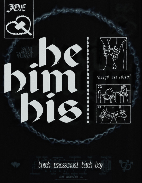
i'm a painter, comic author-illustrator, web/html artist, petty designer, smalltime archivist, passionate marxist. i like anime and virtual pets both from ~1990. as someone working primarily with past decades, i'm interested in broadening our ideas of time/place and who was in it. pro-palestine, native rights and strong proponent/student of irish-native solidarity, blm, roma, the works (uninterested in debating these topics!)
i make trans gay art for perverts and i was recently an artist in residence in the Burren, focusing on traditional paintings and reflecting/writing on being Queer In The Land.
SUPERPOSE: the tremendous dark trans sci-fi comic i make with my life+work partner Anka @kingfisher-cove . take a look! this project is my whole LIFE, and almost every piece i make pertains to it, so if you're unsure of who or what my images are of, that's a safe bet. the comic is recommended for mature readers. here's a brief synopsis,
An ongoing queer sci-fi horror comic about physics.
On the Atlantic coast, in a town called PORT CITY— “a place out of time”
While a tourist destination boasting a popular beach and boardwalk, Port City is also home to ROMAN LABS, an aerospace-turned-tech company now floundering in the tech boom.
Rafael and Royal are each listless in their own lives as longtime locals with little mobility, whose orbits have only occasionally overlapped, until now. Turning a job at the lab into a last-ditch effort for a glimpse of a more equitable future brings Royal and Rafael together, and beaches Kas, a young physicist, on Port City’s shores.
Together they seize the opportunity to alter their future and carve out a place in time for themselves, finally shaking the town and their lives from standstill. Changing history begins with the machine.
(also a supplementary web art/ARG aspect, using flat digital spaces to create a sense of 3d depth and narrative.)
SUPERPOSEBLOG @superposeblog is the repository for all updates and news about the comic.
198X.LOVE our homepage & portfolio
PATREON is where i share most of my work first, early comic pages, WIP, process and thoughts and other resources. it's a direct way to support mine & my partner's work. we are an independent team of two and i'm sure you can appreciate the effort and dedication to managing our practise as well as life obligations. for one-time support, there's also ko-fi. thank you!
i've also begun a new, as of yet unnamed 18+ comic about trans disposability/sapped as a resource + weird blood + nuclear war. so look out for that next year 😘
#introduction#illustration#superpose#comic#webcomic#painting#queer#trans#butch#dyke#he/him#trans artists#artists on tumblr#q&a#please don't call me transmasc
131 notes
·
View notes
Text
HI IM WYATT!! 🫧🧼🐡
im like if a fish was a guy and it and yeah

I'm nonbinary and a fan of soap. My personality develops at a normal human rate as well as my human mind. I'm a normal human age with a normal human life.
i like drawing! ✏️ check out #my art! 🎨 in the tags to see

i won't post explicit NSFW (anything graphically sexual in nature or anything with extreme gore), but beyond that one rule, i do not limit what kinds of topics i post about on here. i will trigger tag the generally sensitive ones, however!
i do not engage in discourse and i go out of my way to avoid it. this also goes for any mean-spirited kind of content! let's be nice to each other.
i don't recommend following me for one specific thing because i post whatever i want whenever i want to. im not an art account or fandom account im sorry!!! feel free to follow me for those anyway but dongt get mad at meeeee


i have heavy general anxiety, so please be patient with me! i tend to respond slowly and get overwhelmed extremely easily; not to say anyone owes me constant coddling or anything ofc!! i just think it's worth mentioning in case i start acting erratic or something HAHA. the more you know! 🪱 brain problems galore
feel free to talk to me either thru my askbox or messages! i love meeting new people and talking to my friends despite how anxiety may influence my behavior to indicate otherwise! i just need time. a lot and a lot of time.
my grammar sometimes is Bad because my brains is Goo Sorry... i struggle with wording things coherently :---( if i say something that comes off the wrong way, i apologize in advance! i am still learning


im a rampant lifelong selfshipper. been in the loving game for quite some time now. if you are an off-putting fictional character, youd best hope you dont cross paths with me.
OC x canon is one of my primary interests; i will probably post about it more often than not on here! if you have a common interest with a character i like, I'm more than okay with sharing! love for everyone Yay !! 🌞🌞🌈
I'm working on a fansite for character shrines but ummm its taking a while

"What does this silly fuck even do?"
Dont fucking talk to me like that. I draw sometimes and try very hard to make art! Unfortunately, the brain I'm using is kind of stupid and broken and it doesn't do what I tell it to do. Working on getting a new one, but it's just not going according to plan.
As for what kind art I tend to make, I'm very experimental with my work! Expecting consistency from me is a bad idea. I get bored of the same ideas quickly and bounce around a ton. I LOOOVE character design and character writing in particular!! i have so many stories and concepts, you have no idea. Anything character/story-oriented is a major favorite subject of mine.
I'm hoping to get around to game development, web design, animation, music production, 3d stuff, and more! Just need to kind of kick myself to the finish line u know
"Wow what concepts do you have in mind"
too many and theyre all unfinished, but I'm planning on making a webcomic! I ambitiously wanted (and still do want) to take on several massive projects that I'm not able to accomplish in my current state, so I thought a comic i can create on my own time would be much easier and a good way to start the road to self discipline... we will see how that goes.
I'd go in depth explaining all of my stories and characters but it sounds like a bad idea to put those here. I'll make a website compiling all of the information about them eventually i promiiiisee
"What do you like"
My interests fluctuate so often that i generally can't fully pin one down as if it's consistently present.
There's hardly any pattern in what I gravitate towards, other than the single qualifier of whether the piece of work contains a token character for me to latch onto who is outwardly antagonistic and/or bitter towards everyone in the cast. Everything else is mostly irrelevant in quantifying how much i will enjoy a thing. this isn't an end all be all, though!! its less of a rule and more of a pattern.
"Did you hear about how they're sending frozen ants to mars just to see what will happen? Just letting them defrost there and crawl around, an isolated ant society. I don't know who's behind this. I heard it from a friend, but I don't think I believe them, because who would do that and why?"
It was me. I was the one sending them. Watch your back. Don't ask this again
"My head hurts."
My head heuts too
"also can i kill you and your family"
Sure
#pinned 📌#oc stuff ^_^#my art! 🎨#art gallery! 🖼️#<-(for others art)#inspiration#important!#very important#favorite ⭐#for my collection... 🐡#silly time 🐛🐛🐛#informative 🔍#helpful! 🎓#ramblings#long post#<- tags for organizational purposes or if ur on mobile#ill clean this account up later when i Feeeel like it#expect this post to go thru many many edits
5 notes
·
View notes
Text
My personal thoughts on the controversial animation for The Celestial Toymaker, now that I’ve seen it for myself.
~~~~~
I really wasn’t expecting to enjoy this, and bought the DVD out of a combination of the sheer curiosity to see it with my own eyes and the desire to have the escape room feature at my fingertips. The animation style left me very apprehensive as I prefer the 2D and this looked very janky and awkward, and I lean far more into purist territory and am not a big fan of taking more liberties than necessary, which anyone could see from the trailer alone that this production did unreservedly. I wanted to go into it with an open mind but I was pretty positive this was just going to be a train wreck. And there certainly are things about it that I don’t like, but I was pleasantly surprised to find that I was still kind of enjoying myself.
~~~~~
To get the negatives out of the way:
- The animation itself is obviously the thing everyone is talking about. The 3D motion capture approach is not something I want from these animations. It is definitely janky in places, especially with the movement of mouths. There are a lot of times it’s not synced very well, as well as the fact that they often don’t open as wide as they should, and sometimes I caught mouths not even moving at all when they should be. The expressions are also quite limited, and granted, none of these animations are ever going to perfectly capture the kind of things that folks like Patrick Troughton can do with their faces, but I’ve definitely seen better emotion from the 2D ones — it’s not that they couldn’t be expressive in this, but it’s not as wide a range as it probably should be and you certainly don’t get any particular emotion out of scenes like Steven panicking that Dodo is going to freeze. I’ve always thought his voice and the production pictures we have of that were quite moving, but you don’t really get that here, even with the audio being the same.
You also get some jerky movements at times, particularly in the legs. I will say however that the mocap is a massive improvement upon The Web of Fear, and you do get quite used to it over the course of four episodes. It felt almost normal by the end. It’s definitely got problems, but it’s also not the end of the world that a lot of us assumed it was.
- Likenesses. They’re not terrible, and I’d say Dodo and the Toymaker are the better ones, but none of them are great either. Though I don’t want to attribute this problem solely to this particular animation, because you can certainly get varying levels of accuracy in the others as well — just ask Jamie. But it is a bit uncanny valley. I also wish they could get something as simple as eye color right. This isn’t the first time something official has incorrectly colored Bill’s eyes blue and I’m sure it won’t be the last but it gets increasingly silly each time. And in the opposite direction, surely you can look at pictures of Peter to know that his eyes are blue and not brown? (And this is more of an overall design choice as opposed to relating strictly to his likeness, but I couldn’t stop noticing that Steven’s teeth often showed way too much when he speaks and I found it distracting).
- Liberties in visuals. I get why it would be enticing to play around and make things as grand as you want, and if this were its own story it would look great that way, but I’m more of a purist so I wish they’d be truer to the original. If you pretend it’s not based on something else, it all looks fantastic and lots of fun, and despite myself I did get caught up in enjoying it, but because I know what it was supposed to look like and have loved that for years, that’s what I wanted to see and I do feel cheated out of an animated version that represents the actual sets and visuals.
In the behind the scenes feature the producer talks about how it’s kind of sad to look at the original sets because they didn’t have the budget to match the high concept, and as a result it feels claustrophobic because they’re just small sets when it should be big and expansive, but honestly I feel the opposite way. I think the fact that these spaces feel closed in help add to the discomfort of feeling like they’re trapped in there and won’t get out unless they win, and to the eeriness of feeling like this is a real place that you could really find yourself in. I see the appeal of the surreality and vast openness, but I actually find it less imposing than feeling like you’re in a more real, physical space with walls and everything. I also just don’t think it feels as cramped as he was acting like it is anyway.
The expansiveness is also often to the detriment of things that should be more grounded — the “make your last move” scene is largely black space, with the Toymaker and the Doctor being quite small in the middle of the screen and you can’t see their faces. That completely detracts from the incredibly dynamic shot we have from the existing episode, where things are up close and personal and this is an intimate battle of wits that we’re right in the middle of. I was shocked that they made that moment — of all moments, too! — so impersonal. I think they definitely sacrificed too many things in favor of scope.
There are also things like the blind man’s bluff game, which I found very Escher-like and over the top (though again, fun on its own), and one very bizarre sequence in episode three as they’ve entered the room with the dancing floor. I can’t do justice to the trippiness of those visuals by trying to explain them, but I have no idea why they did that. They’re certainly fascinating, and I generally like that kind of thing, but they were just so jarring and out of place, only to stop as suddenly as they’d started. It was also quite jarring at the end of episode one when Clara and Joey lose the game; rather than going limp and then reverting to dolls and having Dodo look back disturbed, which I find to be a very evocative and unsettling idea that really sells the horror aspect of this story, they just sort of… fall into a void, or something, and it jump cuts to Steven and Dodo already opening the cupboard door and exclaiming that it’s empty, as if the audience even knew it was there for them to step into at all before that very second. They hadn’t shown the TARDIS cupboard appearing because they were so focused on the spectacle. I found these kinds of choices pretty awkward.
- Liberties with audio. Piggybacking off of what I just said about altering a scene, there are a number of times they mess with the audio track. Thankfully there aren’t too many other examples of them actually removing something from the audio (though I’m baffled by them removing Dodo’s use of Steven’s name before she says that she’s frightened near the end of episode one; just why?), but there are a number of additions to the track. And I do get why, it makes sense to want to add car noises to their booth-turned-toy-car and things like that, and it’s not like these are a massive irritant or anything, but I just don’t see the need and prefer that it be left untouched. I don’t need icy noises to sell the fact that Dodo is freezing and I don’t need electricity noises to convey the electric floor.
- Liberties with character design. This will also be listed as a positive, just because it is otherwise a very interesting thing they’ve done, making the guest cast all be different kinds of toys, but from the perspective of wanting a recreation and not a total reimagining, this is a big drawback. I want to see these people actually be people, and I think they’re far more intimidating that way. It would be easy to depersonalize your interactions with a tiny rag doll or people literally made of cards, but it’s far harder to feel detached from what is clearly a person right in front of you, which makes their determination to beat you more alarming. It also makes it far more terrifying when they do revert to being a doll or a playing card — this item sitting there was someone you were just talking to, someone who’s been punished for losing by having their freedom taken away again. The whole world of the Toymaker is far more horrific to me when you lean into the fact that these really are other people; Clara and Joey stop being funny when they realize they’re likely to lose because they’re so scared of what will befall them when they do, the king and queen are trying to win so they can reclaim their liberty and not spend eternity as cards, and Mrs. Wiggs and Sergeant Rugg are absolutely terrified of the Toymaker when he comes to berate them for their failure. These are real victims, real people who have been trapped here, and that doesn’t come across the same way when you’re not looking at an actual person the whole time who only later becomes a doll again as a terrible consequence. I think this is a critical aspect of the story and it really gets lost in translation here — and it clearly ended up getting very lost on Peter Purves, because in the commentary he kept going on about the toy designs really selling these characters as purely being toy creations of the Toymaker and not real people, which is the exact opposite point of original serial. Dodo is supposed to be right, their opponents really are alive and have their own agency outside of the Toymaker, they do human things, and it really is an awfully sad place because of what’s happened to these people here. That feeling does not carry over at all when you only show them being dolls the whole time in the first place.
- Decisions that go against dialogue. This is tied into the previous point, because it kept happening in regard to choices they made with character design. Specifically, it kept making both Steven and Dodo look incredibly stupid. When Dodo suggests that Steven should recognize the king and queen and he says that they do look familiar, and Dodo has to tell him they’re playing cards, that makes Steven look like an idiot who can’t recognize a very obvious literal playing card when it’s right in front of him lol. It also makes for an odd moment when Dodo is told to touch the king’s arm to confirm that they’re just as real as them, and she is indeed convinced by this, even though in this version she’s just touching paper. Both of these moments really only work when you have real people here that are merely dressed as the characters on the cards. You also then have her comment later that Cyril was the Jack they saw earlier, which makes no sense in light of the Jack having been made of card and looking nothing like the porcelain Cyril, and Steven’s reply that all of the Toymaker’s creations look alike to him just sounds insane considering the sheer variety they encounter in the animation. To top it all off, having Cyril be made of porcelain really makes Dodo’s decision to check on him baffling, as if she could think a being made of porcelain might be bleeding. It wasn’t her wisest moment to begin with, but I find it forgivable because she’s usually quite perceptive (far more than people give her credit for) and only fails in moments like that when her kindness overrides her better judgment — it’s a silly human decision, just like everyone else in the story. But you really can’t justify it here when he can’t possibly be bleeding. Both she and Steven have too many of these moments that are suddenly outrageously questionable in the context of the character design choices in the animation.
~~~~~
However. I was surprised to find that it was actually still enjoyable regardless, and I’m happy that I actually have positives to talk about.
- I want to reiterate that the motion capture is much improved. Not to say it’s not awkward in places, but it’s miles ahead of The Web of Fear, and honestly you do get used to it. At some point it becomes quite easy to roll with, and I eventually even came to the point where I… kinda liked it? There are also things that I’m not sure how well they could have gotten away with it in 2D, such as all the jumping around in the hopscotch game. I do have to admit that the 3D lends itself to a level of mobility that the 2D models have had a hard time with. I would not want this on any other story, but it just about works here and it is actually to the advantage of scenes like the jumping from place to place, or dancing together. (And yet it’s also apparently still not enough to help animate a hug, because when they reunite with the Doctor, Dodo just kind of… walks up to him and puts her hands on his arms after a moment). I also want to give credit for the animation of the Toymaker’s characters, because I felt they were a lot more fluid and good-looking than the human ones. I think the painted look of the human skin can be to its detriment, but the non-human designs do look rather good because the materials they’re made of don’t have that same problem and they’re not trying to mimic exact human movement in the same way.
- A plus just as much as a minus, the character designs. As much as I’m against them on principle for the reasons I mentioned before, they honestly did work very well for a reimagining. Clara is a weirdly cute little rag doll, the card designs looked great, Sergeant Rugg and Cyril make good porcelain dolls, and my standout favorite, Mrs. Wiggs is absolutely adorable crocheted out of yarn. I couldn’t stop looking at her, I genuinely could have kept watching her forever lol. As its own thing, these really were very good character designs. It’s only hampered by the fact that I can’t make myself not think about how they shouldn’t look like this. This all goes the same for the set designs and the choices regarding the level of surreality. All of these things were actually great on their own, it’s just in the context of the original story it’s trying to serve that I think it fails, and that I’m a purist at heart.
- Having anything that moves at all for the first three parts. It may be inaccurate, but there’s still something satisfying about watching ANY moving version of these episodes, and I’ve often found that, even though recons are and forever will be my go-to and I will swear by them until the day I die, watching the animations tends to help me process and retain things better from that point onwards — for example, my memory of The Faceless Ones is a lot stronger now for having seen “footage” of the missing parts, and it then helps make the recon even easier to follow than before. This one is no exception. My memory is good for The Celestial Toymaker anyway, but there’s just something about movement that roots it in your brain that much better. I’m not one who struggles with recons — obviously, since I still love and choose them over animations — but it still helps to have these additional aids to cement it more firmly. Whatever problems this animation has, I still feel like it helps to have “watched” these episodes in whatever way possible.
- Plain and simple, it manages to have a sort of charm to it, in spite of me. Even while I criticized it for different things the whole time, I somehow still had a good time. I’m sure it’s in part down to the fact that I’ve always loved this story, and it would also just be hard for me to be in a bad mood watching Classic Who, but there’s something about this that still made me happy even in the face of my issues with it. I dislike their choices but I nevertheless found it hard to dislike the whole thing itself. I don’t know what it is.
- bonus: you can tell in the commentary that this animation made Peter so happy and I can’t be too mad at it when I hear how thrilled that darling man is with it.
~~~~~
Despite the fact that I went on considerably longer for the cons than pros, I did nevertheless enjoy this, to my surprise. I’m much more of a purist and want as-faithful-as-realistically-possible recreations rather than all-out reimaginings, so on principle I’m still against many of the choices they made, and I really wish this were just a fascinating and ambitious fanmade production rather than the official one because it means I’ll never get a more accurate version out of them, but I can’t bring myself to hate this. It’s kind of like when you watch a movie that’s objectively a bad adaptation of the source material but still entertaining as its own movie. Honestly, I would watch this again and have a good time. I just hope that they do NOT get it into their heads that this is the right style to keep using going forwards, because this absolutely would not work for anything else, and only halfways works for this to begin with.
I do recommend giving this release a shot despite the animation, but your mileage may vary. This is definitely something that you could either love or hate and honestly I think both reactions are valid, because I’m clearly quite conflicted myself. You can really only know if you watch it for yourself.
Verdict: against all odds and my own criticisms, I actually liked this. It’s not what I would have wanted for it at all, nor do I want them to ever do this again for anything else, but somehow despite myself I did like it in its own weirdly charming way.
~~~~~
Bonus: special features
- Great commentaries as always on all four animated episodes as well as a separate one for the existing episode four.
- Optional reconstructions as per usual. I haven’t watched these yet so I can’t say whether they’re on par with Loose Cannon or not.
- There’s a making-of for the animation, though it’s much shorter than I expected since they’ve typically been longer on other releases. Still interesting but not much going on there.
- Very nice to include the VHS intro by Sylvester McCoy. I love that they tend to add things like that.
- They have an old audio interview with Carmen Silvera. I haven’t listened to this yet but I’m looking forward to it.
- Photo gallery as always. There were actually a few I’d never seen before, as well as larger extended versions of things I’m familiar with as being more zoomed in. Always exciting when they can still surprise you with something.
- Comes with the standard informative booklet, which I always love.
- And of course, the gem I largely bought this thing for, the escape room with Maureen O’Brien, Peter Purves, and Lisa Bowerman. I’m thrilled to say it’s everything I was hoping for, and if you’re like me and could watch the Classic Who family do pretty much anything, this feature alone is worth the purchase. You’re following them through this thing the entire time and it was such a joy for me. So many things cut down the runtime of stuff like this — I remember during the Infinity War press tour they had some of the cast in an escape room that had a time of 40 minutes or so, but the actual video we got was maybe 10 minutes tops and I felt robbed of all the material we could have been seeing, because I could have happily sat there for the whole length of what they actually did. This is not a problem here in the slightest, because as usual, the people making these fun features for Doctor Who releases care about me and know what I want. What I wanted was to see these three’s entire experience in there, and I received. There are moments in it where being much more knowledgeable about Who than them is painful because you’re screaming at them to get it right, but most of the time it’s just a ton of fun watching them try to work everything out and to see their different personalities try to take control of the situation at different times. There’s one surprise in particular that had me absolutely grinning from ear to ear, and if you’re planning on getting this release, I won’t spoil what it is, but oh my gosh. Forget this feature alone being worth it, that segment alone is worth it. Could not believe what I was seeing, it was great. Overall I can’t speak highly enough of this and how much I enjoyed the crud out of it, and I am very much looking forward to the rest of them that they’ll be putting out for the other Classic eras.
5 notes
·
View notes
Text
PLEASE READ ALL
Hey there Puparoonies! With December fast approaching and a new 101 Dalmatian Street trending party set up for Jan 2- Jan 3, I figured I should make some ART! I've made an all new drawing grid just for Drawcember and made it vague so people can reuse it for whatever fandom they want! (A shout out back to me so I can see your art would be great if you do btw!)
HOW ITS GONNA WORK- I have made a grid of aesthetics that will be the theme of the piece. Basically I'll draw a characters in an outfit that matches the aesthetic provided. They will get a hat, a bag and a piece of jewellery and I'll try to make it match their personality if I can! (For example, if Dylan got the Space Aesthetic I'd go more sciency. For Dawkins, more sci-fi show. For Dolly, cool aliens!)
HOW DO WE PICK THE CHARACTERS TO AN AESTHETIC?! - I'll be holding polls to decide now that Tumblr can do that. We have an A team and a B team. So we'll be voting on two Aesthetics at a time. I'll post the Aesthetic and a description so you know what to expect.
WHAT ARE THE AESTHETICS?!
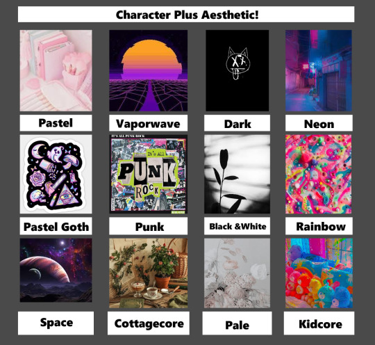
(Photos just grabbed off of google. All pictures here are not mine.)
Descriptions
(Please note that aesthetics can very from person to person on what they mean, and what they include!These are just my takes.)
Pastel- The pastel aesthetic is just as straightforward as its name, focusing on everything that's less saturated and in lighter hues. In particular, the word “pastel” refers to a soft and delicate shade of a color produced by adding more white.
Vaporwave- The Vaporwave aesthetic incorporates early Internet imagery, late 1990s web design, glitch art, and cyberpunk tropes, as well as anime, Greco-Roman statues, and 3D-rendered objects. VHS degradation is another common effect seen in vaporwave art.
Dark - Dark aesthetic covers a wide range of different things. If its dark and edgy , it can fall under this same system. Sometimes there's horror elements, but it can also be cutesy. All you really need is black, greys, and sparse uses of blood red and neon green. Some spikes can't hurt either!
Neon- The Neon aesthetic (Or Glowwave.) Is the use of bright, almost glowing colors on darker scenes. Reflective surfaces, sparkles and bright 'neon' pink can dominate this aesthetic.
Pastel Goth- Pastel Goth is an aesthetic that is a result of mixing goth or grunge with the sweet pastel elements of the kawaii aesthetic. Think if horror was cute, or cute was horrific if that's easier. Lots of black and pastel colours here.
Punk-Punk aesthetics determine the type of art punks enjoy, which typically has underground, iconoclastic, and satirical sensibilities. Punk can be as messy or minimalist as you want. It also tends to be more focused on the handmade, reused and recycled. Newspaper collages, safety pin, metal spikes, oh yeah!
Black and white- Contrast. That is the core of the Black and White aesthetic. Using only grayscale to convey detailed images. Tends to be fancy, simple and clean!
Rainbow- COLOUR, COLOUR, COLOUR! Rainbow is all colour all the time! With clear, fun shapes and fun splatters, rainbow is just... colourful fun.
Space- Spacecore is a type of aesthetic that is centered around astronomy, stars and planets. It can also be called astrocore or cosmic core. Spacecore uses lots of stars and planet type things in clothing or decor. Many spacecore aesthetics will have pictures of the sun, the moon or the stars.
Cottagecore- Cottagecore is an aesthetic that celebrates simple living, particularly in the countryside. It encourages a lifestyle rooted in traditional skills—like baking bread, gardening, and sewing your own clothes. Basically you live in a modern day Jeremiah Puddleduck book.
Pale- Palewave centers around muted and pale colors with a very relaxed and comfy vibe. Think light, easy, breezy and gentle designs. Nothing pops out right off the bat in this muted aesthetic.
Kidcore- Bright colours, cartoon designs, nostalgia, and fun! Its somewhat similar to rainbow, but you can't escape consumerism in this aesthetic usually! Toys, games, anything to do with just being a kid and enjoying life is included!
NOW WHAT?!
Now you vote in the polls! Just pick whichever character you want to see in the aesthetic listed. Please note that in order to draw this all in one month, I will be making the polls quick! The first one I'll have last a week, to help spread the word, but after that they will likely only last a day! That being said, each character will only be used ONCE. So once they're picked for an aesthetic, their off the voting board. Were you hoping a character would get a different one? Well don't worry! I may do this again, or you can try it yourself to! Just have fun!
Make sure to follow @bks-blogs for more 101 Dalmatian Street news and updates for the trending party!

17 notes
·
View notes
Text
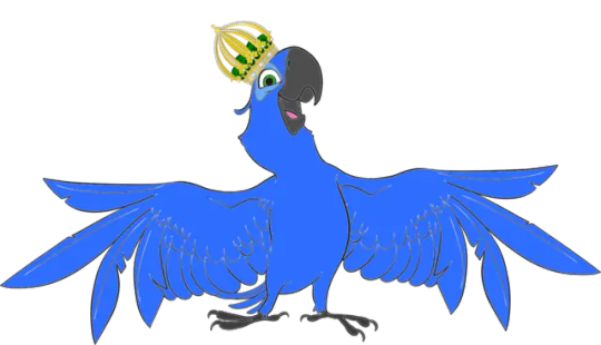
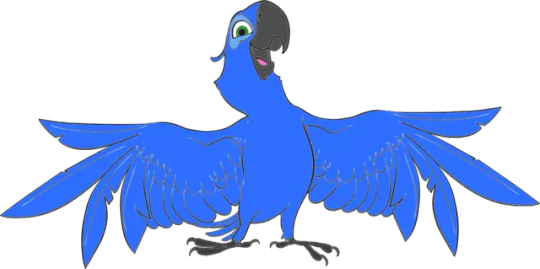
With today being the 10th anniversary of "Rio 2", here's my OC, Rio. He is my first OC to serve as the titular character. I made him sometime in early 2011 (one of my favorite years in my life, in fact), before the first "Rio" movie was released in 2011. Now, as far as his character design, I had to use 2D outlines of Blu, since Rio is supposed to be depicted as Blu's dad, making his son the next King Rio of Rio De Janeiro. I also had to look up clip art for the Brazilian crown for my character's headwear, which he later passes down to his son after Blu and Jewel's wedding and coronation ceremony.
In order to tell the difference between my character and Blu, I decided not to give Rio brown eyes. Instead, his eyes would be green. But it's possible Blu got his brown eyes from his mother, Queen Rio, depending on how she should be designed. Down below is my character's bio.
NAME
Rio
FRANCHISE
(Do I even have to say it?)
BIO
Rio is a blue spix macaw who happens to be the king of Rio. His son, Blu was born as the last of his kind. Even after losing his son, he hand-picked Jewel to live with him until they find his lost son. And after his son came back, he was able to help his son and Jewel get married.
PERSONALITY
Rio is eccentric, but well-meaning. Rio loves to sing and dance to popular licensed music, and is in fact a popular web sensation. He also has a tendency to break the fourth wall every now and then.
INSPIRATIONS
Complimenting how "Rio" and "Rio 2" used "I Like to Move It Move It", which was previously used in the "Madagascar" films by DreamWorks Animation (which ironically they would later be involved in developing "Rio 2" as part of their limited contract with 20th Century Fox), "I Like to Move It Move It" is Rio's theme song like it is for King Julien from the "Madagascar" movies.
For Rio's fourth wall abilities, I based them off of how Kuzco pauses his movies and occasionally draws on the screen with a red dry erase marker. Only, Rio doesn't draw, as instead he has a remote on him. But like Kuzco, Rio will narrate his stories off-screen and on-screen, and will poke fun at some of the characters.
Of course, this was all before I even saw the first film on opening night in 3D. As from the beginning, I depicted him as just Blu's father. Eventually, I evolved him into the character I currently have now.
OTHER APPEARANCES
Next to his own movies, I thought about giving him an appearance in "Ralph Breaks the Internet: Wreck-it Ralph 2", as at the time, Disney was in talks to purchase 20th Century Fox, which they eventually did in early 2019. Because of this, I've made a few other OCs from different Disney/Pixar films, which I can talk about if you're interested.
But in the meantime, you can click here to learn more about my OC.
COPYRIGHT
Rio/King Rio © 321SPONGEBOLT (Me) for "Rio"
3 notes
·
View notes
Text
Adding some links to alternatives with a few personal notes. There is no saying if any of these companies may follow suit and add data scrapping for ai but switching now sends a message (This is not a standard ULA for a creation software it is an over reaching social media ULA that gives far to much control to adobe over user content)
https://www.techradar.com/best/photoshop-alternatives For my needs Krita wins but for photo editing Affinity Photo rocks. and there is photopea
https://www.techradar.com/news/the-best-free-adobe-illustrator-alternatives Affinity designer is sadly missing from this list and I think it beats them all. https://justcreative.com/adobe-animate-alternatives/ Krita again is quite good as is blender even for 2D animation and as a replacement for AfterEffects and Premier and if you have the money ToonBoom rocks. For replacing Substance that Adobe bought and turned into a subscription check out ArmorPaint. 3D Coat is also great for modeling and texturing. Nitro PDF can replace Acrobat or Affinity Publisher if you need page layout to replace InDesign and while where at it for text editor you can replace Microsoft office that now has links to data thieving Open AI with LibreOffice. As for web design tools WIX, SquareSpace and even WordPress are better then Dreamweaver. I'm sure there are many more but I haven't used tools like Nuke or DaVinci Resolve so I will leave the list here saying that there is always an alternative and going open source is the best way to tell greedy corporations your sick of the abusive relationship.
100K notes
·
View notes
Text
MP - Research on 3D Games (LO1)
Yesterday, during our tutorial, Rich displayed the gameplay trailer for animal crossing to show I can create an animation rather than the whole game.
Now, in all honesty, I have been struggling on how to create the interactions so even if I create an animated trailer, I will need reference to how it will look like and Rich gave me inspiration with animal crossing to look at other 3d games.
Virtual Games
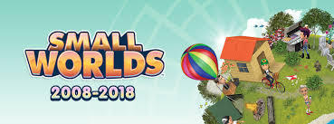
Growing up, I played a lot of virtual games like MovieStarPlanet, HabboHotel, SecretBuilders and Smallworlds. My favourite was SmallWorlds and I was obsessed before I went to boarding school in 2014. Unfortunately, it got discontinued whilst I was in boarding school. However, it's graphics were superior to other virtual world games so I turned to it for inspiration.

It got discontinued but began not many years after from scratch in Portuguese as MiniMania.
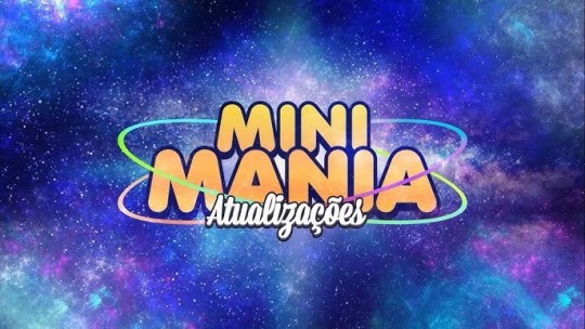
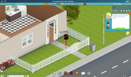
I downloaded it and regardless of the language barrier, I wanted to see the UI. I expected an upgrade but it's understandable as it's still in the beta phase and there aren't much players (especially since it's in Portuguese but mixes English)
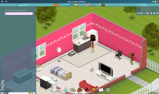
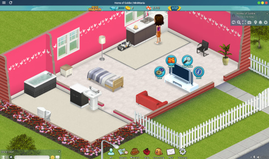
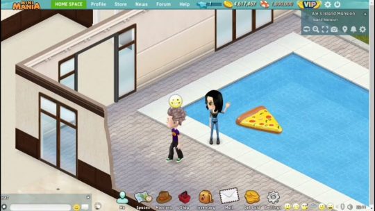
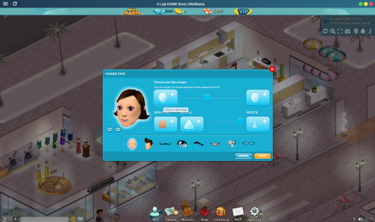
I didn't screenshot the character making page but started analyzing how the avatar interacts with space. There is no pan or zooming or orbiting the space in the game. Instead, the camera follows the avatar's direction using the mouse. For the second photo, I clicked on the TV and a circle of interactions pop-up which I believe I can implement into my idea.

As a beginner, I'm automatically a commoner and can upgrade to VIP with real world money. This is shown in the first page and in the second screen I'm typing. These little UI details are important as I need to integrate pop-ups into my design. The navigator by the side is a pop-up which assists in informing me about my mission. It not only uses the blue hue, but implements green, white and red (Now, I won't be using too many colours for my palette but it's a noticeable element)
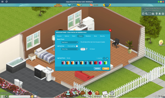

Then I finally observed how pop-ups are integrated into the space. It's place in the center and takes only an 1/9th of the viewport (this is loosely based on my visual assumption but I am aware most to all web design utilize a 12 grid system.
I noticed how alongside the blue hue, yellow is utilized as a CTA.
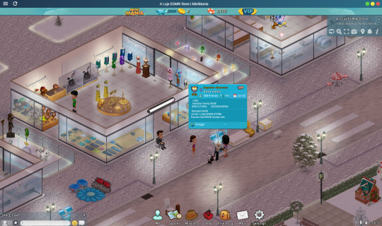
In the fourth photo is a smaller window which displays information (when the mouse hovers on an avatar), it's another elements I could implement to show a small body-copy of information.
Conclusion
The UI inspired me a lot but I expected by 2024, the pixelated avatars would've been clearer.
Secondly, as a played the game it became dull as it's in a different language and classist (I'm a commoner and can only be a VIP if I pay, in my days, I worked and got gold to become a VIP, there's no way I'd tell my parents to pay for an in-app purchase).
I apologize, that last paragraph wasn't necessary but shows I won't be addicted to the game :)
Other Resources
Trailer Oficial do MiniMania! (youtube.com)
SmallWorlds - The Game Where You Belong! - Official Trailer - YouTube
0 notes
Text
Arcane Season 2
Arcane: League of Legends, is an animated web series from the American gaming company Fighter Games, based on the company's video game title League of Legends. Arcane: League of Legends, is an animated web series from the American gaming company Fighter Games, based on the company's video game title League of Legends.
The first season caught everyone's attention when it aired in 2021, and a teaser for the second season has now aired. Expect us to be able to watch it this winter in November! Season 2 "features Caitlin and Azure", these 2 characters have a close relationship, but Caitlin and Azure have an important enemy: Ugarte. As a result, there's a high probability that they'll be battling Ugarte in Season Two.
The appealing wow factor for me is that the concept design seems to move. It's visually stunning, incorporating a stylised rendering of 2D backgrounds + 3D characters, "triple rendered". The team behind it! Produced by French animation studio Fortiche Prod, Fortiche was founded in 2009 by Jérôme Combe, Pascal Charrue and Arnaud Delord, who have been working ever since to develop Fortiche into one of the top animation studios in the world. Since then, they have been committed to developing Fortiche into one of the world's leading animation studios.
I watched the disciplinary film about their production, from how it all started to the production choices. It made me look forward to more animation for the second instalment, and they talked about how "Because we have a sense of responsibility to the players, it feels like we created these game characters, and then the players responded by giving their time and love to the characters, and we feel like these characters deserve a better story to back them up."
It was only when I saw Jinx's animation bindings that I realised that the animators had designed a special binding for her, which allows her to transform between young and old, and this is the source of the charm of Jinx's micro-expressions in the animation. I learnt in the documentary that the production process started with the design stage, where backgrounds and character props were designed, and that all the backgrounds for Battle of the Two Cities were hand-drawn. The sub-production department is also working on the script, but it's important to work with the director to create something that's not in the script. At the same time, the dubbing work is also going on, recording some temporary audio tracks, and eventually, getting a rough and dynamic split episode with sound effects. I was surprised that there was no motion capture used in the animation process, as the film is not motion captured at all, considering it is "semi-realistic", it's all hand-held.
Understanding the production process of such an excellent animation through the documentary behind it, learning not only the professional aspects of knowledge, but also a need to slowly polish the heart, the first season took 6 years, but the second season will soon be with us. Very much looking forward to it!
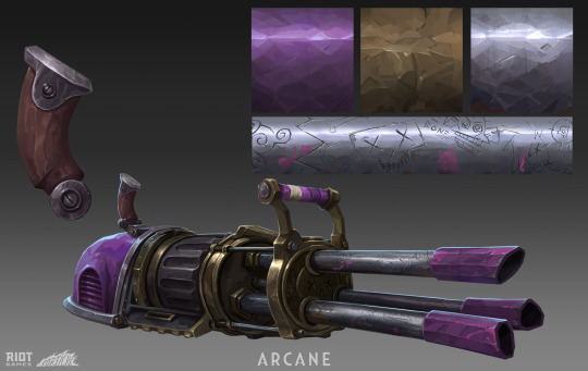
I really like the prop design in it, which is Fishbones by designer Arnaud-Loris Baudry. The exaggeration in the design, coupled with the props of the rational conception. And I did not expect the weapon so big hhh. But my favourite is his material drawing, with a thicker-than-the-touch!
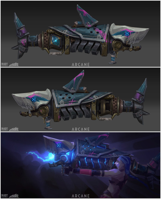

In the trailer clip for Season 2, first there is the sound of ragged breathing and an arm being infused with fluids emerges from the darkness. Then the man with a bandage wrapped around the lower half of his face appears. The fluids continued to be channelled along the pipes on the floor, eventually meeting and fusing within the huge device. The man then glances at the pocket watch in his hand and clutches it tightly in his palm. As the camera zoomed away, he sat alone in the darkness, seemingly planning his next move. And will the huge mysterious figure that appears behind him bring a new nightmare.
References:
Netflix. (2021, September 25). "Arcane Season 2: Release Date & Photos." Tudum. Retrieved from https://www.netflix.com/tudum/articles/arcane-season-2-release-date-photos
IGN. (2023, December 19). "Arcane Season 2 Announced at Netflix: League of Legends." Retrieved from https://www.ign.com/articles/arcane-season-2-announced-at-netflix-league-of-legends
niiicolo. (2021, November 20). "We can't wait for Season 2 of Arcane!!!" Twitter. Retrieved from https://twitter.com/niiicolo/status/1462225669551575042
League of Legends. (2023, November 6). Arcane: Season 2 Official Announcement [Video]. YouTube. https://www.youtube.com/watch?v=Mz4-38d3-AE&t=8s
0 notes
Text
Valiant Technology - A New ERA
Hey there! Let me tell you about Valiant, a top-notch software consultancy firm based in Dubai, right at the World Trade Centre. They offer a wide range of services and products that cater to various business needs. It's like a one-stop destination for all things tech-related! When it comes to services, Valiant truly shines. They have a talented team that excels in product development, software development, and web development. Whether you need a stunning website, a mobile app, or customized software solutions, they've got you covered.
But that's not all! Valiant is at the forefront of technologies like Artificial Intelligence and Machine Learning. They can help you use the power of predictive analysis, natural language processing, and even image and video recognition. It's like having your own tech-savvy genius on hand! If you're looking to enhance user experiences and boost customer satisfaction, Valiant can create recommendation systems that will wow your audience. And if you're intrigued by the potential of blockchain, they're experts in blockchain development, smart contracts, and creating presale dashboards. They can even build you an impressive NFT marketplace or a staking platform. Talk about staying ahead of the curve!
Now, let's talk about Valiant's web development expertise. They can craft stunning websites, create captivating landing pages, and even set up eCommerce platforms to help your business thrive. Plus, they know a thing or two about generating leads and can assist you in custom web development, ensuring your online presence stands out from the crowd.
Are you a fan of gaming? Valiant has got you covered there too! Their skilled team can develop engaging 2D/3D games, captivating virtual reality (VR) experiences, and exciting augmented reality (AR) games. Get ready to dive into immersive worlds and captivate your audience with unforgettable gaming experiences.And if you're looking for a quick and efficient solution, Valiant can work wonders with no/low code platforms like WordPress, Webflow, Shopify, or Bubble.io. They'll help you bring your ideas to life without the hassle of complex coding.
But wait, there's more! Valiant understands the importance of validating your ideas and ensuring your products are up to par. That's why they offer comprehensive audits to assess code quality, UI/UX design, infrastructure, brand presence, SEO, and even smart contracts. It's like having a team of experts giving your business a thorough check-up.
Oh, and did I mention their video production services? Valiant can create stunning videos for various purposes, from game live streaming and captivating game promos to engaging product walkthroughs. They're also great at crafting compelling copywriting and providing seamless translation services. Plus, their expertise in technical content writing and animation (both 2D and 3D) will make your brand shine!
So, whether you're a startup looking for a minimum viable product (MVP) or an established business aiming for product-market fit, Valiant is your go-to partner. They offer a classy and personalized approach, just like chatting with a friend, to bring your vision to life. With their expertise and friendly team, you'll feel confident knowing that your tech needs are in good hands.
Reach out to Valiant today and embark on a tech journey that will elevate your business to new heights. You won't be disappointed!
0 notes
Text
Danny's New Duds
Danny hovered outside the massive nest of web and rock that constituted the lair of the Divine Spider. He didn’t like the idea of going into a spider’s web, but Clockwork had told him this was where he needed to go. Though that was likely to get a bored Danny out of the clock tower; Danny only being there to avoid his parent’s new ghost hunting invention and not because he had a time quest or anything.
Danny had asked Clockwork how Vlad had changed his clothes. Thanks to one of said time quests, Danny had seen what Vlad was wearing when he first became a half-ghost and that wasn’t what he was wearing now, so he had to have changed it somehow. Made it worse, in Danny's opinion.
Clockwork seemed to consider what to tell him, but ultimately said, “He probably went to the Divine Spider. She’s the one who originally made the royal garb of The Ghost King.”
So, Danny took the map of the Infinite Realms and found the lair of the Divine Spider to see if she would be willing to make him a new costume. There was nothing wrong with his old jumpsuit, but it was built to lower the risk of ecto-contamination, not fight crime in.
He cautiously floated into the cave, careful to avoid touching any of the webbing, but he didn’t want to surprise the ghost he was there to meet, so he called out, “Hello? Miss Divine Spider?”
He saw movement from the back of the cave, but as he got closer it changed from a terrifying web-cave into what looked like the inside of an apartment. A couch that was big and comfy looking, a table with a few chairs around it, a flat-screen TV mounted on the wall… Danny could barely believe what he was seeing. He floated past a book shelf filled with anime DVDs, manga, and figurine dolls. There was a matching one on the opposite wall filled with American movies, comic books, and action figures.
“Uh, hello?”
Suddenly, there was movement and a door opened. There stood a creature that looked like a centaur, except instead of a human torso attached to a horse body, it was a human torso sticking up out of a spider where it’s head should have been. The spider was covered in fine white fur, and it’s two most front legs look more like metal scythes than a spider’s legs. The human body sticking out of it looked like a young woman, with long white hair and pale skin and her eyes glowed a ghostly pink. Her human half did wear a lovely white dress that used patterns and 3D sewing to add design, depth, and detail.
“Hello,” She said quietly, her eyes scrutinizing Danny as an intruder to her lair.
Danny swallowed down his discomfort at the spindly creature before him and forced a smile while he said, “Hi, I’m Danny Phantom, and I heard you can make ghost clothes?”
The spider woman immediately lit up with a huge smile on her face, and her entire posture and presence changed. “Oh! Yes, I love making all kinds of clothes and costumes, especially cosplay! I love making outfits based on my favorite movies and anime. I actually just finished making a Madoka Magica cosplay.”
The spider woman quickly ducked back into the room she had been in but quickly stuck her head back out and said, “Oh, I forgot to say, I’m Kumoko! And It’s nice to meet you.”
“Nice to meet you too,” Danny said as she vanished behind a closed door.
She then came out with a new dress on, a perfect replica of the main character’s puffy magical girl dress. She gave him a twirl as she excitedly explained, “Isn’t it perfect? Though, I did think about making a Homura cosplay first, she’s tied for my favorite character, but pink is my favorite color.”
Danny grinned. Oh, this horrible monster was a total geek. “It looks amazing!”
She blushed at the compliment then asked, “Did you come here for cosplay?”
“I’m afraid not,” Danny said, rubbing the back of his neck. “But I am hoping to get some cool clothes.”
“Oh, what did you have in mind?”
“Well, I’m a hero,” Danny said while motioning at his current outfit, “but my jumpsuit just isn't made for it; it'll tear at the slightest bit of friction. And look at how formfitting it is. I guess that can be good because it means it doesn’t get caught on things, except that it does get caught on things, all the time, and it always tears from that too.”
“It’s also pretty plain,” Kumoko added.
“Is that a bad thing?”
“No, but it’s not doing you any favors with the formfitting thing,” She said and started to circle Danny, her scythe legs coming off the ground and poking at his jumpsuit. “And it’s not like you have a lot of muscles to show off either.”
Danny huffed at her bluntness, “I guess I don’t mind it too much, but it would be nice to leave that kind of thing up to the imagination.”
She smiled and started waving her hands in a circles in the air, shimmering white strands of silk started to form a small doll that looked exactly like Danny, changing color to match his hair, skin, suit, and eyes. “So, the black and white color scheme is good for hiding in the shadows and catching bad guys, but how about we add some lines down the sides like this to break up the big black sections.”
The doll’s clothes changed as she explained, like it was responding to what she was thinking. “And you should have an actual utility belt instead of just a waistline reinforcement … and we should add some reinforcements around the knees and elbows, I think they should still be black, but if we want to break up the arms we can ... some thicker soled boots with more ankle support too … and- was this supposed to have a hood? That might be useful if you’re fighting in the rain or trying to hide your face... do you want to add a mask... Oh, but if we make your sigil green, it would really pop and people would recognize it! Like the bat-signal!”
They spent several more minutes talking about what would look good, what would be useful, and what would make good branding for marketing deals. And at the end of it, the spider woman handed Danny the little doll of himself and said, “I think is going to look great when you’re done with it!”
Danny looked at the doll, “When I’m done with it?”
“Yeah, you said it wasn’t cosplay right? That you want it to be your default and not a costume?”
Danny nodded, “But, I don’t know how to sew or anything.”
“Oh, do you not know how to change them yourself?” Kumoko asked and Danny shook his head. “I thought you just came to get some design advice! Okay, but you can definitely change your own clothes. You have to focus on the design you want, which you can use the doll as a reference for, and the ectoplasm that makes your current clothes will change into the new shape you want!”
“What? Really? Is it really that easy?”
“Well, some people find it easy, it can take a long time to get it right tough. Most people just prefer to keep their death clothes or have me make new clothes for them.”
Danny nodded, “I was hoping for you to make them.”
Kumoko gave a bright smile. “Okay! What did you bring for payment?”
“Uh…”
“You weren’t going to make me work for free, were you?”
“No, I didn’t think you were going to work for me at all, actually,” Danny said then sighed, “But, if we treat this like a consultation, how much would it cost to have this hero-suit made for me?”
Kumoko hummed and reexamined the doll, “At least a dozen high quality chocolate bars.”
Danny stared at her, “Chocolate bars?”
Kumoko nodded, “High Quality Chocolate Bars, or maybe some chocolate and some cookies. High quality cookies, of course. Or a strawberry cake, I haven’t had one of those in so long.”
Danny laughed, “Alright, I make the request for you to make the suit now, but you don't have to start it until I’ve given you enough sweets. How does that sound?”
"Since your hero reputation is on the line, I'll start working on it right away and you can pay when it's done." Kumoko held out her hand, “Make it a deal.”
>>><<<
Danny wasn’t sure how long it would take Kumoko to make the clothes he wanted, and he forgot to ask her too. So, he decided to play it safe, give her two weeks, and if that wasn’t enough time, he’d give her a "down payment" and ask how long it would take after that.
So, there he was again, floating into the web-cave of The Divine Spider, this time with a bright pink cake box. “Hello? Miss Kumoko?”
The door in the back opened and the spider woman stepped out, seemingly surprised to see him, “Danny! I thought you forgot about me!”
“Of course not, how could I forget about you?”
“It’s been two weeks! I also thought you might have been scared off by last time.”
Danny rubbed the back of his neck, “Yeah, I wasn’t sure how long it would take to make the hero-suit and I didn’t want to bother you while you were working on it, so I just… waited to come see you again.”
Kumoko nodded thoughtfully, “I should have told you it doesn’t take long at all for me to make stuff with my silk. I only needed a few hours, I do have eight legs and two hands that can work at the same time after all.”
“Really, just a couple hours?”
Kumoko nodded then ducked back into the back room for a moment then coming back with some folded clothes and some accessories. “I did have to go get some materials for the non-cloth bits, but I think it was worth it just to see how cool it is!”
She handed it to him and watched expectantly as he examined each piece of clothing. “Wow, Kumoko, this is amazing!”
“So, I put the hood on a jacket so that if someone tries to grab it, you can just slide it off,” Kumoko said taking and showing off the jacket, “It’s also got your sigil on it! I hope you don’t mind, I did put your sigil on each separate piece. So everyone will know that if it has that symbol it’s yours, or if someone has it, they’re your friend. And For branding! maybe - you could do some merchandising… maybe give your designer a cut.”
"I don't know how to do that, but I can look into it."
"So what you're saying is," Kumoko pointed at herself, "you need a branding manager."
184 notes
·
View notes
Note
How do you as an artist feel about AI generated art? I’ve seen so much of it lately on here and twitter and IG and I feel like it’s a dangerous thing.
Hey nonnie! Thanks for the nice question. Short answer is: no, I'm not worried abt it in the slightest and neither should you💜
Here comes the long answer. Please bear with me and allow me to use some irl examples. Short disclaimer: I'm in no way a market expert or career couch and this is my personal opinion and observations.
When years ago I was entering Foreign Languages faculty, all the internet gurus and influencers were screaming that learning languages as a main occupation is useless and soon machines gonna translate everything for us. Now, much time later, phrases like "did you do it with Google translate" became a swear, derogatory term among translators and related specialities.
Have automated AI translation programs became important part of the workflow now? Indeed, but they didn't manage to steal the work from real people. The results still need heavy proofreading, checking and etc, not even mentioning things like poetry that mostly needs manual translation, and person doing this job still needs to be perfectly fluent in the language. AI still haven't "conquered" the market and pushed human element out, but became an optimization tool.
Now many web designers and clout chasers saying all the artists will be left without work because of AI art, blowing things out of proportion to get more attention (surefire ways to attract people online - fear, hate, lust, cute baby animals).
Some of the AI generated results are pretty impressive. MidJourney kicks absolute butt when it comes to complicated backgrounds, Dall-E 2 perfectly gets all the keywords from request, and there's a new one - based off Octane Render that specifies on realistic lighting - coming out in New Year which I'm extremely excited about.
But the resulting pictures STILL need extra work put on top of them. It may impress people online at the very beginning as a fun toy to test each own's "artistic abilities", but companies and people with taste still would need professionals to work with those AI results same way translation market did. Because those programs cannot trick human eye yet. Our brains still can perceive repetitive patterns in those gorgeous AI backgrounds, and human faces made in My Heritage still have uncanny valley effect because they're eerily symmetrical. Or remember that Twitter drama where anime AI program drew girl with 6 fingers and poor OP didn't notice that?
AI doesn't understand emotions, symbolism, storytelling and many other important art things. Yes, it will generate catchy icons for phone apps like no problem and junior artists in big enterprises like Tencent would have to learn something else. But I don't see AI creating storyboards, comic, movie concepts, complicated portrait paintings/illustrations and animation fully without human involvement any time soon. I don't even mention complicated 3D render with textures for character concepts.
AI makes a wonderful tool to save time or do the work that you don't like to do. So I'd rather try to benefit from it. Here's an example of work made with MidJourney, it was fast and I had tons of fun. IMO the key is staying up-to-date, working on one's unique style, skills and nurturing your visual library - no AI would ever compare to a human mind 😄 sorry if answer was too detailed but I hope you found something useful in it!
Nice vid on it:
youtube
25 notes
·
View notes
Note
Honestly I don't mind most of the suits(except Bunnyx that just looks wrong) so much as the poses. Sure Ladybug is in a skin tight suit but it's taken from Spiderman who is also in a skintight suit and honestly I think Lady Noir is better because it looks less like real leather. But there is just no need for the focus on there bodies in a kids show, they are animated so age is flexible(adult Alix looks younger then Mari to me) but this is a kids show about kids.
Okay, I want to make this clear because on a surface level, I do not have a problem with skin-tight bodysuits as a design choice. The problem is that Ladybug’s design is extremely simple for someone who is supposed to be a fashion designer. It made sense in “Origins” because she wasn’t expecting the transformation, but Plagg confirms in “Frightningale” that the holder transforms into what they want, and I simply do not believe that what Marinette continues to want is... that. The hairpieces and mask are fine, but otherwise, it’s a red onesie with black spots all over with no exciting variation anywhere, plus a black neck. It draws the eyes all over and is jarring when she goes from fully-clothed to leaving absolutely nothing to the imagination when it doesn’t give anything for the eyes to focus on, making the whole thing awkward.
Chat Noir has a bodysuit too, but he has padding and extra features like his belt and the cuffs around his wrists and ankles. The boys get padding and such no matter how simplistic their colors/designs are while the girls simply do not get the same treatment. That’s what I take issue with, especially because padding doesn’t add any further strain to the animation, unlike something like Chat Noir’s tail (which isn’t what I’m asking for; I don’t need Ladybug to have a cape).
As for the Spider-man comment, it isn’t the same for multiple reasons. For one, Spider-man has layers to his design. If you look at the official 3D renders of Spider-man, you can see that the blue and red have very different textures to them, varying up his bodysuit, and it also isn’t all the same thing repeated for the whole bodysuit.
Here’s an image of Spider-man’s design next to Ladybug’s:

Look at Spider-man. Now, look at Ladybug. What you’ll probably notice immediately is that Spider-man’s bodysuit feels a lot less “naked” compared to Ladybug’s (and the “naked” feeling is what makes shots feel worse than they might’ve been otherwise if her bodysuit had been better designed), and the reason is that Spider-man’s draws your eyes to the red parts on his design, not the blue. It almost looks like he’s wearing a jacket and pants (with the blue intentionally being the “pants,” which is important), though made in such a way that it still looks like a bodysuit.
Ladybug’s does not do the same thing. It’s boring, uninspired, and not indicative of who she is as a character. I’ve seen people claim it’s a metaphor for her having room to grow but that doesn’t excuse the issue of her being a fashion designer and the fact that it’s already been established that holders are supposed to get what they want; even if the metaphor of her “having room to grow” was the intent, she’s been this way for at least three seasons now.
Alright. Next, let’s take a chapter from Spider-man’s web-covered book and project his design onto Ladybug’s:
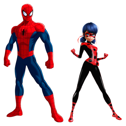

*snaps fingers sassily* I take cash or credit.
lol no, but seriously, see the difference? Ladybug’s colors are more evenly distributed and she no longer has such a “naked” look to her design. The red doesn’t overwhelm the design and it’s still distinctly ladybug-themed without seeming like it was conjured up hastily during someone’s friggin’ lunch break.
Speaking of break, it also breaks up the repetitive design and gives more for the eyes to take in due to the more complex appearance, the red popping and being inviting rather than just being... there.
I’m not saying that Ladybug needs to have padding (though I’d prefer it if at least some of the girls did while some of the guys got bodysuits with no padding at all for the sake of balance). All I’m saying is that, at the very least, Marinette deserves a look that’s more creative than her superhero name.
#((Bodysuits are inherently easy for modelers because it's basically the skin with a design painted on.))#((That's why it's outright INSULTING when said design isn't even GOOD.))#((''Bonus'' if the superhero name is just as bland. Most of the hero names in the show tend to be.))#category: salt#MC's Edits#edit: render#other: ask and answer#category: long post
539 notes
·
View notes
Text
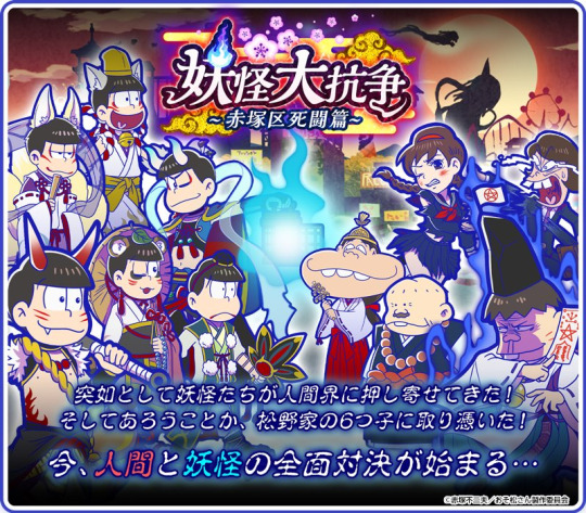
All the Youkaimatsus so far
JExcept sets that have all of them as the same youkais (Nekomata, Tanuki and the various Kitsune sets from Tabimatsu)
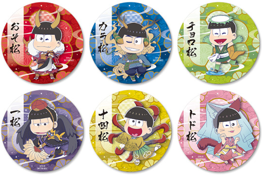
Pinup Poster from the Osomatsu Character Book #6 (July 2016)
A classic. The very first iteration of Youkaimatsu. Kind of hard to find since it was a bonus poster from the character book, so unless you were actively looking for the book, you wouldn’t find this.
Osomatsu - Kitsune (unknown how many tails he has but is often depicted in fan artworks as 6 or 9, 9 meaning strongest/wisest a kitsune has been, Spirit Fox)
Karamatsu - Karasu-Tengu (pun on Kara, Bird Man)
Choromatsu - Dodomeki (usually a woman cursed with long arms littered with many bird eyes because of greed. Most popular one imo)
Ichimatsu + ESP Nyanko - Nekomata (Two-tailed cat, legend says that cats who live longer than a 100 years gain a second tail)
Jyushimatsu - Rokurobi (available in two flavors. Long Neck and Floating Head. He is the former. Theorized to not actually be a youkai but created for entertainment. Also used as a literary device for a wandering soul.)
Todomatsu - Yukki Onna (Also a joke on Todo being scared stiff. Yuki Onna pull tricks on humans that usually end on the person’s death via cold. Has a harsh and soft side)
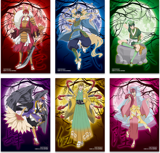
Youkai Units from The Great Youkai War event from Hesokuri Wars (November 2016)
Most popular Youkaimatsu set, this baby could get milked for miles, but for some reason isn’t. Has a lot of variants (Awakened, Darkness, Snow, Sakura and Hyakki Yagyou) and connected to a lot of other sets: Denki Mystery, Colorless Overalls, Mononoke and a bunch of others. She is the top DOGG set.
Osomatsu - Shuten-Douji (Oni Leader with a penchance for Sake, literally carrying a big ass bottle of it on his back, since he is the leader of the sextuplets and the one seen drinking beer the most)
Karamatsu - Aoandon (Summoned after 100 supernatural stories are told. Originated from the blue (ao) paper lanterns (andon) that were sometimes used to give a chilling atmosphere)
Choromatsu - Daitengu (Great Tengu, Tengus were theorized to be ascended souls, but also has its origins in a Dog Beast that looked like a comet. For some reason Dog Beast turned into Bird Man. The bird man’s beak is often anthropomorphized into long noses. Tells humanity to behave by throwing invisible stones at them)
Ichimatsu - Nine-tailed Kitsune (So wise. So powerful)
Jyushimatsu - Inugami (Dog God that possesses people)
Todomatsu - Bake-Danuki (also known as tanuki, mischievous spirits, mostly known in pop culture for their BIG FAT NUTS)
Dayon is a miko, a shrine maiden. Hatabou is an Onmyoji, an exorcist, Dekapan is a kannushi, a shrine priest. Totoko and Iyami are regular civillians
Youkai Hyakki Yagyou merchandise from Animate Girls Festival (September 2017)

One of the lesser known sets, considering that it’s just designs for a line of merch but their designs are so good? Why don’t people use these designs more often.
Osomatsu - Karasu-Tengu
Karamatsu - Nine-tailed fox
Choromatsu - Shuten-Douji (A possible reference to Season 1 Episode 2 where he gets the most drunk?)
Ichimatsu - Mizuchi (Legendary Water Serpent/Dragon)
Jyushimatsu - Kamaitachi (Beast that rides on dust devils. Cuts people using it’s scythe-like nails. The wounds are sharp but painless)
Todomatsu - Ungaikyou (A haunted mirror that can be used to trap spirits. The spirits in the ungaikyou can manipulate the reflection shown on it’s reflection.)
Kitsune Servant Set from Tabimatsu (September 2017)

Ok I know I said I wouldn’t cover the Kitsune sets from Tabimatsu since there are like 5 different Kitsune sets, but this one is noteworthy cause they have secondary Youkai traits other than the regular kitsune traits.
Osomatsu - Oni’s horns
Karamatsu - Tengu’s wings
Choromatsu - Orochi around his neck
Ichimatsu - True Kitsune (Or Nekomata’s paw?)
Jyushimatsu - Wanyudo (Flaming Wheel)
Todomatsu - I don’t know, but there’s something around his neck?
Japanese Youkai set from Shimamatsu (January 2018)
Shimamatsu was such a good game, what a shame it ended so soon. The 3D models were so cute. Edit: The two designs are from before and after evolution!
Osomatsu - Enma-san (A wrathful god in charge of judging souls in the afterlife. Resides over hell)
Karamatsu - Yamato no Orochi (Eight headed and Eight-tailed serpent/dragon)
Choromatsu - Kamaitachi (wields an actual scythe)
Ichimatsu - Youkai Catman or a Bakaneko (Catboy, furry)
Jyushimatsu - Yobuko (lives in the mountains, repeats whatevers shouted into the mountain, explains the phenomemon of Echos)
Todomatsu - Yuki Otoko (Snowman, a Yuki Onna basically)
“Inn” Osoma and Choroe from Osomatsu Season 2 Episode 17
A BUNCH OF PEOPLE REMINDED ME AND HOW COULD I FORGET THE BEST YOUKAI EVER. Osoma baby,,,, I’m so sorry..... Srsly, this skit was so good, I hope they make more skits like this where they make entirely new characters out of the framework of the sextuplets.
Osoma - A Zashiki-warashi, child spirits who live in store rooms or extra rooms, they died buried in their homes. Pranksters but meeting one is said to bring good fortunes to families. Osoma gets crossovered a lot with the other Youkai sets in JP fanart. A popular pairing is Dodomeki Chorosuke (from Denki Mystery) and Osoma also Kitsune Osomatsu (from the poster) and Osoma.
Choroe - Not necessarily a youkai, in fact in the episode she’s presented as just a regular human. But is theorized often to be a Yama-uba. An old woman banished to the mountains. She provides shelter to weary travelers (in the myth it’s just a humble shelter but you know. an inn is also considered a shelter) before eating them. In one story she eats the recently birthed baby of a woman who had to give birth in the mountains.
Mononoke from Hesokuri Wars (May 2019)
Technically they are all the same type of being, Mononoke, but they look different from each other. Mononoke can posses individuals and cause suffereing and even death. And technically they aren’t Youkais but Onryos, vengeful spirits. But Onryos can also be used to refer to youkais and truthfully I just wanna include this set cause their designs are so cool looking. This set’s attacks contain glimpses of units of other sets.
Osomatsu - Bear themed
Karamatsu - Wolf themed
Choromatsu - Rooster/Chicken themed
Ichimatsu - Spider
Jyushimatsu - Boar
Todomatsu - Bull or Ox
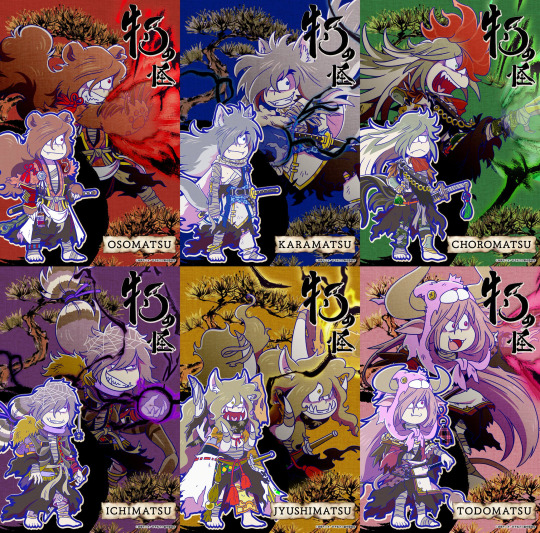
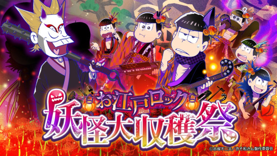
Edo Rock The Great Youkai Harvest Festival from Tabimatsu (October 2019)
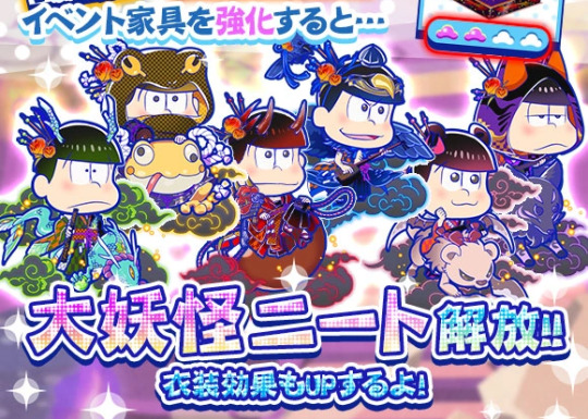
This set is interesting cause rather than youkai alone, they are also musicians. This set also has another set like Hesokuri called The Great Youkai NEET which is basically the awakened versions, properly showcasing more of the youkai traits.
Osomatsu - Shuten-Douji (Again, we need to stage an intervention for you damn)
Karamatsu - Karasu-Tengu (Again)
Choromatsu - Mizuchi (actually riding said serpent)
Ichimatsu - Black Kitsune (Hot Topic, Goth version)
Jyushimatsu - Frog. Just. Frog. (could be a reference to the legend of Jiraiya, the ninja who could shapeshift into a frog/ride big frogs. His mouth is cover just like a ninja is too.)
Todomatsu - Kamaitachi (could be a reference to season 1 where Todomatsu wields a scythe)
Iyami - Oni (not sure if he’s any particular oni but he does have the horns and metal club)
Atsushi - Ibaraki-Douji? (White hair and singular horn, most imporant servant of Shuten-Douji)
Promo Merch from Sega Cafe collab (September 2020)
Edit: Thank you @zenryokubatankyu for notifying me! Another set of promo youkais! You can get them by random by ordering a drink or meal at the now-defunct Sega x Osomatsu collab cafe. And the return of F6? Damn I haven’t seen you since Season 2!
Osomatsu - Oni
Karamatsu - I’m not exactly sure but he seems like a Mizuchi, a water serpent/dragon. He also could be another legendary serpent/dragon though.
Choromatsu - Kappa
Ichimatsu + ESP Nyanko - Karasu-Tengu
Jyushimatsu - I’m not sure, at first i thought it might be a crab youkai judging from the legs, but upon closer inspection he has spider webs on his robes, so they may be spider legs instead. Could be a Jorogumo, a youkai that wields fire breathing spiders with it’s spider legs
Todomatsu - Bakaneko (I think? The veil could be the napkin a bakaneko puts on it’s head)
Ayakashi Sextuplet’s Retro Halloween Cafe merch from Web Kuji (October 2020)
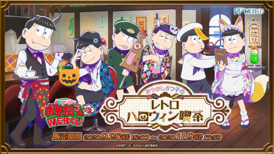
Thank you @gradelstuff for telling me about this! Ayakashi are Youkai that appear above nearby bodies of water. Although the youkais they’re dressed up as (or are?) aren’t really what you would call ayakashi? Although it’s cafe themed, it isn’t actually from a cafe collaboration. These designs are merchandise meant to be won through lottery. So if say you really love Kara and Choro’s designs (I do), then tough luck buddy!
Osomatsu - Oni
Karamatsu - Now you may think he’s Dodomeki since he’s covered with eyes, but turns out there are two other eye-relateed youkai! Mokumokuren is a youkai phenomenon where eyes appear from torn paper walls and tatami floors, initially i thought this was it given the checkered pattern he was wearing. But he might actually be a Hyakume, a youkai covered head to toe in yellow eyes specifically. Underneath those eyes is a body of flesh roughly in the shape of a man. This Youkai isn’t particularly malicious, only detaching one of it’s many eyes to follow you and survey you for criminal activiy. He might also be a BackBeard, a youkai allegedly from the US, err that would make him a cryptid I guess? A Backbeard is often characterized as a shadow with a Yellow eye with a red iris in the center. Note: Backbeard’s true origins are not known as there doesn’t seem to be any cryprid called a Backbeard, it first entered the Japanese public eye as an antogonist in the show Gegege no Kitaro. Although ever since then this “yokai” has appeared in other media and games in Japan.
Choromatsu - He isn’t exactly dressed as it (only themed as it) but the youkai he represents is the one he’s holding, a Kasa-obake, One of my favorite youkais and it’s literally iconic. Thought to be a Tsukomogami, an object that gains a spirit after it turns 100 years old.
Ichimatsu - Edit: I’m not sure but he might be a Kuchisake-Onna. In the description attached to his teaser, it makes mention of specifically his wide smile, his dos dagger and his beautiful shirt. A kuchisake onna is a yokai that wanders in the street covering her face with a mask (skull mask for ichi) and a sharp object (his dos dagger). TW GORE DESCRIPTION: She asks you if you think she’s attractive and depending on your answer she muders you with her scissors, plunging it into you OR she takes off her mask showing her wide smile, her mouth slit at the corners to her ears and asks “how about now?” and depending on your reaction she cuts you in half with her sharp object OR she slits the corners of your mouth to look like hers. END DESCRIPTION. Ichi has the mask, sharp object, wide smile and “attractiveness”. Obviously it would be inappropriate to portray ichi in the same fashion as the kuchisake onna so he was probably given the internal organ tattoos to represent the gory yokai. (internal organs usually = gore in japan). This is speculah and he might be another youkai but this is all i can think of rn.
Jyushimatsu - sailor themed Jiangshi. Jiangshi are basically Zombies originally from Chinese culture. They hop around, and crave for life force. this little jyushimatsu has taken to tomato juice instead. (Bonus: the zombie that osomatsu is in the zombie set in hesokuri wars is also a Jiangshi)
Todomatsu - Kitsune (sly fox)
“The Night Path” Youkai from Osomatsu-san Season 3 Episode 6 (November 2020)
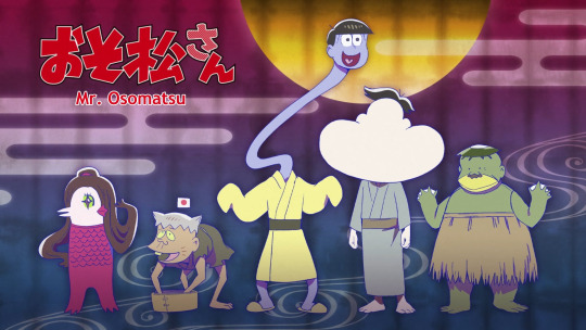
The latest and what sparked me to make this post tbh. This set reuses the Rokurobi design from the very first Youkaimatsu iteration! Full circle yo! I like to think of this set as an addition to the original youkaimatsu, since they’re both from the primary sources.
Jyushimatsu - Rokurobi (Again)
Totoko - Amabie (mermaid with three legs? prophesized about either good harvest or an epidemic, trivia: “Amabie” trended when Covid 19 hit the world)
Hatabou - Azukiarai (a youkai that originated from the sound of something like beans being washed near a river, anyone who comes near will fall into the river)
Dayon - Nopperabou (Faceless spirits that take the form of humans. They are harmless usually, they just scare humans)
Dekapan - Kappa (Mischievous River spirits)
That should be all of them!
Recap:
Osomatsu has been a Kitsune, Shuten-Douji (twice), Karasu-Tengu, Enma-san and an Oni
Karamatsu has been a Karasu-Tengu (twice), Aoandon, Kitsune, Yamato no Orochi and a Mizuchi (?)
Choromatsu has been a Dodomeki, Daitengu, Shuten-Douji, Kamaitachi, Mizuki and a Kappa (No repeats!)
Ichimatsu has been a Nekomata, Kitsune (twice), Mizuchi, Bakaneko and a Karasu-Tengu
Jyushimatsu has been a Rokurobi (twice-ish), Inugami, Kamaitachi, Yobuko, a Frog from Jiraiya and a Jorogumo (?)
Todomatsu has been a Yuki Onna (twice), Bake-danuki, Ungaikyou, Kamaitachi and a Bakaneko
You can definitely see a trend (lmao), I’m looking forward to more Youkaimatsus from Osomatsu-san!
bonus:
Osomatsu-san cameo from Yokai Watch!!!
#Osomatsu san#Youkaimatsu#Yokaimatsu#妖怪松#Hesokuri Wars#Shimamatsu#Tabimatsu#I'm not tagging all the matsus lmao#long post
668 notes
·
View notes
Text
Final Fantasy VII Review
Year: 1997
Original Platform: PlayStation One
Also available on: PC, PlayStation Store
Version I Played: PlayStation One
Synopsis:
The Shinra Electric Power Company rules over the city of Midgar, and the eco-terrorists AVALANCHE stop at nothing to try and prevent the life essence of the planet from being used as energy. Barrett, leader of AVALANCHE, hires a mercenary named Cloud Strife for their bombing mission on a Shinra Mako Reactor. Cloud doesn’t care much for the greater cause and only wants his pay. But then, after a mission goes awry, he meets Aerith, a flower girl who is the descendant of the Ancients. He quickly finds himself wrapped up in the greater conflict against Shinra.
Gameplay:
Final Fanatasy VII utilizes magic spells via Materia – little orbs that come in a variety of colors pertaining to the natural elements. You can mix and match them on your weapons and equipment, which gives you access to different spells and stats. All your equipment varies with the number of slots for how many Materia orbs you can put in. Leveling up not only upgrades the character but the equipped Materia as well.
Final Fantasy VII also uses an ATB system but is known for introducing Limit Breaks – finishing moves that build up after the character gets hit over time. Final Fantasy VI had a prototype called Desperation Attack – but it was very rare as it only appeared when your character had 1/8 of their total HP, and there was a 1 in 6 chance of performing the Desperation Attack after selecting Attack. I actually had no idea that was a thing until long after I finished the game, and never experienced it when I played Final Fantasy VI.
Graphics:
Out of all the Final Fantasy games, I have to say that this one has not aged well. It has the worst graphics of the entire series. The battle and cinematic graphics are passable.
(Most of the graphics power seemed to be put in Tifa’s, uh, bosom.)
But the characters in towns, the overworld, and in-game cutscenes are incredibly blocky. PC versions are supposedly sharper, but the PlayStation One version makes it nigh impossible to see any facial expressions.
The graphics are definitely a product of its time. I always say that the beginning of 3D gaming was essentially like puberty – awkward and full of zits. It wasn’t yet at that stage where it could be aesthetically pleasing. We marveled about it when it was first released, yes, but then we cringed in retrospect.
The environment backdrops however are probably the strongest points, where they capture the industrial nature of Midgar, the reactors and other such buildings.
Story:
Final Fantasy VII became legendary the minute Square released it. Every aspect was memorable. Part of it could be due to the fact that it was the first Final Fantasy game to enter the 3D realm. Another part was Tetsuya Nomura’s character designs, which hit the cool meter to the point of sub-zero.
The cinematics blew our minds. The opening action scene with Cloud, Barrett, and the rest of AVALANCHE attacking Shinra’s mako reactor is the most memorable opening to a Final Fantasy game. Period. Final Fantasy games really do know how to start at the right spot, no matter how good or bad the overall game is. The opening is always the best part.
Then there was the motorcycle chase. Cid’s airship. The gun fights. Battles with Sephiroth. The extra stuff to find, like summons and extra bosses. So much was jam-packed into the game.
But the story was the primary factor in making VII famous. It’s definitely one of the better ones. Man, the story became so famous that even gamers who haven’t touched a Final Fantasy game knew the major spoilers. It is the equivalent to knowing Darth Vader’s line, “I am your father” without having actually watched Star Wars.
Aerith (Aeris in the English releases) Gainsborough – the innocent flower girl who holds the secrets of the Ancients – develops a romance with Cloud and fucking dies at the end of Disc 1 by the main villain – Sephiroth. The scene shocked everyone and practically made headlines. Everybody has seen the horrible image in one way or another.
It seems to me that since Final Fantasy V, the stories have gotten more and more used to main character deaths, ultimately transforming into a heavy-hitting TV series rather than simply a video game series. In other words – it matured. Looking back, Final Fantasy IV appears to be child’s play and a prototype of later dramatic storylines with fully realized worlds.
Final Fantasy VII was also the first Final Fantasy game to create a world much like ours – one with cars and trains and airplanes and machine guns and even cellphones. The main city of Midgar reflects industrialization at its worst, with miles of slums and claustrophobic cities. Shinra Electric Power Company is a reflection of capitalism at its worst - a single entity in charge of so much that it’s pretty much the government. For the first time in a Final Fantasy game, you play as characters who dance between the morally ambiguous line of terrorism and activism. Funny enough, the theme of neglecting the planet resonates with us now more than ever. This game ended up being rather prophetic about the uncontrollable growth of corporations.
While the story is memorable with many intriguing elements, the plot itself is a tangled web. In my opinion, they really hashed in so many things that it’s easy to forget crucial details. It’s not straightforward, but at the same time everything does connect by the end. While Shinra is the driving force as a whole as the villain, Sephiroth takes over, then you learn about his backstory and then with the evil scientist Hojo and the extra-terrestrial Jenova and then “Weapon” and then the planet’s history and this and that and the other thing.
If I were to put Final Fantasy VI and Final Fantasy VII together and contrast them, as many gamers do, I would find that Final Fantasy VII is the summer blockbuster and Final Fantasy VI is the Oscar winner. Final Fantasy VII started introducing the sappy romance subplot to the series. A love triangle forms among Aerith, Cloud, and Cloud’s childhood friend Tifa. While there’s nothing inherently wrong with having a love triangle, the writing is like watching middle schoolers trying to express their feelings. Final Fantasy VI and Final Fantasy IV treated any romance with dignity and realism.
But maybe I’m being a bit harsh. After all, Cloud Strife did go through some suffering as an adolescent. His backstory clearly drives his antisocial behavior, so that becomes a good arc.
The goofiest but memorable part of the story deals with Don Corneo and Wall Market and running around store to store doing tasks in order to free Tifa from Don Corneo. It ends with Cloud needing to cross-dress as a woman to get inside Don’s mansion. Because, you know, it’s not like Cloud can just break in with his sword and Aerith’s magic or anything like that. But whatever. It’s anime.
The recent Final Fantasy VII Remake for the PS4 seems to streamline the story, and actually enhances the emotions they were trying to deliver in the original. I will be talking about the remake in a separate post altogether since I’m almost done with it at the time of this writing. But there’s a lot that I want to say about comparing and contrasting the remake and the original.
The latter half of the plot takes a couple weird turns. At one point, Cloud became catatonic and confined to a wheelchair.
That part of the game became the sluggish part for me. Sephiroth also tries to confuse Cloud, which confused me. Cloud apparently suffers from some alternate subconscious mumbo-jumbo and like. . .ungh. I get an aneurysm thinking about it sometimes.
Complicated plotlines like Final Fantasy VII start showing up from here on out in the Final Fantasy series. The trend of bishonen characters also begin here, bishonen being the Japanese term for “beautiful boy.” Cloud and Sephiroth have that look. The series starts hashing in sappier romances and much more of an anime feel.
Final Fantasy VII ultimately marked the start of a new era for the series – introducing both cool and overused tropes.
Music:
Hands down the best Final Fantasy soundtrack of all.
The entire soundtrack of this game is memorable. The opening tune, with its light twinkle when the stars show up, is enough to make any gamer know exactly what that’s from.
With a story set in a more modern world, we have music that is more modern. After Final Fantasy VI had a more serious and operatic score, Uematsu displayed his love of progressive rock here. The motorcycle chase incorporates a lot of synth, which was fitting for zipping through the streets of Midgar. However, Final Fantasy VII is the first Final Fantasy game without that familiar starting bassline for the battle them. The battle theme is instantly recognizable but also radically different from its predecessors. It’s dramatic and displays danger.
Meanwhile, the boss theme is one of the best boss themes in the series, or any video game really. It’s an electrifying progressive rock piece, and it’s my personal favorite boss theme.
youtube
The more instrumental pieces are somber, given the dreary atmosphere of the planet. The world map music is very different from its predecessors. It’s romantic one moment, soaring the next, and then dips into foreboding terror. I guess that sums up the story of Final Fantasy VII.
And we cannot leave out One-Winged Angel, which I will talk about below.
Notable Theme:
Without a doubt, One-Winged Angel – played during the terrifying final battle against Sephiroth – is the most memorable piece of music in Final Fantasy VII.
youtube
It may very well be the most popular song of the entire series. Nobuo Uematsu was inspired by Stravinsky’s Rite of Spring. It’s a whopping 30 something minute classical piece. If you look it up on YouTube and browse through it, you can definitely note the similarities. However, Uematsu didn’t want some boring classical introduction to the piece. He wanted to add the destructive impact of rock. The theme has a very distinct stamping-your-foot-down quality to it.
I had noticed a certain piece-by-piece feel of the song and that’s exactly how Uematsu composed it. This is the only song that Uematsu has composed where he created several tunes in his head and then rearranged them to make a single comprehensive song.
If you want to get technical, One-Winged Angel is the first Final Fantasy song with lyrics. The chorus sings in Latin about Sephiroth’s burning anger, with some lyrics actually taken from the medieval poem Carmina Burana. It sounds fantastic when fully orchestrated.
In Advent Children, the animated sequel to Final Fantasy VII, the music is accompanied by hardcore metal. This new rendition really illustrates the destructive power of Sephiroth. Uematsu changed the lyrics for Advent Children. They are more original now. I specifically noticed the lyrics “Veni, veni, mi fili”, which translates to “Come, come, my son.” Sephiroth is inviting you so he can kill you.
youtube
Uematsu has stated that the original orchestration didn’t sit well with him. As I suspected, Advent Children’s hardcore metal version is the one he preferred, the one he would have composed had he the technology at the time of Final Fantasy VII.
Verdict:
Another must-play for any RPG fan, even if you think it’s overrated. It’s a must-play because of its popularity, in the same way that people are wide-eyed when you say you haven’t seen Star Wars or such-and-such other popular movie. It’s a whole lot of fun, especially in the scenes that involve other forms of gameplay, such as the motorcycle chase and even a battlefield strategy game in protecting Fort Condor.
Direct Sequel?
Yes – first there was the CGI movie Final Fantasy VII: Advent Children.
I actually watched Advent Children before playing Final Fantasy VII. I had already known most of what happened in the game and Advent Children became a monumental craze when it first came out. Everybody was talking about it. Watching the sequel before playing the game skewers your interpretation of things. My first impression of Cloud was that he was always whiny and angsty, and meanwhile Tifa kept nagging him to move on. I felt really bad for Cloud losing Aerith.
Then when I actually played Final Fantasy VII, I saw that Cloud starts as this badass mercenary. Tifa is spunky and clearly is the better choice (IMO) but Cloud is enamored by Aerith after only meeting her briefly. WHAT? Cloud. Bro. Make a move on Tifa, you nitwit. Tifa is AMAZING.
Square Enix then continued the story with Dirge of Cerberus – Final Fantasy VII. This video game sequel focuses on Vincent Valentine, a fan favorite of the original game.
Let me remind you about something – the original game revealed Shinra’s inner deep secret experiments, namely with Sephiroth and Jenova. Dirge of Cerberus introduces an even deeper research team within Shinra called Deepground. I don’t know about you, but it already sounds like the start of a terribly redundant string of sequels, like how the Jason Bourne movies keep revealing an even deeper level of conspiracy theories. Vincent’s mysterious background is now fully revealed. He is defined by – guess what? – another angsty lost lover story, this time with a woman named Lucrecia. Now, okay, look, maybe I’m just being a dick about these types of love stories. But when it keeps popping up within the same series in the same manner, I start asking if you have anything else to offer on your menu.
Lastly, there is the prequel for the PSP – Crisis Core: Final Fantasy VII. Of all the games in the Compilation of Final Fantasy VII, Crisis Core has received the most positive reception. If anything, play that after playing Final Fantasy VII before bothering with anything else.
Oh, and of course there is the Final Fantasy VII Remake, which we thought wasn’t going to happen for the longest time but they finally released it in April 2020. More on that later after I finish it, and after I post my entire series of Final Fantasy reviews!
#final fantasy#final fantasy vii#final fantasy vii remake#aerith#tifa#tifa lockhart#cloud#cloud strife#cloud x tifa#cloud x aerith#aerith gainsborough#sephiroth#nobuo uematsu#square enix#fantasy rpg#video game rpg#rpg#midgar#video games#onvideogames
25 notes
·
View notes
Text
Photoshop Download Mac Os


Adobe Photoshop CC 2020 v21.2.2 Best photo, image, and design editing Software Highly Compressed Free Download For Mac OS X. Adobe Photoshop CC 2020 the essential software for perfecting your images. It offers productivity and workflow enhancements, powerful new editing tools, and breakthrough compositing capabilities. Adobe Photoshop CC software accelerates your path from imagination to imagery. Ideal for photographers, graphic designers, and web designers, the professional standard delivers new features such as automatic layer alignment and blending that enable advanced compositing. Need alternative? Then, check out GIMP Image Editor software, free download.

Simply download Photoshop from the Creative Cloud website and install it on your desktop. Go to the Creative Cloud website, and click Download. If prompted, sign in to your Creative Cloud account. If you're using Windows, you may be prompted to save the downloaded file. If you're using macOS, you may be prompted to allow the download to take place. Download the latest version of Adobe Photoshop for Mac for free. Read 167 user reviews and compare with similar apps on MacUpdate.
Photoshop Download Mac Os X
So Adobe Photoshop CC’s latest version is a full solution for professional digital image processing or editing. If you like Image editing or want to make your logo, animation files, and as well as you wish to change your style, it is the full solution that includes the most advanced tools for you. That is working with images and new possibilities for creative ideas that allow us and as well as you to significantly improve the performance of your work on image processing. Need similar? then, check out Free Photoscape Photo editor Mac. Adobe Photoshop CC 2020 for mac is a full-version software that allows us to Edit images with exceptional accuracy, use new intuitive tools and workflows for creating 4D, 3D, or 3Dimensional graphics, two-dimensional projects, as well as movies video files and so on.
Adobe Photoshop CC 2020 For Mac OS latest is the full part of the Creative Cloud 2020 full Version. Need New Version for Win/Mac? Then, Download Adobe Photoshop CC 2020 Highly Compressed. Therefore, Some advanced users that are connected to the internet are accessible to all the latest updates of Adobe Photoshop CC and access to new versions that are working full and granted from the moment of their release. This application can publish in the cloud of you any file that you have edited in this program and allows organize your data on multiple computers. It has a great feature that is also called Integration. So through integration with Behance can share their projects with other users directly from the program. Adobe Photoshop CC for Mac OS 2020 full and instantly get feedback on their work from designers from around the world. So if you like this software, then you can download it by following the given below links.
The Features of Adobe Photoshop CC 2020 Latest Version:
Mac Os Photoshop Free Download
Artboard adds the new board to your Photo.
I am merging Panoramas directly in Lightroom all in RAW format.
HDR directly in Lightroom all in RAW format too.
Very fast and easy to used for everyone.
Selective Radial and Gradient filter masking.
Making the easiest of designing forever.
Substantial performance enhancements using your GPU.
I have supported any kinds of Plugins and extensions.
Fantastic web galleries all in HTML 5 and mobile compatible.
How to Download and Install Adobe Photoshop CC 2020 into Mac OS?
Download Photoshop For Macos Catalina
First of all, Click on the below red Download button and shift on download Page.
On Download Page, you will have Download links and other Instruction.
Please follow the steps by step guideline and Installed your Software into your MacOSX.
If you like our work then, don’t forget to share with your friends and family on Facebook, Twitter, LinkedIn, and Reddit.
That’s It. Now enjoy.
If you like and want to be downloading then, you need first to share this post with your friends and family on Facebook, Twitter, or Google Plus and share your feedback with a comment.
1 note
·
View note