#art turorial
Text
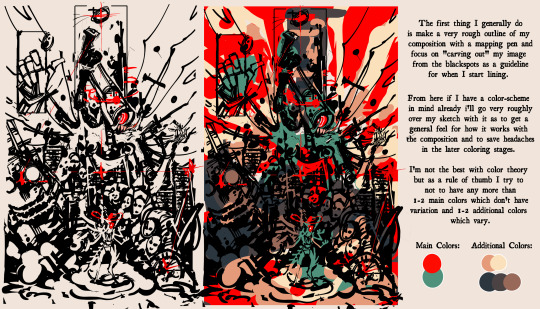
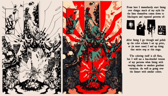
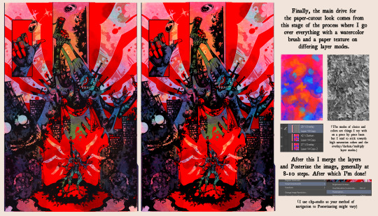
I had someone elsewhere ask me how I accomplished my lined art-style so I put together a rough guide on my process; admittedly I am very bad at explaining things, but I hope this is useful for someone!
#art turorial#my art#resources#I love talking about my weird process stuff#so if you have any questions feel free to send them my way!
244 notes
·
View notes
Video
youtube
How even do bodies work? Sh¡tt¥ Art Tips: Anatomy
Sorry that it's been a hot minute since I uploaded! Real life farm stuff and commissions have been keeping me busy. With any luck though I'll soon be able to show off a new project/character I've been wanting to add to the channel for a long while :3c
17 notes
·
View notes
Text
Do you like yummy shapes in character designs? Here take mine, Art is hard
Available on all tiers except the nsfw tier !! Our goal is 20 patreons >:) If we hit it I'll draw a comic cover for TOGH AU!

#digital drawing#my art#togh au blabber#art turorial#facial features#stylized character design#shaped character design
6 notes
·
View notes
Text
instagram
On Instagram zephy.fr
1 note
·
View note
Note
Okay so, got any advice on making pixel art? Anything at all?
I want to draw two of my characters in a style of the game they're based from, which happens to be a high-detail pixel game called Coffee Talk (for example, this is Freya, one of the regulars)
I don't have much experience with pixel art so far, I have some, but only minor stuff.
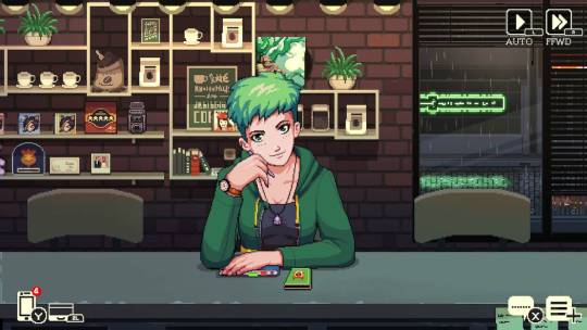
Sure!
If I was planning to do this, I would first search for a clean reference of a character from the game. That means without any jpeg artifacts and not blurry at all.
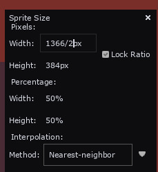
Then i would bring it into Aseprite (or whatever program you use), take my marquee select tool (M in Aseprite) and select one "pixel".

Doing this I can see that the pixel is actualy 2x2 px, which means the base sprite was scaled up 2x. So I will go to my image settings and scale the image by 50% (ctrl + alt + i) so I can have the art at its original resolution.
This is much much easier to work with and study for a pixel artist.
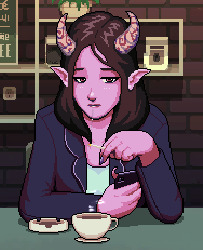
Then I would do my art side by side like this:
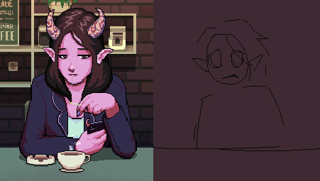
Studying from the original and mimicing stylistic choices when I can
You could also just edit the sprite (this is totally ok to do as long as youre honest/upfront about it, just like any study. So many beginner artists get started with sprite editing, its such a great way of learning).
I want to make a special mention to this website called Spriters Resource, if you're looking for game sprites (especially retro stuff) you may find it here!
If i don't know how to do something i always go on spriters resource and search games I like, so I can learn how they do it. This website is a goldmine for beginner pixel artists
Feel free to ask me any specifics in the future!! and GL
227 notes
·
View notes
Text

Tutorial thingy
#art#digital art#illustration#fanart#tears of the kingdom#zelda fanart#breath of the wild#turorial#art tutorial#artist on tumblr#digital artist#digital painting#video games#nintendo#zelda art#tloz fanart#tloz#botw#study#illustrators on tumblr#artists on tumblr#artists of tumblr#character art#linktober#link
57 notes
·
View notes
Note
I love all your edits!
Do you have any favorite psds that you are willing to share? Or tips on how to make gif colorings looks as nice as yours? 🥹
Hi, anon! Thank you so much! I am really happy that you love my edits. I really appreciate it! (°◡°♡)
To answer your question, I only use one PSD file nowadays for all the edits I make so sharing this one PSD I got for myself would be a bit uncomfortable. I hope you understand. Hehe. ( ̄▽ ̄*)ゞ
But no worries, because I thought of sharing LUT files that you can use as a basis for your color grading. I will only share one LUT file for this post but I might try sharing other LUT files as well in the future. In that way, you can achieve coloring with your own style. I will also be sharing which adjustment layers I use and what are the typical settings I apply.
SOME REMINDERS THOUGH:
I use PS 2021 but all adjustment layers are also available on older versions.
I AM NOT A PS EXPERT. I learned to use PS by reading/watching tutorials. All the things I will include in this post are just my preferences for my coloring. Take anything I said with a grain of salt.
I applied and tested my coloring on anime edits only. You may use it for real-life GIFs/photos but you may want to reduce the opacity or use a different blending mode to make it work.
My coloring deviates a lot from the original coloring most of the time. Some people may find my coloring weird so always keep in mind that this is not the best coloring practice.
ALSO WARNING: BAD ENGLISH AND LENGTHY EXPLANATIONS XD
To start, you may download the LUT file HERE.
This file is basically a compilation of adjustment layers that you may want to apply to other images. So when you use it again on another project, you can simply load this single file instead of the multiple adjustment layers. The disadvantage of using LUT file is that there's no room for further adjustments of the colorings within that file. In my case, I used it as an advantage. You may call it my secret recipe for my coloring. LOL. You can use it but there's a limit to the modifications. Anyways, this LUT file contains multiple layers which is a product of my trials and errors for the past few years since I started editing again.
You may consider using this LUT file as your training wheels. Once you understand further the complexities of the adjustment layers, you may no longer rely on this coloring file. I also did this when I started wanting to develop my own coloring style. And once I understood the basics of the adjustment layers and how to replicate the colors that I had in mind, I got rid of the LUT files and started making my own.
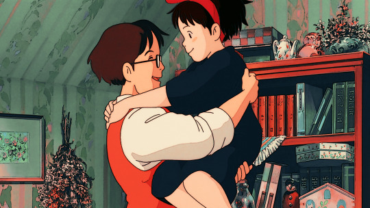
Now, let's use this image for coloring sample:
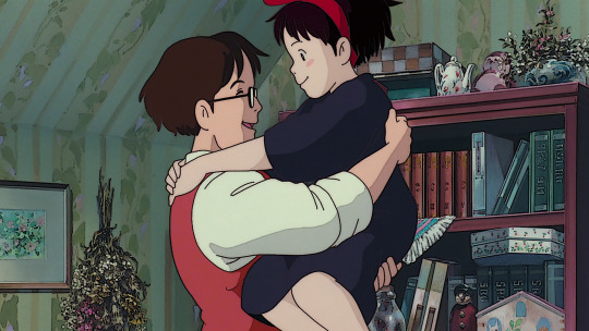
You can also download the image so you can follow my steps easily. This version is already sharpened.
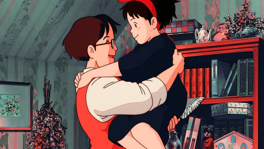
So when I apply the LUT file for this image, this is how it's going to appear.

This color grading has the teal & orange effect. Of course, this is not the final output. This will be the backbone of our coloring as we add more adjustment layers. In my case, I always start with cyan and orange and then make the necessary changes depending on the series and the atmosphere of the image used.
But before we proceed with the adjustment layers, I want to emphasize two things you can explore when it comes to adding adjustment layers. Being aware of these two features of PS actually expands your coloring options exponentially [don't get fooled, I may sound like an expert but this is just really based on my personal experience. XD] Anyways, below are the two:
Opacity - It doesn't have to be black and white when it comes to coloring. You may choose the grey side. If you think the adjustment layer you are trying to add is causing an unpleasant effect on your image, maybe try to lower the opacity first and see if that will help.
Blend Modes - you may want to explore blend modes other than the Normal mode. If you are not used to changing the blend modes, you can check videos posted by Unmesh Dinda on his YouTube Channel. He explains really well when it comes to Photoshop features. I learned a lot from his tutorials and I am now applying these learnings to my current coloring style. You may check this video for starters. He has other videos about blending modes, too.
ADDING ADJUSTMENT LAYERS:
Levels Adjustment Layer - this is always my first adjustment layer but I also modify this in the last part. There are presets available but I am not utilizing those. Instead, I go to Auto Options. This feature is very helpful in heavily dark or bright scenes. Depending on what color correction you used, you may have extremely varying results.
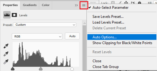
Once you click Auto Options, another dialogue box will appear:
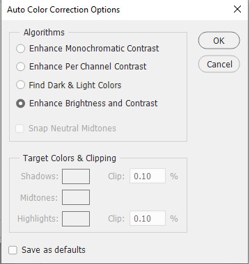
The default option is Enhance Brightness and Contrast. We will choose that option for now then click OK. [We will go back to this layer once we are done with the other layers.]

Color Lookup Adjustment Layer - this is where the LUT file comes in. Once you add the layer, click Load 3D LUT then click Load 3D LUT again on top.
Select the LUT file I shared.
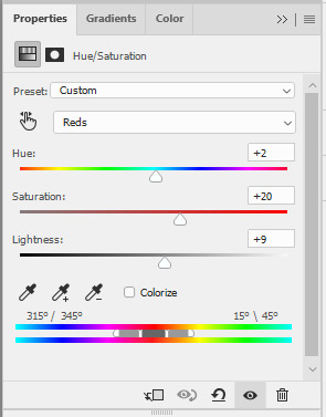
Selective Color Adjustment Layer - for this layer, I always separate my adjustments for different colors and don't do the adjustments for all colors in one layer.
First Selective Color - I will rename the layer as RED and set the following values: CYAN: -100, MAGENTA: -11, YELLOW: -32, BLACK: 15
You can explore the levels of Magenta and Yellow but ultimately, I always set Cyan to -100 and Black is +15. Of course, you are free to change these two but these are my preferred coloring for shades of red. Setting -100 for Cyan gives this warm coloring.

Second Selective Color - I will rename the layer as YELLOW and set the following values: CYAN: -100, MAGENTA: +40, YELLOW: +30, BLACK: 40
Cyan is also set to -100. This adds more warmth to the tone of the image. Then you may change the remaining sliders to your preferred values.

Third Selective Color - I will rename the layer as CYAN and set the following values: CYAN: -60, MAGENTA: +20, YELLOW: +100, BLACK: +40
I don't have a rule for CYAN. This really depends on the color I want to achieve for the shades of blue. Depending on the values, you can make your color look blue/cyan/purple. In this case, I wanted to tone down the brightness of the cyan.

Fourth Selective Color - I will rename the layer as Black and White and set the following values: BLACK: +5
This is just to slightly darken the black shades of the image. I label it Black and White because I sometimes change the value of Black for White but in this case, adjusting the white doesn't help so no changes were made.
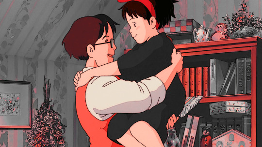
Gradient Map Adjustment Layer - I do not use this layer all the time. It really depends on the image. When I wanted to add another shade of colors to the image, that's the time I would use this. And I use a maximum of 2 gradients only.
The image looks okay now to me but let me add some gradient just to show how I use this layer. I use Gray_10 which is one of the preset gradients available in PS. Then I check the Reverse option to emphasize the contrasts of the colors. Then I set Blend Mode to Soft Light, Opacity at 100%.
Then I add another Gradient Map Layer. I use Purple_17. In this case, I didn't check the Reverse option.
Then I set Blend Mode to Soft Light, Opacity at 35%.

Hue/Saturation Adjustment Layer - this one is optional. I use this on my gifs to increase the warm tones of the image.
I only change the values of Red for additional warm tones.
At this point, I also wanted to make the cool colors lose saturation, so I added another Hue/Saturation layer. To have a grayish effect on cool colors and make the reds stand out even more.

Brightness/Contrast Adjustment Layer - you can use the Auto function and then just make the adjustments you want.
In my case, I set the Contrast to -50 most of the time, then the Brightness varies. For this example, I set Brightness to +8.

Then last but not least, I made some slight changes to the Levels Adjustment Layer and then adjusted Brightness to -3.
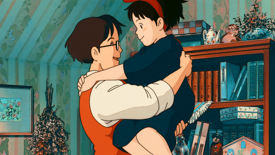
To compare, I will post the original GIF, with LUT file only, and the final GIF coloring respectively:
I hope this helps, anon!
I might create a specific tag for this kind of post and just include it on my master list pinned post so it's easy to find. Also, if you ever use this coloring style or the LUT file as part of your coloring, there is no need to credit but if possible, please tag me in your creations (#userartless) so I can see how you personalized the file and made it your own. ^^
7 notes
·
View notes
Photo


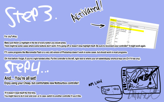
So i made a tutorial on how to turn your video game controller into an art tool if anyone’s interested.
https://joytokey.net/en/ <-- For PC
https://yukkurigames.com/enjoyable/ <-- For Mac
https://joystickmapper.com <-- Also for Mac
40 notes
·
View notes
Text
Hey artist friends who use an iPad for your art, what model are you using? and if you’re not using an apple pen what stylus are you using/what is comprable?
(Also are we all using procreate on there? How is that compared to CSP? Because I’ll be real with y’all CSP is not intuitive to me in the LEAST and I’ve heard procreate is a lot more user friendly so maybe a dummy like me could actually take advantage of all the features instead of doing what I’m doing now and fumbling through the use of CSP)
#they’re so fucking expensive dawg but I might treat myself this year for Christmas#and I’m tired of my little Baby’s First Wacom tablet even though it has served me well#but I think I deserve an upgrade#maybe get a refurbished one because we’re ballin on a budget ya girl took a bit of a pay cut with this new job#I literally still don’t know half of what CSP does and I’ve been using it for at least a year likely more#like I just don’t get it and I don’t even know what I don’t know so turorials aren’t even that helpful#so know that my art comes with the caveat that idk what the fuck I’m doing with the app I use#so if you’re like ‘oh B it’s still shit and you’ve been doing digital art for a bit wtf is up with that?’#besties it’s because I’ve been working at what is the equivalent to 20%brain capacity but for the software añejen#also because I refuse to learn foundational skills because I’m a stubborn asshole
3 notes
·
View notes
Photo

I teach how I draw an adorable t-rex dinosaur! Follow along! https://www.youtube.com/shorts/KZ-9GQLp5Jc
#art #digitalart #drawing #character #oc #originalcharacter #characterdesign #painting #livestream #misswillow #furry #anthro #furryart #sketch #artwork #howtodraw #tutorial
2 notes
·
View notes
Text

0 notes
Video
youtube
Bargain Bead Box for November 2022: Project 1, part 2, Matching Earrings
Our Part 2 of Project 1 for Bargain Bead Bx is out. These are a pair of matching earring to the Cloisonné Bracelet we made.
0 notes
Text
would be nice if some traditional colour tutorial posts would go round or be made bcuz i cant use a colour wheel or the eyedrop tool on a square of cardboard on on paper with pencils and paint
#luxray.txt#the tutorials r helpful im sure but whenever i see like ART COLOUR TUTORIAL or#or rly any art turorial and its like: first get your layer and opacity the eyedrop rool and click the wheen and invert selection and#and its like bro (me looking at a sheet of plain printer paper with. a ball point pen and coloured pencils)
1 note
·
View note
Note
1 and 15 for spiderverse AND dp
1. the character everyone gets wrong
miles morales man 😭😭😭 can ppl PLEASE do a lil more research on puerto rico and our traditions and our holidays and our language and our tribe? like its not like all that shit is super hard to find and damn if anyone has any questions id gladly answer if i have the knowledge
dash baxter. im soooo sick of gay ppl overlooking actual abuse just to make the “its not gay if hes dead” joke dash’s whole personality. not everything has to be about being queer and that headcanon is just about dash’s only saving grace to some of yall. he doesnt have to be reedemable or have some hidden motive for picking on danny to be a likeable character to yall. like you can just like him as he is and if canon dash isnt someone you like then hes probably someone you shouldnt really like anyways 🤷🏽 also big white jock guys bully because they have the power and because society has taught them they are the pinnacle of men
15. that one thing you see in fanart all the time
this goes for dp AND spiderverse too many ppl still do not know how to color darker skin tones and draw more diversified black hairstyles. its 2023 there is every imaginable resource and turorial and image out there if you cant at this point its just willful ignorance. i have seen SO MUCH art that would be so good if ppl just cared a lil bit more about what an undertone is
#dash literally targets an effeminate boy a black boy and a jewish girl like bruh……#queries#dphantom#spiderverse#ty for the ask <3<3#unpopular opinion i hate that dp gets crossed over with literally everything in the fucking world
14 notes
·
View notes
Note
aggie! i was scrolling your art tag and your portraits are really beautiful. how did you learn to paint like that??? any tips?! xoxo
thank you so much ily!!!!!!! I got very into fanart when I was 13/14 and then got kinda good because I'd do it all the time and then I started to want to get super good so I looked at tutorials and stuff online, and then I also picked art as a subject at school and tried everything so MY TIPS: everything is valuable when learning, get obsessed with something, LOOK AT HOW PEOPLE DO WHAT THEY DO FOR REAL LOOK AT SPEEDPAINTING AND TURORIALS, copy other people's art, copy your favourite parts of other people's art, copy real life, really look at things. and put soooooo many hours into it 🫶 and also keep going until you're sick of it and then stop.
7 notes
·
View notes
Text
MP - Secondary Research (LO1)
The art of perfumery by Alena Fedra is a great website, it uses 3d and animations. However, that is not the vision for my idea. I’ve considered this type of website as an idea for the next turorial.
0 notes
Last Seen Blogs

riddlersbailbonds
Untitled
nijjhar
FIRST GNOSTIC PRINCIPLES OF ONE GOD ONE FAITH
madara-nycteris
Madara-Nycteris
world-in-a-nook
World in a nook
capitol-chronicle
The Capitol Chronicle