#bradel binding
Text


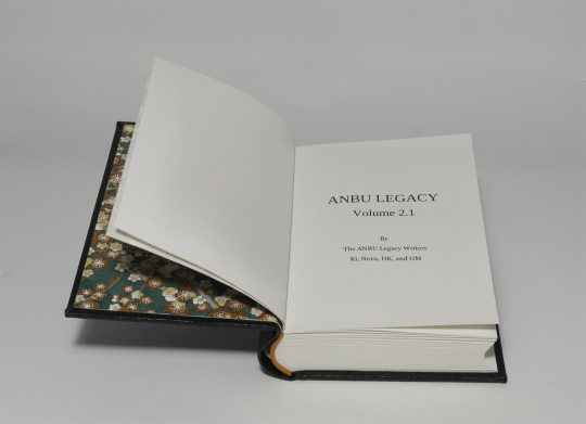


ANBU Legacy 2.1 - @anbu-legacy
With kind permission of the authors
Full cloth binding with title hot stamped on the spine.
case materials
covers - grey board (2,4)
spine stiffener - cardboard
covering material - coated book cloth, black
hot stamped title - heat reactive foil, silver
inner book
text block paper - Munken polar, 100gsm
endpapers - Chiyogami paper
endbands - book cloth and cord
Format: ~A6 (10,5cm x 14,8cm)
#bookbinding#fanbinding#Naruto#anbu-legacy#I'm having a good run with those lately - but I'm dreading the spreadsheets of Vol. 3 already#maybe I'll postpone it just a liiiiittle longer#masashi kishimoto#bradel binding
58 notes
·
View notes
Text


WIP
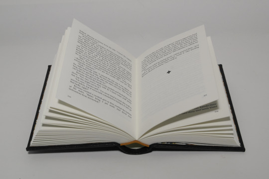
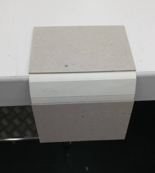
Rounding the spine stiffener of a Bradel case
To be honest, at this spine width one does not need to round a book at all, but I like rounded spines so I will do that whenever it's feasible.
So I round the spine stiffener before dressing it with book cloth or paper, or pretty much any material. Pre-rounding the spine stiffener helps to fit the uncoverd case. The bookblock can be put in, thin rounding it again once the cover material is added. Also, if one messes up that step and an ugly crack shows in the spine stiffener, it's easy to just salvage the boards and replace the spine stiffener.
(And it needs replacing. If you harbour any hopes for the covering material also covering up a crack in the spine stiffener, abandon those hopes.
It won't!
A broken spine stiffener won't ever give you a neatly rounded spine and it will always show through.)
The spine stiffener can be rounded in a few ways that all consist of introducing the desired shape to the cardboard. That can happen with the rounded edge of a table, a wooden rod a bone folder, by using the rounded side fo the bonefolder to round the spine stiffener.
I also work down the edges of the spine stiffener next to the hinge, because they always gave me grief if I did not and curled up a bit. When the spine stiffener was rounded once it's a lot easier to get it back into shape after dressing the case. Even if it dried flat.
It helps a lot let the spine stiffener dry in that rounded shape int he first place though. So if one doesn't doesn't plan on a spine title or decoration that needs a flat surface to work on, the case can be set to dry while wrapped around the inner book and weighed down.
(Don't forget to protect the book against moisture though!).
16 notes
·
View notes
Text
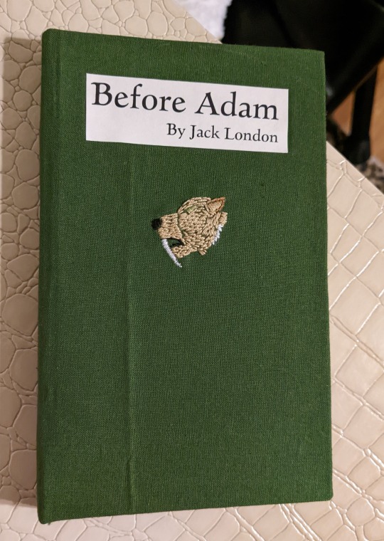


I hand-made a copy of Jack London's Before Adam for my friend's birthday. The little sabretooth is hand-embroidered, and the title is slightly inset.
Text courtesy of Project Gutenberg but formatted by me! Oh, and the oak leaf is courtesy of Openclipart.
Don't mind the crease on the front... I was am still working out how to properly iron fat quarters.
#bookbinding#bradel binding#jack london#before adam#hand embroidery#sabretooth tiger#sabertooth tiger#it's amazing what you can format in Word
3 notes
·
View notes
Text
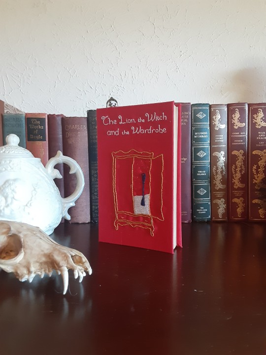

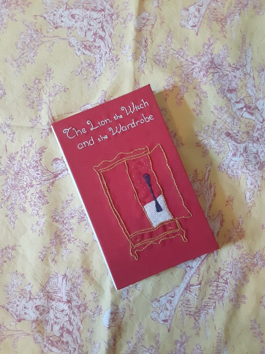
here's another throwback i still love. the embroidery came out a little wonky, but people have told me that's their favorite part of the book, and that it looks purposefully whimsical, so i've come to appreciate that as well.
this was my first bradel binding, and my favorite part of the whole thing is the stark white spine against the bright red covers. it's really such a look.
#bookbinding#rebind#dynastespress#bradel bind#embroidery#narnia#the lion the witch and the wardrobe#cs lewis
45 notes
·
View notes
Text
so, you wanted to start bookbinding?
so @princetofbone mentioned on my post for "factory settings" about wanting to know more about the binding style that i used for it. so i thought i might make a post about it.
i was as terrible as i always am for taking in progress shots, but i can link you to the resources i used in order to make my book. i would also like to point out that "factory settings" is my 120th bind, and i have been doing bookbinding as a hobby for just over 3 years now. unfortunately this means some of the methods that i used for that bind aren't particularly beginner friendly, just in terms of the tools and methods i have used, but i would love to point you in the right direction when it comes to resources. i dont say this to sound pretentious which i fear i might come across, just so that youre fully informed. getting into this hobby is fun and rewarding, but it can definitely be intimidating.
with that caveat, heres a list of links and resources that i have used for bookbinding in general, with additional links to methods i used specifically in regards to this bind.
ASH's how to make a book document. it gives you a great introduction into typesetting fics (where you format the text of fics to look like a traditionally published books) and then turning them into a case-bound book (the style i used for "factory settings"). it is comprehensive, and explains how to use microsoft word to do your bidding. it was invaluable to me when i was just starting out! currently i use affinity publisher to typeset/format my fics for printing, but i only bought and learned how to use that after i had been binding books for a year and a half. i made some beautiful typesets with word, and some of my close friends use it still and design stuff that i never would be able to in my wildest dreams (basically anything by @no-name-publishing)
DAS Bookbinding's Square Back Bradel Binding. a great style to do your first bind in! this method requires, when making the case, to attach the cover board and the spine board to a connecting piece of paper, which makes it so much easier to match the size of the case to the size of the text block (your printed out and sewn fic). using this method is what allowed me to get much more accurately fitting cases, and made me much more confident with the construction of the books i was making. a well-made book is something that is so wonderful to hold in your hands!
DAS Bookbinding's Rounded and Backed Cased Book. This is the specific method that i used to create my bind for "factory settings"! even before i could back my books, i found that watching DAS's videos in particular helped me see how books were traditionally made, and i was able to see different tips and tricks about how to make nicer books.
Book Edge Trimming Without... i trim the edges of my text block using my finishing press and a chisel i have sharpened using a whetstone and leather strop with buffing compound on it. i follow the method for trimming shown in this video!
Made Endpapers. i follow this method for my endpapers, as i used handmade lokta endpapers, and they can be quite thin, but they look beautiful! i used "tipped on" endpapers (where you have your endpaper and then put a thin strip of glue on the edge and attach it to your text block) i used for a very long time before this, but these feel like they are much more stable, as they are sewn with your text block.
Edge Sprinkling. this is the method that i used for decorating the edges of my text block. but the principle is basically clamping your text block tight and then sprinkling the edges. i do not believe you need to trim the edges in order to do sprinkles on the edges, and that's what makes it accessible! i personally just use really cheap acrylic paint that i water down and then flick it onto the edges with my thumb and a paint brush.
Double-Core Endbands. i sew my own endbands, which i followed this tutorial for. that being said, it's kind of confusing, and this video is a bit easier to follow, but it is a slightly different type of endband.
Case decoration. i used my silhouette cameo 4 to cut out my design for "factory settings" in htv (heat transfer vinyl). i also used my cameo 4 to cut out the oval of marbled paper on the front, as i honestly didn't want to try my hand at cutting an oval lol. i also glued some 300 gsm card with an oval cut out of the centre of it onto the cover before covering it with bookcloth, to get a kind of recess on the cover. i then glued the oval of marbled paper onto the top of the recessed area once it was covered with bookcloth, so that it was protected. the images i used were sourced from a mix of rawpixel, canva and pixabay. a more accessible way to get into cover decoration is by painting on a design for your cover as described in @a-gay-old-time's tutorial just here. or even doing paper labels, which look classy imo.
physical materials. sourcing these will depend on your country. i am located in australia, and have compiled a list with some other aussie bookbinders of places to buy from. here is a great post describing beginning materials for getting started binding.
@renegadepublishing. this tumblr is great! its what got me started bookbinding, and being in the discord has been inspiring, motivating, and honestly just one of the best online experiences i have ever had. it is full of resources, and most people in there are amateur bookbinders, with a couple of professionals thrown in. the discord is 18+, and anyone can join!
i'm sorry this post got so long, but i hope that this has a lot of information for you if you would like to get started bookbinding. its one of the best hobbies ive ever had, and i genuinely believe i will have it for the rest of my life.
3K notes
·
View notes
Text

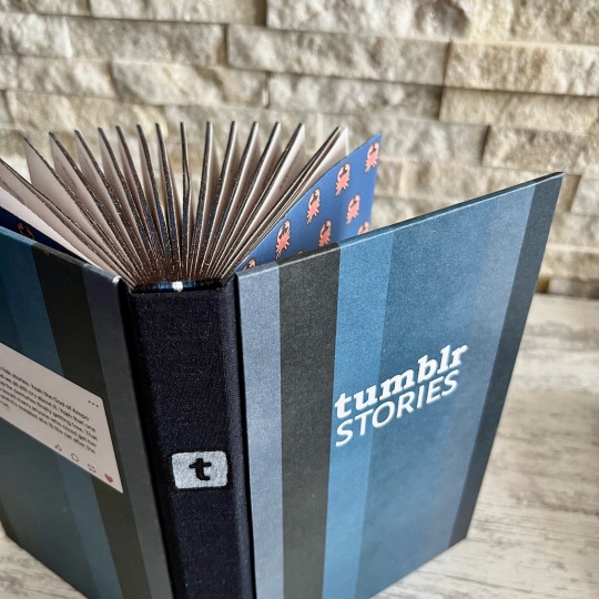

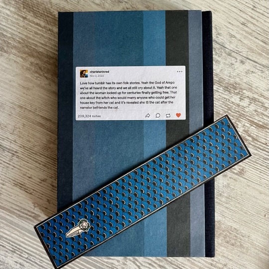

Wonderful @marvinhere over at Renegade Bindery collected a volume of tumblr “folktales”.
Here’s my spin on it!
A three-piece Bradel binding featuring:
🦀 covers in all the fun shades of tumblr blue with the post that started it all on the back cover;
🦀 logo linoprinted on dark blue linen spine;
🦀 crab party on the endpapers;
🦀 my first attempt at sewing double core endbands;
🦀 edges painted to look like ✨space✨
🦀 custom bookmark because more memes is always a good idea, right?
#bookbinding#fanbinding#mythril thread books#tumblr#tumblr folktales#tumblr folklore#renegade bindery#tumblr stories
1K notes
·
View notes
Text
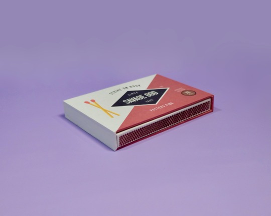
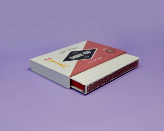
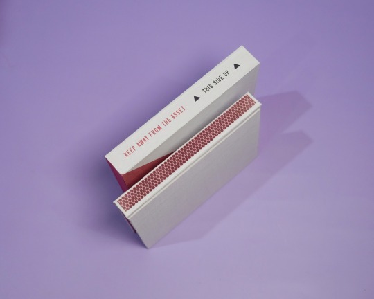
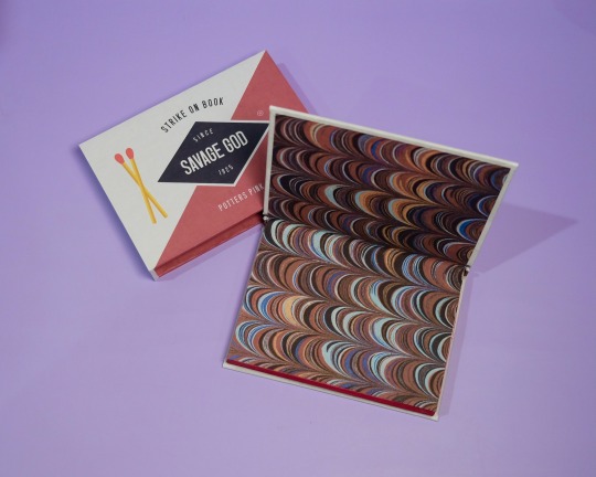
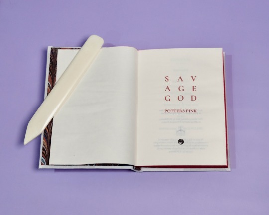


Savage God by PottersPink, binding by DCB Bindery
Summary:
Past, present, future, Steve knows Bucky Barnes. It’s why he recognized him when he found him in that alley in April of 1942, even though Bucky was older, stronger, wearier; he called himself The Asset, and had a metal fucking arm. He flinched when Steve tried to touch him, and when Steve told him he loved him, his first response was to ask why.
The Asset was only with Steve in 1942 for a few days, but it’s enough to change the course of Steve’s life forever; the journey to becoming Captain America is coloured with urgency, with an undercurrent of fear and determination that in the end he just can’t manage to hide from everyone — But it was all for nothing. Steve saves Bucky from Zola, just to lose him on the train. Their second chance, wasted.
Seventy years later, Steve wakes up in the twenty-first century, and he doesn’t know whether to be heartbroken or hopeful when some of the things Bucky revealed to him in 1942 start falling into place.
Specs:
Square back bradel, red edges, marbled patterned endpapers and endbands, A6, with slipcase.
A gripping read from @potterspink, undoubtedly one of my all time favorites. I’ve revisited this fic over and over again and it is no less satisfying to read each time!
On the process:
I knew I wanted to base the design of this binding around a matchbox, and decided to go with Diamond matches. Really liked how it turned out, especially with the striker design on the spine of the book. Had a lot of fun bringing in elements of the story into the slipcase design too, and the slipcase construction was so much simpler and easier than I expected!
I’m quite pleased with the matches marking parts one to three as well, adding a little pop of red that ties everything together. I’m binding three editions of this fic for Binderary so check out the paperback & collector's edition for a more in depth look at the typeset!
More DCB Bindery Projects
258 notes
·
View notes
Text

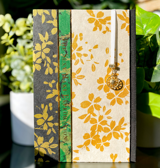
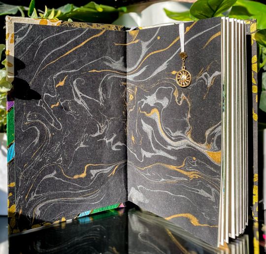


the eagle has landed, and now i can talk about it >;3c
i had the pleasure of typesetting and binding @starshipcaptainjojo's zolu series conquering, and this was a delightful project from start to finish.
the bind is a three-piece bradel with covers made from individual pieces of marbled, splattered, or stamped lokta paper and gold heat transfer foil. on the back cover, i've also foiled the series's tagline. i wanted to mirror the typeset, which includes images of historical rugs, tapestries, and paper at the beginning of each story in the anthology--and i think it succeeded! (even if i ended up unintentionally making a mardi gras bind. that i finished on mardi gras. incredible.)
the endsheets are a thicker black silver/gold marble, and the bookmark is a looped 4mm silk ribbon tipped with an 18k gold clasp and a sun charm. i'm particularly proud of this bind's edges, which i painted with two layers of diluted acrylic: dark green and metallic light green shimmer. like the gold foiling, it doesn't come through well in pictures... but i promise this book is very shiny :3c
last but certainly not least, i also got permission from @/veryqueerdraws to include a comic they drew for jojo's fic stamina, which i won't include photos of lest tumblr obliterate me on sight for... obvious reasons. i believe its posted on their twitter, though!


202 notes
·
View notes
Text


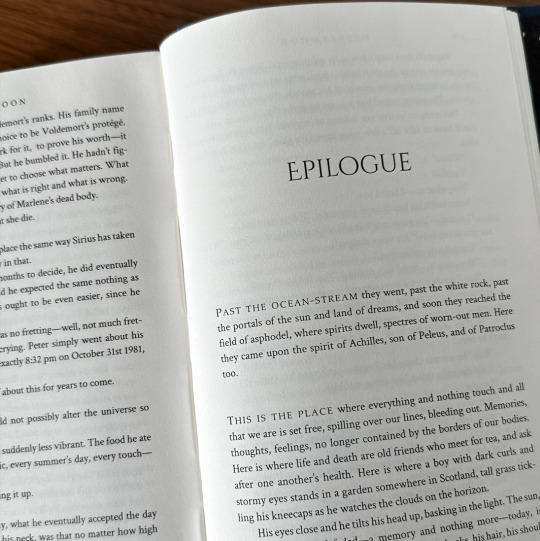
Choices by MesserMoon (@sophsicle)
People make mistakes, but they also make choices. It’s important to James, that difference. He does his best not to confuse the two.
Fandom: Harry Potter
Pairing (s): Regulus Black/James Potter, James Potter/Lily Evans, Remus Lupin/Sirius Black
AHHHH I am SO excited to share this bind—but first, I want to say thank you to Soph for letting me make (my first ever) author copies for this story. I'm definitely a beginner bookbinder but I truly hope I've done this fic justice <3
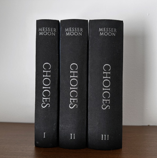
The design process for this bind was probably one of my favorite parts. I decided to go with some really simple design elements in comparison to my other binds, primarily because I felt it was more fitting for the story, and I was inspired by some of the design choices made in my personal copy of Song of Achilles.
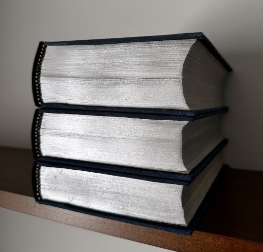
Photographed here are the author's copies, so I've held off on posting about them until now:

(The dedications are all pulled from Soph's playlist for the fic, and each quote reminds me of that particular volume, given that there are three. Pictured above is the dedication for the first volume.)
624,188 words | 1,945 pages
Title Font: Cinzel Decorative
Body: Crimson Text
Headers/Capitalization/Dedication: Palatino Nova
Some elements of this bind were entirely new to me, such as the fact that it was an in-boards three piece bradel binding. It was also my first time painting edges, as well as rounding spines. Neither of these things turned out perfect, even after completing personal copies, but i did learn a lot of don't's.
One of the things that I did in the process of this bind that I LOVED was combining two different decoration styles. I've done covers that are either completely foiled, or completely HTV—but not both. For this cover design, I was struggling to figure out the best way to make the upside-down antlers on the cover pop. Adding HTV over a full foil cover was the perfect way to get the look I wanted:


(The contrast/shininess is best pictured in the process photo on the left.)
Special thanks to both @maybebabyplease for listening to my rants about this bind since July, as well as the @renegadepublishing discord server.
As large a bind as this was, it was so so much fun to bring to life this incredible story that holds such a special place in my heart as well as the fandom's.
#bookbinding#fanbinding#jegulus#marauders#my books#wolfstar#choices messermoon#harry potter#hp fandom#ficbinding
291 notes
·
View notes
Text
As an apology to @natdammit for making this abomination, I also made an anthology of some of her shorter Cait/Vi works.


More pictures of the typeset and details below
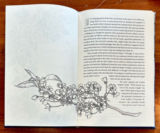
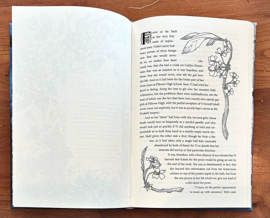
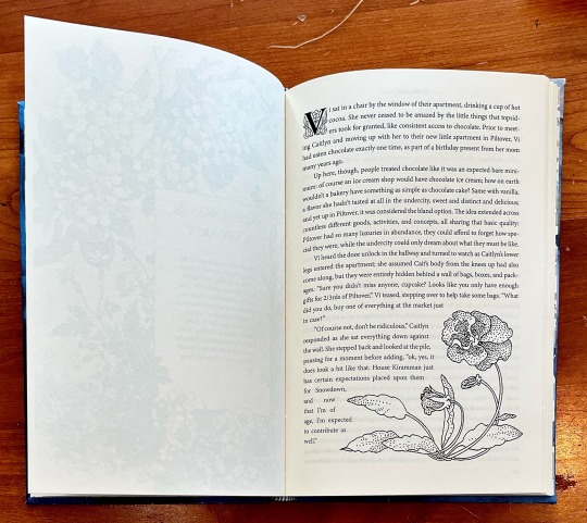
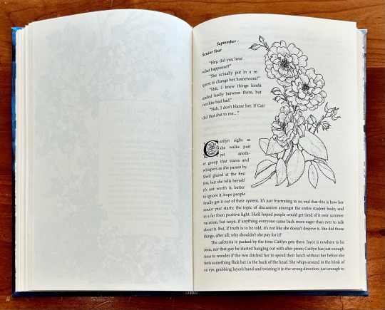


Three piece Bradel binding, bookcloth spine and paper covered covers.
Title text is heat transfer vinyl, flower graphic is a traced design using a hot foil pen.
131 notes
·
View notes
Text
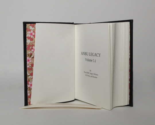


ANBU LEGACY 5.1 - @anbu-legacy
With kind permission of the authors
Full cloth binding with title hot stamped on the spine.
case materials
2,4 binders board and cardboard (covers)
coated book cloth, black (covering material)
silver heat reactive foil (hot stamped title)
inner book
Munken polar, 100gsm (book body paper)
Chiyogami paper (endpapers)
Format: ~A6 (10,5cm x 14,8cm)
#bookbinding#fanbinding#naruto#anbu-legacy#masashi kishimoto#chiyogami paper#bradel binding#oxford hollow#first part of Volume 5#I just love the tiny konoha symbols in the original typeset <3
34 notes
·
View notes
Text

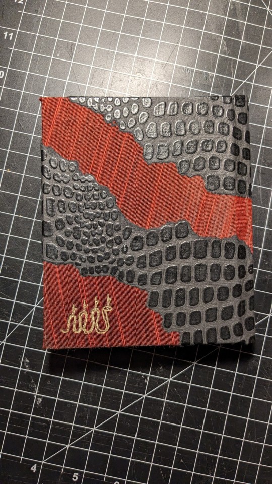
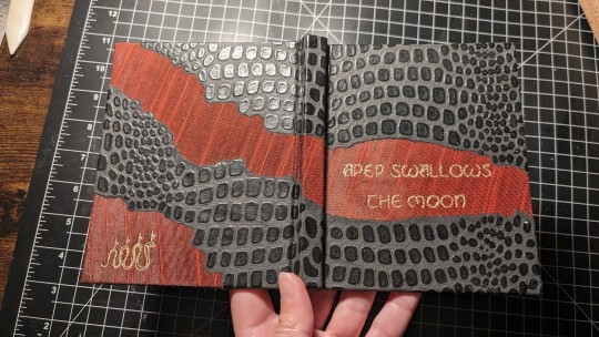
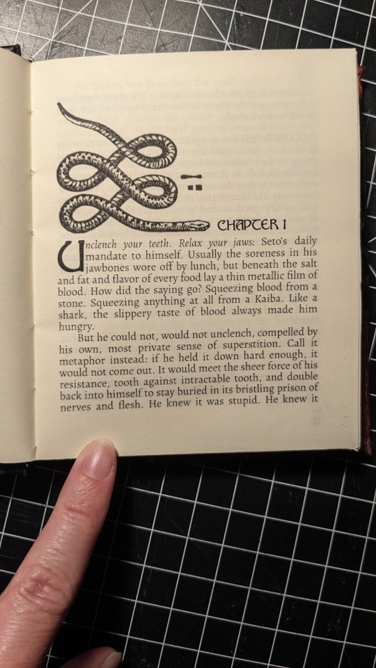
Book #25!
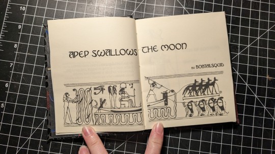
Fic: Apep Swallows the Moon
Fandom: Yugioh!
For: Me, the author!
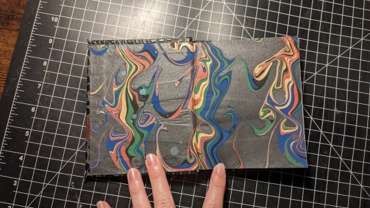
A rebind of my very first bind - same fic, but updated with new skills, supplies, tools, typeset, and design sensibilities! This fic is about some horrible painful body transformations (weredragonism) and ritualistic axe killings in the woods at night, so I wanted the cover and the end-papers to reflect the bloody, uncanny, torn flesh feeling. I first cut a strip of the neon red slub and lay it across the (bradel bound) bookboards; once that was glued down, I tore up the scaly paper until I had the ideal shape for the cover. The end-papers are, of course, Crepaldi.
Typesetting details below the cut!
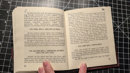
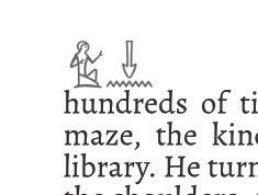
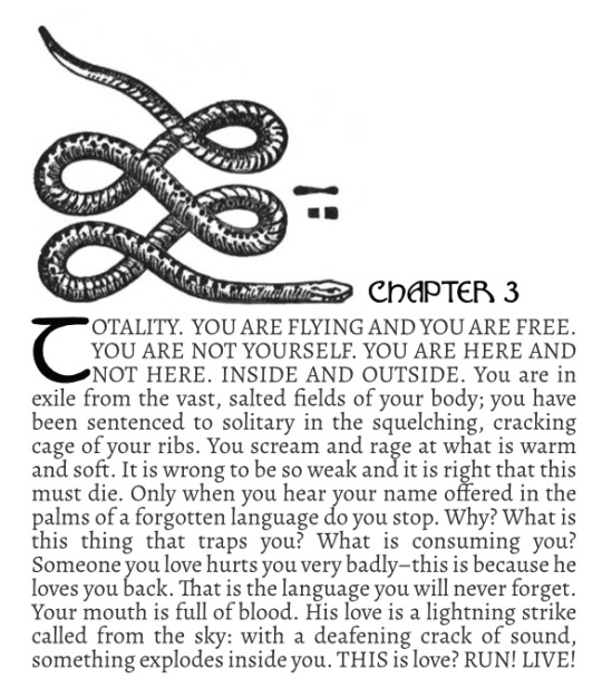
The fic also deals with ancient Egyptian myth and magic, so the typeset has ancient Egyptian elements, like a panel from the Book of the Dead where the gods kill the demon snake, Apep, that I used for the title spread. Apep is in the odd-page header of every chapter, but each chapter has a different hieroglyph in the even-page header, reflecting a key character from that chapter: the cat, the brother, and the Pharaoh.

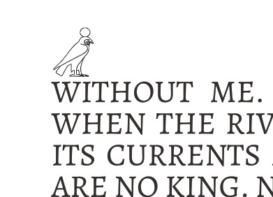
BEHOLD! Demon snake!
79 notes
·
View notes
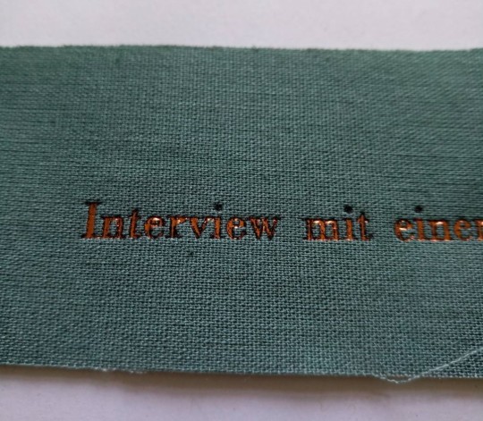
Photo


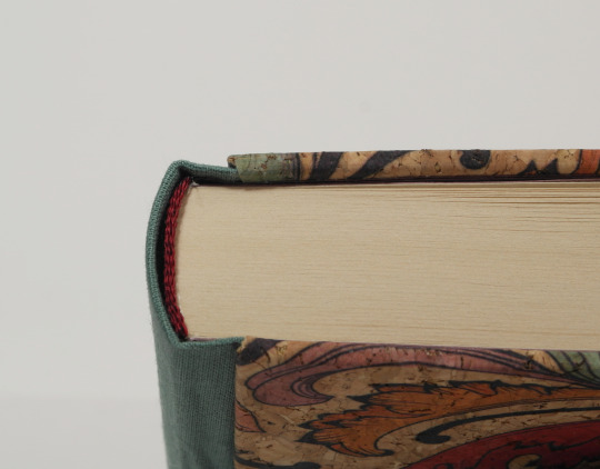
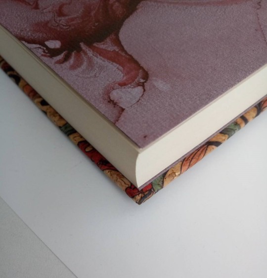
Interview mit einem Vampir - details
Here are some detail shots of my latest re-bind.
I worked with a couple of unfamiliar materials and lets say, I made a lot of new experiences.
I already mentioned in the WIP posts, the book cloth was self made. I pre-washed the cotton fabric and used thin paper and wheat paste glue to back it. Sadly the wheat paste was not strong enough to hold firm at the hinge. This I only found out after it was completely finished, when training the book. (naturally it shows on the front side of course).

I considered taking a syringe and injecting some glue into the loose pocket, but finally decided against it. The loose cloth there is an aestethic flaw, not one of integrity. I’m fairly certain I’d end up with glue stains pressing through and still some loose cloth if I tried it and decided to save me the pain.
As for the self-made cloth, I’ll see how the next book turns out before making more bookcloth now. See, how the different fabrics are to work with first.
The cloth also gave me quite some trouble when hot stamping the title on it. Originally I planned on titling in copper, but for some reason the foil would not adhere to it. I increased, pressure, temperature, stamping time, but nothing got me satisfactory results. Then I tried stamping in black and that went without any trouble. On the first go I got crisp and clean lines with no blank patches at all.

I considered getting creative and use the black as a base colour and simply stamp copper on top (usually that actually works). It did not work though. The copper still came out mostly patchy

It has a certain grunge look to it. But I decided against it in the end.
As for the corkcloth. The turn ins were a bit of a hustle to glue down, but I’m quite satisfied with the result. It gave me no crisp edges, but they do look clean and neat, no air pockets under them and the corners turned out really well, the fix is even hard to see when knowing there is one. Also the cork feels like it’s really lenient when it comes to stains and, something I like a lot, it has a warm feeling when holding it. Even leather feels cool in comparison.
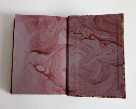
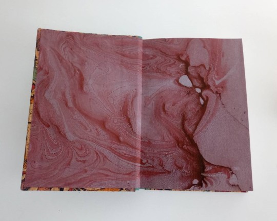
Lastly, I noticed I didn’t even show off those endpapers. I had the hole sheet sitting in my stack for years now and never knew what to use it for. When I made it did not consider it a success, simply for the large blank patches and the brownish red colour that looked a bit weird in contrast (this was another ‘hm I imagined that to turn out different’-moment).
The blank areas don’t even look like there’s something lacking here though.
#bookbinding#re-binding#three piece bradel binding#interview with a vampire#marbled endpapers#details#self-made bookcloth and its troubles#hot stamping troubles#endpapers
41 notes
·
View notes
Text


🍜 The Raw Ingredients, by @rosyfingered-moon 🍜
After a miserable year in Seoul, Bong-hwan finds a way back to Joseon. When she returns everything is very different from how she left it.
This fic is so good, so funny, exactly the kind of fix-it I needed to read after the show's finale, so I had to have it on my bookshelf!
The cover design is based on the title, with the ingredients Bong-hwan uses to prepare her ramyeon. I made a linocut print with the design, that was super fun, and then I made another for the endpapers too. For the cover, I ended up having to go over the lines with a small brush, to make the golden pop-up more.
The binding is a square back bradel, I really liked doing this format, it is a lot easier to cut the covers to the correct size!
121 notes
·
View notes
Text
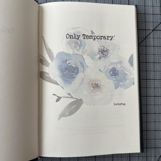
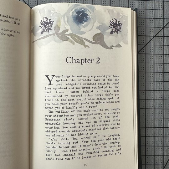
I have been patiently waiting to share this Binderary project!

Only Temporary by Luckybug on AO3 (luckybug.writes over on insta), a Stardew Valley Sebastian x Reader fic that lives in my head rent free.
Armed with the advice of various Renegade Bindery members and a WHOLE lotta luck, I pieced together a sorta three piece Bradel bind on a whim. Shoutout to @rat-juicee, my hype person who got to watch me in real time say 'hey I have a Big Brain™ idea' and then cycle through 'will this work?' -> 'fuck it we ball' -> 'oh noooo did I fuck it up??' CONSTANTLY.
The cover is inspired by kintsugi and the idea that even if something is broken, it can be fixed with enough time, effort, and care - which is relevant to the fic. It's a combination of foil quill - which I am slowly getting better at - and gold sharpie (again, part of the Will This Work? Fuck It We Ball mentality). Without intending to, the cover paper and fabric match which was just the icing on top for me.
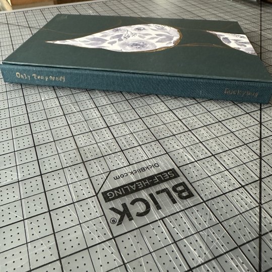
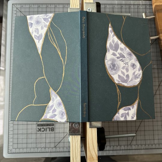

Inside, I used a typewriter font for the flashbacks that pop up as well as the title, and I kept to a blue/floral theme that (imo) tied the chapter headers and cover together nicely.

Overall I'm VERY please with how this turned out and I definitely want to look into three piece bradel binds more!
(Completed: 2/7/2024)
77 notes
·
View notes
Text
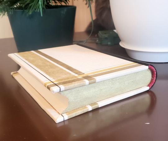
Fanbinding: The Grinch Who Sold Christmas by @forineffablereasons
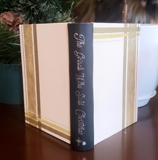
Anthony J. Crowley, a big-time attorney from London, is sent to small-town Tadfield to close a deal before Christmas that would sell out half of high street to a fancy developer and put him up for partner at his firm. The deal will run the local businesses out and change the landscape of the town forever, but that’s none of Crowley’s business; he’s just doing a job.
But as the town invites him to share in their lives, their hopes, and their holiday celebrations, and as the enigmatic Aziraphale invites him to share in something more, Crowley starts to wonder: if everything has its price, is he still willing to pay what this deal will cost?

Finally posting my other bind from the @renegadepublishing 2022 Exchange! This is "The Grinch Who Sold Christmas" a Good Omens Hallmark Christmas movie AU by darcylindbergh (@forineffablereasons). It was a gift for Lofe (@misanthropiczombie), and I had such a lovely time with it.
I had a lot of fun making this book! This is a three-piece bradel bind, with a spine done in arrestox and boards in ivory Italian cloth from Hollanders. I gave painting a full pattern onto the cloth to create the design (nervewracking on white cloth...), which is inspired by Aziraphale's Heaven's Gate tartan pattern from the show. Fore-edge is a gold alcohol ink sponged on. I had this chunky red and gold lace thread I wanted for the endbands for that touch of Crowley's colors. Since I was already painting in the drop caps for Royal Flush, I decided to paint these ones in as well!


I was very happy to be able to gift copies of this both to my giftee and the author! And I got to do my first Good Omens bind <3.

459 notes
·
View notes
Last Seen Blogs

azzs1
A

crossingpointscout
Crossing Point Scout
sweet-like-saccharinee
sacchariinee

leosmaxromanoff
"To my dearest..."

trickricksblog08
TRICK RICKS BLOG No.8 WWG1WGA PUREBLOOD