#calligraphic motifs
Text
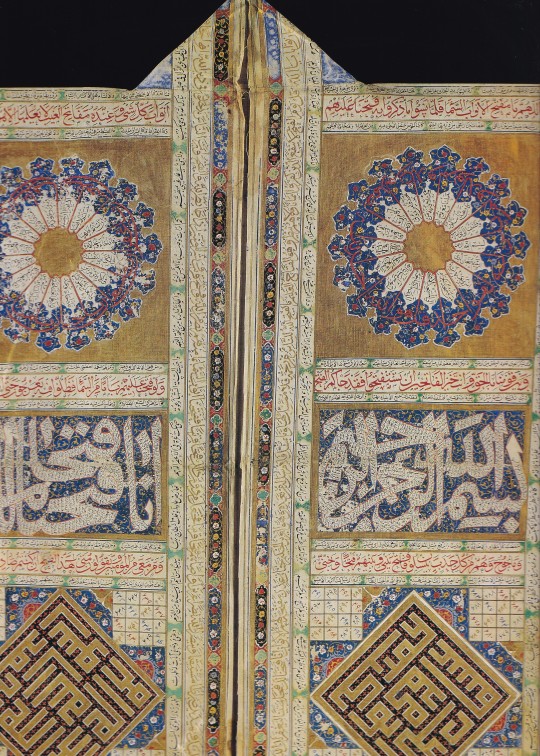
The Tomb of Shah Rukn e Alam World UNESCO Architecture Sites
The Tomb Of Shah Rukn-E-Alam Located In Multan, Pakistan, Is The Mausoleum Of The 14th-Century Punjabi Sufi Saint Sheikh Rukn-Ud-Din Abul Fateh.
The Tomb of Shah Rukn e Alam World UNESCO Architecture Sites
The shrine is considered the earliest example of Tughluq architecture and is one of the most impressive shrines in the Indian subcontinent. The shrine attracts over 100,000 pilgrims to the…

View On WordPress
#Architecture#Bahauddin Zakariya#calligraphic motifs#example of Tughluq architecture#Is The Mausoleum Of The 14th-Century Punjabi Sufi Saint Sheikh Rukn-Ud-Din Abul Fateh#Multan#Pakistan#Punjabi Sufi Saint Sheikh Rukn-Ud-Din Abul Fateh#Shah Rukn-E-Alam#South Asia subcontinent#South Asian#Sufi Saint Sheikh Rukn-Ud-Din Abul#The Tomb Of Shah Rukn-E-Alam Located In Multan#UNESCO Architecture Sites#World UNESCO Architecture Sites
0 notes
Text


Selected Works from Zheng Xie
Zheng Xie, a remarkable figure in Chinese art history, was a talented painter, calligrapher, and poet known for his depictions of orchids, bamboo, and stones and his social consciousness. Born into poverty, he was adamant in his support of others facing the same struggle, even at the expense of his own position and status. After he became a magistrate in Shandong, he eventually found himself critical of life as an official. His refusal to fawn over his superiors and the criticism he later faced after building a shelter for houseless people left too deep a scar on him and led to his resignation after over a decade of work.
After his departure, he found himself deeply entrenched in his art. His art and calligraphy captured the essence of the natural world, blending meticulous brushwork with a profound appreciation for the beauty of his surroundings. He is known today for his repeated use of orchids, bamboo, and stones in his paintings. Orchids were, in fact, such a common motif in his work that they influenced the style of calligraphy he created. He called his style “six-and-a-half script.” It was a sort of hybrid script in every way; blunt but fluid, formal yet clerical, cursive and semicursive. He eventually became one of the Eight Eccentrics of Yangzhou and even worked as an official calligrapher and painter for a short time.
He also found an interest in literature and poetry and preferred to write about ordinary people. Although he is most known for his paintings and calligraphy, his poetry is where his love and affection for men come through most clearly.
453 notes
·
View notes
Text
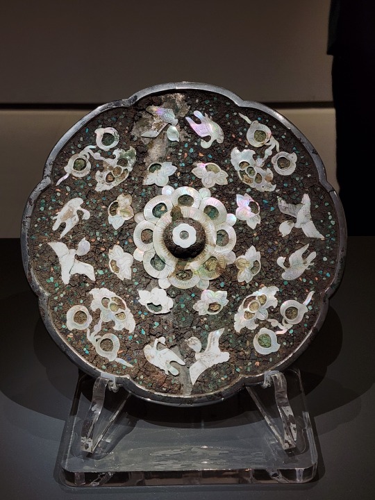
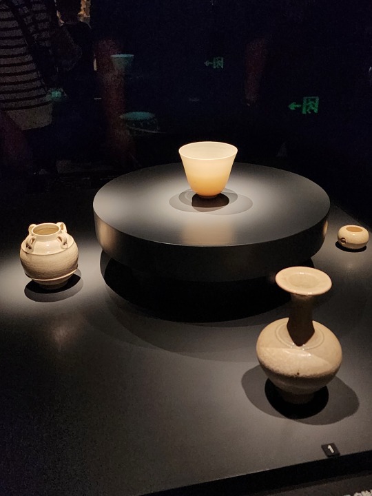
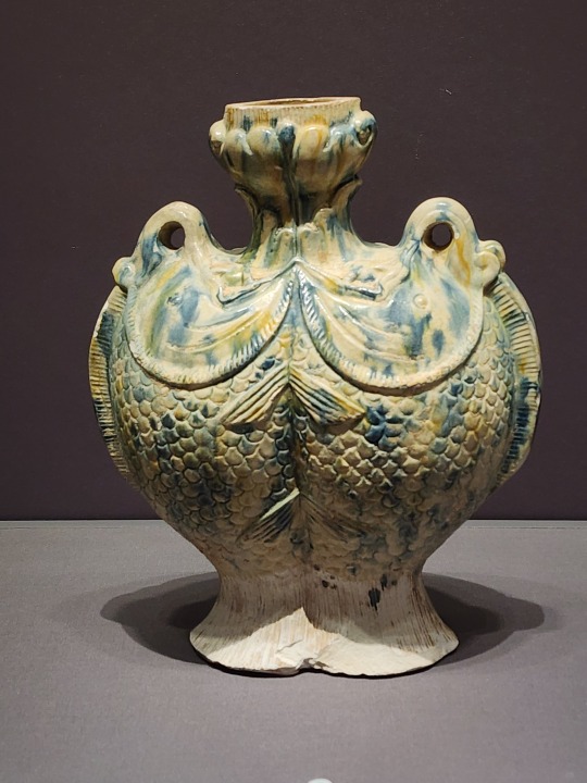
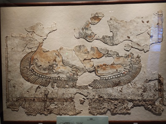
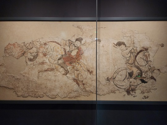
April 13, Xi'an, China, Shaanxi Archaeology Museum/陕西考古博物馆 (Part 4 - Sui and Tang dynasties):
This is another star of the museum, a Tang dynasty (618 - 907 AD) bronze mirror, the back of which is decorated with carved luodian/螺钿 (mother of pearl). Near the edge are various birds, while the inner ring is arranged in a "sunflower" shape. Kinda wish I can see a modern replica of this one without all these marks and discolorations from the passage of time:
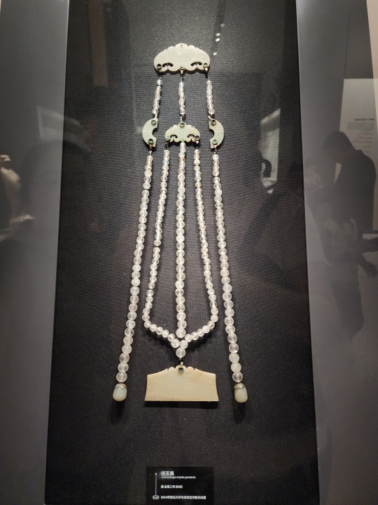
A Tang dynasty yupei/玉佩 (jade pendant). Unlike the Western Zhou dynasty yupei in part 2, this type is most definitely supposed to be hung from the waist. This one in particular was one of a set of two (both worn on waist, one on each side), and these were part of the formal wear of first to fifth rank officials during Tang dynasty:
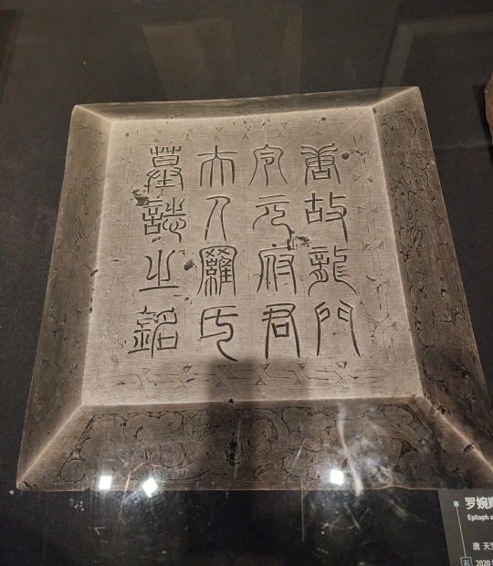
Luo Wanshun's Epitaph/罗婉顺墓志. As mentioned in the first Beilin museum post, ancient Chinese epitaphs have a two-piece structure, consisting of a tablet and the protective covering on top. This is the protective covering on top, with the large inscription identifying this as the epitaph stone of Luo Wanshun, engraved in seal script/zhuanshu/篆书:
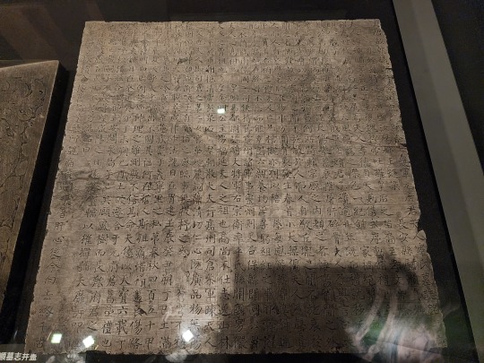
And here's the actual body of the epitaph. This particular epitaph was drafted by one of the "Eight Immortals of the Wine Cup"/饮中八仙, Li Jin/李琎 (he was also the nephew of Emperor Xuanzong of Tang/唐玄宗), and the calligraphy was provided by the famous calligrapher Yan Zhenqing/颜真卿:
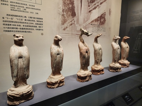
Tang-era pottery figurines of the Chinese zodiac animals. This set is sadly incomplete, but the way these zodiac animals are partially anthropomorphized is pretty interesting. From left to right, these are tiger, rabbit, dragon, snake, sheep, and dog (yep that is a dog head, apparently). Not sure why rabbit and dog figurines are missing their ears though, maybe the ears broke off and are lost?
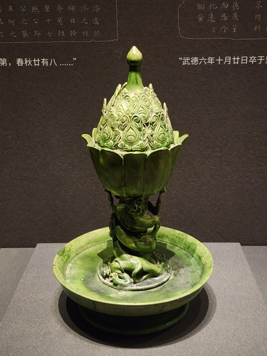
Sui dynasty (581 - 618 AD) green-glazed boshanlu/博山炉 incense burner. Note the panlong/蟠龙 dragon curled around the base:
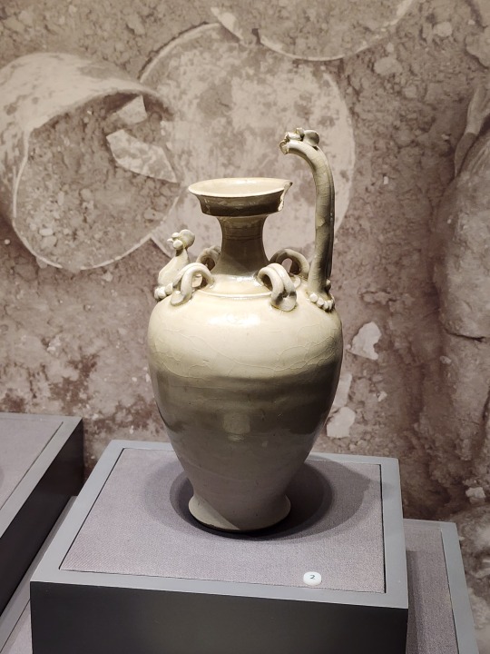
Left: Sui dynasty white-glazed ewer with a chicken head-shaped handle. Right: Sui dynasty white-glazed vase. The curves on this one is *chef kiss*
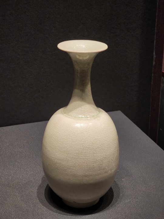
More Sui dynasty white glazed pottery, but the most incredible thing is the white porcelain cup in the middle. The lip of that cup is 1mm (~1/32 in) thick, and the sides are so thin, it's almost see through:
Tang-era sancai/三彩 glazed conjoined flasks that is shaped like a pair of fish. Similar twin-fish motif can be found in numerous traditional Chinese holiday decor, and symbolize auspiciousness, wealth, and surplus--especially surplus, since fish in Chinese (鱼) is pronounced yú, and "surplus" in Chinese (余) is also pronounced yú. This is why the phrase 年年有余 ("may there be a surplus every year") is often paired up with imagery of carps, children holding giant carps, or a twin-fish motif.
Absolutely beautiful Tang-era wall mural of a tiger, which was very sadly damaged over time. But from the pieces left, you can still appreciate the raw power of the tiger captured by these lines:
Another beautiful Tang-era wall mural depicting men on horseback playing "polo", called maqiu/马球 (lit. "horse ball") in Chinese. It's unclear whether the maqiu depicted here originated in China in late Eastern Han dynasty (25 - 220 AD) or was brought to China via the Silk Road at the beginning of Tang dynasty, but anyway this sport was very popular during Tang dynasty, and there were many female players at the time too.
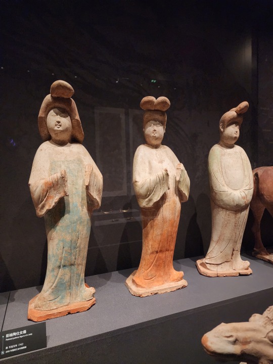
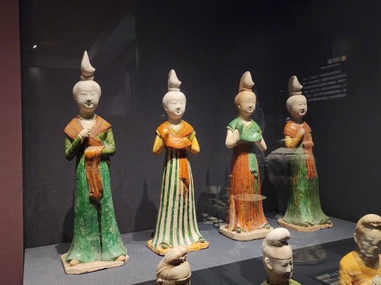
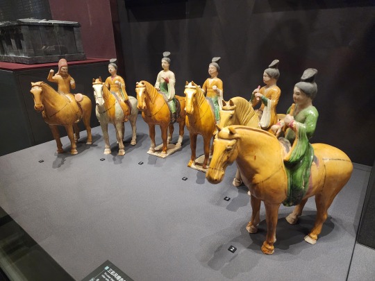
The women of Tang dynasty as depicted by pottery figurines:

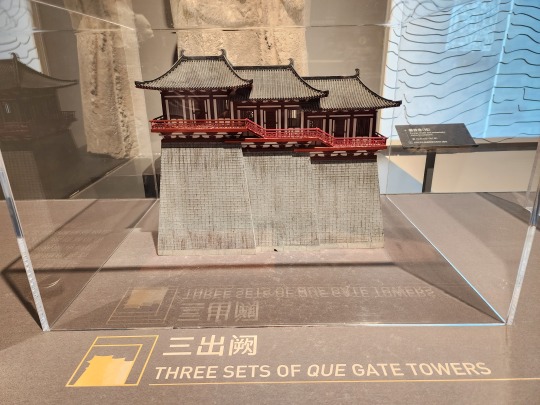
A small model of Tang-era triple que/阙 gate towers. Que gate towers first appeared in Western Zhou dynasty (1046 - 771 BC) and have been a part of Chinese architecture ever since. Que gate towers usually come in pairs, one on each side of the gate, and they were used to display status.
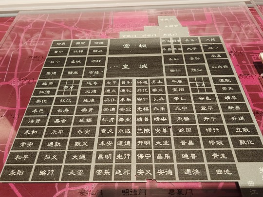
A map of Tang dynasty Chang'an city laid on top of the current map of Xi'an city, showing the imperial palace (top center), the East Market/东市 and West Market/西市, and the 108 districts (called fang/坊):
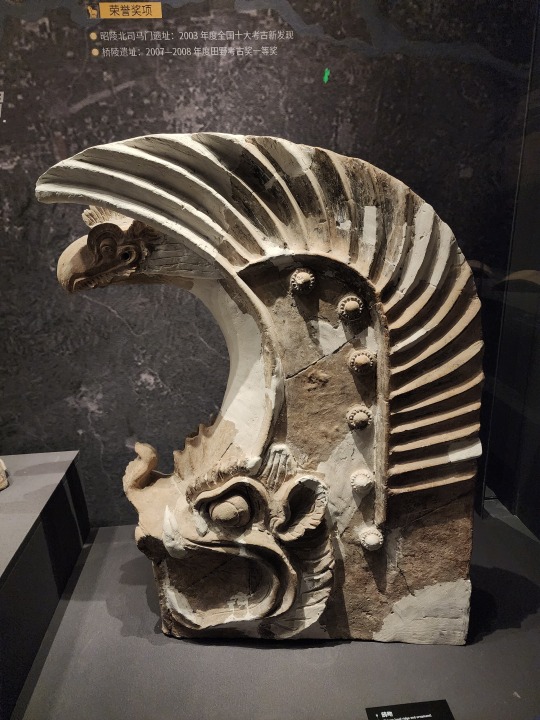
A Tang-era chiwen/鸱吻 (螭吻 is the original name, 鸱吻 is the alternative name, another alternative name is 蚩吻, but the pronunciation remains the same for all three) roof ornament. These are the pairs of horn-shaped pieces on the top of the roof of traditional Chinese architecture. These ornaments are made to represent the Ninth Son of the Dragon, called Chiwen/螭吻, which looks like a dragon-headed fish and has the power to control water, thus it's used in traditional Chinese architecture to ward off fires:
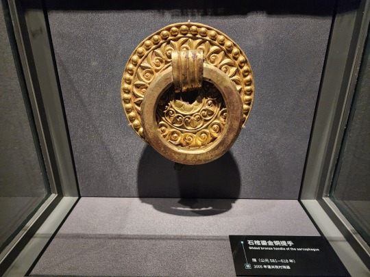
Sui-era gold gilded handle of a stone sarcophagus:
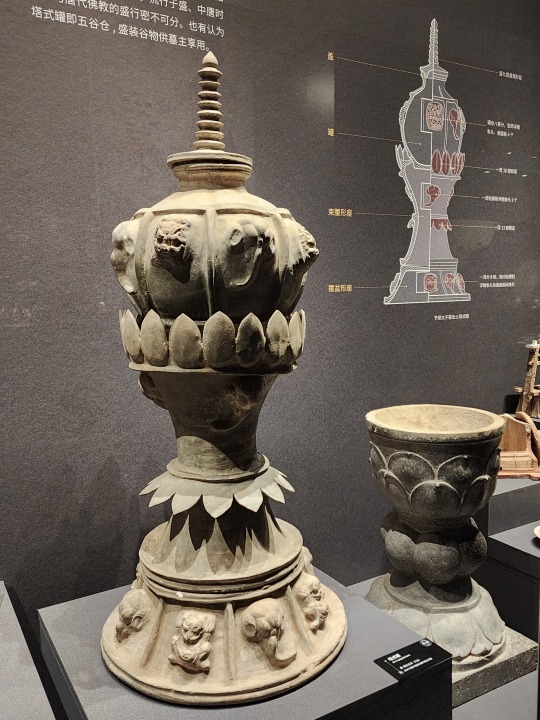
A pottery jar found buried in the tomb of Crown Prince Jiemin/节愍太子 (Li Chongjun/李重俊, son of Emperor Zhongzong of Tang/唐中宗 Li Xian/李显), partially shaped like a pagoda and decorated with various Buddhist motifs such as lotus petals and elephant heads. This is speculated to be a representation of a granary, which would hold grains for the crown prince in the afterlife:
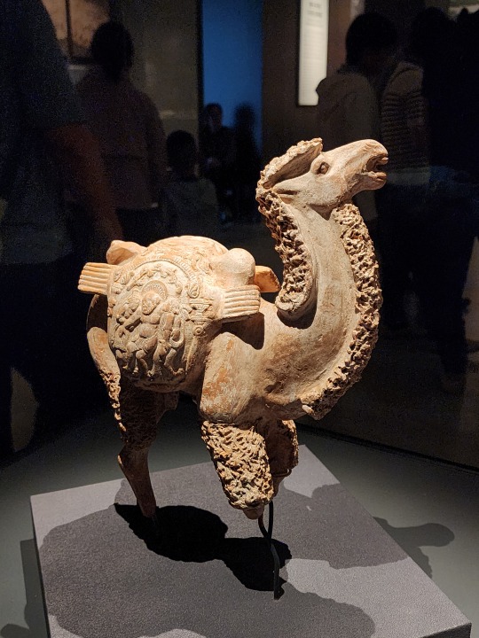
And last but not least, a Sui-era pottery camel bearing sacks that have the imagery of the Greek god of wine Dionysus upon them, which shows the great amount of cultural exchange that took place back then:
#2024 china#xi'an#china#shaanxi archaeology museum#chinese history#chinese culture#sui dynasty#tang dynasty#chinese calligraphy#calligraphy#archaeology#history#culture
185 notes
·
View notes
Photo

The letter "O" from Joris Hoefnagel's Guide to the Construction of Letters (1595), a work designed to aid and inspire calligraphers. Each letter is surrounded by an array of symbolically charged motifs. More here: https://publicdomainreview.org/collection/hoefnagel-s-guide-to-constructing-the-letters-ca-1595
147 notes
·
View notes
Text

Marriage Contract by Ben Shahn, 1961, Ink, watercolor, paint, and graphite on paper
Most decorated Jewish marriage contracts use ornamental motifs as framing devices for their written Aramaic text. Ben Shahn's Ketubbah is a marked departure from this model. In the superb execution of this document, the artist has integrated floral and foliate decorations within his lyrical Hebrew calligraphy, the predominant design element.
While Shahn's artistic personality emerged through the religious themes in his illustrations for the 1931 Haggadah for Passover, he would not return to such subjects for many years. The artist spent most of the 1930s and 1940s as a social realist painter. Along with so many other painters and sculptors during those difficult years, Shahn felt that art could help right the inequities of society. His terse visual commentaries on such topical subjects as the Sacco and Vanzetti case, Nazism, poverty, and labor problems brought him great recognition as both a humanitarian and an artist. It was after World War II that he turned inward through what has been called his transition from social to personal realism. During this period he incorporated allegory and religious and philosophical symbolism in his work, often based on his own cultural heritage.
Shahn's updating of the traditional ketubbah results from his changing stylistic and subjective concerns. He became fascinated with letters, both Hebrew and English, which became essential elements in his work. This calligraphic preoccupation led to his 1954 illustrations for The Alphabet of Creation, a book which related a parable of the origin of the Hebrew alphabet. His own combination of these twenty-two letters become a personal stamp and appears on most of his prints and drawings after 1960, including this Ketubbah.
Like the butterfly stamp of James Whistler and the Japonist monogram of Toulouse-Lautrec, this symbol shows Shahn's stylistic inspiration as coming from outside mainstream Western culture.
The expressive style of Shahn's Hebrew characters changes with the meaning of each theme he depicts. For this Ketubbah, which is presented at the joyous celebration of marriage, he develops a commanding but elegant Hebrew appropriate to the legal nature of the document and the solemnity of the moment-a calligraphy markedly different from the flame-like evanescences in his tribute to the Feast of Lights, Hanukkah. As had been the custom of Hebrew scribes throughout the ages, Shahn adds eccentric elements to certain letters. Most notable here is the oft-repeated, stylized Star of David.
Shahn's meandering floral and foliate forms refer to Psalm 128:3, a common visual allusion in Jewish marriage contracts: "Thy wife is a fruitful vine in the midst of thy house, thy children are as young olive trees set around thy table." (Kleeblatt, Norman L., and Vivian B. Mann. TREASURES OF THE JEWISH MUSEUM. New York: Universe Books, 1986, pp. 192-193.)
#the jewish museum ny#ben shahn#kettubot#marriage contracts#jewish art#judaica#hebrew calligraphy#calligraphy
52 notes
·
View notes
Text


This is a calligraphic filigree rose window mandala design for an upcoming book I'm working on. The single circle form is primary here, as in ancient cosmology this symbolized the One, the unknowable Divine source of all being, as well as becoming the form for the emergent Cosmos as in Plato's "Timaeus". The concentric rings of filigree hearken to this, adapting medieval illumination motifs for the planetary spheres, in this case centrally oriented to the Sun, which symbolizes the undying light of the Divine. This rose window begins the Gospel omnigraph, and for this I selected the famous verses from St. John's prologue, which tie together the eternal origin of all things with the Logos and the embodied entrance of that Logos into human history as the man Jesus Christ.
291 notes
·
View notes
Text
Flavoured Artificer Concepts
Artificer is by FAR my favourite class in Dungeons and Dragons, primarily for how customisable they can be with regards to their flavour; because of the ability to cast through any tools you are proficient in, it gives a LOT of range to how your magic works. As such, I will put some ideas I have had to build unique Artificers.
An Artillerist that uses woodworking to carve totems; they are flavoured as a tribal shaman that summons the spirits of magical creatures to aid in battle. Their flamethrower turret conjures a dragon spirit to burn their foes, their protector turret calls the spirit of a unicorn to protect the virtuous, and their ballista invokes a manticore spirit to pepper distant foes with spikes. Their other spells can also be flavoured this way, such as Thunderwave being flavoured as an Aerosaur spirit emerging from a totem and flapping its wings to blow enemies away!
A Battlesmith that uses leatherworking to create a horrific stitched Frankenstein's monster for their steel defender. Every time they kill things, they skin the corpses to repair their hideous flesh monster. Or, if you prefer, you could stick with the shamanistic theme from the Artillerist entry, and use leatherworking to maintain the pelt of the first wolf you killed; its spirit inhabits that pelt, and defends you to this day!
An Alchemist that uses chef's tools to create supernaturally delicious food that cures illnesses and grants supernatural abilities. I have actually played this, he used brewers supplies to create caustic acidic drinks, had peppers so hot that it made your breath ignite to cast fire spells, and he would spray sticky toffee over the area for web. He would make food puns, and was named Guido Fiero.
An Armorer that uses jeweller's tools to create bling that imbues them with magical powers. A circlet that grants a force field, a ring that shoots lightning, a pair of bracelets that create thunderous shockwaves when brought together. Then, when you hit level 9, you can have distinct infusion tied to each one! A circlet or diadem or whatever for head armour, necklace for chest armour, anklets for boots, and bracelets or rings for the weapon! Perfect for a wealthy nobleman artificer who wants to broadcast their glamorous lifestyle.
There are loads of other things you can do with each tool proficiency, and it's a shame that the class is so easily pigeonholed into "The Tech Class". Not to say I don't like the gnomish tinker that creates fantastical and crazy gizmos to mimic magical effects. Hell, my character in the campaign I'm not DMing is exactly that, an autognome (Flavoured to look like a normal gnome in the face, so they appear normal when wearing their clothes) that woke up one day in a tinker's lab next to his deceased creator, and then left to try and find a purpose in the world. He has an insect motif, so all of his spells and things are flavoured as small clockwork insects he makes.
But the point is, while that's a staple of the Artificer class fantasy, there are loads of other ideas to flavour it! A calligrapher that writes arcane runes in the air, a potter with a terracotta soldier for a steel defender, a weaver that knits arcane circles, a painter whose drawings become magical effects, a glassblower whose glass figurines come to life, I can't think of one for cartographer's tools, but I bet there is a dope idea in there somewhere!
Even as I mentioned before with leatherworking, you can have the exact same class, the exact same subclass, and the exact same tool, and STILL have wildly different flavour! One is Doctor Frankenstein, the other is a mystical shaman with a spirit guide!
Anyway, that's today's rambling. I would also do a thing on subclasses the Artificer could have, given they only have four, but that's a whole other rant. Besides, this is already a thesis.
#dnd artificer#dungeons and dragons#dnd 5e#d&d#dnd#d&d 5e#I don't actually know what I'm meant to do for tags#I'm new here.#Still figuring it all out
40 notes
·
View notes
Text
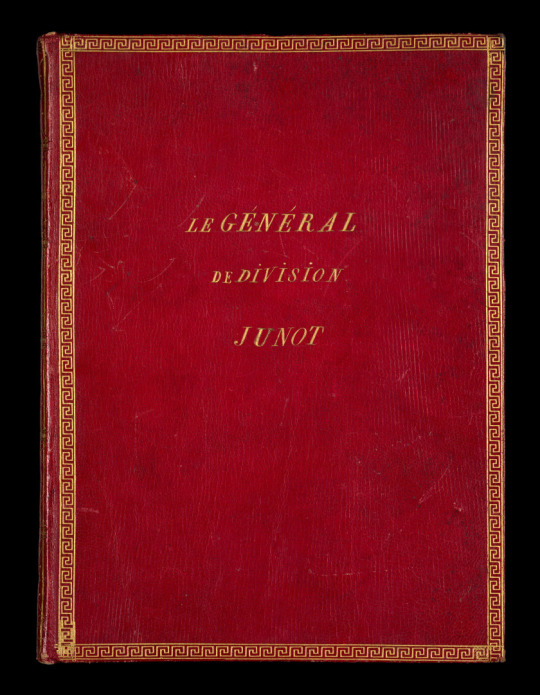


[MANUSCRIPT.— JUNOT (Jean Andoche)] Set of handwritten poems and pieces, presented to General Junot.
[July 1800-March 1802]
In-8 (20.4 x 15.2 cm), red long-grained morocco leather, gilded Greek frieze framing the covers, super ex-libris on the front cover, smooth spine decorated with gilded motifs (period binding).
[31] pages, first blank
Collection of 21 pieces calligraphed in small, legible handwriting by the same hand, except for the last one by another hand.
There are verses entitled “Bardin, aide de camp, à son général”, “Couplets chantés à l'inauguration de la maison du Génal Junot”, “À l'occasion du mariage du Général Junot”...
Top cover gilt-lettered “le général de division Junot”.
Black ink stain on lower cover, rare marks, last page a little creased.
Source: Artcurial — Historical Memories - 24 january 2024
#Artcurial#auction#junot#jean andoche junot#napoleonic era#napoleonic#historical memories#historical memories auction#napoleon bonaparte#first french empire#napoleon#19th century#french empire#history#france#1800s#french history#poems#poetry#vintage book#Morocco leather#vintage
24 notes
·
View notes
Text

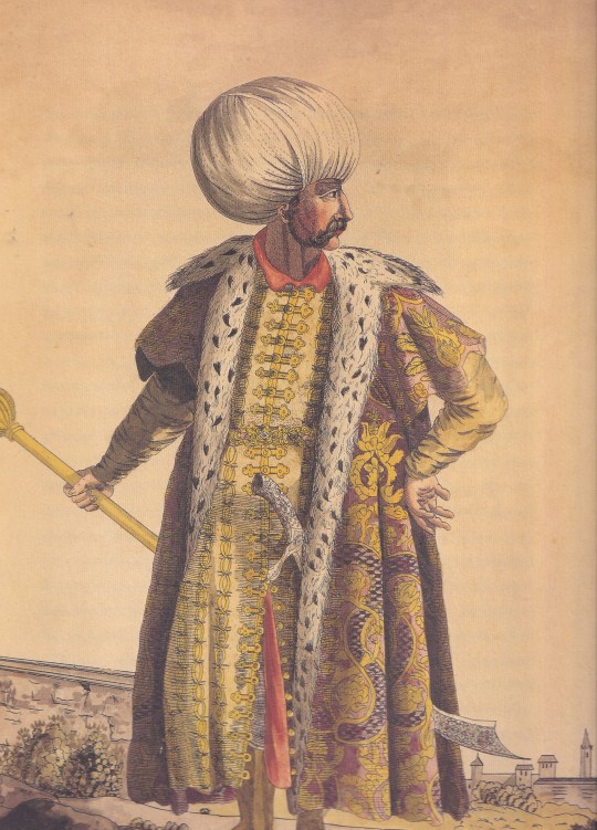
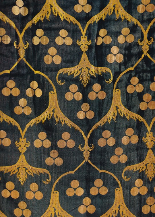

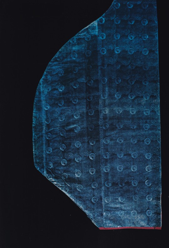


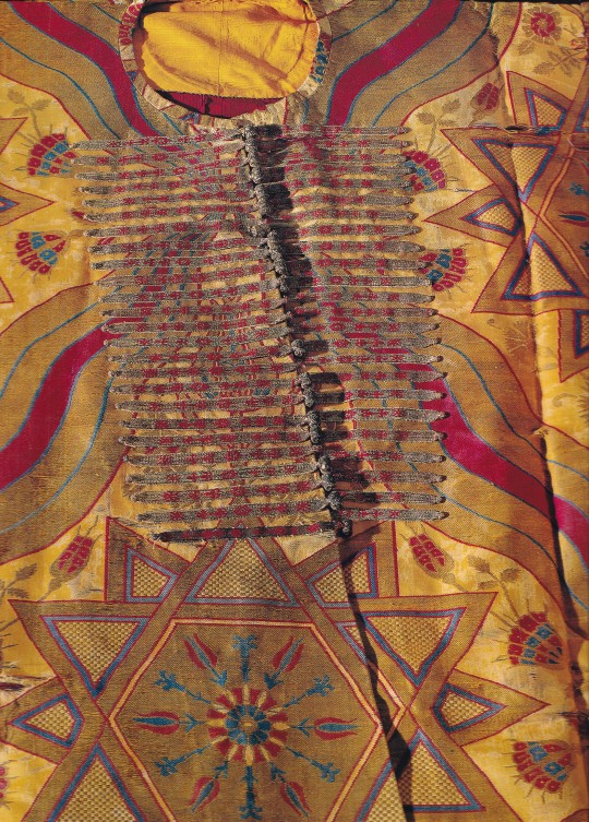
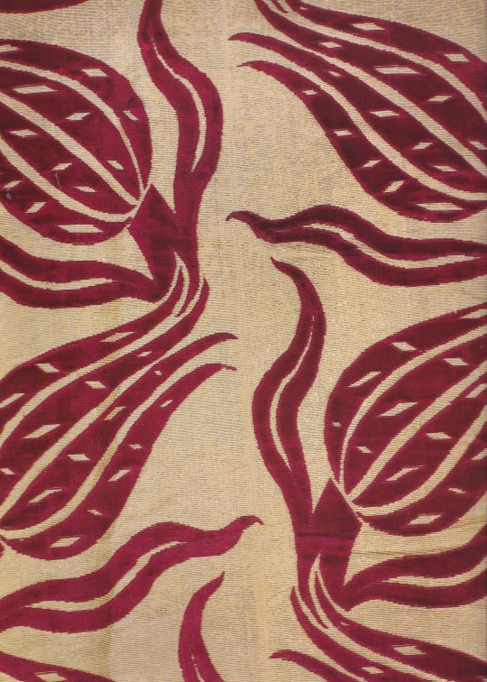
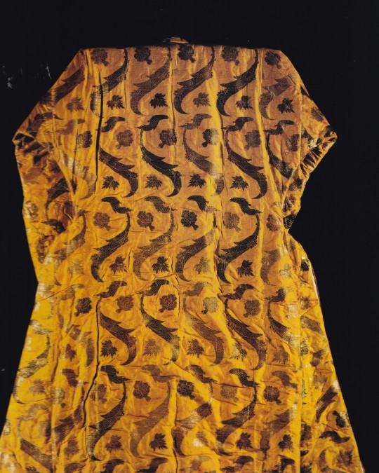


Silks for the Sultans
Ottoman Imperial garments from Topkapi Palace
Photos by Ahmet Ertuğ, Essay by Dr.Patrick L.Baker, Dr.Hülya Tezean, Jennifer Wearden
Ertuğ & Kocabıyık, 1996, 251 pages, 150 colour plates, 31x42cm,
euro 600,00
email if you want to buy [email protected]
This superb oversized book is published by Ertuğ & Kocabiyik Publications, a publishing house established by leading architect and photographer Ahmet Ertuğ and Ahmet Kocabiyik. Their books are unique collector's items focusing on the cultural heritage of Anatolia. The magnificent images by Ahmet Ertuğ are accompanied by articles of world-renowned academics to reflect the inherent value of the masterpieces they contain. The garments shown and described in this book were chosen from about five thousand objects in the garments and accessories collections of Topkapı Palace Museum in İstanbul. In making this selection, emphasis was placed on the silk kaftans (robes) that were worn by the sultans with an eye on such criteria as color, design, and quality reflecting the rich cosmopolitan atmosphere that prevailed in the Ottoman court. The examples in this book are classified according to design categories within which they are generally presented in chronological order. This has the advantage of reflecting the stylistic developments that took place in the design-shops attached to the Ottoman court. The first category consists of fabrics with the "triple spot" motif and its variations. The second group presents two examples of garments in the "saz" style and in the third, of the "Floral style". These are followed by kaftans in "Seraser" fabrics. The next three groups are devoted to fabrics that are of European origin or were imported from India. The next two categories show items of dress made from plain fabrics, some with appliqué designs, other garments from the 18th and 19th centuries. The last group are not kaftans but talismanic shirts, included because the unusual calligraphic treatment of their designs provides an interesting coda to the magnificent and elegant garments that precede them.
24/01/24
14 notes
·
View notes
Text

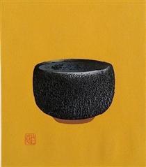
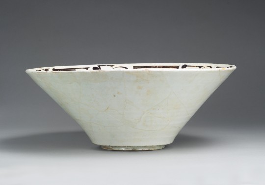
Bowl with Arabic Inscription
Persian, 10th century CE
The calligraphic decoration on this bowl reads "Planning before work protects you from regret; prosperity and peace," but the shortening, bending, and elongation of the letters has transformed the words into abstract motifs of tremendous power.
11 notes
·
View notes
Text


Maki Haku (巻白) is the art name of Maejima Tadaaki who was born in Asomachi in Ibaragi Prefecture. He had no formal art training, although after the Second World War he did involve himself in meetings guided by the visionary modernist Onchi Kôshirô at the Ichimoku-kai (First Thursday Society: 一木会), where he learned much from the master and interacted with other "creative print" (sôsaku hanga: 創作版画) artists. Although his earliest work was strongly influenced by Onchi, Maki gradually developed his own style, particularly when he turned to calligraphic motifs and introduced embossing in his mixed-media designs.
Maki used various printing techniques and media, but he is best known for his combined woodcut, stencil, plastic-and-paper lamination, and cement-relief block prints in which the cement-paste (cement mixed with water and chemical bond) was carved, scored, sandpapered, and chiseled. The blocks were then rubbed and pressed onto paper, first with hand pressure and then with the aid of an etching press to produce a laminated, raised relief or three-dimensional effect. He used both water-based and oil-based pigments. His style was sometimes abstract-calligraphic, sometimes representational. When he used calligraphic elements he attempted to use traditional ideographs while introducing modernist aspects to their shapes, sometimes abandoning their traditional forms, adding or subtracting elements, and rearranging them for aesthetic or expressive effect.
https://www.viewingjapaneseprints.net/.../sosak.../maki.html
14 notes
·
View notes
Text
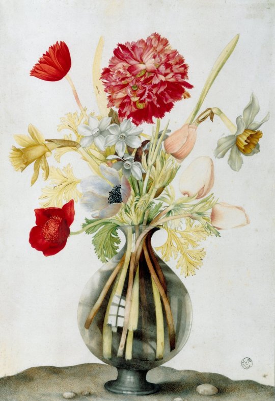
Vase of Flowers with Daffodils, Carnations and Anemones
Giovanna Garzoni (1600-1670, Italian)
Giovanna Garzoni was the daughter of Giacomo Garzoni of Venice and Isabetta Gaia of Ascoli, who also had Venetian ancestors. From 1615 to 1630 she lived intermittently in Venice, where she studied with her uncle Pietro Gaia, a student of Jacopo Palma the Younger , and with the calligrapher Giacomo Rogni. In 1622 she married the portrait painter Tiberio Tinelli, from whom she separated the following year.
In 1630 she traveled with her brother Matteo to Naples, where she entered the service of the viceroy Fernando Alfán de Ribeira. On the way to Naples she spent some time in Rome, where she came into contact with Cassiano Dal Pozzo. In November 1632, at Christina's request, she came to Turin from France and received a position at the court of Vittorio Amadeo I. She created numerous portraits for the court and her first known still lifes. After Vittorio Amadeo's death she left Turin and probably lived in Paris, possibly also in England.
From 1642 she lived as an established artist in Florence and worked particularly for the Medici. Her clients and supporters included Ferdinando II de' Medici, his wife Vittoria della Rovere and Leopoldo de' Medici. Giovanna was at the peak of her popularity at this time, selling many works and becoming somewhat wealthy.
In 1651 she settled in Rome, but continued to maintain contact with her clients in Florence. She purchased a house near the Accademia di San Luca, with which she was closely associated. It is unclear whether and when she was formally accepted into the academy, but from 1654 onwards she took part in the members' meetings. In her will of 1666, the childless Garzoni bequeathed her property to the Academy on the condition that a tomb be built for her in the church of Santi Luca e Martina. This tomb was created by Mattia de Rossi in 1698, 28 years after her death.
Giovanna created mainly works in tempera, watercolor and gouache on parchment, in addition to some oil paintings on canvas. Her motifs are portraits, calligraphy and fruit and flower still lifes, and from 1630 increasingly botanical motifs.
She developed a characteristic, almost pointillist technique between painting and drawing. In the style of English miniature painting, she placed many tiny dots with a special brush and delicate, dense strokes on the parchment. Her works, based on the still life tradition of Orsola Caccia, Panfilo Nuvolone and Fede Galizia, show fruit and vegetable peels, often combined with flowers, animals or foliage in a simple, symmetrical structure. Her floral still lifes are varied and display an extraordinary wealth of color.
From around 1630, Giovanna's pictures show a naturalistic, non-idealized representation of plants and animals that correspond less to contemporary still life painting than to natural history painting in the tradition of Dürer or Leonardo or to the model of Jacopo Ligozzi. Giovanna was obviously knowledgeable in botany and also created illustrations for flower books.
Giovanna's other works: http://www.artnet.de/k%C3%BCnstler/giovanna-garzoni/
#dianthus#carnation#daffodils#anemones#painting#still life#flowers#flower vase#glass vase#women in art#woman painter#woman artist#17th century art#17th century painting#italian art#giovanna garzoni#reflex#woman artwork#fine art
5 notes
·
View notes
Photo

The letter "O" from Joris Hoefnagel's Guide to the Construction of Letters (1595), a work designed to aid and inspire calligraphers. Each letter is surrounded by an array of symbolically charged motifs. More here: https://publicdomainreview.org/collection/hoefnagel-s-guide-to-constructing-the-letters-ca-1595
200 notes
·
View notes
Text
i'm now about halfway through avatar: the last airbender s2 (and halfway through the entire series). and i have thoughts.
i regret missing out on this while it was airing. chest deep in anime at the time, i'd largely turned my back on american TV animation and was in the midst of wrapping up a bachelor's degree. A:TLA would probably have won me over then too. it holds its own as a story so well even now, i don't mind being two decades late to the party.
A:TLA takes place in a constructed world largely based on ancient china, with recognizable chunks from many, many other east asian peoples and subarctic indigenous nations stirred in. american fantasy worlds rooted in real-world places often tend towards this kind of racist pan-cultural stew (black panther—my deep abiding love for it otherwise—is another example) and A:TLA, a dish that manages to be both deeply honorable and kinda disrespectful, is no exception.
for every display of cultural respect:
all the chinese text in the show is real, supervised and/or translated by ming dynasty historian, research scientist and calligrapher dr. siu-leung lee.
the selection process for the avatar closely mirrors that for the actual dalai lama, right down to the search for a child born around the time of the previous lama’s death who picks his relics out of a collection of possible playthings.
the elemental bending techniques and fight choreography are derived from real chinese martial art forms. 5th gen northern shaolin master sifu kisu, the series' main martial arts consultant, chose a form for each element based on its movements and/or philosophy. the water tribes use t'ai chi; earthbenders use the hung gar style of kung fu (and the blind earthbender toph fights with her own aggressive and rare style, chow gar kung fu); the fire nation use northern shaolin kung fu; and the air nomads use ba gua zhang, a style characterized by spinning and other circular motions.
aang sits with a guru who teaches him how to unlock his chakras at one point, and his explanation respects both aang's level of maturity and the complexity of the concept as laid out in hinduism.
avatar roku’s fire temple contains a lotus-petal shaped flame motif common in thai art and architecture; ty lee and katara wear split skirts that resemble those worn by thai performers of a ballet retelling of the hindu epic ramayana (it’s called ramakien in thailand). thai (and burmese!) traditional dance/theatre costume and armor show up everywhere in the fire nation, especially in the military garb. even zuko’s topknot is a traditional thai hairstyle (for children).
there are perhaps two or three of ignorance or apathy.
names in mandarin chinese, korean, tibetan, sanskrit or japanese are mostly butchered; mandarin sees the worst abuse because it's used most often. A:TLA was released at a time when it was still not uncommon for US anime distributors to change japanese names outright in localizations; producers figured 'american-sounding' names would go down easier with audiences. given this, i'm not surprised a mid-2000s american production inspired by anime wouldn't give a toss about names in other asian languages: most americans don't care. (personally i find the mispronounced names far harder to stomach than the dollops of buddhist-daoist-hindu philosophy purée: while A:TLA’s painstaking worldbuilding, tight plot and excellent voice acting make the show's faults stand out all the more, its spiritual aspects aren't a major focus.)
someone thought it would be a good idea to give a group of swamp dwellers vaguely cajun accents. whyyyyy.
the blending (read: conflation) of cultures ignores existing tensions and centuries of cross-pollination in ways that can be offensive. there are many, many other nods to thai (and vietnamese! and burmese! and...) culture in clothing, setting and architecture across the series, but the showrunners made no effort to educate viewers on the provenance of any of these smaller influences. people of non-chinese east asian ancestries already get mistaken for chinese by americans who assume they’re all the same.
and yet. while looking to cartoons for cultural sensitivity may be a fool's errand, A:TLA gets a lot right, particularly when it comes to its characters.
more about the people of A:TLA to follow in a subsequent post.
5 notes
·
View notes
Text
What is Islamic Architecture?
Islamic Architecture is an architectural style that dominates Muslim-majority countries around the world such as Indonesia, Pakistan, Egypt, Saudi Arabia, Turkey and many more, but is not limited to these locations. Islamic architecture can be found across the globe - though the architecture in other locations may not hold all the main characteristics - there are definite elements that have been incorporated into the western, modern world, (The Spruce., 2022).
This architectural style is associated with the religion of Islam, and has evolved from various other architectural styles like that of Mesopotamian and Roman.
Islamic architecture has several characteristics that are recognisable to even the untrained eye; the use of colour, geometric shapes, symmetry, patterns and calligraphy define the architectural style (Invaluable., 2020). This style of architecture is typically associated with religious establishments in Islam such as the Mosque, but is not restricted to this, the style extends to palaces, tombs, forts and public buildings. One of the oldest elements to identifying Islamic architecture is the presence of Minarets and domes. Minarets are tower-like structures with small windows and enclosed spiral staircases made for muezzins (a man who calls Muslims to pray) to call to worshippers from a high point. The minarets often feature one or more balconies. The forms of the minarets commonly seen range from thick, squat, spiral ramps to soaring, delicate, pencil-thin spires, with the base usually being square in shape. The number of minarets located in a Mosque will vary from one to six and they stand as landmarks of Islam.
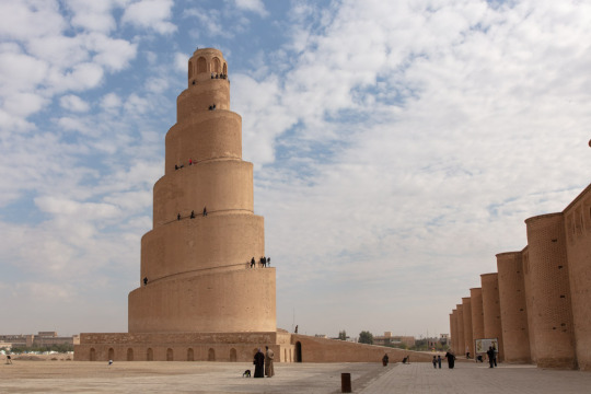
Grand Mosque of Samarra and the spiralling Malwiya Minaret (Adventures of Nicole., 2022).
Domes (like several other architectural movements such as Renaissance and Byzantine) are also a regular feature of islamic architecture.
The first Islamic design featuring a dome is a 7th century shrine in Jerusalem - Dome of the Rock, Arabic Qubbat al-Ṣakhrah. Dome of the Rock was built by Umayyad caliph (chief Muslim civil and religious ruler of the first Muslim dynasty) 'Abd al-Malik ibn Marwān. The structure is situated on a flat elevated plaza known to Muslims as 'The Noble Sanctuary' (al-Haram al-Sharīf), and the rock above which the dome is located is the spot the propet Muhammad was taken up into heaven for an encounter with God (Mi'rāj), (Britannica., 2014).
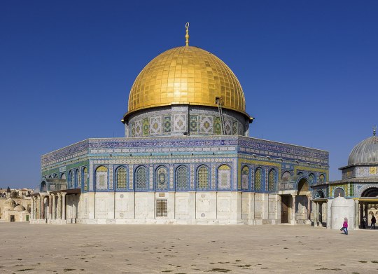
Dome of the Rock, Jerusalem, 691-692 CE.
Most domes rest on pendentives which are constructional devices used to place circular domes over square or rectangular shaped rooms. You can recognise pendentives as Islamic architecture by its decorative tiles or muqarnas - a form of ornamental vaulting, (IvyPanda.,2020).
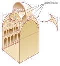
Diagram of pendentives.
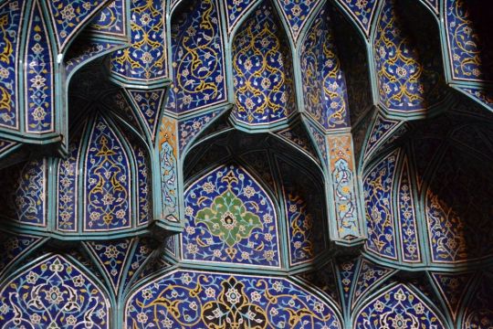
Muqarnas and decorative tiles example.
The most important piece of indo-Islamic architecture os the tomb of the Shah Rukn-i-Alam in Multan. This tomb was built between 1320 and 1324 CE by Giyath al-Din Tughluq in the pre-mughal, architectural style, Giyath was the governor of Diplapor (a city in the Okara District of the Punjab, Pakistan) and is thought to have been built to serve as a tomb for himself. However, it was presented to the family of the renowned Sufi saint Sheikh Rukn-ud-Din Abul Fateh (Sacred Sites., 2020). The tomb is an octagonal shape, 35m high and structured by red brick with a visible frame of beams and shisam wood, and further designed with the use of carved brick, wood blue and white faience mosaic tiles with raised relief patterns. The octagon is decorated with geometric, floral, and arabesque designs and calligraphic motifs. The interior was originally plastered but is now bare and the sarcophagus is surrounded by 72 of his descendants. The saint is still held in high esteem and the tomb is the focus of over 100,000 pilgrims from all over South Asia who visit in order to commemorate his memory, (Unesco., 2004).
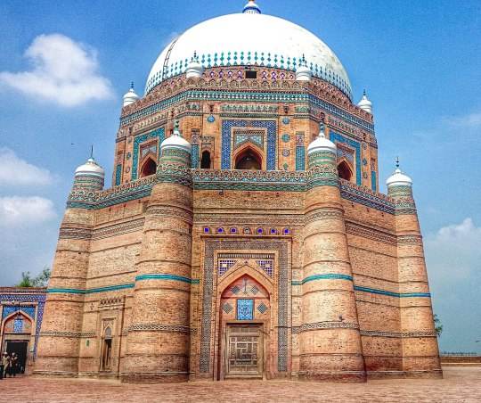
Shah Rukn-i-Alam, Multan, Pakistan.
Arches are yet another prominent feature of identifying Islamic architecture, and their placements usually define the entrances to buildings and rooms. There are several types of arches including: Pointed Arches, Ogee Arches, Horseshoe Arches, and Multifoil Arches. The double arched system of the Mosque-Cathedral of Córdoba, the pointed arches of the Al-Aqsa masque provide excellent examples of how arches become indispensable features of Islamic architecture (Rethinking the Future., 2023).
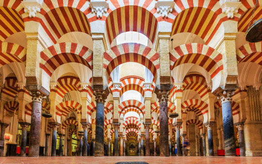
Double Arches of Mosque-Cathedral of Córdoba
The majority of mosques and palaces falling under the style of Islamic architecture feature courtyards and can house large gatherings of people during festive occasions and prayers. The courtyards will feature fountains for the people to perform ablution before prayers.
Now that there has been an introduction into what it takes to create for Islamic styled architecture, the rest of the blog is open to deeper dives of certain establishments, countries, and architects themselves,
Thank you for reading, I hope you enjoyed!
Summer Marshall-Miller
BIBLIOGRAPHY: Hohenadel, K. (2022) The Spruce. Available at: https://www.thespruce.com/what-is-islamic-architecture-5120474 (Accessed 20 January, 2023)
Britannica, The Editors of Encyclopaedia. (2014) Encyclopaedia Britannica. Available at: https://www.britannica.com/topic/mosque (Accessed: 20 January, 2023)
Unknown Author (2020) Invaluable. Available at: https://www.invaluable.com/blog/islamic-art-patterns/ (Accessed: 21 January, 2023)
IvyPanda (2020) 'Muqarnas in Islamic Architecture'. Available at: https://ivypanda.com/essays/muqarnas-in-islamic-architecture/ (Accessed: 24 January 2023)
UNESCO (2004) Tomb of Shah Rukn-e-Alam. Available at:https://whc.unesco.org/en/tentativelists/1884/#:~:text=The%20tomb%20of%20Shah%20Rukn,saint%20following%20the%20latter%27s%20death (Accessed 7th December 2022).
Unknown Author (2023) Rethinking the Future. Available at: https://www.re-thinkingthefuture.com/architectural-styles/a2589-10-distinctive-elements-of-islamic-architecture/ (Accessed: 23 January 2023).
Nicole Smoot (2022) The Adventures of Nicole. Available at: https://adventuresoflilnicki.com/samarra-iraq/ (Accessed: 23 January 2023).
#architecture#islamicarchitecture#art#history of art#islamic#mosque#history#my blogs#student#major project
33 notes
·
View notes
Video
youtube
Speaking Object: Bowl with Arabic Inscription, November 3, 2022
Listen to the proverb on this epigraphic slip-painted bowl. The Speaking Object project gives voice to inscribed works of art from the Islamic world.
The Met

Bowl with Arabic Inscription, 10th century
From Iran, Nishapur
Earthenware; white slip with black-slip decoration under transparent glaze
H. 7 in. (17.8 cm), Diam. 18 in. (45.7 cm)
The calligraphic decoration on this bowl reads "Planning before work protects you from regret; prosperity and peace," but the shortening, bending, and elongation of the letters has transformed the words into abstract motifs of tremendous power. With its monumental presence and the artful arrangement of its letters, in which vertical flourishes punctuate the horizontal flow of the words at rhythmic intervals, this bowl stands out among the many other inscribed ceramics of the same period.
Collection of the Metropolitan Museum of Art
#arabic#kufic#Iranian#Nishapur#earthenware#language#Persian#art#art history#abstract#minimalism#The Met#Metropolitan Museum of Art#ceramic
12 notes
·
View notes
Last Seen Blogs

rinarapoport
Rina Rapoport

ex-t4-sis
ÉXTASIS

alex--porras
Alex Porras

lambishep
Sheepy

kpittman87
Untitled