#character design critique
Text
Rating Hazbin Characters based on if I could tell what animal/creature their supposed to be:
Disclaimer: THIS IS NOT MEANT TO BE AN ATTACK ON HH’s CREATOR/ARTISTS.
I really hate that I even have to say that, because art critique is part of engaging with art and design. People shouldn’t have to worry about being bullied or sent threats because they don’t like every single thing about a piece of media. I’m not saying these character designs are “objective bad” or anything like that.
I just realized that I didn’t know most of the designs were apparently based on animals for a long time, or until it was pointed out to me, and wanted to kind of review/examine that.
Ratings below:
ANGEL DUST—Spider—2/5:
I’m giving Angel a 2 because his design does look spider-ish to me, but I had to be told he was a spider to see the spider-elements to his design. I don’t think I would have figured it out unless told, the only time I think I could have figured it out on my own is with the spider web elements in Addict. The spots under his eyes being extra spider eyes kind of makes sense, but I don’t think I would have realized they were supposed to be eyes if I hadn’t been told. They did actually get drawn as eyes briefly when Angel got mad in the show when it came out-so that was actually really nice to see.

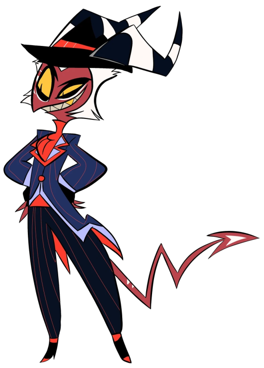
ALASTOR—DEER—0.5/5
Literally nothing about this man’s design makes him look like a deer to me. I gave the half point for the teeny tiny antlers at the top of his head, and because I do think his shoe print being a deer hoof pattern is kinda clever. But i should be able to see his antlers easily if they are an important part of his character design and if he’s supposed to be a deer. I also thought he was an OWL for like. 2 or 3 years while the Pilot was being animated b/c of his hair tufts. They looked like a great horned owl’s feather tufts to me.
VEE—no I’m not calling her that—MOTH
Pilot: 0/5 // Final Show: 1/5
I wanted to add Pilot Vee b/c other than Charlie her design was probably the one that seems to have changed the most. Pilot Vee gets a 0 sadly b/c, while I actually don’t mind her base design that much, and think she looks good, literally NOTHING about her looks like a moth. Is she even still supposed to be a moth? Asking genuinely b/c that’s what everyone says but if that’s the case I sure as hell couldn’t tell and still can’t.
Show Vee gets 1 point b/c I DO like the design element they brought back from her first ever design where her hair is supposed to mimic a moth’s wings laid back. I thought that was clever and fun. It’s the only thing tho that kind of points towards her being a moth. Again if I’m wrong and she’s not supposed to be a moth lmk but every source I’ve seen says she’s a “moth demon” or that her design was based on a moth.

HUSK—CAT—5/5
I mean just look at him. That’s a fucking cat alright! Only thing I may have docked a point for is the feather tail thing, but tbh it’s still very clear he’s a cat. If someone tells me he’s not supposed to be based on a cat tho I may lose my mind.

NIFFTY—???/5 (???)
Is Niffty supposed to be an animal? No, right? She’s just like. A weird creature/girl. Please tell me Niffty is not supposed to be a certain animal or anything b/c I have NO idea what animal that would be.
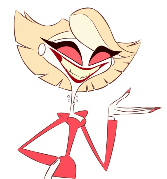
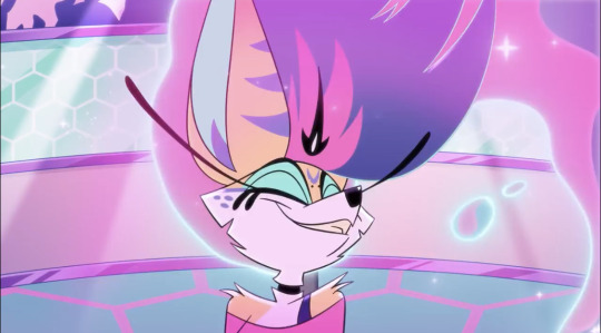
VALENTINO—MOTH—0/5
I literally had no idea this guy was supposed to be a moth until his coat turned out to be wings for some reason. Nothing about the coat made it look like wings to me. I thought his “antennae” were just feathers in his hat. Even when his coat became wings I was still very confused and thought for a moment he was supposed to be a butterfly? But no apparently he’s a moth. He’s got extra arms but I didn’t think that was specifically a “bug/moth” thing, b/c so many of the character designs in HH have extra features. I’ll be real I really don’t like anything about Valentino’s design and don’t understand the appeal of him at all. Sorry Val fans :(

KATIE KILLJOY—PRAYING MANTIS—0/5
I’m really sad I have to give out another 0 but like, I had NO idea that Katie was supposed to be a Mantis. I’m not sure if that’s even accurate like maybe that was just a rumor/speculation?? Right? Please let me know b/c I seriously NEVER would have guessed that she’s supposed to be a Praying Mantis. Even in her other form, I would have thought they were trying to imply she’s a spider…why did they give her 4 eyes? I can’t tell if they’re supposed to represent pseudo-pupils or a mantis’ ocelli but I never would have thought of them as that. I just thought she was like. A scary monster white lady/“karen”-type 😭

CHARLIE—PUPPY/PORCELAIN DOLL/LAMB?GOAT? THING???—2.5/5 (?)
So, based on the creator/character designers statements from a podcast, I believe that Charlie is supposed to be a sort of…amalgamation of the above? But honestly I’m not sure. I’m that statement they mentioned she had a lamb or puppy nose, and I think they mentioned before that her heels are supposed to look like hooves? But also the creator made a tweet saying they never intended her design to be a goat, so I don’t really know what she’s supposed to be. I gave Charlie a 2.5 b/c she DOES look like a porcelain doll to me. Or like. A. Clown??? Cause of her cheek marks. Idk. She at least looks like one of the things she’s “supposed” to be according to the creator, and I can see the puppy element with the nose if that’s what was intended. The lower ranking is more because I’ve heard MULTIPLE things about her design elements so I’m not sure what the intention was with her.
I would have bumped her up to a 3 if I knew what she was supposed to be, but b/c it’s been stated that she’s based on several things it’s hard to tell, and I can’t actually tell if that’s still the case.
———
I may do another one of these with some other characters. There are a few in Helluva Boss that I couldn’t really read either but most of those designs make much more sense to me. ¯\_(ツ)_/¯
#hazbin critique#hazbin hotel critique#hazbin hotel critical#hazbin hotel criticism#character design#character design convo#funhouse convo#character design critique#character designs#art#animation#media criticism#media critique#media conversation
109 notes
·
View notes
Note
I don’t know — I didn’t even notice she didn’t have pants for years — I thought that was just the costume colour.
🪴Once again, we're going to reiterate that the lack of pants aren't the problem: it's the sleeves being white at the same time that throws off the harmony of her character design, so much so that the only point we can really understand why it's still like that is for light fanservice
This has been bothering us since 2016. The edit from this post was made in 2016, and the reason why we noticed was because we went to college for animation and other visual mediums like this one. And as someone who drowned themselves in character design theory we think Gwen Pool's has bad cohesion because they won't let a couple of white sleeves die. We edited her design to show one without the white sleeves only!
We're FINE with her not having pants, but the reason we mention it before the sleeves is it feels like they SPECIFICALLY want to show off her legs in the stories. And as a character that supposedly can "break canon", and has been told to us is uncomfortable with sexualization, and has been confirmed to be aroace, we think that's... odd!
Obv aroace people irl can dress like that but in a superhero comic it's clearly being done for other reasons, because Gwen isn't real. And we're critiquing her in the context of the long history of women in comics being forced to wear less than their male counterparts, I.E. GwenPool with Deadpool.
2 notes
·
View notes
Text
Hello everyone!!! Back with another banger of a design critique!
Okay now time to be serious. (Lol!) Today I'm reviewing all, that's right all! If the designs of Rokka no Yuusha character designs. And now let's start with the strongest man in the world Adlet Mayer!!!!
Adlet Mayer is one of the "six flowers" (if ya know ya know) a warrior chosen by the Godess of fate to defeat the demon lord.
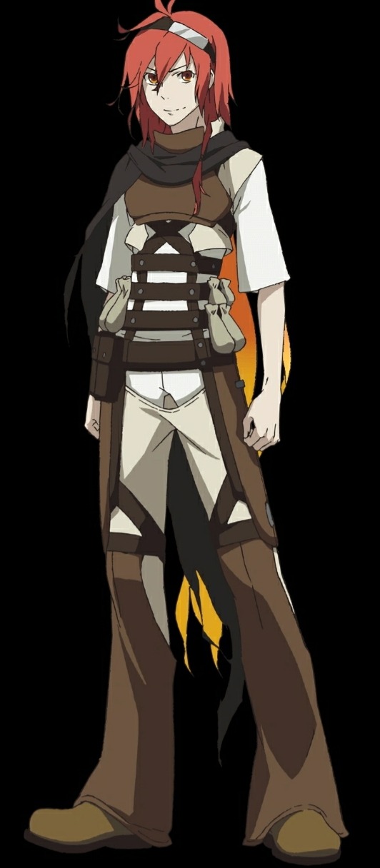
Wearing white shirt and pants underneath all the brown straps. I think the whole look of Adlet screams prepared, which makes sense since he uses his inventions to fight. I like the placement of the shade of brown. One little detail I wanna add is the he has chest plate for protection. Another thing I wanna add is his red hair is a bit top heavy at times but like how it transitions to a much cooler orange and a bright yellow. I wish that the color of his hair could be placed elsewhere on the outfit. I want that cloth hanging from his shoulders gone because it's detracting to me at least.
So...8/10!!

Our next warrior is the assassin of saints and the saint of gunpowder, Fremy!

Okay, so her black cape blended with her pants so that's why her skin is exposed to break up the black cape. And the cloth that's covering her eye is a night blueish but I wish I could see that color more around her outfit. But I like her gloves to signal that she is a marksman and it's light on the eyes which breaks up the black.
I think her head is a bit too top heavy. I love her flower tho. 5/10
Oh! I like the connection between the two with them having a black cap of sorts.
Then the third brave. Nashetania Loei Piena Augustra! A princess!
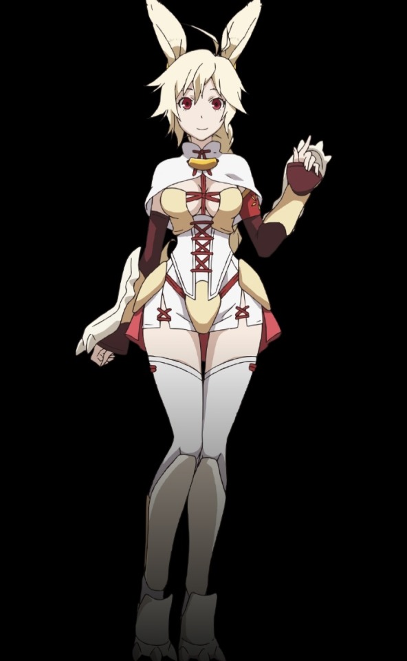
Okay I love this design. And I like her rabbit theme with her ears and her armor. The color placement is great and she looks like royalty which is perfect. My problem with it is that she wears heels which isn't the best for traveling but at the same time her fighting style is basically summoning swords and attacking her opponents. And she shows off her chest which isn't good for protection.
So 9/10!
Okay will do the rest another day see ya!)
#character design critique#rokka: braves of the six flowers#design#character designs#critical thinking
2 notes
·
View notes
Text
the Magnus Protocol Character Designs

these are just my current headcanons, as well as some things I've seen from others. idk who came up with the Sam amputee hc but I rlly fwi! These aren't final, so feel free to tell me your hcs in the comments, I'd love to hear about them!!
Colin, Lena & Celia are next, and if i find the time I'll try to work on some others like Bonzo etc.
Some details:
#tmp#the magnus protocol#fan design#character design#tmagp#tmagp fanart#fictional podcast#the magnus pod#headcanon#alice dyer#samama khalid#gwendolyn bouchard#digital art#trans artist#digital drawing#haha they're so cute i'm sure they all have plot armour and nothing bad will happen right? right???!?#critique welcome
1K notes
·
View notes
Text

Wip of a Danny/Ember fusion design.
#danny phantom#my art#character design#wip#If anyone’s got any constructive critiques lemme know bc it doesn’t feel finished yet#I don’t think the face shape and the silhouette are unique enough?#obsessed with the tatts tho#their name is Ashby#or Ashton?
2K notes
·
View notes
Text
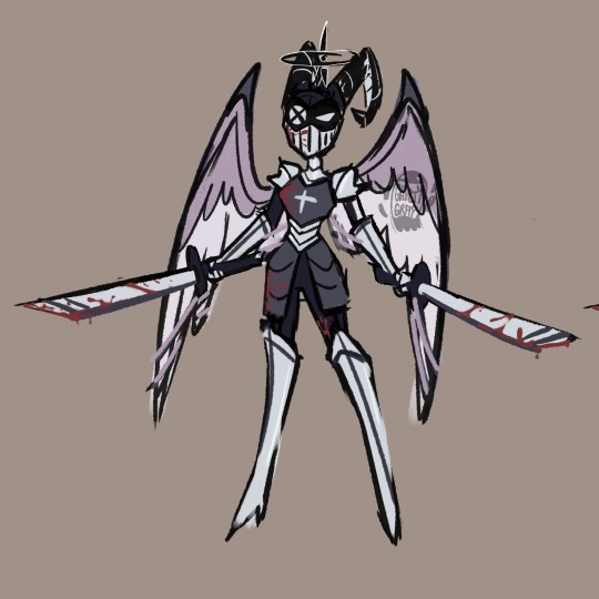
Lute redesign!! aka the sapphic knightify of lute because I actually really enjoyed her character. I was interested in her way back when she was first teased along side Adam and when I finally got to see her in action in the show I was enthralled, I loved her songs!
For this design I decided to add more armour to her, she’s not afraid of getting hurt or anything but I feel like it sets her aside from the rest of the exorcists. She takes her job incredibly seriously, she is a lieutenant after all. I added some crosses to her design and made her wing colour match her hair, also added a second hair option to show off her undercut!
It’s a brighter purple and I think she looks neat with it, I’ll probably add some casual clothing for her, I found it weird how she and Adam were actively sporting their exorcist outfits freely in heaven when the rest of heaven isn’t supposed to know about the annual extermination. Lute even had blood all over her outfit.
I hate Adam but him and lute as a duo was my favourite part they were funny and their duets were great, kinda feel like we got a major villain death wayyy too soon tho. I should be taking a crack at the seraphim sisters or Adam next.
#hazbin hotel#hazbin#hazbin lute#hazbin hotel redesign#hazbin hotel fandom#hazbin hotel fanart#hazbin art#hazbin critical#hazbin hotel lute#hazbin hotel critical#hazbin hotel critique#hazbin hotel art#character design#art#sketch art#sketch#artists on tumblr#artwork#digital art#fanart#vivziepop critical#hazbin hotel exorcists#ghostygray
987 notes
·
View notes
Text

lighting experiment
#artists on tumblr#art#oc#original character#tessa#character design#assassin#mercenary#static sky#neon#big thankies to kfrances and theneonfennec to helping me with the last mile of this#lighting is so so so so hard. i almost gave up on this completely wbjhsdfghjbdfg#but i DID IT with the power of Friendship. and Energy Drink#critiques welcome
402 notes
·
View notes
Text

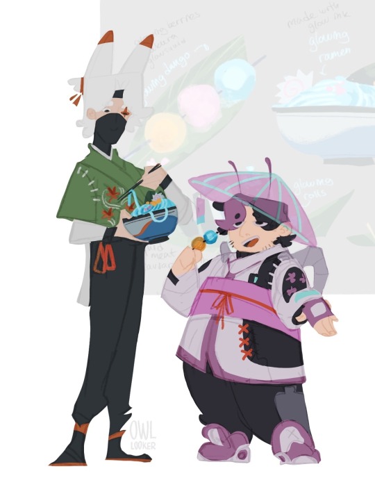

Joel!! (to be read in the way Iskall says it)
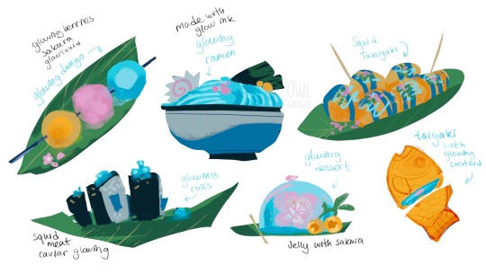
My idea that in Joel’s cyberpunk town food is made out of local ingredients that he farms: glowsquid, glowberries, and sakura ofc! (does he have honey as well?)
Oh, and those things on his back? They are some high tech stuff that allows you to model light after anything, so it can be basically used for carrying berries, or transform into an elytra!
#joel smallishbeans#hermitcraft joel#hermitcraft fanart#hermitcraft season 10#hermittblr#mcyt fanart#mcytblr#my art#digital art#artists on tumblr#digital illustration#character design#cyberpunk aesthetic#and eefo#I find it hard to nail Joel’s design#bug coded#I’m open to critique and helpful suggestions
282 notes
·
View notes
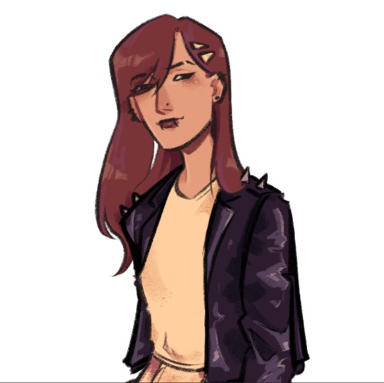
Text
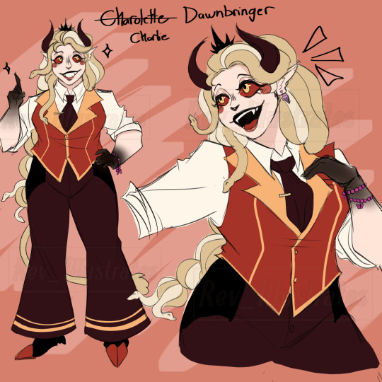
-Reimagined/Redesigned The Princess of Hell - Charlie Dawnbringer (my name). This was drawn out of spite as they massacred my girl Charlie. I feel she was dumbed down in the season we got and lost her authority, personality, and other traits I loved.
-I made her a bit average sized and gave her hooves. I wanted her to have snake like hair and for her horns to be of her mother and for them to be shaped like her father’s wing crown. She even had a crown in general ! I wanted her to look like she’s actively running around doing things due to the rolled up sleeves and vest she wore. I see her as a tomboy like the old art. Shadows on her hands like her father and mother. Rosy cheeks and lipstick. Another trait I gave her is that she makes little trinkets for herself and others. Such as the bracelet on her wrist having a moth on it for Vaggie, and the cotton candy earring she had.. I swapped the red she had for a more orange color it makes it pop more same with her eyes.
Re-Redesign of Lucifer coming soon, !
#character art#digital art#hazbin hotel redraw#hazbin hotel redesign#hazbin hotel critique#hazbin hotel critical#hazbin charlie#vivziepop critical#vivziepop criticism#vivziepop critique#anti vivziepop#character design
224 notes
·
View notes
Text
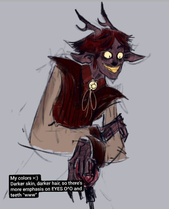
I already told some friends this but it makes me extremely mad seeing Lucifer's design in Hazbin because...vivzie already designed lucifer for zoophobia and he's *so much better*

Look at him! Like yeah it is all red but at least it's a nice muted red with lighter accents in the eyes and eyebrows. He's not 50 shades of blood.
The big horns that reference a broken halo are a wonderful touch. I love the grizzled face and hunched back that show he's Old and Has Seen Things. I like the cloak that adds an air of mystery as to what's behind it.
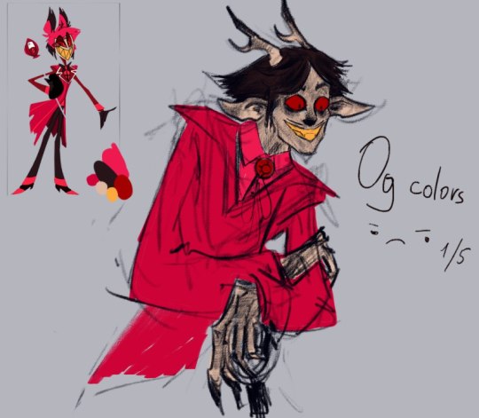
Compared to this...
This is just a White Onceler. He doesn't convey anything lucifer to me other than the snake and the apple on his top hat. He's just another generic triangle tooth twink.
Going back a bit, It also helps for zoophobia that he was supposed to be in a world of characters who WERE bright and colorful so he actually stood out in a good way

Look at these guys! Sure, it's busy, but I can actually tell which characters are what. They all feel like they have their own identity and aesthetic due to their different colors. It's what a cartoon cast is SUPPOSED to look like.
Old lucifer would have stood out in that cast because not everyone is fucking red. New lucifer barely stands out, only because he looks so much like Charlie. And even THEN, they look like siblings!
this isn't official art done by Vivienne but I couldn't find any other good screencaps showing them side by side. If someone didn't know shit about hazbin they'd think charlie and lucifer were twins. Nothing about new lucifer's design suggests that he's a father or even older than 25.
It's sad, honestly. I used to look up to vivienne when I was younger. Now, she's a shadow of her former self as an artist.
#anti hazbin hotel#anti hazbin#anti viviziepop#media critical#fandom talk#character design#hazbin critical#hazbin critique
223 notes
·
View notes
Text
If I’m honest, I actually really like Helluva Boss’s “Beelzebub” design in terms of like. A fun sparkledog character. I think what makes the design really clash for me is the color palette they chose for her, and all the smaller details she has. (Design review below cut—not criticizing to be mean or attack—talking about my personal opinion on the design)
The times when she’s got a different palette make her much more visually pleasing to look at—I like the following color schemes waaay more than I like her general color scheme:


I think I really like the top two color palettes more because the stripes are more subdued—they mesh better with her base fur color, and because they’re lighter more subtle in those color schemes-it really makes her facial markings pop, especially with the second color scheme.
Overall though, I think the BIGGEST issue with her design is not the general silhouette—a dog/fox girl with four arms isn’t that crazy. What really really hinders her design is just HOW cluttered it is.
There are stripes, spots, that forehead mark, her clothes have little tears and marks that don’t actually add much to the design. I don’t really. Understand how her bra works??? Or her? Arm? Strap? I guess? I can’t tell if it’s a bra or not…Her heart window on her shirt is so big that it only showing her chest doesn’t make a lot of sense.
Like. Where her bra go? 🤔❔
I also don’t really like her black crown thing. It doesn’t add anything to the design imho and I assume it was added to distinguish Bee as a Deadly Sin. But I think it’s just an extra detail that clutters the design further.
The main problem with the design really boils down to just how over-detailed and cluttered it is. The lava lamp/honey idea is cool, and I like it, but I think if you’re going to have that, then you have to really simplify the rest of the design.
Bee has SO. MANY. constantly moving parts to her character that it makes it hard to focus on her. The animators did an insanely good job having to animate all of those parts-it couldn’t have been easy.
I still love her tho. Mostly b/c she’s voiced by Kesha, whomst I love dearly, and also b/c she is the only woman character in HB I can think of whose character doesn’t completely revolve around her boyfriend/husband/a man. And she gets to be happy and isn’t just mean and terrible to everyone for some reason? Woof.
#funhouse convo#media criticism#media critique#helluva boss critical#helluva boss critique#character design#character design critique#helluva boss beelzebub
62 notes
·
View notes
Note
Still can’t get over the fact that the official hazbin character designs look bad. They are so red, even when someone makes group fanart of them it’s so hard to look at because it looks like one giant red Blob and no way someone will look at Alastor and be like “ah yes, he looks like a deer, radio demon from 1930s”. Matter of fact I thought Alastor was based on a papillon dog when I first saw him because he has such fluffy long ears.
Don’t worry bud, I still can’t get over the Hazbin hotel designs either. Like I seriously want to know who looked at all these designs and changes lined up next to each other, and went “Yes, THIS is a good idea, to make almost every character have a tone of red/pink/black while the background of the hotel will also be the same color”.
Art credit goes to Nicole Rodriguez on twitter.
I love the art, but putting that aside yeah, it wasn’t a good idea to color most of these characters this way, and I’m deeply afraid that once the show comes out, I’ll have an eye strain trying to look at all these characters and see who’s who and what’s what, because most of them all look the same, have the same body type, and colors. Viv has a crazy obsession with the color red, yellow, white pink, you know the gist, and it would have been nice if each of the main characters had a different color palette, maybe blue? Green? Brown? Try some other colors for once, but that’s not what we got. The only savior we have for this point is the composition team and editing, part of my issue in the pilot was just that there was no focus, my eyes never knew where to look because it was just a bunch of flat colors clashing with each other, so I hope the crew behind the scenes can find a way to sort the lighting and all on the animation out so it doesn’t look like a clunky mess.
And yeah, none of the characters look like their time periods lmao, my biggest pet peeve is how Angel, Alastor, Sir Pen, and Vox all wear the same damn outfit because Viv is obsessed with bland looking tuxedos even though they all come from completely different time periods lol.
#still hate Alastor’s design#god it’s so bad#and Sir pen as well#looks nothing like steampunk this isn’t that hard viv#and yet she gave him Alastor’s suit but a different color#I hate how red they made nifty and Charlie#vivziepop critical#spindlehorse critical#anti vivziepop#hazbin hotel critisim#hazbin hotel critical#demon character design#character design critique#hazbin hotel critique
58 notes
·
View notes
Text
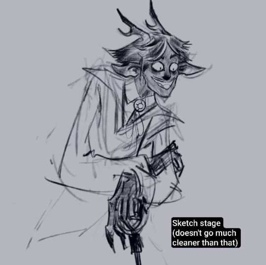
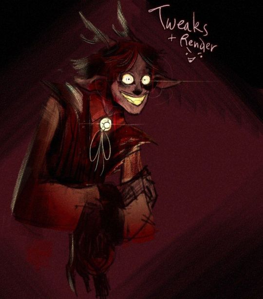
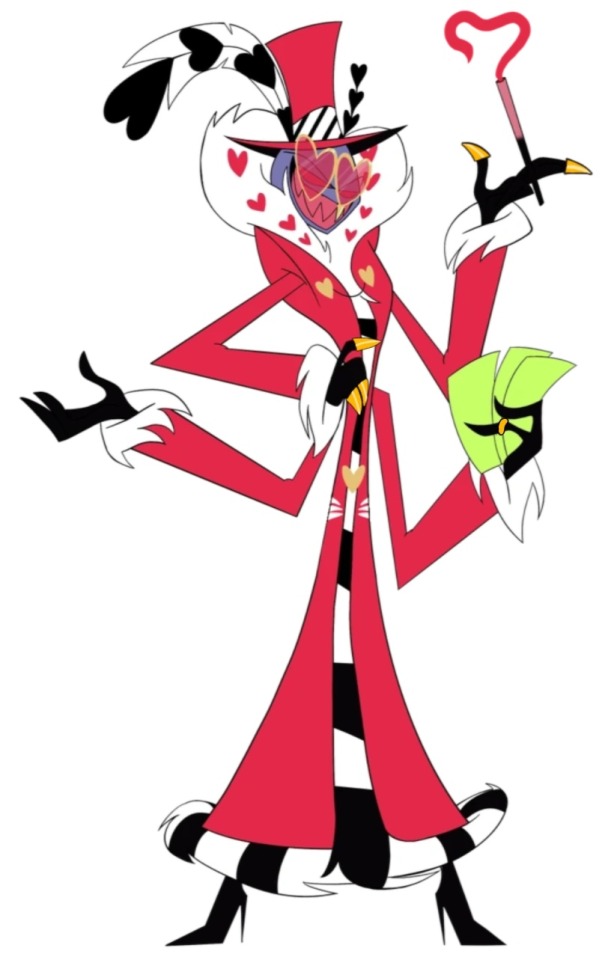
I redesigned the Alastor, come and get me, fight me, kill me, bite me, idgaf .^^^^.
#hazbin hotel critical#alastor#hazbin hotel redesign#redesign#hazbin hotel critique#hazbin hotel criticism#hazbin hotel alastor#hazbin hotel#alastor redesign#artists on tumblr#character art#character design#demon#my art#sandy draws#radio demon
232 notes
·
View notes
Text

I LOVE Senran Kagura. I don't know, but there is something about ninja girls fighting evil ninja girls is just, *chef's kiss*
Anyways, I wanted to talk about one of the characters designs and that's Katsuragi!
Okay, so where to start first? Okay, I like the blue going on with her outfit. The blue lines on her shirt matching the ribbons on her socks and boots. But if you look closely you can see a purple ribbon on the back of her boots, I thing that's a little weird since there isn't purple anywhere else. But I guess it's for the eyes to go to since Katsuragi uses her legs to fight. So far, I love the color placement.
My main problem with this outfit is that her transformation looks a little to similar to her Hanzō Academy uniform and I find her shirt being open is also strange. Now, don't get me wrong, I get it fan service and I've no problem with that. I guess it's just find it a bit lazy to me. But, it says that she is a pervert which she is and I like that her outfit says that about her, I just think that there are other methods to do so.
Anyways I'll give this design a 7/10
This is my first design critique, hope you guys liked it!
5 notes
·
View notes
Text
never forget what they took from us
I hate that crimson looks like a moxie copycat. I know about genetics but this is not how this works. it's worse that he has the same va as moxie too. in the concept, he actually looks like a scary burly mob boss.
i see people defending crim's final design is better cus if he's burly, he wouldn't need so many goons. wtf does that mean?!
edit: about the crim wouldn't need gang members if he's muscular.. are you stupid? he's a mafia boss? you know what that means? a crime ORGANISATION. of course he needs shark demons in his crime family. ughhh this fandom is giving me a headache
#anti helluva boss#helluva boss critique#helluva boss criticism#helluva boss critical#off topic does anyone know who does these storyboards?#they made such good designs for the new characters but it's never used in the final#like their storyboard art is top tier
294 notes
·
View notes
Text
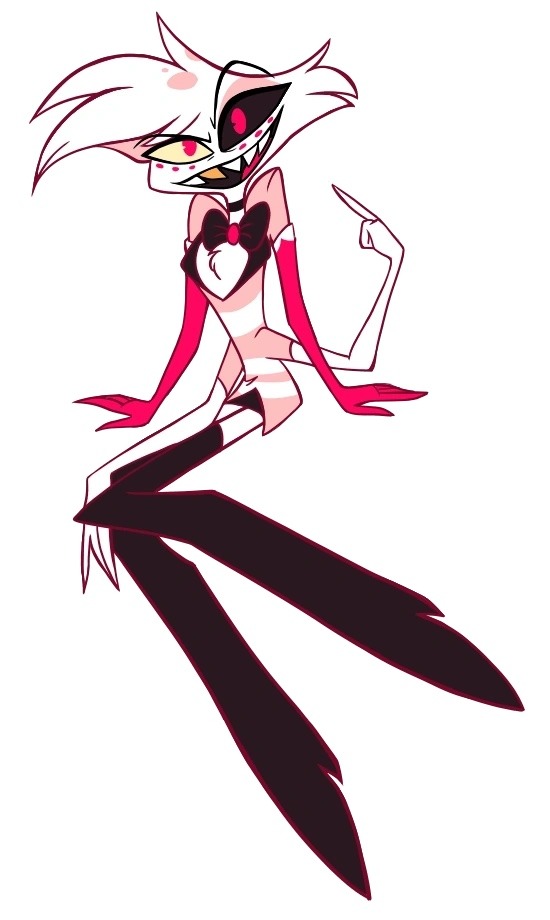
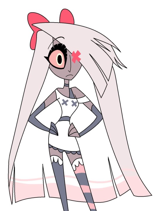
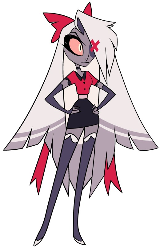
Vaggie Redesign

I am mostly fine with Vaggie’s show design. Most of my grievances with her come from how her character and backstory is handled... and I hate her name a lot lmao. I did want to give her more muscle mass, as she is a soldier after all. I’m not the best at drawing characters with muscles, but the only way to get better is to try!
More info under the cut. If you have suggestions for who I could redesign next, you can mention them in my askbox, anons welcome!
In Hellbound Hostel all angels have virtue names, even fallen ones. Angels are named after values they should embody or things they should do, usually having a full phrase as a name. These are just shortened to one word. Verity means truth and her full name would be “Find-truth-in-holy-light” or something to that effect.
I really love the purple that was present in Vaggie’s oldest(?) design and I think it makes a for nice contrast between my sunshine themed Charlie (who I’m calling Eden for now) and the moonlight themed Verity.
I like the moth silhouette that Vaggie has, but Verity really only keeps this shawl to hide the remnants of her wings. She wouldn’t keep it after her identity is revealed.
Verity is the antagonist of the first arc of Hellbound Hostel. She was a loyal soldier in a squadron of exterminators.
I wrote up a bunch of info, but it is a little scattered without certain lore components explained… So! I’ll just say she wanted to kill Eden early on but she realizes Eden isn’t the devil that heaven told her she would be.
#hazbin critical#hazbin hotel critical#hazbin hotel criticism#hazbin hotel critique#hazbin hotel redesign#Hellbound Hostel#dys draws#dys designs#my art#redesign#character design#vaggie redesign
213 notes
·
View notes
Last Seen Blogs

iizacq-blog
Untitled
rgshedplumber
RG Shed Plumbing & Heating
the-cutest-fisherman
a good good boy
venturetime
Vani Royal
official-franzschubert
(not) Shroombert