#css blend mode
Explore tagged Tumblr posts
Visit Tumblr Blog
Explore Tumblr blogs with no restrictions, modern design and the best experience.
Last Seen Tumblr Blogs


Fun Fact
China blocked Tumblr because of pornography and censorship problems in 2013.
Text

CSS Blended Background
#css blended background#css blend mode#css tricks#css effects#html css#css#html#css3#webdesign#code#divinectorweb#html5#frontend#coding
4 notes
·
View notes
Text
CSS Mix Blend Mode
#css mix blend mode#css effects#css tricks#html css#frontend#css#html#css3#frontenddevelopment#css image effects#neduzone#basic css tutorial#css for beginners#css tutorial#css3 tutorial
2 notes
·
View notes
Video
youtube
🇺🇦 Як видалити фон у НЕ прозорого jpg зображення? Як працює CSS mix-blen...
#youtube#🇺🇦 Як видалити фон у НЕ прозорого jpg зображення? Як працює CSS mix-blend-mode? Зроби цей світ краще 👇 👇 👇 🇺🇦 Фонд Притули - https:
0 notes
Text
Color Mixing With Animation Composition
New Post has been published on https://thedigitalinsider.com/color-mixing-with-animation-composition/
Color Mixing With Animation Composition
Mixing colors in CSS is pretty much a solved deal, thanks to the more recent color-mix() function as it gains support. Pass in two color values — any two color values at all — and optionally set the proportions.
background-color: color-mix(#000 30%, #fff 70%);
We also have the relative color syntax that can manipulate colors from one color space to another and modify them from there. The preeminent use case being a way to add opacity to color values that don’t support it, such as named colors.
background-color: hsl(from black h s l); /* hsl(0 0% 0%) */ background-color: hsl(from black h s l / 50%); /* hsl(0 0% 0% / 50%) */
We can get hacky and overlay one opaque element with another, I suppose.
Same general idea maybe, but with mix-blend-mode?
Another roundabout way of getting there is something I saw this morning when looking over the updates that Ryan added to the animation property in the Almanac. Now, we all know that animation is shorthand for about a gajillion other properties (the order of which always eludes me). One of those is animation-composition and it’s used to… well, Ryan nails the explanation:
Defining a property in CSS also sets what is considered the underlying value of the property. By default, keyframe animations will ignore the underlying value, as they only consider the effect values defined within the animation. Keyframes create a stack of effect values, which determines the order in which the animation renders to the browser. Composite operations are how CSS handles the underlying effect combined with the keyframe effect value.
Manuel Matuzović and Robin Rendle also have excellent ways of explaining the property, the former of which sparked us to update the Almanac.
OK! We have three values supported by animation-composition to replace the underlying property value in favor of the effect value defined in keyframes, add to them, or accumulate for combining multiple values. The add value is what’s interesting to us because… oh gosh, let’s just let Ryan take it:
[I]nstead of replacing an underlying background-color property value with the keyframe’s effect value, the color type values are combined, creating new colors.
A-ha! The example goes like this:
See that? The add value blends the two colors as one transitions to the other. Notice, too, how much smoother that transition is than the replace value, although we wind up with a completely new color at the 100% mark rather than the color we declared in the keyframes. What if we pause the animation at some arbitrary point? Can we extract a new color value from it?
Ryan made this so that hovering on the elements pauses the animation. If we crack open DevTools and force the :hover pseudo on the element, maybe we can head over to the Computed tab to get the new color value.
Interestingly, we get some RGB conversions in there. Probably because updating color channels is easier than converting one hex to another? Browsers do smart stuff.
Now I want to go update my old color interpolation demo…
Hmm, not any different to my untrained eye. Maybe that’s only because we’re changing the HSL’s hue channel and it’s super subtle. Whatever the case, animation-composition can produce new computed color values. What you need those for and what you’d do with them? I dunno, but go wild.
#000#ADD#animation#animations#Articles#background#browser#channel#Color#colors#Composition#CSS#deal#DevTools#explanation#eye#hover#how#it#mix-blend-mode#Mixing#nails#One#Other#relative color#shorthand#Space#Stack#syntax#transition
0 notes
Note
Greetings, greetings. I've been reading through corru.observer and I really love it! Got inspirired to draw my own little obesk guy. Which, As I went, got me curious about your art process for some of these visuals. What resolution are the sprites? And, what kind of dithering are you using to get such striking visuals? I'm quite curious
Hi!! I'm glad you like it!!!!
The signatures are around 1840-2300ish pixels tall at their full resolution! Though that doesn't decide how tall they are in the game, that's determined by the size of their css container. To keep heights consistent, whenever I make a new signature, I just paste in one of the signatures I already made for reference, then resize the sketch accordingly. like this

So for making your own, I recommend ripping the sprites from the game and doing the same.
After resizing the sketch I draw the shapes with a hard, aliased brush, then I paint on top of them with simple round brushes. Then sometimes I add textures on top of that on an overlay or multiply blending mode.
As for dithering, I cover that here, but to summarize I (and all of corru observer, save for... one exception) use floyd steinberg dithering! There are a bunch of different types but that's the kind I use.
To make sure everything looks GOOD once dithered, I will dither the drawing, look at the result, and then adjust the original image until it produces a dithered version that I like. Lots of trial and error. Usually that means increasing the contrast so that there are clean zones of pure black, instead of everything having a faint dithered texture on it.
Does that answer your question?? I could talk about this for hours.
29 notes
·
View notes
Text

like I could seriously make this crown animation in css, have it be animated WHILE flawlessly transparent, where it'll look good regardless of the pattern/image/content behind it. Because of screen blend mode and image masks. the raw power of css now is just CRAZY I NEEED to find ways to push it to the limit.
#forgive the gif repost!! pinkinkinhime on tumblr is deactivated as far as I can tell.... ((IF UR NOT I AM SO SORRYYY))#im so sorry for anyone who's followed me since 2020 and had no idea I am actually a designer askldfjasdf#hello i've just been dead inside since 2020 so this is the first time I've felt this creative <3
28 notes
·
View notes
Text
Hello, I have been away from html/css for a few years and I recently learned that blend modes and masks have been added aaaand..... my interest is severely piqued...
13 notes
·
View notes
Note
¡Hola, Necro!
Estuve revisando tus preguntas frecuentes y tutoriales (muchas gracias por todo eso) pero no logré encontrar un tutorial específico para los fondos para foro, más que nada para saber cómo cambiarle el color a la imagen y que quede de un solo color, como morado o claro u oscuro. ¿Es posible que nos puedas regalar un pequeño tutorial para eso? Por favooooooor.
¡Hola anon! No daría para un tutorial, la verdad, pero sí que te puedo decir cómo hago mis fondos hoy en día, ya que este método tiene buenos resultados y ayuda incluso si no has editado la imagen en absoluto.
Escoge una imagen que te guste. Recomiendo usar Unsplash.
Si vas a querer que sea en monocromo, pásala a blanco y negro. Puedes usar Pinetools.
Crea tres variables, para fácil edición: --body [el color de fondo], --body-img [tu imagen, puesta como url(LINK)] y --body-effect [tu blend-mode]. Si no sabes usar/crear variables, lee este tutorial.
Añade el siguiente código a tu CSS, y listo.
body#phpbb { background-color:var(--body); background-image:var(--body-img); background-blend-mode:var(--body-effect); background-size:cover; background-attachment:fixed; }
Para fondos claros: Usa un color claro (entre #777 y #bbb) y un blend-mode como screen, soft-light...
Para fondos oscuros: Usa un color oscuro (entre #222 y #666) y un blend-mode como multiply, darken, hard-light...
Para fondos de color: Usa tu color deseado y un blend-mode a elegir de los anteriores (para fondos oscuros uso multiply, para fondos claros uso screen o soft-light).
Tus variables dependerán del estilo que quieras conseguir, claro. A veces te tocará editar un poco la imagen (yo casi siempre les quito contraste usando, you guessed it, Pinetools), pero por lo general, este método te dará un buen resultado sin tener que abrir Photoshop, y si en algún momento quieres cambiar la imagen, es tan simple como cambiar --body-img.
¡Saludos!
3 notes
·
View notes
Note
Any tips on using fonts in ao3?
going to assume you're familiar with the basics — creating a new workskin at Dashboard → Skins → My Work Skins, and selecting a skin on the Edit Work page. if not, AO3 has a tutorial for this
(though skimming the tutorial, it doesn't seem to mention the <span> tag, which is your best friend when it comes to applying styles to a bit of text within a paragraph)
now for the more specific part of this question. also, be warned i'm going to be embarrassingly technical before i actually answer your question.
this is going to sound funny, but i am by and large not a fan of manipulating fonts as a stylistic device. my personal opinion is that what font a text is displayed in should be for the user to decide, both for preference and for accessibility reasons (e.g. there's fonts designed for dyslexic readers). i also tend to find most font changes to be a a bit goofy and immersion-breaking
it's different when i do it, but i'll explain my cope in a second
anyway, the style property you want to change to set in your work skin is font-family. e.g. font-family: monospace will give text a code/"typewriter" look, and on my own site i use "font-family: Newsreader, serif;". (the comma there essentially says 'if you don't have Newsreader installed, any serif font will do)
but as mentioned, i don't like messing with fonts, and in fact, there is no font styling as such in my fic at all. what gives?
(note: im going include mildly spoilery excerpts from my fic, Hostile Takeover)
but basically, i wrap cyn's dialogue in <code> tags, and most browsers will make that monospaced by default, but it leaves the door open for custom userskins to add their own flair to code blocks.
for example, my site puts little boxes around them
but with all that said, i think i might be taking this question overly literally. i think it's likely you aren't talking specifically about just fonts, and most of the interesting things people want to replicate from my fic aren't about what shape the letters are.
my secret weapon for styling this fic is the humble text-shadow property.
what it does is simple: it creates a copy of the text, and you have four knobs to turn: you can shift it over horizontally or vertically, blur it, and of course change the color
text-shadow: 1px 2px 3px red;
this gives you a copy of the text shifted to the right 1 pixels, down 2 pixels, blurred 3 pixels and colored red.
text-shadow: 1px 2px 3px red, -1px -2px 3px blue;
same deal but now there's another in the opposite directions colored blue, like a chromatic aberration.
you don't have to include the color or the blur if you dont want color or blur.
now i'll run through some real examples
the "pain" effect is what you get when you stack text vertically

text-shadow: 0 -3px 0px, 0 3px 0px;
the "beyond the grave" effect is text stacked horizontally

text-shadow: 2px 0px 0px;
the famous "i want you destroy you" text is of course colored, and here i offer an actual tip

you can predict the offsets, but the color is special
text-shadow: 2px -1px 0px #da38;
full explanation here, but basically, when you write a color with four values, the first three are RGB, but the last is the opacity. i think this matters because, if the earlier part of this post didn't make it clear, i care about readers getting a good experience no matter how they choose their custom styles (within reason, ofc)
by making the color slightly transparent, it blends with the background color, means whether you read with a light them or dark, it meets you half way

(try removing the transparency on that shade, and it's a pretty harsh contrast on both modes — though part of that might be that i made it super saturated to compensate for the transparency.)
i have some complaints about how ao3 handles css, and one of them is that it forbids you from using the very convenient filter: blur() function. to work around this, i cooked up a very "we have blur at home" solution
text-shadow: 0px 0px 6px, 1px 1px 3px, -1px -1px 3px; opacity: 50%;
(it looks much better on my site, where i can filter: blur all i like)
one of the reasons this sucks is that without a doubt the biggest limiter on doing really complicated stuff with text shadows is that they don't stack.
you'll notice that when the "pain" effect shows up, the "blur" effect disappears.
this matters most for what is definitely the most striking and involved use of text shadows in the work: the big man himself

the basic principle here isn't that special. the illusion of depth is accomplished by increasing blur and opacity the 'deeper' the text is supposed to be. the biggest trick here is that instead of the 'px' we've been using everywhere before, the offsets use 'em', which is a unit that relative to the font size.
but there is a nuance. you see:
text-shadow: 0px 1px 0px, 0px -1px 0px, #fd64 2px 2px 2px, #fd68 2em 1em 3px, #fd65 4em 2em 5px; text-shadow: #fd64 2px 2px 2px, #fd65 2em 1em 5px; text-shadow: #fd6 2px 2px 5px, 0px -3px 0px, 0px 3px 0px, #fd68 2em 1em 3px;
the "translate" looks like a combination of the new effect and the pain effect, but i had to give it a special style, specifying both by hand.
if you want to layer things, it will get out of hand, and if you ever opt to revise the specific colors or values, solver help you.
also, this doesnt show up anywhere in HT (yet), but i've used it in the past — only setting the blur of a text-shadow lets you give words an 'aura', and it's a neat and simple effect
(excerpt from Eifre Quest, an original work of mine from years ago. i have mixed feelings about it)
sorry if that was a long ramble or self-indulgent, but hopefully something there was new or helpful.
thanks for asking!
19 notes
·
View notes
Note
Do you happen to know the CSS code to change the colour of the box as well as the text inside the box that warns you before you open a fic that could contain adult content? Every public skin I’ve tried keeps it as bright yellow and in my dark mode custom skin I somehow changed it to black along with the regular background without me doing that intentionally but the text is also black, so it blends into the background and I can’t read it at all. I made that skin in 2020 and I've just been putting up with it being invisible for 3 years but today I decided I wanted to search for how to change it. However I've searched all over the Internet and no one has talked about changing the colour of this box. Can you help?
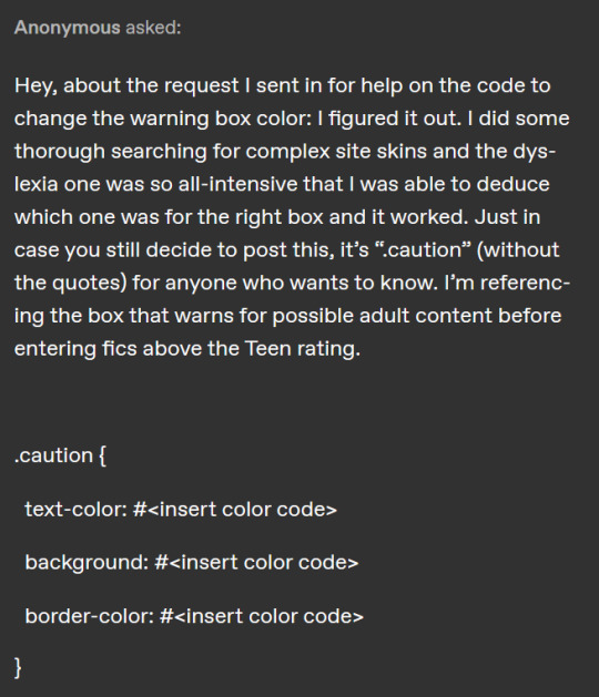
.caution { text-color: background: border-color: }
Hey, congratulations on figuring it out! I would like to note that it is much easier to find elements though inspect element. on most browsers, right click an element you wish to edit and select "inspect"
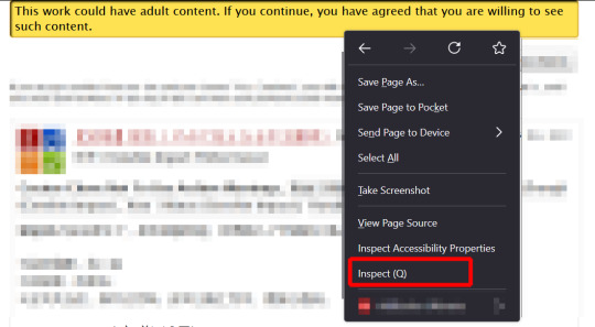
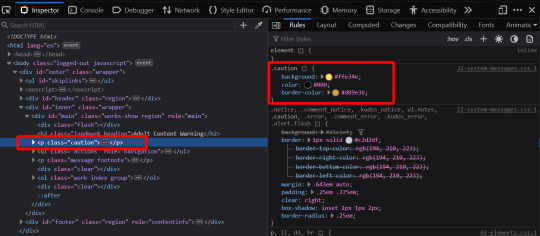
and it will usually give you the style elements of what you clicked on right away!
3 notes
·
View notes
Text

UI Button with Mix-Blend-Mode: https://codepen.io/dan10gc/pen/EQbjgP More CSS button hover effects: https://freefrontend.com/css-button-hover-effects/
3 notes
·
View notes
Text

Blended Background with Two Images
#blended background#css blend mode#css tricks#css effects#html css#divinector#css#html#css3#frontenddevelopment#webdesign
5 notes
·
View notes
Text

CSS Mix Blend Mode
1 note
·
View note
Text
Typography Trends in 2025: What Designers Need to Know

Typography is no longer just about selecting a readable font—it’s a storytelling tool, a brand voice, and a key driver of user experience. In 2025, the world of typography is evolving fast, blending creativity, technology, and personality. If you're taking a graphic design course in Noida or anywhere else, staying on top of these trends is a must.
Whether you're a beginner or a design pro, this guide will help you understand the top typography trends of 2025—and how to use them in your own work.
🔠 Why Typography Matters More Than Ever
Typography isn't just about fonts—it's about function, emotion, and brand identity.
Visual hierarchy: Guides users through content with ease.
Personality: Fonts help tell a brand’s story before a word is read.
Accessibility: Good typography makes content more readable for everyone.
If you're enrolled in a graphic design course in Noida, you're likely learning that strong typography separates amateur design from professional work.
✨ 1. Expressive & Experimental Typefaces
Say goodbye to safe and predictable. Designers in 2025 are embracing wild, distorted, and hand-drawn fonts that create emotion and grab attention.
Where to use it: Posters, campaigns, branding for creative industries.
🔁 2. Variable Fonts Go Mainstream
One font file, unlimited style variations? That’s the magic of variable fonts, now fully supported in most browsers and design tools.
Benefits:
Faster web load times.
Greater control over weight, width, and slant.
Responsive and scalable typography for any screen.
🌗 3. Dark Mode Typography
With more apps and devices offering dark mode, designers are adjusting typography to work beautifully against darker backgrounds.
Tips:
Avoid pure white; use soft light colors for better legibility.
Increase line spacing.
Use open and clean fonts like Inter or IBM Plex.
🧠 4. AI-Generated Fonts
AI tools are helping designers create original typefaces faster than ever before.
Tools to explore:
Fontjoy (for font pairing)
Fontark (for building custom fonts)
Students taking a graphic design course in Noida are increasingly experimenting with AI in their type and branding projects.
📱 5. Responsive Typography for Multi-Device Design
From phones and tablets to smartwatches and foldables, typography must now adapt seamlessly across all devices.
Tricks:
Use fluid units like clamp() in CSS.
Ensure text maintains contrast and legibility at any size.
🖋 6. Retro Meets Futurism
Old-school vibes meet sleek modern aesthetics. Think vintage serif fonts combined with neon colors or digital glitch effects.
Popular fonts: Mazius Display, Be Vietnam Pro, or GT Super.
👁️ 7. Motion Typography
Text that moves = text that captivates. Designers are using animation to bring typography to life on websites and in videos.
Use cases:
Scroll-triggered animations.
Loading screen effects.
Micro-interactions in apps.
Learn this in advanced modules of a graphic design course in Noida focused on UI/UX or motion graphics.
🧩 8. Custom Fonts for Branding
With every brand fighting for attention, custom fonts have become a way to stand out.
Why it works:
Creates brand recognition.
Offers full creative control.
Hard to replicate by competitors.
💡 Quick Tips for Designers
Pair expressive fonts with simple ones for balance.
Always test your typography across devices.
Use contrast checkers for accessibility compliance.
Stay inspired by following platforms like Typewolf and Fonts In Use.
📍 Why Learn Typography in a Graphic Design Course in Noida?
Noida has become a growing hub for design education and creative tech in India. Enrolling in a graphic design course in Noida gives you access to:
Hands-on projects on modern typography.
Training in tools like Figma, Adobe Fonts, and After Effects.
Industry exposure through design internships and studio visits.
Knowledge of both traditional type and digital trends.
Whether you want to freelance, join a design agency, or start your own brand, mastering typography is a core skill—and Noida offers excellent resources to help you do just that.
✅ Wrap-Up: Stay Ahead with Smart Typography
Typography in 2025 is dynamic, expressive, and tech-savvy. By mastering these trends, you can create designs that are not only beautiful but also functional, memorable, and user-focused.So if you're exploring a graphic design course in Noida, make sure it includes strong modules on typography—because type is more than design. It’s a language of its own.
0 notes
Text
Top Full Stack Development Institutes and Courses in 2025

Your Guide to the Best Platforms for Launching a Career in Tech
As technology continues to drive innovation across every industry, the demand for full stack developers has skyrocketed. Companies are looking for professionals who can manage both front-end and back-end systems, making full stack development one of the most lucrative and future-proof career choices. If you're planning to start or transition into this dynamic field, selecting the right institute is the first step to success.
In this blog, we explore the top full stack development institutes and courses in 2025, with a special spotlight on Digihyfy Academy, a rising star delivering industry-relevant, hands-on training to aspiring developers.
Why Choose Full Stack Development in 2025?
The tech world is evolving rapidly, and companies seek agile, multi-skilled professionals who can take ownership of end-to-end development. Here's why full stack development is a smart career move in 2025:
High Employability: From startups to MNCs, every business needs full stack developers.
Excellent Salaries: Due to their versatility, full stack developers often command premium salaries.
Startup-Ready Skills: Full stack skills are ideal for freelancing, entrepreneurship, and leadership roles.
Remote-Friendly Roles: With global companies embracing hybrid and remote teams, location is no longer a barrier.
📌 Digihyfy Academy – Your Gateway to Full Stack Mastery
Location: India (Online & Hybrid options) Course Name: Advanced Full Stack Development Program Duration: 6–9 Months Tech Stack: HTML, CSS, JavaScript, React, Node.js, MongoDB, Express, Git & Deployment Mode: Online Live + Mentored Projects USP:
Personalized Mentorship from Industry Experts
Real-time Live Projects and Hackathons
Dedicated Placement Assistance
Interview Preparation and Soft Skills Training
Why Digihyfy Academy Stands Out in 2025:
Digihyfy Academy blends industry expertise with modern teaching methodologies to offer one of the most comprehensive full stack development programs in India. From fundamental coding concepts to advanced project deployments, the curriculum is carefully curated to make learners job-ready.
Key Features:
Weekly live classes and interactive coding sessions
Career coaching and mock interviews
Portfolio development with real-world projects
Affordable pricing with EMI options
Whether you're a student, a working professional looking to switch careers, or a tech enthusiast aiming to level up, Digihyfy Academy equips you with everything you need to excel in full stack development.
Other Top Full Stack Development Institutes in 2025
1. Scaler Academy
Offers a high-intensity learning experience with deep dives into system design and DSA. Suitable for advanced learners and professionals aiming for top-tier companies.
2. Masai School
Known for its “Pay After Placement” model and structured full-time learning track. Focuses on job-readiness with real-time coding practice.
3. Le Wagon (Global)
An internationally acclaimed bootcamp offering immersive full stack programs with campuses in over 40 cities.
4. Coding Ninjas
Great for beginners and intermediate learners. Their guided tracks and doubt-solving support make it easy to stay on track.
5. General Assembly (Global)
A premium option for fast-paced learners, General Assembly’s full stack bootcamp is known for career support and placement partnerships.
6. Ironhack
Ideal for those seeking international exposure and hybrid learning. Offers flexibility in duration and location.
7. Newton School
Affordable, placement-driven programs with excellent beginner support and peer learning models.
What to Look For in a Full Stack Course?
When evaluating full stack development courses in 2025, consider these criteria:
Updated Curriculum: Ensure the tech stack includes modern tools like React, Node.js, Docker, and cloud integration.
Mentorship: One-on-one guidance can accelerate your learning and keep you motivated.
Projects & Portfolio: A solid portfolio is key to landing your first job.
Placement Support: Look for institutes offering resume building, mock interviews, and hiring networks.
Flexibility: Online or hybrid learning models are a must for today’s learners.
Final Thoughts
Full stack development is not just a trend—it’s a career path with long-term potential. The institutes and courses listed above, especially Digihyfy Academy, provide a launchpad for success in 2025 and beyond. By choosing the right learning partner, you set the stage for a rewarding and impactful career in technology.
Ready to Launch Your Tech Career?
🚀 Join Digihyfy Academy’s Full Stack Development Program today and transform your future. With expert mentorship, hands-on training, and a job-focused approach, Digihyfy prepares you for real-world success.
👉 Visit www.digihyfyacademy.com or contact us to schedule a free career consultation.
#Best full stack development institute#Full stack development courses 2025#Full stack developer training#Full stack development certification#Full stack course online/offline#Full stack development program#Full stack coding bootcamp
0 notes
Text
CSS HAS BACKGROUND IMAGE BLEND MODES?????
4 notes
·
View notes