#css blur effects
Explore tagged Tumblr posts
Visit Tumblr Blog
Explore Tumblr blogs with no restrictions, modern design and the best experience.
Last Seen Tumblr Blogs


Fun Fact
Total funding amounts to $125.3M.
Text

CSS Text Focus Blur Effect
#pure css text effects#Text Focus Blur Effect#css blur effects#css tricks#css effects#html css#css#html#frontenddevelopment#frontend#css text effects#html5#text focus blur
2 notes
·
View notes
Text

Blur Background Image CSS3
#css blur background#blur background image#css tutorial#html css#divinector#frontenddevelopment#css#html#css3#html5 css3#cool css effects
1 note
·
View note
Note
Any tips on using fonts in ao3?
going to assume you're familiar with the basics — creating a new workskin at Dashboard → Skins → My Work Skins, and selecting a skin on the Edit Work page. if not, AO3 has a tutorial for this
(though skimming the tutorial, it doesn't seem to mention the <span> tag, which is your best friend when it comes to applying styles to a bit of text within a paragraph)
now for the more specific part of this question. also, be warned i'm going to be embarrassingly technical before i actually answer your question.
this is going to sound funny, but i am by and large not a fan of manipulating fonts as a stylistic device. my personal opinion is that what font a text is displayed in should be for the user to decide, both for preference and for accessibility reasons (e.g. there's fonts designed for dyslexic readers). i also tend to find most font changes to be a a bit goofy and immersion-breaking
it's different when i do it, but i'll explain my cope in a second
anyway, the style property you want to change to set in your work skin is font-family. e.g. font-family: monospace will give text a code/"typewriter" look, and on my own site i use "font-family: Newsreader, serif;". (the comma there essentially says 'if you don't have Newsreader installed, any serif font will do)
but as mentioned, i don't like messing with fonts, and in fact, there is no font styling as such in my fic at all. what gives?
(note: im going include mildly spoilery excerpts from my fic, Hostile Takeover)
but basically, i wrap cyn's dialogue in <code> tags, and most browsers will make that monospaced by default, but it leaves the door open for custom userskins to add their own flair to code blocks.
for example, my site puts little boxes around them
but with all that said, i think i might be taking this question overly literally. i think it's likely you aren't talking specifically about just fonts, and most of the interesting things people want to replicate from my fic aren't about what shape the letters are.
my secret weapon for styling this fic is the humble text-shadow property.
what it does is simple: it creates a copy of the text, and you have four knobs to turn: you can shift it over horizontally or vertically, blur it, and of course change the color
text-shadow: 1px 2px 3px red;
this gives you a copy of the text shifted to the right 1 pixels, down 2 pixels, blurred 3 pixels and colored red.
text-shadow: 1px 2px 3px red, -1px -2px 3px blue;
same deal but now there's another in the opposite directions colored blue, like a chromatic aberration.
you don't have to include the color or the blur if you dont want color or blur.
now i'll run through some real examples
the "pain" effect is what you get when you stack text vertically

text-shadow: 0 -3px 0px, 0 3px 0px;
the "beyond the grave" effect is text stacked horizontally

text-shadow: 2px 0px 0px;
the famous "i want you destroy you" text is of course colored, and here i offer an actual tip

you can predict the offsets, but the color is special
text-shadow: 2px -1px 0px #da38;
full explanation here, but basically, when you write a color with four values, the first three are RGB, but the last is the opacity. i think this matters because, if the earlier part of this post didn't make it clear, i care about readers getting a good experience no matter how they choose their custom styles (within reason, ofc)
by making the color slightly transparent, it blends with the background color, means whether you read with a light them or dark, it meets you half way

(try removing the transparency on that shade, and it's a pretty harsh contrast on both modes — though part of that might be that i made it super saturated to compensate for the transparency.)
i have some complaints about how ao3 handles css, and one of them is that it forbids you from using the very convenient filter: blur() function. to work around this, i cooked up a very "we have blur at home" solution
text-shadow: 0px 0px 6px, 1px 1px 3px, -1px -1px 3px; opacity: 50%;
(it looks much better on my site, where i can filter: blur all i like)
one of the reasons this sucks is that without a doubt the biggest limiter on doing really complicated stuff with text shadows is that they don't stack.
you'll notice that when the "pain" effect shows up, the "blur" effect disappears.
this matters most for what is definitely the most striking and involved use of text shadows in the work: the big man himself

the basic principle here isn't that special. the illusion of depth is accomplished by increasing blur and opacity the 'deeper' the text is supposed to be. the biggest trick here is that instead of the 'px' we've been using everywhere before, the offsets use 'em', which is a unit that relative to the font size.
but there is a nuance. you see:
text-shadow: 0px 1px 0px, 0px -1px 0px, #fd64 2px 2px 2px, #fd68 2em 1em 3px, #fd65 4em 2em 5px; text-shadow: #fd64 2px 2px 2px, #fd65 2em 1em 5px; text-shadow: #fd6 2px 2px 5px, 0px -3px 0px, 0px 3px 0px, #fd68 2em 1em 3px;
the "translate" looks like a combination of the new effect and the pain effect, but i had to give it a special style, specifying both by hand.
if you want to layer things, it will get out of hand, and if you ever opt to revise the specific colors or values, solver help you.
also, this doesnt show up anywhere in HT (yet), but i've used it in the past — only setting the blur of a text-shadow lets you give words an 'aura', and it's a neat and simple effect
(excerpt from Eifre Quest, an original work of mine from years ago. i have mixed feelings about it)
sorry if that was a long ramble or self-indulgent, but hopefully something there was new or helpful.
thanks for asking!
19 notes
·
View notes
Text
Infinite Logo Carousel With blurred Entry/Exit Effects
A pretty cool infinite-scrolling logo carousel built with pure CSS/CSS3. Unlike traditional carousels, this one utilizes the CSS mask and backdrop-filter properties to produce a captivating blurred effect as logos enter and exit the screen. This design ensures a smooth, aesthetic transition without the logos abruptly popping in or out. This carousel is perfect for displaying partner or sponsor…

View On WordPress
2 notes
·
View notes
Text

Well I have no chill and spent like 6 hours on this today in lieu of anything useful. Basically I wanted to play around with transparency, gradients, and blurs, and much more abstractly a feeling of being kind of shoved through the skin a little bit with the italics and the off center layout. Most of that time was messing with extremely minute styling details. On the one hand I should probably fkin quit it with that, but on the other hand with something as abstract as the idea I had for this, spotchecking the feel as accurately as I can feels important. That feeling of driving through the skin is proving harder to make consistent, but I'm enjoying it all the same. I feel good about the hero and the navigation (aside from restyling John's dropdowns), they're responsive all the way through, but I have a ways to go yet on the categories and the forums obviously. I'm not sure I like them, but I think I have to finish the forum row first to see if the vision is good or just silly. If I don't like it, I know what the fallback is going to be at least (blur gradients, so many overlapping gradients).
If you code, I only really did one thing that might be new, and included the code for that below the cut.
The only real problem I solved so far was how to make the blur gradient spread across the entirety of the page, not just the view. I wanted the hero to be very clear, and everything behind the forums and stats to be blurry af so I can overlay text on them reasonably. Here's a little code snippet if you want to do a gradient similar that traverses the whole page (and not just the view height!). Put this in some script tags on your board wrappers. This basically listens to the page loading, or if someone resizes the screen, and then sets the height of the element that has the gradient on it- in this case blur-gradient. window.addEventListener('resize', setBlurHeight); $(document).ready(setBlurHeight)
function setBlurHeight() { const siteHeight = $(document).height(); $(".blur-gradient").css("height", siteHeight); } And here's the blur-gradient css:
.blur-gradient { backdrop-filter: blur(20px); -webkit-mask: linear-gradient(180deg, transparent, black 50%); position: absolute; z-index: -2; width: 100%; top: 0; bottom: 0; } blur-gradient itself is just an empty div with that class. It obviously doesn't have to be a blur gradient- you should be able to use this for any effect which you want to extend the whole vertical range of the page.
1 note
·
View note
Quote
::after { content: ''; position: absolute; top: 0; left: 0; width: 100%; height: 100%; background: rgba(255, 255, 255, 0.1); border-radius: 2rem; backdrop-filter: blur(1px); box-shadow: inset -10px -8px 0px -11px rgba(255, 255, 255, 1), inset 0px -9px 0px -8px rgba(255, 255, 255, 1); opacity: 0.6; z-index: -1; filter: blur(1px) drop-shadow(10px 4px 6px black) brightness(115%); }
Recreating Apple's Liquid Glass Effect with Pure CSS ✨
0 notes
Text
youtube
Summary
🤖 Rise of AI Agents in Coding The video introduces AI “agents” like Claude Code and Cursor, which interact with file systems, generate code, and even autonomously execute commands—blurring lines between assistant and operator. This has serious implications in cybersecurity and automation.
🧠 Vibe Coding Defined “Vibe coding” is using AI to write code while providing minimal guidance. The narrator tests this through a project based on Langton’s Ant, a simple, rule-based simulation. AI-generated code was used nearly blindly, revealing pros and cons of this approach.
🧪 AI Strengths and Weaknesses AI excels at generating known, template-based code (e.g., HTML/CSS/JS). It's fast for prototyping and repetitive tasks but fails in nuanced debugging, breaking previously working features and often overwriting fixes. Without human oversight, errors persist or multiply.
🔄 Iterative Development with AI The narrator shows how prompting AI incrementally—modifying, testing, refining—can lead to complex projects. But even with features like zoom, multi-color logic, and multiple AI agents, bugs and UI regressions re-emerge due to AI’s lack of memory and global context.
🧬 Emergent Behavior in Simple Programs Langton’s Ant, despite its simplicity, leads to surprisingly complex patterns—making it ideal for testing AI creativity and systems thinking. The simulation benefits from both human abstraction and AI execution.
🔐 Security Risks of Coding Agents Claude and Codex agents can navigate directories, modify files, and execute processes, posing a massive security risk. Even without root access, agents can trigger resource exhaustion via self-replicating scripts, demonstrating how coding agents can become “AI malware.”
🧨 Demonstrating AI-Generated Chaos The narrator showcases scripts that cause exponential process replication and system slowdown—proving how little protection exists between experimentation and disaster. These experiments were sandboxed in virtual machines for safety.
🚧 AI Needs Oversight While AIs like Codex can attempt command execution, they’re generally limited. However, bypassing these limits is possible, which means open-ended AI agent usage should be approached with caution, especially in production environments.
📉 Final Verdict on Vibe Coding Vibe coding is powerful for prototypes, personal projects, and learning, but dangerous for sensitive or high-stakes systems. The narrator compares it to self-driving cars: useful, but disastrous if the operator doesn’t understand the core mechanics.
Insights Based on Numbers
1,000+ line JavaScript file: AI-generated code often lacks modularity and maintainability.
Exponential self-replicating processes: Even without root, AI can flood system memory and CPU.
Cursor: $20/month – Cost-effective for light dev use, but not production-grade AI engineering.
0 notes
Text
So I heard about a site called bearblog.dev and decided to make an account. What's interesting about it, is that it's not connected to anything like most social media sites are. So really, the only way for people to find you is through word of mouth, or by paying (which tbh I prefer not being on a discover page tbh).
I liked their mission statement, about never wanting to sell, that it's run on donations and no ads, etc. But the biggest plus for me, was how you can customize things!
I haven't remotely worked on my own theme yet, but I poked around the code a bit, and it seems pretty straight forward; so I think I should be okay! Though, I can only play around the css, and not html without being a paid member.
Buuut I have experience though the sheer torture of having to customize everything through just css, so I think I'll manage.xD
I can't work on it rn, as I am finishing up on my Dreamwidth theme, as well as a drawing I need to get done soon.T.T But apparently, you can customize your dashboard!!! And, well, I couldn't resist.xD

This is, again, just the dashboard; so essentially, only I can see this lol. But I needed a break from my other 2 projects, and it seemed easy enough.xD
I definitely didn't go all out; as this is just my writing page. But I still wanted it to be calm yet exciting for me to work in! I chose colours similar to the Tumblr Classic (low contrast) theme, as I use that as my base on AO3 as well.xD (But I did shift the hue lol)
Initially, it was just gonna be solid plain colours but then...whoops! I had fun, and I did learn a few new things~
I had found a few codes a few months ago, and decided to play around with them, and made something new from them aha!
Which, if you would have asked me months ago, I would not have been able to figure out, but I managed to make something work.xD You can't see it here, but the headers have a subtle rainbow animation.:-P And when you hover over the boxes, they pop up, and have an animated rainbow shadow! Oh, and all links appear white, but when hovered, have animated rainbow on the text.:-) Yes, lots of rainbow!xD
Which like, technically these have been done in the past; but required Java Script back then. Now, they can be done through css only!:-D (Which was super helpful, since I can only play around with the css lol)
I could not install custom fonts, so went with a browser standard. I think for journal themes, it should work? But dashboard seems like a no go! (Idk tho, I'd have to test!)
Also, not very noticeable in the screenshot, but the body has a blur effect, so anything behind it will make it blur.:-)
And yes, couldn't resist adding Ranka.xD She makes me happy!
Also, yes, this is very busy for most. But I made it for me. The spacey background makes me feel calm and a bit nostalgic over some themes I had made in the past, or of other sites I enjoyed browsing. The rainbow is subtle, not too annoying; but still sparks something fun for me! The colours for the body do well for my eyes as I type/edit stuff, which is what I wanted. And having a character I love in the bg/cursor (which you can't see here either) is just a nice bonus aha~
There are still some very minor bugs I need to fix, but that will be for another time. I would like to make this code public eventually, but not sure how or where, or if anyone would actually want to use it.xD I'm thinking once I have an ACTUAL site one day, I'll post it there?
So uh yea, I'm working on a Dreamwidth, I have a Tumblr already; so why the fuck would I want another blogging platform?xD
A few reasons, which I feel like I've already kind of mentioned here lol. But another big reason, is I do enjoy having multiple spaces for different purposes if that makes sense? I like the idea of having Tumblr for whatever the fuck I do here.xD And Dreamwidth for more art and fandom related stuff (and maybe a few other stuff; but definitely long form posts; idk yet, I still haven't tested the waters. But think art/fandom blogging, mainly). And maybe a bearblog for more mmm...personal or intimate entries. Stuff I don't want too many eyes or engagement on.
Like, yea sure I could keep certain thoughts to myself. But I find myself always afraid of sharing thoughts, feelings, or ideas in my own spaces (I have soooo many drafts). Perhaps of fear of being "too much" or making someone mad; but I feel like I should learn to being okay being me, having opinions or thoughts on stuff, to be able to even change over time, and not worry about an algorithm showing it to the wrong person, ya feel?
And yea, I just want another site to test out coding/design without committing to having my own site again JUST YET lol. (I SWEAR I'll make one eventually...I'm just intimidated + unsure of which host to choose lol)
So yup! Uhhh idk when I'll be done all of this lol. I'll definitely finish my Dreamwidth first, which I will announce~! Once that's done, might work on my bearblog, and let you guys know of that.xD
0 notes
Video
youtube
This Divi Image Hack Looks CRAZY Good!
In this video, you’ll learn how to add a stunning background blur effect to your images using the Divi Theme. This powerful and subtle design trick is achieved using the free-form CSS tab in the Divi Builder along with some clever backdrop-filter CSS code. The result? A smooth, professional blur that draws attention while making your layout stand out.
No need for extra plugins or tools—just your creativity and Divi’s built-in features! We'll guide you step-by-step on how to apply this effect to background images for any module or section. Whether you’re designing a portfolio, landing page, or blog, this blur trick will make your images shine with style and depth.
0 notes
Text

CSS Focus Blur Text on Hover
#css text blur#text focus blur#css blur#css tricks#css effects#html css#codingflicks#learn to code#code#frontend#webdesign#html#css#frontenddevelopment#css3#html5 css3#learn css
8 notes
·
View notes
Text
Weekly News for Designers № 727 - Fixing CLS Problems, CSS One-Line Upgrades, Future Roles for Designers
New Post has been published on https://thedigitalinsider.com/weekly-news-for-designers-%e2%84%96-727-fixing-cls-problems-css-one-line-upgrades-future-roles-for-designers/
Weekly News for Designers № 727 - Fixing CLS Problems, CSS One-Line Upgrades, Future Roles for Designers
Happy Birthday, Macintosh Forty years ago, Apple introduced the world to the Macintosh computer.
Free Instagram Story Templates A collection of Instagram Story templates for Photoshop, Figma, Sketch, After Effects, Premiere Pro, and Final Cut Pro.
12 Modern CSS One-Line Upgrades Learn about the CSS properties to enhance your projects, reduce technical debt, eliminate JavaScript, and improve the UX.
The Diagram that Shows the Value of Great UX
Fading Content Using Transparent Gradients in CSS Here are two methods for achieving text content fading with CSS. One uses mask-image and the other background-clip.
Top Logo Stinger Premiere Pro Templates We share a collection of logo stinger templates for Premiere Pro that stand out with their style, functionality, and ease of use.
Five Future Roles for Designers Jorge Arango shares five possible future careers for designers in our now AI-driven world.
CSS Blurry Shimmer Effect Learn how to create a CSS blurring effect, but not with box-shadow.
The CSS Snippets Every Developer Should Know Discover the CSS snippets that every front-end developer should know about in 2024.
What’s the Environmental Impact of Your Website? Eric examines the relationship between the web and the planet and shows how to measure your website’s impact.
Git and GitHub Essentials If you’re new to Git or GitHub, this extensive beginner’s guide of the most common commands is for you.
Fixing Cumulative Layout Shift Problems
The Most Underused CSS Media Queries: hover & any-hover Learn how to use the hover and any-hover media queries for responsive design and better experiences on all devices.
Improve Your Logo Design Skills Melinda Livsey shares how she improved her logo design skills by studying the work of Paul Rand and Saul Bass.
#2024#After Effects#ai#amp#apple#background#background-clip#bass#birthday#box#box-shadow#Careers#computer#content#CSS#CSS Snippets#Design#Designer News#designers#Developer#devices#effects#Environmental#environmental impact#figma#Future#git#github#gradients#hover
2 notes
·
View notes
Text
"The Web Architect: Full Stack Skills for Modern Builders"
In today’s digital landscape, the demand for multifaceted web professionals is soaring. At the heart of this evolution is the web architect — a tech-savvy builder equipped with comprehensive skills to manage both the visible and invisible elements of web applications. These modern builders are not only fluent in front-end and back-end development but also possess a solid grasp of design principles, security, scalability, and performance optimization. This all-encompassing expertise defines the true essence of full stack development course .
What is a Web Architect?
A web architect is more than just a developer. They are strategic thinkers who design and implement the structure of web applications. These individuals understand how different technologies interconnect, ensuring a seamless user experience and efficient system performance. From choosing the right frameworks to integrating third-party services, their role requires a bird's-eye view of the entire digital environment.
The Rise of the Full Stack Professional
With businesses increasingly relying on digital platforms, the need for versatile developers has skyrocketed. That’s where the full stack approach shines. It encompasses a variety of disciplines:
Front-end development: Building user interfaces with technologies like HTML, CSS, and JavaScript frameworks (React, Angular, Vue).
Back-end development: Managing servers, databases, and application logic using tools such as Node.js, Python, Ruby, or PHP.
Database management: Working with both SQL (MySQL, PostgreSQL) and NoSQL (MongoDB) systems.
Version control systems: Utilizing Git and platforms like GitHub or GitLab for collaboration and code tracking.
Deployment and DevOps: Ensuring applications run smoothly in various environments, including cloud services like AWS, Azure, or Google Cloud.
A full stack developer course typically covers all these areas, enabling learners to transition from novice coders to capable professionals ready to tackle real-world projects.
Why Invest in Full Stack Skills?
Employers are increasingly on the lookout for candidates who can bridge the gap between design and functionality. Being able to handle both client-side and server-side operations makes you a valuable asset in agile teams, startups, and even large enterprises. A web architect with full stack capabilities can prototype ideas faster, solve integration issues more effectively, and contribute across the project lifecycle.
Key Advantages of Becoming a Full Stack Web Architect:
Broader career opportunities: From freelance gigs to leadership roles in tech companies.
Faster development cycles: Manage multiple aspects of a project without relying on separate teams.
Greater problem-solving ability: Understand how changes in one layer affect others.
Higher earning potential: Versatility often translates into better pay and more job security.
Enrolling in a Full Stack Developer Course
To build the skill set required for web architecture, structured learning is essential. A well-designed full stack developer course offers more than just tutorials — it delivers hands-on experience, real-time projects, and mentorship from seasoned developers. Such programs are designed to prepare learners for immediate entry into the workforce or to elevate their existing roles.
Look for courses that include:
Comprehensive modules covering front-end, back-end, and DevOps.
Industry projects that reflect real-world scenarios.
Certification upon completion, recognized by employers.
Job assistance or career support services.
Future-Proofing Your Career
Technology continues to evolve, and with it, the expectations placed on web professionals. The web architect of tomorrow must not only code but also make informed architectural decisions, implement cybersecurity best practices, and contribute to UI/UX design. The lines between roles are blurring, making the full stack skillset increasingly valuable.
For those aiming to stay relevant and competitive, now is the perfect time to invest in learning. Whether you're starting your tech journey or aiming to scale new heights, a full stack developer course can be your gateway to becoming a high-impact web architect.
Final Thoughts
The web architect represents the pinnacle of modern web development — a builder, thinker, and problem solver. With a holistic understanding of how digital systems work together, they’re uniquely positioned to lead projects from conception to deployment. Through comprehensive training and hands-on experience, anyone with the passion to build can acquire these in-demand skills. Embracing the full stack approach is not just a smart move — it’s an essential one in today’s fast-paced digital world.
0 notes
Text
What Is Web Design and Development

Back in the early days of the internet, the line between a web designer and a web developer was pretty clear. Designers made things look good. Developers made them work. Simple, right?
These days, the lines are a bit more blurred. Many web designers know how to write basic code like HTML and CSS. And plenty of front-end developers can sketch out designs or create wireframes. But even with that overlap, their main goals are still different.
Web Designers: The Look and Feel
Web designers focus on what users see and how they interact with a website. They choose fonts, colors, and layouts and make sure the site looks good on phones, tablets, and desktops. They're thinking about things like:
How easy is it to navigate?
Does the color scheme match the brand?
Is the site user-friendly?
Their job is to make sure the design makes sense and looks great.
Web Developers: The Brains Behind the Scenes
Web developers build the structure behind the design. They take what the designer creates and turn it into a working website or app. Developers use coding languages like JavaScript, Python, or PHP to add features and make sure everything runs smoothly.
There are different types of developers, too:
Front-end developers work on the parts users interact with.
Back-end developers handle things like databases and servers.
Full-stack developers do a bit of both.
Working Together
Today’s web projects often need both skills. New tools and trends—like voice-based features, mobile-first designs, and apps that run directly in your browser—require teamwork. Designers and developers often work side by side to build websites that are both attractive and fast.
In the end, whether you're making a brand-new site or updating an old one, designers and developers bring different strengths to the table. Both roles are important in creating websites that people enjoy using.
What Is Web Design?
Web design is all about how a website looks and feels when someone visits it. It covers the layout, colors, fonts, images, and how easy it is for people to use the site. A good design not only looks nice—it helps visitors find what they need without getting confused or frustrated.
Let’s break down what web designers do and the tools they use.
What Do Web Designers Focus On?
Layout & Structure – Where things go on a page: menus, images, buttons, text. Everything needs to be placed in a way that feels natural.
Colors & Fonts – The right color scheme and font choices help create the right mood and match the brand.
Navigation – Can users get around the site easily? That’s key to a good experience.
Mobile Friendliness – The site needs to look good and work well on phones, tablets, and desktops.
Key Skills and Tools
Adobe Creative Cloud – Tools like Photoshop and Illustrator help designers create graphics, icons, and logos.
Figma – A popular online tool that lets designers work together, build mock-ups, and plan out pages.
Wireframes & Mock-ups – Think of these as blueprints. Designers use them to plan how pages will look before building them.
UI/UX Design – This means designing interfaces that are simple to use and pleasant to interact with.
Graphic Design – It’s all about visuals—shapes, colors, spacing, and layout—to make the site attractive and easy to understand.
A Bit of Code, Too
Many designers also know some basic coding. Things like:
HTML & CSS – These control the structure and style of a web page.
JavaScript – Used to add interactive features like sliders or pop-ups.
WordPress – A platform that helps designers build sites using ready-made themes and plug-ins.
What’s Trending in Web Design?
Web design is always changing. Some recent trends include:
Responsive Design – Using tools like CSS Grid to make sure websites adjust smoothly to any screen size.
Dark Mode – More sites are offering dark themes that are easier on the eyes.
Voice Interfaces – As smart speakers grow in popularity, designers are starting to think about how websites should work with voice commands.
Web Designer vs. Web Developer: What's the Difference?
When building a website, two key roles come into play—web designers and web developers. Both are essential, but they focus on different parts of the process.
What’s the Main Difference?
Web designers handle how the website looks and feels. They focus on layout, colors, fonts, images, and how easy the site is to use.
Web developers focus on how the website works. They write code to make sure the site loads correctly, runs smoothly, and works on different browsers and devices.
Roles and Skills
Web Designers:
Usually don’t write code (though some may know the basics).
Use tools like Photoshop, Adobe XD, and Figma to design layouts and create mock-ups.
May also use platforms like WordPress or Wix to build websites without coding.
Work on creating a smooth user journey through visuals and layout choices.
Web Developers:
Turn design mock-ups into working websites using code (HTML, CSS, JavaScript, and more).
Don’t usually design graphics or layouts.
Focus on building interactive features, fixing bugs, and making sure everything works behind the scenes.
Cost and Value
Web developers generally charge more than web designers. According to ZipRecruiter:
Web developers: Around $45 per hour
Web designers: Around $35 per hour
Why the difference? Developers are in high demand for their technical coding skills, which often require more advanced training and experience.
How Designers and Developers Work Together
Though their tasks are different, designers and developers often work closely as a team.
Different Tools, Same Goals
Designers use Figma to map out user flows.
Developers use tools like Chrome Dev Tools to check and fix the code.
Both aim to make the site easy to use and perform well.
Problem-Solving from Two Angles
Designers focus on visual improvements to boost user interest.
Developers solve technical problems to improve performance and safety.
Together, they keep the site running well and looking great.
Shared Soft Skills
Despite having different jobs, both roles benefit from the same personal strengths:
Communication: Sharing ideas clearly helps keep projects on track and ensures design and development align.
Problem-solving: Whether it's a confusing layout or a bug in the code, both roles require creative thinking.
Teamwork: Designers and developers need to work well together—and with others on the team.
Adaptability: Tools and trends change fast. Staying open to new ways of working is important.
Time management: Web projects often run on tight deadlines. Staying organized keeps things moving.
Attention to detail: Small mistakes in design or code can create big problems. Precision matters.
Combining Both Roles
People who can design and develop are in high demand. This hybrid skill set is especially useful for small businesses, startups, and e-commerce sites looking for someone who can handle the full website process.
Job growth in this area is strong—projected to increase by 16% by 2032, much faster than the average for most careers.
Need help with your next web project? Whether you're looking to hire or searching for jobs in web design or development, Mahalasa Infotech can help you connect with the right people and the right opportunities. Start building your future on the web today.
Conclusion
Web designers and developers bring different skills to the table, but together, they create websites that look great and work well. As online needs grow, so does the demand for both roles. Whether you're hiring or learning, knowing the difference helps you build better websites and stronger digital experiences.
#Web Design and Development#web design company#web design agency#website development#web design services
0 notes
Text
Coverflow Card Carousel with JavaScript and CSS/CSS3
This lightweight card carousel transforms static content cards into an interactive, coverflow-style slider with next/prev navigation controls. It lets users navigate through a series of content cards, bringing one into focus while others blur out with a 3D perspective effect. Features Coverflow Effect: Uses CSS transform (translate, scale, rotateY, perspective) for the characteristic 3D…
1 note
·
View note
Text
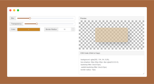
CSS Glassmorphism Generator is a CSS code generate tool designed to simplify the creation of glass-like, see-through effects in web design by adjusting parameters such as background blur, transparency levels, and border finishes.
#CSS Glassmorphism Generator#CSS Glassmorphism Code Generator#CSS Code Generator#free online tools#online tools#web tools#online web tools#online tool#ai tools#a.tools
0 notes