#css border generator
Explore tagged Tumblr posts
Visit Tumblr Blog
Explore Tumblr blogs with no restrictions, modern design and the best experience.
Last Seen Tumblr Blogs


Fun Fact
Mobile Tumblr US users spend an average of 4.04 minutes per session on the app.
Text
am currently working on a neocities site (which i cannot give you the url for yet because im working on the css still and there's no content also it looks ugly still) and oh man does it take me back to ye olde days of custom theme editing on here. i still use a custom theme obvs but back in like 2014/2015ish when i was really into indie rp custom themes were all the rage and you would spend hours editing some character specific image for your bg and then another several hours trying to make the css line up with your image (never at any point did i attempt to actually like. learn html or css. i just read other people's theme codes and edited the parts i could understand and solved problems as they arose. i distinctly remember one time i was using a base that had two sidebars and i only wanted one and deleting the section broke the theme in disastrous ways [bc i had no idea what i was doing] so i literally just made all the elements in the sidebar transparent and moved them off the screen LMAO. the best i ever got was moving from fully built custom themes that i edited to base themes that i built off of)
anyway while im slightly better now (im even reading tutorials! am i following them? sorry i have to go i think someones calling me) i am using a layout builder to build the homepage so it is even more reminding me of mid-2010s tumblr. much like building off a base theme, and definitely easier to understand than tumblr theme building (this time i at least know what all the different pieces of code are doing, even when im not sure how or why, or how to duplicate the effect under slightly different circumstances. but progress is progress!).
a good but annoying thing about the layout that im using is that i havent actually edited the site wide stylesheet, just used internal css on that one page, so when i go to make literally any other page i'll have to start from scratch. this is good because i am learning a lot and i think without doing it this way i would end up with a bunch of useless stuff in the stylesheet that really should be page-specific that i would have to correct with internal or inline css later. annoying because what do you mean i have to make decisions about the sizing and positions of the content? i literally just did that
also im kind of nervous to touch the general stylesheet because im pretty sure what i'll actually want to do is have a couple of stylesheets for different 'sections' of the website, to maintain cohesion between pages of the 'same' type but still allow a lot of fun customization on a per-page basis, but that requires deciding what 'sections' i want on the website and that is a whole other can of worms. but also you can't start without starting so i should probably just try to build a really simple layout and go from there (after all, if it sucks, it's not like i can't just create a new stylesheet, or do the css for each page independently until i hit a groove that's actually worth moving to the stylesheet). but also first i have to finish this goddamn homepage. which means i gotta find a header image that doesn't look ugly as shit
#good idea generator#i dont need a header but im scared of deleting the image in case i break the code and if i go back to the layout maker#i'll have to redo all the code i already did. and im not doing that it was so annoyinggggggg#im having so much fun though. enrichment in my enclosure or whatever#also i found a bunch of my old theme editing stuff while looking for resources and i was like woww i even look like i know what im doing#but ultimately the trick was 90% of my background image should have been css elements instead#like i had a nice box around my content. i should have used a container with a border in the css#but what i did was make a bg img with a box in it already. then try to fit the content to that box#and if youre wondering no i never tested shit all on different screens and i def did not understand positioning#so definitely the boxes did not line up on anyone elses screen. well you live and you learn!
7 notes
·
View notes
Text

Useful websites / links for rentry , bundlrs , gfx & etc for you!
symbol sanatorium - Links to a google document with a ton of symbols , kaomojis & text layouts. I use it for pretty much all of my recent rentrys.
sozaino.site - Website that's been making its rounds on rentry as of late, useful for graphic making. Has dividers, pngs, frames ~ etc if you have the creative touch.
sozai-good - site I found recently that has a lot of pngs you can download, also has frames and borders. In japanese but isn't hard to translate. Everything is also sorted into sections.
lottie lab - Website useful for animating, can be used to move around PNGs for rentry and the like. I don't use it much myself atm, but it's pretty easy to get the hang of.
scripted.neocities - Neocities full of code you can use for bundlrs or carrd. Also useful for stuff like spacehey and other sites that use CSS / HTML
blinkies.cafe - Easily make or find blinkies here! Great for beginners who want to make some simple things.
emojicombos - Search practically anything and you'll find an emoji combo for it. Useful for finding symbol / text combos and kaomojis.
unicode character table - Has pretty much every single symbol you've seen or needed. You can find what you want pretty easily due to its sectioning. Has stuff like arrows , dingbats , brackets , etc etc..
yaytext - Make your text 𝙼𝚘𝚗𝚘𝚜𝚙𝚊𝚌𝚎! or U͟n͟d͟e͟r͟l͟i͟n͟e͟d͟!͟ easily with this website! May possibly break screenreaders in the process though so be warned.
lorem ipsum generator - Too lazy to generate a block of text to make a page look filled out, well look no longer! This site can quickly generate of block of pure gibberish to make it seem like there's actually text there! Good for newspaper / magazine gfx ~
And that's all ( for now )! I use most of all these sites and find them very useful! Hopefully one of them will prove useful to you too dear friend (❁´◡`❁)

#puerileds#text decor#text layouts#websites#sites#pngs#dividers#frames#rentry#bundlrs#carrd#gfx#gfx decor#rentry decor#bundlrs decor#carrd decor#carrd resources#rentry resources#png#divider#gif#rentry stuff#aesthetic#idea#aesthetic bio#bio#discord layout#discord decor#twitter bio#symbols
3K notes
·
View notes
Text
0 notes
Note
Hiya! I found your blog through your neocities website! I was wondering if there’s any tips or things you read/watched that help you make your site. (Im heavily considering making one of my own neocities site it just seems fun)
hihi welcome !! i have quite a few pieces of advice, but the tldr is you should come up with an idea for what you want to make beforehand, and look up how to do each piece! your knowledge will start to fill in along the way :]
(this is probably gonna be long as hell so under the cut is all of the fun stuff /silly)
the way i personally started off was by sketching out what i wanted my site to look like! if you know what you want before you begin, you'll know where to look to figure out what you need to do. html+ css are extremely easy languages to read/write once you know what to look for!
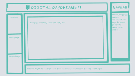
^ this was the original sketch for my site, where i planned out everything i wanted to include. it's a bit different from what actually ended up on the site, but that's alright! it's just about having an outline to work from. i think of it like outlining before you write, it feels like such a pain in the ass because u just wanna start working NOW but u will thank yourself later for taking the time to plan.
once you know what you want to make, start looking for tutorials and resources to make it easier! the grid for my homepage and some of my other subpages was made using a css grid generator, since its one of the more confusing bits of css. you can make grids without it, but its a very easy way to make a more asymmetrical design if ur using the generator!
thats linked here, it gives you some css to put in your head or css sheet, and then the html for the different boxes to slap in your main document. it can be easier to understand what itll look like if you give each one a border while you work, even if its just temporary!
when looking for information about css and html, w3schools is your best friend. its a pretty comprehensive database of every little piece of html + css you could ever need, with examples you can play with yourself to understand what each variable does! it's been a lifesaver for me, ive watched basically zero video tutorials because everything on there is explained so well and you can find basically Anything.
they even have code snippets for things that take more than one or two lines of code, which you can use and adapt yourself! (the tooltips on the official art + my art sections on the hinata shrine were adapted from a tutorial on there!)
in general, having a plan and working from there will make ur life so much easier. the pages that ive sketched out beforehand or ive had a very clear vision for have been WAYY easier to code than the ones i tried to come up with on the fly, and ive been much happier with how they've turned out as well. though i do also have some smaller, rapidfire tips as well that ill go thru now!!
— inline css (the style="" tag) seems so so useful but really should only be used when you're resizing images like buttons. when u keep all of your css in the head or in a seperate document, its way easier to debug and read later. i cleaned up my homepage recently by removing all of the inline css and looking at the code stresses me out WAY less because i can actually read it LOLOL ... plus cutting the css out and putting it in its own document made me realize that id accidentally wrote some really weird code in some places
— this is very much 'do as i say, not as i do,' but use an external editor (like visual studio code) instead of editing live on neocities! you can set up a live preview, and generally wont be pushing out 100 updates every single time you change or add something. i tend to code directly on neocities but its a bad habit and i want to break it eventually v_v
— if you really like an effect someone else has on their site, you can peek using inspect element i promise the coding police won't get you !! dont steal code line for line, but you can figure out what theyre doing and put your own spin on it. things like border images can be really cool, and i only figured out about them because i looked at what someone else was doing and figured out how to adapt it for my own site! check linkbooks and credit sections as well, a lot of people will include links to any effect they didnt make themself or got help with. (including me! the credits section of the linkbook has a ton of little things i got from other places, including a really neat little music player, the rss feed for my status cafe, and the wobbly text on the homepage!)
— most stuff in html and css basically just... says what it does in the tag. so looking stuff up for it is extremely easy! if you've used carrd before you honestly probably already know more abt html than u'd think just intuitively. when ur adjusting the margins or padding in carrd, you're adjusting the margin: and padding: properties in the css of the website it's outputting!
this is getting way too long but!! my best advice is to just get started. you'll never be able to learn without trying, and it genuinely is so fun to have something that's truly your own!
(if u have any specific questions im happy to answer anytime as well! i love talking abt neocities, its a super fun hobby and way easier to pick up than u would think!)
#originals.txt#inbox.txt#neocities.zip#god im so sorry abt how long this is i havent had time to work on the site for a while and its getting to my head /silly
6 notes
·
View notes
Text
Updating the cities generator - it's the only generator that hasn't received a major content update this year, and it needs the CSS update - and whoof, yeah, this is stranger than I could have imagined:
the city is underground, and it is stranger than you could ever have dreamed. it has two suns. prominent here is an eternal storm. this city is built mainly of grasses, in a plain style, and it was once far larger, its borders still marked by fire. a notable landmark is a golden college. currently, the city is in a time of social mobility.
6 notes
·
View notes
Note
Should I make a neocities this week
I'll have a lot of free time after tomorrow since no more midterms or quizzes until after thanksgiving
YES!!!!!!!! u saw my insta story teehee. i have so many fucking links saved for website stuff if u have any questions at all ask me! i may not be able to solve hard html problems but i know general css.
heres some links to get you started, idk ur level of coding so ill throw whatever at you!! you took computer class youll do great
w3schools library of html/css tutorials. good for learning how to do little things and the basics
sadgrls links links for general websitery. includes a free layout template to tinker with!
scripted neocities where i get more cosmetic codes. tons of fun borders fonts and containers
pixelsafari a hoard of cute pixel art. includes dividers stamps teeny pixels and more
lmk if you need anything bro if you decide to make one im excited to see whatever orange thing you produce
10 notes
·
View notes
Note
Hi! I love your neocities page! I'm so sorry to bother but I was curious how you got the two boxes/div right next to each other on your hatchetfield shrine. I for the life of me can not figure it out 😭 TYSM
thank you so much!!
here's one way to get two divs to sit side-by-side. there are other methods, but this one is simple and easy to slap together when i don't want to deal with containers and flexboxes and all that jazz.
each div has two classes, a generic "box" and then either "boxleft" or "boxright" depending on which side it's on. like this:
<div class="box boxleft"> the stuff in the left box goes here! </div> <div class="box boxright"> the stuff in the right box goes here! </div>
then, in my css, i have this code:
.box { width: 50%; margin: 0; box-sizing: border-box; } .boxleft { float: left; } .boxright { float: right; }
width and margin are pretty self-explanatory, keeping each box 50% of the page's (or its container's) width and making sure there's no space around them.
box-sizing: border-box makes sure that even if you add padding or a border to the div, the div won't go over 50%. if you don't have this, adding 5px of padding will grow the boxes a little bigger and they won't be next to each other anymore.
the float on each separate box just tells them what side to be on. if a box is smaller than 50%, or if you only have one box, it will hug the left/right side.
and then of course, you can add any colors or styles that you want to any of the box classes, like if you want them to have unique backgrounds. but i'm a simple guy, so my boxes use the plain ol' style i have everywhere else.
i hope that makes sense!! feel free to ask any more questions about my site, coding is fun and i like talking about it :]
2 notes
·
View notes
Text
okay updates (01/16/24):
separated the header, navbar, and body into separate boxes, added padding between them
general background color and border changes
tried to fix alignment of navbar, header, and body, with mixed results ;; will need to fix.
changed fonts! still want to import better ones though.
fixed width and height of body and added scrollbar so it will scroll!! very cool!
i did not realise how late it was getting TT_TT lost in the css sauce. im proud of myself for figuring out this stuff!! thank you once again alice for your advice,, has been very helpful :)
next things i want to do:
making the navbar have buttons instead of uhh. hyperlinked text.
adding images and decorations!! especially ones outside the "body",, i need to cover my page in stickers. much like my laptop and phone irl.
making the other pages appear "within" the body of the main page, instead of linking to a different page entirely. this will take some doing.
#PROGRESS YAY#ocean's coding misadventures#however it seems on the actual neocities site my changes arent syncing so maybe wait for a bit....
2 notes
·
View notes
Note
hiii I love ur neocites 🎶 the stones r so soft & pretty 🥺 I'm building one rn & hope it can look as nice as urs 💙
Thank youuuuuuuuu <3 I was going for a sea glass kind of look in pure CSS (+ one texture i made myself) ^.^!

this one was very helpful too, border radius blob generator
have a lot of fun with yours!
4 notes
·
View notes
Text
I came across this website where you like? enter anything and it'll do it with AI. so i told it to show me a picture of a really good sandwich.
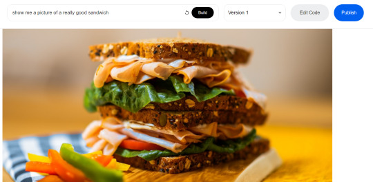
and what it did was generate code that would get a random photo of a sandwich from some photo website. (The images are not AI generated). It automatically generates that description too.
So then i told it to write javascript code for a game of pong (I'll paste the code at the end of this post) and it gave me this:
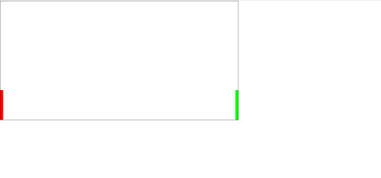
which does nothing. And idk why but I was kinda scared it would actually deliver me a functioning game lol. Probably bc it would take me at least an hour to code a simple pong game, when this generated in 30 seconds.
So i launched the code in vsc and it DOES do something. the ball bounces around but it made the ball white for some reason? so this is what it does after only changing the ball color.
and look at the code, its all formatted and commented and stuff. And i mean, it looks like its at least 85% there, it just needs movable paddles and fixing the ball to bounce into the side walls.
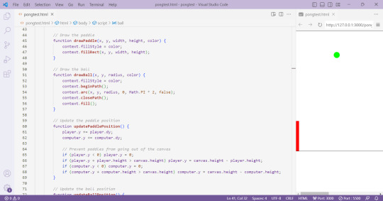
idk i just think this is pretty cool. and now i will be fixing this ai code into a working pong game
Here is the ai generated pong code:
<html>
<head>
<link rel="stylesheet" href="https://cdn.jsdelivr.net/npm/[email protected]/dist/css/bootstrap.min.css">
<script src="https://cdn.jsdelivr.net/npm/[email protected]/dist/js/bootstrap.min.js"></script>
</head>
<body>
<canvas id="pong" width="800" height="400" style="border:1px solid #000000;"></canvas>
<script>
// Create the canvas element
const canvas = document.getElementById("pong");
const context = canvas.getContext("2d");
// Create the paddle
const paddleWidth = 10, paddleHeight = 100;
const player = {
x: 0,
y: canvas.height / 2 - paddleHeight / 2,
width: paddleWidth,
height: paddleHeight,
color: "#FF0000",
dy: 8
};
const computer = {
x: canvas.width - paddleWidth,
y: canvas.height / 2 - paddleHeight / 2,
width: paddleWidth,
height: paddleHeight,
color: "#00FF00",
dy: 4
};
// Create the ball
const ball = {
x: canvas.width / 2,
y: canvas.height / 2,
radius: 10,
speed: 4,
dx: 4,
dy: 4,
color: "#FFFFFF"
};
// Draw the paddle
function drawPaddle(x, y, width, height, color) {
context.fillStyle = color;
context.fillRect(x, y, width, height);
}
// Draw the ball
function drawBall(x, y, radius, color) {
context.fillStyle = color;
context.beginPath();
context.arc(x, y, radius, 0, Math.PI * 2, false);
context.closePath();
context.fill();
}
// Update the paddle position
function updatePaddlePosition() {
player.y += player.dy;
computer.y += computer.dy;
// Prevent paddles from going out of the canvas
if (player.y < 0) player.y = 0;
if (player.y + player.height > canvas.height) player.y = canvas.height - player.height;
if (computer.y < 0) computer.y = 0;
if (computer.y + computer.height > canvas.height) computer.y = canvas.height - computer.height;
}
// Update the ball position
function updateBallPosition() {
ball.x += ball.dx;
ball.y += ball.dy;
// Reverse the ball direction if it hits the top or bottom wall
if (ball.y + ball.radius > canvas.height || ball.y - ball.radius < 0) {
ball.dy *= -1;
}
// Check if the ball hits the paddles
if (
ball.y + ball.radius > player.y &&
ball.y - ball.radius < player.y + player.height &&
ball.dx < 0
) {
if (ball.x - ball.radius < player.x + player.width) {
ball.dx *= -1;
}
}
if (
ball.y + ball.radius > computer.y &&
ball.y - ball.radius < computer.y + computer.height &&
ball.dx > 0
) {
if (ball.x + ball.radius > computer.x) {
ball.dx *= -1;
}
}
}
// Draw the game
function draw() {
// Clear the canvas
context.clearRect(0, 0, canvas.width, canvas.height);
// Draw the paddles
drawPaddle(player.x, player.y, player.width, player.height, player.color);
drawPaddle(computer.x, computer.y, computer.width, computer.height, computer.color);
// Draw the ball
drawBall(ball.x, ball.y, ball.radius, ball.color);
}
// Update the game
function update() {
updatePaddlePosition();
updateBallPosition();
draw();
}
// Game loop
function loop() {
update();
requestAnimationFrame(loop);
}
loop();
</script>
</body>
</html>
4 notes
·
View notes
Text

Here is the image we use for the border frame on the website https://wearyourdictionary.blogspot.com/, as of June 2025. It’s a free-to-use image.
Below is the portion of CSS where we apply the border frame image:
.main-content { flex-grow: 1; width: 100%; max-width: 100%; padding: 20px; margin: 0 auto; background-color: var(--color-background); border-radius: 8px; border-width: 20px; border-style: solid; border-image-source: url('https://i.imgur.com/WWCGIdJ.png'); border-image-slice: 40%; border-image-repeat: stretch; box-sizing: border-box; }
.sidebar { position: sticky; top: 40px; left: -250px; padding: 20px; background: #131314; border-radius: 8px; color: #ececeb; height: fit-content; max-width: 280px; flex-shrink: 0; margin-left: calc(-1 * var(--sidebar-width) - var(--padding-general) + 110px); margin-right: var(--padding-general); border-width: 20px; border-style: solid; border-image-source: url('https://i.imgur.com/WWCGIdJ.png'); border-image-slice: 40%; border-image-repeat: stretch; transition: font-size 0.3s ease; box-shadow: none; width: 250px; height: 100%; }
The full code, including a breakdown and the Blogger XML file, is freely available here: 👉 https://github.com/WearYourDictionary/wear-your-dictionary-blogger-theme
0 notes
Text
0 notes
Text
CSS 58 💻 Cheatsheet
New Post has been published on https://tuts.kandz.me/css-58-%f0%9f%92%bb-cheatsheet/
CSS 58 💻 Cheatsheet

youtube
Basic Selectors Element Selector: Targets elements by tag name. `p color: blue; ` Class Selector: Targets elements with a specific class. ` .highlight background-color: yellow; ` ID Selector: Targets an element with a specific ID (unique). ` #main-title font-size: 36px; ` Universal Selector: Applies to all elements. ` * margin: 0; padding: 0; ` Attribute Selector: Targets elements with specific attributes or attribute values. `[type="text"] border: 1px solid black; ` Combinators Descendant Combinator (Space): Selects elements that are descendants of another element. ` div p color: red; ` Child Combinator ( ): Selects direct children of an element. ` ul li font-weight: bold; ` Adjacent Sibling Combinator (+): Selects the element immediately following another element. ` h1 + p margin-top: 20px; ` General Sibling Combinator (~): Selects all siblings that follow another element. ` h2 ~ p font-style: italic; ` Box Model Margin: The space outside the border. ``` margin: 10px; margin-top: 20px; margin-left: 30px; margin-right: 40px; margin-bottom: 50px; ``` Padding: The space inside the border. ``` padding: 10px; padding-top: 20px; padding-left: 30px; padding-right: 40px; padding-bottom: 50px; ``` Border: The line around an element. ``` border: 1px solid black; border-width: 2px; border-style: dashed; border-color: red; ``` Width/Height: Sets the width and height of an element. ``` width: 300px; height: 200px; ``` Typography Font Family: Specifies the font family for text. `font-family: Arial, sans-serif;` Font Size: Sets the size of the font. `font-size: 16px;` Font Weight: Controls the boldness of the font. ` font-weight: bold;` Text Align: Aligns text within an element. ` text-align: center;` Background Background Color: Sets the background color of an element. `background-color: #f0f0f0;` Background Image: Sets a background image for an element. `background-image: url('image.jpg');` Background Repeat: Controls how the background image is repeated. `background-repeat: no-repeat;` Background Position: Positions the background image within an element. ` background-position: center;` Display Display Block: Makes an element take up the full width available and start on a new line. ` display: block;` Display Inline: Allows elements to sit next to each other horizontally. ` display: inline;` Display Inline-Block: Combines both inline and block properties. ` display: inline-block;` Display Flex: Creates a flex container for child elements. `display: flex;` Display Grid: Creates a grid container for child elements. ` display: grid;` Positioning Position Static: Default value. Elements are positioned according to the normal flow of the document. ` position: static;` Position Relative: Moves an element relative to its normal position. ``` position: relative; top: 20px; left: 30px; ``` Position Absolute: Positions an element relative to the nearest positioned ancestor (not static). ``` position: absolute; top: 50px; right: 100px; ``` Position Fixed: Keeps an element in a fixed position even when scrolling. ``` position: fixed; bottom: 20px; left: 30px; ``` Flexbox Flex Direction: Defines the direction of the main axis (row or column). ``` flex-direction: row; /* Default */ flex-direction: column; ``` Justify Content: Aligns items along the main axis. ``` justify-content: flex-start; /* Default */ justify-content: center; justify-content: flex-end; justify-content: space-between; justify-content: space-around; ``` Align Items: Aligns items along the cross axis. ``` align-items: stretch; /* Default */ align-items: flex-start; align-items: center; align-items: flex-end; ``` Grid Grid Template Columns: Defines the number and size of columns in a grid container. ` grid-template-columns: repeat(3, 1fr);` Grid Template Rows: Defines the number and size of rows in a grid container. ` grid-template-rows: auto;` Justify Items: Aligns items along the row axis within their grid area. ``` justify-items: start; /* Default */ justify-items: center; justify-items: end; justify-items: stretch; ``` Align Items: Aligns items along the column axis within their grid area. ``` align-items: start; /* Default */ align-items: center; align-items: end; align-items: stretch; ``` Other Useful Properties Color: Sets the color of text. ` color: #333333;` Opacity: Sets the opacity level of an element. ` opacity: 0.5;` Margin/Padding: Controls the space around or inside an element. ``` margin: 10px; padding: 20px; ``` Box Shadow: Adds a shadow effect to an element. ` box-shadow: 2px 4px 6px rgba(0, 0, 0, 0.5);` Transform: Applies 2D or 3D transformations to an element. ` transform: rotate(90deg);`
0 notes
Text
Learn How to Build a WordPress Block Theme Style Variation — Speckyboy
New Post has been published on https://thedigitalinsider.com/learn-how-to-build-a-wordpress-block-theme-style-variation-speckyboy/
Learn How to Build a WordPress Block Theme Style Variation — Speckyboy
WordPress block themes offer plenty of flexibility. You can make style and layout changes within your web browser – no coding knowledge is required. They can also include extras like block patterns and style variations.
Style variations give you a head start on design. They allow us to create multiple color and typography combinations. They also house custom block styles defined in the Site Editor. Anything in a theme.json file can also be included in a style variation.
This is handy for web professionals and users alike. Choose the variation that suits your needs and start building your site.
Creating a custom block theme style variation is easier than you think. The entire process takes place in the WordPress Site Editor. A simple variation can be built in minutes.
So, follow along as we build a style variation! We’ll show you how to point and click your way to a custom design.
Style Variation Project Requirements
The requirements for building a custom style variation are minimal. You’ll need:
We don’t recommend using a production website for this process. A staging or local WordPress installation is the safer way to go.
Let’s Build a Style Variation
Now, it’s time to start building! Log in to your WordPress website and follow the steps below.
Step 1: Open the WordPress Site Editor
First, navigate to Appearance > Editor in the WordPress admin to open the Site Editor. Then, click the Styles link in the left sidebar.
The Styles panel includes links for Typography, Colors, Background, Shadows, and Layout. You’ll also find a Browse Styles link that displays available style variations for the theme.
Finally, the Blocks link allows you to customize individual block styles across the site.
Step 2: Change Your Theme’s Styles
This step is all about personal preference. Work your way through the Styles panel and start making changes.
Color and typography are the most obvious changes, but you can take things further. For example, you can change the layout width and spacing. Plus, every block included with WordPress can be customized. Add margins, padding, borders, or custom CSS.
We covered the basics in our variation, including:
Created a custom color palette;
Installed new fonts from Google Fonts;
Added custom spacing for the Group and Paragraph blocks;
Changed the look of the Button block;
The result is an earthy look that aims for simplicity. But you can do as much or as little as you like. Just remember to save your changes when done.
Step 3: Save Your Style Variation
Our next task involves saving our custom style variation. This functionality is part of the Create Block Theme plugin.
The feature is located within the Site Editor. Here’s how to find it:
While in the Site Editor, click on the right panel, highlighted in green below:
Click the wrench icon on the upper right of the screen and select Create Theme Variation:
Name the variation and ensure the Save Fonts box is checked. We’ll call ours “Beautiful Earth.”
Click the Create Theme Variation button to save the settings.
Once saved, the new variation is added to the list in the Browse Styles area of the theme editor. Hovering over the variation reveals its name.
How to Use Your Style Variation on Another Site
Style variations are portable and can be used on multiple websites. The process involves copying the generated JSON file and adding it to the desired site.
Locate the style variation’s JSON file in /wp-content/your-theme/styles/ Replace your-theme with the name of the theme you’re using (ours is twentytwentyfive).
For reference, our JSON file is called beautiful-earth.json
Copy your style variation’s JSON file.
On your new website, paste the file into /wp-content/your-theme/styles/ – you may need to upload the file via SFTP or your web host’s file manager.
You’ll now be able to choose the style variation within the Site Editor.
About Custom Fonts
Earlier, we mentioned the ability to add custom fonts to a style variation. It requires a few extra steps to work when moving your variation to a new site.
Locate the custom fonts you added at /wp-content/themes/your-theme/assets/fonts/
Copy each font’s respective folder.
Paste the font folders into the same directory on your new site. Once again, you may need to upload them.
Give Your Block Theme a Custom Look
Style variations are a convenient way to add personality to your block theme. You can build them to suit your project requirements.
They also act as a starting point for designers. You can continue to add custom styles after applying a variation. The changes you make will be saved in the site’s database.
There’s also an option to reset the styles to the variation’s defaults. That makes it easy to experiment without losing the key elements of your design.
The best part is that style variations don’t require coding expertise. That puts custom design within everyone’s reach.
Related Articles
Related Topics
Written by Eric Karkovack
Eric Karkovack is a web designer and WordPress expert with over two decades of experience. You can visit his business site here. He recently started a writing service for WordPress products: WP Product Writeup. He also has an opinion on just about every subject. You can follow his rants on Bluesky @karks.com.
Read more articles by Eric Karkovack
#ADD#admin#Articles#assets#background#borders#box#browser#Building#Business#change#coding#Color#colors#content#CSS#Database#Design#designers#displays#earth#easy#folders#fonts#Google#google fonts#green#how#how to#How to Use
1 note
·
View note
Text
Why Hiring Front End Developers from India Can Save You 60% on Development Costs

Hiring front end engineers from India is more important than ever as companies try to increase their tech expenses without sacrificing quality. Lower hourly rates aren’t the only thing at stake. You get time zone flexibility, experience working with international teams, and access to a vast pool of highly qualified individuals.
The cost savings — often up to 60% — cannot be disregarded when businesses look at the facts. However, why is India such a hub for front-end knowledge? And when hiring from overseas, how can tech companies be confident they’re getting quality and value?
Let’s examine the real factors that contribute to this hiring strategy’s effectiveness.
Outsourcing Front-End Development to India Isn’t Just a Budget Move — It’s a Strategic Advantage.
Lower Salaries, Same Skill Set
When you hire front-end developers from the United States they typically make between $90,000 and $120,000 a year. You may recruit engineers in India with comparable skill for a fraction of the price, usually between $25,000 and $35,000 annually.
Without compromising skill, that represents a possible cost reduction of 60–70%. React, Angular, Vue.js, TypeScript, and CSS frameworks like Tailwind or Bootstrap are among the contemporary tech stacks that Indian developers are proficient in. Many have experience working with international teams and are familiar with industry-standard coding techniques.
This pay disparity provides an instant benefit for startups hoping to grow rapidly or for digital enterprises with limited funding.
Access to a Massive Talent Pool
Every year, India generates more than 1.5 million engineering graduates. A large percentage of them acquire experience early on by working with clients from other countries, and many of them specialise in front-end technology.
Hiring front end developers from India gives you access to a workforce that has experience working with businesses all around the world to solve real-world issues. Fast ramp-up periods, little onboarding friction, and developers skilled in creating user-centric, responsive interfaces are all results of this.
It can take months to recruit qualified developers in highly competitive hiring areas like the US or Europe. You can get qualified specialists more quickly by outsourcing to India, particularly if you decide to work with reputable platforms or firms to hire remote developers.
Time Zone Advantage = Continuous Development
The time zone offset is another overlooked advantage. You receive development that is nearly constant because Indian teams frequently work while your U.S.-based team is asleep. It is possible to repair bugs overnight. By morning, new features can be pushed.
This “follow-the-sun” approach to development speeds up product schedules for a lot of tech companies. As you’re offline, progress occurs rather than waiting for a local team to log in. When properly managed, this asynchronous collaboration leads to smoother launches and quicker deliverables.
Quality Control and Communication
The days of outsourcing resulting in poor code quality and ambiguous specifications are long gone. Indian front-end engineers today speak English fluently and are very conversational. Because of their familiarity with platforms like Figma, Jira, Git, and Slack, collaboration is simple and clear.
However, selecting developers with foreign client expertise is essential. Seek out portfolios that incorporate cross-browser compatibility testing, SPAs (Single Page Applications), and responsive websites.
Final Thoughts
Hiring front end developers from India is a wise choice for businesses that seek speed, skill, and savings without sacrificing quality. It’s not only a way to save costs. More software businesses are realising that great programming transcends borders as remote work becomes more popular. And with cost savings of up to 60%, the choice is self-evident.
0 notes
Text
ToolsToEdit.in – Your Ultimate Free Toolkit for Everyday Digital Tasks
In today’s fast-moving digital world, being productive means using the right tools at the right time. But what if you could access over 30+ essential online tools in one place—without paying a cent? That’s exactly what ToolsToEdit.in offers: a centralized, no-cost platform built for students, teachers, professionals, content creators, and anyone who wants to get things done—fast and efficiently.
🌐 What Is ToolsToEdit.in?
ToolsToEdit.in is a multi-purpose online toolkit that combines the functionality of dozens of individual tools into one convenient, browser-based hub. From quick calculations to SEO audits, PDF conversions to text clean-up—this platform is designed to simplify your work, save you time, and help you perform complex tasks with just a few clicks.
👥 Who Is It For?
This site isn’t just for techies or web developers. ToolsToEdit.in is built for everyday users:
🎓 Students can calculate percentages, solve EMI questions, or convert between binary and text.
👨🏫 Teachers can create resources, check text readability, or compress files.
🧑💻 Content Creators & Bloggers can analyze SEO, clean content, and manage PDFs.
👥 General Users can generate strong passwords, spot phishing links, and much more.
🔧 Key Tool Categories and Features
Here’s a breakdown of what ToolsToEdit.in offers:
🧮 Calculator Tools
No need for separate apps—just launch and use:
BMI Calculator – Check body mass index.
Discount Calculator – Know how much you’re saving.
EMI Calculator – Plan your finances smartly.
Age Calculator – Get accurate age from date of birth.
Percentage Calculator – Solve quick percentage problems.
✍️ Text Utilities
Content handling made easy:
Word Counter – Know your length before publishing.
Case Converter – Switch between uppercase, lowercase, and more.
Remove Duplicate Lines – Clean up large text files.
Find & Replace – Mass replace words or phrases.
Binary ⇄ Decimal/Text Converters – Useful for coding and education.
Text Encoder/Decoder – Encrypt and decode web-safe content.
🔐 Security Tools
Keep your data secure:
Password Generator – Create complex passwords.
Password Strength Checker – Test how secure your password is.
Phishing URL Detector – Protect yourself from scams.
🔍 SEO Optimization Tools
Get your website found:
Meta Tag Analyzer – Improve search engine visibility.
Mobile-Friendly Test – Make sure your site works on smartphones.
Page Speed Analyzer – Identify and fix performance issues.
Sitemap Generator – Generate XML sitemaps for indexing.
Keyword Density Checker – Analyze your content for keyword balance.
Robots.txt Generator – Guide search engine bots effectively.
🎨 Design & Image Tools
Handy for bloggers, designers, and developers:
Color Picker Tool – Find and copy hex codes easily.
CSS Gradient & Animation Previews – Visualize effects before using them.
Box Shadow & Border Radius Preview – Quick CSS styling helpers.
Image Compressor – Reduce image file sizes without losing quality.
Image to Base64 Converter – Embed images in web code.
Image Color Picker – Get exact color details from any picture.
📄 PDF Tools
Manage documents like a pro:
Merge PDF Files – Combine multiple documents into one.
PDF to Image/Text/Word – Convert PDFs into different formats.
Image to PDF Converter – Make professional documents from images.
💡 Why ToolsToEdit.in Stands Out
✅ No Installations: Everything runs right in your browser.
✅ Free Forever: No subscriptions, no sign-ups, no hidden fees.
✅ Mobile-Friendly: Use it seamlessly across devices.
✅ Time-Saving: Get tasks done in seconds.
✅ Clean UI: Easy to use even for beginners.
📢 Final Thoughts
In a world of scattered tools, ToolsToEdit.in brings clarity and convenience. Whether you're a digital marketer doing an SEO audit, a student calculating your GPA, or a teacher preparing resources—this site empowers you to work smarter, not harder.
Visit www.toolstoedit.in and explore the full suite of tools today. It’s time to edit, create, calculate, optimize, and convert—all in one place.
1 note
·
View note