#css button hover effects
Explore tagged Tumblr posts
Visit Tumblr Blog
Explore Tumblr blogs with no restrictions, modern design and the best experience.
Last Seen Tumblr Blogs


Fun Fact
Tumblr.com rank in the US is 25.
Text
CSS Button Border Animation
#css button hover effects#html css#codenewbies#frontenddevelopment#html5 css3#css animation examples#pure css animation#css animation tutorial#webdesign#css#css button border animation#animation
6 notes
·
View notes
Text
CSS Glowing Button
#html css buttons#css button hover effects#html css#neduzone#css gradient#css glowing buttons#css animation examples#glowing button html css#css#html#css3#frontend#frontenddevelopment
0 notes
Text
CSS Social Media Button Hover
#html css#css button hover effects#animated social media buttons#button hover animation css#css animations#css animation tutorial#css animation examples#divinectorweb#code#css#html#css3#webdesign
0 notes
Text
neocities heracles trials: from a chaotic newbie
okay so i want to actually start posting here and i finally got it through my thick skull that this is LITERALLY A BLOG. i'm supposed to blog. so here's a blog post.
anyways, for context, i've been working on my neocities for a while now, recently started over to make things more original and more me. another thing to note is that i'm using VScode.
the issue here is that i have zero well not exactly zero but i lack any professional/academic background experience with making websites. the html isn't the issue (thankfully) but holy shit dude...css+javascript implementation . basic styling with css is no biggie, right? absolutely, however...may i introduce: smooth transitions + the absolutely tragic fact that the <marquee> tag is deprecated an accessibility issue.
so, my first goal day one was to recreate a marquee animation through css. so i tried to simply implement this incredibly useful bit of code into my site (in which if you're interested i totally think my failure to get it working was user error so please check it out it works great if you're not me) but, lo and behold, despite me getting it to work in my V1 project, i could not, for the life of me, get it to work. so i, not too familiar with css animation and completely lost when it comes to javascript, started grasping at straws. i ended up finding this tutorial and, with some improvisation since the tutorial is for webflow and i'm manually writing everything, managed to make my own css recreation of a marquee effect essentially from scratch, and even learned about the animation-play-state css attribute so i could pause the effect when the marquee is hovered over! victory, basically.

then, i looked around the many cool and absolutely awesome sites on neocities to get inspiration, and then i was like "hey what if i made a custom button background image" and with some trial and error, made myself a pretty decent base (for now) with aseprite, and learned more about the program in the meantime which is always a plus.
then i decided that i wanted to do more with the buttons. i wanted to make it animate on hover. not too hard right? you'll...you'll see why i struggled...in a moment...
anyways, i settled on a simple shrink animation. which THIS i could do with ease, messed around a bit, got the keyframes, assigned that to the button:hover and all of that and all was good!...until i realized that once i stopped hovering over it, it snapped back to its original scale instead of transitioning smoothly again. THIS is where the "fun" began.
see, although i can wrap my head around things easily when it comes to css, i have to constantly look up what the proper syntax for everything is because otherwise i'll mess everything up. and through my research i had conducted (aka surfing through multiple blogs and reddit posts alongside other things on random forum websites) i had discovered the very neat transition attribute.
but we'll have to return to this because i have adhd, and i ended up getting distracted during this process. see, originally i had decided that the button would change it's visual to appear like it was pressed when the user's mouse hovered over it. then i was like "i don't think this makes sense" so i changed it so that the button wouldn't change its background image unless the user actually clicked on it. so i did that. then i had to make sure that the button wouldn't magically scale up again so i had to transform the styling and blah blah blah those details aren't really that important ANYWAYS the actual important bit about this is that if you use the transition attribute and there's a change in background images that change will also be transitioned unless you set the transition to only apply to a specific change. and i didn't know that originally. so every time i tried to fix things up with a transition so the button wouldn't snap back to it's original size out of nowhere the background would slooowly change as well and i actually got so frustrated with this that i wanted to burn something down because that's a totally normal reaction i guess. anyways, then i started frantically searching for answers on the topic and EVERY. SINGLE. THING. THAT I FOUND. INCLUDED JAVASCRIPT.
i do not know javascript. i have not learned anything about it unlike css and html. it SCARES me and it is FRUSTRATING. but i thought i'd try it anyways. news flash that shit didn't work at all and i almost thought about scrapping the animation entirely especially when it randomly stopped working when i made certain changes, but i ended up eventually figuring out what i mentioned earlier (CSS transitions and the fact that you can assign them to only affect a specific change instead of everything) so with some dabbling here and there i eventually managed to finally figure out how to make everything smooth through pure css and although it still snaps if the element hasn't finished animating i'm happy with it.

moving on to another thing, i wanted to then make a sound effect play when you click the button. yes, we are still talking about buttons. THIS i could not do with css, like, at all. javascript admittedly is for interactivity and i had already been bending the rules quite a bit with the animations since those teechnically should've been done with javascript as well but this? this was impossible without javascript. so i found a free mp3, and searched up a nice little tutorial on the very basics of javascript.
little did I know that apparently, this would be my own personal little hell.
see, no matter how many times i tried a different script, the sound just would not work like at all. i'd do everything in what i assumed to be the correct way, and no matter what, it would not play. knowing that i'd just have to revisit this, i decided it was best to just sort of put it on the back burner.
and this is where i wish i could say this is the end of my absolutely gobstopping rant. however, i cannot.
see, one thing that i really like that i've seen in a lot of other people's sites is draggable windows. i think they're sick. but this ALSO requires javascript, but i didn't think this could POSSIBLY be that bad since so many people did it.
...right?.......right? guys. right?
MOTHERFUCKER I WAS SO WRONG.
see, it turns out that a lot of people do this sort of thing with jQuery, specifically for user interfaces. but vscode doesn't have a "user friendly" way to get jquery to work with it. and because i don't want to mess with program files, i decided that logically speaking jquery just makes writing things in js scripts less complicated and doesn't introduce things that are impossible in vanilla javascript so i decided i could suffer a little bit and try and do things without jquery.
this led me to looking at many sites with draggable windows to look at their own scripts, in which every single time i tried replicating things i FAILED.
i eventually stumbled upon a nice code that worked. but the issue with it - in which unfortunately i can't find it, else i'd link it - is that it works with not only element classes but also a specific ID. see, this would be fine if i only wanted ONE draggable element. but i want multiple. and i thought that maybe if i just duplicated the script and dedicated it to a different ID and changed function names it would work but nooo life cannot be this easy apparently. so after setting up my webmaster status window, getting that to work, i tried doing the aforementioned method for what will eventually be a guestbook of sorts. it failed.
so i decided, "hey i'll revisit this later!!" and i went on to finding a way to implement a status widget into my site. this honestly was really easy as i ended up stumbling upon status.cafe . so i registered, eventually got my account activated, and i got it working in my live port of vscode just fine!! all is good in the world.
well that's what i thought until i found out that since i had created my neocities account in march of 2024, and i'm unemployed since i'm still in high school hence i have a free account, that i could not. use the widget. in neocities. so i tried finding a work around, found this handy guide (which is genuinely useful by the way) and set up things through a RSS feed instead which is essentially just a work around that complies with the security restrictions of neocities that i'm bound by. anyways, this works great but i literally just can't customize it to how i want so this is another fail. then i find imood.com which, although is NICE, doesn't suit what i want on its own. so i'm at a loss here too.
so, again, another thing to put to the side i suppose.

so i started working on getting my guestbook, browsed through people's homepages again, and found chattable . and you probably think i have another paragraph complaining about this but honestly i can't write about something when i can't figure out how to even create a chat to implement onto my site in the first place so...y'know.
plus, i honestly have no clue if it'll work on my site either due to security restrictions so this is fun!!
anyways, after dealing with all of this, i finally decided it was about time i ported what i had so far over onto my neocities account. which isn't actually that hard i just had to wipe all of my files, overwrite the content in my index.html file there and paste in what i have now, and then upload my new files. but for some god awful reason after i went through all of this chrome just. kept depending on my old stylesheet??? so i had to clear some of my browsing data and eventually everything was loading properly for me.
and THIS is finally the end of my ridiculous documentation concering my neocities adventure so far.
i have no doubts i'll end up ranting here AGAIN about all of this but for now this is all i have on my plate...besides finally caving and learning javascript for real and continuing to learn more about html and css. hopefully one day i'll stop having such frequent issues but now is not the time and i doubt that'll be anytime soon either.
moral of the story, if you want to start something new and pick up a new hobby, please for the love of all that is of substance in this world don't go in completely blind like i've done if you're going to be making a project of some sorts. it will only lead to many misfortunes.
anyways you can see what i currently have done in my neocities here, make suggestions or give advice in the notes and whatnot i don't know.
#neocities#rant post#rant#coding#web development#geocities#html#html css#htmlcoding#css#javascript#losing my mind#holy shit#send help
6 notes
·
View notes
Text
How to Create Mobile-Friendly Websites with Responsive Design
In today’s digital era, where mobile devices dominate web traffic, creating mobile-friendly websites has become more important than ever. As users increasingly access the internet through smartphones and tablets, businesses must ensure their websites are optimized for a seamless mobile experience. This is where responsive design comes into play. At Nividaweb, a leading responsive web design agency in Vadodara, we specialize in crafting websites that look and perform flawlessly on any device.
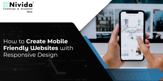
Here is a comprehensive guide on how to create mobile-friendly websites with responsive design:
What is Responsive Design?
Responsive web design is a design approach that ensures a website's layout and content adapt dynamically to different screen sizes and resolutions. Whether your users are browsing on a desktop, tablet, or smartphone, a responsive website delivers a consistent and user-friendly experience. This adaptability is essential for improving user engagement, reducing bounce rates, and enhancing overall website performance.
Why Responsive Design Matters?
Before diving into the how-to, let us understand why responsive design is crucial:
Improved User Experience: A responsive website ensures that users can navigate and interact with your site effortlessly, regardless of their device.
Higher Search Engine Rankings: Search engines like Google prioritize mobile-friendly websites in their rankings, making responsive design a key factor in SEO.
Increased Conversion Rates: With a user-friendly interface, responsive websites encourage visitors to stay longer and take action, boosting conversions.
Cost-Effective Maintenance: Instead of maintaining separate websites for desktop and mobile users, a responsive design simplifies updates and reduces costs.
Steps to Create a Mobile-Friendly Website with Responsive Design
1. Start with a Mobile-First Approach
The mobile-first approach involves designing the website for smaller screens first and then scaling up for larger devices. This method ensures that the core elements are optimized for mobile users. A responsive web design company in Vadodara like Nividaweb emphasizes this approach to ensure a seamless user experience on all devices.
2. Use a Flexible Grid Layout
A flexible grid layout is the foundation of responsive design. It allows website elements to adjust proportionally based on the screen size. Instead of fixed-width layouts, use percentages and relative units like ems or rems to define dimensions. This ensures that your website adapts smoothly to different screen resolutions.
3. Optimize Images and Media
Large images and media files can slow down your website, especially on mobile devices. To enhance performance:
Use responsive images that scale according to screen size.
Implement modern image formats like WebP for better compression.
Use CSS media queries to serve appropriate image sizes based on the user’s device.
At Nividaweb, a trusted responsive website design company in Gujarat, we leverage advanced tools to optimize images and improve loading times.
4. Implement CSS Media Queries
CSS media queries are essential for responsive design. They enable you to apply specific styles based on the device’s characteristics, such as screen width, height, or resolution.
5. Prioritize Touch-Friendly Navigation
Mobile users interact with websites using touch gestures, so it is essential to design navigation that is easy to use. Key considerations include:
Larger buttons and clickable areas.
Simplified menus with collapsible options for smaller screens.
Avoiding hover-dependent features, as they do not work well on touch devices.
6. Test on Multiple Devices and Browsers
Testing is a critical step in creating a mobile-friendly website. Use tools like Google’s Mobile-Friendly Test and browser developer tools to simulate various devices and screen sizes. Additionally, test your website on physical devices to identify and resolve any usability issues.
7. Ensure Fast Loading Times
Mobile users expect websites to load quickly. A slow-loading site can lead to higher bounce rates and lost opportunities. To optimize loading times:
Minimize HTTP requests by combining CSS and JavaScript files.
Enable browser caching and compression.
Use a Content Delivery Network (CDN) to deliver content faster.
As a responsive web design company in Vadodara, Nividaweb employs performance optimization techniques to ensure your website loads swiftly across all devices.
8. Leverage Responsive Typography
Typography plays a crucial role in readability and user experience. Use scalable fonts that adapt to screen sizes and maintain legibility on smaller devices. Tools like CSS’s viewport units (e.g., vw, vh) can help create fluid typography that adjusts dynamically.
9. Incorporate Mobile-Friendly Features
Enhance your website's usability by integrating features tailored for mobile users:
Click-to-call buttons for quick communication.
Location-based services like maps.
Fast and secure payment options for e-commerce websites.
10. Work with Experts in Responsive Design
Creating a truly responsive and mobile-friendly website requires expertise and experience. Partnering with a reputable responsive web design agency in Vadodara, like Nividaweb, ensures that your website meets the highest standards of design and functionality.
Why Choose Nividaweb for Responsive Website Design
Nividaweb is a leading responsive website design company in Gujarat, dedicated to transforming your online presence. Here is why businesses trust us:
Tailored Solutions: We understand that every business is unique. Our team works closely with clients to deliver customized designs that align with their brand identity and goals.
Cutting-Edge Technologies: We stay ahead of industry trends and utilize the latest tools and techniques to create responsive websites.
Experienced Team: Our skilled designers and developers have extensive experience in crafting mobile-friendly websites across diverse industries.
End-to-End Services: From design and development to testing and optimization, we provide comprehensive solutions for all your web design needs.
The Future of Mobile-Friendly Websites
As technology evolves, so do user expectations. Emerging trends like voice search, augmented reality, and progressive web apps are reshaping the way users interact with websites. At Nividaweb, we are committed to staying at the forefront of these developments, ensuring our clients remain ahead of the curve.
Conclusion
Creating a mobile-friendly website with responsive design is no longer optional; it is a necessity. By following the steps outlined in this guide and partnering with a reliable responsive web design agency in Vadodara, you can create a website that delivers exceptional user experiences, drives engagement, and boosts conversions.
Ready to take your website to the next level? Contact Nividaweb, the trusted responsive website design company in Gujarat, and let us help you create a website that stands out in today’s competitive digital landscape.
#Responsive web design agency in Vadodara#Responsive web design company in Vadodara#Gujarat#Responsive website design company in Gujarat#Vadodara#Website design and development company in Gujarat#India#Web design and development agency in Gujarat#Website design and development company in Vadodara#eCommerce web design in Vadodara#eCommerce website developer in Gujarat#eCommerce website developer in Vadodara#Best web design agencies in Vadodara#Web design company in Vadodara#Best website design company in Vadodara
5 notes
·
View notes
Text
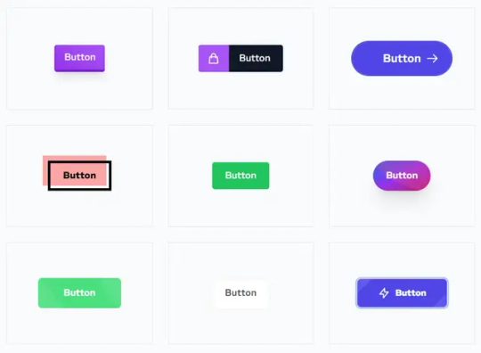
45 CSS-Only Buttons For Modern Web Styling
This is a collection of 45 CSS-only button designs for modern web projects to improve user experience and engagement. These 45 unique designs, all made purely with CSS/CSS3, come with intriguing hover effects that can captivate and retain user attention. Whether for a call to action, navigation, or simple user input, these buttons cater to a wide range of use cases. How to use it: 1. Go to the…
View On WordPress
4 notes
·
View notes
Text

UI Button with Mix-Blend-Mode: https://codepen.io/dan10gc/pen/EQbjgP More CSS button hover effects: https://freefrontend.com/css-button-hover-effects/
3 notes
·
View notes
Text
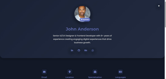
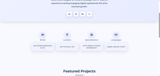
Profile-Pro - Ultimate Personal Portfolio Template
LIVE DEMO | BUY NOW
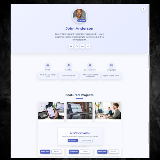
Profile-Pro is a professionally designed personal portfolio template that showcases your skills, experience, and projects with elegance and impact. Crafted for modern professionals who want to make a lasting impression, this template combines aesthetic appeal with functional excellence.
Why Choose Profile-Pro?
Modern Design Aesthetics: Sleek interface with harmonious colors and sophisticated effects
Exceptional User Experience: Perfect contrast, subtle shadows, and smooth transitions
Fully Responsive: Flawless performance on mobile, tablet, and desktop devices
Day/Night Mode: Eye-friendly theme switching with automatic preference saving
Professional Project Showcase: Elegant portfolio section to highlight your best work
Easy Customization: Simple modification to match your personal brand identity
Key Features & Capabilities
Professional Design
Modern UI with sophisticated styling
Harmonious color scheme with customization options
Precise shadows creating depth and elegance
Theme Switching
One-click toggle between light/dark modes
Automatic user preference saving
Seamless design consistency across both themes
Fully Responsive
Adaptive layout for all screen sizes
Consistent user experience across devices
Smart element and text scaling
Project Showcase
Elegant project grid layout
Project cards with impressive hover effects
Clear action buttons (Preview/Buy)

Contact Information
Innovative information card design
Icon-based contact details
Social media integration
Performance Optimized
Lightweight codebase for fast loading
Clean HTML/CSS without frameworks
SEO-friendly structure
License
This template is released under the MIT License - free for personal and commercial use with attribution. See LICENSE file for details.
Quick Start
Download the template files
Customize content in index.html
Replace images with your own
Deploy to any hosting service

Transform your online presence with Profile-Pro - where professionalism meets design excellence!
#css#html#html css#htmlcoding#js#Profile page#landing page design#ui ux design#design#template#template design#landing page#landing page builder#landing pages#panel#coding
0 notes
Text
webflow tip of the year
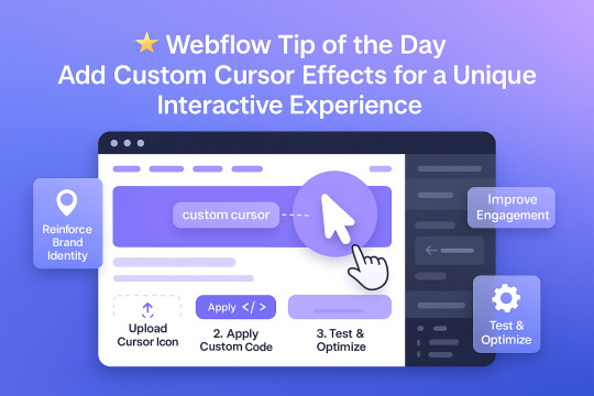
Webflow Tip of the Day Add Custom Cursor Effects for a Unique Interactive Experience
Want to make your site stand out and feel more interactive without heavy JavaScript?
🎯 Use Custom Cursors to Enhance UX & Visual Identity
Why Use Custom Cursors? Custom cursors can guide user interaction and reinforce your brand personality. Subtle changes (like hover animations or icon-based cursors) elevate the experience.
How to Implement in Webflow:
1. Upload a Cursor Icon Go to your assets → Upload a `.png` or `.svg` icon for your custom cursor.
2. Apply It via Custom Code Use this code in Page Settings or Embed:
css body { cursor: url('your-cursor-url.png'), auto; }
3. Change Cursor on Hover (Optional) Target buttons or links with different cursors using:
css a:hover { cursor: url('hover-icon.png'), pointer; }
Pro Tips:
* Keep file size small for performance * Test across browsers * Use contrasting icons so they remain visible on all backgrounds
Result:
* Better user interaction * Unique, memorable brand experience * Improved engagement without extra plugins
Portfolio:-https://lnkd.in/dt5pF9MW 🎯 Upwork:- https://bit.ly/4iu6AKd 🎯 Fiverr:- https://bit.ly/3EzQxNd
#WebflowTips #WebflowDesign #WebflowDeveloper #UXDesign #CustomCursor #WebflowMagic #NoCode #WebDesign #WebflowExperts #CreativeUX
#webflow#freelancewebdeveloper#webflowdesign#webflowlandingpage#webflowexperts#web development#website#nocode#web design#ui ux design
0 notes
Text
Mastering Z-Index in Elementor: Everything You Need to Know
When designing websites with Elementor, managing layers and ensuring proper content visibility can be a challenge—especially when multiple elements overlap. This is where understanding Z-Index in Elementor becomes essential.
What is Z-Index in Elementor?
Z-Index is a CSS property that controls the stacking order of elements on a web page. In simpler terms, it decides which element appears on top when two or more elements overlap. The higher the Z-Index value, the closer the element appears to the front.
In Elementor, every widget or section can be assigned a custom Z-Index value. This is especially helpful when creating advanced layouts such as overlapping text, layered images, sticky headers, or pop-ups.
How to Use Z-Index in Elementor
Select the Element: Click on the widget, column, or section you want to modify.
Go to the Advanced Tab: Under the 'Advanced' settings, scroll down to the 'Z-Index' field.
Set the Value: Input a positive or negative number. Higher values will place the element in front.
Example: If your text is hidden behind an image, increasing the text’s Z-Index will bring it forward.
Common Uses of Z-Index in Elementor
Making sticky headers stay on top while scrolling.
Creating interactive hover effects.
Layering background shapes or graphics.
Fixing overlapping issues between sections and widgets.
Tips for Using Z-Index in Elementor
Avoid unnecessary high values: A Z-Index of 9999 might work, but keep your values logical to avoid conflicts.
Use relative positioning: For Z-Index to take effect, elements often need a relative, absolute, or fixed position.
Check responsive views: Overlapping might differ between desktop, tablet, and mobile views.
Special Features of Z-Index in Elementor
The Z-Index in Elementor isn’t just a basic layering tool—it's a powerful feature that gives you full control over how elements appear in relation to each other on your webpage. Below are some standout features and benefits of using Z-Index effectively in Elementor:
1. Precise Layer Control
Z-Index allows you to manually control which elements appear on top or behind others. This gives you the freedom to design complex, multi-layer layouts without coding.
2. Works Across Widgets, Columns, and Sections
Elementor makes Z-Index available for:
Widgets (like buttons, images, headings)
Columns
Entire Sections
This means you can adjust layering at any level of your layout.
3. Dynamic with Position Settings
Z-Index works best when combined with Elementor’s position controls:
Relative
Absolute
Fixed
You can create advanced designs like sticky headers or floating call-to-action buttons that stay on top of all other content using Z-Index.
4. Responsive Control
With Elementor’s responsive settings, you can tweak Z-Index for mobile, tablet, and desktop individually. This ensures your designs remain visually consistent across all devices.
5. Conflict Resolution
Z-Index is your best friend when solving layering conflicts—like when a menu hides behind a section or a popup doesn’t appear as expected.
6. Supports Negative and High Values
You can assign negative values to push elements further back, or high values (e.g., 999) to bring elements to the front. This flexibility is crucial in layered design scenarios.
7. Improves User Experience
Using Z-Index properly ensures that clickable elements like buttons and menus stay accessible and visible, leading to a smoother UX.
Unlock the Full Power of Elementor Pro at an Unbeatable Price
Want to take your web design to the next level with advanced features, templates, and custom controls?
Get Elementor Pro @ Just ₹499 through CVWorld’s Elementor Group Buy and access premium tools affordably!
0 notes
Text

Flipping Button CSS
#flipping button css#css button hover effects#html css#codenewbies#frontenddevelopment#html5 css3#css animation examples#pure css animation#css animation tutorial#css#webdesign#css snippets
5 notes
·
View notes
Text
Awesome CSS Button Hover Animation
#css button animation#css button hover effects#html css buttons#css animation examples#css animation#css buttons#button animation css#animation#code#learn to code#html css#codingflicks#html#css#css3#frontenddevelopment
0 notes
Text

Creative CSS Button Hover
#css button hover effects#css buttons#css animation tutorial#css animation examples#divinector#html css#frontenddevelopment#css#html#css3#html5#learn to code#learn css#learn css animation
1 note
·
View note
Text
The Role of Motion UI in Web Development: Adding Delight to UX
In the age of digital-first interactions, user expectations are higher than ever. They don’t just want fast-loading websites—they want smooth, intuitive, and engaging experiences. One of the most powerful tools to achieve this is Motion UI—the strategic use of animations and transitions to guide, inform, and delight users.
Modern Web Development Company teams are increasingly integrating Motion UI into their workflow not just to make interfaces look good, but to enhance usability, improve storytelling, and make digital experiences feel more human. When used well, Motion UI turns static screens into dynamic journeys that users enjoy navigating.
What Is Motion UI?
Motion UI refers to the use of animated elements within a digital interface to convey meaning, improve interaction, and enhance aesthetic appeal. It includes elements like:
Smooth page transitions
Micro-interactions (e.g., button hover effects, toggles, loading spinners)
Scroll-triggered animations
Modal or menu reveals
Feedback animations (e.g., shake effect on invalid form input)
Unlike flashy or distracting animations, Motion UI is subtle, purposeful, and user-centric.
Why Motion UI Matters in Modern Web Development
1. Guiding User Attention
In a visually noisy digital space, animations can help direct the user’s eye to what matters most. Whether it’s drawing attention to a CTA, highlighting a newly loaded section, or showing the progress of a task, motion cues subtly guide behavior without overwhelming the user.
Why it matters: Strategic motion reduces cognitive load and enhances information hierarchy.
2. Providing Feedback and Affordance
Users feel more confident when the interface responds to their actions. Hover effects, loading animations, and success indicators provide instant feedback that confirms, “Yes, your action was registered.”
For example:
A button that slightly enlarges on hover indicates it’s clickable.
A form field that glows red upon error highlights correction needs.
A spinner after form submission reassures the user the process is underway.
Why it matters: Feedback builds trust and smooths interaction flows.
3. Creating Seamless Transitions
Instant changes on screen can feel jarring or disorienting. Motion UI introduces transitions between pages, states, or elements to soften the shift and help users understand how they arrived at the new state.
This could include:
Page fade-ins
Slide transitions in mobile navigation
Expanding cards or modals
Why it matters: Transitions help maintain context, making interactions feel more natural and logical.
4. Enhancing Brand Personality
Motion is also a storytelling tool. The style and speed of animations can reflect your brand’s personality—playful, elegant, modern, bold, etc. For instance, a creative agency’s website might use lively, bouncy transitions, while a law firm’s site may favor slow, smooth fades for a calm, professional tone.
Why it matters: Motion supports emotional connection and brand differentiation.
5. Improving Mobile and Touch UX
Motion UI isn’t just for desktops—it plays a vital role in mobile web design. Mobile users rely on gestures and need visual feedback more than ever. Swipe animations, touch transitions, and collapsible sections improve usability and reduce interface friction.
Why it matters: Fluid mobile motion contributes to better retention and conversion on handheld devices.
How Web Development Companies Use Motion UI Effectively
Strategic Planning, Not Overuse
Experienced developers use motion sparingly and intentionally. They prioritize usability over decoration and ensure motion supports functionality rather than distracting from it.
Performance Optimization
Heavy animations can affect performance, especially on low-powered devices. Agencies implement motion using:
CSS animations for lightweight transitions
JavaScript libraries like GSAP or Framer Motion for advanced effects
Lazy loading and hardware acceleration for smooth playback
Accessibility Considerations
Motion isn’t for everyone. Users with motion sensitivity may find transitions disorienting. Web development companies honor user preferences by respecting browser settings like “Reduce Motion” and offering toggle options where necessary.
Testing Across Devices
Motion must be consistent across browsers, screen sizes, and performance conditions. Agencies rigorously test animations to ensure they work well on all devices—without causing lag, layout shifts, or usability issues.
Final Thoughts
Motion UI isn’t about adding glitter—it’s about adding clarity, emotion, and flow to your user experience. When implemented strategically, it enhances usability, builds trust, and transforms your website from functional to unforgettable.
A professional Web Development Company understands how to balance motion with performance, accessibility, and brand storytelling. They don’t just build static websites—they craft immersive digital experiences where every interaction feels intuitive, responsive, and delightful.
0 notes
Text
my homepage journey: entry 2
...plus other shenanigans
soo, yesterday's update was a right mess, reasonably so. but today? i'm honestly just chilling.
first i wanted to note that i've actually switched the website i'm using to host my website from neocities to nekoweb, not to say that either is "better" than the other, nekoweb just suits what i need in a hosting service more!
moving on, i unfortunately had to scrap my own css animation for a marquee effect with another. in which case, i ended up using the lovely resource that koba over on nekoweb has provided
unfortunately, i haven't quiet figured out how to implement a way to still pause the animation play state on hover without it kind of breaking the marquee, but hopefully i'll figure it out eventually?
next up, i still have not found a solution for playing a sound upon a button click which sucks. i honestly have no clue why it's not working but no matter what tutorial i try and reference it just does not work for some reason.
but now we go back to good news!! i actually have a way to make draggable windows now thanks to sadgrl's drag and drop snippet however i'm still trying to find a good way to make them open and close with a function concerning display and whatnot. objectively it should be easy to do but i want there to but two buttons, one like a desktop icon to open it, and then a close button on the window itself to, well, close it. i don't know, i'll figure it out eventually.
anyways, besides continuing to work on my project yesterday, i also officially joined the melonland forum! so that's cool. melon has a lot of sick projects in all honesty.
that's all for now! i'll try and keep up with updates, but no promises.
#unfortunately no visuals this time because i'm lazy#but basically if i just do a normal .marquee:hover pseudo class and set that to animation-play-state: paused;#the looped marquee portion will just continue to go and then when you unhover it becomes SO messy#it looks great though#also i'll return to neocities eventually but i'm only focusing on my homepage for now#also i dont need to use the rss feed workaround to display the status.cafe widget on nekoweb lmfao#work smarter not harder kids!!!#coding#front end development#web development#nekoweb#neocities#webpage#man i need a nap#anyways yeah thats all bye
4 notes
·
View notes
Text
8 CSS & JavaScript Snippets for Creating Sticky Elements — Speckyboy
New Post has been published on https://thedigitalinsider.com/8-css-javascript-snippets-for-creating-sticky-elements-speckyboy/
8 CSS & JavaScript Snippets for Creating Sticky Elements — Speckyboy
Modern websites often feature extensive scrolling. Long pages are common on desktop devices, but are even more frequent on mobile screens. The practice creates usability challenges for tasks like navigation and referencing important information.
That’s where “sticky” design elements come in handy. They allow users to scroll without losing access to your site’s menu. You can also use them to keep ads in view, attach social media sharing buttons to the viewport, or create fun special effects.
Implementing a sticky element can be simple, as CSS has a dedicated position property for this function. JavaScript can be used for building more robust features. As usual, there are several methods to achieve your goals.
We searched the CodePen archives to find interesting examples of sticky elements in use. Below, you’ll find various options that enhance the user experience. So, get stuck in your easy chair and be inspired by these code snippets!
Pure CSS Header Animation to Sticky Navigation
Created by Amit
Sticky headers are among the most popular use cases. On Chromium browsers, this snippet uses CSS to transform a tall and narrow header into a full-screen bar upon scrolling. Unsupported browsers receive a narrower, taller, sticky header. Keyframe animation is used to create smooth transitions. The feature is useful, lightweight, and attractive.
See the Pen Pure CSS header animation to sticky nav by Amit
Sticky Responsive Sidebar Navigation
Created by Areal Alien
Sidebar navigation can also take advantage of staying put during scrolling. Hovering over the sidebar expands the navigation to include text labels – it works on mobile too. However, you might also reserve this concept for large screens and use the traditional “hamburger” menu for mobile.
See the Pen Sticky responsive sidenav by Areal Alien
CSS Sticky Table Header & Column
Created by Mike Golus
Long HTML tables can be a pain to read. You have to memorize the column headers to understand the context. Sticky headers make even the busiest tables easier to read. Using position:sticky (and a few other tricks) on the first row and column enables scrolling without losing sight of key information. The examples in this Pen demonstrate how it’s done.
See the Pen CSS Sticky Table Header and Column by Mike Golus
Long Scroll Sticky Sections
Created by Burmese Potato
Here’s a unique way to denote the various sections of a long page. Scroll down the page, and the episode number (displayed in the left column) sticks until you reach the end of the section. The snippet combines sticky positioning with the calc() property on the container’s height to keep the number in view. This little bit of CSS adds a nice touch to the user experience.
See the Pen Pretty Sticky by Burmese Potato
Just Another Sticky Section Layout
Created by Misala
Sticky design elements can also be used to show off product features. Scroll down this page and watch as featured text and videos change. The layout occupies the entire screen viewport and is responsive for mobile devices. It’s a high-end feature sure to capture a user’s attention.
See the Pen just another sticky section layout by misala
Multi-Navigation Sticky Bars & Layout
Created by Den
This snippet asks the question: What if you have more than one navigation bar? The first bar is sticky by default. Scroll past a few sections, and a second sub-navigation bar lines up underneath. That second bar also features a neat frosted glass look as content scrolls underneath.
See the Pen Sticky layout + filters #2024 by Den
Sticky Video with CSS @container scroll-state()
Created by Jhey
We’re seeing more websites implement sticky videos, where the presentation sticks to the bottom corner upon scrolling. It allows users to view the rest of your content without losing sight of the video. Here, CSS container queries are used to reposition the video player. Use the included config panel to see how different settings impact the animation effects.
See the Pen CSS @container scroll-state() faux PiP video by Jhey
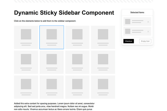
Dynamic Sticky Sidebar Component
Created by Ryan Mulligan
Features like shopping carts are a perfect fit for sticky sidebars. The UI makes it easier for shoppers to keep track of their cart and, most importantly, finish their purchase. This sidebar widget keeps track of cart contents and sticks to the screen while you scroll in the page content area.
See the Pen Dynamic Sticky Sidebar Component by Ryan Mulligan
Stick With What Works in Your Designs
We may think of sticky elements as being used for site headers and navigation. However, the examples above show that they can do much more. There are so many creative possibilities for informing and entertaining users.
What’s more, CSS can do a lot of the heavy lifting for you. Several snippets in this collection don’t require a single line of JavaScript. Still, it’s nice to know you can add some DOM manipulation when needed.
We hope this collection sparked your imagination! Check out our CodePen collection for even more sticky snippets.
Related Topics
Written by Eric Karkovack
Eric Karkovack is a web designer and WordPress expert with over two decades of experience. You can visit his business site here. He recently started a writing service for WordPress products: WP Product Writeup. He also has an opinion on just about every subject. You can follow his rants on Bluesky @karks.com.
Read more articles by Eric Karkovack
#2024#ADD#alien#amp#animation#Articles#attention#Building#Business#buttons#Capture#change#chromium#code#container#content#CSS#CSS Layout Snippets#CSS Snippets#Design#desktop#devices#easy#effects#Featured#Features#Filters#Full#glass#hamburger
0 notes