#button animation css
Explore tagged Tumblr posts
Visit Tumblr Blog
Explore Tumblr blogs with no restrictions, modern design and the best experience.
Last Seen Tumblr Blogs


Fun Fact
Premium Tumblr themes are available from anywhere between $9 to $49.
Text
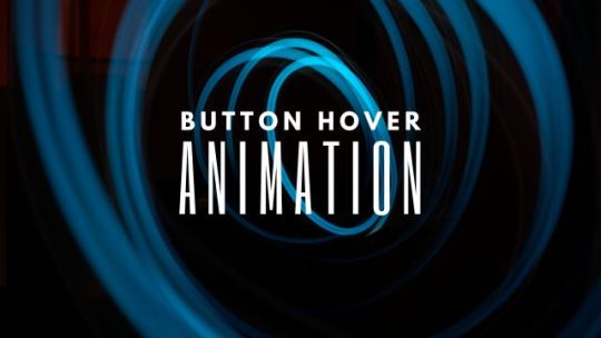
Awesome CSS Button Hover Animation
#css button animation#css button hover effects#html css buttons#css animation examples#css animation#css buttons#button animation css#animation#code#learn to code#html css#codingflicks#html#css#css3#frontenddevelopment
0 notes
Text

CSS Button Animation
#css button border animation#css buttons#codenewbies#html css#html5 css3#frontenddevelopment#css#css animation examples#pure css animation#css animation tutorial#code#css tricks#css snippets#html5#frontend
3 notes
·
View notes
Text

CSS Neon Buttons
#css neon buttons#html css buttons#css buttons#css animation tutorial#html css#divinector#css#html#css3#learn to code#frontenddevelopment#css animation examples#css animation snippets#neon effect css
2 notes
·
View notes
Text
I THINK I GOT MY NEW SITE LAYOUT WORKING :DDD
#maddie meows#gonna try and get things moved over/start to rewrite pages tomorrow i think. YAY!!!!#there's a few more little things i wanna add but for the most part. IT'S FUNCTIONAL!!!#the one big thing i wanna add (ideally also tomorrow) is a a button that pauses css animations
2 notes
·
View notes
Text
youtube
Fancy css button animations
2 notes
·
View notes
Text
8 CSS & JavaScript Snippets for Creating Sticky Elements — Speckyboy
New Post has been published on https://thedigitalinsider.com/8-css-javascript-snippets-for-creating-sticky-elements-speckyboy/
8 CSS & JavaScript Snippets for Creating Sticky Elements — Speckyboy
Modern websites often feature extensive scrolling. Long pages are common on desktop devices, but are even more frequent on mobile screens. The practice creates usability challenges for tasks like navigation and referencing important information.
That’s where “sticky” design elements come in handy. They allow users to scroll without losing access to your site’s menu. You can also use them to keep ads in view, attach social media sharing buttons to the viewport, or create fun special effects.
Implementing a sticky element can be simple, as CSS has a dedicated position property for this function. JavaScript can be used for building more robust features. As usual, there are several methods to achieve your goals.
We searched the CodePen archives to find interesting examples of sticky elements in use. Below, you’ll find various options that enhance the user experience. So, get stuck in your easy chair and be inspired by these code snippets!
Pure CSS Header Animation to Sticky Navigation
Created by Amit
Sticky headers are among the most popular use cases. On Chromium browsers, this snippet uses CSS to transform a tall and narrow header into a full-screen bar upon scrolling. Unsupported browsers receive a narrower, taller, sticky header. Keyframe animation is used to create smooth transitions. The feature is useful, lightweight, and attractive.
See the Pen Pure CSS header animation to sticky nav by Amit
Sticky Responsive Sidebar Navigation
Created by Areal Alien
Sidebar navigation can also take advantage of staying put during scrolling. Hovering over the sidebar expands the navigation to include text labels – it works on mobile too. However, you might also reserve this concept for large screens and use the traditional “hamburger” menu for mobile.
See the Pen Sticky responsive sidenav by Areal Alien
CSS Sticky Table Header & Column
Created by Mike Golus
Long HTML tables can be a pain to read. You have to memorize the column headers to understand the context. Sticky headers make even the busiest tables easier to read. Using position:sticky (and a few other tricks) on the first row and column enables scrolling without losing sight of key information. The examples in this Pen demonstrate how it’s done.
See the Pen CSS Sticky Table Header and Column by Mike Golus
Long Scroll Sticky Sections
Created by Burmese Potato
Here’s a unique way to denote the various sections of a long page. Scroll down the page, and the episode number (displayed in the left column) sticks until you reach the end of the section. The snippet combines sticky positioning with the calc() property on the container’s height to keep the number in view. This little bit of CSS adds a nice touch to the user experience.
See the Pen Pretty Sticky by Burmese Potato
Just Another Sticky Section Layout
Created by Misala
Sticky design elements can also be used to show off product features. Scroll down this page and watch as featured text and videos change. The layout occupies the entire screen viewport and is responsive for mobile devices. It’s a high-end feature sure to capture a user’s attention.
See the Pen just another sticky section layout by misala
Multi-Navigation Sticky Bars & Layout
Created by Den
This snippet asks the question: What if you have more than one navigation bar? The first bar is sticky by default. Scroll past a few sections, and a second sub-navigation bar lines up underneath. That second bar also features a neat frosted glass look as content scrolls underneath.
See the Pen Sticky layout + filters #2024 by Den
Sticky Video with CSS @container scroll-state()
Created by Jhey
We’re seeing more websites implement sticky videos, where the presentation sticks to the bottom corner upon scrolling. It allows users to view the rest of your content without losing sight of the video. Here, CSS container queries are used to reposition the video player. Use the included config panel to see how different settings impact the animation effects.
See the Pen CSS @container scroll-state() faux PiP video by Jhey
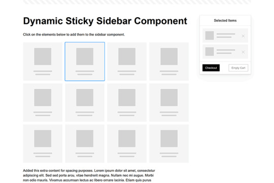
Dynamic Sticky Sidebar Component
Created by Ryan Mulligan
Features like shopping carts are a perfect fit for sticky sidebars. The UI makes it easier for shoppers to keep track of their cart and, most importantly, finish their purchase. This sidebar widget keeps track of cart contents and sticks to the screen while you scroll in the page content area.
See the Pen Dynamic Sticky Sidebar Component by Ryan Mulligan
Stick With What Works in Your Designs
We may think of sticky elements as being used for site headers and navigation. However, the examples above show that they can do much more. There are so many creative possibilities for informing and entertaining users.
What’s more, CSS can do a lot of the heavy lifting for you. Several snippets in this collection don’t require a single line of JavaScript. Still, it’s nice to know you can add some DOM manipulation when needed.
We hope this collection sparked your imagination! Check out our CodePen collection for even more sticky snippets.
Related Topics
Written by Eric Karkovack
Eric Karkovack is a web designer and WordPress expert with over two decades of experience. You can visit his business site here. He recently started a writing service for WordPress products: WP Product Writeup. He also has an opinion on just about every subject. You can follow his rants on Bluesky @karks.com.
Read more articles by Eric Karkovack
#2024#ADD#alien#amp#animation#Articles#attention#Building#Business#buttons#Capture#change#chromium#code#container#content#CSS#CSS Layout Snippets#CSS Snippets#Design#desktop#devices#easy#effects#Featured#Features#Filters#Full#glass#hamburger
0 notes
Text
AI Writer Services HTML Landing Page Template
Are you ready to revolutionize your AI writing services? Look no further than "Writey" - the ultimate AI Writer Services HTML Landing Page Template that combines stunning design with powerful functionality. Whether you're a content creator, or copywriter, or run an AI writing service, Writey has got you covered.
Buy Now:
#html#ai writer#landing page#template#clean design#responsive#RTL support#PHP contact form#dark theme#light theme#animations#testimonials#FAQ section#sliders#W3C validation#cross-browser compatibility#updates#accessibility#SEO optimized#fast loading#social media buttons#SCSS files#back-to-top button#coding#landingpage#css
1 note
·
View note
Text
Web designer in Jodhpur
Creative Web Design
We are a web designing company that has a team of skilled and experienced web designers and developers who can create stunning and functional websites for any type of business or domain. We offer a variety of web designing services, such as custom web design, web development, web hosting, SEO, and maintenance. We also provide you with a free web design consultation, where we can discuss your goals, needs, and preferences, and provide you with a web design proposal that suits your requirements and expectations.
What we do in Web Design
Our web designing services are the services that provide web designing solutions for clients who want to create or improve their online presence. It involves the use of various elements such as colours, fonts, images, graphics, animations, and interactions to convey the message and purpose of the website to visitors. Web designing services can help clients with various aspects of web designing, such as Consultation: Our web designing services can help clients understand their goals, needs, and preferences, and provide them with expert advice and guidance on how to achieve them . Strategy: Our services can help clients develop a clear and effective web design strategy that aligns with their brand identity, target audience, and business objectives.Design: We help clients create a unique and attractive web design that reflects their vision and personality, and that engages and impresses their visitors.Launch: Our services can help clients launch their website to the public, and provide them with web hosting, domain registration, and security services.
Our Design Technology
At Web Farm House, we understand that web design is not just about making a website look good. It is also about making it work well, communicate effectively, and provide value to the users. That is why we use the latest web design technology to create websites that are:
Visually appealing: We use web graphic design to create stunning and consistent visual elements for your website, such as colours, fonts, images, icons, and animations.
Easy to use: We use user interface design to create intuitive and interactive elements for your website, such as buttons, menus, forms, and navigation.
Functional and reliable: We use web development to code and program your website, using languages such as HTML, CSS, JavaScript, PHP, and others. We follow the principles of web standards, web accessibility, web performance, and web security, to ensure the quality and reliability of your website.
Our Work Process
At Web Farm House, we follow a systematic and collaborative work process to create your website. Our work process consists of four main phases: Discovery, Design, Development, and Delivery:
Discovery: This is the phase where we get to know you and your project. We will ask you some questions about your goals, needs, preferences, budget, and timeline. We will also conduct some research on your industry, competitors, and target audience. Based on the information we gather, we will create a project proposal and a contract for you to review and approve.
Design: This is the phase where we create the visual and interactive elements of your website. We will start by creating a sitemap and a wireframe, which are the blueprints of your website’s structure and layout. We will then create a mockup, which is a prototype of your website’s appearance and functionality. We will present the mockup to you and ask for your feedback and approval. We will make any revisions as needed until you are satisfied with the design.
Development: This is the phase where we code and program your website. We will use the latest web development technology to create a website that is functional, reliable, and compatible with different devices and browsers. We will also test and debug your website to ensure its quality and performance. We will show you the progress of the development and ask for your feedback and approval.
Delivery: This is the final phase where we launch and maintain your website. We will upload your website to your chosen hosting service and domain name. We will also provide you with a user manual and a training session on how to use and update your website. We will also offer you ongoing support and maintenance services to keep your website running smoothly and securely.
We will also listen to your feedback and suggestions and make any changes as needed. We will work with you as a partner and a friend, not just as a client and a vendor. we value your input and satisfaction throughout the work process. We will communicate with you regularly and keep you updated on the status of your project.
Our Web Designing Services
Our is provides web design services for clients who want to create or improve their online presence. We help clients with various aspects of web designing, such as consultation, strategy, design, development, testing, launch, and maintenance:
Static web design
Liquid web design.
Adaptive web design.
Dynamic web design.
Responsive web design.
Single-page web design.
Why Choose Us?
We are a One-Stop Solution for delivering the best web design and development services. We render customized and affordable web design facilities to suit your requirements. Choose the best plans for building a responsive web design according to your needs:
Excellent technical support
Core PHP &Codeigniter + MySQL.
Secure and Reliable coding.
Satisfactory Customer Support.
SEO-friendly web development.
33 notes
·
View notes
Text
"Hotel Couches & Other Hail Marys" Fic Notes
These aren't the traditional format but I have enough Hidden Little Things I wanna do very loose an informal fics notes
The "Hotel Couch" was Catra's Hail Mary, but the shared bed was Catradora's, and Catradora's reunion was the fans' Hail Mary.
The way I do tweets was invented back in DITM and "perfected" in SaD, when I also invented how I do Instagram posts/stories/reels/DMs. I wasn’t reinventing shit for the changes Twitter has made, it’s ~historically accurate~ to when Dashcon happened. The one change I made was not using the block quote indent for all the digital posts I usually do, but that entire fic was digital, so I only ended up using it for indented reply chains on Twitter (which worked out better tbh) and on the Instagram chapter to distinguish the posts and the descriptions of the images/videos.
Fake tumblr posts/alternate reality dashboard simulators are already a popular format on Tumblr so there really was very little for me to do there. I made some tweaks by adding in the comment/share/like icons I use for Twitter, but overall that part was easy. The hardest part was getting the follow button blue. On Tumblr that's easy, colored text is a built-in option, but for AO3 I had to use a work skin to include some CSS for the color code. I ended up modifying the Reddit skin I had made using this tutorial because I was planning to capstone with a Reddit post anyway so I could just add on the blue on. Normally I don’t consider using colored text for many reasons (hard to read, might look great on my site skin and be invisible on others, etc), but in the case of the follow buttons they could just as easily not be there and contribute nothing but realism, so I wanted to have them in their standard blue.
Normally I don’t even consider using Tumblr when doing social media posts in a fic but considering this was inspired by Dashcon which was literally a Tumblr convention, I had to for this one. As such, the first chapter is mostly set-dressing for the disaster the convention is itself so when people complain in future chapters it makes sense. The rough outline was: Tumblr (convention background) Twitter (reconnect and beef background) Instagram (bond) DMs/texts (get together) Reddit (retrospective epilogue wrapping up the story)
Most of the usernames are just like. Random shit I could come up with. The ones on Tumblr are supposed to be random stuff on the site and the ones on Twitter lean more towards fandom-associated stuff for the She-ra fandom since it’s transitioning from the pool of All Con Attendees to the microcosm of their fans affected. Most of these can be found in previous fics such as DITM. That said, here are the name(s) with inspo behind them:
🍕nnlftbf: none pizza left beef. And no vowels. I have always desperately wanted to eat the none pizza
🦉pewpew4gloria: Star Siblings fan (reference to Starla’s bird)
🐍nagashed: this is a reference to both the plethora of (human animal hybrid)(bodypart) tumblr usernames (ex: dragongirlsnort) and a manga that my friend is reading.
🎃pumpkakitty: reference to a really cute hat in Pokemon Go 🥺 (okay it’s supposed to be a pikachu but it looks like a kitty tbh)
🌈edgeofgloria: another Star Siblings fan
He-Ro in the Freak Zone @frightzest: He-Ro is an actual MOTU character, frightzest is from DITM
Aside: the “looki loo” thing is a reference to Razz’s good ol pal Looki, hence the fandom in-joke
praying mantis wife @nineten02: nineten is a reference to my Stardew Valley chickens <3
Katastrophe @viviviolence: Vi’s shoulders you mean so much to me
Oh yeah Zeni is Zine just. Flipped. Also the original She-ra artist was one of the two sponsors who pulled out and the entire reason they were there. I mean what?
When Adora called Catra aggravating on camera she was doing it in a horny way but with Real Beef between them it didn’t come across that way. She also said they wouldn’t work together as a factual thing rather than spiteful. There was no way the studio OR Catra would let them.
When Catra said she’s “finally suing” she’s referring to the long-standing rumor that the previous showrunner “stepped back” because Catra was threatening to sue for the wage/credit theft, or the discrimination, or the abusive work environment, or the-
The dates Adora reached out to Catra via DMs were all significant ones for the real series — season 1 debut for when they were nominated, prompting the thank you story, season 2 debut for when they won the award (I didn’t look up and don’t care when the actual GLAADs are lol), and season 3 debut when ZeniCon is actually taking place. Almost three years have passed since Catra’s ousting from the show back between seasons 3 and 4, tho.
Given the NDA and general threat-level from the studio, Adora didn’t think she could mention Catra on her main page without getting a talking to even with Weaver officially departed, so she tried to do it on her story, but Catra did NOT want the heat that could bring.
The foam She-ra crown from the Instagram reel is the same one they gave out at cons in 2018 and 2019.
Adora calling it the “season 5” rather than “season 4” wrap part led to fan speculation that season 5 really was written by Catra except for the weakest parts — some stuff needing to be condensed, the insertion of a new storyline — which like. Well they are right. But she said season 5 rather 4 (which was wholly Catra’s) because it’s the part she’s most proud of even after they took it from her. It’s what she was building to the whole time.
Catra and Adora lasted like ten minutes lying next to each other in bed before they ended up kissing and when it started progressing they snuck into the bathroom. It was obvious Bow was asleep and they were just hoping Glimmer was too. Glimmer, too, wishes she was asleep.
Glimmer refers to Catra being “at her worst” because she got really aggressive and disparaging of her old cast out of bitterness after they wouldn’t back her up in the press (to keep their jobs). They all understand why, but it is still frustrating.
Melendy is from my fic lore, she’s a magicat character I use sometimes who is named after Catra’s VA in the 80s. She plays a recurring character on the show, though on the minor side.
I linked the Ohio con video because 1) that video is the ONLY time I’ve heard of it and I love the drama 2) to hammer home all the shit I say in this isn’t just from Dashcon, I am not here to libel people and 3) because I like my secret little links, BUT if you want to see a good video on Dashcon, watch this one and literally never watch Internet Historian he’s a POS: https://www.youtube.com/watch?v=ZAqy-KDJAUM
The behind the scenes shitshow for She-Ra itself was inspired by the TV show Lost (though Catra keeping her storylines secret was inspired by Real She-ra and ND Stevenson)
Like I said, I had been wanting to do a fic that was “just digital” for a while. The massive problem with that is getting across the shit people don’t post online because there is not a single trace of Catra and Adora potentially being a couple until after ZeniCon. Catra and Adora were basically wildly attracted to each other from the moment they met on the show but wouldn’t cross that barrier because they worked together (especially because of where they worked together). They ended up hooking up during some high-stress times for the show just to deal with how much they wanted each other. Catra felt really betrayed when the cast wouldn’t stick their necks out for her when she was ousted. Privately they were all on her side and told the studio so, but to publicly side with her was to lose their jobs, and the show was their entire life. They ultimately picked their passion & livelihood over showing public support they didn’t think would make a difference anyway and she cut all ties with them. They did what they felt they could, which was mostly never denying her version of events and deflecting questions when they had no other choice, but they all felt bad about it and tried to reach out to her privately. She didn’t want to hear it, but fans were right that the real beef was with the studio. She fell back into their arms eventually because she could see they were doing what they could while keeping their jobs, and she knew just how much being unemployed sucked. Adora was also telling the truth when she said they were fighting for her version of the story by staying on the show and no matter how much Catra calls it theft, that is what she wants for her characters. Being forced into the same room let them all remember what it was like to be friends, and that’s what led them to eventually giving their apologies.
I have no idea why, when presented with “lol dashcon au” my brain goes “rampant wage theft, behind the scenes abuse, disgrace and scandal, show extension hell a la supernatural, brrrrrrrrrr” but there we go
#ff 25#fic notes#hcaohm#I'll edit some things when I get home I have to run errands before things get rudely close to closing time
28 notes
·
View notes
Text
☽ ✦ Welcome ✦ ☾

Helloo. We're the Blackout System.
☉ You may call us Astra
☉ Collectively we use They/Them pronouns.
☉ Bodily 20
☉ Black, AuDHD
☉ Generally we identify with Alterhumanity, though some of us may not.
☉ We're fine with interacting with others, and accept DMs and Asks about things. However, if you are under 16-17, we will likely block you if you attempt to befriend us, interacting with anyone below that makes us very uncomfortable. Otherwise we don't care if you interact with our posts, and it's a 50/50 on if we block you from following.
BYF...
✦ We don't participate in syscourse. We're not here to get into arguments, and would rather just share our own experiences.
✦ We don't follow back/like posts. This blog is a sideblog to our main, which we'd like to keep mostly private. We'll occasionally reblog posts here, however.
✦ We liberally use our block button. Most of the time it's not because someone did something "problematic", and is generally just us not vibing with their energy or thinking someone is generally unpleasant. Though we do block people who are genuinely problematic, we're just not gonna say shit about it here lmao.
✦ We may use terms we've coined ourselves to describe our own system online.
✦ We will not share our headmates if they're not the one posting. Do not ask, you won't receive a headcount nor names. All names are replaced with an emoji and a letter, at most, if they feel like signing off.
✦ Do not ask for our Simply Plural/Octocon, or any other social medias.
✦ We are pre-diagnosis, if that is an issue for you. While we're not seeking to get it on our medical records, we are also in the beginning stages of working with a trauma specialist to hopefully get a second opinion. This also might not be possible for many years as we live in an incredibly conservative state with few mental health opportunities.
INTERESTS AND HOBBIES...
☄ HOBBIES ☄
Digital Art, Animation, Webdev [HTML/CSS/Javascript], Gamedev [Godot], Embroidery/Sewing, Music Transcription, Tarot
☄ GAMES ☄
Secret Histories [Cultist Simulator/Book Of Hours/The Lady Afterwards], Who's Lila, Warframe, FFXIV, Fields of Mistria, Risk of Rain 2, Splatoon 3, Hollow Knight, Rain World, VTM: Bloodhunt, Valheim, Terraria, Minecraft, Don't Starve Together, Dr. Robotnik's Ring Racers
☄ DIGITAL MEDIA ☄
Chainmail Chasers, Vita Carnis, Midwest Angelica, Interloper ARG, Emesis Blue
☄ MOVIES/SHOWS ☄
Arcane [Only seen 1st season], The Owl House, Spiderverse, Delicious In Dungeon, Frieren, The Apothecary Diaries
☄ BOOKS ☄
Blood Debts/Blood Justice, The Poisons We Drink
#astra.post#actually osdd#osdd system#actually did#osddid#did system#actually dissociative#did community#osdd community#sysblr#did osdd#dissociative system#osdd#sysconversation
26 notes
·
View notes
Text

Neon Glow Buttons
#neon glow buttons#css buttons#css animation#html css#css#css3#html#frontend#html css animation#css neon glow effect#animation#neduzone#learn to code#webdesign#frontenddevelopment
4 notes
·
View notes
Text
CSS Button Border Animation
#css button hover effects#html css#codenewbies#frontenddevelopment#html5 css3#css animation examples#pure css animation#css animation tutorial#webdesign#css#css button border animation#animation
6 notes
·
View notes
Text

Buttons with Ripples Animation on Click
#button ripple effect#ripples effect#javascript animation#css buttons#html css buttons#Ripples Animation on Click#html css#divinector#css#frontenddevelopment#html#css3#vanilla javascript#javascript
0 notes
Text
neocities heracles trials: from a chaotic newbie
okay so i want to actually start posting here and i finally got it through my thick skull that this is LITERALLY A BLOG. i'm supposed to blog. so here's a blog post.
anyways, for context, i've been working on my neocities for a while now, recently started over to make things more original and more me. another thing to note is that i'm using VScode.
the issue here is that i have zero well not exactly zero but i lack any professional/academic background experience with making websites. the html isn't the issue (thankfully) but holy shit dude...css+javascript implementation . basic styling with css is no biggie, right? absolutely, however...may i introduce: smooth transitions + the absolutely tragic fact that the <marquee> tag is deprecated an accessibility issue.
so, my first goal day one was to recreate a marquee animation through css. so i tried to simply implement this incredibly useful bit of code into my site (in which if you're interested i totally think my failure to get it working was user error so please check it out it works great if you're not me) but, lo and behold, despite me getting it to work in my V1 project, i could not, for the life of me, get it to work. so i, not too familiar with css animation and completely lost when it comes to javascript, started grasping at straws. i ended up finding this tutorial and, with some improvisation since the tutorial is for webflow and i'm manually writing everything, managed to make my own css recreation of a marquee effect essentially from scratch, and even learned about the animation-play-state css attribute so i could pause the effect when the marquee is hovered over! victory, basically.

then, i looked around the many cool and absolutely awesome sites on neocities to get inspiration, and then i was like "hey what if i made a custom button background image" and with some trial and error, made myself a pretty decent base (for now) with aseprite, and learned more about the program in the meantime which is always a plus.
then i decided that i wanted to do more with the buttons. i wanted to make it animate on hover. not too hard right? you'll...you'll see why i struggled...in a moment...
anyways, i settled on a simple shrink animation. which THIS i could do with ease, messed around a bit, got the keyframes, assigned that to the button:hover and all of that and all was good!...until i realized that once i stopped hovering over it, it snapped back to its original scale instead of transitioning smoothly again. THIS is where the "fun" began.
see, although i can wrap my head around things easily when it comes to css, i have to constantly look up what the proper syntax for everything is because otherwise i'll mess everything up. and through my research i had conducted (aka surfing through multiple blogs and reddit posts alongside other things on random forum websites) i had discovered the very neat transition attribute.
but we'll have to return to this because i have adhd, and i ended up getting distracted during this process. see, originally i had decided that the button would change it's visual to appear like it was pressed when the user's mouse hovered over it. then i was like "i don't think this makes sense" so i changed it so that the button wouldn't change its background image unless the user actually clicked on it. so i did that. then i had to make sure that the button wouldn't magically scale up again so i had to transform the styling and blah blah blah those details aren't really that important ANYWAYS the actual important bit about this is that if you use the transition attribute and there's a change in background images that change will also be transitioned unless you set the transition to only apply to a specific change. and i didn't know that originally. so every time i tried to fix things up with a transition so the button wouldn't snap back to it's original size out of nowhere the background would slooowly change as well and i actually got so frustrated with this that i wanted to burn something down because that's a totally normal reaction i guess. anyways, then i started frantically searching for answers on the topic and EVERY. SINGLE. THING. THAT I FOUND. INCLUDED JAVASCRIPT.
i do not know javascript. i have not learned anything about it unlike css and html. it SCARES me and it is FRUSTRATING. but i thought i'd try it anyways. news flash that shit didn't work at all and i almost thought about scrapping the animation entirely especially when it randomly stopped working when i made certain changes, but i ended up eventually figuring out what i mentioned earlier (CSS transitions and the fact that you can assign them to only affect a specific change instead of everything) so with some dabbling here and there i eventually managed to finally figure out how to make everything smooth through pure css and although it still snaps if the element hasn't finished animating i'm happy with it.

moving on to another thing, i wanted to then make a sound effect play when you click the button. yes, we are still talking about buttons. THIS i could not do with css, like, at all. javascript admittedly is for interactivity and i had already been bending the rules quite a bit with the animations since those teechnically should've been done with javascript as well but this? this was impossible without javascript. so i found a free mp3, and searched up a nice little tutorial on the very basics of javascript.
little did I know that apparently, this would be my own personal little hell.
see, no matter how many times i tried a different script, the sound just would not work like at all. i'd do everything in what i assumed to be the correct way, and no matter what, it would not play. knowing that i'd just have to revisit this, i decided it was best to just sort of put it on the back burner.
and this is where i wish i could say this is the end of my absolutely gobstopping rant. however, i cannot.
see, one thing that i really like that i've seen in a lot of other people's sites is draggable windows. i think they're sick. but this ALSO requires javascript, but i didn't think this could POSSIBLY be that bad since so many people did it.
...right?.......right? guys. right?
MOTHERFUCKER I WAS SO WRONG.
see, it turns out that a lot of people do this sort of thing with jQuery, specifically for user interfaces. but vscode doesn't have a "user friendly" way to get jquery to work with it. and because i don't want to mess with program files, i decided that logically speaking jquery just makes writing things in js scripts less complicated and doesn't introduce things that are impossible in vanilla javascript so i decided i could suffer a little bit and try and do things without jquery.
this led me to looking at many sites with draggable windows to look at their own scripts, in which every single time i tried replicating things i FAILED.
i eventually stumbled upon a nice code that worked. but the issue with it - in which unfortunately i can't find it, else i'd link it - is that it works with not only element classes but also a specific ID. see, this would be fine if i only wanted ONE draggable element. but i want multiple. and i thought that maybe if i just duplicated the script and dedicated it to a different ID and changed function names it would work but nooo life cannot be this easy apparently. so after setting up my webmaster status window, getting that to work, i tried doing the aforementioned method for what will eventually be a guestbook of sorts. it failed.
so i decided, "hey i'll revisit this later!!" and i went on to finding a way to implement a status widget into my site. this honestly was really easy as i ended up stumbling upon status.cafe . so i registered, eventually got my account activated, and i got it working in my live port of vscode just fine!! all is good in the world.
well that's what i thought until i found out that since i had created my neocities account in march of 2024, and i'm unemployed since i'm still in high school hence i have a free account, that i could not. use the widget. in neocities. so i tried finding a work around, found this handy guide (which is genuinely useful by the way) and set up things through a RSS feed instead which is essentially just a work around that complies with the security restrictions of neocities that i'm bound by. anyways, this works great but i literally just can't customize it to how i want so this is another fail. then i find imood.com which, although is NICE, doesn't suit what i want on its own. so i'm at a loss here too.
so, again, another thing to put to the side i suppose.

so i started working on getting my guestbook, browsed through people's homepages again, and found chattable . and you probably think i have another paragraph complaining about this but honestly i can't write about something when i can't figure out how to even create a chat to implement onto my site in the first place so...y'know.
plus, i honestly have no clue if it'll work on my site either due to security restrictions so this is fun!!
anyways, after dealing with all of this, i finally decided it was about time i ported what i had so far over onto my neocities account. which isn't actually that hard i just had to wipe all of my files, overwrite the content in my index.html file there and paste in what i have now, and then upload my new files. but for some god awful reason after i went through all of this chrome just. kept depending on my old stylesheet??? so i had to clear some of my browsing data and eventually everything was loading properly for me.
and THIS is finally the end of my ridiculous documentation concering my neocities adventure so far.
i have no doubts i'll end up ranting here AGAIN about all of this but for now this is all i have on my plate...besides finally caving and learning javascript for real and continuing to learn more about html and css. hopefully one day i'll stop having such frequent issues but now is not the time and i doubt that'll be anytime soon either.
moral of the story, if you want to start something new and pick up a new hobby, please for the love of all that is of substance in this world don't go in completely blind like i've done if you're going to be making a project of some sorts. it will only lead to many misfortunes.
anyways you can see what i currently have done in my neocities here, make suggestions or give advice in the notes and whatnot i don't know.
#neocities#rant post#rant#coding#web development#geocities#html#html css#htmlcoding#css#javascript#losing my mind#holy shit#send help
6 notes
·
View notes
Text
The Lost CSS Tricks of Cohost.org
New Post has been published on https://thedigitalinsider.com/the-lost-css-tricks-of-cohost-org/
The Lost CSS Tricks of Cohost.org
You would be forgiven if you’ve never heard of Cohost.org. The bespoke, Tumblr-like social media website came and went in a flash. Going public in June 2022 with invite-only registrations, Cohost’s peach and maroon landing page promised that it would be “posting, but better.” Just over two years later, in September 2024, the site announced its shutdown, its creators citing burnout and funding problems. Today, its servers are gone for good. Any link to cohost.org redirects to the Wayback Machine’s slow but comprehensive archive.
The landing page for Cohost.org, featuring our beloved eggbug.
Despite its short lifetime, I am confident in saying that Cohost delivered on its promise. This is in no small part due to its user base, consisting mostly of niche internet creatives and their friends — many of whom already considered “posting” to be an art form. These users were attracted to Cohost’s opinionated, anti-capitalist design that set it apart from the mainstream alternatives. The site was free of advertisements and follower counts, all feeds were purely chronological, and the posting interface even supported a subset of HTML.
It was this latter feature that conjured a community of its own. For security reasons, any post using HTML was passed through a sanitizer to remove any malicious or malformed elements. But unlike most websites, Cohost’s sanitizer was remarkably permissive. The vast majority of tags and attributes were allowed — most notably inline CSS styles on arbitrary elements.
Users didn’t take long to grasp the creative opportunities lurking within Cohost’s unassuming “new post” modal. Within 48 hours of going public, the fledgling community had figured out how to post poetry using the <details> tag, port the Apple homepage from 1999, and reimplement a quick-time WarioWare game. We called posts like these “CSS Crimes,” and the people who made them “CSS Criminals.” Without even intending to, the developers of Cohost had created an environment for a CSS community to thrive.
In this post, I’ll show you a few of the hacks we found while trying to push the limits of Cohost’s HTML support. Use these if you dare, lest you too get labelled a CSS criminal.
Width-hacking
Many of the CSS crimes of Cohost were powered by a technique that user @corncycle dubbed “width-hacking.” Using a combination of the <details> element and the CSS calc() function, we can get some pretty wild functionality: combination locks, tile matching games, Zelda-style top-down movement, the list goes on.
If you’ve been around the CSS world for a while, there’s a good chance you’ve been exposed to the old checkbox hack. By combining a checkbox, a label, and creative use of CSS selectors, you can use the toggle functionality of the checkbox to implement all sorts of things. Tabbed areas, push toggles, dropdown menus, etc.
However, because this hack requires CSS selectors, that meant we couldn’t use it on Cohost — remember, we only had inline styles. Instead, we used the relatively new elements <details> and <summary>. These elements provide the same visibility-toggling logic, but now directly in HTML. No weird CSS needed.
These elements work like so: All children of the <details> element are hidden by default, except for the <summary> element. When the summary is clicked, it “opens” the parent details element, causing its children to become visible.
We can add all sorts of styles to these elements to make this example more interesting. Below, I have styled the constituent elements to create the effect of a button that lights up when you click on it.
This is achieved by giving the <summary> element a fixed position and size, a grey background color, and an outset border to make it look like a button. When it’s clicked, a sibling <div> is revealed that covers the <summary> with its own red background and border. Normally, this <div> would block further click events, but I’ve given it the declaration pointer-events: none. Now all clicks pass right on through to the <summary> element underneath, allowing you to turn the button back off.
This is all pretty nifty, but it’s ultimately the same logic as before: something is toggled either on or off. These are only two states. If we want to make games and other gizmos, we might want to represent hundreds to thousands of states.
Width-hacking gives us exactly that. Consider the following example:
In this example, three <details> elements live together in an inline-flex container. Because all the <summary> elements are absolutely-positioned, the width of their respective <details> elements are all zero when they’re closed.
Now, each of these three <details> has a small <div> inside. The first has a child with a width of 1px, the second a child with a width of 2px, and the third a width of 4px. When a <details> element is opened, it reveals its hidden <div>, causing its own width to increase. This increases the width of the inline-flex container. Because the width of the container is the sum of its children, this means its width directly corresponds to the specific <details> elements that are open.
For example, if just the first and third <details> are open, the inline-flex container will have the width 1px + 4px = 5px. Conversely, if the inline-flex container is 2px wide, we can infer that the only open <details> element is the second one. With this trick, we’ve managed to encode all eight states of the three <details> into the width of the container element.
This is pretty cool. Maybe we could use this as an element of some kind of puzzle game? We could show a secret message if the right combination of buttons is checked. But how do we do that? How do we only show the secret message for a specific width of that container div?
In the preceding CodePen, I’ve added a secret message as two nested divs. Currently, this message is always visible — complete with a TODO reminding us to implement the logic to hide it unless the correct combination is set.
You may wonder why we’re using two nested divs for such a simple message. This is because we’ll be hiding the message using a peculiar method: We will make the width of the parent div.secret be zero. Because the overflow: hidden property is used, the child div.message will be clipped, and thus invisible.
Now we’re ready to implement our secret message logic. Thanks to the fact that percentage sizes are relative to the parent, we can use 100% as a stand-in for the parent’s width. We can then construct a complicated CSS calc() formula that is 350px if the container div is our target size, and 0px otherwise. With that, our secret message will be visible only when the center button is active and the others are inactive. Give it a try!
This complicated calc() function that’s controlling the secret div’s width has the following graph:
You can see that it’s a piecewise linear curve, constructed from multiple pieces using min/max. These pieces are placed in just the right spots so that the function maxes out when the container div is 2px— which we’ve established is precisely when only the second button is active.
A surprising variety of games can be implemented using variations on this technique. Here is a tower of Hanoi game I had made that uses both width and height to track the game’s state.
SVG animation
So far, we’ve seen some basic functionality for implementing a game. But what if we want our games to look good? What if we want to add ✨animations?✨ Believe it or not, this is actually possible entirely within inline CSS using the power of SVG.
SVG (Scalable Vector Graphics) is an XML-based image format for storing vector images. It enjoys broad support on the web — you can use it in <img> elements or as the URL of a background-image property, among other things.
Like HTML, an SVG file is a collection of elements. For SVG, these elements are things like <rect>, <circle>, and <text>, to name a few. These elements can have all sorts of properties defined, such as fill color, stroke width, and font family.
A lesser-known feature of SVG is that it can contain <style> blocks for configuring the properties of these elements. In the example below, an SVG is used as the background for a div. Inside that SVG is a <style> block that sets the fillcolor of its <circle> to red.
An even lesser-known feature of SVG is that its styles can use media queries. The size used by those queries is the size of the div it is a background of.
In the following example, we have a resizable <div> with an SVG background. Inside this SVG is a media query which will change the fill color of its <circle> to blue when the width exceeds 100px. Grab the resize handle in its bottom right corner and drag until the circle turns blue.
Because resize handles don’t quite work on mobile, unfortunately, this and the next couple of CodePens are best experienced on desktop.
This is an extremely powerful technique. By mixing it with width-hacking, we could encode the state of a game or gizmo in the width of an SVG background image. This SVG can then show or hide specific elements depending on the corresponding game state via media queries.
But I promised you animations. So, how is that done? Turns out you can use CSS animations within SVGs. By using the CSS transition property, we can make the color of our circle smoothly transition from red to blue.
Amazing! But before you try this yourself, be sure to look at the source code carefully. You’ll notice that I’ve had to add a 1×1px, off-screen element with the ID #hack. This element has a very simple (and nearly unnoticeable) continuous animation applied. A “dummy animation” like this is necessary to get around some web browsers’ buggy detection of SVG animation. Without that hack, our transition property wouldn’t work consistently.
For the fun of it, let’s combine this tech with our previous secret message example. Instead of toggling the secret message’s width between the values of 0px and 350px, I’ve adjusted the calc formula so that the secret message div is normally 350px, and becomes 351px if the right combination is set.
Instead of HTML/CSS, the secret message is now just an SVG background with a <text> element that says “secret message.” Using media queries, we change the transform scale of this <text> to be zero unless the div is 351px. With the transition property applied, we get a smooth transition between these two states.
Click the center button to activate the secret message:
The first cohost user to discover the use of media queries within SVG backgrounds was @ticky for this post. I don’t recall who figured out they could animate, but I used the tech quite extensively for this quiz that tells you what kind of soil you’d like if you were a worm.
Wrapping up
And that’s will be all for now. There are a number of techniques I haven’t touched on — namely the fun antics one can get up to with the resize property. If you’d like to explore the world of CSS crimes further, I’d recommend this great linkdump by YellowAfterlife, or this video retrospective by rebane2001.
It will always hurt to describe Cohost in the past tense. It truly was a magical place, and I don’t think I’ll be able to properly convey what it was like to be there at its peak. The best I can do is share the hacks we came up with: the lost CSS tricks we invented while “posting, but better.”
#2022#2024#ADD#advertisements#amazing#animation#animations#apple#Art#Articles#attributes#background#background-image#Blue#border#burnout#buttons#change#checkbox hack#Children#code#Color#Community#comprehensive#container#continuous#creators#CSS#css animations#css-tricks
0 notes
Text

Hey guys! 👩🏻💻 I’m excited to announce that I’m officially starting the 100 Days CSS Challenge! Over the next few months, I’ll tackle a new CSS challenge each day to finally check it off my to-do list (it’s been there for a while, but I never had the chance to dive in, even though it’s something I find fun and easy). And of course, I’ll be sharing every step of the journey with you!
What is the 100 Days CSS Challenge?
The 100 Days CSS Challenge offers a fresh CSS task daily, ranging from creating simple buttons to designing complex animations.
What to Expect: For each challenge, I’ll be posting a detailed blog entry where I’ll:
Walk you through the steps I took to complete the task.
Highlight the key CSS features and concepts you can pick up along the way.
Stay Tuned: Whether you're learning CSS alongside me or just curious about front-end development, I hope these posts spark your interest! Let’s make these 100 days count. 💻✨
Catch me every day at 8 p.m. CEST (GMT+2)!
#100dayscssChallenge#codeblr#code#css#html#javascript#java development company#python#studyblr#progblr#programming#comp sci#web design#web developers#web development#website design#webdev#website#tech#html css#learn to code
7 notes
·
View notes